Transcripts
1. 1. About this class: Hi there. My name is
Ann and welcome to my watercolor class
Watercolor puppies from sketch to finish work. In this class, I will guide you step by step
through the process of creating a stunning
watercolor painting of puppies. Whether you're completely new to watercolors or looking
to refine your skills. This class is designed to inspire and help you
grow as an artist. We'll start with the basic, creating a simple
yet elegant sketch. Then I'll teach you essential watercolor
techniques like washes, blending and layering to
bring your puppies to life. You will also learn how to add those finishing touches that
make your artwork stand out. By the end of this class, you will have a
beautiful painting that you can frame, gift, or simply enjoy as a reflection
of your creative journey. Grab your brushes,
some watercolor paper, and let's get started on this colorful
adventure together.
2. 2. Materials: Hi, just a quick overview of the materials which we will
use during this class. First of all, you will
need watercolor paper. The perfect size is a four. I have here a larger one, but I will only
paint on half of it, the perfect paper is with
100 cotton, 100% of cotton. But if you have just like me, 25% of cotton is also fine. Next, watercolor
paints, of course, because we will use watercolors. We will paint with watercolors. I don't have any
original palette. These are my colors
which I really like. You can use whatever you
have similar colors to mine. You don't have to use
exactly the same colors, so you don't need to buy the
same stuff which I have. We will also use gouache to
add some details at the end. So guash or white posca, Japan will be fine and
of course, some brushes. I recommend you especially
rigor brush for this course and some smaller like number four or number six, will be fine, also
water, a glass of water, some paper towel and mixing palate I think that's all
see you in the next step.
3. 3. The sketch.: At this stage, we will make a
simple puppies composition. To do that, we will use
regular piece of paper. It's like a printing paper. I don't use watercolor paper at this stage because we will have a lot of raising and
it will dematch our paper. I draw composition only with a pencil and
with printing paper. I will use seven B pencil, but you can use some a
lighter like HB pencil, which will create softer lines. I will use seven B because I wanted you to see
what I'm drawing. That's why I use
the seven B pencil. The first thing is I
draw the rectangle where my composition should should be, I will try to stick within that rectangle and with
the lighter lines, I will simply divine this rectangle just
like in photography on three parts,
three equal parts. And if I do that, I will have the main points. Just like in photography,
if you know, what are the photography
rules that you know that there is a rule of fruits and the rule of fruits state that the main focal points
should be in these areas. So let's think about how many puppies we should
have in our drawing. So for example,
at the beginning, we will draw our puppies just as simple as
a simple circles. For example, one
puppy will be here, another puppy will be here and don't draw only two
puppies because our eye don't like equal elements on the work on a photograph also. We usually place odd
number of things. For example, three, five, seven. So we have two right now, and I will draw
some shape in here, and I will only draw half circle because this puppy just goes
beyond our composition. I know that it should
end like this, but it's over our composition. That's why I don't draw it. And remember that puppies
can also overlap each other. For example, another
puppy will be in here, and we will think later which
one is overlapping, which. For example, we can we have
right now one, two, three, four puppies we need
one more, for example, one puppy will be in here because our composition is like element of some
bigger photographs. That's why we have
this puppies which are not hole in the picture. So like here, if we need
to place some more, I think it's too empty in here. But if we place
another puppy in here, we will have equal elements, equal puppies on
our composition, so we should place another one. For example, let's stop with the puppies and draw
stems for them. They don't have to be the
regular straight lines. They could have been
a little curved. So for example, like that. So this line will go like this. The last one so it
gets crowdy in here, so we won't draw anymore
puppies at the moment. And let's move on to the buts. For example, and I draw buds
like an oval at that stage. For example, one puppy but
will be here, one here. So here, and here, here, a lot of puppy buds they could also go over
our composition line. And so also let's draw
some stems for them. Okay. And let's move
on to the leaves. We draw leaves in
the empty spaces. With the leaves, I like
to go beyond our box. For example, our leaf
will go like this and I just raise the border line in here because I don't
want it in there. In here. I will look
something like this. For example, here we
will have a leaf. I don't have to be
the whole leaf. It could be a half
of the leaf drone. In here, we have a lot
of a lot of spare place. I think one will go out
of the porter in here. We can draw smaller
leaves, bigger ones. You choose which one you like. I will erase border in here and make my leaf again
something in here. Okay. We have some
empty space in here, but I won't go outside of
the border with that leaf. We could have a smaller leaf and perhaps something in here. Okay, so we have the main
shape of our composition. I think here is the
long straight line, and I think I will
create that leaf bigger and overlap
my puppy stem. I will make it like this. I think it's more interesting
than that straight line. And let's go to the puppies. I will erase these lines
which are in here. With these two puppies, you have to decide right now which one is overlapping which. For example, this one will
overlap this bottom one, so I erase this line and now I know which
one is at the bottom. Okay, so let's draw our
centers of our puppies, so I will draw my one circle. Not every puppy is
directed toward us. So for example, this
first puppy will have the center
somewhere in here, more at the top, and
the first big petal is bigger because this puppy is directed more
to top than to us. So we see it's bigger petal and the center
of the flower is more hidden. Let's draw Other petals and don't draw these petals
with simple lines. They should be shaggy. Try to shag your lines, make them more interesting. And the last petal is in
here and we draw our center. The next circle, here we have usually it's a black
or yellow circle and I draw something like that. This poppy is, for example, more directed toward us, so I draw center. And draw some petals for it
because it's directed to us. We see all petals in its
bloom in its full potential. So it's like that. Okay, I'm raising
the first lines, which I don't want anymore. Okay. Let's move
on to this flower. I think we won't see
it because the whole, it will be similar to this one. So it's more directed. I imagine that it's
more directed to the top and the sun than to us. I only draw some
petal shapes for it. This one. I wanted this
one to be directed to us, so I draw a center
of that flower. I erase these lines. Okay. The last one, this one will
be directed on the left side. So for example, the
center will be in here, but it will be covered
with the petal. So we see it like this. Okay. So now let's move on to the buds and create
some shapes for them, so they will look like this. And the buds have these little hairs on it
because puppy buds are hairy. Okay. So we have our
composition made with a pencil. Right now, what I'm going
to do is to fix it with my brush pen brush. I use pentel sign pen for
that with the color gray. But anything which is a
dark color will be fine. I usually use I usually use darker color
like this dark blue, and I refine my sketch
with this brush pen. So I will start
with the flowers. And I usually draw some
details with this brush. So I will mark some details on the petals to
make them more interesting. And remember, don't draw
don't draw straight lines. They should be
curved a bit because it simulates the shape of the
petal, which is not flat. It's more rounded, so
it's rounded and full. That's why these lines
shouldn't be straight lines. I. You can also do it
with ink if you wish. At this stage, it doesn't
matter what you use. I simply like to use a brush pen because it creates
different lines. I could make fin line
and a thick line. So it's a matter of your liking. H The border, I would like to have very thick, so I create this thick line. With darker lines, it gets more interesting
just like you see. I like that sketch better. And you can create coloring
pages like that for printing, for example, for your kids. For yourself, not just
that one composition, but some more and paint it later with anything
you want, exactly. We will paint it. In my course, we will paint it
with watercolors. But you can paint it with everything you want
with crayons, markers, it's up to you We almost finished. Just a few last lines. I have everything drew
with my fine liner, and now I need to erase
all the pencil marks. So it's not a watercolor paper, so we don't have to worry
that we ruin our paper. Well, just like you
see not all marks because I have
very thick pencil, so not all marks, I could
erase from my piece of paper. But still, it's just a sketch, and I simply transfer my sketch to watercolor
paper with the light pad. And on a watercolor paper, I will use lighter pencil
and do it very slightly. For the purposes of this course, I will make it more
visible for you to see. But you do it with the
very light pencil. I hope your
composition is great. If you place it in a project section of this course and see
you in the next video.
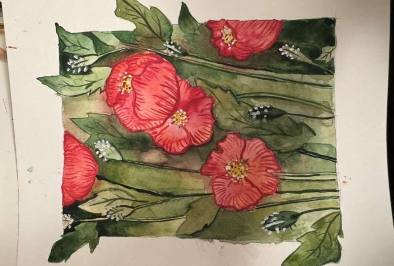
4. 4. Background - first layer: In this step, we will
color the background. I have transferred my sketch
on my watercolor paper, and right now we need some
greens for our background, and we will make one trick. I will show you one
trick while painting. Except greens, we also need to mix some red for our flowers. First layer of color should
be very translucent. That's why I mix my
colors with a lot of water for mixing purposes, I use bigger brush because
it's easier and much faster to mix colors with it. And because the
background is quite big, that's why we need to mix a lot. A lot of these colors. So first color, we
need three or four. It depends how many you have
on your palette greens. And the best greens
are this medium value. So for example, my favorite
one is autumn green. The color is named autumn
green from Roman Schmal and this color is and this
color is granulating one. So this will be my first color. The second color
will be most green. It's similar, but with a
different tunnel value. This color is one ton different
from the previous one. And once again, I mix
it with a lot of water. Okay. I need color which
is light gray. And for that, I
use golden cream. It's like a yellowish
shade of cream. So I also mix it quite a lot. We also need some dark green. For that, I use green color. This color is from white
knight and it's green. This is quite dark shade. I'll add more water
to it and more paint. Okay. And we need one shade of red. We also need one shade of red. So in the last area, I will mix because
just like you see, my reds are almost empty. That's why I mix my magenta. And I will add to it some red cadmium red. Because this magenta is
quite dark and intense, I would like to have
some more muted colors. So I'll add to it more
reddish than pinkish. So I'll add to it a
bit of cadmium red. Once again, water. Okay. So I think we're ready. So I will put away my
palette and change my water. I need a clean water
for the stage. So I will show you
my previous work. So the first layer of green
will be around our flowers. So we need to at this stage, we need to leave the
flowers white unpainted, and paint everything around
with leaves and buds. So we can start even with water. So the first And I think also easier is
with the bigger brush. So I start with the bigger, my number 16 brush. And I think I have not
cleaned my brush enough. Okay. So I had some water. I put some water
on the piece and I don't cover the whole work
with the water at the moment. I will paint it step by step. And when I'm starting, I'm starting adding colors. The one which I
have on my palette, simply I simply pick from one of my shades which
I have on my palette. When we are around some flower, we need to take a smaller garush and put some red in here. On the border on the
edge of this flower. And this will bleed
with our brains and create very interesting
effects while it dries. Let's move on to
the next flower. For example, in here, I will paint around my flowers. Add some other green to it. So you need to be careful not to paint on your leaves
flower petals. And once again, I will pick
my red and leave it in here. And I don't care that
this goes onto the leaf. I quite enjoy this effect. Let's put some red in here. Well, if it goes like this, if you do that, just like me, you can simply take a bit of your paper towel and lift the
paint when it's still dry. I will switch to smaller
brush because I see that. But I have too many
petals in here, and I need a I need to be more
careful and with the bigger brush is
harder to be careful. I use one brush for my reds because I don't like to clean my
brush all the time. That's why this
one in this stage, I only use for reds. Nice. Let's move on. Okay, let's again add some red. So we need to add it in here. And you still, you
need to remember that this is the first layer. It will be very light, and we will paint on it
later with another layer. So don't worry or think
that this looks quite strange or something because it will be different
when we finish our work. We will put some
more layers on it, so don't worry that perhaps it looks a bit off or something. The first layer don't always look good in most
of my paintings, so I don't care that perhaps
this is, for example, that it has this not very
perfect connections of color. It doesn't matter at that stage. This layer is for you
to have fun simply. So paint and don't worry much. Okay. And the last area. Okay. And once again, red, I simply just touch with
my red and it flows, and I like the way it flows. Okay. So it's all for that stage. We need to leave it dry. In the next step, we will
start painting petals, our flowers petals,
see you there.
5. 5. Flowers - first layer: So my background layer is dry
and we can at this stage, move on to the to the
painting flowers. We will paint the first layer
of flowers, our puppies. So to do that, we need to mix two or
three shades of red. I place my palette with my colors for you to
see which color I pick. I don't have many colors, many reddish or red
colors on my palette. I will pick the
ones which I have. This one is this one
is like rose one. I will mix this color with water on my palette and I will mix it
in the proportions. I call it 50, 50%, 50% of water and 50% of color. I don't want this color to be very translucent
and transparent. But still, I don't
need it to be very thick because I have
five flowers to paint, I need I need quite
a lot of this color. This is my first shade. The second one will
be more orange one. This one is from Roman Smeal and this orange is reddish orange. I can see in the scrap paper how these two colors
mix with each other. This will be my second color. I place a lot of watering
here on my palette and add my color Okay. And the last one, perhaps maybe the darkish one. For example, here
will be magenta. Magenta and because it
don't for the moment, I thought that perhaps maybe this magenta won't
much with this color. But this crepe
paper shows me that this magenta blends quite
well with the rest to colors. I think I will
leave it that way. I will not mix it with we can paint our
flowers in a few ways. I will show you
exactly my strategy of painting on few petals
and one more role, we don't paint petals which
are next to each other because we don't want
that the colors bleed. Between petals. For example, we paint one petal, move on to the other petal on
the other side of our work. And while this is quite
dry or becomes dry, we move on to this place once again
and paint another one. One way to paint our
flower is to, for example, pick one color, add it
at the top of our petal. My brush, dry it on a paper
towel and pick another color. For example, clean brush, and with a wet brush, drag move this color
to the bottom. Still, we can take the
last shade and add it at the top of the petal to create this
beautiful blooms. O Okay, this is one way, let's switch to, for
example, this petal. The other way to paint the petals is simply
starting with water. For example, I paint at the
beginning only with water, then take one of my colors, place it in here,
take the other color. For example, this one will
be darker near the center. And clean my brush, try it on paper towel and pick the orange one color
and add it in here. This way, we create
interesting blooms, interesting transition
between colors. Once again, let's switch
the side of the work. For example, right now
in here and you just pick which of these two ways
is better for you to paint. It's okay. You don't
have to be perfect. And what exactly means
perfect, you know? The last three
petals. So this one. I'm trying to be very careful, but it not always helps. And And the last one, I think it will be because we have a lot of wet
paint in there. So some orange. But still, these colors work well together so you don't have
to worry much that it bleeds because we checked on the scrap paper that they look quite interesting
with each other. Okay, we have all flowers done. To the next stage, once again, we need to leave it to dry, see you in the next video.
6. 6. Background - second layer: Hello again. This time we will get back
to our background. My work is dry, all layers are dry now,
just like you see. And at this stage, we will go back and play a little more
with our background. So to do that, we need some greens and I will
mix few shades of greens. By few, I meant like
three or even four and let's start mixing it. The first shade is my
favorite autumn green from Roman Schma and you don't have to pick exactly
the same colors as me. You can choose the
ones you have on your palette and right now, I'll mix it with I mix it
with 50 50 proportions, 50% of water and 50% of paint. So the colors are very
transparent, not very translucent. They are not in milky stage. They are quite quite
thick but still watery. We need to have a few shades
few middle tone shades. I have this one, which
is autumn green. The other one is golden green. It's also from Roman Schmal. It's also my favorite one. You can use the
same colors just as you used for the first
background, first layer. So this color will be green. This green comes from white
knights and it's quite dark, not very very dark, but it's quite dark,
just like you see. And I have some new
shades on my palate. So let's try them. Well, this one is
called Chromium green. Chromium green oxide dark. It's also from Roman Schmal and I will pick it and I
will test it on my work. This one is quite dark, but this color is
granulating one. It creates just like
the autumn green. These two colors are
granulating one and they create very
interesting effects. I have my colors ready, but still I think I
will mix something while I paint because I
think it's not enough mixed. I will use them while I paint. I think I will mix
in the meantime. Let's put away my test sheet. I have my two previous works, and right now we will create
some darkness in our work. For example, we will make areas
under the flowers darker, a little bit darker. We will use negative
painting techniques. For example, we will leave the stems light and the
rest will be in shadow. We will just play
so you don't have to be nervous about the outcome, you just have to have fun and
just play with the colors. I don't know, let's start. I think the easiest
way is to think about the areas we
want to make darker. For example, we will make this area darker and
just like before, I switch between colors. For example, I will
pick the first one, take the other one, and see what happens. We will leave this leaf lighter, so we paint rounded. And at that stage, I will take smaller
brush and I will blend the edges of my
color with the background. I don't want these
hard edges in here. I want this translucent. Perhaps I will add some yellow, yellowish green in here. I think we also need to
make this side darker, but I will add this medium to green because I don't want it
to be as dark as this side. I think I want this
puppy bud to be darker, I will take my darker
green and make it darker. Also with the stem, this one, the stem
goes like this. Perhaps the darkest tone. I think we should do
similar with this leaf. So I will place my paint only on the
half of the leaf and with the wet brush, damp brush, I will
blend this color. Here, I think it would
be fine if this leaf is darker and leave the red area
in here just like it is. I will pick my dark green. I'm trying to not to smudge the wet paint here and
make this one darker. And for example, we will pick the medium value while we go up. Let's see how it
looks quite nice. But we need something
in here because it's just like they look
like the white one area, so we need to distinguish it. I put the light stone
in here only like that simply to blend it
with my wet brush this way. To create a little illusion that perhaps it's not one thing, but two separate things
like puppy bat and leaf. I think we need
something on the leaf. I will take my
medium green and put a very light layer not
on the whole leaf, but only on a piece of
it and with the water, blended with the rest. In this way, we create some
more depth on the leaf. Still we can add
some darker tones. We can have fun, we
can play with it. Okay, and we will see how
it rests on the paper. I think this we will
paint in darkest tone. So I think it's the swan. So it's darkest from the
rest of the background. But still, we need
something in here. I will take my
medium medium shade and round this puppy bud, I will place align with the color and blend
it with a wet brush. Or perhaps at the lighter one perhaps maybe the
darker one, a bit. But every time I
blend the edges, I don't want these
hard edges in here. Okay. So I think we will put
some darkest tones in here. Uh but still blend the edges. You don't have to
paint the whole area. You can simply paint
just a little bit of it, still, you see that
the leaf goes in here. So perhaps to define this leaf, we need to paint to its edges
like this one, this way. And once again, blend this edge. Okay, let's put
some more green in here and blend it. I think some we need to darken
this area a little bit, not much, but just a little
bit to define this leaf more. So like that, perhaps one, this but should be darker. I'll pick my darkest
tone and make it dark. I think to still
define this leaf, we need to darken
a bit this area, so I will do it with my
medium medium value. And I will do it again in here, but just on the edge, I don't want to
paint all the area. Just the edge, clean my brush
and with the damp brush simply make the edges smoother. This is slide. For example, this will be darker. Okay. And this to a bit, just a bit, not much. And with my damp brush,
make it smoother. I think I will dark this area and leave the bad
and a leaf lighter. So I will place my
darkest tone in here. With the medium
value or the one, this we almost have done the
left side of our work. H. I think we have to define
more this leaf and the stem. The first is a
medium value or the lightest I will add again, my darkest tone in here, but with a lot of water
and I will dilute it. The same goes in here. We have to more define
the edges of this leaf. Okay. It looks
better now, I think. And what have we have next? I think we go back
in here and create a little light layer in here and with the dump
brush, make it smoother. Okay. Perhaps I will add once again dark color to define
the edges in here. Okay. I think the left top corner
will do similar to this. I will make it darker, the edge will be painted with the darkest tones,
two tones, exactly. And here, I will blend it. Blend it with the background. I don't want this color
to touch with this. I don't know. I know
it's not a stem but I don't remember exact word. And here I will add
with my latest value. And blend it. I blend almost everything, and let's move on to this
leaf and add the ltus value, which I have mixed only on the left side of
this leaf and blend it. Once again, blend it. Medium value, and we'll put this medium value in here
and once again, blend it. Everything we need to blend. Every color perhaps we'll add some darker to make
more interest. And I will add in here. This darkest tone
and leave it to blend and my first layer
created here sharp edges. I don't want these sharp edges, so I will paint over them with my darkest tones so they will not be visible in
this way and blend the edges. I think I will make the
puppy darker in here. I will take my
darkest darkest tone. Okay. I will make this area a
little darker and blend it Did you notice how
beautiful effect we achieved in here simply by placing a different color
to the wet area we had? Okay, I think I will add once again my arcos
values in here. You still can return to the places which you
have painted before. You can just move on and see
how this looks and decide if you want to paint
over them once again. I think we have only
this site left. So with the lightest value, I guess, or with the middle
one, we'll define it. And I will make
this area darker. This is it. We have all
the background painted. The second layer, we
need to leave it to dry and at the next
video at the next step, we will go back to
the flowers once again and add some details
on it. See you there.
7. 7. Flowers - second layer: Okay, so our background
layer is dry now, so we can move on
to the next step, which is the outline
of the red flowers. To do that, we need, once again, two colors, two shades of red. So we can take the same
colors just like before, but dilute it with
the less water or we can take any other red colors we have on our palette so let's pick two
different shades. For example, one will be red, cadmium red mixed
with the magenta. The second one this time, I will take viridian, which is darker color, and let's switch to
the smaller brush, and let's start outlining. You can pick one color
or the other one. It doesn't matter which one of the sto peck at that stage. We just need to make
some contrast on our work and make it
more interesting. And we don't outline the buds. We only outline the
petals red petals. Okay the one in here. Okay. And when we have
our outline done, let's switch to the
rigor brush and make some details on our flowers. So we will use the
same two colors. And with the rigger brush
and each of the petal, we will draw the details, these lines, details
on on flowers. And don't worry about the lines. Then they don't need to be
perfect to create effect. But remember, they don't
need they don't have to. They shouldn't be
straight lines. They should be curved
a bit to create an illusion that these
petals are rounded. So we don't make straight lines. We make all lines should be
slightly slightly rounded. I move around my work
because it's easier for me than to just move
around with my hand. And the last flower. In the next step, we will move on to the center of our flowers, and I think we nearly finish. It's about two or three
layers to finish our work. See you in the next video.
8. 8. Final Details: In this step, we will
finish our work. First, we need to paint
our center of the flowers. To do that, we need
two shades of yellow. The first one will
be cadmium yellow. This is our first color. Which we will use. I'll switch to
smaller brush because the centers are not big and simply choose one of
these two colors, sometimes the first one, sometimes the second, and
I will paint the centers. I want the centers to be not flat and paint with
only one color. But I want them to
be more interesting. That's it when it
comes to centers. We will leave our
yellow centers to dry and we will move on
to details on leaves. For details, I will
only need one color and this is some darker green. I will use green
from white nights. It's quite dark but
not very dark green, so it looks like this. So I need some
brush for details, and this will the rigor
brush from renaissance and we will paint some
stems on the leaves. We will add some details on the puppies and don't worry if you go
outside of the line. It's not a big thing. Actually, we will
add some details. We will add some
details on a stem of the flowers in here, I need some more of my color. This way, I will
define some stems, which sometimes are
narrowly visible. So I will make
them more visible. I will make them pop this way. Don't draw this
stem on every leaf. You can leave some
of them untouched. Okay, so I think I will
leave it that way. I don't want to overdo it. I think this is enough. Let's move on to the centers
because they dry now, let's move on to the centers. For details in center, we need orange color, orange and Sienna or something
like that, light brown. I will use red orange. Straight from my palette, I only add some water to it because I need this
color to be very thick. That's why I only add colors to my pan and my orange
looks like this. It's reddish or orange
with a brownish tint. The second color will be light brown and I
do the same trick. I only add water to my pan. This is the second
color which I'll use. They are both similar. If you don't have
this orange one, you can simply pick
orange color and add a little bit of red to
it or even purple or even dark red or add
some brown to it and mix it on your palette
with little water. We will add some
details like dots. On the center. It's super easy. But we don't want
them to be flat. That's why we use two colors. Perhaps maybe I'm thinking that perhaps brown
will be too dark, so I will pick my
naples yellow once again and perhaps second color for dots will be the
Snapples yellow. And again in here with yellow and with orange, some dots, and in here. You can even try to go
beyond the center like that. Perhaps let's go
back to this one again and go beyond the center. And the last flower, so my orange First,
my orange color. And second yellow apples yellow. Okay. The last thing, you will need some white and you can do it with white quash, or you can do it
with white posca, or you can do it
with white alpin. We will add details, the last details to our work, the last touch, and we only add some
details on our puppies. This should be dry now. I will add like these little marks on it
to give them some shine. The specially visible on darker puppies on darker buds. So we can add some
more details on them. Try vary the lines
so they don't all be the same size and somewhere in here. And remember, we don't paint
realistic realistic puppies. It's only our vision of puppies. Also we add some details
on center of our flowers, but we need to make sure that
the centers are dry now. Mine are not, so I'm trying
to add the white dots between watercolor because
I don't want them to bleed and the last two flowers. I think that's it. I think we have
finished our work. This was the last details. I wonder how your
work looks like. I hope you are proud of yourself because I am sure that
your work looks beautiful. I will be very honored
if you will place it in the project section
for me to view it and see you in
a wrap up lesson.
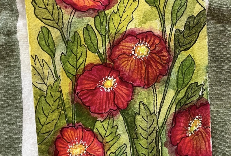
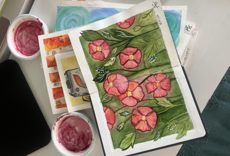
9. 9. Final Thoughts: Congratulations.
You've just completed your beautiful watercolor
poppy painting. I'm so proud of the
work you've done and the creativity you've
brought to this project. Whether you're a beginner
or an experienced artist, every piece you create is a step forward in your
artistic journey. I hope you enjoy this class
and learn techniques that you will use in your
future watercolor project. Remember, the beauty
of watercolor lies in its unpredictability and the
unique outcomes it creates. I'd love to see your
finished artwork. Feel free to share it in the class gallery
or on social media. Don't forget to tag me at Instagram so I can celebrate
your amazing work. Thank you for joining
me in this class. If you enjoy it, be
sure to check out my other watercolor courses
and share your feedback. Until next time, keep
creating and have fun.
 Anna Krupa, web developer & graphic designer, mix media artist