Transcripts
1. Intro: Hi, everyone, and welcome
to my new watercolor class. This time, we will be
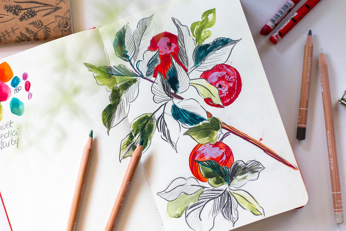
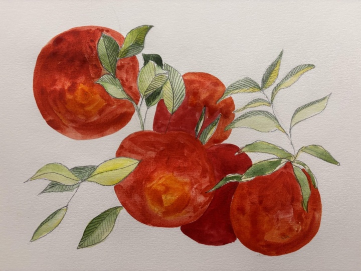
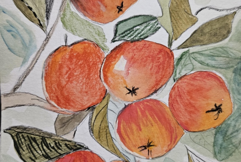
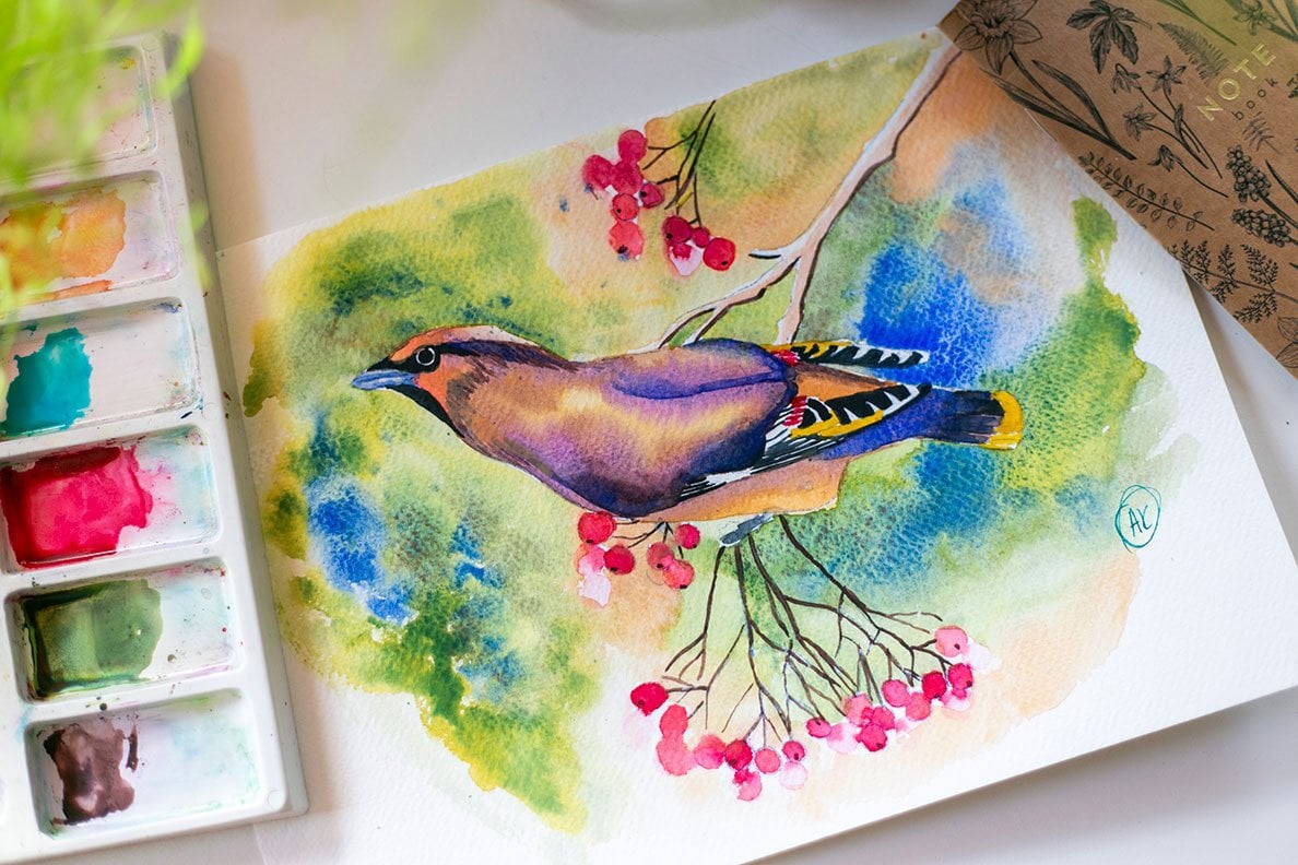
painting a branch with vibrant red fruits and lush green leaves inspired by a beautiful reference photo. Instead of starting with
a ready made sketch, we will use this photo as our guide and build the
drawing step by step. What makes this class
extra fun is that we won't be working
with watercolors only. I will show you how to
combine paints with colored pencils and
even simple graphite. You can create rich textures and vibrant details
in your artwork. Together, we will explore how
to capture natural shapes, play with loose brush strokes, and add definition with pencils. By the end of this class, you will have a beautiful
mixed media illustration that feels fresh, expressive, and truly yours. Grab your brushes, pencils, and sketchbook and
let's get started.
2. Materials: Hi, welcome in my new class, and just like you see
in the intra video, this class will be a
bit different than the others because
this time we will not my predefined sketch for this class and we will
sketch by ourselves. In the project section, you will find instead
of ready sketch, you will find this
reference photo. This photo is downloaded
from Osplash website, so it's royalty free
and you can use it. For this project because
we will use mixed media. You don't have to use
watercolor paper. I will use Mixed Media pad. I bought it in action in Poland. This paper is not
suitable for watercolor, but we will use also
crayons and pencils. That's why instead of
real watercolor paper, we will use this blog. So this one is 300 GSM, but you can use even 200
GSM also will be fine. We will also use pencils. Mostly gB and six B. This one is to B,
but we will mostly use four B or six B pencil. I have my set of different
pencils in here. Age B for sketching and six
B for refining our sketch. Next, we will use Was watercolor paints
watercolor paints, just like you see on my picture, we will mostly use
greens and reds for our purpose for our work. You don't have to
have different colors and the whole set
of watercolors. You only need just a bunch
of reds and bunch of greens. For that, we will use brushes for painting
with our watercolors. So and we also use crayons. You can use whatever
crayons you have. They don't have to be
watercolor crayons. I will use corners aluminums. These are not watercolor
crayons and I will also use crayons from Mondus Cohenour and these are watercolor ones. But we won't use the watercolor
ability of these crayons. That's why they could be
any crayons you have. For the last stage,
from our work, we will add just a hint of guash to define some
details on our work. That's all. I'll see
you in the next video.
3. Sketch: Okay. This time,
as a first stage, we will do a sketch
for our drawing. Just like I saved you
in a material section, we will not use
watercolor paper. Of course, if you have
watercolor paper, you can use it
because at one step, we also will use some watercolor
paints for our paint. I will show you the results. We used watercolor paints as one of the steps
for our project. I think they will look much better if you
use watercolor paper. But still, if you don't have it, you can use mixed
media just like I did. I will use mixed media
but this is from action. And just one thing. This paper is very smooth and it likes
to smudge a pencil. That's why I will use some
piece of paper which I can place my hand on it and
this will prevent smudging. I will use three B pencil, but I will use it only because I want you to see what I draw. I recommend you to
use number H pencil. Ge or HB, so you can
check it in here, what kind of pencil you have. I think the lighter
sketch is better. But just like I said,
I will use three B because otherwise you won't
see what I will sketch. Also we need some
eraser for our sketch. As a first thing, I will
draw a border for my work. I places here and there, I usually use for
testing my colors. We have our working here and we still have some
place to test. This is our reference image
on which we will work. But I would like to crop
it somewhere like that. I don't want to draw
all of what is in here. I want this apple to
be slightly lower than they are on original photo. Let's start with apples. Let's draw this one and this
will be somewhere in here. So I simply draw an oval and I will place
the center of this apple. Just like you see, it's not
in the center of this oval, it's slightly to the left. I will also mark it
somewhere in here. Next, we have our second apple, so it's slightly bigger and it's slightly under
the first apple. I will draw it
somewhere in here. It doesn't look like
an oval in my case. Every time I draw something
new on my sketch, I usually erased lines,
which I don't like, for example, in this case, I don't like because
it doesn't came up as an oval and I usually also
erase the lines I don't need. I will correct my
oval. Like that. The center of the
apple is somewhere in here. We'll mark it. On the picture, we have four
apples, one, two, three, four, but this one is so
hidden that we won't draw it. And there is a role
in the photography and in graphic design
that human eye, human brain doesn't like even numbers even number of
things on illustrations. That's why we will use odd
number, only three apples. We only will add this third one, it's somewhere in here, just like you see, it's hidden, almost half of it, so
it's somewhere like that. And this one is
almost strt in here. This is almost a straight
line on a picture, and we have something like that. Let's raise unnecessary
lines for the apple. We don't need that because
we don't see them. This erase and correct
them the same with this. The center of the apple
is somewhere in here, so it will be just
like that. Okay. Next, we will draw a branch. So this branch, I will
draw like that so it will go like this
on our picture. Now let's move on to the leaves. I think the easier thing will
be starting from this area. Just like you see
on the picture, we have even starting
point for that. It's somewhere under this apple, we have the starting point
and we have some tree, but we could draw more leaves
coming out from this point. Let's draw the first one. We have somewhere,
something like that. I will make thinner stems. We have a second leaf which
goes beyond the border. First, I will only draw
a stem line and then I will draw a leaf. This leaf is folded in here, it goes something like that, that it's without any
distractions in here, but it has folded part. Now we have this
leaves, this leaf, which goes something like that, and this one is also folded. In that case, it's
easier to draw the part we see for example, like that, let's erase these lines because
we don't need them. Also I will raise
some under this leaf. Over the leaf and let's draw
the second part of the leaf, which is far away from us. It's something like that. I
will make the stem thicker. I think I will draw some
more leaves in this area. We have some mess in this picture and I
don't want that mess. I want to have some leaves. I will draw leaves which there
are not on this picture. This is one leaf and over here, we can have a leaf which can go, for example, under it can go under or over
just like you want. Just be aware which
lines do you erase. If the leaves goes
over the apple, you need to erase these lines. If it goes under the apples, you should erase the lines. For example, let's make a
little change in what I draw before and this leaf will go
under the apple, like this. We create illusion, what
goes over or under what? We have this part done. I want to draw also
this stem with this few leaves because I like the composition
of the leaves. But I think I will draw them slightly higher because we
have some area in here. For example, this stem
will go like this. This branch, it's even a branch, not a stem, it goes here. We have some leaf which goes
almost from the top of it. Let's draw it erase
the lines we don't need it even could
goes like this. It will easier for us
painting later, right now, let's draw these leaves which
are slightly On the side. Once again, let's draw
a stem the side we see. For example, it's like that. I don't need to
erase anything and I will draw this thing. Simple the same goes
with this leaf, so I will only draw
some thicker lines. We have this leaf Okay, let's erase unnecessary lines, and this one I will draw a little bit different
than it is in a picture because I have some
area in here and I want to cover it in here and I don't want to make this repetition of
the shape of the leaves. And we also will draw this
one, it goes somewhere. This and just like before we can draw it slightly different than it
is in the picture. Just remember that this picture is only a reference for you. You don't have to draw exactly
as it is on this picture. You can add you can add
your own details or you can remove whatever you don't want
to repeat on your picture. We have the top part of the
picture of our sketch done. We need to move slightly
down because um, it lacks some details over here. I think we will draw this leaf, which covers this apple, I will draw it here and I
will cover this apple a bit. Let's erase unnecessary lines. We have also this leaf. I like it in that picture. That's why I think we
will also draw it here. Okay. I think that's all. That's all for our
sketching part. In the next part, we will make some details
with the pencil. But for that stage, we will
need some softer pencil. If you use T B, I think we will need something
even softer than T B and I usually use Tombo
six B pencil for that. But it doesn't have to be tumbo. It could be any brand you have, see you in the next step.
4. Pencil: Just like I said before, we will use a softer pencil. In this stage, we also need this additional paper on which we will place our
hand at that stage, we will add some more
details on our sketch. We will add just a
simulation of shadow. For example, we will add
outline some leaves. For example, this one and we will cross
hatch some areas. So we will only add some
simple light shading. Because this is a
mixed media class, we will use different tools. We will move on to the
next to the next leaf. So for example, this one, I will outline it first
and make some shadows. Only light shadow. In this way, we create contrast
between dark areas, dark areas and light areas. We don't only draw apples, so we will leave
them as they are. We only will do the
streak on leaves. The shadow don't
have to be exactly as they are on a
picture or example. I don't have to be,
but it's your choice. For example, here,
this will be darker and this will be lighter and this part we
will leave white. Because this is a
very soft pencil. I can smudge the
areas which I want. For example, this one in
this one a little, not much. This leaf, I will only outline, I think I will leave it without cross hatching,
without this hatching. Let's go in here. Okay. And here I will
have some little shading. And I will smudge
with my pencil, the back of the sleeve. We can leave this leaf
unpainted for now without hatching because it will create interesting contrast with the
hatched ones and this one, which is almost white. We have the last leaf in here. And I will only hatch this s, this side, and draw the branch. Also, I will draw a branch. Let's draw our branch and we
have two more leaves to go. This one I also will leave it white
without hatching. I think it will be quite
nice because we will have odd number of
unhatched leaves. It will also create
this odd number and the last leaf in here. Okay. I next stage, we will move on and we will
use some watercolor paints. So we will paint
the apples and we will add some colors to the
leaves. So see you then.
5. Paint: So right now we will add some color with the
watercolor to our work. So we need um, green or two shades of green and two shades of
colors for our apples. So let's mix them on
a palette quickly. I will mix them in 50 50 ratio. My first color is autumn green, so it looks like that. It's granulating color. This is my favorite
shade of green. I use it almost in
every painting. If you see my other classes, you will definitely see
this sorry for my cat. I will definitely
see this color. This is my first. The second color will be green. I don't know exactly the
name of it because I have squeeze it on my palette. Sometime ago and I
don't have the tube. I will show you how
this color looks. This is just an
ordinary green and I will mix it with fallow blue, green shade to achieve this very dark and
bluish tone of green. It looks like through Christ. That's why I need to add
more green to my mixture. Once again, let's
try once again this. Okay. That's quite nice. And on this area, I also test how these colors
look with each other. So if I see that they are
well bounced and work well, I usually leave them. So we also need Red. For my dark red tone, I will use Alizarin. This is also my favorite red. This is Alizarin, Alizarin
crimson and more of that color and as you
see on reference photo, this area next the
center of the apple is slightly lighter and
the same goes in here. We need something which is
lighter than the thread. It could be also like
orange color, orange shade, or all use, this
is naples yellow, but in reddish tone. This is not naples yellow. This is apples, yellow reddish. If you don't have
naples yellow reddish, but you have naples yellow, simply add a touch of red
to your mixture and it should look similar to mine. These are all colors. I will use this medium brush. Number four, it's from Princeton and I like it
because it's very soft brush. It's not the end, it's not stiff, so
it's very soft. That's why I can rotate
with different directions. Let's start with apples. I will place water. This is remember, this
is not watercolor paper, so I suppose the colors won't blend with each other very the same as on
a watercolor pad. But it doesn't matter because
it's only the first layer, so I'll start with
this redistone, clean my brush, make it dry on paper towel and take my red, and add it to the edges. Just like you see, it's not
very well for watercolors. It's mixed media paper, but these colors
don't blend well, but it doesn't really matter in this painting because
I tested it before and the results gets
quite nice if you add more layers
with crayons later. Don't bother if it
doesn't look pretty. Pretty is a well word for that. Let's do second apple
and just like you see it dries faster than
on cotton paper. With this apple yellow red, reddish tone, and
let's pick Alizarin. Alizarin from here. And perhaps some over here, and I will do straight
from the pan. The pen has a trouble blend
to flow on this paper. That's why it looks like that. But like I said before, don't worry much because this is just a process and at the
end, it will look great. Trust me. Last apple, I will start with noples
yellow, reddish here. Add some water to the
edge and switch on Alizarin perhaps I will even add touches with
this sarin here. Now we move on to the greens and I usually start
with this lighter one, for example, we can add it here. I know that this one
is granulating once, so I only place a few lines with this color and
with my wet brush, move this paint
around on the paper. You can go on, go beyond your outlines. It doesn't really matter
in this kind of painting, so you could just test what you like or
what you don't like. For example, I will add
some strokes over here. We can add this color on
lighter sides and darker sides. Now I will take
this darker color because I want this color to blend with this lighter
one and add it in here. Here we have some
still with our colors, we can paint some additional
leaves in the background. For example, in
here, some in here, but I would like them
to be very translucent. That's why I only place
one dot of paint and then I blend it with the water trying to create
the shape of the leave. I think we need more
of this darker value. We can still with the
water, blend it a little. And once again with my
favorite autumn green, I will make some leaves in here, and I think here we
need some colors, we'll add this autumn
green in here. But we will add just a
touch with this darker. That's all with the paints. In the next stage, we will go back. One more thing. I forgot
that we also need to paint our branch. I will take my
light brown color. This is my red or her color. I call it light brown because
it's the only brown I have. Sorry for my other cat. We need to paint the branch, the branch goes in here and also in here and it was in here. And I will switch
to smaller brush. I would like to also paint this branch but in
different color. I have dark brown and I will
paint it with dark brown. In my case, it's October 2023. It's straight from the pon because I want it
to be very thick. Okay. I see that. It's quite thick. Now we'll add some
of this darker, darker value of brown in here to the branch because this one, this part is in shadow. We need to leave it to
dry and after it dries, we will go on with the
next layer with crayons. It doesn't have to be
watercolor crayons, but see you in the next video.
6. Crayons: Okay, my layer is almost
almost already dry, but I will try to be aware
of the watery parts. And at the beginning, we will start with the apples
because they're dry now, so it will be easier to
start with the apples. I have my crayons
just like you see some of them are
very, very small. This is number 36 from Cochenour Mondus
with this color, I will only mark the
centers of my apples. These are the centers and I will take my number 589. This is crimson alizarin
from luminance. I only need it to be sharp. I will add outline on apples. It doesn't have to be exactly ideally what
you have before. This outline can also
be thick and we will create shape of the apple
with rounded rounded strokes, we will create the illusion
of ovalness on our apple. In here, we will
start adding details. And still, just like perhaps you noticed that I don't go
over the slight area. I only add these details
in the area where I have my dark red color because here we will go
with the orange color. So some slight color
values changes will be in here with my red, I will also add I want this bottom part of the
apple to be darker. That's why I draw something like that with
the side of my crayon. I will take the orange crayon, and this is a number five
from Montes, Cochenour, and I will add the
center, similar strokes, but from the center
of the apple and we can go even to the
reds with our orange. Okay. And we will do
similar on other apples. First, this down one, I will outline the whole apple. Make this part where the two
apples meet with each other darker if I had even darker
shade of red in my crayons, I will also paint in
this area because I want it to be even darker
than it is right now. I will see if I have
something which I could use. For example, I have this
is a sugar plum from Derks I will use it in here so make it
even a bit darker. Okay. And with this
orange once again. But remember that these
strokes should be rounded. And the last apple. So Outline. So perhaps let's start
with this orange first. Perhaps it will be easier. And a bit of darker red. I will add with this sugar
plum first, some strokes. After that, with my red
with my Alizarin crimson. One more thing. I want to create this effect. That's why I will also draw some vertical lines and the same in here. So lines. Let's see what is dry now. We will go to the leaves and I like to
start with the darker ones. I will use number
739 from luminance. This is dark sub green and I will add details
on the leaves. Once again, not every layer which was first
cross hatched with pencil, I will draw with crayon and just don't over
draw the same line. So just add the color
where you like simply. It could be just some
lines on some areas. It could be the whole leaves, for example, just like in here. Remember that we will do the
same with the medium green. Don't draw everything the spart. And here I will make this dark. I was wondering if
this is already dry and I will switch
to medium green. I call it medium green. This is two, 25 mouse green from luminance and I will
use it in here. And over that, I will use
a bit with dark subcreen. You just play in here. Just play test what you like. What you don't like. This is just like a playground. This line also can be very soft and notice. See if you like
this kind of lines, or you can draw with
a light tone on a dark background and also notice if you like this effect. If you like it, just
try on the other leaf. Perhaps I will add. Sometimes it can be just
like a few strokes here and there or just the outline. This is for you to test. I think this is final, and we also need to
work on our branch. I will see if it already dries. I have number 31 from
MondesT is like dot brown. I have also sepia, 50% from luminance and this
is number nine oh six. I usually call it dark brown
and I have French gray 10%, eight oh two from luminance, because I think
sometimes lighter color looks very interesting or
dark on darker backgrounds. One thing just like
you see on the branch, we have these dots and we have this light on the left
side of the branch, and I would like
to simulate that. I I don't like the effect which I will achieve
with my crayon, I will paint it later
with the guash. But for now, I would like
to test my crayon for that. I will add this later on a branch and the dots
which are on a branch. I will take my darker color
Sosepa 50% and I will create the exact form of my
branch and perhaps I will add some simple details. It doesn't have to be much. Especially on the areas which are too light
just like this one. I have this lighter brown, but I think I don't need it. This is all for the
crayons and the next step, we will add just
the touch of guash. It will be the very last layer
on our work. See you then.
7. Gwash: Okay, so I have my squash over here and I will use a very thin. This is the thinnest I
have number three brush. I need this squash
to be very thick. That's why I only add a drop of water to the place where
I have my own squash. And test over here if
it's thick enough. We will add just a
glimpse of light. When you see on a picture, we have some light over here. We also have some
light over here and over here on apples over here on apples where the light just shines on it and
it just diffuses it. We will add some
details with it, perhaps maybe not exactly
like this is on a picture. And on this apple, I will add just this
single very thin details. Here. We can even add
these lines on our leaves, but I didn't do it on
my previous work and I just show you for you to
decide if you want to add these lines with the
white gouache on the leaves. You can see the result
without these lines. For example, in here, I will add simple some lines just to test how it looks
and if I like this effect, and also if I like this effect. If you don't have quash, you can also use some gel pen
and for example, posca pen. I think I will add Sometimes it's
hard to just stop. I think I will also
add this white here on the places which I draw
with my slider crayon. Okay, that's all. I
hope you like it. This was a mixed media project. I would be very happy
if you place your work or even stages of your work
in the project section. I would love to see them. I usually give a
feedback if you place your work in the project section and see you in a wrap up video.
8. Outro: Thank you so much for
joining me in this class. I hope you enjoy experimenting
with a different process, starting from a
reference photo and layering watercolor pencils
and graphite together. Now it's your turn.
Upload your project to the project section. I'd love to see how you combine the different mediums and what details you
choose to highlight. If you enjoy this class, please leave a review. It really helps me and
other students discover it. If you're ready for more, check out my other classes where I guide you step by
step through painting, birds, flowers, and more
watercolor subjects. Most importantly,
keep experimenting, keep painting, and keep
having fun with your art. See you in the next class.
 Anna Krupa, web developer & graphic designer, mix media artist