Transcripts
1. Welcome to class!: Hello there friends and welcome to this tiny Polaroid landscape painting class. Just kind of rolls off the tongue, doesn't it? I'm Elise and I'll be your teacher for today when we break down the super basic elements of creating a landscape painting which is a background and a foreground. That's it! I think a lot of the times we let ourselves be overwhelmed with all the things we don't know and how to take that first step into starting something new, for example... watercolor landscapes! The reason I know that this is a great place to start for beginners is because this is literally how I got started. When I started painting back in 2018, these were the scenes that I was drawn to, trying to create that soft blurry background and then contrasting that with some darker, sharper elements in front, usually mountains, or trees and I'm still painting those. Meaning that the skills we'll be practicing in today's class are really essential when it comes to working with watercolor and we'll be practicing alongside actually creating something that's finished. You can also do this whole class with just one color seeing as we're working in monochrome. That also allows us to just focus on the techniques, focus on the light and dark. I'll be taking you through step-by-step, my favorite kind of backgrounds, and then sharing some essential tips and tricks for those foreground elements to get them nice and sharp, working on our brush control, getting to know our supplies better, no matter what supplies you have. I'll also be adding some photos in the resources if you want more inspiration, or you can use your own photos, giving you all the ingredients so that you can put them together in a way that feels like you. I hope this has gotten you excited to paint your own landscape paintings and join me in the next video when I'll talk about our project for today's class. I'll see you then!
2. Class Project: Today's project is to create a tiny landscape with the techniques and elements you'll learn in class. I love it when students add their own flair to it, so feel free to play and start exploring other ways of using your colors and paints and supplies. I'll be going through all the parts nice and slow, and then showing how I create nine different scenes with those same elements, combining them in different ways. You can recreate the same combinations as me or put together your own. I'm a huge fan of learning by doing so while painting landscapes, you'll also be developing useful skills like blending, water control, brush control, coordination, and getting better at layering, composition and details. You can also do this in a sketchbook as a way to get to know your supplies better. This class is packed with information about watercolor as a medium, and it's such a nice way to get all the benefits from deliberate practice while also leaving your desk with that spark of pride that you created a tiny work of art. Let's get started.
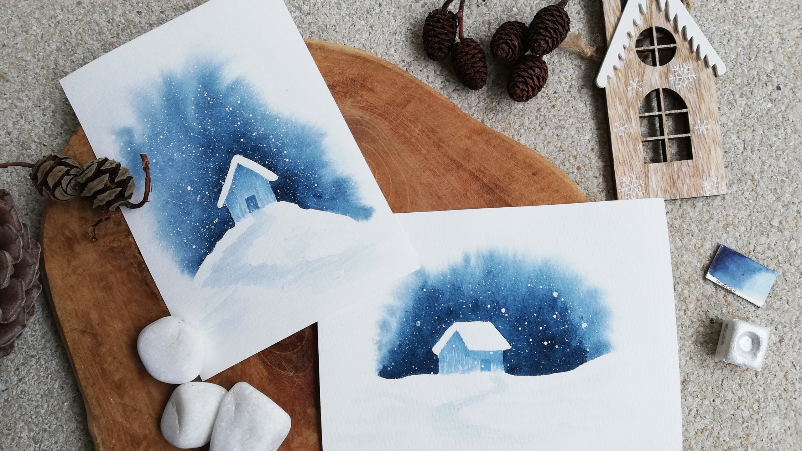
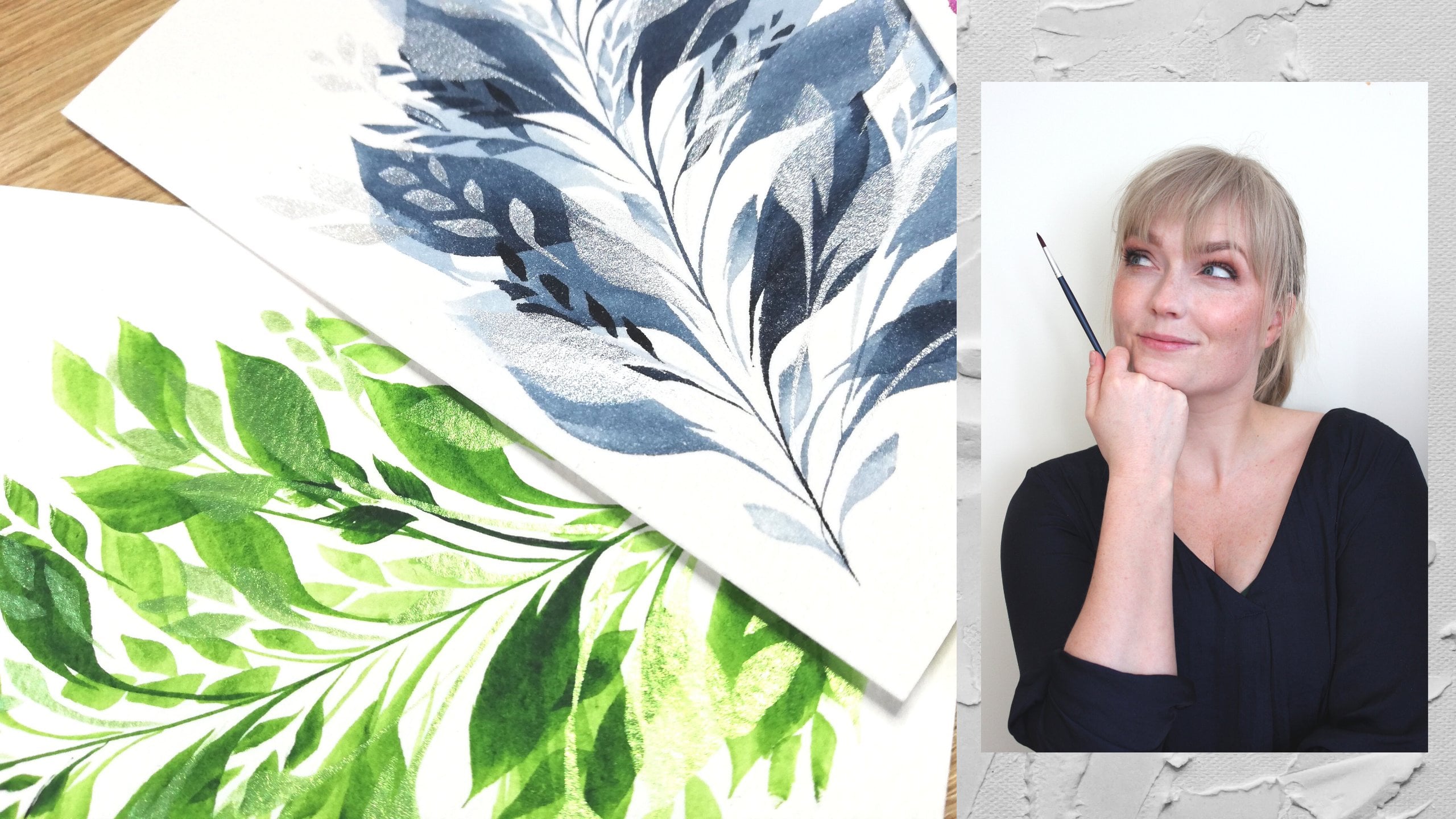
3. Supplies: These are the supplies I'll be using for today's class. I'll be going through them but you can absolutely use whatever you have available. First step is our water, can't do watercolor without water. I like having two. That way, one is for rinsing off brushes and then the other one for picking up clean water. That way I always have clean water available. The nice thing about using jars is both that I just close them when I'm done so they're ready to go for next time, and the inside of the lid can be used as a palette if you don't have a separate one. These are beautifully decorated by my mom. Thanks mom! Next up we need paints for our watercolor painting and these are mix of White Nights and Roman Szmal. You can use any kind you have. I usually use pens, especially for smaller pieces. That way we don't need a lot per piece. When working on a monochrome, I'm looking for these dark shades. That gives me a lot of contrast between the light and dark, instead of using these ones, which gave us softer contrast for our monochrome color. The darker the color, the bigger the range between the lightest and darkest shade. Then of course we need paintbrushes. I like using round ones with a nice pointed tip. That way I can do bigger areas and smaller details with just one brush, although for this class I'll use two. This one is slightly bigger and softer, but still the nice point, it's extra pointing out because it's wet. Then these two are more or less the same size and it's smaller and springier for more control while painting tiny details. The reason I'm showing both of these smaller ones is because the blue one is a size 7 and the yellow is a size 4 because they're from different brands. So don't trust only the number when shopping for brushes, make sure to check the measurements as they vary from brand to brand. Then just bring something to wipe your brush on so you can regulate how much paint and water is in your brush. I like using this old piece of an old t-shirt or tissues or napkins. It's nice if they are white too so you can see the color and if your brush is clean. Then a little palette is nice to have. This one's just a tiny ceramic plate. Often watercolor palettes come with a mixing space inside the lid. But if not, then something like a plate or again, the inside of that water jar lid is nice so we can create different values, adding more or less water to our paint. For this as well, I would recommend a white one so that the colors show up in the same way it would on the paper, how it dark and light our paint will be. Lastly, and most importantly, watercolor paper. The reason it's so important is that for watercolor, it needs to be thick enough to hold all that water we will use, as normally, water and paper are not friends. These are cut already to four times six centimeters and I recommend 300 GSM, which is a great thickness for this. I'll be using cold pressed watercolor paper for this whole class, which means it has a little texture and is great for this kind of landscape. To get that polaroid look, we need tape and something to tape that paper onto. I have a piece of an old wardrobe. This one is very well loved and I like that I can move it around so you don't have to tape it to your table or floor. Then this tape is just from an art supply store. You can use washi tape or normal cell even. Just make sure it's not going to tear your paper apart. For our final project of putting everything together and to show you how to take multiple polaroid at once, I'll use this block. It's 100 percent cotton, stays nice and wet for a long time, which makes it easy to blend and paint on. I'll just need a ruler, a pencil and eraser, and a normal pair of scissors to measure and mark and cut at the end to get that polaroid shape. That's it. Take a minute to get what you need and I'll see you in the next lesson where we do our taping first so we can start with our painting afterwards. I'll see you then.
4. Taping a Polaroid: Taping the edges of a watercolor painting both gives us a crisp, clean white border and keeps our paper flat when it dries. I've chosen this tape, which is twice as wide as I want my border to be, and that makes it really easy to measure that it's more or less equal around our landscape. If you have a single piece of paper like this, I would recommend taping it to a board, making the top and side borders the same size and the bottom a bit bigger. I usually do half a tape around and a tape and a half for the bottom. That way it's easy to measure and taping multiple at the same time. Taping the top first, attaching it to the board, and then the bottom one straight across, then the two sides, making sure to flatten the tape down with your finger so the paint and water doesn't escape and mess up our polaroid edges. If you want to take more than one, they can share a border. I'm taping my first one, placing the top border halfway under my tape, and then putting the second one next to it, securing both of them down, making a border for both with that one piece of tape. Then, same as before, a bigger border at the bottom and both the sides, then they can share that middle tape, since the tape is two borders wide. Easy-peasy. My tape is quite narrow. I've chosen this one because it gives me two borders in the same tape. If your tape is a lot wider, then it might be a better idea to do these one-by-one, cutting them up first. That way the borders won't be too wide and you'll have a little bit more space to paint on, or you can, of course, make your polaroid bigger. Now, I really like using blocks for watercolor and this works for a bigger sheet too. Then, the whole thing will see flat as it dries, and then when it's dry, you remove the tape and cut them up. This is completely up to you. I'll just show you my way of doing this. This one is 12 times 18 centimeters and I want to make nine small ones, so splitting both sides into three gives me 4 times 6, nine times. Check the sizing of your block and see what measurements are the easiest for you, measuring them up with a ruler and then marking that grid on your block of paper. This block could also have given me four, 6 times 9 centimeters if I wanted them a little bit bigger. I'm just using my ruler, marking on the four, eight, and 12, because I have an extra half centimeter here that I'll just cut off later, and then six and 12, making my lines across. Then, we have our grid, and then for taping, you can just tape all the pencil lines, making sure the line is in the middle of the tape. I tape the two shorter central lines, then the bottom polaroid space down here in the middle, turning it around and making my last three here. Then, I tape this outer edge, doing the long lines in the middle and then that other edge, and then at the very end, make sure that you push down the tape to eliminate the chance of any water or paint, again, escaping underneath the tape, messing up those clean edges. That's it. Then, this one is ready to go for later. I'm going to show you all of the backgrounds and foreground elements on smaller pieces of paper. If you want to do that, you can get those, or if you feel comfortable going right in, you can start directly on the grid. I'll show you how I paint all of mine at the very end.
5. Before we get started...: Before we jump into painting, I wanted to mention a few concepts and properties of watercolor that are good to know going forward. First of all, watercolor is a transparent medium, meaning that when you add water, you dilute the paint and make it lighter. This range from dark to light is called value. A darker value means there's not a lot of water in the paint. The more water you add, the lighter the value gets. With a light value, we see more of the white of the paper through, which is why we don't need to use white watercolor because the white of the paper acts as our highlights to your clouds or your snow, for example. This range of values makes watercolors a perfect medium to work in monochrome because we can get all the light and dark shades we need from that one paint. What's also good to know is that because it's transparent, we want to be able to layer light colors on top of dark ones to lighten them. It's better to start lighter as we can always go darker instead of the other way around. A great trick for making it easy to practice painting this way in monochrome is by changing your reference photo to black and white. This way you don't need to know what value that blue is compared to that green. You'll just see the light and dark you need to make with your one color. I love painting like this, not having to worry about my colors getting muddy or matching my reference photo. If you have a photo that you'd like to paint from, try adding a monochrome filter on your phone and see if that makes it easier for you to see the light and dark areas. Now, there's two main techniques we use while painting with watercolor. It's either wet on dry or wet in wet. Wet on dry is the most common one to start with. You just get some wet paint on your brush and start applying it to paper, and it stays where you put it. This makes this technique perfect for details, and precision, and sharp edges. This is what we'll use for our foreground elements, trees, mountains, birds, and water. Then the other option with watercolor, which makes this medium so unique is the wet in wet technique, where we wet the paper first and then we put our wet paint onto that wet paper. Then that watercolor would go in and spread wherever it's wet, and we start blending and leaving us with soft edges and blurred outlines, which causes this beautiful effect. This is what we'll practice when we get to our backgrounds. The reason I wanted you to know about the range of values as well as the wet in wet and the wet on dry technique is that when we look at a landscape, what's furthest away from us is softer and lighter. Then what's closer to us is sharper and more defined. These are the tricks that we'll use to make our landscapes interesting. Making that soft blended background, and then putting those sharp edges on top, making sure that we have nice contrast in pieces with light, and dark, and soft, and hard. It makes them more interesting to look at, and more fun to paint. I hope you are ready to get started, and I'll see you in the next lesson going into our backgrounds.
6. Gradient - A classic!: For most of our backgrounds, we'll be working wet in wet and starting with water first, putting our paints in, getting that soft blended effect. But there's one other way of getting that seamless background look and that's with a gradient. That means starting up top, for example, with a dark paint, and then blending our way downwards going lighter and lighter to get that smooth, seamless guy. I just have these small pieces of paper just to practice. I'll just start with this one. I'll show you two different ways of doing a gradient; one from dark to light and one that goes in from both sides. Very fancy, which is the same technique of blending. I'll be using this brush. This is a size 8 black velvet. Its nice pointed tip and holds fair amount of water. Getting some clean water in that and these two backgrounds are the only ones that start with the paint first. I'm going into my indigo first, getting quite a dark value here in my palette and keeping it quite wet. I'm making sure that's nice and wet. Starting up top here, going across, rinsing off my brush and then wiping that a little bit, and then just putting the tip of the brush into that wet paint. Dragging more paint downward. As we put paint down, it will get lighter into that clean water. Now you might want to go over it a couple of times blending downwards. As we go down, the paint will mix with more and more water getting lighter and lighter. Now as you can see, my brush has left a little bit of water here, which I don't want there. What you can use is what I call a thirsty brush, which is just when I rinse off my brush and then I dab it on my tissue, that way, it works as a sponge and it can soak that up. It can pick up that extra water or paint. This is a really nice tool to use whenever you put down too much water or paint, doing it as many times as you need. Since we've made this from dark to light, that means I can layer that mountain or a forest over that bottom part and those will both show up and it will have that nice contrast. Also notice that I angled my paper the way it feels most comfortable for me to move my hand. I don't try to hold my brush in a strange way. I'm just leaning it backward, like the way you would write. If I was left-handed, I would do it the other way, making sure that I'm dragging. I also don't want to push my paint upward. Pushing against the [inaudible] , I want to drag it down. Then, we're going to do this other one, going from darkness in both sides into a lighter middle. I'm just getting some more indigo on my palette. The reason I try to make it quite wet is that I needed the time to go back and get that clean brush back in. If not, it might stain my paper and I'll have a hard time blending it because it starts soaking into this cotton paper. Let's do it this way because this is the top of the night sky. Since we're going in from both sides, just making two lines like this, rinsing off my brush and then, putting some clean water in the middle like this. That way it has a place to go and I'll keep the middle very light going in from both sides, linking those together, like so. Then turn your paper around in a way you can still drag your brush. I'm doing the same on the other side into that light going back and forth, making that blend seamless as possible. If anywhere is still a little bit too wet too, you can do the thirsty brush again, going and picking up if there's any pooling of the water on the paper. Here we go nicely to sided gradient. You can also, while it's still wet, keep blending and going back and adjusting a little bit. Also, notice that I'm not paying any attention to what's going on around the edges because that's where our tape will be. I'll paint on to the tape. Then when we peel the tape off, we'll get those crisp edges of the Polaroid. We don't have to be precise at all on our edges. While it's still wet, you can keep adjusting. What you could also do is do a gradient from top to bottom and bottom to top and meet with that light in the middle. Then it could be a reflection, for example, put a mountain in the middle and then, make some water underneath. Lots of options. In the next lesson, we'll start with our wet [inaudible] wet techniques. Let's go.
7. Clouds - Practicing Wet in wet: Moving on to our next one, we're going to start with our wet in wet technique, which is when we put water down first, and we'll put paint into that, and it will start to spread around and flow, but we can't make it too wet. To show you what I mean, If I put down too much water, see how that's dripping off my brush. When I put that down on my paper, you can see it flowing around. If I now put in the painting, see I try to make a cloud in the middle there, it will just go everywhere. See how that gives us no control whatsoever. It will flow freely everywhere there's water. Yeah, this, it's very abstract. What we want is more controlled wet in wet, so we want that sheen. Remember that thirsty brush from earlier. If you want to practice, you can use this one as a sponge, wiping it off, and then soaking it back up. That clean dumb brush is your secret super weapon tool. Remember that this is an option, if your paper ends up being too wet. The sheen now, this is really nice. You can still see the texture of the paper, but it has a sheen, and it's not flowing around uncontrollably. What we'd like to do instead is make that directly, sheen immediately. This depends a little bit on the paper that you have, and also actually how warm or cold or humid your home is. If your house is very warm or very dry, it might dry faster than mine. Now we can see the sheen, you see the texture, and it's so shiny. Now, grabbing some indigo, we can start going in with those clouds. This is usually how I make clouds, just working my way down, dropping in random looking clouds. Very loosened, loosen is fancy. Then if you want to, while it's still wet, you can go in with a damp brush and shape them a little bit. Let them play around in that water. Picking them blended and smooth, like so. What we want is also to not cover up everything, keep some of that white in the background. That way it isn't just one color. This one is going to spread out everywhere, and this has more of a defined cloud shape. You can see it's still wet, and while it's still wet, you can keep playing. But the moment you see that paper is starting to dry, your paint will stop flowing. Now, I know that usually clouds aren't the dark part of the sky. They're usually the white fluffy ones, and they have that beautiful blue background. I'll also show you those ones. You remember earlier when we talked about white things being just the white of the paper. Now we're painting the sky, leaving space for the white instead. Let's do that, making white fluffy clouds instead, starting with the wet in wet once again. Then I'm working my way around some white spaces. Just making the clouds stand out, making some lines in between, I usually like to make my clouds on the top bigger than the ones at the bottom. Now, we're getting that blue sky with a white fluffy clouds effect. Those are not my greatest clouds ever. But what you can also do is go in and pick up a little bit of paint before it dries. See if you can get some of that paint off again, if you put paint where you didn't mean to. For this one, we have dark stormy clouds, and for this one we have light fluffy white clouds. Then you can just keep practicing both of these or choose the one you like the most, and find that nice balance between not too wet and not too dry.
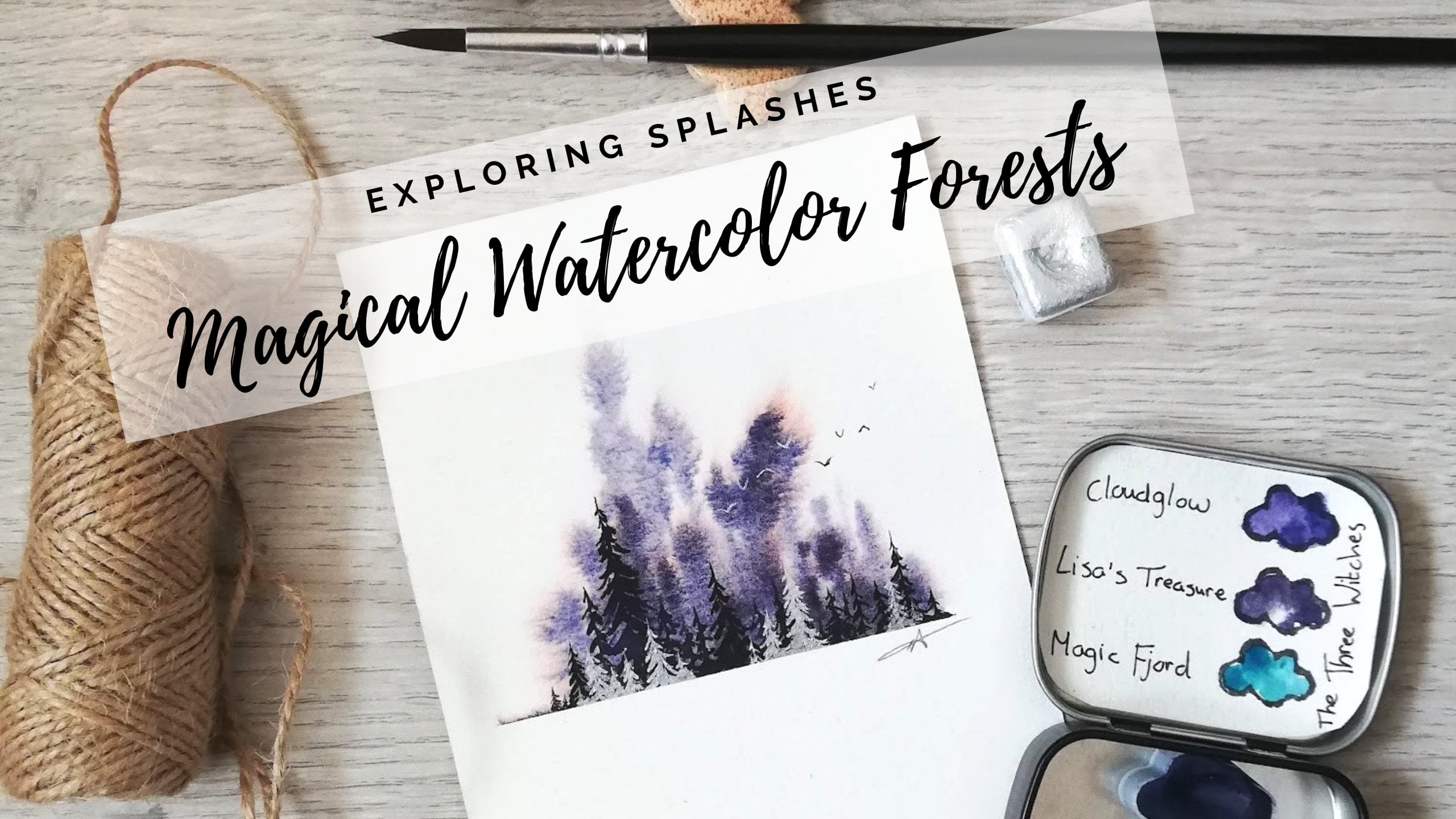
8. Foggy forest: Maybe the background you want to make is a foggy forest and I'm sure it doesn't shock you that this is also made wet in wet. Getting that sheen first, putting clean water on our paper, checking that that's nice and wet. Then, I'm just going to use whatever I have in my palette so that the background doesn't get too dark. Then, I'm just starting from the top, making the trunk downward first and then some loose branch-like branches which will blend nicely into that water. I'm making a couple of different ones, starting from the top, going wider downward towards the bottom, making sure they're all not the same height and size and shape. Filling in a bit at the bottom there and that's it. That way, we have a nice foggy forest and those little trees will poke up in the background. Now, as you can see, there's no paint up top, so if there was a tape here, it wouldn't have made that Polaroid edge. What you can do when your paper is still wet is add a tiny bit of paint to make that contrast to the white paper, marking off the edges so that when you remove the tape, there will be a crisp edge even though it's very light. If you forget to, you can also add it carefully as the second layer. When you paint wet in wet and you lift your brush, that releases a bit of paint down onto the paper which can spread and we don't get that narrow tip of the tree. Just showing that one more time, just to make it really clear, just so you can use this trick or anything else as well. Making sure we have that same nice sheen from before. If I'm doing the same thing, starting from the top, that will be the thinnest point of that line, making some branches, all of that just blending into the water. Now, see what happens if I go the other way. See how that releases that blob of paint? If I do my branches in the same way going outwards, you'll see how that makes a very different shaped tree without that pointy pine tree top. Just showing that one more time. See? They're all blending into the water so they're getting that nice loose soft effect. But you might want the pine tree look. This is maybe a beautiful tree, but a very different one, not a classic pine tree. Make sure to start from the point of whatever you want to paint, making sure you start from that smallest point. Also, I just wanted to mention, if I went in with the background this dark, I'm close to the darkest value for this indigo, so even though it dries lighter, I wouldn't get a big contrast for that second layer of wet on dry trees I would go in with later. There they are. Next up is our final glowy sky. I'll see you there.
9. Glowy sky : Our final stretch of backgrounds. This might be one of my favorite ones with a beautiful glowy sky and it starts like any wet-in-wet with clean water first. I want to make a really dark outer edge and then I want it to glow from the inside going from the lightest in the middle and then out into that night sky. I'm going directly from the pen, getting it really dark, dripping in paint around the top and side. You can see that the watercolor is actually doing most of the work for me, going from the inside and out just like that foggy forests, making those points inward by starting in the middle. Now, you can leave it like this and that'll spread beautifully and be nice and soft, but if you want to tweak something, going with a nice clean, damp brush, which is basically the same as a thirsty brush, and then swoop outward from the center. Now, remember to be careful not getting it too wet into the darkness. Making sure that we get all those different shades from light to dark. Now, see that I wiped into that dark paint that's on my brush. If I go back here, I'll leave dark paint in the white part. I'm going to wipe my brush quite often, rinsing it, and then going back in with a clean one to keep adjusting and moving that paint around, creating that glowy effect like so. It's a glowy sky, leaving that light bottom part where we can put in a mountain or some trees or anything else you like. Now we're also going to do this with a reflection. I'm doing the same thing but on both sides. I will do the opposite of this one, mirrored if I was doing this with a glowing reflection underneath. Our final one is a reflective, glowy mountain, so there'll be a light center glow and then it will be dark around all the edges. Getting that water first, going in with a nice, dark shade straight from the pen, going around the edges, top and bottom this time. I also like connecting the edges on the side. That way the tape will peal peal in a nice, perfect square. Imagine your mountain is in the middle. If this is the highest part, it needs to be the lowest part of the bottom and opposite. If I go in a little bit here, I need to match that on the bottom part imagining that there's a mountain in the middle. It doesn't have to be a perfect match, but it's more or less that same shape so it looks like it's reflecting, keeping that soft inward glow and dark is towards the edges. Again, like that foggy forests, not wanting it to explode and release paint in the middle starting with the tip in the middle, if I want to make those spikes inward. Then using that bent thirsty brush, blending around, pushing our paints around a little bit if there's any adjustments you want to make. Remember, you can still make adjustments while the paper is wet enough. Remember, we don't need to bother with anything around the edges or the lines because that's where our tape will be. That's it, now we have all of them. We have some clouds, dark clouds, and light clouds. Our foggy forests, some nice ones and some strange ones on the side there and our gradients from the beginning. Actually, that's not from top to bottom. Let's put it this way from top to bottom and then in from both sides. I'm really excited to see how you use them. Now since we're starting our foreground elements, those will all be wet on dry. If you have a smaller brush that you want to use for this, go grab that now and I'll meet you for our mountains in the next lesson.
10. Mountains - Practicing Wet on Dry: Mountains is probably the foreground element I paint the most. I've swapped onto my foreground element brush which is slightly smaller. This would be equivalent to a size 4 in most brands, has a really nice pointed tip but still holds a fair amount of water. Getting some indigo, just putting it on my palette making a nice dark mountain first. As you can see, that's pretty dark, so I know it'll be a nice dark value. Then, when I start painting I want to angle my brush, not straight down because that will give me a very precise slide, which is great for a lot of other things. But for this one, I'm just going to try it angled, which means I'll cover a bigger part of the paper at the same time. This we'll use later for our trees. But now we'll lean it backwards, swiping our brush on the paper. Going in with our first one, just making a wriggly line up top, and then I'm going back to fill in the rest down towards that bottom tape line. We [inaudible] a little mountain top and back where it came from, and that's it. We don't really need to do anything with that bottom line because that's where our tape is. Just dipping that in water, do the same thing again. Just getting rid of some of that on my palette. Now I have more water, which means the paint will be lighter. Doing the same thing, leaning that brush backward, draw a two peak mountain, going back and forth, filling in the rest so that mountain stays nice and smooth. You can see that this one now has gone a lot lighter because it has a lot less paint and a lot more water. Now if you want to, you can absolutely layer mountains like this. But what's also really nice is to make a mountain like a gradient. What can sometimes happen is that we make our mountains too dry. I'm just going to show that when it's soaked into the paper already. Putting down a nice dark mountain first. I'm rinsing off my brush, drying off. Now this is already soaked in a bit, so you can see how it's not really picking up any color, not blending it downward. That line there is going to be difficult to get away. Now what you could do to save this one is to add more color up top, so the top of that mountain would be darker, and then you could probably blend in that downward covering that layer with another layer of paint. But what we can do instead is make sure that that first line you put down with paint is wet enough so that it will seamlessly blend downward into your clean water like that gradient from before. Getting a little bit more paint and some more water immediately going in with a damp brush. Now that paint is already starting to blend downward bleeding into that clean water, picking up that with my thirsty brush wiping that. Now you can see that's more of a seamless gradient mountain. Then I can layer more of those on top of each other. Now for this one, some paints stain more than others and leave sharper lines, and they're more difficult to blend. Just try them out with your own paint and see which ones work for you. You can use that as a way of getting to know your paints, knowing how dark and light they can get. I wanted to share one more way of painting mountains with you because you've already actually learned it. I'm just going to turn this video upside down, and you'll see how easy it is to paint white mountains with a dark blended sky. Because sometimes we want the sky to be darker and then we paint those snowy mountains or perhaps just the snowy ground or hill. We just keep the white of the paper, like I mentioned, for that bright white snow. Now can you see just by turning this upside down, this is what we would call a negative painting technique. Now, this looks like a white mountain with a dark night sky on top. Again, just reminding you to keep that line wet enough so that it can blend it seamless upward. All of a sudden with the same thing, you've painted a white mountain. All of these now look like white mountains with dark blue skies instead, isn't that fancy? Now in the next lesson, I'll be going through some very simple ways of painting water, which is perfect matched up with these mountains. I'll see you in the next lesson. I did want to mention that just like our foggy forests, if we didn't make that top part of the sky, we wouldn't get that clean edge all the way around our Polaroids. For this as well, if you're making a white mountain, it's really nice if you make some diagonal lines, for example, from the bottom up or a paint some trees or a really light bottom gradient. That way you get that square shape of the Polaroid all the way around, even though your mountain is white. You'll see me do that on one of the nine final paintings of the class.
11. Water: I always thought painting water was super difficult, and very advanced, and something that I would spend hours trying to learn how to do. But in these tiny landscapes painting water can be simplified to horizontal lines. That's it. This creates the look of ripples in the water, reflections of the surroundings, and that's all we need. Some are flat and straight across, and some are more zigzag lines, especially for rivers, for example, but that's it. They're just lines. Magic. Just starting with our brush and some scrap piece of paper just to practice how we're holding our brush. Because instead of the mountains, where you're holding it at an angle, I'm holding it so only the tip is touching the paper, moving my hand really lightly back and forth. It doesn't need to be perfect, it doesn't need to be super precise because water doesn't mirror exactly. So going back and forth, placing it more or less underneath wherever what's being reflected, like the mountain, is positioned, and then trying not to fill in everything, leaving a lot of white space. Just to show you what I mean, just making a mirrored image of a mountain, just a simple example mountain like this just to show you where the top is, and then I would like my ripples to be in the same area, but going downward, and sometimes little bit further out towards us because that's how it would look if we're looking at a mountain. I'm just making my way down, making them thinner as I go down. Here we're going back up, making a little bit darker up against that mountain in the water, where a lot of it would be reflected, and that's it. That's all you need. Look, that already looks like reflections of that mountain in the water. Just to show you what I mean with the holding of the brush, I can also get really thin lines, but then, accidentally, if I push my brush down too hard, I will get wider lines. I won't get that ripple effect and those thin horizontal lines. So the more I hold my brush straight down to the paper, almost like I would hold a pencil, I'll be able to paint with just the tip. Then making sure again here, water control is important, so not too much paint and water in your brush at the same time. To paint a river, I would just go back and forth in a zigzag motion like this, making it wider as it's coming towards me. So if the river is just as wide the whole way, it won't have that perspective look. It doesn't need to be very advanced, it's just needs to be smaller up top and then bigger as it's closer to us. That way it looks like it's coming towards us. This would be a dark river in a snowy landscape. You can also do inverted, like negative painting like with the mountains, so we're painting the land around the lake or river, like you can see me doing now. I'm just painting the same as that white space above and then matching it from the other side following that same curve, but making it wider as it come down the page, coming towards myself. You can already see how that's creating that river look. You can fill in the sides, cover it with trees, make a mountain on top, but that's just a really simple way of making a river, and you can also use this for lake. Just make it wider, and that's it. There's no more hocus-pocus in that. Nice and quick and easy. There is a tiny bonus lesson on this, I wasn't really going to add this because I know seascapes and painting ocean can be intimidating, but I wanted to show you that you've, accidentally, already learned all of the elements. If we look at this photo here, I've turned it black and white so it's easy to see the values. see there's just some dramatic clouds. We already learned how to paint clouds. There's a gradient at the bottom there, and you can mark it as hard or as light as you'd like with a horizon line there, and then look at all the water. It's just horizontal lines. To show you a little simple version of that, it's just clouds, and then there's a gradient. I made this from the bottom up, darker closest to us, and then there's horizontal lines on top, and that's it. Magic. Again, you've just managed to learn all of the elements for a seascape without even trying. Isn't that nice how things fall into place? In the next lesson, we'll go on to trees so we're going to keep our brush in the same way, pointing straight downwards for that precision. I'll see you in the next video.
12. Trees : After mountains, trees are probably the thing I add the most to my landscape paintings and they're usually pine trees. What I'd like to do is either make a layer of soft wet and wet pine trees and then some sharp wet and dry ones on top or I add in pine trees in front of mountains or on their own in front of a beautiful blended sky. Let's paint one together. I'm just getting some nice dark indigo and refresh. A foreground element should often be little bit darker than the background. Instead of with the mountains when we held it flat, now we're going to point it straight downward. I'm just starting from the top of the tree, making sure that my brush doesn't have too much water in it. Also I'm holding it quite close. I'm not holding far back on the brush that gives me less control, so I'm holding it like a pencil that gives me a lot of control and I can point it straight down starting very lightly with that trunk from the top going down to the bottom. That was not a perfect trunk but it doesn't matter, there will be branches. Then not starting at the very top because then it's difficult to keep it this narrow. I'm starting slightly further down, starting to make little branches pointing outward and downward, just like that. Then I just repeat it, pulling down, not making it super symmetrical and not making it the same on both sides. Making my way down and my thumb is covering it but we'll see it very soon. Like that, kind of looking like a Christmas tree. Now what you could do is make them even smaller. Because our paintings are so small because this is quite a big tree actually, so going even tighter, even smaller, tiny line. Then maybe you just have space for two or three little branches on either side. This is a perfect way of practicing your brush control and your fine motor skills. We're getting those details really nice and sharp and tidy. As you can see I'm making them all slightly different shapes, slightly different heights, and different spaces. Usually these will go all the way down to the tape and be straight at the bottom. Or you can leave the trunk exposed like this top one here. Now if you want to do them the other way, I like mine pointing down, you can also make them pointing up and I'll just do the exact same thing. I'm just making those angles upward instead, I like brushing downward. I'll just do the same strokes, I'll just swap at side at side so that I brushed down into the trunk. Like so. That's really it, that's the way I do my pine trees most of the time no matter what size it is. You can just keep making them tinier and tinier with more or less water on your brush. I would say the less, the better. That'll give you more control because now I'm going to show you what happens if I don't wipe off any water off of my brush. I'm just dipping it and you can see now there's this drop hanging off the tip of my brush and I think you'd probably suspect how precise this will be. When I put this on my paper, it will just release that whole lot. Yeah, here we go, let's [inaudible] a straight line. Then I can try to do the same thing brushing outward, trying to make those branches starting a little bit down. Yeah, I'm not really getting much definition, I'm just moving that big puddle of bladder around and does look like a cute tree but it doesn't look anything like the trees we just made. If I wipe off my brush again, I'll come back to that nice pointed tip and all of a sudden there is our precision again. A water control is more important than the size of your brush. If you have a really nice pointed brush, but it's a little bit bigger you can even use that one for this work. It doesn't need to be the miniature brush for a miniature painting, as long as it has a nice pointed tip. That one I'll just keep flowing out. Also making it this wet will take a really long time to dry. Keeping that tip nice and pointy, putting that straight down to the paper will give you the precision you need for these kind of trees and details. Now since we've already practiced that in the next one we'll do the same thing but make birds, and those are also very tiny and also very important that we use the tip of my brush to paint. Now I'll see you in that one and that is our last one before putting them all together.
13. Birds : I'm no bird expert, and these are more of a representative bird shape. What's nice to do is to make them caught in the moment of mid wing flapping. Because when they're flying, they don't fly in the same rhythm. As they move their wings, you can paint them at anytime. I've left some of these photos in the Resources if you want to practice some more, but I'll go through the ones that I use the most. Most of the time for painting birds, I like making them quite dark, so I'm putting deep value of indigo on my brush. I like them to have different shapes, and look like they're in flight. I'm holding my brush pointing straight downwards like we did with our water, and like we did with our trees. Instead of making that McDonald's M, my favorite type of bird is the check-mark, which is literally what it looks like. It's about this advanced. That's all we need, because these are so small, you can make these as simple as possible and it will still have the impression of being birds up in the sky. The reason I make them quite dark is because they need to be layered on top of the same color. If that's already a medium darkness and median value, I'll need to add quite a dark value for my birds. Then you can make them small or as big as you want. The check-mark one is probably the one I make the most. But you can also make them with wings in a different angle. Maybe if they flap their wings all the way down, their wings would be angled downward instead, like an arrow pointing upward. What I like to do is do a couple of different shapes, a couple of different sizes, often with the bottom one being the biggest one. That way, it looks like they're in various distances from each other as well as further and closer away from us. Then there's a check with the wings made into the other way. It's like a U-shape instead. Then you can make these as loose, and fast, and small, and big as you'd like. But since our landscapes are so big, I would recommend practicing a little bit, just making the super tiny little marks, making the tips of the wings nice and small. Because birds usually don't find in a perfect formation, except those that fly in that V-shape, the geese, but they don't flap their wings at the same time. They would be caught in different moments of flight. I usually add five or three, you can add as many as you like, and not worry about making the angles perfect or the sizing perfect. There are so many different kinds of birds. You might just be painting another kind of bird than I. There it is. That's all we need. Take a little time practicing fine motor skills. That my friends concludes all of our foreground elements. We have our mountains, we have our trees. That big one is still not dry. Then we have our water as well, if we want to make any lakes or reflections. We can keep combining these in so many different ways. Just keep playing with them, making it your own, choose your favorites, and I'll see you in the next video where we start putting them all together, which is a lot more fun than practicing. I'll see you then.
14. All together! First layer: All right. Okay.
15. Final layer!: In order for the system. Hello. Hello. Okay.
16. Removing tape and Final steps: Now that everything is dry, we can move on to, maybe one of the most satisfying parts, which is removing the tape. What's important is to be careful around the edges of the paper where it's more likely to tear. I'm tearing it off carefully there and then I'm tearing it at a diagonal flat angle away from the paint. That way, it's less chance of ripping the paper. Doing the same thing on the other side, being carefully first and then I know that this tape doesn't tear this paper. Since I know that I can tear it quite quickly, but I'm still tearing at an angle. Same thing with the bottom here. I'm starting with the ones that are laying on top, the ones we put down the latest because they're not obstructed by any of the other parts of tape. This paper and tape work really well together and since it's a block, it also is easier to remove it from the edges because they're glued. But say you have a softer paper like Khadi paper or anything handmade, I find that I need to be even more careful when peeling. This one on the corner here where it's not glued, this is a little bit more sensitive to peelings. This is a bit of a strange different way of peeling, starting from the middle and then tearing off the tape because then I can peel outwards to the side because it's always much less likely to tear from the middle of the page than from the edges where the fibers are exposed and cut. There they all are. Look at those crisp, nice edges and clean lines and cut corners. It's just such a nice revealing when you take off all the tape and your artwork suddenly appears. Then this is another one of my favorite parts. It's removing the sheet from the block. I'm using this very, very advanced and expensive exclusive tool called a plastic ruler. I just insert this into the opening here on the corner. Sometimes the opening on blocks are in the center of the back. I know arches is that way, so just find the opening of your block and then just pull your remover tool as if you are opening a letter with a letter opener. Just working my way around the edges. So simple and very satisfying. Then comes our final part. Almost. I'll just be using a completely normal pair of scissors for this, but if you have a cutting board and a knife for cutting paper, you can use that too or a guillotine, one of those big machines that goes [inaudible] and you can cut everything at same time. For this one, I'm just following those pencil lines that we put down at the beginning of class, just going to follow those carefully and then I can erase those afterwards if any of them are still visible. I'm starting with that leftover border of half centimeter on the side and then I'm pretty sure you know how to cut paper. I'm just going to speed through this one and get to this satisfying it. There they are. All of our nine Polaroids. I'm really excited to see what yours look like. When they're already, I would also love it if you sign them because I think you should always sign your artwork, put your name on it or your initials perhaps. I usually use a tiny micron pen for this. You can even use a pencil or you can use a paint color with a very small brush. Now I'll see you in the next video for some final thoughts before we say goodbye.
17. Thank you!: Aaaand that's it!! That's the end of our class. I'm sure you're not surprised, because we have finished what we set out to do. I hope by now you're ready to start combining some elements, making your own little landscape Polaroids, and when you do, I hope you'll share them with me in the project gallery below, so that I can see what elements you've chosen, how you combine them, what colors you've chosen, I'm really excited. I usually also always share my students' work on Instagram, if you want to tag me there you can. I don't know why I'm doing this. I don't know if that's where my name will be, I'll try to put it in here, make it look super professional. Instagram. If there's anything that's unclear by the end of this, I hope you'll contact me, either send me a message or start a discussion here, and let me know how I can help you better in another class, another time. I hope you keep playing with your watercolors, getting to know them better, exploring how they can work for you, in a way that you find enjoyable, because I think that's the most important thing. I will see you soon.
18. Just for fun!: Hello there friends. Not against making large things. What do I say in the outro? YOU MADE IT! I'm just really excited for you. I usually don't say happy painting, I usually say happy splashing, but this is not a splashing class. That makes no sense. No. Can't have it. It's not a class about saving money. Can't havel that. You sound like a crazy person. Magic everywhere. When it comes with, when it comes to! Will the shiny face matter? I don't think so. Do you know how to paint a piano? I'm not breathing. That's all. One minute. That's what I wanted to say. No touching the hair. Someone coming home? Are you hearing that? And you're free to make your own choices. If you'd like to do [inaudible]. This just comes out of nowhere. Maybe no, maybe.. maybe yes. No. Where am I going with this... Did I? No. There's a lot of the snapping that doesn't need to be here. That doesn't make any sense. Not even going to say this is going to be the last one because we know it's not.
 Elise Aabakken, Voice Coach - Teacher - Performer