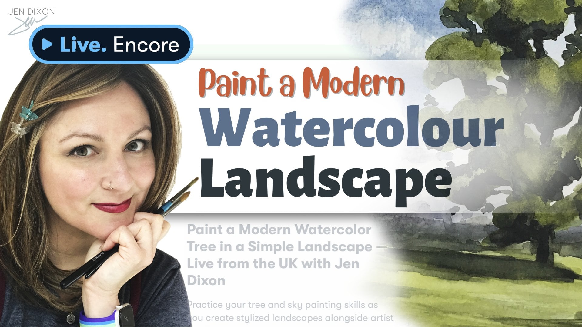
Transcripts
1. Introduction: Sketching and painting away from your regular art desk
can be so enjoyable. Part of the fun is packing the bare minimum of supplies and tools to take with you without limiting your creative options. Here's where I have failed
so many times before. Oh, I've been prepared,
are too prepared. And I end up with a much
bulkier kit than necessary. Not to mention more stuff I might lose when
I'm out and about. But recently, I designed
a dead easy way to have everything I need without
as much in my bag. And you know what? I
spend more time on making art and less time
managing my stuff. Okay, this is gonna sound
like an infomercial. But wait. There's more. This thing is also great for my art business
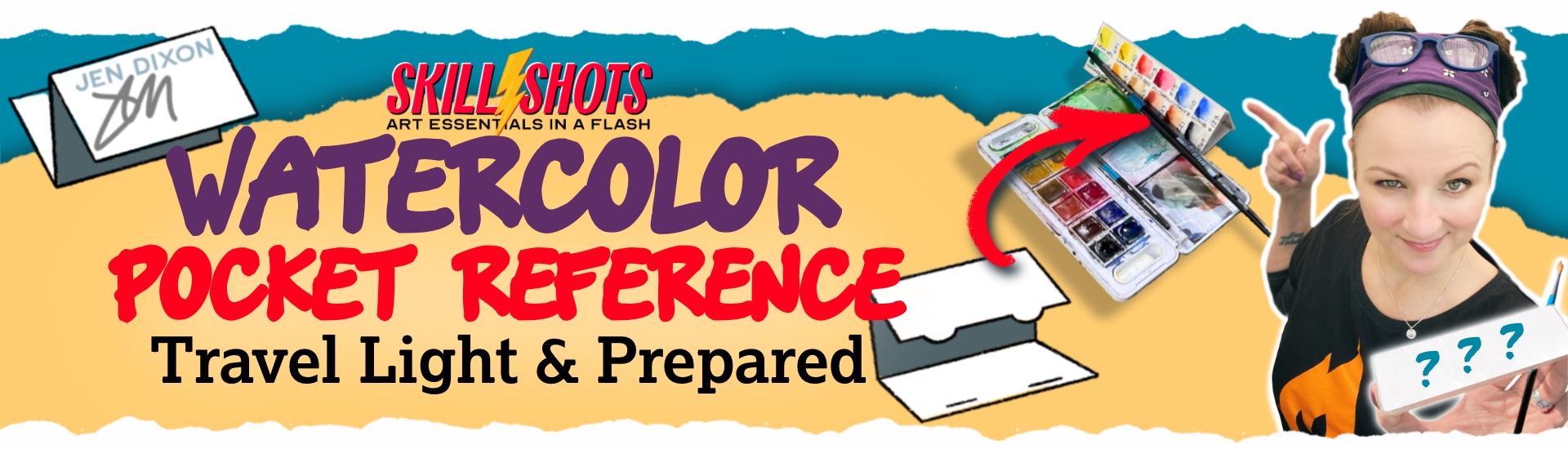
because I never miss an opportunity to connect with curious potential collectors and fellow artists in the wild. How? Behold, the humble travel
palette color reference card. You've probably made one of these to swatch out new paints, but this little card
could be so much more. In this quick class, I
will share how you can turn a color reference
card into a portable, fully customized powerhouse
art tool for traveling, whether that journey
needs a passport or simply another tasty
beverage at your local cafe. I'm Jen Dixon. I'm a British American multi disciplinary
artist in the UK. My decades of teaching art have always focused on
fundamental skills, materials knowledge,
and working smarter, not harder by crafting
the solutions you need. My skill shots
classes will help you with these art
essentials in a flash. Even if you use materials
other than watercolor, this class will no
doubt spark ideas for your art making and
communication needs as well. So get yourself a tasty
beverage and come on in. We've got crafting to do.
2. Project Overview + Materials: Okay, it's time for
the project overview. So let's talk about
what we're making and what materials
we'll need to do it. So first of all, what do
you want to travel with? Do you want to travel with
gouache or watercolor? Maybe soft pastels or
maybe you're into markers? This is just a guide,
but it is what you'll see me using
in my demonstration. Use what you have on hand. Choose your travel set. I'm using a watercolor set. Your preferred painting
and drawing paper, it's going to give you the most color accurate
representation. A pigment fine liner
that is waterproof. Clear packing tape, which is a great alternative
to laminating. Printouts of useful references like paper charts,
that sort of thing. A pencil and eraser, a ruler, some kind of craft
knife and cutting mat, a bone folder, which basically just helps you to
make a really good crease. That's optional and a glutick. Also optional, but I found
it helped me hold down my references while I was applying the packing
tape over top. We'll talk more specifically about references in
the next lesson, but your project is going to be to choose some of
those references, create a mock up using them, double check all the
content in your mockup, and then move on to making
your actual pocket reference. And of course, we'd love to see your
pocket reference cards, plus any preliminary mockups
in the project area. So please upload your
photos and tell us about your process and
reference choices. And, of course,
it would be extra wonderful to see project updates showing your pocket references being used the next time
you're out sketching. I
3. Pocket Reference Possibilities: Many palette reference charts use only one side,
but why stop there? A single page
reference can easily utilize the reverse side
for more information. And just think if you had
a four page reference, and that's only one
little fold away. You can even try making
a reference chart with even more space
for useful information. See the class PDF
for the six page Accordion fold as well as
the barrel fold templates. For this class,
you're going to see the six page barrel roll fold. Imagine how handy
your color charts can be with more panels. This Accordion style example shows the manufacturer
range of paints, part number for
reordering, Q name, transparency over black, and graduation from full
strength to dilution. But you could also
make getting in touch easier with a QR
code or your website. And wouldn't it be handy to be able to give size information? Well, you can give
that information if you've got a little
handy conversion chart. Being prepared and having
answers immediately for potential customers
can make or break a sale. So think about the kinds
of things people would ask you when you have been
out sketching before. And I can't stress enough
how important it is to have that contact
information ready for the people who are maybe
too shy to approach you or don't want to
interrupt you while you're in the flow of painting. Having my details visible
has been so useful. It's like having my
own little personal assistant marketing
person in my pocket. So good. Here are some pocket reference
ideas I want you to steal. Paper size is chart, protractor, rulers, a value scale,
composition ideas, troubleshooting prompts, contact information,
and, of course, a QR code to your website, a color wheel that uses the colors in the palette that
you have in front of you. Maybe some favorite
mixes formulas. And this last one supplies list. Because this is really
handy when people ask you, What kind of sketchbook is that or what kind of
pen are you using? And here's what you do to take
it that one step further. Create an affiliate
link QR code, maybe like the top three
things people ask you about, and you get that affiliate
income, as well. So now you can see just how useful your pocket
reference can be. Say goodbye to a simple
color chart and hello to this Swiss Army knife style
wonder card in your pocket. And now it's time for you to
make a list of things that would make your pocket
reference most useful for you. Remember, you can make more
than one pocket reference to suit different materials
or different situations. Once you've got a list together, then it's a matter
of deciding on which template would
be best for you. And we'll get into the
building of one next.
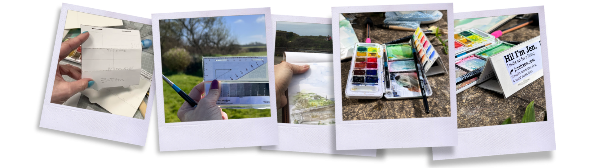
4. Barrel Roll Fold Process Demo + Thanks: Let's make a barrel roll fold
style reference, shall we? Boy, that's not easy
to say out loud. Anyway, I just like
that it ends up looking like one of those little
name tag signs on a desk. You know, why go flat when we
can go dimensional, right? Plus, it puts the info at an easy to read angle for
anyone approaching my sketching spot
and also makes it easier to weigh down or clip to something
when it's breezy out. You're going to start
by making a mock up, which can be started by using the PDF template I have
available for you to download. If it's too small,
print it bigger. The measurements I have on
the template are a guide, not a gospel, so you
do you, my friend. This demo is a step by step cut down from a much,
much longer process. But that also
included me having to redo the first version
of my palette reference because I didn't like the way the opacity test line
looked on my petite grid. The palette I chose for
this pocket reference is one of my favorites for
factory color selection, and it's so lightweight. The only downside is that the folded up pocket
reference doesn't fit inside the
compact plastic case. So I simply stored
on the outside of it by using a couple of
rubber bands to attach it. If this were for
a metal palette, those usually have a little
bit more room inside, and I'd be fine with
fitting it in there. So just keep this
storage point in mind for your own design
and expectations. If you've got your list of references made from
the previous lesson, then you are ready to start penciling them in
on your mockup. You got to fold this
thing up to make sure your panels are all in the
right reading directions, and any rulers and
value scales you include are along an edge
that makes sense for use. And panels that need
to be read by you or an approaching person
will be far more effective if you don't
make them upside down. Just saying. If you're using
printouts of references, I suggest cutting them down to test drive them on
your mock up, as well. Rulers are best
when photocopied, if you have that
available to you. My mini triangle, I think they're called squares,
actually, but anyway, my mini triangle serves as both an excellent angle reference for
perspective drawing, and it has a tiny
ruler on its edge, too, which is perfect. And now I don't
worry about breaking the actual one when
I'm traveling. If you'd like a value scale
to put into your reference, I have a fun class called
Charcoal drawing Boot Camp, which I recommend
for every artist, no matter what your
medium usually is. And the value scale you see here is available in that class. To draw out the swatch grid, I compared the original
packaging chart and the actual paint layout in the palette. They are different. But then I decide what
info I want to fit into my own reference and sketch
it out loosely on the mockup. It turns out that I thought I had everything sorted,
but in reality, I didn't like how thick the opacity test line looked on the actual pocket reference. So the moral of the story is test your fine liners
on the mockup as well. And that's why I
had to start over. You'll also find
that you may need to abbreviate the color names
to fit into the swatch grid. No one has to understand
your system but you. So make your labels something
that works with your brain. I also like to add the manufacturer codes
and opacity test, but you might like to also
add the pigment codes or whether a color is warm
or cool in relative bias. Your pocket reference,
your rules. Also, during the mock up making, I realized that my info panel
with the QR code was too big for the actual panel with the tabs and
slots and stuff, so I shrunk it down
a little bit more. I don't need my pocket
reference to be a work of art. I need it to be a
collection of tools. So while I like to make the color chart panel
tidy and pleasing, the rest of the panels are
just there to do a basic job, and I don't need them to be
stunningly graphic designed. You might choose to create
one with more pizaz, but make sure it is functional as its
reason for existing. Transfer everything you
learned on the mock up to the actual watercolor
paper or bristle or whatever you typically have
in your travel sketch kit. And a little tip
about folding things. I use a bone folder. This one is made of wood, but you can get them in
plastic or actual bone, too. But I use a bone folder to
make good crispy creases. To start a fold, I use the cutting ruler as a hard
edge bending the paper up and then run my bone folder along the
underside to make it clean. Then I lay the paper down, folded, and rub the bone
folder over the bend again. Take some time working all the folds back and
forth and practice folding the pocket
reference up into the final shape.
Is it too springy? Try bending your tabs, if that's the style
you're making with me, down a little to lock
it in place better. Remember, you're going
to want to protect the final in packing
tape or lamination. I found that my pocket
reference had to have the panels cut apart to deal with the
thickness of the paper. And so mine relies on
a little gap between the panels where the hinge is only made up of packing tape. Just remember to keep
test folding as you go. After getting the
color chart in place, which is the most critical panel that takes the most effort, the rest of the panels come
together pretty quickly with some cutting of printouts and sticking
with a glue stick. If you don't have a glue stick, I recommend finding some way to stick the floaty
little printed out references down to keep everything tame at the
packing tape stage. Packing tape is fiddly enough to use without making
a crinkled mess. So make things easy on yourself. Notice that I got a crease
in one of my panels. I use a lot of packing tape, and I still get a wrinkle
from time to time. Thankfully, it's not on the color swatches because
that would bum me out. Likewise, I really didn't want to get a wrinkle
in the info panel, which would look
bad and maybe not allow the QR code
to work properly. I know I said this
pocket reference isn't about aesthetics, but there are some standards. Some advice about
taping your reference. I let the tape stick
it to the cutting mat. It not only made it easier for taping the
rest of the panels, but it made it really easy for me to trim it
with a craft knife. To pull the card up
from being stuck down, I used a palette knife. If you use the craft knife
to do this, as well, just be careful for your
fingers and the card, too. You may need to
trim a little more and keep testing
the hinge folds. And if you made
this style with me, test your tabs with the added flange of
tape now sealing it. Also, try to avoid
trimming to the paper edge to keep the pocket reference
as waterproof as possible. And that's all there is to it. This simple idea came to
me when I was packing a new version of my
travel sketching kit, and I just didn't have room for the little rulers and triangle and business cards
and other stuff. I got obsessed with figuring out what I'd find useful
when on the move. I started taking a laminated
info sheet with me, but that relies on
having a place to put it and it being noticed. With this little
barrel roll reference, I keep it right next
to what I'm painting, which is where others
are already looking, so it gets seen effortlessly. Some people ask if they
can take a picture. So do without a word. But the connection happens. And even if you don't
actively sell your work, it's a nice thing to be able to point people
to your social media. I may be an art hermit in my rural home studio
most of the time, but even I love connection. Thank you for joining me
for this skill shots. Art Essentials in a flash. I can't wait to
see your projects, and I'll be back with
another class soon.
 Jen Dixon, Abstract & figurative artist, educator