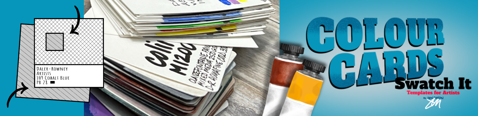
Transcripts
1. Welcome to Colour Cards: Calling all color lovers. Are you a collector of all
the pretty pretty paints? Do you have random piles of swatches and color charts that you'll never
reference again? I've got all that stuff, too. But in today's class, I want to show you a better way to manage your
information about color. Perhaps you want to feel more in tune with the
colors you have, to use them more effectively
or see them in a new way. I'm so glad you're here. Hi. I'm Jen Dixon. Multi disciplinary artist living on the North Cornwall
coast of the UK. I've been selling my art for almost 40 years and teaching others how to draw and
paint for even longer. If you've taken my
classes before, you already know I share
foundation building techniques and skills that I've been using in
my own art career. I help artists of all levels and mediums develop their
unique style and ability through both sides of the brain approach that is
big into doing the work, feeling confident and
natural with your materials, and making the hard
stuff approachable, because if it's
not approachable, we don't use it because
it's not approachable. I have one of those whole
brain classes for you here. In this class, I'm
going to show you how to make color cards. You're going to get to
know the things that you have right now
in all new ways. It's a tool that you're going
to use over and over again. Now, these cards are a serious
tool for your creativity. You could compare paints
with the same name, but are different
qualities or formulas, find amazing new color
combinations with ease. Get to know the pigments
that are in your paints. See color temperature, bias, and values like you're
some kind of wizard now. I'll share the
making of two sets of color cards, my results, and also what I would
do differently next time because mistakes
are valuable teachers. Plus, I'll also show a third deck because
it's extra fancy pants. To fast track you into color
reference card Nirvana, I made templates to
get you rolling. These color cards are
going to change the way you work with color. I
know you're gonna love it. Get yourself a tasty beverage, and I'll see you in class. We've got swatching to do.
Results may vary regionally. Some artists may
become sorcersGgwiges, and more generally amazing.
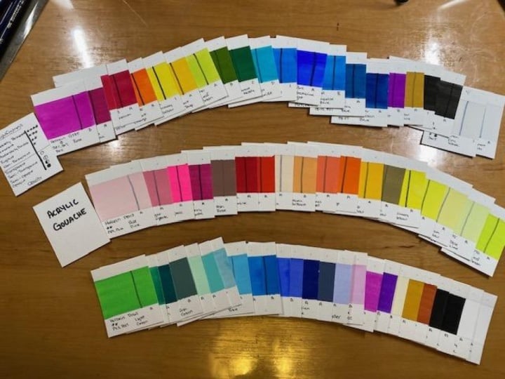
2. Materials and Project Overview: Let's dig into the materials
and project overview. You're going to see me make a couple of different
card stacks, one with Aquafine
Watercolor ink, and the other with
Turner acrylic gouache. You're here to make
color reference cards of your paints, not mine. So please use these materials suggestions
as exactly that. Suggestions. On a basic level, you'll need your paints, paper, and whatever else you normally
use when you're painting. I don't know what you have, but skim these lists and clips for ideas on what you
might find useful. I'm not here to spend your money on things you'll only use once. So think especially
carefully about anything you see in
my nice to have list. I've been gathering
materials for my art career for decades. You can take your time
building your supplies two. If you see things you want, make a list and keep
an eye out for sales, Ebay, or the refurb
section on Amazon. I've saved an enormous
amount of money by taking my time and being
patient. Be creative. You'll probably have
everything you need to make your first complete set
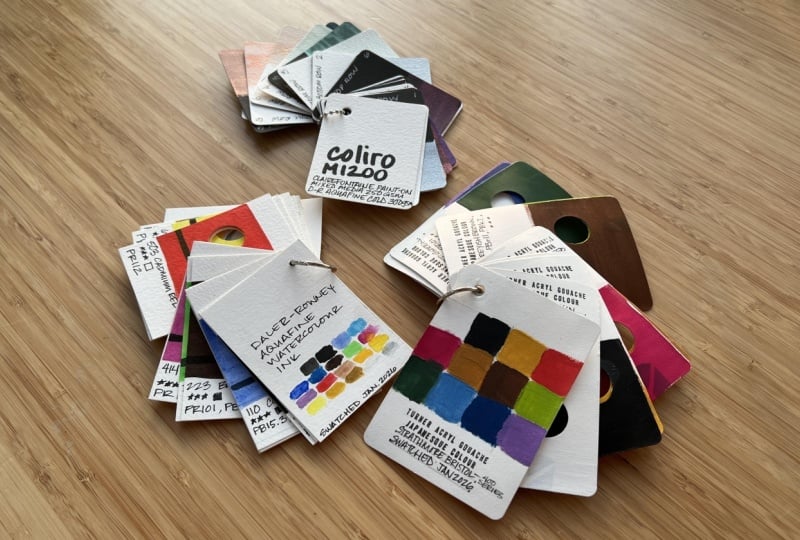
of cards right now. Color isolation
reference cards are a versatile tool you'll
use again and again. These color swatches are
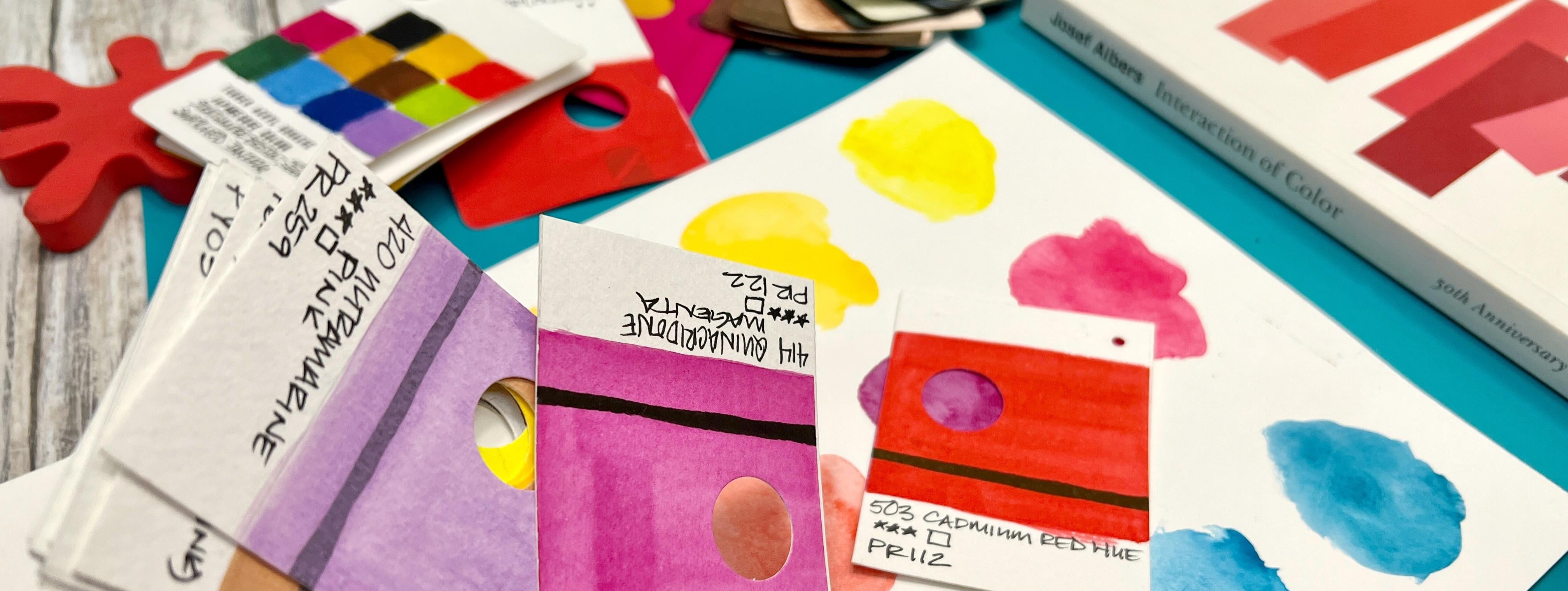
reference with a difference. See that hole? That's the
color isolation window. The window isolates
a color sample from a source underneath
the top card. The top card helps you compare, match and learn from
the bottom source card. Context is everything for color. These cards will
help you see it. And they're just so dang
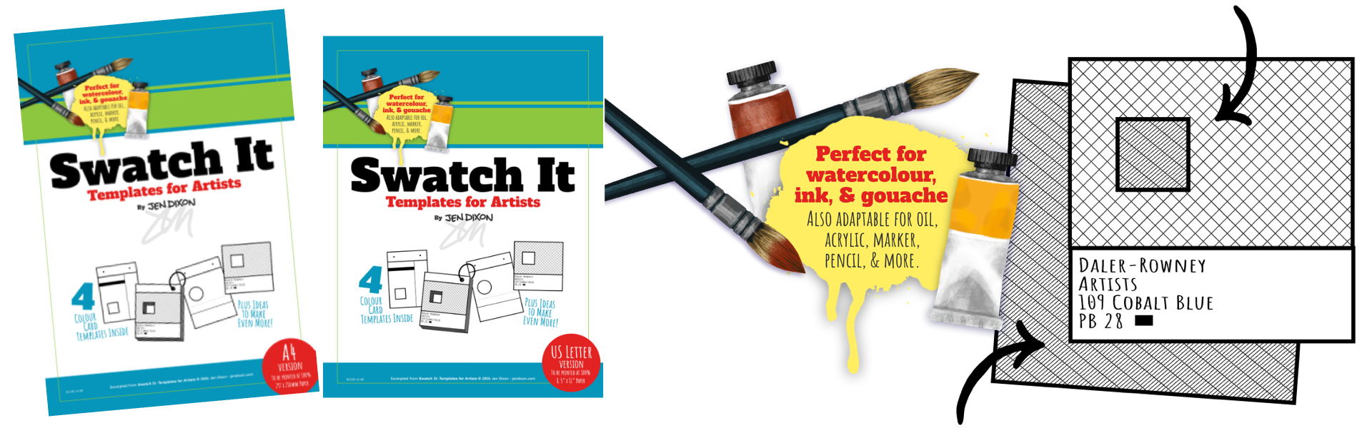
pretty, aren't they? To help you begin, I've created templates you can use before diving into
your own designs. Download the PDF in A four or
US letter for your printer. The Watercolor ink cards I
demonstrate use a template. But the gouache
cards, you'll see are a freestyle design created
with the templates in mind. Like so many things in art, learn something and
then make it your own. Ready to get started? Your insanely useful
cards await you. Gee, I'd love to, but I have
paints to swatch tonight.
3. Decoding Paint Labels: Decoding paint labels. This is a big topic, too big, but here are some terms and tips to scratch the
surface of it all, plus a few resources you'll want to scribble
down to dive deeper. I'll help you with some high
level stuff you can use right now to better understand
your paint collection. Paint tubes are not totally
standardized when it comes to how and with what the
manufacturer labels them. But there are standards
for safety and units of measure by region
and for pigments. If listed on the product, pigments are typically
listed in order of the greatest to least amount
of each pigment source. These identify colorants by an internationally
recognized system listing a colorant category, dye or pigment, general hue and serial number based on
its chemical constitution. Sounds easy enough, but let's look at how it works in action. If P is pigment, the V is violet. So PV 19 is pigment violet
19, AKA primary magenta. Where things get a little
weird and confusing is that PV 19 is also known
as quinacrodone red. Same color index code
for quinacridone violet. Three colors, one
Color Index name, and that's just
one manufacturer. If I check others, PV 19
is also rose permanent, quinacrodone rose,
permanent magenta, rose matter
quinacrodone, and more. And they all have
their own visual look and vary in transparency. For a long time, I
avoided learning about color at this level
because of this mess. But if it sounds complicated, take heart because knowing the basics I'm sharing
here will be more helpful than you can imagine and isn't as scary or
boring as it may seem. Knowing the basics
of the color index and the codes and symbols on your paint is like having a key to unlock a big box
of possibilities, and your color cards
will help you learn and grow with the basics in
truly practical ways. Color Index is broken down
into pretty basic colors. These are the general
hues, including metallic. Paints with single
pigment formulations are often artist grade or contain a pigment so common that the paint can
be made inexpensively. Series number is
an indication of price band based on the
rarity of the pigment used, not of the quality of the
material. No series number. That range of paints has been price balanced for
easier shopping. Multiple pigment
formulas can make additional high
quality paint and also create dupes of
more expensive paints. When you see hue or
imitation on a label, it's often for either a
more economical formula or to avoid using a toxic, rare or discontinued pigment. Light fast and permanence
are different but related. Light fast is specifically
about UV light exposure. Permanence takes other
atmospheric conditions into account as well. The color index codes
can help artists make color choices based on whether
a pigment will endure. Paintmrs also have
their own recipes for their color formulas, which may use different
binders, fillers, or chemically altered pigments, which helps explain
the PV 19 thing. Think of it like food. A banana can be eaten when ripe or it can be left to over
ripen for making bread. Same ingredient,
different treatment, different taste result. Color naming, not
the index code, but rather the
common color names can also vary in
spelling and language. AP and CL are for products
in the American market, not required outside the US. If in doubt about
product safety, visit the manufacturer's
website for advice. So, what to put on your cards? I recommend the common name, light fastness and or
permanence rating, opacity or transparency, pigments in order
as on the label, and the manufacturer's
product code for reordering. Knowing these color index
basics can help you to create substitutes
and alternatives to paint you admire
or have run out of. See the connections
between colors like how a pigment shows
up in several paints, can help you create
better palette choices and give better visual
cohesion in your art. You'll also save time
and paint by giving you more clues as to what pigments mix well
and which mix mud. Want to avoid mixing mud. Choose paints with single
pigment formulations for the purest results and choose multi pigment colors with common or compatible pigments
for cleaner mixing results. Fewer pigments, fewer problems. And finally, figuring out
color temperature bias is much easier to determine if you know the bias of the pigment
ingredients of a paint. And this is truly just the start of a
gigantic area of study. To dive deep into pigments
and other label language, I highly recommend
artist pigments.org, retailer blogs like at Jackson's Art, paint
manufacturer websites, and collect their printed
catalog brochures if you're fortunate enough to have an art supply shop near you.
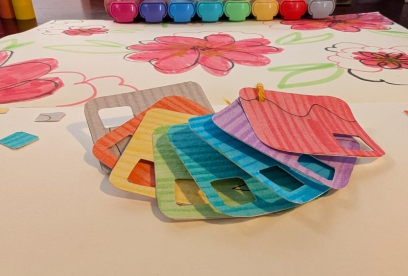
4. Create Your First Cards: And it's time to create your
first set of color cards. Don't forget to download
your PDF template worksheets available both in A
four and US sizes. Remember that this project is for what you have right now. So while I can show you a
process in this lesson, it is only one result of
infinite possibilities. I'll guide you
through how I created my Aquafine Watercolor ink
color isolation cards. I use template number two from the A four PDF as my layout. Feel free to choose any of the six formats in the templates worksheets
for your first card deck. Hang on. I thought there
were four templates. Why are there six in the PDF? I'm so glad you asked. So template one is
basically two templates, but two versions of each. So that variation turns
them into four, not two. And add those two
templates two and three, and you get six. If it sounds
confusing, I get it. It is kind of confusing, but it makes a lot more
sense when you see the PDF. After choosing which design you'd like from
the PDF templates, you'll want to
trace it down onto the paper you're
using for your cards. I'm using an inexpensive
light pad to trace mine. But if you don't
have a light pad, you can hold your papers against a sunlit window and let
nature be your light pad. By positioning my paper edge
with the template card edge, I can fit two rows of four cards on an A
four sheet of paper. I quickly and lightly drew all the important lines for my cards and made
light marks for the three possible
hole punch positions in the binding margins and also a small X to
mark the spot where I plan to cut out the
color isolation windows. If you're using one of
the templates that has a tape gutter included
in between the cards, be sure to include
that space between any further cards you need
to trace onto your paper. Trust me, it's easy
to forget to do this. Technically, I don't
need to put tape in between my cards because there's a gap in the template I chose, and I'll be cutting
the cards apart. So the edges will
be clean anyway. But you'll see a sheet where I accidentally skipped
a tape gutter, and I had to be extra careful
with the swatch painting. Adding a transparency
opacity test line is another useful way to
get to know your paints. Use a waterproof
pigment marker and make sure the line is completely
dry before you paint over it. Feel free to draw
like a smiley face or another simple mark if you want something a little cuter
than what I've done. A half inch flat brush is perfect for
painting your cards, but you can use any similarly
sized brush instead. What is important is that
it's large enough to hold plenty of paint to lay down a fairly even color reference. The paints I'm swatching are the Aquafine Watercolor
inks from De Loni. The paints are beautiful, but I don't use
them often enough. I had swatched them
a long time ago, but they were on a single
sheet like a chart. And while it's nice to look at, it isn't versatile
like the cards. Swatch cards help us
see colors in new ways, and now I use these paints more often because the reference
cards live on my desk, unlike the chart, which is
in a binder in a cupboard. Both formats have their uses, but the cards have
the versatility a chart just can't touch. And when you use them together,
they are even better. Each bottle got a good shake to remix any settled pigments, and I protected the rest of
the swatches with a sheet of scrap paper to keep them clean for when it's
their turn for colour. You will want to load the
brush well but not dripping. These particular paints
do dry pretty quickly, so I needed to make
sure that I had enough paint in my brush
to apply an even coat. Amusingly, the one place
that I really should have masked off is where the
color meets the label area. But I didn't think about it. I simply tried to paint it as neatly as I
could. No, biggie. Because you're making
color references, be sure to rinse your brush
thoroughly between colors. And I suggest that you change
your rinse water often, especially between hue families. These swatches represent the
purest form of your paints. So take extra care here. Relted to that, make sure your brush doesn't
hold any excess water, which will dilute the
next color you apply. I like to dab my brush on a bit of damp sponge or a bit of paper towel after rinsing to ensure that it will load
a fresh color properly. To keep track of what card swatch goes with
what bottle of paint, I very lightly wrote the product number on
the card using pencil. This little number means
that I don't need to fully label each card
before or while I paint. And I can wait until
they're all dry before labeling them with
pigment information and more. And if you make an error
while painting the card, which I did, then you have a
little less to make again. There are other ways to
document your paints on these cards to give even more
information at a glance, but I recommend starting with a pretty basic solid swatch for your first card deck
and growing from there. I have some information
design ideas that I'm going to explore
on future cards for sure. Create the tool that
works best for you. I'm actually glad that
I put tape in between the cards because even though
I'm cutting them apart, I'm pretty sure I
would have done a little messier job without
the Washi Tape there. I like to reuse my tape
until it's no longer sticky, but there's always
the danger of mixing colors from the tape
surface to a new swatch. So I try to remember to wipe down the strips
with a damp cloth. For my second sheet
of Watercolor inks, I accidentally didn't make the tape space in between
the middle cards, so I had to be very tidy where the colours butted
up against one another. It's helpful to wait
until the first swatch is dry to better avoid
bleeding colors. There's something so
satisfying about laying down a good solid
block of color. I find it really enjoyable. I only had a few colors
left for a third sheet, but I did have to make the
gold swatch twice because I didn't wait until
the pigment line was dry enough on
the first attempt. I was glad I had traced
some extra blank cards. Use a hair dryer to
warm the tape a little, and it will peel up much
more cleanly from the paper. I think it's fascinating that the two black Watercolor inks have such a
different effect, even though they are formulated
with the same pigment. This is part of why making
these cards is so useful. You can cut your
cards apart with a ruler and knife or scissors, but I recently fulfilled a childhood classroom dream of having my own guillotine
style paper trimmer. So that's what I'll be using. You could cut card blanks
first, then paint them, but we'll get into that with the gouache deck in
the next lesson. There are pros and
cons to that method. After trimming all
the cards down, you're ready to make the
color isolation windows. These take a little
while to cut by hand, but you can make the
task much easier with a paper craft punch that
makes a big circle, square or other shape. I got this punch during a sale
on scrapbooking supplies, and it's made a huge difference. It can punch through thick
things like fabric and cork, but I found it easiest to
feed it one card at a time. My holes didn't line up
perfectly, but I don't mind. I think perfection gets in the way of enjoyment
far too often. So my wonky holes
are very welcome. At this stage in the project, I found it impossible to resist laying one
card over another, isolating color samples with
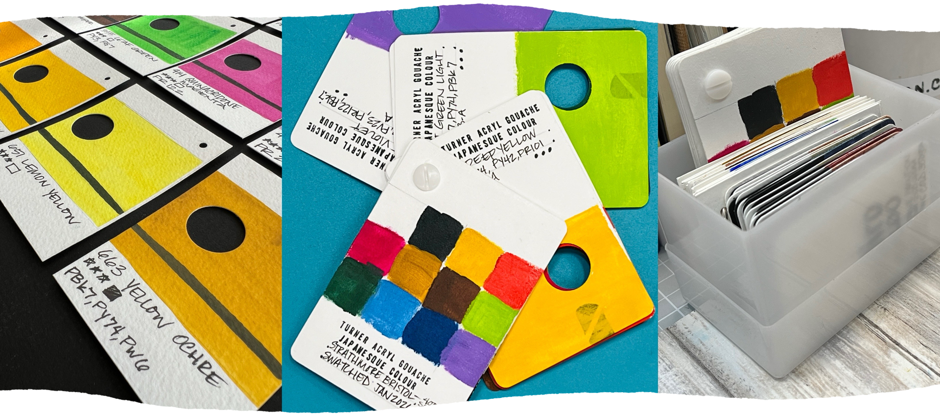
the little window holes. I love seeing the subtle differences between
these yellows. Color differences are just so much easier to see
in this card format instead of on a chart
where they can't be so directly
compared and layered. To finish the cards, I used the three
little pencil dots to choose where I wanted to punch a hole for
the binding ring, and I labeled each card with useful information
from the manufacturer. Although it takes time
to create color cards, using a template takes a lot of the time consuming design and measurements guesswork away, giving you a fast track to the painting and enjoying
of your first card deck. To bind your deck together, you can use all
sorts of things from ribbon and string to binder
rings or ball chain. In the gouache deck lesson next, you will see a Chicago screw and why I changed it out for
something different later. It's really your choice, how you keep your
cards together, and you can always
change your mind to make your deck work
best for your needs. So there's a little
wooden handled tool called a screw punch
in this lesson, but I had never used one before, bought it to try
and found it was a little bit fiddly and kept
clogging it with paper. With some practice, I'm sure
I'll find a use for it. But I switched back to the
handheld office style hole punch for my cards. I'll practice the screw
punch some other time. I fed the ring through the unlabeled cards to check how everything
was coming together. And although I didn't film it, this is what the labeling
looks like on my cards. I made a little quick
reference cover so that I can see
what's inside the deck, and I absolutely love my
Watercolor ink cards. They are delightfully imperfect,
absolutely practical, and definitely deepen
my understanding of these paints and how they
work with other sets I own. I can't wait to see your
color cards in the projects, and I'd love to know how you're using them
in your creativity. Next up, I have an
acrylic gouache deck made without a template,
and after that, a very pretty metallic
Watercolor deck that really shows
off in sunlight.
5. Learning from Mistakes - Acrylic Gouache Cards: The process for making this acrylic gouache freestyle deck was a lesson for me, too. I'm a big believer
in the lessons we learn through
trial and error, and I've always found value in sharing not only
what went right, but what I do
differently next time. This acrylic gouache
deck took hours to make. So you will see the
relevant highlights and speeded up footage. But making a swatch deck is a repeated task
for each color, and so I promise you
won't miss a thing. This is the end result for my Turner gouache
color isolation cards deck, and I love them. They are a little messier
than I'd like them to be, but I hadn't opened these
paints in a couple of years, so the pigments had settled and took a little
extra effort to use. But the part I do
differently actually has to do with the backs of
the cards, not the colors. This deck is a mix of good ideas and things I
feel went less than ideally because I rushed to the fun
part without thinking through a major process flaw I
should have anticipated. I have painted on
countless kinds of paper over the decades. It's currently my favorite
surface to work on. And yet, in my rush to make
the pretty pretty swatches, I neglected to consider
the reaction of Acrylic polymer based paint on the relatively thin Bristol
stock I chose for the cards. Boy, oh, boy, did that
bristle buckle and curl with the contraction
of the polymer as it dried? I should have coated
the reverse side of the cards first with
an Acrylic medium, but I rushed to the fun part first and then had to figure out a way to apply a counterforce of polymer to correct
the distortion. This easily doubled how long
the cards took to make. Not my smartest moment, given how often I use this counterforce coating on lots of art I create with paper. For some reason, the card format just made me forget this step. So here's what I did to correct the major error and what
I'd do differently. First, this will
probably only matter if you're making an
Acrylic based swatch deck. Watercolor and
traditional gouache will probably be
painted on a kind of watercolor or mixed media paper and is not likely to encounter
this problem at all. Acrylic polymers are
different and tend to curl lighter
weight paper stock. This bristle is a great
surface for gouache, but in the small card size, it couldn't hold its
shape against the paint. If you make acrylic
gouache cards, I recommend you first coat the back of the paper
with map medium, gesso, or a fluid Acrylic paint. Very lightly, let that dry, then create your
color swatch side. Whether you choose to
cut down the cards first to size or work
from larger sheets, you'll cut down
into the individual cards later is up to you. I have no doubt
that waiting to cut the cards would be easier for
this two sided technique, and the paper will probably
not curl as badly. If you plan to use a really heavy watercolor
paper instead of bristle, then you may not need to
coat the backsides at all. Make a little test piece first. It could save you an
hour of time later. As you can see, the two sided
coating worked a treat, and I would absolutely apply the reverse side coating first when making a polymer
based card deck next time. Now let's look at the
swatch side process, starting with some time saving tools to help with
the repeated tasks. From the start, I knew I
wanted to round the corners. So this special card punch
helped tremendously for that. And hole punching was
made much easier by using a binder hole punch instead
of one of the handheld ones. I used a test piece to
line up the position for my cards and was able to punch
several at the same time. Speaking of holes, the
color isolation window is made with a craft
punch I found on sale, and it saved so
much time for me. I have osteoarthritis
in my hands, so I'm always looking for tools to save me a little
effort and pain. I had these customizable
office stamps in a drawer, but the ink pads they came
with are not water resistant. So I used some scrap
packaging foam I'd saved in my junk stash to create a little handle
for the letter plate. I'll get to the part about
the dots in a moment, but this stamp saved me so much time in
labeling my cards. I used a waterproof
pigment inkpad to stamp that information, and also a little
opacity test mark I carved from a small
chunk of eraser. I used a practice card to test my stamping pressure
and placement and also to practice writing the information I wanted
to include on my swatches. After the ink dried,
I literally connected the dots I typeset using
periods from the stamp kit. To avoid using a
ruler for each line, I cut a little stencil from a thin plastic thing
I had in a drawer. You can use any thin plastic, like from packaging
or acetate for this. It may not seem like it
saves a lot of time, but I can use it on
future card decks, too, so I'm really
glad I made it. I planned the cover of my color card's deck to show a little sample from each card, which I painted at the same
time as the card itself. It's a useful mini tool and gives me an overview
of the deck at a glance. It's worth noting
that if you don't have a rubber stamper
or label maker, you could save
lettering time by only including the paint brand and
range on the cover itself. Doing that will cut the labeling
task down considerably. I found a number
on the tube labels that seemed to be
the product code, so I put them in that order and included the pigments and
light fastness rating. If you'd like to know more about the labels for
the Turner paints, their website includes
a description with each of their colors and includes the
Munsel notation code for that color system. The Turner Japanesque paints have a gritty mac consistency, and over the years
of not using them, the paints had
separated a little. Each paint had to be
checked and shaken up to remix the pigment particles
into the polymer binder. This isn't a manufacturing
flaw when a paint does this. It's simply gravity, and some pigment particles
are heavier than others. It's also worth noting
that the blues and purple paints in this
set had broken down into a terrible rotten
egg smell after having been exposed to air and then stored for a
couple of years. I genuinely had to walk away and light incense to get through
making those color cards. You can really see how
badly the Bristol card curled after the
cards had all dried. I knew I had to coat
the reverse sides to counter that curling, or else the deck would
be nearly unusable. After that corrective process, which I shared first
in this video, to help you avoid my mess, I was able to lay out the cards, double check the order
by product code, and then bind them
using a Chicago screw. Which is also known as a binding post and probably
some other names, too. If you've ever used a
Pantone swatch book, that's how they bind
their swatches. It's a popular method
for binding stuff, but I did change to a ring for my Turner
gouache cards after realizing that the
post binding just didn't work for these
color isolation cards. The ring binding is
much easier for me to open and close and for
using single cards, too. So while the Chicago
screw makes sense for a long fan style swatch
reference like Pantone, it was the wrong
choice for my deck. So in summary, when swatching Acrylic
polymer based paints, you may need to coat both sides of the
surface you're using. Make a test first to save you
the trouble I went through. Time saving tools
like stamps and stencils will make the
repetitive tasks so much easier. With a little planning
and creativity, you can get to the fun part
of painting much more quickly and possibly save yourself
from hand cramps and boredom. Separated and stinky
paints happen sometimes, but who am I to judge? I'm not my best self when
I'm neglected, either. And what works well for one format may not be
right for another.
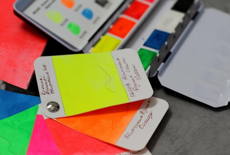
6. Card Inspiration - Metallic Watercolour: If you thought our
first two color isolation reference card
decks were works of art, just wait until you see
this next little beauty. I didn't film the
process of making it because I didn't really
make it for this class, but I still have lots
to share with you. Metallic pearl and
iridescent watercolors can vary wildly in
their appearance, depending on the
surface you're using, and traditional swatching is inadequate unless you include a dark and light paper to really see their shimmery
reflective potential. I swatched this Calio
pearl color set years ago, but even so, I rarely
used the paint. Why? I know I have
them in a drawer, but the swatches just
aren't useful in that old single card
small swatch format. I got to thinking
about how pantone makes their color references on different paper stocks to show color reactions
more accurately, depending on coated,
uncoated, matte, et cetera. So why not make my
own mixed deck of black and white cards for
my fancy pants, paints. This now puts an underused paint set in my thoughts by having a gorgeous and useful
swatch card deck on my desk right along
with the other cards. The Calio set didn't come with label stickers like
newer sets from them do. I simply labeled my
swatch reference cards by their place in the palette, like a spreadsheet
with row and columns. This gives me enough to be
able to identify the sources, and so each color has two cards, one white and one black. I used a white gel pen to
label the black cards. This very simple
deck has completely changed my relationship
with this Calio paint set. I have cards that can be compared to one
another or matched to non metallic sources like this mat that
I have on my desk. I would never have noticed this before making these cards. Now a palette of paints
I considered more of a shiny collectible
seems to have a lot more potential
for use in my art. I have several other
metallic paints to turn into color
card references like these also mostly neglected from Kuratoki
and Rembrandt. Making these cards opens up possibilities I never
considered when I only had little samples bunched up on a single
scrap of Watercolor paper.
7. Final Thoughts: These color cards
are going to change the way you use color in
your own art practice. I'm here to help you better catalog actual representations
of what you have. And I'm really
excited about this because this is something I
know you're going to love. I know that you're
going to use it, not only for information,
but inspiration. These color cards will change the relationship you have
with all your paints. Not only that, you'll know what you actually have on hand, you'll make smarter decisions about the colors that you use, and it's gonna be
really pretty, as well. This is stuff that
you will want to keep nearby so that you can reference
it time and time again. And that all sounds
really good, doesn't it? I can't wait to
see your projects. Thank you for joining me,
and I'll see you again soon.
 Jen Dixon, Abstract & figurative artist, educator