Transcripts
1. Intro: Welcome back, artist,
No Deranel here. Happy to be back after a while. I took a little bit of space to do different things like
photography or something. Never stop to be
creative anyway. Today, I like to show
you how I realize this. Water por painting. I tried to show you and
hopefully you can see better, but I now will place the final image somewhere around here,
so you can see better. Anyway, of course, I am going to show you every single step of
this painting from tracing, so how I transfer the reference image on the paper and all the
materials I've used, and of course, step by step. I like to The way I teach is I don't want to be like this is a rule
you have to do that. What I mean is I do
not want to limit your creativity and I don't want to be like a surgeon to say no, you have to do that because
Mine during my teaching, and by the way, sorry about
my little broken English, mine are suggestion
and how I paint, so my workflow, and I like
to show you what I do. But if I really like you feel free to
do anything you like, take this like a
suggestion like a base, like sharing of what they do. But if you like to
change something, if you like to change
subject colors, maybe use a different technique. I am totally open and
happy to see what you do, what you will do,
what you've done. And if you want to
share me your work, I will be really happy to see that and maybe give you some
suggestion if you need it. So the most important
thing to me is the emotion to be cre creative and the way the best way to paint because maybe my workflow worked for
me but doesn't work for you. It's totally is totally okay and it's totally
understandable. So if you maybe I can learn something from you
because I missed something I never tried before. So why not? This is the main
point and the main focus. Now, I don't want
to talk too much. I'm going to show you what
I did with this painting. See you next time. Thank you again to follow me, and I really hope you enjoy all the full entire
work for. Chi.
2. Materials: I'd like to start to show you the material
I've actually used. I start with the paper, which is the arches, I don't know if you
can see, arches, Aqua l cores, 300
GSM or 140 pounds, 23 by 31, and this is
important under percent cot. This is the version. I show you rough, which means there is a lot of
texture here on the paper. I actually love to use
this kind of paper. There is other two kind
of paper on the market. One is just cold press. This is cold press as well. But with rough texture, the other co ps is a
little bit more smoother. Is not completely smooth. Probably could be
something like this. As you can see, less smooth. This is a piece of
paper. I need you this for one s molting in 1 minute. The last one is the hot press
paper, which is the paper. I've I try to use for a while
and I do not like at all. The main reason is because I can work on the color a
little bit more of this one. I mean, on the hot press paper, the color will dry
very instantly. If you miss if you
make some mistake like you make stripe or a line you don't like,
there is no way to come back. With this one, if you deep
the brush in the water, you can still be able to
paint over again for a while. No forever, of course,
because it's watercolor, but this is the
main reason why I like the cold press paper even better for me if it's grain or rough
personal preference. The paper I suggest you
n way is cold press. Last one piece of paper. The next thing is technical pen. You can use, of course,
any pencil you want. I like to use this
technical pen. I don't remember if
this is an HB or two B, but actually it
doesn't really matter. This is just for the train trace to trace the main
line of the work. The other important
thing is this font pen, I have three Fontaine pen. Wordsworth and Black is
one of my favorite brand. I don't know if all of those three are Wordsworth and black. The main difference between all of the Fontaine pen is the Nib. This is fine, like this
one. This is fine as well. If I remember if I'm correct,
this should be medium. This is a little bit bigger, so this is medium size. On this let me show you. On this pontine pen here, The ink I've used is one. I tried many different things, but this one I
think is the best. The carbon ink. This is good because it is
suitable for Fontaine pen. No every ink. Black ink
is suitable for font pen, but this it is and also is very good as waterproof, black ink. Which means if you go
over with wash after you trace with your painting, you're not going to make a mess. The thing I suggest you This is a little tick trick and
tricks or tip and tricks. I don't know. Sorry,
but my English. Anyway, the thing I suggest you when you
finish to trash to trace the drawing on
your piece of paper, make some scratch on
a piece of paper, you have to th piece of paper you have from
another painting you didn't like like I usually do. When you finish to
trace the drawer, make some lines here. Wait just a little
bit, not so much. But when you think the ink, the black ink is completely dry, just go over with some wash or take a rubber and
just scratch it. If this is okay and
doesn't make any problem, which means that the one you used to trace the main
work should be dry as well, so you're not going
to ruin everything. Brushes. For this particular work, I used a lot mop brush. I got a lot of different mop brush because I like a lot to use
this kind of brush. This is well, I think. This is an Italian brand. It's really really good. I didn't know the kind of
bruh signs a few months ago. B Bonati, you can
find those kind of painting brush
on their website. I really love this,
that all synthetic, but the construction, this part, I mean, how I can hold
in my hand is very good. Another thing I quite like is this part here because you're not going to
lose your brush. When you drop down,
it stay on in place and This is a this is the
series one of a brand. She's a watercolor artist. This is not a brand
who make brush. But I think she collaborated with someone make
brush and actually, I quite love this brush. Now I don't think this is
on the market anymore, so probably the series
one is continue. I know she made a series
two, but I never try. Anyway, I got those are two, but the set is brush in total, and I like this even because
especially with this one, synthetic and vegan as well. The point here, it's very good to make some fine
lines or some details. This is why I particularly
love those brush. Of course, T normal brush, this is another brand I
really like is principon. Round brush, very pointed. This is the princon Neptune. I think this is a
square limitation, synthetic this as well, I stopped to use natural
hair a while ago. I go with synthetic
bristle because I feel more comfortable to use synthetic bristle for
many different reasons. I'm not vegan, but I don't
know how they made brush. Just to be sure, I switched to a synthetic even because
now with the technology, the synthetic bristle
are very, very good. So Neptune very smooth. As you can see, this is middle, this is not completely dry, but it is not
completely wet as well. I'm going to wet just to
show you how what I mean. This is very, very smooth. As you can see, can keep I don't know if you can
see against the light. This can keep the point. I use this brush for
probably two years, and as you can see still very Good is not
ruined on the point. From the same brand
print or acquit, this is a little bit more
strong compared to this one. Smooth and strong. I'm going to this one as well, so you can see what I mean. This is more strong. I don't know if you can
see the difference. You probably won't get it, but I hope you believe mean smooth, strong, or at least more tight. Colors. I know Daniels Meat is one of the most popular brand
of W color around there. I try that. I like
Daniel's Meat. But I find two brands I love much more than
Daniel's Meat. My favorite one is gran color. I particularly love
this kind of color because they put a little bit of honey inside of the
tube and the color, which means those
color can stay you can reactivate this color very
very easy even after years. If I remember well, I didn't touch one of those two blacks, which is assuming is this one. As in cream is is this one. Let me show you what it means. Nothing else to say.
Nothing else to say, sorry. Another brand that I
really love of course is Smink the color in general I use for those
particular brush. Let me do this so
you probably can get better. The palette. Reds and yellow and orange. One of the most beautiful color I use is keen acrid on gold. This is a gold and is
this color in particular. I want to show you
how is this color and It's a yellow is very, very rich of pigmentation. It's a okra. Is brighter than an cra and is darker than
a normal yellow. This is why I particularly
love this kind of color, then some orange, of course, and mixing between
reds and some brown. I like to use those
kind of brown, assuming is this one Cp if I read well and
the maroon Perin. This is why because
I like to make my red darker with
brown if I need to get the brown reddish and I have to keep the brown
quite bright and vibrant. For the blue part, I think you know I actually
love turquoise color, so So, this is actually
the Windsor and Newton. But I found this color
on minke as well, so I'm going to finish
this cobalt turquoise. Then I will probably
switch to hinke. Of course, turquoise from
ram and the Prussian blue. The Prussian blue,
I think is very important because it's
a very dark blue, and you can use the Prussian
blue, which is this one. If I am correct. No, sorry is this one
because this is yes, which I should switch
those two colors. This is paints gray, which is another
color I actually use. As you can see,
the crushing blue, you can really see by your own how much is
vibrant, steel blue. But if you need a
very dark blue, you can get to this
value of color. Those are pretty the material I used to make this
painting, nothing else. Then I think start it's time to switch to go
to the real painting. I'm going to show
you how I trace and I report the reference
image on the paper as well. I've used an app is
called Da vinci, but I will show you everything
in 1 minute. Go to paint.
3. Transfer Reference Image on Paper: So I want to show you how I trace the reference
image on the paper. So you need to have something can hold your
phone like this in this way. And then you have to download
this app is called Davini. I don't know how much is the
cost when I bought it was 40 and absolutely worth it. So open the davici. S, find your reference
image, which is this one. I use classic mode. So I'm going to place the paper right underneath
where I need it. Then I press move.
I'm going to enlarge. See where he is more or
less place preference Mg doesn't matter if now
is bigger or not. I think this is readable. So I'm going to
press again move. And as you can see,
as long as you move, you can see what happened The image would be
transferred over here. What is the magic of
this? Exactly that one. So let's say you want to
start to draw some from here. You can click see what is your pencil and what are
you doing right here? If you don't see if you
want to see better, just move the opacity. Then you can click see better. So this help you to save a lot of time and to be more precise
when you draw something. I think there is
nothing wrong when you basically project an
image on the surface. The only thing you have to
pay attention in this way, do not move this anymore. Because if you move this,
everything will be gone. So what I do what
I usually do is I take off the sheet
of paper I need, and then I will fix
with some tape, some masking tape
on top and bottom, and then I will start to draw. I everything I need. You can zoom, you can move. If you move here, no problem. If you move here, it's a mess. Very easy, very useful. I think this save me hours
over hours just to trace just to make the
first tracing of the reference image and to transfer the reference
image on the final paper.
4. Inking: Well, I have to tell you I miss to show you one important thing. I I start to use the
micron pen to trace the main design after
I use a pencil. It's not that I
regret the decision, but I do not feel very
comfortable with the micro pen. The main reason is
because they do not have enough ink for some
kind of painting. For example, in
this specific case, I am going very, very slow, especially on the
rough paper like this, using a micropen, let's
say 0.1 or 0.2, even 0.5. I don't think is a good solution because you
have to go over and over and over to get a good bold line and see if The final paint
is going to be all right. I will show you in
a minute that I will switch to the Fontaine pen, and I probably hope you will see that the final result
will be definitely better. Using a micro pen
like this could be good to make some very
finest details like, I don't know, you're
working on a portrait, for example, on a
realistic portrait, and you want to
get a very thin in line I don't know
on the eyelash, or you want to make
the eye very precise. This is a good idea
to use a micro pen. But with the fontin pen, like I'm using right now, and that kind of ink, It's a game changer for me because I can be
precise as well, especially if you
use a small nib. But you can switch to
another fontin pen like a medium nib or a big nib. In that case,
you're going to get you can drive more
faster than usually. Well, As you can see here, I'm using the font pen to make even fine line and
even the bold line. I actually like a lot. The final result compared
to the micro pen. The only thing you have to make You have to pay attention, you have to focus is
to take your time. This is not this is
a real time drawing. So this is I'm not going to make the video faster or slower. This is the right
time I'm using. And yes, it takes some times. I think I used 1 hour to
trace the final result, but the trace the drawing. But the important thing is To take your time because
in this particular case, you want to make sure
that the design is quite precise, and this would be, of course, a structure, basic structure, the fundamental of the rest of your paint. In this specific paint, easy, s, the most
easier thing would be wash the water
color afterwards. If you miss something right now, even at the end of the painting, you basically can
trash everything. And start from zero
because there is no way to recover
an inc mistake. So again, again, if I have to talk to make a comparison between the Fontaine
pen and the micro pen. I like to tell you probably
to use the Fontaine pen, take a little bit more to be confident compared
to the micro pen. But I think if you want
to try the Fontaine pen, and you understand
how to manage that. I think you won't
come back. Or maybe you can use both of them. Personal, probably
because I start to use the old Nib and ink
to make some comics. Something probably I feel more
comfy to use Fontaine pen, but this is very personal. This is just a suggestion I
can give you because I like more the workflow on the in through the Fontaine Pen
compared to the micro pen. Um, as you can see, I'm wearing black glove,
a black glove. This is the usual glove you
can wear when you are using, I don't know, graphical tablet or when I paint or an iPad. If you do not have that
glove, it doesn't matter. You can put something
underneath your hand like a tissue or
another piece of paper. The reason I I'm using that
the glove because I don't want with the side of my
hand direct on the painting, I don't want to spread the
graphite of the pencil, so I don't want to make a mess. I know I can use an eraser
later and clean it everything. Clean up everything, but
if I pay attention now, I can save time afterwards. So If you have a glove actually, it is not very expensive, it's a few or a few dollars. If you are in the US, I
think you can afford it. It's it's no natural
fiber like cotton, so it's synthetic fiber. And well, I I feel confit to use that
kind of glove probably because I'm usual to use to wear that glove
when I paint on an iPod, but for a very long time, I use another piece of paper
underneath of my hand. The most important
thing you don't go over and over
with the side of your hand to the trays made on pencil because you're
going to spread everything. And you probably I'm not going to say you erase
some part of the drawing, but you can make
some kind of mess. So Yeah. Go ahead and this is
this particular point. It's probably the most board one because I would like
to cover the design with something and take a brush deep into
the blacking and just throw some random
in splash around. But in this particular case, I'd like to be more precise. So I'm going to take again my time to make
any single splash. Even because this style
is between sketches, a little bit of manga, a little bit of
digital painting. As I told you, and as you can clearly see from
the reference image, I create this image with artificial
intelligence through my account in photoshop. This is a paint I made ages ago. It was different, of course. But because I sold it, I liked the idea. So I just think, let me see what happened
if I'm going to tell to the AE to generate
something different. And after a couple of trying, the IE gave me this
image and yeah, this is why I decide to
use it and make it real, not just made from a computer doesn't
really know me. Well. So sometimes the
artificial intelligence can actually help
you in some way. While I'm talking, as you
can see, I still painting. Again, it probably took me
1 hour to do everything. And I want to be very precise. Usually, I'm not really precise. Usually I do I sketch very fast, and I'm not the
kind of person make the well at least signs
a few months ago, I was not the person, the kind of artist who make a very fine line,
very precise line, but sometimes needed to
get a good final result. So I'm going to take my time I'm going to be patient and going
to be confident. And this is to build
a good final result. So take your time. I'm going to leave you with a little bit of music so you can see the rest of the tracing and just go ahead
even because my hand, I can understand is
going to cover a lot. Sometimes going to
cover what I'm doing. And I try to attach piece of video where you can see better
what I'm doing right now.
5. Watercolor Wash (Blue Water): All right is time to watercolor and actually
don't worry if you miss the first part of the water underneath the ball
because basically, this technique is suitable
for all the rest of the painting exactly as I did right now on the
screw on the ball. This kind of technique is
between wash and glazing. You can do in multiple
different ways, but the one I like to do and to show you
today is basically, especially in this particular
part of the painting, the classical wet on dry, which means As you can see, I'm going to use, I'm using a mop brush because with
this kind of brush, I can carry on a lot of water
and a good amount of color. So this is why this is very good and suitable to to do
this kind of technique. Wet means brush wet
on dry means on a dry paper because you can do also a wet on wet technique, which means you're going
to wet with the water. You're going to put
water on paper, so you're going to make
the paper humid or a wet. And then you put
the color on top. That particular technique,
the wet and wet, I think it's better
when you have to mix two different colors, and you want to blend
to different color. But in this particular case, I think it's better wet on dry, especially because now I'm doing the first layer of color basically uniform
for everything. Now I am drying the brush. And with this kind of brush, because I know it's suitable
to carry on a lot of color, I'm going to pick up some
color from the paper, which means I'm going to remove some color
from the paper. This is one of the reason
I suggest you to use a cold press paper because
we've done hot press paper. It's very difficult and
actually to me, never work. So I'm going to say
from my experience, it's basically impossible to
pick up the color because when you put the color on
the paper, it dry instantly. And this make basically impossible to pick up some
color and make some shading and different deep of colors between the variety of blues. Different values of blue. So the first layer
I put on paper was a light between turquoise
and light blue. Now I'm going to pick up some
color and make it lighter. And then I will put
some dark color. Dark blue. In particular, I will
use I will mixing. Russian blue, tracinon blue is another blue I really like. But we have to be careful
to use tracinon blue with turquoise because the
tracinon blue is a very, very dark blue, and the risk is you're going to
lose the teal tint. So the turquoise tint. If you want to use a very turquoise and teal tint carefully if you're going
to use tracking on blue. This is why I didn't
show you earlier when I talk about materials, but It's something
I like to mention. I prefer mixing a neutral tint is a kind of dark
gray and a paints gray with the turquoise because I think it
work much much better. Another thing I
want to suggest you is when you try to
use some color, this is the paints
gray actually. When you want try to
use some new color, Especially if you use cakes, color in cakes and pants. I suggest you do not pick up the color straight from the
cake and go on the paper because you can you
cannot control the amount of color your brush
is actually holding. The thing I suggest you
is to pick up the color, go to the mixing area, mix the color on
the mixing area, have a piece of paper
like I have on my right, and see what happened before
go on the actual painting. So this is what I
suggest you to do. Because if you miss
something right now, and the amount of color is too much to remove the color now is going to be very very tough and you're not sure
you can do that. So it's just a simple it's just a simple little extra step to do and to me this
sound very good. This is a pointed brush. I didn't show you early
because I tried to use it, but actually, I
didn't like so much. Well, this I love this
brush. Don't get me wrong. I really love this brush. But for this particular paint, it was not a great idea. So I switched back to to
the normal mop brush. I used a few minutes ago. In fact, I think I'm switching
immediately right now. Turquoise, dark turquoise. Because remember, you see a kind of light color because
it's mixing with water. But the actional color you're
going to see in the pan, that could be the
real dark value you could get from that color. Play with water and get in
use the color dark and light. Actually, you can without
adding any other color. I'd like to tell you I
stopped to use black on my watercolor painting probably six or seven years ago. I should make a full glass on the black and I'm
not going to use it. But the real thing
is black and white. Are not real colors. And I'm pretty sure mixing
any other color with black, you basically are going to kill the value and the
vibrancy of the color. The white is the same
thing because you're going to make the color
in a pastel way. So the vibrancy and
saturation of the color, you are going to drastically be dead if you're going
to mix let's say, in this case, a
turquoise with black. The worst things
if you will mix, for example, the
yellow with black. You're not going to
get dark yellow. You're going to get a kind of dark military green
most of the time. This is why I use a lot of
basically all the time. Paints gray or a kind
of neutral tint, or I found another very
good wonderful color is paints gray, bluish. So is very dark, dark, gray. Paints gray is already
a little bit blue, is a kind of photographic
blue and I like a lot because it's cold and I like cold color, especially if and when I use
the blue tint and the color, the cold color in general. But That specific color
paints gray, bluish. This is what I can
read on the tube. If I am not wrong, is from Sch. That one is absolutely gorgeous because it's not going
to kill the value, the vibrancy and saturation
of other colors, but at the same time, I can get very deep And dark color. So the value in the monochrome
of blue in this case, could be very in a
very large range, and you can play a lot. I try again to use
the pointed brush, but I think I'm going to
switch if I remember, well, I switch immediately
back to the mop brush. I switch back, especially
because I can manage the point, but I can't see what happened on the other
side of the brush. So because some part of the this painting
is covered by my hand, I can't see what happened
with the flat brush, of the pointed color. This is very good if you
want to make some blending. If you want to make some shadow. If you want to mix two
different colors, that's great. This is probably one of
the best brush I've used, but in this case, because I need to distribute the color more or less in a flat way because
it's the first layer. I remember and I think it's much better
to use around mop brush. The one I have, also, it's pointed, so I can be
very precise on the edge. Yeah. So Take your time because the first layer of
this color is quite important. I I didn't mention
another small thing. If you want to leave some
part of the water white, you can use a fluid masking
fluid watercolor masking. I would like to use here
a watercolor masking, but the problem was when
I decide to open the tip. The lead, my watercolor
masking was completely dry, so basically impossible to use. But it's okay. I don't need some
specific white part here. In case I can use. I have a kind of iposca, but with the e, very, very thin, it's pointed, very, very thin, and it's actually
an acrylic white. If you put white
on other colors, You have to remember two things. First of all, the layer underneath needs to
be completely dry. And the second
thing is basically, when you put white on top, the white is not
completely opaque. So you're going to make
a very light light blue, but is not pure white. This is why the fluids fluid
water colored mask exists. But as you can see it happen, especially with the
cold press paper. You can pick up the
color and you can work a little bit even
if it is semi dry. I think there is
no way actually. I was never able to
fix like here in this hedge or pick
up the color in the middle of the wave
on a hot press paper. See to be precise, I
switch to the mop brush. And actually, probably
from this point, I will never go back again
to use the pointed brush. Took a while to realize. And as you can see, sometime, I also make some experiment
and see what is better for this kind of painting or maybe for another painting is better to use
another kind of brush. There is no there is no a full entire
rule for everything. But when I showed
you the material, I go straight to tell you to use this brush because actually you're
going to save time. Now, glazing, what
I'm doing right now, I put a layer of dark
blue on a semi dry paper. Remember, the blue where I working right now is
not completely dry. So because it's still semi
wet, let's say humid. And the paper is a cold press. I can use the flat
part of the brush. Let's say flat part, the
side of the brush. Sorry. It's better to say the
side of the brush, clean, to make some shade. And in this way, I can blend the second layer of the dark blue with the first
layer of the light blue. In this way, I can create I tri dimensionality of the
blue of the final result. Also here, as you can see, I'm using two kind
of different blue. Underneath. On the
side of the bulb, let's say bottom left, the bottom right, is pure
teal and pure turquoise. If you see early, I pick up a little bit of green. Here, I'm going to use
a kind of pure blue. So basically is a Prussian blue. And I want to create this difference also between the hue and the
value of the colors, just to make more dynamic the final
result of the painting. The technique is
exactly the same. For all the water
around here and pretty much will be the
same even for the coy carp. I will talk about
the coy carp in the next chapter because I'm going to switch
to the warm color. So I will use another
palette of color. This one, you're going
to see on my right. I usually I use this
more for my bluish and purples and pinkies and Fuxia teal,
something like that. The other one is
more for warm color, and especially if I have to make some portrait in the realistic
kind of realistic colors. I could buy a full big new
palette and can carry on, I don't know, 40, 35, 40, 45, 50 colors. But I don't like
too much the idea, just because I think as you can see here is going to be a mess, the mixing area. So if I if I put too many
colors on the same palette. The risk is to get everything
muddy and brownie. So I prefer to use two different palette and keep
my color, let's say clean. At least the mixing area. Keep the mixing area clean. Sometime I think to
buy another palette. It's not a big deal to switch. Actually, the other palette, you're going to
see on the left of the frame close to my elbow. And as you can see
the other palette. Of course, the other palette got some bluish and paints
gray and stuff, but I have that color because I need that color just
to make some shadow. Let's say I have to do a
portrait with realistic colors. The shadow would not be the
same value of the light part. So pretty much, the first
wave is done and in a second. I'm going to switch
to the second wave. I will use exactly
the same techniques. So again, a first layer
of color very light. If you want to save some part
of the weight pure white, I suggest you to use a film fluid film masking made specific for weather color, and then you will remove afterwards when
the painting is finished. And then the glazing. The glazing technique,
it's technique when you go layer layer, overlayer, overlayer with a
very thin layer of colors. You can blend with the layer underneath and you can create this particular shading and
blending between the layers. This technique is quite easy. As you can see, there is at
least from my point of view, there is nothing difficult
because you have enough time to put the right color and to use the brush in the right
way when you need it. And in case you make some mistake because it is
the cold pressed paper, you can recover quite easy
from a point of view. The suggestion again is to pick up the color
from the palette. Go to the mixing area. Maybe try the color on the piece of paper close
to the real painting. You can see you can
actually see what happened when you're going to place the color on the real painting. And I think you will
be actually very, very easing this way. Well, in this particular moment, I'm going to try a
kind of wet on wet. So as you can see, I'm not going to put
color on the top. It's a very light color, so it's not a clean
brush. Let's say that. Because I want to see what
happened when and if I put some wet color on a wet paper. Even because
underneath the carp, I like to have some
very dark area so I can create this
tri dimensionality. In fact, I think if
I remember well now, I'm going to carry on a very
good amount of dark color. And I'm going to mix
the color before. Now just touching the wet part of the ern and let the
color run around the paper. This give you a little
bit more time to work on the color because the color is not going to dry instantly. I tried these things
this technique, even on the hot press paper. I know I I don't like
hot press paper. Let me tell you if you use it, there is no problem at all. It's just my
personal preference. I don't like because for
my style of painting, the hot press paper is
not suitable for me. That's it. I have nothing
against the hot press paper. But with a hot press paper, I will not able to do
this kind of painting. Probably it's good to
make something different, but I bought two albums, always from arches paper, again, 300 GSM, pure cut on
the top of quality. The top quality of the
paper made from arches, but it's the kind of
the paper is made. So hot press I would like to use the hot press paper because sometime I mix airbrush
with watercolor, but because of the
hot press paper is not rough and
is basically flat, is like a normal sheets of paper you put on the copier
on your printer, for example, it's
very, very flat. I thought in my head, Oh, that could be game changer
for me because I like to have some paper really flat so I can use with
airbrush and mixing. But after what I say, no, no, no, that's not
definitely not for me. In fact, I actually at
the moment at my home, I have only rough paper. I like the texture. So again, personal preference, nothing wrong with
any kind of paper. Use which one you mostly like. In case, you can try if you never try a hot press
paper, you can buy, I don't know a small album, just to try and make
some little painting or try some technique. If that work for you,
no problem at all. But I think I'm not going
to buy personal for me. Again, another hot press paper. If I have to make
some painting or I don't know a commission
when the client doesn't like The rough paper, I just going to buy any cold press paper normal
cold press paper, not rough. The brand I quite like is, of course, arches, H
any Mel and Canson. I know there is another brand Italian brand,
actually, like me, called the Fabriano
Fabriano Artistico. I don't remember if I try it. But because I like
the arches paper. By the way, Arches is not
see that the mask in fluid. I was doing live
painting as well. So I showed to the people was
watching the live painting. I show you I showed them why I didn't use the mask filming. By the way, the next
one, of course, I bought another mask filming, but this one is not on the tube, like I showed you
now, is on the pot, and I'm going to use the normal liner to put the
film masking on my painting. Well, I'll let you
see the finish of this step because I think
you got what happened and see you to the next chapter
when we will start to paint I will show you how I painted the i carp
with warm colors. A. To the way the bay T of the b. To the face of the way the b. To the face of the y Do the way. Do we bond Do Do the bond.
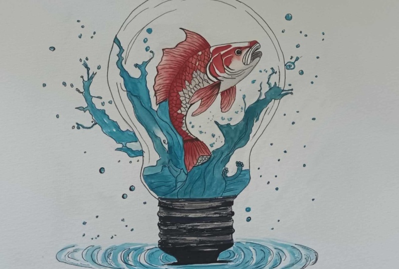
6. Watercolor Wash (Koi Carp): Right. This is time to
paint the main subject. And just pay attention because if you make
some mistake now, you basically going
to trash everything. I'm telling you because it's not the first time that happened to me and was very,
very frustrating. Anyway, I was joking because
if you did in the right way, the waves and the water, I actually don't
think there could be any other problems or
issue with the carp, exactly exactly exactly
the same thing. I start to again put a little
first layer ba basic layer. Of a flat colors, warm color in this
particular case. This color I'm putting on top right now is not black
is actually CPA. I like to use sepia, when I have to make
some dark warm color. In the same time
that I used to use paints gray when I have
to make the blues. So Instead to use the black
pigment and the black color, which is damage from
my point of view, the other colors when mixed when they are
mixed with black, I like to use sepia and
paints gray instead of black. Sometimes I mix sepia and paints gray together
to get a very, very dark color, almost black, but not the pigment
is different. I think the main most important
point of this discussion is the problem is actually
the pigment of the black. Because I think he get
from carbon or something. So it's not a color like well, it is a real color, but
it's hard to explain. You have to try to mix
some of your blues with black and then try to mix your blues
with paints gray. You will see the
difference straight away. So here I'm exactly doing the same technique and the
same thing I did on the waves. First layer, flat
red, not everywhere. And then I'm going to
with a semi dry brush, semi dry bristol brush. I'm going to make kind of
blending and kind of shading. And of the colors, so make it lighter
from dark to light. And then I will apply
the final dark color. Bright red, and
then I'm going to put some oranges and the golden I showed you before is already in the mixing
area in some part. So this will help me to make the red a little
bit more bright. I really love to use the kind of gold and even the orange. But the gold is better because
it's more transparent. Some orange are not
completely transparent. You have to check your tube, or you have to make
to see your cake, if the color is in the cake. Or the pan, you're going
to see a little square. If that square is
completely black, which means the color is opaque. So well, with the water color, the colors are not
completely opaque, so you Basically every
color is transparent. Let me tell you if the little square on the
tube is completely black, means you can cover
the color underneath. But from my point of view, because this water color is
still at least transparent. If you see the square half
black and half white, which means is semi transparent and if you see, of course, the square completely, white, which means it
totally transparent. Well, as you can see
here, I'm going to mix the golden yellow with the red to make some orange
straight on the paper. I did that because of
the glazing technique. I mean, I can make the
orange on the mixing area and then pick up with
the brush and then put the orange already ready, let's say this way
on the painting. But I didn't find this is very helpful because
with the glazing technique, I can exactly what
I'm doing right now, I am mixing the yellow and go
down basically to nothing. I create a blending between
the yellow gold and the red. If I make the orange
before on the mixing area, I can make this game right now. On the top of the
carp, as you can see, I'm doing the same
thing, but I start with the orange color
instead of the black. Sorry, the red. Just because that
part of the fish, I want to be a little bit
different so you can get more dynamic and more
different color. The final dynamic range of the painting will be more
various and more vibrant. Now I'm cleaning the brush, Sami dry the brush, and then I'm going to pick
up the color and extend a little bit just to create
the famous glazing technique. Which means make everything very smooth from a strong color
to basically nothing. When I say nothing, I'm not talking about completely white, but in this particular case, I'm going to say from red orange to light
light light yellow. Basically transparent, but I don't want to leave
anything transparent here, especially on the co fish. Because the bulb will
be completely white. So Even if we make an ink
edge of the carp black, and you can clearly
see where is the carp. I prefer to paint every
single part of the carp. I will leave something on
the head without the color, but you're going to see in a
minute why I will do that. So I'm going to make
a very bright red. Picking up the yellow
to make some orange. Because on the head, I'm going to paint close to the head. And because he's on the
top of the painting, I like to imagine
the light come from that direction of the carp to make the three
dimensionality. And this is the reason
why I am going from the dark brown of the tail on the bottom of the coi
carp to the light red, light orange, light, golden
on the edge of this carp. You're going to see
that in the head, I didn't trace everything
because some mold, I'd like to leave basically without an outline
a black outline. Probably this is the
most difficult part of the car make the head. In this at the moment, I do little scale. I hope it's called
scale in case, sorry about my English. And again, the technique
is always the same. This is because I want to make a dynamic range different
on some part of the cart. As I see on the original
reference image. So the cart is not
completely read. The range of color, let's say in the color
wheel, of course, is warm. And here, I think it's
better to use yellow. As you can clearly see, I didn't come back to
use the pointed brush as I did at the beginning
on the wave and on the water because This kind of brush is definitely more
precise than the other one. And I have a tissue on my other arm because you probably don't
see what happened, but when I deep the
brush into the water, I semi dry the brush. And as you can see here, I'm picking up the color
to make a blending, again, a shading, again,
a good transition between full color
and transparency. And which means because I'm
picking up color and water, I need to use the brush, semi dry Semi dry because I can still have
the point of the brush, but this is not completely dry, even because use brush completely dry is
basically impossible. If you have to
pick up the color, you have to kind of
reactivate the color, and then with a good brush, pick up the excess of the color. This is the moment
when I start to make some red mold on
the on the i carp, and this is not dros. This is completely
free hand. Little tip. You can help yourself, if you're not confident to
do something like that, with a light trace
with the pencil. But there is a big butt. If you go over with the
pencil with the water color, you're not going to able
to erase the pencil trace. So you will still see the
pencil through the color. So careful, use maybe really rough and strong pencil
like 3h4h, if you want. Or you can use a classical pencilH b2b
or something like that. Then before put
the color on top, you will erase most of
the part of the trace. Leave the trace enough to
see it, but not enough. To be able to see
afterwards and after you put the color and
the water on top because you're going to kind of activate the paper and the graphite will be
absorbed in the paper, and this is not
going to help you at all to erase afterwards. So just keep that in mind. At this point, because
it's free end, I think it's easier
to make something. You don't have to be precise. This is just something
you can do quite easy, and this is totally free end. Same technique here as well. So put the layer on top of flat color and then pick up the excess of the color just to make some
three dimensionality. The thing I'm not
going to do in here it puts some dark color on top. That thing put some dark color on top would be the next step. Let's say on the back on the
top of the body of the fish. And would be with a CPA and
brown reddish CPM brown. Just to make some three
dimensionality and some shadow between
the body and the top. Well, this is the last mark
three end on the carp. I decide to follow more or less the rest
of the other marks, but I think it easy anyway. Oh, another thing, you
do not have to keep your your piece of paper straight and
glue on you can move. So you can adjust rotate the paper to make you com comfortable as much
as possible to paint. Because made some lines in the reverse way
is not easy to me. So I prefer to move. The paper and be able to create something suitable
for the painting. As you can see here, to pick up the color, if you
do immediately, you can remove at least
50% of the color. This create from
my point of view, a very good shading, so And I'm going to tell you again this is possible
with a cold press paper. I know I'm going to laugh, but I tried many times to use
the hot press paper, but I was not able to do this. So I definitely totally
switch to this kind of paper. Well, the fish is
more or less done. So I think I will jump now on the last part
of the painting, just to show you how I make how I made the shadow
on the body of the fish. Nothing out of the word, still the same technique for
basically for everything. But I'll tell you when I switch now so you can see better
what I'm going to tell you. So now I'm picking up some CPA, pure CPA, and I'm going to paint straight
on the dark part. Even the orange yellow part and on the reddish part as well. It doesn't actually really matter because as
I told you before, CPA work really good
with warm colors. So the CPA will work perfectly
with any kind of red, brown, red, orange or
yellow, as you can see here. Again, technique
always the same, a little bit of
color, pure color, and then with the
semi dry brush. Just pick up the
excess of the color. Now I'm making the
CPR more reddish because I go back on
the body of the i carp. Make sure, please make sure
now that the body is almost. Do not put this dark color
on the body if the body still semi dry as a semi wet or wet because if You
can't miss now, this is not the time
to make a mistake. Careful, M case, use a air dryer to be sure
the paper is completely dry and put some dark
color now on the body, but again, make sure it is dry. Because if this dark color will spread all around
the body is going to make brownydy, bad mistake. Same thing. Layer of color and then
pick up the excess. With a semi dry bristol, keep your tissue or whatever you like to use
to dry the brush a sponge or kitchen roll or something
similar to your brush. Basically semi dry and clean. When I'm talking about semi dry, it means also clean
because of course, if you are going to pick up the color with the dirty brush, you're not pick
picking up the color, you're going to put more
color on the painting, and this is not the case. You have to remove
some excess of color. Be patient. Take your time. No one is going to have a kind of timer behind
you and say, hurry up. Well, this is quite important. Do you remember
earlier I told you I used this palette
when I have to make, let's say, realistic portrait. In this particular case, in this particular moment, I'm making some shadow underneath the body of
the coy, as you can see. Because that part of
the coy fish is white. I'm going to leave
basically, let's say white. I can't use a warm color
because I'm going to make some very bad mixing or mistake. I'm going to create a
separation and this is why I'm using a paints the
normal paints gray, so not the bluish paints
gray because I don't want to make the bottom of
the i carp to bluish, but because the paints gray is already bluish, I'm
going to use that. Basically is a neutral tint with a slight tonality of blue. Also because the reflection of the water on the body
of the carp is blue. So feel free to use a normal neutral tint
like a normal gray. But I think it's better
in this case because you're going to
match a little bit, the color of the water
using a paints gray. Again, same technique,
glazing technique. Layer of color, be very
light because remember, the body needs to be white. Did you see what
I did right now? I pick up the color and I was going to go straight
away on the paper, but I just stopped myself. Even if this particular point
needs to be quite dark, but I stopped myself
because I cannot manage or I can't understand the real amount of the color I'm going to
pick up with the brush. So i deep the brush on the
water, pick up the color. Work on the mixing area. Try in case on the piece
of paper on my right, on the left of the video. If the color wri for you
it is right for you, just go back and put it on the main painting on
your real painting, and you can't miss anything. You can make any mistake because you know
what you're doing, or what you're going to do. And from my point of view, this little amount of gray
paints gray, bluish gray. It's really good
because can create a tree dimensionality
and a dynamic range extended on the
body of the fish. Can you see here? I just see on the fish. There is no a very
smooth transition. And again, because this is cold press with a
semi dry brush, as you can see, is just
so, I fix the point. And I fix the thing. Some splshy blue, dark blue, light blue, turquoise, anything. Just to match the rest of
the painting and take again, the fountain pen at
the end or anything, just put the sign, and the
painting will be done. My last tip or my
last suggestion, if the painting is
going to be okay, and if you're happy of
what are you doing, do not overwork your painting. Say stop at same point
when you think it's good. Maybe go to get a coffee, go out to get a walk, and go to sleep, whatever, or wait one day or two day, and then go back and check your painting after a
little bit of time. Or Basically, you have to touch your mind of what are you doing right
now and then go back. If you think it's okay,
just put the sign on top. Photograph it, sell it, put it online, whatever. Do Do not overwork on a painting because that is the best
bad moment you can get. If you're going to
ruin now the painting, I think you're going to
be very, very upset. Thank you again for
to watch all of this. Sorry again, for my English. I hope you enjoy the painting. I will show you in the next
Chapter the final result, close to you so you can see better the final result
and see you next time.
7. Greetings: So I really hope you enjoy all the workflow and
everything I show you. If I miss something, if you
didn't understand any point, or you want get
more information, feel free to contact me
because I'm here to help you, and I'm really happy to
help you as much as I can. So again, this painting is a style
I really like to do, but if you like me to do
something you want me to do, please feel free to ask me. And if it's my style,
and if I can do that, I will be really happy to make a painting
you asked me to do. It's a kind of comision
fake commission online call whatever you want. Anyway, I really hope you
enjoy to paint with me and my workflow and how
I realize this painting. Again, show me what you did, what you do, what you will do. And if you need help, I'm really happy to
contact me any time. I'm in Italy or
around the world, but now with the connection, I think that the distance
is not a very big problem. See you next time.
Thank you again, Neil Dine Chao and don't
stop to be creative here.
 Umberto Zanoni, Nero di Venere Fine Artist