Transcripts
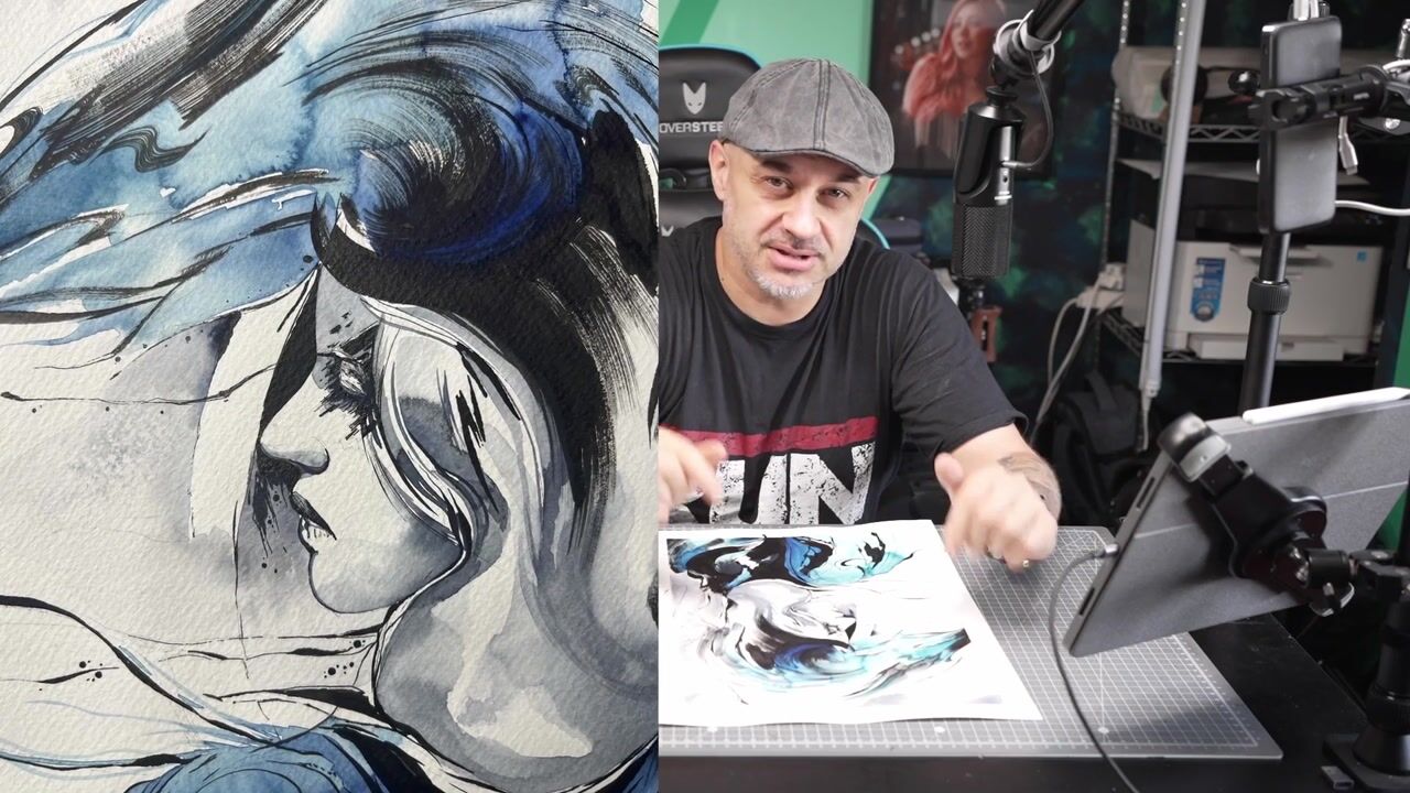
1. Intro: Welcome back. I'm Nio Di Vere. I am an Italian artist and specialized in
watercolor painting, as you can see here
and in photography. I'm really happy and
excited to show you today the full entire
process to realize this watercolor
painting right here. We are diving through some different
techniques like inking, washing, wet and wet wet
and dry a little bit, make details and other
exciting things. I think this is oriented
to an intermediate level, but I suggest you in
case, if you like to try, if you like to painting, do not miss the opportunity to try
to do a painting like this. It doesn't matter
the final result because to be a good
painter needs time, and this is absolutely normal. So I will show you all the
full material I've used. I show you how I
transfer the image on the final paper and step
by step until the end. I also open a
project about this. So if you want to share me your final result, what you did, what you learned,
if you have dubbed, if you have questions,
I am here for you. So now I think now is the best moment to start
this new painting. So let's go to paint.
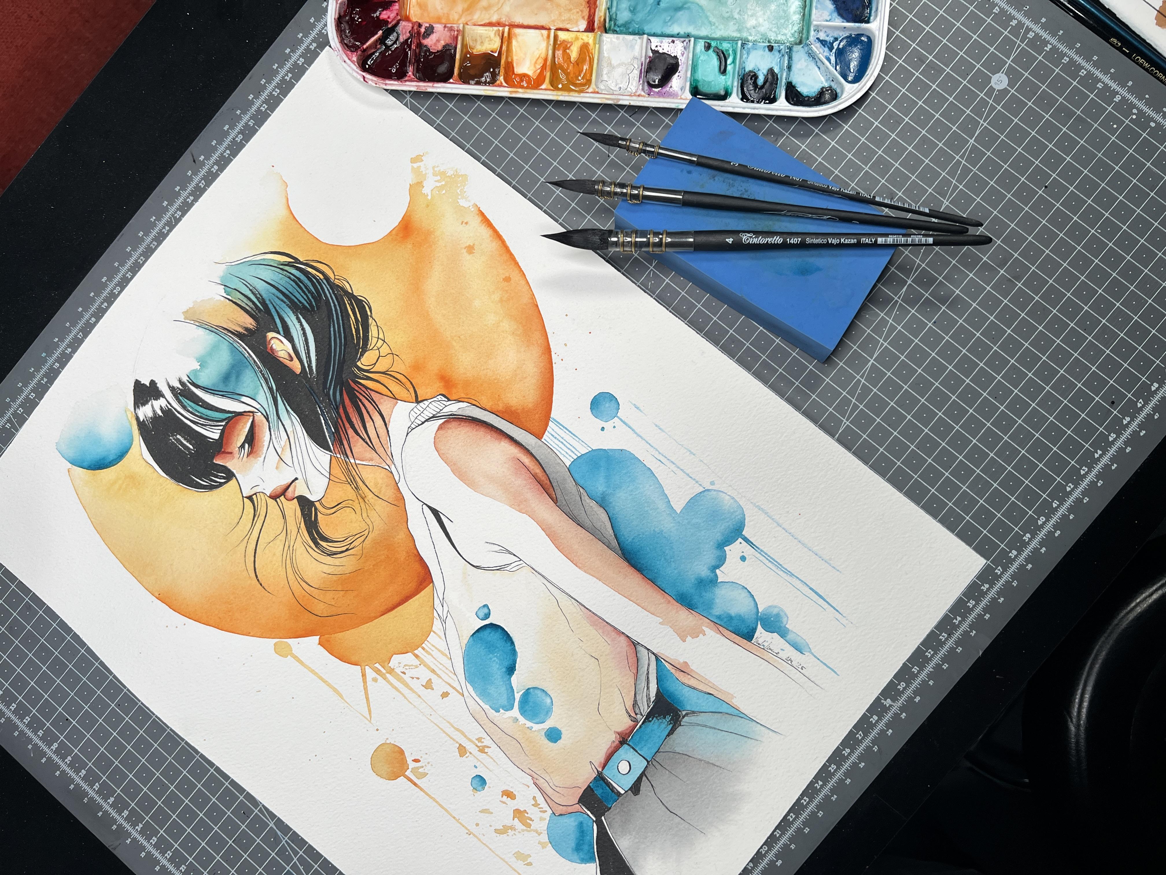
2. Materials: I am showing you material I've used for this
particular painting. So start with the paper because I think it is
the most important. I actually love to use these brands or the arches
or arch because it's French. This is a grain torsion. I particularly like this kind of paper because I love
to get some texture. In fact, this one, it's very, very,
very textured paper. But you can use as
well, cold breas paper. It doesn't really matter
if you feel confit. With the cold press paper, go ahead with that. It's a little bit
smooth and probably is better when you
apply the ink. Just personal preference. The important the real
important thing is better if it's 100% cotton because
it can handle the water much, much better than the classical
paper with some ellos. Okay, so and, sorry, 300 GSM or more. This is quite good. It's okay. I mean, no problem. So a technical pen to trace, you can use anything you
like. About the ink. You probably know I love to use the fontaine pen for
many different reasons, but if you do not
have a fontaine pen, or you do not have
the right ink, which is this one, I found very very
good ink is called carbon ink because this ink is suitable for
the fontaine pen, but is also 100% waterproof. This is very important
because when you finish to trace to ink, your painting and you
go over with the water, you need the ink stay
in place and do not spread everywhere and make
everything muddy or messy. If if you don't like to
use a fountain pen or so, technical pen are
very convenient, you can have this set for a decent amount of the
price is not crazy, and you still have from 00512
sorry, 010203 until 08. This is actually
exactly the same. I finish the 0.1 because
it's one of the I use more, so I destroy basically the 0.1. I like fine lines. So this is from Stetler, and this is probably
much a little bit more popular is micron
pigma. Exactly the same. Um, This one. So I found this thing very, very useful because this
is not normal pencil. This is a quarrel. Or
watercolor pencil means you can use this as
a normal pencil. But when you go over with water, this is going to melt
into your color. The only thing you have
to pay attention is, this is pigment
added to your color. So keep in mind this because this is going to mix
with your color. So if you use a different
orange or I don't know, you're going to use I don't know, let's
say with the blue, you touch the orange,
you're going to get the magical brown color. Uh. I will show you
where I used this in the final painting
because I didn't trace everything just with the pencil, but I
use this as well. Colors. I have another palette. This is the one I'm going to use today because I'm going
to use a lot of oranges. This is a gold. Now, this is a yellow Indian
yellow, something. This is the orange azul.
This is the golden. I actually I like this
is very, very bright. A couple of reds and then
some browns until sepia. I do not use black. I never use black. I start
to stop to use black. Ages ago, if you
need to make black, this is pains gray. You mix with sepia and
you're going to get a very, very, very wonderful black. Also, if you need a cold black, the percentage of sepia needs
to be more than pains gray, if you need a cold
black, do the opposite. Let's say, 75%, 90%, and a little bit of sepia
if you need to swap. Brush. No. This first. I started to use this a few times a few not
so long time ago, but actually, I love this. This is just a sponge. As you can see, it's
a very thin sponge. So I use this instead of the classical tissue
or the kitchen roll to clean the brush before
go from the palette to the final painting or if I
need to clean the brush, I actually love
to use this tool. It's small, stay in a corner. It's not big as a tissue. It's actually, I'm impressed. Brushes. This one, I start with this one because
this is a very bad brush. Why I use a broken bed, low quality brush, easy. Because this it's very useful when you pick up the color and you're
going to the mixing area. Do not use the brush
you are going to use on the main painting because this brush is going
to do the dirty job, dirty work, the
difficult things. This is going to be it doesn't
actually really matter. This is for a critic, but the only thing actually
matter for this one, pick up a lot of color mixing
the color here in the area. And then with the real brush, you're going to pick the color already set and you go to paint. So if you have an old brush, bed brush, doesn't matter, use this for that kind of job, and then the main one. Start with this one because
it's very strange to me. This should be a goat imitation. I don't particularly
like this kind of brush, but sometime I found that
convenient when I don't know, I have to spread the water all around some area
to do wet or wet. Pay attention because
this brush is the one I do not have a full control of the amount
of water or amount of color. I'm going to use on
the main painting, so I keep an eye. I use this very careful. Instead, I much, much, much more prefer something
like a mop brush, especially this one because it is a Tintoretto number four, because as you can see
the point is very, very thin, so you can have a good tank of water
or water and painting, but you can still very
precise in case you need it. I start to use this Tintoretto few months ago and
I actually love a lot them. Of course, all the
brush are synthetic. I'm not I stopped to use
natural hair a few years ago. This is a value limitation. Basically, it is a
squarer limitation, and actually it's perfect. Still on the same range, those are two, this
is a zero and, and this is a 30, of course. This is for the medium details and this for the final details. Those are in the last few months became my favorite brush ever. This one is a Borcgi bonazzi. This is an Italian
an Italian brand, and I actually love
their brushes as well. They make also something
similar to this one, but it's less pointed. So I use the other
one when I have to do a kind of wet on wet, more wash and it's called Bocani bonaziOnk
if I remember well. This one is the synthetical 800, and basically, this is
a Kolinski imitation. The only difference
is I'm going to wet. As you can see, the bristle
are a little bit more strong than the
squirrel imitation, which show you what happened. See? These stay in
place like this. Is smooth compared to this one. This one is going back
to stay very straight. And this is the brush
I used for a very, very, very fine
and thin details. There is another brush, but I don't have here right
now at the moment, still for acrylic, but not the bad brush like
this is a good brush. Why? Because in this
particular painting, I'm going to paint
with black ink. On the paper. So I'm not going to use a watercolor brush to use the ink because it's
totally different color, and I don't want to
mix both of them. You can just in case
I could use this one, but the problem is, this is not a watercolor
a watercolor painting. So because it's ink, if this is going to get dry
for any different reason, I actually can trash this
into the water because, again, when these get dry, there is no way to boom reactivate the color
or clean the brush. So, just keep an
eye on this one. I will show you later which
brush I'm going to use. Nothing special. It's
very cheap to brush. It's just to filling some area with black
ink, nothing different. Let's say would be something
between those two. Okay, let's go to
painting at this point.
3. Transfer Image: I like to show you how
I trace this image. So how I transfer the image from my device to
the final paper. This is not the paper I'm
going to use, of course. This is just an example. But imagine this is going to be your real watercolor
paper, just the light. Okay. So first
thing I have to do is take my phone and take
another stand or whatever. You can use a bottle, you can use a bucket, anything suitable for you. Go and open Da vinci eye. I'm going to say draw
and then collections, swipe, swipe, swipe until
I found the right one. So this one. I use classic mode. And what I'm doing right now
is place the piece of paper. Pretty much in the center. When you are set, you can just say move. You place your image
wherever you want, so you can adjust
the proportion, the composition, the
position, the size, anything. Then take away move. From this moment, your
picture and the paper are linked. Now it's important. The paper is not going
to move anymore, so take a piece of
tape and fix it. Important, the paper is not
you has to stay in place, now you can zoom in and out and do whatever you
want, and as you can see, you're going to see your hand
through through your phone. And from this moment, you're able to report the trace. Your reference image, you can draw all the details you like, or you need to follow
for the next steps. Sorry, so you can move. And as you can see, when you go back in the same place where you were where
you were before, you can continue, you
can zoom in out, move. It doesn't matter because now the image and the
paper are linked. Okay? I think this is a
very convenient method, very fast, very very
helpful as well. So this is the
method I usually use to transfer the image from
my phone to the final paper, and then I can stick with the reference
image on the phone next to me to continue
on the next step. As you can see, this
is just roughly image then you can adjust. Now I'm ready to start
the real painting, and now it's going to
be the inking steps.
4. Lines Inking: When you finish to transfer
the image with the pencil, and again, check the main lines because in this particular case is actually very important. You didn't miss any mainline. But the main line, I mean,
some reference lines, you actually need to
properly understand the full global
composition and painting. Subject. Um, as you can see, I am starting from the bottom, and this is something
I did many times, even when I used to tattoo. I think it's important
to start to the bottom because probably you think it's better to start from the difficult part
of the painting, which is, I think, assuming is the face. In this case, the
face of the subject. But, um, I know you probably many people want to start from the
face just because I said, Okay, if I can do the most difficult part of the painting, I can do everything
with no problem. There is two feedback
I like to show you if and when you think
to do something like that. First of all, is at least this
happened to me many times. So when I start to do the most difficult part
of the painting, I'm getting kind of relaxing. So I said, Okay, now I did the bad part. The most hard work
is already done. So now I can do everything in chilling and without
think so much. And this is when you make
mistakes on the small details. So keep focus and decide which
one is the best workflow, painting workflow for you to do. Why I start from the
bottom and why I told you I did this many times
when I was tattooing. When I applied the stand
sell on skin of a client. And let's say in this
particular case, okay, imagine this is a stencil
apply on, I don't know, an arm of a client or on
the back of a client. I start from the top, so start with the hair
with the face. And so with my arm and
with the side of my hand, I'm gonna kind of rub, I kind of delete,
I kind of melt. The stencil underneath
my arm, my hand. This happened a
few times for me, especially the beginning
a couple of years ago. But the thing is the main focus is I was thinking about to
trace the eye properly, the lips properly,
the hair properly. And as soon as I remove
my hand and my arm, say, Okay, where is the
rest of the stencil? It's gone, was
vanished, was canceled. And this is pretty much the
same thing could happen here. I know this is just pencil. This is not a skin of a client. You can recover everything, but why do twice the same job, the same things to do. So this is the main reason
why I start from the bottom. As you can see, my
hand at the moment, is not touching anything else. Of the main subject. At least, if I touch
something when I go when I move on top, it doesn't matter if I
spread the graphite of the pencil because I can't
delete with rubber gum later. But the ink is going
to stay there. And this is a method. Probably you agree, you do not agree is my suggestion for you. So as you can see, I just take my time because
this is massive important. As usual, when you when you make a painting
like this or actually, anytime you make a
painting, take your time. Do not rush if you want to
pay attention to the details. Many years of painting, I realize details like now, I'm just painting on a belt. And probably no one is going
to pay attention on a belt. But the corner of your eye, when you will look this
painting at the end, if that part is not good enough, you're gonna say, there is
something I don't like. There is something I miss. So the same attention you pay on the main
subject right now, for example, I'm doing
the profile of the girl. So of course, if the line
I just did was a bad line, I can trash basically
everything because as you think I clearly as you think you probably
can clearly understand is if you make a mistake right now with the ink, there is no
way to come back. Many different reasons
for that, first of all, because the main
thing is because the ink is basically impossible
to clean and to delete. And this is why earlier, I told you to use a cold
press paper because if you do a mistake with a watercolor
with watercolor paint, there is a chance you
can reactivate the watercolor painting
with the water. And because of the
old press paper, leave you some time before the painting
get completely dry. You can go back
and try to recover even after a few
minutes or hours. So this step is quite crucial because it's
basically a no way back. If you trace a property
line with a pencil, I think you'll be absolutely fine and you're
not going to get any trouble when you apply the ink on top because basically
you have to do the same thing with slightly
more attention again. Because now you have to do, let's say, more detail
compared to the pencil. This is going to be something. This step, the ink step is something you are not
gonna be to touch anymore. So what you're doing
now it forever. I mean, forever, of course, it's just related
to this painting, but I think you got the point. So again, I don't know if you like to use back to
the technical things. I don't know if you like to use fountain pen or if you
prefer the technical pencil. In this case, if you're going
to use a technical pencil, you can switch between thin thin nib like
one or 005 between, let's say, 0.4, or 0.6, for example, now I'm
feeling the eye with black. I will go back later
probably with a brush, and I'm going to
use the same ink. But if you like to use the
foontinPen as I'm doing now, you can use more
different pen tech sorry, you can use more
different foontainPen. At the moment, I'm using
a pen with small nib. You can find even with
medium nib or maybe bigger. I don't know. So I actually know there is an extra fine, fine and medium. At the moment, I got just
those three fountain pen not of the same brand. The brand that I actually
recommend you is called worth worth and black,
something like that. I like that because
it's made in steel. They are very, very strong, and the price is actually
very affordable. So in case you use or you
damage your fountain pen, you're not going to
lose a lot of money, like the more majority expensive
brand around the market. At the moment, I'm going
to trace the main line, and then in the next step, I'm going to use like an
acrylic brush to fill some part because
with the fountain pen and a small nib or even
with a medium nib, it could take ages. But right now, for example, be sure you're going to
make the right lines in the right way because I
don't think I'm going to touch again this
particular line with a brush and a blacking because, again, this is a no way back. Step. I will leave the
top of the head open. Not just because
the reference image doesn't have the finish. I can finish, of course, the head of the girl. But I think sometimes is a good way to be
more interesting, more creative if you
leave some part, not finish or
something like that, because the human high at least for always from
my point of view, the human high can finish in their own brain the
final painting. Also, this is
another thing I like to do when I print
photography in fine art. I definitely love, and I think
it's very professional to leave a kind of passepo
all around the image. What is a passe parttu is
basically a white frame. I calculate in base of the final size of the
painting or the printing. In this particular case,
this because it's pretty much around 30 by 40 centimeter. I think it's a
good idea to leave 2 centimeters of
passpartou or white frame. So if I'm going right now to finish the head on the top of the girl
and the main subject, I will lose this idea to leave those hypothetical
or let's say, virtual, two centimeter of frame and white stripe,
like white passpartou. Sometime is a good idea. To broke this idea line
and go over the passptu. But to do that, you have to make a
kind of balance. In this case, for example, I have to do something like on the bottom of the main subject. But because on the bottom, there is nothing interesting, in this particular
painting here, in this specific painting, I thought was better
idea, not good, better idea to live on
top and on the bottom, those two centimeter of passpu. I can extend the skirt. I can extend the arm, but oh, I can extend
the background, but I don't think would be worth enough to try
something like this, just because the final
composition is not going to be very improved if you
do something like that. So this is why I decide to leave open leave open the top of the main painting
and the main subject.
5. Brush Inking: This can be the
most difficult part of the full entire painting because we are going to use a brush with a black
ink on the painting. So we're going to make
to fill some area could take ages to do with
the fountaine pen or the regular technical pen. So with the brush, we're going to speed up the
process, but, of course, with the brush and the black ink is a combination which is quite difficult because you are not allowed to make
any error now. So take your time. Don't rush because this is
going to be crucial. Strong suggestion.
As you can see here, I'm using some very
different brush than I usually use on W,
Watercolor painting, sorry. Why? Because the black ink
is not a watercolor, even if it's water
based and is liquid. I already told you when I
show you the materials, but I love I like to
do more precise here. So the black ink is more
similar to an acrylic paint. It's not an acrylic paint. It's another technical
kind of paint and color. But the thing really matter here in this
case is you can use, of course, any kind
of brush you want. But if you're going to use a good watercolor brush
or an expensive brush, make sure to clean the
bristle immediately. As you can see, and as
already told you earlier, by the way, I'm
using the same ink I used on the fountain pen. To main reason this is an
extra an extra discussion. First of all, because
black are not the same. So different brand
makes different blacks. Someone could bid more shine, another one could be less
waterproof than another one, another one can be more mutt, another one could
be I don't know, with some strange cast, like, could be warmer or colder compared to the black
of the fountain pen, and I am definitely assure you you are going
to see the difference. So strong suggestion, use the same black ink you used
with the fountain pen. Actually, I don't think is a difficult thing to do
because as you can see there, you already have that kind of black if you use
that kind of black. If you use a technical pen, try to use a black very
close to the technical pen. The technical pen usually tend to be a little
bit more matte, less shine, less bright. So if you if you think
you be enough confident, go over the technical pen line even with the brush
and the new black. Anyway, I'm using
an acrylic brush, and in particular, two
different kind of brush. The brush I used before this specific step was very thin is called a linear brush. Why? Because the bristle of
that brush are very long. But the line is going
to be very thin. Why the bristle
are very long just because the final line is
going to be very thin. You need to have enough painting and inking
or whatever into the tank. So the long bristle means
it's the kind of tank of the normal brush with
the drown brush, okay? Um, if you have a flat
brush in this particular, point of the painting is
gonna be very, very suitable. I didn't use that, but I have a couple, of course, because sometimes I prefer to
use the side of the brush, but a flat brush is gonna
be very suitable again. Leave some part in white, as I'm doing right now because, again, when this is dry and I think you can clearly see it's
gonna dry in seconds. I think it's visible, how fast is going to dry. Well, as soon as you dry, you're not going to
able to use it anymore. Or you cannot correct some
error. So take your time. Don't rush, please, because
this is, again, very crucial. And another thing at
the end of this video, I'm going to show
you a quick tip. But actually, I think
it's very important. So in case you don't want to go over with this
step because this is basically feeling the black. Looking the reference image and where is black,
I'm putting black. I'm not doing anything special. But at the end of this video, I'm going to show you and give
you a very important tip. Because, well, I can give
you a spoiler right now. So when I finish all
this full enter process, you can see the broken piece of paper next to the ink pot. I'm going to make some lines
and go to make I'm going to put some ink back when I
finish the main painting. Why that? Because when I have to come back after a
couple of minutes, my baby hour is better, I'm going to use that kind of broken paper to
put the water on. If the black ink stay in position in the black ink is not going to
spread everywhere, which means the
ink is completely totally dry even on
your main painting. So when you finish to
paint the main subject, like I'm doing now, the hairs, if you're confident
made some new lines, maybe sorry, maybe more bold. When you finish to
fill the black area, just take the broken or the testing piece of paper next to you and put
some black ink on top. I think is a very good thing to do because you are going to do that when
you finish the painting. So it's going to be the
last stripe, the last line, the last filling you are
going to do with your brush. So which means if that
is dry, of course, all the lines,
everything you did on the main painting is going
to be, of course, dry. And you can go over
with the next step. You can do your wash. You
can put water on there, and you'll be safe because if the black ink
is not completely dry, or if the black ink is not
completely 100% waterproof, when you will apply the
water on the black ink, you're going to reactivate
it or you're going to pretty much spread the black everywhere
on your painting, and you basically have to
start again from scratch. Because, again, this black ink, there is no way to remove it. There is no way to
clean it, and there is no way to delete. So what you are doing now
is going to be permanent. And this is the main reason why you have to be very careful, decide which one, what lines it's important
to you as a reference. See, this is what
I'm doing right now, and I told you a minute ago,
do something like that. And when you are to come
back to do the wash, put the water exactly on
that piece of black paper. If the inks, if the black ink
is gonna stay in position, you can be saved and go ahead with the wash
on the main painting.
6. Watercolor Background: So as we just discussed, this is the final test to see if the black ink
is completely dry. And so I'm going to take
the piece of paper, I make the last scratch. I put water on top, and as you can see,
it's perfectly dry. So which means we can go to set up the colors and then apply the colors on the main
painting to set up the color, I'm going to use two
different palette. This is my main palette,
but on the other one, I got more different warm color. And this is the reason I told
you during when I explain the material to use an old brush because this the
work I'm doing right now, so pick up the color and put
that in the mixing area. It's better if you
do with, let's say, a brush with at least not expensive or the brush you usually use to
do something else. Because I think with
the real brush, sorry, with the main brush, you're going to use on painting, though this work can create
two different problems. The first one is you
basically fill up in between the bristles or
the hair of the brushes, you're going to fill with too much color from
my point of view. And also, you're
probably going to ruin some bristle because this is a let's say dirty
work, bad work. It's hard work for the brush. Uh, so if you have
an acrylic brush, an old brush or
something like that, I think it's going
to be perfect to do this kind of this kind of work. I'm basically mixing
different turquoise and bluish with a little
bit of yellow green. So it's a turquoise
as a turquoise, a little bit green, greenish,
close to the green. So I want to find
a color that can work very good close to the warm color like
orange or red or something. Set up a quite good amount
of color right now because if you're going to
mix two or three different kind of painting, and you finish that to create, again, the same tint
could be quite hard. So I'm going to take now a
big mop brush just to spread the water all around
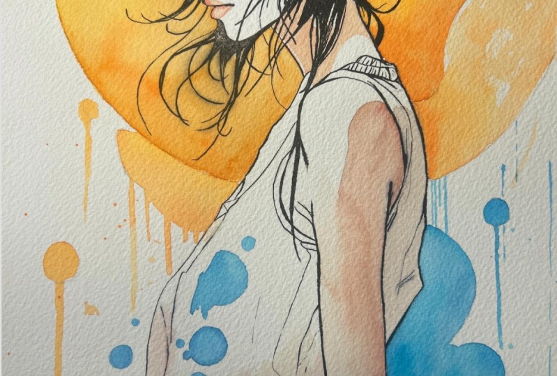
the the background, I decide to start
with the background, and I just notice the
edge of the bubble is not inked and also is
not made with the pencil. Plus, I'm using now smooth rubber gum to remove
the excess of the graphite. I go also over the
watercolor pencil, but this is not going to remove too much of
the watercolor pencil because it's different
than graphite, of course, because when you will go over
the edge with the water, that will be melt
with your color. Clean water, quite
good brush, big brush, and then start to
apply the water all around the area you will
you decide to start with. You can start with
the main subject. Also, let's say, with the
skirt or with the belt, but in this particular case, I like to start with the background because I
want to see in advance, I want to get a preview
of what will be pretty much the final result leaving the subject
black and white. So just ink as it is now
with the background. Because if I start with the
dressing of this subject. And I can lose the perception of what's
going on in the next one. I mean, if the background
doesn't work very well, I just lost time for nothing. So this is why I start to
painting the background. Another important
thing, as I told you in the intro chapter, the amount of water
you have to put on the paper shouldn't
be too much. Just enough because the paper is going to take anyway, a couple of minutes, maybe a lot of minutes
before get completely dry. So you have plenty
of time to work with your color on your wet
area at the moment. I also using a different brush because the big one I
like to keep it clean. If now I put the main brush
into the, as you can see, into the turquoise,
and I'm going to apply the color on
the main subject. By the way, check your color
on the piece of paper, the usual at the classical piece of paper on the right side, just to see if you
like the final thing. If in the next step,
let's say with the orange because it's
going to be the next step, just a little spoiler. The bristle of this brush
would be, let's say, dirty if a little bit of turquoise remain
between the bristle, you're not going to
pick up a clean orange, but you're going to
pick up a dirty orange. So which means it will be pretty much close to the brown
and known to the orange. And this is not what we want. Another important thing, as
you can see here, the color, I can mixing, I can blend the
color, but as you can see, there is not so much water, so I have a lot of control overall the
turquoise I am plying. I think you can clearly
see the color is not running away randomly
with no control. Like you have 1 millimeter
of water above the paper. So the color, you just put the color in there and the
colors start to run away and you do not have any minimal control
of what's going on. I think this is
important because, yes, this is some splash, this is some splash
of the background. But I think it's
important to get the total control in this
specific part of the painting. And this would be pretty much the main focus of basically
all the painting, even on the subject,
especially on the dressing of the
subject and in the air. But if you still have control, like I am doing right now, you can have multiple different
let's say, option. Okay? For example, you can set
up two different colors, two different tint of
turquoise, let's say, a dark turquoise or
light turquoise, or you want to leave some
area slightly light. Then you can wash your
brush and go over. So you can extend a little
bit the turquoise I'm doing exactly right now to make some three dimensionality, some part more light and some part basically filled
with the main color. And this is something you can do only if you avoid
to put a lot of water and the color start to run everywhere without any
minimal control from you. And You also now because it's going to take time before these colors
would be dry. So if you clean your brush, and if you dry your brush, you can also pick up
some excessive color. Like check what I'm doing
right now, exactly this. So I'm using the sponge
and I pick up some color. Probably you're not going
to see right now very well, but you will see later. When the color is
going to be dry, especially if you here when I am where I
pick up the color, the excess of color right now, so make it more light. In contrast to this, what I'm doing right now
on the opposite side, you're going to use
a darker turquoise. To make a dark turquoise
turquoise is not difficult. You have just to add some color because don't forget
the amount of water decide how the saturation of the color because we are mixing the turquoise with
the white of the paper. Okay? So at the moment, this is a light turquoise. Because the watercolor is,
of course, transparent. And then you can go over and over and over
with other layers of turquoise and make
the turquoise darker. If you see the real
color in the palette, you're gonna see it's
very, very dark. You can tell it's pretty much
almost black. But it's not. You can get that dark hue
of the color, of course. Another important thing
about to pick up the color, this is possible from
my point of view, only if you use a
cold brass paper. And again, I know I said these things many time,
and also I didn't. I'm doing something I just
told you to do not do. So pick up the color
with the main brush. But of course, in this case, it's not a big deal because the color is already
reactivated, and as you can see, the mixing area is
not full of color. So the amount of
color is not too much like when we was going
to set up the color. And as you can see right now, because of the cold paper and because the right
amount of water, I have plenty of time to blend, let's say, dark turquoise, mid turquoise and pick up
the excess of turquoise. So I'm going to create something more dynamic than
just a flat column. And, yeah, this is possible
if let's make it a cup. The right amount of water, you properly set up the color in the mixing area properly, and you're going to you
are using colds paper. Sorry, and a brush with a
good tank of bristle, okay? So this, I think, the mixing of those three things it's quite important to
get the result you want. I'm setting now the orange
because I'm going to do the top of the painting, and the technique would
be exactly the same, but with a different color. And let's say, if you're
going to do this job, like reactivate the
color and mixing the color with a
dirty bristle blue, the orange would be
absolutely darker, brown, muddy, and so. I think the light is
gonna help me right now because you can see on top how much water I put
on is not too much. It's not just too to the
amount is basically right, is not too much and
it's not too less. And so I do not have you can still see
the texture of the paper. So which means the right amount of water it's that one, okay? So you probably can have a visual representation of what is the right
amount of water. If the water is
gonna be too much, you probably see just a
flat area full of water, and I'm not sure if you can
see the text of the paper. Go ahead with exactly the
same technique we did with two pis before 2
minutes before this. And again, in this
particular case, I set up the main orange, which is going to be that one, the main the main color
very bright, a yellow, and I used a I used
to dark not dark. I try to increase
the saturation of the orange with a little
bit of bright red. I don't remember
the name, but it's just basically a normal red. Do not use pink fuchsia
or something like that because you're going
to make you're going to change the
tint of the orange. Just stay on classical, normal, medium red,
if you have it. Just the classic Ferrari red, okay? Probably. You go. This is gonna be a
very good example. So yeah, paint the color. Do not rush. As you can see, I'm not rushing at all because I know I have plenty of
time to do everything. Pay attention to the edge, especially here
because this can be pretty much the same thing
about the black ink. If you go into the
dress of the girl, these times could be quite
difficult to remove because I think that part of the dress
is going to I'm going to leave that part of the
brass basically white. So I'm not going to
touch with color. I like this kind of brush
because it's very pointed and can help me to be quite
precise, to be honest. And also just another extra tip. When you apply the color, you will add a slightly
amount of water as well. So, I know I'm going to be
quite knowing, probably. But this thing is
very important to me because the right
amount of water can avoid you to change the hue of the color because we are going to use
transparent color. So if it's too much water, the color will be
definitely lighter. And also, as you can see, you can have a very, very good control overall of the color you're going to
apply on your main painting.
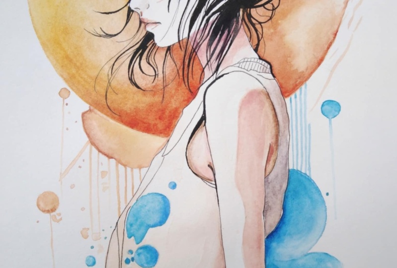
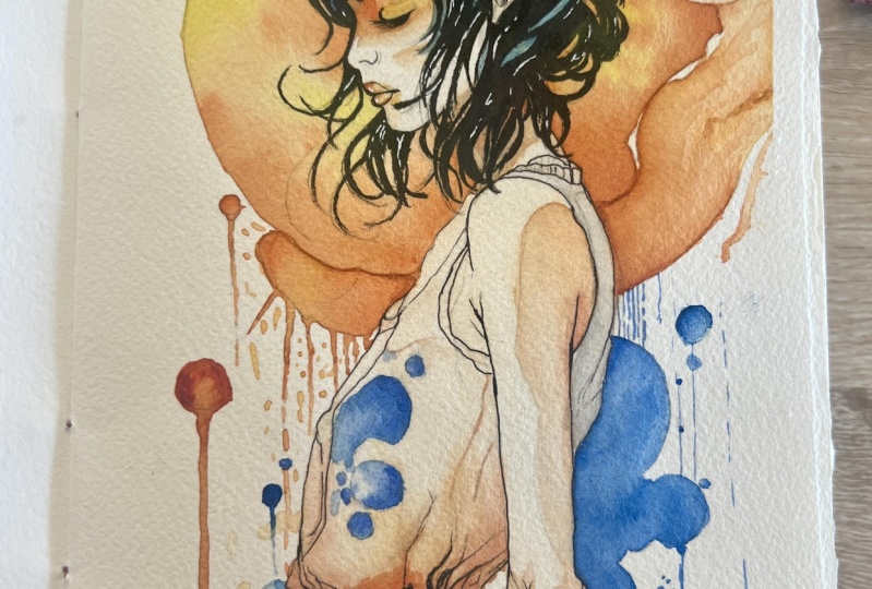
7. Dress and Arm Watercolor: A This is time to finally switch to
the main subject, and I think this is basically
the most exciting things. I'm mixing neutral tint is a kind of gray graphite
gray with pains gray. Why Paine's gray Because
it's the best gray. I actually love
Panes gray because it's pretty much bluish gray, which is very, very
photographic gray. Um and again, the
techniques still the same. So slightly amount of water, the right amount of water. And as you can see, look how much control
I have on the color. I can the area is
completely full of water. So it is actually wet. But as you can see, I can have the full control of the color in the area
I'm going to work on. I can create some shadow. I can blend the colors. I'm going actually to blend two different colors because on the right side
of the painting, I can clearly see it's
going to be bluish, so I will add some
blue to the skirt. And this is totally fine
because with this technique, you can do pretty much
everything you want. Taking your time,
pay attention to what are you doing can you imagine if this area
was full of water? No way to do what I do now. Look how smooth and blend. Now, this is basically dry. Look how smooth and
the transition between the gray and the
blue is very soft. It's very natural,
it's very clean. I think this is a
very important part when you want to be
precise in watercolor, of course, again, this is
a very creative technique. So pretty much where
everyone can do everything. But, um from my point of view, if you like to paint
in a clean way, and you want to get much the most control
possible, this is the way. I'm switching to the skin tone. You probably see from
the video right now, I try to add some white. It's totally useless because we are going to use the
white of the paper. So we have to make
some skin tone. To make skin tone, it's pretty much a slightly
amount of orange, very, very little amount of let's say a dark red is
between red and brown. Of course, it depends
of the color range, the dynamic range
of your painting. But in this particular case, a dark red pretty much in
the middle way between red and brown would be
the best choice. The rest of the main subject needs to be very, very light. So I'm going to use
in the mixing area, a lot of water, like, is the best way to make the
watercolor color light. And then I will use the white of the paper to make the
color light or darker. Again, the technique
still exactly the same. So I pre pre wet the
area, sorry, not pretty. I pre wet the area, and then I'm going
to add some color. Um, I probably told
you already 200 time, but look how much
control I can have. And I am doing a wet
on wet technique. For the people, maybe he's
not a massive expert. This, I think is going to be
the main tip of the class of today because Look how
light I am right now, and pretty much in this area, I can do anything I want. I can pick up the color with
the tissue if it's too much. I can blend the color. I can make the color smooth. I can create a
smooth transition. I can add another color. I can mix two different colors. I can I can blend a dark, like the thing I'm
doing right now a dark orange or red with
the light orange or yellow. I can create a three
dimensionality because remember, this is behind the arm, so I need to create a separation between the
main subject and the arm. So the color here, the hue of the color,
the saturation, the value of the color needs
to be different compared to some other areas
should be in light. But anyway, I think
you can clearly see how pretty much I can
control everything. It's like when I
use the airbrush, in a couple of years ago, I start when I start to paint, I use I start to
use only airbrush. And when I actually
use an airbrush, I can have as much
control as I want. Because it's going to
be a kind of glazing. So layer over layer. I can make it dark,
I can make it. I can leave it light. The only thing you have to keep in your mind in
this particular step, you can make it dark
as long as you want. To add color, you
are always in time. But in terms of airbrush. But in this particular case, also because in the airbrush, I can't use watercolor I have to use pretty much acrylic
and when acrylic. Will be dry, there is
no way to remove it. But because here we
are using watercolor on wet surface like a wet paper, you can apply the
glazing techniques so layer over layer
to make it dark, but also with a wet
brush, clean brush, wet clean brush, you can
pick up the excess of the color so you can make a
very, very smooth transition, a very light blending between color and the
white of the paper, you can actually do pretty
much everything you want. In case you want
to make it darker, just wait a little
bit, wait the color. Sorry, the paper would be dry, and then you can
do this technique again over what you already did. I try to be more
clear as possible. Now we are basically painting
a shirt or a t shirt. No, it's not a t shirt,
but it's a clear dress. So if we need to make
it darker and we don't want to be too
strong in this transition, you just need to wait. The paper will be
pretty much dry, and then you can put other water again on top of this and do
this process again, over and over and over. As long as you need. But
until you will be light, you can do basically
anything you want. Now the dress is dry. Look how smooth, soft, blend it is right now. And the things still
exactly the same. So as you can see, I'm using, again, this brush,
the clean brush. So this brush never
touch any color since I start to do this
painting is just dedicate to apply the
water on the paper. This one is brush because
it's pointed and I can have more control. On the edge, like, I'm doing the
shoulder right now. I'm painting on the shoulder, but I don't want to
go into the back of the shirt of the dress
of the main subject. With the pointed
brush, I can do that. I can be more precise. And again, check, see the color is not
spreading everywhere. He's not running even wear. He's not bleeding everywhere. Still in the position
where I actually paint. I'm free to do everything here. I'm free to extend the
transition of the color. I would be free to use another
color like, I don't know, light orange or put some
dark orange between, let's say, on the armpit, to make the final result more tri dimension,
tri dimensional. Um, pretty much. I think you at this point, I think you got the
idea and what is the main focus of this painting, not just of this painting. I mean, if you use
this technique, on any paint you're going to do, I think you basically
you shouldn't be afraid to do anything about
creating a mess, make the color muddy, do not have control about the
color can run everywhere. You can do pretty much you'll be safe to
do anything you want. I'm doing a mistake right now. Which one is I
didn't wait enough time until the paper
is completely dry. So I just told you you can get basically the control
of everything but not 100%. Take your time because later, I have to go back in this area and fix what
I'm doing right now. Some part of the color spread
a little bit too much. I'm talking about millimeters, okay? It's not a big deal. I can fix easy this, but many time I told you, Take your time, don't rush. And this is one of the
main reason I told you that because in this
particular case, right now, here I'm
doing a mistake. I should wait five, 10 minutes just to be sure
that the layer and the paper, sorry, the water and the color
on the paper will be dry. And then I can go over
with another layer. So we are switching
between wet and wet to glazing is not a
massive difference, but I think it's really important to tell you even
this small detail right now.
8. Face Watercolor: Last very important step of the voluntary process
of the painting, of course, we are going
to do the main subject. I mean, the face and basically
the face and the hair, but the face is the
most important thing. Right now, I am mixing because the face still kind
of warm color. I'm going to mix, again, orange and yellow
like golden yellow. We are doing something
different here, slightly different, not so much. So the techniques
should be the same, but here we're going to do
some glazing wet on wet. As you can see, I'm not using
the brush the big brush I use for pretty much the full
entire painting till now. This is one of the
main brush I used to put the color on my subject. Why that? Because it is slightly
smaller and it is pointed, more pointed than the other one. So I can be more precise
around the edge of the hair, around the eye, and so. So as you can see here, I'm applying a very
thin, thin, thin, small, light layer of color, and I'm going to do the same
on the neck, of course. And I'm going to
create this ideal line underneath of the hair. Basically it's the
shadow of the neck. And here, as you can see, I am very, very careful. The color is very light. You can see in a minute
what's going on. During the time I'm
doing the neck. The color around the
eye is going to dry. That because I use a small amount of water and
just a thin layer of color. So at the moment, I am playing between
glazing technique. I'm playing with timing
because during the neck, the eye is going to be dry, so I can go on the eye in a few minutes on the dry eye in a few minutes during
the glazing technique, this area knee on the neck
is a little bit bigger, so I can play slightly
more and they can be, let's say, less precise
compared to the eye. But now, again, I'm using
exactly the same brush, exactly the same color. So this color is not darker
compared to the first layer. It is exactly the same color. As you can see on the right, I didn't change the palette, and I didn't mix other
different colors. The only thing I'm
doing right now is go over and over
and over with layers, light layers to create
the three dimensionality, the shadow, the blending, um and this is crucial because this is going to be the focus
of the painting. Yes, it is the last step. Many people maybe like to
do this at the beginning, but from my point of view, if you do this at the beginning, you could lose the
full entire range of color of the painting. What do you mean? Now you can apply on the
eye from my point of view, the right amount of color. And because we are doing
something very light, like I'm doing right
now now I'm basically drying the brush to blend the color to full color
to nothing, okay? So what are we doing right now? This is the classical
glazing technique. Layer on layer, light layer, light layer, over light
layer, over light layer. If we do this at the beginning, and we go too dark, let's say, too
dark or too light. This is going to be
a strong influence for all the full
entire painting. Do this at the end, instead, make you in a condition to put the right amount of
color around the eye and on the face of the girl
because you already have the full range of
color of the painting, and you can clearly see
that from the background. I'm pretty sure
you're not going to do something darker
than the background or lighter than the
background because you have a huge vision of
the painting right now. But if you do this
at the beginning and you have all the
painting without any color. The risk is around the eye, you could go to dark. And if you go to the color, when you if you will do
the background afterwards, the risk is to go very, very dark with the background, to get the right separation between the main subject
and the background. For the lips, as I'm
doing right now, the game is not changing. I'm doing a very thin layer. I'm going over and over to create the three dimensionality and the round and dead
idea of the lips. And during this time
around the eye, the color is getting dry. So when I finish here on the lips and when
I jump back to the neck, and then I go back
again to the eye, I will apply a layer of
color on a dry area. And this is pretty
much what glazing is. Also, I could be able to
go over and over and blend the color from dark to light without a huge amount
of water. Right. You see now I pick up a little
bit of red just because the top lip because
it's in shadow, needs to be slightly
darker than the rest of the painting just to make sure you got the
three dimensionality, and this could be apply as
well between the eye and the nose and underneath
the hair above the eye. So again, you conclude,
see, I'm not rushing. I'm taking my time
because it's not so much. We're talking about
probably ten, 15 minutes. As you can see here,
my brush needs to be almost dry because I
need to pick up the color. And also, I need to blend the color between
the full saturation, the full value to
basically nothing. I'm just going over
and over and over, as you can see here, and I got patience. I got I'm taking
my time because I think this is the most important the most crucial,
the most delicate. Sorry. I think delicate
is the right word. This is the most delicate
part of the painting. I mean, if you are not precise at that level on the
background or let's say, on the on the dress, I think no one can see
a huge difference, but if you make some
mistake right now here on the lips or around the eye or on the face of
the main subject, the risk is to ruin
the painting you did. This is one of the
reasons people, well, not people, not everyone, but this is one of the
reasons a lot of people tend to start from this area, because it's the
most difficult and more is the most delicate. And then go ahead with the rest. So someone can think, Oh, if I'm not gonna do any
mistake in this area, I'd be safe about all the
rest of the painting. Yes, but it is true but
not completely true. Again, the value
and the amount of color you put you put on the eye and on the lips can influence the
rest of the painting. The same thing here
is on the hair. The concept still
exactly the same. So now I'm using pretty much the same color I use on the background.
It's not the same. It is slightly green, as you can see,
compared to the blue, the light blue off
the background because I want to stay on the same range
of the color wheel, but I want to make the subject a little bit more
separate to the background. So I'm not going
to use a purple, for example. I'm not
going to use a red. I'm not going to use, let's say, a strong Fuxia but I'm still on the same area
of the color wheel. So this is another turquoise, slightly green compared
to the turquoise, slightly blue of the background. I think there's a kind
of harmonic view. And this could be an harmonic color
Shoes, color No shoes. I choosing you're
choosing the right area of the color wheel to stay in harmonic
composition of colors. But without exaggerate. So you can get a good
separation of the subject, but without exaggerate,
changing the color so much. The hair, the area of the hair at the moment,
still slightly wet. And again, I'm applying
at the moment, again, the same color of the
first layer because I think you saw I didn't add
any green or any blue. It's just a second layer. And with the brush almost dry, I can blend the second layer with the first layer with
pretty much no problem. Is nothing difficult
at the end of the day. You have just to keep an
eye on what you are doing, follow the reference image, and the mistake I made when I was at the beginning was very
clear and very simple. I want to see color straightaway immediately in zero time. I didn't have any patient,
pretty much, basically. Painting teach me that, because I trash many
works, many time, a lot of hours for nothing, just because I didn't want
to wait a little bit, and I want to put the color straightaway
everywhere in 321. So take your time, be patient, and you can correct
or avoid mistake. Maybe you can think
slightly 1 minute before. What are you doing? As you can see here, I
didn't do anything special. I just apply two layer of the same turquoise
color on the hair. And as you can see,
I got pretty much a good three dimensionality
and a good shape of the hair. And here, again, I'm doing exactly the
same with the orange. This is an extra
separation between subject or a fusion,
if you want. Between subject and background
in a little bit of in the same area could be a good creative way
to finish your work. Almost dry brush, and you can blend
everything with no problem.
9. Greetings: Come back. I really hope you enjoy to
paint this subject with me. In case you need
some further detail, please feel free to contact me, and I will try to help
you as much as I can, because unfortunately,
my English is not my main language. I hope you can
understand and you can stand my English because
sometimes I miss some word, but I think the connection
between art and my mistakes, my speaking mistakes could be fixed with visual when
you see what I'm doing. This is I think I think
this is much important than maybe some word, say in a bad way. Anyway, um, strongly suggest, again, a smaller cap, I strongly suggest that you use cold press paper and
not hot press paper. I know it can be smooth
the hot press paper and probably a few
people or a lot of people like to use
a smooth paper because it's helpful when
you at the beginning, when you trace with the ink
because with a rough paper, maybe it's not very comfortable to trace the line with ink, but I do not probably if you follow me
for a while, you know, I don't I'm not a fan of hot press paper
because I'm not able to make a good glazing and sometime I
struggle a little bit. I basically, to me, the hot press paper
dry too much fast, and it's almost like an acrylic when I paint on acrylic with
acrylic on canvas. So sometimes if you need
to retouch something, I think it's better
a cold press paper. I don't mind if you
use the rough one or the other one
slightly smooth, but I suggest you a cold
press paper because it is an easy paper to paint on especially if you're
not very expert. I tried twice, probably, and hot press paper is
definitely not for me. This still my favorite paper and the cold press
paper in general. In the material,
I forgot to say, I'm going to put the
template of my palette, and I wrote the
name of the color. Sorry about my calligraphy,
but I think you can get it. Is not really important to get the precise name of the color, but just in case if
you have an help, if you need bigger advice, say the color, maybe you forget if you have the
name printed on that. I think it's better S
means Jaminqe color, M G means gram color. At the moment gram, are still my
favorite color ever. The problem is in Europe, I struggle a little
bit to find that. So I stick with Schmincke. They are absolutely fantastic. But the gram, because they
have a slightly honey inside, the reactivation and the
creamy of that color is, I think, the best in the
world at the moment. Anyway, feel free to contact me for any further details
for any question, anything you want. I'll be here. I really hope you enjoy
my class and see you to next painting or next
photography class. I don't know yet. I will do both. So I
wish you a great time. Now, never stop practice. Cho.
 Umberto Zanoni, Nero di Venere Fine Artist