Transcripts
1. Intro: Welcome back Narrative
inner Channel here. I'm really happy
because finally I am back after a long,
long, long time. As you can see, I
changed everything. I moved to a new house. I made a new painting studio, and I'm ready to make
some new classes. Today, I like to start
not with just a class. Is something I like to explain you for
science many times. Every class I made, I
strongly suggest you to use a specific kind of paper and
was a cold pressed paper. But now today I
will show you why, and I made some test to explain you why I
strongly suggested you use one kind of paper and
why the other one could be not the best
for you or at least you can have much more
information to choose which one is the right paint
paper painting for you. So I'm going to cover this
would be a very short glass. Actually, I'm going to cover some different technique on
these four kind of paper. I'll show you three, but
actually it is four. But one from my point of view, it's really best to avoid. So just jump into the
explanation, not a class. I will show the materials
I use very very easy, and I will explain
everything about the paper. So see you at the end of
the explanation or classes, and thank you so
much to join me. Sorry if I disappear
for a very long time, but as you can see
here, I'm ready now. I'm set up to go ahead
with new classes. Let's see what happened
with the paper now.
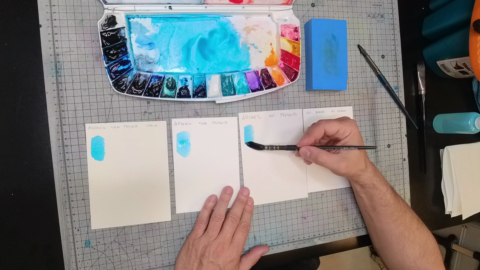
2. Materials: Okay, speaking about
the material is gonna be quite easy because as I said, these are gonna be common
stuff that I usually use. So this is the brand
I like so much. Is the Arches paper or
arch because it's French. This is rough, so green
torchon all of them, the stuff is going to be
300 GSM and 100% cotton, except for one and a hovlaor. So this is the cold
pressed, rough. This is cold pressed,
but fingerin, okay? Again, 100% cotton,
300 GSM and so. And this is the hot pressed. 300 GSM and blah blah blah, 100% cotton. The last one. I'm not going to
show you the brand because it doesn't
really matter. I just want to tell you that
this is not 100% cotton. But it is 300 GSM. So this is a generic brand. I'm not going to show
you the brand because I don't I don't like this paper, so there is no way I can use
this paper in the future. So Enough to say is
not 100% cotton, but still 300 GSM. And to do the test, I'm going
to use just two brushes. So those are the Tintoretto
synthetic value, which means squirrel emit. And actually, tin toreto
is my favorite brand at the moment for watercolor painting
watercolor brush, soft. Okay? This would be some soft bristle and just a generic brush
with a hard bristle. Um, this is absolutely no brand synthetic
found on Amazon. And this is pretty
much the brush I'm going to use to
mix the color here and to I'll show you later
to pick up some color and work on the color
afterwards on the paper. A sponge, this is
to clean the brush, before pick up some color, so just to download
the excess of water or clean the brush from the
pigment, and that's it. We're going to start our test.
3. Full Test: So I will start to
reactivate some color. I'm going to use
kind of dark color just because I want to
show you a very contrast, very contrast on
this white paper. So pretty much I will use
something like this turquoise. Keep in mind when you
set up some color, pick from the palette and go
to the mixing area before go on the actually on the actual paper
because in this way, you are going to get
the right amount of pigment and
color and you don't have you avoid the
mistake to have too much color on the brush
before on the real painting. So to be sure, always
some piece of paper, and then you can try
and see the color before before paint on
your final main work. Okay. That's it. So I'm going to
pick up my I show you here probably if you
like this could be better. Okay, so I'm going to
carry on some water. I'm going to download some
water, pick up some color, and just start our
test in this way. I'm going to start
with wet on dry. And here you can see what kind
of paper I'm going to use. So you can see
what happened with the same technique with the same test on each
different paper. So try something like this. And then switch to the normal
cold pressed, so rough. Pick up some more color, go to the hot pressed paper. This is wet on dry, okay? And on the final no brand. I think you can already see the big mistake of a non
hundred percent cotton paper. And I'll show you straight
through the camera. Can you see this?
This is not uniform. And this pretty much
is already dry. So not so much you can do right now and it
is just a few seconds. Let's say I want to go back here and make some
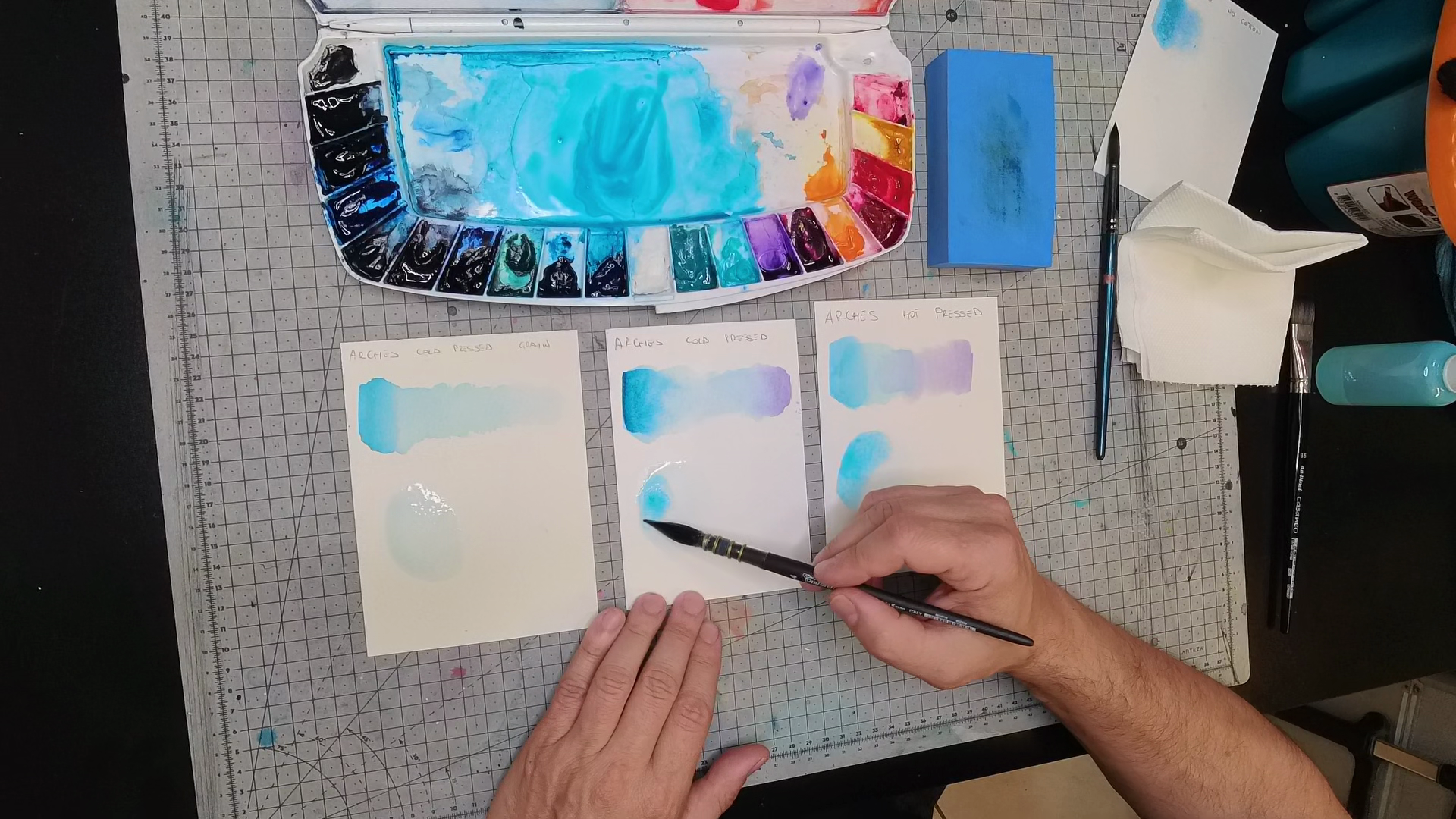
smoothing transition. Okay, let me pick up
this hard bristle. So just water, nothing else. Download a little bit of water. Now it's already past
pretty much 1 minute. And as you can see,
I can still work on my painting and the smoothing
the transition is very, very smooth and clean. Okay, I can go ahead and
a head and the head, so I can start from
full color to zero in a very smooth smooth,
smooth transition. And so I can I don't know, go back with another color. Let's say, I can pick
up this light color and start from here and
go back or mixing, I don't know, a purple
or something like that. So as you can see, after
let's say 3 minutes, I can start I can work. I can pick up some color. I can actually take
tissue deep in the water, go back here and pick up some color if the
excess of pigment. So I'm going to make
the transition smooth. Okay? Right. Let me do the same thing. Actually, this is going
to be almost dry, but as you can see,
I can work on it. Again, it is pretty much
now couple of minutes. And I can go back with this
and make now the transition. Now I'm going to use wet-on-wet. So it's easy to make some
smoothing transition. But as you can see here, it's very easy to work on
those two kinds of paper. Let's talk about the paper I don't like at all and
see what happened. Not so much I can do, okay? You still see here this edge and a massive difference between this part of the first
color we put on the paper. And actually, there is no way to get a
transition over here. These two kind of paper, well, now this I place too much
too much color on the paper, but as you can see here, I can obs I can still work on my color
and fix some mistake, maybe, or again, pick up. Let's pick up some pink right here and go back in the opposite
way like this. And as you can
see, you can blend the two color pretty
much with no problem. Here, I think there
is no way to do this. I think I think you
can clearly see, well, let me switch to the good
good brush. So, yeah. As you can see here, this is pretty much a mess. I think you can clearly
see the difference between this transition
and blending and this one. This edge, this mixing area, well, I think speak by himself. See what happened here
because of course, I don't try to do this here because it's pretty
much impossible, but I want to show
you something. So let's say I want to try
to work on this paper, on this color and I don't know, try to fix some mistakes. So I'm going to
pick up some water, and I start to work on
this part of the paper. Can you see what is going
on after a few pass? This this point here is actually paper that is going to broke from the foil
from the paper. So can you see here? The paper actually
is going to ruin your entire work because this
is broken or torn paper. I think this explained by
itself what happened here. So I'm not going to use
this piece of paper anymore because I think there is no way to explain
more than this. The dry here is not uniformed, is actually really bad. You can try to do some
smoothing and transition, but you are going to broken the paper even with just
a small amount of water. So a non cotton paper is
definitely not for me. Let's see what happen if we
do something wet-on-wet. So I'm going to wet. An area here, again, another area here, and
again, another area here. Before I do anything, I don't know if
through the light, you can see what happened here. So I still have some water here, and you probably
see it can move. This is almost already dry. Okay. Right. I hope you can see that. So those two still
pretty much wet. And now I can do a
wet-on-wet technique. This is pretty much
already dry and actually, to show you what happened, I'm going to paint first
on the hot pressed paper. Right. The amount of water
here is too much, so I probably need to
pick up something. But can you see how much
time and how much yeah, how much time the paper
gave me to actually think what I can do if I need
to set up another color. So I don't have to rush. And here, I have
to be very quick. I have to do the thing
in a really fast way. Let me pick up some color here, just because the amount of water on the paper needs
to be the right amount. So it doesn't need to
be basically soaked. A minimal amount of water can
make you able to work very, very quiet, very clean. As you can see here, I'm
not rush and not running, I'm not no anxious. I can do everything
in the right way. And now with the semi
dry brush, of course, here I can do a little
bit of smoothing, but I want to show what happened
when this would be dry. Okay? Here, of
course, is my fault. There is too much water,
so I'm going to pick up some excess of
water in the brush, download the excess
of water and again, put some color in here. So let me extend the smoothing, the transition, and so. Something you can clearly
see when this would be dry is this is very common. And this is why for some reason, I like to use the rough paper
with the semi dry bristle. If I do this movement, as you can see here,
I'm going to get this kind of effect. Maybe you can like,
maybe you don't like. I don't know. Sometimes
I like this effect. This is not going to
happen here, of course, I show you immediately because this is a
cold pressed paper, but is a little bit smooth. So as you can see here, the the effect pretty
much doesn't exist, okay? Or is very, very, very low. Of course, on the
hot pressed paper, this effect pretty much
disappear, as you can see. Okay, it's not completely dry, but I think you can already going to see
what happened here. So the transition
here is quite good. I can add, let's say, some more color here just to increase the three
dimensionality of the final effect. Okay? Something like that. With the other brush would
be better, of course. But as you can see, let
me do things properly. Uh, I'm going to show
you in a little bit, even what happen when you use a very good brush compared to
a known brand brush, okay? Right. So I think
you can clearly see the transition from full
color to zero is smooth. There is no edge even here, apart from the effect of the rough paper, but
this is something. Again, you already know that
this is going to happen, but the transition here
is pretty much perfect. Check the hot pressed paper. Can you see here at the border? Okay. This is something
I really hate, especially when I have
to do a portrait. For example, when you have
to do let's say you have to put some contour on
the chin on the face. So yes, on the chin, and you need a very smooth
transition from, I don't know, the here
to the mouth, okay? You're going to get this edge around the middle of your face. And, um, well, I show you with a strong,
very hard bristle. Check here. Still, no way to remove
this edge over here. The transition here I'm gonna
do the same thing here, very, very I'm not
gonna be very gentle. Can you see what happened here? And this, I didn't touch this piece of paper for a while now for a
couple of minutes. Look. Perfect. Pretty much there is no edge,
no transition, nothing. I hope this can explain in the best way why I don't
like the hot pressed paper, even if it is the best
brand in the world. Of course, from
my point of view. This is why I love to use this rough texture for
some work, of course. And this one, the cold pressed, the normal cold
pressed, fine grain. Last but not least, of course, this hot pressed paper
would be amazing if you ink because there is
no texture on the paper, so you can pretty much
it's perfect for using, I don't know, a technical
pen or a fountain pen. Even you can do exactly
the same thing pretty much here because there is a little bit of texture,
but not so much. The texture is very smooth. Here you can find some problem, but I always use this and
you see pretty much all of my work are inked before with a fountain pen or with
some technical pen. So from my point of view, I have no problem
to use an arch. Sorry, rough. Paper texture. This would be amazing
even with the airbrush, because with the overspray, with the airbrush, actually, this kind of paper could
be a problem because, again, with the overspray, the if you see this
to the microscope, the grain would be touch on top from the overspray
of the airbrush. So there is a possibility then you can get some
visible overspray and you can have this kind of result and
it is not the best. So again, inking,
if you want to ink, those two are the
best in general. If you want a smooth
transition, those are the best. If you want special effect, this one is the best. Keep in mind, if you use the hot pressed
paper, you have to be quick. You have to paint
very, very fast. And even with wet on dry, sorry, wet-on-wet, keep in mind, you have to constantly go back immediately with the tissue
and try to fix the edge. But the problem to me, the problem is the time. You have to be very, very, very fast to use an hot
pressed paper. At least from my point of view and from my
kind of painting. 90% for I suggest for the
people start to paint. So from beginners to start
with this one because it's a middleway and is very
quite easy to use, okay? But to avoid some problem, to avoid some mistake, to avoid some anxious, be sure, please to use 100% cotton paper. I know it is expensive. You can try to use this if
you want to do some exercise, but keep in mind,
you're going to pretty much ruin the
paper and the work. And when you feel maybe
more comfortable, you can switch on
100% contum paper. In the next chapter, it is going to be very quick. Pay attention because
even if the cover of the album says is 100%
cotton, suntme is not. I remember an album, and I'll show you in
the next chapter. I remember I used an
album says 100% cotton, but that paper was
awful because I feel like have
plastic cover on top. So the ink doesn't go
actually into the paper. And I ruined two works. I remember. So I pretty much
trash all of that album. I hope this is a good test enough for pretty much glazing wet on dry and
wet-on-wet technique. And maybe now you have a better idea what happened on different kind of paper
just to let you know, I actually love this transition. This is why I still say this is my favorite favorite paper ever, even this one on top. With a little bit
more attention, I could avoid even
this small edge, but last test just to see if it's fixable because sometimes it is even after
almost 20 minutes. No, I was asking too much. No. But as you can see, I can go over and over
and over and over and over and over and over and over and over and over
and over and over, and the paper still clean and it's not
gonna broken like this.
4. Fake Cotton Paper: So I want to show
you what happened right now here because
the piece of paper I'm going to paint should be 100% cotton because that
was pretty much a no brand. But on the cover of the album, I can clearly see 100% cotton. I clearly remember this
paper was absolutely awful because there is
a kind of coat on top, like a plastic, like a
tape plastic tape on top. And it was really hard
to paint on this paper. So compared to the
other one, this, I can say I can tell
you it was fake. So I actually pre wet the paper, and now I'm going to spread
some color in there, and as you can see, the color spread with pretty
much no control. It goes everywhere and it's not precise as the other piece
of paper gave to me. So totally totally no control of the color on the fake paper. Keep an eye on the center one. Don't mind about the other
five, the other four. The center one is the piece of paper you
have to keep in mind. So, apparently,
the paper is dry, and this is going to happen. I took a piece of paper, a tissue of paper and
check what happened. I am completely, totally 100%
going to remove the color. So this is very, very, very bad. Check what happened here, okay? This should be dry. So just with a piece
of wet towels, wet paper, I can completely
remove the color. It's unbelievable.
As you can see, on the other piece of paper, nothing happened because
everything should be dry. See? How much was disappointed? This should be 100% cotton. So pay attention when you buy something with no brand
because this can happen. And when this happened
on a painting, when you spend time and skills
and color and everything, you're going to be very,
very, very disappointed.
5. Conclusion: So I really hope you enjoy
everything I explained to you. And hopefully now you
got more information to decide which kind of paper is best for your style of painting. Again, I strongly suggest, as I already said during
all these minutes together, the two I mostly like, which is the still
on the brand Arches, as I showed you in the material, this is my favorite
kind of paper, even a little bit difficult
if you want to sketch on this one because the
texture of the paper is not very friendly of
sketching and I don't know, use technical pen, be precise. But to be honest, from my point of view,
this is my best. I use often quite a
lot, this one, as well. And as I told you, probably, I just got this
hot pressed paper but probably I'm
going to send back because it's good
for the airbrush. For example, I use the
airbrush a lot. In fact. Behind here, I'm going to make
a mural with the airbrush. But from my watercolor style
is not the best for me. I hope you can see which one would be the
best for you if you want to try and check what happened with all of these
different kind of paper, feel free to do it. I have nothing else to say
nothing at the moment, and I really hope I went back to search a piece of clip back in time because I already
made this class ages ago, but was not a good level
as I hopefully made today. The only important
thing when you buy a paper and you see
is 100% cotton, if there is not a very no brand, because no one is
going to pay me. So Arches AnmullKanson
is not going to pay me. But I'm sure if you stick
Windsor and Newton, as well, if you stick on
this very no brand, you're not going to get prong. If you try to save some money, probably is not
really 100% cotton, because I remember once,
as I showed you before, was kind of a kind of coat on top of the paper
and was very plasticky. So the color doesn't go, doesn't from the paper. So Pay attention because
sometimes you can get wrong and you probably
think to save some money, but you are going to
waste some money. Stick on the brand,
and you're not going to be wrong. Okay,
thank you again. Sorry about my broken English. I hope everything
was explained in the right way for you and you can understand pretty
much everything I said. Visually is better
than listening. See you on my next class
because I have already pretty much ready a portrait to show you monochrome probably. I'm not sure yet. I will
decide later. See you soon. Feel free to message me and ask me more information
if you need it. See you again. Thank you so
much to support me, Cho.
 Umberto Zanoni, Nero di Venere Fine Artist