Transcripts
1. Intro: Welcome back Niro
Diner channel here. So today, I'm really happy to make another
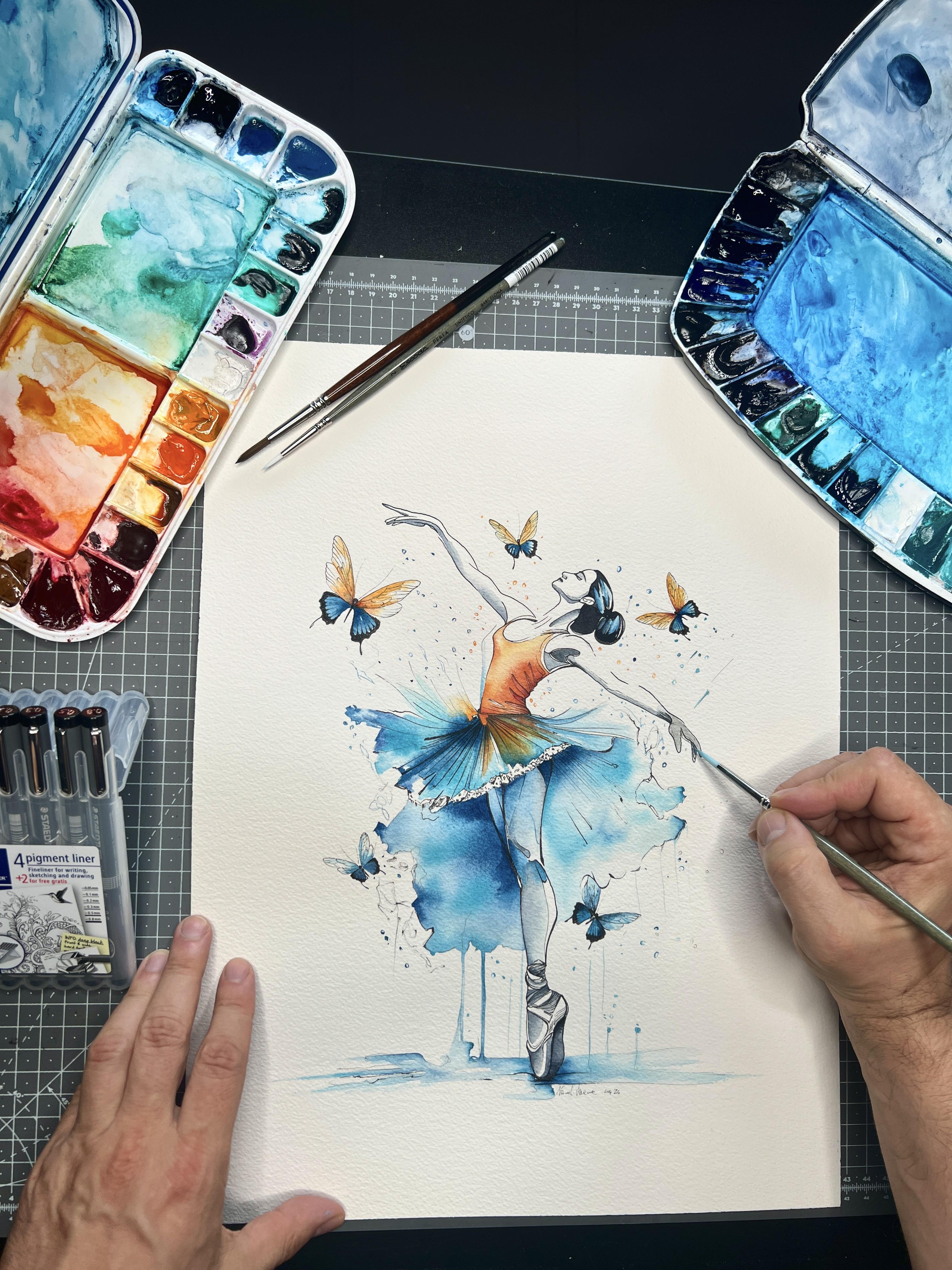
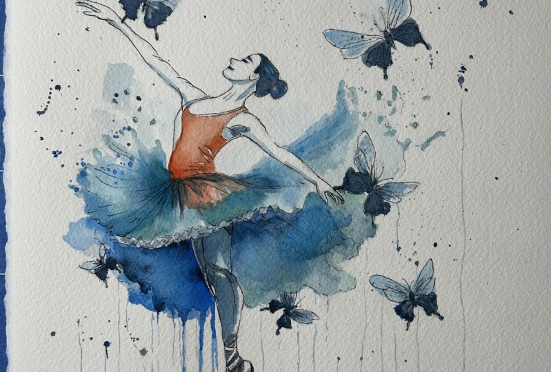
class and to show you how I realize step by step this painting that I have
right here in front of you. I'm going to show you now pretty much everything
about this painting, I'm going to give you the
reference image as well. If you like to do
something different, so find another image
similar to this one. No problem, you can find a
similar image on Google or Pinterest using the keywords
ballerina or classic Dance. I'm going to show you how
I transfer the image from my phone or any other device like an iPad through the paper. I'm going to show you
the material I've used, the brush I've used,
basically everything. Just a quick reminder
and a quick question. I will show you
all the materials, but as you can see, I have tons of different brush. So maybe I've used this one, maybe this one, maybe this
one, it doesn't really matter. The thing it's really matter
is you enjoy the painting. So when I will show you
in the next chapter, the material I've used,
don't get mad like, Oh, I have to get that
kind of paper, that kind of brush, that specific brush, no. It's okay. If you have
already some materials, and if you are, let's say, beginner or
intermediate, it doesn't matter. Enjoy the process of painting because even if I
should be an expert, I still learning day
by day paint by paint, many different new
skills and new things. This is why I like to
share you my experience. I think that's all. Let's see what material I've used and what material I
suggest you to use, and then let's start to paint.
2. Materials: So those are the
material I pretty much use to make all
of the painting. I start to show you the paper. So I usually love to
use the arches paper. This one is torsion. I don't remember if
this was the grain. So this is very I'm
going to show you. Sorry. This is a very texture. Paper, as you can see, could be a little bit tricky if you will use the
ink on the paper, so you can use as well, the normal cold press. I strongly suggest
you cold press and not the hot press because I've used the
hot press many times, and I think to me,
at least to me, I found some difficult to blend and make
the good shading. So I think you can work much
better on the grandson, like very rough paper or
the normal cold paper. The thing I strongly suggest
to you is at least 300 GSM and pure cotton,
100% cotton. This is because the cotton paper can handle much, much better, a good amount or
high amount of water without being torn
or get ruined. Brushes, pretty much
for all the paint, I use the Escoda versatile and a Princeton quill and this new brand is
again from Escoda, it's called Escoda Perla. I tell you why the versatile, it doesn't matter if you have
an escoda versatile again. But the thing I strongly suggest you they
have strong bristle. The versatile is a
synthetic brush, Kolinsky sable imitation
and not squirrel, because when you get wet, this is more pointed and you can be more precise
when you do details. Again, this one is a quill brush or a mop brush and still Kolinsky
sable imitation. You can use as
well, not this one. I think it's something here. Well, the Davinci Casaneo
though that kind of brush, this is going to be the same of the Davinci
casaneo that I use. I recently tried the
tin toreto brush, they're absolutely phenomenal. This is squirrel
limitation, squirrel. So it's a little bit smooth and you can carry on much water, and it's better to make some wash and blending
and something like that. Basically, two rounded, very pointed brush for
details and two mop. The other one is Da Vinci
casino number zero, if I remember well, I
don't know where it is. It's probably dry somewhere. So it's a little bit
smaller than this. This is squirrel imitation, so a little bit strong. The bristle are a
little bit rigid. And this one, again, Casaneo from DaVinci because
it's much popular probably than Tintorreto and still a little bit cheap
compared to Tintato. That one is, again, see here, synthetic ovo cazans a synthetic
imitation of squirrel. Painting in tubes, I love to use gram because they have some
honey into the painting, so they still very creamy and to reactivate them is
absolutely amazing. Oh, here. No, still
another Tintoretto. Anyway. And some Schminke. I know probably people from
America use the Daniel Smith. I tried something, but
because I live in the EU, it's much better to
me to find Sminke. So minke now is going
to be my main brand, even if I love, love, love gram. Because Hem gram
they have honey. I try to put some
honey in the mink. Okay, don't do that. It was
a very, very bad experience. For the ink part, it doesn't
matter technical pen. This is the classical stdler. So I set 005-08 or
the classical micron. Probably these are much
more popular than this one. I love to use as
well, fountain pen. I know this can be
difficult to someone. So go ahead with the
classical technical pen. Actually, the only thing I strongly actually not
strongly, it's very important. You can't miss this is you need to be sure
the pigment into this technical pen are 101% waterproof because if
the ink is not waterproof, when you go over the ink with
your brush and the water, you can make a mess
everywhere and you have just to trash all the
painting you have done. If you like to be sure, this is 100%, um, waterproof, grab a
piece of paper anyway. You put some lines in that, wait a little bit because
should be instantly, but they need time to dry and
then you take some water, you go over if this
still exactly as it is, you can be sure that this is 100% waterproof and you can go ahead and paint your
best artwork ever. Pretty much that's it. Oh, a towel because many times, most of the time,
basically all the time, when you want to make
some smooth shading, you have to clean your brush into the water and then dry it, go back and pick
up the excess of the color or extend the color you already
put on the paper. And this is why I
particularly like to use the cold press
paper because you have some seconds more like maybe a minute to work on
before it gets completely dry. The hot press paper
dry very quickly, and at least to me, I found some difficult and more challenging to be able
to extend the color, make a smooth blend
or a smooth shading. That's it. Now we are
going to stop to paint. I'm going to show you
right now how I transfer the image from the
device to the paper.
3. Transfer and Trace Image: Okay, if you see
some other classes, you probably already
know this process. But anyway, I'm using an
app called Da Vinci I. It's not an app free, so you have to pay for that app. But I think well, when I bought this app, back in time was probably
four euros or could be, I don't know, four to $5. But it's going to save
me a lot of time. And now I'm show you how
to set up everything. Basically, you import image into the app you want
to draw and trace, and then you place your
phone or I don't know, other device like an
iPad on a tripod. That is probably the other
thing you need a tripod or something can hold your
phone in a steel position. So you do not have to
move your phone anyway, but the most important thing, you cannot move the paper anymore as soon as you find
the right composition, the right size, and right
position of the image. So when everything
is locked in place, you can just as you can see, pinch and zoom the image, you can move the
image and everything will be stuck together. I mean, the image and the paper will be stuck
together in the same place. And in transparency,
you're going to see your hand through the ap, the app and the iPhone. This can help you a lot because you are going
to save a lot of time, especially for complex
drawing like this. I mean, with many different
elements, you can, of course, do everything with
other different techniques. But I actually think because the app is
not very expensive. If you trace a lot like me, this is going to save hours. You can do anything freehand. You can use the
square technique. You can use the transfer paper like the carbon papers
or whatever it's called. In the US, or in the rest
of the world in Italian. In Italy, it's
called carbon paper. It's like a graphite
paper you put between the reference
image and the final paper, and you actually go over with something like
a pen or pencil. And when you remove
everything on the paper, you're going to see
the trace done. To be honest with you,
this at the moment, is the best way I found to
transfer the image from my device because most of
the times or many times I use picture made by me
or made in Photoshop, for example, like this one, I actually create
the base image. So the ballerina was created
by me with the Adobe AE, AI. I made three different
solution of ballerina, and then with Photoshop, I put together everything like the body was
from a ballerina, the legs from another one and the background from
another one again. Also, the butterfly, because
I was a tattooit as well, was one of the most butterfly. I tattoo to some of my clients. I got two or three
different position of the butterfly. Shapes. Sorry. The butterflies. So yeah, I put everything together. And now I'm able to see before start to trace and drawing the size and the
position to the paper. So the final composition would
be basically in preview. At the moment, I'm going
to use a graphite, like a technical
pen with a to be graphite very easy
to clean afterwards. And I am going to
trace the main lines. So when I turn off the app
and I remove the phone, I still have basically the
most important lines to follow with the ink because the ink is going
to be the next step. Yeah, I think this is the most easiest way to do
anything because actually, it's not copy because I prepare this image before I
go into the paper. Anyway, sometime I go
free hand as well, but this is going to
save me a lot of time.
4. Inking: We are going to start to the
most probably difficult part of the full entire painting
because this part is crucial. We just finish to trace
all the composition and the basic drawing
with our pencil, and now we're going to make
this permanent with the ink. I'm going to speed up a little bit this
process because this is going to take 30 30 minutes
to 1 hour, at least. Take your time. Don't rush. I want to show you everything, but I don't want
to make this part, this chapter long more
than 30 to 40 minutes because I think it's enough to get the idea of what
I'm doing right now. Quick tip. Keep a
piece of paper. It's better if is a
watercolor paper as I have on my right because that kind
of paper can save your life. I mean, anytime you
are not sure about your ink or if in case you
are using a fontain pen, the pen is going to
write very good, or I don't know,
your technical pen, as I have right now, is not you're not sure how
many ink is left, you can try on the other paper, on the other piece of paper. And also, if you have
another piece of paper, you can leave when you
finish the main design, you can draw some lines, some sketchy lines, as you
can see on the right side. And then before go with the water and the watercolor
on the main painting, you can try on the
other piece of paper, to put some water or
some color just to be sure that your ink
is completely dry. If the ink completely
dry is crucial, is very, very, very
important, right? Because if the ink is not completely dry and you
go over with the water, you're going to make a
very disaster because the black ink is going to spread everywhere on your main design, and there is no
way to come back. So you have just to trash
everything. I did many times. So I'm speaking
by my experience. Another important thing now
because apparently I am just copying the pencil trays
with the ink, yes and no. What do you mean? I'm going
to do something, okay. In Italy, it's
called tonal line. It's a kind of line, thin in some part and
thick in some other parts. Okay, to understand better
this concept is imagine you are drawing something in three dimensional as
we're doing right now. You will have some part
of let's say, a sphere. We have part of the sphere under in light and some part
of the sphere in shadow. How can you explain that
concept just with one line? So you have to make
a very thin line when the part of the sphere
is underneath of the light, and you have to do
a very thick line when the sphere
is on the shadow. This is why I am using
even a fountain pen and some technical pen because
with the fontain pen, I can't be sure my line is
going to be very thick. Because it's a medium
kib at the moment, as you can see here on the on the leg on the need of the body, of course, would be in shadow, and the line would
be very marked. Differently, for example,
you're going to see later on the body on the tattoo. The line would be
definitely different and also on the face
would be very different. There is some this
is sketchy line, construction line, what
I'm doing right now. This is just to
make your painting a little bit interesting,
nothing special. It's very kind of
free to do that. I am tracing very light, so not bold line this little sketchy part
because this can be the shape of
the shadow, okay? On the calf here, I have to be very light and then go bold again when I will trace
close to the ankle. I'm very confident to
use the fontin pen, so this is probably my
favorite tool ever. This is why you see me use
the fontin pen, very often. But if you are not confident
to use a fontin pen, just go back to the technical
pen that absolutely fine. And I use the technical pen
as well many, many times. Um, but probably 25, 28 years ago, I started
to sketch some comics. So to me, it was 907-90-6907. For me, it was quite natural. It is quite natural. Use a nib. So back in time, I dip a
nib into the ink boot. Now I prefer to use I have, as you can see,
on the top right, I have two or three
different fontain pen because the nib is different. One is medium, one is thin, and the other one is super fine. So I can switch between
different fontainePen. The only thing you have to
keep in your mind if you want to use a fontainePen is pay attention because the ink is not suitable for
any fountain pen. You have to use a specific
ink for a fountain pen. In this particular case, I using an ink
called carbon ink, and I am actually very sure
it is totally waterproof. I start to use this ink
a couple of years ago. The only thing when I finish to trace the now the drawing, the basic drawing, I'm not going to put the water straight
away on the design. I leave everything
there for a while, 30 minutes, 1 hour, sometime all the night. It's not gonna take so long, should be instant, but
I got some problem. So now I'm going
to take my time. I'm not going to rush anymore, and this is why I keep the
piece of paper on my right. Because when I finish here to draw this ballerina,
all the butterflies, all the details I need
to go ahead in this way, I will trace some sketchy line on the other piece of paper, the piece of paper,
I will trash. Then before going
my main painting, I will put water in the
other piece of paper. If the ink is going to stay in position and it's not
going to spread everywhere, that means I can start
to wash my painting. What else? You will see some thin line outside of the body and outside of
the tutto of the ballerina. It's totally up to you.
You can just leave the colors in the background
without an outline. In this particular case, I prefer to use an outline. Sometime I leave just with
the pencil because it's going to be a gray outline
and not a bold black outline. But in this case, I just decide to go in that way. It's totally up to you. Be free to create whatever
you like to do. Y.
5. Wash: Time to wash, and the
first thing I'm doing, it's actually very important here is to set up the
color into the palette. It's important because here you can take the right amount of color mixing with the water without charge too much color or I don't know,
have too much water. So in this end, as
I'm doing right now, you can mix two colors to get in advance the final tint you like. And it's important because
you can try as well, kind of, again, in
another piece of paper. If the cloor is
right for you before go straight on the painting. In this particular
case, I mixed before, I think an antraquinon blue and taloblue or ultramarine
blue, I don't know. Was those kind of
range of colors. And in this particular case, even if you see the
color into the palette, very dark, it's going to
be a light turquoise. Now, I uh place I'm placing
the water on the paper. And then I will leave
the color work for me. Should be clean paper. Should be sorry, clean
water. You're right. But in this particular case, I don't mind so much
because it's gonna be blue, and if some part of water
will be light blue, it's okay to me. Even because probably in
this particular area, nothing will be clean water, and I'm not going to save
white part of the paper. So I'm not charging too
much water on the paper, even because if the
paper is too much, I'm not going to
have a good control of the color in the next step. The paper needs to be, let's say, humid,
not completely wet. I don't want 1
millimeter of water on the paper because in a minute, you will see right now, I will pick up the
excess of color. So as you can see here, the color is spreading. If the water is too much
compared to the paper, I don't know if you
already seen that effect, the color would be like stripes. It's not be uniformed, blended into the water into the, with the water would be the water is going
to be too much. So in case you put too
much water on top, you can pick up
something with a tissue or wait until the paper
dry a little bit. But I think you can get
the right amount of color, seeing what I'm doing right now. And this was probably
one of the reason I didn't use a mop
squirrel emit brush because that kind of
brush carry on a on the tank is load too much water. So the squirrel sorry, the Kolinsky sable emit is going to charge is
going to load less water, and this is much
better now to me, especially in this part because this is going to be quite light. I don't want charge
too much color. It's a mixing between the
skirt and the background. So I don't want make
everything a messy. Another important thing is the amount of
color. Not so much. It's better if you go onto the paper twice, three
times, four time. It doesn't really matter,
but don't basically put a bucket of color straight away on the paper
because in this way, the way I'm doing right
now, as you can see, I can still keeping the
control of the color. So now I'm trying to blend
the two different blue, and as you can see, I can still work a
little bit on the paper. This happened because I told you earlier in
the other chapter, I am using a cold press paper
with the hot press paper. At least me, I'm not able to do this particular step that
I'm doing right now, so blending the color
and pick up the aces. In fact, probably you don't see because it's
out of the camera, but I am picking the
color from the paper, and I'm going back
to the towel to dry the brush and then come
back again to pick up other color or have
the bristle quite clean. To blend the two different blues and make this very
smooth transition. Cold brass paper, I like that kind of flavor
because at least to me, or at least the arches paper
I've used, they give me, as you can see here,
quite a decent amount of time to go back and work. Again, to blend
the two colors to pick up the color to
remove some water, to add some color as well, because the paper at the moment, still not wet but humid. So I can again, have as much control as I want
to have the final result. Another thing. Another thing I think is really
important, I'm not brush. As you can see here,
this is time is not speed or
something or slowing. It's just timing one to one. And this is important because, probably if you have not a good amount of patient
as I was when I was young, you want to see everything
straight away in 1 second, and then could be difficult
to recover some mistake. If you work in this way, you will have, I think,
anything under control. And what I'm doing now, now I change the brush
because I'm adding some color using the
point in specific spot. Of this transition. And even if it's a
background, as you can see, I'm using a very I'm
not rushing, okay? I'm I'm taking my time. Um, so I'm working on the
edge of the background, and this is why I left the
black line ink earlier instead of clean or live just with the pencil or
live without the outline. It's just an effect
I quite liked. So it was in my mind
earlier before. In my project, in my
starting project. So this is why I left the kind of outline is
not very bold outline. It's just an outline. So part is going
to be bold and is exactly the part when I'm
gonna load more dark blue. And, again, in some other part, it would be a light blue
with a light outline black. I changed the brush in this particular step in this particular moment
because with this brush, I can carry a very, very small amount of color. And this is important
because I don't want have a full amount of deep blue that I cannot that
I'm not able to work with. Um, Again, this process
can take a while. But if you have patient, I think you can get
a very good result. And you can even in
some step like this, you can have the right way to get what you have in
your mind because actually, that's the only
thing really matter. What you have in your mind
and enjoy the painting. Well, probably in
this particular step can be a little bit bored. But if you want a good result, I think this is something
I learn from art. Be patient and don't rush, because I see the details, even in a background like this, because maybe someone
can keep in mind, oh, it's just a background.
Is not important. That's not true. Background
is part of the image. If I leave the
background in a bad way, I can make the main subject as detail as I want,
maybe perfect. But if the background
is made in a bad way, you can see there is no
attention to the details, even if it's just a background. Background is part of the image. Even, for example, when
you take a picture, I care a lot about
the background, let's say, behind the model. Because if it's not the real, the good location
or I don't know, if it's a rotten place, the picture is going to be is not going to be a good picture, even maybe if a model
is a very good model. So, um, background is important. I am the first one many
times skip this part. This doesn't keep in mind
this u idea and this concept, and anytime I regret
because I said, Oh, I should be more patient. The other side of the leg is exactly the same thing I
made in the left side. And now I'm just using
the same technique. It's called blending
wash techniques, sorry. Underneath the shoes of
the model just to create a little bit of shadow and
three dimensionality again, and the background
will continue, let's say, on the floor. Oh
6. Shoes and Legs: Details on legs and shoes. So again, as you can see, my magical piece of paper, they're gonna save
my life a lot. And this one, I have
tons of these gloves. It's called drawing gloves. I use that to draw on iPad. You can take another piece of
paper underneath your hand. The thing is, keep
in mind your hand because touch and scratch
everything can be dirty. So if you have the border of your hand dirty and you go
on your painting, you're going to make a mistake. In this particular moment, I am using a color quite
new, to be honest. I never used it before, but I love a lot. So minke create this gray
called graphite or graffiti. Basically, is a
gray, very similar. Actually, it is the same
effect of a pencil. I am mixing graphite
with, Pain's gray. Why paints gray? Because
it's a dark gray, but it is a kind
of I like to call him photographic gray because
he is a little bit bluish. So I don't know if you
already use Pains gray. It's probably one of the
main color I use in general, even to mix black because
I don't use black. I do not have black
in my palette. So I use pain gray and sepia
mostly to and now graphite to I mix those three different
colors to make some black. A here I switch to
the detailed brush, very pointed, and
the amount of color I put on the shoes
is very, very low. This is not a wash technique. Instead, we can call
this glazing technique, which means it's
very light layer on layer on layer on layer
on layer until you get the right amount of color to
create the shades and the T D. And you can pick up
some color as well, but in this particular moment, I'm not picking up the color. I'm just cleaning the bristle to make the transition between dark and light
smooth and also to blend light and shadow
in a better way, very, very soft transition. You have just to be
patient here and do basically any straps
or bends or lace and make some three
dimensionality in this particular point of the painting because some
part would be totally white, and some part is going to be
not black but quite dark. Again, I don't like to use black because I think it's going to ruin some other tints
and some other colors. So I prefer they on,
let's call black. But as I told you
before, I basically use, sepia and Pains gray even
because if I need a warm black, I can use much more sepia than Pains gray or the opposite. Anyway, um, make some
three dimensionality here, go over and over
until you can get the right amount of the
darker shadow you have in your mind until you can see the three dimensionality cames out and the
different values. So the shoes on the background is going
to be a little bit. Actually, we can
see just the soul. But basically, it's
going to be much darker than one in front of you. And again, some
part like the hell. I don't know if it's the right because
there is no hel here. But anyway, the back of
the end of the ankle, basically light because assuming the light is coming from
the top of the painting. I never mentioned
before. I think this is time to mention the light. And now on the legs, I switch to this other
brush because I need to get a little more a big area compared to
between the lay of the shoes. I'm going to make
this transition. So the legs would be pretty much blue
like the background, but will make a transition
between blue and gray. And I think this is going to be a good final result if we imagine the
end of the painting. Now it is just clean water, and this is very
actually clean water, not like bluish,
like I did before, and as you can see, is not. I didn't load too much
water on the paper. Why? Again, to have as much control as I can
to work with the painting. If especially here, and
this is a good example example better than we
did on the background. If in this particular
moment and step, I put on the leg too much water, there is no way I can control the blue as
I'm doing right now. And probably there is
no way that I can make a transition between
blue and gray because I don't remember
if I go to do that, or is going to be the same of the background.
Actually, I don't remember. We'll see in a minute
what happened. Anyway, if the
weather was too much, the color was just
run with no control. So I have to go back, pick up the color and try to
get the smoother transition, but there is no way because now, as you can see, the water
still a little bit clean. And this is how I
can make right now, a good transition
between gray and blue to get the full
basically the amount, even because the calf
should be in light. So I'm not gonna have I don't need a calf too much dark,
especially right now. The blending here is going to be very smooth
because the amount of water is just humid
and not wet or soky.
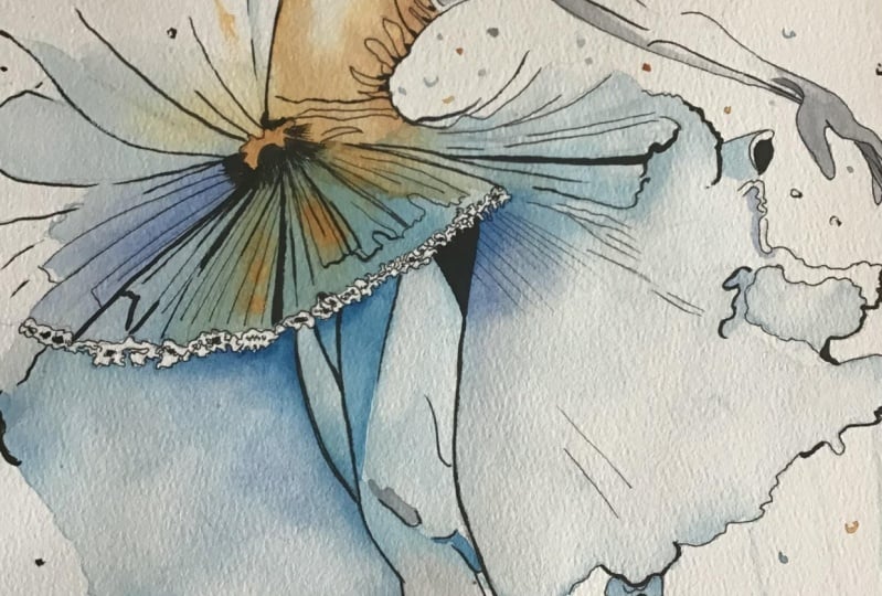
7. Skirt and Body: Still going on in the
same way with the skirt, will be slightly
different on the body, but you are gonna see in
a minute what I'm doing. So again, put some
water on the skirt. Again, don't load so much water
because you still want to get control of
over the painting. In fact, here, I'm using a very detailed and
small painting. This brush, sorry. This is a new brush
I never used before, and as you can see,
the bristle are white. So which means they
are synthetic. I'm not sure what material it is because they said
it is not nylon, which I thought was is apparently
new kind of technology. So apparently, you can make a category
about this painting. The only thing I can tell
you, I really like it. So this was the first time
I've used this brush, sorry. And I actually enjoy
a lot to use it. As you can see, the
control is very precise, and the bristle doesn't release
the paint straight away. They release the paint the flow, the workflow of the painting and the color into the water, it's very, very clean. It's very the control I
have still very high. So I can pretty much do
anything I like to do. Here, I'm using a slightly
slightly vibrant color, especially for the turquoise, because this is going to
be the top of the skirt. So assuming the
light is coming from the top of the composition, in this particular way, I can still using the blue, so I can stay on the blue
part of the color wheel. But I can be I can realize a much more clear
difference between the background blue and
this part of the painting. So I can stay separate between background and the main subject, even still using blues. In this particular case, I'm using a tale of
blue or traquinon blue, but assuming it's Taleo blue, so to me, it's a little
bit harder to say PHD ALO, blue, and a very
vibrant turquoise. I think Teo blue is from Agram and the other
one is from Sminke because I never found a
vibrant light turkey. Color like mink dash. Here, I'm not going
as you can see, I'm not going to push
the color everywhere. I want to leave the border of the skirt light so I can still watch and see the three
dimensionality and the light coming through
the main subject. Just go ahead with everything. I will jump to the
body in a bit. And you are going to see one of another crucial part of
the painting in 1 minute. As you can see, even
with this brush, I can pick up the
excess of the color, so I can make a very, very light and blend
and smooth transition. But what I'm actually
going to do in a minute is to jump to the
top of the body. Which means I'm gonna mix
some orange with the blue. Why I think this is a crucial
part of the painting. You will see in
just a few seconds. But keep in mind, when you watch like
a movie or TV show, most of the time, the color is the coloring of the
film and of the movie, it's called in cinematic
way Orange Deal. Because our orange and
teal are two colors. They really work
very well together. They are complimentary color, which means they are on the opposite part of the
color wheel if you are keep in your mind the
classical color theory, which means they work very good together because they're
complimentary like another complimentary
color or range, you can see, could be
like purple and yellow, for example, or green and red. I don't particularly
like this last one, but still complimentary color. And so they actually
work very good together. You can play with the complimentary color
and some neutral tint, like the gray I've used
basically anytime you want. On the body, again,
same technique. I'm going to push very
small amount of water, and I'm going to show you why in literally few seconds because now I'm going
to apply the orange. What happened here?
Orange and blue. Again, they are
complimentary color. They work really good together, but if you mix both of them, you're going to get muddy color. So the risk is to get
brown basically everywhere or something like green if
the orange or the blue. Are really close to
yellow or green, and I think you can clearly see he's not pure orange
over the pure blue. They're going to mix
because watercolor means transparent color. So this is why I
told you earlier, this is a very crucial moment. If you make some mistake
here and you're going to get brown or I don't know,
green, for example, is going to be probably not saying you're going
to ruin your painting, but the transition
is not going to be good as it should be. I still working always
in the same way. So it's a very light
wash technique. Small amount of color,
maximum control of the colors I can get. And this can allow me to avoid a big mistake
to have muddy color. I think, and you
can clearly think. I assuming you are according
with me when I say, can you imagine the transition between the skirt and the body if would be basically
brown like Notela? I think it doesn't look really
good or even some green. I don't think it's a good idea. Or a good final result. Another thing you are going
to see you can see right now, I'm not going to
make flat orange everywhere because the
skirt have some, let's say, wrinkles, and those parts
would be in shadow because, again, assuming the light
is coming from top, so that part would be in shadow. And so I will apply a dark
orange probably mixing with some CEPIA color to get some three dimensionality
in the body as well. I will finish, but this
will be the next step. Again, like I did on the
legs with neutral tint. But at the moment, I am focusing to the transition
between blue and orange. At the end of the painting, I think, well, I already know because I
already finished the paint. At the end of the painting, I personally think they
look very good together. Um, I don't know if you like
this mixing of the colour. You can choose different
color as well if you like. Again, for example, you
can do the bottom of the painting using purple and
the top, using some yellow. Um of course, sorry. This is not just orange. As I did for the blue, I'm going to use a different
range of orange so I'm going to use the Azo
orange or cadmium orange. And the yellow is gonna
be the gold yellow. So it's not a bright
classical lemon yellow because I
need to stay close to the orange and not go too
bright or too shiny, okay? So I don't want the body Pop up too much compared to
the rest of the painting. It needs to be kind
of focused because, of course, the focus of this painting is going
to be the ballerina. And again, usually,
when you watch a body, your focus goes straight
away on the face. And this is the face would
be the last step, of course. Another thing is going to be the last step because
if you see what I did, I trace with a pencil
from top to the bottom, but I start to paint
from bottom to the top. Why I did this.
Okay, there is not a very clear answer
about this question. I tattoo. I was a tattooist for, let's say, 12 years. For me, it was quite normal to start from the bottom and go to the top because I
didn't want to touch. Or delete or ruin the stencil with the main line I have to follow to
finish the tattoo. I think this is a kind of
mechanical way to paint. A mechanical workflow,
it's conscious to me. As you can see, I'm not
gonna touch anymore. Legs, background, the
bottom butterflies. By the way, I will show you
how I made the butterfly on top later because I'm
going to use, again, the same gaming of color between orange and blue and
tell even on the butterflies. But anyway, to me, it's natural because I
did this for 12 years. So start from the bottom
means I don't have to touch anymore the
bottom of the painting. And about the transition
between orange and blue, I, of course, wait the
right amount of time before I apply the
orange over the blue. I didn't wait until the blue was completely dry because I
need a little bit of mixing. But almost the blue was almost dry before
I apply the orange. We are working and
painting with watercolor. So which means they
are transparent. There is no way to get
some opaque color. So you cannot cover
the color underneath. You can, if you use light blue, and you go over
with a dark blue, for example, or in this case, the first layer
was light orange, and you go over with a dark
orange or even some dark red. But cover a blue with an
orange is quite impossible. You can use guache,
but the vibrance of the guache is not in my
I don't like so much. I prefer still using watercolor. Instead of gouache. Guas basically a watercolor
with some white. It's not the right
way to say that, but to explain why they
cover the color underneath, it's between acrylic watercolor. So this is pretty much
everything for this step. We're going to jump in the
next step on the real skin, neutral tint again, just
to match the rest of the color range
of this painting.
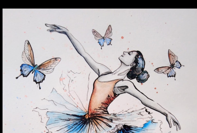
8. Ballerina Body: Nothing change about
the technique. Clean water, in this
particular case, just underneath of the
body because, again, assuming the late
is coming from top, so top of the body, top of the ballerina
will be light. Basically, I will leave this particular case,
the white of the paper, and I'm going to use the same gray I've
used on the shoes. So graphite and paints
gray, very light, very, very light because now I don't need
to be very dark. The black line helps me to
make the drawing readable. So I don't need to get very
dark, especially in this arm. On the other one,
maybe in the armpit, I will place I will apply some
dark color, but not here. So here, I'm going to be
very light, very clean. Um, I'm using, in fact, a very precise and small brush.
This is the number four. And this brush I like
a lot because I can, as you can see, be very precise and I can blend even
a little bit gray. So the blending between light and dark is going to be the transition is going
to be very smooth. And this helped me to give the three
dimensionality of the arm. Um, couple of few very light
layer just on the armpit. And then I can go ahead to make the same technique near to the face on the
hair, on the other arm. And basically, this is the main workflow
and the main way to paint all over the draw and the main subject we
are making right now. Mm. Here, I didn't apply the water before because this is just
a straight normal line. Nothing special needs to be the separation between the face, the neck and the
rest of the body. Because the light
is coming from top, this is actually going to be
very should be very dark. I'm not going to do anything. Kind of black. Let's say black or
dark gray because I like to stay delicate basically
all around the subject. The only part maybe is
gonna be a little bit darker afterwards would be
underneath the arm, probably. Not sure. In the armpit, the
arm the right armpit. So yeah, as you can see, I think neutral tint
can work very good. With the orange and the blue, I'm going to apply a little
bit of blue in the hair. The original image
reference image, she got the black hair, but I don't think
it was a good idea. Put a very black mold in
the center of the painting. I think was too strong. Even make with ink, black or my black, the watercolor black, the
fake black, actually. So, yeah, I think this is
the gray I'm applying now. This would be the darkest, let's say, shadow, I am going to apply all over the
rest of the image. Um, here, I'm forced to do that just to increase the three dimensionality
of the body. If I don't do that, it's
going to be too flat. But please don't exaggerate and be ready in case to pick up the excess of the color
with a clean brush and slightly amount of water. The last thing, probably
you saw what I did, I make I pick up the gray and I jump on the
black, sorry, on the yellow. Not because I'm crazy, not because I'm doing something special
with the yellow just to make the gray slightly warm. And this is to get to
do something again. The paints gray. So the gray, the
photographic gray I usually used underneath of
the painting. So bluish.
9. Butterfly and Details: The paint is nearly done. I'm going to show you how
I made the butterfly. As you can see on the left, I make the bottom of
the butterfly blue, and now I'm doing the top of this one in yellow,
orange, yellow. Why am doing that
Because this time, I don't need orange and blue blended together
as we did on the skirt. So this is just to
save some time. Bottom of the last one off
the left one, sorry, blue, orange of the middle one, and then the bottom of
the other one blue. I just waiting. Everything is gonna get dry. And this is actually a good
time to make some splashy. Usually, I can spread
the splash with a stick and with a
brush, more natural, of course, but I don't want make everything get dirty or splashy or muddy or messy
because of the splash. At the end of the
day, I decide to add some black on the hair. This is not a pure black
straight from the tube. This is my black, as you can see on top
is very browny black, which means I use, let's say, 70% of sepia and I make it
dark with the paints gray. They together create
very soft black. They can give you
the idea of black. Because in this case,
if I want to use black, I just go straight
away with the ink, even on the hair, as I'm doing right now. But, for my honest
opinion, it was too much. So in this way, I can get more control. I can blend some black if
I need it with the hair, using, I don't know,
let's say, a dark blue. But I think this is the best
way to get the hair done, give you some idea of deep
three dimensionality. Again, the thing basically
are always the same. I hope you can get from
this painting the idea. Do not rush. Even now, this is a little
bit speed painting, but I actually didn't
change basically anything about the technique from the beginning to the end. If you go with calm and
you take your time, I think you would be
absolutely fine to avoid mistakes messy and with
the control of the color, you can go darker
if you need to go darker or you can stay light
if you need to stay light. And at the end of this hair, if you want blend
a little bit of black with at the moment, light blue, you can just take some dark blue and
go over the black. Let it dry. Because the black, even if he's handmade,
could be dangerous.
10. Greetings: So I actually wish you enjoy this painting and to
follow the process with me. I would be really happy if you try to make a painting
similar to this one. I'm going to show you,
but you already seen everything from all the different chapter
and step by step. Feel free to contact me
if you have any question, any if you want further idles, I'm really open to be here for you if you have something,
anything, anything, okay? Don't think, Oh,
I'm not going to ask him because it's
a stupid question. No questions are stupid
when help you to improve yourself and make
you more confident to enjoy the painting
and the art process. Again, thank you to support me. Sorry for my broken English. I know sometimes
it's not the best, but I think I give you the right way and
the feeling I have. When I painting
something like this, I really enjoy watercolor. I will probably show you
something much more expert and difficult in the future because I've used the airbrush
for a very long time. But I know that could
be very scary or very difficult to someone
because the airbrush is not a very easy way to
paint, but I like it. So sometimes I mix
the two techniques. So again, see you next time. Never stop practice
and painting Chow.
 Umberto Zanoni, Nero di Venere Fine Artist