Transcripts
1. Watercolor Painting Basics: Color Made Simple: Hi. I'm Chris, a watercolor and creative skills teacher and
coach living in the desert. I have over 25 classes here on Skillshare in a variety
of creative topics. And I also have a
YouTube channel plus more in depth courses
available on the website. And in my free watercolor group. I've produced
creative lessons for Bonnie Christine's
flourish membership, Emily Jeffords
collective membership, Peggy Dean's art blog, been a guest on
several podcasts, and I've created
video tutorials for sustainable paint
brand Viviva colors. I'm back on Skillshare with a series of shorter classes that will cover many of the watercolor basics
like color theory, color mixing, inspiration,
sketching versus drawing, watercolor hand lettering, how to break Creative
block and Me. Even if you've been
painting for a while, it's a great idea to go back to some basic
every so often. In case you'd like to
refine your process, try some new ideas or up your painting game
by going deeper. In this class, we're
going to go over just about every artist's
favorite subject. Color. I'll talk to you
about color palettes, some color psychology
because each color has a different meaning and invokes different kinds of feelings. Pantone.com, the world's
leading color authority. Let me share what I call the no fail color
palette formula. While you're learning,
this will help you keep your color
palette balanced. And we'll actually mix
some color together. They also have a PDF dide
so you'll have resources to refer back to as you gather your tools and
choose your colors. This class will be perfect for beginner to intermediate
watercolor student. I'll be sharing
examples with you along the way so you can stay on
track with your processes. You can see that color
is a vast topic. If you don't understand
how any of this works, yeah, stick with me, and
I'll take you step by step. In the meantime, I'll see you in the next lesson to get started.
2. Your Project: Project in this class will be
to follow along with me in the class videos and choose your color palette based on
the lessons I've shared. Or follow along with me
on my color palette. Paint it on small squares of watercolor paper as I'll show you in the
following videos. I've created a workbook for you as your companion to
the class lessons. Be sure you download it in the Projects and Resources
tab under the class videos. I really hope you plan
to share your project. I grew exponentially when I first started showing my work. It was magical to have
feedback and comments, and it helped me grow so
much faster than I imagined. If you've never done it before, here's how to upload your
project on Skillshare. First, you'll go to the
Projects and Resources tab under the class videos. Then click the Green
Create Project button. From there, you'll want to
upload your cover image for your project. Choose a file. Then click Submit. From here, if you want to
replace your image, just click the button below, find an image, and below, you can make it larger or
smaller with a slider, or you can drag it side
to side to position it. When you're happy,
just click Submit. Now your project needs a title. It can be funny, descriptive,
or whatever you like. Below is your personal
project field. Click Image to Add Image files. Then position your
cursor underneath the image to add descriptions. I'm adding a series of images to show my entire
process for this project. You can do it anyway you like. Below, you can also
add a video or links. When you're done, just click
the Green Publish button. Once it's published,
you can go below the videos and see your project
on the right hand side. When you click on it, you can see that all your
images have uploaded. On the right is where people can comment and
like your project. I comment on every project, so I can't wait to see
you in this space. You can also find
upload instructions on the Projects and Resources
page under the class videos. When you upload your project, you can win a Skillshare
badge, which is kind of fun.
3. Tools & Materials: As always, I'll be keeping my
tools and materials simple. I'll be using my
favorite Viva colors, watercolors because not only are these colors super
concentrated for vivid color, but they're made with natural non toxic dyes from the Earth, and all their sets
are made with vegan and 100% biodegradable
materials. If you'd like to learn more about Viviva colors,
watercolors, I have a link in
the projects and resources tab and in the workbook where you
can get more info. The medium round brush is
the most versatile overall. Even I get that feeling
that I'm going to mess up or it's just going to
not be what I expected. So I have this
little sketch pad. It's 3.5 " by 5 ". It's regular sketch paper, so not fit for
watercolor at all. And I purposefully got
a sketchpad instead of a watercolor sketch
pad this size because I wanted to feel like I could just mess it up
and it wouldn't matter. I have done so much
strategizing on colors and paint strokes, and I strategized an entire collection
on this spread here. It was so much fun,
and I could just make little notes and just
cross things off and I wouldn't feel about intimidation that I'm going to mess
anything up at all. So I keep this right on
the side so that I can grab it anytime I feel a little unclear or unsure about
what I'm going to be doing. And so today since I'm just
kind of discovering colors, I'm keeping it over here
just handy in case I need to just drop
some paint on it before hitting my actual paper. Now, this is a Strathmore, 5.5 by 8.5 inch
little pad of paper. And I call these my
practice papers. And it's 140 pound
watercolor paper. You can see it's nice and thick. It's got the nice cold press
texture on it, which I love. And I can do all kinds of really fun things with
this. I can cut it up. I can put it, you know, sideways or do a more
deeper practice version then on here because this is actual watercolor paper before
hitting cans and paper or my arches paper
or whatever paper I'm using for my final projects. Because I'm trying
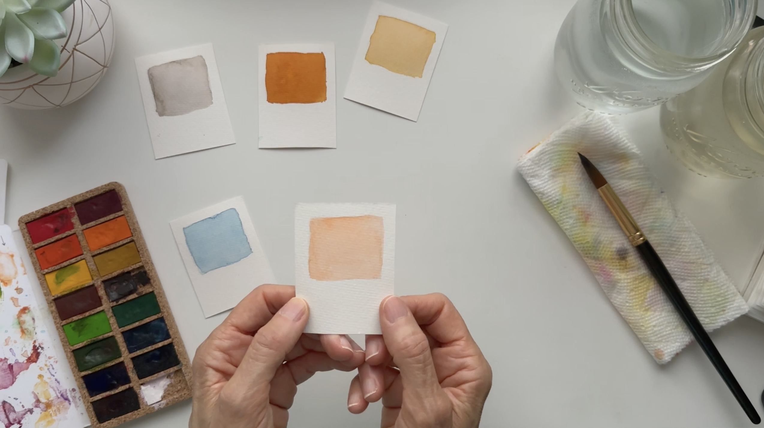
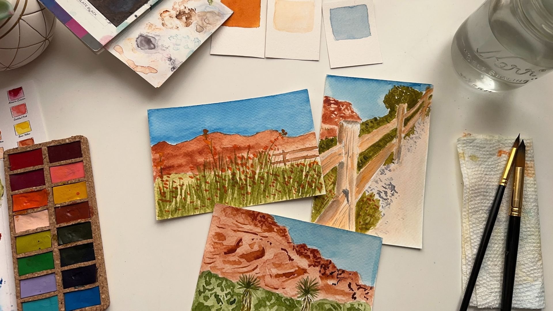
to strategize color, I cut one of these
sheaths up into some little
rectangles like this. I drew squares in them.
So you can see it. I have five little sheaths
with rectangles in them. I can paint my colors inside these and turn
them into color swatches. I can have my colors
handy when I need them and just maybe have
them out at a glance. But you can also use
mixed media paper, which is also heavy enough
to absorb some water. I have a couple of jars of
water to rinse my brushes and some paper towels
to clean my brushes with in any messes I
might make along the way. I'll also be using
a tube pencil and a polymer eraser that doesn't leave black
marks on my paper, but you can even
use a mechanical pestle and a gum eraser, which is also safe to
use on your good papers. And I also have this small
house painting brush I grabbed from my garage just to brush off any eraser or dust so I don't use my hands and get my oils on
my project paper. You'll find a full list of
the tools and materials I'm used in the workbook tools
and materials section. Now it's time to work on colors.
4. No Fail Color Palette Formula: Share what I call the no
fail color palette formula. It's a combination
of two cool colors, a neutral, and two warm colors. If you don't know what that
means, let's break it down. Cool colors are blues,
greens, and violets, and warm colors are reds,
oranges and yellows. These are the colors that make
up this basic color wheel. Neutrals are non color
colors like brown and gray. They help ground
any color palette, give the eye a place to rest, so the colors don't
get too busy, but that doesn't mean
you have to use a neutral in every
single color palette. However, while you're learning, this will help you keep your
color palette balanced. So blue will be my cool color. My warm colors are going to be this terracotta,
which is brown, mixed with a bit of
orange, light peach, which is a water down
orange and yellow ochre, which is yellow
mixed with brown. My neutral will be
this medium gray, which will act as a balance
to the blue gray I'm using. You may have noticed I've
already broken the rules of this formula by only using one cool color and
three warm colors, but it's still balanced, and this is a color
palette that I love. It works well, and as an artist, you can break rules. Once you understand
them a bit better, you'll start to see how to use your artistic license to come up with your own beautiful
color palette.
5. Pantone Colors: Not familiar with Pantone. They are an international
color institute that informs industries
like fashion, home decor, wedding, auto
design, and so much more. On what colors are relevant
to use for their products? The color text work really hard to define
what times we live in and match colors that
define or complement that era. For example, during 2020, the color of the year
was classic blue, which was a soothing
and comforting color at a time of international
chaos and confusion. Every color they select for each year tells the story of what's going on at that time. It's a pretty
interesting resource and a very fascinating
science to learn about. You can learn more about
them at pantone.com and see what kind of color
tools they offer to help designers and
artists all over the world. They have been a
trusted resource for color palettes and single
colors alike since the 1960s. As a surface designer, I can use Pantone
to match my colors. So any companies I happen
to be working with, I will be guessing
what colors I'm using. Pantone acts as an international color language
translator in a way, taking the confusion
and guesswork out of big projects where
color is so important. They also have a really fun
Instagram account where they match colors with objects that creates
so much inspiration. And that leads me to
color psychology.
6. Color Psychology: Color has a different
meaning and evokes different
kinds of feelings. In general, here are some basic colors and their meanings. Red symbolizes passion. Orange symbolizes
positivity and energy, and yellow symbolizes warmth. Green is a symbol of nature, and blue is very calming. Those meanings differ depending on what culture you're in. For example, the
Western world white symbolizes purity and
hope and cleanliness. And in the Eastern world,
it symbolizes death. So as you use color, you might want to pay
attention and do a bit of research to see how your colors
will be affecting others, depending on the scope and
purpose of your project.
7. Using Color Palettes In Your Work: Earned that over the years, when I make multiple pieces of art in the same color palette, I can create collections that I can use for all kinds of
things like my website, my POD shop, my
courses, and lots more. I teach this concept in
my Skillshare class, watercolor collections, scroll stopping
color thieved art, which is a snippet of
this entire concept. But I also have a bigger course, which teaches my
nine part process called the art style
clarity formula. I go deep on this topic. The reason is that it has gotten me two brand
deals already, and it's leading to more
things as we speak. So I am so excited to
give you snippets of this process so you can learn it and use it in your
own art practice. I'm an artist and a teacher, but I'm also a surface
pattern designer, and I plan to use some of my art to inspire
future designs. From the art you're creating, you can make screening cards, open a POD shop with
your art and products. Or you could just
find your sketchbook. If you have a purpose for the art you're
going to be creating, I would love to hear about it in the comments so I
can cheer you on. Other artists often approach things differently
than I would have thought to and it's wonderful to get a new perspective
and learn from you. Once you've learned
all the basics, then you can feel free
to explore and still know you're going to come up
with a great set of colors. But there's a lot more
colors out there in the world than what you
see on the color wheel. That's because we can create versions of these colors
with color mixing, and that's where it
gets really fun.
8. Painting Swatches: This was the first set
I ever got from Viva, and it's kind of
like an old friend, and I just love it so much. So I'm going to
start with this set right now. Let's see here. I am going to start
with a peach color. I have a brand color palette that I'm going to
be painting out on these cards that I'm going to be using for my projects
during this challenge. So I'm going to start
with some burnt sienna. Now this is really almost gone. This is my go to color.
I love it so much. I love the color of terra cotta, and that's what
this reminds me of. I just I don't know what it is. I don't know if you have a color that just makes you
feel like it's home. It's almost always
incorporated in my projects. Like I said, it's my
main color for my brand, for my website, for my
marketing, for my logo. And I've used it to death, so it's just about gone. But I have just enough to
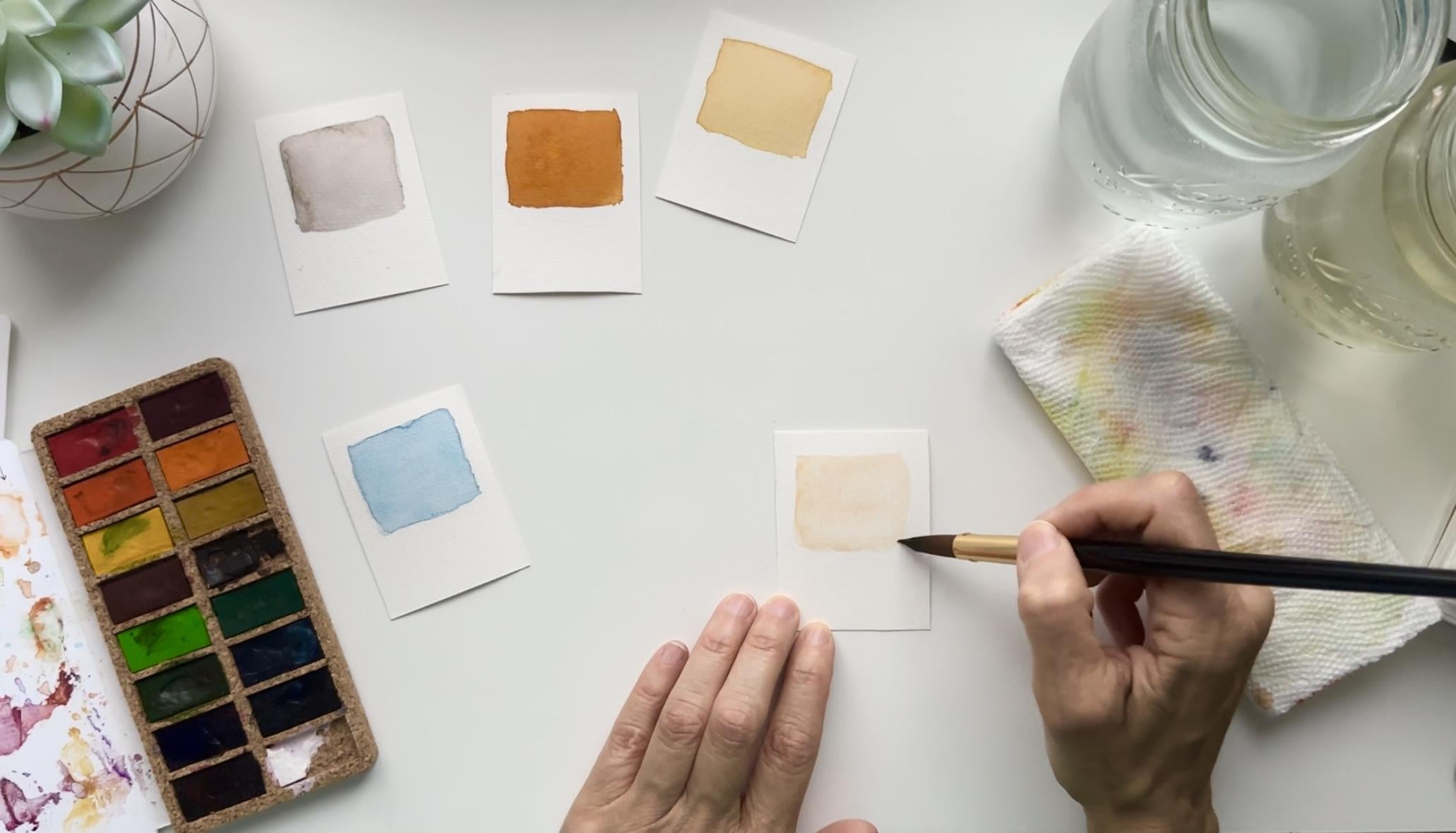
paint some light peach, and I'm going to let that dry. And yeah, let's go on
to the next color, which is going to
be yellow ochre. So there's actually
a yellow ochre here. But it's a bit light for me. For what I want, yellow ochre is essentially yellow
mixed with brown. And depending on
how deep and dark and rich you want it is how
much brown you add to it. So you kind of want
to play experiment. This is definitely a
lovely lovely yellow ochre it's not pure yellow. You can see it's
not super bright. It's just got that nicely
muted feature to it. However, I do like a
little bit more brown, and I have some on
my palette here. And this burnt umber, which is a much darker brown, has a lot of red in it. And it's a little
more red than I want, but I think it's going to be
enough to do the job here. I'm going to add a little
bit more yellow ochre, just to yellow it up more. And I think that might
just do the trick. You can see me mixing my colors right on the paper.
I do this a lot. I think that I just like the space of all this white
to be mixing my colors on. Now, obviously, my
palette is just covered in colors
that I keep reusing. So if I had it available here, I think I would
still use my paper. I've just gotten in the habit
of that, and that's okay. You can even use, like, a
practice piece of paper to do some mixing on to
see what your colors are going to look like
on the actual paper. So next is my rusty terra
cotta. I'm going to have to. Really get this dark. So I either have to put
my new color sheet on or I have to start mixing with some other colors
to get it there. We'll see how much color
I can get off of here. It might may or may not
be enough. We'll see. And it's kind of breaking down, so I may have to do something
a little different. I'm gonna add a
little more water. I'm going to add some
burnt umber to this. There we go. Now we've got a little more color.
Actually a lot better. And I'm probably going to add some orange to this
because I want just a little more terra cotta
looking a little bit more. So for me, color mixing
is not an exact science. I know that many, many
teachers will show you the exact colors to use to
get this exact mix of colors. However, I really love
to ad lib these colors. To me, this is the most
beautiful chemistry project. And by the way, I was
terrible at chemistry. So this is the chemistry that I love, the
visual chemistry. And I think that you can do just as well with
this as anyone when you just start playing
and experimenting and understanding how these colors interact with each other,
that's really all it is. As you practice, you
just learn more and more about it, like anything else. Now, that's nicely
kind of red and rich. I like that a lot. So this color is
essentially red and brown, but this brown wasn't a true
brown, so orange brown. I added a mix of yellow ochre, brown, orange, and
my burnt sienna. Again, you'll have to play
around and experiment. You'll have colors that might be completely different
than what I have. And so you can just
play with the colors you have and see how close you can get to the
colors you want to do. Now, one of my colors in my palette is a gray,
like a medium gray. So I'm going to take a little
bit of my slate black, which I have on my palette already and move it
on my square here. And you can see
I'm not being too precious or perfect with this. This is just a swatch card, and it doesn't have
to be a masterpiece. I'll make it as neat as I can. So please don't
put yourself under pressure for these
kinds of things. Just enjoy yourself,
have fun, relax. And it doesn't matter if you
make squares or circles. Sometimes I do circles,
sometimes I do squares. Sometimes I do blobs. It just depends. Just add a little bit more gray. Now, the more water you
add to your mixture, the lighter it's going to dry. So I have to really watch
my mix of water and paint. I can't say pigment because
this is actually dye. Vi viva used as natural dyes from the Earth for
all of these colors, and traditional watercolors
are made with pigments. So this is technically an ink, but they call them watercolors because you put water on them and you can
paint with them. And my last one is my blue. So this is my second
favorite color because it's just gorgeous. And it's a color I love
to mix every single time. It's just my favorite
thing to mix. And I'm going to have to use this palette because
it has white, and I need a little
bit of white for this. So let's do it. Now I need my color card. I'm going to use some
of this deep blue. I start with the darkest blue. Now, shadow blue is
probably the truest blue, according to the color wheel. But I'm going to be making
this sort of a gray blue, and I want to start with a
little bit darker color. So I'm going to go ahead and I'm actually going to use my
palette for this because I don't already have it anywhere
where I can just grab it. This paint goes a
long, long way. These colors are
so concentrated. That's why they last so long. A color sheet set can last
me, 2.5, three years. One of these can last me longer, so, yeah, it's pretty cool. I'm just going to add
a little bit of white. Now, white is not traditionally used in watercolors, right? If you've been painting
with watercolors for you don't see watercolor
teachers really using white. But I love white, and
I'll tell you why. It gives me a uniqueness that you might not see anywhere else, and
that's the whole point. White makes your colors creamy. If you want to make a pastel,
that's how you make it. Now, you might argue that
it won't be watercolors. It's more gouache looking, and that might be true, but they're still gonna
be translucent. And it gives you such
a beautiful look. I just think it's fun. And like I said,
I'm not technically correct on some of
these. I just playing. And that's why anyone
can really pick this up. You should give yourself
permission to do that. If you're not doing that,
you're kind of missing out. Hats. You don't have to
show anybody anything. You don't have to tell
them you're doing it. Just enjoy yourself and
see what comes out of it. I mean, there's nothing
wrong with that. I'm just laying down this color. So now you can see
it's not a true blue. I can kind of see the
white a little bit. I made it a little
pastel looking. Uh oh. Got a little bit of
green or yellow on here. So I'm just gonna
lift that spot. C, there's a spot right there. That got on my brush. I'll mix more if I have to.
But that's a good start. I do want this blue light, but I think it's
almost too light, so I'm going to mix
just a little bit more. Like I said, I'm going easy with this because it's concentrated. And I might just even
just put this blue on top just to give it a
little bit more color. It's not exact,
but it's so close. And again, I think striving for that perfection for me really holds me back
on a lot of my projects, and letting myself go and give myself permission to not
have the perfect color, but very close or not have the perfect shape
but very close I think has really opened
things up for me, and I hope that you'll consider that in your
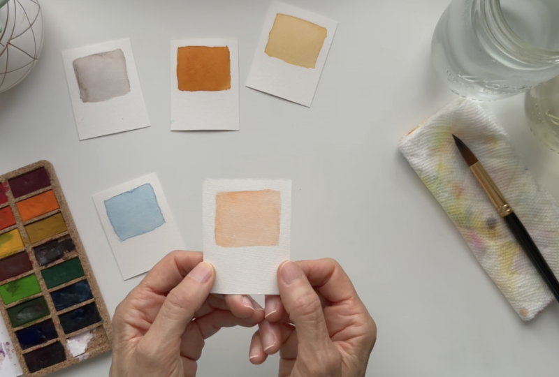
own art practice. Okay, so there we have it. These are my five colors
that I'll be using. This color here is a
little darker than normal, but it's a little closer
to the new Pantone color, which is peach fuzz. Another way to get to this
color, I think this is dry. I can do something
on the back with you here really quick, just to take you
through this exercise. I normally get light peach by just taking a little orange, and I'm just going to
pretend I have a square already and just not
getting it too dark, make sure that I have plenty of water and
not a whole lot of paint. So orange becomes peach just by regulating how much pigment
and water I'm using. That's a little too light, but I can get it a little darker. See that? It's quite nice. So you can create
different colors with your watercolor paints
just by, again, the chemistry between the water and how much paint you have, and you can experiment with this and just see what kind of
colors you can come up with. Now, if you look at this
color and this color, this one's quite a bit more
concentrated than this color. This is truer to what
I use on my website. But if you look at
the Pantone website, this is a little truer
to the new color of the called peach fuzz. I encourage you to go on the Pantone website
and check it out and learn more about how
they picked this color for the year and the other
colors of the year as well. There's all the colors. I'll be kind of coming in and
out with some other ones, which is why I cut
some extra squares to see if I want to incorporate an extra
color here or there, but these are going to
me my go to colors. I cannot wait to
see what you have chosen for your go to colors. And I hope you've had fun with.
9. Thanks for watching!: This class, we discussed the no fill color
palette formula, color psychology, pantone.com, and you can see that
color is a vast topic, and it deserves way more time
that at least this gives you a sample and hopefully ignites you to discover it more. Don't forget to download
the class workbook, so you can stay on track
as you watch the lessons, and I can't wait to see your project in the
project gallery. I never grew so much as when
I started sharing my work, so I can't wait for
you to do the same. If you'd like to stay in touch, I would love for you to join
my free watercolor group. We do challenges,
I share tutorials, and I do regular live
painting sessions. In the community, you can
share your work, get feedback, guidance, and meet other beautiful
creatives just like you. Can't wait to see what colors you choose for your projects. Will you be using
multiple color palettes throughout the year or sticking to a single set of colors? I'd love to hear about it in the discussions
tab where you can ask your questions and we can
have ongoing conversations. Thanks again for being here, and I'll see you
in the next class. Bye for now.
 Chris V, Artist, Designer, Maker