Transcripts
1. About the Class: [MUSIC] As someone new
to watercolor painting, you probably have a lot of questions about how
to paint with depth. Why does my painting
looks flat and dull? How do I capture
the sense of light? How do I create interests and highlight the focal
point in my painting? It can be challenging to create a stunning and vivid watercolor
painting when you're unfamiliar with how tonal value works, and how it influences
the use of color. What most artists don't
understand is value is even more important
than color when it comes to learning
how to paint. You can mix the most
beautiful paint colors, but if the values are incorrect, then the painting will not work. Even as a total beginner, you can create great paintings
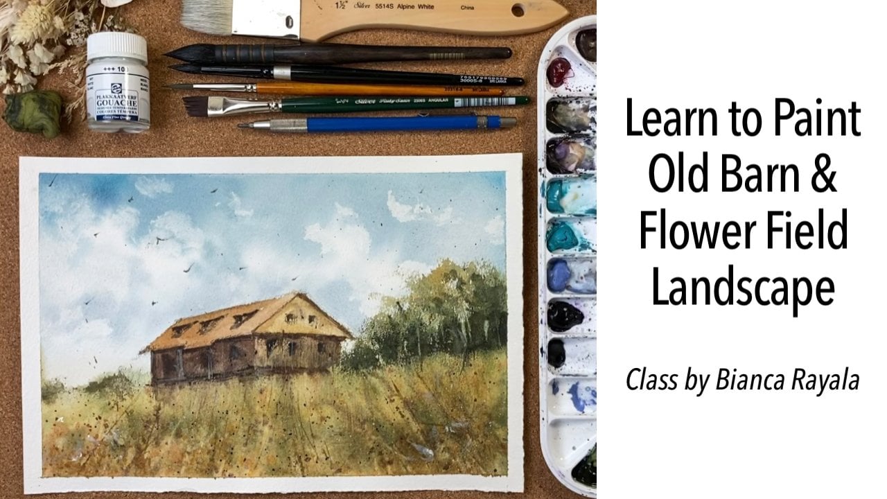
with proper use of values. My name is Bianca Rayala
and I've have been an artist and educator
for over five years. I'm a Skillshare top
teacher, and I work with brands like Schmincke
and Silver Brush. I believe that painting
is for everyone. Art has a special
way of allowing us to escape to a place
where we could refresh ourselves from the
daily routines of life, and also to freely
express who we are. But I know making art can
also be frustrating at times. With that, I teach in a way that provides guidance and
sets you up to succeed. That way you understand why and will have an
easier time to apply the principles on your
own as opposed to simply following a
step-by-step instruction. This course is for beginners and experienced
watercolorists looking to learn about tonal
values in order to paint with depth
and atmosphere. We'll first explore
the tonal value and its relationship to color. We'll use that
knowledge to create your tonal value sketch as
you plan for your painting. Then, I'll walk you through the entire process of
sketching, masking, and painting to create
a watercolor painting that has an illusion
of form and depth. For the class project, you'll create a value
thumbnail sketch and then paint a full ocean waves
scene in watercolor. Watercolor painting shouldn't be complicated and frustrating. Having a clear understanding of tonal values is so
important to enjoy and simplify the
printing process and definitely bring
satisfying results. I'll see you in class. [MUSIC]
2. Class Project and Materials: [MUSIC] For the class
project of this course, I want you to be able to
apply the principle of creating depth through understanding changes
in tonal value. I want you to paint this ocean
wave plot and observe how proper use of value can greatly change your
painting game. By following my
step-by-step guide, you will realize that it
is possible to create a stunning and vivid
watercolor painting in less than 30 minutes
through a very simple, and doable approach. To make sure you
can follow along, they're useful tools for you in this video player where you
can pause and play the video. There's a little button that
will allow you to rewind 15 seconds if you need me to
repeat what I've just said. You can also adjust how fast
or slow the video plays, and you can also
turn on captions in different languages
for this class. I intentionally
designed the course to help you understand
the principle and learn to think as
an artist so you can apply it to
your future works. I want you to succeed in
your creative journey, so if you have any questions or if anything didn't make
sense in the videos, go ahead and leave me a question in the discussion
section of this class. I'll be answering your questions
in that section as well. Once you're done with
your class project, I want you to upload
it in the project and resource section so I can see it, and share feedback
about your work. When you add your project, be sure to include a link
to your Instagram so that anybody who's curious about your work can find
more about you. Because this course is
designed to help you learn the technique, and produce a start to finish
watercolor painting, you'll need a few materials
to do the class project. First, you need the
watercolor paper. There are several
watercolor paper in a variety of formats, sizes width and surface
available in the market, what I do encourage
you to have is the 100 percent
cotton cold press to watercolor paper in 300
GSM or 140 pound weight. This paper provides
some thoughts to the surface, and accepts
washes really well. A common problem you might encounter when using a paper in lighter weight or not 100
percent cotton is buckling. It is when the areas
of the paper swell or wrinkle when wet and they tend to dry faster
thus allowing you a much limited time to
work on your washes. Cotton papers, however,
maybe on the expensive side, but it is definitely
worth the investment as you will learn faster
and get better results. Since I'm using
watercolor sheets instead of paper blocks, I use a masking tape and what they're resistant board
to hold and stretch the paper so it won't buckle when it's so soaked in water. For the class project, I'll be using a six
by five inch by 12 inch paper in
landscape format. Now for the brushes, watercolor paint brushes
are quite different than brushes using
other mediums. They're ones made
of natural hair, and of synthetic fibers. The ones I use in the
class are natural hair brushes as they absorb
much water and pigment, making it easier
to create washes. This is silver brush
Renaissance Round in Size 8, I use it for painting
mainly everything, even the large water fragment. This is Silver Brush Black
Velvet Round in Size 4. It is a mix of
natural squirrel hair and synthetic fiber
used to paint small areas and fine
lines like the shadows of the waves because this
brush has a nice fine tip. This is Silver Brush Black
Velvet Liner, Size 1. I use this for creating this thin subtle marks
on the water fragment. You will see me use
this chip fan brush, but I just use it for
dusting off the paper, and this one is optional
and really not necessary. For the paints, the colors
I use are from Sri Lanka, harass them as squirrel. For this end, I
use yellow ocher, burnt sienna, Quinacridone
Magenta, and gold. I like adding a hint of gold to the sand color for
a subtle sparkle. I varied the amount
of burnt sienna, to get either a darker
or lighter tone. For the water fragment, the colors I use are
Cadmium Orange Deep. Phthalo Blue, Phthalo
Green and indigo. I mix, Phthalo Blue and Phthalo Green to
get the torque mix, and then they add a bit of cadmium orange to
diffuse the tone. If I want to get a lighter tone, I simply add more
water to my mix. If I want the darker
and deeper tone, I add indigo to
these three colors. Lastly, I have your
cobalt violet hue to paint the shadows
on the waves. We will also use
masking fluid to mask the portions of the paper
that we want to preserve. If you don't have masking fluid, you can use a white
wax crayon instead, as watercolor doesn't
layer on top of it. To apply the masking fluid, you need either an old synthetic
brush or a ruling pen. I prefer using a ruling
pen because I can easily create thin and thick marks depending on the
angle of the pen. I simply dip the pen in the masking fluid and then create marks as if I'm drawing. I also use a toothbrush
displeasure masking fluid. I also use a water sprayer, the moisten or miss the
paper and two cups of water, a pencil with 4B lead eraser, an old towel or tissue paper, and a heat gun to fasten
the drying process. Don't worry if you don't have
a heat gun or a hairdryer, it is not really
necessary as it is also nice to let the
paper dry naturally. I also provided a
downloadable copy of the reference, and
final painting in the resource section
of the class to help you in creating your
class project. [MUSIC]
3. Understanding Tonal Value : [MUSIC] If there is
a secret to painting water and any other
subjects well, it is being able to
control tonal value well. Observe, some of my students are pretty good with creating flat, or graded wash, how to
keep edges hard or soft, and create fluid brushstrokes but some of them, however, have not gotten the
concept of value yet. Without understanding
the concept of value, it will be a struggle for you to create depth and
dimension in your art. Value is the relative lightness and darkness of a surface, and changes in values, grid corners,
contrast, and shadows. It also brings the
atmospheric perspective that directs the viewers
into your painting. Value is very important because it creates
the illusion of form and depth on a
flat piece of paper. I know you're excited
to go on and paint, but not doing this basic thing will prolong your learning time. Let's do a quick
review in practice. Here's a scale from 1-5, you can either do
this scale using watercolor or a soft pencil, like a 4B lead. If you're using watercolor, you can adjust the
value by adjusting the amount of pigment
and water in your mix. The darker the value gets, the more pigment, and less
water you have in your mix. In contrary, you
achieve a lighter value by having more water,
and less pigment. At the top of the scale, which is Number 1, is white. The purest, brightest white. In painting, our Number
1, or the purest, brightest white is your clean, unpainted watercolor paper. At the bottom of the scale, which is number 5, is black. It is the darkest,
deepest black. In-between one and five are three shades of
gray that gradually progress from almost perfect white to almost perfect black. Now, how do we identify the values in our
reference photo? We have two ways. First, is by squinting, and second is by creating a greyscale copy
of your reference. Let's try the first one. I want you to look at your
reference photo by squinting. It is like looking
through your eyelashes. Do a rough thumbnail
sketch of their reference, and shade the drawing based on the values that you
see when squinting. Pencil is a close
medium to watercolor because it is also a
transparent medium. As you do that, you can easily identify the shapes of
the lightest values, which is number 1 in our scale, as well as the shapes
of the darkest values, which is number 5 in our scale. Those in between
one and five are the mid-tones or mid-values. Here, we identified
that the portion of the waves has the
lightest value, while the furthest
part of the ocean in some parts of the spots around here have
the darkest value. The sand in the
middle portion of the ocean are the mid values. The concept I want you
to understand here is, you must be able to
assign the lightness, or darkness of a surface to
a spot on the value scale. Then this will be the
basis of assigning the intensity of a particular
view when you add color. If you feel uncomfortable on identifying the tonal
value through squinting, another way you can do
is to create a copy of your reference in
monochrome or in greyscale. For convenience
purposes so I don't have to resize or
edit photos anymore, I use full printer. It's a thermal printer
that I connect to my phone via Bluetooth to print my photos in
just few seconds. It will save you
the time to make a thumbnail pencil sketch to study the tonal values
of your reference. As you can simply print
a greyscale copy of it. This tonal value study serves as your roadmap as
you apply colors to ensure that your
painting will have depth and atmospheric
perspective. It will be your
guide in creating appropriate color mix
and the consistency of your washes based
on the values you identified on each shape. Now that we know the tonal
value of each fragment in our subject, let's
relate it to color. Again, values represent
the intensity of the color that we will apply. By referring to our value study, let's assign the colors
on each fragment based on the corresponding
level of value. Here in this end fragment, I painted with brown color in tonal value number 2 in the
park closer to the water, and I make it a little
darker by using value number 3 to paint
the fragment closer to us. I paint the mid part of the water fragment with a darker tone using
Tone number 4. Then, I make a heavy tone
of color in the outer part. I left the wave area unpainted as we assigned it
with Value number 1. I'll intensify the value
and some spots by darkening some spots even more
for added contrast. Here, we can see
that even if it is only a basic color study, as long as we assign correct tonal values
in each fragment, the painting will automatically create depth and atmosphere. Here, I'm just adding more paint over the layer with
a dabbing stroke. Wave fragment has
Value number 1. Sun fragment has
Values number 2 and 3, water fragment has
Value 4 and 5. Now that you're ready, let's move on to creating
our class project. [MUSIC]
4. Pencil Sketch: Let's begin our
class project with a simple pencil sketch. Looking at the reference photo, let's draw the
outline of the wave here in the lower third
portion of the paper. This makes the wave the
focal point of the painting. You don't have to actually copy the entire thing perfectly. I suggest you observe the
movement of the wave and draw the essence so you
won't feel lost in the details or
complexity of lines. I try to draw as
light as possible so the pencil marks won't be
too visible after painting. Since watercolor is transparent, if we draw with much pressure, the tendency is it
might show through. Another thing also is that when the pencil lead has been
layered with paint on top, we can no longer erase the
pencil marks afterward. Now that we're done
with the drawing, I'll take my shrinker masking fluid to cover the
wave fragment. Using a ruling pen, I simply dip it in
the masking fluid and hold the ruling pen at an angle to create
varying strokes. You don't need to apply thick
amount of masking fluid to ensure that the paper
fragment will be preserved. I start with the outer
edge of the wave and I intentionally make
broken strokes as I place the masking fluid. I tried to wiggle my pen and follow the
sketch that I did. Keep in mind that I don't try to outline the entire
line completely. It's okay if there's
broken strokes. The thing here is we
don't actually cover the entire block with solid
field of masking fluid. In reality, the waves are not really purely
white in color. Its color is affected by the reflection of the
things around it. It also has shadow
and dimension. Now I'm trying to do another upward marks to cover
larger and thicker areas. I start from the initial
outline that I need, and then do an upward stroke to imitate the movement
of the water. I continue on
wiggling and shaking my pen to apply
the masking fluid. What we'll do here is
great large marks on the surface to cover a
major part of the fragment. Applying masking fluid tend
to be so tedious at times, but this step actually
makes the painting process easier than manually trying to avoid painting
the area with color. That's why it is really
necessary to apply just a thin layer so it
will also dry faster. It takes a little
bit of extra time and can sometimes
test our patience. But remember, there's
always a reward in waiting. I look at their reference, so it will serve as
my general guide on how to form the general
shape of the wave. I try not to copy the exact thing to
simplify the process. We just focus on getting
the essence of the scene. It also keeps us from getting lost in the details and end up covering a large unnecessary
portion in our paper. I avoid strokes that look
like a drawing and I don't hold my ruling pen like a
pen to create my marks. I still do the same way of
applying masking fluid, which is holding it in an
angle from start to finish. I discovered that
even a ruling pen can get damaged because
of masking fluid. What I suggest to prevent
that is to always wash your pen with
water after few dips so the masking fluid won't
dry and clog the opening of the pen or damage the metal
tip of their ruling pen. If you're trying to use a brush, you can do this same way. But you just need to control the pressure if you need
to create thin marks. Keep on washing the
brush from time to time to prevent the brush
from getting damaged. I also learned from
another artist that you can initially code your synthetic brush first
with soap diluted in water, and that will serve as a
protective coating of the brush. But if you're using
a white wax crayon, apply it as if you're drawing
the details of the waves. Just be careful in imitating the shape
and form because you cannot alter or cover it
with paint afterwards. In case you don't have a
crayon or a masking fluid, one last alternative I can share is to use a white wax candle. You'll be amazed that it
works similar like crayon. I add some extra marks to cover spots that look a
bit loose and empty. I also use an old toothbrush, this flatter masking
fluid around the area for a more natural
water splash effect. I'm just adding a few more marks before I finally
let the layer dry. You can let it dry naturally, but to fasten the process I use a heat gun, or another
alternative could be a hairdryer. It is also important to make sure that the masking
fluid has dried up completely before layering
paint so we don't smudge the fluid, and paint over the area that we
want to preserve. [MUSIC]
5. Painting the Ocean Waves: Welcome back. Now, before
we start painting, we want to make sure that
all areas are dry already. I encourage you to tap the
surface lightly to be sure since some areas have thick
application and, in effect, would take extra time to dry. For the painting process, we will be painting
on a dry paper, meaning we will not
pre-wet the paper. We will start at
the sand fragment and then we will do the
water fragment next. We will do the
painting in one layer, meaning we will try to build a tonal value in just
one application. Let's mix the colors
for the sand. I get yellow ocher, burnt sienna, a hint of gold,
and quinacridone magenta. I will moisten the
paper a little bit with sprayer so it is easier to create color washes
even with a Size 8 brush. I'm trying to get the
right mix of color for the sand by adding each
color little by little. Since we will paint
the sand area in value number 2 and number 3, the consistency shouldn't
be too saturated, meaning the mix has to
have more water in it. Notice that since we moisten the paper a bit with sprayer, we don't get hard strokes
as we apply colors. The paint doesn't
easily get dry, too. Again, we make it light by
adding more water to the mix. Water dilutes the intensity of the colors so we can
adjust the value. Another thing I want to
keep in mind is that watercolor fades by one level
in tonal value when drying. Now, for the area near
the edge of the paper, I make it darker by adding more burnt sienna and
quinacridone magenta to my mix. I lightly dab some color here in the outer
edge while it is still wet and let it blend
naturally in the first color. I continue adding
some more strokes of darker tone here
in the outer edge. I also create subtle texture in the sand by splattering paints. I keep the added
strokes very light. I try not to overdab the
brush because paints dry more beautifully when we
let them blend naturally. I paint the wave fragment with a very subtle shade
of cobalt violet, which serves like a
shadow color of the wave. I encourage you to
always refer to your value sketch
or color study to serve as your guide
as to applying the appropriate values of color. Now, let's mix the
color of the water. I get phthalo blue and phthalo
green and small amount of cadmium orange for
this turquoise color. It is normal if mixing
colors takes time. We want to make sure we apply the right mix with the
right consistency and tone. That's why it's okay to
spend extra time on it. Since our paper is dry, we're not really in a
hurry in mixing colors. However, later on
when we will be applying dark tones on top
of the initial wet layer, we have to move a little
faster so we can apply the darker value while
the paper is still wet. After an initial stroke, I moisten my paper to make
it easier to create washes and to prevent having hard
edges on the water surface. I tilt my board at a
slight angle so the paint will flow downwards and
not settle in the middle. I continue adding color
with the same color mix, and then I will fade it out
by adding water in the edge. I observe the
reference photo and I see a play of light
tones and dark tones here. So I try to bring
that effect, too. I dab dark colors in the edge of the masking fluid because I
want to create high contrast. Once we remove the
masking fluid, if the color surrounding
it is dark and rich, the wave fragment will
look much brighter. I focus on building on the
areas with wet paint before moving to other fragments so I can create the
depth in one layer. I maximize the time
that the paint is still wet so I can create
soft blend of tones. Notice that there are
strokes that are light, while some are dark, depending on how they look
like in the reference. If I want a dark tone, I make sure the
mix look opaque in the mixing palette and having
very minimal water in it. Since we notice that
the fragment here on the farthest part of the ocean
and the fragment close to the wave has a
darkest tonal value, we need to create a
thick mix of turquoise to achieve that depth. I keep the water content
in my color mix very minimal so I can get the
thick and deep color mix. I still paint in dry paper. I just try to move
fast so I can connect the colored areas smoothly
without creating hard edge. The last thing we
want is to have a hard edge border in
our water fragment. If you feel you'll
run out of time, you can do the trick of
spraying the portions with a little water so it gives you extra time to paint
over the surface. It is the same principle we did when we painted
the sand fragment. I have covered the entire
water fragment successfully. Next thing to do is to build
depth by adding dark tones. Here I mix my colors
using the same color mix. While the initial
layer is still wet, I dab in dots of dark turquoise color on the other edge and
also near the waves. This step is very crucial. Since the paper is wet
because of the initial color, you have to make sure that your brush doesn't
have too much water in it to avoid creating watercolor blooms or
cauliflower effect. I also dab the brush lightly and avoid creating heavy washes. Since there is not
much flowy paint here, I can lay my paper
flat on the table. I also tend to tilt my board
from time to time so I can direct the flow of paint
to my desired direction. There are also times that I do step back and look at
my work from a distance or look at it through the
lens of my camera so I can check if there are spots
that I need to strengthen. This also helps me prevent overworking on a
particular area. Now as we look at the reference, you'll notice that faint area near the inner edge of the wave. We will try to bring
on that effect by lifting of the color
lightly with a damp brush. But we will do that later
on when the paint is not so wet anymore and has quite settled in
the paper already. While waiting for the moment, let's just continue darkening the spots that needs to be dark and maximize the time while
the paper is still wet. If you also notice, I hold my brush near
the edge of the handle. I do this to have a
very light pressure and less control of the brush. If you try to hold
your brush near the ferrule or the metal
barrel that connects the brush and the handle, the tendency is you'll
have a heavy hand and create thick strokes. Another practice I also do when painting is standing
up while painting. This way my entire arm is
free to sway and move. I don't get limited by the space as compared to painting
while sitting down. Also, I get to have a wider view and bigger
perspective of my work. This prevents me from overworking
on a particular area. However, I do see
it when painting delicate details where I need
more control of the brush. I also hold my brush in the ferrule to create
precise strokes. You can try it for yourself
and see the difference. Now, let's create the
faded illusion next to the waves by lifting
of the paint lightly with the damp brush. As you do this step, your brush has to
have no water in it. It has to be damped and clean. You lift it off gently so you won't remove the
entire color off. I gently do the same step
one area at the time. I start from the left, then gradually
moves to the right. As I lift off the paint, I maintain that upward
stroke of lifting the color. I also clean my
brush with water, then wipe it off on
a tissue every after stroke to ensure that the
brush is clean and damp. If you don't clean the
brush from time to time, instead of lifting the color, the brush will just stain
the portion that it touches. Now, I will dab a few more dark dots using
a very thick color mix. Now I will also
strengthen the tone of some dark spots that I
can see in the reference like those on the right side and here in the middle ground. Since the paint
fades while drying, we need to darken the
tone once again as needed to get our
desired results. The technique here is the brush has to have a very
creamy mix of paint, almost no water in it to
avoid water puddle from flowing to the paper and
will create unwanted blooms. The paper also has
to be moist so you don't create hard-edged strokes. If your paper has
run dry already that you get hard strokes
when you dab your brush, I suggest that you
stop from adding layers and wait for
it to dry completely. If you really need to add
some more dark spots, once the paper is
completely dry, add the dark tone and then
use another damp brush to soften the edge so that two
layers will blend smoothly. Here I'm just adding more paint over the layer with
a dabbing stroke. I don't actually
make big washes, but just dab my brush gently. Here I'm trying to dry the
painting completely with a heat gun because the
painting has to be all dry before I remove
the masking fluid. However, I find some spots
that need to be darkened. That's why I'll alternate darkening these spots and drying the area with a heat gun in preparation to removing
the masking fluid. Of course, you can skip
this step if you have already placed enough
dark values in the area. I just wanted to make
sure that I create enough dark contrast around the wave so once I
peel off the rubber, the outline will
be more defined. It will be difficult to do this step once I already removed the masking fluid as I might accidentally paint
over a big fragment. Well, I'm making
sure that the area is all dry before peeling off. You can remove the
masking fluid by simply rubbing it off with your finger. There is also a rubber
eraser sold in art stores, which are designed to
rub off masking fluid. This process is a bit messy, that's why I use a
synthetic fan brush to sweep off the dirt. When you saw your
painting smudging of as you remove
the masking fluid, it might mean that your
painting is still moist. In that case, you have to
dry it first and continue removing the masking fluid
when it is completely dry. The next few steps
after this would be lifting off a little
bit of color on the water fragment to
enhance the overall look of the waves and add subtle shadows on the wave fragment
to create dimension and also add shadow
on the sand fragment. That would be our final steps
to complete our painting. Now, I'll get my liner brush, wet it with water, and do
some thin, shaky strokes. Right after doing so, I take my tissue and dab it off the paper to lift the color. Here you'll see a light
color being lifted off, creating a subtle
stroke in the water. I usually do this in the edge of the waves as an extra
detail and interest. Make sure you use
a thin fine brush, then immediately wipe it
off with a dry tissue paper to avoid watercolor blooms or too much water flowing
on the paper and pushing away the paints that
looks like cauliflower. I repeat the same step of
lifting off color with a liner brush to make the
water fragment more dynamic. Again, your brush
has to be wet while the tissue has to be dry to successfully lift off the paint. You also have to wipe it off immediately after meeting
the wet stroke so the water transferred to the paper will not
spread too much. It's nice to see the
paintings transform like magic with little yet
important steps like this. Here, I get a small Size 4 brush to paint the shadows
on the waves. I use a thin wash
of cobalt violet, and I don't paint the entire white space
that we preserved. I paint only on some
small spots randomly. This way we create
dimension as waves are not purely white in reality. The value of this
cobalt violet that I'm applying here is very
light and very transparent. It has to be so close to the
lightness of the paper so there won't be a very
distracting change in tone with the waves. Now, I'm mixing burnt sienna
and cobalt violet to get a brown color for the shadow on the waves touching the sand. The tonal value we'll assign to it is maybe around
value number 3. Just find the right
shade by adding a little cobalt violet
to burnt sienna. The more cobalt violet you add, the darker the mix will get. I do a very light stroke around the wave and then get another
brush to soften the edge. That brush used for softening the edge should be
damp and clean. You don't need to
outline the edge completely from left to right. Lost and found edges
are much better so the waves won't look like
a tattoo or a drawing. I also always soften
the marks with a clean, damp brush to get a soft
transition and blend of colors. But for now, it is
definitely helpful to practice the basics
until you master it. I really look forward
to seeing your work, so I encourage you to upload it in the project
section of the class. If you have questions
about the process, feel free to leave
me a message through the discussion
section and I'll be glad to answer and
assist you there. It's normal to sometimes
feel doubt while painting. When you experience that, choose to believe that everything will work
together for the good. Trust the process,
enjoy happy accidents, and of course learn
from your mistakes. Here I'm just trying to adjust these strong lines I initially
created by trying to cover it with a darker tone, and then softening the edge
so they blend in nicely. What I'm doing is
similar to what I mentioned earlier
as to what to do when you need to add more dark tones while your
paper is already dry. Simply add the dark color and get a damp brush to
soften the edge. As a final step, let's add more contrast
to the waves by placing dark spots around some edges, then softening the edge
with the damp brush. We make the wave
shine brighter when there is high contrasting color. Here I'm placing some strokes of dark tone color to make the
wave pop even brighter. I suggest checking
your work from time to time at a distance to avoid overworking on a
particular area and, in effect, losing the sense of light. I also encourage you to
try what you've learned, like the use of tonal
value study, color study, masking fluid application, ways to soften edges, adding depth in one layer
when painting other subjects. Feel free to share it
in the project section as well so I can have a
look and share feedback. I'm excited how you can incorporate all the
learnings we've gained to painting your
own choice of subject. Remember not to be afraid of
using rich mix of colors. Sometimes we tend to mix just
light colors because it's scary to see creamy and
very saturated paint. Keep in mind that as long as
your tonal value is correct, it will cooperate well to
build a stunning painting. As you look at your
work by following the tonal value study that we did as part of planning
your painting, you can now see how
light tones, mid tones, and dark tones work together to create depth
in your painting.
6. Your Turn To Paint: Congratulations on making it
to the end of the course. We've covered so much lessons from understanding tonal value, identifying shapes with
lightness and darkness values. We also covered
how values relate to color and applied
everything by creating an ocean wave scene painting from start to finish. I'm excited to see your works. Don't forget to upload
your value study and painting in the project
section of the class. Just as how I experience it, there may be times when we don't get it right
on our first try. I encourage you to
keep practicing, looking for the values through squinting and thumbnail sketch. Never give up on painting
and be patient to yourself. Most people don't spend enough time studying
their subject, yet they don't realize that what makes a
beautiful painting is this very important
element, tonal value. If you'd like to
improve your skills and learn more about painting
water and ocean waves, I invite you to watch
my other classes, Master Ocean Waves
in Watercolor, Three Easy to
Intermediate Exercises, and Painting Water
in Watercolor, Important Things You Need
To Learn To Paint Water. If you enjoyed the class, I hope you could
support me by leaving a class review in the review
section below this video. Knowing your thoughts
would really be a great encouragement to me. Thank you so much for
being with me and I look forward to seeing
you in my other classes.
7. Join the Giveaway!! Win Arkon Mounts!: Let's make learning
extra fun and exciting through a
special giveaway. I will be giving away this Arkon Mount remarkable
creators bundles stand to one blessed student. All you need to do is number 1, watch the full class to be included in the master
list of students. Number 2, for extra
three points each, upload your class project and leave a class review
here on Skillshare. For extra two entries, follow me on Instagram at
Bianca Ayala and Arkon mounts. This special giveaway ends
on November 30, 11:59 EST. I will randomly draw the
winner and will announce it via Skillshare email and
Instagram on December 2. If you have more questions
about the giveaway, mechanics, feel free to leave me a message in the
discussion section below.
 Bianca Rayala, Top Teacher | Watercolor Artist