Transcripts
1. About The Class: Hello, everyone.
Welcome to my class. Today, let's take a look at the seemingly difficult
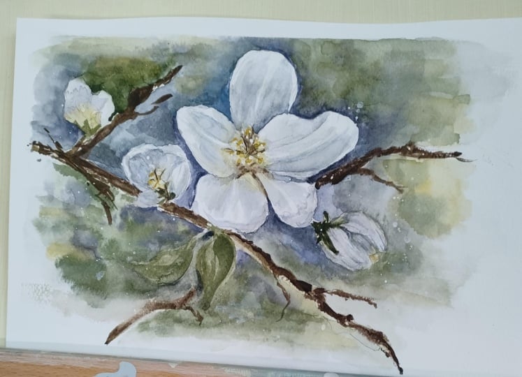
subject of watercolor, which is painting white. As our main subject, we're going to paint the all time favorite white
cherry blossoms. Of course, who wouldn't love the precious, short lived flowers. I'm sure you've heard this many times before that in watercolor, we seldom use white paint
to paint white subjects. Yes, it sounds tricky to paint
white without using white. But with the essential
principles and techniques that I will be
sharing through this class, I'm sure you'll be able to paint any white
subject on your own. In our class, I'm going
to take you through the entire process from planning your
composition, sketching, choosing the right colors, painting the white
flowers and creating a soft contrasting background to make the flowers
come out very well. Whether you're a beginner or an experienced watercolorist. I'm sure this class
will help you not just grow your
watercolor skills, but make you fall in love
even more with the medium. I'm Bianca reala a
watercolor artist and educator from
the Philippines. I love watercolors and I'm so passionate about sharing
my love for arts. My goal has always
been to inspire people to pursue their creative
passion and purpose. Come and join me. Let's take this beautiful journey together.
2. Materials and Color Mix: Okay. Let's talk briefly about the materials and the color mixes that
we will be using. Prepare a watercolor paper. Feel free to experiment with whatever watercolor
paper you have. But the one I'm using is 300
GSM paper made of cotton. For watercolors, I only use few colors like Amit is
genuine or a violet color, horizon blue, paints gray, new gamboge and yellow
ochre for the flower. For the greens, I use indigo, olive green, and lunar blue. We will use an opaque
white water color for final details. Now for the brushes, I
will use a flat brush, but this is optional, synthetic and natural hair round brushes in creating our washes. Prepare pencil
eraser, cup of water, and also a mixing palette. The reference pencil sketch, and the photo of the
final painting are all uploaded in the resource
section on which you can find in the right most side of the screen under the
projects and resources tab. Now, let's proceed
on the color mixes. When painting white flowers, we don't use white paint. Instead, we basically paint the shadows to form its
shape and dimension. To paint the shadows, we can use horizon blue Amit is genuine and a bit of paints
gray with lots of water. We want a cold gray
mix diluted with lots of water like this one. If you don't have these colors, an alternative color you can use is Burn Shena
and cobalt blue. Or you can also use burn
Shena and ultramarine blue. Mixing these two colors
will give you a gray color. Make sure to create
a grayish blue mix and dilute it with
lots of water. For the yellow part
of the flower, I will use new Cbogiluted
with water as well. Now, for the play of
greens at the background, I'll be using horizon
blue and burn Cena to create the
slight green mix. Next is OoliveGreen
and lunar blue. Another one is horizon blue and indigo for a dark teal mix. And lastly, I also mix horizon blue indigo
and olive green. Okay. That's it. Feel free to create different mix of greens using
your own set of paints. But just a tip,
the paintings more harmonious if you play around a small group
of colors only. I'll see you in the next
video for our pencil sketch.
3. Pencil Sketch: Let's begin with
a pencil sketch. I often share with my students that pencil sketch is very important to have a
beautiful painting. No matter how good your
application of paint is, if there is something wrong
with the pencil sketch and the composition of your drawing. Everything will not work. In drawing flowers from
a reference photo, the first thing you need
to do is plan out how to translate a photo
to a painting. It's not always
necessary to duplicate every detail that you see in the photo to your working paper. Just select the pieces
that you want to highlight in your painting and
make them the focal point. For my painting, I will
retain these three flowers, but I will omit the
leaves around and just place a loose
watercolor background. Now, when you draw flowers
in order not to get lost with the details and
complexity of each petal, always look at the general
shape of the flower. Second, observe the alignment and the direction of the petals. Since we are painting
a white flower, we want to minimize
the pencil marks, so I suggest that you keep your strokes very
light and thin. I also won't be shading off
the shadowed portions of the petals to keep the
pencil sketch clean. As I work on the bud
on the left, again, I observe the general shape of the bod then form the
inner petals loosely. The same thing I do with
the other bud on the right. To complete the composition, I will add some branches. Draw the branches in a way that will make them look natural. I don't draw straight
stiff lines. Feel free to add
additional elements like a small bud here to
enrich your composition. It is always good not
to be limited with the reference and play
with your imagination. Let's proceed on the next
video for painting the flower.
4. Painting The Flowers: Before we begin painting, let me explain
first the principle behind painting white florals. In watercolor, we don't use
white to paint white objects. Instead, we leave
the brightest light of the subject unpainted, and we paint the shadows
to show dimension. We also paint the background through negative
painting because leaving the background unpainted would make the main subject. The light on the white parts of the flowers will simply not pop. We will paint from
light to dark. The lightest parts of
the flower will be the original color of
the unpainted paper. Then we gradually go dark
starting from the shadows of the petals and painting
the background. I recommend that you practice the color mix that
I showed you in the previous video so you can save time in getting
the right tone. There are parts that we
will work wet on wet. That's why we need
to work fast before the paper completely
dries. Let's begin. I start with pre wetting this particular flower and a small area around it
using my flat brush. The level of wetness of
my paper is just moist. There is no puddle of water formed in the
surface of my paper. I wet my paper for the
purpose of making it a bit moist so I can paint
soft shadows on petals. I wait for a few seconds
for the paper to absorb the water as I don't want to have
uncontrollable bleeds. If you'd like to learn about water color and brush control, I suggest taking my heartled expressive flora
class here at Skillshare. Since we are looking for the
tonal value of the petal, it is also necessary
to squint your eyes, so we can identify the
fragments that are light and fragments
that are in shadow. If you are not so
comfortable in doing this, you can create a gray scale
copy of the reference photo. Let's start painting
the reflex of the yellow stamen on
the white petals. Using a watery mix
of new gumbos, I gently lay the colors on
the inner part of the petals. I can also see some green
spots here on the center, so I get a light mix of
olive green and lunar blue. If you can see the colors are very soft and you cannot find hard edges since the paper
is moist at this moment. Now, let's paint the petals. Using the mix I showed
in the previous video, horizon blue, amis genuine
and a bit of paints gray. I used this cool gray mix to paint the shadows one
petal at the time. Again, I squint my eye
to see where the light spots so I can avoid painting
over those fragments. I will keep them unpainted
and reserve the whiteness of the paper as this is the
brightest part of the flowers, as much as possible, keep
the strokes clean and light. Observe how diluted my wash is, and it is like a t mixture. The key here is preserving
the white paper for the light spots
and painting with shadows with a light wash. While the surface is still wet, I layer a slightly darker
tone on some fragments to enhance the dimension and to prevent the flower
from being flat. Areas that needed this are the shadows on overlapping
petals and folds. Notice that the wash is
very soft and there is no hard edges since my paper
is still moist at this time. Don't worry if your flower doesn't look like a flower yet, as it will once you create contrasting
background later on. Just keep going and trust
yourself as you do the process. Okay. Next, let's
paint the left bud. I still wet the bud
with clean water. I wait for the paper to
absorb the water a little bit before painting the
yellow reflexes in the inner part of the bud. Using a diluted
mix of new gobos, I painted the yellow reflex. Again, I let the paper to absorb the paint for a while
before I paint the shadows. I make sure that the
fragment is still moist. So as I lay down the
colors for the shadows, I can still achieve
that soft blend. Again, I leave some
spots unpainted. These small spots are the
lighted parts of the petals. Using a slightly darker and thicker mix of
the same color, I darken some portions of the shadow as seen at
the reference photo. I do the same thing in painting the second
bod on the right. Always remember to
squint your eye to properly see the tonal value. If you fail to set up
the correct tones, it will be difficult to identify the flower and we lose the
depth of the painting. Keep your strokes light. You can always add
a darker layer to adjust the tone as long as the fragment is in
order to get a soft blend. Don't worry if you
cannot appreciate how your flower looks
like at this stage. Have faith in yourself. As long as you are able to set up the tones properly by leaving the brightest parts
unpainted and the shadowed parts painted
with appropriate tones, you will surely have a gretst. I'll see you on the next video as we paint the background.
5. Painting The Background: This is the part where we define the general shape of the flowers by painting the background. This is what we call
negative painting. Even though your flower looks
odd or dark at this moment, once you add a
darker background, you will see that
it looks lighter. The darker the contrast, the brighter your
white flower will be. That's the magic of total value. I will be using two brushes, one for placing thick colors
as I outline the petals and another one for softening the wash as it reached
the edge of the paper. I create a thick mixture of bluish green color and
paint in between petals. I soften it gradually
using another brush. Remember to use this step of negative painting to define the general shape
of your petals. Now, to have a nice
soft background, you need to play with
soft and hard edges. The color transitions
should be soft. Meaning, you have to add or drop another color while the
other one is still wet. By doing this technique, you'll be able to create color connection
between your washes. Mm. If you feel that your paint is
running dry too quickly, you may use a spray bottle
to soften the drying edges. Notice that every time I paint the tiny spaces in
between petals, my mixture is dark and. As I mentioned earlier, the darker the contrast, the lighter the flowers
will look like. I repeat the same process in coloring the background
on the upper side. I make sure that the wash gradually fades out as
I reach the edge of the paper so the main focus
will be kept in the flowers. I also randomly adds
flatters as my heart leads because I feel my work
is incomplete without it. It is like a personal mark. Feel free to add personal
touches on your work, even though you're trying to do how I paint it step by step. As you practice and learn
more about painting, you will eventually discover
something that you love doing that gives your
work a personal touch. Now, going back on
painting the background, be careful not to
place too many darks of a single color
to a certain spot. Try looking at your work
from a distance from time to time in order for you to keep the balance
in your work. Since the weight
of the composition is mostly on the left side, I intentionally made the
background color on the, then gradually lightens
as I move to the right. Doing this leads the viewers
to a flow or direction. While the background
layer is still moist, I create a dark brown
mix using burn china and Amit is genuine to create a blurred impression
of branches. I create fluid and jagged
strokes as I paint the twigs and branches and notice that since my
mixture is really, the brown paint didn't bleed
on my moist background. Okay. Be careful not to create a stroke with a very wet brush as
this will give you watercolor blooms that I'm sure you wouldn't like
in your painting. Okay. I darken some spots of the branches for emphasis, and I check if I completely
fill in the background. I almost missed this
small spot in between these two flowers and adding color separated them
from one another. The same thing I do with the inner parts of the main flower. Okay. I notice that I created a mark on one of my petals which
make it look odd. I simply correct the shape of it by painting
a darker color. Now, let's add some tiny leaves here on this small bud using a thick mix
of green pigment. It doesn't have to
be too detailed. A simple stroke like this
will actually be enough. Let's finalize the painting by adding some details
on the next video.
6. Painting The Details: Now we are at the final
stage of our painting. This time, let's add
little more details, hence the shadows to bring
out the dimension of the main flower and finish
off with some highlights. I decided to splatter some
paint here on the right, since the fragment
is still wet and I want to create
some nice effects. Now, I'll be creating again, my color mix for shadows
using horizon blue, am is genuine and paints gray. I will enhance some parts
of the shadowed area, especially those
that are curved, folded or overlapping petals. Okay. I simply paint a small portion using one
brush and then soften the stroke using
another damp brush so it will nicely blend
on my initial layer. You don't need to
outline everything. Adding even just a small, dark spot or what we often call a suggestive strokes will
already make a huge difference. The same thing is what I'm
doing on overlapping petals. I darken the area of the petal underneath to show the shadow caused by
the petal on top. Don't forget to soften
the strokes that you will layer so you can keep a smooth transition of
tones in your flowers. Also, be careful
not to paint over the white spots that
we intentionally left unpainted during the first
stage because losing the white spots will take away
the light in our flowers. M. I don't need to emphasize or make this too defined since it is almost
part of the background. I'm trying to soften
some edges using a damp brush so the flower
would not look like at. Now that I'm done enhancing
the shadows on my flowers, I will paint staamen
with a very thick paint. I want it thick enough
to look opaque. As you paint the stamen, check the direction of the filament based on your
reference photo to maintain the natural flow. Okay. I simply some highlights
of yellow on random areas. I also use white paint to add more light on some spots
especially on the filaments. We are nearly done
with our painting. This final steps are mostly
adding highlights on some areas to put added
interest on theosition. Okay. I splatter paints using a white opaque paint
as my finishing touches. And lastly, using
this dry brown color, I do a dry brush stroke on some twigs just to darken
those blurred spots. This is our final paint.
7. Key Learnings and Class Project: Thank you so much for
joining me in my class. Let me recap the
important lessons that you need to remember so you can paint not just this white cherry blossom painting, but any other white flowers that you want to
paint on your own. First, drawing is
very important. It is the skeleton
of our painting. You don't need to have
a detailed drawing, but you need to have
a sketch that builds a balanced composition
and a sketch that translates the natural movement
or essence of the flower. Focus on the general
shape so you won't get lost in
the drawing process. Okay. Second, I highly encourage that you practice
your color mixing, particularly the different
consistencies of paint, so you can create
proper tonal values. Without tonal value, the
painting will be flat and dull. Get to know your brush
the way it responds on the level of water and pigment to have a
better brush control. Third, painting white flowers is about keeping
the brightest light unpainted or with the
lightest total value and painting the shadows
to create dimension. We also create
contrasting background. Since the darker the background, the brighter the
white flower will be. Remember that it is
completely normal if you don't get it right
during your first try. Don't be discouraged,
but keep on trying. As you repeat the process, you will learn something
about your paint, your paper, and your brush. I suggest that you go back and rewatch important
portons such as painting the shadows and the backgrounds and observe
how I hold the brush, create the strokes, and prepare
my watercolor mixtures. I'm excited to see your work, so please share it
with me through the project section
of this class. You can also share it
on Instagram and tag me so I can have a look and
leave a review on your work. I also upload new classes
almost every week, so don't forget to follow
me here and on Instagram, so you know when I have
new classes for you. Do check out my other skill share watercolor
classes on painting, human figures
scapes, landscapes, florals, and more. See you then
 Bianca Rayala, Top Teacher | Watercolor Artist