Transcripts
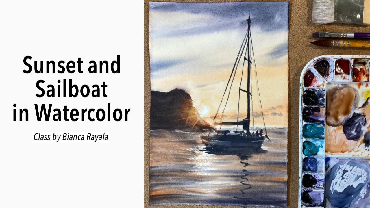
1. About the Class: Do you love sunsets, but always end up frustrated
when painting it? Do you find it hard to portray glowing light and sun rays? Are you lost in creating
the perfect color palette? Or maybe, are you on a creative block and you want to ignite the passion
to paint again? If you answered yes to
any of these questions, join me on this class,
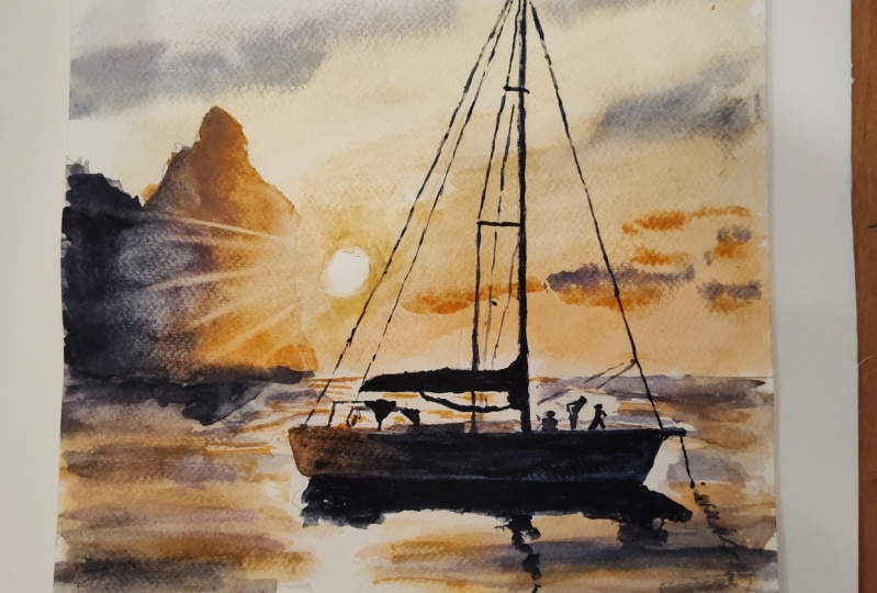
and let's paint this sailboat in
sunset lighting. We will understand aerial
perspective and tone. We will draw light and contrast, and learn to simplify
painting water, waves, glare, and reflections. I will share the
simple color mix using just six basic colors to create your sunset
color palette, and we will start with important
brushstroke exercises, to prepare you on painting this picture in just 30 minutes. I'm Bianca Rayala. I'm a watercolor artist and a Silver Brush Educator
from the Philippines. I love watercolors and I'm so passionate about sharing
my love for arts. My goal has always been
to inspire people to pursue their creative
passion and purpose. So come and join me, let's take this beautiful
journey together.
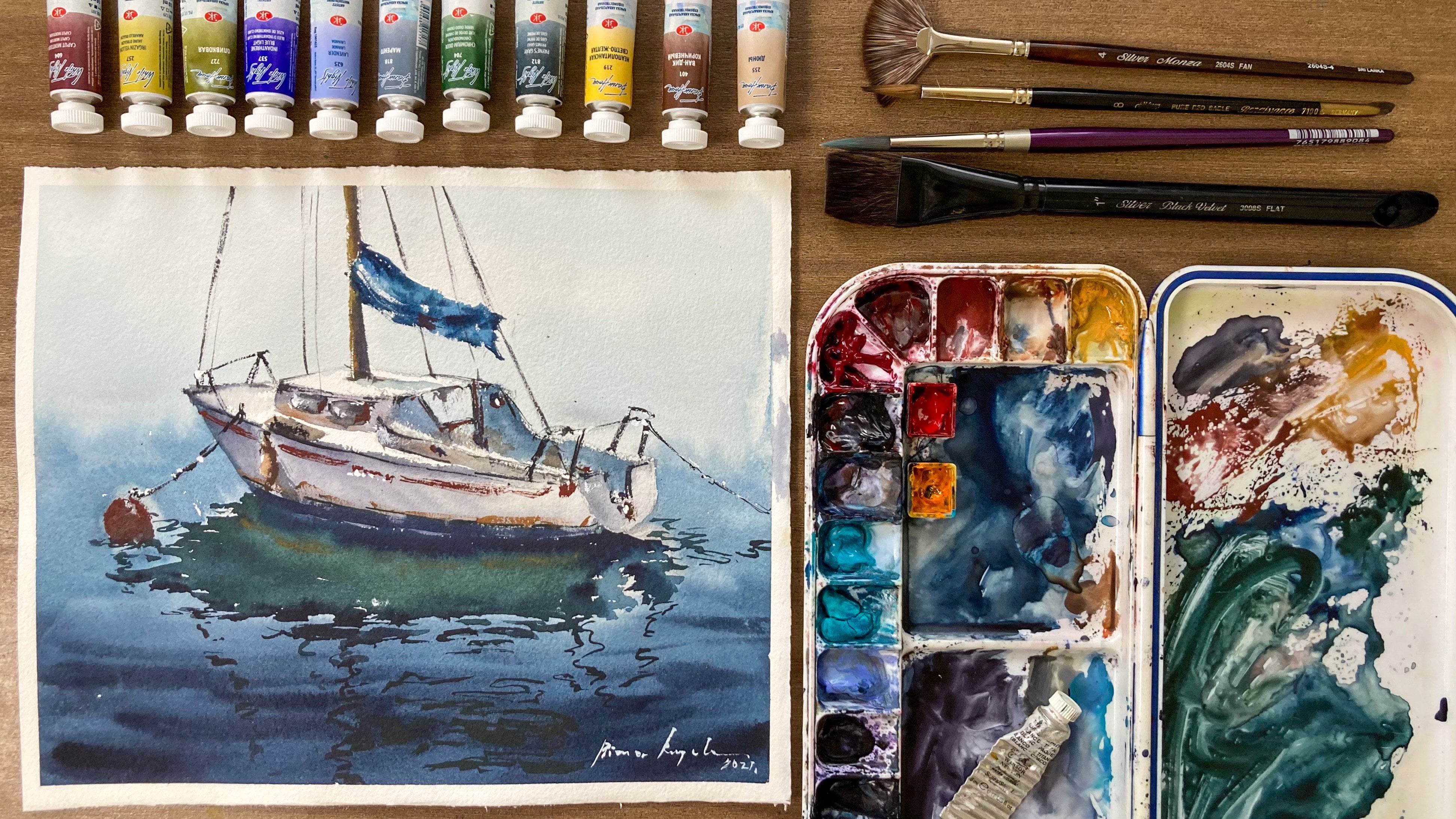
2. Materials: Colors and Strokes: [MUSIC] I'm going to share quickly the
materials that we'll be using for our sunset
and sailboat class. Let's start with the brushes. I have three kinds
of brushes here. A flat brush, which is made of goat hair for
wiping the paper. Next is a small
chisel brush made of synthetic hair
for lifting color. The mop brush with a nice sharp tip for the
waves and other washes. The watercolor paper
that I use is made of 100 percent
cotton and 300 GSM. Then for the paints, I will use, Number 1, is yellow ocher, second is quinacridone
sienna, neutral tint, amethyst genuine, horizon blue, Payne's gray, and indigo. These are the only
colors that we'll need. You can use a
different color with a similar shade if you don't have the exact colors
that they have. We will also need
two cups of water, pencil, eraser, ruler and most importantly, a water resistant
board like this one. It is a regular clipboard
with a plastic cover, so it's water resistant. We'll use it to hold the
paper as we paint wet on wet. Now before I proceed
to sketching, I want to show you
how I mix colors and the important brush strokes that will help you paint
a better painting. To paint light, we need to preserve the
whiteness of the paper. The source of light
should be left unpainted and the
contrasting colors around it will make it blue. Around the light I
will use yellow ocher, and then I will mix it with
quinacridone sienna to get the yellow orange shade
that you see on the sky. You will just vary
the tone depending on the water we add on our mix. Less water will
bring saturated mix, more water will
create a lighter mix. Next, the purple
tones in the sky. I mix amethysts genuine
and Payne's gray. Payne's gray will make the
mix richer and darker. [MUSIC] To build these
very dark tones in the ocean and also at the
outer part of the sky, we will add indigo
in the previous mix. As we paint these dark tones, we should put more
pigment and less water. [MUSIC] Now to create this
partially lighted sail, I will be making a transition from quinacridone
sienna to neutral tint. I connect the two colors
while the first one, which is quinacridone sienna, is still wet so the two colors
would blend in naturally. [MUSIC] For this mountain in silhouette, I use a mix of
quinacridone sienna, amethyst genuine
and neutral tint. Quinacridone sienna and
amethyst for a mid tone, and we add neutral tint to
have the darkest tone.[MUSIC] Now, we need to practice some brush strokes to prepare us in painting our seascape. For our first exercise, we will use this
small chisel brush made of synthetic hair
to create light rays. Wet the brush,
remove excess water, and then gently use the
edge to lift the color. Do the same process of
cleaning the brush and removing excess water before
making your second stroke. Next is a dry brush stroke to show the impression
of glare on water. Using my synthetic mop brush, I get a creamy mix of tint and then I will flatten the brush and remove
the excess water from it before I do the stroke with my brush
flat on the paper. We do it like this. It's okay if you don't have the exact same
brushes like mine, you can use any
synthetic brush to lift colors to create light
rays and you can also create this dry brush
stroke with your round or flat brush as long as you
remove the excess water in it. I suggest checking
the brushes that you have at home and
take some time to practice these strokes using your selected brushes so you can be comfortable
when using them. [MUSIC]
3. Pencil Sketch: [MUSIC] Now let's
begin sketching. First, we need to identify
the horizon line. [MUSIC] I will place the horizon line at the lower
third part of my paper. [MUSIC] I just draw a freehand, but feel free to use a ruler to ensure your
line is straight. Then I draw the
mountain on the side. I estimated the size based on how I see it in the photograph. [MUSIC] I tried to draw lightly, so the lines won't be too
visible after painting on it. [MUSIC] To draw the sailboat, drawing the outline,
focusing on the big shapes. [MUSIC] Don't forget also to draw the little reflection of the sailboat on the water. [MUSIC] Remember to draw
just the big shapes that you see on the picture. [MUSIC] You don't have
to be too particular on the exactly details that
are in the reference photo. [MUSIC] Next, I draw the mast, and then the boom, and some lines to show small details like the people and other parts of the sailboat. [MUSIC] I will move this on
a little lower and I draw it very lightly, so it won't be too visible
later when we put color. Don't forget to erase
unnecessary lines, and also find the
lines you're drawing. I uploaded my pencil sketch
in the resource section, so you can use it as your guide. There's no need to
draw the waves, as we will use brushstrokes
to show that effect. [MUSIC]
4. Painting Light and Sky: Let's begin. I will wet the paper on this water fragment
with clean water. Then I will paint the reflected light on the water with a milky
mix of yellow ocher, but I will avoid the vertical fragment
right underneath the sun. Still using my flat brush, I create a milky mix of yellow ocher and paint
over the wet surface. Remember to leave this
vertical fragment under the sun unpainted. In watercolor to paint a light, we leave the brightest part, which is the source
of light unpainted. Next, I added a bit of
quinacridone Shanna on my ocher. Milk and mix and paint
on the outer areas. I will let this layer to dry completely before proceeding
to the next step. You can either use a
hairdryer to speed up the process or just
let it dry on its own. Now that the water fragment
is completely dry, I will wet my entire paper, both at the back and in front. You might be wondering why I do wet the paper even at the back. We call this technique
painting wet-on-wet. Working on a moist
surface allows us to have more control on the movement of pigment
and prevents us from creating hard edges as
we lay down colors. Second, it will also give
us enough time to work on our painting without
worrying that our paper will run dry. I will explain it more
as I paint along, but I'm sure that
learning this technique, the wet-on-wet technique, will make painting a lot
easier for you. When you wet the paper, make sure that all the
areas were thoroughly wet and there is no air
or lumps underneath. The paper should be
flat on the board. Then do the same thing in front. We have to wet the
paper really well. This is the reason why we need
to use a plastic board or any water-resistant
board to hold the paper flat while it's wet. But before we start painting, we need to wait for the paper to absorb the water really well. The paper should be moist and glossy when we start
applying paints. If the paper is too wet, paints will move uncontrollably. But if it is just
moist and glossy, we achieve two things. We have more control on
the movement of colors and there's no hard edges
formed on the surface. While we wait, let me explain
again that in watercolor, we paint light by keeping the surface of the
brightest light unpainted. The sun in our drawing should
be kept unpainted when we paint with yellow
ocher area around it. From yellow ocher, we will
smoothly transition to orangey color using a mix of yellow ocher and
quinacridone Shanna. I tilted my board at a slight angle so paints
would naturally flow down. I will be using my
mop brush made of synthetic sable hair
for the washes. As I apply paint on my brush, I will remove excess water from my brush using a tissue paper. I make sure that my brush is loaded with lots of
pigment but less water. They gently paint
around the sun, leaving the center unpainted. Notice that the
paint didn't bleed towards the inner
part of the circle. This is because the paper is not too wet, but just moist. In case you apply
the pigment too quick and the paint
bleeds inside the circle, just use a clean tissue to lift the color and to keep
the sun unpainted. I gently spread the
yellow ocher color, then softly blend
the orangey color here at the bottom part of
the sky near the horizon. Remember that it's important to remove
the excess water from your brush as
you apply the color. If your brush is loaded
with lots of water, it will create blooms because
the water will tend to move the pigments on your paper away. As I reach the top, I will create my purple mix by combining amethyst
genuine and Payne's gray. The rule in aerial
perspective is the sky closer to us
is darker in tone. Using a darker tone of purple, I will tilt my board at the higher angle and paint
from top going down. I will let the paint to
naturally blend with orange to avoid muddy colors
and overdone strokes. I do my strokes
with a light hand. Doing this will help you
create a sky that looks soft and has good
blending of colors. I make the part of the sky which is the topmost really dark
by adding indigo on my mix. I continued making soft
strokes to show illusion of soft clouds in the sky. Don't be afraid of
saturated and dark colors. When watercolor dries, the
color really fades out. It may look too bright now, but later on it will be less
bright as it dries out. This is the beauty also
of painting wet-on-wet. We have an extended time working on a wet surface
so we don't have to be in a hurry in painting
the sky and clouds at once. We don't need to worry
about having hard edges in a soft sky because the paper
is moist enough inside. I darken this top part
portion even more by adding more indigo
on my purple mix, and just add some
more few strokes. Now, let's build
on the mountain. I start painting the edge near the sun with
quinacridone sienna. Then I will gradually
transition it to a darker tone using a mix
of quinacridone sienna, amethyst, and neutral tint. Observe the reference
photo so you can copy the transition
from light to dark. Next, using the chisel brush, I create light rays using
the lifting technique. Don't forget to
clean and wipe off the water from your brush
every after stroke. If you don't clean your brush, you might stain
your paper and ruin the glowing light
in your painting. Here I'm trying to
darken the outer part of the mountain a bit more
for more contrast. You see light shines
brightest if there's a great contrast around it. Upon looking at this mountain, I feel that I am not so happy with how the
light turned out, so I painted over it again. I try to repeat the process of lifting the color later on. That is another benefit
of working wet on wet. It gives you an
opportunity to move and edit your work while it is wet. Of course, you can
skip this process if your first try of lifting
the color has gone well. To have a more
natural transitioning of colors from light to dark, I will use a clean tissue and swiftly swipe off the color, starting from the
lightest part going out. Always use the clean side of
the tissue on every swipe.
5. Painting The Water and The Boat: Now let's paint the water using dry brush stroke that
we practiced earlier. First step is get a
substantial amount of paint. Remove excess water
from your brush, then flatten your brush to
create an equal stroke. I started from left to right, then right to left. But be mindful not
to entirely cover the unpainted fragment
we preserve on a paper right
underneath the sun. I repeat the strokes
with a light hand. Next, I get my
purple mix to paint the dark waves I see on
the reference photo. Do the same process of getting
a creamy mix of pigment, removing excess water
from your brush, then flattening your brush
to create an equal stroke. Look at your reference, squint your eye to see
which areas should be dark. I started here at the
bottom with long strokes, then gradually goes up
with shorter strokes. The same rule in aerial
perspective applies in water. The water closer to
us is darker in tone. Thus, we may add indigo
in our mix to create the portion of the
water closer to us with a really
deep and dark tone. [MUSIC] Notice that my strokes at the bottom are long, then gradually becomes
shorter as I reach the top. Second, I preserve
a good amount of light on the small fragment
underneath the sun. Doing this will help make
our sunset glow really well. I am adding some more
darks here at the bottom. The dark tone should really be bold and dark to give contrast. [MUSIC] Since I notice that
I have a lot of unpainted spots here
under the mountain. I will get an orangey color
and paint over some areas. I want the reflected
light and the glare to be narrower and just
focus underneath the sun. [MUSIC] I will add a little bit
of dark waves here, again to make the
foreground even darker. [MUSIC] I paint some strokes under the mountain to imitate
its reflection. When you're happy
with your water, let your paper dry before proceeding on
painting the sail. If you paint the sail while the sea fragment is still wet, the paint will just
bleed and you won't be able to create a defined
shape of the sail. [MUSIC] I mix a dark brown color and add a bit of Horizon Blue to
make it a bit opaque. I will start painting from
the darkest part of the sail, which is the
rightmost part of it. My brush is dry that's why the paint is really
thick and semi-opaque. [MUSIC] Next, I get an orangey color to paint this left portion of
the boat lighted by the sun, and then I will blend
both colors lightly. [MUSIC] While the boat is still damp, I get a thick mix of neutral tint and paint the
reflection of the boat. [MUSIC] I will also paint some
details of the boat using the same dark paint and just vary the tonal value from
one part to another. [MUSIC] Now, I begin to paint
the boom starting from the dark portion and then blending in the lighted portion. [MUSIC] I add some more
details on the boat, but I always remind
myself that I don't have to be so particular
on what to paint. Just copy the shapes that you see on the reference
and it will be fine. [MUSIC] Using the tip of my brush, I paint the mast. If your hands are a bit shaky, you may use a ruler and a smaller brush as
an alternative. For me, I prefer
using with a freehand for a more natural
feel on my painting. [MUSIC] Also when you paint the mast, my brush should
have a creamy mix of paint with almost no water. This will enable you to create the crisp and defined stroke. Don't forget to paint with
an orangey color the part of the mast that has been lighted
by the sun like these two. Now I go back to painting
the reflection of the mast on the
water by painting some wavy lines going down. Since the mountain has lightened
too much after drying, I want to add another layer
to enhance the contrast. I will paint again a
thick [inaudible] here, and then add a portion of
yellow ocher here at the edge. I will also paint with a dark brown color the
outer part of the mountain. I soften the edge of the base of the mountain so it would
blend on my water. Then again, you using
my chisel brush, I will lift the color
to create light rays. Make sure that your chisel
brush is clean and damp with no excess water in it and try to do the stroke
slowly, but surely. I soften some hard edges, and then smoothen the
transition of colors. Now the light looks
much brighter because of this contrasting
color of the mountain. [MUSIC]
6. Key Learnings and Class Project: Let's summarize the
important learnings that we can get from my class. Number one, to paint light, we keep the brightest
light unpainted. We don't use white paint. To make light glow, we need to put a contrasting
color around it. Second, when we
paint wet on wet, we must wait for the
proper thiamine, which is, the paper has already absorbed the water really well
before starting. In this way, paint
will not just flow uncontrollably as we
lay them on the paper. Wet on wet technique
allows us to paint soft colorful skies without worrying of creating hard edges or unwanted blooms. Third, aerial
perspective is very important to give
dimension to our painting. The sky closest to us should
be the darkest in tone. The same applies to water. The water and the waves closest to us have the darkest tone, and of course, the
waves closest to us are also bigger in size. You can learn more about painting water through my
other Skillshare class, which is painting
water in watercolor, where I teach all
important things you need to learn
to paint water. Lastly, we paint the sailboat when the water fragment
is completely dry. We also don't paint it with a solid black
color, but instead, we still take note of
its tones based on the reference photo to make
it look more realistic. That's it. I hope you
learned a lot from my class, and I hope you appreciate painting using
wet-on-wet technique. For our class project, I want you to paint the
same sunset painting that I did in my demo. Just follow the same process that I did and feel free to go back and re-watch
the portions of the videos that you
want to review. Don't forget to practice your color mix and
brush exercises to prepare you well in
doing your project. I'm excited to see
your paintings. Don't forget to upload it on the project gallery
of the class, and tag me when you
post it on Instagram. I invite you also to check
my other Skillshare classes, and don't forget to
follow me to get updated about my new classes. Thank you so much and God bless.
 Bianca Rayala, Top Teacher | Watercolor Artist