Transcripts
1. What's In Store for You: When I was a beginner, I used to believe that
the more colors I have, the better my art would be. Yet I found myself endlessly searching for that
elusive, perfect palette. It all changed when I
discovered the art of color mixing and the power of a simple three color
limited palette. I didn't stumble
upon this by myself. I have art friends who
advised me that learning how to mix and understand
my colors is an essential. Now I am returning the
favor by showing you how to mix the very colors you need for your painting projects, armed with just three colors. Hi, I'm Bianca Lustre, a watercolorist from
Batangas, Philippines. I'm recently focusing
my efforts on helping watercolor beginners improve their skills and
gain confidence. One of the key
skills to do that is by learning how to
mix your colors. In this class, we will learn how to choose and
mix primary colors, create your own chart, and expand it to find the very colors you need
for an art project. We'll also talk about
color temperature, why mody colors appear, and how to avoid them. Finally, we will apply what
we have learned by painting a simple landscape scene
using three colors only. As a bonus, I will also give
away an E book containing all the color charts that I created for the past few months. Please state tuned
for my announcement on how you could grab your copy. Anyone who loves
water colors and would like to give
color mixing a try. Welcome. In this class, you'll need your basic
watercolor materials, such as paper
paints and brushes. But above all, your passion to learn and
experiment with colors. Once you're done
with this class, you'll have the confidence and knowledge and
mixing and choosing your own colors and applying it on different painting subjects
using a limited palette. Grab your materials
and let's get started.
2. Class Project: Our goal for this
class is to be able to choose our three
primary colors and create different
charts that will be a valuable reference in our
color mixing exercises. I will demo how to
swatch your colors. Create an odd
shaped color wheel. Extend it to an
earth color chart in either landscape or
portrait orientation. You can upload any of this as your class project if
you want to go extra, then expand this chart
even more and find the specific colors you'll need to create a simple
artwork like this. I will show you how
I used a warm, cool, and mixed palette to these landscape paintings you
can use as an inspiration. To get started, please
download the class guide in the resources center and prepare the following watercolor paper. Please use any texture and quality that is
available to you. Three watercolor
paints, don't worry, I'll show you which
colors to pick later. A palette where you
can mix your colors. Any brush that you're
comfortable using. Water jar for rinsing
the brush and paper tawel or rag to
remove excess water. Of course, you love to learn
and experiment with colors. I want you to have the best
experience during this class. So please make sure to use the different features
such as Projects Gallery, where we can share our work
and receive feedback and also discover different
combinations that everyone came up with. The discussion stab, where
you can start a conversation, ask a question, or just say hi. The review stab,
where you can write an honest review
for other students to decide if this class
is for them or not, if I am making quality classes. In the next video,
let's discuss what you'll gain by learning
how to mix your colors.
3. Why Learn Color Mixing: From achieving harmony
to being able to paint anything you want
in terms of colors. Here are some reasons why you
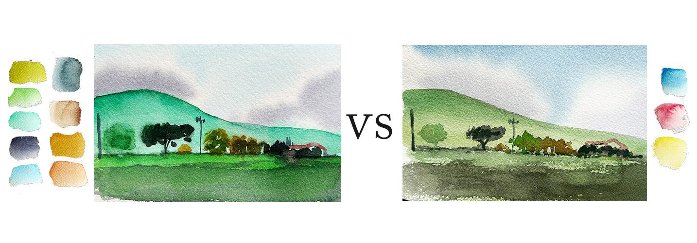
should learn color mixing. By using a limited palette, you will harmonize
your painting. Look at these two artworks, do you see the difference? Can you feel it? For the
painting on the left, I used as many
colors as I think I need without heavily
mixing my colors. Well, on the other one, I used only three colors. You have probably heard that
by using a limited palette, you will definitely achieve
harmony in your paintings. That's because all of the colors are related
to each other. For example, the blue I used in the sky is also present in the grass in the
foreground and is also used for the smaller
details in the middle ground. Using a limited palette will unify our colors and help you avoid disjointed colors or jolting wants like
what happened here. In the other example, we
actually have a term for a painting where you used almost all of the colors
available to you. They call it the
fruit salad effect. That's what we want to avoid. Well, unless you're
going after that style, no need to buy endless
tubes of paint. When I was a beginner,
I treated myself with this lovely set of water
colors from Pebeo. I thought that the
more pigments I have, the better my paintings will be. But I was wrong, since I have these
beautiful, convenient mixes. I totally ignored
learning how to mix my own colors and relied heavily on the pigments
that are available to me. If I need green, then I
use the green pigment. I want to paint
grapes or lavenders, Then el pick violet. And it became a habit. If I want to paint
a beautiful scene or a still life setting, I'll check my colors first
before I commit to it. If I have all the
pigments I think I need, then I'll work on this project. But if not, it's
either I purchase a new color or I'll completely
give up on that project. Which is a shame really because I'm the type of
artist that needs to be inspired and feel
a connection to my painting subject first
before I could begin. It feels really bad. This also meant more palettes. Since I can't seem to find the
set of colors that I need, It's an important skill that
every beginner should learn. You're working with
only three colors or a limited palette. You are forced to think
about your colors carefully when you do not
have so many resources. You are forced to be creative and to be a good problem solver. This eventually leads
to confidence in painting and choosing
your colors wisely. If I could go back in time, I would definitely learn how to paint using a limited
palette and mix my colors efficiently before trying out other
convenient pigments. If you're a beginner,
I suggest that you learn the skill as
early as possible. You can paint anything you
want with only three colors. You can paint
landscape, still life, portrait, abstract shapes, literally anything
that you want. As long as you know how
to mix them efficiently, would you think that
all these paintings are from the same
limited palette? Yes, they are. I really thought that would
be impossible at first, but with lots of
time invested on testing and mixing
different combinations, it is indeed possible. It was actually a
fun exercise to paint different subjects
with three colors only. But for the sake of
simplicity of this class, we will only focus on
landscape paintings, but you are free to paint any subject that you want later. Okay, this also
encourages you to expand the palette and experiment to achieve the
colors that you want. Learning how to mix your colors does not only apply
to water colors, but with other mediums as well. There might be slight changes
and adjustments needed. But this skill of mixing your
colors and being mindful about it will be useful no
matter what medium we use. Here's why. You need to learn
how to mix your colors. You'll achieve harmony
in your paintings. No need to buy endless
choices of paints. You'll build confidence. You'll be able to paint
anything you want, and it is applicable
to other medium. In the next video, let's discuss how to choose
our three colors.
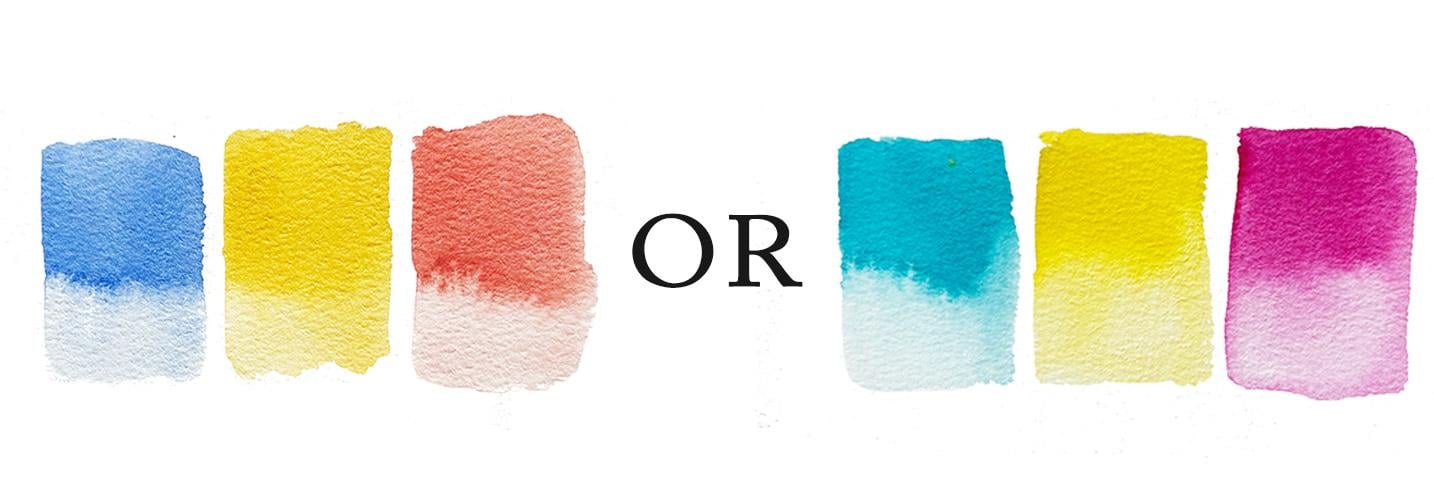
4. How to Choose Primary Colors: What are primary colors? You must have heard
from school that the primary colors consist
of red, yellow, and blue. Technically, colors
that you cannot mix. You can have one
red, one yellow, or one blue as your
primary with water colors, you can also use yellow. And just like how printers work, how do you really
choose your primaries? Here are some tips to help
you choose your primaries. Start with what you have, whether you have
a beginner set of water colors or a few
tubes in your possession. The best advice that
I have in choosing your colors is to just
start with what you have. Unless you don't have
a red or magenta, blue or ion and yellow
on your palette, then you might need to
borrow or purchase new ones. If you have a set where
the pigments have no name, then it's important
to Swat shear colors first and intuitively
pick up your primaries. Take note of starter
kits from famous brands. Another good
reference in choosing your primary colors is checking what the famous brands are
offering as their starter kit. For example, here's a list from Windsor Newton's
official website. Their three color system
includes Winsor lemon, Windsor blue, red shade,
and permanent rose. I use the closest
pigments that I have, and this is how the professional three color system looks like. Well, from their Cotman line, which is considered
student grade, they have lemon yellow hue, ultramarine and permanent rose. I use the Cotman
three color system as my reference in creating this color chart with
M grams basic set, he can spot ultramarine blue, Azo yellow, and
Alizarine crimson. I use cadmium yellow instead
of Azo yellow to give you an idea how the color chart looks for this starter kit. On the other hand, Daniel
Smith's starter set includes a bright primary triad, which has ultramarine
blue hands, a yellow medium, and
Quinacridone rose. I've substituted bum yellow
light with hands a yellow. And this is how the bright triad looks like
as a color chart. While the Earth
primary triad includes Montata natural Siena,
transparent red oxide, and cerulean blue chromium, I use the closest
pigments available to me to produce The Earth
Triad color chart. Looks a lot different than
the previous months. Right? Equally spaced from each
other in the color wheel. In case you have accumulated
lots of tubes and pans, then it's best to consult Bruce Mcavoys,
Artists Color Wheel, which shows the color
appearance locations of all major watercolor
pigments in use today. Looking at both the
color wheel and the suggestions of major brands
in choosing your primary, we can see that ultramarine
blue, cadmium lemon, and cadmium red are equally
spaced from each other. If plotted on a color chart, this is how that
combination looks like. We can also try cobalt till quinacridone magenta
and cadmium lemon. Ideally colors that are equally spaced and therefore produce
a triangle shape like this. Here's what it looks like
when you expand that palette. Pretty cool, huh? A pickup on choosing your colors,
start with what you have. Check Famous Brands starter
kit and see the color wheel. In the next video, let's
start mixing our colors.
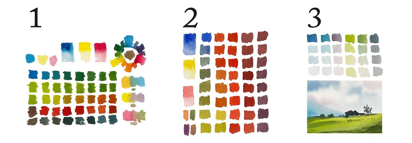
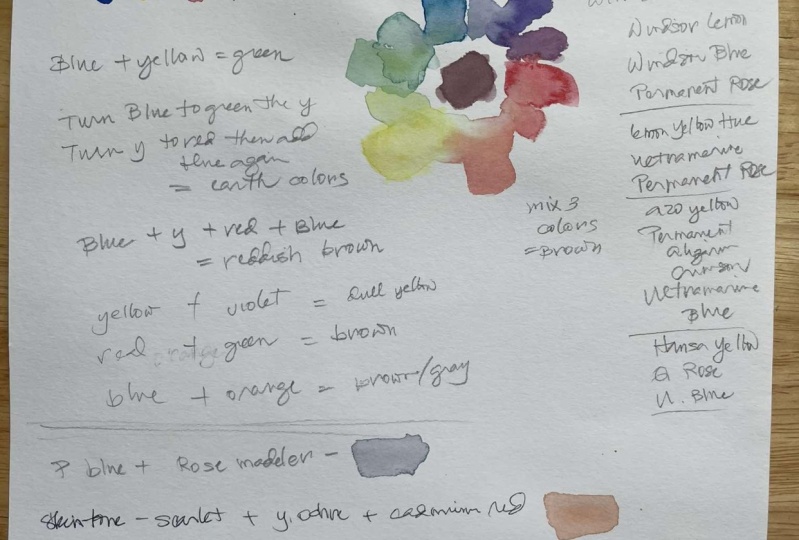
5. Mixing Your Colors: Now that we know how to
choose our primary colors, we can start creating our color charts that
will be useful later. I've chosen Prussian blue, cadmium, yellow light,
and rose matter. They are from different brands, but it doesn't really matter. Place the pigment names here and an informal color
wheel over here, and it should look
something like this. We'll also expand it and
apply it on a painting later. Now first things first, of course, you need to
swatch the primary colors. I'd like to start with blue, because that's my favorite. Add a bit of water on your paint To achieve
this consistency, then paint a small
square like this. Rinse your brush, tap
off excess water on your rag and extend that square downwards
to create a rectangle. This way you'll see the
color in two shades. Do this for the other two
primary colors. A quick tip. With water colors, you can
treat water as a color as much as it's important
to keep our bodies healthy also plays an important
role in color mixing. It's not only meant for
rinsing your brush, Water also controls the opacity or strength of your mixture. For example, this blue is too dark for
painting skies, right? But if you add just
enough amount of water, you can achieve
different shades of this blue that fits
your painting. With acrylics, you can add white to a color to
make it lighter. But with water colors, we use water for
demonstration purposes. Here's what it looks like when you mix white with
these primaries. Instead of making
the colors less intense and more
transparent white paint, turn them into pastel colors, lighter powdery and more opaque. They could be useful in
other painting styles, but let's stick to
the traditional approach in this class. Next, let's create an
oddly shaped color wheel. I start with two triangles
overlapping each other. On these three that I marked, I will paint my blue,
red, and yellow. Starting with blue, again, paint an abstract
shape like this. Make it big enough to
mark it as your primary. Then mix with yellow. And that makes our
secondary color green paint that a bit smaller
than the blue shape. Then add more blue, mix blue green,
and place it here. Add more yellow.
For yellow green, we have two tertiary colors. Now go ahead and place
yellow over here, slightly bigger
than the secondary. And tertiary colors. Mix that bit red to produce orange, Another secondary color. Then add more yellow for yellow, orange, and red for red, orange. Another set of tertiaries. Lastly, place your red
here as much as you can. Make the primary
colors the same size. The secondary color is
the same size and so on. Makes red with blue
to achieve violet. Another secondary color then more red for red
violet and painted here more blue for blue violet looks like a
descent color wheel, right? It's not just circle,
but you get it. Just with three primaries, we were able to mix three secondaries and
six tertiary colors. If you mix the three, you'll have this
muddy brown color. This muddy color might
not be tear liking, but in painting different
subjects you will definitely need brown and
different shades of it. A quick recap, we
swatched our primaries in two shades with an
added white paint to see how they look like, and created a color wheel to mix the secondary and
tertiary colors. In the next video, let's
mix our Earth colors.
6. Earth Colors: Now that we have a color
wheel with our primary, secondary, and tertiary colors, let's expand it and mix these Earth colors to
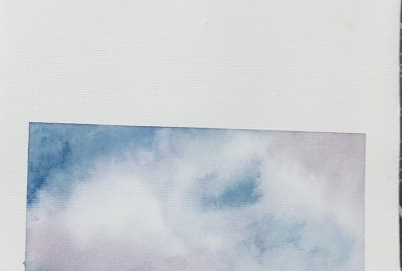
the perfect for trees, ground, and shadows
of the clouds. Starting with blue, mix
here blue with water. To achieve this consistency, and paint a small swatch. Gradually add yellow
to the mixture. See how it change just with
a tiny amount of yellow. Add a bit more and
more and more, and see how the colors change. Do this until you get as
close to yellow as possible. If your mixture
is getting thick, don't forget to add water. By doing this chart, you'll learn the following. Through experience, the range of colors you can create with your primaries and not just your standard secondary
tertiary colors. Which colors are
overpowering and how versatile a limited
color palette truly is. Enjoy this process and expand
your limited color palette. Our goal at this
point is to turn blue to green and
then to yellow. Then when you come
at a point where the mixture is close to
yellow or yellow green, you can then start adding
red to the mixture. See how it changes by using
all three in the mixture. From this point on, our goal is to turn
this yellow green to a color as close as to
brownish red as possible. These are your earth colors, perfect for land masses, grounds, and anything
that requires this shade. It is a good alternative
for burnt sienna, light red, and
other earth colors. Now, when you get to the
point where the mixture is close to red and
doesn't seem to change, no matter how much
red you add to it, it's time to add blue
back into the mixture. I might have added more blue than I intended
to, but that's okay. By looking at the color wheel, I know that I can produce a lighter brown with
these three primaries. Go ahead and continue until
you fill out this page. This time you'll get a
range of dark browns and even bluish browns depending on the primary
colors you're using. They are a good alternative to Bird Umber CPA and paints gray. These shades are also
perfect for shadows. Who would have thought
that you could have lots of colors from
three primaries? Right, A recap on what we did. We started with blue and turned the mixture into
green, then yellow. Then we introduced
red to the mixture. When it turned red, we finally added blue
back to the mixture. This type of chart shows various shades of green,
browns, and grays. In the next video, let's
look at a simpler version of this chart and more examples of three color combinations
that you can use.
7. Other Color Charts: Just very quickly. Here's a simpler alternative
chart that I love, graving. I like it so much that I filled the whole sketch
book with these type of charts and explore different primary
color combinations. This is actually pretty
straightforward. Write the names of the
colors at the upper left, Swatch your primaries downwards, followed by the secondary colors and a mixture of the three. Then do the same thing as the
Earth color chart earlier, only in portrait orientation. Starting from blue and slowly adding yellow, then add red. Once the mixture turns
out as a yellowish green, then add blue again once it
turns into a reddish brown. By testing out different
color combinations, you'll see that you can get a
wide range of green browns, purples or grays depending
on the pigments you use. You can even control how abrupt the change is from one
color to the other. Take it slow and swatch a
wide range of earth colors. Like in this example, I got lots of greens, a fair bit of browns, which turned into really dark, neutral colors once I started adding blue
again in the mixture. It really depends on which type of chart you'd want to share in
the project's gallery. It can be a simple
primary color swatch plus a color wheel, or an earth color swatch in landscape orientation or
in portrait orientation. Here are some more color charts featuring different three
color combinations. I love how muted this color is in the grays
that it produced. While this one has lovely muted browns,
greens and purples. This chart boasts
its olive greens, reddish browns, and red violets. While this combination has really bright greens and grays perfect for
sunny landscapes. I'm giving away
this color charts for free with pigment's name. Of course, I turned it into a small book with over 30 pages. Please stay tuned
for my announcement and how you can grab your copy. I spent hours and
hours testing out different combinations just
to satisfy my curiosity, while hoping that this could be a useful guide to others to decide on their primary colors. A quick summary of what we did, we created a simpler
alternative chart in portrait orientation. We found out that
different combinations will produce different charts. In the next video, let's learn about
complimentary colors.
8. Complementary Colors: Let's talk about
complimentary colors and why it's useful to
know what they are. Complimentary colors are ones that lie opposite
in the color wheel. Blue and orange, yellow
and violet, red and green. When used together, they
create a bright contrast. When mixed together, you'll have various versions
of neutral colors, such as browns, grays, and black very quickly. Let's mix the
complementary colors by using the three
primaries we used earlier. You can see that the orange and blue turned out is a greenish. One, yellow and violet mixed
together became brown. Red and green also
turned out to be brown. But keep in mind that this highly depends on
the pigments you are combining together and the amount of each pigment
in the mixture. Also, we're using a limited palette for
comparison purposes. Here's what other
complementary colors from pigments look like. Knowing your complementaries
is especially useful when you want to tone down
or desaturate the color. For example, if
this yellow is too bright to your liking a purple, which is actually red plus blue, you'll have a dull
yellow like this. Same goes for red. Add green from a mixture of yellow and blue and you'll have a sort of muddy red
perfect for roofs. Lastly, blue, mixed
with a bit of orange from red and yellow
turns into this cooler blue. Put simply, depending on the amount of each
primary pigment, the result would be different. That's the power
of color mixing. Here's the convenient
mixes from earlier, mixed with a bit of their
complimentary color. A quick rec up on
complimentary colors, they lie each other
in the color wheel. When placed beside each
other, they appear vibrant. But when mixed together, they'll turn into
a neutral color. Could be brown or gray. A color can be used to
desaturate or tone down. It's complimentary. In the next video,
let's talk about the temperature of colors and how it affects
your color mixing.
9. Warm and Cool Colors: Look at these two
sunset paintings. Does one feel warmer
than the other? Why do you think so? Right? That's because
of color temperature. But how do we know which colors are warm and which are cool? The simplest way is to
think of fire and ice. When you say fire, we feel warm. What colors are present there? Reds, oranges, and yellows
on the opposite ice, which can contain greens, blues and purples is
generally on the cooler side. That's one way to remember
our warms and cools. In case of our limited palette, red and yellow are on the warm side and blue
is on the cool side. But there are other ways
to identify a colors. Temperature, divide the
color wheel in half. Technically, we can treat one half as cool and
the other half as warm. Take this color wheel by Arts
and Foundation's website, for example, from red
violet to yellow green, they are considered warm. The other half with blues, violets and greens
are considered cool. We can do the same to
our own color wheel. I think this line divides them, marking the upper part as cool, the lower part as warm. But water color
pigments are versatile. All blue pigments are
not necessarily cool. There are also warm variations. The same applies to red and yellow that determine its bias. This is a, an intuitive way of identifying a
colors temperature. You need to swatch, see, and observe if there are chases of other colors
in your pigment. For example, each of
these yellows is warmer. If you pick the one at the
right, then you're correct. It has an orange
bias and appears to have a red mixed in it, while the other one looks like it has traces of blue in it. As mentioned earlier, blue
is cold and red is warm. This is lemon yellow
and gumbo Enova. Can you determine which
yellows are warm? You got it. Those with bits of red and leaning
towards yellow orange. Now, which of these
feels cooler? The one at the right
is cooler since it has a violet bias and appears to
have a bit of blue in it. While the other one seems to have a bit of
yellow mixed in it. Again, blue is cool
and yellow is warm. These are vermilion
hue and rose matter. Which of these reds
appear warm, right? Those with traces
of yellow in them and appear near orange
in the color wheel. Now, this is where
it gets tricky. Which of these blue is cooler? The one at the left
has bits of red in it, while the one at the right appears to have
yellow mixed with it. Before I answer that, let's check the
color wheel again. Both red and yellow are on the warm side of
the color wheel. How do we know which is
cool and which is warm? In fact, some artists think
that all blues are cool, while others think the opposite. But here's something
to keep in mind. Most of the time we paint oceans and seas with blue green blues, with traces of yellow
in them and seem to be leaning towards blue
green are considered cool. One with bits of red
and leaning towards violet is warm here. The one at the left is warm,
that's ultramarine blue. And the one at the right,
turquoise blue is cool. What about this group which
are warm blues, right? Only two of them. Now, why does it matter to
know your colors, temperature? If you want to suggest
distant mountains, your better choice
will be a blue. If you want to paint
grasses in the foreground, near the viewer, then it only makes sense to
mix a warmer green. That's because cool
colors recede or go back in space and
warm colors advance. This is due to the wavelengths of warm colors being longer. Your eyes see them sooner than the shorter wavelengths
of cooler colors of, of those technical terms. If you want to paint landscapes
to warmth or coolness, it's better to use colors with the right temperature
for comparison. Here's another
version where I use the opposite color,
temperature feels different. Right here are the
two sunset paintings again, which feels warmer? Yes, the one at the right. I used warm primary
colors on this one, which made it appear warmer. But this is not
an absolute rule. Take this painting for example. It looks like the grass in the middle is warmer than
the one in the foreground. And I also used a warm blue
in the distant mountains, and it seems like I still
use the correct colors. It really all
depends on the mood that you want to create
in your paintings. You could also
avoid muddy colors when you consider a
pigment's temperature, you might have experienced firsthand or heard
from someone else, that greens and violets are the hardest secondary
colors to mix. That goes the same for me
until I discovered why. If you want to successfully mix a clear and vibrant
secondary color, you must take the temperature
into consideration. Let's look at this
simple color chart. For example, on the left, I have warm and cool blue. At the top, I have
cool and warm yellow, warm and cool red. A warm blue and warm yellow mixed together will
produce a warm green. A warm blue and cool
yellow will mix. A different green mix and
match and see what happens, now, this is where
it gets muddy. Vermilion hue is a warm red, and Prussian blue
is a cool blue. When mixed together, they
should produce violet, right? Mud brown. Why? Because Vermilion has an orange bias which appears to have a
bit of yellow in it. Prussian blue has a green bias, meaning all primary
colors are present. Blue plus red plus
yellow equals brown, or a neutral color. We learned that earlier when
we created our own chart. If you want to go technical, here's more info on
the two pigments from King's Framing
and Art Gallery. Prussian blue contains
anthrop blue pigment. Well, vermilion hue has
transparent pyal orange, pyal red, and Iso
indoline yellow. Yes, technically
all primary colors are present, thus
producing brown. You have greater
chances of producing vibrant secondary color mixtures if you mix colors with
the same temperature, but it's not applicable to all warm and cool
color combinations. That's why the time spent mixing and testing out
different combinations, we keeping in mind their temperature is an essential skill
that you should learn. Creating swatches might
look and feel tedious, but I'd like to coat one of my favorite authors,
Charles Swindle. I'm a real believer in spending
some time every day doing what's important rather
than doing what's urgent. Let that sink in a summary
on how to tell your colors. Temperature, think
of fire and eyes. Divide the color wheel in half, determine its bias and learning this will help you
avoid muddy colors, and I'll see in the next video to apply what we have learned so far and paint this
simple landscape scene.
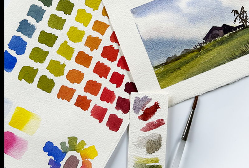
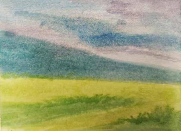
10. Cool Color Palette: Now it's time to put our
color mixing to the test. We will expand this chart we created earlier to achieve this, using our cool color, limited palette
featuring prussian blue, yellow light, and rose matter. We will recreate this
painting by finding the colors that are not present in our
earth colors chart. Yes, we have a range of different greens,
browns and grays. But there are still colors in the reference painting that
are not Swatched here. This time we will also see
how each color changes by gradually adding water to
the mixture for reference. Let's place this here and work on finding the sky colors first. I also did a simple sketch that will serve as
my guide later, where I'll paint
the house and the trees using the same blue, Prussian blue to
start the chart. But this is too bright, it's actually too
cool for the sky and the mood that I want
to portray. What do we do? Consult the chart that
we made earlier and find a base color this
blue violet will do. We know from experience that by adding a bit of rose
matter on our blue, it will turn into a blue
violet swatch again. And check, yes, this is
the color that I'm after. We'll also need a blue green
for the distant mountain. Again, check the color wheel. Find the base color,
and it's here. By adding a bit of
yellow to our blue, it makes it even cooler. But I think this is too
cool. What do we do? Remember, our complimentary
colors, blue, green, and red, are not necessarily placed directly opposite each
other on the color wheel. But if I add a bit of
red to the mixture, it should change,
right? Correct. I think I like this version
of blue green more. Lastly, we need some shadow
colors for the clouds. What could work as a base
color red violet, right? If it's too blue, add
and if it's too red, add blue swatch to check if you like the
color that you're mixing. I think it's too
bright and vibrant. Let's add a bit of
yellow to tone it down. It's the same complimentary
color principle that we discussed earlier. Do you now see the importance of the color charts
that we did before? Through experience,
we know which pigments are needed to
mix such and such colors. Soon, you won't even need
to check your color wheel, but intuitively grab the
colors that you need. Now that we have the
three colors for the sky, let's see how those
colors change by adding water gradually
to the mixture. Remember what I said earlier. You should also treat water
as a color mixing medium, not just for rinsing your brush. If a color is too
strong or dark, maybe you just need some water to find the shade that you need. Here, you can already see the sky colors that we can use for our landscape painting. Okay, it's time to
paint the background. Since that blue is too
dark to my liking, I'll add more water to achieve this shade and use
it on the sky. I want soft clouds, let me wet the whole sky
area first with water. Work on this, wet on wet. Starting at the top, I'll drop the blue shade that I chose earlier and
move downwards. Don't forget to leave some
white spaces for the clouds. As I go downwards, I'll also go lighter
and that means more water in the
mixture while still wet. Load your brush with a
red violet mixture and paint the underside of the
clouds with this shadow color. The sky looks dark right now, but water color is dry lighter, so don't worry about that. Next, your brush with blue, green, and paint the mountain. While the paper is still wet, I want to create
an illusion that the mountain is far
in the background. Painting it wet and wet
will help me achieve the look that I'm after now. While waiting for
the sky area to dry, let's mix the other colors that we'll need for the
grass and the house. Instead of wiping off the mixtures that we
already got here, let's just adjust them to
find the colors that we need. I'll prepare a
bright yellow green and a dark green for the grass. This is mainly blue, so we know that by
adding lots of yellow, it will turn into
a yellow green. In fact, we already mixed that color earlier
in our color chart, right next to mix a dark green, then there should be
more blue than yellow. Keep adding, mixing, and
testing your colors until you find the shade that you
need for the house. I'm looking for a
color near this one. We know from experience
that to achieve that, there are lots of
blue and red with a bit of yellow as
an alternative. You can also try
dark brown instead of a bluish brown,
something like this. If you watch all the
color mixing exercises earlier and better, if you did your own chart, you'll know that we can achieve this by mixing all
primaries together. I can borrow from this color, adjust it by adding a
bit more yellow and red. It really does take time to get the colors
that you'll need, but in practice and in time, you will get faster. Don't rush and enjoy every minute you spend in
these exercises. Now let's do the
same thing we did earlier and add
these colors here, along with the different
shades creating by adding water to each mixture. I actually ran out of
space for the brown, but you get the idea right. Next, it's time to work on the foreground
using a flat brush, I'll cover most of the foreground area
with a lighter green. The white spaces I'm leaving out are for the darker greens. This Gs isn't really about how to paint
landscape paintings, but more on color mixing and finding the shades
that you need by using a limited palette and
understanding basic principles. But there might be some
of you who would like to go extra and
paint this scenery. I'll narrate my approach and decisions as I work
on this artwork. Okay, I have let this dry completely before adding
the final details. I tend to work from top
to bottom, light to dark. It's a more traditional approach
and I'm comfortable with it with the same dark green. I'll paint some bushes and
add shadows and texture. With dry brush technique, you don't really need to paint individual blades of grass, But adding some grass
shapes will help the viewer see what we
intended to portray. Now, with the darkest
color paint the house, it's just a silhouette. No need to worry about
doors, windows, plant balls. Just focus on the big shape. If you've observed, I also
switch to a smaller brush. For the smaller details, you can keep on
adding more red or more yellow depending on the
colors that you are after. But since they're all dark now, no need to be extra critical about getting the exact
shade I am using. In fact, you should be getting different shades
of colors if you are using a different color combination after adding some more details. We're done now for
a quick recap. We chose our primaries
and Swatch them. We added Y to see what they
look like as pastel colors. We created an oddly
shaped color wheel to mix the secondary
and tertiary colors, and then extended it to
create an Earth color chart. We also experimented by mixing
the complementary colors and expanded it even more to find landscape colors we'll
need for this painting. There are lots of color mixing
exercises presented here, and I hope that by providing
those opportunities, you are starting to love
mixing your colors too. A quick recap on what we
did to find the color, we determined a base color first and made
necessary adjustments, and that could
include adding water. We painted a simple
landscape scene. I'll see you in the next video. And let's try a warm
color palette this time.
11. Warm Color Palette: This time let's use warm colors featuring royal blue Gambo, Genova, and Vermilion Hue
to paint a landscape scene. This time, the field takes up a bigger space than
the clouds or the sky. I will scratch the
foreground colors first and then paint them. I'm mixing a dark green, a yellow green, a neutral
green, and a brown. We know from
experience that greens are a combination
of blue and yellow. And if you want
to produce brown, then add red into the mixture
and adjust as needed. These colors definitely have a different vibe
than the first mark. It only shows that
whatever colors are available to you and
their temperature are. You can still mix
colors that will fit a specific painting project. All honesty, I used
to hate warm colors, Red, orange, and yellows. I always tend to only paint with cool blues,
violets, and pinks. I wouldn't even touch
red because it's too bold and bright for
me. But look here. Ever since I focused on maximizing a primary
color palette, I'm amazed with warm
colors potentials, especially the earth
colors that they produce. I didn't think that
would be possible. Why did I even hate them before? Take this chance for you to try out colors don't like to use. Don't forget to create
an opacity chart too, And expand this palette even more to produce
different shades. For you to really appreciate
how far this limited palette could go time to work
on the foreground. With a flat brush,
I'll start with yellow green and cover
most of the area. Then change my colors as I reach the bottom and turn it
into a darker shade. Actually, my reference photo, the composition, didn't look that interesting
until I cropped it. But for simplicity's sake, let's just use my
finished painting as the reference photo. While wet, I'll connect this huge filled area with
Earth mass and paint brown. Then drop darker green to
add texture while still wet. I will speed up the demo, since I trust that you
get the process first, decide on the color
that you need and then find a base
color in your chart. And just as needed, while working on the foreground, I suddenly realize
that I also need a darker shade of
brown pre texture. So let me add more
blue to the mixture. To achieve that, then drop some dark colors and paint
broken diagonal lines. Now leave this a dry
before working on the sky. It's time to mix our sky colors. This blue is a bit too blue. If used, purely adding just a tiny bit of
red will make it perfect for the sky color test on your scrap paper and see, yes, that's the
shade that I want. Now for the cloud shadows, I'll have red and blue. You know what? I've always
regretted buying Vermilion Hue because I thought it's too warm and orangy and vibrant for me. Who would have thought
that mixing it with blue will create a pretty
nice shadow color? I used to mix blue with
orange only for my shadows, But I guess I will substitute this pigment
from time to time. It wasn't a waste
at all, wasn't it? Just like the first project, I like to work, wet
and wet in the sky. Go lighter as I
reach the bottom. Add shadows on the
underside of the clouds. Paint the mountain wet, wet. When painting the
mountain shape, though, it really helps if there are more pigments than
water on your mixture. It's easier to control and the colors won't
go everywhere. Color mixing can be
tedious for some, but I think knowing your colors play an
important role too. It's like preparing coffee. They need more coffee. Water, is it bland? Do you want it sweet? Then add sugar, you
want it creamy. Then add milk or creamer. If you're familiar how
each ingredient tastes. Coffee, grounds, water,
sugar, and milk. You know which one is
lacking in your mixture, which one is weak or
which is overpowering. Please take this time to get to know your pigments
and don't rush. All that's left now is
adding more texture on the foreground using
the same colors as earlier and we're done. Here's another project idea that you can share
with the class. You can either upload
just the color chart or share a finished painting using your limited
color palette. It's amazing how those
bright and brilliant yellows and reds can turn into
rich earth tone colors. A summary on this video, we used another
set of primaries. And found the specific
colors we need by consulting our chart and
finding a base color, then making necessary
adjustment. We came up with a
simple landscape scene. In the next video, let's
explore a mixed color palette.
12. Mixed Color Palette: It's time for a
mixed color palette. Now let's use ultramarine blue, Gambo Inova, and Scarlet lake. This is how the chartletts, both my yellow and blue are on the warm side while scarlet
lake is on the cool side. Are mix the colors L need here and created
an opacity chart. This video will be
quick since I only showing you how I
painted this landscape, you might have been wondering
what a mixed looks like. And no, you don't really
need to strictly use warm colors only or
cool colors only. A mixture of pigments from
different temperatures will also produce different colors
like what you see here. That's why I spent a
huge amount of time matching and mixing different
three color combinations. It doesn't even matter if
you're using different brands. Like in this case,
my ultramarine blue is from Shinhan and both my Gamble snovenscarlet
leg are from Holbein. The approach in painting
this will most likely be the same as the first project I work on the sky wet and wet, and started the blue, left some white areas
for the clouds and painted the underside of the
clouds with a shadow color, a mixture of blue and red. The mountain in the background was also painted wet and wet. But unlike the first project, I didn't wait for
the sky to dry and I mixed all my primaries to produce this brown
for the ground. Then I added more paint to mix a darker and thicker
and black curve version of that and used
it on the details. I mainly used dry brush
technique for the bushes and trees and other landscape
elements that you'll see here. It's really only a matter
of adjusting your mixture. Adding more blue or
red or yellow as needed depending on
the neutral color that you want to mix. Here's another project
option that you can upload. The colors are not as vibrant and bright
as the first two, But personally, I like how
gloomy this scene looks. A quick recap on what we did. We used a combination of warm and cool colors and learned that brands
really don't matter. We learned that spending time in studying your colors
will all be worth it. I'll see you on the next video, and let's discuss what
you can do from here.
13. Sharing Your Work: Congrats for coming this far. How do you feel about
your color mixing skills now that you've
finished this class? It was a fun journey with you from learning the
advantages of color mixing, to choosing your primary colors, swatching and mixing them
to create our color wheel and expanding it to produce a
wide range of earth colors. For those who took
the challenge of applying their skills in
painting a simple scene, I commend you for that. If there's one key lesson that I want you to take
away from this class, that would be taking time to really understand your colors. You don't need blots of tubes of paint to
improve your skill. What you need is
to dedicate time, and don't be too
harsh on yourself when you don't get
it on the first try. Now that you know the
basics of color mixing, go ahead and pick up another
set of three colors and be surprised and amazed on the different charts you
can make out of them. Try applying them on different
painting subjects too. I have plans on making other color mixing classes and painting with
a limited palette. Don't forget to follow me
here and on my socials. Now it's my time
to learn from you. What colors did you try and how does your
chart look like? Please share them on
the projects gallery and let's appreciate each other's effort and the wonderful mixes
we have produced. I will highly appreciate an
honest class review too. What did you like the most about this class and what do you think should have been included? Looking forward to
painting with you see on my other
classes together, let's make this world
a little bit more colorful with our artworks.
 Bianca Luztre, Watercolor, Productivity, Color Mixing