Transcripts
1. Intro: Painting realistic
black animals with watercolors can be
quite challenging, especially if you are new to it. Trust me, I know from
a personal experience. When painting a black
animal in watercolor, are you struggling with creating
depth in your painting, trying to make the
black look natural, creating endless hard edges, and fur that lacks softness
and then trying to paint every single hair and
adding layer after layer, hoping that it will start
to look more natural. And no matter what you do your animals still
lacking in depth. And the colors look muddy. Don't worry. I know what to do. I can teach you how to achieve a natural shade of
black and add depth to your painting
without overworking certain areas and avoid
the colors to get muddy. The key to painting animals and watercolors is number one, use the wet on wet technique. Number two, layer the object starting with undertones
and number three, to mix colors mostly on the
paper, not your palette. The wet on wet technique
is very forgiving, allowing you to create a soft smooth layer
without having to work on every single hair and making that fur look
soft and fluffy. Starting with undertones
gives an object more depth, and mixing colors on the paper is the key to avoid
muddy colors. But that's also
the key to create natural shades of a color. In this course, I'll teach you how to control
water and paint on paper from the very beginning and to create your
own shade of black. Using colors that
will enable you to paint black animals
more realistically. My name is Maria A Chinska and I'm a watercolor
artist and teacher. I've been teaching
watercolors since 2016, and I have taught thousands of people how to paint
with watercolors. I am proud to say that I
have over half 1 million of followers on all
social media platforms. I also run two online schools
a part of skill share. As an experienced
watercolor artist, I have even developed my own
line of watercolor brushes. I have a lot of experience
as a watercolor artist, especially with techniques
such as wet on wet, lifting, and properly layering an
object using undertones. I know how to paint realistic black
objects in watercolor. And now I am super excited to share everything I know
with you in this course.
2. Class Structure: I will guide you
through the process of preting two black dogs and a cat painting using wet
on wet and lifting techniques and painting
with undertones. Each project is designed to help you get
better and better at painting realistic black
animals in watercolor. By building on the skills you learned in the
previous project, you'll get plenty of practice
and gain the confidence you need to create beautiful animal paintings on your own. The first two
projects one and two, will focus on exercises. Blending colors on
people creating your own shade of black
and making swatches so you are familiar with the color values of
that blend of black. You'll also paint cats ear
and practice lifting colors. In Project three, you'll paint
the entire cat wet on wet. And we will use different
colors for undertones. You'll practice wet
on wet and lifting colors to add more
highlights to the fur. Project four and five, you'll paint two different dogs, first, a black lab, and then a bull terrier. Both of these dogs will
be painted wet on wet. However, the bull
terrier is slightly easier since we won't be
wetting the background. This course includes three
different black animals to allow for repetitive
practice of color blending, mixing your own state of black, layering with undertones first, painting wet on wet and
then lifting colors. In this course, I will teach you how to create your
own shade of life. You'll learn about undertones. You'll learn how to control
the paint and water, how to lift colors, how to layer an object, wet on wet, how to
create soft edges. You'll learn how to
read a reference image, how to add a
background, wet on wet, and when to add a background. I always simplify things and put myself in shoes of a beginner, since I was once that
person who didn't know the difference between
wet on wet and wet on dry. I would like to invite you
to take the class with me and experience a
unique way of learning. So get ready to dive into the world of black
animals in watercolor.
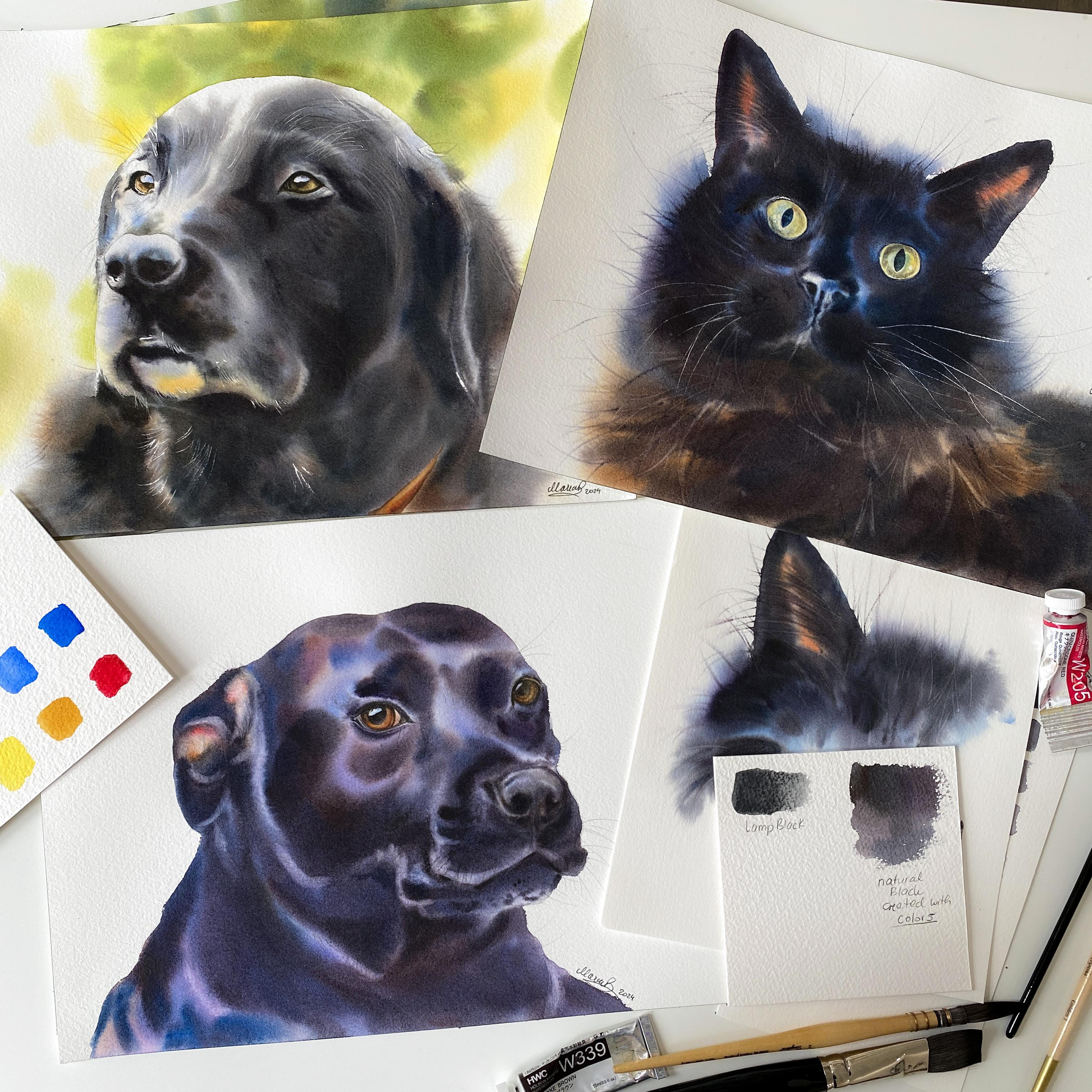
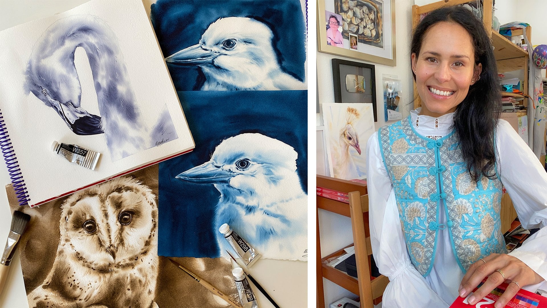
3. Art Supplies: This course is about watercolor painting of
three different animals. Black animals in watercolor, but we don't need
that many colors or brushes and just one type
of a watercolor paper. Let's start with
watercolor paper. I recommend using 100% cotton
watercolor paper co pressed hundred and 40 pounds
and a paper that's good for layering The paper I
recommend the most is arches. But basically, you
want a paper that has texture and a paper that
is good for layering, since we will be applying
a lot of darker tones. For the paints, you
don't need to use the same brand of paints I
use, which is whole white. You can use the watercolors
you already have. For the colors for
black animals, I recommend quinaca red, so like a pinkish red, ant brown or sepia, Rcana which is similar
to yellow ocher, but rocians a little
more orange like. Then burn Siena, which
is reddish brown, cobalt blue, you can use ultramarine lights if you
don't mind granulation. However, I speak only for
Holbeins watercolors. Then fallow blue red shade, which is the primary blue according to Holbeins
color chart, Indigo, which is
the darkest blue, Io yellow deep, which is like an orange shade of a yellow. And then south green, if you plan to add
background. For the brushes. You want to have a flat brush, and I recommend a
softer flat brush. This is Da vinci casin one
of my favorite brushes. And then a medium
sized stiffer brush. I have a round eight
here. This is golden one. It's from my own
line of brushes, and you can also
use size ten or 12. But also, we'll be
using a quill brush. This is a long quil size two, and it has a fine point. It's also from my own
line called song bird. So for this, you could
use a round ten or 12, a softer brush, like a round brush if you
don't have a quil. Then the rigger brush or
script liner or liner, You want to have a rigger
brush for lifting colors, and overall when
you want to apply more hair detail
to the cat or dog. And then lastly, you want to
have smaller round brushes. That's for details.
And basically, it's just for the eyes
and maybe for the nose. So I'll be using my
songbird details line of brushes and sizes
zero, two, and three. As far as anything else, you want to use
masking fluid for watercolors to mask some
of the hair hair detail. And then a brush, an old brush you can use with that masking fluid because other tools just don't
give you the same effect. A paper towel for
additional lifting, definitely a regular
like bath towel to wipe your brush on. And then three small
jars of clean water. One jar is basically to dilute
your colors with water, and then you have two other
jars whenever you paint. And then you need
a plastic palette or if you don't
have any palette, just use a dinner plate. A good light with
a daylight bulb, so you can see nice
color or true colors and preferably a head light, and then a picture of a color wheel, that
would be nice to have, but you can also find
it in the workbook attached to this course.
Let's get started.
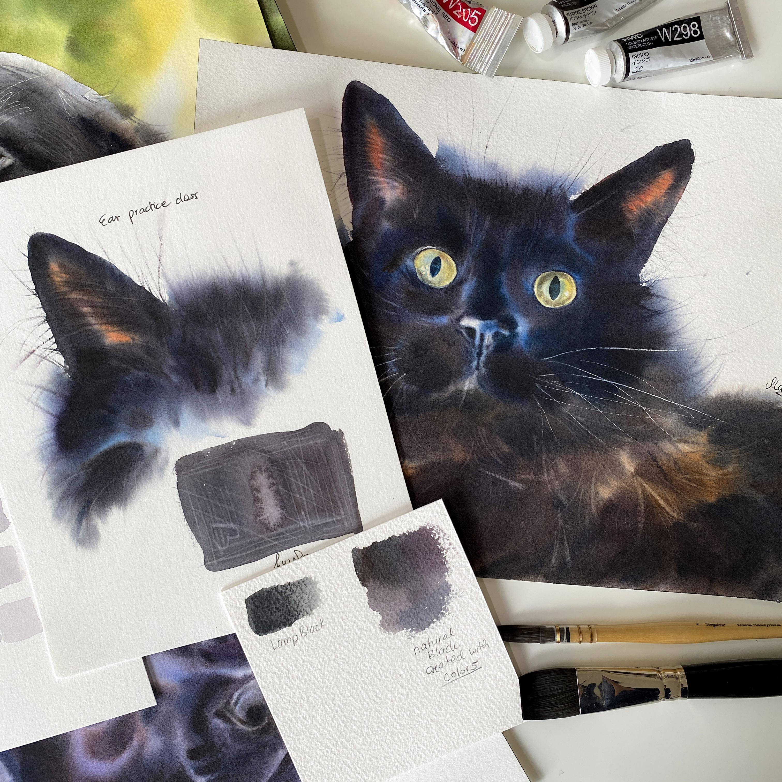
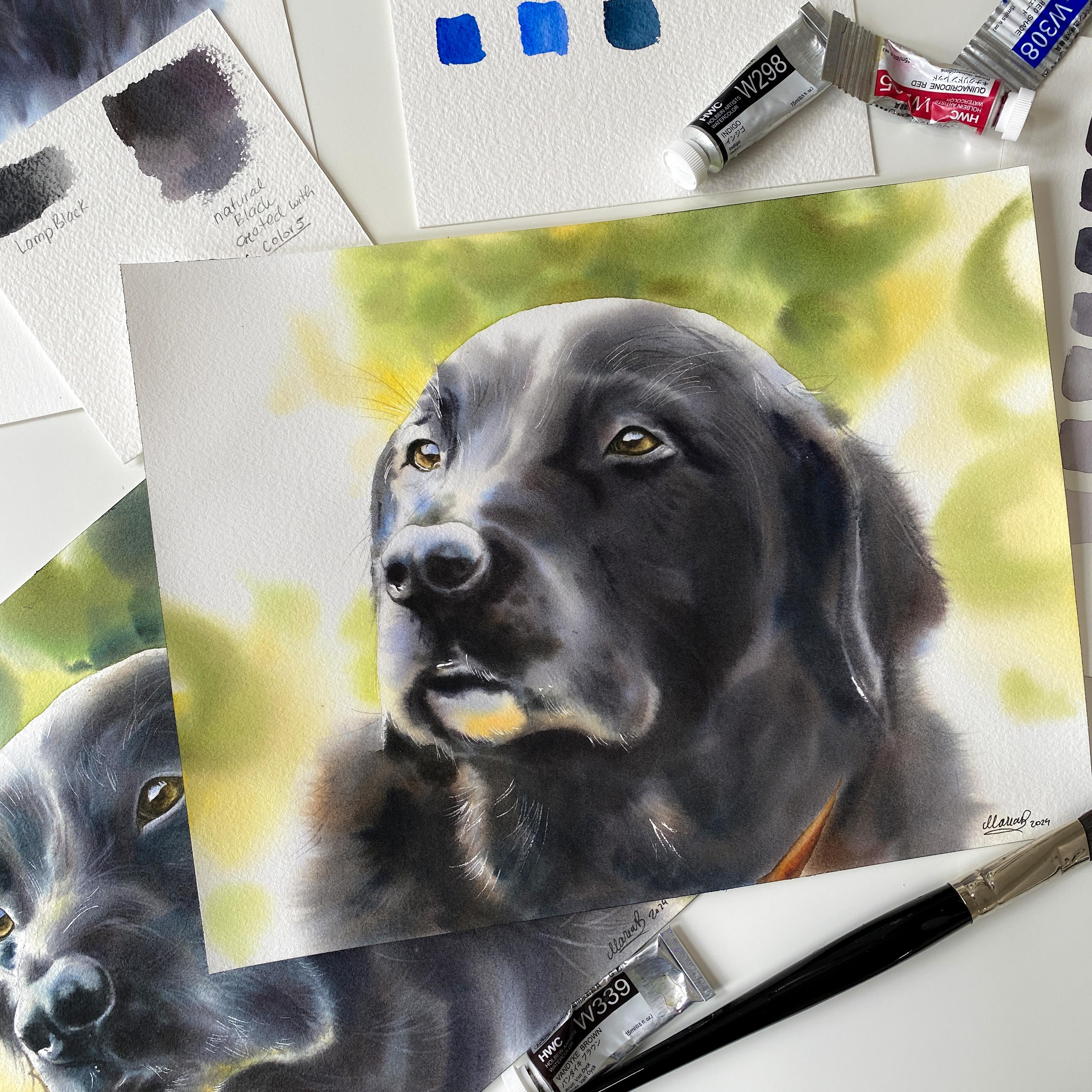
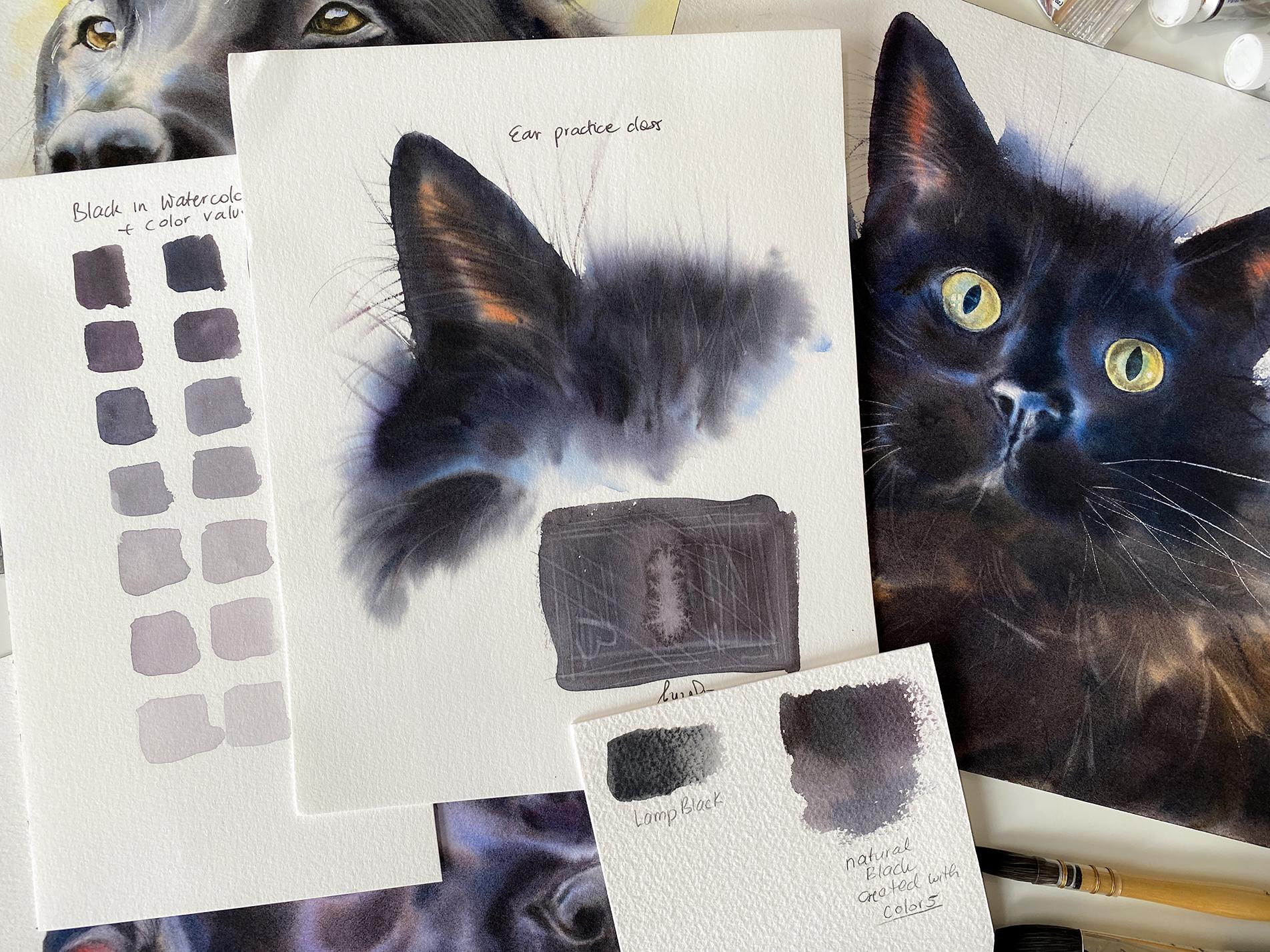
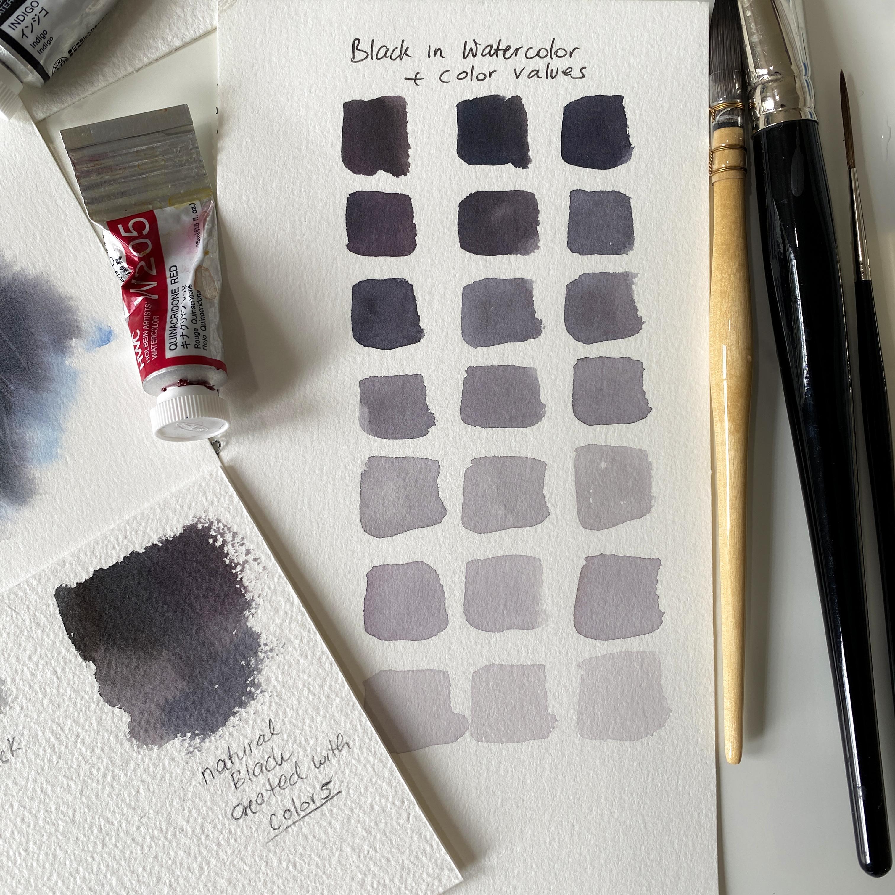
4. Exercise: Creating Black: Hi, friends. Welcome
to this first lesson. Before we begin
painting the animal, I need to first talk
to you a little bit about how to create
that shade of black, a natural shade of black. If you use black
straight out of a tube, let's say lamp black, which is a popular
shade of black. But the black will
not look natural. Because everything, whenever
you put it under the light, everything will
have a shade to it. Even white, there's no
true white in nature. Yes, this paper is white,
but it's handmade. It's a somebody made it. It's not something you would find in nature,
like a flower. There's no true white in nature. That's because
white white petals, white dog, whatever it is, it would be affected
by light and shadows. You always see colors
and on a side note. Whenever I paint
something white, I'll actually refer
to a color wheel and I'll use the
three colors mainly, which is red, blue and yellow. But let's go back to the black. The same happens. When you see a black
cat out there. When the sun is
shining on that black, the fur, you'll start
seeing colors in that fur. You might start seeing some red, maybe some blue,
maybe some brown. You could even see some green. Who knows what
colors you would see once that light
shines over that fur. That's why you want to use
colors to recreate that black. The same thing goes
for the shadows. Let's say you see a cast shadow, you're walking in the sunlight and you're looking
down at the sidewalk. You have this big cast
shadow of yourself. It seems black, but you
wouldn't want it to use black. You want to actually use colors and shadows are not
just gray or black. Either you were
painting, let's say black shadow or gray shadow. You still want to use colors to give life to your painting. It all comes down to really the color wheel because that's where you want
to refer to the colors. Then just training your eye to see these colors
and undertones, but thinking about how is that light affecting the object. This is like a very
basic blend for me. Sometimes I'll add maybe
just these colors, sometimes I'll add this color. It really depends what I'm painting because it depends
from the reference, what do I see in
that cat or dog? Do I see more yellow there
or if there is yellow, then I would use
maybe Io yellow deep. Do I see more red? I will go with this in red, but I will blend indigo,
this is my dark blue. Follow blue, I'm going
to show the blue. Then I have band brown
burn sienna and red. These would be in the
same category since this is my red and that would come off the red burn sienna. But anyway, you don't have
to use the same colors. You can use any colors you want to try to have a
darker blue, some red. It does help to have a
little bit of burnt CNA. Basically just look
at the colors, of course, first
of the reference. A lot of times I will actually use the blue undertones
for an animal. I will see that blue, and then I'll just use
different shades of blue. Cobal blue, follow blue indigo. Now, a lot of talking, not enough visual here. I'm going to jump into
that process of creating your own black and everything will make more
sense once you start doing it. The idea is to squeeze, I guess, the colors
onto your palette. First, you have these colors
separately on your palette, and then we'll start
blending them together. And then we'll create
our own shade of black, and then we're going to create different values of that black. You can see what
it looks like when it's like milky paint,
then watery paint. The thing is you want to see
the separation of colors, you want to see a little
bit of that blue, a little bit of
that red and so on. I'm going to squeeze just these colors onto my palette now.
5. Exercise: Black Color Values: So now, this is my burnt sienna. This is quinacri red. I just want one area to feel more like heavy
cream like ratio. So I think dairy, and then
some other parts could be more diluted like
malf ratio, let's say. This is my vd brown here. I do want more water. Just going to let that water
go here so the paint gets diluted with water.
Clean my brush. I'm going for this indigo. I have quite a bit
of it. I'm going to grab a more water here. Okay. Then this was
fallo blue red sheet, I'm and this is the indigo. This is the indigo. That's
all I'm going to work with. Now what you want to do is grab some water with your brush. You're going to grab
some of this quinacrid. Let's grab some of
this fall red shade. This is more like milratio. This is my burnt sienna. You're just placing
colors next to it or in this little island. There's my indigo Just
because it's a dark color, that doesn't mean I have
to have a lot of it. Okay. And then I didn't
grab I don't think I grabbed this band brown. Did I well, just in case I have burned and
bandage brown too. So you can quickly
swirl through this. Feel it out. A lot of it, I feel it out on my
palette actually before I go for for the paper. So This is my shade of black. Now this black has a
reddish shape to it. If you want this black
to be more bluish, grab more of the
fallow blue with it. It becomes more like this. Now I can also maybe I want
my black to be even darker, grab, let's say in
more indigo with it. It's just that you can
basically play with the colors. But what do you do to create
lighter shades of it, so different values.
Grab more water. And just go underneath it. This way you see more
of what it looks like. Now keep mixing colors
on your paper mostly. But grab different colors
or I'm sorry, the mix here. I have this brown here, then I have the blues and so on. You just want to grab
all these colors at once to show the
separation of colors. You are creating different
shade of that black. But I want more water, I want to show you here different value. I'm going to try to go
lighter and lighter now. A little more water. These
are the lighter values. What if I want lighter, I just have to add
more water to it. These are the lighter
values of my black, and in a second, you see how different these
shades really are. Now let's go with
a lighter value. There you go. This is
even lighter and lighter. Then if I want to
make it super light, that a lot more water with it. This is the lightest
value of my black. Now, this is my black, and you can tell
from the top here, this is black, and
then becomes gray because I add more and
more water to that blend. The value becomes lighter
and lighter and lighter. Just like when you
buy new colors, you want to do swatches. One side is a little thicker of that paint and then it goes
into more transparent. You can see different
values of that one color. You want to do the same
thing when you're creating either a shade of gray or you're going to be practicing
painting something white. It's basically the same
because I will also use red blue and yellow when
I paint something white, and then when I paint
something gray. But you want to create
different values of that color blend. That also helps visually to see how colors separate because this side is
more reddish here, then it becomes more bluish. Then I guess more
reddish and this is more yellowish. That's my black.
6. Exercise: Lifting Colors: So now, let's practice a
little bit of lifting colors because lifting is very important when you
paint an animal. I'm going to do this wet on dry. I'm going to grab this
all this black blend. Place it right here. I actually want this to be more bluish. At least one side of it,
still not blue enough. This is going to be my area here to practice
lifting with you. I want you to do the
same thing to scoop all that paint,
do it wet on dry. This way, the paper will
dry actually faster, so you'll be able
to lift faster. I think I scooped
all of the paint. I'm going to quickly zoom in
so you can see this better. Now what happens here
is the paper is drying, first, we see that
paper being shiny. Let me just change this up. You can see that
shine on the paper. That's not that perfect
timing to lift the colors. In fact, now if I
started to lift, the colors will separate and it's very easy
to create a bloom. I need to wait for
that moment when that shine goes away and
that's already happening here. Different parts of the paper
will dry at different speed. It just depends
how much water you added there to that paint. Let's say you were
painting wet on wet. That also matters
how you wedded it. It all depends like how much paint you placed in there too and maybe what area
you worked on last. I'm going to show you this
with my rigor two brush. This is my song bird brush. I'll start right here. Once you start lifting, you
don't want to stop. It's like a quick line. You just create lines, and
I want you to practice. Once that shine starts
to slowly go away. That's when you want
to start lifting. If nothing happens, let's say the paper is still to we just
wait another 30 seconds. On there's no more
shine on that paper, it just paper feels damp. That's a very good
timing to lift. But if you have a
large area to lift, you might not make it from
one end to the other. Sometimes I'll
start much earlier. You just practice
lifting colors. You clean your brush, you wipe your brush
on a towel first. It's very important, so it's just a damp brush, a damp brush. You don't have to
use a rigger brush. You can use a round
two or three. This is my sum ber details. It's a smaller brush, and you can lift two with
a smaller brush. Let's say I want
to make a heart. I just go back and forth
till I have that heart. There you go. I can go
and re lift as well. But you keep practicing
until you get it right. I'm going to repeat this again. Number one, your brush
needs to feel damp. You clean your brush,
you clean your brush, you wipe it on a
towel very well, and then you lift. You don't stop. You don't go like this and stop because that's how you're going to create
a blue right now, no, because the
paper is just damp. But you want to go in
this continuous stroke. This is actually a good example here because this is still wet. Now what happens if I
don't wipe my brush on a towel and I try to lift.
This is what happens. I create a bloom, so there is my
bloom right there. You always have to wipe
your brush on a towel and then you lift the collars. Number two, the
paper first is shiny wet from water paint and then that shine slowly
starts to go away. W there's still a
little bit of shine and the paper is on the verge of
it feels damp almost there. That's a very good time
to start lifting colors. Then of course it feels
damp, that's when you lift. But sometimes we miss that timing because it
might be a little too late. You want to start earlier. But here's the
bloom. If we bruh, when you don't
wipe your brush on a towel, That's what happens. You don't want that when
you paint an animal unless intentionally you want this effect, that's fine too, because there's many artists that actually take advantage of the blooms and then they just use those blooms to
create some texture, some parts over the animal. Maybe some main over the horse or any other areas they want to show that
this effect of a bloom.
7. Exercise: Creating Grays: Hi, friends, welcome
to this lesson. I'm going to teach
you how to create a natural shade of gray. This combination is very useful whenever you paint
some cast shadows. However, most of the time, you want to add complimentary
colors anyways. I'll just give you
a quick example. Let's say you're
painting a red apple. You locate where's that red
color on the color wheel, and then what's on
the opposite side on the color wheel
is a color green. Green is a complimentary
color to red and red is a complimentary
color to green. So when you paint the apple, that's red, you use some
other colors, of course. But to create a natural shadow, you would want to use
a shade of green, you would add green
to the colors you've used for the apple. That's how you would
create a natural shade or shadow for that apple. Now, whenever I paint
something white in watercolor, and we will be using
actually this blend, the shade of gray for the lab. The black lab because
the black lab has some gray hair, for example. But this is also a
good combination to use for some shadows. The key is to not mix or overly mix the
colors on your palette. Most of that mixing
should always happen on the paper with any
painting basically. Okay. Unless you're trying
to create a brand new color. So then yeah, you just keep mixing and mixing
on your palette. Grays are great to know how to create a
natural shade of gray because of painting something white in watercolor or
you have a gray horse, for example, or or
not even gray horse, just a white horse with some
spots that are grayish, for example, or
some other things. You want to refer
to a color wheel and you would think of the primary colors
yellow, blue and red. Then you would blend these colors very
slightly on your palette. You make sure the colors are
not overly mixed together. But based on how much yellow or how much red or blue
you add to that blend, it will determine, is it yellow gray or blue
gray or red gray. The easiest way to
explain it is by showing. I'm going to grab my
round eight golden one, we're creating a
natural shade of gray. This is my yellow, mng yellow. There's my oracer on red. And then I'm going to grab this fallow blue here. Some red. I usually blend blue
and red together first, and then I have yellow and red and then I go like this
and there's my gray. Now it's a matter of
how much blue I have in that blend or how much red or yellow to determine
if it's a yellow gray, blue gray or red gray. We're going to first
create a blue gray. Grab the same combo
we just created here, the shade of gray, and then just try to have more
of the blue in there. There's a little more blue here. Although I could definitely
use even more of that blue. This is my blue gray. Now I'm going to quickly
clean the breast. I'm going to now make
it a yellow gray. A little more of the
yellow overall and not to overly mix
colors on your palette. This is my yellow gray. Now, I want to make it
more of a red gray. All the colors, but mostly
it's that red and there. This is my red gray. This is something that we are going to play with
when we paint the lab. The next thing I would like
you to do is create a circle. I have my stencils here. I'm just going to
create a perfect circle with this little tool here. Create a little circle. I want you to grab
any brush, I guess. This is my long coal
size to a softer brush. We're going to wet it because I have something on my brush.
But I'm going to wet it. Make sure you don't
have puddles of water. It's not something bad
to have too much water. It just depends on the
style of painting. What are you trying to achieve. The way I paint, I
don't want any puddles. I just want that
water to be nicely absorbed inside the paper. Nicely shiny wet paper, but no puddles on top. I'm going to remove a
little bit of the water, but I don't want the
paper to become. This is good. What
I want you to do is apply the grays
and you're going to be mixing colors
mostly on the paper. I want you to apply the grays mostly closer
toward the edges and leave the middle section alone. This is what
we're going to do. We're going to grab a
little more of the red, more of that blue, and
then we have the yellow. Make it more like a blue gray, milk like ratio. Think of milk. You're going to apply
this on the inside. On this side, basically,
that's our blue gray. Now, you're going to
not clean your brush, but you're going to grab more of the yellow with
all these colors, and this is our yellow gray, and you're going to
apply it on this side. Let these colors to spread, just watch how it spreads. The next blend is going
to be our red gray. I need a little
more of the blue, the same color, you still want yellow and blue. It's
just less of that. This is going to be more of the red gray although this almost feel
like a red gray too. I didn't add enough of the
blue. I'm going to fix it. How am I going to fix it? Well, as soon as I'm done here. I'm going to grab now
more of the blue with my blend because I want this to be like a blue gray right here. I am adding it right here. Now it feels more
like a bluish gray. The ratio that I had on my brush between water and paint
feels more like milk. Think of milk.
That's my blue gray. Okay. Now I have a nice circle
at all these grays. That's something
you might want to practice until you feel comfortable with
these grays overall. I think something like
this will basically do. Let's move on to something else.
8. Exercise: Blending Black: Now, for this lesson, I am
going to draw two circles, and I want you to do the same. I'm going to have
these perfect circles because I'm using stencils. One and two. The second one. Now this
is where we're going to practice blending our
black black on the paper. But this circle is just going to be for the bluish undertones. You're also mixing
colors on the paper. First thing we want to
do is wet the paper. We're going to wet
the left circle. Wet it wait it for
a minute or two, just so you have enough
time to play with this. This is my long quo
size two brush. It's a softer brush. I mainly use two brushes. My chop two brushes
are this one, and then the round eight
golden one with a fine point. These are my main brushes. If I had to give all my brushes, for some reason, I
would keep the two. Okay. All right. This is good. Now, we're going to start with the blue undertones
because most of our paintings in this course the dogs or the cat are going to start with bluish undertones. This is my fallow blue. And this is my inacal red. Don't overly mix those colors. Now, try to not feel
everywhere like the circle. Just place it in some areas. Now you're going
to go back, grab some of this blue more
and then again, the red. You never want to have the
same ratio between the colors, you change it all the time. Now this is more like
a blue violet almost. There is way more red
in it in this blend. That's all you want to
do. But what if you want to add more color, maybe more concentrated paint. This was more like
a milk like ratio. Let's grab a really
thicker paint. More like a heavy
cream, there's my blue. This is something that
feels like heavy cream. I'm just going to apply it to the left side and you can
see how much darker it is. The paint is still spreading nicely because it's wet on wet. The paper is still wet. The paint is spreading. I'm just going to go
around right here. Now, what you're doing here, you're creating different
shades of that blue violet. You're constantly
changing the shade of your blue by adding more
or less of the red. The next exercise. We're going to wet it too. But this time we're going
to add our shade of black, the black that we
created earlier. First, grab some water
and wet the paper, first I add a lot more
water to my paper. Then I play with it and
if I need to remove some, I will wipe my
brush on the towel. So you want to feel all of this. Feel it with your hand, not
just watching the video. I really want you to
do these exercises. I'm removing a little bit of
that water because I have way too much. Now. What I need to do because I don't have
that black anymore. I'm just going to quickly
create some black. There's my Vande brown. There's add, some of
this burned sienna. These are the colors vandal
blue indigo and brown. These are all the colors
that we will be using in this class or in this course. Now, you're just filling, let's say you're just adding
this black toward the edges. Watch how the paint spreads. Let's say you want
to go through it. Now you see different
shades of that black. What if I want this
black to be more bluish? I'll grab this black and then
grab more of the blue here. I'm going to apply
it right here. I see blue, but it's not enough, so I'm going to grab
even more of that blue. In the course,
actually the lessons, which you will be doing,
you're not going to be applying black toward the
white paper like this. What you will do and
I want you to do is grab thicker amount
of that paint, blue, more like a heavy
cream, browns, do. There's my black, grab it on the tip of your brush
and then go right here, go back to the
circle on the left. And try to add some of that
over your blue undertones. These are our undertones. Now, when you apply this black, you're changing the ratio
between water and paint, so it becomes thicker paint. Otherwise, things
will spread too much. That was my finger right here. I've actually smeared it. You don't want to just
have something like this. You rather want to have
undertones and then apply that black
that we created. Now, the circle is
drying pretty fast. I can still add the colors. But now you can see what
the black looks like over my blue underton versus not having
any underton here. It's still pretty, but what looks more natural
this one right here? I'm just filling the
circle all the way, so I have it closed in here. That's it for this exercise. Almost looks like planets. Let's move on to the next one.
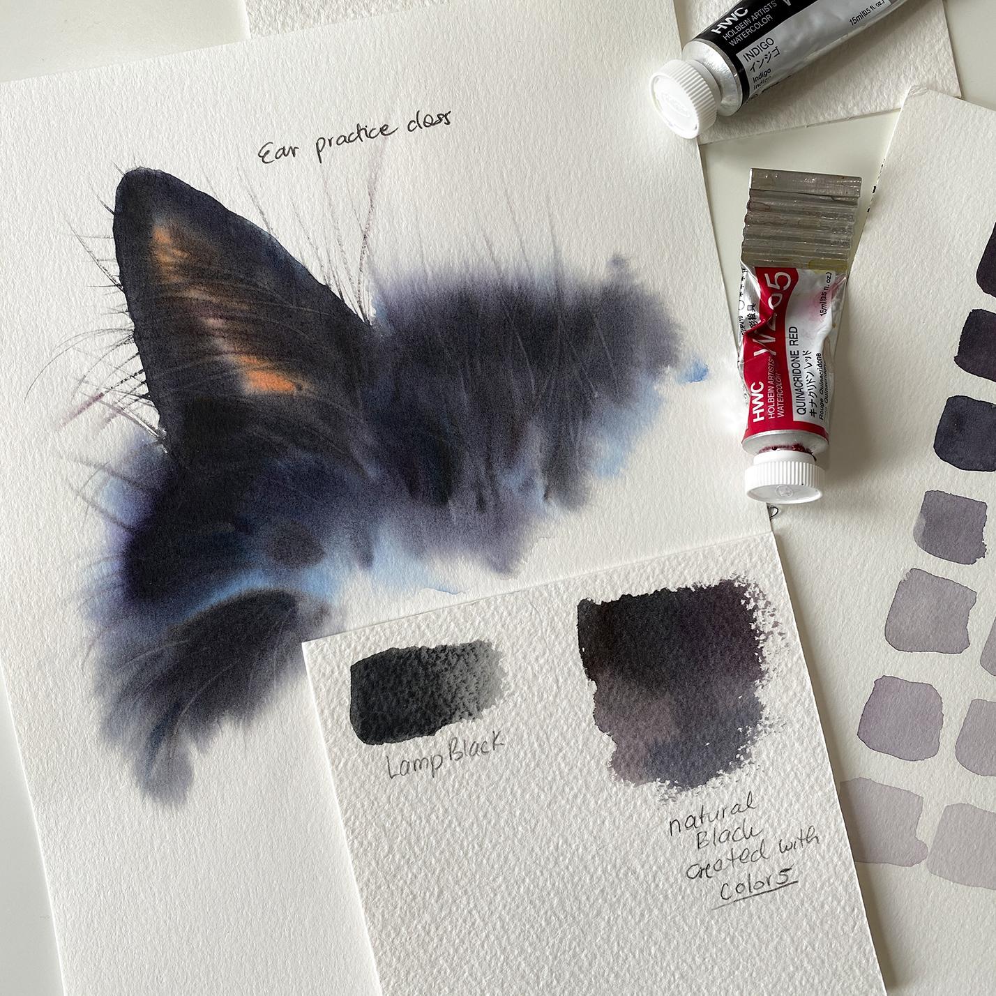
9. Exercise Painting the Ear Part 1: Hi, friends. Welcome
to this lesson. I want you to practice with
me first layering this ear. Okay? So I want you
to get the feel of it working with the
undertones first. Plus, we have a nice light
area here because it's an ear. I want you to get
your palette ready. Fallow blue indigo,
darkest blue is digo. Fallow blue red shade that's
actually primary blue. Then intact red as the red, med as a long yellow, for the yellow, primary yellow, and then burn sienna
brown and then bandic brown plus for
the inside of the ear, while we use raw even if you prefer raw
umber, that'd be fine. What we're going to do is wet
the inside of the ear here. Then we have a little
bit of that fur, but we're going to
wet the background here too just to let these colors from here to bleed a little bit
toward the outside. This is an exercise piece. I want you to be
comfortable with starting with the lighter colors first and then applying the darks, your own shade of black
toward the darkest parts. This is exercise to get
you started to get you ready for this main
piece, which is the cat. What I'm going to do is
grab my long two brush, this is my long coal size two. I'm going to wet the inside
of the cat. Right here. Another thing where
we can practice is also creating fine lines using a rigger brush for the whiskers and finest
hair that you see. For now just sweat
the inside here. Then this is part of the cat. But then we're going
to add water also toward the background because we want the paint to spread here
as well to create softness. This is technically cold
pressed water color paper, but it's not It's this
paper feels too smooth. It feels like hot pressed. I just have a lot
of sheets left. I'm just reusing
it, but it's not something I'd recommend
for a beginner. Just in general, it's better, easier to paint on
a cold pressed. Hot pressed when you don't
have texture like here, it forces you to work a
little more on details. Plus, it well you have to spend more time
wetting the paper. Otherwise, the paper just dry super fast because
there's no texture, and this is almost
like hot press. Anyway, I'm going
to wet it and I want you to wet your
ear, so the ear. For two or 3 minutes. It's important to spend
some time wetting it and going over the same
areas over and over again just to fill it out how that water gets
absorbed inside of the paper. The longer you wet the paper, the more time you're
going to have to apply the colors. A little longer. I'm almost ready. We're going to start with this section here. We're going to apply raw sienna, red, some burnt sienna,
right in the section. And then we're going to go with the blue blue tones
like right here. Technically, this would
be the eye right here, but we're not going to do that. We're just going to
focus on the fur. Once we have some blue
for all that fur, blue as an undertone then these reds and yellows
here for the ear, then we're going
to start focusing on applying our shade of black. So I'm going to
take a pause here, and I want you to
follow with me with this or at least watch and
then create it on your own. Grab a little bit of
red, place it here. Think like heavy
cream like ratio. I'm grabbing a
little bit of blue, placing it right here, some of the cobalt blue. I'm creating my own
sheet of black. There's my Vande brown, placing it here, burn not. Then do, my darkest blue. Then you quickly go through it, but don't do more than that. Just let it be just
the way it is. I'm going to clean my
brush, go back to the ear, once more, I'll go over it, just to make sure it
doesn't dry too fast. Once you're ready,
you feel like, this is good, start
pushing that water, there's puddles of water away. Just so you don't have
puddles of water. Okay. I just want nicely absorb water
nicely and shiny paper. A little more what actually
remove too much water here because I wipe my brush from a towel and that
can happen easily. When you feel like, Oh, I have too much
water and you start pushing pushing down the water or wiping your brush from a towel and then you go
back to that same spot, you remove that water from the paper and you make
it feel like damp. Okay. First, like I said, I'm going to try to show
you as much as I can. This is my rash And then there's
my acorn all red, and there's burnt a little
more of the Russia. That's all I want. I'm
going to place it here. Don't over mix the colors. Just watch how it spreads and place it like you do
want it in the middle. Actually need this to be
more like a milk like ratio, but you want to spread. Now, if you're painting
on a hot press, your paint the paint will
react a little bit different. If you paint on a cold press, I have hot press again. I
already mentioned this. But this is the area where you want the middle to
be a little lighter, but you also want to show
the color of that skin. I'm going to clean this
press very quickly. Now I'm going to grab
Some of this blue, maybe cobalt blue here, but it cannot be
that wet or this was a water like
she I need milk, and then a little bit
maybe of the quin red, and then blue and indigo. The three blues basically. Now I'm going to go for these
bluish areas that I see over the cat very gently
applying the colors. Actually in the main class, I'll be doing this mostly with my flat brush because it's just easier to
cover a larger area. But this is going to
be the bluish areas. I'm going to grab
more of the blue. Place it maybe a little
more here and there. You're placing the
blue undertones. Now, what I will be also doing is just going around
the painting, keeping it wet longer by
applying the colors here, for example, I could just go
with the darks right away. But I don't want this to dry
too fast because I'm not ready to grab that blend of
black that I just created. I don't need to go too far here either because I don't
have a full cat, but I'm letting the color to bleed over the edge
here and here too. Now, this is the moment that I'm going to grab a heavy cream. Feel something like heavy cream of this blend that I created. Don't over mix it, fill it out, and if you need more blue, grab more blue, and then go back toward the
edges of the ear. You want to do all of this wet on wet before the
paper starts to dry. I actually don't have enough
of the black on my palette. Always have more than you need. In my case, what
am I going to do? I'm just going to have
to spend some time now on duting more of
this color together, grabbing the colors and
creating more of that black. I just quickly did that. Then I'm am I placing this? I'm looking for
the darkest parts, the area is what I can see. The darkest parts,
which is above the eye, what do I do about
these sketch lines? I don't want to pay
to travel too far. You want to actually
apply the color right before that sketch lines like somewhere here I
want a little further, but you want to go a
little before that or apply the darks, so it doesn't bleed too
much toward the background. And then here, you can use
the tip of your brush to pull the paint a little bit for
the whiskers for the hair. Now, this part is a
little darker here. It's a little harder,
I guess to paint something that you're
only painting one, you know, I don't know,
tenth of the cats, it's a little
different, but the ear for example, is not
really that perfect, so we can change
it a little bit, so it's not straight line.
That's another thing. But that's pretty much it. You have these
blackish areas now. I grabbed a little more
of the brown and some more of the indigo and going
back with the cream top. Now it's cream top like ratio. You're adjusting the ratio between one and paint to
have more and more control. Now, I'm fine with
what I have now. I want to keep going, but I really don't
have the cat actually. This is from my
lifting exercise. I don't want to go any
farther than that. I'm going to clean
the brush instead.
10. Exercise Painting the Ear Part 2: And I'm going to
grab a rigger brush. I want to show you
now some tricks you could do with
a rigger brush. This is my song bird size two. First of all, I want to grab the same paint to
my blend of black. I'm going to show this to
you what it looks like. Here it is a little
chunk of that black. It's a chunk basically
because this is creamy paint. I will have the most
control if I use this cream top and I
can create the hair, but I can also go on the other side like
this, pass through. Pull the paint. I still have paint some paint because
I just grabbed it. But then I'm also pulling paint from the areas that
are already painted there. Yes, we'll have a
little hard edge there. You can always soften it if you want to if it bothers you. You use it like a damp brush, you're going to
connect the areas a little bit here and there. You can do that, of course. I usually don't bother about it. But here to add some
more of the hair, I'll just pull the paint. And pull it, keep pulling it.
You have hair everywhere. You can grab more
of that cream top, like ratio between
water and paint, more and more, just
grabbing more of the blues. You can do this whatever
you feel like you should add more darks plus
that hair detail. I'm just scooping that black that I created
leftover of the paint. Because I don't
want to waste it, but this is basically
what I would do here. I grab a little more maybe here. Whatever I feel like the
areas need to be darker, that's where I'm going
to apply the hair. The pain spreads because
this is wet on wet. It's a good thing because I have more time to apply to collars. This went a little too far up. Next thing, what I would
do to control all this. I actually would
use the same brush that I was using my
long quill says two. I would use damp brush. This is a squished
brash, but I'm going to wet it first again. Squish it a little bit,
it feels like this. Then I would grab
again that black. Then I would go back through these areas and just
stop a little earlier, and this is for the fur again. But now I have this creamy
paint a cream top like ratio. I'll go only into some areas. I don't have the eye
here, but I would stop a little earlier
to create more depth, so I would add the darks but
also using a damp brush, the paint wouldn't
spread that much. But what else we can do? Other than adding more and
more of these hair strokes. Let's say I want to add a little more. You can
continue doing that. Just make sure you
use a cream top like ratio between
water and paint. You just keep going, adding
some more of depths. I want to make sure
you can see it. I don't want to cover
it with my hand. What you can do is
lift the colors. So for that, we
have to wait again, we have to wait for
that perfect timing when the paper loses that shine, becomes more damp, more damp. I need to wait. Of course,
I could add a little more. I'm tempted to add
a little more hair like hair to go through. It has to be a cream top though. That was not a cream top. I have to go back to my palette, grab that thick paint if I can and go through it again and just add creamy paint and
creamy brush strokes, just to have a
little more of that. Okay. So I don't want to
keep correcting myself. It's easy to get lost in it a little bit because we only have this
part of the cat. But I want to wait a minute here to show you how
to lift the colors. It's very easy to miss out on that timing because we
get sidetracked or do something else like painting
basically or that we focus on a different area or basically look at the
computer screen again, the reference, and
they start thinking about it and I forget to lift. Well, I don't want
to forget to lift here because I'm
going to demonstrate. But this area right here,
it is almost ready. So you wipe your
brush on a towel. It's a damp brush
and then you're going to go for some of
these areas to lift. Now, this was a little
off camera here, so let me do it
again and you pull you don't stop halfway
with that stroke. You just keep going. It's very important
to keep going. Here, I'm lifting, but where
do I really want to lift? You don't want to over over
lift because it's black, we're going to create highlights with those undertones and by staying away from some of these areas when we
start adding the darks, like the darkest darks. Let's just say the
darkest values, the darkest color mixes. But just to show you and you
can practice this lifting. You go through the
areas that feel damp. Some areas would dry faster because it just depends how much water you applied there in the first
place and so on. It looks funny having
just the ear here. But you can also lift more the ear area and you
can add more hair, more of these
whiskers and so on. But that's it for this exercise. Let's get to our main
painting now. Okay.
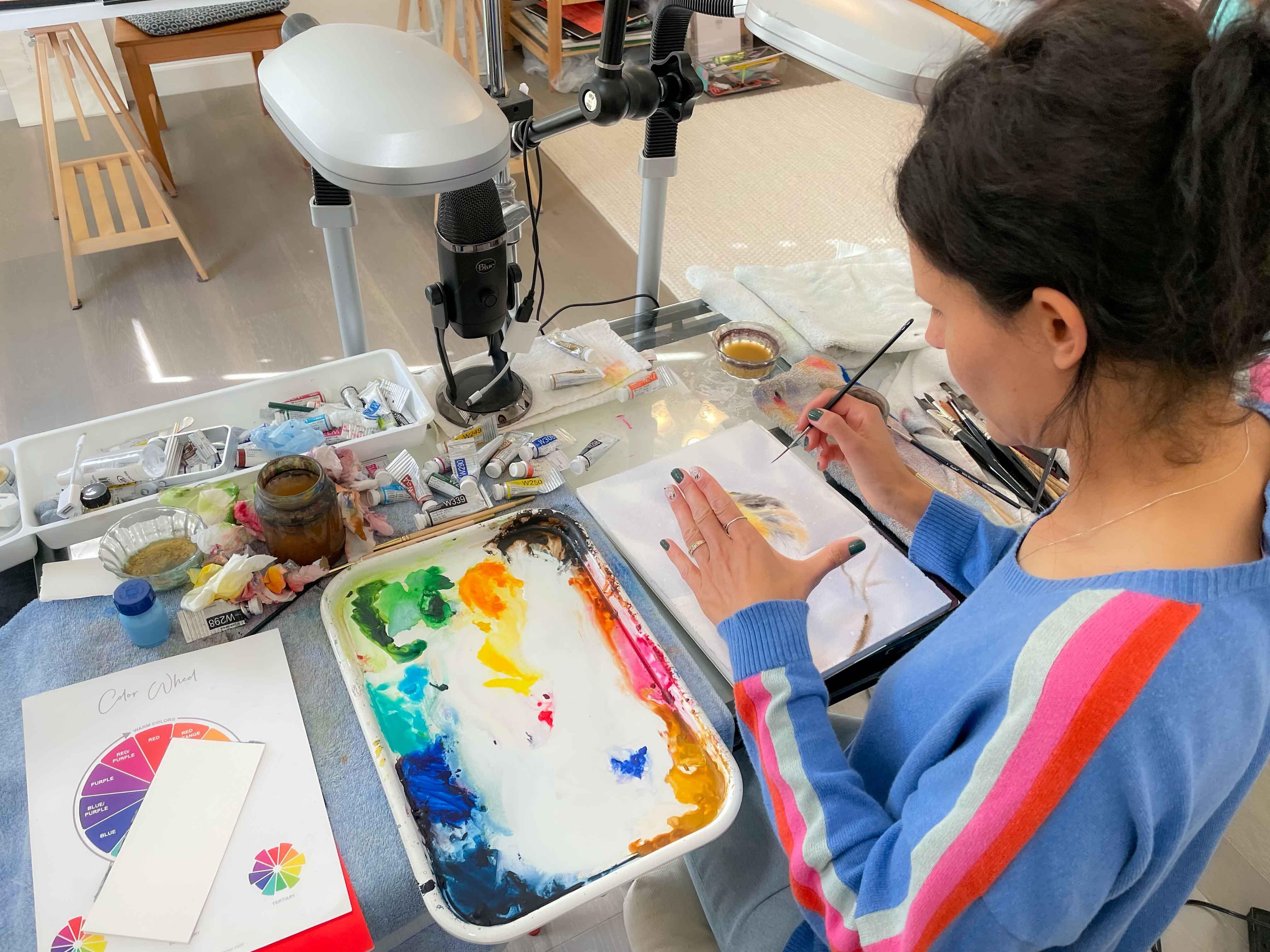
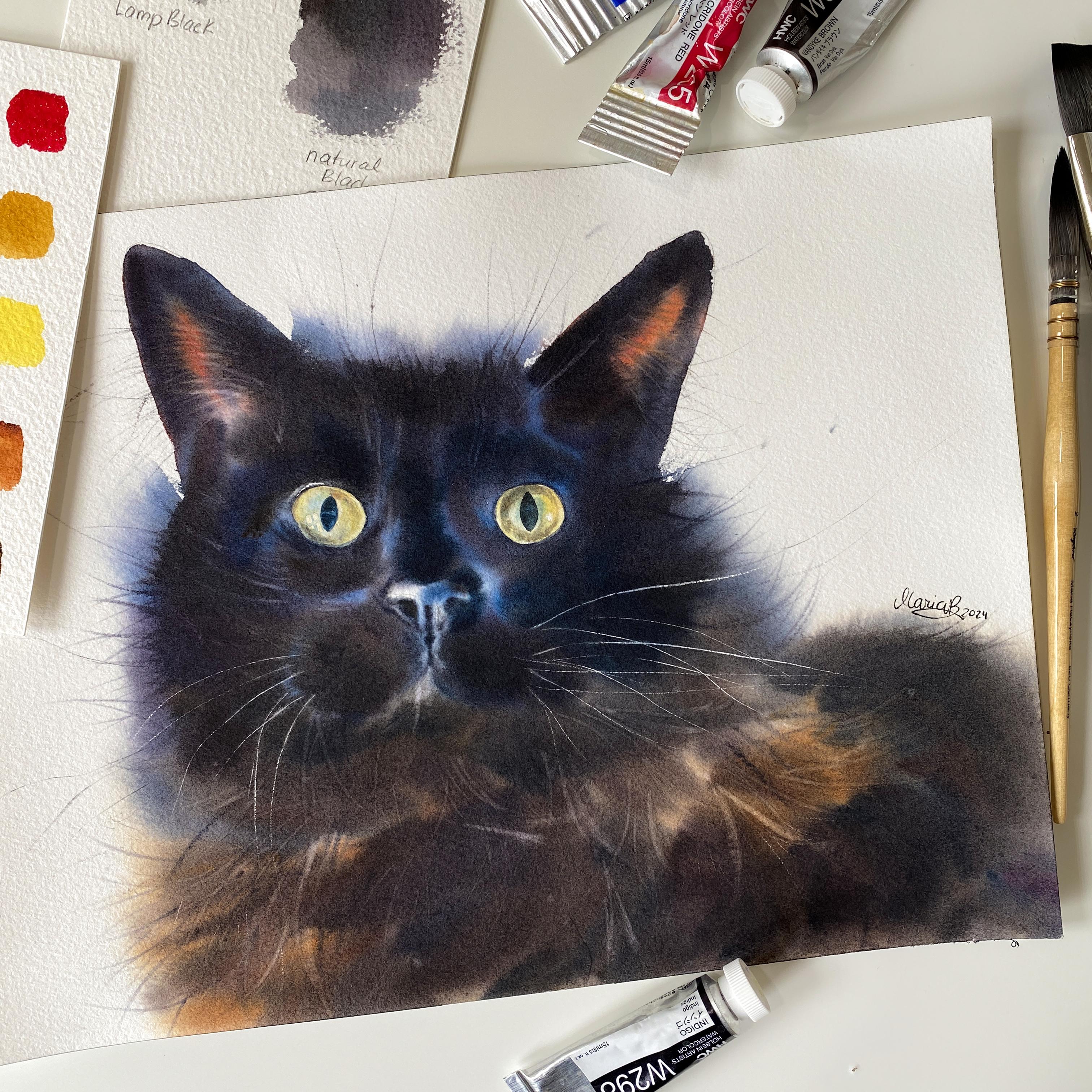
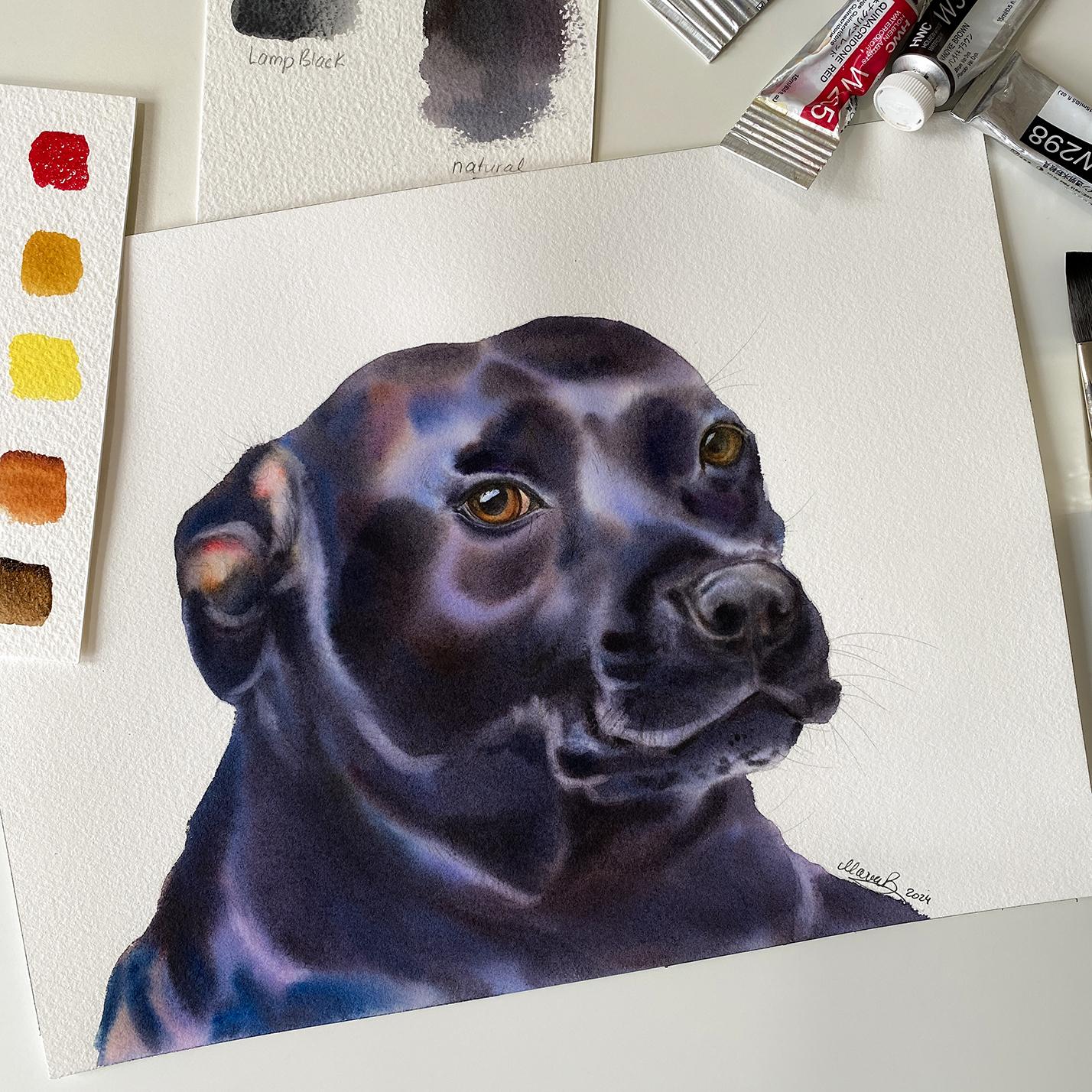
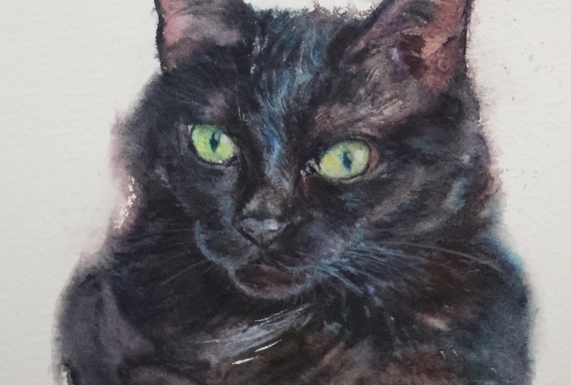
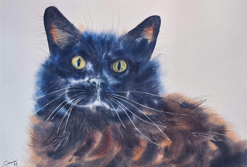
11. Project 1: Applying Masking: Hi, friends. Welcome
to this first lesson. We're going to paint this cat. Now, when you look
at the reference, I want you to try to find different colors in that
for not just black. When you look at the
chest like the neck area, you'll see there's a little
bit of yellow brown. This to me speaks as okay
this is burniena for example, but we can also use Ria I'm
going to actually use rota because that color
will also look great in the ear here
in this ear area. What are the colors.
When you look over here, you actually see around the eye, there is a
little bit of blue. That's your blue
undertones right there. Blue for these brownish areas, not just like let's say burn
maybe R but also van brown, we'll play with colors just
as we see these colors, we'll apply them with I'd say
light to mid tones first, and then you start
applying the darks. Before we begin everything, and I'll talk about in a second, how we're going to work it too and how we're
going to wet the paper. Let's apply masking fluid for watercolors
for the whiskers. Okay. I have a different brush. This is my tester brush. I've been working
with Da vinci on developing special brushes
for masking fluid. Those would be part
of my sum bird line. But try to have a rigger
brush that you don't care about and you don't
mind if it gets damaged because most likely
masking will damage it. This is Shmkas masking fluid. What I do is I grab
it on this brush. First, actually, I dip
my brush in water, I wipe it, and then I will grab mask and
I'll flatten it a little bit. Then I'll look for
these whiskers, very gently barely
touching the paper. I have created whiskers like this before just
by lifting colors, that is another one of
your options and option, basically to create whiskers. These whiskers on the left are not as highlighted, let's say, but you still want
some whiskers, and this is our backup
in case we can't lift. At least we have
some whiskers here. Even though I am not planning on painting the background here. I'm still going to go sometimes over toward the background here. This whisker is a
little thicker. I really want to keep
them as thin as possible. Now, since we already
have masking, let's find maybe
another area that we could preserve to stay white, maybe just a little
touch above the eye. It's so light there.
Then maybe how about this little highlight or the highlights are
going to be lifted. We're going to lift the
highlighted areas anyway. We can also use a
little bit here, maybe where we have the
brown black feathers, the fur, all that hair. It's like you're barely
touching the paper. I almost don't see what I
apply masking actually. That's it because
all other whiskers are pretty dark so we
can use color for that. Now, what I do is I clean
my brush regardless, and when we come back, we need to start wetting the paper.
12. Project 1: Wetting: Now, how we're going
to wet this cat. To create soft fur. I'm going to show
you example here. You want to wet part of
the background as well. Here, I decided that I'm
going to have a hard edge. I only wet it on the
inside of the cat, the same here on the
inside of the ear. But here, I wet the top. I didn't mind the colors to
bleed toward the background. You want to think of
all the steps ahead. This way, there's
no surprises and you visualize the
process of what happens. This same thing here. Now, when my line, the sketch
line is actually here, I should have probably
stopped a little earlier. But it's still worked out. The catch just looks puffier
than the actual reference. When you apply the colors, you want to be actually stop maybe right here. This
is my sketch line. I'm going to do the same thing as I did in that other piece. That's actually for
a patron class, but the same situation. When I apply colors, I'm
going to stop right here. But I am wetting the
background here because I want the color to bleed over toward the background
a little bit. I have that soft transition.
Are there any areas? I'm not going to
wet? Yes. I'm not going to wet the background
here around the ears. I'm only going to wet
the ears on the inside. Here, I'm going to go
for the background, but I'm also going to stay
away from the eyes very often. I do wet the eyes too, but not if I'm painting something black and
the eyes are so light. That means I don't
want that black, the color that I'm
going to create to bleed over the eyes because then I'll
just end up lifting. I won't be able to create such a nice light
shade of these eyes, what is it It's like a yellow gray blue,
something like that. That's another clue that
tells us about colors, the eyes are yellow, but there is some blue in it. To avoid creating a shade of green because when you mix
yellow and blue together, you create a sheet of green. To avoid that, you want to
first play with the yellows. Then on top of that
add that blue. If you grab the two
colors from your palette, then the chances are that you
blend them on the palette, the chances are by the time
you place it on the paper, you will already have
a sheet of green. First, you want to place the
yellow shade on the paper. And then follow with the blue. I'm wet in the
background here too. So first, I actually
add a lot of water. I want that water to get
in deep inside the paper, and this is the ear I'm staying
on the inside of the ear. There you go. Then
here's the fur. In a second, I'm actually
going to dilute my colors with water because by the time
I'm ready with this paper, the colors will be ready to dry. There you go. As soon as I have it all covered
nicely with water, I'm going to take a
moment to re dilute my colors with water
and then I'll come back to this to keep wetting
a little longer. Again, I'm not wetting
this background here. I'll just the
inside of the ears, so I have a hard edge there. And don't we the eyes. We'll focus painting them
later. That will be separate. Now, you actually don't want to I try really hard
not to add second layer for the cat because it's
very easy to reactivate all these colors
because those are the darks like the shade
of black that we create. You don't want to
do that. I'm going to start diluting my
colors with water, again, which is the ant brown. Burn actually I mentioned about using this rai
I need water here. This is my raw Until I
feel like it's creamy. I'll keep diluting it. Actually, I wouldn't
mind using R two. I'm sorry, Rum. Raw umber, which is like here,
but this is optional. Don't feel pressure. You
have to pull an at a color. The beauty for me about painting any animal is creating
different shades on the paper. That's why sometimes I'll have so many colors
and in the past, I would really use
a lot more colors, but I limited my palette for my students because it seemed like it was a
little too complicated. I'm going to dilute the rest of the colors
now with water.
13. Project 1: Wetting/Diluting Colors: Okay. I just diluted my
colors with water. I haven't prepared
the blend yet, the black blend,
but I'm going to go one more time
through the paper. What I'm going to do is start pushing the water whatever I see too much of the water over like the edges
of the paper. This she does not
inside the block. I actually pulled
it out of a pad. It was moving any way too much. I'm just going to add
a little more water here toward the ears. Staying away from the eyes. I have to remind
myself because I'm so used to wetting the eyes too, and then pushing that
water over the edges. It's not a bad thing
actually to have a page out and just place it
over the leftover pad. I'm going to start
from the top and I'm going to think about the
colors I see of the ears. The lightest colors first, which is like a raw Ciena
say maybe burnacro red. Definitely Quinacri red.
One thing I didn't mention, just make sure
that your paper is 100% dry from the masking
before you start wetting. Okay. All right. I think that's pretty good. You don't want puddles of water. All needs to be
perfectly, like spread. Nicely shiny paper. I'm actually going to
stick with this brush, maybe a smaller size fit brush. This is my 20 vice casinel. I have this brush.
Actually, never mind. I'm going to also use this one, which is my long quo size four actually start with this
for the ears, why is that? It's because it has a nice
fine point like this and I can squish it and it will resemble almost the
shape of that ear. Before I do anything, I need to create that shade of black. I'm going to grab
this red right here. A little more of that
red. I need a lot of it. That's my red,
cleaning my breasts. There's my brown burnt sienna. I'm actually going to
place brown here too. The palate at den is
going to be super messy. That's okay. There
is my intake brown. Actually I need to
dilute it more with water already dried.
But it was fine. And brown right here. I'm going to add some more water here because I need more. Then blue fallow
blue right here, which is actually I
create the shade of blue violet almost or purple. There's my indigo,
the darkest shade, and then you go through it
and we'll do more of that as we start picking up the colors and cleaning
quickly this brush. Because I did this,
I can't help myself, but I need to wet
this one more time. It's like the moment as
soon as I'm done wetting, that's when I want
to apply colors, and I need to fill it out
and the way I wet it again, I'm feeling it out
how wet is it? Where do I need to go over and this started to dry on me a little bit already,
which is normal. But I do need water. Just so the paper stays
wet long enough for me. Too much water I felt like there was not
enough water already. I'm adding a little more. Of course, too much
water is not good because then spreads too much. I'm going to have a
little more water here because this will be the next or one of the last
areas I'm going to get to. But first, my long well,
14. Project 1: Applying Colors: I'm going to grab a
little bit of water. So whatever paint I have, it feels more like a
milk like ratio I'd say. Raw burns here, aca
red, raw umber. This is the ear area, and when a little more
of that raw umber, and this is where I feel like it needs to
be more reddish. These are the yellows. I want to do the same
thing on this side, and you want to have
more like a milk ratio because if you start
with a heavy cream, then things will dry super fast. A little more of this
reddish on this side. Yeah, if you start using right away like this heavy cream, then the chances
are the paper will just dry on you too fast because when you use
this milk ratio, you keep your paper
wet a little longer. I'm going to stop right there because now I need to
focus on the blues. Okay. Some of the blue
tones and then brown tones. I'm going to put my long t four on the side, and
this is my flat 20. I have some water on my
brush, but you know what? I want cobal blue to. That's one of the blues to use. I apologize for
not mentioning it, I will mention in the
list of art supplies, but this is my blue, and I want all of this
blend as well. My sheets of blue
with other colors. Then here we go. You want these
bluish undertones. You can see thicker paint there. I'm actually going to dilute
it a little more with water. This is the bluish areas
where I want them to be I don't need to necessarily
go all the way here yet. But this is where the
background is wet. I have to keep reminding
myself I can't go too far out there and the
same thing here. It is. If it feels like the paint
is spreading too much, wipe your brush a
little on a towel. At the same time, it's like
we see the highlights. Let's try to stay away
from the highlights. Just a little bit. I'm grabbing this thicker paint
from my palette. It's still say between milk
and half and half ratio, ratio between water and paint. Now, this will drive faster unless we go here
and add some paint. That's because we started
with this area with the ears. Let's just add a little
bit of colors so we don't get ourselves trapped in that we can't just
add any more color. Here, there's my blues. And they are browns
and reds and so on, all these colors, but
I want more blue. There's my indigo, follow blue, cobalt blue, and
the other colors. Again, the idea is not
to mix these colors. On your palette. Try to let these colors to
blend on the paper. Now you can see so many
different sheets of blue. Don't worry about
splatters and stuff. From a brush, that happens
to me all the time. Trust me, if anything, it makes it prettier. I
don't worry about that. I'm going to get really
close to I'm the eye, and the same thing on this side. I have on one side, I have a little more of indigo
other side of the brush. There's a little bit
of let's say the red, Browns got to be very
careful so I don't go over. The nose. It does have some blue and I want
some color in there too. Another thing that
we're going to do, which we already practiced
earlier is lifting the colors, which is very important
to lift the colors. When you pay an animal. Let's grab a little
more of the brown this time and then
place it on this side. Now, we talked about all this
fur that was brownish here. Let's keep in mind that we
do have to come back here. Let's add before I
continue with the browns. Let's add a little
more color here. This doesn't dry on us. It's like jumping from
one area to another only because you don't want the
paper to dry on you too fast. I have a little
too much water in the background, so this
is what's happening. I have to keep an
eye on all this. Now I'm going to clean my brush. Just so now a little more water. I have these shades of
the fur is different. It's brown, but we
can see the shades of that raw umber and some bunt
brown let's say and burn. All of that. That's our key then a little more
of the Bncavt brown here, we can do Quin red. All of this is brownish. That's our brownish undertone. More of the roca
brown, just overall. We will be also lifting colors. That's another thing
we'll be doing. Now, I do want to go
back to the ears, make sure that ears
are dark enough. But here before I do that. Let's use some of the color I already have on my breast here. And go back here. The paint is spreading
more than usual for me because I wear it too much a
little bit, the background. It's a little too wet, so just keep that in mind. I have the paint just
spreading, but that's okay. One thing when I could
do is use a damp brush. I wipe my brush on a towel, actually squish it between the towel pieces and just pull it in a little
bit or just brush it, so you have at least
control over this. I'm just pulling it a little, but that damp brush, it would dry the area too
because you're removing the water from that area at the same time.
Just a damp brush. Now with that damp brush, I want you to grab, find brown. Like a damp breast. Red, the blues,
all of the colors, and let's go back quickly
before it's too dry. Toward the ears, and let's
add these darks here. Actually, this is the chance
to reshape the cat too. If you're using a creamy paint, cream top like ratio
between water and paint. There you go. I'm using this qui breast because
I need the point. Keep in mind,
something like this. You just need to practice, I wasn't painting
like this right away. It took time and
it took time and a lot of practice because it's
about learning techniques, the main core techniques, which are the wet
on wet and lifting. I actually run out of color. I need to squeeze more
of the and brown and let me grab some more
with my flat brush. This is and brown,
not enough water, so more water here
to make it more like a half and half ratio. Then brown, I'm sorry, the blues, all of these colors. Let's not overtly mix the colors because then
it just becomes muddy. If the brush feels too wet, which it did feel a little bit, then wipe your brush
a little on a towel. Now at this point, find the darkest areas
that you see over the cat. I'm grabbing more of the darks. What is the darker area? For sure, around the eye here. This is the area that's going to shape the nose,
nose bridge area. Let's see, we have this part
where we have the whiskers, then we can go around the eye. We're looking for
the darkest part. Try to find your sketch
lines, not always easy. But if you can, then
that's even better. I'm grabbing more of the
red with the brown indigo. All of these colors. Now,
this fur on the bottom. It's not just brown. I'm going to grab some
blues. Cobalt blue too. Let's not forget that
we have cobalt blue. Or if you don't, that's okay. You can just grab fallow blue. This is the area where
I have this fur. I don't want to cover all of it because I want to
show that there is that can raw umber. This is a little harder for
me because at the same time, I have to explain all this. It's not a voice over. I'm talking in real time. That's the difference with my classes I do it in real time, which sometimes very
challenging actually talking explaining when
everything is drawing and I go to move on to
this part or this part. Now this is the area that
needs to be darker too. Right underneath
the eye. I'm going to have to use a
different brush for that. But since I have a larger brush, I have more coverage, which is why you want
to use a larger brush. Now if we want to lift the areas next to those ears
or over the ears, actually, then we need
to keep an eye on it. The area doesn't dry on us because if it does,
then we can't lift. I'm going to go back here
and using the side of my brush to recreate
that head there. It's like I'm you're
mapping it out. You're traveling through
the whole thing, looking for the areas, what else you can
reapply colors. You're making sure that there's some light so you can
see all that too. Don't want to cover it
too much with the darks. I grab more of the
blue blue tones. This is all darker actually.
15. Project 1: More Colors + Lifting: This is what my
palette looks like. It's not crazy. It's so dirty. But it's okay. I
still keep mixing colors on the paper mostly. It's still happening. And as
long as the paper is wet, I can continue doing this. So I like the blue shiny, but I don't want it
everywhere too much too. I want to shape my cat. The goal is to shape it
to give it a nice shape, but also dimension is the key when you want to make
something look realistic. This needs to be darker
around the nose. Muddying a little more color here using the
angle of the brush. These are overall the areas
that are a little darker. We see the highlights. But the highlights
don't need to be so strong over here. I
can go back here. Add a little more
color, there is the mouth I don't want
to cover it too much, although the mouth
is a little covered. Let's keep in mind, we
can also lift the colors. Now, we have to
also know when to stop because if we continue
just adding and aiding, then things can still
get muddy even though we are mixing colors
on the paper. I'm going to show
you thing you can do cleaning my brush
first. That's important. I don't grab this brush by accident when it has some color and I don't
want that color. I have three jars
here with water. I really need to now
pay attention to how the paper is drying
because if I want to lift, that's it. I'm going to grab
actually with that brush, like a creamy paint of the ras and try to lift or lift lift, but apply the hair through
the area of the ear here, and then I can live too, but
I want a little more yellow. I'm just grabbing thick raw I guess raw umber slash raw
and the same thing here, but it has to be creamy paint. Now I'm going to grab
that blend of that black. And it has to be creamy paint. Let's find the nose area. Let's try to shape it better. This is just grab a round brush, round two or three is fine. I'm just using my rigger brush, but it would be more
comfortable for you for sure, if you were using a
smaller round brush. I'm used to using this
brush, that's all. Then you go around the nose
area just to add the darks. Remember that we're
also going to lift. This is your chance also
to shape the mouth part. This is creamy paint. Okay. Don't worry if something doesn't
just come out right away as you wish because
this is practice. A lot of it just
requires practice. The more classes
you take from me, the more you realize,
this makes sense now, this makes sense because when
you're new to my classes, it's harder a little bit
probably to listen to all these messages about color blending and if you're coming from a different
teacher, for example. But I always cover about the fundamentals and refer to the color wheel because
it's so important. We need to lay that
foundation in you. Just like my mom did it and it helped me, I need to help you. You refer to the color wheel when you need help with colors. Now, we need to lift colors, but we can also use that creamy cream top cratia
between water and paint, and we can pull the paint. I changed the view a little bit, so the painting is a little
highlighted, I guess. It's not the true
colors when I look at the painting in my
camera as I'm recording, but I'll show you photos, different photos,
I guess of this painting using different light. It's hard to actually take photos of a black painting
of a black object. Now, what you're doing,
or what I'm doing, I want you to do is pull
some of that paint through. I have paint on my breast, but you also at
the same time add in hair detail
using a gar brush. This is still shiny wet. Now, keep in mind too
that sometimes when we use all these colors,
so many colors. It's a little harder
sometimes to lift too. Just keep that in
mind because not all colors lift easily. Not all colors lift easily. You got to keep that in mind. Try to leave as much light
as you can over the nose. Nose is always
important and the eyes, because you connect with the eyes first when
you see the painting. I got to lift colors there. I just want to add
a little more here. I have this screen
top on my brush, the ratio between water
and paint is screen top. But I also pull
that paint just to add some more hair Now
this area right here, be nice to add the hair, because it's different color. But this is now this cat is reflecting the colors that
we see in that reference. Careful when I have to
tell myself to be careful. When you have jars of
water right next to your painting because
I have a little splatter if it went over there, then I would have a little
bloom, which is okay. Now, I wipe my brush on a towel just like
in the exercise. When that shine is, when that shine is gone
from the paper, that's when you want
to lift the colors. You don't want to
stop when you lift, and then you stop halfway, you go all the way. All the way till you're
outside of that ear. Now, I have a hard
time a little bit lifting here is okay. Press a little harder and see if that helps if
you have a hard time. Again, we're using
a lot of colors, not all colors lift easily be nice to lift
a little bit here. This area lifts a
little too easily. I don't want to
make it too light, but I want to show some hair. Now, this should be
lifted here actually. I might have to wait
for it because it's a little too wet, all of this.
16. Project 1: Lifting Colors: What I could do is grab
a cream top creation. I'm going to create
this creamy paint of this van brown, cad red. The blue is very creamy paint, cream to creamy paint. The brush is pressed
a little bit. I'm going to try to add a little more darks here
for these whiskers, but I need do
actually for this to, to make it really dark. But I don't want Justin
Digo that's the thing. I don't want Justin Digo I want other colors because
I don't want just blue. Here, I might as well
just add some hair. Go through that and that.
A little more of this. Then you can keep pulling on the outside
too if you want to. Just to add a little more hair. But this is the area
that I do want to lift. We first of all, here, I can tease the areas because this is where
we have these whiskers. I want you to notice
something at the beginning, I said I had too much
water on my paper, right? I had paint spread too much. But then I shaped my cat anyway by later adding the darks
here closer toward the cat. That's the thing. Don't panic. If the paint at
first spreads a lot. You can see all that
by first stroke, but then all that
shaped it better. Just continue, don't give
up, finish your painting, and then if you want
to do it again, do it again, but don't
give up, please. Because it's all about practice. You just have to practice. And then you become a pro at painting animals using the
wet on wet and lifting. I'm going to grab a
little more paint. I'd like to paint or add
these whiskers on top. Now, the line is breaking my line because what
I should do is grab a little more water
with that paint the lines are smoother,
something like this. Good enough, but I'm going
to create longer strokes. More I'd say like a half
and half like ratio between water and paint because you're
starting wet wet surface, and then becomes
the paper is dry. We're going here so it
becomes wet on dry. I'm going to clean the
brush because I really wanted to lift some
of these areas. Some might be too late, because I don't have to
really lift here. With lifting, you don't
want to overdo it. If you do, then the area
just looks overworked. Just wait for that
perfect timing. Of course, you can practice too and test the paper
if it's ready. Just don't do too many strokes
because it's really easy to make it overwork, basically. I'm going to clean this
brush while I'm waiting for the paper to set all a bit, but these are the
areas where I'd like to lift a little bit. It's a good excuse because
we have the hair there. Now, what I want you to also do, what you can do is
lift the colors, let's say too much color bled over here, which
in my keys did. I'm going to make that line above the eye a little
lighter by lifting colors. I wipe my brush on a
towel first, I clean it. I pick up the paint
and I clean it again, my brush. What other area. This is good timing
for you to lift. Let's say you I lost here,
actually part of the mouth. I'm going to lift this. But let's say you
lost maybe the nose, lift it, lift a little bit. Wipe your brush
on a towel first. This is a good
highlight here to keep the right side or it's in the
middle there for the nose, but this would be a nice
area to lift right here. Now I have a nicely
highlighted nose. If I want to let's lift
a little more here. I'll press a little
harder with my brush. Anything here, I guess
it's just the hair. Something like that, let's go back with every group price. I almost forgot. I
don't know if I can actually live here,
just a little bit. It's very hard. I'll
tell you why also. It's because we added
cream top ratio. The ratio between water
and paint is creamy paint. Now, if everything that you did feels like a lighter
values lighter values, you created lighter values, it's not going to be as
hard for you to lift, but it will look lighter, which is okay too. Here I'm going to press
a little harder with the brush to lift, it's
definitely harder. Because again, all these colors, thick paint harder to lift. If you tone it down everything and it becomes much lighter, of course, you will have
easier time lifting. But if you want to do this
richer make it darker, then you end up with
a little difficulties lifting just FYI. I press a little harder
with my breasts. Then I got to make sure I wipe my breast on a towel
before I lift. Super easy to create a bloom. Sometimes I'll go over the
lifted lines a couple of times until I can see a little
bit of that lifted area. It would help to have
this at lifted here too. But that's pretty much it for this part of the
class of the lesson. Because next thing we're going
to do is work on the eyes. We don't have to
do that much with the nose as we already
painted part of it. I press really harder
with that brush just to uncover some more areas. I lived a little too much. You know what? I don't
mind that little line. It gives it a character, let's say, then maybe
here a little bit. Well, I really
like the nose now, so I'm going to leave it. If you like certain area
on your paper already, leave it, don't do
anything with it. It's so tempting, I know
plus you're following my class I know it's impossible for you to not compare your
work to my work, but please try not to
do this because it's discouraging sometimes when
you're learning and you want your artwork to look
like not even my work, but somebody else's
work that you're going to see in the
community section. You're starting out and let's
say this other student has some experience and
painted it much better. Don't worry about things like
that. You have your time. Everything takes time to grow and I have
been there myself. Just stay focused on your
painting and you'll get there. I promise you that. You
just have to commit. That's all it takes
us commitment. My mom used to say when she was teaching
how to paint with oils. She always said, 20% is talent, 80% is hard work, and it's true. I see this over
thousands of students. I have thousands of students
across all the schools, whatever I teach.
Over the years. This is what I've
seen. I've seen those that were more talented. But sometimes it
took them actually longer because they
wouldn't focus as much or they wouldn't spend
as much time on painting and practicing and they
thought they were already so good that they wouldn't
have to practice as much. But the thing is, you
still have to practice. All right. Let's leave this, let it to dry, and then
when we come back, we are going to work on the ice.
17. Project 1: Painting Eyes: Hi, friends, welcome
to this next part. So we need to paint the eyes. And the way I break it down is basically there's always
some highlight, right? So I'm going to focus on
the highlights first. So I won't go for the darks
or anything like that. I just want those
highlights to have a color. I don't want the highlights
just to be paper white. Although a lot of times it just seems like it like it could be just plain white,
and that's fine. But here, the highlights are
definitely not got white. So what we're going to do
is wet the entire eyeball, and now we're going to apply colors that we see
in that highlight. We have four little squares and that looks like a window reflection of a window in there, and I use the same
thing in the other eye. We're going to wet it first. I have my round eight
golden one brush. Right away, I went
over. That's okay. As long as I can white pits to make sure that
the color does not get reactivated because these are really dark shades that I
used and It's not even that. It's just that I painted it
with these heavier ratios. Heavy cream and cream top, that's super easy to reactivate. This is a larger brush. You don't need to
go around eight unless you feel
comfortable with it. It's just this brush has a
nice fine point and that works for me as using a smaller brush because it's a larger brush, I cover the area
much faster compared to using a smaller brush
around three or two. A little more water. I'm not going to spend too
much time on this, but I still want to make sure
that this is nice and wet. Now, what colors, I'm going
to start with the yellows. I want to use some
of this raw sienna since we use raw sienna and then a little bit of me that's a long yellow.
Very tiny amount. It's not really
yellowish in there, but I do want some
of that yellow, and I might as well just add it whatever other places
I see the yellow. This highlight needs a little
bit of that blue in there. But since I have a color, I'm going to spread
it a little more. That was the two yellows. I'm going to grab this
cobalt blue here. I'm just going to place
it next to it in a way. See, I feel like fallow blue would be
actually better one. I'm going to wipe my brush on a to grab a little
bit of fallow blue. Yeah, because fallow
blue is much cooler. It works better. There you go. I'm placing this
fallow blue here. It's a very pale wash, don't work on it too long, leave it as long as
you have you created a little bit of a color there or you blended
some colors there. I'm going to actually grab
with that same brush. Some of the yellow again. Let me see make sure
you can see it. It's very hard to actually show it for some
reason on the camera. When I'm painting
something dark, it's like I have to work
with the exposure on the camera because it's super hard to show
the true colors. I mean that that pale. I'm
going to lift a little bit, and that's it for this eye. Let's do the other eye. So same situation, we're just going to wet it and then
apply colors we wet. I'm grabbing water
with the tip of my brush here,
spreading the water, being careful not to go
over the outside the lines, the sketch lines because I
don't want to reactivate the darks that I used to
create the shade of black. This is my daughter's new
favorite painting cat. I painted the other cat two. That's for patron but she
likes this one better because she likes the shades of brown actually in the fur. Go. No puddles of water, so I need to make sure
there's no puddles, I'm wiping my bon tail and
going through it again. Again, I'm not going to
spend too much time on it. Grabbing this milk like ratio of the yellow ochre
and let's see. Even if I'm sorry, Riana, but you can grab
yellow ocher to. And then some of
this mi desal yellow and try not to mix the
colors on the palette, let this mixing to
happen on the paper. We are focusing on
painting the highlights, but we might as well
add this first player. Since we have all these yellows, I'm going to grab
a little more of that rocia maybe a little
too much. I want the blue. With the tip of my brush, I'm going to grab this
fallow blue because last time I grabbed the Cb
blue I didn't like it. I'm going to place it here
with the tip of my brush. I wipe my brush on a towel because I had a little too much. If milk like ratio does not
work for you, that's okay. Just try to adjust the ratio. Maybe you need
something heavier, something that feels like
half and half or heavy cream. It's up to whatever you feel needs to be
adjusted, just go for it. I'm going to add a
little more blue here. Since it's going to
be darker anyway, and it's just nice to do a little more with
this first layer, since you map it out
all these areas. Let me see if I can
adjust the light here. I don't like what I see here. It's super hard to
show what I'm doing and if it gets too dark,
then it's not good either. I'll try to stick with this. Anyways, this is wet.
The other one is wet. I have to wait until
both of these eyes are dry and then we
can add an layer.
18. Project 1: Eyes, 2nd Layer: All right, friends,
we're ready to start painting this eye. What I want you to do
when you wet the eye, stay away from these
little highlights. What I do it as to get lost. Just wet the majority
of the eyeball. Then when you have a
color in your hand, then it will be easier
to stay away from it. I'm just going to
wet the most of it, but really staying away from that highlight plus
more just to make sure. Then once I have the
color on my brush, it will be so much easier to see where I'm
placing the colors and the area that I'm
preserving to stay paper dry. It's pretty good, I guess. You can use a smaller brush. This is my round eight gold one, and I'm going to grab the
same colors as before. With the tip of my
brush, I'm grabbing rociana milk like ratio, rociana and some of
this ming yellow. Where do I see the most
of it here, maybe here, over here, whatever I feel like I'm going to actually with that dirty brush grab
some of that cooled blue. I know I was talking about
not really using cooled blue, but it does feel okay if I grab it with that yellow that
I already had on my brush, so I'm not mixing
colors on the palette. I'm not. I am just quickly grab quickly
grab that cooled blue. But I'm going to
grab now some of this diluted flow
blue with water. Now this is what I'm
going to mark for myself, where is that little
window we see in the eye? Something like this.
Now it's much easier. Now I know where it is. I'm
going to stay away from that. I have paint on my brush, might as well just
place it around. I'm going to wipe my
brush on the top, because I have a little
too much of the water, grab more of the rust I'm going to travel
around, I guess here. Overall. If you look at the eye, this side is lighter, and then I guess that's the
lightest part right here. We can also lift it
if it gets too dark. You know what, I am
going to switch to a smaller brush because
with a smaller breast, I'll have less paint or water
I'm sorry on my breast. With around eight, I just felt like I had a
little too much. I'm going to grab actually raw, some and brown and a
little bit of indigo. I'm going to go for
these darkest parts now. The ratio in my brush
has to be heavier, more like a cream top like ratio because I want to
have the most control now. I don't want the
paint to spread, especially that I'm
adding these darks. I just want a little more of
the indigo with the browns. It does feel like I should add a little bit over the edge
there because this is shading. I need to create dimension too. Let's see this could
be more bluish. How about grabbing a little more of that fallow blue alone. Actually, this is
fallow blue indigo. That's way it looks
dark. Okay. That works. P blue and indigo works. So I have a little bit of that, but it has to be cream top. Everything at this
point has to be a cream top like ratio
between water and paint. I'm going to grab a
little bit more of the browns together and
shed it just like I see it, but it needs to
feel more brownish, I guess, not brownish,
more dark blue. I'm going to go with this paint here that I have on my brush. Just a little bit this area. It does feel like it needs a
little more of the yellow. I'm going to grab
more of the yellows. And just apply here
and overall here. Now, I don't have much time
to apply all these colors, so I have to hurry up. What I need to do is
apply a little more of just a blue like a follow
blue right in here. I'm going to clean my brush, wipe it on a towel and use just a damp brush to spread what I have to smooth it. I
should say smooth it. Move it around it looks soft, if I need to lift, I
need to lift here. May I have some lifted
areas here too, but I'm going to lift this part. There's that line
around right here, that should be much lighter and that helps
with the dimension. Now, if you want to make it more greenish like we see
in the reference, just let that yellow blend a
little bit with the blue on the palette that will
help you to get that. I'm going to grab
actually a little bit of the yellow with a tiny
bit of that blue. Now I have this greenish shade. And you know what, is
almost too dry to show you, but maybe I'll do that
with the other eye. I'm going to leave this
one alone and let that to dry and then we can move
on to this right eye. We're going to do
the same thing here. We're going to wet it.
I guess I'm going to stick with this brush
just for that at least. We have a highlight
here on this side. Let's just wet it except for that highlight,
that makes sense. You know what? We can
leave that edge two. There's a a left side
of the eye is lighter, so you can just stay
away from it as well. I'm going to wet it. The right side is softer, so I'm just going to
wet it altogether. So here, Wedding. All right. I'm going to
grab this Rosi Amy Del yellow and more of
Amy Des yellow. Now, I'm stopping right here. So be a hard edge there. And adding spreading
that yellow. If you add more of that yellow, which is the primary yellow, you have more like what we see
actually in the reference. I think I added a
little too much of the s and the other
one, but that's okay. The eyes don't have
to actually look exactly the same as
a matter of fact. Now I'm going to
grab a little bit of the yellow and then grab a
little bit of that green, I'm sorry, blue, follow blue. Now this will resemble what
we see in the reference, grab a little more of the blue. This is what it looks like. I'm going to let this
to spread a bit. You know what? I
forgot. I was supposed to stay away from
it. That's funny. Well, you know what?
Good thing I have a masking there. Masking fluid. Well, I totally got sidetracked. I forgot. Now I'm going to
grab a little bit of brown. This is heavy,
this is cream top, cream top between one and
paint of that and brown. I already know I need to
use some of the indigo two. I'm just going to shade it for now with this van **** brown, keeping the paper wet longer a little bit
just by going around. Then with that same brush, so I didn't wash it. I have now indigo
and Vandy brown, but a little more
and creamy paint. It's like little
dots because I don't want perfect coverage here. And then go a little lower. To create some more
of this texture in the eye we can see all that. Then I'll just lift this
area if I don't forget. Then here. This eye seems
a little darker over. I'm going to grab a
little more blue. Just to add it here. I don't
want to do dry brushing, so I have to hurry up
before this is too dry. I'm getting there for sure. I grab more of the and brown. I can tell the paper is
just about to dry on me, not a good thing, but
that's all I can do. I'm just going to very quickly
go around one more time. What I want to do is
grab a little more of the blues, the blues, I guess, all the blues, add
a little more of that fellow blue here before
it's too dry, too late. What I want is left
the left side. To keep the left side
a little lighter, just like I see in a reference. Then let's grab a little
more of that follow blue to place it in the middle. So we have a nice color there. If it spreads just a little. Actually I'm using a damp brush just to let it spread
a little more. And I'm going to
lift the right side, just to make sure
this stays lighter. After this, we can move on to do the pupil
on the other eye. This is a damp price now. I'm going to lift
whatever I need to lift. I like this would
be nice to lift. Maybe move this paint
around a little bit. Basically, it's this
side, this side, and then this little
highlight, that I lost. Well, once I remove masking, it'll be very bright
actually. There you go. Just lifting. All right. I am going to go back to the other I so
we can finish the pupil.
19. Project 1: Finishing the Eyes: So for the pupil, when you look at the reference, I'm going to use my round
two brush this time, when you look at the reference, that pupil has some
blue in it, right? Let's grab some milky
milk like ratio of the fallow blue and
let's say indigo, make sure it's dry. And then place it over this, but make sure the paint
doesn't dry too fast. So maybe like a water
milk like ratio. If you don't see your sketch, try to maybe re sketch it
because it's much easier. Now with that same brush, don't clean it just grab
and brown and indigo. A little more I need
that indigo then find in that pupil
the darkest parts. That's all you need to see that's where you want
to apply the colors. That's it. You have a little bit of that
blue in there too. All right. I have one, that eye, but I can't do the
other one because the other one is still too wet. I'm just going to
do something else. I'm going to re
wet this line here because I have too many areas
that are like white dish. I'm just going to use that paint around to reshape the eye. I am reactivating a
little bit of the paint. That's okay because
I'll she it in a way. I don't want any
white spots in there. I'm just waiting for
this one to dry. What we could do is
remove the masking fluid. Well, friends, let's remove
some of the masking. I'm going to use this
pickup cement eraser. Let's see, one area here. That's actually the whisker that I thought it was too
thick, but maybe it's okay. Now what happens
is we're going to have this huge contrast, a big contrast between the
light the white and black. Yeah. That's it. Don't panic. If it's too bright, you don't like it,
doesn't look natural. Because I'll show you a
little trick what you can do. You don't even have to paint these whiskers, paint over them. I think that's all the areas. I guess where I
apply the masking. This is what you
would do. You would use a smaller brush.
This is round two. You would wipe your brush
on a towel first and literally you would just go over this whisker and
at the same time, you're actually reactivating
colors next to it. You can keep going to cover the entire whisker
if you want to. But the thing is that that white is not as bright anymore, Now I'm going to do
the same thing with the bottom or these whiskers
where they start right here. The transition is softer. But you want to clean your brush pretty often because you're
picking up all these colors. You don't want to you can touch the outside
of the whiskers, which I am anyway, but just keep in mind that
you might live too much. Try to focus on just rewetting these whiskers. There you go. Then I can do the same
thing on the left side, and just reactivating colors. And covering up my whiskers with the colors that
I already have here. I'm very careful. That's how you can
minimize that contrast. Maybe a little more here because this is a thicker whisker. I guess it works, but I don't
need it to be that dark. Then once you do
it, you realize, You know what, the white is not so white anymore and
it looks more natural. He got a little more here. Perfect. Let's go
back toward the map. All right, my friends, we're
going to do the same thing. First, I want you
to always zoom in onto the eye so you can
see it really well. But I'm going to grab this diluted fallow blue with indigo. I want this to be more
like water to milk. It doesn't dry too fast because
my intentions are to add indigo with some font brown over it toward the darkest
areas that you can see. Use a smaller brush
for more control. Then with the same
brush, just grab this thicker indigo
and band brown. I don't have enough
paint, but I'll go with this at first to cover and let some of the
paint spread more. I'm grabbing this indigo. This is probably where I have a little more,
but you know what? I'm not grabbing enough of the paint because
the paint is so dry. I just need to dilute more with water and I got
to do it pretty fast. That's why I would say, make
sure your palette is ready. So you don't have to
spend time on diluting colors with water while
the paper is dry. I think that's fine I
think it needs to be a little darker. Be here. Just right here in
the middle section, and then the top
part, tiny darker. There you go. Leave it. Now, what I did actually
with the other eye, I went around it and I reactivate a little bit
of the color just to make it even the outline. It makes sense, it's not broken. I don't have light
coming through. From the areas, I didn't
paint all the way. I think I have masking
there and I forgot. Let me try to remove it,
see what it looks like. I do have masking there and
I had masking, not anymore. If it's too bright white, you will do the same thing here. I'm sorry, I didn't show this to you, but you will
do the same thing. Just use a damp
brush and re wet it. Do we need to do anything with the nose? I really
like the nose. If you feel like the nose is not dark enough or it just
needs more definition. You can always re wet the area. Which I always say wet
more than you need. But I like that the nose is lighter because it gives
me a nice contrast. I'm just going to show this to you in case you
want to do it. I'm just going to
apply a little bit of that color just to make this
one nostril a little darker. You can do that.
You can just add more color if you need to. Yeah, I think that's it. I was going to re wet the nose, but I really like
the way it is now. My friends, our
painting is done. This class is done,
please let me know if you have any questions
and happy painting.
20. Project 2: Intro/Masking Fluid: Hi, friends. Welcome to this new class. In this lesson, we are going
to paint this black lab. I chose this one because I really like how
it has gray hair. I feel like we can do
a lot more with it, we don't have to necessarily
just make it paper white. We can use a color to
recreate these grays. What I often do whenever I paint white object
and watercolors, I will use primary
colors, which is red, blue and yellow to recreate
that shade of white. So there's something different. I guess about the
reference that I did. I put it through
photoshop to help me focus less on details. I made it a little bit of focus if it makes sense
like this part here. I started recording a class and already went
fine until I started lifting and I lifted too much in the effect this dog,
it looks puffy. It doesn't look
like a typical lab. It feels like I lifted too much. I had to help myself visually and to make it
more out of focus. This time, I want
basically focus on lifting as much and I'll just work in patches in a way. My mom an oil artist has
given me many, many tips, great advices, even though
she's an oil artist, and I'm a watercolor artist. One of the things
she has taught me is that you see things in patches, and what helps you
squint your eyes, so you focus on less detail. I've been doing that
since I started. I like the idea of it. I think it's great and I want
you to do the same thing. But also what helps us to make part of the reference
image out of focus too, and then we see less
less of that hair, individual hair,
especially the grace. Now, I am holding
a rigger brush. This is my test bruh, something I've been
working with Devin I'm developing another brush. I'm trying to create a brush that's good for masking fluid. Try to have an old brush
you don't care about. I have my old heritage brush, and that's something
that I guess I would use for masking. Just right away, wash it off, so maybe we will last you
for a few more times. What I want to do is
use this masking fluid. To mask some of the whitest hair that I see over the face. Not too much, just a little bit. It's like for example, here, maybe some hair, here, here. There's actually a couple areas that since we're
already using mask. You may as well mask this little tiny little hair
area and almost the eye, the corner of the
eye, and there's another area. You
might as well do that. I wouldn't mask the highlights
in those eyes because it's the effect is going to be
much better if we work from the highlights to
the darkest layers, and I'll show you how to do
it with a couple of layers. So I don't do that. You could use maski maybe here underneath the non trail because it's a strong
highlight and will be easier to preserve that area. Just stay light, white,
almost like white. Then we have here a couple here, we can do that here, maybe
here, and maybe here. Not too much overall. We are going to add background. The reason I want to add
background in disc painting is because the top of the head here is very nicely highlighted. It's a very nice highlight, and when we add a background, darker background
here from above it, it will give us a
really good contrast. The same thing here
with the muzzle, the left side of the
muzzle is much lighter. If we add a dark color here, that will be a nice
contrast right there. Now, how do I create
this soft fluffy fur. We don't have it everywhere, so that's why I don't
want to endp with this again, fluffy, too soft. But something in
the middle parts are fluffy like the
bottom or the bottom, the neck area, chest area. This is a good area
to make it fluffier. What I would do is
wet the background of the of drawing here as well. The paint from this side
bleeds toward the background. I don't have to really
preserve the top of the head because I'm going to
add the background and when I add the background, what I'm trying to
say is I don't have to stay only on the inside of the labs head just to
wet it and apply colors. I can lend those colors to bleed toward the
background, too. I will just not apply many
colors toward this line here, but more away from it. The thing is that the
background will help us to create a contrast and
to shape the animal. But this fluffy ear here It would be nice
to keep it fluffy. That's when I would wet
the background here to background here
too for this fluff. The same thing here,
I can wet this part, but just stay away from these
areas when applying colors. Now this ear, it
could be fluffy, but I will show
you what happens. I wanted to make the ear
fluffy and here and here, everywhere around,
and then just became a little over fluffed,
which is fine. But maybe this side, I just wet only on the inside, just to keep this
side section here. All this, I'll just
wet on the inside. I won't wet the
background, but here I'll wet the background
background background. You know what? It's much easier to understand once we
do it. Let me do it. But first, masking fluid. What I do is I dip my
masking brush in water, and then I go for that masking. This is the Sm'morry
blue masking. I flatten the brush like this. And then I find the finest, the whitest hair that
I want to accent and I barely touch the
paper when I apply it. You can't really see it because it's the masking first of all, it's it's blue, but you
can't really see it. It's just so light,
and the thing is my lines are very light, fine. They're very thin, so
it's hard to see it. Let's just apply color or
the masking, I'm sorry, toward the lightest areas
just some fine hair strokes. Here maybe some here. Now, I'm grabbing a little more. I actually I'm going to add
a little bit over the lip. I like that lip and then I was talking about the nostril here. Then I was talking
about the left eye, which we could create
a line underneath the eye bowl and then
let's see we have this. That's light, and then
there's a little hair. Let's see what else. We can add some here here, not too much. But some highlights
from the masking, that area will be protected from too much pain
to flow in there. Let's see maybe here
very tiny hair. We will lift some, but just
have to be very careful. It's I'm used to lift thing, but then you can
overly lift or you can just lift where you
don't need to lift. Then you end up with
too fluffy painting. You would think it's
not a bad thing, but it's just not right
for this kind of a dog. Maybe here a little highlight. I barely have any
masking on my brush, and I grab a little more. Let's see, what else
would I like to add it? Maybe like here, but
just like tiny spots. Okay. Let's see. This is more of
an area for the masking, which would be let's see. It would be right this part where I marked
it with a pencil. And then these
eyebrows, I guess. You can't really see it, but I thought I will still
show this part of the video just so you see where I'm applying
some of this masking. All right. I'm going to
clean the brash now, and then we can start
wetting our lab.
21. Project 2: The Process/Wetting: Some friends. This is
about the process now, how we're going to layer it. Again, we're going to wet
it and paint it wet on wet. I am going to wet the
background here as I am wetting the dog, all of this. Then here, I'm going
to stay on the inside of the dog and here I'm going to go again toward the background because I want the
fluffiness here too, background, background, the dog background here,
here, here, here. All this is just
going to be wet. This area on this side, I'm going to stay on
the inside of the dog. When you wet the paper, do it for 4 minutes
maybe 5 minutes, just to keep your
paper wet longer. Another idea which
works is great. Wet the back side
of the paper two, and then don't worry
about staying away from not wet the entire paper. Just wet the entire paper from the back and then on the front. Back for 3 minutes and then wet the front side for
four or 5 minutes. That will give you plenty of
time to apply colors on wet. You might be asking yourself
a question thinking like, why isn't just I don't know, stretching the paper or
submerging it in the bath tub? Yes, you can submerge it in the bathtub if you want to
for a couple of minutes. Why am I not stretching
the paper because when you stretch papers and you wait for it to dry and you
rewet it or something. The thing is you're removing
sizing, the surface sizing. The paper has sizing,
internal sizing, and then some papers do some papers don't
have surface sizing. Either way, when you
stretch the paper, you remove some of that sizing. Now, imagine having
a tissue and you decide you're going to paint
on a tissue or paper towel. Okay. So you grab the paint
without water. What happens? You paint and then
the paint spreads uncontrollably because
there's no sizing, okay? That's why you want
sizing in your paper. And whether you want
to stretch it or not, it's totally up to you. This is my take on it, and I just get so
many questions why I just don't stretch because I don't want to lose that sizing. The sizing is what
helps me to control the paint and water when I
apply colors wet on wet. What I'm going to do
is start wetting, in the middle of wetting, I am going to jump
toward the palette, dilute these colors with water, and then I'll go back to wet it for a little longer
to the paper. Here's my flat 40 brush. This is Dacl I'm just going to basically I'm
wetting the entire side here. Now, before you
wet, just make sure your paper or the
masking is 100% dry. All this is fine, at
first I grab a lot of water, lots of water. Again, this is the area
where I'm also wetting the background background here and then I'm going to
stay on the inside. Only to have a little bit of
control here, more control. I don't mind the hard edge. It's just that my first version. I start recording a class
and I'm happy with it, but then I'm thinking to
myself, you know what? This is way too fluffy. That dog does not look
like that reference. Of course, I didn't add the
eyes yet and I also share the photos that just
basically images, close ups because it's
not a bad painting. It's just that I made
it really fluffy. Yes, there's dogs like
that there's just not the dog that I see
the reference image. So making it soft
and fluffy works, especially when you paint a cat, but maybe not with
a black lab that has this smooth short
hair on its head. Okay I'll still
finish that painting, and then I'll just share images
of it so you can see it. I always like finishing
my paintings. Probably 1% of my
paintings overall. I have not finished all the way. I am wedding, again, if you want to, you can wet the backside of
your paper as well. I'm going to add a
little more water and I'm going to let
it sit like this, and I'm going to start the
looting colors with water. I'll tell you now what
I have. Why yellow? When you look at the dog, the chin or the chin, the muzzle part, the
bottom part of the lip, you can see a little
bit of yellow. Why not to show that
in our painting. It's a nice little
highlight there and it reflects something nice. This is my coin red. Here's my red, and
there's raw umber. That's for the yellow blend. What is the consistency
that I always say to dilute to is something that I call heavy cream ratio
between water and paint, but you also want
to have an area that's a little more
diluted with water. Now, there's my cobalt blue. You don't have to use
two shades of blue. You can just go with
the one shade of blue. There's my flow blue shade. Finally, I have the browns. It's like I start with
the lighter colors first since my water
is getting dirty. It actually doesn't get
dirty that much until I touch fallow blue,
and then indigo. Everything else I don't know, I don't see that much.
What is not that dirty. Here's my vantage brown
and there's my indigo. I didn't squeeze new
indigo because indigo by whole bin is very
easy to reactivate and to get into that milky
and then creamy texture or texture It's not as
diluted with water the paint. I have vt brown burqa
yellow roca blue, fallow blue indigo. Now, When it comes to colors, do not worry about trying to match the color palette as
long as you have yellow, blue red, that's more important. With the process of painting, it really you don't have to
ever use the same colors, even if you're painting
with the same brand, don't worry about using
exactly the same colors. It's always all about
light and shadows. Of course, it does matter to a certain degree what colors you're using because you don't
want to use, for example, opaque colors when
you're blending mostly colors on the paper because that opacity of a color, if the color is too opaque, things become too muddy. The idea of blending colors on the paper is to avoid
that muddiness of colors. But of course, if
you have a muddy or not muddy opaque color, that can get you into
that muddiness too. Now I'm almost ready.
22. Project 2: 1st Layer: Okay. But not quite. I want
you to grab a brush. So what are you going to do is grab thicker amount of that
and brown or some dark brown. Then I'm going to
clean my brush. I'm going to grab
this burned here. You're creating and
she just like before. There's my red, but you're not mixing these colors really. You want to see the
separation of colors. There's my fallow
blue, a little more. There's some raw umber,
let's say, some indigo. This is going to be our black. Don't overly mix
the colors here. Because I'm breaking
it down like this, I was just diluting
colors with water, and then I went back to
create the sheet of black. I can go back here and
re wet this and I'm pushing the excessive water
over the edges of the paper. This paper sheet is not
in the block or pad. Actually, I ripped
it out of a pad. It's the last sheet I
have of the good paper. You see the collection, but the cold press is not
the same anymore. Honey mulled
collection cold press now resembles hot press. That's a huge difference. I
don't recommend it anymore. I still have lots of sheets, so I'm going to use it up, but it's not something
I would recommend. Unfortunately, and that
was my favorite paper. But anyway, this is my
flat 20, Can D vinci. This is my long quill size four, my online song bird. What I'm going to do is
first layer it with under. I'm going to dip my
breast in water, wipe it on to a little bit. We're going to first create
a sheet of that gray. Cobalt blue, some red and a little bit of
yellow although that became a too much yellow. Something that feels like
in the middle of there. Maybe more of the yellow.
Test it out first. I actually test out
a lot on my palette. I want a little more
of these blues and reds and go for
the lighter areas, but not too close
toward this part. Now, the consistency, you
might be tempted to grab right away more something
that feels like a heavy cream or cream top. But don't go for
those ratios yet. I'll tell you why because
you dry your paper too fast. The paper will dry too fast
if you use a heavier ratio. Instead, grab something
that feels more like a milk like ratio. And don't overly mix the colors because you don't want
that muddy shade. You want the colors first of all to separate on the paper. You see different
shades of that gray. I actually want more
of the blue and red, more like a blue violet. This is a bluish area, even more of the
blue, let's say. We can go here. I'm sorry, water to milk like ratio, yes, it's okay that
the paint spreads. This is your undertone. Think of the whites, all the whit areas. Don't go for that water
like ratio. I'm sorry. Don't go for that heavy cream or cream top like ratio between water and
paint because again, the paper will dry too fast. Then apply it, you
don't have to go exactly toward the
lightest areas. You can go just next to it. It's just there's
some color there now, and it's like you're mapping
it out like these areas. Now, this is the area that
actually needs more yellow. First, I'll get rid of what
I have on my breast here. I'm going to clean this brush. This is my long coal fire. Okay. I'm going to focus on grabbing now the water to milk like ratio a little too much water off just the yellow and red.
Let's go here. I'm going to wipe it slightly, I touched my brush over the towel like I wiped it a little bit just because
I had too much. I want a little bit
of more of the red. I want to change the
shade of this yellow. Then this is the
area. But again, water to milk like ratio. Nothing too thick when
it comes to that ratio. Let's go with those yellow, yellow tones because we're
creating different yellows, the yellow tones by constantly grabbing the
colors from our palette. You never want to have
exactly the same plant of the two colors
or three colors. You always want this to be a different shade of that
orange or whatever that is. Maybe here's some
warmth, we want to add the warmth to our doggy.
Here here and there. Now, I want to start
going a little darker. I'm going to grab also some of this act red and then
there's my cobalt blue, I can grab some fallow blue to. I'm going to go for
these bluish areas. It's okay if it's
tech to reddish. You can decide how
much red you want. I'm going to grab more of
these and then plus my dig. So what are the bluish parts? Well, first of all,
you can add it toward the darkest
parts that you see, but you don't want to just cover the whole thing and
think about it. You always want to think about where you're
applying colors. Now, I wipe my brush
a little bit on a towel because I felt
like I had too much water. That can happen. Be careful, though,
because it's very easy to dry your paper like fast just by wiping
your brush on a towel. You have to be very
careful and just watch how the paint spreads. And that will just
give you the clues. The worst skin happen
is when you're still adding all these colors
and the paper just feels too damp to apply colors. Well, what you can do is just basically you will
stop right there, let this to dry, and then
you can re wet your paper. And then apply the colors
once you re wet the paper. But you don't really
want to do that, you want to do this
all in one go. Because it's easy to
get into that moment, you're in it, and you
just apply colors. It's just easier to think
about the composition over of the colors and to have that
blending to happen naturally, very nicely, I'm
going to slightly wipe my brush on a
to not too much. So I can add a little bit
more of that blue here. But yes, at the beginning, more likely you'll
have to break it down into parts to come back
to it later and it's okay. It's part of the
learning process. And there's nothing wrong about painting something
over and over. Of course, it gets boring. But the thing is that
there's no wasted time because every time
you pick up a brush, you're practicing,
that's more hours. Imagine when you
learn how to drive, try to remember when you
were learning how to drive. Nobody can sit for you
in that driver's seat. You have to be the one
that makes the call when to stop the light,
like what to do. Can you go turn on
the red light and stuff like that. It's
the same kind of thing. You have to experience it for yourself to get better at it. Now, I'm going to go
with those shades of blue to all my
blues basically. And just add a little
bit of that blue here. Now, watch how the
paper dries because some areas that you're not touching are going
to dry faster. For example, like this
I didn't focus on, but I want to add browns. Okay.
23. Project 2: Blue Undertones/Creating Black: I'll be here too. What
I'm going to do is start actually decreasing the
amount of water on my brush. This is not the black yet. It's like the indigo
and andate brown. I am going to go for the
black but not quite yet. This is the darker she I
need to slightly touch my brush toward to tell us to remove that excessive
water even more like that. I'm going to grab a little
bit more of that blend. This becomes more like a half
and half like ratio now, half let's say just half half
and half to heavy cream. You just feeling it out.
You don't want the paint at this stage to spread as
much as at the beginning, I want to say, you still want to flow because
you're not done. Then thing is, I have
so much information to share with you
and I just don't want to overwhelm
me with all this, but there's a lot, but
the more you listen to me the more you get used to basically the
idea of all this. The thing is that you're
mapping this whole thing area, like you're jumping
around for a reason. It's to keep the
paper wet longer. Keep grabbing this
find brown here. We have the blues brown here. It's basically a shade of black but not the actual
black that we created. But you're traveling around because you want to keep
your paper wet longer. This should be more like a damp brush just to pull
the paint at the same time. The same thing here, but we can come back there in a second. And this is where we
will have a hard edge, and I need that
hard edge because I didn't have that before and it became too fluffy at this stage at this moment
when I was doing that. There is a lot of these areas, but I want to show now
that I have some of this burned to re burn yellow. Just to add it like here
where we have the chest area. My daughter saw the I'm grabbing the black
dish that I created. But my daughter saw
the painting of a cat and she liked that it had all these brownish tones because more than the one that feel more like a blue undertone only. This is my black. I'm grabbing
more like a heavy cream. Okay. Heavy cream and
soon I'm going to start grabbing just
this creamy paint. But I'm not there yet for that. Because again, if
I start grabbing cream top like cratio
between water and paint, then I'll dry my paper faster. Now, where do you apply
these colors a little more blue with this mix
the follow blue? I'm looking for
the darkest areas, but I don't want to cover just leave this alone like this. This is too light. I'm just traveling around it. You're looking for
these darkest areas. I'm going to grab more of
my black that I created, but I'm actually
going to create it on the go like this,
just grabbing colors. Because I need thick paint
thicker for shirt thicker now. This is the chin. As you see, I'm not just
covering it completely. I actually prefer to
use a larger price. I'm going to grab
use my flat 20, all these colors just to create
a sheet of black, right? All of them. Now this using a flatter brush like this and the larger brush will
give you more coverage. You do want more
coverage overall because you don't have these individual brush strokes that don't often look nice. This is a little more
of the indigo here, but I want to pull this
through this masking because masking sometimes can stop
the paint from flowing. And I want some of this as well here and
now we have a color, but we don't need to worry
about the color right now. This is just to push the paint
a little bit too when I'm using this flat brush to
spread it, help it to spread. Now, what works is
having using a DM brush. So the damp breast technique, I'm just going to
release a little more of this paint
around the muzzle. The damp breast technique works if your paper
is still wet. The paper cannot feel like
damp so it's barely wet. Has to feel like they're
still shine over that paper. I feel like I'm almost
ready for that. Okay. So I need to smooth the
layers and then next thing, I'm going to be adding our lifting colors to
but just a little bit. Now, first, let's grab some more browns reds just to make this
area a little darker. Every one is to be too light. I am avoiding the eye. I wet it too, but it
doesn't mean that I have to be paranoid over it. I'm not. I'm just watching it, and then a little more of the
darks here because this is the ear and we need shadows
and then more of that here. I feel like in a moment that
if I don't do this now, I won't be able to do it at all. This is my flat brush,
need to clean better. I'm going to leave
my paint brush or the long quill
that I was using. On the side, I don't
have time to clean it, but this is my damp brush. What I'm going to do is just like we see the hair going up. I like to smooth it. We
want to do the same thing. We just pull it. Pull it, pull it, you pick up
some paint, that's fine. Take advantage of it and
just spread it a little bit. But try to brush your dog. It has smooth hair and you can control the direction here too, for example, how it's
spreading and so on. Just a damp brush. Second, we need to grab a smaller brush to add a
little bit more of the darks. But again, take advantage of it. To brush your doggie in a way. It's like brushing it. Now this needs to
stay at light as possible. Might have to lift. Thing you can do is
grab this thick paint, something that feels
like a cream top. And go back towards
some of these areas. I don't really have enough, but I'm going to grab some indigo. Maybe if I do it fast
enough, I need the browns. This is creamy paint
with it on a damp brush. I just want to show more
than just dark layer there. This is the area that
needs some of that. I'm going to clean this brush
and grab my round eight
24. Project 2: Details/Hair: Golden one. I just have to clean my brush. The one brush that's dirty. I have to remind myself
because it's very easy to grab I'm sorry, dirty brush, like
you know it's dirty. But then you forget in a
moment, like, Oh, shoot. I just grabbed this dirty brush and I was going to go over
like a light area, right? So now, this is what my pat looks like, right?
It's pretty messy. Then I grab the blues. Some of this rusty and whatever
color I still have. Of course, I can squeeze it,
but do I have time for that? Probably not with the weight
papers drawing right now. This is my shade
of black cream top like creation between
water and paint. Let's go for even darkest parts. The darkest parts we
can see over the dog. Now, again, you can do this as long as your paper
is still shiny wet. If you're losing that shine, so the paper becomes too
damp, just feels too damp. Don't do it, don't add any
more color because you're just going to end up having
these hard edges and that's not the
look we're going for. This is still wet for me. I'm adding the darks
toward the nose, and then I have this line here. Let's see, a little more here, color, and we have the nostrils. It doesn't mean I have
to do nostrils now. I can re wet this area later. But if time allows the
paper still feels wet, I might as well just add that and that makes it easier
later in the process. I don't have to
spend as much time on re wetting and
adding the colors here. So here is another area where I could easily add the darks. This is on the border,
almost like too dry, but I'm still going for it because it feels
quite wet, I guess. I want to divide this
to show the lip. Keep an eye on how the paper is it still that wet? Can
you still keep going? I'm going to grab a
little more water a little tiny more water so there's some more flow
to it, but feel it out. Just feel it out. This
is the gray area, so I don't need that much color, but I'm going to
grab a little more. This is the creamy paint. Now, this area right
here is not dark enough. This feels them. This technically
is not a good spot to work on because
it dried too fast. This is too dry.
I just tested it. This is ish. I can add a little bit maybe of the color here, and maybe here. Another thing we
need to do is lift some areas not to do too much lifting because
that doesn't work well. But I grab more paint just so I can separate
a little bit the ear. Now, very often when we find a reference of a
black cat or a dog, what happens is,
the reference is so dark that it's hard
to see anything like highlights and
stuff like that. That is when you can
put your painting, the reference
through exposure on your phone or whatever
you're using. Maybe you have photoshop. But this is the brown red blues I barely have any color that
left that I actually want, but I need creamy paint. This is on my riggar
breast sce too. I want to add a little
more to my painting. I want to add individual
hair strokes. When If the paper
still feels damp, then go for it because
then you're going to have all of it blended together. If the paper start to feel too damp and you're just
creating hard edges, that means it's too late, and
it's best to just leave it. You leave it until you can
rewet maybe a section. But here's the thing about
painting these dark animals when you're trying to make
it as realistic as possible, means you're trying
to make it dark, not light because you
can make a black cat like You can make it easier if you just create it
with light values, but it's not going to look
as realistic as something like when you use the
true tunnel values. You try to match that.
When you try to re wet, a dark area, just keep in mind, what's going to happen is that you might reactivate the colors. That's why I train myself to paint these black
animals with one layer. I have done those doggies and
everything with two layers, but again, you
reactivate the colors. It's much easier. By the way, I'm just pulling the
paint to create the hair. Okay. So if you're just going
for the first I'm sorry, one layer like I am
showing it here. The beginning it's okay
to make it lighter. Just make it lighter so it's easier for you to
lift the colors too because it's hard to
lift if you have a lot of these creamy
ratios here used. The paint doesn't
lift as easily. Now I'm going to lift, but not as much as in my test piece. I want to show this to you
again. This is too much.
25. Project 2: Lifting Colors: I need to keep it
somewhere in the middle. Now, of course, there are some areas that are
a little too light, and I'm just going to have to probably add the second layer. But those are smaller
sections I'm talking about, not like rewetting
the whole dog. I'm just going to actually
lift a couple areas on because I don't want to do the mistake I did earlier when I overly lifted. This is okay here because
I'm just going to recreate some of these
highlights over the forehead. I'm not going to try
to lift too much. However, this needs to be lifted because I need to
show that there is this ear. I'm pressing a
little harder with my breasts and then over that area where
a flight masking to. And then we have
this fluffy ear. I am going to lift some here. There you go. Then we do have some of this sleeky
hair here, sleek hair. There you go. Some lifted parts, but not
too much because again, I overly done it overly
did it in my other piece. To be careful and
mindful of that as well. What you can also do
is work a little bit on the nose, for example. I'm looking at my painting. It's a little too
exposed here for you. Let me try to adjust it. As you can see, I'm trying
to adjust the exposure on my camera so the colors are not so pales because of all the
lights that I have here. But if you need
help with the nose, let's say you
covered it too much, too much color bled there. You can always lift, you just
want to lift the colors. I'm using a smaller brush. This is my round
three sober details. We are going to again add background so that will help us. Now, this is the area
that I almost missed. This is actually where
I do want to live. And create some of
these highlights. It's a little too late. If
it's not too late for you, try to lift this part because this is the lighter
fur, especially here. You clean your brush,
wipe it on a towel, and then you clean
your brush again. But you need to wipe
your brush to make sure you don't have too
much water or any water, you just want to
have a damp brush because it's very easy
to create a bloom. As I showed you in one of the exercise videos
about lifting. It's very easy to
create a bloom. This is to lift, but this is the area maybe where we can lift for the color. Just to leave a space for
that nice orange color. We can add that later. I
think that's it for me. I can't really lift anymore. It's a little too late. Overall, take a look at it and just to make sure
there's contrast. We have light and shadows. Let's walk away from this for nail and let's let it too dry.
26. Project 2: Wetting Background: Hi, friends. Welcome back. Let's add background. I want to add the
background first, instead of working on the
eyes or something else, because I want to
see that contrast and I want to show you my piece from that class
that I started recording, but it didn't go the way I wanted it to go
in that direction. I added the background, but I'll tell you what I did wrong here. I added a little too much color over here because
here's the thing. When you have a lighter
area over the dog, Yes, you add more color in the background because
you want that contrast. But this ear here is darker, so I don't need to make it
creates such dark values. This is a mid tone, but it
should be a little lighter. I want to keep these
parts that need to be lighter really much lighter
than what you see now. For example, here, all this
area is blended too much. That's why because the
far here is black. And I should have left it either alone or just make it
really light in color. Here, I still have the highlights around
the ear, which is fine. I could basically just make the background here
a little darker. The most important
is here to have a darker value mid
tones right here above the head because
the head is much lighter. Let's do the same thing. What
we're going to do is wet the background plus a
little bit of the dog, whatever we want to
preserve that soft fur. Before we do that, let's
dilute our colors with water. What colors I'm going to use. Actually going to
use yellow, oellow, Ss green, vt brown, and maybe a little
bit of go and flow. Basic palette. If you've been with me for
a while and you see that I always use almost
the same colors over and over again, of course, unless I'm painting a seascape, then I will use
Manganese blue nova, cobalt turquise
light or vidian hue. These are some of
my favorite colors. And the reason is
because they turn out, they look so pretty
and it's easy to blend them and seascapes look
really nice and vibrant. These are the
colors I'm going to squeeze now onto my palette, and I'm going to dilute them
with water to consistency, I like to call heavy
cream like ratio, something that feels like heavy cream when you think of dairy. Then we're going
to start wetting. The reason we're going
to prepare the palette first is because
we're not going to spend too much time
wetting the background because the areas that we're
going to wet over the dog, we don't want to wet too
much or spend too much time wetting it because it's easy
to reactivate the colors. Let's get to our palettes. So this is my color
palette. I have Quinn red. Actually, I don't even know
if I'm going to use it, but this is Van brown, a yellow, yellow, Seth
green, fallow blue indigo. So I'm going to place
this on the side and I'm going to start
wetting the background. I'm just making sure
it's all on focus, and I'm going to use
my flat 24 press. When you wet, I really
want you to pay attention to where exactly
you are wetting, what parts of the paper? Here, we definitely
need that contrast, so we're going to add color
right above the head, right above the top of its head. We're going to add
some background here as well on the right seg. My paper is it's
not flat because it's out of the block.
It's been ripped. Basically, it was
actually a pad. That's what it was. But
it was the last page. Now it's like I have the
pad underneath that. Here, because I want to
preserve that softness, I'm going over the ear as well. I don't want to spend
too much time going over these areas that I want
to keep softer because it's very easy to
reactivate these colors because I use these
heavy cream to cream top like ratios between
water and paint plus, I use darker colors. Now here we have this ear. This is your call. If
you want to look softer, you can wet part of
the ear as well. I'm going to stop here. I'm not going to wet
the part of the muzzle. And I'm going to go right here because it's
the background. Then what do I do about
this? I'm probably not going to add
much color here, but I'm going to wet the fur. You can see actually how I'm reactivating the
colors because they are darker and I use
this heavy cream to cream top like ratio, which is why exactly, I don't want to add another
layer here toward my dog. I don't want to re
wet it because I will reactivate colors
just like you saw. Here, a little more water and I'm pushing the
water over the edges. If your paper buckles
like this, it's not flat. Well, once you start wetting, you see that it just
flattens a little bit. You can also wet
the backside too. That would help a ton actually, especially if you are painting
on a glass top table. I just have a little
piece of hair from the brush, see if I
can get rid of it. There you go. If there is hair, I say, leave it if it's
too late because you already start applying
colors, just leave it. You don't want to mess
with the painting. I'm going to go a
little further here. Same thing here. There you go.
27. Project 2: Adding Background: I'm going to start
with this yellow, I mean, there's a long yellow, some of the eyes are yellow. I could grab I guess
a little bit of quin d. Make it really warm. Actually I want mil click
ratio. Really warm here. This is the area that I want
to create also contrast, but I want to show some
of these yellow tones and then right above the head. You don't have to add
these colors everywhere. You're choosing areas. You want to choose the areas, and here maybe a little bit. I don't need that background
everywhere, some places. Think about it you don't want
again that background busy. This is what it's
going to look like if you just follow the reference and add the background
in all these spaces. Now I'm going to
grab a little bit of Sep grain I'm going to add this step grain to
some areas too. This is the area that
I want contrast. I'm going to go right next
to the muzzle. Right there. Then again, this is the area, but I want some fallow blue too. I want to change the
sheet of my green, and I quickly just
grab another color and I don't try to mix
them on the palette. I want these colors to separate and to mix
them here on my paper. These are the lighter years. I'm going very close toward the dog because that's
where I want the contrast. You can use super
values of colors. Because now I'm still
using this milk like ratio between water and paint.
The paint is spreading. So even if I'm creating
these maybe shapes like almost like a bouquet,
something like this. It will still spread, so
it's not going to look funny like I'll show
you an example. Here, I was using heavier
ratio between one and paint, so I had a lot more control. It just depends what
look you're going for. Okay? What else
do I want to add? Maybe a little bit
of a color here. But again, I want to leave so much more light here than in my other version just because I feel like
it was just too much. I'm going to grab now
some of the blue and some of the sub green and
some of the van brown. I want to make this
a little darker. Just slightly
darker, and this is the area that I
really need to keep darker overall because this is the contrast that I was talking about right here above the head. I got to go very slowly. This is, of course,
drying fast too. I got to be careful. I
think this is enough, maybe a little more here. Because again, I don't
want this to be too busy. I want the dog to beat the first thing you want to look at,
not the background. It's so tempting to keep going. I'm going to clean the
brush and basically, I can't do anything until
the paper is dry again. I'm just cleaning my brush. This is just a damp
brush. One more time. I'm just going to go through, this is a damp brush, I just controlling
the paint with a damp brush by moving
the paint a little bit, so it doesn't spread
too much like this and I have a
little more control. But for the steps, you wet the background plus
parts of the dog, whatever you want to preserve
that softness in the fur. And then you want to
make a plan of like, where do you really want
to apply these colors? If the area here, the forehead is highlighted. The best way to create a
contrast is if you add the mid to darker tones here,
on the other side. Whatever you have a darker area, like the ear is darker, I didn't want to add the
same values right here. I actually decided to keep it light because that's
my contrast there. This side is darker,
so this needs to stay lighter. The same thing here. Technically, the
ear is highlighted, and I could still
lift this part, but I'm going to
keep it this way just because in general, the ear is darker anyway. I mean, there's a
highlight here. Yes, technically, you could add a darker value right here
just to create that contrast, just like we see
in the reference. That's pretty much it
to add the background. The next thing we could do is focus on painting the e yes. I'm going to start with the
undertones for the eyes. When I say it undertones, actually mean the colors I
see in those highlights. The colors I see in
those highlights. What I do is I zoom in
onto the reference image, and I see that that highlight
has a little bit of blue. Plus, I will still add
the colors of the is, I see maybe a little bit
of yellow brown, I'd say. I start with that and
later I make sure that I leave the highlights alone
with that second layer.
28. Project 2: Details, 1st Layer: Hi, friends. If your
painting is already dry, then let's start
working on this eye. Why wouldn't you grab
a smaller breast, I have my round two
somber details. And I want you to wet basically the whole thing
or not the whole thing, but the whole eye with all these lids around
because it doesn't matter. We're just going to be focusing
on the lightest tones. Lightest colors we see
first. The highlights. So let's see it for a minute because I know this is smaller area and it's
pretty wet already, but you still want to spend some time in applying
that water there. It goes inside the paper. Okay. Now, you want to
grab a little bit of blue, you can grab fallow blue or cobald blue and tiny bit of red. Go toward the highlight,
which is right here. Apply this color, this
shade toward the highlight. You need some color
inside that highlight. Actually I'd say why won't we grab also a
little bit of yellow. This feel like yellow
because when you look at the reference
or the background, I'm sorry, you will
see there's sheets of yellow around the dog
in the background. Add a little bit of
yellow there as well. I'm actually going to grab
even more. Move this yellow. Apply toward the
iris at the bottom. But I'm thinking about
the highlight the most. This is the highlight here. But if I don't use
too much paint and just milky ratio
of water and paint, but just on the top of my brush, I just want flot this area. It's not going to be overtly layered with this first wash. I just want the little
color there here and there. Just so it's easier for me to later break it down even more
into, what's the next step? I'm going to grab
a little bit of intake brown just
because I wet it this area so I have a little color here as well,
and that's all I want. This is the first layer.
We keep it simple. Let's wet this eye now for
a minute just like before, including the the lids,
basically everything. Then we focus on the
colors of the highlights, you can go a little bit over
because that's the lid part. This is a tiny price, but I can just grab
a little more water. Just keep wetting it
for a little longer. Make sure it doesn't
dry on you too fast. I wipe my brush a
little on a tow because I felt like I
had too much water. But now I feel like that
wiping maybe wasn't good because when you
wipe your barshi on a towel and then you
go back to the paper, then it's like you're
removing the water actually. From the paper too much
and you make it more like dam. You don't
want to do that. I'm going to grab
the same colors, blue plus some of
the red and apply it not entirely over the
highlight all Amos did, but just around it and just
see how it flows over there, how the paint flows because parts of the highlight
are a little lighter, you can go a little higher, watch how that paint spreads and what that bottom lit here, could have a little
color and this two, maybe a little more bluish, and then let's clean
our brushes and grab a little bit
of the yellows. And apply it where you
see the iris area. So the iris right there. Then just before we add it a little bit toward the
highlighted part two. And then with this dirty brush, let's grab a little
bit of and brown to and not close to that highlight because
it's easy to lose it, but maybe away from it just to have another shape
here right away. And this is what I have is very small amount of the paint, and this is more like between maybe milk like
ratio and half and half. I know I have a lot of
control because I don't have much paint over on my brush. I'm just going to add a
little bit here, for example, this is the moment when
it's super easy to actually add color without having it spread too much. Okay. Because the paper is
almost like it feels damp, there's not that much water left before it just
dries completely, and then I have just to paint
on the top of my breast. But what we could do is
move on toward the nose. Sometimes we can easily just tuckle it basically
with that first layer, we do it, great. We don't have to do it. Do anything more to it. We can leave it
just the way it is. But in this case, I feel like I was
adding the paint and you can see it last minute. It's on the border of having that hard edge
to right before. Which actually it
doesn't look bad, and when you take a
look at the reference, it's pretty much
alike that area. It was good timing actually
over to add the darks. But the nose is just not
finished because I need a smooer transition
here where we have the nostrils and the
shadows over the nose. I do need to keep
the top part of the nose very light and
then this area here. When I wet the nose now, I am not going to wet this
little highlighted area right there and I'm
going to wet more than I need. Also this part. Well, but I have
to be very careful because I can easily reactivate these colors and
I probably will. This is my round eight
golden one brush. Make sure your colors are
pre diluted with water, they are not just
sitting there like a rock because you have to spend time while this is drying. You have to spend
time otherwise to dilute the colors with water and you don't
want to do that. I'm going very gently over these darker areas that
I already painted. Because it's super easy to
reactivate these colors, and I can feel it I'm already reactivating, but that's okay. As long as I don't rub into
it too hard in those areas, I'll be just fine, and
this is fine because there's not much color
on top here anyways. This is all real time,
just so you know, I don't do voice overs anymore. That was my first
couple of years on patron, and that was it. Because on my other school, I've always done a
real time recording. I just noticed that
everybody learns faster and everybody enjoys my classes way better
versus voiceovers because voiceovers are not
how do I say as a teacher. It's just not fair in a way to a student because
it's not in real time. There's a lot of cuts and
everything out of the video, and I am going to
grab cream top like ratio between water and
paint of Vandy brown, Quach red, more of the
Vandy brown, and indigo. Here's my indigo
tiny bit of blue. Follow blue, for example. So I want even more of the
indigo that was close, most water ended up on my paper. But I got to go toward
the nostrils Actually, this doesn't even have to
be painted right away. I can wait for this part to add the color
toward the nostrils. What I need is blue,
like a shade of blue. I just grabbed a
little more blue. I am going to add it here
right above the nostrils because that's what I see that shade and all this
needs to be darker. Then I have this part, I
didn't wet this section here, but I can use the tip of
my brush to go over here. Here, this is all drying. I didn't spend too much time wetting it for a
reason because I don't want the p to get
reactivated from these areas. I'm going to wipe my
brush on a towel. I wipe my brush on a
towel and I'm going to go with that damp brush
for these areas again. I feel like this could
be more colored. This is a damp brush. I'm just going to
use a damp brush, but I need to squish
it more between the towel pieces of my towel and just go
above, smooth it. Smooth it with that damp brush, lift, if you have to if you're
losing those highlights. For example, this is a nice area that
should be highlighted. I don't want to lose it.
I'm going to lift it. If it's easier maybe a
smaller brush to lift. I wanted to really add color here and I feel like I
just run out of time. I'm going to try. One more time, go here, but I think that's
pretty much it for me. Unless I want to add a
little more color to Vande Browns indigo toward here. This area, but it has
to be creamy paint, cream top like ratio
between water and paint. There you go. Something like that now, you can see more
depth from there. It's better overall better. This looks a little weird. I just need to add a little
more color right here. This is much better now. I'm going to clean the brush.
29. Project 2: 2nd Layer Eyes: We're going to go back
toward the yes now. I'm my friend, I want you to
grab a smaller brush again. This is my round two
song bird details. You want to have a
nice fine point. What you're going to do, you don't really have to pre wet it, but it will help you because it will stay wet
longer in this area. What I want you to do is wet some parts below
the highlight, this blue highlight,
and then maybe here. Just a little bit. We are going to add
color in a second, but you want to have a flow. Otherwise, when you
paint wet on dry, things dry super
fast right away. Let's quickly grab some
of our yellow I'd say, maybe burnt Canavan
brown and some of the yellow or mids alone yellow. As long as you have
a lighter brown, like a burnt sea, let's say, and then some darker brown,
brown and some yellow. I need to grab more water. This was more like a
half and half ratio and it's just too thick. It's not even that because I guess control here is not bad, but the paper is just
drying too fast. These are my browns, the seeds of brown I have here. Even though the areas
are here like darker, I still started with like a
lighter tone, my undertones. I want some of this indigo
and Vanda brown now, and this is the pupil area, so that's where you
want to add color, but I should have wet
it a little longer to say YI because this
is drawing super fast. So I may have to re wet it. Although here maybe it's okay. So you always want to
wet a little longer. I feel like I just goofed up on that part
because I should have wet it longer because now I wouldn't have to be so in a hurry
to add these darks. I'm going to quickly
grab some of the indigo with and brown and this area should be still wet and then add
it one more time, not everywhere, just some areas, and then this is the
most important part here because we have the pup. The pupil is here,
I'm going to clean my brush and I'm
going to leave it. I'll tell you why.
It's not done. But I have no choice because the paper feels almost
like it's too dry. I'm just going to leave
it just the way it is. One thing I could do is grab
on the tip of my brush like milk like ratio of
this van brown indigo, and just like we see lashes, over the highlight, we might as well do that too and I
can actually go here too. This is wet on dry. I think that's pretty good. This is wet on dry
just so you know now. I'm just going over these
areas next to where I have the masking because I added some masking, so I'm
going to have a contrast. This time, I'm going to
wet a little longer. You're going to see this
enlarged on a screen. But if you printed maybe
the reference or something, make sure it's all zoomed in so you can see the eye.
We're doing the same thing. I'm just going to
wet it a little more Right here where
I have the darks, like the pu pol and all that, it's just going to be everything basically by the highlight,
by the highlight. Above the highlight.
The reason I'm doing this is because I want the
paper to stay wet longer. Otherwise, if it was just a
smaller eye or something, I would have done it
like wet on dry and a lot of times I
do it wet on dry. If the eye is
simple, more simple. It's just blacks and let's say highlight is
blue and that's it. Well blacks we would still
create our unshade of black. But this eye specifically, we can see that it's
brown the eyes are brown. Now I'm going to grab
actually milk like ratio of the burnt some yellow. You can grab oellow or mas yellow and just
go for the pupil, although it's dark anyway. Just let that paint to
spread toward the iris part. The same thing here
because you also keep your paper wet longer because
you're applying this color. That's one of the reasons why I add colors even in the areas that I don't really need
that color. There you go. Now I'm going to grab
this creamy paint, which is my van
brown and indigo. Mostly, I'm going to tip of my breast trying to see
that highlight inside. So it seems like a tiny
highlight there, but maybe not. Maybe this is just
the main thing. But there's a
highlighted part here. What am I going to do continue
going with these darks. I feel like the ratio
that was like what I had was a cream top like ratio
between water and paint, let's say, the lashes. Now it just feels more
like a heavy cream. But I got to keep going and add this color toward the
darkest areas I can see. Now, I grabbed a little
more this time of the indigo and aiming
for that middle section or where the pupil is and then this part is
important to add the darks. It is pretty dark, but
as long as you shade it, you'll be fine. So you have to
think about leaving these areas lighter over here. That's why we start with
the brown undertones. We can show all of
that and then we can also lift colors here
if this gets too dark. I'm going to grab more
of it in digo just because I want to make
this part much darker. Then with that say brash,
I didn't do anything. I didn't clean it or
anything. I still have digo. I just went back here,
what would help is actually go really around this highlight to
make it darker. Keep looking at the reference. That's the most
important. Actually, I don't want you to
look at my painting. I want you to focus on
the reference so you can follow what you see with the color wise,
light and shadows. Okay. I'm going to leave it and decide later
if I want to do any more although when I study the
reference, I see way more. Maybe I'll add a
little bit more of this creamy paint and just some darker tone
here, so van brown. I made is a little
bigger in a way. I think that's
pretty good overall. I'm going to leave it. I'm just tempted to use a damp brush right here
actually over these lashes. But now I lift it too much, and I want to add a
little more color so this is my indigo. I just added some
indigo on top there. I would like to fix the muzzle.
30. Project 2: Partial 2nd Layer Fur: Okay. As much as I prefer not
to re wet the areas. I do need to re wet this section and it's actually
pretty light anyway, so I won't reactivate
too many colors. So what I'm going to do is grab my long quill size two brush, a softer brush for this. And I'm going to
wet all of this. Even the bottom here because you always want to wet
more than you need. I'm going to add
here quick layer. Just so it's darker
because that's why I'm adding this
extra layer here. I prefer not to because it's very easy to
reactivate the colors. But if I'm just going
to do a little bit, I'll be okay and these
are lighter areas anyway. I just need a contrast here, and I need to fix
the muzzle area. So whatever is lighter, I'm
going to keep it lighter, but I'm just going to
add a little color to make it to create
more contrast. Very gently, that's why you
want to use a softer brush. So I'm going to
start with the milk like crato of this
mas yellow here. Then I have is yellow and inc. This is the bottom here, yellowish, making it yellowish, maybe a little more red with it. This part. Now let's go for the
darks because that was the main reason why
I'm doing this. There's my and brown and
then the blues red as well, sorry, I didn't show this, but here's my indigo to. This part needs
to be way darker, which is why I'm
coming back here. Here, be careful, so you
don't get side tracked, not too much color goes over here because this is
supposed to be grayish. I just said wet more than you need and I didn't wet
this part. There you go. Then I want a little color
here and the creamy paint now, the same colors but creamy
Let's go here and add it, although this is a little
too blueish for me. I had to grab more of the
and brown, some more red. We need to create
that contrast and show that this is
the muzzle part. Okay. So you're using a
creamy maybe like a heavy cream or cream top like crato
between water and pain. It really all depends
how wet your paper is. That's all depends
from from that. I'm going to use my round eight. Okay. Because I need to wet this part. I wasn't planning to
go that high and I always say, more than you need. Well, that's a
good example, why. I'm going to lift this
part a little bit. You can see that
part of that muzzle. This needs to be darker,
more color here. Actually, this is the area. I was going the wrong direction. This is the part right here, that needs to be lifted. There you go. And all this a little darker because
this is part of this. Easy to get confused when you actually paint
something black I'd say. There you go. That's much more like what
we see in the reference. But to hurry up,
if I was going to add color here, I
almost missed it. A little more colors or
colors that color blend. This is almost all too dry. I need to grab more water, likly re wet all of this. Technically it's easy to
just add that next layer. Just have to be careful because the paper will drive
faster because we're not spending much time
on I'm re wetting the paper because
we can't not when we work with these heavier ratios between
water and paint. Might as well just add a
little more color here. This is where I want it to
be with that first layer, but it didn't happen
because the paper dried too fast and Overall, you want to have everything
planned in your head. This is going to be a little
hard edge and I'm okay with it because this way, I have a nice highlight here. Let me move this here
you can see better. I'm going to continue
adding a little more darks here just layer now, I fix the contrast
issue that I had. Just a little bit, not
everywhere to re it, just some areas of the painting because then everything will just
make more sense. Again, not too much. I want to keep it
simple in a way, a little more color, but
more lack of the int gods. I do want this to be way darker. I want to show this
part is darker too. Whatever I feel like I need to contrast, I'm doing it now. And that will be it
for my painting. I'm going to clean the brush. We're not Danny just FYI. We need to do a little
more around the ice. What I need to do is zoom in and add one more layer
actually toward the ice. Let's grab this indigo and some of the vana
brown milk like ratio, so the ratio between
wood and paint. Be careful with the
area we just paint it just so you don't
touch it by accident. This is wet on dry.
You're going to layer the part
that's really dark. The two colors. I'm going to create
a contrast here. I'm going to clean
my brush, wipe it, and this is a DM brush, I'm going to let some of
that paint to spread. Whatever I feel like I
want this to spread, I'm going to touch
the outside part. Some of the paint
spread, not too much. If it didn't enough,
I don't see enough, I'm going to grab a little
more paint this time, more like creamy paint and
let that spread even more. Now I have better contrast. I have to do the same
thing with the audit what I'm going to do
is do the same thing, I guess, grab the
indigo and bond brown. And then go right above
where the darkest parts. I like that the way it is, but there's just not
enough contrast. Now I'm going to clean my brush, wipe it on towel and just wet underneath those lines
and then above this line, just for that soft transition, but I also want a
little more color here. Now I'm going to clean
my brush wipe it and then go with a damp
brush on the outside, some color will bleed and it
will be a softer transition. Now more of the color. Let's go back here because this there needs to be more contrast. I didn't lift that area. Keep in mind that it should
be lifted a little bit. Just a little bit. Then
here, this is all dark. I should be maybe
a little darker, but I don't want
to again rewat it because it's very easy to
reactivate the colors. Now, one more area. Is above the nose. What
do we do about it? The problem is there's a
contrast right above the nose. I'm not going to wet the
nose, just above the nose. But everything else, yes. More than you need, always
wet more than you need. Just be careful with the
areas where we already painted with the heavier ratios
between water and paint. You go to be careful here
because this was still wet. Now, I'm going to grab
the same two colors or even follow blue two, Mont brown and go right here with that of heavy
cream like ratio. Yeah, heavy cream feels right. Just above the eye, just so we have a
little contrast. I'm sorry, above the
nose, there's a contrast. There is a contrast because we didn't have enough of that. Actually, there's a
little dip there. I need more of the banda brown. Right in here. Let me fix this. There you go. Now,
it's much better. Now for the color, what we could do is basically just
paint it with dry. We can grab some
of this oellow and cinacal that'll give
you a brighter orange. Don't mix too much the
colors on the palette. Then I'm going to
grab some more of the red and just place it, but that's way too
much of the red. I grab now red and some of the yellow and just
add it on the bottom. But we need shadows too. Some of the blue as well, maybe antic brown even, and just add it a
little bit there. We have a little shadow. I don't like it
that much because this part of it should
be paint wet on wet at the same time with as we were painting like everything
else like the dog. But as long as we have
shadows will be fine. I'm going to lift this
part just so there's more contrast, nice balance. Let's grab group brush, S two. Let's add some whiskers
and hair, I guess. We will have some of that from having the masking fluid,
but that's not enough. I need to zoom in back onto the head so I can see
it not too close, but just so I see some. Then let's grab. This is
like a blue, some and brown. Nothing too heavy, more
like a milk like crass. Try to flatten your rigor
and with very quick strokes, you're going to pull toward the background to add
some hair detail. This is water like ratio, and you can just add
some hair basically. More detail. You can also do it on the inside of the dog, just go in between. Then the last step will be
to remove the masking fluid. I can't wait to do that.
31. Project 2: Removing Masking/Summary: Hi, friends. Welcome back. What's next? We have
to remove masking. This is my pick up cement racer. We can get it from Amazon
or any local art store. I'm sure they would have it.
It's just a rubber eraser. I'm going to remove these? Okay. I'll show you a little trick, what I do if these masking
lines stand out too much, which they will because we
painted something black. The first thing I would do
is grab my rig I'm sorry, not the rigger, but the
long coal size brush. What you can do is very
gently wet as section, larger than where
you have masking. Try to see if you can just right there to way you re wet to
reactivate some of the colors. If that doesn't work, grab the same color combination for that black and just add
it in a couple of areas. Not everywhere, just a
couple of areas to make that white less prominent like so it doesn't stand out so much. This doesn't bother me there, but maybe let's see here. Very gently, that's why I'm
using the softer brush. This is my long quill two. You always want to wet
more than you need. You have to be careful
because this is the black area or
the paint, rich. If that doesn't work again, we're just going to
grab that blend that we were using to create
the black brown, reds, blues, of course. Then you're just going to add it toward these couple areas, not everywhere, it's just so
it's not so bright white. Okay. I do have a heavier ratio, by the way, on my
paint on my brush. Sorry. And you know what? Everything else is fine.
It doesn't bother me, but those are the things I do. So thank you so
much for your time and please let me know if
you have any questions.
32. Project 3: Intro: Oh. Hi, friends. Welcome
to this class. Painting this dog
will be a little bit different compared to
painting the fluffy cat. With the fluffy cat to create
that softness in the fur, we wet the background too and we stop applying colors
maybe somewhere here. We have to pay attention
to how we wet the paper, the ratios between
water and paint. With this painting or when
we look at the reference, there's hard edges technically
when we look at it, there's just not much
fluff in this dog. If we do want to make some
parts fluffy with the cat, we can wet a little bit of the background like
I'm seeing like, there's a little bit of that softness here
on top of its ear, so we could wet a little
bit of the background here and let some of the color bleed toward the background. That's optional. The same
thing here with the body. Now, I want you to notice
something with my sketch. Normally, I don't do so much
drawing over the sketch. But it might help you go over the areas with a pencil
that are really shadowed. This is shadowed, so you can mask it for yourself or
market for yourself. Now, the reason it's okay
to do it with a pencil is because the dog is going to be black and you're not really going to see
these sketch lines. That's why. You might
as well help yourself and let's see the nostril
is so dark anyways. This is all dark. Need to move the computer screen a little bit because I
have all these lights, and I can't really see
as much the shadows, but here we have
another one here. For example, this is all
shadowed. This is all shadowed. You can go through
the sketch and mark some of these areas that are going to be much darker. This way, it might be easier for you to layer it to
place these darks. Here, for example, and then all this is going to be darker. That's one way to do it. Now, whether you are using my sketch or
you create your own, you always want to spend a few minutes just studying
the reference image, no matter what, and think
of the layer in process. What really works is planning
these steps in your head, like visualizing the process. What colors am I
going to start first? Is it going to be
blue as an undertone? Is it going to be maybe like a brownish? That's
what I'm thinking. This is going to be a
combination of blue, like a cold blue, and some banda brown
with quint red because I see those
reddish areas. Now the ear, I'd say this
is more like a quin red, some russian a burnt sienna. Now, when you hear
all these colors, you may be like,
Way, so many colors. First of all, you don't have
to use the same colors. You don't have to mix
that many colors, and the most important
actually is to mix colors on the paper because
that's how you avoid the mightiness of colors. Another thing is when you paint a black object like a dog, cat, or a bird. You really want to try your best to paint
it only with one layer. Especially if you're
going with this style, the way I teach because we start with water
to milk like ratio. We layer it with these bluish
or brownish undertones. After that, we start using heavier ratios between
water and paint, becomes more like a half
and half and heavy cream. I'm referring to dairy. That's the easiest
way for me to compare the ratios that I have
on my brush to dairy. When I say heavy cream, think of that creamier paint. Then when it's cream top,
it's really creamy paint. Once we use the screen top like ratio between
water and paint, and the reason we use it is
to have the most control. But at the end, we will. Then
once you let that to dry, you really don't want to go over the whole thing and re wet it because you will
reactivate the colors. When you reactivate the
color darks like this, you will more likely get into
that muddiness of colors. Now, smaller sections, I'd
say is still okay to re wet. Maybe you need to add
some more contrast or you didn't manage to add the darks
in the ear, for example. And that's okay as long as you don't
rewet the whole thing. You really want to spend that time looking
at the reference, imagining how you're
going to layer it. If you are using my
sketch, that's okay, but I want you to go
over my sketch lines, and it's as if you were
sketching it yourself. Look at that reference. There's some fluff here. You just recreating
my sketch lines just so it's like you're pretending as if you are sketching it because
when you do that, you get connected with
that reference and you pay attention to those
lights the highlights, and especially here, we
have a nice highlight. Left set of this nostril and
then underneath the eye, we got to make sure
we capture that. What I do with my computer
screen is I enlarge the reference the same size as I see basically on my paper, but a lot of times I'll zoom out just so I don't get caught in smaller details because
if you have it zoomed in, you start looking too
much in one area, and sometimes you just
want to zoom out. And I think we are going to mix colors to create our own sheet of black, which is
very important. If you just use black straight out of a tube,
let's say lamp black. Um, it will be very hard
to create that dimension. It's just that
painting will feel flat and won't
look as realistic. When you look at black, you see that that black, it has different shades to it. Everything is affected
by light and shadows. That's why that black
on whether you have a dog or you're looking at the black dog on a
computer screen, you'll see it's not like a typical black that
we have in a tube. It has shades of a color in it. My suggestion is to
never really use a black straight out of B tube instead always create your
own shade of black. What makes the painting
look natural is if you start painting
with these undertones. So I want to say prepare your color palette but we might
as well start wetting and then take a break and then
dilute colors with water. This way, we'll give ourselves
more time to paint or wet. I'm sorry, the dog. Now, I'm going to
wet the entire dog. I want you to use a flat brush. If you're not used to
painting with a flat brush, then this is a good start, at least even if you're
just wetting the paper. When you paint
with a flat brush, you have more coverage this way, you don't focus on smaller areas especially with a tiny brush. That's one thing I don't recommend just working
with a tiny little brush, a large animal like this. This is a nice size.
You have plenty of room to work on the dog. But if you're using
a tiny brush, then the paper would dry super
fast and you end up like wetting only small sections at a time, which is fine, too, but you really want to work the whole thing
at once to let all these colors blend with
that first layer together. It's okay if the dog
turns out too light. It's okay. But you have practice of blending colors together. Another thing I do and I teach is so you don't focus
on one area at a time. But you're focusing
on the whole thing. The best way to do it too is when you look
at the reference, you squint your eyes, and then you see less details. When you squint your
eyes, it's suddenly like, I don't see like
so many wrinkles. I don't see so much hair,
and that's important. You don't paint
every single hair. Of course, it depends
from a style. But if you're taking
classes from me, then you more likely
don't want to paint every single hair
because that's not what I do. That's not my
style. I'm guessing that you don't want
to do that either. I add quite a bit of water. I let that to soak in there. What I'm going to do is
focus on my palette. I want you to do the same thing. In the second, you're
going to leave this alone. There you go. We're going to
dilute colors with water. Indigo. Band brown red Burna
Rosa fallow blue. Is there anything else I need? Probably not for now. Co with blue, I want to say. Let's dilute these colors
with water to consistency. I'd like to call
heavy cream like ratio between water
water and paint. It's okay if the areas some
areas like more milky, but as long as you don't have just watery paint
on your palette.
33. Project 3: Color Palette/Wet Paper: All right, friends. This is
my palette, Rosina Quinn red. Berta and Brown, Palo blue, Copal blue, and diga I'm going to grab
again the same price. Go through the areas
one more time. This time, pushing water over the edges because I don't
need that much water. The paper will start
buckling a little bit. That's okay. To much
buckling is never okay. And you do want to
use cotton paper. 100% cotton. Not just 50% cotton, 100% cotton because
the paint will be absorbed differently compared to using cellular
water color paper. The paper will dry faster, yes, the colors will look more vibrant because the
paint settles on top of the paper doesn't
get absorbed as much inside as when
you paint on cotton. When over here, I
don't want to do that. I just suggest
using 100% cotton. The results otherwise
might be very different compared to
what you see here. I just went over so
I use paper towel. I just don't want that water
there because otherwise, I'm going to change
the shape of my dog. If you go over the edges, then the paper I mean the shape will change too
because the paper I'm sorry, the paint will bleed
over the edges as well. So I'm talking about the
edges of your sketch lines. A little more water, then I'm going to start
flying colors, but you know what,
I'm going to switch to the smaller size flat brush. This is my 20, and this is
by the way Csvici brush. These are really fine brushes, and I love this line a lot, other than my own songbird, but I don't have my own
line of flat brushes to SFY I do have I guess
the golden two, but it's a smaller brush. That one works too, but it's not as
white as this one, and I like the wider size. Okay. All right. Again, pushing it down just so the water is nicely
absorbed inside the paper. All right. Okay.
34. Project 3: Black + Undertones: Now, quickly, let's grab
some of this and brown. We're going to create
our own sheet of black. There's my quinacrid. There's my cobalt
blue. There is P blue. Burn Indigo. There's my shed of black. Now, it's just a matter of how much red or whatever
other colors I have. I do want to have this
general mix black here. Because I am going to start
with these undertones. But the thing is that
a lot of times I just jump in in some areas
right away to that too. Now I want to start actually
with the smaller area, the ears, that's the lightest. I am grabbing actually
different parts is my long two. I'm sorry, four,
long cool size four. I'm going to grab a
little water here. This is my conoc There is
my way too much of the red. And I need more water. Riana I wanted to grab a
little bit of burn I use my palette a lot to
actually test the ratios. This is a little too red.
I'm going to do it again, but I test the ratios,
does that work? The ratio is between
water and paint. If it does, I just keep going. It's a little more intense,
but that's okay because I'm going to start adding the darks anyway and that's going
to blend in there. What I want to do is go back
to that flat brush, says 20. Now I'm going to grab this quinacrid I want this to be more like a water
to milk like ratio, and then grabbing antic
brown at the same time. It's like a blue violet
and antic brown. I'm going to test it
out here a little bit. I want more of that
blue violet in here. I here, I'm going to map
this area a little bit. These are my undertones. If I want this to
be more bluish, I'm going to grab red and
a little bit of flow blue here and I'm going to go
for these areas right here. I'm not adding the
background here. I don't feel like I need
the background here. The background changes
a lot because then I just need to adjust the ratios, the values, the color values. But I'm not adding
the background. So it's okay if the dog
is a little lighter. If I was adding the background, then I would more likely have
to make it a little darker. Here, more of that
quinacral red, but I want more fallow blue. Fallow blue, still grabbing
that quinacral red. You can see the
separation of colors. I want you to do the same thing. Think about that separation
of colors. It's important. This area should
have a little bit of pontic brown, let's say, Picn acral red, and fallow
blue or cobalt blue. Either way, it's fine. And then I'm going
to keep moving, and I don't want to just stop right here because my paper is drying and I will keep my paper wet longer if
I move around a lot. Now, I grab again too much
of the red. That's okay. I'm going to grab
a little bit of the antic brown because what happens is you can
adjust the ratios. You're just grabbing more of the other color if
it's too reddish, then you're going
to grab more blue. Now this is like the edge. I want this to be
more bluish again. That's just cobalt blue, but I want this to be
more like a fallow blue. It's like a blue violet. If it feels at some point like this is
too muddy the colors, there's too much going on,
then just clean your brush. Can your brush quickly, wipe it on a towel slightly
because you want some water, and then go back to that
color blend, blending. I'm going to do
that now actually. I feel like maybe
there's too many colors. I'm going to grab quickly this cobalt blue and some
of this fallow blue. And I'm going to go
right here and here. It's like I'm finding the chunks and adding the pay
to these areas. Whatever I see the most blue
that highlight basically, it's a highlighted area. That's where I'm going to
go and add the colors. The fallow blue, cobalt
blue, grabbing more of it. This is very bluish. This area could be a little more bluish. Then let's see the nose. I don't want to skip the nose because otherwise
it would dry fast. Then this area. We are
working with a flat brush. You can of course work with a round brush if you want
to have a larger brush.
35. Project 3: Adding Darks: Try your best to
have a larger brush. I'm grabbing a little
bit of that black mix. I want to actually shape top of the head here and
the same thing here. Using that flatness
of the brush. Now, I feel like it's time to
add start adding the darks. So that's the next step. Question is, do you have
enough of these undertones? I'm actually going to
grab a little more of the blue just to do
it here, add it here. This area is quite dark overall. I want to make sure
I show enough of that blue. Here and there. Because I don't need
super highlighted areas. I want to show
there's some color to that highlight actually. I think this is pretty good now. You're traveling
around your painting the whole time to keep
your paper wet longer. Now, we wet in the eyes, but we're just staying
away from the eyes, you see that much color
bled in there anyways. No big deal. Now I'm going
to clean this brush. That's my flat 20, I am going to start grabbing
this shade of black, but you know it dried on me, so I'm going to quickly
grab the colors again. All the colors, every single color I have
here, basically, and like a creamy paint a cream top like ratio
between water and paint. Trying to make it more
on the reddish side. Now, cream top. Make sure that that's okay
that works for you because cream top might be
too dry of a paint. What's going to
happen, what could happen is that you
start removing too much of that paint water
from your paper. By using creamy paint instead
of heavy cream like ratio, it might actually
speed up the process of the paper drying
on you too fast. I'm going to add it here,
whenever I see the darks. You see this is for me too dry, so I have to use more
water like ratio. I'm going to grab I'm sorry, heavy heavy cream like ratio. I had to go back and add
a little more water. I got to go to the area actually where I started
working on first, which is the ear because this area right here will dry
faster than anywhere else. I don't want to
neglect that part. Then going back here. Now the
top of the head is darker. Now what I'm doing is and
what you need to do is focus on the darkest
parts that you see, and that's where you're applying this shade of black
that you created. You created a shade of black. Now you're looking for
these darkest spots that you see over the dog, and that's where you're
applying this shade of black blued brown,
all of these colors. There you go. Just don't over mix
the colors here because it's very easy to make this all look muddy
and very easy things to start becoming muddy. This is where the darks are, and I'm applying colors toward the darkest
areas that I can see. You have to remember to
go back toward the spots that you started with because those areas will drive
faster than anywhere else. If you're not done, then, you really need to go back
there because for example, this spot, I didn't
spend much time here. It's already drying
pretty quickly. There's an area around the nose. I'm actually going to
use a smaller brush in the second to do that. I almost totally decided not to use this reference
because I thought, well, maybe people
prefer to paint like other dogs, other breeds. But then I thought this
one looks so cute. It's actually much
easier to paint than a lab, a black lab. I wanted to share this
option with you too, to paint something like
this, a dog like this. Now, again, I'm focusing on
the darkest parts that I see, and there's these folds, the skin folds, and sometimes
grab even more of the blue. Mix colors as you go. Sometimes you have
more of the blue on yours in the color blend. Sometimes you have
more of the red. You're changing the
shade of your black. You constantly change the
ratios between the colors. That will give you a a
natural look of that black. Now, this area, I'm going
to have to lift it so I can show, Where is that muzzle? I don't want to lose
it. In the second, I'm actually going to
grab a smaller brush, so I can control smaller
ears because I've been doing this with
a large flat brush, which is so much easier than just working
with a small brush. With smaller brush, I would
have a whole bunch of areas with brush strokes. You could definitely see
those brush strokes, and you want to have a
nicely covered areas. W a little further here, well, I'll have to probably
way nobody will notice that I changed the
shape of the side of the face a little bit. I'd like to work on
the nose a little bit. Okay. I still have paint. I'm going to wipe my brush
and grab a thicker paint. That was cream top
I've been working on. I'm sorry, heavy
cream like ratio between water and paint
that I've been working on. I want more like
a cream top now. I can also smooth the areas. If you've taken my bird class, which I do recommend because the areas are overall smaller, but I show how to paint
with that damp brush. A damp brush technique,
I teach about that, and it's very useful
here too, actually, if you have if you get that chance to
use your damp brush. What I'm going to do
is clean this brush.
36. Project 3: Damp Brush + More Darks: Clean it, I'm going
to quickly show you the damp brush technique
instead of talking about it. So you squeeze your brush
between the pieces of a towel, and what you do is go through the areas on the paper
that feel like shiny wet. If your paper feels too damp, don't do it. That's too dry. The paper has to look shiny, still wet, and then you
brush through your dog. You're pulling the paint, you're controlling
how it's spreading. But again, if it's
too dry the area. You're just going to
lift the colors and a lot of s. I do have to
be careful about that. Here, actually, I'm
coming to the nose. What I need to do is
focus on the nose. Again, if you want to practice
the dam bras technique, I highly recommend going
to my birds course because that's where I was demonstrating with the
different subjects. I was much easier. What you want to corrkly
grab is creamy paint, which is the bond brown, all these blues, Cream top. I call it cream top, creamy
paint, way more blue. There you go. On the
top of my breast. This is my roundy
golden one breast. You want to have a fine point. Now with that creamy paint, you're going to go
toward the areas that need that contrast, more contrast over here. I didn't add enough color. I'm going to shape
the dog a little bit. Now, this blend was fine, but bad was showing
a little too much. Here's the area around the eye. To be careful, first of all. This is where I'm getting
closer toward the nose. This is still wet for
me, nice and wet. I have that chance to play
a little bit more here. If your paper at this stage
feels too dry, that's okay. You layered it. We
still have chance to work on the muzzle later
because that would be a smaller area that
we would re wet. Don't worry too much about it. A lot of times, actually, I focus on layering
everything else, and then I don't really get
to make it to that nose area. That's okay. I just rewet the section because
it's a smaller section and I usually leave the nose anyway lighter.
It's no big deal. I don't want you
to worry about it. Then I'm going to grab more of that creamy paint
from my palette. I'm going to look
for that muzzle. Okay, where is that are? This is the part of this muzzle. I have to look at the reference. I don't see my sketch lines. This is exactly why
it was okay, I said, don't worry about
the sketch lines because you won't even see them once you paint this dog because we're
painting something black, with all these shades,
you won't even see it. Now, I do need to
look at the reference because I don't want to add the darks when I don't
need to add the darks. This is the muzzle. What will happen too. To bring it all back because now it's hard to
separate it all. What will happen is
lifting colors too. Somewhere here is where
I should have the darks. Then we have this, this part, I will be lifting in just
a second because I need to bring back the nose that I
almost don't see anymore. We have these folds, as we add a little more of
that creamy paint. This exactly I'm just placing
a little more color here. But this is exactly why. I don't recommend rewetting this because we're using
this creamy paint. At first, again, I know that
this is not easy to follow, but you got to start somewhere. The more you practice, the better you get at it. This is just the same black. I'm just grabbing
a creamy paint. And that's why it's important to really study
the reference before you start painting and overall playing these steps
in your head. Okay, this is where
I'm going to place the blue undertones. This is where I'm going
to start adding more of the brown and here and so on. You just doing it
visually at first, and then you jump in and you know exactly how to layer it. I know that it's not
easy at the beginning because I was there once before, I was the beginner
too, at some point. But the thing is what helped was really studying
the reference, creating my sketches, and then just trying to
figure this out like, where am I going
to layer it with these blue undertones and so on. You really want
to practice that. I'm just looking for the
darkest parts over the nose. So I can shape the nose
as much as I can now. Let's see. Yeah, this is
pretty well layered now, so I don't have to
continue going. This was like some
water drop there. Now this is important
too to be careful so you don't have any water dripping down there or something because it's easy to create a bloom. I'm going to clean my breast and going to show you
that thing you can do.
37. Project 3: Lifting Colors: I cleaned my breast. I wiped it on a towel.
It's a damp breast. I need to lift the areas
like here. This is the ear. I'm going to press harder
on on my paper. I'm sorry. I forgot actually
that I need to lift the ear first because
the ear is drying. I'm going to lift whatever I see highlights and that
lighter area inside. That's why it's okay to add a little more color
because you're going to end up lifting. It's more important about
lifting it on time. I almost missed that timing. I press harder on the paper. The most important
when you lift though is to wipe your brush on a towel so you don't
carry much water, you really just want a
damp brush when you lift. Now, I get to quickly go to more important area,
which is like the eye. At the bottom lid
needs to be lifted. For example, maybe you have other ear then
you need to lift. Maybe like here, other eye. Let's go toward the nose
and the muzzle part. I'm going to first focus here. I want to make sure you
have this nice muzzle here. There you go. And then do this
dividing the line here. Here. That's the nose. Now we have a nice
highlight here. Now, it might be easier to lift with a smaller brush just FYI. But here, I don't
have that fold, and I don't have this fold here. My as well do that
before it's too late because at some point you
should not be lifting because the lifting is just
not soft anymore. It depends. It really depends
when you're painting because you can lift a
lot of different stages. I shouldn't say
that you just have to feel it out and decide how much of that lifting
you want to do because you can lift even earlier. Perfect timing to lift
colors is when that paper loses the shine and it
just starts to feel damp. If you lift earlier than that, you just spread the
paint or too early, the paint will just
spread too much. There's different stages. It really depends
what you're painting. I think with lifting, you just really have to
experiment on your own. I just continue
lifting because I can, the paper is still wet. But what I have to
focus really is just making sure I don't
lose that muscle here. That's really important. Because of those
blue undertones, our dog looks shiny, as long as we don't cover
too much, of course, Okay. Look for the most
important highlights. I know there's a highlight
here, for example. It's a good highlight and I have the shades of
pink there to showing. But maybe another area is more important and
the papers drawing, so you're like, word lift. You have to decide what is more important for this
dog for the features. Especially if you end up
doing commissioned work, then you really want to make sure the dog looks
like in the reference. You want to just decide, what's the most important for this dog? I think I feel like what
I'm doing here is enough, maybe just a little
more of this area, which I'm going to
grab a smaller brush. This is my round three
so bird details, and I'm using a smaller brush
now to lift this nostril. I got to make sure I wipe
my brush on a towel. Sometimes the towel becomes wet and we just keep lift or wiping
a brush in the same spot, but then we end up like
actually not wiping the brush enough and we bring the water to the painting so be
careful with that. Okay. This is the highlight
that I'm thinking about. Of course, I have
smaller areas here. You know what help is grabbing actually a little more
of that creamy paint because we have these
little tiny spots for the whiskers like here. If we can and this feels damp, just try to add
little tiny spots there because that will help down the road with the overall. I'm going to grab
a little more of the same blend so the black. This is wet. The only reason
is because it's wet and just add colors right away here. This is cream top like ratio
between water and paint. It's just creamy paint, and that's why it's
not spreading much. That's why the paint is
just not spreading much. I'm just looking, this should go all the way here,
this little line there. That the reason again,
I'm doing this. I continue working on this
is because it's still wet the paper is still
wet in those areas. What I could do is just add
some darker areas here, but I need a little
water, even though it's like a creamy paint, you always still need water. Otherwise, it just
feels too thick. Then here, this is a good spot to make it look more like to where we see in the reference and then
maybe here some spots. Which you also could do, I ran out of time to do it.
38. project 3: Hair & Whiskers: But what you would do
is grab a rigger brush. This is if I can find it, my rig song bird. That's the brush I
used to lift colors. There's not much to lift. However, you could definitely
create small hair detail. This is creamy paint. What I could do is
find a couple of areas where I could just
create these lines. I don't really have chance
here because this is too dry, but it would be nice
over to do that. If your paper is still wet, try to create some hair detail to pull the paint
through some areas. Because that's something
that I normally do, but I run out of time, and this is becoming wet on
dry, which I don't want. What I could do
instead, I guess, because this is
too dry for that. Although maybe here is okay. Nope, too dry. But I could do is
now instead of using creamy paint to use
water like ratio. Squish your price of
little bits, sits flat, so the lines are thin and you barely touch the
paper when you do it. Then you just create
the whiskers. You want the pat to be
quite deluted with water, something that I call
milk like ratio. Milk like ratio, and then whatever you feel
like it would benefit the dog to have the painting to make
it look more natural. To add some hair
and the whiskers. Now because I'm going
to go over this area, some parts are still wet. I grab more like a
half and half ratio, but I should go with a
heavy cream or cream top. If I'm going to add
some whiskers here. Earlier, the cream
top that I had, it's all the same but it
was a little too thick. Maybe here. This is all wet on dry now. Not to confuse you. I can't do much wet
on wet anymore, but you do need to keep adjusting the ratio
between water and paint. Because what works when
you paint wet on wet, doesn't necessarily work
when you paint wet on dry. So I'm going to leave it, and then when I come back,
I'm going to paint the ice. Okay.
39. Project 3: Details Eyes: Hi, friends. Welcome back. So we're
going to paint this eye. I'm going to zoom
in, and I'll explain further how to approach
something like this. What you want to do
is actually focus on the lightest colors that
you see inside the eye. We have a highlight there, and then we have the sclere the white part of the
eye, and then the iris. All these things are
actually the lightest, but we would paint
this eye and layers. What I want you to
do is make sure that your color palette
is ready to go, so the colors are
diluted with water. This is my round three. I'm going to wet the eye
first the entire eye, including the lids, Just wet it. I'm actually going to even go on the outside a little bit, put that part of the lid or skin there and stay on the inside
when it comes to here. Just wetting it and
I'm going to focus on the colors of the
highlight, so the blue. See a little bit of blue. Go. I'm going to grab that blue. I'm actually going to grab
a little bit of co blue, some la blue and apply on the lower end
of that highlight. See how that spreads. This part of the pupils a
little bit bluish there too. We can see some of those tones. I'm going to grab a
little more of that. This is like milk ratio, but just a small amount of paint and I'm going here
over this part, which is the lid, and I'm going to grab a little
bit of rociaron and arid. I'm going to go right here
where we have the sclera part. It's not just white, so we have to give
it some color. And I'm going to grab some
yellow and acral red, yellow, acoronRd maybe burnt sa but try not to mix these colors
too much on your palette. Try to apply a little bit of that with the tip of your brush, just a very small male, maybe more of the red and toward the orange areas that
you see over the is part. Again, this is just
the first layer, so we don't need to
do too much to it. This is we're mapping it out like mapping the
areas just so we know. This is where we need
to place some orange. This is where we're going to add some red and q red
with some yellow. I have a little mor qu red here. This is going to place it there. It's just the beginning. What I could do is grab a little bit more of
the burnt sienna, maybe some vantage brown. Lots of colors, but I really
don't want to do too much, just a little color here and
there, just to map it out. The most important is that you actually have paints on
the top of your breast. Imagine as if you were
drawing with a pencil. And you want to have
all of control. The paper can't be too wet. What I'd like to do is add a little more
toward the clara area. I'm going to grab
some acal some of that raw or raw umber, whichever and just go in
the middle of a little bit, add a little more
then tiny bit of the brown, just like we see, it's a little darker, but
I need to tow it down with the dampers I think that's pretty good
for the first layer. Let's move on to the other eye. For the eye, we're going to do the same
thing for this one. We're going to wet the whole
thing, including these lids. Every e is different. But the idea that steps are
very similar overall. Go. Wetting it nicely, and then
I'm going to start with the same blues that I
used. So follow blue. Although I don't see that much, but I do want it in
this highlight area. Then I might as
well add it toward the pup then we have these lids. Mapping it out, and then I'm going to
grab the same colors, which was my yellow some
burn Ciena and place it toward this orange
toward the is parts, but maybe wipe my brush
on the to a little bit, just because I have
a little too much. And see how it spreads. The reason I'm using iso
yellow and quint red is because I want more like
a richer shade of orange. Io yellow deep by whole wine
is already like orange, but with the combination
of with a quint red, it just becomes even brighter. Plus, you don't want to mix colors too much on your palette. You're just going
to quickly grab the colors and let that blending
to happen here actually. On your paper, I'm
going to quickly grab some maybe Van Dak
Brown a little bit. Paint is quite dry. And I just want to
have a sub transition, so I'm actually going to apply
this Van Dak brown here. It's mostly Van Dak brown. Okay. Toward the darkest areas, but I have a lot of control because the paint is just
on the tip of my brush. You got to stay away for the most part, from
the highlight. I don't lose the
highlight. Let's see. Closer here because it's all like soft transition
if you look at it. That's why wet really
works for this. Technically, you can
paint everything wet. If you want to give it like
that nice and soft look. Let's move on toward the nose.
40. Project 3: Details Nose: I am going to use a
round eighth brush, so my main brush, basically. This is my round
eighth golden one, and I'm going to wet
more than I need. There's my nose. Now, it is a stiffer brush I
have to be careful, so I don't like reactivate
colors too much. What I want is a
little more color and texture here over the nose. But I do need to wet a
little more than I need. Never know how far you're
going to really go. When you start applying
colors, it's like, Oh, maybe, you know what, I should add a little shadow here or there. That's usually how
I go about it. Very gently. You don't want
to spend too much time rewetting because we
reactivate colors. Let's grab this font brown, go some qua cralRd creamy paint, or like a cream top. Let's go right away
toward the nostrils. Nostrils. The darkest
parts that we can see. I didn't wet this part. I'm going to try
not to go there, but this should be
darker and then all this area is definitely darker right
underneath the nose part. And then we have the spots
so I can make it too. Actually, it feels like
it should be altogether. That's what I was confused
a little bit earlier. Okay. Touching slightly with a brush. I'm going to wipe my
brush on a towel, grab a little more
of that brown, some qua crit red. I just want a little more
color here over the nose. Yes, I want it to
be highlighted, but it doesn't have to
be that highlighted. I apologize for the noises with a neighbor leaving
on a motorcycle. I want to figure this out.
I have a highlight here. Actually this part
makes no sense. The nose should be like this. In my case, I just have to
fix it up a little bit. There you go. Because
I have a little spot there right here. That's
what it should be like. And then we have the nostrils. Technically, this should
be a little darker. Okay. I just need a little
more contrast there. Wiping my breast on a towel and I'm going to grab a little
more of that band brown, some quinacrid red, make
it a little lighter. I am adding more color
on top actually. It's just that it's
a lighter shade. Then I was using earlier. The last thing I can do is just basically lift the colors if I need to and then go
back toward the eyes. It's going to grab a
little more color here. To make sure I can show that
these are the nostrils. Now the nose is maybe
too light let's say. Maybe I will grab a little
more of that indigo. So it's not so light in colors. You got to be careful
because we're adding these creamy ratios
of water and paint. We don't want to go too heavy and then keep
playing with it. I know we have this line here. All right. I'm
going to leave that
41. Project 3: Details 2nd Layer: I am going to wet the is part, and then except
for the highlight. So the is but no
highlight wetting. I'm not wetting the highlight. So once I have a color
in my breast will be much easier actually
to tackle this area. Then it goes all the way
to here, There you go. And then I'm going to grab the same colors that I used for that is to some browns. Yellow, I yellow, burnt sienna, corn red. I'll start with these. And I can use the color even though it's
not really the color, but to go over the iris, I mean, the pupil, just to
mark for myself, how far am I really going to go. This part here
where I'm touching, part of the sclera or that scar. This is the iris. That's a, I'm going to
grab some and brown red. This is creamy paint. Paint is not spreading as much, so I have more control. Plus the paper is not that wet. More of that and brown, actually grab a little bit of digo because that was pre mixed. And I'm going back here. Cream top, it has to be creamy paint just so I
have the most control. I can go here now. This is the puo
area inside here, and then some of that blue
would be great to grab quickly with that dirty brush
to add it right there. I should go around here, add more of that color. I'm going to have to
lift a little bit here because it became
a little too dark. Just to lift it, and then
I'm going to grab cleaner yellow to add that there. Then the vant brown and indigo
back to this area here, the pupolight underneath
the highlight, and then we have the lashes too. If it dries on you,
don't worry about it. You just add this more
colors with a second layer. Here you go, and
there's way more to it to this eye actually. I'm going to go on the outside and mark for myself here
even though it's wet on dry. Just so I know how far
I'm going to go with it. I do ideally would like to
lift just a little bit here. It does feel like I
lost that balance. Wiping my brush on the f
and then lifting colors. Okay. I'll have to come back to it again
because this is not done. I'm going to focus now on this. I'm going to we pretty
much everything, I guess, except for this
lids and I just wet it. I'm just going to
grab the paper towel and quickly press on it, and now I'm going to wet everything again
except for that lid, and except for that
tiny little highlight. Okay. A lot of times I'll use
paint actually to do this. This marking because then
I'll be able to see. I'm going to grab this quinacrid eye yellow.
I'll start with that. Not exactly where that highlight is here, but away from it. Then I'm going to grab
this inde brown and dig more like a heavy cream
just on the tip of my brush. This is where the highlight is. I'm finding the highlight
and framing the eye two. Where are the darks
here and there. Right here and then above. We also have the darks. I actually quickly need to
go back toward the nose. I just got a little too dark. I'm sorry, too dark over here. Let's go back here. This is not really dry yet. I'm going to wait a
couple of minutes so I can finish
painting these eyes.
42. Project 3: Details/Summary: Now I need to focus
on some more details. First of all, I'm
going to grab a little combination of blue. Let's say follow
blue and indigo. I'm going to mark for myself
the darkest lines areas. This part, and then we have
a little line here and then this becomes the
corner of the eye. Maybe more of the blue.
This needs to be darker. I'm working with
a size two brush. It's a smaller brush,
I have more control. Then I need to do
the same thing here, create these darker lines, but thin and transparent. Think of it like we need
to be still transparent. Make it darker. The same thing here. Then we have this part. I'm going to grab
some fun brown indigo because this area right here, it really needs to be
darker to show contrast. I'm going to clean my
brush wipe it on top and go with a wet breast
just underneath that, so the paint spreads
that makes sense. Then I'm going to do the
same thing from the top. Make it really darker here. You go clean brush, wipe it on a towel and go
with that wet brush from the top to let that
color to bleed up there. I grab now creamy pated brown and just to create that
one line right on top. This is wet on wet melt
because I just wet it. Then let's see, there's a
little highlight in there. I got to go back, make some of these lines much, same colors. Same color combinations. I'm going to grab, buriRd Let's start with that
and then go right here. Just so it becomes a
little more intense. This is wet on dry cleaning my brush wipe and I'm just going to go
through the middle. Then I'm going to grab the and ground and the two
colors burn sienna. And Brown. Then I'm going
to focus on the pupil. This is more like
a milk clay ratio of the and brown digo. And then let that color
to bleed a little bit. There you go. Then
just a dam bleed. Okay and then just lift things just so it
doesn't bleed too far. Then I'm going to
come back to fix that pupil one more time. The reason I did it is because
the lines are not sharp. I want them to be soft. But you can control of
this with a deep brush, you can smooth it
and go around it. Now actually, we can
probably finish this now. We don't need to do
much more to it. Let's grab actually,
Let's wet it again. Let's rewet it. The reason is because everything is
blurred out in a way. You don't need to wet
it for a long time. You don't want to spend too
much time on wetting it. Let's grab again
the same quacRd and iso yellow to make
it more intense. Nice yellows and then
and brown and indigo. Then this is the area that
we didn't do much work earlier because we were
focusing on the yellow tones. You start by the area
around the pupil. Go and then this is not as
vibrant as they wished for. But it's okay. I can add
another layer there later. Then I'm going a little higher and I'm going to
do the same thing. The brush, clean brush, basically a little bit
of water and you're letting that color to
spread above there. We should do the same
thing on the bottom, let's grab some of
this and brown and indie and do the same thing. I'm not going to touch
that what I just painted to slightly below it. Clean my brush wipe on tile
and just a clean brush, let that paint to spread. The eyes are quite dark anyway, but they do have
this nice color. The eyes have nice color. I'm just going to
lift a little bit just so it doesn't get too dark. I'm actually going
to go back and grab a little more
of the van and indigo and layer better here. Just so we see that separation
so we can see like, Okay, that's where the pup is. And then I have to
come back here later. It's just right now I can't
because it's too wet. There's a lot to it, when we paint the eye overall. We have to focus, of course, on the highlights, that's
the most important. But overall, the painting is pretty done, pretty finished. We can add more whiskers. We can add some here detail. I'll show this to you
with a rigger brush. This is my rigger size
two b I'm going to grab a milk ratio between water
and milk like ratio of some and brown and indigo, and then you can just go
back to a couple areas, not too much, but preferably
toward the darkest parts. Then you can just add a little hair detail
here and there. Now, I like to add these details while the
paper is still wet, but here the paper dried and
I don't want to re wet this. I prefer not to re
wet it because then I can very easily
reactivate the colors. I much prefer just to do
it wet on dry like this. Just to add some hair detail. Again, you want a milky
paint milk like ratio, something that feels like milk or even water like
ratio is fine. You have to feeel it
out with your breast. Then you can add some more hair. We have the ear. We can add some hair
here maybe here. We do have whiskers
over the muzzle part. The only thing I wanted
to do is really add another layer toward
the pupil and then I'll call it done because I think we're pretty
good with this. Okay. This is almost dry
there almost dry. I'm going to start
getting ready for it. I'm going to grab
this milk crecia of indigo and Vandek brown, and I'm going to
have it on the top of my round two brush. I'm going to zoom in
for myself on the on the reference image
just so I can see the eyes and I actually want this to be even more
diluted with water. Now I'm going to really focus on adding this
darkest layer here. It's actually above or
the highlighted part as well because I am missing that contrast
in my painting. It definitely needs to be
darker, the pupil area. Whenever I feel like I
need to make it darker, that's where I'm
applying the color. I'm actually going
to grab more of the blue just to
make this highlight bluish, just the bottom. You want to spend
some time actually painting the eye and all the details because
it does matter. This is just by D Browning Digo. Whoever is going to look at your painting, they're
going to study it, at the eye or both of the eyes and try to
connect with the painting. They might even see their
own dog in this painting. That's pretty much it. Thank you so much for your time, please let me know if
you have any questions, please don't forget that
it's all in practice. You have to practice, give some time to train
your eye for the colors. The most important is really to master the wet on wet and
lifting the two techniques. Then after that, it's just
a matter of the steps. Of course, how fast you
can layer something because if we want to
paint this with one layer, then we have to adjust
with the size of the paper and everything
and how we're going to wet the object. So thank you so
much for your time and please let me know if
you have any questions.
43. Conclusion: You have just
completed this course, and you learned so many
new techniques and tricks to paint a black
animal in watercolors. So let's summarize this. You not only learn how to
properly wet the paper, apply colors we and wet, but also how to paint
with undertones and why undertones
are so important. You have learned what is
the best timing to colors, but also how to create an even smooer layer
using a damp brush. To the already painted
area on the paper. Congratulations.
Please don't forget to share your beautiful
paintings in our community, and please keep an eye
out on my future classes. You can also find me on
Instagram and YouTube, where I have over 1,000
of, like, free videos. And my other school is
on Patrin and then on Teacher all the links are
attached under my profile.
 Maria Raczynska, Watercolor teacher