Transcripts
1. Introduction: What it colors can be really
frustrating for a beginner. Before I painted like this, I used to make the
same mistakes. I used to paint
everything wet on dry. I know what it's like
to be a beginner. Paintings that look
flat like on dimension. Lots and lots of hard edges, no softness and then
unexpected blooms. I didn't even know
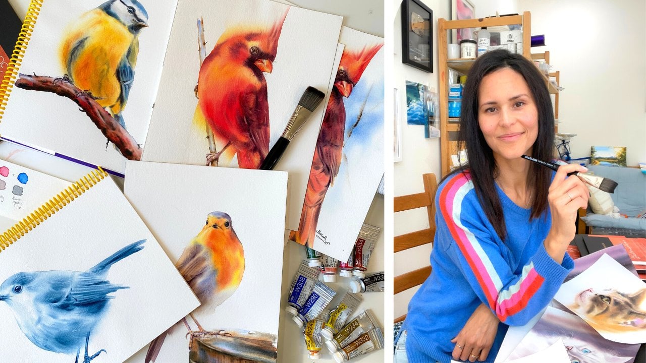
what blooms were. My name is Maria China, and I'm an experienced
watercolor teacher. I have taught thousands of students over the years how
to paint with watercolors. Wet and wet and lifting are the two main techniques
I teach in watercolor. With wet and wet and lifting, you'll be able to create
smooth and soft layers. You'll also be able to create
natural looking shadows. And shadows are needed
to create dimension. No shadows. No dimension. No light, No shadows. In this class,
I'll teach you how to control the paint and water, add layers, read a
reference image, create your color palette. Use a color wheel, natural shadows based on a color wheel. Create more vibrancy
when needed. And how to create a background, how to add a
background wet on wet. I want you to know
that I break down all these techniques
step by step by the end. You have created a full painting and will feel
confident in using wet on wet and lifting
techniques on your own to achieve more
realistic paintings.
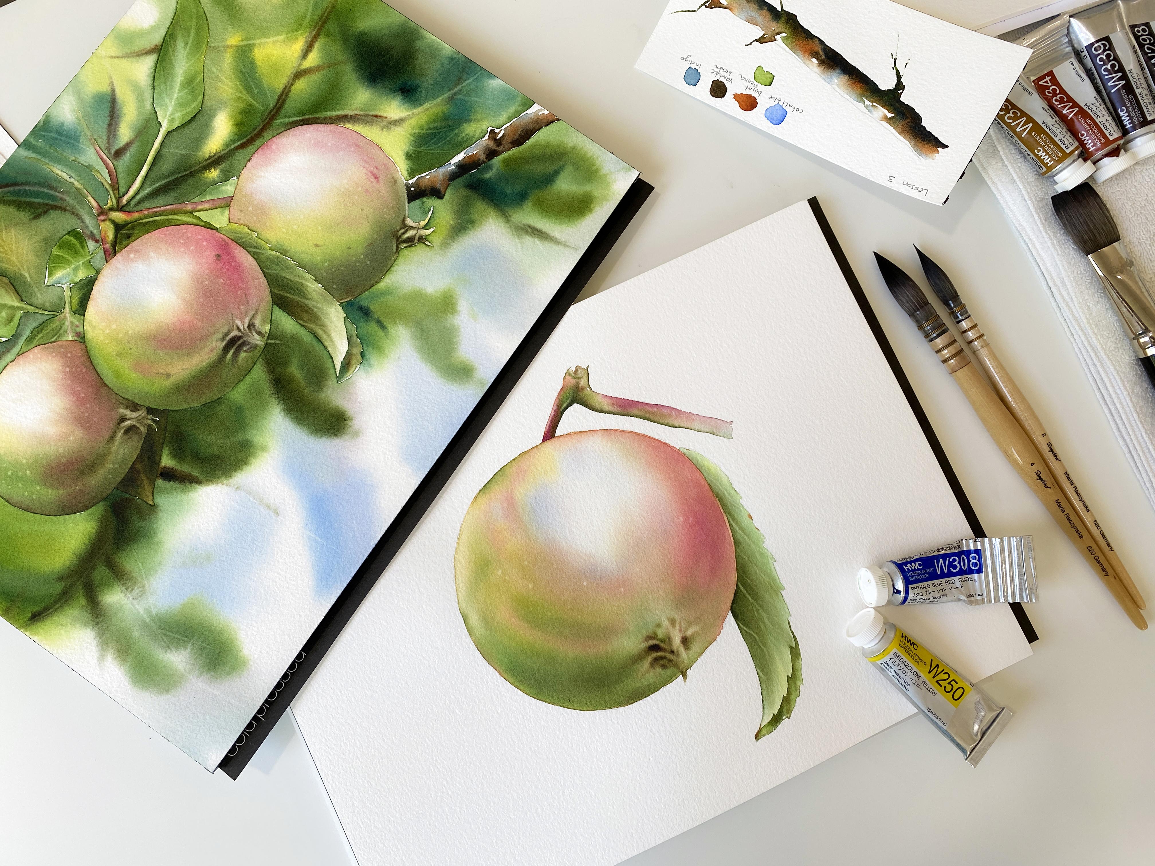
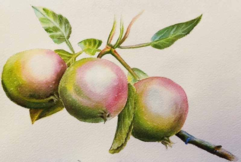
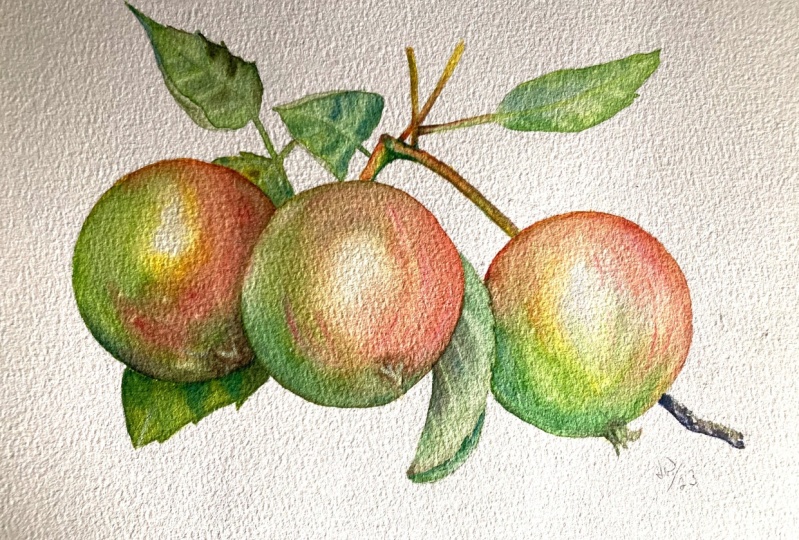
2. Class Projects: How This Class is Structured: In this course, I'll be teaching you how to
paint green apples, including leaves, with an option of adding a background later. In the first part of the course, which is project on E, we will be focusing on
b***ding colors on the paper. This will be an exercise with the main goal of b***ding
colors on your paper, not in your palette. You'll be also staying away from the most highlighted areas. In the following class,
which is project two. You'll be painting a full apple with a leaf against
the white background. You'll be practicing adding colors to the wet
surface of the paper. And you'll be b***ding colors on your paper, not your palette. All will be done wet and wet. Just like in a project one, you will paint this
apple with two layers. I will teach you how to
add that second layer for more vibrancy and to create more contrast in
the main painting. The final project
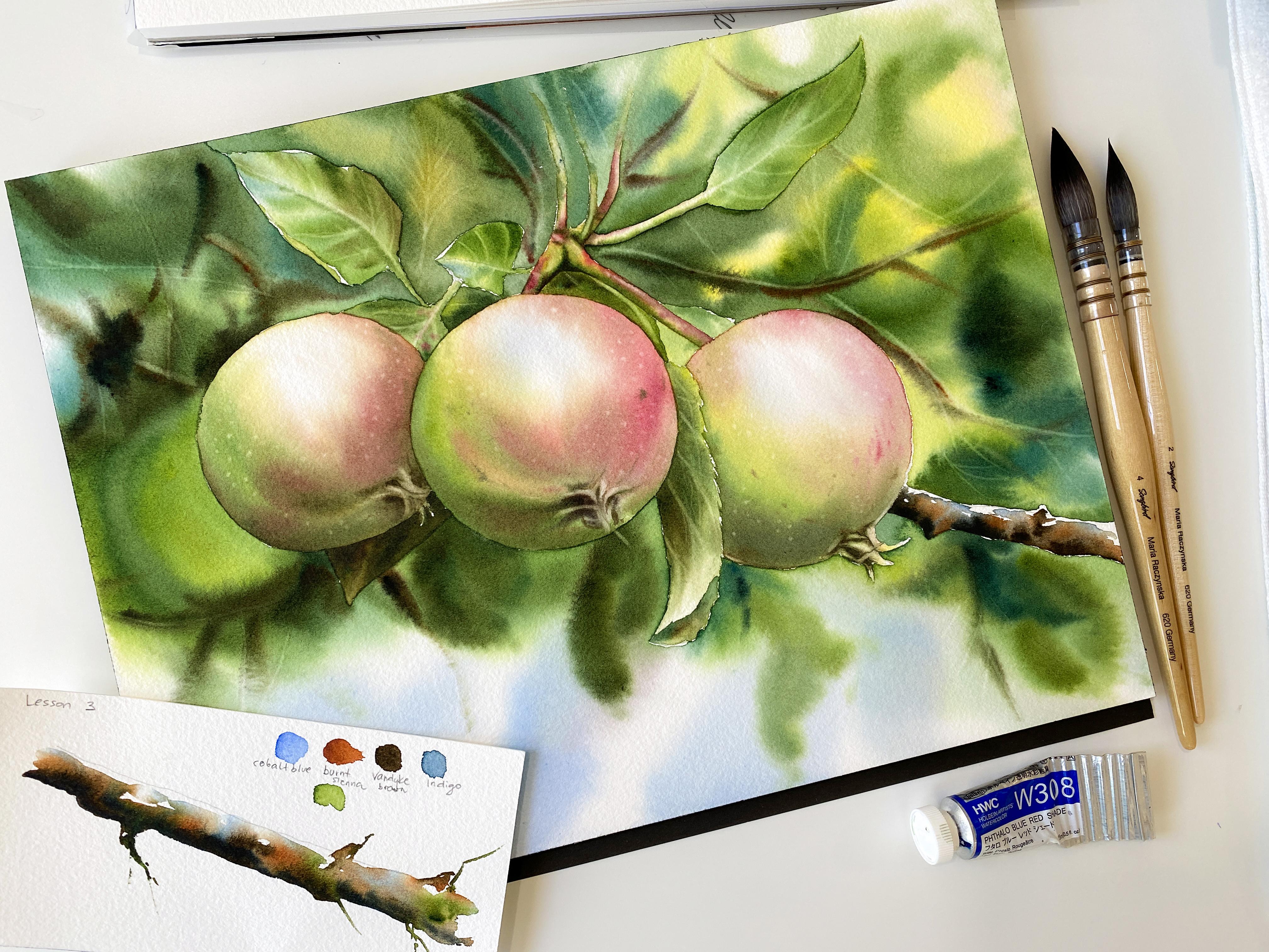
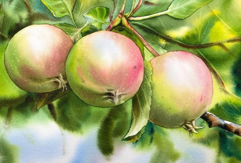
of this course, you'll be painting
three apples on a tree with an option
of adding a background. I chose to include
three apples because the steps are repetitive
And you will get to practice more and wet and
b***ding the colors on the paper because the steps are repetitive and we're
painting still life. This is a perfect
project for a beginner. I am not only teaching the basics of watercolors,
like the techniques, and about color b***ding, but also about fundamentals
of painting in general. I will be covering about
the color wheel in a non intimidating
way and referring to the color wheel through
the lessons explaining why we're using a certain
color and why adding another. Now let's talk about art supplies and
all the materials you might need for this class.
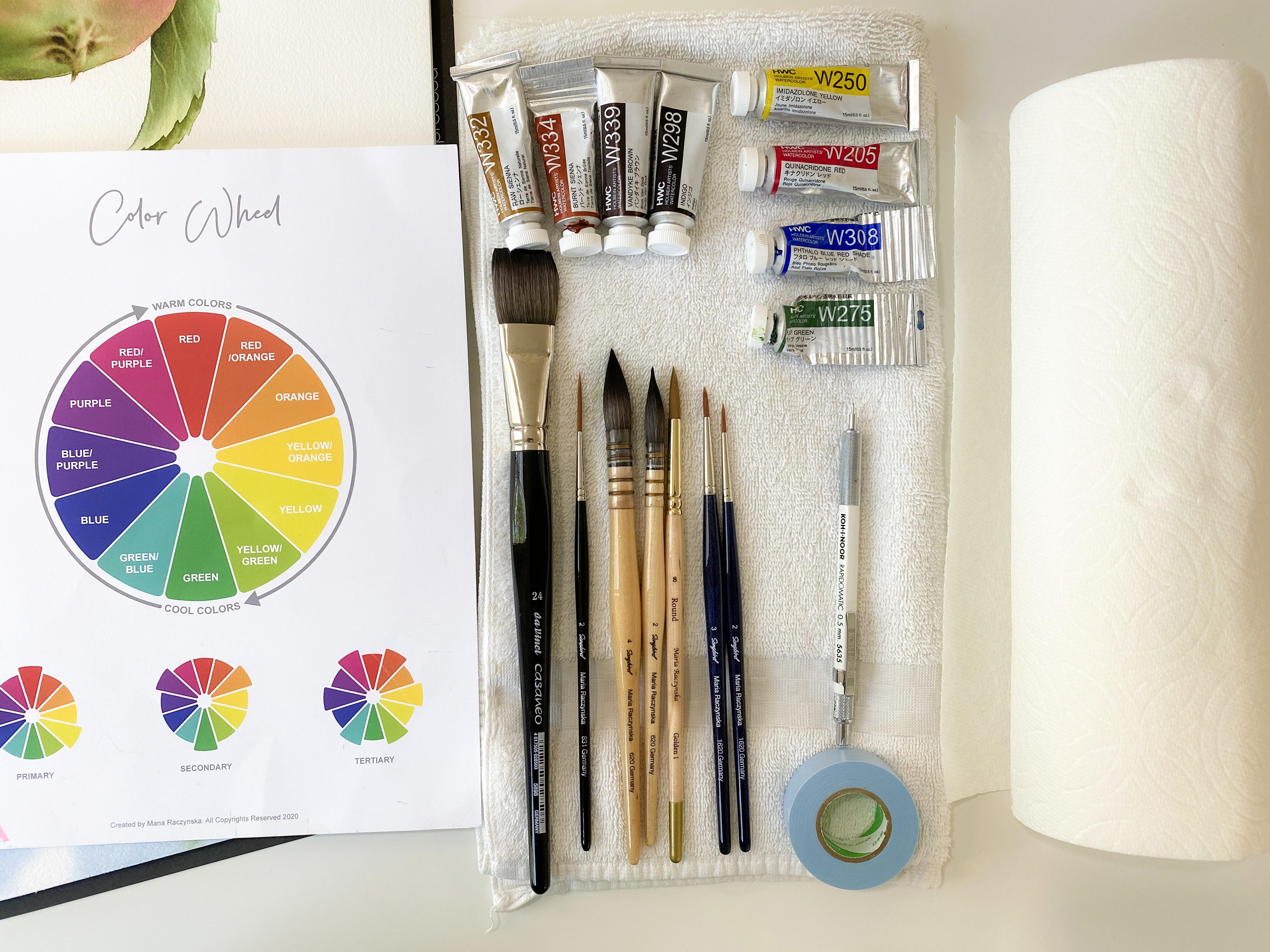
3. Art Materials: Now let's talk
about art supplies. What color paper is
always number one. Let's say you can invest
in only one art supply. I always say the paper is the foundation of a
watercolor painting. That's where everything
can go wrong. If you're painting with layers and you want to
see lots of vibrancy, but also you want
to have control over when you paint wet on wet. You want to have
100% color paper. This is nine by 12. You don't have to have a block, You can just have a pad. But this is the size that
we use for this class. Now let's talk water colors. I mostly paint with hole bind water colors
and these are in tubes. These are my favorite
because I have a lot of control but also
for their vibrancy. We actually don't need that
many colors in this class, I purposely created
this class thinking of this limited color palette. We're actually using
only four colors. If you're not adding
the background, all you need is yellow, blue, red, and green. I have my deon yellow, which is primary yellow according to Holbein's
color chart. But if you're painting
with a different brand, maybe they're calling that yellow a little bit differently. So you need to check on
their charts basically. Then I have fallow
blue red sheet, which is also a primary color, primary blue according to
Holbein's color chart. Then I have Quenton red. This is not the primary red, but I love this red, It's pinkish,
something like that. You don't have to
use the same colors. You don't have to paint
with the same brand. It's just something similar basically that you want to have. And I do suggest professional
grade watercolors. Now this is sub green. I do want a shade of green even though you can simply
create a green, a shade of green just by
mixing yellow with blue. I'll cover more about
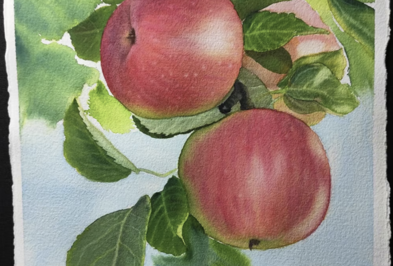
this in the class. Now if you are adding
the background, I'll be teaching you how to
paint the background too. This is an option because some people simply
prefer no background. And this is what painting would look like
with no background, which is very pretty and lots of still life like
vegetables or fruit. I will paint without
adding the background. It's your choice. This
is no background. And again, the
main painting from this class is these three apples and
there's the background. If you are going
for the background, then I am using burn sana, which is like a reddish brown. Then I have fund brown. You can use something like CPA. I use this color for the
branches and then Roca rosa. I actually sometimes
I'll add rosina to my primary yellow just to change the
shade of that yellow. Now if you are painting
that background, you can also use an
additional shade of blue. In this case, I
added cobalt blue because I like to add cobalt
blue for the branches. I start with cobalt
blue as the undertone, and over that I
add burnt sienna. For example, mark
that in the class, so everything will be covered. If you're adding the background, try to have maybe
two shades of brown, for example, if you want to have an additional
shade of blue. Now, what else do you need? I do suggest having a
regular bath towel. You can have a paper towel, but wiping your brush
on a paper towel is not the same as wiping
your brush on a towel. I think towel is like
one of those essentials. Paper towel just absorbs so much water and it just becomes like all
too wet too fast. You need a towel,
Just a regular towel. Now you do need water. This is just a glass
jar after yogurt. Basically, I suggest
having at two. I usually have
three because I use one jar just just to dilute
my colors with water. The second one is kind of
in between when I clean the brush and then I have one
clean jar whenever I paint. So I'll quickly dip my brush in water and then
wipe it on a towel. So I just want to
have always like one jar that's
clean, clean water. Now for the palette, this is a plastic
butcher palette. It's by whole wine. Actually,
it's plastic though. So it does not thrust
and it's very light. And I've had this
one for three years. I feel like it's like a lifetime investment that nothing can go wrong
really, with it. The thing is that you have so much room to b***d these
colors on the palette. Now we're mostly b***ding
colors on the paper. However, I do begin the slight b***ding on
the palette already. Having this big
palette helps me to actually test that quick
b***d just to feel it out. Sometimes I'll just go over the palette here
with that color b***d, just to feel it
out what it feels like on that brush
before I bring it over. To the paper. This is how
I line up these colors. Basically, I have yellows here. I do have the
primary yellow here, actually, because
this is raw sienna. But then yellows, reds, browns, greens, blues, and then
indigo, the darks. That's how I go about it. I do suggest having
a larger palette. Of course, you can even use a regular plate because you just need some space and area where you can dilute
those colors with water. And you want to have some room to slightly b***d the colors, especially when we start
working on the shadows. This is the main brush I
would use for this class. This is a long quill size two. And the reason I like
it is because it's soft and I cover a lot of
area. It's a size two. Quills always look larger
than regular round brushes. Now you always want
to have a fine point. Now I have also a larger one. This is long quill size four. That's because I was using it for the larger apple that I
was doing in project two. If you don't have a Quill
brush, that's totally okay. You could go with a round
brush size 12 or 14. Try to have though
a softer brush. Now, other brushes that I
recommend is having a medium, stiff size round brush. This is my round eight brush. It's in the middle
and it is stiff. It's also good for lifting. This one helps me to
get into smaller areas. Then I have the smaller brushes. These are size 02.3 All you really need
is like a size three. It's a stiffer brush. This is when we
lift smaller areas, for example, or need to
a small chunks of paint. Lastly, I do recommend
having a rigger brush. This is my rigger size to brush, and I use this brush
to lift the colors. It's not really just
to lift the colors, because when you take a
look at this painting here, this is our main project. I have like stems in the
background too, and branches, so it's easier to add these lines when you have
actually a longer brush. It could be a rigger
brush or a liner brush. Different companies called these brushes
basically different ways based on how thick
or how long these are, but a rigger brush will do. If you do add that background, I do suggest having
a flat brush. This Da Vincis Casaneo say is
24 and it's a softer brush. I do suggest a softer brush and this is just to
wet the background. Well, also to add
colors, wet on wet. But you can add a lot
of those colors with round brushes or quill
brushes as well. Now, in project one, we are going to draw a circle, and this is when I
used this pencil. Any pencil is fine and plus all the watercolors that
I already mentioned. I hope you are as excited as
I am and let's jump into it.
4. Project 1: The Warm Up : Hi everyone. Welcome to lesson one. In this first part, I want
you to get the feel of b***ding colors on the
paper, not your palette. Even I say b***d colors on
your paper, not the palette. I still want you
to grab a couple of colors at the same
time from your palette. The first thing
we're going to do actually, is draw a circle. You want to, you can use some object where
you can just draw, and this is actually Daniel
Smith. What color ground? I'm not going to use
it in this, of course, but this is something
that you might want to consider when you
just need a circle. All right? This is
not a perfect circle, and it does not need
to be perfect at all. Even an apple is not
perfectly round. Now, next step is to dilute
our colors with water. I have a butter palette, and I have yellow, red, brown, eta
brown, green, blue. There's more yellow.
If you think about it, you want to have blue, yellow, and red which
are the primary colors. Then it's like brown is an additional shade
of red in a way. And then you have an
additional brown. And then we have like, I have fallow blue
and then cobalt blue. All you need is just one blue. Please don't worry about
having like two blues. We're going to dilute
these colors with water to a consistency that feels
more like a heavy cream. Think of like heavy cream. Something like with
dairy basically. I'll say heavy cream like ratio. I'm going to clean
that brest quickly. I'm going to go for
actually yellow. I should start with that
lighter color first because the water will
get dirty quickly. There's my yellow. If you notice, I left this
little island here of color because I want to have this thicker paint on a side. This is like a cream top.
This is what I always do. I have paint that's more diluted with water and then
I have this like a thicker paint
which I like to call cream top like ratio. I'm going to in this price and continue the luting colors. I don't know if I'm
going to use raw sienna. Sometimes I like to add an additional shade of
yellow because again, I mix colors on the paper. Then there's my burnt sienna. The thing is that you don't
really need a shade of brown for an apple wherever
you see like brown colors. Because you can quickly
create your own shade of brown by mixing red with grain. That's the good thing.
Then I have the red here. I'm going to grab
a little water. I'm just going to
dilute a little part of it and then clean my brush. And then there's
my sap green here. I do have a couple of
different shades of green, but I'm going to focus mostly on this one. This is up green. Now that we have our colors
slightly diluted with water, we can place the
palette on the side. I usually keep my palette
on the left side. And I have a couple
of water jars. The main one is right here. Actually, this is
the one I'm going to use to wet the circle. And on the left side is if I really need to clean my brush.
5. Wetting the Circle: I want you to grab a
comfortable brush. A softer brush. Ideally
a softer brush. This is my long quill says two and you want
to wet the circle. When you wet the circle, think of it like you're
brushing the paper in a way. You're messaging the paper. You don't want to just do it
one time and call it down, Okay, I'm ready to
apply the colors. You want to spend at least like 2 minutes to wet this circle. One of the things you might
start noticing is that the area where you wetting
starts to buckle slightly. A little bit of
buckling is okay. Too much buckling
means just the paper, it's probably not good quality. Ideally, you want to paint on 100% cotton water colored paper because then you know you'll be able to act seen layer
too much buckling means it'll be hard to have
that nice even layer. I'm going to start wetting it. You want to go in circles. Ideally, you don't
want to go over the edges of your sketch lines, especially if you have like
another object next to it. Because whatever you go over
with that water it this way, the paint will flow
in there as well. You do want to make sure you
don't go over the edges. There's different times
where I do allow that. It's okay if the paint
flows over the edges, especially if I wet the entire background at the same time as I'm
wetting the object. But this is a little
different now, we're just focusing on wetting
the circle slash apple. Although it's not going to
look really like an apple because we don't have a
stem or anything like that. However, we are going to refer to one of these apples
in the reference image. And I am choosing the middle one because we need something
where we can see, okay, this is where we have
the most highlighted part. That means right here, you would add less color. This is where you want to
start with undertones. You want to start with undertones through
the entire apple. However, where you
have highlights, sometimes those highlights
can be really strong. Something can be really bright. You might want to consider
adding blue, for example. Blue will look natural as
that color of a highlight. But a very light value, you want it to drive
like a very light value. It's not like saturated
or anything like that. I've been wing for probably 2 minutes now
and I went a little over, just push it in there I guess, and just continue
wetting my paper. Started to buckle
just a little bit. That tells me that
I'm pretty much ready to start
applying the colors. Now, I'll give you a tip here. When you wet the paper, you are not using
actually enough water. During the process of
wetting the object, you might actually end
up removing the water. You might not notice that backing happening on
the paper for longer, like a longer time,
because you continue removing water instead of
adding water at the beginning. You might as well
just drop a lot of water and play with that. Just move it around. Then when you get closer to that moment when you want
to start applying colors, that's when you can start
brushing it off, removing it. Or if the whole papers
basically what, you can push it over the edges.
6. Applying the First Colors: I want to start actually, where I see the
highlights right here. This is the highlighted area. I want to start with
those undertones and I have some of
this cobalt blue. Either way you can
grab fallow blue, cobalt blue shade of blue. Now I like to
change the shade of my blue by adding a
little bit of to it. Because the way the
object looks like, that one color, it's
affected by light. And shadows in a different way. When you have a red apple, it depends how that
light hits it, right? And then where we have a
shadow that red would change, The color of it will change. And the same thing
with the highlight. Where's that highlight?
Let's just circle it. It's right here. This is like an oval shape. The highlight is
somewhere right here. Now we have a little
bit of blue there. We can go through it slightly. Now you want to use a very
small amount of paint. As you see, there is
not much going on here. I used very small amount
and if you have too much, then the whole thing
is just going to fill in with that blue, right? So we want to control that by grabbing just a small amount. I'm going to clean my
brush in the clean water. The next thing I want to grab is the undertone
for the red areas, that's going to be my yellow. Now, you can grab two shades of yellow if you
have right away. Right away, I'm
grabbing the Rosana. I'm only grabbing
it because I want to see different
shade of that yellow. And I'm not trying to create
a new shade of yellow. I want to have these two colors b***d on the paper and
slightly separates. I can see different
shades of that yellow. Now, when you mix too much
of the yellow with the blue, you might start
seeing the shade of green because yellow
plus blue is green. You want to do this
fairly quickly. And which is why also we mix
colors on the paper palette. Because if we mix the blue
with yellow on the palette, we'll just create
a shade of green. That area I'm grabbing more like a milk between water,
milk like ratio. This area especially
needs yellow undertones. That's because we have green. Green is created by a
mix of blue and yellow. That's why you want to start
with like a green undertone. But you can also use
blue because that's how green is created by a mix of
blue and yellow together. I'm placing it everywhere, but where I place that blue is undertone or
for the highlight. This is not done yet, because I need to start adding the reds and the actual green. I want to create like a slight transition between the colors. I don't want to jump in
right away to my red, I'm going to grab this. There's a yellow, some
of the other yellow, whatever yellow
you want to grab. And that's when
I'm going to start grabbing this quad red, which is my red, right? My main red here. Now,
how do you apply it? When you look at the referenced, the most red you see
is here and here. And that's where you want to go. Whatever you can see
that shade of red, that's where you
want to apply it. Now go gently, Try
to use the tip of your brush as if you are
drawing with a pencil. Try to grab small
amounts of paint. Yes, the paint will spread because we're
painting wet on wet. If you want to have a
little more control, try grabbing thicker paint. However, try grabbing
small amounts each time you're grabbing
small amounts of paint. Now you want to move around. You don't want to just get
stuck on one area here, because that means
other parts of this apple circle
will dry out faster. You want to keep it all wet
at the same time, Longer. It stays wet longer. Somewhere here I
would have that stem. I'm not going to worry
about it right now. In this lesson, I
want to take it slow. I'm going to show
you how to first b***d these colors on the paper. Once you place the colors, you can go through them, like through the areas and you can polish it and move
the paint around. Now, I do want to make this part a little more intense
with the red. I didn't clean my brush, I'm just grabbing some
of this quin red. It does feel like I have
a little too much water. I'm going to wipe
my brush first, slightly on a towel and
then come back here. Now, if it feels like I
don't have enough water, I'm going to have to come back to my water jar and
grab a little water. But this feels right. What it feels like
is more like a 2.5 like ratio on
the tip of my brush, but not having just much
paint on my brush in general. And now you're going
for these mid tones. In the way the darkest parts, or not the darkest yet, the mid dark, maybe somewhere
here, somewhere here. We're also shading the
apple at the same time, specifically staying away
from this highlighted part. However, it can't be just like this light, it's a
little too light. But I'll get to that moment in a second where I'll show
you what you can do to make it softer and b***ded a little better in a way so
it's not so bright white. But in the meantime, we can also pull the paint a
little bit, but again, you don't want to lose
this highlighted area. I'm going to keep going here. Now, why am I going here? On this side, this
is all greenish. That's because this part
of the apple is shadowed. Now, I will talk more in another segment of
this course about the color wheel
and why we need it and why it shouldn't be as
difficult really to use it. But when you want to create a natural shadow for an object, you want to first
determine what is that local color of the object. This side right here is green. When you look at
the color wheel, you'll see what is on the opposite side
of green. It's red. That means you want to use some red to mix in with that green to create a
shadow, natural shadow. But I'll continue
adding some more color. Because this is drawing, I won't have that much time if I continue talking and
explaining the color wheel. That's why it's going to be covered in a different
section part of this course. A little more of the quin red. But you know what,
I want to change the shade of my quint. I grabbed more like a heavy cream like
ratio between water and paint of that with some
brown burnt sienna. And this is a heavier ratio
between water and paint. I'm very gently like
brushing through basically the painting and I'm going
for like the darkest part. Now, Because my paper is drying, I have to quickly
think about like, do I want to start adding
the shade of green and I do.
7. Adding Yellow & Blue: I'm going to quickly clean my brush. I'm cleaning my brush. I slightly wiped it. I don't
want it to be too dry, but this is where I want
to start grabbing green. But I want to have a soft
transition just like before. This is my yellow
and plus green. Try not to overly mix those
colors on the palette. Leave that mixing to
happen on the paper. Now I'm going to
grab some more of the green and add
it right in here. And another way to
change the shade that green is by adding
some of the blue. You would add a little
bit of blue again. Why? Because to create
a shade of green, you need yellow plus blue. You can play with those
additional colors. There is my blue. To change the shade
of that grain, I just grabbed some of the blue. I'm not done with adding
red either to my apple, to this area right
here that's shadowed. This is just the beginning because we can
continue playing with this apple as long as the
paper stays wet, right? How do we keep it wet
longer, basically, by cruising around, going from
one area to another area. We're not focusing
only on one part. Now, it would be nice to add
a little bit of green on top here because that will
give it more of a dimension. When we have a little shadow there and a shadow over here, the main highlight
is right here.
8. Creating a Shadow Blend: This is also highlighted, or maybe it's just the way
the skin looks on the apple. But what I want to
do is quickly grab a little bit of tiny bit of blue with the
tip of my brush. I'm grabbing it more
like a heavy cream, but my brush is pretty wet. It's like, I feel like
it's more like a 2.5 R. I wanted to grab the red and blue to continue working on that shadowed
part right there. This somewhere here.
I have this stem so I can circle it so I know
it's right there. Right? You still have paint
on your breast with the tip of your breast. You slightly brush it? I just want to
brush it slightly. Touch it. I want this part
to be a little darker. I'm going to grab again, some of this quina blue, but you can also grab
a little bit of green. And then I want a
little more of red. It feels more like this, but maybe more green and
more blue. There you go. Some point like that, this is a different shade of green.
Why is it different? Because the ratios
that I'm using here between the colors
constantly change. Sometimes I have
more of the red, sometimes I'll have
more of the green, or maybe blue if I'm
adding also blue. I'm going for the
shadowed areas, I'm going to leave
that top alone. The paper is drying now, I want to show you a way how you can make
everything softer. And I have to do this
before this is too dry.
9. Damp Brush Technique: I'm going to quickly
clean my brush. Please clean your soft brush. Next thing I want
you to squish it, like you're making it feel like it's a damp brush but
you're squishing it. It looks like this. Even
make it in this position, It feels that way. That alone will help you to create a soft
b***ding here too. What we're going to do
is you're going to brush through your painting
just like this, starting in this most
highlighted part. And the paint to the highlighted part
is not so highlighted. It's not like you're covering it because you want it to be light. But you're pulling the paint
so it's all nice and soft. Now, you might want
to clean your brush because you're picking up some paint and
you're squishing the brush again,
removing the water. So it feels damp, but
it's squished like this. I'm going to go for
these parts right here. Now here's the thing. It's important you want to do this as long as the
paper is still shiny. If this is all shiny, it's okay. You're ready to go. If the paper has
lost that shine, you know the paper is damp
basically, then leave it. You need to leave it
because that's how you start lifting colors. You're going to start picking up everything that she
already placed in there. That can be frustrating, right? That's why when you see no
more shine on that paper, that's when you leave it alone. Now I want to add a
little more color with that damp squashed brush.
How am I going to do it? I'm going to go for this
thick paint basically like a cream top like ratio
of that quinoa red, let's say some of the burn scan, you can do this as long as
this is still slightly shiny, I am losing that shine. But I can still
add color as long as the paper is still slightly shiny and
it's not like dry, damp, does not feel damp. And it's the same thing
like brush strokes. Here's something to
remember and consider. The apple has that pattern. And the way like the lines go, it goes towards the stem. That's how you want
to lead those lines. The strokes, you want to
pull it that direction. Just like if you were painting
the whiskers of a cat. You would be going in a certain
direction, not straight. You would follow that pattern. How that fur folds
and how it's aligned. You want to do the same
thing with the apple. I'm grabbing a little
more of that red with the burnt sienna and I'm going to brush through
a little bit here. Now this is too dry for me, I'm going to stay
away from that part. Now, you can also use
like sides of a brush, but however I'm starting
to pick up the paint, I need to walk away from
it before it's too late. I'm going to try to add
tiny bit of green too. I'm grabbing this cream top like ratio between water and
paint of just the sap green. I'm going to find a couple areas where I
can add a little more. It would be nice to
have some blue too. This is when you really
need to feel your paper, how wet it is, because if it feels damp,
there's no more shine. Walk away from it. Let it dry because we can play
more with it later. For me, this is now I'm
going to clean my brush. I'm cleaning my
brush. That's it. That's pretty much it.
You're going to leave it. In the following lesson, we will practice with apples. The next lesson will be
about painting an apple with two layers and we're
going to also paint a leaf. This is just to b***d
the colors on a paper, but we are thinking about the highlight and shadows
at the same time. I hope this was helpful. Please let me know if
you have any questions.
10. Project 2: Painting an Apple w/ Leaf: In this lesson, I will be
teaching you how to paint the actual apple with the
stem and with a leaf. Here we're going to do
similar things we did in the lesson one
where I was teaching you how to blunt the
colors on the paper. Here, we're going to begin
by wetting the apple, just like before, and we're
going to apply colors on wet. Where is that biggest highlight? It's somewhere right here. And I encourage you to grab a pencil so you can draw
it for yourself too, but gently because sometimes
lines don't come off. Once we are done painting and
everything dries and then we use the eraser
90% of the time, it just doesn't come off. It depends, of course, on what
color paper you're using. But just for safety, try to have a very
light, gentle sketch. Then for the most, like the darkest parts, it's pretty much all
this right here. The first thing
you want to do is to have your colors
predluted with water to a consistency that
I like to call heavy cream like ratio
between water and paint. This is what it looks like. I do need to have a
little more water, tiny bit of water on the side of each of these little islands. Just so you have different
ratios on a palette. Two, it's easy for you to
grab like this cream top or heavy cream like ratio between water and paint
when you need it. Let's begin wetting the paper. Grab a brush, a softer brush that you can use
to wet the apple. I'm using a larger brush. This is 24 size only because I want to cover
this much faster. You need to spend about two, 3 minutes to wet the
circle the apple. Because the longer
you wet the object, the more time you're going to have apply the colors, wet on, wet before everything
dries out too fast, Before the paper becomes too damp to work on or
to continue working on. There's still things you can do when the paper feels damp, like lifting can be done
until the very end, but you won't be able
to apply colors. For example, if you want
to have a nice move layer, I'm just going to wet it
for two more minutes. If you are using a flat brush, it's actually a little easier because you can use the side of a brush like that angle
to go along the line. Try not to go over
the sketch lines because again, it goes there. That means the paint
will travel there too. I'm wetting it. You'll notice the paper wants to start
buckling a little bit. A little bit of buckling
is always okay. Too much buckling is not okay because if my paper puffs up, that means the paint will
just go towards the sides and I'm not going to have that smooth layer
that I'm going for. Okay. Now, when you
first start wetting, you can actually just
grab so much water, like it doesn't matter
at the beginning, but towards the end, you want that paper to look
shiny like this. You don't want any
puddles of water. Puddles of water are not good for this type
of a painting. You want to try not move it around. There's
still too much. You wipe your brush on a towel. Remember not to grab too much. I just did because I was actually trying to
demonstrate it. But try not to grab too
much because then again, you remove that water from
the paper and then it might actually dry out too
fast because of that. It's the same thing when you
apply colors wet on wet. You want to have
enough water with that pain on your
brush actually, because it's very easy to start removing colors
instead of adding colors.
11. Apply the First Colors: Blue Undertones: I'm going to grab a different
brush for this part. This is my long cool size four. I'm going to wet it
just like before. We're going to start
with the highlights. Here is my cobalt blue and I
want tiny bit of quin bread. But try not to mix it too much. Just grab the two colors. This is more like a between
water to milk like ratio. I'm going to circle it again. This is where my highlights are. Like somewhere here I do have quite a bit of paint
now. I have two choices. I can wipe the brush
or I can continue spreading it towards like
the greenish parts too. Because I do see I'm that
blue undertone in here too. Might as well go
around the stem part. Now, I'm going to wipe my brush. And then I have to be careful because if I don't
have enough water, then I'm going to start
grabbing it from the paper. I need to grab a
little more water. I'm actually going to go back to grab a
little more of this, but this time I want to have a little more of the quin red. I'm, I have something here, I don't know what it is,
something on my paper. And then I'm going to apply
this like a blue violet. Because whenever you mix
blue and red together, you create a shade of blue
violet, just like before. We're just going to slightly
spread it not too much. We do want to see that
bluish undertone though. Now the next one
will be our yellows. I'm going to clean my brush. Quickly clean it. Clean it again. I slightly touch
it on the paper. I'm on the towel. I don't want to
have a damp brush. I need to have enough
of that water there. There's a little bit of red, but my main color
here is the yellow, the yellow tones and plus
a little bit of rosa. This is my imo rosa. A little bit of red. Now, I'm not going
to go directly over the blue highlights around it. Whatever I can see that
the most of that red basically in the apple for
sure, on the top there. Please remember that
anytime you go back to that palette to grab
more color that b***d, right, of the blue
or not even blue. Now, yellow and red, you change the ratio between
red and yellow or yellows. You never have the same b***d
on your brush right now. I want to have slightly
more of the red. I just grab some of that,
more of the quin red. I'm going back to
the same areas, towards the same
areas, whatever. I feel like that yellow is
an undertone for the red, like over here for sure. Not only that, also
for the green parts, I want some of that
yellow as well. Why is that again? Because
to create a sheet of green, you need blue and yellow. That's how you want to change
the shade of that green. I'm going to travel
a little bit here. I'm going to push through
a little bit here. Just gently because I don't want to lose my highlighted part. Now, I want to have a
soft transition between the red or the yellows and reds. I still need a little
bit of yellow. This is more like
a milk like ratio. Now, why milk like ratio? Why not grabbing
like thicker paint? Because right now, I still
want the paint to spread. As long as I don't
grab much on my brush, I will have control. I do want that
paint to spread and this is why I am
painting this wet on. Wet, right? You're
painting this wet on let, because you want
that flow to happen. It's about like how much paint that water you have
on your breast. You want to feel it
out. Give it some time because everything
takes practice things out on your brush. Then I'm going to go along this sketch line just so I have a nice shape
of this apple. Now I want to start
adding more of the red. Now fill it out, so
you have enough of that water in your brush. Because again, it's
super easy to start removing that paint
from the apple. At this stage, I need a
little more of the red. I want a little more to make
it a little brighter in some of the areas not looking
for like the mid tones. Maybe over here for sure, like I see through
the green parts here. And then over here, we still didn't start
adding the greens. I'm saying greens
because even if you have one shade of green, you can change that
shade of green by adding a little
bit of blue to it, or you start with the
yellow plus green. Why? Again, it's because to
create a shade of green, you need blue and yellow. I want to press a little harder whenever you see
me pressing like this. A little harder on the paper. That's because I'm trying to release more paint
from my brush. But for the most part, I think you notice that I am actually using
just the tip of my brush very gently here. This is my little stem, right? Well, I don't want
to forget about it. I do want to work on it is just, it's not the time for it yet because this part can
be easily lifted too, to create like these nice
highlights in there. Here, maybe a little more here. Don't be afraid to go back to these parts to
add more color. Since you still have
color on your brush here. Why am I adding
even the red here? Because as I mentioned
in the lesson one, to create a natural shadow
for the object first, you want to determine
what is that local color. The local color for this
part of the apple is green. Green. You look at the
green on the color wheel. What's on the opposite side
of the green? It's red. We can add some red to this area here
because it's shadowed, that will look natural. Now what I need to do
is clean my brush. And let's remember, we
don't need to go too dark here because we're going
to add second layer.
12. Adding Colors & Damp Brush Technique: I'm going to start with
that soft transition. This is my yellow, just
because I used before, yellow. And then there's some of that
subgrainI have two colors. Try not to overly mix
them on the palettes. Again, I'm going to
grab some yellow and then there's my sub grain. Then I'm going to go
for these parts that felt against greenish,
which is here. Let's see where else would be nice to add it again
on the top here. This is very much like we
did in the exercise video, painting that circle apple. Then I'm going to press
a little harder or for the full brush just to release
more paint from my brush. Then very gently, just spreading or applying
this sheet of green. We created that sheet of green by adding some yellow to it. And I'm going to go
through a little bit here, but it's time for me to just
grab more of that green. Now, I want this to be also thicker between heavy cream or actually I should say 2.5 and heavy cream like ratio
between one and paint. This is just sub green now, this is just sub grain. In a moment I'm going to grab, start grabbing or
adding blue as well. That's to change the
shade of the grain here. Whatever I feel like I see
like the most of that grain, that's where I want to add it. But you can also go through these parts where we
have the reds, right? That would make it pretty. This is fallow blue. And then there's my sap grain. I need to add a little more of that sap grain because that
was a little too bluish. What would help is adding
now some of this red. I didn't clean my brush. I did not clean my brush. I just grabbed some of this red. And now that looks way more like what we see in
the reference image. Now, I don't want to go
too far ahead with this because we can definitely paint the apple with
just one layer. It can be done
like 100% However, I want to show you this
part in this lesson, how you can add even more
vibrancy with the second layer. That's something that we sold plan ahead because
that's the case. We don't need to
add that much color with this first layer. We don't need to make
it like super vibrant. Now I do want a little
more of the red. What I'm going to do is grab with that slightly damp brush, a little bit more of that quin red as long as
this is still shiny. Although I want to wipe my brush first because it's
a little too wet, it feels more damp now, I want this to be more 2-2
and heavy cream like ratio, but more like on a damp brush. Have more control.
The paint is not as spreading much and as
fast as it was before. Now I'm going to grab again, this like a heavier ratio of the quint red and
some burnt sienna. I'm going to go for
the more vibrant part, which is like right in here. But again, I got to remind myself this is not
the final layer. What I want to do
next in just a second is basically clean
my brush, wipe it. That trick is to work
it with a damp brush, going to pull it a little bit. I'm going to clean it clean, clean it well, clean it well. Make sure you remove that water from the brush so
it looks like this. It's like a damp brush.
Now, with that damp brush, as long as this is still
shiny, you can brush through. Now, this is a little
too dry of a brush. I had to redo this because it was a little too dry and also the area is too dry. I'm going to walk
away from that part, but I'm going to wipe my brush. Go, actually, for this
area to confuse you, what you want to do
is only go through the areas that feel still
like they're shiny. Then you pull the paint, brush it with that damp brush. Again, I don't want to
confuse you with that part. What I did, what happened here? This was a little too dry. I'm walking away from it. I'm going to just let
it settle the way it is with that second layer. I'll work on it to
add more vibrancy. For example, this
is our first layer. It will be really
nice once we add it, the second layer,
because we'll have a little more color
to add over there, the reds, everything will
settle even prettier here. What we do about the stem, I want to clean my brush
before this is too dry. What I need to do is basically grab like a brush
for more control. And I have my round golden one. What I'm going to do
is grab thicker paint. This is going to be
cream top of soft green, and some of the quint red, I'm going to find that stem
which is like right here. Why am I grabbing
the two colors other than you use the two colors
for the natural shadows? Another reason is also because that part
feels more brownish. And to create a natural
shadow of brown, you can also just use the
colors you're already using, green plus red, a
shade of brown, we might as well just use
that what I have on my brush. It's really thick
paint in a way. But just on the tip of my brush, this is like a cream top like ratio between
water and paint. You only want to have it on the tip of your
brush and you want that creamy paint like this
to grab it from your palette. And then you're
going to apply it towards a couple of the areas, just so we have the beginning of that stem somewhere here. We're going to add it some. I'm not adding paint everywhere, and I want you to
think about it, not to add it everywhere,
just some areas. And then we can
work it more later. We can also lift the colors. For example, I'll grab a
little more of the red. I'll go through this part,
go through this part. And we can go on
the outside too. This is not going to have
background like this painting. And then you can pull
it a little bit more, you can keep going. But this is drying too fast
or this is almost like damp. I should not even
touch that area because I'm picking
up water from here. That means this is not any
more like a cream top. This has become more
like a half and a half. So I have to be
careful because if a drier area meets a wet brush, that's right there, bloom. We have to be very careful. Now, the last thing we
could do for that stem, clean out the brushes.
Probably a minute. Say, let's wait a minute until that shine is completely
gone from the paper. Right now, this is still shiny. Now, once that shine goes away, I can go in between here, that paint that I
just placed there. And I can, I can
lift the colors and those hit parts of stem part that will
look even more natural. So let's just wait a minute.
13. Lifting the Colors: I'm back and I wait
at about a minute, I'm going to use
a smaller brush. This is a round
size three brush. And I'm going to
clean the brush, wipe it on a towel first. Very well, it's just
at the end brush. And you're going to go through the parts that you want to add, those highlights and
separate parts of that stem. Now, what is the
perfect timing to lift the colors once that
shine is almost gone, that's when you want
to start lifting. I'll show you something. This is actually a good spot to lift because if I go in a
little circle right here, I have a little spot
right there, right? I just uncovered a
spot right there. And the same thing here. This is a perfect timing now to lift colors here
through the apple, you can see like those
little white dots, right? Why not to do that? Just for
practice, go in a circle, Wipe your push on a towel first, and go in a tiny circle just
to create these white spots. At the same time. Don't
forget about the stem, because maybe you need
to lift a little more. In a separate segment, I am showing how to
lift the colors. This is no different.
This is the same thing. You wait for that moment till all that shine is
gone from the paper, and that's when you start
lifting the colors. I'm lifting it to resemble what I see like in the reference.
Doesn't have to be perfect. Nothing has to be
exactly the same. Has to be perfect, just like
we see in the reference. This is a painting,
then I'm back here to create like
some little circles. Now, make sure to
clean your brush quite often because when
we lift like this, we're picking up the
color from the paper. When you pick up the
color, that means you might move it over
to another area. Maybe like a couple
times we can do it. But then I suggest to wipe the brush or
clean the brush first, then wipe it on a towel again. You can also just touch the paper like this with
the tip of your brush. That creates some
texture as well. It's just with the
tip of your brush, What's happening is
all this lifting. It's almost like
creating blooms. Actually, tiny, tiny blooms. But you're controlling
these tiny, tiny blooms because your brush is not overly wet or anything. It's just a brush. Now you can go back to the same areas where
you already lift it. If you want to re lift,
if you want to re lift, maybe add more light, then you go back and you lift
again and again and again. We do need to wait
for the apple to dry before we can start working
on the leaf. Why is that? It's because if we don't
wait for the apple to dry, then we start wetting the leaf. Then whenever we start applying
colors towards the leaf, those colors in the water will start going over
towards the apple. At that point, the apple
will be almost dry. When a wet area meets
almost dry area, that's when you create balloons. We don't want that.
Once. This is 100% dry, that's when we can start
working on the leaf.
14. Creating Different Shades of Green: Now, before we begin
working on the leave, I want to share
something with you that will open up your eyes and will make a lot of sense
when it comes down to choosing colors for
your next painting. When you are painting
leaves or even an apple. This is something that helped me when I first started learning how to
paint with watercolors. Before I would use three or four even
different shades of green based on what I see
in the reference image. Leaf is green. But then, okay, maybe I will
use this shade of green. Maybe that one maybe Hookers
green, maybe leaf green. But the truth is, all you
really need is one shade of green and then blue and yellow to change the
shade of that green. First of all, here's
the color wheel. My intentions are
not to confuse you here or intimidate you
by the color wheel. I want to make it the easiest
possible way for you to understand something about
that green color here. Our green when you
take a look at it, right, it's right here. Now, how is that green created by a mix of
blue and yellow? As soon as you mix blue
and yellow together, this is what you can
achieve right here. Now, this is all nature. It's not something
I just made up. Once you start seeing
this in your work, when you look at
the reference and you start breaking it down like, hey, wait a second. I can create that shade of green just by adding a little
bit of blue to my grain. Or even starting with
a yellow undertone. Everything changes. And that's when your paintings start to look more natural
and realistic too. But the realistic
part, of course, it comes with adding that depth. We always work with
light and shadows, but let's focus on
these undertones and how to change that shade of
green when we paint a leaf. Now there's green leaves
and then we have of course, red leaves and some other
yellow gold leaves and so on. But for now we're just going
to focus on a green leaf. When we see that green
leaf in the reference, what happens if we add a
little more of the blue? It becomes more bluish like
a sea green green blue. This is what happens when we add some yellow to our green. We go here, it becomes
more like a leaf green, like a yellow green, right? That's what we're going to
be doing in this class. In this class and then
the following course, when we paint the
full painting with all these apples with
an optional background. Now before we paint a leaf, I want you to grab
a spare sheet of the watercolor paper
just for practice. You're going to do this with me, so you get the idea of
mixing those colors. Now when I say mixing colors, you want to mix
colors on the paper, actually, not in your palette. When you mix colors
on your palette, it's like the
intentions would be to create a brand new color. But if you think about
mixing colors on the paper, you start seeing the
separation of colors and you start seeing different
shades of that green. For example, I'll show
you the difference too. First of all, if
you have any green, I guess I have sap green here. I'm just going to grab this milk like ratio of the sep green. And this is my round brush, here is my main green, this is the main green I use. And then I'm going
to clean my brush. Now what happens when
I just grab blue? I'm going to show this
to you. There's my blue. Then I'm going to,
with a clean brush, grab some of this yellow. I'm creating my own
shade of green. I'm going to place
it right next to it. Of course, it is a
different shade from sap green because that sap green was probably created
with a different blue. But the idea is here, right there, this is a green. Now I'm going to grab some of that yellow again and
place it right here. And then I'm going
to clean my brush and grab the same blue which is fellow blue, there it is. This is the yellow I use, this is the blue I used. I combined those two together to create a brand new
shade of green. Now this was different because
I purposely mix the colors on my palette to achieve
that shade of green. However, if I want to change
the shade of that green, I just need to use a little
more blue to it with it. Or I need to add some more
yellow to that grain, and then I'll create
different shades, variations of this green. Now whenever I paint, I do like to have my main green that already is in the tube, such as sap green. There's my sap grain, right? To change the shade
of my sep grain, I will start very often with a yellow,
There's Miami yellow. Then without overly mixing
colors on my palette, I'll quickly grab the step grain here is that shade of green. This is like a yellow green. I changed the shade
of my sap green. Because I use yellow, I'm going to do the same
thing with the fallow blue. The brush is clean.
I'm grabbing some of this fall blue.
There's my fallow blue. Now I'm going to quickly
grab some of this green. Again, I don't want to
overly mix these colors. I want these colors to
separate on the paper. Here is a combination of my
sap green with the fall blue. I hope this makes sense, but this is how I was able to create different shades
of this sap green, the main color from
my tube right here, just by adding some
of the primary yellow and then adding some
of the fallow blue. Now we're also going to be
doing something like this. We're going to grab some of this yellow, some of the green. Then why not to grab
some of the blue? Now we have three colors. Now I am mixing
colors on the paper. Again, not my palette. I can see this area
is more bluish, this area is more yellowish. But it's the same colors. When you think
about it, you have so many different
sheets of green. That's how you want to think about when you paint
a simple leaf. You really don't need like
five or ten different greens, like shades of green coming from a tube, a watercolor tube. Because you can just
create your own shades. And you want to mix
these colors on the paper so you can see
the separation of colors. Just like here, you can see some more of the sep green and then some more
of the yellow.
15. Creating a Natural Shadow: Knowing now how we're
going to create those different seeds
of green over the leaf, we can start moving closer
towards painting the leaf, but not quite yet. There's one more thing
that's important to explain. When you take a
look at the leaf, especially this area right here, when you see in the
reference image, this part of the leaf right
here is behind the apple. This part of the
leaf is shadowed. How do we go about a shadow? I paint shadows like this. This is a soft shadow. I will paint wet on wet. But what colors am going to use? First thing you want to do is determine what is the local
color of your object. In this case, we're
looking at the leaf. The leaf is green. Where's that green? Right in our color
wheel is right here. What is the complementary
color of green? It's red. A complimentary color is on the opposite side of that
color on the color wheel. Complimentary color
to red is green. Complimentary color
to green is red. That means that you
want to add some red to your green to create that
natural looking shadow. Now, you can also add blue. Why is that? Because
to create a green, you need blue and yellow. That's why you can
also play with colors. You don't have to limit yourself to only like using
green and red. You can also break this
one down into two. Okay, we have a yellow and blue. How about adding a little bit of blue to our mix with that green and red to make that
shadow a little darker? I'm going to demonstrate this to you first on the spear
sheet of watercolor paper. Here's a spear sheet, right? Again, we're thinking
about our green leaf. I'm going to grab a little
bit of sap green here. I'm going to place
it right in here. Then I'm going to clean my
brush because I want to grab a clean red, which is my corner red. I'm going to move
this right here. What you will notice is that actually by mixing
green with red, you're creating a
shade of brown. This is how you can
actually create a natural shade of brown too. But this is what you want to
start using for that shadow. Now, what other color I mentioned you can
use some blue too, because to create
a shade of green, you need blue anyway. Then when you add that here, it doesn't feel right. It's a little too bluish. That's when you
want to grab again, maybe a little bit of red. You go back here, you're changing the shade
of brown, right? This is more like a green brown, say, but that's the
idea right there. You want to use a complementary color
of that local color, which is green for our leaf to create a natural
shade of that shadow. And I'm going to grab a
little bit of green here, just because we're
talking about green. And then I'm going to place a little bit of red
right next to it. And then as a third option blue, which is my fallow blue, this is a combination
of the green and red. And this is a combination of all these three
colors right in here. That's how you want to create that natural shade
of the shadow. We'll work on that
in just a moment. I'm going to place
these on the side.
16. Applying Colors: Wet on Wet : The first thing
you want to do is wet the leaf because we're
going to paint it wet on wet. This is my long
coil size to brush. You also want to have your colors slightly
pre diluted with water. I suggest like a heavy cream, something that feels
like heavy cream, heavy cream like ratio
between water and paint. I'm going to start right here. You do want to take
your time wetting. And here's another thing. The bottom right here, this is a fold,
right, folded leaf. The inside part of the leaf, we can see that it's shadowed, it's inside there, right? Do we paint it now or later? We can paint it now and
then with the second layer, we can make this part darker. And it's much easier this way. Let's do it this way. We're just going to wet the
entire leaf all at once. Take your time. Just like when we were
wetting the apple. Being careful so I don't
go over the edges. Because if I do and I
start applying colors, that means those colors
will travel over the edges. At first, I do use
quite a bit of water, but then as I get closer
towards that moment, I'm ready to start
applying colors. That's when I start pushing the water towards
the other areas. But then I also remove
it with a brush. And if I have to, I will
wipe my brush on a towel to now I'm almost there. What I'm going to do is start with yellow and some
blue undertones. Because to create
that shade of green, all I need to do is play with the blue
and yellow basically. But I also want to have
like a main grain, which is my sap green. I'm going to start with this im on yellow the
paint dried out of it. But what I want on my brush is something between
water milk like ratio. Then I'm going to grab
a little bit of sap green right away because it's not like I need
just the yellow. It's not like I have parts of a leaf that look very yellow. That's why you can also grab a of yellow to like
Rawia, for example, because that part
there feels like a rawia you're going to pull through and watch
how the paint flows. I do want some of that bluish
undertone in there too. I don't want it just to be
like yellowish for now. I'm just going to let that in there just getting
rid of the paint. But I'm going to clean my brush, clean, clean it now. I'm going to grab
this fallow blue. I have a little too much water. I'm just going to grab this
fallow blue right here. Then I want slight, just tiny amount of
grain right there. Then I'm going to go for
other areas that feel bluish. There are some areas
that do feel bluish. Now, part of the leaf like
for example, the bottom here, not the folded
part of the inside but the top do feel lighter. I stay away from that area over. Just keep an eye on how the paint is flowing there.
I don't have too much. But you can go back
to the same areas and go through it multiple
times, releasing the paint. Try to use just the tip of
your brush as if you're just drawing with a pencil in a way then you're
pushing through. What you're trying to do is just place more of that color, that blue with the green next. And on top of that green
with yellow right there, I'm pushing it over here. These sites as well. Now, how do I make
it dark, right? This is not rich yet. I'm not even there yet. Like to start working
on the shadows first. I want to grab some
thicker amount of paint. This is my sub green, but I don't want this to be just sub green,
doesn't feel right. I'm going to grab some
of the file blue. I'm trying to grab
more like at least 2.5 ratio between
water and paint. Before this dries too fast, too much, I need to
start adding it. And the closest I
can get towards the apple right there and here. And pull it, pull it down a bit. But keep this part much
lighter if you can.
17. Adding a Shadow to the Leaf: Now it's time for me to start adding a little
bit of red to my grain. So I can get closer
to what I see in the reference I'm going to
grab with that dirty brush. Some of this drier quin red here is actually from
the previous mix when I was demonstrating the color b***d that was
sap green with already some of the red at first, this is more like a 2.5 ratio
between water and paint. I'm going to go for like the mid dark areas because there's a little area
right here, for example. Again, you're trying to paint
with the tip of your brush. Even though like you grab paint with probably half of a brush. But try to get used to that
idea because a lot of it, like you don't need to
switch to a smaller brush. For example, here we're getting
close towards the apple. And technically to
have a lot of control, you would want to have a small
brush, like a round two. But if you teach
yourself and train yourself to work with
the tip of your brush, then you won't have to switch. And then when you
need more paint, you just press
harder on the paper with that brush to
release more paint. We'll get to the veins later. Like right now, we don't need to think about it.
This is still wet. What I really need to do is make sure I have a nice
shadow in there. I need to grab now a
much thicker paint, something that feels
like a cream top. Here's my red and
here's my green. Now I do want a little
bit of blue too. I want to make it really dark. There's the b***d,
this feels like a cream top like ratio
between water and paint. With quote brushes, they hold
a lot of water and paint. You might want to grab
like a stiffer brush, like a round eat, for example. If you feel like you have paint there but it's
just too diluted with water, it's a matter of
feeling it out really, I'm going to keep going next to my apple to release
that thicker paint. However, what's happening is because my paper is still wet, as soon as I touch the paper, I dilute this paint with
water more and more. It's not as thick anymore. Now, I do want to
grab even more. I'm going to grab again,
thick paint here. This is like a cream tub
like ratio between water and paint of quin red. There's my sub green right here. And then I do want
it to be darker. I'm grabbing some
of the fallow blue. This is a good example actually because this is
thick and it's dark. Now where do I go with it? I go towards the darkest
parts that I can see of that leaf is
like right here. Basically it's right
of the apple right here in this part
where I'm adding it, this you can see
like the difference. I'm creating a contrast. At the same time I'm creating a contrast then
before it's too late, before it dries on me
too much, too fast. I want to show you
that little trick, how we smooth things out. What I need to do,
what I really need to do is clean this
brush very quickly. Clean it all the way. Now, wipe your brush well on a towel so it feels like this. You're squishing your brush to the point that
it looks like this. Now, it won't look like this if you're using a
stiffer round brush. But this is a soft brush, it's a quit brush, I'm
squishing it to this. Then I'm going to pull this just like
that to make it soft. Now please keep in mind that this has to be still
wet to do this. Otherwise you're just
going to lift the colors. You need to see that shine
still being on the paper. The paper needs to
be still shiny. If you want to pull with that damp brush, this
is a damp brush. Another thing we can do, which we definitely can do in our main part of the course, is grabbing a small brush. This is my round two. I'm going to grab that.
Sap green actually. But this is burn burn
on the tip of my brush. I want this to be more like heavy cream but this
is like a cream top. Well, let's see how
that works out then. Add a little bit of that towards like a couple areas
that feel like there's some of that burn sina just to add something to our
leaf just more to it. Another thing, what
you will notice is that after using that squishy damp brush
and going through, right, you are actually
drawing your paper, that technique of softening it. It means that you're
removing more of that water from the paper
and this will drive faster. If you want to lift the
colors, you need to k, really pay attention to
that shine on the paper, because as soon as
that shine is gone, that's when you want
to lift the colors. This is my rigor size two. I'm going to right here, this is almost perfect. Timing. I can lift the colors. Maybe not perfect yet, but I'm going to
go right in here. I can lift the colors
for these veins. Now the veins are traveling
different directions. It's not perfect, straight line. And we got to remember that
there's nothing straight. Don't have straight
lines really, like in nature,
everything is off. So are these veins. I'm just lifting the colors. There you go. In just a moment,
I'm going to show you demonstrate the lifting
using indigo color. Indigo color is a very good
color to practice with, lifting, because it
lifts beautifully. I'm just going to go back
here to lift a little more every time before
I touch the paper. I wipe this brush on a towel. You have to wipe your
brush on a towel, you don't, and your
brush is soaking wet. You're basically going to
create a bloom right there. Still the time allows, you just continue lifting. It really depends like
how many veins you want and it's just a
matter of preference. Another thing is if we had
an apple on this side, then we would have
a nicer contrast. Because we do have
like the lighter lines over the edges so we
can lift those as well. We're not done with
the leap because we still have to
add the layer here.
18. How to Lift Colors: But in the meantime, as
we're waiting for it to dry, I'm going to show you now
how to lift the colors on a spare sheet of a
water color paper using an indigo
color. Indigo color. I'm going to use a quote, I'm going to grab color
indigo right here. Now, if you do a wet on dry, then it'll be much
faster to get to that moment of lifting and
need a little more water. I'm going to try to use between water and
milk like ratio. This is wet on dry use Indigo because it's super easy to see that lifting or to
get to that lifting. Here's my indigo. Different parts of
the paper were dry at different speed because it just depends how much
water we used in one area. This is all shining. This is not when you
want to lift the colors, you could especially like you're painting animals and you have this big animal on the paper. Let's say you're
painting not nine by 12, but maybe like 13 by 19. That's a large sheet of
what I call it, paper. You added, maybe
too much paint in one area or you just want
to make it like lighter. Just because then you can
lift at this stage. Sure. But to create these fine
vein lines or like that, perfect lifting
that looks sharp. That's not the timing it. You want to wait for this
shine to be like almost gone? I want to say almost gone, but it's pretty much
when it's gone. I start when the
shine is almost gone. Because if I have a
large area to lift, then I need to start earlier. Otherwise I won't
be able to lift like 90% of whatever
I want to lift. Because it's never 100%
but at least 90% Let's say this area right here is
drying faster than this. This is, there's no
shine right here. Actually, there's no
shining right here. I'm going to start
lifting the colors. I like to lift. Record brush, this is my record brush. But you can lift
with a round brush, two or eight, whatever
brush you want here. This is the area that's perfect because that shine
is completely gone. Then I'm going to
keep moving this way. This actually is going
to be a little easier right here because the
shine is almost gone. You just practice
lifting colors. Now this area right
here is still shiny. You can lift but it's
not as clean as here. Now, you can always
go back and re lift. You don't wipe your brush on a towel, you have that water. This is what happens,
you create a bloom. That's why it's extremely
important that you wipe your brush first on the
towel before you lift again, you can go back to the
same areas and lift. Lifting is essential
in water colors. It creates softness. It adds softness and also helps you to bring
back the highlights. And you don't have to use like white gush or just
any white color. You don't have to
cover up any mistakes. It's a good technique to master, really then Once you
know how to lift colors, it's opens up like the door to like so
many possibilities. And it changes your
style of painting too. Because you start thinking in a different way instead of like, okay, I need to use white. You think about lifting. Wait a second, my painting will look cleaner if I lift colors. This right here is actually a good area because
there's no more shine. I just keep going through, this is still a little wet, but basically I start
lifting when it's like this. When you press harder, like with the full body of the
breast, you lift more. Really just depends
what lifting you want. Lines or fine lines, let's say like this or
maybe small dots and so on. That's pretty much it,
about lifting the colors. Let's focus again on our apple. Since this is still actually, it's dry, but this
feels a little damp. I'm going to have to wait
for a minute or two, and so I can start
adding second layer towards the apple and also
this little area here.
19. Applying Colors: Wet on Wet : All right, how do we add that
second layer for the apple? It's actually pretty simple. All we need to do
is rewet it and add colors towards the same areas as we've added those
colors before. But a lot of times when
I add the second layer, I actually do this to
create more contrast. For example, I'm
okay with colors, but one area of the apple or some other
object is not dark enough. I will still rewet
the entire apple, but only add, let's say, colors the bottom, to create
that contrast more contrast. Let's begin by
wetting the apple, because that's the
easiest way to explain. Here's another thing. When you have a
significant highlight, let's not like here. Maybe my highlight is way bigger than what we
see in the reference. But if we did have
that highlight, I want to say maybe
something else. Like when we see that branch and the reference
image on the bottom, there's like a branch and
there's a big highlight. You could stay away from that area when it comes
to wetting the paper. But in this case, here, we want to wet the
whole thing Again, you want to mix
colors on the paper. Now, I talk a lot about
mixing colors on the paper. One thing is about
seeing the separation of colors to see that natural
shade of green or red. But another reason why you want to mix colors
on the paper and not your palette is actually to
avoid muddiness of colors. Muddiness of colors can easily happen with watercolors when
we use too many colors, or even if you're painting
with professional watercolors, you can still get into
muddiness of colors. That can easily happen, That's Y. I mix colors on
the paper, not palette. Now here's another thing to consider when you rewet
something you already painted. First of all, use a
clean, clean water. Number two, use a soft brush. What's happening is some colors, regardless of how good the
paper is for layering, some colors can still
slightly get reactivated, especially if we use
this cream top like ratio or heavy cream like
ratio between water and paint. Let's say if I used
here that cream top and the color was lifting, it would be easy for me to
activate or reactivate it. You don't want to spend
too much time rewetting, you just want to actually make it wet enough so you can
add that second layer. But you want to keep an eye on all these areas so you don't
lift really the colors. If you do, then do it very, very gently and quickly again. Soft brush uses soft
brush, just like before. I use some of the yellow. Here's my Imed yellow. I use some of the Quinn
which is my main red. I want to make this part right here a little
more vibrant. I'm going to place these
colors right here. Go for the highlights. Maybe if the highlights
are a little too much. This is like a water to milk
like ratio on my brush. What I have right now, I don't like the orange
shade of orange as much. So I'm going to mostly grab
now some of the quin red. I don't want the apple
to feel like orange now. I'm just grab or like the shade of orange
that I'm applying. I want this to
feel more reddish. I grab more like a clean
version of qu red. Here's my red, right? I'm going to place
a little more red. Let's see over here. Now this is again like a
water milk like ratio. The paint is diluted with water, so the paint is spreading. Don't need that much
control right now. Then I do see some pattern here. I'm just going to pull
through here and a little more of that
red right in here. What would change the
shape of that red here is if I added a
little bit of blue. Actually this is cobalt blue. So I'm going to grab
some of the fallow blue. Fallow blue, and then
there's my con red. Okay. This is more like what
I see in my reference. I had to wipe my
brush a little bit on the towel just because I had
a little too much of that. But now I changed the shape of my red just because
I added some blue. There's red and there's blue. When you mix red with the blue, you create a shade of purple. But also like it
just depends how much blue because you
can still make it. It just will become like a cooler and that's
what I want for. I went for that
cooler shade of red. I still have the paint on
my brush and you know, why not to go through those
areas just a little more. That's just another
idea of how you can change the
shade of your red. You could do it
by adding yellow, but you can also do
it by adding blue.
20. Applying Additional Colors: First I'm going to grab my mis, along yellow and then I'm going to grab some
of this green. Now I'm going to add this
green with the yellow towards, like the most green
yellow areas. Like a yellow green
which is like right here and right here. Maybe on top a little bit there. Then why not go in here too, where we added some of the red. Then maybe on the
bottom as well. Now with that same brush, because I don't
need to clean it. Just a little more water, I'm going to grab this. So green, here's my fellow blue. Trying not to overly
mix these colors, then go for the
darkest part you see. Now this, what I have on my brush feels like it's
too diluted with water. I'm going back, I wipe my
brush slightly on a towel. I'm trying to grab more
like a 2.5 like ratio. Again, if it feels
too diluted again, I'm wiping my brush on a
towel and going back here, adding this towards
the darkest parts of the apple that I can see. Now we do see that lines here, something like this can be
achieved by lifting colors. I don't necessary to make the apple look pretty because
it's already prettier. I'm just going to go just
without lifting that part. I grab a little more of the blue just to go
around here, for example. Now here's a question for you. How can we shape this more, change the shade of
this side of the apple? I'll give you a minute
to think about it. What color we need to add to our grain to
make this darker? To change the shade. To change the shade of this green,
I have on my brush. All right, you're
ready for this. All we need is a
little bit of red. There's my red, que red. Then there is some
of this set green. Try to grab like
a thicker paint. I'm actually going
for much thicker. More I'd say heavy
cream like ratio. Go for the darkest parts
if it feels too brownish. Because again, when we mix
red with green together, we create a shape of brown. Then go back and add or grab a little more of the green and you can also grab some of the blue. I also grab a little
bit of the blue. The other thing, what
we can do and we will do is we're going
to soften this with our DM brushes and
then you can go back or go towards
the stem area too. And that's the area
where we lift it earlier with our previous layer. And we can do the same thing, you're just looking
for the darkest parts, whatever you can add this shade. Right Again, we're mixing
colors on the paper, but this is like red and
plus green and plus blue. I'm going to grab a little
more of the red just because I want to be a little more
shaded right in here. That shadow right there gives us dimension and
that's what we want. I'm going to clean
my brush, clean it, clean it in the clean water squish my brush as
I am wiping it. It looks like a damp
brush but it's squished. And I'm going to
do the same thing as I showed you before. We're going to go
through it and brush it. We're going to brush our apple.
We're going to smooth it. Make it really nice and smooth. But gently, gently, I feel like I could add a
little bit of blue there. I'm just going to
grab a little bit of fallow blue with
that stem brush, just to have a little bit of blue that changes
actually a lot. When we add that, I'm going to clean my
brush again. Leave it.
21. Using a Smaller Brush : And another thing what we can do is grab like a smaller brush. I'm grabbing my round
two smaller detail brush and I'm going to grab, let's see, cream, top
of this Akron red. And there's my se green. And then I'm going
to go for the stems. And now I'm going to add it towards the darkest
ears, just like before. If we want to make it and we can grab some flow
blue for example, or any blue you have, you could use ultra rain
if you want to. You can use some other
basically set of blue. If you don't have fallow blue, you're going for
the darkest spots, little tiny spots that
you can see there, tiniest spots wherever we
can spot something darker, you can even go back here
because this is still wet. Just to add some dark, if you want to, you can add
some spots to your apple. It's totally up to you. The last step for
this class will be to color the bottom
part of this leaf. Again, the leaf is folded. We didn't need to divide
this into two parts. All we have to do now is wet it. This is my round to brush
and I'm wetting it. I'm just going to wet it. Then we're going to
apply the same colors, basically with an intention
of making this darker, the closest to this
line right here on top, just like with the other leaves. I'm going to start with some of this yellow plus my green. And I'm still going
towards the top. Even though this is not the
darkest sheet that I have, I'm going to grab more
of that yellow green. Then I want some of this
green plus fallow blue. I'm trying to grab more
like a heavy cream like ratio that became
a little too blue. I'm really going
towards the top parts, right underneath the, this main part here that
we just painted. Just like before we need to
think about the shadows, we need red with our green. We can also have some
of the blue in there. I basically just grab the b***d that I already
had on my palette since we've been painting
using this b***d already. Do we need to lift that part? Not so much, it's
just the folded part. If you need to make it darker, grab b***d of sap, green or green with
some of the blue and make it like a cream top like ratio between water and paint. That's it for this
part of the class. We just painted a
realistic apple. We were working with
light and shadows. We thought about the contrast. The most important
is the mix part. Mixing colors on the paper, You were the green with yellow, green with the blue. And then to create shadows, you were adding red to the green with an addition of blue. I hope this was helpful. One more thing we've learned
here is lifting the colors. We're also lifting colors to
create veins, but also here. One more thing I
guess we could do. We can also go back and re, lift the stem if we want to. Let's move on now to the
main part of this course, and let's start painting
all these beautiful apples.
22. Overview of the Main Project : Welcome to lesson number three. In this part, we're
going to be painting three apples with those branches and with an addition
of the leaves. Again, this is our painting, the apple from the
previous lesson. This was painted
with two layers. Now, do we need two
layers for these apples? It really depends what do you
see after that first layer? Is there enough vibrancy? Are you happy with
that vibrancy? Most importantly, is there an F contrast between
light and shadows? Here in this example
there actually, I was happy with
it like there was an F contrast between
the light and shadows. And it was, vibrancy
was okay for me. But I really wanted
to show you how to add that second layer. Now let's remember, adding
a second layer doesn't always work because it depends from the watercolor
paper you're using. For example, if you're using a cellulose watercolor paper, when you start rewetting
apple or any object, you might notice that you
are actually lifting colors. That's because it's
not like 100% cotton. What a color paper. But it also depends from
surface sizing. Not all cotton papers will
behave the same way too. You got to keep that in mind. There's papers I recommend
and I like to paint on. I know I will be always successful with
that second layer, but if I was painting on, let's say honeymules, Britannia or Honeymulese
Harmony with a color paper, I would not go for
that second layer. Because with that second layer I would most likely lift the colors because it's
a cellulose paper. I'm going to place
this one on the side. Now, if you already painted it, then I suggest you have this
somewhere in front of you. You can use that
as the inspiration and just something
like the reference, so you can see like how you added the colors and everything. We're going to focus on
this painting right here. The sketch is available
for download. We're going to start from the left side only
because I'm right handed. Otherwise, I would start
from the right side. But if you are, let's
say left handed, then you want to start here
probably you would want to fast forward basically
and find this apple. But I'm going to start
on the left side here. We're going to do
everything is the same, like exactly the same way. We're going to layer this apple, this apple, and this apple. We're going to wet it and
then apply colors wet on wet. I'm not going to paint
those water droplets. That's something that I will
do in a different class. I'm going to omit
the water droplets. Now, this apple, when
you take a look at the reference it has
like these white spots. This is where you can lift the colors with a small
price, for example. We'll get to that point
and I'll explain more. Now when you also look at this apple in the
reference image, what you will notice is that
the bottom of this apple is shadowed more shadow
than this main apple here. This apple seems like it's
mostly more in the foreground, But it does seem a
little bit out of focus. It just depends how
the person was, I guess, taking the image. But whatever the focus was on
this one is also in focus. For this one though,
we need to add, or make sure we add enough of
the shadows right in here.
23. Applying Colors: Wet on Wet : The first thing, I
want you to take a look at your palette
and make sure that your colors are slightly
pre diluted with water to a consistency that I like to call like
the heavy cream like ratio. You don't want to
have colors diluted, so it feels like water, like everything is
just watered down. You always want to have
a thicker paint there, something that feels like
in the middle and then maybe a little bit of that
water to milk like ratio. That's because we're painting
wet on wet and we want to have just different
variation in a way, on a palette of that paint. Mostly that heavy cream, because that's when you have the most control when you apply colors towards the wet
surface of the paper. Now what I have in my hand is my long quill size two and
I'm going to wet the apple. Now, there's nothing different compared to the previous lesson. We're just going
to wet the apple. Take your time wetting,
because the longer you wet, the more time you're
going to have to apply colors, wet on wet. Also, try not to go over
the edges because again, if you do go over
and there's water, that means whenever you
start applying colors, that color will also travel
towards the background there. Now, this would
not be the end of the world if we're
adding the background, because the background
is actually darker in a lot of these areas that
would be easy to cover up. But it really is up to you if you want to
add that background. And I will be teaching
in this course as well, how to add that background. Now let's just focus
on applying the water. Use the tip of your brush
to go along these lines because that's how you
have the most control when you use the
tip of your brush, whichever brush you're using, and spread that water. Once I get closer
towards that time, that moment when I'm almost ready to start applying colors, I start moving that water
more and more around. And if it's too much,
then I'm just going to grab it with that brush and
slightly wipe it on a towel. Now, I want to start with
those yellowish undertones. And I mentioned earlier, you don't have to just
stick to one yellow. You could grab like
another shade, which I would like to
grab some Rosanna. Now you're quickly grabbing
the colors from the palette without actually mixing them on that palette, overly mixing. At least you want to have all this mixing to
happen on the paper. Now the highlight is right here. I'm going to circle this part. This is where my highlight is. That's where I want to stay away from and I'm going to grab more. This is like a water
to milk like ratio. Right now, I don't really
have that much control. Well, I do in a way.
And why is that? It is because I'm
using the tip of my brush and I'm
not so much paint. But the thing is that I do
want the paint to spread. I do want the paint to spread. This is not the
moment when I'm using this heavy cream to
cream top like ratio. This is just so I have
this yellowish undertone. Now I want the same
colors, my imine, tiny bit of this rota but
more of the quin red. Again, you're quickly
grabbing the colors without trying to mix
them on the palette. Maybe here I feel like there's a little bit of like
that orange shade of orange. We're changing the shade
of yellow basically by adding some red to it. There's definitely yellow here. There's, it would be like a yellow undertone
because of the grain. Right. Might as
well go there too. Now, I'm going to slightly wipe the press on the towel and grab this time more of that red. This is more like a milk ratio
between water and paint. The paint is still spreading. This is just milk ratio. I'm going for this
area right here. This area feels like it does have a little
bit of green in there because that red is
not like a clean red. We'll get to that moment when we can grab a tiny bit
of green as well. I'm just doing this with
the tip of my brush. I'm going to go
here a little bit. Why not to have a little
bit of red here as well? We are going to get that
moment when we start applying the green
in just a moment. For now, we're just adding
this like a shade of orange. I'm going to say, here you go. Now I'm going to clean
my brush and I'm going to go for my yellow. This is my yellow. I have
a little too much water. Slightly wipe my
brush on a towel, then I go back to this yellow. And then I'm going
to grab this green. This is my yellow green. And I'm going to
go for the areas where I feel like there's that transition yellow and
some green, right? I'm going to add it here. Now, if you take a look at this green sheet of
green right here, it does feel cooler, doesn't it? That's when we will need
to add some blue to it. Till then, let's release some more of that paint that
we already have on our. A little more on the bottom. I'm following basically
with my eyes. Like what I see
in the reference. All the darker spots, the areas, that's
shadows, right? That's when we will be b***ding
the red with the green.
24. Adding More Colors: Working w/ Green & Red: With an addition of
blue for example. I'm going to grab heavier ratio between water and
pat of that grain. There's my sub grain. I'm going to grab
some of this red actually here I had like
a b***d from earlier. This is where I'm going
to mark for myself. This is going to be the
shadowed part right in here. And then all this on the bottom, this is cream like ratio, might not seem like it because the paint is spreading just because they have a quill brush, Brushes like hold a lot
of paint and water, it always feels like
it's actually too much, but it does feel right when you don't have that much
over on your brush. Now what I need to do is grab some of this
green and blue. This is my sep, green and blue. Now, I did not clean my brush. I still have that sep green with some of
that red on my brush. I'm just going to go
towards these darker spots. I'm going to go very slow. I'm going to clean my brush. We then I'm going to grab cleaner version of
sap green but also yellow. And then some of this blue
and go right in here. This is more like, I'm going to say half
and half like ratio. I'm going to grab more of it because this is
the greenish part. Now keep in mind that
everything is drying fast. We don't have that much
time to play with this. However, the more you go around your object and
you don't focus on like one spot at a time, then you keep your paper wet longer because you're
traveling around. This is actually all good. However, the red is not popping. I need to take care of that. Are in one moment. First I'm trying to grab
a little more of that 2.5 like ratio of that
green and blue basically, and add it like grad in there. Now we do have the stem. I'm not worried
about the stem yet. Get to that later. I
just clean my brush. I'm going to grab, again,
this doesn't yell, I'm going for like
a heavy cream like ratio between water and paint. There's my red too. I'm going to go right here. It's not clean because I'm
touching the green areas. But that's fine because that's the way the
red looks like, It's slightly b***ded
with the red. But take advantage of it because when you have that
red, I'm grabbing more. That's what makes a shadow. When you go over
that green, right? It becomes darker
and darker here. I want to go back here, but actually I need more
red, More red on my brush. Without cleaning the brush, I still had some of the green, but I grab like a heavier ratio, more like a heavy cream
like ratio between water and paint that quin
red on my brush. The red I'm using is
just the quin red. I have not grabbed any
other red however, you could definitely not shoot. But you could grab a different shade of
red if you want to. There's no limit, like you could grab Pero red for example. Pero red is like a primary red according to Holbein's
color chart. But every will probably have, they will have
different shade of that red as the primary red. Primary red as P red. But maybe like Schenkein, it's ruby red, maybe. I don't remember actually. I do paint sometimes with Schmincke but not as
much as with Holbein. Here I go, I'm adding
this red, right? But I want to grab,
now with that, actually a little more
red. This is heavy cream. Now I'm going for this green, but I'm looking for a drier
area of paint on my palette. I can have this drier. I need way more of the green. This is becoming like a
brownish shade of brown. This is more like brownish. That's because I'm mixing
green with the red together. This is the moment when
things are drying. I'm going to grab a
little more of that red with that dirty brush. But things are drying.
You're starting to grab heavier and heavier ratio
between water and paint. It's no longer this water
to milk like ratio. You want to have more and
more control now since you already have
paint too and you're going for like the heavy cream to cream top like ratio
between water and paint. I grab even heavier ratio. I might have to squeeze, actually paint on my
palette because everything I'm grabbing is just a little too diluted with what
I have a little hair. I'm just going to grab that. I want some blue because
all this feels bluish. I just grab this heavy cream, even more paint on my brush. Heavy cream like ratio
of the fallow blue. Let's remember that. I
didn't clean my brush. I still had like the
sap green and some red. Just going around and watching
how it's all drawing. I'm trying to keep this part lighter right here
because that's the light and at the same
time shaping my apple. Here I need a shadow right
next behind this apple. I'm trying to do this
with the tip of my brush. Now, I really quickly grab some more of
that green and blue. And I'm going to have
to do this with like a heavy cream like ratio or even cream P. This
is my sap green. And I grabbed a different
brush actually because I still have like the paint I was just
adding with the reds. But I just quickly want
to add some more of that green with the blue here. This was like a cream top ratio. Why am I having so much
control here? Right? Paint is not really spreading and I'm not creating any blooms. It's because of the ratio
between water and paint. She has grabbing
very small amounts. I don't have much
water on my brush. This is just like the red, blue, green and
like a cream top. Grab more of the green
now and blue on my brush. I can work this part right here. This is supposed to
be a much darker. Now, I am going for one layer, but sometimes even I plan just to have that one
layer Doesn't always work out that way because everything dries more pale than
when we first see. There's one thing I should be
doing is smoothing things. I'm cleaning my brush, wiping it on a towel, and I'm creating
this squishy effect. Just like in lesson two, I can pull the paint. It does feel like I don't have enough red. What
do I do about it? How do you add more red? You're basically going to grab, with that same brush,
more of the red. And it has to be dry paint
that you're grabbing. That's how you can
still control it. You won't create blooms, but it has to be damp, like the paper still
has to feel damp. And then I grab more of the red, because I want more
of the red here. Then we have all this
part right there, right? You're brushing with
that damp brush, you can see how the
shape of it is changed. Something like that. I'm going
to clean the brush again. I'm creating this nice, it's not nice, but
it's a squished brush. I can pull this through here just so it's
all nice and round. Now we have one more, actually, a couple more things to do. We're not even close
to be done yet.
25. Lifting with a Smaller Brush: With this little apple, we have to lift the colors. And also we have that stem
we need to lift here. But to add colors for the stem, we need like a cream
top of the quinoa red. This is my round tube brush. And then some of
this sap green here. And I'm going to grab a
little bit of indigo. It's like a brown, right? We need to find the
stem somewhere here. I have the stem. I'm going to designate
this area right here. This one needs to be darker. And then once I start lifting, then everything will make sense. This is supposed
to be darker too. This is supposed
to be darker now. As long as this is
still feels wet, like at least more
than just damp, you need to still
see that shine. You can add more and more color. I'm just going to add some
more darks right here. This brush is a damp brush and I'm grabbing
like this scream top like ratio between
one and paint. What I'm going to do now
is use the same brush. I cleaned it, it's just a
damp brush and I'm going to start lifting for those stems. There's one part there, something there, and then
another piece there. We also have these tiny spots. That's when you want to
clean your brush again, wipe a towel and you're going to go on this circular motion. It's motion to create
these tiny, tiny dots. You want to have a pointed
brush and a damp brush, basically to lift the colors. Sometimes I'll just touch it, but most of the time
I'll go like in a tiny little circle just
so I can create these tiny, tiny dots on the apple, on the skin of the apple. Then the second we're going
to paint the apple, actually, not this one yet,
because this one is wet. But we will paint
the other one on the other side because we don't want to
disturb colors here, that would be too
easy to ruin it. I'm just you can re lift, you go back again and
you re, lift, right. You re, lift the colors so
you start seeing that stem. The thing is that we can
add more color to it, too wet on dry. It looks more like the stem you don't want to lift too much, but just enough
resembles that stem. Everything is about creating
an impression of something. Like you don't need to paint something exactly as it is with details about shape shapes
and lightened shadows. You wipe your brush on a
towel before you go for this motion to create these little dots
you lift in colors. But make sure you wipe
your bush on a towel. First, I'm going to clean this brush because I
don't need this anymore. What we're going to do is move
on towards the next apple. We lifted this technically, I could have more shadows here, but I will play
it by just how it all looks together once I'm
done with the next apple.
26. Adding More Colors: All right, we're going to
focus now on this apple. We're not painting
the metal apple because the left apple, the one on the left
side, is still wet. Instead, we're going
to wet this one. We're going to do the
same thing again. Here we have a
leaf on this side. We're just going to avoid
it, not go over it. We're going to wet
everything else. This is the apple
we're painting now. I already painted it. And here's the example. You'll be able to see
all these examples too in this course.
You can see those. How I painted this right
apple on the right side. For now, let's just focus
on wetting this apple. We can also wet the stems
so the color bleeds over. I think I'm pretty good here. What I'm going to do, start
with the same colors, but I need to
squeeze more color. Because what's happening on
my palette is that everything became more like a
milk to water ratio. I need to have like
these islands of colors basically
something like this, where it's easier
for me to achieve that desired ratio
between water and paint. I'm going for something like this and I'm going to
grab, at the same time, slight amount, just tiny bit of Rosina And then corner red, I have red blue. I'm red yellow. That other yellow too. It's not that important to have like this
other shade of yellow. But why not? Like with water colors, we have over 100
different colors, so many different
shades of yellow. Sometimes, especially that we're mixing colors on the paper, it's nice to see that
additional shade it. I can create an additional shade of yellow by adding, let's say, a little bit of red to it, but I can't create like a
paler yellow, for example. A lot of times you just want to grab a different shade of
that yellow from a tube, for example, if you like
it too, because I love N. But anyway, I'm adding yellows towards like the most yellowish
areas that I can see. Also, whatever I see the most of that green like
here for example. Then we do have red. This red feels cooler in a way, that's when we
want to definitely have some of the blue in there. But I'm going to press a
little harder with my brush, I can release that paint. What I'm going to do is slightly wipe the brush on a towel
and grab a tiny bit of water just so I have a milk like ratio in a
way that quad red. And I'm going to start
from this side right here, releasing some more paint here. This is the quin red that's slightly b***ding
with the yellow. And I want these colors
to b***d on the paper. Go along the edge of the
apple trina to go over, go slow and use the
tip of your brush. That's how you can
have the most control when you use the
tip of your brush. It doesn't matter how
big the brush is, then there's like some pattern
through the apple lines. This red again, feels cooler. I'm going to clean
my brush slightly, touch it on a towel so I
don't have as much paint. And this is just the red
quin red does feel cooler. It's more like
what I see here in the painting or I'm
sorry, reference image. I'm going to pull it through
here a little more here. This is the area that's
going to be shadowed. I could already have a
little bit of red in there. I'm going to clean this brush. I'm going to clean
it, I'm going to start actually grab first
a little bit of blue. This is my co blue, fallow blue. This is my fallow blue. And some of the quad
tiny bit, tiny bit. Because I want to
have a little bit of that bluish tone in here where we have the
highlight right there. Now that's all I
want to do for now. I'm going to clean
this brush again, slightly touches on a towel. I'm going to grab my
emison yellow, yellow. Then some of this
green right here. A little more of that, I'm grabbing a heavier paint but it becomes more like a milk only because my
brush is pretty wet. I do want Paint to spread. Like right now, I'm
not looking yet to have a lot of
control, Not as much. That's why it's okay for me. Like the paint, the
paint spreads because I want the colors to slightly
b***d there with other parts. The color bleeds in there, the green shade of green. And I'm going to grab a little
bit of more of the yellow, actually, just so I can show
more of that yellow here. Now with that same brush, I'm going to go for
this drier part on my palette and grab
some of this blue, this is my fallow blue. Now to feel out the color, what do you have on your brush? You can test it on your palette. You can travel
through your palette. That's why actually it's
a good idea to have like a bigger palette. Mine is a butcher palette. I don't like three years ago, I didn't want to use it and
I had it for a long time. Then one time I was doing this big painting and
I was thinking like, how did I go without
it for so long? You need that space. You really need that space. This is where I'm
adding this blue, blue with grain, very
gently touching. You. Always want to really go
slow and think about it, how things are
spreading, go slow. Then we can add some couple of lines
because we're going to use a damp brush to
soften everything. But what's happening here is I don't have enough red here. And this is where
I need to start adding some of the
red for the shadows. But before that, I want
to grab a little more of this follow blue here. I'm trying to grab more like
a half and half like ratio. I can add more here before
I go back to this site. Now this is still shiny,
so I can go back, but you got to be
careful because maybe for you it's
not shining anymore. If that's the case actually, then you just leave it alone. But if you can still
add red in there, I do suggest to do that if that's what we have
that second layer for, to add more vibrancy and
work more on the contrast. What I'm going to do
is clean this brush and I'm going to
grab this quin red. And it's like I also have a little bit of yellow in there. I do want to be more reddish. I don't feel like I have
enough of that red. Also, please keep
in mind that paint, on a larger scale, you have more room
to b***d the colors. And doing the exercise
earlier in the lesson two, and even one, we
had this big apple. And it was so much
easier, actually, for me to b***d the colors to achieve
that certain effect, just to see how colors
spread and everything. You have that room for all this. When you paint something smaller and this is much smaller, it is harder overall
to do all that you want to do basically in
this little object, right? I do suggest to make this
actually as big as you can, this painting, plus it's nice to have something larger
hanging on our walls. Right? That's why I do suggest to paint is much larger if you can. Now with that same brush, I'm going to grab this quad. I actually need more
sup grain right here. And I'm going to grab
some of this fallow blue to I am going through
these shadows right here. The ratio is important here. You need to grab more
like a heavy cream, even cream top like ratio between water
and paint also go on the inside leaf because the way the leaf is
shaped, it's not straight. It does have the not spiky
but it has these parts. We want to show
that the best way is actually when you're
painting the apple, that's how you're going
inside and that's how you're shaping it here. I didn't forget about the stem. It's just that I don't
need that much in here. I actually need more of a
red and yellow in there. But one of my focusing on
more is adding some shadows. And I do want to come back
here onto this side too, to have a little
bit of a shadow.
27. Damp Brush Technique : This is like a damp brush, and if you want it
to be more damp, just slightly touch it on a towel so the towel can
absorb some of that water. So the brush becomes like this. And then you can pull it and start pulling
with that paint. The brush is not clean.
I didn't clean it. And it's just a damp brush with some color in it and
you're leaving color. But you have a lot of
control because again, this is a damp brush
and the paper is dry. It feels damp too,
like it's still shiny. So I still have that freedom
of doing a little more, but not much time left. I'm grabbing some more of
the actually in Fallow blue. This is Fallow blue,
I don't think I grabbed in this course yet. Indigo. That's just
another option if you want to make
things darker actually. But if you do use indigo, then you want to
be really careful. Things can get very quickly, Like too dark here. I'm just pulling
through. This is fine. Now what I want to do is
grab a smaller brush, like a round two, quickly grab a small
amount of yellow and red. This is my quin, red and yellow everywhere. Don't add it everywhere. Grab now a little bit of
yellow with the grain, feels more like a 2.5 ratio. And add it in a
couple other areas. Now this is important
when we are shaping. Now this stem you want to grab, I'm going to show this to you. This is like a
creamy quad, right? Like a dry paint,
almost. There you go. I need some of this sap, green, creamy cream top. Then just to change
the sheet of it, I do want a little bit of
that blue. I can scoop it. There you go. This is cream top. This is cream top on
the tip of my brush. This is the moment
when you can add it, but I don't have enough of the fallow blue.
Now I have enough. Then I'm going to place this towards the darkest
areas that I can see. Only the darkest right in between basically the
shadows, the shadowed areas. That's all you want to do, like just place those colors
in most shadowed areas. We can also lift the colors. That's not a problem either. Feel like I didn't
go all the way here. I didn't paint this all the way. Now I have this darker
paint, but it's okay. I didn't shape this all the way. I should actually
have a light here. Just keep that in mind. You need to keep that
more highlighted. But it's like last minute to shape my apple basically
before it's too dry. Here, I'm going back to the same little areas we're
revisiting to add more paint. This is still like a cream top ratio between
water and paint. Now, with that same
brush, if you see, let's say like some spots like apples usually
have spots, maybe not. This one looks pretty,
pretty perfect. But you can use that
same color to travel through and maybe add some
spots right over the apple. What I'm going to do
is clean this brush. Clean my long quill, the main brush I'm
using for painting. It's time to add some
spots, those lifted areas. You're going to
clean your brush. You're going to wipe it
on a towel very well. It feels like it's
just a damp brush. And then when you don't see that shine anymore
more on the paper, that's when you want to go in that little circular motion. You're creating
these small dots. You're lifting colors. This is just lifting. It is
just a different way of lift. You can also use
actually a rigger brush. You can lift with the
rigger brush just as good if you want to create
that effect of these little white dots. Now you really need to wipe
your brush on a towel. If you don't, you're going to create a bloom in your apple. Please keep that in mind. Now this is another
fun thing to do. You can also grab dry
paint which is like this. Quinn, add some lines like
pattern if you want to. A lot of apples do have that. Maybe not this one as much, But you can do that too. Add some more redness. Want to but let's focus on that. Lifting, for example. Like this part should
be a little lifted. I'm doing it with a small brush. This is a round two. This is the area I was talking
about earlier. But you know what, I
can still lift it. It's no big deal that I
lost some light earlier. Then back to lift for those little tiny white spots
on the skin of the apple. After it is, we have
one more apple, then we're just onto
painting the leaves. This is the same thing over
and over and over again. Going to lift here,
and then let's not forget to lift our stem. When the shine is gone from the paper,
that's when you lift. That's perfect timing to lift. You can reshape things. If I want to make this
lighter, here I go. I'm just going to
make it lighter. Lifting is very easy
now because I hit that perfect timing
to lift the colors. I want you to practice
a lot of lifting before you begin
this main painting, either with indigo or
our exercise apples. You can do that just so you
can get the hang of it, so it's easy for you
to lift the colors. We're going to move
on to our next apple, and that's going
to be the one in the middle which we
already painted. This is how far we have come. Now the middle apple is the same apple we're going to
paint like we painted here. This is the same one. We're
going to paint this one next.
28. Painting Leaves: First Layer: All right, we are
ready to paint a leaf. Now I'm actually going to, I'm going to grab my long, well, say two part again, but then I'll probably
switch to my round eight. Now we do have folded parts of the leaf
which is right here, so we can avoid that because that folded can be much lighter. Actually, this is not exactly what we see
in the reference. This leaf change the shape
of it and everything. You can paint it just like
you see in the reference. Or you can follow like how I I have this folded
part as well. I'm not going to wet
it, I guess too long. This is a small area and I
don't need to do dam much, but I'm also wetting
this little stem. I don't want too
much water either, but go through it a
couple of times at least so that water gets
absorbed inside of the paper. Have the time to
ply colors on wet. Now, we're going to start with yellowish and some blue
undertones for this sleeve. I'm going to quickly grab some of this is a
long yellow here, I need a little more water. Here's my sub grain, sub green and my
doesn't on yellow. We do have like blue in there,
like highlighted parts. When you're placing colors
follow like the pattern like, let's say you're staying
away from the veins. Stay away from the veins. And then you quickly add colors just like
that. You know what? Let's grab some of this. Follow blue. I didn't
clean my brush. I tried to show this to you. Although it's a close,
it's a little harder. Now, I have this fallow blue. But again, I didn't
clean my brush, right? I still have some of that
subgrade and yellow in there. However, I am not mixing
colors on the palette. I'm mixing colors on the paper. I quickly grab the blue
as well without like mixing it or b***ding
it on my palette. Now we can see like
different shades in there. Just like before, we can control this and we can make
it even smoother. Let's grab some
thicker sub grain. I still didn't clean my brush. I'm just grabbing like
a heavy cream like ratio between water and
paint of the sap green. Okay, now think of
it this way again. Let's say you're
avoiding the veins and you're placing
colors everywhere. But wherever you have
the veins go everywhere, but whatever you have the
veins, something like that. And then this part is shadowed. What do we need a little bit of red with that same dirty brush? Try to grab like a
heavy cream like ratio between water and
paint of that red. Scoop it more and then
add it on the right side. Or chop side of the leaf again. Stay away from the veins. You can't see the veins, your sketch lines. That's okay. Just divide it into sections of the leaf and we're going to
be lifting colors anyway. We will get to those
veins like even if you can't see them yet or it's
not coming along quite yet. A little bit of a
paint over there. Now, I'm going to clean
my brush quickly, just like we did with the apple. We're squishing our brushes. This is a damp brush
and we're going to use that damp brush to pull it, to pull the paint. But this is really simple
if you just keep it that way and then we can
lift the colors.
29. Lifting Colors: One more thing you could do
is grab like a smaller brush. This is my round two And I'm
going to grab, basically, it's like sap green with
this indigo, right? This is cream up like ratio. And then you can come
back to this darker side and add more color
against the dark. You can control this a little
better also creating like the variation of the shade of
different shades of green. And then that line right
next to that vein. It's not a bad idea
to add that there. We just have more darks this
way and then come back here. This is still creamed
up like ratio between water and
paint on my brush. I do need to pay attention
to how this is drying. It's very easy to miss that timing because you start
painting something else. I'm just going to stare at it until the shine goes away.
I have another minute. I'm just going to wait for like a minute until this settles
and that shine goes away. So I can lift the colors. All right, the shine
is almost gone. And you can lift
with a small brush, like a round two, or you
can use a rigger brush. My favorite way to lift
is using a record brush. This is my record size two. So the first thing I want
to do is find that in, this is a damp brush, damp paper, feel damp. And then a damp brush. So I wipe it first on the towel and then I create that vein. Now I do have more veins, right? For example here,
where is another vein? I was avoiding these areas for the veins and now it's
going to be all enhanced just because I'm lifting
the colors another in other vein here,
another one here. And you can go back re, lift it a couple of times. Let's say one of vein here too. Then from these main veins
you also have smaller veins. You can keep lifting. I say like not to lift too much because then
it looks overworked. Let's do another leaf now, since this is a
class, of course, I was thinking that maybe some of the leaves you
can do by yourself, and that would be
a great chal***ge. You already know how
to paint that leaf, and you already know how to paint this leaf if you
can see it right there. Because we did this
in a lesson two. I'm going to quickly
we now this one, I'm using my round brush, This is golden one, this
is my stiffer brush. I'm avoiding the folded
parts of the bush leaf. The leaf has these folds. I'm not wetting those, I'm just going to paint the inside. Leave the folds for later. What with the background? If you have these folded parts. Sometimes even have
to color them because that whiteness sometimes it's
striking, it doesn't work. But that whiteness
a lot of times, which is adds some
contrast in our paintings, that's an option just
to keep it white. Now we're going to
start same color combo, which is the yellow, with some green right here. Again, you're staying
away from these veins. I didn't do a good job yet, but I will get to that for now. I just want some color
floating in there. Now I'm going to grab this sap green with some fallow
blue. I have some blue. This is like more
blue is right there. Maybe this is too
much of the blue. I'm grabbing some
more of the sap green and I'm going to stay away from the vein parts
to the veins. Let's see, go back here. Now I want to clean
my brush actually. Because I just want most of
it to be like a fallow blue. And I'm going to add it right there so this feels more bluish. Now, if I want to control
this better, well, first of I can right away just a damp brush but I
want to be a little darker. What I'm using on
the tip of my brush, cream top like ratio between
water and paint of polo blue and sub green
avoiding these veins. It's like painting in
between the veins, adding the colors in
between the veins. But don't worry too much
about it because again, we're going to lift
the colors even if you didn't preserve, like these areas to
be more yellowish. Let's say you still
have a chance to lift the colors and you will
have these veins here. We have this folded
part very gently. You're adding colors using
the tip of your brush. And then clean your brush. I want you to clean it and
wipe it well on a towel. And this is like a damp
brush. I squished it. And I'm going to pull
through just to soften this. Now, this is not over
yet because again, we have to lift the colors. I'm going to clean this brush. Again, I need to wait
for a minute or two. Shouldn't be too long I
can lift these colors. Now I'm going to
do one more leaf, but then I want you to actually do a couple
of leaves by yourself, so this will be a
chal***ge for you. You know the pattern,
we're starting with, yellowish undertones
and I'm saying yellowish because it's yellow
plus a little bit of green. Then you can add a
little bit of blue, blue plus green for example. Then you're starting
to work on the darks. And when you start working
on the mid tones, right, so you're trying
to make it darker, that's when you can start using this heavy cream to cream top like creation
between water and paint. And just remember to paint
with the tip of your brush. In the meantime, I'll
do one more leaf and then we'll come
back to this one. I'm just going to wet it. I'm actually looking
for the sleep in my reference, it's
a little different. Do I want to paint all this? Yeah, I do want
to add this stem. And I went a little too
far with the water here. Way bit, slightly. Keep in mind if you're doing
the same thing, keep an eye on the
leaf you just painted. Because you want to lift. The veins go before I add
color, I do want to lift. I got to remind myself, it's super easy to
get side trapped. Then by the time
I'm done lifting, I'll probably have
to add a little more water here
because that will dry. But at least it will be
already, like pre wetted. I'm going to go back
to my under leaf so I can lift it here. This is my rigor size two. You can use a small
brush size two, round two for example. Then the first thing is this is a little early to be honest, but I'm going to lift a
little bit center vein here, wipe your pressure on a towel, and then go through these areas. It's a little early because
this is still slightly shiny. Perfect timing to lift
the colors is when that shine is gone
or almost gone. Just enough of that lifting.
30. Painting Leaves: Second Layer & Lifting: We can start applying
colors here. I'm going to wet it one more
time. A little more water. I am making sure I can see
that leaf or part of it, at least in the reference. Then there's a lot of like
bluish tones in there, so it's like a
cooler tone of it. I'm still going to start
with my yellow and green. There's my yellow green in sep green and emision
yellow. Same thing here. This needs to be more
bluish. This time. I'm going to clean my
brush and then grab this Fallow blue with the grain. Actually, I want scratch that,
I'm going to clean this. I want this to be
way more bluish. Here you go. This is
mostly fallow blue. Instead of having
more of that sprain, I want this to feel more bluish just because
it's so highlighted. Here you go. And now with that same brush, grabbing some of this soup
grain with yellow earlier, did not even grab any sp. Green feels so
yellowish. That's okay. The idea is actually to grab
a little bit of green right away too with that
yellow when you start applying those
yellowish undertones. But it's okay now I'm adding it, then I'm going to go closer towards the edge
here, for example. This feels cooler. Now, what I have on my
brush is also follow blue, green, yellow and blue,
green, yellow, blue. This is something I
didn't know when, when I first started painting
with watercolors years ago. It's something that I would
often make a mistake, like thinking like,
wait, I need like ten different shades of
grain to paint a leaf. But then I learned
that you basically just can create your own shades of green by adding
yellow or blue to it. It's really more rewarding and it looks more natural
and more realistic. I'm going to go actually
grab a little bit of yellow with this with the tip of my brush
and want to grab a right on the bottom there. It does not feel as bluish as
the leaf in the reference. I'm going to grab some
more of this fellow blue. I lost a little bit
of light right there. Just FYI, what you
can do is lift, I'm just going to
lift a little bit. Pull it, pull the paint over
here, towards that side. Now, one more color I
see is actually red. I'm going to grab a tiny
bit of red with the tip of my brush and add
it from the top g, the top side, the top part of
this stem or little branch. And then with that red, grab some of the green too. We can shade it right away. Right in here, it feels more
greenish with that red. I still have red and green, but now I grab the way more green from the bottom
here. I'm just adding it. Then I'm going to come back here because I want
to shade it more. And I'm going to grab even
more of the green and more that blue then
make it darker. Now this time this is
cream up like creia, between wood and paint this way. I have more control, the
paints not spreading, and I have a little more darks. Now, this leaf is not done yet. Because there's one
more thing I want to do which is lifting color. I have to wait on this. You can use the Mps. You can also pull the
paint if you want to, but I suggest to
basically stare at it and wait until that shine
goes away from the paper. And that'll be cute right there. Okay, This is the time
to lift the colors. I'm just going to
wait. All right. It's time to lift the colors. This is my rigor size to I'm going to find
these veins now. There's one here. I'll go the way up to here. Again, wipe your person
on a towel first, make sure you don't
have much water. Just a damp brush. And then you're going to
create some veins. Again, wiping my pert
on the towel first, and I'm going for those veins. Here you go. Then we can go back through
the same areas to lift again, and you can create
smaller veins coming off of these main veins Again, I suggest not to do too much
because if it's too much, it just doesn't look as natural.
31. Warm up. Painting a branch: So our painting is coming along. We're almost done really because we have a couple
more leaves to paint. But then there's also a branch, we have a branch here. And then actually this
is like the stems, but the main branch
is right here. I'm going to show you, share with you like a simple
formula that I came up with how to paint basically
every single branch that you see out there, you can paint using
that same formula. I've been doing this for years. I'm going to grab first
the spare sheet of a watercolor paper and I want
you to do the same thing. Please grab a spare
sheet and I'm going to create like a
quick branch here. I want you to do the same thing. Don't worry about the
perfect shape of it. This is just the
branch and I'm going to place it like right
here so you can see it. Well now the first thing
I like to do when I paint a branch is
to wet the branch. You also want to determine like, okay, how much
light is in there. Like this branch
in the reference is pretty highlighted
on top right. We want to focus on adding
colors mostly on the bottom. The first thing is I, I don't really wet it perfectly. A lot of times I'll
skip a couple areas. Touch the branch like this, I skip it the first thing. The first color I always, always place is blue. My favorite is cobalt blow. Now for this class, I say, let's just
use follow blue. Because I want to really limit
the palette. It's simple. But if you happen to have cobalt blue like I do on my palette, then grab cobalt blue and start hogging like the
bottom part of the branch. When you're applying
this cobalt blow, you're pressing a
little harder or whatever You want to
release more paint. Now, clean your brush, and as a matter of fact, I don't have burnt sienna
squeezed enough of that. I just squeeze some burnt
sienna on my palette. Because the next color
is burnt sienna. I want the first part
was cobalt blue. That was milk like ratio. Now this is between milk and 2.5 like ratio, burnt sienna. This is my formula where
now I add burnt sienna. You add it over the blue
but also next to it. And watch how the colors b***d. It starts to look
really natural. Now, you can also like over to add some accents and pieces. Because we're not
done yet. We have one more color to add here,
or even a couple of colors. Try to remember, it is
blue first, brown, second. Now, if you happen to see
some green in your branch, you can now add some green. Let's say we want to add
a little bit of green. I'm going to add
some sub green here, but this time it's
like a heavy cream like ratio because this is pretty wet and I don't want
the paint to spread too much. I just added some sub green. The next color that I like
to grab is actually indigo. But before that, a lot
of times I'll go for a darker brown
again, blue brown. You can add two browns. First one, I always suggest
the burnt sienna because burnt sienna goes very well with coal blue or fallow blue. Then at this point, you're not touching the top. You're just touching the
bottom part of the branch. Especially that the branch in the reference is
shadowed on the bottom. You're just adding
this on the bottom. Now because we have
these pieces elements, we can also go next to
those parts right there. Something like that. And
then clean your brush. And the third or fourth
color is indigo. We're grabbing some indigo. A lot of times are actually slightly mix the indigo
with that and brown. So I don't really separate
and brown with indigo. I grab them together, then you only add that
indigo towards the bottom. Now watch what happens and how beautifully
the colors b***d. And you have that contrast
and it looks very natural. I'm going to clean my brush now, because in our reference, the top part of the branch, the top part of the
branch is much lighter. When we add the background, we'll have a beautiful contrast because that will be lighter. Another thing what you
can do is basically, once this feels damp, you would create blooms. You can add some blooms
with a tiny bit of water and go over the branch. Now, one more thing you could do is grab, let's
say some of the, and some of the vande brown and sub
green. Brown and green. You can add some branches, but this needs to be
more like a milk crea, otherwise it's too thick. And I do have paint
that's too thick. You can add some pieces
you using a righ. I prefer a rig
brush and then you just going off of that part. Are you ready for this? We're
going to paint a branch now in our main painting here. So what I'm going to do is zoom in so you can see
everything better.
32. Painting the main branches : All right, we are going
to do the same thing. Let's wet it. This is
my round heat brush. I'm actually using
a different brush, but either brush
is fine and then you're just wetting
it in a lazy way. I want to say mostly
like the bottom, but some top part
two, the first color. Again, I want to think
about it, it's blue. So you're going to the bottom. Now, this is a little too wet, so I need to remove a
little bit of water. Now I'm going to go back and grab more like between milk and 2.2 like ratio of
that cobalt blue. This is my cobalt
blue right now. There's parts of this branch
that feel like maybe like this a little bit,
that clean the brush. The next color is burnt
sienna ground between milk and 2.2 milk and 2.5 ratio. The ratio between
water and paint, there's my burnt sienna. And I'm going to leave it,
I'm going to grab this. It's like a heavy
cream of panic brown. But at the same time,
just like I said before, I'm going to right away
add some of the indigo. And then with the
tip of my brush, I need to go close
to this tree tree. But the apple make it darker. Here you go. It does feel like I need more
of the Van Brown. I'm grabbing more
Van Brown here. You don't have to
place it everywhere. Go perfectly along and choose the areas where
you want to add it. You know what? I don't
feel like I have enough of the blue,
those blue undertones. I'm going to clean my
brush and grab or add more of that blue in here. And just add it
towards, like the top. There you go. That's it for the branch
basically because I don't see any other branches in there
in this reference image. Again, you can add more
color on the bottom. You can make it even
darker if you want to. I'm going to show
you now how to paint these stems next to the apples. And then I'm going
to chal***ge you to finish painting the leaves, ones that are in
focus by yourself. What we're going to
do is wet it first. We're going to paint
it all at once. You want to wet it
this time I'm wetting it carefully through
these stems. I'm not avoiding any
areas, actually. I do want this to be all wet. There's a lot of going on here, as a matter of fact, I have a little bit of blue
here from something. I'm going to pull
this all the way. Then let's see what's going on in here. There's two of these. I'm pull it as well. Then I have a Ted piece. We could add more leaves, but that would take
a little longer. I'm just going to focus
on what I have now. What are the colors of these? I do feel there's a
lot of that yellow. I'm going to start with yellow. And more like, let's say like a milk like
ratio right here. This does not feel clean. I'm cleaning my brush a little more and then I'm
grabbing again this. Plus I want a little
bit of red right away. It's a tiny bit of qual red. We're doing the same
thing we did before because we're just mixing
colors on the paper. Then let's find the
stems like this one. For example, we have the
red but yellow undertones. Now let's grab like a heavy cremlin creation
between water and paint of just the Quinn red. It's a thicker paint, does not feel right, Right. Let's grab a little bit
of yellow with it too. If it feels too rich, a little too high, there you go. And then again, red on top here, and then finding other parts. But I do need this richer qu, red again here,
que que red here. This feels more brownish. Or brownish? Yeah,
like green, brown. But I want to divide this
part now with that brush. I'm going to grab sap green. I didn't clean the brush. There's my sap green. I'm going to make
this darker green, Whatever you feel like. You see that sap green. I want you to add it, stay
away from the lightest parts. We have enough of that light. Something like that. And
then the bottom part. But you know what, if I used that brush
that I already had. Like with all that paint, it would spread too fast, too much. That's why I just
grab free green and more like a cream top like ratio between
winter and paint. I do need to add more red. But for now this, and
then I'm going to grab se green with fallow blue. Okay. Cream top like ratio,
the darkest parts. Now, I just touched my branch, I got to be very careful here. Back to this little spot
here at this cream top, towards the darkest
parts that you can see in this little branch part. To try to focus
whatever you see. Like the darkest parts doesn't have to be
exactly the same. My paintings, like I
always tell my students, like the paintings look
similar like the references. But it's nothing
ever like perfect. I'm going to clean
my brush now white. I want some of this fallow blue with tiny bit
of quid white. That because this red
right here is much cooler, cooling it by adding
some of the blue. But now I want just
a quid red with a dirty brush and then adding it towards a couple other areas. It doesn't really
need that much more. This branch here for the stem, just to make sure I
don't go over there. The next step will be
to lift the colors. And lift the colors. This is like a game of colors. Basically, you're just
playing white colors. I'm going to grab a little bit more of the green
here. There you go. Another thing which you could do this option two is
grab a smaller branch. This is my round two
and I'm going to grab red quad for me, quad and some of the green. You can also add some to
it to make it really dark. Then you have this cream top like ratio right
between water and pink. And you're making this
bottom part even darker. Just towards the
darkest couple parts, like the areas here that we see, there's another area here. So we're creating this
contrast very fast, but we need to also
lift the colors. I got to pay attention to
how the paper is drying. I'm going to clean
this, brush, wipe it, wipe it, and wait for
that moment to lift it. This is almost
ready to be lifted.
33. Lifting Colors: For example, this needs
to have more light. This is still the
round, I'm sorry, the round two that I'm
using. Small brush. And then another part should
be lifted a little bit here. This is how you start separating the pieces two just by lifting. Now, this is early to lift, but I do want to make sure
I don't forget to lift, I'm just going to lift
are a little bit, then some parts are
just too early to lift. But maybe here I do need to
wait a little bit to lift, but might as well lift these
couple areas, some spots. You can also slightly touch
the paper to lift here. It doesn't have to be perfect, doesn't have to be
exactly the same here. I should lift a little
bit, basically that. Now we painted this, we are so close to start
painting the background. I would love if you could paint a couple of these
leaves by yourself. Now, this one. And guess what, this is the same leaf that
we painted in lesson two. If you need help, please
go back to lesson two. This is the same leaf, so
we're going to paint this one. Or you're going to
paint this one, then this one here. Now please keep in mind this one is way shadowed because
it's behind this apple. That means you have to add way
more b***d for the shadow, which is red plus green. And you can add some
blue to make it darker. Now this part of the
leaf is lighter, you can paint it just
like the other leaves. I added another leaf right here if you want to
paint it or not. It's totally app
to you, actually. When you're done with
those leaves, guess what? We're going to paint that
background wet on wet. And I'm going to explain
more how to do it. We have that nice
balance in our painting.
34. Adding a Background: Welcome back. This is pretty
much a finished painting. I chal***ge you to paint this leaf and this
leaf on your own, and I guess this 12 in the back. This one you had already
in the lesson two. This one actually was
the main chal***ge, because I wanted you to add
a shadow more color here, red green, to create
that darker shade here, a shadow over this sleeve, because it's hidden
behind this apple. Now, if you don't want to add background,
then you're done. Congratulations, You've finished
this beautiful painting with apples. Three apples. And you also have an
apple from lesson two. If you want to
continue practicing, I have a chal***ge for
you right after this. But for those of you that
want to paint a background, you want to add a background. I'm going to show
you how I do it and the best way
to achieve that, smooth layer layering
in the background. And also like when you want to create objects that
are out of focus, the best way to create
an object that's out of focus is by painting the
background wet on wet. What would be out of focus? For example, there's
like some apples in the background there
and they're pretty green. That's an option for us. We can also add branches
that are out of focus. You would be adding
all that wet on wet. The first thing is to actually
have your palette ready. These are my colors pre
diluted with water. Now, there's no different
colors than I have been using. There's indigo, fallow
blue. I have sap green. I have Dak brown, mid yellow, burnt sienna in red. And then some real sienna
colors are exactly the same. Again, there's a lot of
going on actually in this background when we take
a look at the reference. Now, do we have to paint all
that? No, of course not. It's totally up to you
how rich you want to make it and how much do you
actually want to include. Because you don't need to add out of focus apples
if you don't want to. Now here is something
that I always teach. Whatever background you
add to your painting, always designate an area in the background that's
going to be much lighter. Because if you paint
a full on background, like rich everywhere, the painting will more
likely become too busy. Often works in the
reference image doesn't always work
in the painting. That's why I created
that rule in a way that I'll always find an area in my background
that I will keep, er, what will I
keep lighter here, I will make all this busier. But the bottom part. In the bottom part, I
want to show some light. I'm going to make the
bottom maybe more bluish, for example, but I don't need to add the color everywhere. The first thing
we're going to do though is wetting
the background. You can divide the background
two into two parts. Basically, thanks to
having the branch here, we can wet all this. Then we can basically
just stop right here. Now if you have a washi tape, then even better, right? Because then you
right away you have a washi tape going over
the leaf, for example. I'm not using wash here
because this is a block, so I'm not going to damage the sheet underneath
in this block. But a lot of times I just use Washi tape because I want to create a beautiful white frame. If you want to do that, go
ahead and use the tape. However you're going to have
this leave sticking out. Unless you sketch it
the way you sketch it, the leaf ended like
somewhere here. And now you can just easily
put the washing tape. But the wash tape, if you
really do the washing tape, I do suggest to do
this ahead of time before you even start
painting anything. Now, I'm going to grab a
flat brush. This is my 24. Again, I do suggest to have
your colors pre diluted with water to a consistency that I like to call
heavy cream ration. Today is a hot day. Again, I'm in Southern
California and it's super hot. And because of that,
I close the windows. Now, it's a little warmer, but I'm not going to
have that air flow. I'm just sharing this because you don't really
want to have a window open or some AC blowing right on your paper when you're about
to paint the background. The longer you wet the paper, the more time you're
going to have to apply the colors wet on wet. There's tips and ways to actually give
yourself more time. For example, if let's say we were just
painting the background, there was no apples, then I'd say we the backside
of the paper too. But this is not
the case scenario because we have already
painted apples. Another way, which was
a tip given to me, is to put your jar with water in the refrigerator
overnight, basically. And you use a cold water, but I'm going to start
wetting right here. Now, you really don't want
to go over the apples because that means the colors
will go over the apple too. When you start adding colors. Try your best to stay away. Now, I didn't paint this
folded part of the leaf. I'm going to see
how it turns out. Once I add the background, like maybe the contrast
will be too much, maybe not. We'll find out.
35. Background: Bottom Half: How am I going to do it? I'm
going to start from the top, actually, different ways I can do it because I see yellow
undertones and I see blue. I'm going to start with a
lighter color and I need water with my mis yellow
just like before. And then some of this cin, maybe a tiny bit of that green. Okay, that's the first part. And then I'm just going
to start watching how everything spreads again. I was talking about leaving part of this much lighter
and I'll do that. I still want some
green here and there. Now, this is when
I want to start adding some of this fallow blue, maybe some more of the green. This is going to be
all the Richard area. Watch how everything spreads
more of the fallow blue. But I do want to clean
my brush just so I have a cleaner version
of that fallow blue. You're adding
colors, wet on wet. This feels more like
a milk like ratio. And the reason is because I don't need so much
control right now, I do want the pig to spread. I'm going to grab a
little more of that. Actually. I'm going
to start grabbing, I just grab some
of the indigo to. When you go around
these, be very careful. Try to either use the edge of a brush or use a round brush
so you have more control. I'm getting closer
and closer now. If I want to create
some apples in the background out of focus, I'm going to use, I think,
stiffer brush for this. I'm going to use different
ratio between water and paint. It's going to be more like
a heavy cream cream top. That's because I don't want
the paint to spread as much if I'm painting apples. If I want to give those
apples a shape here, I'm still going close
to those objects. I am going to actually grab
my round eight Golden on E, and I'm going to grab
the same colors. I just want to go
right next to here. Whatever the area of the apple
is, actually much lighter. Then I will want to have more concentrated paint and more darks just because I want to create a
better contrast. For example, like here, this part of the stem
is much lighter. Because of that, I choose to
add more color like vibrant. This is sap green and
some fellow blue. Because this way the stem will be more visible,
will be a contrast. And I want the,
that looks better. And I'm going to do the
same thing on this side. Actually, this side of
the leaf is not finished. I actually forgot to
add that second layer. If I had this
already, I probably wouldn't add the
darks on this side, but I will add some
dark on this side here. Then I get closer
towards this apple. I'm using the tip of my brush and trying to get really close. There's no white in between the background and my main
objects. The same thing here. Once I go around, oops, and win a little over, I go around like the
apples and all that. Then I'm going to
focus on creating apples out of focus and adding some more
here to the background. I got to hurry up. Everything
is just drying really fast. I do want to add these
branches out of focus too. So there you go.
There's my apple. I'm sorry to leave
here some dark. So I'm getting closer here. I'm doing it really much faster now because the paper is
drying and I'm not even done, close to be done with
this background. I want some darks here. I'm just going to grab some of this line ground to make
this a little darker. There you go. Then what I want to do is actually
clean the brush. Second, add some blue cleaning my brush, cleaning, cleaning it. And I'm going to grab
my fallow blue here, some of the qudus to choose the shade of
that fallow blue. This is my lighter background. It's different than what
I see in the reference. Right? I want this
to be different. I don't want to have like this busy background everywhere. Now, I'm going to
grab a little more, I guess a little more
of that fallow blue and I'm leaving some
areas much lighter. How do I go about that contrast? So what I'm going to do
is clean this brush. And I'm going to, first I'm just going to
grab my long quill. I'm going to grab my long quill. I'm going to start
grabbing heavier ratios between water and paint. This is sub grain and
this is my fallow blue. But I also want some of the indigo and this
is my Andy ground. I want to show
there's some branches here and just maybe some leaves. I want to create that contrast. I do want some apples there
in the background too. So what I'm going to do is
grab a different brush, or the same brush, but clean
brush, to create that apple. I want to grab some
of this heavy cream Raimi doesn't want yellow here and some of this sap green. And somewhere here is
where I want that apple, but I need some blue at it. And I'm just going to created
like wet on wet in a way. It's all the same thing here. But I need to create
more contrast because this is not dark enough. So I just grab some more
of the fallow blue. I basically need way more
color on my brush then the round shapes for the
apples, something like this. A little more of the
blues and some brown, and go back towards the same areas to add more and more color if
you want to The leaves. The same thing with leaves.
If we need to create leaves, this is the time when you want
to towards the background. Actually, I have two brushes that are loaded with
the same colors. In a way, there's one leaf here, let's say this one is behind. This is between heavy cream and cream top like ratio
between water and paint. There's my apple there. I want some more contrast. Indigo, brown, green,
all those colors. Actually, I want some
of the burn too. I just grab burns as well. I'm going to go closer here. This is behind that apple there. It's a little different
then the reference. But I want this to be different because if I keep
everything dark, then it's just there's no
balance in my painting. Now, this is the
part where I should have some branches, right? This is the area I designated
for the apple, for example. Right there. You can keep playing
with this background as long as this is all wet. Like you don't have
to stop painting. I want some of the fallow, blue, indigo and brown. Just be, it'd be nice to have something
darker in there too. Now, I'm going to
grab a third brush. I want to create branches here. What I'm going to do is
grab some of the blue with the burnt sienna bund
brown somewhere here. This is cream top like ratio
between water and paint. Why is it cream top? The paint does not spread much or like all it will spread. It's just that I want to have a minimal spreading
of the paint branch. Here may be something here. Burn one of your blues in
the bund brown for example. And you're pulling it with that cream top like ratio
between water and paint. Show that there's something more to it, to those branches. But I need more blue. Maybe some b***d egg brown too. Since this is my apple here, like in the background, just going to add some more there. Don't be afraid to go back
and just add more color, for example, if you want to. Right. I feel like this part of the
background is finished. All I have to do is work on
this part of the background. Of course, we can do
things like lifting too. I'm going to grab a little
more of the indigo with bland brown just because
I see something that nice if I had this part, a little something like this. And then more contrast here. Now, try your best not to
go over like I did over the apple because then you change the shape
of your apple. It's probably not a good idea
to do that. And I did that. I just learned from my
mistake here because I went too close and
changed the shape of it. I'm like cleaned and fresh.
36. Background: Top Half: Now, wetting this part of the
background may be a little trickier because we
have more to go around. But it's the same process. We're just going
to wet it and be more careful now
because that water that splutters could end up like somewhere here where we have already painted the background. You don't want that
because that could easily create the bloom here. I'm getting closer towards
the branch and I'm going to stay away from the top part because it's supposed
to be highlighted. That'll be my nice
highlight there. You can also divide this
part of the background. Don't have to paint
all of it at once. You're almost there
with this painting. Like to be done, I'm going to I should actually
use a paper towel. This is bad to show this how I am picking up the
water with my finger. Please don't pick up on that. That's a bad habit,
getting closer here. These are the tricky parts
because you want to go around one more time here carefully so the
what it doesn't splutter, pushing it over the edges. I'm getting closer. Here you go. Since we painted like this part of the
background already here, we need to match it. Right? It would not make sense
if it was like yellow or we just have to expand
this part of the background. The first colors we started
anyway were like yellows. This is my yellow. I'm going to grab some of this. Grab actually, no, I didn't. But you know what, It's okay. I'll just make like
apples in the background. Then I'm going to grab now
this sep green in here. But this is the part I was
talking about matching. You're adding colors
like in different spots. You go right above this branch. Again, this is
going to be busier, doesn't have to be like
all super vibrant and busy though We can still
choose where we want, like what part we
want to make darker. For example, I just
grab some more of the sub green plus I have some follow blue. I'm grabbing more of the blue, I'm going to grab some and brown to make it darker and
just matches this part. My brush is full of colors
because I'm trying to mix colors on the paper
that my palette here, this side of the
apple is lights. It'd be nice to have a contrast. You're wet in the background
to give yourself basically more time to apply
the colors we wet. Because if you're doing
the, if I go in circles, that means I'm
going to designate the areas here for maybe
some apples there. But you're wetting
the background first, just so you have more time to apply the colors wet on wet. If you paint the background
like this wet on dry, you're just going to have hard
edges because you're going to get stuck painting one part of the
background too long. And if you want to come back to it or you
want to add more color, you're just going
to run out of time. Now, I just shorten this little leaf, so
you got to be careful. But this looks pretty. I'm going to grab my
round eight golden one, which is a stiffer brush. I'm use that pointy
part to get in there. I don't want to lose
these stems here, but I do get it, get close
towards these leaves. Overall, I'm grabbing some
yellow, it's not too dark. There you go. I want this to have some
blue and I ran out of blue, so I'm going to squeeze
some fallow blue. I'm clean. The round eight, I can grab this fellow blue. I want to show some blue
shade of blue in there too. Okay. And then let's
see, be like here two. Although this side has to match to what we have on
the other side right here. Using a round brush that
stiffer from more control. I'm grabbing more green because it doesn't match the
shape to that one. Then right above the leave here, if you go like in circles, then you give an illusion there's something
in the background. However, you need more of
like a transitional color, maybe like the fallow
blue green here. Let's get closer to
this in between. I didn't really put
this part too much. I want some sap green,
the fallow blue. But I want some
yellow stew yellows. This literally is mixing
colors on the paper. I got to be careful so I
don't go over the stems. I guess this part
should be part of the background because it
wouldn't end like this. When I do is use my damp brush and just
sweat it from here. It b***ds together. I'll have to keep an eye on it. I want to grab some more. This is wet on dry. Now, why is it wet on dry? Why am I okay with it? Is because that area is small. I need some blue here. Then water water to make this wet so it doesn't
dry on me too fast. Some yellow tones. Whenever you see it's drying, then you add some water. We still want to come back here technically to add
some branches. I just have to keep reminding
myself, I want to do that. I'm just going to grab water because since I have
enough of the paint, the same thing, actually just
the damp brush go through. It b***ds together, but I got
to get closer to this leaf. I'll leave the
small parts, okay? There's my indigo
or fallow blue. And try to connect this part. I'll have to rewet it later. This was actually
good example to show like why I don't
do things like that. Wet, dry, because these
parts are already dried. How am I going to add
like a branch there and be a little harder for now? I'm going to grab some of
the blue burn, brown indigo. Then this is if I want to
add some branches. Right? This is wet on dry. I'm still wet and wet, but we're using
this thicker paint, cream top like creo
between water and paint. Why not to add some red with it, since we have all
these stems here? Anyways, it could be like some
leaves in there actually. But I don't want to make
it back too crazy busy. I'm going to go
right next to it. Something like that. I forgot because I was
going to show you how to lift the colors here. I can still lift you
would use a brush. You go like next to a
branch, for example. It's a little late, but
you can still do it. I prefer to do it. My rigger brush, This
is my rigger to.
37. Background: Adding More Colors: Let's say you want to
lift like the leaves. Well, this is too late. Let's see if I can lift here. Actually can still
lift a little bit. Lifting is nice because again, it's like a clean way
to add highlights. It's too late just going to
have to maybe do it here. I was able to lift
tiny bit, not ideally, but if you're still there, try to lift the colors
just a little bit. Now, this is all drying, so I can go closer to these
branches, lift next to them. Then let's say I want
to add more yellow. I can still do that for
a leaf, for example. As long as this is all wet, this is the yellow
for the leaf and I added it with that
like a milk like ratio. But that's only because
it's super wet still. I get a keep eye on these parts. If I want to lift, you can lift, create like leaves and stuff
like that if you want to. Now, I do have these
tiny, tiny, tiny spots. I want to use the same colors. It's easier to actually start more like a milk like ratio, then you just cover it. This is my round three brush. Carefully going again next to the apple because we're
shaping the apple, right? I grabbed a little bit of the indigo and band brown
just to make it darker here. Steady hand. I want
to have a steady hand here, something like that. To clean the brush. And just use a
damp brush to push the paint a little right there. It's harder to do it
when everything is wet. May be easier for you
if you wait for this to dry for the background
and then you can rest your hand over it. There's my background now. I need to lift, right? If I want to lift,
this is my rigger to wipe your brush
on a towel first. Then you can go next
to these branches. For example, you add like a high light
next to it this way. But you can also pretend
like there's a leaf and create some veins or something
like that if you want to. Next to these parts we can lift. To just lifting. I do have one more spot right
here to add some color. I have to be very careful, sit on, touch the painting, the background, but till then I can still
lift a little bit. Just a little bit of lifting
will change a lot, actually. If you need to soften anything, all you need is a
damp, soft brush. Like a brush, and then
you're just going to pull, pull the paint just like that. Let's say you're really
working hard on creating like a shape of apple
in the background. That's when you would
use the brush for that. I'm going to clean this brush. Actually first, this
is my flat brush, which I don't use anymore
or don't need anymore. We're almost down and then I'll talk about this painting again and then I'll chal***ge you to paint something
on your own. I'm going to grab first's along yellow with some of
the set green here. More of that water with it. Then I really have to focus on having my hand
steady so I don't go over the apple ops, but
I went over the leaf. It is 100% much easier if you can rest your hand
over the painting, but I can't do it right now
because it's still wet. If I want to finish it faster, then I just have to
be very focused here. This is my round three brush is the smaller brush you go in. And if I want to change
the colors there, then I got to grab, let's
say I grabbed earlier, just fallow blue and indigo. But here some of
that day ground. And then again, going
towards the up Walt. All right. I think
that's pretty good. I'm going to clean my brush. One more thing I can do. Well, first of all
here I'm going to quickly add a layer here. I'm wetting it. And I'm going
to grab this yellow and green and then some blue and
keep it darker on top here. Maybe some too just to
get closer right there. Just make sure your
back ground is dry. You haven't done this part yet. Then actually I could add
a little bit of b***d brown to then just
a clean brush. One more thing, I was
thinking of this part, if it's too light and
I feel like it is, I can add a little bit of a
color here that would be like a lighter color yellow
and some green. Try to add it more towards
like the left side, but this way I have something. Is there anything else
that I wanted to do? I can't think of anything other than if I want to lift more. Lifting can take like
extra 15 minutes. If you really want to just keep playing
with your painting, this is good timing to
lift because there's no more shine on the paper. Everything feels down. You just use that clean
brush to lift the colors, but try not to overdo it. Because again, it's easy to get lost in this lifting and then it just doesn't
look as natural. Can maybe lift
through here either. Like the fresher areas,
they just paint it, but that's pretty much it. I think we're finished. Yeah, that's it. Please let me know if you have
any questions. Thank you so much for your time. Please check out the next
part of this course, which is where I
chal***ge you to paint something on your
own. Thank you so much.
38. Conclusion: Congratulations, you have
just completed this course. You not only learn how to
properly wet the paper, but also how to paint with undertones and why
undertones are important. You have learned what is the best timing to
lift the colors, but also how to create
an even smoother layer using a damp brush to already
painted area on the paper. Big, congratulations. Please don't forget to share your beautiful paintings
in our community and please keep an eye on my upcoming classes
on skillshare. I also have two other
online schools. One is on Pat, it's W that Patron.com slash Maria Jane. So you can find me there and that's where I share
weekly classes. And then I have another online
school which is Maria in Scott.com But you can find all this information
on my main website, which is www Maria
Morgan.com Lastly, please follow me on Instagram and you can find me on Youtube. I have my own Youtube
channel since 2016, and that's why I share weekly
demos or watercolor tips. Thank you so much
for your time and please let me know if
you have any questions. And again, don't forget to share your beautiful work either on social media or here
on Skill share.
 Maria Raczynska, Watercolor teacher