Transcripts
1. Introduction: Painting realistic birds with water colors can be
quite challenging, especially if you
are a beginner. I have personally experienced the difficulties
that come with it. Are you struggling
with hard edges, feathers that lack softness,
overworking certain areas, trying to paint every single
father, every single hair, and adding layer after layer, hoping it will start
to look more natural. So the good news is that I can teach you how to
achieve realistic, soft and smooth feathers while avoiding overworking
certain areas. The key to painting birds is to use the wet
on wet technique. This technique is
very forgiving, allowing you to create
a soft layer without having to work on every
single feather or hair. I will teach you how
to control water and paint on paper from
the very beginning, which will enable you to paint
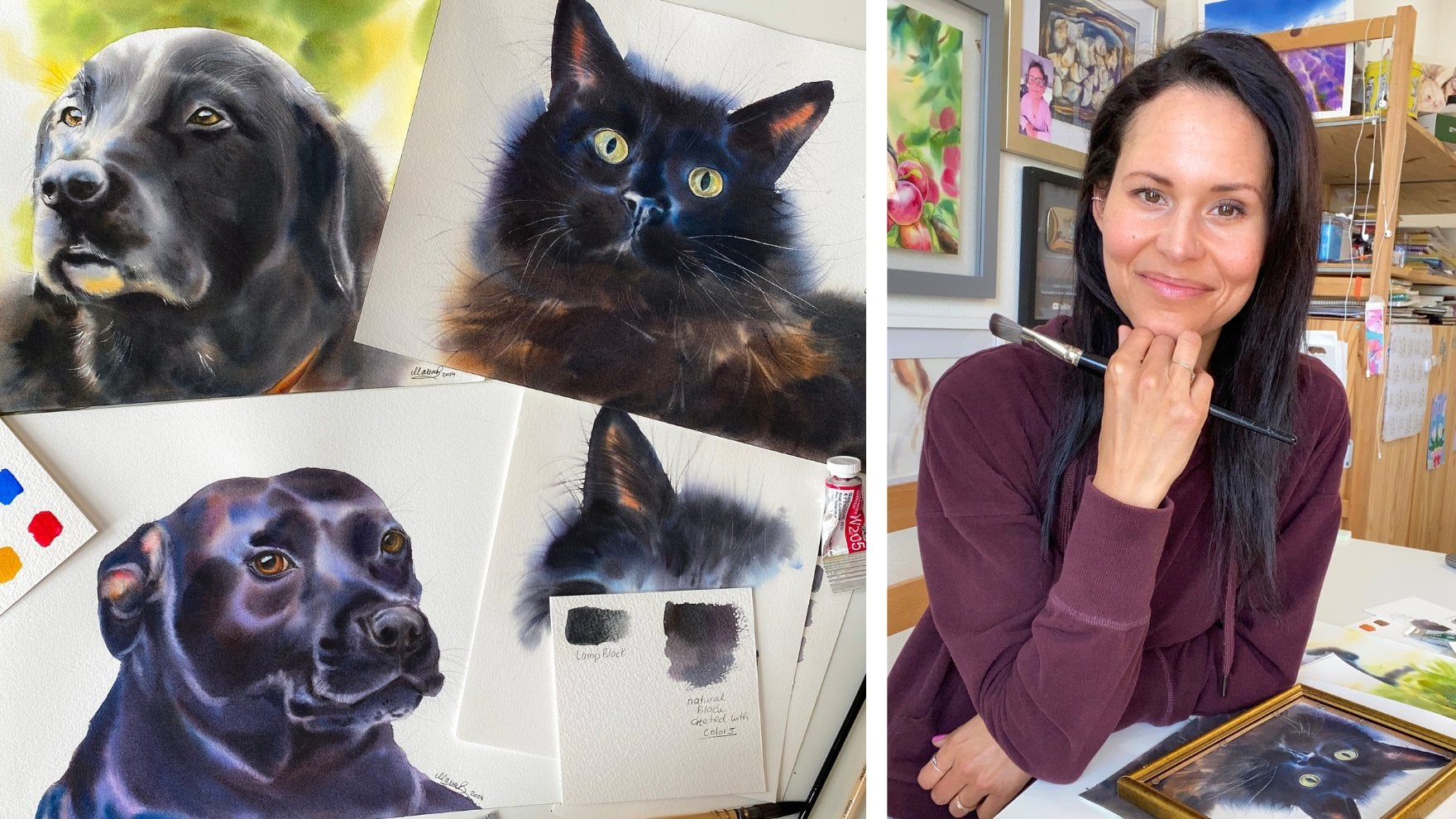
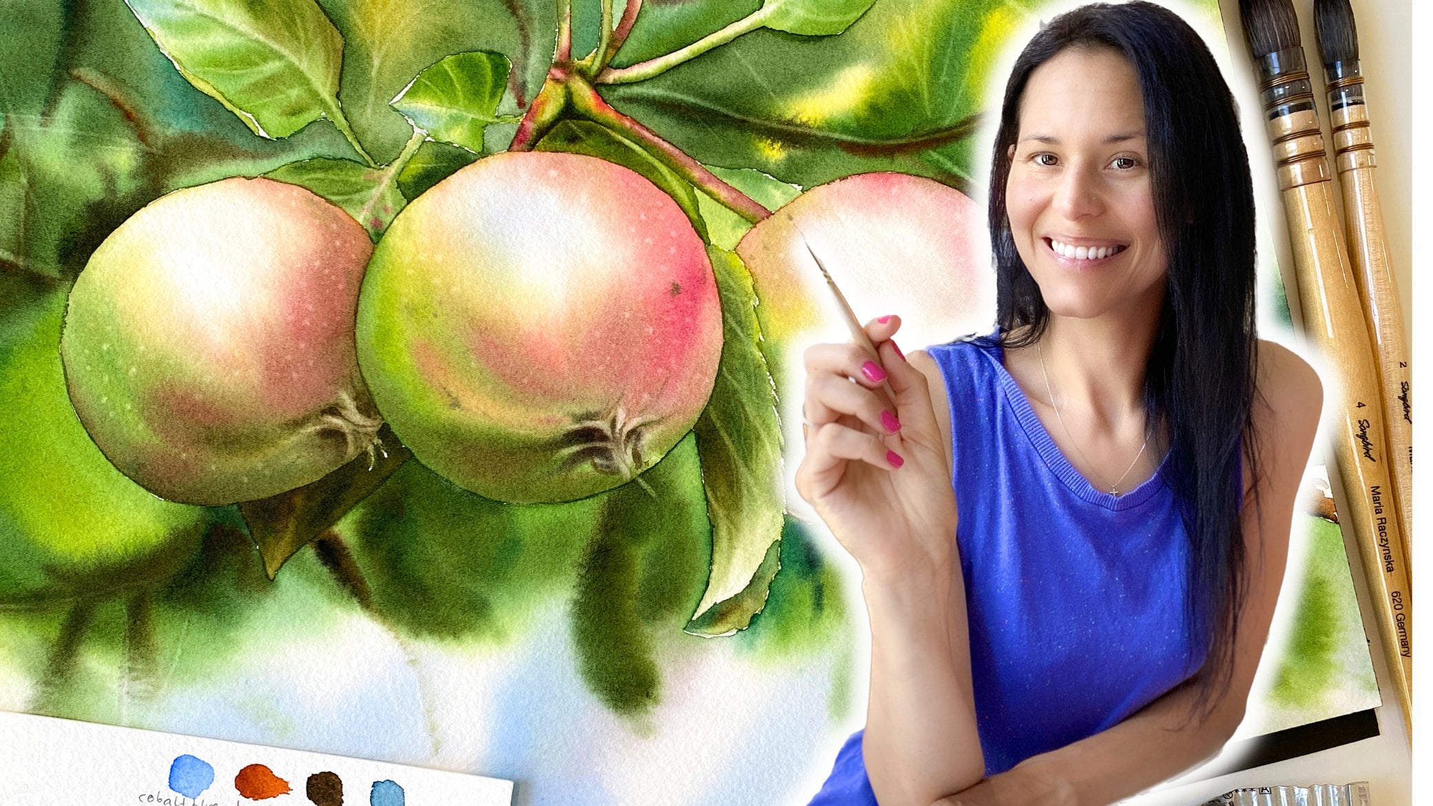
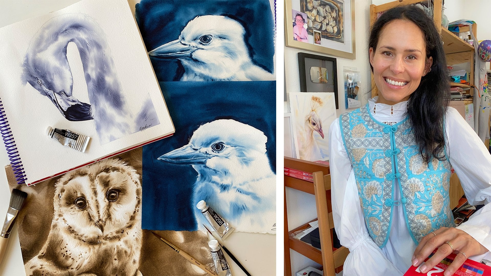
birds more realistically. My name is Maria Nachiska
and I'm a watercolor artist and teacher who has been
teaching watercolors since 2016. In my eight year career, I have taught thousands of people how to paint
with watercolors. I have over half 1
million followers on all social media platforms, and I run two online schools. I have even developed my own
line of watercolor brushes. I have a lot of experience
as a watercolor teacher, especially with the
two techniques, wet on, wet, and lifting. And I know how to paint
realistic objects in watercolor. And now I'm excited to share everything I know with
you in this course.
2. Class Projects: How this Class is Structured: I will guide you through
the process of creating five bird paintings using wet on wet and
lifting techniques. Each project is designed to
build upon the previous one, allowing you to practice. I know that with my guidance, you will gain confidence
and be able to paint realistic
birds on your own. In project one, we will
focus on painting with only one color using the
wet on wet technique. The goal is to create a contrast between
light and shadows by lifting colors
to add highlights and create a soft
feather effect. Project two, you will paint a different bird,
only half of it, focusing on its eye and beak, and mixing primary
colors to create a natural sheet of white
and gray feathers. All will be done wet on Wet. Project 34.5 will be full bird paintings with a wet background to create a soft transition
for the feathers. You will also paint a branch
with a blue undertone. The course includes five
different birds to allow for repetitive practice
of color blending and painting wet on wet. This is a beginner
friendly course that teaches the basics
of water colors, color blending, and
painting fundamentals. In this course, I
will teach you how to create soft feathers
and smooth layers. And how to create depth
in your paintings. Control the paint and
water, add layers. Read the reference image
paint with only one color. That's our monochrome class. Create a palette and
use a color wheel. How to smooth a layer. Using a M brush technique. Lift colors to
create highlights. Create a natural shade of
white using primary colors. Create natural shadows using knowledge of the color wheel. Create your own
shade of black and how to add vibrancy
when necessary. I always simplify things and put myself in the
shoes of a beginner, since I was once that
person who didn't know the difference between
wet on wet or wet on dry. When I first started, I didn't even know how to
lift the colors. But now after years of teaching, I have developed techniques that make it less
complicated for you. So I would like to invite
you to take a class with me and experience a unique
way of learning. Get ready to dive into the
world of bird painting.
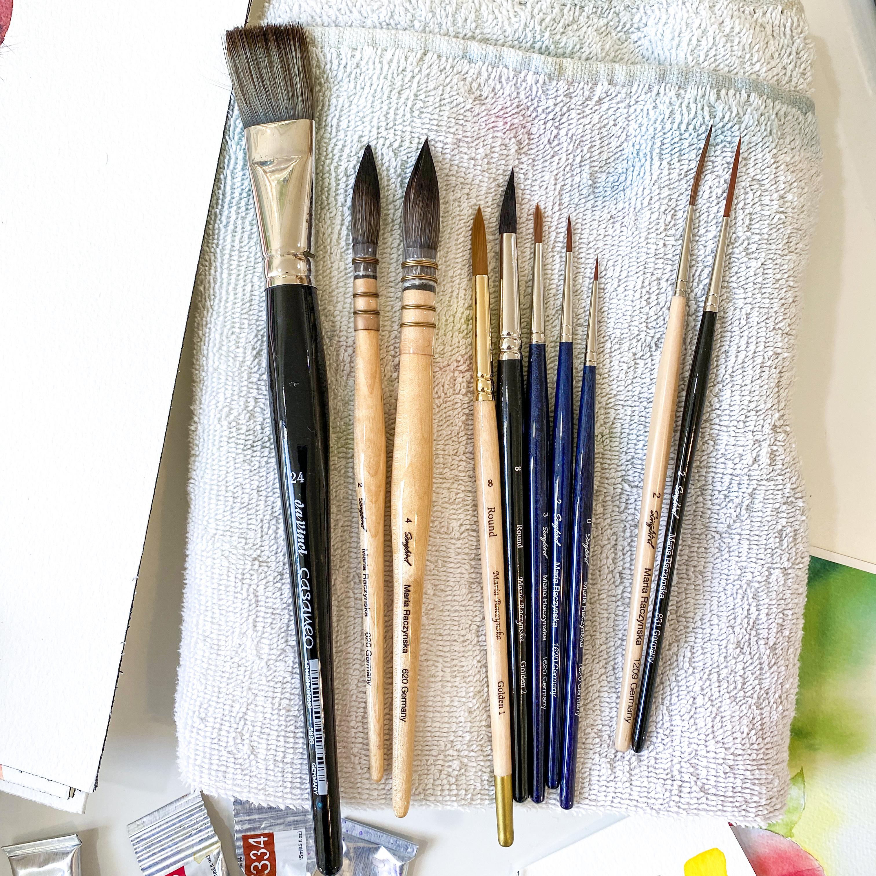
3. Art Materials: This course is about watercolor painting
of different birds, but we don't need
that many colors or brushes in just one type
of a watercolor paper. Let's start with
watercolor paper. I recommend using 100%
cotton watercolor paper, pressed 140 pounds. A paper that is good for layering student grade
watercolor papers won't give you the same results. Watercolors, you
don't need to use the same brand of paint I
use, which is Holebine. You can use colors
you already have. And I suggest for the birds imi, deslone yellow or any other primary yellow,
Iso yellow, deep, a richer orange like yellow
row tiena or yellow ocher, fine fallow blue, red shade, which is a primary blue. You can also use cobalt blue or ultramarine light
quinacrdon red, or some other cooler red. Pero red, which is
the primary red. Vandk brown or pia burnt sienna
or an orange like brown. And then you have indigo, the darkest blue
for the brushes. Whatever you feel
comfortable with, you'll find a list of all
the brushes I'm using. You can also use cool
brushes, just a Y, I. Those are softer brushes. They hold more water and paint. And that's mostly what I will
be using in this course. Also to lift the colors. The main brush I use
is a rigger brush. It's a rigor size two
and it's really good to create longer
highlighted lines. For example, other materials, a small bath towel to
wipe your brush on, a paper towel for
additional lifting. Or maybe you needed to
rescue a spot where a water drop landed
on the paper. You need small jars
with clean water for the easiness of dipping your brush and
cleaning your brush. A plastic palette, or
if you don't have one, you can use a dinner plate. Then you need good light
with daylight bulbs, make sure you have good
lighting because you need to see the
colors on your paper. So let's get started.
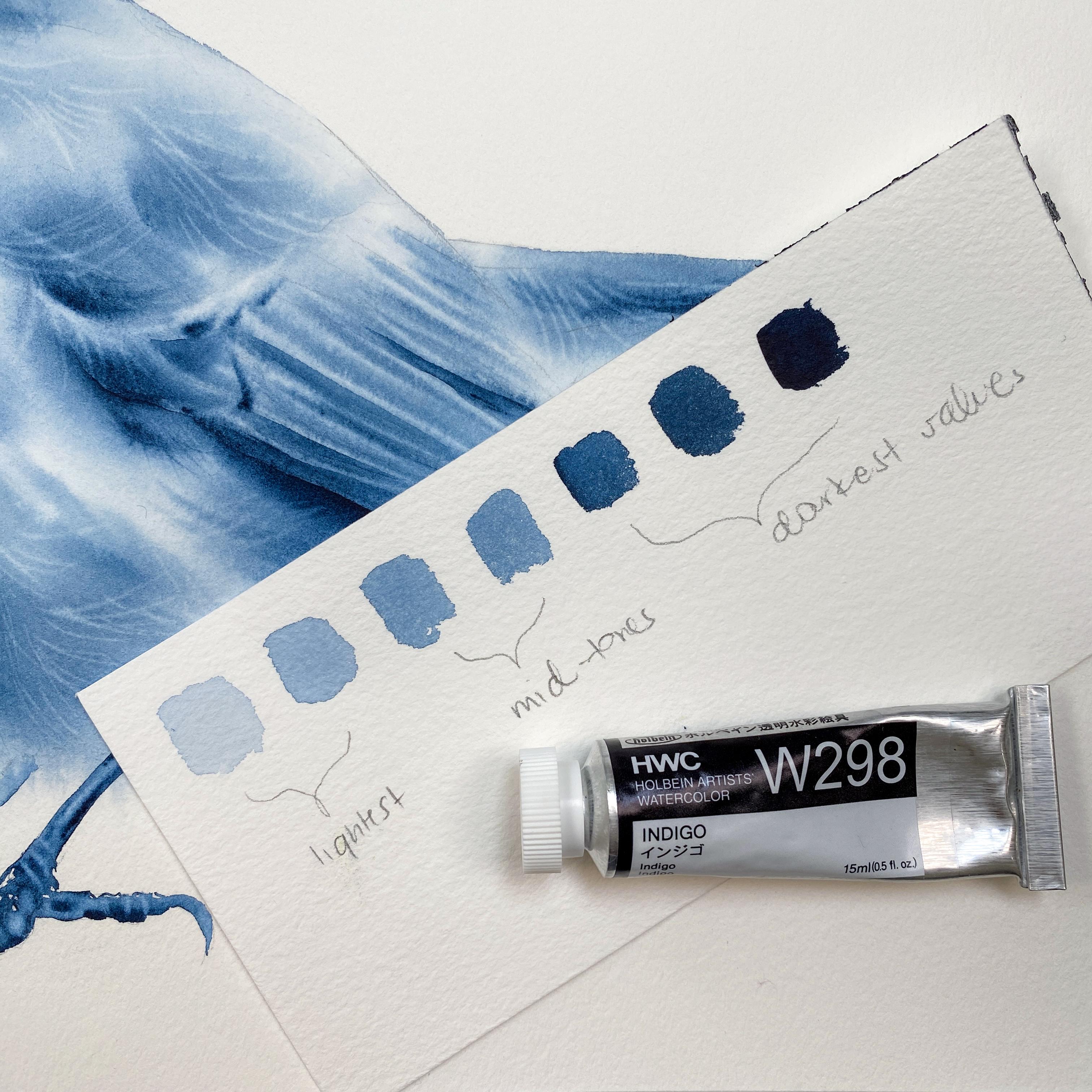
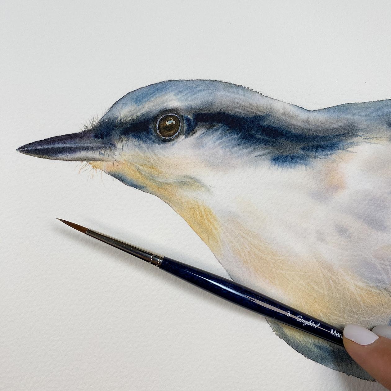
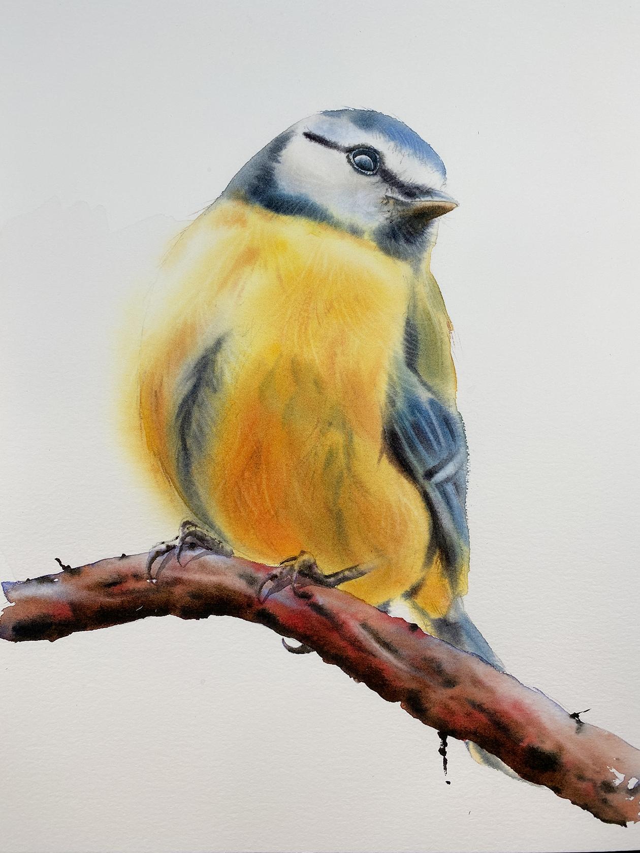
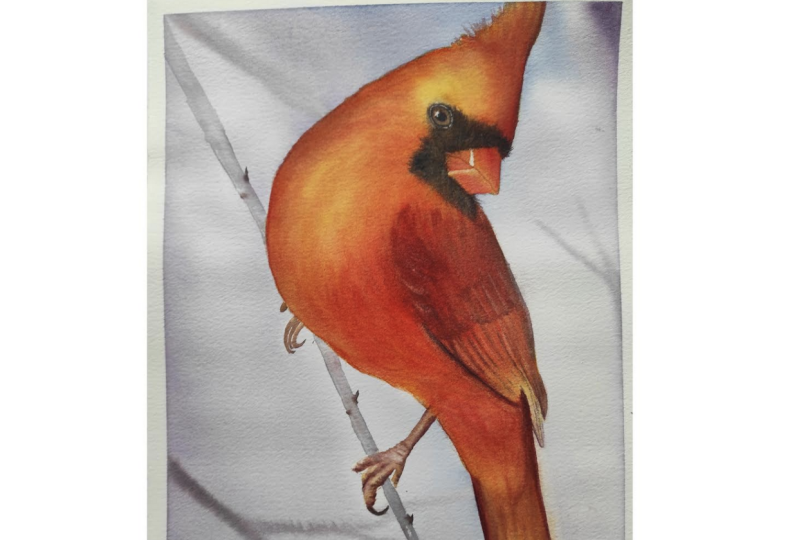
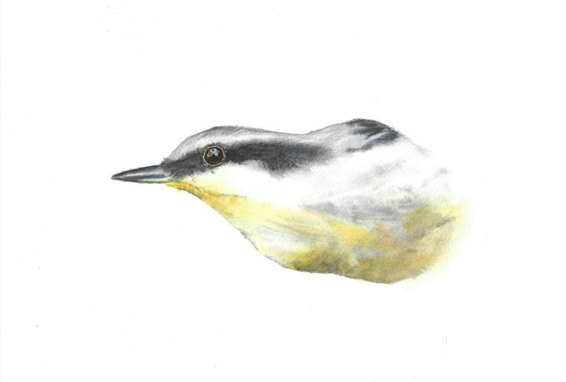
4. Project 1: Monochrome Bird Intro - Color Values: Hi everyone, so welcome
to this first project. So we're going to paint this bird, but in
a different way. We're going to paint
it in monochrome. So we're going to
use only one color. So I want you to pick one
color that's a little darker. So I'm going to choose
indigo for this project, because indigo is darker. And I'll show you in a second
the color values of indigo. But also this color
lifts very easily. Ideally, you also want
to choose a color that lifts easily because we will be practicing
lifting colors. Now the reason I'm choosing
to paint this with one color is because
you'll be able to focus easily on the
light and shadows. And that'll help you
down the road like with the other bird projects. When we look at the
reference image right away, like you can see this
part is lighter, this is going to be lighter. And then we have some
lighter feathers here and then lighter
feathers here. But before I continue
talking about how we're going to paint it
or where the highlights, let's the color swatch for that one color that you're
going to use for this project. This is just a spare sheet
of a watercolor paper here. And I'm going to choose
this indigo color. I'm going to squeeze
it onto my palette. When you dilute it with water, I suggest to still keep
it like, nice and creamy. Maybe like a heavy cream like ratio between water and paint. I want you to do this with me. I'm just going to grab the
pieces that fell over, but I guess it doesn't matter. I'll just clean
my palette later. This is going to be
actually perfect for the lightest
values of indigo. This is the indigo, just a
little chunk fell over here. Then here's my indigo again. I'm going to grab a little
more water because this is. But then I also have the paint that's more diluted with water. It's actually pretty easy to create different color values from one color in water colors because all we need
is just water. If you were painting like
with acrylics or oils, you would be using
white and black to create the lightest
values of a color. You would or add
white to your color. Let's say you're also using indigo to create the
lightest values. If this wasn't oil
or acrylic paint, then you would add
color white to it. Then you just keep adding white to make it really, really light. If you're going to create the darkest values
of the indigo, what's already pretty dark, but you would basically add some black to it
with water colors. It's super easy because all
we need is just some water. Since I already have some of the indigo here very
diluted with water, this is going to be the
lightest value of indigo. I want you to do the
same thing to create values with me of that one color you're going to use
for this painting. Now you want to have
a little more color. So tiny, thicker, right? It's still a light value, but I added a little
more pigment. I'm going to grab a little more. Let's go for like a
light to mid tone. This is darker. I'm
grabbing more paint. I'm going to grab
a little more now. I'm grabbing it from this part, which is a little
thicker, and then I'm going to add it right here. And then I'm going
to grab again, even thicker amount of paint. Maybe a little more water here. These are like, I'm starting to create like the mid tones. This is a little thicker
then even thicker, this is even darker, going
for really darker tones. Now this is a little thicker. But this is like the
milk like ratio. This is as far as
I would go if I was painting wet or dry. Right, with wet on wet is different because I
would probably just go with even cream top like ratio if I wanted to
create this darker value. We have the lightest
values here. These are the mid tones, and then these are
the darkest tones. Lightest. This is somewhere in
the middle, mid tones. Then we have the darkest values. All of it, you can
call it values, basically the lightest
values. Mid values. And then you have the darkest
values of one color only, this is just indigo. What we're going
to do is focus on using these values in our
painting to paint this bird.
5. Project 1: Color Placement: For example, we have the lightest parts of
the bird here, right? This is in monochrome,
so it's very easy to see what are the lightest
parts right away. It's the area around
the eye of it here, I'm going to use this. Even something
lighter than this, I could definitely get
something lighter than this. You want something lighter than this? Or even this is fine. And place it right away and you can cover
most of the bird. But you don't want to
just cover it like this. Grab, let's say flat brush and just covered
with that even tone. You never want to do that. You want to grab a brush and
just slowly place colors. Whatever you feel like, that lightest area could
have a little darker spots. That's where are areas, that's where you're going
to add a little bit of that lightest value, then you can move over through
the bird because we're going to build it up
by adding more color. We have also some light here. This part, these feathers here. Actually, for this, I suggest just to lit the
colors later later. Then we have the feathers here. These are actually highlighted
feathers right here. The hair, what we're going to do is actually wet the bird, the inside of the bird, including the tail feathers. Then we're going to wet also
this part of the background. What will happen is that we will stop applying
color somewhere here. Some colors will
bleed over here, but you want to
stop a little bit earlier to compare
to where you see. You have the sketch line,
you stop before that, some color will bleed over here. That's fine, but
you control it with the amount of water you
have in your brush. And that ratio between
water and paint right, that you carry after you picked up some paint
from the palette. Then this area will dry softly because of that where we're going to wet
part of the background here. And we're going to do this in the other bird projects as well. We're going to choose
areas that we want to keep softer to show that
those soft feathers, of course, you can wet the entire paper and paint
the bird wet on wet. Then you have a softer areas basically for the most
highlighted areas, we're going to also
use a ricker brush. So we're going to lift colors, so we're just going
to lift the colors. But let's talk more about these values, the
lightest values here. Then you're going to go
for like the mid values, somewhere here in the middle. And you're going to start
applying it here and here. Basically, you're
not thinking about the darkest parts yet, although you're applying
these mid tones toward the darker areas, because the darkest parts, you have the darkest value. That's when you're going to use this cream top.
And why cream top? Because everything will be wet. You want to have
the most control. You use this creamy paint on the brush and you're going to apply it only toward
the darkest parts. Then we're going to find the feathers later
by lifting colors. The same thing with
the beak here. The bottom part especially
is darker then the eye. We're going to build
it with layers. So we're going to layer it here. The area above the eye,
that's like mid tones. We're going to be
somewhere here basically. And then we're going
to add some of these mid tones here as well. And then here for the shadows, we don't need to think
about the legs yet. Legs can be left for
later, it's no big deal. Also, you can use a masking
fluid for water colors. If you want to
make sure that you have some nicely defined hair, I suggest using like an
older rigger brush for that. I'm going to place these
values on the side.
6. Project 1: Wetting the Paper: I want you to have your color, the one you chose
for this project, already slightly
diluted with water. This is like creamy, I'd say this is actually
more like a half and half, and then I have
like heavy cream. And this is like a cream top
because there's some water. But I'm keeping this really
thick and we're going to start by wetting
the bird for that. I'm just going to use my flat. It will cover more right away, so I don't have to spend
more time wetting it. Although I still need to spend three to 4 minutes
wetting the paper. But it would take longer
if I was using like, let's say my round
eight brush, right? I don't want to
do that. You want to use like a larger
brush for this, to paint the bird. I also suggest using a
little larger brush. You don't want to paint the bird right away
with this little tiny brush because you're going to leave like
visible strokes and you want to have
like nice flow later. We can use a smaller brush if we want to show like
individual strokes. But you want to create the overall look of
feathers and will help us to do that is basically lifting colors later
because that's how we find the feathers
and we separate parts. That's one of the things
we're going to be working on. Then it all starts with the placement of your
colors in the first place. Now, when you wet
the paper, again, I suggest like not doing
it for 1 minute only, but maybe like
three to 4 minutes or maybe even 5 minutes. I am using a smaller brush
because I have tail feathers, I don't want to go
on the outside. I'm going to add more water
just so it stays wet longer. Then the same thing
with these wings. Here I am using way more water right
now because I'm still in the process
of wetting the paper. Now that I wet it all this, I'm also going to wet the
background here because I want these feathers to look soft. I'm just going to wet this
part of the background here, then continue wetting
the bird through. Go over it many times and I'm going to grab again my long, this is the round eight, medium stiff brush just
so I can wet the beak. There you go. I suggest for the color wise, like using a darker
color overall. Because with the lighter colors, it's harder with
those darkest values and you have to start
really, really light. It's much easier to paint something in monochrome
when you use like black. Actually, you could use lamp black or some
other sheet of black. In this case, yes, black is. Okay. Otherwise, I always suggest creating your
own sheet of black. I'm just going to
continue wetting almost there like
I feel like, Okay, I'm ready to start painting
the bird then I'm going to make sure that there's no
puddles of water anywhere. I need to either push that water over to the other areas or
just wipe my brush on a towel. But you have to be careful
if you, let's say, start removing that water with the brush because you
might make it too dry. You don't want the
paper to feel damp. You actually want the
paper to stay wet. You want that nicely wet paper. You see that nice shine
there, but no puddles. Then you can always push it
toward like the background, right, which is what I'm doing. But I have a little
too much water, so I'm just going
to scoop it again. We're going to start with the lightest values
of that color. I'm going to use my indigo. I like indigo for
something like this. Because it lifts easily, it's easier to show that
process of lifting, just the effect is nicer versus like using,
let's say Rociena. It does lift but not as nicely. And also because Rocienas lighter color
rights's hard to see it not as nicely as I
can show it with indigo. I'm going to go
back again toward the beak and then go through it again. Wipe my brush
slightly on a towel. Not hard. Press it really hard on a towel. I just want this to
look nice and shiny, like nicely spread water but absorbed already
into the paper. That makes sense. No poles. Okay, for this I'm going to use.
7. Project 1: Applying Indigo: My long quail size for brush. You don't want like
a damp brush yet. You want to use
this lighter value. So I need a little more color but lighter value of the intigo. I actually do need more water. I wipe my brush on towel, but I want to see the flow now. This is just one color. Continue doing this
on your palate until it feels right. Like
you have enough. I feel like I already lost
too much water and I want water because I want this to feel like a water like ratio. First part, we're going with the lightest value right
here of the indigo. I'm going to continue now. This lighter part of the bird, all these feathers like we can see a little bit of
a color there, right? That's why I'm placing
some color there. It's just a light value. My whites are going to have a little bit of a color
because it's all shadowed. I need more water because
I want to have a flow. I don't want to dry too fast. And the thing is that
as I am painting, I continue wetting my
paper. That helps, right? To keep it wet longer. I am actually going basically
everywhere right now. These are just the
lightest values. Again, I am keeping
my paper wet longer. This way I'm just
looking for some areas. Of course, the
lightest areas need to stay as light as possible. But doesn't mean that
I can't add any color there to something like this. Then here I'm pressing
a little harder here to release more of that paint. Now, you don't want the brush
to be soaking in water, basically, you still want to
control like how much water. It's just like I was dipping
my brush water jar just to get more because it
just felt like I would be removing water
instead from the paper. And this is the edge
basically, right? But I got to start working on these mid tones before
I grab my palette. Somewhere here,
actually, here and here. I'm going to start
with the mid tones. Now, I don't want as
much water as before. I still have, this
is like a milk maybe like ratio between water and
paint and I'll feel it out. If this doesn't feel right, it doesn't feel as
thick in the way, then I'm going to go for like maybe two a half ratio, right? Ratio between water and paint. Now, at first you see all paint is spreading and
everything. That's okay. You want the paint to spread? Of course, you can decide
how much control you want to have because now I can
grab a little heavy ratio. If I feel like there's
too much water, I can wipe it on a
towel and then go back. Now, the brush does feel damp. I have more control. If I
don't want that much control, I'm going to grab the
more water with this. I'm going for the midtones. And at the same
time, like some of these darker areas are
getting covered too. But I'm going to show you in a second is this damp
brush technique, when you wipe your
brush completely, like on a towel, squish it, then you brush through the
painting with that damp brush. But here with the
tip of my brush, I'm going to add some of
this value toward the beak. I have this old course
in my old school. This is my old teachable
school, right? It's a monochrome class. And I remember that was like the most popular actually course. And I'm very happy
to do this again. The reason is because
it's just so much easier to understand the values. And like keeping areas much
lighter versus keeping it, sometimes we just
go too dark here. With the tip of my brush, I'm going to apply
these darker tones. The reason I'm also going here is because the paper
is drying fast. If I don't supply this
with more water and paint, this will dry on me too
fast, faster than I want. I'm still not there yet. Like I still want to
add more color, right? Because this is not dark enough. Now, use the tip of your brush. Basically, press a
little harder for the paint to release that paint. In the second. We're going to grab the screen
top basically too. We're going to work on
our darkest values, but what's happening
to the paint? D' paper is drying like you really want to
actually cover most of these areas when
you move around, you keep your paper wet longer, right? You want to do that? That's why I'm like,
okay, I need to do this first before I go for
these darkest tones, just because I need to
keep this wet longer. And then I can grab
maybe more of this, but this is going to
be like a damp brush, like a 2.5 ratio. But I'm going to
wipe my brush when I tell it looks damp, right? So we are going to go for this damp brush technique
in a second. I just want to first add a
little more color here here, before I show this
damp brush technique. Now, for the damp
brush technique, what doesn't work is if the
paper loses that shine, you actually want to do it when the paper is still shiny wet. I got to do this quickly because now that my
brush feels damp, I'm actually removing
water from the paper. It's like good and bad, right? That's why you want to
always think like, okay, what can I do and what
works, what doesn't work? I'm just going to release
a little more paint. And when I say that means
I'm pressing harder on the paper to release more paint. Then this is just with
the tip of my brush. And then here we
have these feathers. And I'm going to
clean this brush. I'm cleaning it and I'm going to show you
what I'm going to do. It, it, how do I show this? Maybe here wiping the brush and then I need to grab a piece of a towel so I can show you. I'm going to squish
this brush right here. It feels damp like this. Okay, then you're going to
brush through your painting. Now, again, this does not work. If you lost that shine
already on the paper, the paper needs to
be still nicely wet. You're just brushing through. This is the damp brush on. I don't have any paint, although I am picking up the paint right. But it's not like I'm using like fresh paint
or anything like that. This is just a clean brush. Then now you see the difference. Like it's brushed through
and it looks softer. You can pull on the outside
too of these feathers. Here we have soft feathers. We can add a little more color since we have some color on our brushes from applying,
pulling the paint. It's not lifting because
we're not trying to lift, we're just pulling the paint. If I want to add any more color, I can do it with the same brush. Squish your brush again,
so it feels like this. And pick up some of this indigo. This is a damp brush. Still a damp brush technique, but we're picking up
paint if you can see it, like I have some paint here and you're
going to be careful because if it says
squished brush, like you're covering
a lot more to right. You can maybe turn the
brush a little bit, just so you have
the most control. Look at the highlighted
parts and where you need to add these
darker feathers. Because maybe we don't
need to add it everywhere. The reason we're also using this damp brush
technique and you want to do it with
a softer brush. By the way, this is my quill. It's a long quill size for because if you
use a stiffer brush, you're going to just
pick up the paint and you're going to
lift colors instead, instead of like brushing
through right now, what I want to do really, is lift colors, but I
can't lift the colors yet.
8. Project 1: Adding Darkest Tones: The reason I can't lift
is because I have to still add some darks and
this is still nice and wet. That's my only chance
I'm going to grab this creamy paint from here. This is like a cream top almost. I'm going to find
the darkest parts. Feel it out because
maybe you just need heavy cream like ratio
between water and paint. You're going to paint the
feathers wet and wet. Basically you're going for the darkest parts that you see. You're separating these
feathers by lines, but you need either heavy cream, cream top like ratio
between water and paint and quickly go back toward the tail feathers because maybe it's too dry or hopefully
it's not too dry. If anything, you
can always rewet it and at the second layer, and that's when you
can make it darker. Ideally, you want to do
it all with one layer, because then everything
blends in that first layer, nicer than rewetting
it and doing it again. But that is an option too. Here, this is the darkest part. Then I got to go back here. I still have paint,
but I want to go back for my cream top. Ideally, I'd like
to paint the beak, but it's too late.
I just tested it. It's too late. The only places I can go is around the eye. Then here, to add a
little more darks, some parts like the eye, I'm going to paint it
anyway, separately. But here I can still add
a little more color. Then maybe I can add more
color here and here again, I can go back here, maybe separate some more
of these feathers. Now we have to
remember about lifting colors because that's
another thing I'm teaching and it's
important in terms of creating the soft feathers. I'm doing this fast
because the papers drying and I really don't
have much time left, but I can still add a little
color. You want to stop? If things start to
look like you're just doing it wet on dry, then I suggest not
to do it anymore. Just wait until it dries. But if you are able to lift colors, this
is a good timing. You grab a rigger brush or you can grab a round
brush, says two. For example, assuming there's
no more shine on the paper, on your paper, that's when
you want to start lifting. There's no more
shine on my paper. I'm just going to start
lifting wherever I can. I'm going for the most
highlighted areas. But also like if I see
like softer feathers, like like here for example, this is where I need to lift. These are good areas to lift
then to find my feathers. I'm going in between for the
highlighted parts, right? When you look at the reference, you're going to see right away which feathers or
what areas to lift, because you're going for
the highlighted parts, you're lifting the
highlighted parts. And then ideally separate
these feathers by lifting as well, you're finding feathers. Maybe here, this is a good spot. I'm trying to be fast
because this is almost dry. But this is the thing. If you focus less on my
painting while you're painting, of course, then you'll be able
to do more on your paper. Of course, when we're
not distracted, we can do way more. I suggest for you to
watch the class first, then watch what I'm doing. You can listen to my voice, but I really you
focus on your paper only you don't follow my strokes because that's
when the get confusing. And I know this because I did this project with another
artist not too long ago. We challenged each other
by creating classes. I created a mushroom
class for her. And she created, by the way, these are the little
lighter feathers here, I'm just going to lift. She created a escape
class for me. My first attempt
wasn't as successful because I was following
her too closely. And that's not a good thing. Then once I focused on the reference and I
already got all the steps, how she was painting something, then everything just made sense. And much like I was
enjoying my painting, basically, otherwise,
it was just too hard. I'm lifting until I
can't lift anymore. But the thing is that
you don't want to overly lift because then you
also lose that softness. And the softness is there, but it just looks overworked.
That's what I meant. I'm going to lift a
little more here. The paper is almost dry. No one thing you can also do, if it feels like still damp, can go back with the paint. This is cream top.
You can tell it's cream top because my brush is basically damp and
it's not even in shape anymore right now unless
I grab some water. But I'm going to grab this
cream top like ratio of that indigo and I'm
going to go toward these areas that need
some more color. The darks, I'm looking
for a little wet area. This is all wet on wet. You can also create like
individual strokes. Just find couple areas maybe
that are still a field dam. Then you can create a
couple strokes like this. This is just on the tip of my brush. Nothing
more than that. Then I'm looking for these
areas that feel a little damp. I don't want to go I
guess here because this is supposed
to be much later. Maybe over here then this part should have
some hair, right. But ideally, you
would go like over these darkest lines to add some of the cream top like ratio
between water and paint. Next step will be to
work on the beak. And they actually, I'm glad this is going
to be all separate because then we can focus on just different
parts of the bird. So that will make it easier for you to follow the
other projects. Let's walk away from
it and let it dry.
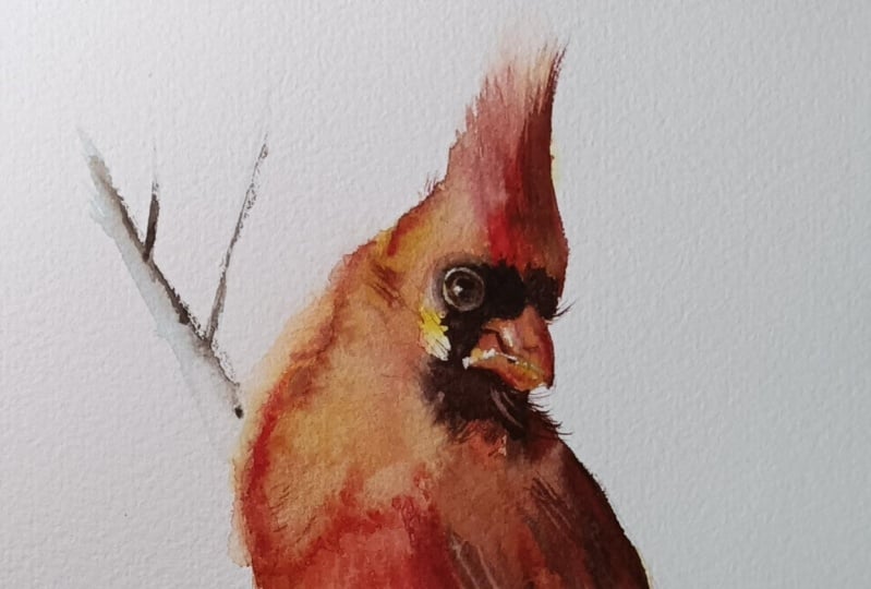
9. Project 1: Painting the Beak: To paint the beak. I want you to zoom in onto the
reference image. You can see I've
closed the beak, and then we can
see the nostrils. Of course, I focus on
the beak and the eyes. Everything else, I
try to keep it loose, and as you notice, it's mostly just wet and wet. I try not to add
the second layer, but a lot of times I
do it because of lack of vibrancy and I want to
create more contrast dimension, that's when I sometimes
add that second layer. But a lot of times it's
more satisfying if I can do this contrast with just the first layer doesn't
always work because again, it depends from the colors
you used with the colors. Some colors just dry more
pale and it all depends. The first thing you want to
do is you want to dilute your colors or the
color color with water. I quickly added
water to my India. The next thing you want
to grab a smaller brush. I suggest maybe size two
or maybe size three, round brush, medium stiff. What we're going to do is wet almost the entire beak
except for the top part. When you look at the reference, you will notice that this
top line there is lighter. That's a highlight, right? You want to avoid that,
you don't need to wet it. And also on the bottom, like
there's a nice highlight, we could technically avoid that if you can go ahead
and avoid it. Now, another thing
is don't worry about the nostril highlight because we will lift the color there. Then another thing,
when you wet, you always want to wet
more than you need. We're going to wet the
inside here as well, because you want to
have a soft transition, we're wetting more than we need. I'm going to add
more water here. It's much easier, of course, to just do this wet on dry because then you
can just add the color. But the pat, the color, the layer will look smoother
if you do it wet on wet. Which is why I'm
teaching you how to do this wet on wet instead. Now, grab like a heavier ratio, maybe heavy cream like
ratio between water and paint off the color
that you're using. In that case, this is o, aim for the bottom part. Think of it as if you're
drawing maybe with a crayon or pencil
colored pencil. You're just using the
tip of your brush. You're just applying that color and then pushing it a
little bit down there. Now I am going to
grab cream top. Because I want to have
even more control. I actually need to
grab like a chunk. I can add a little more
color on the bottom. Yes, the pay tool
spread toward the top. But as long as this
is like a cream top, then I'll have
control over this. And I keep going fruit these
parts over and over again. And then there's those
lines that I marked for myself, that skin there. Then I need to reload my brush because when you are
touching the wet paper, then you're just diluting that paint with
water on your brush. You just have to refill. This is you can tell right away this is like a chunk
of almost paint. You don't want that chunk
straight out of a tube. You do want some tiny
bit of water there. But the idea is to
have the screen top, let's see, a little
bit maybe of it here. We're slowly building it up. These are like the
darkest values that we're using for
the beak, by the way. Then I'm releasing
even more paint because I still had
a lot of paint. Now, what about the top? I
do want to add more color, but I need to wipe my brush. This is a damp brush.
Now what I'm going to do is with that damp
brush, wipe it again. And go right above. And just spread it
up to that line where where you
wet it, the beak. We can also go on the
outside a little bit just to connect That's the bottom
part I'm sorry, of the beak. And then we have the top
right there, that thing. And we have to
keep an eye on it. It will be left in colors. So we'll get to it in a second. For now, we can work
with the damp brush. Just a damp brush. Okay, that means you're
not bringing any water. It's just a damp brush. Now, should we zoom
out a little bit? Yes, because zooming out helps us to get a
better perspective. Don't worry like if you
cover too much, by the way, because we're going
to lift the colors and then a little
bit here and then I can grab a little
more color of that cream top just
to make it darker. Right there, you'll notice the paint is spreading
less and less and less. It's because the
paper is drying. That's why I don't want to walk away from this because
this will dry in seconds. Instead, I should
clean my brush, wipe it on a towel so it's like a damp brush so I can lift. First of all, I'm
going to lift here. This is a little too early, but I might as well
lift a little bit. And then this is the area
where we're going to wait for. Because I want to have a
sharper line when I lift. I just need to
wait a little bit. In the meantime, just
don't get sidetracked. That's what I have
to tell myself. But we can add a little bit
of water toward the eye to start the process
of wetting it. Let's see, do we want
to wet more than we need the wrinkly part? Probably not. Let's just wet
the inside of the eyeball. That's because the areas around
the eye are pretty light. We can work on that later. Now, let's keep an eye there. I'm going to clean my breasts.
Make sure it's clean. Wipe it. This is when
I'm going to try to recreate that nostril. Now, this is still too wet.
It's actually too wet. I'll continue wetting
this and keep an eye there just so we
don't miss out on the timing. Hope I don't. We'll see what happens if
I miss out on the timing. I'll just repaint this part
so you can see it clearly, which I have to do sometimes. All right. Now I'm
going to go back here. This is a M brush, it's still literature early. What I'm going to do is
lift a little bit the top, just so I have a
better contrast. I'm just lifting the top part. And then I do have
to create that line that separates this nostril. It's a little too early. I'm going to wait
a little longer, but I'm going to lift
a little bit here. If you don't see much
lifting and you know you're using a good color
for that, that lifts, then wait a little bit longer, just going to lift a little here so I can shape that beak. Then I'll just continue
adding water here. This will stay longer this
way when I'm ready to paint the eye just a
little more water. Then we're going to work
on the highlights here. By the way, we're going to start with the color of the highlight, which is like very light value and that's what we're
going to focus on later. With that next layer, we're going to focus on adding
the darks around the eye. And then we're going
to work on the pupil. It's also going to be wet on, wet back to the beak. Now, it's better being able
to lift because the thing is, if you start too early, you dilute the colors
with water more and more. You don't want to do that.
Then here, there's that line. You want to use a medium
stiff brush for this. I still started too early. I am able to lift here. There you go. Then we can create that
first lightest layer there. Or the wash. I'll grab
like a milk like ratio. The ratio between one and Pat. I'm just going to think
of the highlights, right? The highlight is here, but I want some color in
the middle of it. I don't want it to be too white. This is actually my first
layer for that, for the eye. I just have to wait for this to dry so I can paint
that second layer. And then in the
meantime, I can go back here to lift a little more. I can also grab a little more of the cream top of that color, the cream to ratio. Since this is feels
a little damp, I just add a little color toward the darkest
parts of that nostril. There you go now, It just makes more sense there, but I do have to wait
for this to dry. What? Let's move on toward the toes.
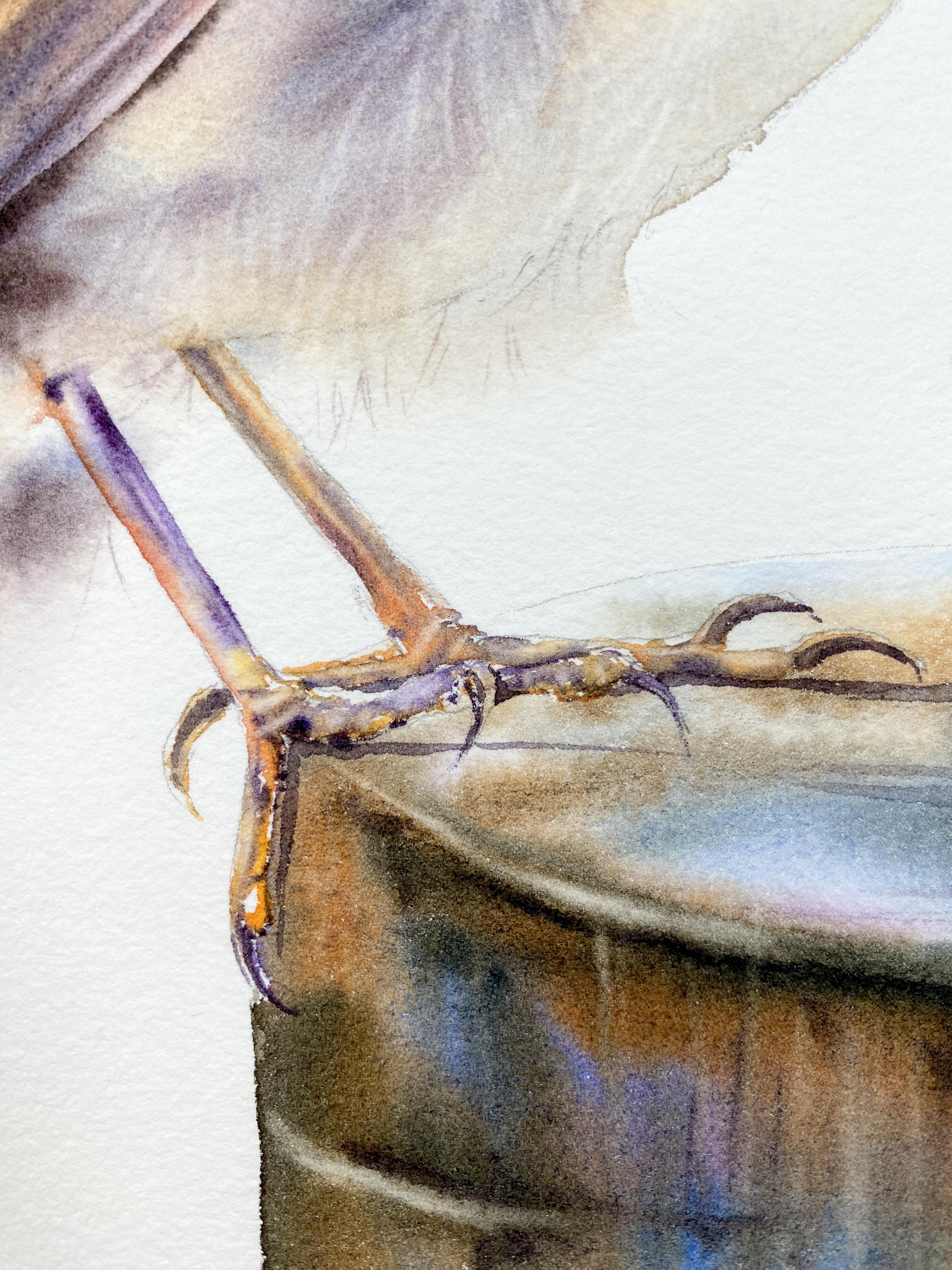
10. Project 1: Painting the Feet: With the feet, right? You basically want
to wet the toes. And you don't even have to wet the entire toes or the legs. The parts of the legs just skip smaller areas and then you apply colors toward the darkest parts. And a lot of times I
start with undertones. If we see a little bit of
pink or maybe some yellow, that's what we're
going to start with. Then later we're going to
add like the screen top like ratio between water and
paint of a heavier color. Let's grab like maybe
a little larger brush. This is my round three,
we're just going to wet. Here is the thing you
want to stop with. This one. You want
to stop right there because this leg is hidden. It's like behind this
belly with this one. When we wet this leg, we're going to go on the
inside of the feathers. But for this one, we just
want to stop right there. Then I'm not wetting
it perfectly. We do have a lot
of water and what might as well just
wet this one too. We're just dealing
with one color, not to connect all
the toes right away. You can just not touch with
that water everywhere. You're not wetting
everything all the way. Then again, you're going
in inside the feathers. For the soft transition, when we apply color, we're going to stop right there. Some color will bleed. But
we'll have a soft transition. It won't look like that
was like glued in there. Just wet it. We have the claws go a little more water and we're going to start slowly
with this lighter value. I'm going to remove a little
bit of water because I don't want puddles a little more. Water is okay here. In this case, actually
my water jar is blue. To have a little bit of blue, I'm going to grab let's say like a milk ratio between water
and paint of this, ED. Watch how the paint spreads. I want a little more flow. I'm grabbing way more
water with this. I just want to see more flow. You're adding this
either on the bottom or the right side here when
we're painting the lake here. The same thing here, when this
is what I'm grabbing here, it feels like it's like
milk like ratio, right? But I'm grabbing quite a
bit on my brush again. You want to add
this on the bottom. The top is highlighted, right? We don't want to
add too much there. Let's see what's going on here. This is in the back, that clock and then
more of that milk. Same thing here. I'm still
looking at the reference, it's just that I'm
focusing mostly on this. I want a little heavier
ratio here on my brush. I have a lot of water, but I'm stopping right there. That's as far as I want to go. I'm going to have
a soft transition. Once it dries, now it's the good time to grab
like a heavier ratio. Really heavy, I'd say like between heavy, cream
and cream top. This actually I was saying you apply color
toward the bottom. But this is darker, this is shadowed, you're looking for like the darkest parts and that's where
you want to apply. This cream top. This is cream top like ration
between water and paint. It's still like on
the bottom here when you see the claws and toes. Got to hurry up.
Actually, this is drying. You might want to do it
actually one at a time, 1 ft at a time, but we want to mostly
on the bottom. And then there's
those wrinkly parts. You can go through
them, connect. We have these wrinkly parts. Again, that's how you
shape these wrinkly parts. You're adding color,
but not everywhere. Then when you have
this cream top like ratio between
water and paint, that's actually when you
really show the dimension. But you have to find
the darkest parts, where to place it and then
we can also lift colors. That's another thing that helps in painting something like this. I'm going a little on top there just to show
that highlights. As you see, I'm still
a point colors, but mostly on the bottom. I'm going to wait for this to settle a bit so I
can lift the colors. It's not going to be that long because this is a smaller area. But I'm going to wait
probably a minute. I waited a minute. Thing is that this one
is drying already. There was a toe
here somewhere and I goofed up it a little bit. So I'm going to create a claw here and I'm going to
push the paint down. It looks like I lost a toe
here. Just by lifting. I'm going to add it
here. You know what? Nobody will know, you
know my little mistake. But that's okay. That's
just my sketching. But anyway, you
can go through and lift the lightest parts. Let's see on top
parts of the clause, the best timing to live colors is once that shine goes away. This is too early. But
once that shine goes away, that's when you want
to lift colors. I'm going to grab my round two, actually, if you need
more help with lifting, I have this other course
about apples and water color, and there's a section
about lifting, it's just about lifting. I'm going to grab a
little bit more color on this brush just because I want to show that
there's this foot here. Or not foot by the toe, then back to lifting. This is a smaller brush to lift, you can go through,
but this is too early. But I do need like a heavier
ratio between water and paint because this part
needs to be darker. I'm adding cream top and
stopping right there. Well, I can go a little further just because I want to show that buried there right
underneath these feathers, you don't really need
to do that much. If your placement of
colors of color was good, then you created like
enough of that contrast. I'm just lifting a little bit. I clean my breast, wipe it on a towel, and I
come back to lift again. This should not be highlighted, but these parts here
could be lifted. Just lift again. It has to do also
with patients like you just have to wait
for that timing of time. I'm just going to lift now. But the best time to lift is once that shine goes
away from the paper. That's when you lift the colors. Depends what type of
lifting, of course, because if you just want
really soft lifting and you have a larger area, then you're going to
start much earlier. I just want a line here, but I don't want to forget
about it. There you go. I don't want to forget about
that to this part either. You can go back and
like relift the areas. What I'm going to
do is leave this alone actually one more,
not completely alone. I'm just going to go in a circle here to lift a little
more, a little more water. If you add too much water, just that's when the blooms happen. So be careful. We're going
to go back toward the eye.
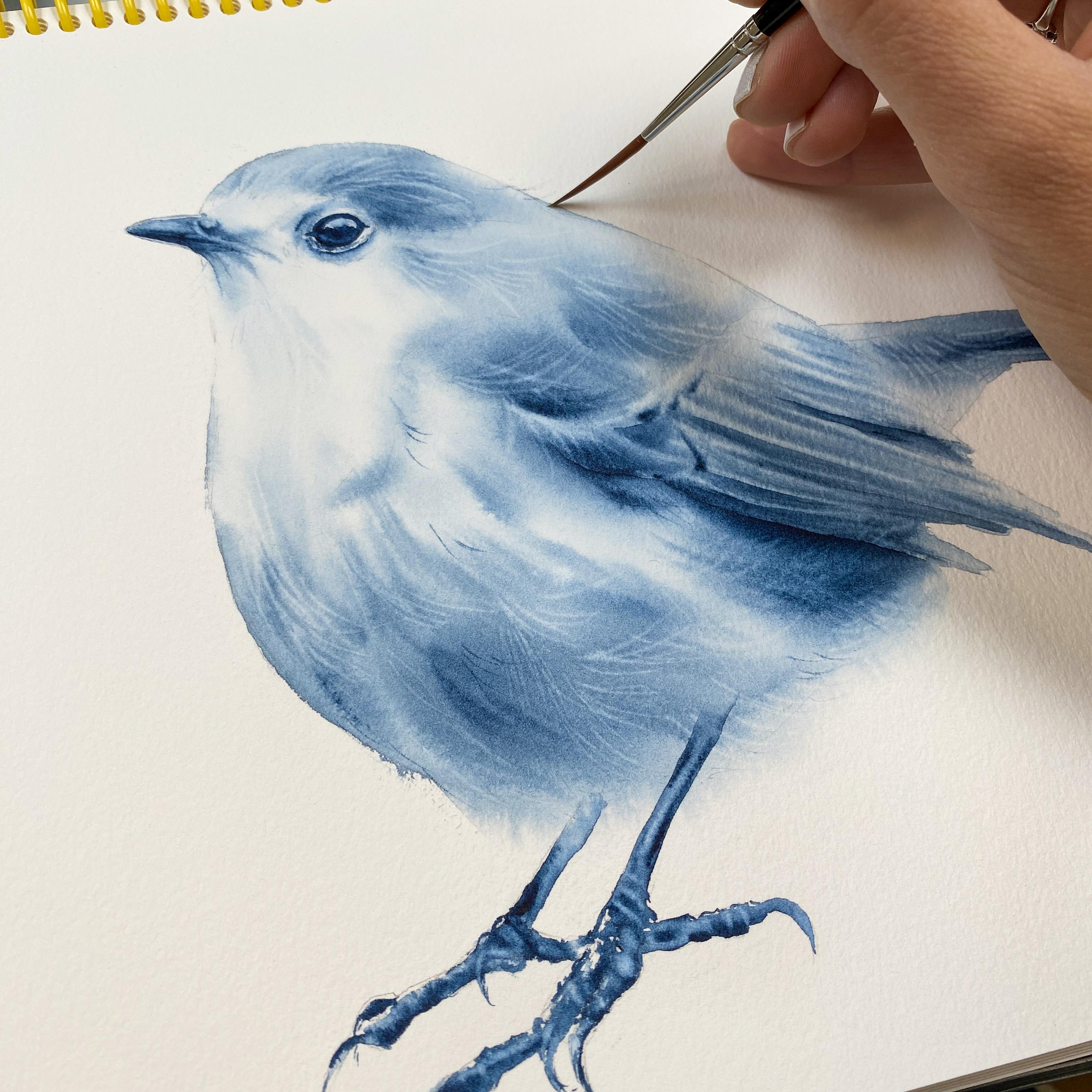
11. Project 1: Eye and Shadows: I want you to zoom in onto
the ice so you can see it, so you can see where
that highlight is. This time, we're going to
avoid wetting the highlight. So I'm just introducing a little bit of water
inside the eyeball, but not wetting the high light. I'm going to grab like
a milk like ratio between water and paint
of the color indigo. Now that I have water,
I have a better flow. I just need to remove the hair. I'm going to go around it. I do want the flow. It's
easier for me to basically, the paper is not
drying on me, right? So I don't want to do this dry. I want this to be wet on wet. This part is wet on dry. But all this on the
bottom was wet on wet. But on the top it's
easier to go wet on dry. To shape that eye, let's see, goes like this, actually
something like this. Then the eye goes, actually gums out a little bit like this. Or not the eye but the lids. Then we have these
wrinkly parts. A lot of times I'll create some wrinkles right away and this should be actually
larger on the outside, on top, something like that. Now we have that first part. This is the second was
technically we need to grab a cream chop to
have the control. Where would be the pupil? We're in the middle here, right? You're adding that
cream top only there and you grab more
of that cream top. And you're going
to go right above the highlight where you would have the lid
right on the bottom. Basically, you're
leaving that area that would be more colorful, which is most likely brown. You're going to leave it alone. You have different values there. You want to create
different values in the eye in the painting. For now I'd say that's it. But what I'm going to do is grab some milk or water like ratio. We can paint this part. It's like you're going on
the outside wet on dry. But then you're going
to clean your brush, wipe it and you're
going to touch that and that'll spread this
way you're shading it. I'm not crazy about
these wrinkles. It's going to wet them
gently just to a bit, and that looks much better. We're going to do the same
thing from the top here. Add some paint and
clean my brush. And just water. And I'm
just letting it to spread. Should be much darker, so light actually this side, you just have to
wet it, but you got to be careful so it doesn't flow too much toward
the eyeball there. Grap a little more
of that cream top. We still want to separate the eyeball from the rest
of it to make it darker. I'm just applying more of
that cream top inside where I have the pupil, and still leaving that
part much lighter. Then I can come back
to it later too. I can also make a
little darker the outside by adding this pain. This is wet on wet because
I already wetted it. I can add maybe paint here too to make it slightly darker. I want to show you
one more thing now, when you zoom out out
of this reference, or not zoom out but make it smaller so you can
see the entire bird. On your computer
screen, I want you to focus like looking at like, okay, where are you missing? Like those shadows,
maybe darkest parts. I usually add a shadow
right underneath the wing. And I'm going to show you with my round Et brush,
I need clean water. What I'm going to do
is wet more than I need to wet underneath
the wing right there. You always want to
wet more than you need even on the outside
where we have the background. And then you're going
to grab this cream top, heavy cream tea, cream top. Say that color. And you're going to place it
right underneath that wing. The paint will spread right, So we're creating a shadow. And then here as well. Now there's different ways
to do it because you can also just do it wet on dry
and then spread that paint, just like we did around the eye. Then here, just to have
a soft transition there, you can also lift these colors. It's up to you, but you can
also do this wet on dry. For example, maybe
this area right here. I'm adding the indigo here. Then I'm going to
clean my brush. And then use a
damp brush just to let it spread and
make it softer. You can pick some areas
that you feel like need to be darker, maybe here. Then with that damp
brush, I'm going to go on the left side of it, the paint spreads there.
Let's see over here. A good spot actually. Then the damp brush that spread. Then if there's another area, maybe. Let's see over here. Well, I don't have enough
paint. I need to grab more. We can do this here too. We're creating more
contrast, right? Another area, maybe over here. I don't often do this. I usually just leave
it the way it is. But if you want to
create more contrast, you need some dark
maybe over here. You see this part should be
actually, this part sold. I'm going to clean
my brush and then, so this, it, that's
all I would really do. I'm going to zoom out more.
12. Project 1: Summary: Congratulations, you just
completed this project. You painted a bird wet on wet. And you painted it only with
one color, which is amazing. Let's jump on to
the next project. Just keep in mind that you always want to focus
on light and shadows. The idea is to mix
colors on the paper, not on your palette. And I'll explain more
about this in each project so you understand
like why we're using certain colors to make
the other colors pop. Anyway, to use an
undertone color, we'll be talking about
all this, the dimension, and everything in the
following projects. Thank you so much for your time and see you in the next one.
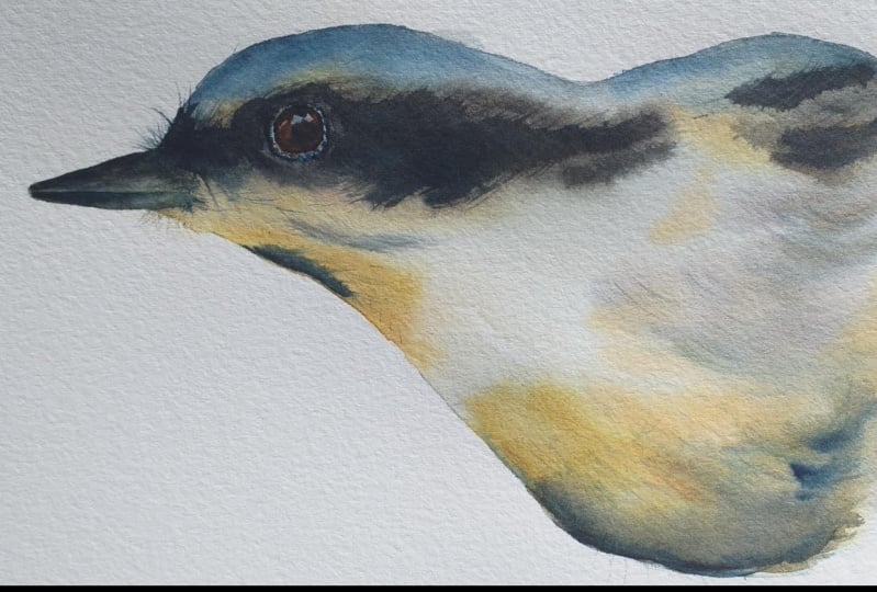
13. Project 2: Introduction: Hey Ron though.
We're going to paint just part of the bird
to make things easier. This way you have
more time to cover this area versus having the entire bird and
thinking about the, the entire chest and
the bottom part, the tail feathers and so on. We're just going to paint
basically up to here. We're going to wet
more than we need. We're going to pass the
sketch lines this time. We're actually not
going to wet the eye. We're going to stay
away from the eye, but we can wet the beak too. This is enlarged,
so it's going to be much easier to stay
away from this area. And the reason I'm staying
away is because we are going to apply with
the first layer, the darkest feathers. If you have these
dark feathers next to the eye and we want to preserve
some of the highlights, then the darks would
bleed over there. And we'll just end up
lifting and lifting and lifting to make
it a little easier. We're just going to
stay away from the eye. We're going to wet the
entire bird on the inside. Then we're going to wet, also the background here, even past these sketch lines. To make it easier, we're going to use a very limited palette. Basically, it's yellow,
blue, red, yellow. There are my blues. And then plant brown
under red category. Let's say, put it this
way, yellow, blue, red. You can add additional yellow
blues. It's up to you. The idea is to mix colors on
the paper, not your palette. This way you avoid the
muddiness of colors. The most important
thing is to actually see the separation of colors. When I first started, I didn't know that was
really important. I taught myself how to
paint with watercolors. And it got to me later
on that it really is very important to actually mix these
colors on the paper. Because when you look at any object and you
paint any object, and water color, even
if it's just one color, let's say red apple,
you turn that up on. Or just basically by
looking at an apple, you'll see that one side is more highlighted and the
other side is shadowed. Even it's red, that
red will change. That's why we want to
mix colors also on the paper and maybe even add other shades of red just
to make it prettier. And a lot of times,
like talking about red items or subjects, if you paint the red apple, just Y would help
to make it pop. That red pop is that you start
with a yellow undertone. A lot of times I start
with undertones. In this case, here we have
a bird with white feathers. There's some yellow feathers
too. A lot of shadows. That's why I chose this
one because I think it's a great practice in
terms of painting something white and
watercolors and then recreating your own black. You never want to just use black straight out of way tube. You actually want to
create your own shade of black, because again, that black will be
differently affected by light and shadows depending where you place
that black object. When you look and study
those black feathers, you see yeow, there's a
little bit of red in there. There's a little bit
of blue. I can see some brown. That's the thing. It's like you get
excited because you start seeing all these
colors and okay, I just need to basically
create my blend of colors to create
that shade of black. You want to see
the separation of colors because when
you look at the bird, you see, I'd say this part
like all these feathers, they feel like's indigo. The area around the eye has
a little bit of red in it. Then say we can add some
red and brown maybe. And brown, red,
fallow, blue, indigo. Yeah, those are
the good colors to create our shade of black. Now, for the white feathers, all you really need
is yellow, blue, and red to create a natural
shed of that white, or even gray, gray, white. This is how I paint white
objects in water color. And it's very important actually
because you don't really need to try to match like
whatever you see there. Let's say you're trying to paint these lower gray feathers. And you don't need to go
for like Dave's gray. That's one of the
grays, or paints gray. Let's say you can just use the primary colors and then
when you mix these colors, you create that sheet of gray. Then it's just a matter of how much yellow you had or how much blue or how much red to
determine if it's a yellow, gray, blue, gray, or red gray. That's just something that always be with you
once you accept it. In a way you just see how much more natural
everything start to look. When you create
that sheet of gray, I want you to squeeze your
colors onto the palette. Next, we will start
wetting the bird. And you can stop like halfway
when you wet the bird. And then maybe the lot
colors with water, and then the bird will be wet. So then you can come
back to the bird and keep wetting it because more time you're going to
have to paint the bird.
14. Project 2: Wetting paper: Let's start by wetting it. I'm going to use a couple
of different brushes. This is my long coil size four. I'm using a brush like this, so like a, more like
a round brush, right? Because I want to
get inside the beak. Like the size is actually perfect for this, if
you think about it. Because I'm just going on the inside and I don't have
to do much with the brush, like to twist it or
anything like that. Then here I'm going
to go around the eye, then I can go over the lids, just not the inside. Even if you did,
it would be okay. But I'm going to show you like an easier way when
you actually do avoid the eye because then
you have no color in there. To begin with, you
can use more water. I just realized this is actually rough water color paper for me, although I am suggesting for this class to use cold press. Cold press is the
easier paper to work with because there's a texture, but there's a way less
texture for this part here. You can just basically
leave it like this and maybe you can dry brush
even through lower parts, but it's not that important to wet or just be focused on
like how much to really wet, because that will come
more spontaneously. The most important
are these parts here. This was, we'll be
focusing on applying the lighter colors for
the white feathers. Create our own shade of gray. This time, even though we
have the soft feathers here, we're still going to stay
on the inside of the bird. Because in my other classes I would wet the background too
for that soft transition. But to make it simple, to keep it simple
for this part here, we're just going to focus on wetting the bird on the inside. Only no background
other than here, but that's because we're not
painting the entire bird. I'm going to leave it just the way it is with all this water and I'm going to focus on diluting my colors
with water quickly.
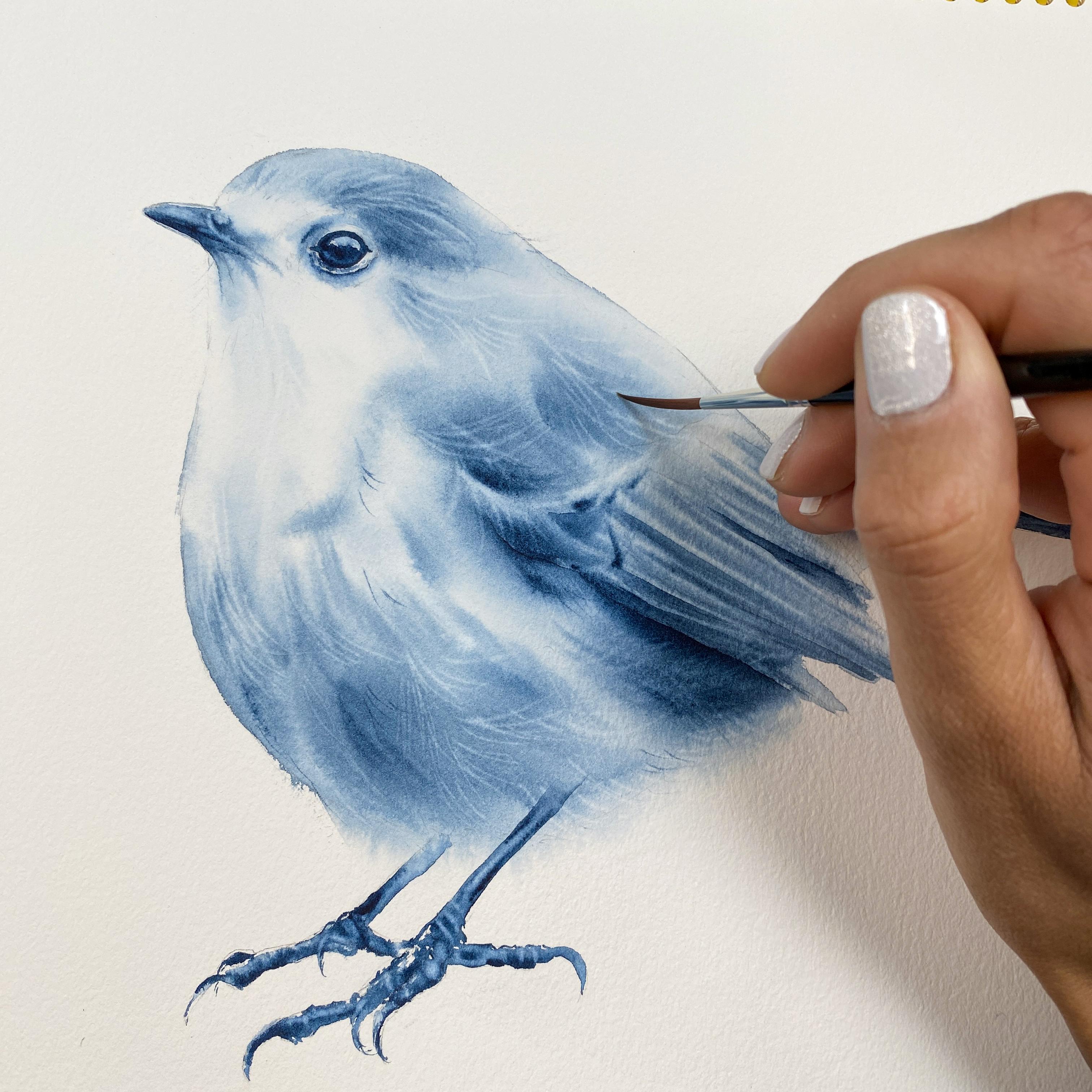
16. Project 2: Applying the Darks: I suggest grubbing
this antic brown. Some of the indigo,
maybe some of the red. Just feel it out. I'm moving my palette very quickly so I can
add these colors. But this is the area and I want to see the
separation of colors. You can see that
I'm using some of the indigo there is, and brown. I'm adding it towards the darkest parts that I
can see over the bird. It needs to be heavier. This doesn't work for me
when I'm just using a 2.5 It has to be like a cream top like ratio between water and paint. To see the separation of
colors that I'm using, the shade of red and blue, I need to not blend these
colors too much on the palette. I'm coming back here, I know this area is
going to drive fast. It's okay if I have
to add another layer, but maybe I can start
with this initial wash, which will help me greatly with the second one because then I'll have something
already there. The thing is that
I will be painting the eye anyway later
once this dries. Now you want to use the tip of your brush very
carefully and go around. But ideally have that cream top like ratio between
water and paint. You create that soft transition. Treat this painting like this process here as
like an exercise. Just the fact that we're not
painting the entire bird. I think it helps because then
you have less to focus on. Then again, I'm
going to come back here, add some more color. The paint is spreading,
which is wonderful. That means that I still
have time to apply colors. Then we have the
beginning of this wing, so I'm not going to
do too much here. I have all this paint
still on my brush. Well, you know what, I may as well add it toward the darkest part which is
like here, for example. What I have computer screen, I have zoomed in like
the bird basically. I have it zoomed in, but I
don't see much more now. I have to move it just to
see where are those shadows. But again, I don't want
to do more than this. This is for my painting,
for this part.
17. Project 2: Damp Brush Technique: Next step, you want to use your larger
brush that you used. I'm using the long,
cool size four. I squish this brush. I wipe it first, or I squish it with a towel. So I remove water, but
I squish it like this. This is a damp brush technique. This technique works if the
paper is still shiny wet, you're pulling the paint with this damp brush, that's
what you want to do. You pull the paint. When you pull, you're actually
picking up paint too, for example, from these
darker parts, right? You can use that to add, to mimic the hair lines, right? You can do that. Or you can keep cleaning brush to
have a clean brush. But I think it works when we
just do something like this, although it became a little
too dirty a little bit. What I can also do
is lift the colors. But I'm going to clean my
brush and I do want to lift. But before that I want to
add more darks Right here. I'm going to grab
the same colors that I used to
create, that black, red, red, Van ****
brown, and indigo. And this is cream top, and I'm just going to add it toward the darkest
parts that I can see. Now, please keep in mind
I'm doing this because I can because the
paper is still wet. That's why I'm not just
doing it to do it. I can't just do it anytime
I have to make sure that this is still nice and wet. I feel like we're
getting closer to that moment to start
lifting colors. What I'm going to do is put this brush away to
my round eight. The beak will have
another layer, most likely, although it's
pretty nice the way it is. But what I'm going to do
with that damp brush, I'm just going to
reactivate a little bit the color because I want
to have a nice shape. There you go. All right,
that's much better. Then I have to now paint on my brush because I was
reactivating the color. But you know what,
this is too dry. It feels like I
was dry brushing.
18. Project 2: Lifting Colors: All right, let's get to the next part which
is lifting colors. I'm sorry, this is my rigor
size two brush songbird. And I'm going to start lifting, what are the areas
that lost that shine? Pretty much all here. What you do to lift colors, you need to first of
all determine, okay? Is there an area that, that she, the paper feels down. That's the perfect
timing to lift colors. Next, you want to
have a clean brush. You want to wipe it on a towel, and then you go for lifting. If you don't wipe your
brush on a towel, what you're going to
do is create a bloom. And blooms can happen
very quickly when we have a damp area right now. Let's go back here. This is the area that will drive
faster than anywhere else. It's a smaller part that
was separated in a way. I got to come here. I can tell like this is like
the last moment to lift. Plus I want to lift here because I want to
find a feather. I want to find my
feather here by lifting. I can do that because then
I can separate parts. For example, right here. Then let's try lifting
a little more. Your paper will drive at
different speed than my paper. That's why you have to
keep an eye on your paper. And I do suggest
that you focus on your paper more than
mine, my painting. It's really better if you watch this class a
couple of times and then make notes on the steps and try to
recreate it on your own. Because then you fully
focus on your paper. You won't miss out on the
timing when to lift the colors. Here, I'm just lifting. Lifting helps to
create that softness. Then it brings back like
the highlights too. That's another reason
why you want to lift. Of course, I don't always lift. And by the way,
I'm going to lift this part here for the beak. I don't always lift
because I don't always get to lift
based on the timing. Sometimes I get sidetracked
doing other things. This really happens to me. Yes. Because I'm so busy
doing something else. And even though I have a choice, and I tell myself,
you know what, this is your last
moment to lift. I'm like, okay, you know what? But this is more
important to add the color here because yes, I can always add more color for vibrancy with the
second layer, right? The problem is sometimes it's better to blend all these colors with
the first layer, because then you have
this nice softer, organic transition
with the second layer. Like we're trying
not to reactivate colors, that's one thing. When you add that layer of phonetic color that
you wanted to add, it just it doesn't
look the same. Yes, it's an option always, but I do that very often,
but it's not the same. My goal is always
to add the colors I have in mind with
that first layer.
19. Project 2: Fine Hair: Now. I don't want to
do too much lifting. It's super easy to overdo it and then it
doesn't look natural. Instead, I'm going
to grab some of this Rustiena with quint red and maybe pull it here or
create these individual hair. Now I do need this to be darker here because we
have darker feathers. You're using just the
tip of your brush. And this is basically like
water to milk like ratio. The ratio between
water and paint, but using the tip of your brush. And here I'm lifting again, this is the eyeball actually. And I didn't paint
the inside here. What I could do is reactivate a little bit
of this paint around it and drag it the outside of the eyeball just
so it's a little darker. I'm just reactivating
color. Just very gently. One more thing I
want to show you. You're going to
grab this more like a cream top of the Vandy Brown. Indigo and that quin red. But I need more Vandy Brown. Even more and brown. You have this cream top you want to create like
individual hair strokes. This needs to be done
with this cream top, like ratio between
water and paint. That's when you add these
individual strokes, right? But ideally, you really
want to do this wet on wet. The paper still should be wet. You can add more hair, pull it in, but it has
to be that cream top. The paint feels like creamy. Then you can pull it just
to create some darker hair. We're going to wait for this to dry so we can paint the eye.
20. Project 2: Details: All right my friends, let's focus on the beak and the eye. First of all, we can leave
the beak just the way it is, because we have that
lighter part on the inside. But if we want to add maybe some more blue to the top part, since we see a little bit of
a blue undertone, why not? Right. First thing I would do is wet the top
part of the beak. Now, this will get reactivated. I have to go very gently. The reason they will get
reactivated is because I used heavy ratio here
between water and paint. And also I used
like indigo there. If I want to add some blue, then I'm going to grab
now a little bit of that indigo would follow blue. Just let that in there. That was like a milk like ratio ratio between
water and paint. And that's it. If I
wanted to do that, that would be it for now. But later, once this
top part dries, I am going to wet the bottom and add the
line on the bottom. Now, this is totally up to you. I guess if I wasn't
doing this class, I would just probably
leave it just the way it is because it didn't
bother me at all. I just wanted to show you how you can add a
little bit of blue. Now if you covered it too much, can always lift
that bottom part. So there is that
highlight right now. Let's move on toward the eye. With the eye you
want to focus with that first layer on the
lightest colors you see, that would be like the highlight
colors of the highlight. Inside that highlight, we see, let's see, there's some blue. I do see like yellow and I
see a little bit of red. Actually what I do is I wet
the inside of the eyeball. I'm grabbing actually
a different brush that was earlier size three. But now I have round two. I'm not going to touch
the wrinkly part. You know what, I could.
We can actually wet the whole thing. Let's
wet the whole thing. When we add second layer, that's when we can go back
to these wrinkly parts. Because this first part is about the colors
of the high light. All the latest colors we see. First, we're wetting it. Going to apply
colors. Wet on wet. You spend maybe a
minute just wetting it. We're going to start
with some yellow tones, just like we used for the bird. The bird's feathers.
Same yellows. You don't want like
a pot of water. Make sure there's
no pot of water. Then you're going to grab a little bit of that
yellow that you used earlier, maybe
with some red, and place it around
that highlight, because mostly inside is
like a shade of blue. I'd say I have some more paint. I'm just going to
let that in there. And then I'm going to grab
some fallow blue for example. Or maybe follow blue
with some indigo. So the blue is not so
bright then just inside. I'm not trying to touch like the yellowish parts because that can easily turn
into a green color. Yellow plus blue creates
a shade of green. I grab a little more, maybe a little bit here actually too, I feel like there is a
little bit of that blue. Now, the reason I have a lot
of control is first of all, I have paint on the
tip of my brush. I'm going to grab a
little bit of quid red with that fallow blue, then I don't have much
water with that paint. Overall, this feels like
it felt actually like a 2.5 ratio and I only had
paint on the tip of my brush. That's why I have more control. As you see, like barely
leaving any paint there. Right. Just adding to
these wrinkly parts. Then we can grab maybe a
little bit of some brown. I have actually burned cena. I'm just going to add this burnt cena maybe
like on the bottom here. Just say I have a nice undertone and I can go a little lower too. This is the wrinkly part
where I place the blue. Then I have some undertones, because the next layer
is going to be about adding the darks, darker tones. Now let's go back
toward the beak. We do the same thing, them. This is again, optional. When you re wet, just go gently because you
will most likely reactivate the colors just because we use such heavier ratios
between water and paint. If the top part, let's say it just covered too much of that
highlight, you can always lift. I went back to lift, but
I can't touch the top with the bottom so the
colors don't bleed. I just want to show
you what you can do is grab this heavy cream or cream top like ratio between water and paint of the blue with the bontic brown and
maybe some yellow too. And then you're
just going to add this cream top on the bottom. This is the shading
that I could have done actually with
this first layer, but I was busy
doing other things. That's the thing.
Sometimes you just don't have the
time to come back. I'm also shaping
it a little bit. You're going to be
very careful when you shape because it's easy to, again, misshape it,
that's one thing. But here I'm going
to lift a little bit just to keep that part lighter. I do wish I had this
a little lighter. I should have lifted it when
I was painting the eye. I still can, but maybe it
could be a little lighter. Just have just so you know when to actually
go back to lift it. That would be actually before
you even paint the eye, just leave the eye alone
and focus on the beak. I'm going to now have
to wait for the eye. But in the meantime,
like how about like adding some hair? Grab my rigor. Some birds size two. That's my rigor. The other
rigger, I have two and a set. So this is the one that
I use for finest hair. Let's say you want to
add some more hair? And let's say I would
add that hair actually toward the top part
where I have the darks, the darkest feathers and hair. This is just using the tip of my brush and this is
vantage brown and indigo. You can add some more fuzzy
hair there if you wish. Then you can go over these
parts too if you want to, but I think this
looks nice like that. We can also go back here, but this is a little wet. If that's the case, then
you either wait till it dries or you add this
hair with the cream top. I just switch to the cream top like ratio between water and paint because parts are
still wet here as you see. Like I can still add
some fuzzy hair. It's just that I had to adjust the ratio between
water and paint.
21. Project 2: Final Details and Summary: Now this is quite detail
now because the reason is because I purposely painted
this part much larger, so we can focus on
that beak and we can focus on the eye this way. It's much easier to just go about these layers in general. Right, the next step, we're going to avoid
the highlighted parts. For that, I'm going
to use my round two. I'm going to grab this burn. I guess I wasn't mentioning
about using Burna earlier, I decided to use it for the eye. I have this burnt sienna
with a little bit of brown, making sure I don't have any
water on the feral part. What I'm going to do is for now, this is not really that very
diluted paint with water, but there's more water now. This is like a water like ratio. What I'm going to do
is find my highlights. I'm going to actually
paint around it this way. I have a color and I
know I won't go over it. Use that blend of that and brown and burn sienna
color everywhere. But where you have that
highlight, this way, you're marking for yourself, all these areas
for the highlight. It goes like this,
but don't go over the wrinkly part because that's
supposed to stay lighter. That's my highlight there. I do have a lot of water.
I have a flow here. I don't want this to
dry on me too fast. But you want to focus here because it's like a nice circle. I feel like it's a
little misshaped. But that must have been my
sketch, something like that. And then you can go all the
way lost the part of it, but it's okay because I
have the other highlights. Highlights, that's
why it's okay. Then here I'm going to get a
little closer to this side. And then with that
cream top ratio, first I'm going to use some of this Ind brown and I'm
going to go around, this is cream top, the
paint will spread. But just a little bit, I'm the tip of my brush. You got to be very
careful because you're going along the edge. If you go over, then you're changing the shape again
of the eye, right? Then the darkest parts
are like right here. In the second what we're going
to do is add some indigo. I'm just also shaping
this high light, but it's super easy to
lose the highlights. I got to be very careful because you see like I'm
touching all these parts. I'm like clean my brush. The reason we started
with a lighter color, I'm actually lifting
a little bit, but we started with
this lighter color, is because we want to show that the eye is not just black. Now I'm going to
grab this cream top. This is going to be a
combination of the and brown, and indigo. And brown, indigo. This is like, almost
like a black. Right now you're
finding the pupil. That's the pupil right here. It has to be cream top. The paint does not spread much. We're finding the pupil and you don't need
to cover it fast, just go slow and it's like you're touching with
the tip of your brush. This couple areas here and there that should
be a little darker. Once it dries, it
will look really nice because then you have different sheets
of that brown. That's the most important thing. Then I'm going to wipe
my brush on a towel. I'm just going to slightly remove a little bit of
the paint from there. Then just grab maybe
antic brown only. I just want to create different
sheets of that brown. I just added it to some area. Now we have those highlights. I can also lift a little
more for the highlights, but overall it's fine. Then another thing
is to grab some of the combo of Von
Brown and Indigo. What you can do, you would
go this wrinkly part, right? You're going in a
little bit and out, they need less water
with all this. Although you don't want
this to dry too fast. Because there's one more
thing we need to do that's using a damp
brush to soften this. The color bleeds toward the feathers like this.
This is a wet brush. You go around with
that wet brush, not too much water,
just a little bit. Then you let that color
to bleed these feathers. We're shading it this way. We can do a little more of this, I'd say like here,
but this is too wet. I need to grab like
a heavier ratio between water and paint. There's another row basically, of something going on there. Might as well just add it a little further, then actually, this is already
spreading because I wet it enough on the outside. Then the last thing is, because we have
this wrinkly part, we should basically
wait for this to dry, then we should add, let's see, the indigo, maybe with some red, just so you let the colors
to mix on the paper. And that basically will
cover the eye here. For the eyeball, just
make sure that you have enough of these highlights
so it's not too dark. I just lift a little more. I'm just waiting for this
to dry a little bit again, I can fill that part. All right, so this
has dried now, I'm going to grab this. Basically any blue you have
with a little bit of red, maybe some and brown and go around but show different
colors that you're using. Again, some of that cold blue, just so this area
around the eye is not like super white
or anything like that. You want some color in there
and that's pretty much it. I'm going to zoo out. All right, so we just finished painting and then the bird. Congratulations, let's start
another bird bird painting. This time you're going to
paint the entire bird.
22. Project 3: Robin Bird Introduction: Everyone, welcome to
the third project. You will paint this bird. This time we're
painting the full bird. We will wet the entire bird
and apply colors, wet on wet. When you take a look
at the reference, you see like there's
parts that are orange. That's the chest area. This is where we can start
working with undertones. Yellow for the undertones, since the chest in parts
of the head are orange. And what creates a
shade of orange is a combination of yellow and red. That's why you want to
start with yellow as an undertone to make
that orange, red pop. Now the belly, the lower
parts are grayish. There's a little bit of blue. What we can do is create our
own shade of white and gray. Basically, this is
where you want to work with primary colors,
yellow, blue, red. Whenever you blend it
three colors together, you create a shade of gray. And then it's just a matter
of how much yellow or blue or red you add to it to
determine if it's a yellow, gray, blue, gray, or red. Once we apply all the
colors wet on wet, we will work on lifting colors. That'll be another
thing. And then we'll be adding more dark with a
cream top like ratio. With a heavier ratio
between water and paint. There's one more
thing that we will be doing to create softness. Let's say on the bottom
of the feathers. You want to also wet them, part of the background. Let me give you an example. This is my other bird. I wet the bird on the inside, but then I wet it a
little bit the background here because I wanted some color to bleed
toward the background. Whatever you are
okay with and you want the colors to bleed
toward the background, you can wet the
background as well. Sometimes I wet the
entire background. Sometimes I wet
just parts of it. Depends. If I'm going to, let's say I want to have soft
feathers everywhere. It just depends from
the subject because sometimes it's just like it looks like a hard
edge everywhere. Then I will just
paint background separately and then
the bird separately. However, to create
those soft feathers, this is when you want to
have parts of the background wet it as well so the colors
bleed toward the background. How do you control
all that spreading? That has to do with how
wet the paper is and how much water and paint
water paint consistency you have on your brush brush. It just depends
from a situation. I can't just say I'm
always going to use like cream top like ratio between water and paint
because it's not true. It just depends how much
control I want to have. We'll get to that
through the lesson. But that's the thing. I wet all the body of the bird and then I
wet the background. We're going to do the same
thing in this lesson. I want to keep these feathers
on the bottom here. Softer. I'm going to wet this part
of the background too. Everything else,
I'm just going to focus on wetting the inside. Let's talk about colors.
23. Project 3: Color Palette: When it comes to like
choosing colors, you don't have to have the
same colors as I am using. Every painting with
every painting is all about finding that balance
between light and shadows. That's how you
create a contrast. When you look at the
belly of the bird, you see there's lighter parts. You actually want to
find a highlight. Whatever the areas
are highlighted, let's say it would be the
left side of the face, the head, and maybe little
bit of the back here. But how about making this
part a little lighter? And maybe here, this part of the belly with the
light is not as obvious like as I was
painting this bird because then I kept this part lighter and this part lighter. But it's, the idea is
the same because if you just cover the entire bird
with that same value, color value of the same color,
it's going to be plain. There's not going to be any
dimension in your painting. To create a dimension, you always want to create that balance
between light and shadows. That's really all you
need to think about. Colors are, of course, we pending with water colors. We want to use all these colors. But it's the balance between light and
shadows that matters. If you want to create that
natural looking object and to create that dimension
in your painting here, going to designate like this little area to
keep it lighter, maybe over here and then
maybe all this here. And then overall, like we need to find the parts
that are darker, that's going to be the
right side of the head, right here, all this part. And then a little bit
of that belly here. Of course, all the parts
that are underneath, like the wing or not all
that specific line here, that would be much
darker because the feathers would create
a shadow for the colors. Again, like we want to use a couple yellows then
the white feathers, Think of it this way, primary colors, which is yellow, blue, red, you can create a shade of gray just with the three
colors, yellow, blue, red. Those are the primary colors. And then once you
blend them together, you don't want to
overmix these colors because you want to see
the separation of colors. That will help you to
create a blue gray, red, gray, or yellow gray. This is how I paint white objects or gray
objects in water color. That's what I teach. It's to use primary colors instead
of using some shade of gray from a tube because
it's not going to look as natural as when you create
that gray or white yourself. For that, we're just going
to use primary yellow. Let's say my red,
this is my red. It's not a primary red, but it's my main red color. And then I'm going to
use this coupled blue. It's not primary blue either, but this is like a good combo
that I always work with. It works, it just works then
for the bluish feathers. So we can just use the combo of Queen Red and coupled Blue. However, the left side,
the left side of the bird, where we have the wing, we can see a little
bit of that Brown, right hint of Brown. That's when we can
use a little bit of Band Brown for example. If you don't have and
Brown you can use P. You can also add some
other brown burn. Siena sin is like a orange
shade or orange brown, I want to call it, but not as strong as some
brands have like this. I'm trying to remember
what the brown is, but some are very like orange. This is like in the middle. Let's say we can use that sheet
as well and we can use it also toward the orange
feathers of the bird. What we're going to do
is have our colors pre diluted with water
on the palette. Try to have a
consistency that I like to call heavy cream like ratio. That's the ratio between
water and paint. It feels like heavy cream. And I'm referring to day
you have that consistency. It's okay if some parts are
more like milk like ratio. It's just you want to
have like a chunk of paint that's a little thicker. I don't have the palette ready, but this is like you want to have like a chunk like
this or like this, and everything else
is like heavy cream. And it's okay if
there's a little bit of paint that's more
diluted with what? That's because when
you paint wet on wet, you don't want to
end up just having this overly diluted paint
with water on your palette. Because all you're going to grab is that water like ratio. I call it water because
it's so thin down. You want to be able to grab that heavier ratio between water and paint. We're
going to wet it. We're going to wet all of this like this and then
plus some background. We're going to also
wet the tail feathers.
24. Project 3: Wetting Paper: What I normally do is
wet the paper first. I wet the bird or
whatever I'm painting. Then like halfway through, that's when I start
diluting colors with water. I'm waiting for that to squeeze the colors and then I'll
dilute them with water, and then I'll come back and
I'll wet a little more. The bird this way. I give that a chance
to really get inside of that paper and then I come back
and I wet it again. Otherwise, you can just wet it. I'd say three to 4
minutes is a good idea. Let's see, I'm going to
use my brush for now. This is my flat 20. Don't worry about
the eyes generally. Like general ideas just don't directly add color
toward the eyes. We can always lift just to make sure we don't
have it all covered. The reason we can wet the eyes too is because the
eyes are darker. Yes, we do have some
highlights in there, but because the bird overall
is lighter mid tones, it's not like it's black or dark brown or
anything like that. We don't have to worry about the darks going over
highlighted parts. Let's begin by wetting the
paper first to the bird. And I'm going to grab
a little more water. I do have quite a bit of water. There's a reason why I'm
using a larger brush. That's because I want to have
more coverage right away. Now, I do have to be
careful when I go, like next to these edges, right? Because I don't want the water
to go, for example, here. Unless I'm okay with that pain bleeding over toward
the background. Again, it depends a lot from the effect you
want to achieve, what techniques you're using, the effect you want to see, much control you want to have. Those are all the aspects
like you have to think about trying not to go over
like the areas where you really want to paint on
the inside of the bird. Like you don't want to go over the edges here, for example, because then the bird
will just become really, really puffy here. I'm just using like the side
of a brush in the way to go over this part,
which is the feather. Then I have these feathers. At first, I use a lot of
water, like a lot of water. I let the water to sit there
as I am wetting the paper. Basically, I do it
for a few minutes. It depends where I'm painting,
how big the object is. But you don't want to just wet the paper one time
I go through it and call it done because you're not going to
have enough time to apply colors with wet later. The paper which is dry too fast, I feel like I placed
a lot of water. I'm going to start working
on my palette now, which means I'm going to squeeze the colors and start
diluting them with water. Just want to make sure I have enough water all the way here. And I don't want to change
the shape of the head. I just have to be very careful. I have enough of that
water that's floats there, but not too much. All right, I'm going to place
this brush here, and again, I'm going to start squeezing
my colors onto the palette. So I'm going to start
with the yellows, and then the red, and then the
browns, and then the blue.
25. Project 3: Undertones and White Feathers: This is what my
palette looks like. Now, I decided to basically
dilute ciena as well. And I have some of the yellow. Ok, just because I always use these colors and I have them already
on the palette. Red burn band brown. The two yellows, yellow, yellow. Then I have cobalt blue here. Indigo, because I'm
going to use that, the red already here from
a different painting. So I'm just going to use
these colors basically. Now, back to the painting. I walked away from it,
I stopped wetting it, and the paper started to
buckle. And that's okay. A lot of buckling is not okay, but a little bit is okay because if you have
so much buckling, it just depends from the paper. This is honey mile
de collection. If you're painting on
arches, you're fine too. This Arches was actually my first watercolor paper
and I still love it. But this is collection. I'm just rewetting
these sections and I'm going to start
pushing that water. If I feel like I
have too much in some areas I'm just going
to keep spreading it. But move it a little down here, wetted the
background there. Yet I'm leaving that for
the last part technically, but here I'm sinister
doing it right away. So I don't confuse you too much. Wetting the background
here too now. Because this is where
I want the feathers to look softer, the
paint to spread. I'm not wetting this
part of the background, but only up to, here you go. Going over now as
you're wedding, like this is the last time you're really wet's
say last minute. Look at the reference. I always want you to look at the reference when
you paint with me. Because if you don't
look at the reference, then you're going to focus on
recreating only my strokes. I want you to think about why you're placing that yellow
there and here and so on. You want to have that reference in front of you no matter what, because you need to see like, where you're going to
place the colors, like, is this the area much
lighter, should I avoid it? And so on. Now that I'm getting closer,
I'm going to again, push that water toward
the background here, actually toward the bottom, slightly wipe my brush on a tel. But sometimes when you
wipe your brush on a tel, you actually remove
water from the paper. And that's not a
good thing because then you're drawing your
paper. This is good. I don't have puddles of water. I'm going to grab
my long quiz four. You want to have a softer brush overall, you can grab a quill. Or you can maybe grab like a
round brush size 12 or 14, whatever larger brush you have. And then make sure you
have a fine point. But you do want to
have a softer brush. The first thing
I'm going to grab is like the yellows, right? I want to start with
undertones. This is orange. The bird is orange,
right, overall. But how do you create
a shade of orange? Or you can grab red and yellow to create
a shade of orange. That's why we're starting in a way with a yellow undertone. You don't want to overly dilute
these colors with water. You want to see the
separation of colors. I didn't grab enough of
the other yellow for now. Just a little bit. But you're
trying to find actually those yellow areas of the
bird that's like here. What's the ratio? The ratio
is like milk like ratio. You just don't want to
have too much paint on your brush because then you're just going to
release too much paint. I'm going to slightly wipe
my brush or not white, but touch the towel just
so I don't have too much. Just to make sure very gently you're finding some areas where you can place that yellow. As you see, I'm not
placing it everywhere. I'm going to grab a
little bit of water here, so it feels more like a
milk back to that yellow. Again, I'm going to very
gently blend these. I don't want to
really blend these, I just want to grab colors because I want to see the
separation of colors. I grabbed red because to
create a shade of orange, you need yellow and red. When I grab red, I change the shade of my orange, or from yellow becomes orange. Right here, you're finding areas wherever you want to place that color. Not everywhere you need
to think about it. Like where you're
placing this yellow, you go for the
lightest colors over all that you see in the
picture, in the reference. Then whatever you see, like the feathers look
more orange, more reddish. That's when you can add a little more color
and I wipe my brush, my tone because I feel
like I have too much of the paint right now. It's not the moment
where we need to have a ton of control.
That's not it yet. Now, I quickly grab some more
red, but more water too. I don't want to have
too much control. This is mostly Iso
yellow and quad red. At this moment, you're
going to place this orange, which feels too orange. I'm going to grab
more of the yellows towards like the most orange
parts that you can see. Again, you're
avoiding some parts. I said this left
side is lighter. We just want to add maybe I'll call it orange
sheet of orange. Only to some parts. Let that paint do its thing. Like we don't need
to control at all. Now, this is the
edge of the bird. I'm using the tip of my brush just to make sure I have enough. Okay. Now, this
is the beginning. We need to clean the brush
because we're not done yet. We have the rest of
the bird to cover. We're still in the woods. We're not even close to be done, but I'm going to wet
it just a little bit more here with
the squall brush, just so this part doesn't
dry on me too fast. And now I'm going to start
working on the white parts. Grab a little bit of yellow, yellow, red, yellow,
red, and blue. This is how you are
creating a shade of gray. I'm going to cover more about
this in a separate section, but those are the white
feathers of the bird. If you want it to be
more like a yellow gray, grab more yellow with it, then it's became a
little too yellowish. I'm grabbing more of
the other two colors. Now I have a little
more of that blue. Then we have these feathers that go toward the
tail feathers. And then I have to have
some of the blue here too. I can't forget that this
needs to be bluish. I don't really have
to clean my brush. I'm just going to grab more of this cobald blue and
more of the quin red. That's like a blue
violet, right? I need more blue because that doesn't feel like a
bluish completely yet. I'm going to go right
here and I have to be careful because if I go too far out here
where I have this orange, those colors will blend
too much and I'll create, basically will
start turning into more like a greenish
shade of green.
26. Project 3: Damp Brush Technique: What I need to do
is grab more like a heavier ratio
between water and paint off that blue and red. I'm grabbing also
a different brush. This is a smaller size
of that long coil brush. There's my blue violet and I want to have
that blue violet like right here, somewhere here. This is the area for
those blue feathers. Very quickly, gently and what we cannot forget about
the top of its head. This is actually
where you can use all three colors,
yellow, blue, red. It's like a gray, but keep
it on the bluish side. It's not exactly the
color that I see there, but I need some color right
away before this area dries. I have that top of the
head painted as well. What will help is the fact that I'm keeping it wet longer. A lot of times
people ask me like, how do you keep your
paper wet longer? It's actually because
I travel around, I don't focus on one area, only before this is too dry. This part I'm going
to quickly grab like a heavier ratio yellows, more like a heavy cream
yellows and some red. I need to add it very quickly, needs to be cream top. Actually, because
this is almost dry, I could grab some of the
burnt sienna as well. Then this is like
a heavier ratio between water and paint. It feels creamy. The
paint feels creamy. I'm going to grab a little
more red because this part, it feels more reddish, this part actually
feels more brownish. I can also grab some more
of the burnt sienna. When you're grabbing
all these colors, you're changing
the ratios ratio. You want to change the
ratios between these colors. You never grab that same blend, because to make
something look natural, you need to change the
ratios between those colors. I'm going to grab
some more of the red, maybe place it like
toward the darkest parts. Then we have these feathers. With that same brush, I still
have some yellows and red. I'm going to grab some of this blending brown
and quin red. I'm quickly going to go here
before this is too dry. And actually I want
some yellows as well. I don't have that much paint on my brush and it feels
like a damp brush. It's like I grabbed almost like I want to say milk like
ratio or half and half. But the key is that I
don't have much paint on my brush now. I'm just grabbing this
drier paint basically. But I need more of the red, maybe some blue, and pull it more blue and red
with that brown. There you go. So it
looks like this. We'll have to hurry up because everything just
D, which is okay. There's other things
we'll be able to do once the paper
dries a little bit. Now I had too much of the red. I grab more of the blue. Now it's like a shade of gray that we were
already working with. But then I have, with
an addition of V Brown, I need to see the
tail feathers here. The tail feathers almost dried. This tells me right
there. If I want to add, let's say, some blue tones. I'm not cleaning my
brush, just FYI, But this is cobalt
blue, quin red. Then I'm going to go right here. These are my tail feathers. Then just because you're
already added color, it doesn't mean you
leave it alone. This is when we get to
play a little more with our layers and we can
use that same blend, A little more of the blue, I'd say for these
feathers right here. These ones feel a little darker. And then we have the shadows. Of course, even though I wetted the background
there, not that much. Color really bled over. But this is another area where I need to add
a little more dark. I'm, I'm trying to grab
more like a cream top, so you can see my brush feels, I'm going to add it
right here and towards the right side of the head
because this side is shadowed. More shadowed. Again, I'm not worried
about the eyes. I can lift them later
if it gets too dark. But with this cream top,
I'm going to grab again. Quin red, coopled blue
and my, and brown, right? It's cream top brush. You can see it's a damp brush. I'm just going to flattened
it so I can recreate some of these feathers using this cream top like ratio
between water and paint, like having a damp brush. Some parts need to
be much darker. That's when I'm using
that cream top. Then there's some shadowy
feathers here too. Why not to add that as well? We will be lifting colors too. That's fine. We have
that balance there. We just need to make this
part a little darker, more of that cream
top of the blue, red and yellow, blue, red and brown,
yellow, but brown. Although I have not
cleaned my brush, technically, I would have
some yellows there too. Just FYI, Then I'm going back toward the same
areas over and over. There's actually
another wing here. Didn't add color there before, but right there,
something like that. Whatever you see, the darkest
parts that you want to go back to, this
has almost dried, but I'm going to
add a little bit of the color toward the beak, just on the bottom, since I have that nice cream top
consistency on my brush. Just to add that
mix that I have, which is the and brown and
cobalt blue and in red. Right now, I'm going to
quickly clean my brush. I'm going to show
you a little trick. This trick only works if you still see
shine on your paper. It has to be, you
have to make it like a damp brush and you squish
it. It feels like this. Then you pull it down. But I can't go here
because this is too dry. The only thing I can do in this section here
is lift colors. And I will do that in a second. But first I want to pull it for that softness, or softness. But pull it the direction like
it goes down the feathers. The lines lines the strokes. They'll pull it
down a little bit. The paint is not going
to spread like this. Instead, I'm going
to pull it this way. But I can't do it in a lot of the places because the
paper already dried on me. That's the thing.
This is too dry? Yes. I'm going to clean my brush.
27. Project 3: Lifting Colors: And let's begin
lifting the colors. So my favorite thing, so
this is my rigger brush. You want to have like a medium, a stiff brush, medium stiff
brush, to lift the colors. Rigger brush is
great, but you can, of course, lift colors with
the round brush as well. I'm going for the light
parts, which is like here. The lightest feathers
and parts that I see. Now, what's the
best timing to lift colors is once that
paper loses that shine. And I actually
need to start with the orange feathers because
this is almost so dry. I don't even know if I can
lift here a little bit. You want to go back towards like these most
highlighted parts, hopefully we can still lift. This is the eye area.
Now here's the thing. I don't always lift, even though it
seems like I always lift, right in all my paintings. I don't always make
it with that timing. Sometimes I get sidetracked because I'm doing other things. A lot of times I will
basically use masking fluid. Just as my back up
this way I have a little bit of some
highlighted hair here. I can still lift some of these feathers I'd
like to lift here, but this is actually too early. Right there, I'm looking for another area
where I can lift, for example, these
feathers right here. These are the tail feathers. This is how I find feathers
zooming in so you can see, but this is how you find
these feathers you lift. In between whatever you see, those highlights, you lift and I press a little harder to. Now the key is when
you clean your brush, you wipe it very
well in a towel, so it feels like a damp brush. Then we want to maybe
divide this part, separate this feather from this feathers so we
can create a line. When you don't want to
work on details, right? You don't want to create
like every single feather. You don't want to paint
every single feather. This is how I go about it. I don't want to work on
every single feather. I the overall with
the wet on wet. Then I maybe create some
detail work with lifting. But we can also add color two. I'll show this to
you in a second. I just don't want to
miss out on this part. The timing to lift
these feathers then this is the area where
I really want to lift. It seems like it's
a little too wet, But I'll start a little bit
with a little bit of lifting. Now, you don't want to
lift if something is too wet because then you just
add water to that area. When you add water to that area, then basically the
page just spreads. You don't want to do
that diluting paint with water on the
paper more and more and things start to flow.
You don't want to do that. Lifting here a little bit. The only thing I wish I
lifted a little more, this section, but
this is too dry. Back to the feathers again. Like if you want to lift more here you're looking for those lighter lines that
you see over the feathers. And that's how you
can, the left side of the face should be lifted, just so we have
these highlights. And then we can
also lift the head. I can go back here and you can always go back to
those same spots to re, lift. I call it re lift because
then you create deeper lines. Deeper lifted lines. That's how we create
softness over whether you're painting like these feathers here or the head, or even if you're painting
like a different animal. This is exactly how I create that softness
in the painting. I can't lift here, but I can
lift it here, for example. You don't want to over
lift the colors either, because if you over
lift the colors, like it would just
look overworked.
28. Project 3: Creating Contrast: Another thing, what you can do, and I'll quickly show this. You want to grab that same brush that you were using to lift? This is my blend of
the and brown quid, red and blue, right? Coal blue. This is a damp brush
and a cream top like ratio because the paper is still wet. This
is what I can do. I can create lines, dark lines, using
this cream top ratio, some of the darkest parts. This will help me to
create a contrast. A lot of times I won't have to add another
layer because of that. Let's see, I can't
do it everywhere, but maybe the areas
should still feel damp. That's what I'm trying to
say. Because if it's too dry, then you're just going to
be painting wet on dry. You do want to add
strokes wet on wet. This is a little too dry. But maybe here I
can add a little more that will give me
some more contrast. Just because I added these dark, this feels like I'm
almost dry brushing, but I think I'm okay. Just to add a little color. Yeah, the tail feathers
are a little too dry. Now, I have some color, right? This is the blue,
red and yellow. I'm sorry, That blue, red and yellow,
blue, red and brown. I can just add some feathers with the
tip of my brush now, like I had this damp brush with that cream top like ratio. Right? And I already used
up a lot of the paint now. Everything is I have very little amount of
paint on my brush. But why not to add some hair
detail that dryer paint? It's like you're barely touching the paper. Just a little bit. Worked better here, actually, when I was doing it here. Because you can
also go back here, let me grab that dry paint. This is actually too dry, but if it's still dry, you can add some
details to like this. You're not painting
every single feather, it's just couple areas
where you want to add that. Those strokes, it looks like it's detailed but
it really is not right. That's the idea. Like something looks detailed but
it really is not. You're just giving the
impression of that. Yeah, I have one more
area I would like to lift right here and then here. Then I'm going to let it dry. This is going to dry.
Here's the thing. If you cover too
much and you worry about the eyes, you can lift. This is my round three brush. I really don't need to lift
because the thing is that this is just yellow over there. And that's
what I was saying. Yellow undertones are fine, that the eyeballs
are basically black, but we still need
to use colors to recreate that black
in water color. What I'm going to do is walk
away and let it dry again. When we come back, we're
going to work on details.
29. Project 3: Details, First Layer: Okay, friends, so we
finished that first layer. Maybe that's the only
layer for the bird, but we want to start working
on details such as eyes. And those are the areas where
I focus on really the most. Because with most
of my paintings, I will make sure like the
eyes and noses are like most detail while
everything else is loose. And that's how I go about my
paintings, just in general. Now I want you to grab
like a smaller breast, so I'm holding round two. You could go with even
around zero or one if you feel more
comfortable with it just depends how big your bird is. Now, with the eyes you want to zoom in to
the reference image. So you can see that eye up close and you see like
those highlights. Let's start with the left eye. The left eye has the blue
tones there and so on. But it's the darks that we will add that will
create a contrast. We don't have to
worry about like that flow of the yellow
in there too much. What we're going to
do is wet it first. You can wet the
entire eyeball with the lid on the bottom, I guess because I don't
see it on the top. Yeah, let's just
focus on wetting the bottom part right here.
That's pretty much it. Just a quick moment of wetting, then we're going to
grab a little bit of blue and red on the
top of our brushes. It's a very small
amount of paint. You don't want to overly
mix those colors, then you're just going to apply it mainly like toward
the right side, but it doesn't look too bluish. I'm going to grab a
little more of that blue and add it to right side. Right, just the right
side of it, basically. Leave it maybe a little more
here. I'm going to leave it. I'll work on it later once this dries because then I
will just add the darks, the same thing we are doing with this right eye. The right eye. We're wetting it. We can wet the lido if you feel like things are too
dark for you already because of that first layer
when we're painting the bird, you can always avoid
the area of the eye. Then you just completely
like paint it separately, just like now. It's just that you wouldn't have that first layer. Now,
here's the thing. Everything becomes
easier when you paint on a larger scale. Again, blue and red because
when you on a larger scale, let's say the head is
the size of my palm. Then you have so much more room to work on details like this. For example, let's focus
on adding some blue tones. And more blue than red, because then you don't
see as much blue. It's mostly like
those highlights. Although I don't have to go directly over those highlights. I just want to have
that bluish undertone. That's all I really want.
Now let's focus on the beak. This was our technically
second layer, but first layer for the eyes. For the beak, I'm
going to wet it. There's a highlight
on top of the nose. I'm just going to lift it
later just to have it lighter. But I'm going to the beak, but then more than a beak
towards the right side, because I want to have
a nice soft transition. This brush is medium stiff. I don't want to press
too hard because I just painted this bird. Even though it's all dry, I don't want to reactivate colors not too long just
to wet it a little bit. But more than you need, you
always want to wet more than you need go.
30. Project 3: Details - Beak: Now I'm going to grab a
little bit of the yellow. With the red as the undertone, but like a heavy cream like ratio between
water and paint. If this part is richer after that first layer when we were painting the
bird just in general, then maybe you don't
need much color here. Just keep that in mind. Now I'm going to grab blue violet, which is let's say cobalt
blue and quin red, blue and red together to
keep it cleaner here. Well, this is a highlighted area here to make it more bluish, I just have to clean my brush, but I'll keep going
with this now. To have even more control. You want to have like a cream top ratio between
white and paint, but I'm going to grab tiny
bit of that cobalt blue here. I will lift later just to have a better highlight because
right now it's covered. Then here for this part I'm going to use
this cream top of and brown and indigo v brown, indigo but cream top, which means the paint
is like really creamy. And I'm trying to have
a lot of control and I want to show that there is Vandk brown and then there's indigo. But they have a little
too much paint. And you know what, even a little bit of when red would be good. You're aiming for the areas
away from the highlights. Now, this is a
little too reddish. I have to keep adjusting. But there's that
line in between, the line that
divides the bottom, the bottom part and a
top part of the beak. I am working with the tip of my brush just so I
have the most control. Then there's a little bit
of some coloring there too, that we can add for the paint. I'm shaping the beak. I want some more color
over all the red, maybe with the yellow, like a cream top as well. To add it on the side and
just pull it a little more this way now because we wet this
part soft transition. I'm also using a damp brush. Not just to push the paint, I can grab a little more
of that of the dark. You can even use blue
violet if you want to. Now what you want
to do is make sure keep an eye on this
part because you want to keep that as
light as possible. You can keep working on it if
you need to, but generally, like I suggest, just watching, this area needs to stay light. I'm lifting a little bit because the paper in that
area felt like damp. I'm going to grab
tiny bit more color. This is cream top of
the cobalt blue red. Just so I have this
nicely shaped this part. And I'll pull this through
a little more now. I want to clean my brush, wipe it very well in a towel because this is the
highlight that I lost. I don't have as much
of that highlight, but it's going to be overall, that left side is
going to be lighter. Here you go. Then I can
go through this part, but it's soft so it
doesn't bother me. Now, let's go back toward
the eye, our left eye. There's a lot going on
in a way because we have that little part that's lighter and but I wouldn't
worry about it at all. We can do this actually
wet on dry this time I always say like it's
easier to paint wet on wet. However, we have a smaller
object to work with, This is my yellow yellow
with Van de Brown. Because it's smaller,
it's easier to tackle this actually wet on dry. It'll be easier to preserve that little area
to keep it light. But in the second
I'm going to add a different color
to, so there's that. And I'm going to grab
some cobalt blue way, bequeen red with
some Vande Brown. I'm going to keep shaping it. You want to set your
mind. It's basically, it's almost like you're
drawing with a pencil. When you use the
tip of your brush, that's helpful when you
think of it that way. And then this is cobalt blue
only then this is a M brush. Now, just to soften
this, this is so tiny, right Then I want like a heavier ratio of
the Vandek Brown, let's say, and Indigo, just to add it here. Hopefully this is. Yeah,
it's still a little, we should be a little more wet. But I'm adding it
on the left side. Right side, right here. Now I. So now let's jump
toward this eyeball. With this eyeball, okay,
this is the thing. It looks black, right? So it's like, do
we just use black? No, you don't want to just
use black atrovate tube. You want to recreate
your own shade of black. And how do I paint
the eye like this? First of all, we have
highlights, so that's helpful. Another thing is you want
to start with an undertone. And when you start
with undertone, it changes a ton like so much. Because then you give
life to that painting, to that bird, to that eye. It's important to start, I'm sorry, with that highlight.
31. Project 3: Details - Adding More Color: And what color do you
use for the highlight? A lot of times I'll just
use like a blue violet. And I do see maybe there could be like a blue
violet on the bottom. But I also want to add
some brown to give it like of some color
for that pupil. Or is the iris part, I
guess, or the eye wall. What I will do is wet almost the entire eye except for the areas where
we have these highlights. I'm going to stay away. And then once I start adding color, I'm going to get closer to it. The reason I'm pre
wetting is so I have a nice flow here so the
paper doesn't drive fast. I do need to start with let's say even blue
violet. That's fine. Start with the blue and red. Let's place it maybe closer
toward the highlights. This is when you go around
these little highlights, you can mark them for yourself. Okay, these are the highlights. And you just stay away from these areas now because
you pre wet it. You have more time right, to
play with this a little bit, spread the paint and so on. We're not done with
it yet because we still have to add other colors. Let's grab that was by the way, like a very light like
I'd say milk like ratio. Okay. Now this is like a
heavy cream like ratio. Because I need to start
having more control now. Because I'm going to
paint wet on wet. It felt more like a
cream top, actually, for a second when I
first touched the paper, but I'm placing it around
these high lights. Again, I don't want to
just place in one area. I need to keep moving because
the paper is drying now. It's a moment when you can add a little bit of that indigo, I grab a little more water because this is
drying super fast. You know, this eyeball, it needs to be really well shaped. You need to go a
little on the outside. I need to use the
tip of my brush. I touched my paper
towel just so I have a fine point on my brush
and there's my eyeball. And now here's the thing. If you don't see like that transition, it's just too plain. Well, first of all, I'm adding a little more of the indigo. But what you can do
is clean your brush, wipe it very well
on a towel and then you're going to lift the bottom. So it's not just like
a one tone, right? Another place you can lift, it's right here
above the eyeball. You're looking for those
highlighted parts, right? I know it's hard
sometimes when you see these eyes and
they're just like, okay, this is just
the black eye. What do I do with
it? How do I make sure that I have
something in it, not just a black shade? And that's when colors
come into play. And I'm going to grab
a little more like, you don't need to
work that much, but maybe you need to
separate the wrinkle, maybe part of from the eyeball. But this is it. That's pretty
much it for these eyes. Of course, there's
more we can do to it. We can add some
more color around. But for now, I'm just
going to let it dry. I'm going to let
it dry this part, and then I'm looking
at the other side. Is there anything else I can do? Technically, I could add
a little more color. I'm going to show this to
you as more than you need. We more than you
need. We're because we need some more
shading around this eye. Or maybe you already have
shading around this eye. Don't worry about this part, but I'm going to
show you what I do. I wet, I re wet
more than I need. And I'm going to
use the same brush, which is my round two for example. I'm going to grab this. There's a long yellow.
Some of the yellow, all the colors, and then red, all the colors I use. I do need shading around it. Maybe you down again,
just take a look at your painting because you might have already
added colors there. Then I just add color. Cream top ratio. Just so I have some more
shading around the eye. I do want to keep it lighter, but it just became
a little light and I'm going to grab a
little more cream top. I'm trying to find
some cream top. It's not always that easy. When the paint is
already so diluted, I'm just adding the same colors. Maybe slightly more of the red, and then I have a little more of something
they are going on. Maybe a little more. Actually,
maybe something like this. That part is a little
more highlighted, but I don't want to go too
deep in it like too much. It's just this side
needed shading. Then the same thing
with this side. Like technically, like if I already added
some shadows there, well, I should have it on
the right side because actually the right
side is more shadowed. What I would do is, again, we more than I need, make sure the eye is dry,
wet, very gently. Although I am using like
a medium stiff brush. But I do have, I'm not touching too hard on the paper like I'm
trying not to, so I'm not reactivating
colors more than you need. You always want to wet
more than you need. You go I'm going to
grab my round three. Actually, for this,
I am going to grab this yellow, red, yellow, red, Even burn Sena
would be fine, but try not to mix the
colors on the paper. The palette on the palette
paper is good to mix colors. Then you're adding
this ner layer, basically to make it the darker. And I'm getting closer just
so I can shape it more. I want more of that. And
brown. I'm sorry, Burns. And then and brown right here. Just so it gives more to the eye when
there's those shadows too. I can always lift the
colors too if I go too far. I want a little more of, let's
say, red shading, shading. You just can't create dimension without
shadows and lights. That's really important. I'm going to grab tiny,
tiny bit of the browns with some red but cream
top right there, right here and here. I was debating if I need to lift this part, but
I really don't. Because from that first
layer, initial layer, I have undertones, like all
the colors already there. That's it for this part.
32. Project 3: Tree Stump and Feather Shadows: With the toes. Very often I
actually paint the branch, whatever the bird is sitting
or standing on first. Because if I try to
paint the toes first, and I try to avoid like these areas to paint
that wooden part, it doesn't look as natural. Instead, I went the whole thing
and then I just don't add color where I have those toes and the paint flows too much. Then I lift the color, we're
going to do the same thing. I'm grabbing my long quills, which is the softer
brush overall. Like you want to zoom in onto the reference or
whatever that part is, then I'm going to wet it. If you want to keep it loose, you don't have to go all the way to the bottom of the edge of the paper, Then just set it. You don't have to wet
it exactly either. It's perfectly even there. That's not important. And
you don't have to go over like these toes either. You can actually avoid
them nicely here. But we're going to start
with blue undertones. Try to grab like a milk ratio between water and paint, right? The ratio of cobalt
blue and quin red. We start with bluish undertones. This is exactly how
I normally paint. Like the tree branches
and trees in general. You want to start with
a nice blue undertone. Grab some red with it, so it's not just blue. This is all like the
milk like ratio. We don't need as
much control yet. We want the paint
to spread here. It was easy because the
toes are like on the edge. So I didn't actually
wet it there. Now that same brush, you can grab some of
the burnt sienna. But I need to clean
my brush first. This is the same
formula I've used in my apples or
some other classes. There's my burned Sienna. I'm going to go in that same to shape the part of
this post so it's round. I'm adding the burnt scena
toward like the darkest parts. And then I'm pulling
the paint just like I see in the reference image, but I want some of this
and brown right away. I didn't clean my brush, I just went for
that creamy paint, which is more like
a heavy cream. Although my brushes,
it's a quilt bar, so it holds a lot
of paint and water. But here it goes. This
is where the toes are very gently going
next to those toes. I know there's shadows we
can add to those later. You don't have to
worry about it now since we are avoiding the toes. Otherwise, it'll be easier
to add the shadows. But the shadows would require
using a much darker tones. And I don't want to do
that right now just because I wetted the toes too. Now I can grab that same
brush to tip of my brush. Some of the indigo.
Indigo. Now again, this is where the
shadows would be, but I don't want to
play too much with it. Then I have post, which shouldn't be
the way I painted. It should be like
this straight down. You can pull the paint
a little bit, so on. There's just not that
much to do to it and we're keeping
things loose anyway, I'm going to clean the brush, just to add a little
more towards the bottom, although I'm not
finishing it then. Where you have the toes, just lift the paint
a little bit so not too much paint goes
over those toes. That's pretty much what we
can do until this dries, of course we can come back
lift just like we see. Like that part is, I'll highlight
it. Just can do it now. Pull the paint a little bit. I grab paint, so I'm like using the paint that I grabbed
to pull it down here. I'm going to clean my brush. Here's a thought, since we're waiting for
that supposed to dry, why not set a
little shadow here? I'm going to wet
more than I need. I'm using my round eight
brush for this purpose. I just want a shadow. Let's say here, right? What do you do when you want a shadow? You wet more than you need. Again, you always want to
wet more than you need. I'm going to wet the legs to
some of the leg, two legs. Because I'm not going
to get to the legs until the post is 100% dry. Then I'm going to
grab the same combo which is like the
And brown quin red. You can grab the
same colors you use. So with the yellow two cream top like ratio between
one and paint. Then I'm going to
add it right here. It's like a specific area,
but I need more yellow. This is supposed to be the
same sheet of that gray. It's just to make
it a little darker, just like we see
in the reference. Now I have a little
bit more contrast. It can make it a little darker. This area right
here. So I grabbed a little bit of indigo for this. Now we have a little
more contrast there. Yes, you can go
through the feathers. You can do the same thing. It's just a question,
if you want to do all those details, right, All the detailed work. That's one spot where I needed
a little more contrast. And I'll show you
like an example, I guess just so you
know how you can add color to shadows. You go underneath
a feather that you want to, so there's a feather. See these parts here. Then you clean your
brush quickly. It's a damp brush and then
you wet right underneath you. Let the color to bleed toward the rest of the
part of the bird. Right, I'm just going
to turn here with this. There you go. That's how you can create like shadows
under feathers. But if you want to
keep it simple, then you don't do
anything at all. This is the post that
we've been working on. The last thing we could
do is let's say lift. This is my ricker brush. Fuels damp. I just
wiped it on a towel. You can lift the
colors here too, although it's a little too
early in this part because the perfect timing
lift the colors is when that shine
is almost gone. A lot of times, yes, I start early because let's
say I have so much to lift. This is the nice part here. I'm just going to
lift a little more. And I'm using like the
full body of the brush and pressing it with
the full body of the, a little harder to lift more. If you want to create
like some pattern or you need to lift the
legs or the toes, then that's the way to go. You just want to go through it. Once that paper feels
like it's almost dry, that shine should be
gone or almost gone. Then you can go
back to re, lift. Think actually
it's a cool thing. You can do the same thing we did actually with the bird.
You grab the colors. So let's equal blue, ndeg brown. I'm trying to grab
the cream top. Maybe some indigo to
make it even darker. Then you add like this cream top into some areas
to the lines that we see over the tree parts. And this is cream top, right? You can go right underneath. To create the bigger, larger
contrast, you drag it. The brush brush, this is a
damp brush that I grabbed, like the paint with. It was cream top like ratio
between what and paint. And then you can still
lift if you want to because this is actually
perfect timing not to lift. Let's say I want
to lift a little more. I can go back here. I can keep playing with it, but I want to leave
it, and then we can focus on the legs.
33. Project 3: Painting Legs Wet on Wet: When we first see
like the legs toes. I remember when I first started painting
with watercolors, it was like, it
looks so complex. Looks so complicated.
I was thinking like, how do I paint these toes? There's so many wrinkles and everything. But
here's the thing. Once I felt so comfortable
painting wet on wet, there was nothing that I
thought I couldn't paint. It's once you feel comfortable with that
technique which is wet, and this is the main
technique in watercolor, you realize that everything
can be painted wet and wet. You don't, just
like with feathers, we didn't have to work on every single feather or
paint every single hair. We can do the same thing
with those toes, those legs. What we're going
to do is basically wet one leg at a time. And we're going to apply
colors with the wet, when you wet the leg. First of all, you want to go
inside the bird's feathers. But when you apply colors, you're only going to
apply here up to here. Right this way. We're going to create
a sub transition when you wet the toes with them, but skip maybe tiny, teeny areas to keep
them paper dry. Now I have this one here, we have this toe here, and then I have this one here. Everything else is
the other legs. A little more water, just so it doesn't dry on me too fast. Again, I'm not
perfectly wetting it. Just enough water, it
doesn't dry too fast. Then again, you want to go over here to wet the bird's feathers. So you have a soft transition, the first colors
and we're going to use cream top ratio mostly, or I should say heavy cream. Use the yellow ocher. Or if you have rosa more
like a heavy cream, then apply it more
towards the left side. Going to start with this color, then this is more yellow
is how about grabbing some of the yellow that
we've used already, which is like a. I'm going to clean
my brush because I have a little too much
of the other paints. I'm grab some of the
quin red with it. Then quickly here,
before this is dry, I'm adding some of
the yellow tones. As you see, I'm not
doing it perfectly. I'm applying these colors
perfectly covering these spots. I just want some color there. Looks like parts are
like highlighted. So maybe a little
more color here. And it's just the
tip of my brush. I'm like clean my brush. I want to have a blend of
the Qured and bald blue. The blend should be more like
you want to have control, but you don't mind if the
paint spreads a little bit. This is, I'd say like
a 2.5 like ratio. Once I'm touching the paper, it becomes like the paint
just spreads even more. And then I'm going to go
over some of the areas, like over here with
the tip of my breast. This is not a bad moment to
grab like a smaller brush. Actually, you might want to grab a smaller breast
for more control. Then whatever you see those
purple is over the toes. That's where you want
to apply this color. And you can go over the close, but I'd say like the bottom
or the middle section. It should be like
the middle section. There are toes, then
let's grab cream top. I don't know if you
still have that blend, but I had a blend
of the coal blue, red, and bund brown. I just have it on
the tip of my brush. And I'm going to start right
here before this is too dry. There's like a line there. When you have cream top, the paint won't
spread much anymore. Of course, it depends
how wet the paper is, but assuming it's drying, then it's not going
to spread as much. And you want to add it, the sticker pat to cream top
mostly toward the bottom. It's okay if something feels
there like your pat wet on dry because it's okay to have a stroke here and there
that feels like wet on dry. Then I should have a little bit of that here,
although has dried. But the transition is there. I still see a little bit of that red when I apply it there. I'm thinking, what else
could I add the paint? That step would be
to lift the colors, if we need to lift colors. But that's pretty much
it for this part. I want to lift, I'm
just going to wait a little bit because I get
sidetracked too fast. I start doing something else and next thing I don't
lift the colors, I'm actually going to grab my round two to lift the colors. This is my round two brush and
it's a medium stiff brush. One area to lift would
be like right here. But remember, the paper
needs to feel damp, like you lose that shine. That's why I'm able
to lift here easily. That's because the
paper feels damp. Now, some parts may be
already too dry because different areas will
dry at different speed. That's because it just
depends how we wet it, how much paint we
add it, try to lift. Whatever you see in the
reference, there's lighter parts. Try to lift. Of course,
I can't lift everywhere. And I'm reactivating
color here just to add a little more
to the top part here. But you can't just probably lift everywhere because we
run out of that time. I can't either. And
that's okay. It's okay. If you didn't lift at all
too, it would be okay. I'm just going to
lift a little bit here and I'm going to
go through this part. There you go.
Without working too much on the leg we show like
we have some detail there. Right? The same thing we're
going to do with this leg. So we're going to
go inside the bird, the feathers and
then wet the leg. You don't have to
wet everything. Just have enough water there
so it doesn't dry too fast. Looks like I have
this part here. And of course, this
is my hand sketching, so it's not perfect, but with water colors being
such a forgiving medium. And if we paint something
loose and wet on wet, that's even better, then we really don't have
to work on too much. And then here we have
this top, our claw.
34. Project 3: Painting Left Leg: I'm going to start
with the same colors. It was like the yellow
cad, yellow ochre. Whichever color you prefer, I'm going to grab some more
of the quin red actually, and then maybe some
more of the yellows, just because this part
becomes more yellowish. But I want to see the
separation of colors, which is why I quickly grab all these colors
without like mixing them on the paper or
anything like I'm sorry, on the palette a
little bit here. And again, I getting
too close to this part. Some paint will
bleed and it's okay. And if it's too much then
I'll just go back there and control it with the lifting. Now I'm grabbing this is like
the coupled blue quin red. But I have a little bit of
brown, which is the and brown. Actually, I do want
that brown and brown. This looks a little different because the
highlights are different. Maybe here, this
should be more purple. Ish, I'm actually
going to start here first, just like I see it. I'm not going to apply
colors everywhere, either skipping and
touching it very gently. The tip of my brush. And then this is the claw
I'm going to go underneath. Just so I have a
nice shadow there. Just to separate this
one from that one. Maybe I want to
add something more here. Again, not too much. It's just, we're giving
the impression, right, that there's that detailed leg without working on
too much on it. I could add a little more of, let's say yellow and some reds. Maybe here I just grab more of the yellows,
the yellow tones. But I want more red with it
because this part reddish. When I look at the reference, just a couple of eras, they
want to drop the paint. That's pretty much it. If the
paint bleed too much here, then you're going to grab a brush and just
going to lift it. Or not lift, push the paint. Now, just like we
lifted this leg, we can do the same
thing, although it's a little too early for me. Actually, I don't want the paint to stop only there because
the way I painted it, it would look like this leg would be skinnier
than the other one. I'm just using a brush to
spread the paint a little more, but it is too early to lift. And while I'm
waiting, I actually want to add a
little more of that cobalt blue and quid
red toward these parts. This is cream top. I have
a little more control now. Lastly, we're going
to add some shadows. Shadows are, of
course, optional, but shadows do add a
lot to your painting. It's a good idea to create some shadows underneath
those costs. I'm going to, actually, I don't have to wait because
parts drive faster here. This is my round
two, by the way. This is lifting colors. Just the top part. Maybe here again, like I was going to wait. But different parts
will drive faster. No, I don't have to walk away. Just keep an eye on all this. As you see, like
nothing is perfect. But when you paint
it like loosely and you do a lot
of it wet on wet, you realize like how
forgiving this technique is. It's all about lighting
shadows. It really is. I'm just lifting colors. I'd like to lift
here, this part here, just with the tip of my brush. Normally I lift with
the record brush, but this is fine too. All right.
35. Project 3: Cast Shadows: Just the shadows, right? For the shadows, I'm going to grab the same brush,
my round two. What's the color? Right? Well, first of all, whenever you determine what is the local color of your object, which like if we just look at the legs, is it like orange? Technically, once you
locate on the color, we wears orange, That's orange. Blue is the complimentary color. We should add some blue to the colors
we use for the legs. Right? You want to have that combination of
those colors with water? I suggest using that
same blue you use. Plus that is yellow. Let's say It's like working
with primary colors almost, But we're going to use
like a milk like ratio. So make sure there's
some red in it, in blue and red. Then with the tip of your brush, just like we see
in the reference, we have this shadow. The best way to paint
shadows is if you just continue with the stroke
without going back to it. This shadow, it goes like this, it stops, and then
we don't really have many shadows that side. And then we have some
shadows here underneath. I need a little more color here underneath it to
create a contrast. Then we have this shadow
in between to separate, maybe this claw from this leg. I can add a shadow here
too. That's pretty much it. If we want to, we can
add another layer towards the claws to one side. Maybe that needs to
be a little darker. I'm just going to add
like a line here, then this would be nice
to add right here. This is wet on dry. Okay. The ratio is, I say
milk but it feels like water to sometimes now it
feels like water like ratio. This is like the second layer. Technically, for these claws,
that's pretty much it. Yeah, there's of course, more to the shadow because
when we look at the bird, like these shadows are part
of the bigger shadows. Technically, we
should expand it. Maybe this is just a damp brush, but this should be much darker. We can do it wet on
dry or wet on wet. Our shall is to wet on dry. You grab the same colors. I have my round
eight golden one. It's a medium stiff brush. Again, the same consistency of color and water,
or paint and water. Then I'm just going to add this very gentle shadow
just so we see it. Okay? This is from the bird. There you go. Just that. I'm going to keep it that simple because I'm not doing
like a full background.
36. Project 3: Summary: All right, so I guess
that's it for this bird. Again, if you want
to add another layer over the bird's face to
create a larger contrast, because you need a
shadow here, right? Which we could. But I'm
going to keep it simple, but I want you to
know you can do that. You can re wet all this. So you wet more than you need. And then you apply the same
colors toward the same areas. Maybe slightly
darker, maybe more red with it toward
the right side. And the same thing
with the feathers. Just like we added
a shadow here. We added it wet on dry. And then we use the dam
brush to soften this, to let the paint spread. We did the same thing here. You can do that through
these feathers, but here's my advice
to don't overdo it. Because then it, that softness that the painting
loses that softness. It can very quickly
lose that softness and it stops looking
like so organic, like that looser style
like wet on wet. You want to keep it as soft, smooth as possible, so do
very little of wet on dry. Please let me know if
you have any questions.
37. Project 4: Cardinal Introduction: Hi everyone and
welcome to this class. We're going to paint
a red cardinal. I want to show you my
two other attempts. I was trying to come up with a strategy steps that make
it the easiest for you. I was thinking,
how am I going to explain exactly like about
the color placement? As usual, I pretty much
always actually refer to a color wheel and I will cover a little bit more about
it during the class. I want you to feel
comfortable with it. It's just that I want you to know why am I using
certain colors? Because I think
that's important. Especially like when
you start or you choose your own reference image and you're trying to come up with
that color palette, right? You want to know why I am
choosing these colors and why it's actually important
to refer to a color wheel. This was my first attempt. I actually recorded the class. I did the class, but then I
was thinking I didn't explain enough about these
undertones overall, like I did explain
about the yellows, but I didn't explain like
why I was adding blue. This is my other attempt where I want to show
you and make sure you understand why I wet this part of the background as well as I am
painting the bird. I wet it, the entire bird, including this part of the background and this
part of the background. This is optional 100% like. You can decide if
you want colors to bleed toward the
background or you want to keep things
clean and have a hard edge all along this bird. That's an option, right? The reason I do wet the background is
because I want parts, the feather here, for
example, to look softer. I do that a lot when
I paint animals. This is actually for my
book, watercolor book. The book is still in the making, so it's not published
or anything like that. But this is Olivia. I painted her 99% This
is all wet on wet. So I wet 9% of the paper.
That's what I mean. I wet 99% of the paper
except for this nose bridge. Why is that? It's
because there's a nice highlight right here. And the same thing with
the reference image. I knew if I we all of the paper, then the colors from
the background would lead over toward her nose. The nose wouldn't be as
bright white and I wanted to really keep it
light everywhere else. The paper was just wet. The way I had so
much control was, Number one, when
you wet the paper, you don't want the
paper to be overly wet. You don't want puddles of water. You do want to wet it
for like 5 minutes. The longer you wet, the longer your paper will
stay wet for you. That's what I did, and
then I applied the colors. But I was thinking about
the ratio the whole time. Every time I grabbed
that paint with water, it was important to determine
how wet the paper was and what is the correct ratio that I need to use
the certain areas. I'll give you example. I first started actually
with Olivia's face. Then for the background here, once I was done with her
face just a little bit, I started painting the
background right to create a contrast and to form
her body basically here. When I got closer to her fur, I would use a heavy cream to cream top like ratio
between water and paint. I would also stay away from the, from the outlines of her body. My sketch lines are right here, but I would stop applying
color up to here. Right here. Some color
would bleed here. But then I would
control it more. I wipe the brush on a towel
and I'd have a damp brush. And I'll go over that stroke that would help to
control the spreading. Other thing I did was
lifting the colors, but back to our bird. Basically, this is how
we're going to paint it. Again, you don't have
to wet the background if you want to have
even more control. But we're going to start
with yellow undertones. And I want to explain to you why yellow undertones by
using this color wheel here. When you look at the cardinal, when you look at the feathers, where are those colors? We have red, we have orange. When you look at the feathers
and you see this is red, orange, and this is orange. We don't really see
much of the yellow. Maybe a couple spots, there's
like yellow feathers. But it's mostly right here. Now, to create, let's
say, shade of orange. This is orange. This is orange.
What colors do you need? You need red and yellow to create shade of
orange right here. This is very important
because of that, whatever we have that those red feathers or even
orange feathers. That's exactly why I would
use a yellow undertone. First of all, that's
how you create, create a shade of orange. Number two, it's because
yellow placed first. And after that you
place the red, that yellow will make the red pop even more and it will
make that red brighter. This is teaching from my mom. Actually, she painted like
the entire life with oils. She's an oil artist and she has taught many people
how to paint with oils. But the same idea basically
applies to watercolors. Like you can use a lot
of that knowledge. So a lot of things I've
learned from my mom, I can apply to my own paintings. She was really hard on me
with this color wheel. And when I first
started painting, it was very important,
and now I can see why. Because I can easily choose the colors and the
shades are natural. I'll give you
another example why you don't want to just
pick shade of orange. I could easily use
some brilliant orange. Or I could easily use this
vermilion hue, right? Those are orange, orange, and
maybe an addition of red. But if we can create our
own shade of orange, and if we use that
yellow as the undertone, again, the red will pop more. Here's the example, right? This looks nice and pretty.
38. Project 4: The Process: But I'm going to
give you an example of a fruit, for example. I'm holding a pair, right? All that light is
coming this way. Now the pair is green. However, that green
has different shades. It depends from what side
that light is affecting it. That shade of green
will slightly change, because then we
have shadows too. That's why to create that
natural shade of that green, you don't want to
just use one color. Let's say leaf green.
You want to use actually colors that
create that green, which would be blue and yellow. When you mix blue
and yellow together, we have blue and yellow. When you mix those two together, you create different
shades of green. That would be like
your base color. You can start painting
the pair with a yellow, or you can start painting
the pair with a blue. But at the end, you create a shade of green. It's the same thing
with the cardinal. Like the cardinal
overall is red. If you were not an artist,
you would just say, well wait, there's
a red cardinal. You wouldn't really think
about much of the colors. Maybe. But then because we're artists, we have
to think about it. And that's why we're
thinking about these undertones and
different shades of that red. We're going to start again
with the yellow undertones, and then we're going
to start mixing in a little bit of red to change
the shade of that yellow. And then we're going to
create our own orange. But we're not going to over
mix colors on the palette. We want to mix
colors on the paper, and that's very important. Number one, you're creating different shades of
yellow or orange or red. Number two, you're avoiding
muddiness of colors because if you over mix colors
on the palette, which you really
don't want to do, then it can quickly become like a muddy color and you
don't want to do that. It's a quick blend and then
you apply colors here. Now let's talk about
these shadows. First of all, the cardinal
has black feathers, right? So you want to create
your own shade of black. Whether you're using
ultramarine blue or you're using quinone red
with some burns in it, that's fine. It's
totally up to you. I'm going to use Fallow
blue probably and Banda brown and code
red, maybe some indigo. But you don't want to use a
black straight out of a tube. You want to create your own
shade of black because again, the light is affecting feathers. In the light, those feathers
will have different color. Like you'll see
different shades. You might see some
brown popping there. You might see some blue, some
purple. That's the thing. That's why you want to
use different colors to recreate that black feather. Now, for these shadows, here's the thing
we're talking about. What is a complimentary
color to red? It's green, but here we
also have orange feathers. Let's say we go
with this orange, which is the latest orange. Blue is a complimentary
color to orange. I'll cover more
about this later, but I want you to know why
am I going to add some of the blue to my red
when I are orange, when I apply the darks, for the shadows to create a natural looking
shadow of that object. First, you want
to determine what is the local color
of your object. Let's just say it's orange. Let's just say it's
orange, right? Then what is the
complementary color of orange? It's blue. What? Green, Blue.
Here's the thing. Red, that's complementary color. Green, right? Red is the complementary color of green and green is a
complementary color of red. Yes, you could use green to add to the red to create these
natural looking feathers, the shadows for the feathers. However, how is green
created, blue plus yellow? These two colors mixed together will give you a shade of green. You might as well
just add some blue. You don't have to
go for the green. You can also go for the blue when you paint shadows.
I hope this makes sense. I'm trying to make it as simple as possible. Here's the thing. The more classes
you take from me, the more you get
used to this idea. And I constantly repeat these things about
the color wheel. Like what is a
complimentary hair color? Why am I using this color as the undertone you get used to? And I taught thousands of
students over the years, and I know it works, is just the idea of getting
used to that lot and having actually that color
wheel in front of you. Have it somewhere like
hanging above your desk, because that's how I started. Now let's talk about the reds. It's a little tricky
with the reds. In the past, I had a
hard time actually painting Cardinals,
the red ones. Because reds, first of all, a lot of reds are opaque. If you're painting
with hole winding, you'll be familiar
with this color chart. If not, that's okay. Because
you can use your own colors. Different brand is fine. What I wouldn't use for the
cardinal, our opaque colors. Which would be like codmiumd
purple or comm red deep. And I want you to use to
choose a transparent red. That's why I'm going to go with which is like semi transparent, which is Po red. And then I'm going to
use my favorite red, which is actually a cooler red. It's quinacral red
because it's transparent. So I'm going to use Po
red and then quar red. And then for the yellows I
want to use a primary yellow. Actually tells you right here, this is opacity rating and that's why I want
this one semitransparent. I want to use my Im yellow. Another reason is because it's a primary yellow according
to Bins color chart. Because of that, if I use
more primary colors together, so the three primary
colors, red, blue, and yellow, then I will have a less chance of
getting into muddiness. Let's say overly mix the colors. The colors will look
better together if you use like the primary
colors when you mix them. It's just a general idea of it. You don't really have
to, but I do suggest the most important is to use
actually transparent yellow. You could go with Rolin or you could go that's
transparent, 100% transparent. And then we also have like Cm transparent which is Imes alone lemon, permanent yellow lemon. But it's all up to you
right then I'm going to use a primary blue which is semi transparent to
fallow blue, red shade. That's a primary color, all wine primary color
for watercolors. And then if I want to add, let's say another shade
to those feathers, I can always go with brown. And I would use
maybe Band Brown, which I will be using for this mix. For the
black feathers. Brown like you want to
think about it like it's, it goes toward red in a way. I'm going to use that I'm that places on the
site actually. Before I do that, I want you to know that I also
lifted the colors. Practice some lifting
when we wet the bird. If you take a look here, and I purposely didn't
finish this up, you could see the idea, right? This is all one layer. I finished it, which is
one layer and I left it. But when I was wetting the bird and parts
of the background, I did not wet the beak. Why is that? It's because I have black feathers
around the beak. And if I wet the
beak to the colors, black feathers will bleed
over toward my beak. And I do have some
nice highlights there, and I want to keep
this beak really, really clean, just like here. If I had any colors from the black feathers
bleeding over here, then I would lose like
that cleanliness. I'd say the layer
wouldn't look as clean. I wanted to do that and I
want to show this to you. The first thing
we're going to do is wet the bird plus
the background. If you want to, then we're
going to stop for a second. We're going to dilute
our colors with water. And then we're going to go
back to wet the bird more. Then when we're ready, we'll start applying
colors again. My color palette is
this first part. Then we have this, and maybe
I'll use some Phansic brown. These are the colors I'm
going to start wetting.
39. Project 4: Wetting Paper: I'm going to use a wider
brush, and I'll tell you why. First of all, when
we wet the paper, it really does help
to have a wider brush because you cover the
area much faster. Okay. That's number one reason. But when I apply
colors first washes, I also want to stick
to this wider brush. Because I don't want to create visible individual
strokes first. I want to make sure this is all just nicely
spread, spread paint. Just start with those
yellow undertones. I want all that to spread. Then when I want more
control, first of all, I'm going to change the
ratio between white and paint from milk like ratio
will go to like heavy cream. But then when I want to really work on these
feathers, for example, that's when I will
switch to a quill brush. This is my long quil size four. Then I'll be able to create more visible individual strokes. It's always easier to actually cover more areas like right
away with a larger brush, you have more
coverage right away, you don't have like these
individual strokes. And what I don't want you to
do is use like a tiny brush. This is like round
three, for example, to paint every single feather. This is not what I teach, this is something I
recommend personally. It would drive me crazy if I had to paint every
single feather. Instead, what we're doing is
we're playing with light and shadows to create that
natural look of feathers. This is actually the most
way to paint feathers. You work with light and shadows. You work with those colors. Then once the paper
dries, you can, you can use a smaller
brush to maybe recreate these small feathers. But you're still
painting wet on wet. This is still first layer. You're just going to use
like a heavy cream to cream top like ratio and then
we're going to lift colors. All that together will
give you this look. It looks like there's
so many feathers. But it's just an illusion because we're working
with light and shadows. And then we're just lifting
and adding some dark. We have to create a contrast to, this is the flat 20 push. I do recommend using
larger flat brush. Now, this is Leonardo
watercolor paper. Please don't stress about
using the same paper. I went a little
too far out there, but please don't
worry about that because it's not
important to use exactly the same paper as long as I suggest to use 100%
cotton watercolor paper. Another thing is like
normally I paint on the collection watercolor
paper by Hanna Mile. But I love this Leonardo
paper and unfortunately, it has been discontinued
in America. In the US, I hear that
it's still available, like in India and
some other countries. You might as well just
take advantage if you can get hold of this paper. It's very similar
to the collection. The collection
watercolor paper by honey mill is very
similar to arches and arches was my first
watercolor paper and I still love it.
I think it's great. And I'll always recommend
it if you're not bothered by the gelatin sizing, because it is a animal product, you have to be super careful so the paper doesn't
get spoiled for now. I'm staying on the
inside of the bird. I'm actually using a
lot of water at first. I always use a ton of water. When I get closer toward that moment when I'm going
to start applying colors, that's when I will start pushing
that water down or away. And then again, I'm
wetting the background. You don't have to do that,
but it's just this area here because I want to create
like soft feathers here. And then this area right here, Those are the couple
areas where I want to create like that softness,
that soft transition. I'll have to think more about the ratios between
water and paint. I'm going to add a little
more water and then I'm going to begin diluting
colors with water. When you start diluting
colors with water, I want you to think
of having like the heavy cream to cream top like ratio between
water and paint, whether you squeeze the
colors or you use the pants. I do suggest overall using
tubes like these ones. This one because it's
much easier to get to that consistency of heavy
cream cream top and so on. Now I'm going to
work on my Pal and I'll show this to you
in a just a second.
40. Project 4: Applying First Wash: Here's my palette. So Pero red, quin red, Mis, a long yellow. I do have Vanek brown, but then there's fallow blue and then some indigo that I
had mentioned earlier. That's, or maybe I did, but that's for the black
feathers. Back to wetting. Because I took a pause with wetting and I started diluting
my colors with water. This allowed time for the water to sink
inside of that paper. Now I'm coming back to
wet a little longer. This is just one way to
wet the paper basically. It's just that this way, like the water was sitting a little longer on the paper and I had a lot more
of that water now. I'm pushing it away. Pushing it down over the edges, Let's say the paper then again, I'm wetting the background here. There's so many
different ways to make the paper dry slower. One way would be to wet
the backside of the paper. And you just basically
have everything wet. That's fine. Because
you can or you can paint the cardinal like that
to entirely wet on wet. You also have the
background wet. I have done that before. And you just have this
nice puffy bird basically. But you can paint the
background and you can frame it more to this way. You have like highlights
around the feathers. And I can show you the example. If I remember, I
can remember that. Because then I can just add
a photo into the workbook. You can see it how I did it. But I'm pretty ready here. You don't want to have
puddles of water. I'm just going to push
it down a little bit. And you don't want to wipe your brush too much on a towel. Because then when you come
back to wet the bird, you actually end up removing
the water from the paper. Now I want to make sure I
have a good focus here. What we're going to do is grab some of the
undertone colors. This is my imlyellow, this is more like
a milk like ratio, and I'm going to right away
grab some of this pearl red, Maybe that's a little too much, but don't overly mix those
colors on the palette. Do all the mixing
here on the paper. More of that along yellow, you're aiming for the
most yellowish parts. But you can also
add these colors, like the shade of that
yellow to where we're going to put like the blue feathers or blue I'm the red feather. The red color with a little
bit of blue for the shadows. More of that, If you want
to have more control, you can adjust the
ratio between water and paint to maybe have
like a 2.5 like ratio. Again, I have it here.
You don't want to just cover the entire bird
with that same tone. First of all, every time you grab the color from the palette, two colors, right now it's Ems along yellow and pearl red. But every time you grab these
colors from your palette, you always want to change the
ratio between the colors. Now I'm grabbing
some red there too. Again, back here. Then I want to keep
my paper wet longer. I can't just focus on one part, That's why I'm going
right away here. This is the bottom or
the tail feathers. Right away. I'm applying
color here too. Now let's start playing
with the colors. Right, I'm going to go back
to the cardinal on my screen. Not just the tail feathers, more of that P red. And try to grab like a heavier ratio between
water and paint. This is again the P red. Some of the is a long yellow. I actually want more
of that Emil yellow. There you go. And then
here we can go back here. And back here toward
the tail feathers. Let's go here. And this
is where the paint will spread because we wet
at the background too. But again, this is optional. Right now I'm going to wipe
my brush on the towel, I have a little too much water. Wipe my brush on the towel
again, so you can go back. And now it feels like a
damp brush and then you can pull it up there and then
back to these areas. I'm going to grab some
of this heavy cream of the pearl red and red. Maybe a little more water. Now I'm playing
with these tones. This is also Quinacridone red. Now my cooler red as
well that I just added. It's like I'm going from
here to here to here. I'm going to go closer
toward this edge here. Just so I have a nice
sheet of red here. A little too cool, I need
to grab more of that. Pero red with Imed
is a long yellow. This is like the reddish part. Then use the tip of your
brush. But here's the thing. If you're not used to
painting with a flat brush, you may as well just grab maybe like a round eighth for example, just to have a
little more control. To pull it up. Now, just
because you add a color there, doesn't mean you have
to leave it alone. You actually want to go back
and continue adding more. I'm grabbing this heavy
cream to cream top of this red quad and Imi
does a long yellow. Now these feathers, the
tail feathers are a little more reddish or orange.
I'm sorry, orange. It's like using the side
of your brush mostly. Just have different tones. I want to have different tones. I'm grabbing more of that.
Quin Red pops more here. I want this to pop more in
this area where we have the wings or the wing
one wing basically. It's okay to keep like parts a little more yellowish but
I'm going to go through just a little bit
and I can add some red right here around the beak. Just using the side of my brush, I have the control again, you can go back, but every time now you're
going to grab paint. It has to be more
like a heavy cream to cream top like ratio
between water and paint. So you have the most control. If you grab paint that's
more diluted with water, the paint will just
spread too fast. Too much. It's like if you have an area
that's drawing already, let's say on the paper, it's
easy to create a bloom. I'm just using like
the flat side part of the brush in a way
to add some more. Oops, red. I went over
the beak, but it's okay. It's going to be red
anyway or orange. I'm just going to go really
close here, Go back. I'm going to wipe the brush,
so it looks like this. Then I'm going to go
with that flat brush. But I wiped it right.
It feels more damp. It's more damp. And I'm
going to grab more of that qu, red cream top. Then maybe here and here. This is the time where I should start grabbing a
little bit of blue. With my reds, I
just grab some of this fallow blue, I
could grab some of the. And brown like I was mentioning, these are the darker feathers. I'm going to switch to my
cool brush in a second. But as you see, I'm not
creating like tiny strokes. I don't want to create
like tiny little strokes. I want this to look like
it's nicely covered. But you see that the difference is because of the tonal values and changing the
colors maybe here, release some of that paint here. And I'm going to
clean this brush. Quickly, clean it,
the clean water, so I don't forget, I'm going
to grab my long quail. This is my long quil size four. It's a larger quil brush. What I need to do
is go back and grab this cream top, even yellow, it's fine, red, blue and red, blue and yellow basically. Now let's try to recreate some of these individual feathers. This is also Van de Brown. Yes, we have to be a little bit in a hurry
here because the paper is drying and we want to apply these colors
pretty quickly. So it's still wet on wet. But let's the beak, because that's where we're
supposed to apply the dark. The black feathers are
going to be here as well. Add the blend first. This is again the quin, the bow quin red, fallow blue. Let me grab this N brown too. I'm trying to see
like my sketch lines. Here's more of the blue. It's right here. I have this one feather here.
I got to go quickly. The bottom is drying. That's not good, but it's okay. I can still quickly
apply the dark. Be more on this right side, just lines with the tip
of my brush right here. There you go. Dark. Now let's go back to the wing, Basically use the
tip of your brush. This feels more
like a damp brush. That's why you
don't want to have any more water
because that means the paint will just
spread too fast and it's easy to make it
all a puddle basically. You don't want to do that.
But what I need to do, once I play some of these dark, I need to go back here
and add some more reds. Maybe a little bit of
that blue tone here. I'm moving around the reference, they can see exactly like the tail feathers
this is feels like, let's say cream top like ratio. And I'm just going
around the beak. It's not like the
color yet that I want for the feathers
around the beak. It's just that I have this shade and I want to keep
the paper wet longer. I have that chance to apply
the colors later, the dark. Otherwise, they
would dry too fast.
41. Project 4: Damp Brush Tech: That thing, which you can do. I'm going to show
you a little trick. This only works if there's
shine on the paper. You can use a damp brush. This is like a damp
brush technique. And you can pull the paint to make it actually look softer. But the paper has to be shiny. This has to still be shiny. I'm going to clean the brush, and I'm going to make
it like a damp brush, because I actually
want to grab more of the reds, some of the blue. Now you can see more of
these brush strokes. But you know what
we will resemble. What we see over the cardinal,
like these feathers. This is like a damp
brush but like a cream top like ro,
between we and paint. And you know what, I need
to add more dogs here. This is a good
moment to add more. Here we have all these
feathers on top. It's like I'm pulling away. At the same time, this is
pretty, it's tiny, tiny, shiny where I can still add some color and I
want some more of the blue actually with the
red, just to add it here. It's just a flat brush, right? It's just a flat brush. And I'm using that brush
to add some more paint. This is actually a good
moment to lift the colors to then maybe like shape it more here and then add
some more color here. Then we have these
tail feathers. I'm going to clean this brush. I'm going to grab my
round eight golden one and I'm going to grab
this T brown, the blue red. Where is my red? I got to go
for the feathers right here. This is cream top like creation
between water and paint. These are going to be
my black feathers. And I do have to
lift the area around the eye before it gets too dark. It dries like that, so I don't
want it too dry like that. But this is like my
last chance to add these darker tones to create the illusion of
these black feathers. Then what? Since I'm already
painting with this brush, I might as well go here through these feathers.
My tail feathers. Here's the thing.
I suggest watching the class first and then
100% focusing on your bird. If I was not talking, I would basically
be able to do a little more of like
with the bird overall. But because I'm talking, that takes a little bit of time and the paper dries
faster on me in the way. I do suggest that you watch this first and then play
with your bird. Here's another thing I'd
like to share, how I do. I'm going to lift with
this rigger brush. What we're going to
do is lift some of the areas you don't want to overly lift because it
doesn't look as natural. You want to find like the
most highlighted part, basically maybe like lift here. What is the perfect
timing to lift colors? I'm going to grab
my round three. I'm going to lift the eye
just because I do want to have some apply
lighter tone here, overall toward the
wrinkles. But what is that? Perfect timing is right
before the paper is too dry. But you always want to start
pretty much lifting earlier. You want to start earlier because you have so many areas to lift. For example, right? Maybe over here for example, I'm pressing a little hard in the areas that are
a little too dry. But let's say I
want to lift here, it's a little bit not ideal, but I can still
lift a little bit. This is the area where
I should be lifting. This is where still can I'm going to lift
a little bit here. You always want to
wipe your brush on a towel before you lift. It's a damp brush, right? It's a damp brush you
lift with the damp brush. And then let's separate
some of these feathers. Whatever you see the
lighter parts lines, that's basically where
you want to lift. And this is a good area here, but it's a little dry. Let's see if I can
lift, I'm going to try to lift with my round brush. Three, it's a
medium stiff brush. If you use a stiff brush, it work to basically like I have this one brush that I leave
for like the very end, Sometimes I will lift with it. It's a chisel blender brush. Stiff brush, like a flat brush. That helps too if
you want to lift. But let's say it's
really hard to lift. And I will use like a
really stiff brush. But what mostly works
is a stiff brush. Just the areas that they need, some highlights and
separation basically, I'm not worried about
the background, like where the paint bled. That's like not my
concern at all. What else should I lift? Maybe here you can go back lift. That's another thing.
You can go back and relift the areas
I'm going to lift, right here you go. After doing all
these test pieces, I decided that this was
probably the best way because I also did a test piece where I divided the painting
and took two parts. But the thing is that
when you do that, you miss out on that timing. Like you can't
really lift as good. That's the thing I
decided, you know what? We just have to paint
it all at once. If this is a challenge for you, then I just really suggest
to wet the backside, and it's okay if
the paint spreads. I'll show you the
example because it's not that big of a deal. If you're using correct ratios
between water and paint, it will still look
beautiful and soft. What is one more thing
that I sometimes do? I will grab my rigger brush. Okay, let's say I still want to lift so I can go
back and maybe re, lift, maybe add some
more highlights because that's how you can
actually add the highlights. But one thing you can do is add a little more brush strokes. So those will be
individual brush strokes. So these are the reds.
With some of the blue, it's a little darker, right? But you can add individual
hair, for example, like here, let's say pull it
away from these feathers. These are the black feathers. Then let's say you want
to add some more, right? Spread them a
little bit. This is a rigger burst size two. I'm just adding like some more. Then I got to go back toward the eye just so it's nice and light when I come
back to paint it. There you go. That's
pretty much it. I know it's intense. It feels intense because we have how long I've
been painting, Probably for 20 minutes. But it's just that
first part of applying the colors and then you can
just easily focus on like, oh, okay, I will do some
lifting and this and that. Because basically like based on how much time like I have left because the
paper is still wet, I decide like, okay, now I'm going to add some
more darks and that, or I'm going to continue
lifting, for example, now I have this cream tub like gratia between
water and paint. The paper still feels
a little damp, right? That's why I'm adding a little
more of those darks For the shadows then let's say we have some
hair actually here. I'm going to show you
what a different brush the bird has, like hair coming up from here. I'm going to grab this
water like gratia, basically the same
darks, brown, blue, red. Then with the tip of my
brush, I can add more. But you know what, this
is a little too thick, it needs to feel like really just with the
tip of my brush, I'm going to zoom
in so you can see it with the tip of my brush. I'm just going to add
some strokes here. A couple of strokes here.
I can go back here, but this is actually still
wet. It may be here. I want to add, I
guess hair detail. The next step will be
to work on the details. We just have to wait for
this first layer to dry. Let's walk away from
it and let it dry.
42. Project 4: Beak and Eye Painting: All right, so to paint the beak, I want you to zoom in
onto the reference so you can see exactly
all these colors. I'm going to start wetting the beak with my
round eight brush. This is a medium stiff brush. I'm using like a smaller
brush in general, but it's medium sized basically. But it has a fine point. I want you to have a
fine 0.2 because then it's like it serves almost
as a smaller brush. If you have that
nice fine point, I suggest not to use Kolinsky brushes or natural hair brushes
because those brushes, the hair is just out of
control from my experience. Okay. It's just so hard
to have a fine point. When you have the Kolinski or some other Siberian or whatever the natural
hair brushes are, you wet it and you want to actually wet it a little longer. Now, we do have a
nice highlight there. You can use a wax
stick for that. Right here and here, you could do that or you
can just lift later. I'm going to lift
the colors also when I apply colors
in those areas, or I'm not going to apply colors towards those highlights. Except if I want to start, maybe give it like an
undertone, let's see, blue. I'm going to show this to
you how you can do it too. This way you mark
for yourself like, okay, this is where
the highlight, so grab some of the quo
red with a fallow blue. And this is where
the highlight is, and this is where
the highlight is. Highlights look
really pretty when they have those tones
in there, right? I'll often start like this
and that will remind me like, okay, this is where
the highlights are. And also we have like
a little area here, you might as well add a little
bit of that blue and red. Now we should grab a
little bit of red. And actually let's start
with the yellow Ems. A long yellow with teeny
tiny bit of red or Pero red. I'm going to grab,
I have Pero red. Then you're not directly adding color toward
these highlights. You staying away, adding
color next to it. I want a little more
water with my paint. More like a 22 creation
between water and paint, because I do want
the paint to spread. I don't need that much control. Let's see, I'm going to start
grabbing more of this per red and quacddquacdm yellow. Now we're creating like
a sheet of orange. But we're mixing
colors on the paper. We don't want to mix
them on the palette. We're just quickly
grabbing the colors. It's okay to blend
them quickly is just, you're not trying to recreate
a brand new color, right? That's the idea. Then again, narrowing down the spot in here where I have
these highlights, you can still see those spots. You go back toward the
same areas over and over, and then we're going to
grab like a cream top, almost migration between water
and paint of the yellows, but mostly the yellow, but mostly it's like there's
more of the red in it. In this blend, you're using
the tip of your brush. That's why I'm
thinking maybe now you want to switch to
like a smaller brush, like a size three, I'd say to have more control. It's trying to imagine as
if you are using a crayon, let's say our colored pencil. Because you're using the
tip of your brush to shape the beak and release
more and more paint. Normally, like I'll do everything or looser
like wet on wet, I want to say, I want to
focus on some details really. But when it comes to beaks, yes, I do spend more time because
I like that type of detail. I'm going to clean my brush
and I'll wipe it very well on a towel so it feels like a damp brush and I'll
almost flutten it. And I'm going to
go through these areas with that damp brush, but I still have too much water. There you go. You move the paint around,
you're smoothing it. This is the damp brush technique that I've
mentioned before. You're spreading it
with a damp brush. But the key here, if you want to do this
damp brush technique, the paper needs to
be still shiny wet. There's no other way it
has to be shiny wet. Now I'm going to
grab my round brush. Says three smaller brush and I'm going to grab a little
bit the cream top of the reds with tiny bit of
blue for example the bottom. This is dry fast, hopefully. Well, I want to
add a wet on wet. Well, this is still wet. It's like shading it with
the tip of your brush. You're adding some shadows. And this is the area
that I actually didn't see with my first version. This is actually part of this
beak. This is how it goes. You're adding some colors. Right there. The little shadows,
right? And you can go over the
beak a little bit. So the paint from your brush or from this side where
you're applying color, it bleeds toward the beak. It's a softer transition where we have all
these black feathers right then let's see
where we see the darks. I'd say like we have to
hurry up because this is drying, maybe like here. And then we can add the
feathers. Our feathers. Like the hair going
over. I'd say. We don't have to
butter about them now, I did it with my under version. I prefer to do it like later, some more dark maybe. And then we can lift
the colors too. Let's say a little
more of these. I have not like grabbed
any more paint. This is all the same. Then
I'm going to clean my brush. And I'm going to
wait a second so I can lift the colors here. For lifting, you want
to use a damp brush? You wipe your part very well in a towel and you can see
how easily I can lift. Right. That's because the paper lost that she there's no
more shine on the paper. That's why it's okay if
you don't use like masking or wax stick for this part because you can
just lift the colors. I think that's easy. Once you really focus on the paper and you watch how
that shine is going away, you see, okay, this is
it. That's the timing. And then I can lift a
little bit here again. You have to wipe your brush
on a towel very well. So it's like a dry brush. You don't want it to
be just dry brush. It has to be wet
it first and then you use that tip of your
brush to lift parts of it. I think that's pretty good.
Let's do the eye now. For the eye, we have that
first layer, but not really. What we're going to do
is wet the eyeball, including the outside,
which is like the wrinkles, the wrinkly parts,
the wrinkly parts. Say the lids wet it when
I paint the first layer, let's pretend like I didn't paint that first
layer wet on wet. Let's just pretend this
is our first layer. You focus on the colors that
you see in the highlight. This, like the lightest
tones you can see later on, that's how you're
going to focus on the mid tones and the
iris. More on the iris. And then the last thing
is actually painting the pupil so you don't have
to worry about it at all. Okay, the first color
I want you to grab, the combination
is blue with red. It's blue violet. We're
going to place it there. It goes towards the lids. And then we have the
highlight there too. Just spread it a little bit. Now we could grab some of the. And brown, let's say
Imed long yellow. That would work for
that lightest tone. And maybe just place
it here but away from that highlight because
that highlight needs to stay light. If you lose the highlights
in this process, we don't worry about it because
you can lift the colors. I'm actually using that Iml yellow to go around the eye to. But let's see here. Maybe some color here. There you go. You know what? That's pretty good
for the first layer. We don't need to do more to it. But what you could do is actually I need
more red with it. You can go back here. This is almost dry, so
it still feels damp. So I'm just going to create
like a sharper line. This has to be cream
top like ratio, cream top like ratio
between water and paint. If you want to add
any more detail, we'll come back to it. Any let's add some hair
and stuff like that. What I could show you is
how to paint the leg now.
43. Project 4: Eye and Foot: So I want you to zoom
it onto the leg, and then we're going to wet it. We're going to look
at it as a whole. So we're not going to
try to separate pieces, like the toes, we're
going to actually wet it. And you don't need to like
wet it exactly everywhere. It's going to jump
around a little bit, so you have some parts,
maybe paper dry. If I was painting, this
looks like the toes are, the claws are around the branch. Basically, most of the foot was over the branch or
something like that. I would probably paint
the branch first, but here we have it
separated anyway, like this top part of the
branch and the bottom right, I'm just going to show
this, see this way. And then you always want to
go over the feathers too, because you're going to
stop applying color here. But you want to have
a self transition, a little more water with
the tip of my brush. Actually, you can
use a smaller brush, maybe size three, if you
feel more comfortable. Now let's start with, let's see, we use
already that yellow. Let's not jump to a
different yellow. Let's use that same
yellow and some of the red, pearl red, let's say. Then we're going to apply
it towards the bottom. The highlighted parts
are mostly on the top. We're going to use color or
apply the color mostly like toward the bottom here. Then maybe a little more. I'm pressing my brush
a little harder. But you know what, I touched the paper after I tried
to lift it a little bit. Okay. I'm just going
to press the paper or the tissue or the paper
towel toward the paper. There you go. Then
quickly before this is too dry because
now I got sidetracked. I'm grabbing some of the blue with the red and I'm going
to apply it first here. Now I need way more red with
it. And then apply it there. And then it's like
you're looking for the most like the darkest parts. Grabbing a little more of it. This is let's say, let's add a little bit
of bond. Brown too. Blue, red and brown toward the bottom mostly because that's where we
would have the shadows. Something like that.
You can go through this part because it's
all wrinkly part. Now we're stopping
here right now. We're going to have
a soft transition. This is going to be
our soft transition. I don't want too much
color on top here, because that's supposed
to be shadowed. I should focus on
the plying colors toward the bottom.
That makes sense. A little more of
these colors in here. Of course, my sketch
is different, right? It doesn't look exactly like what we see in the reference, but it's up to you. You can use my sketch, or you can try to sketch on your own. But the thing is about
that painting, the feet, the toes, you really don't
need to make it perfect. I'd say the one thing
not to do is painting it on dry because then you're forced to do
like details here. By the way, I just grabbed
a little bit of indigo. Or no, this wasn t indigo,
this was follow Bloom. You want to paint it wet, Wet. Because wet on wet is a
very forgiving technique. The last thing what we could
do is just lift the colors. I'm going to get ready with
my round brushes three, and I'm wiping it on a
towel and wiping it. And wiping it and wiping it just in case I
lost some highlights. Those will be like
the top parts here. Then did I lose some highlights
here? Maybe a little bit. I can also lift here
a little bit then. Yes, we have these lines. We can spend more time lifting those if we want to in between. But that's pretty
much it for the like. What we're going to do is
come back toward the eye. I can show you how we can
paint the second layer. And you want to zoom
in onto that eye. You can see
everything perfectly. I'm going to grab
a smaller brush, this time around two.
Here's the thing. What I want you to do is stay away now from
that highlight. The little dot there, that's our highlight,
Everything but that. Or you don't even have to
wet the entire eyeball. The reason we're wetting
it is so we have a flow so the paper doesn't
dry too fast. There you go. Now with that and Brown, you can even grab burn
CNI if you want to, but with that and Brown, I'm going to grab like a 2.5 ratio because it's not
like overly wetted. But this is when I'm going to mark for myself where
the highlight is. It's right there,
right? I'm keeping that highlight paper dry. I'm not going to touch it, then I'm going to place the brown. Because there's also like a
highlight that goes through. So I don't want to lose it, but the tones, it's not
like perfect tone of that. And brown, that's why we
need to grab other colors. I'm going to grab,
let's say Red. With A and brown, maybe
some of the burn. Sena then I see
like there's more of that here. Let's see it here. Some more of that, of it there. But stay away from that
highlight so you don't lose it. We don't want to
lose that highlight. You're applying colors like
toward these mid tones. Grab a little more color, Maybe that red with and brown. And I'd see go around
that highlight again, just so we have a
darker edge there. The other thing is
we have these dark, a darker line on the inside, grab a little bit of blue. It maybe quin red, yellow, blue, and
then this and brown. Now we got to hurry
up before it dries, but you want to add it toward like these edges right
along this line. Then once you add or
you work on that pupil, then you see how
everything just pops. You can also lift colors in case you maybe lost too much
light in the eye, right? They do have those
darks and they probably shouldn't work on that pupil
yet or show you to do that. But I just wanted to add a little more color
there, the darks. Now we're going to leave that. However, if you need to lift, to wipe your brush on a towel, let's say you have to
lift here or there. You can lift with that brush. Right. Other thing
we're going to do is grab the same three colors, the Vanc, Brown, red and blue. You can grab fellow blue
or you can grab indigo. Then we're going to
go the eye here, maybe more of the Vang Brown. You can even grab burns in if
you want to. It's optional. You're going to go around it
just like this feels weird, right then you clean your brush and you
spread the outside. You let that paint to spread on the outside,
we're shading it. That looks very pretty. That's another thing
which you can do. This is another
thing I do often. I'll grab the three colors. Let's say from here I'll create like these
lines, the wrinkly parts. A lot of birds have
these wrinkly lids, or the parts around the eyes. You can do that too. This is just a paint on the tip of my brush and you got
to be very careful. Yeah, basically it's just the paint on
the tip of my brush. It's more like a
half and half ratio. And I'm going to use now my
rigger brush to Songbird. I'm going to grab the same
colors I used to create. The black, blue, some red, and let's say and brown. Then with the tip of your brush, you want to create like really fine strokes that's going in, but that's not fine yet. There you go. I had
to wipe my brush on a towel because I
had too much paint. This is between
water to milk ratio. Water to milk like ratio. The ratio between
water and paint. Just the paint, just you want
to have a nice flow, right? And then we can go out here, maybe add some more. We did that already, but I feel like this is a
nicer color shade. You can go here, you
can add some more here. Not too much I say
because it's super easy to overdo something like this and then it's
just too much. All right.
44. Project 4: Painting Branch and Claws: All right, the last part of painting the eye would
be to that pupil. Now what I want to do
is grab like a diluted, maybe like a water ratio
of brown with dark blue. I'm going to grab bond
brown and indigo in. What you're going
to do is basically quickly create that
circle but more water diluted,
it's not so thick. What you're going
to do, shape it. Keep in mind of that, you
don't lose that highlight. It's like right next
to it basically. Then you're going to grab indigo with the tip of your brush and only
like a creamy paint. Maybe tiny bit of
bond brown tube. You're just going to
apply it to one side. One side is a little darker. We do have a little
highlight going through, but we can do that, get
that back with lifting. Another thing is I want
you to grab that water, to milktio of the same
colors, bond brown, indigo. And then just to create shade. Yes, but same lines
around the iris. And I feel like it's a
little too light the eye, but I think I'll be
okay with it once I maybe lift the pupil. I need to wait to lift it.
It's a little too early. I'm going to do is grab a
little bit of fly brown, like a pale wash, and go over that wrinkly part. If I have to add another layer, I will add layer if this
doesn't feel right. But what I really
want to do is lift. And I need to wait
probably like a minute. I can lift that part quickly. I'm just waiting now. I'm wiping my brush
to make sure I have no water there and I'm going to lift it still a little
too early to lift. Now I have a little highlight
going through my pupil. So I want to do the same thing, but wait till there's no
more shine over that area. Now let's focus on
painting the branch. To paint the branch, that can
be really simple actually. Usually I start with
a blue undertone and usually it's cobald blue. But you could use a
different sheet of blue. I'm going to quickly
dilute my cobalt blue. You could use follow blue. And I'm just going
to make a note that to make this
palette simple, at the beginning of the course, you see it's just a follow blue and cobalt
blue is optional. Okay, what do you want to do is basically wet the branch and you don't have
to wet it perfectly. Then you're going to start
with that blue undertone. The highlight is actually tell because there's a branch
in front of the branch, but I'm guessing the edges
would be a little darker. Then we can grab
some of this burnt. I grab like a milk
like ratio with the tip of my brush because
this branch actually is really light in colors added
mostly toward the sides. Let's say if you
want to do more, you can grab like
a cream top like ratio of like Vanda
Brown for example. Then add it toward like one
side, for example, here. And you let that to bleed. It's pretty when you
add these acids, we're going to do
the same thing here. Fortunately we have
it all divided, which is easier right then we don't have to worry
about painting all at once, wetting up to the foot. Then you want to go over
the bird a little bit. You're going to stop
applying colors. Like right here you
have the transition, soft transition again we're
doing the blue undertones. This is cobalt blue or
you can use follow blue. Then some of this burn CNA but more like a
milk clay creation. Actually grab and then careful so you don't
lose the toes. Now we have a soft
transition and then if you want to grab this cream top, I'm going to make a close up in just a second so
you can see it better. But this is cream top
of the Van **** Brown. All right. I'm going to make a close up on the bottom here. We're wetting the branch again. Doesn't have to
be perfectly wet. I'd say perfectly wet, maybe next to the toes, but everything else
doesn't matter. And then we grab this diluted
like a milk of follow. I'd blue, blue all
the way toward the to clean the brush and
then grab this burntNa. I am adding more here underneath the toes because that's where naturally I'd have
the shadow right. And then releasing more paint by pressing a little harder, Then grab the cream top
of this Vanda Brown. This really is like a cream top, and I'm going to add more here. I would grab a little bit of
also like I'm going to grab, I'm adding indigo just
so this part is darker. Because I would have a shadow exactly like right
underneath the clause. Then continue with that
color if you want to, like maybe create some pieces
sticking out or something. There you go. That's it. Yeah, that's pretty
much it for the branch. That's all I would do because
this is a lighter branch. We do have claws here too. I'm going to finish these claws, just like we painted
the claws below. We're going to do the same
thing. Grab this time. I'm not sure if we
grab the round three, but try to grab
something like 23. Brush. This time you don't want to wet
the feathers because these claws are behind
the body of the bird. Behind, but behind this part, you don't want that to go over. And then we're going
to start with that yellow and red, same thing. Maybe a little more yellow. And then we're going
to end up with the blue, red, and brown. All right, let's grab
some blue, brown. Follow blue, red, and, and brown. But I
need this cream. I need this to be cream top that was too diluted with water. Then where you're placing this color on the
bottom of each toe, basically just to separate it, now we can tell there's
the to this part, this little line that's just
from what I was painting. I think I was trying
to create like a of a hair or
something like that, so don't worry about that part. Here you go. There's
are my claws, although I need to make this one a little better. There you go.
45. Project 4: Cardinal Summary: Okay my friends, so we just
finished the Cardinal. Here's this version
that I was actually the first layer that I was
showing in this class. It's pretty similar overall. It's just that I
don't have the eye finished yet and
everything else, but the idea is all the same. If you want to practice more, I'd say just paint this bird like three
times or four times. Practice as much as you can. And you're going
to practice with other birds too, which is great. If you don't like
the colors you use, you can always
switch the colors. Try them on a separate sheet of a paper so you can create
some swatches and so on. But thank you so
much for your time and please let me know if
you have any questions.
46. Project 5: Introduction: Hi everyone. Welcome
to this class. We're going to paint this blue T. There's so
many different ways. Of course, we can
paint the bird, but the way we're going to play with the
feathers is wet on wet. Wet is my usual technique and
lifting at the same time. Those are the two main techniques
I teach in watercolor. We're not just
going to the bird, we're also going to the
background in some areas. Here's the thing, you decide what parts of the feathers
you want to keep softer. That's where the paint will
bleed toward the background. This is what I mean, I'm going to show this
to with the brush, You wet the entire
bird on the inside. And then you decide, okay, maybe I want to have a little
more softness on this side. You can wet the
background here too. Colors from here will bleed a little bit
toward the background. Now you can just the inside
of the bird if you want to, the technique will be the same. We'll just paint the
bird wet on wet. However, again, if
you want to have a little more softness here on this side or maybe
here on this side, you can wet parts of
the background too. It's up to you. There's many
paintings I did this way, especially if you want to
add, let's say background, how much of the bird
you going to wet? It's up to you too because
you can wet all the way here and you don't have
to worry about the claws cuss are
darker anyway. We just don't need to apply
colors directly there. We'll add this foot
later as well. This tail part here. This is out of focus. This is what I would like to do. I'm going to wet the
entire bird, all of it. Even here. This is a
little background here. I'm going to wet that
too. All the way here. This way, this can be out focus. Then when we're ready, we
start applying colors. Wet on wet. What I'm going to do, before I squeeze colors onto my palette, I'm going to actually
start wetting the bird. I'll place a lot
of water in there, and then I'll jump
onto my palette, dilute colors with water. And then I'll come back
here and wet it again. That will give me more time for the paper to
absorb that water. And then I can keep
adding more water. Because the longer
you wet the paper, the more time you're
going to have to apply the colors wet on wet. As far as the colors go,
think of it this way. We're using red,
blue and yellow. Three colors, primary colors, yellow, red and blue. Everything else is an addition. Also like let's say you want
to use more than one yellow, then you can add these two. This is a yellow and
this is raw Sienna Burn, Sienna would go more
toward the red. Then we have Diga, which would go under
this bluish category. Then we have Banta brown, which would also go
under this red category. Yellow, blue, red. Now you can paint this bird
with only three colors, which is yellow, red, and blue. Or you can keep adding
some other sets of yellow. One thing I always
teach is to not overly blend the colors
on your palette. Instead, blend the
colors on the paper, which is why you
can easily just add an additional shade of
yellow or additional shade of red if you want to. It's nice to do
that because we're painting with
watercolors and again, we're mixing colors
on the paper. And you want to
see the separation of colors. That's the idea. If you blend the colors
too much on your palette, you get into that muddy color, into the muddiness of colors, and then the colors
stop looking pretty. You can blend, I should say, blend colors on your
palette for very quickly. It's just a quick swirl. You can do it even
with ten colors. If you do it very
quickly and you grab that blend and place
it on the paper, you'll see that you're not
going to see muddiness. Instead, you're going to see that shade of,
there's ten colors. It's probably going to be like a grayish or blackish color, but at least you will see
the separation of colors. Okay? The idea is to quickly blend the
colors on your palette. And then you actually mix
the colors on the paper. And that separation of colors, and that's what gives it a
natural look of that object, whichever object you choose. In nature, let's just say we see this yellow bird with the belly here and chest
outside on the branch. Technically, those
feathers are yellow. But it depends how that light and shadows affect the bird. Because even though the
feathers are yellow, yellow, well, it depends because from the light that
yellow might be brighter. And from the shadows
that yellow might feel more reddish or you start
seeing some blue undertones. It just depends how object is affected by
light and shadows. That's why you don't
want to just grab a perfect shade
of the color that you see in the reference. You actually want to create these shades when we
look at the bird, let's just say the lower part
where we have the belly, there are parts that
are more orange. This is when you can add a little bit of red
to your yellow, because that's how you
create a shade of orange. Yellow plus red creates
a shade of orange. The same thing, like let's
say something green. To create a shade of green, all you need is yellow and blue. Together, you create
additional shades. Now let's talk about the
white parts of the feathers. We see white around its face. To create a shade
of white or gray. I will always though it's red, just in general,
yellow and blue. Because when you blended
three colors together, you create a shade, you can create a shade of gray. And then it's just a matter of how much blue, red, or yellow. You add it to the blend to
determine if it's a yellow, gray, blue, gray, or red gray. This is also how I
create white objects. I paint white objects in water color because of
course we have shadows. It's important to
remember there's no true white in nature. There's no true white in nature. Of course, this is
perfectly white. That's paper. Somebody
made this paper. But if you look at the flower, let's say Arcade, or I have
plumeria outside here. I study those petals. Yes, the center is yellow. But the petals are white.
They are white, yes. But if you are going
to paint these petals, you would need to use
colors to show that there's shadows and light
is affecting it too. That's why you need
to use colors. Create something white
on the white paper. But there's no true white
in nature, even snow. It will be affected by like
how the light is hitting it, how the shadows are hitting it are affecting it.
That's the thing. What I'm going to do is
place these colors on the side and then I'm
going to wet the bird. And wet it for a
couple of minutes and plus some background
parts of the background. And then I'll start
working on the palette. And then I'll come
back to the bird and start wetting the bird even
more for a little longer.
47. Project 5: Wetting: I'm using a flat 20 brush and I'm going to start
wetting the paper. I'm using a generous
amount of water. Actually, going to
place the jar right here because I do want
that water to get absorbed deep inside of
the paper, whatever. I don't want the colors to
bleed toward the background. I need to really make
sure that I'm wetting only the inside inside
parts of the bird. There's so much water
right now because this is just the
beginning of wedding. I still have a few more minutes. A couple more minutes for sure. You want to spend time
wetting the paper. The longer you wet the paper, the more time you're
going to have to apply colors, wet on wet. It depends from the
paper you're using. Some papers, like
the cheaper paper, student grade will
start buckling a lot. You have to be
careful with that. I always suggest using 100% cotton watercolor
paper no matter what. Although if you decide to
paint something quick, let's say you're
painting a bridge or you're painting a lantern, then even the cellulose
papers can be really fun. Now, a little too much over. I'm going to use my paper towel. I only want to stay on
the inside of the beak. I'm using my round eight, I'm just waiting the
inside of the beak. I'm waiting the two, because the overall is darker, I really don't worry about it. Like if the paint goes over, I will not directly
apply colors there. But even if some
color flows in there, which will the
blues for example, it's okay because it's just a highlight that's lighter and we can lift
the colors there. If you worry about nuts
being able to lift, maybe you can always use
masking fluid for water colors. Okay, Now the areas that I want the feathers
to look softer, for example, I'm going to
wet background here as well. This way colors from the bird will slightly bleed
toward the background. But it just depends
how much paint I'll have on my brush
with that water. The ratio between
water and paint will matter a lot and how
wet the paper is. But I'm not going to wet the background where I have
the head because I don't want the colors from the
head to bleed toward the background or any
other areas like here. I'm just going to
stay on the inside, although there's a little part of the background inside there. Now, I'm going to
take a quick break to dilute my colors with water.
48. Project 5: First Wash: I just diluted my
colors with water. This is Rosana, red
and brown, yellow. As long, yellow. I do have cobalt blue. But it's not a necessity like it's just because I
already have it there. Fallow, blue, indigo. I will continue wetting
my bird a little longer because I really want this paper to
stay wet longer. Another thing when
I paint a bird, and I know that
I'm just going to wet the entire sheet, basically. I'm not going to just
the bird on the inside. Then I will wet the
backside of the paper too. And that won't give me
more time to apply colors. Wet on let that's
another option. It's just the same as
that I wet it before. I'm using a wider brush because I have more
coverage right away. It's not a bad idea to start your first wash when you pay the bird with
a wider bush too. Because then you don't have
the visible smaller strokes. When we use like
a round brush or brush, I'm pretty ready. I want to make sure I don't
have like puddles of water. I'm just going to
spread this water and push it over this
background here, this part of the background. Then make sure this is all nice and you don't want
puddles of water. That means the paint will
spread too much, too fast. I'm going to start with
those whitish parts. I'm going to grab my
long quill size for, for that I need yellow red. Trying to grab thicker paint, a little bit more
than just the milk, more like a 2.5 And
there's my blue, If it feels to greenish, you need to add more red. But essentially this
is my gray mix. If it feels like falls
into more like a greenish, then add more red and blue. Then the yellow, one of those grayish part spots are red here and I want
actually more blue. I want to show there
is some blue with this gray mix or blend. May as well add
some here as well. It's like your mapping
areas for yourself. Then we have all this part. These are the white
gray feathers. We want some color there. We don't want to just leave it white unless we're adding
darker background. Maybe that would
make more sense, then the top will
be more bluish. Now I'm going around
these whiter parts, I don't have that much
water really on my brush, grabbing more of that
blend plus more blue. These are going to be
the black feathers or very dark blue feathers. Maybe some of that mix here. The reason also I jump around so much from
one area to the other, is so the paper doesn't
dry on me too fast. When you move around, I'm
grabbing the cobalt blue and in red with some of the yellow when you
move around a lot. You keep your paper wet longer. Why am I adding
these grays here? Because this side is shadowed like it's
darker. It's just darker. A little more of that over here. I'll add some more
dark there too. This is going to be
like my light area. All right. I'm going
to clean my brush. I'm going to go for the yellows. There's my emison yellow rosa, some of this o yellow, but mostly it's just
Rosina Ems along yellow. This part here, this is going
to be more intense colors. A little more plus
quin red in this part, I'm going to keep it
lighter right away. You're mapping for yourself the areas that are
going to be lighter and then some darker. More of that, this
is more like between milk and half and half ratio that I'm grabbing on my brush. If you want to
have more control, you start grabbing
like a heavy cream like ratio between
water and paint. You get all the colors
and you're not spending time really mixing
them on the palette. It's all mixing on the paper. This part right underneath
these darker feathers, that could be darker too, I grab more of the yellows. More intense. Here you go, more of the eyes
of yellow and in red go. These are the more intense
areas like mid tones. Then we can add a little
bit of yellow here too, because this is like
a greenish area. And to create a shade of green, all you need is blue and yellow. Now I just grab
more of the eyes of yellow and I'm grabbing
more of the quin red. I want this part, these feathers, to be
richer, more orange. There's other parts,
like right here next to these darker feathers
that feel like that too. Now we do want to keep
this overall lighter. Doesn't mean like I can't
add any more color. Have to be careful
of how much. I just grab more of the yellow, yellow, that was my yellow. Then this part needs to be also more yellowish then
all these feathers. Now, I would like to add or grab a little bit of
fallow blue here. This is too much and this
was actually indigo. I didn't clean my brush,
instead I grabbed some of this. Indigo. Indigo. Then
clean my brush, and I'm going back towards
the shadowed parts. Then how about here? Let's grab the yellow leftovers. We have the yellows
plus some of this blue. That will give us
a shade of green, like what we see in the
reference, even more of the blue. Because when you mix blue
and yellow together, you create a shade of green. A little more of that, we technically should add
some more color there. I'm going to grab a super
brush for more control.
49. Project 5: Applying the Darks: Then my round eight
and I'm going to grab this Fallow
blue, some indigo. Play right there where the
areas need to be darker. Now to make it more blackish, I'm going to add red
and brown to it, then go all the way here. This is still wet again. The longer you wet your paper, the more time you're
going to have to apply colors, wet the top. I'm not going to clean my brush. I didn't clean my brush.
Instead, I grabbed fallow blue. And I'm pulling it, but I need more of that cleaner
Fallow blue. And I'm actually going to
clean my brush and then grab that fallow blue and
apply it like I say, grab cream top to see
how the most control. Then you can also pull away to add some hair
to create some hair. Now this is fallow blue indigo. We're going for our feathers, Wing feathers,
before it's too dry. You're just creating
long strokes. Later when we get to
the lifting part, we can separate them more. Let's see, the same
thing here before. It's too dry. Jumping
around a lot. And it's important
to jump around, actually from one
area to another. You have that chance to apply colors like in
most of the parts. This is the indigo and brown. That's because paper dries fast. Yes, you can keep
rewetting paper like once, let the layer dry and
then reapply colors. But I think it's overall, it's easier if we can tackle all of it in
this first layer. Now I'm going for the
darker parts in between, this is going to be lifted
for the whiter feathers. And I'm going for the contrast I'm creating, adding the darks, whatever I feel like the
bird needs shadows now. This is still wet, this and
brown. There's some indigo. And I'm going to be
lifting very soon. I can see how the
paper is drying now, I forgot one area. This is the area that I should
have added those lines. Fortunately, this is still wet. This is the indigo
brown quin red. I'm going for the darks, then I can add some
more color here. A lot of frustration
comes from actually when the paper dries on us too fast and we're not able to add like some
colors and so on. That's why it's important
to really focus on wetting the paper and not
do it for a minute or two. But even like 10 minutes, sometimes you just wet the paper right before you are
ready to start painting. What I want to do, this is like the mix up of all these colors. I need to clean my brush.
50. Project 5: Damp Brush and Lifting: Another way you can do it, you squish your brush like this. On a towel, you remove
all that water, the squish, squish it. Just to look like this,
it's a damp brush. This is called a damp
brush technique. If your paper is still shiny wet and this
is a little shiny wet, you can start pulling the paint down if you want to
create more softness. You can also that damp brush
that looks funny, right? But you grab these
yellows with some red. This is a, to dry I'm, I needed to wet my
brush a little bit. There's the reds. Then
you can add more color. This is really like a damp brush and you can
see the brush strokes. Now you can add strokes
with the damp brush. Doesn't mean you have
to have this brush, you just want to have a
softer brush for this. Then you can add more of the red with the yellows,
for example, like here. Another thing I'll show you
in a second is we can use a rigger brush for this too to add the thicker paint
toward our bird. When I clean this brush, it's time to lift the colors. This is my rigger too. When I left, I need to look for areas that are feel
like the paper, like there's no more shine, Different parts on
the paper will dry at different speed here. This is still actually
nice and wet. You're pulling away
towards the darks simple one then you can lift
over these darker fathers. This can become darker. If you add the second layer, you can always, always
add second layer. Now this is the important
part to lift for me, I'm going to go right away here. This is a damp brush ricker
two, I'm lifting colors. This area sees it needs to
be a little lighter so I can lift the second I'm going
to lift over the feathers, or the wing feathers. But for now, let's focus here
where we want to show like these highlighted details like the hair, the same thing here. We added all these. Again, the paper
needs to feel damp, like you just lost that shine or about
to lose that shine. You go. We can lift, lift. You don't want to overlift either because it
doesn't look as natural. If you do too much lifting, go. Now another thing I want
to show you we can do, although I want to lift
a little more here. Because we can see the
lighter feathers here. Just go through the dark
feathers in the way.
51. Project 5: Fine Hair and Lifting: But I want to grab heavy cream
like ratio. Or cream top. I'd say cream top,
creamy paint like this. I don't really have
the melon yell, I just have this other yellow. But I'm going to
grab this orange. Then you're adding some
more orange strokes here. And you can also
add some blue for the shadowed ones, and
that would be okay. This is a little drier, but you can continue
working on detail. For example, I have some
of this orange here, right, which is yellow and red. And then I'm going for the
blue, yellow, red and blue. So it's basically a gray. Then we can add these grayish
feathers on the bottom, especially, let's not forget
about the wing feathers. That's very, actually
important to go there. I got to hurry up. I just wanted to add this
cream top with using this brush a little more
of the individual strokes. To do that, you can use
actually ricker brush. I put it away, but I'm
going to show you with the rigger brush and
I'm going to show you with a round brush. This is a ricker you can lift and you go
over the lighter parts. The lighter in between the
feathers. We have the light. You want to lift that now? This is too late for me. I'm going to grab
my round three. I'm going to try to lift this. Although it's a little too late, I'm still going to try
to lift a little bit. It's okay if it's too late, but you might as well try. This should be a little later
too. There's another here. That should be L,
which is right here. Just keep an eye on it, because this should
be later like this. Then we can continue lifting. Click here, here and here. Lifting this way you're
separating the feathers. And you're creating feathers without actually
working on details. Then we can grab more darks, let's say you're
grabbing and brown red. This is camp. The paint is really, you can still go back
towards the darker parts and add more contrast as long
as the paper is still wet. That's very important. I'm
going to add some more here. Because this is still wet
then this is not wet. But I can add a
little more shadow here because this is still wet. Some parts are still wet, some parts are just way too dry. But contrast is important. If you have to re wet, then I would say,
go for it this way. You still have like
those darker parts. Now, last thing I want to do, if let's say you have too much pain that
blood over the toes, you can lift those two. You wipe your brush on a
towel and then you lift. It's not really that
important because these toes and just
feet are darker anyway. And the yellow
will just serve as an undertone. It's no big deal. It's just if you want to
have a fresher at the start. For now, we're just
going to let this dry. And then when we come back,
we'll focus on other parts.
52. Project 5: Details Eyes and Beak: Hi everyone. So everything is dry, 100% dry, and I'm ready
for the next step. I decided that I'm going
to start working on details to paint the
eye and the beak. Once you have the
eye and the beak, you can see like right away, like things just change
quickly and suddenly you have almost
completed painting. Because once you have the eyes, you put life into your painting. The bird becomes more lifelike, basically, before I do anything, because this is me coming
back after a few hours. I need to clean my
palette a little bit. And it's no big deal if I
was painting a background. But here I need cleaner colors. My imlon yellow is
pretty much gone. And then I have a mix
up of the three colors. Primaries here, I want to clean it and
what I normally do, I grab a paper towel, I dip it in water, and I
just go through the this. I try not to pick up the colors from
the islands of color. I don't waste the paint,
it's very quickly. Just so I have my palette
with clean colors. Again, this was all
like a mix up of the ml yellow, there and red. And I just want here
some along yellow. This is what it looks like.
Again, the same colors. I'm going to zoom onto
the eye and the beak. First thing you want
to do is zoom onto your reference so you can
see the eye app close. You want to use a smaller brush. I'm using my round
two smaller brush with a finer point
and we're going to wet the entire eyeball plus the wrinkly parts
of the wrinkles. Or not wrinkles but the lids. We're going to wet all that. Try to wet it for a little longer because you don't want this to dry too fast. Part of those lids, I covered it too much with
the pain, but that's okay. I didn't lift enough at the end. But again, it's okay. The first layer is all
about the highlights. You want to focus on the
lightest colors you see first. That's when I'm going
to use all my blues. I'm going to grab
quickly the blues. I have more like a heavy cream like ratio
between water and paint. This is like cobalt blue. I have here, I have some
indigo and I have fallow blue. But you don't want to just
cover with the same tone. Basically, you want to find the darks, which is like here. This is the darkest part. Then we have these wrinkly
parts right there. Just market for myself. Let's see, this is
going to be darker. This part, we're not really
painting the whole thing yet. It's just it's easier to see. I have like colors now bleed toward this lightest
part. The highlight. This is going to be the lid. We're going to work
on that later. This is our first layer. Then
let's focus on the beak. You want to wet it too, but you want to wet more
than you need for that. I'm going to use my round eight. I just want to cover more. Right away it's covering more. It's just that if you
only wetted the beak after here and you
add all these colors, you'd have a hard edge. You want to have a
self transition, so you want to show that
there are feathers. Using the tip of my brush, either you use a larger brush, make sure you have
a nice fine point, or maybe you're using
a smaller round brush, just make sure you have
a nice fine point. We're going to start with
the yellow undertones, grab like Iso yellow
and some burnt sienna. This is the bottom part
that's more yellowish. Try to use between heavy cream to cream top like ratio between
water and paint. You can add even here to basically could leave like some of that
yellow in there too. I'm going to grab more
like a cream top, very creamy paint.
Add a little more. The pink doesn't
spread too much, which is why I'm using
the cream top now. I'm going to use my damp brush just to push
it down a bit even more. Then with the smaller brush, I'm going to grab my round two. I'm going to grab this cream top of the mostly and brown I guess, but there's a little
bit of indigo. It's from the bottom here
that you're adding now. Am I going to make it for this top part? I have
to hurry up here. If not, I'm going to
have to rewet it. Go and I'm going to
quickly grab the blues that already used for
the eye, the same blues. I'm still making it time wise because this is
still not 100% dry. This is the indigo
and fellow blue. And then I have copal blue to basically all the
blues I've been using. There'll be a moment
where I can start lifting too if I
went over too much. But I'm going to push
the paint a little bit. This is with the damp brush,
damp brush technique. You're manipulating
how the paint is spreading and how
everything is going to dry cleaning my brush,
again, wiping it, it's just a damp brush and then a little
more of that blend I guess the band
ground and indiga, just to place it there. Nothing has to be perfect. Nothing has to look exactly like we've seen
in the reference. Maybe I covered too
much, I can always lift. What I would like
to add is that line between the top and the
bottom part of the beak. It has to be done
with a creamy paint. Though I'm trying to find like an area where I have
creamy top like ratio between water and paint so I can create a cream tub. This is literally with the
tip of my brush painting, this line, it's like
a really dry paint. There's a little tiny bit of
water, but it's really dry. It's just so I can separate
the top from the bottom. Then. The dry paint sometimes
is nice dry brushing, but not really because I don't really do much dry brushing. But if it comes to like hair, you can pull a little bit. Especially if let's
say area is wet, then it's nice to
pull it from there. We can go back now
toward the eye. With the eye, you want to focus
now on the darkest parts. We're going to grab
this time more like a water like ratio between
the paint and water. Let's indeed with
some vand brown. A lot of times it seems
like the eyeball is black, but we always want to
start with some color. That's why I'm adding
here Van de Brown. It's like I'm sketching
almost with my brush. It's actually better to even use more diluted
paint with water. But I'm going to go around
here so I can frame this eyeball and it goes much higher. Make sure you have a
comfortable brush. Good brush with a fine point. You can do this part easily. Just focus, right?
Just focus on it. I'm going to do is
clean my brush, grab a little bit of blue. I can reactivate
the bottom part, but add blue some blue. At the same time,
clean my brush, wipe it on a towel, and this is just a damp brush to
move that paint higher. Now, this is not dry anymore. It's wet on wet. Because this is wet,
I'm adding more paint. Indigo v brown with the cream top like ratio
between water and paint. That's This is not dry anymore? Yes, it's wet cleaning my brush, wiping it just with
the damp brush. Manipulating again how
the paint will dry. We can also work on the outside. This time you're going to
go for water or milk like ratio because we're going to paint wet on dry.
This is wet on dry. You're grabbing the paint
that's loaded with water. We're going to go
over these parts. You can go into, just like the wrinkly parts are, you know what, it should
be a little wider. Then I can go like this. I'm going to go over it again
and then clean my brush. Slightly white but you want
to water because you want to paint to spread around that eye lids so
you're reactivating. But from the outside the paint, it's a soft transition and you're creating more
depth this way. I want a little more
of the ground there. I'm adding a little
more paint now. You can see it spreading,
right? Because I wetted it. I wedded the outside. Yeah, it does look better
if you add the Van Brown. Look more of the Van Tic Brown.
53. Project 5: Details and 2nd Layer: I think that's pretty
good. We can let it breast a bit and we do have to work a little bit
on those parts maybe. And we can do it now.
Actually, since we're here just a cream top. Well, it's a little too
early. I'm going to leave it. Let's add one more quick layer toward the bottom
part of the beak. I'm rewetting the
beak, the eyes. Those are the only details
that I really work on. Like, I wouldn't spend time on painting like
feathers for example. But once you have the ice, it's like the outcome
changes so quickly. It looks pretty and
somewhat realistic. Baad yellow. Then I need the
dark on the bottom. Van Brown in Digo, just on the bottom
or not even bottom. It's like this
section right here. I'm actually staying away
from the bottom bottom then since I have
all this paint. May as well some parts a little darker to maybe this
is not that pretty. I'm going to lift it a little
bit, something like that. If you need to lift
you wipe your brush on a towel just so we can also manipulate how
the paint will dry there. You can add a little, let's say Indigo to make it
a little darker. I'm just adding indigo could like a cream top
lay creation between water and paint and just using up the paint
to add more hair. For now, this part is fine. What we could do is just add a very gentle layer toward
the body of the bird. Whether you want to
add more color to the head or this part of the body, it's
totally up to you. But general idea, like I placed the colors in the
same places like before, the same spots and you
can wet the entire vert, like I said only. Or you can also wet part of the background to
maintain that softness. It's optional, it's up to
you if you want to do that. You still have softness
from that first layer over, even if you just wet the inside. And you can soft that line too
later with the damp press. You want to wet the bird first. You want to use a softer brush. You don't reactivate
the colors too much. At least some colors will still get reactivated because
it's just a matter of what colors you used and some colors
just do get reactivated. I'm not going to
work on this wing. I really like the way it is. I'm just going to
wet a little bit here just for the
soft transitions, but I'm not going to
apply colors there then. Do I need color here? No, but I still need to wet
a little more than I need. I don't have a hard edge. I'm gently going over here because I just
painted that part. Have your colors ready to go, pre diluted with water. Let's see, do I want
any more water? I'm reactivating
colors have to be very gentle quick to when I'm
adding that second layer, it's just too easy to
pick up the colors. And I'm going to
grab my long quill. Two, I'm sorry, four. I'm going to start
with the Mason yellow. And some of the yellow same
areas, rarely added colors. It's just to create more
depth and more vibrancy. This is like a 2.5 like ratio
between water and pain. Now, when you re wet and paint and add
another layer, right? You are going to lose some
of these lifted lines. Right? You got to be
aware of that but you can still re lift a little bit so it's not like
completely gone. What I need to do is
add some blue tones. This is my long cal, two, basically the gray tone that we used before which
is yellow, blue, red. And just add it
more like here in the more shadowed parts
of the bird. Little more. Then back to these yellows, I actually want to start
adding some of the red. This is, is yellow, yellow. And in red it is a
little more orange. But I'm just going to place it toward this richest part here. Maybe this, say a little bit, this is the richer part. The bottom right. I also want a little
bit right underneath these darker feathers.
Just a little bit. This is not really
the brush that I would go like with
the smaller strokes, but I might as well just
place tiny, tiny bit. Then here and here over. I don't want to do too much. Maybe a little more red with it. Don't want it to be too red, but this is more like
a heavier ratio now. Like a heavy cream for sure. I think that's pretty
so I'm going to leave it. I don't overdo it. Now I'm going to use this round three
brush, medium stiff. I'm going to grab Van Tak Brown
and some of the quin red, maybe burn tiny bit
of maybe blue, blue. And I'm going to place it right here so the paint
spreads a little bit. Just right there.
For more shadows. To create more shadows
like this. There you go. Now I want this blend to have more like indigo
shade of indigo. Maybe I didn't clean my brush, I just grabbed indigo cream top like ratio between
water and paint. Brush feels damp
so it's flattened. And then I'm going to
make this part darker. Because that's a
contrast there, right? That's my contrast. I
need to work on it too, or I don't have to, but I want to add a little more darks. Same thing with these feathers. This is my rigger two. And I'm going to apply this cream top with
the rigger brush. It's just some detail. A little more cream top you
can pull toward the outside. You can add some individual
hair, something like this. Pull it outside to add
create more depth. You want to have cream top
like ratio between water and paint and go back here, for example, not to overdo it. That's pretty much
it. I'm going to wait to lift the colors here. I don't want to
have a hard edge. Feels like the water
was not clean, so I'm just going to use that damp brush to
go a little higher. Now. I'm going to wait
to lift the colors.
54. Project 5: Painting a Branch: When you wait, you want to take a step back so you don't
keep working on it too much. But the general idea is
to an eye on everything, how it's drying, and you
want to lift the colors. You need to remember that it's not easy to lift
with the second layer. A lot of times I just find the lines that are
already lifted before, like here for example, and I'll go over them again. Right? Sometimes the
work sometimes doesn't. But the thing is that
with the second layer, you don't place colors everywhere exactly like
where you're already placed. The idea is, yes,
that's where you want to place the colors
the same colors, but there's a lot of areas
that we kept lighter. For example, here it's a little
easier to lift, re, lift. I say here we just have to
wait a little bit longer. Basically, you want to wait till that shine is gone
from the paper and that's when you want
to lift or re, lift. Like this area here
wasn't as rich as before. It was much lighter. I should be able to lift colors
because I added way more of that is a lone yellow and before it
was more like whiter, it is easier to lift. That's actually perfect
because I kept it light before and now I
added more of that yellow. And then I'm creating those
softer feathers there. You don't need the softer
feathers everywhere. It's just a general idea to have some lifted
lines, right? It's a good place
here to lift too. If you can, that's great. If you can't, don't
worry about it. But then basically re lifting, it's a little too wet. You got to remember that too. Like if nothing is happening, it doesn't necessarily mean
because you already have that second layer and it's harder to lift
with the second layer. But sometimes the
paper is just so wet, like it feels like
okay, There's no more shine, but it
still can't lift. That's because it's just
too wet and hard to see that moment I lift enough and I'm not
going to lift anymore. I'm happy with the eye, with the beak, so I'm not
going to add anymore to it. The only thing left is really to work on the toes
and the branch. Technically, we can start
actually working on the branch because the way I
paint the branch, like I wet the whole branch and then I paint
the claws later. If anything, I just
lift a little bit. Do you paint the branch? You want to make sure you have
like the two main colors. Which is the cobalt blue or any blue you want to
use actually and burn CNL, which is like the orange
brown. Ready to go. I'm quickly diluting
these colors with water. It's all like a
creamy consistency. You can add to it
red if you want to. And actually that is
a good idea because the branch in the
reference is red, ish, I will quickly dilute
some more of that quin red. A lot of times this is my way
of not wasting the paint. Like when I clean
the pallet later, I use all the colors I have
whenever I paint the branch. But the main thing is
to wet the branch. So we're going to wet
it. When you wet, you really don't
have to like wet every single part of it. You can skip area, so you have like paper,
dry, tiny spots. And that's nice too.
Almost like dry brushing, but not really just that
we're skipping some parts. The reason you are wetting
it so you have a nice flow. The first color is
the undertone color, and I always go with
the blue that gives you the base and then you add that reddish brown and
then the colors just pop. This is my bald blue and what, You can also grab some
quinacridal red with it. That's not a bad
idea since parts, let's say you can see
those highlights. The highlights are
usually blue violet. They look like blue violet.
Why not to have that? I'm going to go a little higher here if the paint is too thick. So you want to use actually
more like a milk like ratio. Because the milk
ratio will cause the paint to spread
more and you don't want to have actually
that much control. Sometimes I go with the heavier. It really depends like how rich the part is and
what I'm trying to do. But the more you try
to paint on your own, from your own references, even if you feel like, okay, I don't like it and
stuff like it's okay. It's okay because
at the beginning, like you're still learning. Just remember that I haven't stopped learning. I'm
still learning to. I come up with different ways to paint things all the time. That's part of learning
like okay, you know what, I prefer to paint it this
way or the other way. I'm going on the
outside a little bit. Just the layer is not so even then I'm going to
grab burn Ciena. I'm trying to grab
like a heavier ratio. Actually, burn
Siena and Quin Red. This is a good one.
It's a good combo. Normally, I'd go for
just burned ciena. But this is reddish as well. I scooping all the paint I have, this is it should be more like a heavy cream to the paint is litter to
diluted with water. But you know what,
It feels nice. I keep going with
it and then I'll grab something heavier
in just a moment. But you can see like
the separation now, like the blue violet we have. And then the reds, or the brown and red. I'm going to grab some
more of the quin red. This is just a quin red now, but the brush is dirty. Technically, I still have
burned Sienna there. I'm just adding
some more of quad. But again, it's not
a clean qu, red. Because I have some
burned Sienna. And I'm going to lift this area so it's cleaner for the toes. Now the next color I
want to add is something darker I'm going to
go for. And brown. I'm going to clean my brush. Actually use a smaller brush. Round eight, round eight. So make sure you leave some
parts with that blue violet. This is going to
be my Vanda Brown. You can also start grabbing like the indigo too
at the same time, although sometimes I do. And brown first and then indigo. Now the idea here
is to grab like a really creamy and brown. So more like a cream top
like ratio between water and paint going toward the bottom of the tree because that
would be the shadowed part. But you can also go in
more like middle sections. Now I'm going to grab
and brown plus indigo. And brown indigo. But this is way too
diluted with water, so you have to grab
like a thicker paint. Again, you can create
a couple lines and dots going through
the tree as well. But the idea is the bottom
part of the tree is shadowed, that's why it needs
to be darker. You can even go all the
way to the top with this the darks
because maybe there's like some little branch
that's trying to grow, something like that. And then we can add shadows
underneath the claws later. This is just the bottom.
55. Project 5: Lifting: All right. You can also
lift, that's fine too. You can add some
water like this to make the paint go down a bit. If let's say you add it too many colors,
it's just too dark. You can push that down a bit. Maybe these are the areas
actually to do it a little bit. Water here, push it down a bit. I'm still wiping my
brush a little bit on a towel, making this a little. This is just a clean brush. Water and pushing it down a bit. If you lost like too much
light, you can do that. Then I'm going to wait to
lift. We can lift now. It's just so I don't have
too much paint over claws, although it's really no
big deal because the toes are darker like we're going to be adding
like indigo and so on. Some undertones will actually do good, we don't mind those. It's just a general idea
to have some highlights. We're going to let it dry. I'm just going to go through it. With that, it's almost like a lifting a little bit just
to create some texture. Bring back some of
the highlights, but be careful if you add too much water and things
which just flow too much. But it's fun to work on trees, they do encourage you
to play a little bit. All right, then leave this. Then when we come
back, we're going to work on the clos and the toes.
56. Project 5: Final Details: For the toes. You want to zoom in under the
reference image, you can see them up close. Just take note on all
these highlights. We're still going to start
with those undertones, which is actually
about the highlights. But we're going to wet
the toes very gently. We don't have to every
single part of it. Just so we have some water
or paint flowing later. We have the flow going
because otherwise we'll have too many hard edges which
is okay too for the toes. Depends how you want
to paint it, but I just generally just
wet a little bit. Start with the blue
violet as my undertone. I add it on the bottom, but
it is a little too dark. We do, I don't know
if you see it, but I see a lot of indigo
color in those toes. It makes it like right
away, like, okay, I'm just going to use that
indigo as the final color. You could actually use
yellow and red for example, so the shade of orange. But we already have
undertones from that layer that was
flowing over here. A little more of
that blue violet mostly toward the bottom
that to bleed over there. And then I'm going to
grab some cream top of the and brown, and indigo. More of the indigo that
felt more like a brown. Then you're adding it
toward the bottom. Because the top is highlighted, I feel like I didn't
wet it enough. Just keep that in
mind. You want to make sure you wet it enough. That's pretty much
enough for those toes. I'm going to focus on these to same thing, same situation. We're wetting same thing here. But here we have the leg you always want to wet
more than you need. You have a soft transition. You just stop applying colors. Like right here, for example. Right here. All right. I'm going to start
with that blue violet. Again, this is creptpk. You have the most control. But I need more paint. I feel like I'm grabbing but
I'm not grabbing enough. Then the leg, it's fine. It's blue, blue
violet, for example. More of that paint. You see,
I'm stopping like here. I went a little further but it's okay. And then right there. Then we have that to now. Let's grab this cream
top of the indigo. And brown brown. Why am I adding always like fine brown when I do
something with the indigo, it's gives me like that really
dark shade of the color. I want to see more
than just the indigo. I'm letting these colors
separate on the paper. I see like different
shades of it, this way, like there. And this should be
a little darker. There should not be a highlight, which is why I'm
adding more color. Because I would not
have a highlight under the claws or toes. If anything, I'd have shadows. Cast shadows. The little
things we have to think about. Right, This is fine. The only thing if we want to do is add a shadow underneath. So we'll go back to this one. Almost dry, grab a
little bit of blue. With that, I guess
blue, red is fine. We can add some burn
to make it more like milk to water ratio or water to milk like
ratio to confuse you. Do we see any shadows
from this one, really? Because this is supposed
to be behind, you know, there's a toe here
that would not make sense to have a open area. This is the blend that
I just talked about, but now I added it here
because I had to fill it. Otherwise, there's
no toe shadows. We do have some shadow here. This is a little wet, but
I'm thinking about this one. Maybe a slight shadow like
this, something like that. So we have a shadow and
then here, the same thing. Sometimes there's no shadows. Like really in the reference. I'll still add a
shadow just to make it there's more sense in it. I added like some
shadows from the claws. What there should be here
to another one that maybe. Okay, that makes
more sense, right? I'll pretend like
the bird is really behind this branch and
it's just the toe. I don't have to
work on the shadow, for the, for the
body of the bird. But let's focus on this part. This is just like
the tail feathers, but the end of it, this is
the fastest way to paint it. You wet this area
completely. Small area. We're going to start with the yellow undertones,
some red yellow. This is heavy cream like
ratio between one and paint. And then we grab this indigo and basically at the same colors before cream top for
the most control. That's why I really believe that is such a
forgiving technique. It's just so much easier to paint something.
I'm going to zoom out. That's pretty much it. We
finished another bird. Actually scratch
that. I have a toe. I forgot about this toe. Okay, wetting it first. Now, this toe will not have any highlights.
It's underneath. Let's grab this
blue violet anyway, as our undertone, but
no highlights here. And then indigo, band brown. Now, you could actually
have a little bit of yellow as an undertone or too,
because I can see it now. But be fine with just that, maybe make it slightly
darker on the bottom. Here you go, and can lift
maybe tiny bit here. I'm looking at the reference, I'm thinking like, okay, needs to be a little
lighter there. Okay, that's it. Thank you
so much for your time. Please let me know if
you have any questions.
57. Conclusion: You have just completed
this course and you learned so many new techniques
and tricks to paint smooth feathers.
Let's summarize this. You not only learn how to
properly wet the paper, but also how to paint with undertones and why
undertones are important. You have learned what is the best timing to
lift the colors, but also how to create an
even smoother layer using a damp brush technique to the already painted
area on the paper. So congratulations, Please don't forget to share
your beautiful paintings in our community and
please keep an eye on my upcoming new classes. You can also find me
on social media and I have two other online
schools. Thank you so much.
 Maria Raczynska, Watercolor teacher