Transcripts
1. Class Introduction: Hi, my name is Madeline. I teach watercolor and welcome
to my Skillshare class. Watercolor landscape painting. The day. We are
going to be painting three different
landscape paintings together at three different
times of the day. We're going to start off with a sunrise painting
and then move on to a sunset painting and then finish off with
a mid night sky. We will start off this
class by going over wet on wet technique and how to get
a smooth background wash, as well as how to avoid
muddy our watercolors. As we paint our
landscape backgrounds. I find art and
creativity when we give ourselves the time and
the space to create, I find that it can
be very relaxing and also energizing
to who we are. Thank you for being here. I'm excited to see you
in the next class.
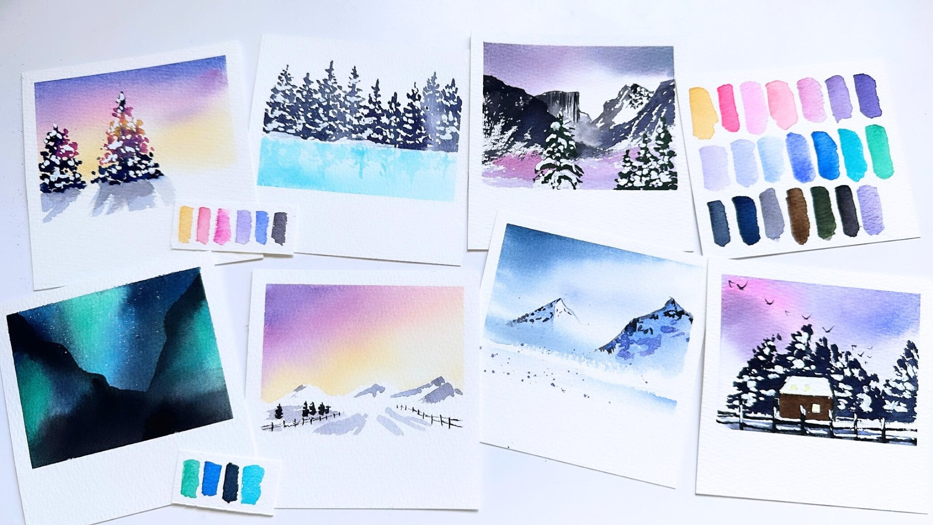
2. All the Supplies: Let's go over the
supplies we will be using together in this class, I will be painting with 100%
cotton watercolor paper. If you can get your
hands on some, this is what I recommend for
getting the best results. As for the brushes, I have a flat brush. The majority of our
illustrations are painted with this quill size to an equivalent brush
would be a mop brush. I have around eight, around one and a
script liner size one. I'm also going to be
using this toothbrush for White Star spotters and
our last landscape. As far as pain SCO, I use several different
brands of paint and instead of using the same
brand of paint as me, I think what is more
helpful is if you use a similar color to the
colors that I use. For the first two pieces. I'll be using yellow
ocher, opera rose, cobalt blue, cobalt
turquoise, and Payne's gray. For the last piece, I'll be using opera rose,
small blue, indigo. And I have indigo
swatch to twice so you can see a darker
and a lighter value. And lastly, Payne's gray. We'll also be using Dr. Ph. Martin's white gouache. I have my paint palette here
where I do my color mixing. I also have several
different ceramic palettes where I have my
paint squeezed out. I have white masking tape, a jar of water. And lastly, this is optional, but I have a hot air tool which helps expedite the
drying process. You don't need this.
If you don't have one, you can just wait for
the layers to dry. But I like to speed things
up a little bit with this.
3. Wet on Wet Technique & Soft Backgrounds: Let's go over a wet on
wet technique together. Wet on wet technique
with watercolor can sometimes be
tricky to work with. But it's really important in creating soft background washes. On this piece of paper
on the right side, I'm going to show you what Wet on Dry watercolors
look like. I'm going to take some
cobalt, turquoise. And I'm going to take the paint and paint this top
portion of the paper. This is turquoise
paint on dry paper. Now, I'm going to take
opera rose and I'm going to paint the bottom
portion of this paper. So if you look at these colors, the colors look pretty vibrant. Now, on this left side, I'm going to wet
the paper first. And I'm going to show
you how watercolors wet on wet look different
than wet on dry. So I'm gonna do the
exact same thing. I'm going to take
my cobalt turquoise and I'm going to paint this
upper portion of the paper. Now already, you can see how this side is much
lighter and softer. The color is softer on wet
paper than it is on dry paper. Now again, I'm going
to grab opera rose, and I'm going to
paint the bottom of this page and move my way up. So you can see how the
wet on wet page has a much softer feel than the wet on dry on both of
these pieces of paper, I used the same
amount of paints, same kind of brushstrokes. But the difference is
pretty noticeable. So we will use wet on wet
technique to our advantage, to paint soft and loose
watercolor washes for our landscape backgrounds. I also want to touch on why sometimes wound paint two
colors next to each other. Say in our background wash. Sometimes the colors can mix
together and turn muddy. Muddy colors is when our paints turn either brown or gray. And marrying our
watercolor paints is something that can happen
when painting landscapes. And to understand
why it happens, I want to take a closer
look at this color wheel. Colors that are
adjacent to each other. When you blend them, they will blend smoothly. But colors that are on the
opposite side of each other's, say on the color wheel. When you mix them together, they are more likely to create
and muddy or a gray color. So that's just something that we need to be aware
of when we're painting our landscapes
and we're mixing colors in our
background, washes.
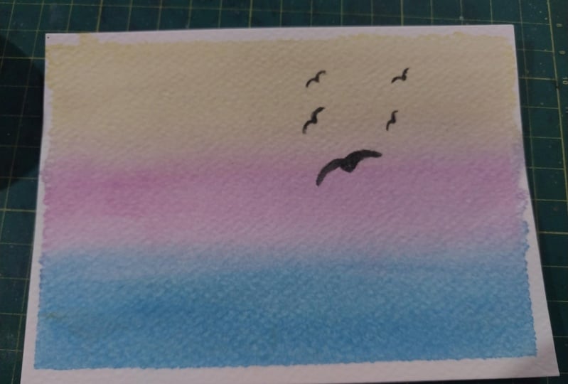
4. Project 1 Sunrise: To start off, I have my 100% cotton watercolor paper taped down on all four
sides with masking tape. I'm going to take my
flat brush and grab some water to wet
the entire page. I love 100% cotton
watercolor paper for these landscapes
because I feel like they hold water
and pigment the best and you get
the best results. Now that my paper is all wet, I am going to grab
some yellow ocher, as well as some opera
rose to make a warm, peachy color for the horizon. I'm going to just make soft sweeping brushstrokes
across the page. Now, I'm going to grab some yellow ocher and I'm going to paint just the
top of our sunrise sky. Now, I am going to
go some cobalt blue and we're going to paint the bottom half
of our landscape. And this is going to be
the top of the ocean. Now, I am going to
grab a little bit of cobalt turquoise and mix
it in with our cobalt blue to get a little bit of a darker color to paint
the bottom of the ocean, which is closest to us, to give the landscape
a little bit of depth. Now, I'm going to
take my round brush and I'm going to
grab some whitewash. This is Dr. Ph. Martin's. And I'm going to paint some loose waves on this very front section
of our landscape. And I'm gonna be doing
some dry brushing, wash. And what dry brushing is, is instead of getting one
clean smooth brushstrokes, we're gonna get little
broken up brushstrokes that we get with when the paint is a little
bit on the drier side. This gives the illusion that there are waves
crashing right here. And the last thing we're
gonna do is paint some birds. I am going to get my black velvet script
liner science one. And I'm gonna pick up a very watery amount
of Payne's gray. I want the paint to be pretty dilute and I don't
want it to be creamy because of the pink
consistency is creamy than our brushstrokes are going
to be a little bit thick. So we want a very thin
amount of Payne's gray. And I'm going to
paint some birds right here along the horizon. And this is our sunset piece. Once we're done, we
can peel the tape off.
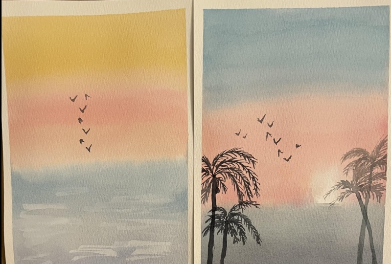
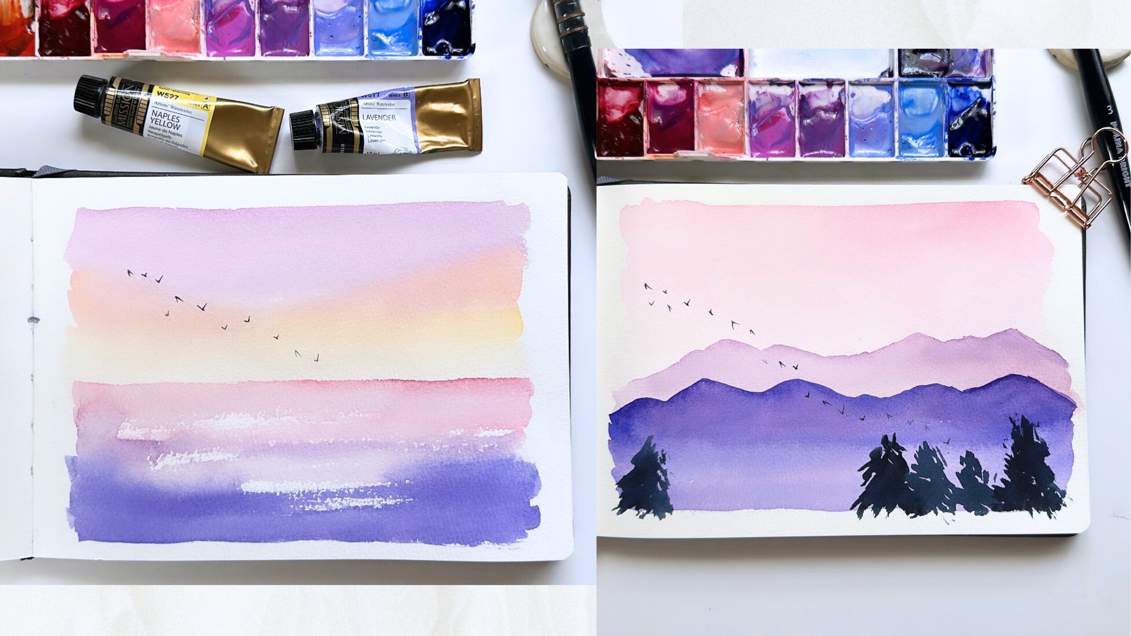
5. Project 2 Sunset: We're now ready to start our second loose landscape piece together, our sunset piece. Again, I have my 100%
cotton watercolor paper taped down on all four
sides with masking tape. I'm going to grab
my flat brush and some clean water to
wet my paper evenly. We are going to start with some yellow ocher
and some opera rose. And I'm going to mix
these two colors again to get that peachy pink color. And I'm going to start painting on the
horizon right here. And I'm gonna be
careful to leave a little bit of open whitespace right
here on the right side. Because that is where our
brightest point of the sun is going to be in watercolor when we're
trying to paint light. The brightest point of our watercolor piece is where there is no color on the paper. So leaving white-space
on this background, sunset sky, It's going to
create a bright sunspot. I'm taking a clean brush and just smoothing
this out a little bit. I am now going to grab some cobalt turquoise and
paint the top of our sky. Again for these washes, we want to make smooth
brushstrokes across the page so that our colors
blend together evenly. We do not want to overwork
our paper too much, meaning I don't want to pull the turquoise way
down into the pink. And I don't want
to pull the pink all the way up to the
top of the turquoise. I just want the colors to
touch so that they can blend. Otherwise, if I bring them
back and forth too much, it can cause meaning of colors. I'm going to take a
clean brush and just pick up a little bit of this
muddy color that I made. So right here between my
cobalt turquoise and my pH, I see a little bit
of money colors, a little bit of gray right here. So I'm just going
to take my brush. It's clean and has no
water or paint on it. And I'm just going
to lift this brown. Now. I'm going to grab
some cobalt blue. And I'm going to grab a
little bit of Payne's gray. And we're going to
paint the ocean on the bottom of our landscape. Again, I'm just doing wide sweeping brush strokes to give that soft blended feel. I'm gonna get a little
bit more Payne's gray with my cobalt blue
to get a darker blue just to paint the very
bottom so that we give our sunset landscape
a little bit. I'm gonna take my
clean brush again and I'm going to
pick up some color right here because again, I want this to be the
brightest point of my son. Now we're going to paint
some palm tree silhouettes. I am going to use my round
one synthetic brush. And I'm gonna grab a pretty watery amount
of Payne's gray. And we're going to
start by painting the palm trees on
the left-hand side. I'm going to start by
using the belly of my brush to make them
palm tree trunk. And then I'm going
to use the tip of my brush to paint the
palm tree leaves. To paint palm tree leaves. We went to imagine what
the palm tree looks like. They usually have big bulbs
of leaves coming out. So I'm going to paint
a curved brushstroke. And then I'm going to paint
tiny little brush strokes coming out of that curve
to represent the leaves. Let's paint another
palm tree right here. Again, I'm going to
use the belly of my brush to paint
the palm tree trunk. And I'm going to use the tip of my brush to paint the
palm tree leaves. Okay. Now let's paint the palm
trees on the right. For the palm trees on the
right because it is going to be in front of the brightest
point of our sunset. And I want it to
have a backlit feel. I'm going to use a lighter value of Payne's gray than what we
used on the left-hand side. For the leaves that are directly
in front of our sunspot. I am going to use yellow ocher. I'm going to leave
some open space as I'm drawing these
palm tree leaves. So it kinda looks like
the sun is shining through and we can exactly see
the entire palm tree leaf. So I'm going to use yellow ocher and a little
bit of Payne's gray. And palm trees can grow slanted. So if your tree isn't lately, straight, upright, you don't
need to worry about that. We want our palm trees to
feel real and loose and fall. So I'm trying to paint
as many leaves as I can without making
it look too crowded. Now, let's add some
birds with the horizon, like I did in the sunrise piece. I'm going to use my
script liner science one. And I'm going to grab a
watery mixture of Payne's gray so that my
brushstrokes are very fine. And I'm going to
paint some birds along the horizon right here. This is our sunset. Once everything is dry, we can peel that
masking tape off.
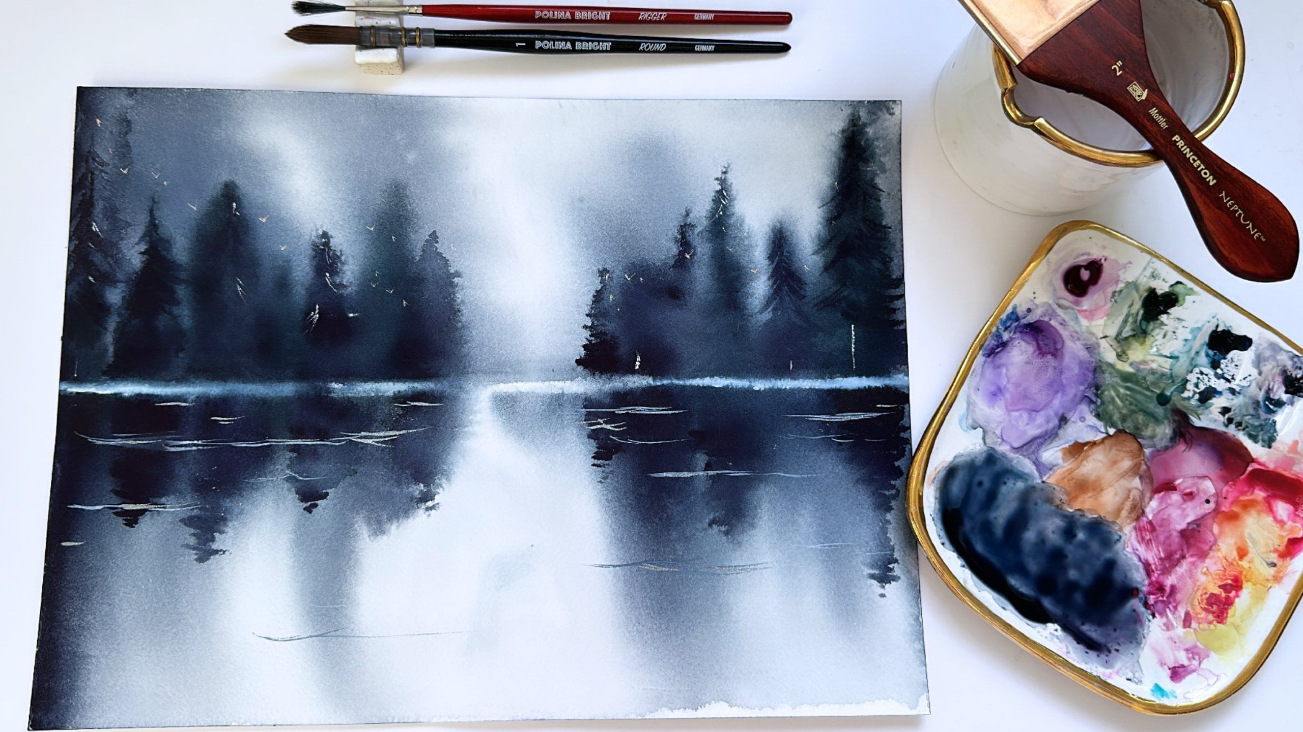
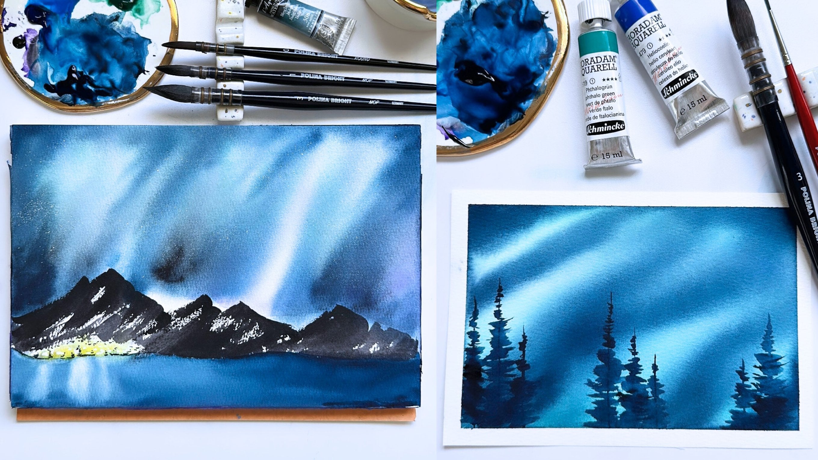
6. Project 3 Midnight: Let's start our third
watercolor piece together. For this landscape,
we will be painting a midnight galaxy sky with some loose watercolor
mountains in the foreground. My 100% cotton
paper is taped down on all four sides
with masking tape. I'm going to grab my flat brush, some clean water, and I'm going to wet
my paper thoroughly. I'm going to start the sky
by grabbing some small blue. And this is a deep blue color. If you don't have this
color, specifically, ultra marine or
French ultramarine is a good substitute
for this landscape. We're going to paint
the sky a little bit differently than the
sunrise and the sunset. Instead of smooth horizontal
sweeping brushstrokes, we're going to make dabbing
motions with our brush. And the reasoning for this
is that I want to create texture in this mid
night sky where there's pockets that look
darker and pockets that look brighter so that it gives the sky a little
bit more dimension. So for this area right here, I'm gonna grab some opera rose and I'm going
to drop some pink. As the pink mixes with the blue will get a
little bit of purple. And we can bring the
pink all the way down. Now, I'm going to
grab a tiny bit of indigo and I'm going to darken
the corners of our sky. So right now in the
middle of my paper, I see a little bit
of water pooling. So I'm going to dry my brush and pick up
some of that water. Mop or quill brushes are really great for
landscape pieces, and especially for
large brushstrokes. Because it is such
a thirsty brush sometimes we can pick up a
little bit too much water. And so if that happens to you, all you have to do is take a
dry brush like what I did, and just pick up
that excess water. Or you can use a paper towel. I'm going to grab a
little bit more pink and dab a little bit more
here to make it brighter. So if you are looking at
your sky right now and freaking out a
little bit because it doesn't really look smooth. Our sky is not going to look as smooth as our first two pieces. And that is because
we want our sky to have depth so that it
doesn't look flat. And when we paint our
white gouache stars later, the stars are really going
to bring this guide to life. So let's start
painting our stars. I'm using Dr. Ph. Martin's white gouache. And for galaxies, stars, skies, I like to
use a toothbrush. A toothbrush can give this really concentrated
splatter of stars that I feel
like resembles say, a midnight sky constellation. And using my thumb, I run my thumb along
the tooth bristles kind of quickly so that
I get this kind of concentrated
splatter right here. Then I can also take my thumb and gently distribute smaller, finer stars on the
other parts of the sky. And something to be careful
of when you're using a toothbrush and if you're
using a jar of paint like me, sometimes the toothbrush head can pick up a lot of water and just be careful of white water splatters
kinda falling out. Now I'm going to grab my round eight brush and I'm going to grab
some Payne's gray. And we're going
to start painting our loose mountain scape. I'm going to paint with
downward diagonal strokes to paint the mountains. And I'm going to paint
them in a triangle shape so that it looks like we
have varying mountains. And for the lower half
of the mountains, I'm going to use indigo and
I'm gonna do the same thing. But just on this bottom side. If you see a little
bit of the sky peeking through as you are
painting the mountains. I think that's okay. I personally like it. I think it adds to the loose feel that
we are painting with. And my goal and painting
these mountains is not to completely color in the
bottom half of the landscape. Now, I'm going to grab
some white gouache. And with my round brush, I am going to gently do some quick brushstrokes
so that it looks like the tops of our mountains
are snow-capped. Now I'm going to take
the whitewash and mix it with our indigo
and Payne's gray. And we can fill in some
spots on the mountain. I like how there is some bright white
at the top of our mountain and some darker
gray and other parts of the mountain to meet. The contrast in colors
gives the mountains some depth so that it looks like these
mountains are higher. Maybe getting a
little bit more light than the darker gray mountains, maybe they're a little
bit more hidden. Now for the last part, I am going to paint
one shooting star. I'm gonna get my liner brush, grab a little bit
of white gouache, and just make one
streak line right here. And now we're done with
our mid night sky. And I am going to
peel our tape off. And this is our third and
last watercolor landscape.
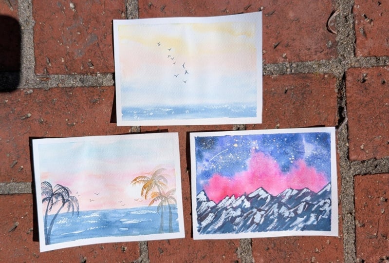
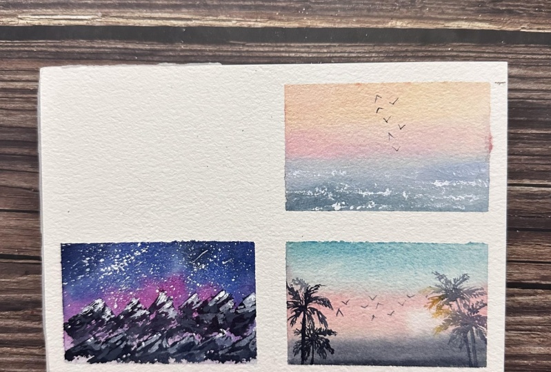
7. Class Project: The class project is going
to be very straightforward. You are encouraged
to paint any of the landscapes that we
learned together today. I would love it if you posted in your project to the
project gallery. If you have any
questions, feedback, or comments, please feel free to post it in the
discussion section. I also have all three
of my finished pieces available for you to refer
to in the resources tab. I really hope this class was
fun and relaxing for you.
 Madeline Kerrii, Watercolor Artist