Transcripts
1. Introduction: Hello and welcome to this intermediate watercolor
painting class. My name is Paul Cheney. I've been a watercolor painter
for almost 15 years now. During that time,
I have made just about every mistake
you can possibly make. And watercolor painting today, I hope to help you
not do the same. In this course,
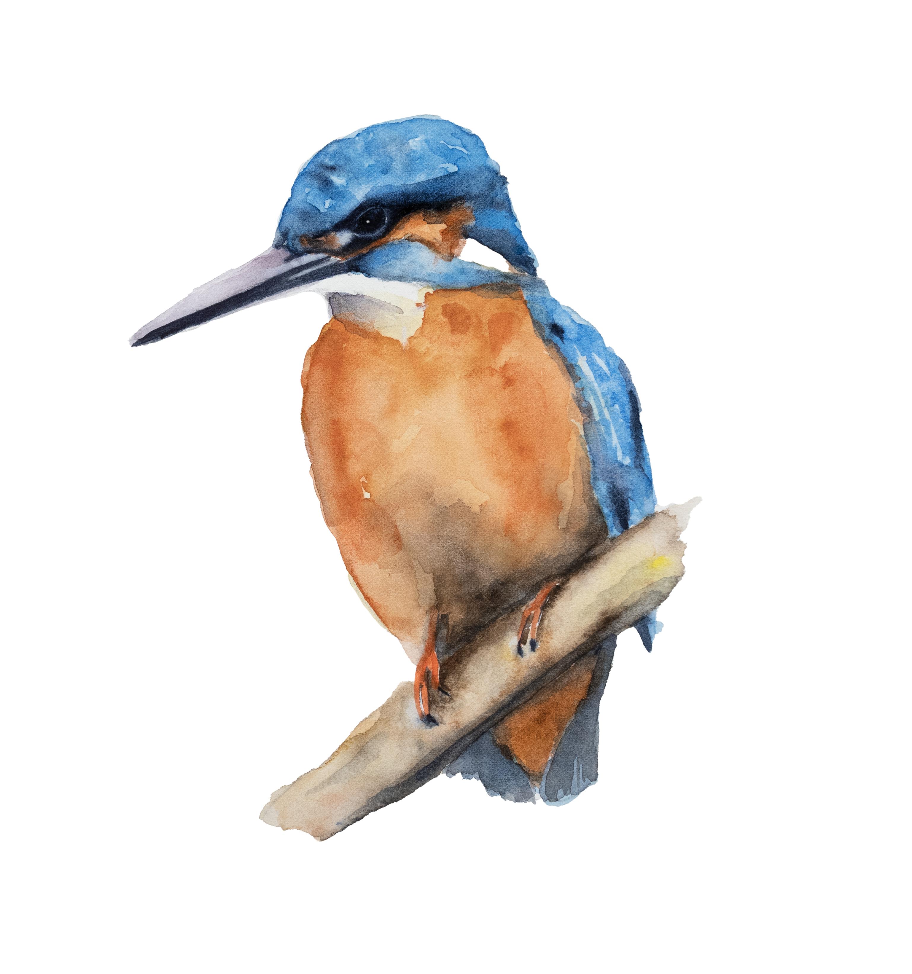
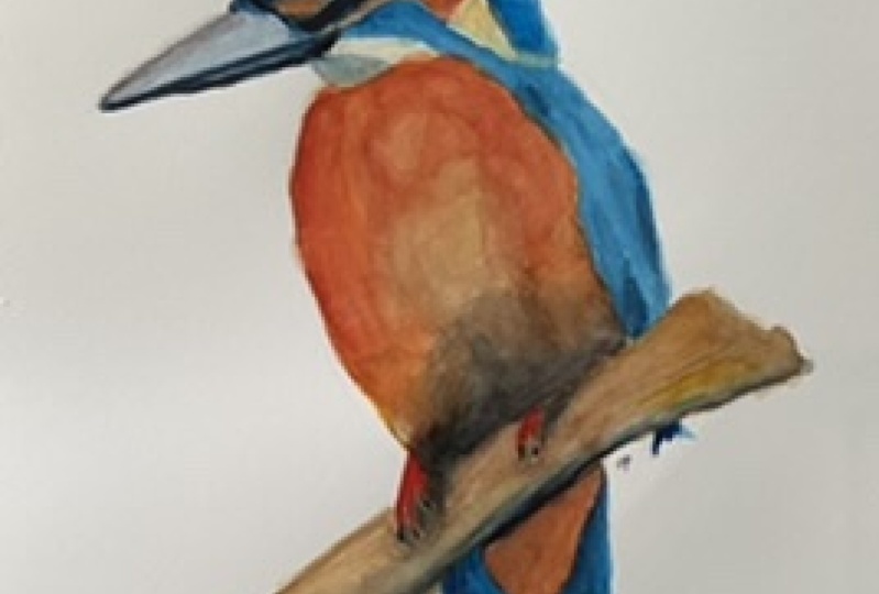
we'll be painting this beautiful watercolor
painting of a king fisher. The course covers
everything from start to finish and is broken down
into easy to follow chapters. We will begin our painting
with simple washes and gradually work our way
up to the finer details. Now, don't worry if
your drawing skills are not up to this subject. I provided you with
a simple outline, trace onto your
watercolor paper as well. I provided you with a guide
that will help you practice your drawing skills and
instructions on how to use it. Please be sure to post
your finished painting in the projects and
resources section. It's a great way for
me to provide you with feedback as well as
to inspire others. If you have any questions about this course or any
of my courses, please post them in the
discussion section here. If you wish to speak to me
one-on-one by all means, reach out to me through
my website or Instagram. I'm always happy
to hear from you. Thank you so much for investing your valuable time and
taking this course. There's nothing
more inspiring to me than other people
wanting to learn what I do. I can't wait to see
your finished artwork. Happy painting.
2. Preparing to Paint: Welcome. Today we're painting
our king fisher. So I've got my sketch
on the paper here. The first thing I do is
tape it down to the board. If you've watched my
videos in the past and you've seen me do this
100 times already, please feel free to skip, but for those of you
that are new to this, this is my process. I am now putting a taping the paper down
to the board and board. It's a piece of cardboard. You could use any board, plywood, hard board, any kind of thing you could do right
to the table if you like. The reason I do this is
it keeps the paper flat, stops it from
buckling and bending. It will buckle up as
it when it's wet, but it will then dry to be flat. Which for a lot of
reasons is a good thing, mainly because if
you end up with your paper all wavy and wobbly, when you're putting on another
layer or a lot of water, that water will pull where in the lower parts of the paper and paper and that may not
be where you like it. And then of course at the end, you're going to have a
flat painting versus a wavy and wobbly one. Okay. So no real rhyme
or reason to how I put that on other than there's about a quarter of
an inch around in some places a bit
higher than others. Main part is I want it stuck
to the board nice and tight. Hey, we'll stick by itself
to the paper. Very well. You don't have to worry
about that too much. Tape I use is a frog tape. So the brand, it tends to To do the least damage to the paper when you're
peeling it up. And that's that portion of it. The next thing I sometimes
do is go around and give myself a roadmap as to where I'm going to
have darks and lights. I'm going to keep the drawing on this painting to a minimum. If you feel you need more
detail than by all means, go ahead and add in some more details so you know where the paint is gonna go. But to me, the less detail that we have in the painting
and the drawing, sorry, the more loose
the painting will be.
3. Painting The Chest First Layer: Okay, so our king fisher, we've got a couple
main areas that are very obvious and apparent
on our king fisher here. If we look at the reference painting,
reference photograph, sorry, we've got basically two main colors in
the chest area. We've got a light
pale yellow color and then a deep
burnt orange color. And then again in the head area, we've got a light pale blue
and then a dark area liquid. There's little flecks
and stuff like that. Fluorescent orange
and the feet and then a slightly darker value and the colors below the branch will probably leave out
all the bits like the moss and stuff like that
and just do a simple branch. We don't want to take away
from the bird too much. I like the, I like
the intensity and the I will keep that maybe darken
it up even a bit more. And then of course, the beak, we basically got two layers
and the beak we've got a light area on the top and
the dark area on the bottom. So the first thing I
think we'll do is we'll tackle this chest area here. And to do that, we're
going to start, we'll probably do this in two, maybe three layers,
see how it goes. So we're going to basically
find this pale color here. It's a pale yellow color. We've got, you've got
cadmium yellow light here, but that's a very cool kind of definitely not
what's going on there. We've got some raw sienna
here or raw umber, I believe raw sienna, and that is definitely
more in line with that. So why don't we grab some of this and
we're gonna just going to dilute it a lot
with water to get that lighter color there. I'm going to mix in a bit of cadmium yellow light
just to, there we go. Okay, so now you can see
that this is pretty similar. Maybe warm it up a tad. They're at in a bit more water. Now, I'm using my
squirrel hair brush or any brush will be fine. You want to avoid using a very small brush
and trying to fill in a large area like this
quickly because you just can't hold the same amount
of water and paint. So feel free. You can go to a larger
round brush if you like. It doesn't have to be that big. Obviously you want
to be able to work comfortably when the
area that you can. So good rule of thumb, the largest brush that you can use to achieve the
goal that you want. The reason being is this holds a lot of water and
a lot of paint, and it's a very light color. So we need to use a
fair bit of it on our brush and then dilute it, diluted sorry, with with water. So I just took another look at that and I think it's a bit, there, be a little bit lighter than it shows
on the palette. Alright, so step one, let's get this onto
the paper here. So we've got this light
area up at the top. Just want to make sure
that I know where that is. I've got my pencil
lines are in there. And you can see how
my pencil lines. You guys want to
make sure that I'm using a water-soluble pencils. So if I go over top
of it really hard, then I'm going to
lose where those are. I don't want to have
a uniform wash. I want some areas to be lighter in some areas to
be darker because that's the reality of what's going on in
our picture there. And I want these to show through selectively when I put
on the next layer. So this is all really, I'm only a few light
areas there are, so I'll come over
here even though this wouldn't be much darker. You can see how loosely
I put that down and how relaxed and
easygoing It was. I'll pick up a bit
more paint and plop it in a few areas here, just for the effect of
giving it some variation. Now, we're going to
let that dry and see how easy that is, easy-peasy. We've got this area
down here too. Let's throw in a
little bit there. Okay, now we're going to let it dry and we'll come
back when that's dry. And then we will go to
the burnt orange color.
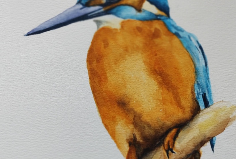
4. Painting The Chest Second Layer: So our orangey
burnt orange color, that's up and around in here. We've also got a dark
shadow area there that will probably try and address and this layer, Let's
see how this dried. Basically a nice simple wash. There's a few little
blossom areas there if you're
white patches left. Any of those little
details, things like that. I kind of like the add
character to the painting. So I'm not worrying about those. I'm actually not
worried but anything. One area that I want
to be aware of here is my light area here that I made too dark because it's very bright in the in
the painting there. Like this area up here is okay, but I'm going to just
grab a different brush and I'm just going to try
and lift some of that out. And I want to keep that effect. It'll be fine when it's
all said and done. It'll show relative
to the rest of it. It'll look just dandy. But while I'm thinking of it, it's showing you how we can fix a little simple
things like that. I'm pushing with a brush load. This is an older brush for a long time and it's getting a little
rough around the edges. But it's what it's
allowing me to do is I'm not worrying
about breaking it. Like if I tried to do
that with this brush, these hairs are really fine. It would destroy it in minutes.
And I don't want that. I quite like my little
squirrel hair brush, like this brush too. But There we go. We're going to have to
darken that up in there, this little shadow under there. But for now, we're going
to leave that area there. I am just going to make a
little pencil line around it. I'll be done that too dark. I just wanted to know where
that is because what will happen is if I come
right up here when I put the next layer on
and that's still wet, well then my burnt orange
color is going to run up into that area that
I just tried to rescue. We don't want that. Do we need to know? Okay, let's go over to our palette and attempt to
make a bright orange color. So I've got some orange here and now that is
excellent for the feet. But for our chest,
it's a little dark. So I'm going to take some
sepia and mix it in there. That's great for
the shadow area, but I think that's too dark
for most of the chest. We can always add more orange
and go back and forth. But I think no
matter what we do, we're going to end up
with that being too dark, That's great for
the shadow color. So we'll leave that
clean off my brush. I'm going to grab some
of my raw raw sienna. I bet you I mix those together. Will that work?
Getting pretty close? Here we go. Okay. Yeah, and that actually
works well because I've got some colors are just
really intense and they just wanted to have
all the attention. So you end up, now I'll get
light and it's more raw. Raw sienna, raw sienna. The names mixed up. So hard to talk and do
things at the same time. Okay. What do we got? How's
our color there? Buddy? Oh, maybe not. Yeah, I think that's good. Okay. Let's get that color on them. Okay. So we're gonna
watch out for the area there that's a light. We're just going to come
up to the edge here. We're getting the color on. Grab a bit more orange, I think. Too much. There we go. Try that. Okay. It's lighter down
here in the center, we've got a darker area over
here, and then it's lighter. In the middle here we've got
a lighter area down here. So what I'm gonna do
is I'm just gonna kinda put in some of these darker colors here. Very careful up here. Keep that exposed. I don't want these to
dry, so I want to be careful that I don't
let this sit too long. I clean off my brush
as much as I can there and lots of water in here. I'm just dabbing in
some clean water. You can see how loose
and easy it is. I'm trying to avoid
getting hard lines. So avoid that. And just put in lots of water to give us that
lighter area there. Now, down here it's darker. So let's get some
of that water off. Grab the darker color,
maybe even a bit more of the sienna there. For down here where
it got really dark. I'm going to touch
those together so that they blend and bleed. But more see uneven.
There we go. I can even dab some
of that along here. Now. You just get this on and then I'll talk a
bit more sienna here. It's almost pure. Well, it is pretty dark
down here that values like getting really dark
down at the bottom. They touched together,
they should be okay. Okay. One of the things about using
a squirrel hair brush or a brush like this is they
hold a lot of water, but they also hold
a lot of pigment. So when it comes time to
get it off and clean, it can be a bit more work than maybe you are
prepared to deal with. I take some getting used
to, but I quite like them. We will probably add in more
shadow down here later just because I'm trying to bit more grabbing pure sienna there. I might even use like a neutral tint or Payne's gray or something like that
to get that really, really dark area there. And the water is kind
of pooling down there. Makes up a little
bit darker color that has less water in it. Forever. The top here. Okay. Even this out a bit. Put some water in there. Okay. We, now we can do this little
area up here at the top. We've got so that
brighter orange. And this comes pretty much
right underneath the eye here. And it gets darker
at the bottom. Later over there. You can use a smaller
brush for this, don't feel the need
to use a giant brush. And these detailed
areas, again, remember, the largest brush to come to achieve the goal that
you're trying to do. Some example like coming
up in here, this, I can use the very fine
point on that brush. But there's really no
point, no pun intended. And it would've been a good
one if I did intend it. This just orange up in here. Don't worry about it too much
because you're going to, if you don't get
it bang on because all the other colors are darker that are going to fill in. Over top of it. We're just getting out of
a base layer down there. Okay, I'll grab some dark now. We're here at the bottom. Throw on some of that up
at the top, that blend in. Now this in here should
come over this way more. I just want that
to be not so over, not so much of a
hard edge there. Okay. I think I'm going
to actually grab a little bit of indigo. Just bear with me here. And then I want to add
in, see if I can get this dark color all
done in this layer. The more, the less
layers you have, the better your
painting will look. That's just one of
those golden rules. Less is always best. And watercolor, indigo
is a very dark color. I use it quite often in
almost all of my paintings. I'm losing a leg down here. So I want to make
sure I rescue that. I'm just lifting some
of this paint out. Using my brush, my brush, my Bravo my brush like a mop. And yeah. Okay. We'll let that dry
and we'll come back. We may we'll probably add some finishing
touches in the end. We still need to do the, oh, we still need to do the bottom. Whoops, daisy. Let's do that. Bottom area will
grab the dark color here with our orange mixed in, maybe a bit more orange. And put that down here. Well, you could add some more of the indigo or whatever
you like and you're using just sienna or whatever brown color we're
using and put it up in the very top there because that's going to be a
shadow under there. Blend it in underneath
the log there. Okay. Alright. Now we're going to let it dry.
5. Painting The Head and Back First Layer: So let's look at how our
painting dried here. So it looks pretty good. I think just for a bit of character and a
bit more texture, we need another layer, perhaps over a brighter
orange color in some areas, but nothing too much
vary a little bit. This area down here, we kinda got a little
blossom or the water pooled. And I want this to come
down in that direction. This is a lighter
area down here. So really, all we're
gonna do for that is just kinda brush out that
top bit there. Like so. So we're pushing feathers
down in the right direction. And then we can add
a little bit of shadow area down here
over top of the leg. We can darken that
up a bit the next time when we do the next layer. But for now let's move on to the head and back
in the blue areas. So like we mentioned, there's two light
blue areas there. We've got basically underneath the lighter area and then
we've got a darker area. We're taught the way watercolor
works, being translucent, we can't really
paint light over top unless we start using
gouache and stuff like that. Which I think is fine for a little highlight
here or there, but I don't want
to turn my whole painting into
something like that. So I'm going to put
down a base layer of the lighter color. And then we will do a
darker color over top. Probably add in some sea salt or something like that to give the texture of the kind
of spotty areas up there. But for now let's move over
to the palate and sure. Palette is pelleting,
okay, it is. And we will grab
a lighter color. I think this is a cobalt blue. Yeah. We'll go with
that as a cobalt blue. And I think with a bit of water diluted down that should come out just about
being onto what we want. It's almost like a
white blue color there. Feel free to clean off your
palate of the other colors. You can always mix them up again later if you don't
have a lot of room. One of the reasons I like
having a large pallet. It's for that reason a
fair bit of water on here. I'm just going to
try to be careful and not make a big mess. It's using the tip of my brush. Now when you get a lot
of big puddle like that, you can always come back
and grab it and put it, use it elsewhere
on your painting, which you want to
avoid is a drawing and getting some hard lines
that you don't want to have. So that's why a lot
of water is good. It also keeps the
painting loose. And that's how I like to paint. Okay. So that's pretty
much it for Tambora had there we've got this blue
area underneath here. Not worrying too much about
the paint overlapping later. Lily ray, that comes down there, but we don't just for consistency,
I put this down here. You don't you can just move
right on to the darker color. But for consistency, I
think we will flick out a few some of that water
up there, bring it down. Darker areas. I'm not going to
worry too much about this part down underneath
the eyes. For now. It will do it all with it. We'll just use like
solid indigo on that. We're just trying to fill in any little spaces that I don't want. Okay, now there's a
very light blue color up in the wings here, but I'm not going to
worry about that. You could put in some sea salt if you want it to for that. Now that I said it, I will do it just to show
you basically have got some coarse sea
salt here and that should give us some
little flecks. They're a bit more up here too, just, just for the fun of it. So give it a bit of variation
in how it, how it dries. Okay, So now again, like we did in the other layers, we have to let this
dry and then we're gonna put another
layer over top. And for that I think
we're going to use probably just like we could use an ultra marine
or a fellow blue. Just a darker blue that
compliments this one. Well.
6. Painting the Head and Back Second Layer: So let's take a look and
see how did this dry. We've got are you can see
are where assault went there and made some lighter
areas in that blue. Again, not overly necessary, and that's something
that you'll see done. And people make the
mistake of saying, well, I made a painting and now I gotta put
sea salt in it. Like anything, it can be
really overdone really quick, so use it sparingly. I just thought it's
a good example. I've said it, so I put it in. I tried to avoid things like
that as much as possible. I think watercolor on its own, if you leave it alone
and let it do its thing. It looks fantastic already. So I just basically,
once it's dry, it's going to be hardened
into your painting there. So just very lightly push it with your fingers to get it off and try not to make sure if it's
wet you not getting fixed streaks across
your painting there. I've got a few
little splatter bits there, but that's okay. People always like them. So if you get one by
accident, leave it again. It's taking your brush and going on with the splatter
across your painting. Get done, can get very
overdone very quickly. A couple of ways we can
handle the top here and the darker areas
we can literally go across and put lines in, but it's not going to look
good no matter how you do it, unless you spend a huge amount of time going in
and doing those. Nothing wrong with that
if you wanna do it. My paintings. So I like to
keep things loose and I don't like to put in a huge
amount of detail stuff. I just think it takes away
from what watercolor is. But if that's your
forte by all means, it wouldn't be hard to do. You can just take a
little section and go line by line and
just fade them out. But for today we're
just going to rep, make a representation of it. So over here on the palette, we are mixing some
fallow blue in with our lighter blue just
because that's bases there. And it's that way too, they kind of blend in together. So I'm going to look
at this and say, where are the darker
areas in here? There's a dark area down here, so I'm in there. And over here, it's
darker. Like that. Goes down here like this. Now I'm going to put in some just a little
random water spots here. The darker paint. Ok. Now you may not like that, but just bear with me. I don't want to get
all my orange there, which I did list
that out before. It gets worse. Okay. You grab some water. I'm just going to go along
here and blend these together. Okay. So now we've got the darker
areas, like even darker. So for that we're gonna go
into indigo or go too dark. And we're going to bring some of that in while
this is still wet. It will blend nicely that way. Really messed up that
spot there, excuse me, while I grab a piece of
paper towel and dab it out. And I just want to be able if I if I put in indigo
over top of that, I'll never get that
orange spot back. So I'm just gonna
make sure that it's dry and paint doesn't bleed. Their mission accomplished,
we can move on. Okay, so now we'll come over this way and come down here
along this back here part is very dark mixture of light and dark everywhere
in there it seems. So you can see we're
kinda getting like a representation of all the
different areas in there. The lighter areas and we've
got the darker areas, not as many lighter areas as in the as in the reference picture, but we can put some
water on in the second and lighten that up top. Where else he's
coming around here. I'm just trying to
establish this. Well, this is still wet. Clean off that brush.
This is a number to Heinz Jordan Series 400. Brush. In case you're wondering
any round brush will do. Stick with horsehair
on it if you have it. No, I'm just kidding. But don't worry too much about
the brush right now. We'll put in more
details in here later. For now, I'm going to
take some clean water. And this area that
comes around the eye, they're kinda like it's like a round kinda kinda
highlights the eye. So I just wanted to see
if I can't get some of that out and make
that area lighter. So I'm just cleaning off
my brush and lifting. You probably just dab in
some clean water too. And that will spread
the pigment around. And see where else can we
do here was putting in some clean water spots in here. Still a few lighter areas. Break it up a bit. So we
could have left more of the, um, and we put in a bit too much water in there and we could have
left more light spots. But I think it also
would take away from, you know, some
things look great in a photograph or in real life. Then translated to a loose
watercolor painting. They don't sort of like
a white fluffy dog. People asked me to paint white
fluffy dogs in watercolor. And I just get sugars because he's one of the most
difficult things I think there is to paint and they just don't translate
well into watercolor. And been my experience anyways, I'm sure someone out
there has mastered IP. Okay, so I don't want to
mess with that too much. We'll let that dry because anything else that
I do like e.g. here, I'm gonna put in
some darker over here, but it starts to get Nick. It's not dry enough that it's
going to make a difference. Maybe it will. Maybe it is. Okay. I think one of the things
I say the most is okay, I'm going to let that dry
now and then I never do. I just keep mucking about, keep poking at it. When I'm teaching
a class in person, I'm notorious for telling people stop painting, just
leave it alone. Geez, when it comes to my own paintings, it's a
whole different story. I definitely don't practice
what I preach enough, working on it, but
whichever. All good. Okay, So we can do
the same thing down here with our bit lighter color. We can leave in some areas
that we had that were we want to leave in
some light areas there and how some dark areas. Putting in. However,
there we go. I'm not going to
worry too much about the wing details because
they are going to put in some darker areas
down here and start to highlight those
after with that. But for now I'm going to
let that be like that. We'll grab some water, fill in a few of those areas so it doesn't look too blotchy. And we put it in
some dark spots. Now, down here I've
got a dark spot here. We got one, over
here, we got one. And then this whole
bit down here. And we've got some up here. And we've got some over here. Now we can put in some
drier dark paint, some indigo here. Just be quick, clean
off the brush, grab some clean water. And we blend that in. Just trying to eliminate
any hard lines there.
7. Painting The Eye And The Beak: Welcome back. So our blue is dried. Now we're going to work
on our eyes and our beak. For the beak. And we're going to use some. And we'll use
Payne's gray because it's got a bit more color to it. And we'll add in a little bit of magenta because there is
some at the top there. So over here we're
mixing some of this up. I'm using my number two
brush, grabbing some of that. Oh sorry, that's neutral tint. But whatever neutral tint, that's what we're going
to use neutral tint. And we'll grab a bit of magenta. Just for fun. My paints are
starting to dry out. She need to rewet them again. And yeah. Okay. So we'll let some of that diluted down
and we'll just do a layer, simple layer with this color. It more magenta,
maybe. There we go. Nice light layer there. So just grabbed a bit more
water to lighten that up. Even a bit more water over here. There's a little light
area there that I'll leave is going to come up and
it's gonna go back. Cross will do that
dark part later. For now, just a
simple even wash on the beak and we'll leave
the dark part later. I'm going to just
grab a bit of water and lighten this up at the top. Okay. That's that. Now we're going to
grab some indigo and it goes a very dark
color once you wet it. That's very rich and very dark. So we're going to come
over here to our eye and we're basically just going
to follow this along. There's a very light area underneath that we will leave in a little bit
of one at the top. I'm going to leave these fairly large so you can see
what I'm talking about. I'm just going to fill
this whole thing in. I'm gonna put a,
I'll put a dot of gouache on later
just so that it's easier to find one sometimes
sometimes when it's dry. And he got all the rest of
the details figured out, it's easier to see where where the highlight
in the eye should be. That's like that little
white flecks area there. On top of this, there's
a very fine line. Okay, So this is, you can
see it's fairly dark, which is what we want. We can try to close this white line a bit and keep
it as narrow as possible. It's easier to fill it in than it is to try and put it in after you've already got
really dark paint on it. Now, if we look here, this goes right up like that. And okay. There. Okay, So you should have
something similar to that. I'm going to add
in a bit more here just so that I can
use it to pull up. So I'm kinda piling on
the pigment up here. And I want to use it to blend this area in here so
it's a bit darker. I might go over the eye again later just to make
it even darker. That's some dark
areas in their lives. They don't have
enough water in here, called dark area there. Depending on how
dry your beak is, it's still a bit wet
so we'll leave it. But if you're a beak is dry, you could decide to tackle the next part
now by going over it, but I'm going to leave
mine to dry a bit. Okay. I'm going to clean off my brush. Get rid of it all. A little bit of water there. And now I'm going to use some of this to bring that up
around here a bit more. See what we're doing there. We're just basically using
water and picking up some of the Indigo to get them
more textured area. We missed an area underneath, it's fairly dark as well. Down in here. Are underneath or highlight
there's like dark. Let's see how are
because it seems fine. Okay, we can move
over to the beak. Route, some darker other. I need a bit more
water for this. So we'll get that on this
so that it spreads evenly. And we come up over top, almost right to the edge there, but we'll leave that and
put a bit of orange later. Okay. We have that on. We can grab
a bit more, darken it up. Easier to do this
while it's still wet. And take some of that off. Blend this you, some of this that
we just picked up off of here and do this
little shadow area down here. If you've got enough. I think we're we're going to
need is we're going to need a bit darker color up at the top here because it's too concerned about making it too
light or too dark. I think I made it too late. So I'm just going to add a bit more value into that
beak there. That looks better. This area here, this white
area is not actually white, but I'm going to
leave it for now. Because if I don't
want is going to bleed in the wrong direction,
which I don't want. Okay. All right. We're going to let that
dry and we'll come back and do the feet and then the branch wide
and a highlight in the eye. And then we'll wrap it
up. I think we might actually do another layer on
the chest, but we'll see.
8. Painting The Feet And Adding Details: So we've got our eye has dried
here and our beak is dry. Now, let's take a look
and see where we're at. There's a few things I
think we'll cover in the finishing touches and we'll go over and do some of those. But before we get to that,
I think what we'll do is we'll work our way
down to the feet. And I would like to
see a bit brighter, a bit more in the chest there. I'd like to bring
that out a bit more. So I'm going to use a
little bit, not a lot. Just going to use
a bit brighter of an orange over here
to the palette. Mixing some of that raw sienna. I always forget
the name of that. It's got like they've
got a funny name for it, but basically you can
use it's the same color, almost identical, yellow
ocher or something like that. Okay, so I'm just basically
going to grab some of this pigment here, paint. Same thing and you can
see it's a bit brighter. And I'm just gonna put
it on in a few areas. Not worrying too much exactly
how and where it goes. It'll all work itself
out in the wash. This area here and it'll
cover that up nicely. Now I don't want those streaks. They are obviously,
so I've cleaned off my brush, grab a bit of water, and I'm just going to
blend those in a bit more. Just trying to accent
that, you know, it kinda comes around this
lighter area here a bit. Make it stand out a bit more. And we don't have to
worry about it being overly bright because it's, it's on top of two
other layers already. Let's drying pretty quick. There we go. So now I'm just
basically spreading it around and evening
it out a bit. There. We've got that
darker area there. So let's grab some of our sepia. But another layer down here that just being aware of
where that leg is there. Grab some indigo and mix it in. Darkening this up a bit. Again, it's not a solid line and it's hardly aligned at all. So we're just using
some clean water, pushing it down
into that shadow. Just to blend that out a bit. The darker run outside. Bring some of this over
here. There we go. I think one of the most
important things in painting, well, there's a lot
of important things, but unimportant thing. A important thing
is the keeping, using our values like lights and darks to make things
three-dimensional, to give it, like keep
it looking real. I think that often gets overlooked when I look
at people's paintings. So for down the bottom here I'm going to keep
it really simple. Just use some indigo. I'm just going to
bring us down here. Let me a little bit darker
at the top. That's silly. Shadows work. Clean water. You can use any kind of dark color there if you
want for the shadow. Now, I often use a neutral tint and then
it's like a neutral color. But again, just
use what you have. Okay. So now these feet, so we got our orange
color out there. I'm gonna grab a smaller brush, number two, brush here. And the feed mine, I'm on a I'm on. This is an eight by ten sheet of paper which your drawing guide will be set up to be the same. I like using smaller
sheets of paper because it's cheaper and
it's great for practicing. One of the things
that people will do is I'll say they'd get a
giant full sheet of paper. It's been like $10 on it. I mean, that's what
it is in Canadian. I'm sure that's a lot cheaper
in the US and some places. But there's been
a lot of money on the paper and they're
painting doesn't work out and then they get
discouraged and they think they give up. And using your paper like
teaching yourself how to paint. You're going to have some
paintings that don't work out like it's a given. Okay, so we've got
our orange on there. Now we need some clause. We will add some more
definition to the feet shortly, but for now we'll just put a
little bit of blue on there for sure those are
I just want to have them here is we're gonna
put we paint the branch in. I always forget these and
then they get kinda leftover. So I'm just using some of
this as a shadow color. Basically just drawing a
simple line underneath and that shows bit
of a shadow there. And don't stress too
much about the feet. I quite often leave
feet right out. Okay. So we can let this dry
now before we do that, let's give our eye
a little love here. So we're going to use our
handy tube of gouache here, which is an opaque
white watercolor paint. And I'm going to decide where this bird is looking
by putting a little dab of, that's probably
too much of this. Alright, about her. I think. There we go. Now our bird house, some vision. I'm sure has vision, but it looks like I'm
looking somewhere. What I mean, we
can use this if we wanted to bring out some of
these feathers up here, e.g. like I made this area in here, I filled in for your reference. If you wanted to do
something, you can use it like a fixed area. Let's say you had a
feather coming down here. You could flip that
over kind of thing. But keep in mind it
is bright white. You can get other
colors that are, that are in use it as well. But leave your
watercolor painting, a watercolor painting. Don't feel bad about
using this either because it's anything you can do to make your
painting look better. As great. While we've got this little brush and
we've got our bright orange. I'm going to put some of that up in here because
this is a little dull compared to
our guy up there. This part up here
that we had to fix. I almost forgot about that. So we'll use the same
orange in there. And I'm just going to put it in. Then I'll bleed it in after
with some darker blue to make it look more realistic. And gazes down here. I'm just going to blend that
in with some clean water. There we go. Whoops, whoops, it easy. There is no orange on
this blue part here. That doesn't go there. I think that Blue need some love anyways, I think
it's a little dull. So let's grab some
of our, some blue. There are more brightness
up. Well there we go. That's pretty write
that down there. And again, we're going to
clean water and blend it in. I think the bird
looks good like that. He's a bit more dark up in here. More dark down here.
9. Painting The Branch: So for our branch, in a picture there
you can see it's got a whole bunch of
moss and stuff on it. I'm not gonna do that. I'm going to grab some
burnt umber here. I'm going to keep
it really simple. And I'm gonna go underneath
at the bottom here. Put on some brownish
color like that. Try to avoid leaving any spaces and you can see how quickly
I'm putting that on. Now, grab some of that
raw sienna color. I'll dab some of that in
different places very loosely, not really overworking
it too much. I'm going to spread that around, even it out with some water. Now this color does
kinda when you, now that you've gotta do
it and see how the color matches the the bird, which I don't
necessarily want up, picking up some of
that claw there. The indigo that
we've put on. Okay. So there's our branch, okay, we've got a brown branch, we can add in some
brighter yellow, got some cadmium yellow there. Some light, whichever
doesn't matter, just to give it a
bit a color texture. Now, again, this is a
three-dimensional object. So it's going to have shadows. I've gotten my indigo or
there are faithful indigo. Some bits there. Just see how loosely
I'm putting it on them, not over stressing
about it too much. It'll grab some of that sepia. Put it down here. Few spots. We don't want to take
away from the bird or king fisher here and
his royalty after all. Show him sitting on something. Okay? Now, as we mentioned,
the shadows, you're going to have shadows
because he's or she is going to be casting some shadows. So put some more sepia up here underneath our
feathered friend. In-between. Whoa, I went right on
top of the there we go. I went right on top of his foot. Her foot. Maybe we'll let
that dry and then we can add in some more detailed
bits once it's dry. And at that time we will also
do our finishing touches. We're gonna go
over our bird here and we'll see where we can
improve on certain things. I've noticed a few
areas already, e.g. I think the head looks too flat, so we need a bit more
shape around here. And I think the I also, there's white line
that we've gotten needs to be filled
in quite a bit. And maybe a few other
things that we'll discover. I'm sure I'm going to
let that dry for now. No. Come back. As you can see how quick
that was very simple. You know, it's mostly about making it three-dimensional
shape, your shadows, which are your values and
lights and darks, so to speak, kind of thing there
than anything else? I mean, yeah. If you made it
purple, it wouldn't be like why is the
branch purple? But for the most part,
that's a bit bright. There we go. Okay. Now again, I'm going
to let it dry.
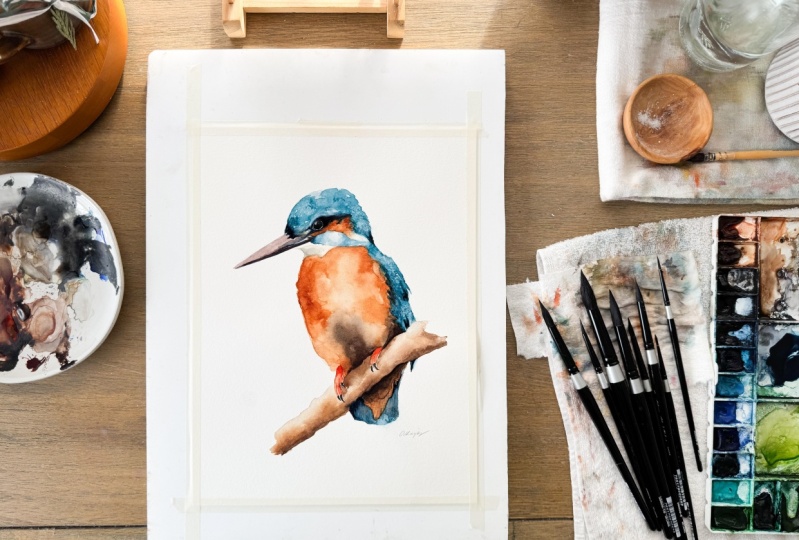
10. The Finishing Touches: So our branch is all dried
and I like how it looks. I'm not going to change
anything about that. I am going to move up. As I said, we're gonna
look at our eye up here. You look at the
reference picture. We can see there's a line
around the eye like there is, like some highlight
areas, but none of them are bright white like that. And I used to make this
mistake quite a bit. And I found that just a very subtle things like this can make all the
difference in the world. So what I've done
is I've just got some clean water on my brush. And we have a lot of
indigo and the eye there. So I'm just very
lightly going near it. I want to see it. I want to know it's there. But I don't want a glaring
out at me like that because it's not in the
picture and that's not how the bird looks, the eyes and things
like that are probably the most important part of the painting as far as them being in
the right position, the right size, and little things like
these highlight areas. So you can see it starting
to make a lot more. It's a more dramatic,
it's more powerful. Same as this little
white area here. It's not actually white. So I'm just going to
tone that down a bit. This area in here
is a lot darker. Grab some more indigo. Not this area up here that comes up all the way down here. Again, this some clean water. Now I can just use some
of that indigo and this dark and this orange
area a bit up here. Just by pulling that up. You want that kinda dark and mysterious looking
shadowy area there. So any bright white
or something like that is going to take away
from that considerably. Now let's seen here
in our white line on our beak in tone
that down a little bit. Now I do want a
bit more character up on the top of the head. I'll grab some of
my fellow blue. And I'm just going to bring in, actually I might do is
try and put in some of these mines there like that. And then just, um, lead them in a bit with water. Good. Just gives a bit more shape, I think to the head. We all need a little
more shape in our heads. I'm just looking at
the areas that I think are lighter and darker. I'm putting them in there. Some orange and some
sepia down here. They're standing a bit more
value to the area there. There's a bit of magenta
color up here on the beak. That in you can see now those little subtle
changes that we did there. They add a lot more like, it's more dramatic looking,
more three-dimensional. Same here, the shadow area. So regardless of what you're
painting or when you're painting at this stage or at near the end,
you're painting. Take a step back and
look at it and say, what can I improve on?
What doesn't look right? What, what areas
need to be tweaked. And then at the same time, learn when enough is enough. I think we're getting
pretty close to that. I would like to see
some more deaf, something different, something bugging me
about this wing here. I just needed to be
broken up into two parts instead of one big
solid area there. Alright, I'm gonna say all this tone this
down a little bit. It's got my clean
water went over that IN area a bit more. Highlight was fit, more neutral, sorry, a bit more indigo. Bit darker up here. Dabbing in some because it's still wet. Anything too. I think our highlight
might be a bit on the bright side to one of
those out by dabbing over it. Some fresh indigo
on top of there. There we go. Now I'm birds
looking a bit more forward. I like it. A little bit more. Shadow underneath the log. Rid of the leftover paint
on my brush Anyways, they're just makes it
stand out a bit more. And I'm going to say that
our king fisher is complete. I hope you liked it.
Please leave me a comment. In whichever medium
you're watching this in, and let me know what you think. Thank you very much.
 Paul Cheney, Teaching watercolour and digital painting