Transcripts
1. Intro: Hello everyone. Welcome. My name is Paul. I have been in watercolor painter for
over ten years now. And today I hope to share
some of that with you while I teach you how to paint
the spirit bear. I think this is a
suitable painting for all levels for two reasons. One, it's made up of
simple brushstrokes that don't require a lot
of skill and practice. And number two, you don't
need to know how to drop. The course is broken
down into sections. Each section contains an easy to follow lesson on different
parts of the painting. On top of the video lessons, there's loads of other material. There's a detailed guide on drawing, accompanied with that, there is a drawing guide, a grid that shows you where
to place what on the paper. You don't need to go to all that trouble
if you don't like, because I've also
included an outline, two of them, one is irregular outline for you
to sketch or draw from. The second one is a
very thick outline that will allow you to see the lines through
your watercolor paper so that you can hold it up to
a window and trace it off. There's a separate
video section on the materials along with a downloadable list
of those materials. The glass does not use
a lot of materials. A few brushes, a few paints, some cold press paper,
and you're good to go. Once you've completed
your painting. I hope that you can
share and posted in the discussion section On that note in the
discussion section, please feel free to post any
questions that you may have. A monitor them regularly and I will get back to
you as soon as I can. Good luck and happy painting.
2. Materials: Let's talk about
the materials that we're going to use today. So we've obviously you've seen, we've got our gut, our drawing, and our paper, which will put down on a board. And we have a pallet with
a bunch of colors on it. We're not going to use
all of those colors, just pretty much the
ones you see here, plus some blue and maybe a
bit of green, some yellow. But not. This is just what I
use and what I have at hand when I'm doing a
painting like this. So here is my green frog tape
that I use totally flat. Talk a little bit more
about that when we go into the preparing the
painting stage. I have a water-soluble pencil. These I love is like one of those greatest invention since sliced bread kind of things. This one is by fabric castle. There are a few different
companies that make them. Basically it's a pencil
that is diluted with water, so it saves you from
having to erase a lot. And in case of an emergency, IN that note, I have
a kneadable eraser. You can squeeze them into little shapes and
erase little bits. Try not to do this too much. It'll disturb the sizing and the paper and that
will affect how the watercolor dries
on the paper and essentially make your
paper look more muddy. I have a tube of gouache
around here somewhere. It's white, sort of
opaque watercolor paint. And if I do use that, you'll see later in the video, what I use that for is the
highlight areas in the eyes. If I accidentally cover over the little circle
that I leave behind or I don't know where I want
to put a little circle. Another option which is great is Jelly Roll pen
or a jelly pen, basically an opaque
white ink pen. They work great too. You can use that. This is my little
Mr. spray bottle. I use this when I'm
getting my palette ready. So my paints right
now, they're dry. They're not been used. So I would have to use a lot of water and I wouldn't get a very I wouldn't pick
up a lot of pigment. It'll be very diluted and I want to keep my paints
as rich as possible. So I like to let them
first I go round my palette here and spray them. No, I don't use all the colors. I just go around a few
times and do that. The brushes that
I will use today are just grab my brushes here. No, I'm not using
all these brushes. I'm just trying to find
that we can use that one. So I will use probably because of the
size of the painting. I'm doing this as like
a number for pen. Or here is, oops,
here's the equivalent, equivalent of it in a quill
pen or a calligraphy brush. These are not pens,
either brushes. So this is a number four brush. You can, basically
what I'm looking at is the size of the head here. So when I'm looking
at the shapes of my painting in the
areas of my painting. This will do nicely for the more detailed
areas I have here. This is a number two brush. This is a mixed real
hair and synthetic hair. It's called an e-waste is 400. They're very durable. They pick up a nice paint, they put down a good wash. But you can also use
them for lifting and pushing and other
stuff like that. This is the exact same brush. However, just in a quiz format. This brush here is a actual real hair
Kolinsky sable brush. The best of the best.
So they say, I mean, it is nice for putting
down like even washes, they hold a lot of water or the point comes to a nice point. I think it's still
a great way to go. Palette, ceramic palette. This is made by meet and I think it's called,
I bought it on Amazon. The reason I use
ceramic is you can see here how the paint
goes onto the palette, just like he goes on the paper. If you're using a plastic
palette like this, e.g. I'll just use the back
of it to give you sure you see the paint,
how it beads up. It doesn't lay down
flat like that. That's important. So you want to have that, you
want to have here. You want to be able
to see like how the paint goes on the
paper, how it mixes. It's easier to mix
your colors together. I also like the size. This is a nice, big
mixing area here. The wells are nice and deep. I can put loads and
loads of painting. Sometimes when I'm
painting like a full size, full sky and I suppose
I should have paper. I'll use a large, yes. I do use this large calligraphy
brushes to paint with. I quite like using those. So all of a sudden
now is palate, isn't that big and these
wells are not that large. This does when wet come to a fine point so you can pick
up a lot of paint with it. I wouldn't use this
very often, be honest, I do use this one
regularly though. So anyways, back to the palette. You can use a dinner plate, like something
ceramic or porcelain. You can use a tile. I would just recommend
using something that gives you an area that you're
comfortable working with. A place where you
can put your paints. You can clip on little. I'm empty pallet or
pans if you like. I'm just something where you
can see your paints mixing on with any of these materials. Use what you have for now. Don't feel the need to run
out and buy this or that. I mean, unless you
don't have something, you need a palette and you have nothing, or you need a brush. We don't have any brushes
or you need paint. The paints I'm using on this palette or
Daniel Smith paints. Again, if you use, excuse me, if you're using Winsor, if you have Winsor
Newton or I don't know, one of the other girls, M
Graham or something like that. Handmade paints by someone
by all means use those, use what you have tried to use the best quality artist grade paint that you
can because you're gonna get the most pigment in it and that will make it easier. So by pigment, I mean the
pain, the actual pain. So when you're picking
up your paints, I get a nice dark
color there and my burnt sienna without
really a whole lot of effort. So I had pre wedded, I
pretty wet my brush, but I still have a nice
amount of paint there. And that's a decent
artist quality paint. But again, use what you have. The paints that we're using today are the
colors are huge. How you want to call them? We're going to use burnt sienna. We're going to use burnt umber. We're going to use a yellow
ocher or raw sienna. Or there's a lot of
different versions of this color here and don't go by. If you have a raw sienna, use it, don't feel you need
to go by yellow ocher. Actually, this is raw sienna will use a yellow,
will use a blue. Blue here I have is
fallow blue, red shade. If you have ultramarine blue, It's not gonna make any
difference whatsoever. Yellow. So you can use
any kind of medium yellow and you kinda already
kind of light yellow. Really, you can even
get away without that. You can mix the greeny
color in the paint. I'm using yellow
ocher and the blue. Let's keep it down
to keep it simple. And then sorry, one last one
that's really important is your dark paint or you're
gonna get your shadows from. So I have three choices here
on my palette that I use. This is neutral tint. This is Payne's gray and indigo. Indigo with being the coolest, Payne's gray being
the second coolest and the neutral tint being
the most neutral by coolest, I don't mean like Hey
cool, like you're cool. I mean, like cool
temperature wise. Any of those you can warm
up by adding like a brown, I'd like a burnt umber, which is a warmer pink here
and I can make some money. I see you look at
how dark that is. And I can make it more
brownie or warmer, right? If I wanted to
make it more cool, I can add in my indigo. You can see the difference in the two colors there
on being very cool, dilute them so you
can see them better. And one being more brown, okay? So those will either
give you nice, nice shadows as
far as shadows go, keep them as neutral
as possible. That's why I use a neutral tint, because that's what they are. They're a shadow,
it's a clean area. Now, once you start
to get more into more advanced painting
and stuff like that, the color temperature of the shadows when will
make a big difference. You're warm and cool shadows. But for the sake
of this painting, it doesn't matter where more about what I want to
really get through in this painting is
taking something that looks complex and turning
it into a simple, easy to do painting. And I know you might
still think it's complex, but trust me, it's not. We're gonna go through it.
It's gonna be very simple. And hopefully you
can take this and apply it to other
paintings in the future. Oh, sorry, other things
that I have here. Just a folded cloth. And of course, water, which needs to be
changed already. So try to keep your water clean. That makes a big difference, especially when using
lighter colors, whichever the muddier water is the mother your your
paint is gonna be. So try to keep that clean. And I think that's it for materials. We will now get
started on painting.
3. Preparing the Painting: Okay, so now this is the stage that we'll call
preparing the painting, getting it ready,
ready to paint. So there's a couple
of things that I do to start off first is I like to take my paper
and attach it to a board. By doing so, I'm
going to use a tape. I prefer this brand
here, frog tape. The reason being is it
doesn't do a lot of damage, if any, to the
edge of the paper. As long as you peel it away. Like a long like
don't lift it up but like lifted up but
peel it like this, like sort of pull it
across like that. It tends to be fine. So I'm going to some tape
and I'm going to cover the, all the edges of the
painting with tape. This is an optional
stage. I do recommend it. Unless you're using
a painting block. The reason being is
once you wet the paper, it will buckle and
warp and keeping it held in place will allow it when it
dries too dry flat. It also stops. Help stop. It doesn't
prevent it 100%. While it's drying. It helps keep the
paper flat and stop it from stopped pigments from peddling and pooling where
you don't want them. It gives you a bit more
control over that, which, which I
think is important. So I recommend this stage again, this is not mandatory, but it will help you
keep your painting flat. And to me that's important. I know some people blow it off and don't care
about it, but I do. So. Okay. The next
thing that we'll do is it's a bit late on here. I tried to keep the pencil
drawing part as not. I'm trying to depress
it into the paper because then it's near
impossible to get out. The other thing I want to
avoid is a lot of erasing. Erasing on the paper
removes the sizing. And the sizing is sort of like a finish to the
watercolor paper. And that is when
that helps create those water Blache kinda
styles to the painting. If that's all removed or you're using a lower grade paper, then you will not have
that same effect. Let's take a look here at
a little example, e.g. so this is what I'm
talking about here. So you can see
these like edges in here without the
sizing and the paper, those wouldn't be there. So then what I'm gonna do is I'm gonna make a
little road map for myself as to where the
lightened dark, sorry. This is basically what
I've done is I've gone and done exactly what I recommend for you to do is take the digital outline that I created and trace it so that we're working
from the same thing. My original, I like to draw. It gives it a more organic
feel, like a sketchy feel. But if you feel the
need that you're not, you're drawing is
not quite there yet. Don't let that be
a stumbling block. The next thing I'm gonna
do is I'm going to go around and I'm going to find, identify where the
darker values are. So you might want to call those shadows or whichever
in painting we're referring to the pigments and the value of
the pigments which create the dark and light areas. So these are woke if
you hear me say value, That's what I'm talking about. So here we are in between the legs and I've got
some darker areas, like very dark up in here that this particular
section up in here. Think about if you want, you can look at
it in breaking it into very simple shapes. And that's what
this painting is, is a very simple painting made
up of very simple shapes. So we can see in there, we've got some more defined the nose a bit so that
I can see it more clearly. Our eyeball shape. If you don't have gouache, which is a like an
opaque watercolor, like a white gouache
that you can plop on the eye or a bit of
white acrylic paint, then you might want to
leave a tiny little circle here for your
eyeball to show up. I'll try and do it that
way so that you can leave out the gouache stage and keep
it as natural as possible. Underneath our feet here
we've got some darker areas. A little bit of texture
in there we want to encounter. I don't think really. Again, this is a very simple, sketchy kind of painting. Sketchy as in hand-drawn. Sketchy like it's an
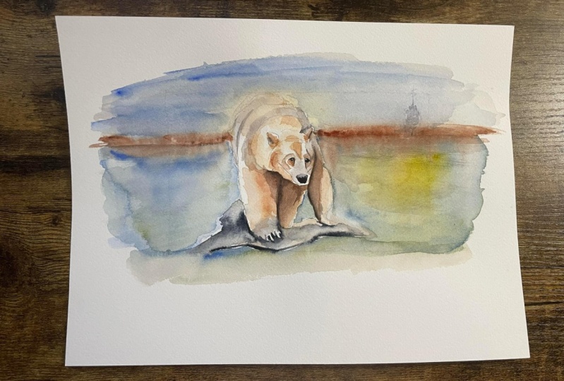
untrustworthy polar bear. I'm sorry, not polar
bear, spirit bear. Big difference between a
polar bear and spirit bear. Spirit bear is essentially
a black bear with white fur and a polar bear
as well. It's a polar bear. Okay. I'm going to shape out because doesn't matter that this kind of lumping his back, his layers of for that kind
of give texture there. I want to be able to see those on over the face
is divided here. This part in here, he's got an ANOVA or
she I should say, has a section in there
I want to include. Okay. Alright. So I'm begging. You can see I'm being
very not anything crazy about how I'm putting the
pencil on or whatnot. And again, you can
leave this step. You don't need to do this. I like to paint a little quick and blend the colors together,
make them bleed together. So I like to kind of
know what I'm looking at where everything is and
it can get kinda confusing. So this is, this is preparing
the painting for painting. And so now you can probably see the lines
a little bit better. Yeah, so I say now we're ready to put some
paint on the paper. Now we'll move on to that next.
4. The FIrst Layers: Okay, Now we are ready
to start painting. The first thing
that we're gonna do is we're going to start with our light wash here. I'm just going to
clean off my palette. A lot of people, you'll
see some artists. They say they don't
clean your palettes. To me, that's just extra chaos and
I don't want to deal with, I like to have a clean start, so we just cleaned off
our palette there. Now we're going to
look at some of the lighter areas here. So let's take a look at where we have light areas and let's just focus on the bear for now. We'll do the background last,
we'll do the rocks last. We're not going to worry
about any of that right now. We're just going to
focus on the bear. So in the bear, Let's look at our layers here. We've got a lighter area here in the background
along the legs. You can see that that's
gonna be either, we can use a watered-down
yellow ocher. And then over top, this layer
here you can see where that hard edges along
underneath the head here. And we're looking
at this hard edge where the yellow ocher, the lighter yellow ocher and burnt umber is over top of it. So that burnt umber has
dried over top of that. So right away, you know that, that's two layers right there. So let's start by putting down this base layer of
this light ocher. So where do we see that here? We see it on both of the
legs and the background. We see it on the very
back of the bear. We see it all along his spine area there or whatever you wanna
call it a little humps like that. Okay. And then if you zoom in
on this little section in here right on the forehead
is underneath there. You don't need to do that
because I probably just doubled up that because it
didn't look dark enough. Whichever it's around
the ear here, whichever. So let's grab our
some yellow ocher or raw sienna or whichever
you want to call it. And we'll start
by diluting that. I'm going to grab a little
test piece of paper here. And I'm going to
see how that looks. That's a bit light. I'm going
to add some more pigment. And I think that
looks a bit better. Now in the painting, it's a bit more orangey. So I could add an orangey. Again, I have my own
set of technical terms. I could add in some burnt
umber or raw sienna to that, but I'm just going
to add a doubt. We'll add a drop, a couple
of drops. There we go. Now, let's see where
that's a bit more like it. So we've mixed in a little
tiny bit of burnt sienna. We've got the consistency
that we like. We've got it on
our palette here, we can see what it looks like. Now. Hold your breath. We have to put it on the
paper. Don't this part here, just do it. Try to hold your brush
as loose as possible. Try not to be so tight and squeezing and
shaking and whatnot. Just get the paint on the
paper and then let it dry. Okay, so where do
I am looking at my painting and I'm seeing
where I have some of this. So that is a bit
quite a bit darker there than what I
had originally. So I'll just pick a
little bit that up. I'm gonna come down here. And again, I'm not being
so I'm not worrying about where exactly
how it's going down. I'm just getting it
on the paper here. Don't be afraid to leave a few little white areas in there. That always looks cool. Like this area right
here where I just left that little
white area and then dilute it a bit more for this
area on the backside here. Okay. So again, just
alluded the paint a bit more less water up here. And this shadow area, essentially that's what this is. Spirit bears are like
a very off-white color and they have the
other side there. Sorry, Spirit bears are a
bit off white in color. The sun hits them and kinda look yellowy or orangey or whichever. And they are a black
bear with white fur, which I think I
mentioned earlier. Okay. So I'm just putting
this paint on like so. Okay. We've got our area up
here on the forehead. We've got some area here around the under under the chin here. I'm a bit darker fur
over here on this side. I think I might even
add a little bit more burnt sienna there. Trying to leave a little bit of white along the edge there. I'm not going to worry
too much if I don't. Yeah, I could probably be
using a smaller brush. These areas here you can see I just made a boo-boo
there in the ear, but whatever, it'll be fine. There won't mind. Okay. No, I don't want to push
the paint around or do too much dabbling at this point. I just wanted to show you
that what's going on here, okay, that is it. That's
your first layer. So we've got 123-45-6789
blotches of paint. That is all there are villages
of paint and that's again, grab our piece of test paper
here and look at this. That's what I did. Or that, or however you want to put it on,
make it a larger area. That's a wash. We
can make it a wash. We can add in some more
pigment to make it darker. But the more we do this, the more we push it around, see those pigments, they're
getting pushed around and that's taking away from
this look that we want. Okay? So what we've got in here, we want to see those hard
edges in this painting that gives it that kind
of sketchy look to it. Okay, so we're going to let that dry and then
we'll come back to it.
5. Second Layer: Now we're going to focus on the darker sections here,
along the legs here. So we've got the leg on the left and we've got little section here in the middle. And so basically that is
a mixture of burnt umber. And then in the
darker, darker area, that's where we have
like our neutral tint. I'm kinda color there. I'm just adding a bit
of burnt sienna to my burnt umber to give it
a bit more rich color. You don't have to do that,
but you kinda feel like. So we're gonna put
it on in two parts. So we're gonna put on first, we'll put on the burnt umber, burnt sienna kinda part here. And we will bring
that over here. I'm going to add a bit
more water just dropped. There. We go. Down
in here like so. I'll come back around
over here to the edge. I'm going to just press my
brush down on my palette. I get flattened it
out a bit there. Bring it around. Now inside this area here, 1 s to get that. Now inside this area right here, you can see there's a
lighter area in the bear. So that's some water
that's been added to that. I just want to bring
that up a bit more. Not some like I've put
some water in there. That's what pushed those
pigments out to the side there. Before I do that, I'm
going to grab some of my neutral tint. And I'm just going to
bring that down on there. Again, down this here. Again, I could be using a
much smaller brush for this. You want to try and
do this part when your paint is still
wet so that it dries. Nice. And even
Stephen like okay, so now I'm just going to took some
of the paint off my brush and dry it
as much as I can. And I'm going to pull this down in here and I'm
just picking up. I'm using a brush
almost like a mop. And I'm just taking some
of these out here and at the same time lending
in that darker area there. Now if I clean my brush write-off on our
bear on our bare, this is a lot lighter here. I wouldn't normally push like this with this
brush because it's a real hair brush and it's
not the greatest thing to do. So now you can see
what's happening there is I've taken clean water. I pushed it in there. And I'm going to do the
same thing over here just to give this
a bit more round kinda look and to mimic what's going on in
the original painting. So we'll call that a blossom,
protecting the people. Call that. Now, again, this area here I put too much
picked up too much pigment, so I'm just lifting some off. And you're going
to have variable results as well like this. So don't stress about it
and it's more about is getting the lights and darks in whatnot. I mean,
did the same thing. I'm going to grab a proper a
different brush for lifting. Get it nice and
it's water on it. And I'm going to
push my pigments. It has already started to dry. I was not really
doing what I want, but you'll see, it'll
look good in the end. Keep in mind, I want to
point out to, don't, don't stress too much
if you're painting, starts to look
different or change, different papers, different
panes, different brushes. It's all going to make
a difference in it. In the general result
will be the same. It will look like a spirit bear standing on a rock in a
sketchy kind of pattern. Well, we've got some
of that darker pigment there on I just, you'll notice I change
brushes not for any rhyme in particular
is because I had already had it in my hand, grabbing some of
that area up there. I'm going to put some
in the ears of here. These are the inside of the
ears there. I'll call it. You could do the eyes
now if you wanted to, taking your neutral tint or your dark color,
whichever you like. What else we got going
on here. We've got up here on this edge right here, we've got some more
shadow up there. Kinda spilled in
with lots of water. Okay. I'll dab in there again. So adding a bit more, some dabbing in here. I just want that
to be a bit more. I'm just trying to match my original painting as
much as possible. I probably wouldn't do that. Like I didn't do
it in the start. I don't think speaking what
I did do and didn't do. There we go. Okay, so now while we've got that neutral tint color again,
we're going to dilute it. We're looking over here on
the palette a fair bit. And we'll just come
back round here and add in this shadow
along the back here. If I'm pushing back a bit there, I'll do that a bit more after. So you can see, just to blend
in those two colors there, see how loose my
brushstrokes are. I'm just getting the paint on and not worrying so much about. What is going on there? Adding in some of these here, grab some of that
and blend this a bit more or better there. We didn't do we
didn't put any of our lighter colors up here
on the top of the head. So let's go ahead
and do that now. Bringing our beer ear. Where else are we missing? We're missing around
here on the eye. Let's do that now. And we've got some
neutral tint tone here on the other side, just a little bit
of a shadow there. We can, since we got our paint, again, we can do the
nose or the nose. We've got basically a
very simple shape here. I'll just paint this
whole thing and it's not painted in on the on the
original painting there. So what I did is I put down
the solid color there. Now I'm just gonna
take my brush with not very much water at all. And I'm just pulling back like
touching the edges there. And that's allowing
that to bleed in. I don't want too much paint. I'm getting I'm
just picking it up, back up with my brush, using it like a mop
and drying it off, rinsing and repeating
until it starts. I had a fair bit of paint there. And see how we can use our
brushes and tools like that to correct mistakes or shaped
things are changed them. So when you're taking
classes like this, it's really important
to not so much, you know, it's good to see
you exactly what's going on. But instead of trying to copy
brushstroke to brushstroke, try to learn all
these little bits, these little kinda tips
and tricks and stuff, that term that are going to
help you a lot in the future. Let's look at this
splotch right here that doesn't exist in the
original painting. I don t think it's really going
to make a big difference, but I wanted to keep
it as close to the original one for your
sake as possible. So I'm basically
doing the same thing again. I'm lifting up. So I will clean water on
my brush and I can come back and I can grab some
of that out of there. And I could do that
pretty much anywhere. I wanted to bring in
some more paint or take a sari take away paint or make a soft edge where
there was a hard edge. Same thing up here or there's I think that was going on there. No, it wasn't a little too crazy with my
paint strokes there. And I've lost my eyeball. I don't know where it is
now, somewhere in there. So I'll just draw that in
after once this dries. Before we go any further, I think we'll let
this dry as it is. Oops, I think I'm going to blend this area in here
a bit better because that big shadow came up with a hard edge
there, putting some. Now you can imagine
if you are using a real hair brush and
you're doing all this, like sort of pushing
and pulling. Your brush wouldn't
last too long. Okay. Alright, we will leave
that as it is for now. I'm just going to fix this
area in here a little bit. Okay? So I can see
right in here, I'm going to probably
have to add in some more paint in there. I can might be able
to do that now, I will probably regret
this, but I will try. It really depends
on the stage or how how dry your painting is, whether or not that
kind of thing works. Sometimes it doesn't,
sometimes it does. So I picked up some more
burnt umber to blend that in. And now I'm going to
do my clean water, very, very little water like there's not a lot of
water on the brush here. Notice allowing that to pull
over there to the edge. The same thing over here
while we've gotten it. Essentially where the painting
is dry at this stage here. So not to worry. Okay. Worry. It will start
to look like a bear soon. Got to have faith. Trust the paint drying
magic of drying paint. A watercolor painting
is watching paint dry. Okay, on that note, we'll let her painting dry.
6. 3rd Layer: Okay, so a couple of things. We put a bit too
much water in here. So you can see here are, there now is a bit more
diluted than we want it to be. So we'll have to fix that. This side over here. I
think I'm okay with. I might add a bit more
dark in there. Right now. Let's focus on some
of the smaller areas, like the detail areas. So we've got our eyes here. I've zoomed in a bit so that
you can see what I'm doing more will get the ear's done. We'll sort of try to bring in some of the
shapes a bit more. I will define this area
along in here are very long, here are little bits
underneath the eyes. Will do those. Maybe tighten up the nose
a little bit just to give it some more to make it starts looking more
like a bear, right? And so we've got our
nice loose shapes on. Now we're going to tighten
things up a little bit. Let's start with the eyes here. Okay? For the sake of simplicity, you can either leave
that little circle, like I suggested earlier, or you can just paint
over the whole thing. Okay. So there I've left the
little circle there. You can see it. Hopefully you can see it. I always say that
it's amazing, Nice. Camera technologies today. Of course, you can see it. There we go. Okay. Eyes are done pretty much. Now we can take, so we've got some other colors that are going on around there like all round. Probably use our burnt sienna. Makes it a little bit of
burnt umber underneath here. Water. I think that's one problem
with using a smaller brushes. They don't hold as much water. So you can kinda tend to
lose that watercolor. Look. We know and love. Okay. So in the original painting, it looks like we've got
two layers there were probably just use
the one on this one. It looks dark enough. We don't want to be just adding paint for the sake
of adding paint. So I've just put down some
simple brushstrokes there. I don't want super
hard edges on these. So I've added some
water then I can dilute with now anything down here. Actually. So the
proper way to do that, we'll probably just be using
the right amount of water. I like to make things more
complicated for myself. Too much water there. I think we've got some
neutral tint color in here around our nose. Too much. Push
some of that back. We need a bit more definition on the back of the head here. But I don't want that
big dark line there. I want that to
kind of fade away. So I got clean water,
adding it in there. We need some more. Darken the ear
here. Way too much. Always good to check
on the palette first. Try and pick some of that up. There we go. So I'm
just scooping up. Actually, I kinda I might have done that the first time to looks like I did. Okay. All right. I'm
saying a little bit of light color underneath here at another layer over
here to see if it a bit more. Maybe too much. So I'm just trying to
build up the shapes and contours of the face there. But I'm pretty happy with that. I don't think I need to
muck about with it anymore. Just had a bit more definition to see behind the ear here. So I don't have enough
white in that ear. So I'm kinda losing
that effect there. So I could do a couple
of things here. I can make this area
behind the ear bit darker, make kind of a gradual shadow
there I'm pointing again. Clean Water Act that we know that that's
associated with that and our other beer. So now you can see it's
more shaped like and here. We've also got some more shadow along here that we left out. It looks like. So I've since I need
more down there, some diluted neutral tint there. I don't want this to be a
super hard edge up here. So I'm diluting that. I'm not worried about that. Or maybe they'll take that
hard to do a little bit. There we go. Now I've got
my little brush here, so I may as well fix
what's going on down here. In the ground, so
more brownie color. Not enough water. So starting in some water there, too much, too much, too much. Go. Pull some of this, this way. Push some that way. I think that's probably good. Head here, could use a bit
more definition around here. So I can take some of
this, was pulling, just going to grab some
of this pigment from down here and gradually bringing it up around there to give
a bit more definition. Where else do we need paint? Looks like guy over here. So around our eye
here we've got yeah. So this is Yeah, Sometimes it's hard to
tell what's going on. So they have this
little round shape inside their external
shape there. So I'm just accenting
that a bit more. And I'll get some clean water. Again. Pull this down. If you watched my
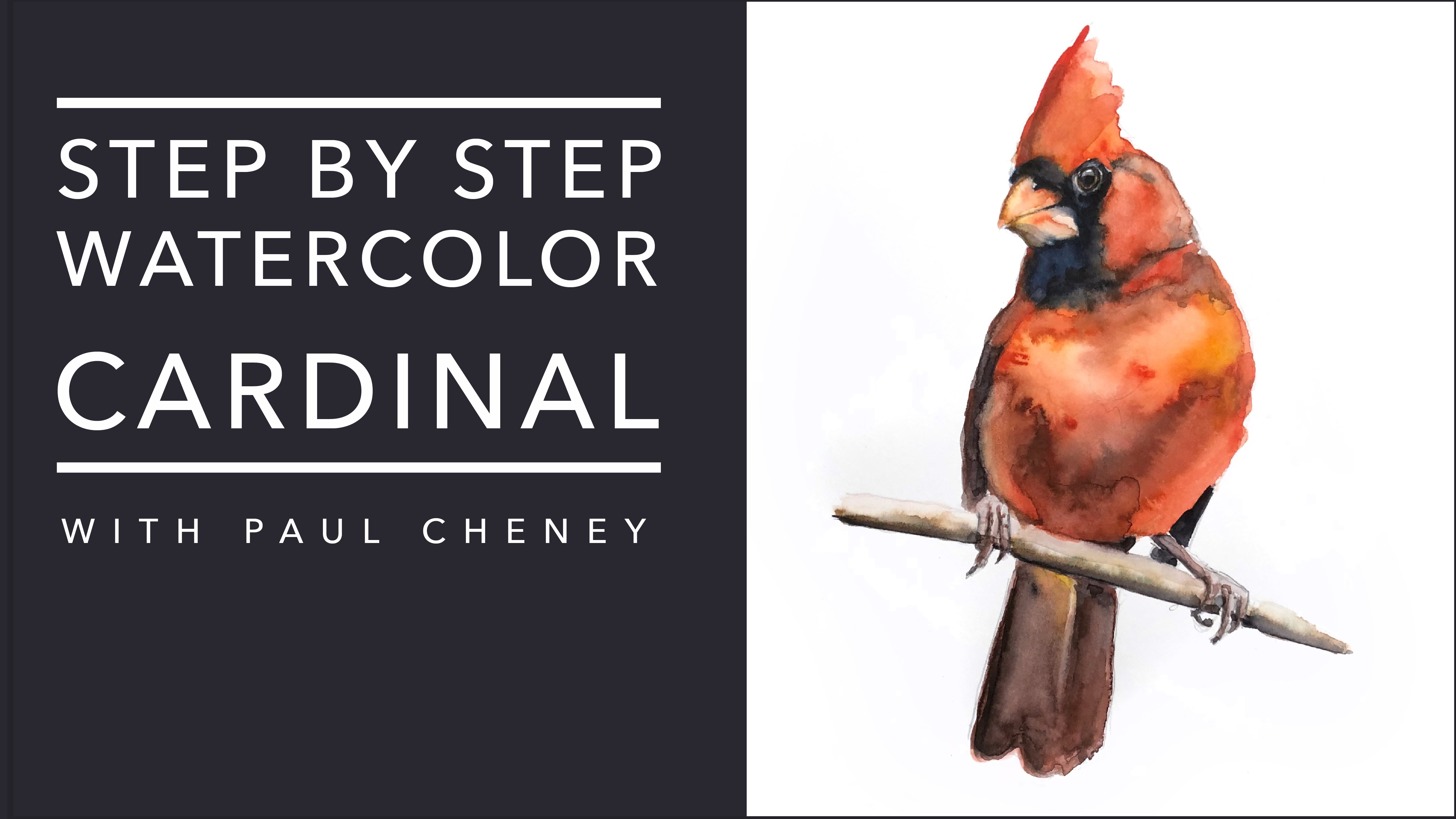
video on how to paint the Cardinal is basically a
lot of the same techniques, different paper
we're using here. And we're trying to get
a bit more hard edges versus more soft edges. Now. We need a bit more
shadowy area up here. And the reason we have
those different edges like that is so that it
gives you that, that's what gives it that
kind of sketchy kinda look. A bit more definition to
this I here showing he's got some shadow light gives it more depth in there
and gets more, um, what would you call
that more character? I guess a more yeah. A little bit collarbone
here, so it's not all white. Now, on that note you could add like lots of colors in here. You could add some
pink because it is, in reality there is
a lot of color in these bears that's
being reflected off of the environment around them and different
things like that. There's also more subtle,
like in, you know, e.g. in here they're
probably more muscle, it'd be more different
shapes like that. We're keeping this pretty
simple, but if you wanted to, if you want to add
more by all means, you can make this sum. You can take this shape
that I've given you, the outline and you
could go to town on it. I would love to have
saw them in real life when I was there this summer,
up there this summer. But I didn't I'm
just going around. I'm just adding in
some more definition separating some of these areas. And a lot of what
I've got on here is just kinda leftover
paint like that. I'm scrubbing on a bit in a bit more scraggly
bits in here. Now you'll notice on our nose, there are no highlights in here. I think it's dry enough.
We're not still a bit damp. We can do that after
the next bit there. And I think we're probably will go out at the over
at the end a bit more, but I think we're
probably pretty close to being finished with. The bear will go out at the end and we'll do some touch
ups and some things to sort of bring out
a bit more character. I think this area over here, this white dot is a
bit too pronounced, so I'm just basically
very lightly gone over and scrubs and paint around it. Okay. Alright, so now starting to look like a bear, I
don't know about that. I in there, I might just paint over it and add a dot later on, but we'll leave that to the n. So for now I think we're okay. We're going to let this dry
and then we're going to paint some background around our beer.
7. Background top half: One of the reasons why put it background on this
in the first place. So it's okay to leave a
little bit of space around. Don't leave a giant space,
or it's going to look funny. There's probably
a bit too much of my original painting
along this side here. If you want it to. Now, you can lightly erase
your pencil line here. The reason why I say that
is that if once you get the pencil wet and
you let it dry, well then it's no
longer water-soluble. So if you've got any
really dark areas, they're just very I'm not
pressing hard on the paper. I'm just very lightly
going over top. I'm just too. Make sure that I don't have a whole bunch of
early pencil lines. Not that I actually kinda like pencil lines left
in the painting, but I've had customers asked me, Aren't you going to
erase the pencil? That's customer
voice by the way. If you're a customer,
that's how you talk. Or if you're a woman customer or two going to
erase the pencil. That's how my mom That's
my mom voice actually, that's how my mom talks. Okay. Okay. So I would lightly erase it. I'm not worried so much
about this one here because that is a
darker area in there. So why don't we start with that. That is burnt sienna
or dirt or land, kind of out-of-focus
land in the background. I prefer it to be out
of focus because then I don't have to put details. So I mixed together a
little bit of burnt. I'm Daniel Smith. Burnt sienna is a
little bit ready. It doesn't really
look all that like burnt sienna or like how
I like burns Hannah look. So I've mixed a little
bit of burnt umber, so it just looks a
little bit more brown. That is why. Forgive me for that. I mean, a bit quicker
because I don't want a big hard line on this. So I've wet my brush and
I've gone in and diluted it. One of the more important
things to do is you want to keep this as straight
as possible. The earth doesn't curve. Well, it does. It is round and not
the bidding that, okay, So anyway,
what was I saying? Yeah, So now I'm diluting
some of my blue here. And really light wash
is when a mix that in, pick up some of the brown. And I'm just using now
pretty much clean water because I'm going to
allow that pigment to bleed up in there. These, this is my sky. We'll call this our sky blue. Now, this is a lot darker
than our original painting, so I'm adding in
some or water there. Okay, so we'll do the
same thing on this side. Now we've got our paint, will take our darker color paint and we'll
add it in there. Now we've got just clean water
and we're picking it up. And we're bringing it
over as close to but not exactly on top of our bear. We can get, depending
on your mixture, your sky might look a
little bit different. We want to kinda diluted. We don't want it to
be all about the sky. We want to focus on the bear, whoops, wrong color,
ground sky Brown's guy. Okay. So I'm just going around here. You didn't see I'll
lose some hold on, barely holding onto
the brush at all. Is this a very loose
part of the process? You can now add in some
other colors if you want. So I'm grabbing some. But it is pinky color. Just give the sky a
little bit more texture. You don't have to do this. I just thought it
would be fun. Fun. And what other colors
can be added in there? Have you been a yellow? So just because
our bears yellow, it's good to keep like
to tie in. Sometimes. Like you'll notice that here in the water there are
some yellow there. There's actually
not yellow water. That's more just to tie it in with the colors of the bear. Keep the painting harmonious. Like to call it. Remembering that in a little
closer, little bit closer. There we go. Okay. Alright, so there's our sky. I actually kind of like this
guy a little bit better.
8. Background bottom: Alright, now let's
get onto the water. So for the water, lots of did not want to go. So I'll clean off this
part of my palette here. Give me some new.
Grabbed the wrong blue. We don't want that. We don't
want this bright blue. We want a nice light. We're going to start with
lots and lots of water here. And I just lit, I'm picking up the water
and I'm going along. I want to touch
that edge so that it bleeds in a bit there. That comes down that was
a little on the dry side, but it's still
bleeding in so that's a reflection in the water there. Water. It's not going to look like in our painting anyways. It doesn't look overly. Oops, I went a little
bit on the bear there. I mean, actually
trying to have that up above I can because I want
to keep the leg white. We don't want to keep
it like, you know, we're not painting
individual waves or anything like that. Were more focusing on just colors and an abstract
he kinda background. Once we get this all on
and nice, big, even wash. And you'll notice I'm using
a larger brush for this too, because it holds more water, more more paint and allows you to carry it through
more and it will look a lot less streaky if you can if you have one
of those and do that, leave the rocks for now. We're not going to bother
so much with the rocks were just focusing on this because we want to do
this all in one go. So this, we want
this to be nice and wet so that we can
add in some of the other colors that we had. Where's our we had in our group? We did not have that much ochre. There we go. I accidentally had too much yellow
ocher on my brush there. And I just grabbed a
bunch of water to fix it. I get a bit more
darker blue there. A few darker spots and crazy. This is a ton of water. Very loose and not something you definitely don't
want to be overthinking. I have some green in
there. I don't know why. So I'm just going to mix
in some yellow cadmium yellow medium with my blue. And just for the sake
of making the painting look as close to the
other one as possible. Probably because the water is actually especially
in the Pacific, it's very grainy. So this area here where the
Spirit bears live is way up. I can't remember the
name of the island. I probably shouldn't
tell you anyways because they do try to keep these bears safe. But it's very as far up past Vancouver Island in
British Columbia, in an area that has
become known as the Great Bear Rainforest. I just picked up some of these colors and I'm
just bringing them into current or hormone
naught and Harmonia lies. Thanks. Oh, we can't forget. In here underneath our
beer big triangular spot there where we've got some water showing
through in the background. Oops. We don't want
it on his leg. Get out wrong way, wrong way. Boop, boop. Okay. It's very important
that you make all those noises to all your painting. It really helps bring
things together. Okay. So you might want to watch
that a few times more. So just because it's
all done kind of in one big chunk, right? So it's really a not that
stressful or difficult. Doesn't try and get
some of this bears leg there too late. I'll
scrub it out later. Yeah. It's not that it's difficult. It's just that it's done
kind of in wet on wet. And while the paint
is wet, if you're in a really warm area, warm place, it might dry, it might, it might not work
that well for you. So next we're going to
focus on the rocks. Then we're going to
come back to our bear. I think I've got a
few areas here sorry before let me just correct
that. Well, it's still wet. It will blend together. Yeah. They're going to come
back to our bear. We're going to look at, okay, what can we touch
up on the bear? We need a bit more
detail in here. This area here,
this is just a big, solid white area
that I don't like. I like a little bit more color variation in the back here. It's gonna blend. It's
a bit too much gray and not enough warmth
to tie it all in. And yeah, I think
that's pretty much it. And then I think we sign
our name and we're done. We'll do probably two
layers on the rocks, but that'll be quick,
kinda like the background. We don't want to get
too detailed in there, but we do want to
make sure we've got some shadows and stuff in there. His feet are kinda behind
these rocks here are her feet. So just to be aware of that. Okay.
9. Rocks: While to dry if you used as much water as I
did see in here, there's blossoming area here
that's from a lot of water. My water backgrounds
a little bit paler, but I think it looks fine. I'm happy enough with it
when I would maybe do, but I'm not going
to bother is put a little bit more
separation in here. Maybe we can, we'll
see how it goes. Maybe we could use
some indigo or something like that and
put it in some separation here and then just
draw that down to make more of a reflection on
the water if we wanted to. Now we're going to
focus on the rock. So for the rocks, the rocks are kind of a bluey gray color. But again, use
what you have job. Don't worry about it so much. Just very simply. Very light washes on the rocks. Don't worry so much
about what they are. You know, whichever we just
more about using them as a separation tool
from the background. And you can add in
some colors there. Remember, we're
keeping it harmonious. What else can you tell
me about the rocks? Rocks. They'll have light areas, dark areas where
they meet the water. In particular, it will
be darker underneath, like where our
bear paws are not. There's gonna be some shadow
areas in there that we want to pay a fair bit of
attention to will do that. Now I'm grabbing my
smaller brush and I'm just painting these claws. I want to be careful
here not to let these hard lines draw
too much and see, you know, in the
shot shadows or not. You know, unless
it's bright sun, It's not only, it's not
really a hard line. I will have a shadow from
that other rock down here. There's pause there. And then of course we're
going to have different, you know, different
rocks, different shapes. And then where there are
rocks meet the water again. We're going to have
different icon. I like how this one is. Quite often you do a painting
and then the second time, you know, it turns out
better than the first time. So I'm just adding some, not a lot of water on this. I want to keep this, you know, indefinite edge here
where the line is. Having lots of paint. It's kinda sketchy. Um, so yeah, it looks fair bit different
than the first ones, but I kind of like
this one better. I'm looks a bit more like rocks are mirror here has a bit more detail,
so that's okay. We want to paint that
in the PAR bit rounder. Get some clean water, soften that edge up. Again, just some clean water
down here. Soften this up. I'm going to just add in a
bit too much blue there. A bit of blue. Okay, so that's already dried
of that hard edge there. Now I'm trying to
add some painting, not crazy about that, but it is what it is. We just rub it a little bit. It should pick up, bleed
down. There we go. Okay. We've got some rocks, rock on. While we're here, we
can add in a little bit of color to the paws here. Like we said, we were
gonna do earlier. Warmer a little
there a little bit. Just trying to fill in a few of those white areas
with some warmer, very, very light colors. Once this is dry, or we could probably do it now we
could really come in and tighten up these
claws here a bit. Make them a bit more
detailed and defined. Make a bit more shape to it, gives it a bit more sort of a blend of like
abstract and reality. If it's too abstract,
it doesn't look right. If it's too real, it doesn't look right either. So we don't need to
worry too much about it. I just want a nice, easy. Now I use different colors
in my rocks the first time, but you can by all
means go ahead. It doesn't matter. I more or less just want them to look like rocks or ground of some kind
that he's standing on. You could put some green in there if you wanted to
add like, you know, some kind of impression of
vegetation. But again, no. Not overly necessary. We didn't go over top
of that hard line with new paint and make
it blend a bit more. What's underneath? We don't need to. Okay. Alright. We're going
to let that dry. I'm going to come
back and we're going to review our painting. Go over, make a few touch ups.
10. Finishing Touches: Hey, welcome back. So our rocks have dried. I'm pretty happy with the rocks. I'm not too worried about them. I do think I have too
many claws on my bear. I just noticed that now so we could fix that by
pushing some of that up. I really wouldn't worry
about it too much. But if we want to be
sticklers, will be sticklers. One thing I noticed in the
original painting and I like, is I like the warmer color
of the burnt sienna. And so I'm gonna just make some diluted burnt
sienna and hopefully I don't do anything terrible here. And I'm just going over some of these areas in here. With that. I think I need now to put some open up that can
of worms and now, Yeah, So as I promised
this section here, we're just going
through and we are going over some
of the details in the painting and even
some final touches. So as I said, I just warm
that painting up with a little bit of
burnt sienna there. I don't want, I don't want
to be a big solid thing. So I added in some water there. Okay, now to tie that in a bit, I'm going to bring
a bit of that paint back here somewhere again, warming up painting and tie in some of the colors there. One other thing that I
noticed was we just did this, didn't seem to find enough. This section up here, you know, separating that
kinda round big ball of fur apart. The lumbering shapes there. And a little bit of
warmth over here. And that's somewhat pencil in there, that doesn't come out. Then I'm going to try
and lift it out with water. It's not coming out. So I mean, I just
got some clean water and I'm just here we go. Watered OK. Background. Came forward a little
bit there too. So I left that out if I can. That's okay. It kind of gives a bit
of shape to the bear. I'm going to put a little bit of a light wash over top here, like right at the water's edge. Here. Again, I'm just grabbing some paint and very lightly gone just to make our and this is almost like a not what I want to keep
that hard edge. It gives like a little
bit of reflection. Didn't do that in the first one. But I kinda like it in this one. I will do the same down here. So I'm kinda like
it's dry ish, right? It gives a little bit
the impression of some waves maybe, you know. Okay. And we'll separation
or oil or sugar and water. So again, I'm taking this is just some and
neutral tint there. That ended just divide that little section
up a bit there. I'm Mike. Little bit in there. Okay. And I say we are done. So couple of things. Hopefully you've
watched the video. And a couple of times
before he started painting, you will probably find that, um, you know, you'll, you'll, it'll be a lot easier going through after
you've seen it already. If you haven't and
you're frustrated with it or if something
didn't work out, I will be monitoring this
class quite regularly. I've already started
on my next video. So please by all means, reach out and ask me, I am more than happy to
answer any of your questions. I don't I have no
problem doing that. I'd rather see you
succeeded this, succeed at this, and enjoy it. I'm talking as I'm
still painting here, I am probably like I always
tell people leave alone, stop painting, but I am just as guilty of
that as everybody else. I keep seeing things
that I want to change. I need some more shadow here. Again, right here, see
there's war anymore shadow, like this area under here. It needs to be
defined a bit more. You can. It's always good to stop. And step back and look and say, Hey, what's going on here was
what bugging me about this? What kind of what don't I like about this pain or something
in there that just doesn't look right and just step back and take a look at it or walk away from it and come back. But usually just stepping
back and looking, you'll see all I
needed more shadow. There wasn't enough
separation from the head. There is a problem right there. Okay. I'm going to add a bit more, so I should really stop. But it's funny when you
like doing something, it's easy to keep doing it. I'm just adding some more, maybe a bit more muscles
in there and whatnot. Okay. So hopefully you're bear. It looks like a bear. And if at first, you know, don't feel like, you know, okay, I tried and
it didn't work. This is, watercolor is not, not the easiest thing to learn. I've been doing it
for over a decade now and I still struggle with
certain things and I still, you know, someone gives me a painting or they asked
me to do a painting. I still get nervous about it. I still get worried about it. It's a practicing, anyone
can learn how to do. That's the most
important thing to remember is that this
is something that you will definitely get better
at them already practicing. So by all means,
keep practicing. Keep monk and about. And you'll get there. Oh, the eyes, my
eyes worked out fine with leaving the little what you might call it,
the little circle there. I had gone around and added
a bit more dark paint there. But here's the gel pen
on a dark spot and you can see how that comes up. I'll make it a little
bit larger there. So if I wanted to have an eyeball reflection or
something or a highlight, It's just sort of,
it's almost 100, say about 80% of pay. It actually works quite well. So this is a Jelly Roll pen
by them in any craft store, you could also use
white gouache, which I know I have a tube
around here somewhere. It is in my other video that I posted the same tube
that I've had forever. Just any white gouache will
do as long as it's opaque. You can use, basically you can use white acrylic
paint if you want. And that's probably even easier. And it's probably more opaque. Just use a dab, a tiny dab of white
acrylic paint if you have it, or
white house paint, drywall or anything like that will work for
those kind of things. So yeah. This stage
you can go through, you can take it any pencil
lines that you don't like. And if you're using
a water-soluble pencil and they don't come out, you can wash them
out with water. Again. Let me know what you think. Please post your copy
your videos online. I'd love to see what
you paint. This one. In particular, I quite like
this painting and having just gone on a
little adventure of Nordstroms to see what
other interpret them.
 Paul Cheney, Teaching watercolour and digital painting