Transcripts
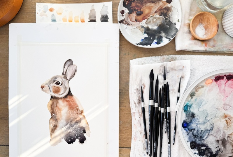
1. Introduction: Hello everyone. Welcome.
My name is Paul. I've been a watercolor painter
for over ten years now. Today I'm going to teach you
how to paint this rabbit. And just like an all
my other classes, you do not need to
know how to draw. I provided you with a
simple outline that you can hold up to your
window and simply trace your drawing onto
your watercolor paper if you prefer to practice
your drawing skills. I have also provided you with
a guide that you can use to draw your painting onto
your watercolor paper. This is a simple type
of site size drawing. There are also detailed
instructions on how to use this method
available for you to download. And of course, you will need a reference photo to paint from. For this, I've included a
high resolution image for you to download as a special bonus. I have also included a high resolution image
of my finished painting. Please do not reproduce this for any other purpose
than this video. This is for you to study and help you master this painting. All of these resources
can be found under the Class Projects
and Resources tab. Our lesson today is broken up into sections
as it always is. We start off with the
materials we talk about, the paints that we use. I'll show you my palette. Different materials like that. By all means, use what you have. Don't feel the need
to run out and buy everything that I
use in my video, chances are you've already
got what you need. I would recommend as I did
in the materials section, that you use hot press paper
for some of the techniques, it makes it a lot easier. We'll move on. We'll
start at the bottom here, and then we'll move on
our way up to the head. We'll do some interesting
techniques to overlap. The firm will move up to the
ears and then onto the eyes and finish off with
some finishing touches. I hope you enjoy it. Happy painting.
2. Preparing to paint: One of the first
steps that we have to do when we're making
a painting is, I like to call it
preparing the painting. So for me, what that means is identifying where the
light values are, where the dark values are. Having a good outline drawing
or sketch of the painting, securing my paper
down to a board, getting everything ready
so that when I pick up a brush loaded with
paint and lots of water, I'm ready to start at it so that I'm ready to go without thinking
too much about it. What happens when
you're painting in this style that I
like to paint in is, you know, it happens
pretty quick. So if the room is
warm, if, you know, depending on the time of year where you are, where
you're painting. The painting, you
drive pretty fast. More often than not when
you're using a ton of water, like we're probably
using this painting. It's not so bad, but certain areas
where you're trying, you do have more control or whichever you're going to find. Oh darn, my painting
is drying too quick, so I I want to make sure that I get everything
down at certain times. In certain ways. Certain parts of the
painting are going to be areas where he'd say, Hey, I need to have a lot of water in that area,
or maybe this area here. I want to have more
control and then I want to have less water blowing things around
a whole bunch. So in those areas,
I didn't want to know when I'm putting
my paint down and so I don't want to be trying
to figure out where everything goes and where what color goes and
what I want where. The more fluid you apply the paint and
the more fluidly you paint than the more fluid and loose your painting
is going to appear. So what I'm doing right now
is I'm going around and I am defining my sketch,
just finishing it off. I've got a basic outline here. And I'm saying, Okay,
where am I going to put what I like to go through
and say, okay, e.g. in this area here It's like a very brownie kind of yellow. And I've got this
dark area up in here. I've got a shadow around here. I've definitely got
a shadow up in here. I'm not pressing hard with
my pencil into the paper. I'm just very lightly, hardly touching it all just so that I can see where
some dark areas are. This is a water-soluble pencil. This one is made by fabric
castle and I'm using right now a six B pencil. So it's pretty dark, right? It's a very soft
pencil and the lead goes down very easily. So shows me exactly. So I'm creating a
roadmap here as to where I'm going to put
everything are poured Bunny, it looks like somebody
took a nipple out of his ear at some point in time. So I have gone and given
him a little surgery there and rounded it up based on what the shape
of this year is up here. Hopefully he appreciates it. And we've got some kind
of shadow down there. That's my shadow around here. And that should be pretty good. Yeah. Okay. The next thing that
we're going to need to do is we're going to need to taper painting down. I'm using frog tape here. The reason I use frog
tape is that it doesn't least amount of damage to
the edges of the paper. When I peel it back. I peel it back along the edge. I don't pull it up
like this and that helps it from tearing
away at the paper. This is an optional stage.
You don't need to do it. If you're gonna use
a lot of water. I do recommend it because
it stops your painting from buckling up
and bubbling lot. If you keep the paper tight
and flat as it's drying, then it will go back
to its original shape. For the most part,
there will still be some wavy bits
here and there. You can reduce those by using a hairdryer and speed
up the drying process. If you like. Sometimes I just leave it, go get
lunch, come back. But in a lot of times, if I want to make a painting, I want to finish a painting, then I will use a
hairdryer to write faster. So I make sure I
use a higher heat setting versus a
higher air siting on a hairdryer to because
I don't want be blowing puddles of water around
and stuff like that. So now I'm pressing down
here on the board part, not on the paper.
That is the area. It will stick really well
to the paper all by itself. Try to keep from pushing too hard into
the paper because you want to be able to
remove it later without doing a whole lot of damage. I'm just a few more
areas here and I'm noticing that this
little V-shape there. And then of course
around the eye, we've got a bit
extra of an area. There we go. Okay. So you have a sketch
and an outline drawing. You can either draw it on
or you can sketch it on. I have, or you can
trace it on. I have. In this instance, my
original painting was drawn. I like drawing it because
it gives it more of a loose feel to it. And I think that helps in
keeping your painting loose. Now, I'm doing what I'm doing it this way
is so that I can try and make my painting look
as much like the original. And then therefore as much like yours can look in the end. So it's easier for you to copy exactly what I'm
doing if you want to do that. If we're both using the same materials and the same things are the
same as much as possible. I hope that makes sense. Okay. I think we're pretty good there. And now I think we can
probably go from here. And the next step we'll do is we'll start putting
on first layer of paint.
3. The materials we will use: Let's talk about the materials that we're going to use today. First off, we've got a palette. This is a ceramic palette. You can use a ceramic
or porcelain. I always recommend
ceramic or porcelain over plastic because
the paint beads up in a plastic palette. You could use a
ceramic dinner plate. You could use a tile, like a ceramic tile or
something like that. You don't need to
run out and get this palette if
you don't want to. The colors that we're
going to use today in our painting here we've
got, what do we got here? We've got some burnt sienna, we've got some neutral tint, we've got burnt umber, we've got cadmium yellow medium. We have a yellow ocher, or you could use a raw
sienna or raw ocher. We've got a pink color
in there that we've mixed to make the
color inside the ears. You could use
quinacridone, magenta, or any one of the quinacridone red colors, they're all fine. Any or any kind of pinky, cool red color will do. And I do believe that is all
for the dark colors there. And you've got a neutral
tint that I use. But you could also
use Payne's gray. You could use indigo. You could, you could mix like a burnt umber and
a blue together. It's better to learn to mix your colors versus
we'll try and run out and buy a tube of paint for every single thing
that you want to do. So I don't obviously have every color under
the rainbow on here, but I have a mixture of warm and cool red, warm and cool yellow, warm and cool blue, and
some browns and some darks. From those I can make just about any color you can imagine. That's a great thing to learn and just a great
thing to practice. And having a nice
big mixing area, you've got a great place
to practice it on. So that's why I like this
palette for that reason you've got a big area
to mix your paint. You've got deep wells. So those are characteristics
that you have. But for now, use
what you've got. Don't run out and buy
something for that. I like showing people what I'm using because people always ask, I use the green tape to tape my paper down to the board
to stop it from buckling. The brand I like to
use is frog tape, because I find it does
the least amount of damage to the edge
of the paper here. My brushes, my brushes
or by Heinz Jordan. So these are the three brushes that we'll use in this painting. This is a synthetic Kolinsky. I like it. It's got a great
show up very well, but it's got a great way
to hold the brush there. It comes to a nice fine point, holds lots of water, which we will be using
in this painting here. And these, again are
by Hinds Jordan. This is called an awaits us 400. That's their series
of this brush. That's all that means. This is the same. You'll see me use this brush in the video. This is also an waste was 400. It just happens to be in
this quill shape here. It was kind of a
little prototype project that we worked on. This, you can see they're,
they're the same. This is, your waist is 400 brush and it's pretty identical. Just a good quality brush. Again, use what you have. Don't feel the need to run
out and buy new stuff. Spray bottle here in case you
see me use it in the video. I use this because I go around
and that's what I used to accurately get water into
all my paints to rewet them. So I'm not spraying it
all over the place. I use a water-soluble
pencil to draw my painting out with it. That way, I don't worry about erasing the lines before
I start painting. I just start painting. I'm very careful not to press
into the paper. If I press into the paper. If you press into your paper, you end up getting this. You'll never get it out whether
you're going to erase it or use water on it,
it doesn't come out. But I really liked the
water-soluble ones. I think these are
the, one of those, the best thing since sliced
bread kind of things. And then if I do make a mistake, I have my kneadable
eraser that I can need into different shapes. I've got a cloth here
to dab my brush on and I'll use another one to
kinda hold in my hand. I often clean off my brush with my fingers and then to my pants. I recommend you don't wear a
nice pants when you paint. If you're gonna do everything exactly the way that I do it. And of course, water,
you need some water. Keep your water
clean, your water is muddy, your paints or muddy? I like my palette to
be clean when I start. I don't like a messy palette
because I like to mix things and I like to use the
colors that I have. Sometimes they're very subtle. So yeah, That's about it. I taped my painting
down onto a board. This is star board
that's called, It's very thick bar, but
you could use a piece of plywood or MDF board. Anything really that's
smooth and flat that you can tape
your paper down to. I prefer using loose
paper because one, it's the cheapest way
to buy your paper. I can make it any size and I can tape it
down, keeps it black. Then when I sell my
paintings are ready to go into a frame as well. And I think that's about it. The brush sizes today, sorry. This is a number 12. This is the number two. And we'll call this one a. It looks to be about
the same number 12. Yeah. So a big brush
in a little brush, little brush for the
details and a big brush for getting washes on. The reason why I'm
using two large brushes here is I don't like using my nicer brushes for pushing and lifting because
it damages the hairs. So if you're wondering
why I've got identical brushes and
sometimes I like to use more than one color at once. Okay, and that's it. Let's start painting.
4. Painting the first layer: Okay, So we're ready
to start painting. We've got our outline down, we've got our paper
taped to the board. We need to use a brush. So today I have
grabbed the brushes. I mentioned in my
materials section, I will probably use more
than one brush at a time. Sometimes I'll use one
just to apply water. Sometimes if I want
to go really quick, I don't want to change
the color on the brush, so we've got a few
fair number of really neat colors that I
want to blend together. So I may use two
brushes to kind of bring the pigments together,
push them together, or touch them together
just so that they bleed the way that I want them to get the effect
that I want to. As I mentioned in the
materials section, we are using hot
press paper today. So that allows us to push and pull the pigment that gives
us a lot more leeway. It allows us to be more
abstract and it gives us, it gives us an effect
that I really like. It's developed into my
own personal style. A lot of water on
hot press paper. Yeah, and I hope that you like
it and can learn from it. So let's get started. So we're going to start, I think by certain this
little triangle section here, I want to establish that color because it's a standalone color. And I'm going to take some of my Daniel Smith
burnt sienna here, which they're burnt
sienna tends to be a wet, my pigments a bit
more dry in here, they're burnt sienna
tends to be a bit more on the ready side. So that I am going
to mix it with some burnt umber so that
it's not too ready. Again with lots of water there. Okay. Now, applying the paint, just put it on. Don't know. You don't want to be like this, just very loose this stage we're just kinda establishing
some very basic shapes. I'm going to save some
room along this edge here for a lighter color that
we will put on later, and I'll explain
that a bit later. We come around in here, it starts to get a bit more brown. So I'm gonna go back
to my burnt umber. I'm going to use a bit of sienna there and mix these
two colors in. I'm gonna come down
here with that color. And it wraps around a bit. And then he's got
some lighter colors that come over here. So for the lighter colors, I can use just my brush, I can just use water and let
that kinda pulling down. They're a bit, I
want to avoid too many hard edges on here. Darken some of the
water off my brush. I'm going to darken
this up a bit up here. I'm going to grab smarter
the burnt sienna color and get it going down here
so that, that blends in. Okay, now, if we look here, we've got some yellowy color in there and we've got our
darker color down here, and we've got some
more yellow down here. We also, we can use our reference picture and go spot onto the
reference picture. But we can also use general
rules of composition. Think about how things are
going to draw the eye, where the eye is going
to be drawn and whatnot. So we can look to bring
down here and grab some of this yellow color and keep the i kinda
going over this way. Now you see how that's what I was talking
about, the pigments, how they were wet and
they run into each other. That's a really nice effect
that I want to keep. Okay. Some lighter areas are and
don't be afraid to leave a little white spots on
your painting as well. That always looks nice. Okay, now we've got
some neutral tint here. And I'm just going
to bring that in. I'm going to mix in some of
the burnt umber and sepia just to keep the
colors harmonious and bring some of
that down here. I don't want really dry streaks. I want lots of paint and water. Neutral tint is going to
darken it up a bit if I really wanted to go
crazy on the dark, because I've got it up here. I'll pull some up here. Kinda has a little bit
darker down the middle here. Now other brush,
the yellowy color, bringing these in together. Now I want them to touch their
nose and mixing together. Grabbed the brown color. I know I'm going
kind of quick here. So you should, you know, this is why I recommend
watching the video a couple of times before so you can get a feeling of
what's happening here and what we're doing. I am calling out the colors
as I'm picking them up. And it's going to take you,
you know, don't be alarmed, but it will take you a little
bit of practice to get used to putting them in, keeping the colors a
bit more harmonious. I'm going to try and in
this one I'm going to try and bring some of these
colors together here. Our drawing. Okay, Awesome. Our water in here give some
more interesting effects. I'm going to leave this area as I want it to be more yellow. And then in my original I want
to see a bit more yellow. So this is a synthetic brush. So you'll see here
what I'm doing to get. To clean that area out. I'm pushing which is
also called lifting. And I'm wearing come
over later and go back over top of that with
some other colors. We can do the same
thing in here. We've got this
light area in here. We're not gonna put
any paint in there. We're going to move up to
this dark area up here. And then after
we're going to push this dark line there will
accentuate that a bit more. We're going to push
this dark line down. And that will make it give
the impression that the, for which it is,
It's coming over. Okay, So if you
look at the head, the four is coming over
top of that dark area. So by doing this, you'll see when we
do the next step. By doing that, how
it comes together. I do that a lot with dog
paintings and other paintings. Again, one of the beauties of hot press paper really
allows us to do that. Mimicking our original
painting there. So this area in here starting
to get a little bit pale. Okay, but that's okay. I think what we'll
do is we'll address that after and we'll
put on another coat of paint because right now as the because we've got
so much water on here, what's happening is it's
starting to bubble. So you can see that's
giving us this line down here because basically
there's a hill here and the water is, the pigments are rolling down that hill and it's happening
over here as well. So what happens with a lot
of people at this stage is, is they, oh no, I don't
want that to happen. So don't worry about it. So again, one of the
beauties of using hot press paper is that we
can just leave it alone. We can always add in
some more pigment later once it's dry and
going back to being flat, we can push and we can pull, we can pretty much make
it look exactly like the reference picture
in our painting. I'm just going to lift
a bit of this up. The same thing with
this area in here. So what we're gonna
do up here again is we're going to be
pushing down on here. So right now you see there's
a hard line up here. It won't be one, we're done. So we're going to take a
bit of that pigment out, but we want enough
there that when we put the next layer on which
essentially is just gonna be a very light color paint
that we have in the cheeks. And that's going to
we're just going to push that down and we're going to fill in
this white gap in there, which you'll see the
gap in a second. Okay? So now, depending on how
comfortable you are, you know, you can skip ahead
before letting us dry and paint up here. Of course, the obvious
danger is putting your hand in the wet
paint down here. If you're like me, you end up coming around like
this and doing this. Or you can just let
this dry and move on to the head next and do
it in a separate stage. It's up to you
completely that we will do it in the next video, we're going to move
on to the head. So if you want to jump
ahead and no pun intended, if you want to jump
ahead, you can. But I do want you to focus on though is I want
you to leave like this area along here because we're going to
fill that in later. And especially these
areas in here, we're going to leave
those into those after.
5. Painting the second layer: Welcome back. So let's take a look
at our painting here, how it's derived so far. We've got some really
neat edges and shapes and patterns here that are great. Bit too light in this area. She probably want to fix this area down
here and this is a bit too distinct where I had
a big puddle of water there. But not to worry, It's
going to be fine. I think this actually is a bit too light for
what we wanna do, but we'll leave it for now
and see if it doesn't work. There's a couple of ways
we can go about that. One of the things that Let's take a look
at it, this stage. First of all, what
direction does the forgo in and how is our paint
applied on the paper, right? So our paint is blotches or
rabbit is blotches of paint. The real one is layers
of very fine for unless we are painting like
really super detailed, maybe with oil or
something else like that. We're not going to get those
little and I don't want to, I want to keep it
at more abstract. That's kinda the
style I'm going for. But at the same time it is
important to pick up on where does everything lie and how does it all come
together? So e.g. here are firm needs
to come this way, especially this area right here. It almost looks like the
bottom part of the fur is coming up and over with
this splotch right here. So how do we fix that? One of the nice things
about hot press paper is we can push our pigments and
give that impression. So see what I'm doing here is
I'm pushing my paint down. And now all of a sudden
my first going in the opposite direction. Like so. Okay, so now one thing to be aware of
when we're doing this, it's all fine and dandy. However, we now with this dries, we're gonna get that little
shape there so it takes some clean water
and rub that down. Okay. And I think for now we'll just fix this here
because it's bugging me. That line out. I'm pushing down with my brush. I'm just taking away some
of these harder edges that I don't want in some areas, it's fine to leave
them and others. I'm going to make
this a bit more soft. Okay, now we will add some more pigment later down here and darken
this up a bit. Now let's move on
up to the head. So our bunny in that
area is kind of agree. Let's try and use the
same color all the time. A gray brownie color. Okay, So I think that's
probably pretty good, maybe a bit more yellow in their immediate
cadmium yellow medium. There we go. Now we're starting to
get where we want to be. So we're going to keep
in mind we've got a darker shaping here and we've got a very pale fur around here. It warms up in this area, it warms up in this area
and it's very warm up here. So for now, let's
just get our paint on our bunny and go from there. We're going to try
and watch over this white area down here. We need to make
sure we leave that. So we're gonna come up
here and this area. And it will come up here. And this area to see how we're going around
the eye and leaving that, we're going to
leave that for now. So think of this as a base layer that we're putting down here. We're leaving some areas there. Let's think a bit too hard. I'm going to warm
this up a little bit. Or this area up here actually
all the more orangey color. There we go. Okay, so now we've got our
warmer color up there. So I'm trying to
keep my hand out of the way so you can
see what I'm doing. Warm up down here a bit. Okay, so what about
those darker spots? What do we do about those? How do we address that? First, I'm going
to use some water, clean water there just to let
that bleed down here a bit. We can do the same up here. What are the big
blob of water there? To lighten that down? Just want to make sure that the areas that I'm getting too. Okay, and let's scrub
or darker paint here. Oops, that's quite a bit darker, but it will dry lighter
so not to worry. And follow those shapes
around that we had that kind of triangle shape up here. We had this shape there. I think it went up
at too high here, so I'll push that down. Here we go. Don't worry, doesn't need to be a trial and meetings actually, some of these more
abstract shapes actually make it look better. We'll leave this area
down here until after, and you'll see why. For now we'll just get a dark
areas where we need them. So the area around
the eye relieving or just putting
the darker colors where they appear to be. Handling the area up
around the ear here. And this is some burnt umber. Might have been better to
do this one. It's dry. But that's okay. Just because see how it's
bleeding down in here. And in our picture. It's more of a defined shape. So we can probably pull that out later or we can do it now. It's also lighter over here. So here what I'm saying
and see what I'm doing. And you'll notice what I'm
doing essentially is I'm looking for light
areas and dark areas. Those values is what
they're called, are essentially what
give the rabbit it's shaped brown shapes and where
the body comes out here. So we do need to put some
more dark down here. We want to bring that out a bit. These shapes, I'm sorry, the different colors
and values are what are doing that
it's a bit more burnt umber on my brush
over here and I'm just bringing it
around onto this side. Here. It's kind of more
gray than that. Will push some gray paint up in there with
our neutral tint. And now let's clean
off my brush, a little water off
there, and we'll break that hard line there. And we'll use it to bleed
these two together. Comes down here. Let me push this
up this way a bit. Alright. Now, so we can probably put
a bit more dark up here. And you know, you're painting
is going to look different. It may very well look better. You may like it better,
you might like it worse. But the reason being is because of the style of painting
that we're doing, it is near impossible to make everything
exactly the same. This is more about how to put the paint on versus
like duplicating it. Exactly. But using these techniques, you can do what you like to. You can do a lot to make
it as close as possible. Because again, we're
using hot press paper and allows us to push
our pigments around a lot more than you would be with cold press paper
or a rough paper. We've got a bit more brown Ian, ready colors up in our original, in my original
painting up in here. So I'll just dab those in. Now and I get that. I quite liked the
reddish color in there, the burnt sienna. So we talked, we said we'll put some darker paint up here. And we're gonna do that now. I'm just gonna bring his
right up in here and then I'll pull it back down
with some neutral tint. A whole bunch, just
want a little bit. I'm using less water here
because they don't want it to run bleed off like it
did the last time. I kinda comes up there a bit. But we also don't
want a solid line, like we don't want this to dry and that will draw
like a hard line. So just kind of dabbing along the bottom here with some
clean water right on the edge trying not to take away too much from the part here in
the center, right? I don't want to I just
don't want to end up with the same exact result
that had last time, which was to light. I'll bring some of this down. And I could bring in some
harmony in her. Hey, there. So by harmony, I mean, you know, taking some of these colors and bleeding them around
the painting a bit. Blending and peer
with some water. Try to avoid the paint drying with these
super hard lines. More neutral tint. This just wants to
keep drawing light. Again. It's round in the papers bubbling up like
it did last time. So in that case, we
may have to come back and do a little bit later. Okay, for now, let's just bring this
up a little bit more. So we've got some
harder lines down here. Soften those up a bit. Don't have to do
that if you like. The hard lines by
all means leave them some Lost and Found edges. That's essentially what
makes a watercolor painting. I mean, try think. I don't think it's too wet
that I should be able to put some darker paint up in. They're not gonna give
me the effect that I want because it is a
bit on a damp side. I grabbed some sepia and
some of the neutral tint. Really darken this up
a bit here because it really dried really
like last time. So we'll just bring it up. I don't want a lot
of hard edges. So I'm going to
soften them down. Again. When we pushed our fur down. Using my brush like a mop here, it's pulling some
of that paint up, trying to give this
round shape here. It might have to
wait until it's dry.
6. Continuing with the second layer: I'm just putting some
colors in where I see them on the reference picture
and the drier areas now, a little pushing or pulling. This more sheep in there. I do have a darker area up in
there that I will address. Now, it looks pretty funny with these white areas in there, but don't worry, we are
going to address that. All will be revealed. You see how I'm
holding my brush here? So this is like I'm
really not gripping it. Using my brush as a tool to push little bits of
pigment around the paper. And really try to
keep that in mind with everything that you're
doing when you're painting. Understanding how paint is made and how it and what's
in it was really, I found that one of
the best lessons that I ever learned in painting, and I am going to teach a
class on how to make paint. If you want to make
your own paint. But mostly so that you can understand what's in
it and how it works. So that really makes, when
you're doing stuff like this, it makes more sense. And you're not just
trying to copy. Like, you know, you're
not finding yourself doing this because
I'm doing this, you end up doing it because
it just kinda make sense. I kind of did it because I wanted you to be able to
see what I was doing. And yeah, so I've grabbed
some lighter yellow now. I'm just going to bring it back down along this edge here. So I want to warm that up a bit. I'm not gonna do anything
to it because I'm going to fix it after if if now I try to bleed
these in too much, I'm going to lose
the vibrance of the yellow and the warmth of it. Maybe the same thing over here. Pushing it in. All right. I like that yellow. Okay. Let's let our bunny be for now. Very difficult lesson. I struggle with. It's
still to this day. You'll probably see
me at the end of this painting still going out, it's still pushing,
still pulling, whichever it's a, you
know, when to stop. That's one of those
lessons there. You want to know
when to hold them, know when to fold
them kind of thing. Yeah, so how the paint dries is what makes
watercolor painting. So if you don't stop
at the right time, it's going to not dry that way. So these areas in here, I think I predict
they're going to make some really nice cool
shapes and patterns. I quite like it actually I even like it more than
the original one. So exciting. That's always a good
thing. We'll probably do. Another layer on the head
up here and the ears. Next. We may tackled
these white areas. We'll see how it.
7. Painting the third layer: Welcome back. So let's take a look
at our painting and see how it's dried here. Again, you're just going
to look quite different. So keep in mind, you're looking where I'm
showing you mine and on yours. Hopefully you can pick
up some of the things that I'm saying and we'll
apply them to your painting. So this blossom, cauliflower, whatever you wanna
call it right here, is working against what we want. I mean, if it was just over this way a little bit,
it would be fine. Um, this dark area up in here, we put it on when it was
wet, if you remember. And so it's very muted. There's no definition
of there and actually bled up
here making the top a bit darker than we want. That's kinda highlight area. What else do we got
going on down here? This doesn't look the
same as the original, but I like it, so I don t think I'm going to change
anything on the body. I kinda like that.
What I might do is this yellow line down here
is a bit just straight and so I will probably push and pull
some of that in a bit. Yeah, so for now, we're just starting this
white area right here. We look at our reference photo. This is kind of a
brown color and then it gets white
as it comes up under here on our original
painting, it kinda does that. So how are we going
to paint that in? Well, we're not going
to paint that in. What we're gonna do
is we're going to use this pigment down here. And by pushing into it with wet water and keeping this area, the white area wet. We're going to pull some
of that pigment back, hopefully, hopefully just the right amount to give us
the effect that we want. We can always mop,
sum up as we go. And ideally we get this
right in the first go because we don't want this
to end up like really muddy. It did end up almost too muddy
in our original painting, but we want to keep this just, you know, it's an
off-white color. It's, uh, it's certainly
not white the way it is right now
and it's certainly not a hard line like that. So I've got some water on
my brush, not too much. You can see some
of it coming off my fingertip is not
making puddles. And I'm going to come
across again, sorry, I'm using my opposite hand
here and I'm going to push down into this. So this does two things. One is bringing up the
paint that we want here. And it also What's our fur in the right direction and gives us the
impression that are for is causing a shadow
underneath the neck as it is on the original
painting or sorry, on our reference
picture, I guess. And on the original painting. Okay, so now it's
lighter up here, so I'm being more cautious
with my water there and and pain and
making sure that it doesn't get too dark
and muddy there. I'll get those areas that are there to try and bring some of this pigment that's
up here just to try and make this a bit more
of a gradation there, because it is, is more like
this color here, down here. It's okay though
if it doesn't if the rabbit word it's turned directions even ever,
ever so slightly. When when I took the picture. Then I'm just going to grab some pigment up here
and put this in. Then it would change
how the rabbit looks. So we've achieved
our goal there. I don't want to mess
about with it too much. You can see in here how this dark area here is
now cost of shadow there. Okay, So we'll leave that alone. I put this on
pigment in on there, but because I pushed see some of the sizing I picked up an
immediate to be granular, so I don't wanna do that again. Let's move on to the ear. Actually, before we
go into the ears, Let's look at this area
around the eye because we've got the same thing
going on here. Okay, So we've got
this off-white color here and R for is coming down into like our lighter fur is
coming down over top there. One thing I want to point out and keep in mind is
this is a synthetic brush. So that is important because
real hair brush would be destroyed within
minutes of doing this, the hairs are really fine. Even if it's a
high-quality Russia. They're not made for this at no brushes are
really made for this. But a synthetic brush
will stand up much more. If you can use a like
an oil painting brush. Like a they call that hair. Now I can't remember. Let's call it a,
we'll call it an oil painting brush with
stiffer bristle Harris. It's going to come
to me later on. I'll put it in when
I added the video. But they will, they're
very hard on the paper. So you want to use
them very carefully. This, I find these brushes
here, this isn't a waste. Those 400 from Heinz Jordan, I find these brushes are
ideal. They work great for it. They're very durable,
they're very well-made, They hold up to it. They're not expensive. If you If you do ruin one, I'm trying to may have
done once or twice. So we've lightened, we've, we've put a bit of color
into this area here, and we've also made our edges around here showing
that our firm is overlapping
those darker areas. This area here is too light. And we want to correct
this blossom here, but I don't want to run into this wet area because
that's going to take whatever paint we put
down here and it's going to run into that
wet area up there. So let's let that dry
just a little bit. It's not that wet, so it
won't take that long. Let's move on to our ears. So our ears, what
color our ears? I'm just going to clean off
an area that palette here. We can work with our ears. They have a little bit of
pink and a little bit yellow. I always fine, I think a
yellow ocher or raw sienna. And one of the quinacridone, whoa, gosh, those are bright. Makes the ideal color
with lots of water. Okay. We close therapy are pretty
close with a bit more pink. Maybe. There we go. This is a color for
like a cat's nose, a dog's nose inside
of their ear. It's that kind of
fleshy, pinky color. And I'm just going
to put some in here. We're making up the
top area because we've done surgery on our bunny and fixed
the little nick part. So what does leave that
in like that for now, we can put in some of the
shadow areas that we want. Try not to put too much paint on because C like that
it will bleed. It might be better to do
that after more shadow here if up here at the top
of this side of the ear. The inside of the
ear, so very shadowy. And it comes down
to a fine line down the side here. Too much. And while that is still wet, we're going to grab more, clean off our brush and
grab more of the pinky, yellowy color, which
was our raw sienna. And one of the quinacridone, we'll call it magenta.
That's probably what it is. They're really near identical. It's crazy how many colors of paint manufacturers make
that look the same? E.g. raw sienna
and yellow ocher. There's another one,
natural something, whatever, I don't know. It's there all the same. So just use whatever you
like, a yellowy color. I think I should go
back to making paint and I'm going to make a
whole new line of paints. And one's going to
be called Ready, one's gonna be held, greenie, one's gonna be
called the yellowy. It is really when I'm looking at my palette, I have no idea. When I'm looking over here. I know some like bang
on what they are. But one of the one of these is raw umber and one is sepia. I can't remember
which one is which. And I don't know which
blew that is, you know, so but they work, they do their thing. And I know they're
all artist grade. So that's the most
important part, is using high-quality paint versus what color you are using.
8. Continuing with the third layer: I'm going to leave
this area in here because I want because
there is a hard line there. So if I come along
and I touch it against our yellowy
pinky color there, then that is going to
bleed like we were worried about over here on this. So now that we have had
that dry a little bit, we can fix this area here. So I'm making my little
triangle shape that I lost. And I'm going to bring
this back down here. I'm going to try
and put this in. It's there. I don't, uh, kinda blends into the bottom and
it blends into the top. So they're not hard lines. So we'll put it on as a hard line and then we're
going to soften it up later. Because if we try to do both, it's hard to control the paint and it will
work against us. Wants just get these little
sections in here for now. Like so. Just defining
the areas there. We've got another one over
here that I think we need some more section down there. Under our nose here remains
will put some of these in. Probably be using a
smaller brush for this, but I will we'll
make a mess of it. So again, I took most
of the water off there. And I'm going to just say
I'm grabbing the edge there. Whoops, I grabbed
from that year there. I'll do the same thing up here. It's kind of a very fine
balance of keeping the shape, which I lost again, here we go. Hopefully that stays. So e.g. this here, this, this blob, that's not a thing and it
sticks out like a sore thumb. I don't want that. I don't mind the one
hard I'd actually, it looks kinda nice there. But I'm going to lift out This making a mop section there. So what I'm doing is I'm making a series of hard and soft edges. So we can touch this
along the bottom here. We don't want to
blend it too much because we don't want it
to run down all the way, especially in I'm going to push up into it with some water, try and soften that
edge as much as I can. Now this we've got a
lighter area up in here. So what I think we'll do
is we'll let this dry. I'll see how much we can
lift off right here for now. Yeah, Actually, it's working. And we're going to push
down against that edge. So we need to grab our crazy, I think this up here. To come around. There we go. And this is a bit
darker back here. It's not so brownie color. Now again, we're gonna do our same lifting thing over here. Actually on both sides. We're going to do this
because we've got this lighter area up here. So let's just try and pull
some of that out right now. For starters, it's a light area. And now our firm goes this way. So I'll just push in really
not a lot of water on here. They usually I'm pulling most of it off with
my fingertips there. So this is we had just put this on and it's starting to dry. There we go. I take away these hard edges. There we go. This guy
has got a bit of pigment and I'm just dabbing in some extra
neutral tint there. Same thing down here. Underneath that area
that we pushed down. And then we can soften it up. Blending this. There we go. That are going
in the right direction there. Now, our area up here, we've got another
off-white area up here. I can't remember what
colors on my brush, but if I just a
little bit of water there and grab,
push in, pullback. These light areas are once you, once you get this
technique down, this is a really handy
thing for areas like this. I mean, it really kinda mind what we did there
and how we did it, right? Like we put again this line here that we're just
touching and pulling back. Now, we put that
in and let it dry. And now we're pulling it out. A little whisker there, some darker areas there. We've got this
light area up here. We can just push into it a bit. I'll leave a little bit of it. We need some yellowy
color for our nose. Actually right along
the whole top here. Elbow to that. There we go. It's got some
highlights down here. More yellowy up here. There we go. Okay.
What's like that? Actually lets just
grab some very, very light watered
down internal tint. And we'll just push up somebody's Harrison there
because it's not white. It's not that dark, but
it's also not white. And when we isolate our
painting or like how I isolate my paintings to make prints
and other things to sell. The white areas, we
don't, you know, they look terrible if they're blasted out white
because really there's this guy does not have
like blasted out wait for pushing our further
back a bit more there. Okay, so right down here, this is going in the
wrong direction. This dark spot here
just a little bit. We defer goes up. We need to make sure that's
going the right direction. All these little
things will make rabbit look a little
bit more rapidly. Okay? Alright. That's, that's
like it looks dry here, but it's actually on a
blended around there. So I'm going to pause and I'm going to dry
it with a hairdryer real quick and we'll
come back and we'll do the areas on the
ears will do the nose, and we'll get
started on the eye.
9. Painting the fourth layer: Welcome back. So we just did a quick little drawing
of the paint there. I'm not sure. I think our shape here
is a bit off on the ear, but we can fix that after. So I'm just going to
grab some burnt umber and I'm going to try
and make my shape. And here we go. In a bit more. There we go. We can pull some
of the paint off here because this
area isn't all white. And then in here we can
push our paints backwards. Like so. Give me the
impression that tear, get it hair, hair.
See what I did there. Little line that
goes down the middle here and really crazy, but I'm gonna keep
it fairly light. I don't know why I
insist on painting and I did that in the first one too and said, Why
did you do that? And I just did it again. It
will won't worry about it. That's a bit more
brown and I want to, I want this to be a bit more
neutral in this area here is a lot darker over here. So we'll bring that in. I'm bringing this dark
area up here a bit more and this is
way darker up here. Goes along that edge there. Not that thick though. So we'll push some of that
back, clean water back. Something about, you know,
what's what's bugging me is the ready yellowy color isn't doing what
it's supposed to do. Yellowy, pinky color. So are you ready? Ready. You learn to use your
own definitions, Paul? Okay, that's a little
bit better. Alright. This actually comes in
quite a bit more over here. There we go. Let's darken that
up a little bit. We don't know what
this looks like, so oldest darken it up a bit. Remember in real life
he's got a hole there. Okay. Well, let the ears be.
I don't know what that is. I'd already there. It's a bit late in there, so let's pull some of this out. See how I said let the ears b. And then I just
started thinking, that's the curse of a
watercolor painter as you letting it go, stopping, stopping the painting. Okay, Now let's move on
to the eyes. The eyes. I'm going to take some
kind of approached them differently all the
time. This one here. So it's harder to
make a gradation on hot press paper for all the wonderful other
things that it does. A bit of brown him
there. It, it's harder to make an
easy gradation. It's more streaky so you see how the paint is streaking
there like that. So we'll fill it in with some burnt umber here I'm
going to put the white dot. And after, now that
I've just painted the whole thing in like you
don't have a choice here. So I'm going to try
while this is wet. I want Brown, but I also want it to be
darker on the edges. So I've got some
neutral tint here and around the edges here. Clean water. Too much. So there we've got our Well look like a little
ghost bunny here to start. It'll all make sense in the end. So for now we'll leave
that like that and we'll have to put
some other layers on. I'm going to take some
of the pink color there, mix it in with the
neutral tint to get this area around
the eye here. And you can pick up some
of that dark color that we just put it down
and it will do the rest like magic for us. And while we've got
that color on lingo, we can take it with a
bit more diluted water, bring it over here and
plop it on our nose. Nose, nose. Now let's see what
else can we do? Overweight that to dry. Let's define that a little. I don't know what you call
this part of bunny rabbit. It's like the part that twitches around the
nose, a little cheeks, but it's not a cheap
because the cheeks here, like a nose, cheek, I do know we can call
that somebody knows. Maybe they can post it in a
comment section somewhere. No, I don't like this line. It looks like he's
got a weird smile where he's on smiling. Too much. Still does. Pushing that out. There we go. That's still
they're neutral tint is one of those staining colors
that stains the paper. We can blend it in.
This. Pull it down. That'll work. Let's get
some darker color up here. Maybe even more. Trumpets, more neutral tint in around
the edges over I here. I'll store what kind of lighter on the top. You can do something
like that where we do like a little
semi-circle on the top. Tommy around the edge
with some water. There we go. Our starting to come
together. Just dabbing. We don't want to push and
pull the paint too much. We do want a darker in
certain areas like down here. We want the water
to kind of lead the eye to make it look the way that it's
supposed to look. A little line here, but
it's not that hard. We bring this around a bit more. Yeah, I should probably stop
mucking about with this because I'm just going to
ruin it if I don't want, it kinda looks good
the way that it is. Oh, maybe too much. Yeah. Leave it alone. There we go. Okay. So let's just do some very light gray getting some of
these areas here more. And they aren't really lines that actually lines in nature as different colors and shapes and a bit more morose our bunny. So we'll bring down this face, like in this direction there. There's some stuff
going on up here. I'm going to try and pull some. So the eye up there, it gives a lot of character. I don't wanna leave that out. And it's also up here. Some that line. I don't like it. I do
like the other ones. So um, what else do
we have up here? I noticed there was we
need more shadow up here. So we started now
with our painting, looking at it and saying
what needs to change, what looks good, what
can we build on? What? There's that
I did it again. I did it again just with
a line and I didn't want to put in this well, it's their ages, their soften it up a bit
here. There. That's better. The top of her ears, too light on this side,
the back one. And that often happens
when you're trying to blend your colors together. You put too much water
and gets away from, it, starts to take away from
the value that you had. And quite often I don't notice that until after
I love how this I came out. There we go. I don't want hard lines. So definitely darker
down in here. Dabbing in some pigment so
that it pulls and then blends. All right, Let's
shadow on the nose. Clean water. I'm more shadow
Devin, something. There we go. Alright. I will come back. We're going to let
that dry the eye dry. We're going to dab on some. Use our gel pen, put a little highlight
area in there and maybe a few more touch ups and then
I think we're good. I'm loving how this looks.
10. Adding the finishing touches: Okay, welcome back. Just a few little finishing
touches here that will do. He's going to put some more
shape into our eye here. More pointed, shade, shaded
a bit more at the top. It's got some shadow there. And again, I'm just
using my neutral tint. You can use Payne's gray, indigo, any kind of dark color. Blue mixed with the
brown, also works. Very little dry, kind
of a dry brush now. And I'm going to paint leftover. I'm just using just sketching, feathering over top to make
a dark area there. Okay. I'll leave that I'm happy
with the I for the most part. I'm going to use very
little paint again. I want some more definition or more emissary definition value
to give more definition. Under the nose here. There's something about this knows and you know what it is. I think it's because we
don't have a light area like a wash up there,
like our bunny does. And also behind here
there's a bit more, a bit more dark. What else we got here? We've got our little whisker
kinda thing down there a bit and put on our ear with the burnt umber. Mix those two colors together
with some neutral tint. Again, any dark color
I see neutral tint. I should just say dark,
it's much easier to say. Now. It's blends a bit better in our original or in our
reference picture. I'd say same as this line here. Not a hard line. But I like how that looks. I'm just going to add in some
but more pink down here. I think we're good enough
to call that done. Now, we need one more thing. We'll use our Jelly
Roll pen here. And I'm Jonas, start off very small and
trigger the right spot. This dabbing in a few
little highlight areas. There. There we go. And I'm going to try. Yeah, it really only works
on on darker colors. So I'll see if I put it on here. It doesn't really work because it's area where it will
work as likely we wanted to put in like one of those little whisker
errors there are bringing one of these
out here, it'll work. But it is very white, so you want to be giving the impression of
those lines there, but it will only really work on the top of the dark
areas like that. We could use it up
here over top of our give some more Ferrari
kinda looks there. No. I don't want to
overdo it though. Very easy to do a lot of these things
and make them overkill. Darken this up a bit here. At the top, they're going
to get all the water off this using a very dry brush
and just blending out around. There we go. Now, I don't know if you can
see any difference or not. I think I can. I might just be
imagining it again, my dry brush here. And bringing these two bits together there,
they kinda connect. Very little paint.
Alright, let's grab a little bit
more brownie color. A few little flicks up here. Darken these edges around here. I a bit. There we go. And we do have a light spot up here that we've kinda
filled in accidentally. See if we can't push that up. We guess it looks like it
doesn't need to be perfect. Shaping, putting things in the right direction and
getting the right value. Step back and take a look. What we didn't do.
We were going to blend in some of this
yellow line over here. So I just grabbed some
water on my brush. Push this down this way. The firm growing in
the right direction. I think we're good
to go. There are some pencil lines in here. So with the
water-soluble pencil, you can either go over them with clean water depending on
the state of your water, how clean it actually is. If you don't put any water, if they're if they're exposed. Like say I had a pencil
line right here. I could see here's one
up by the ear here. I could wipe it away by
putting water on it. If it does get water on
it like this in here, then once it's no longer, once it's dry, it's no
longer water-soluble. So you can try and lift it off like you
do with regular paint. That's your only choice. Really. Weird shapes in there. Okay, Let's let that guy be
done and declare him down. I'm really happy with this. I hope you've
enjoyed it as well. You remember how I said
when I say I'm done, I've never really done. I'm just going to
try and there we go. Put a little bit of extra little twinkle in the eye there. Oops. And again, I could do
this all day long if my camera wouldn't run out
of film space and time, like I believe my
palette camera just did. Then, you know, I could
just paint it all day. And yeah, we'd never
get anywhere really. It would end up
being really muddy. I just stuck my
hand in wet paint. Definitely another sign to stop. Let it dry fall, go away. Okay. Alright. Can't wait to
see what you've created. I look forward to
seeing your paintings. Thank you.
 Paul Cheney, Teaching watercolour and digital painting