Transcripts
1. Introduction to class: Hi, I'm Abhishek Rug. I'm a professional filmmaker
and a watercolorist. I'm based in Bangalo India. I'm here to help you to
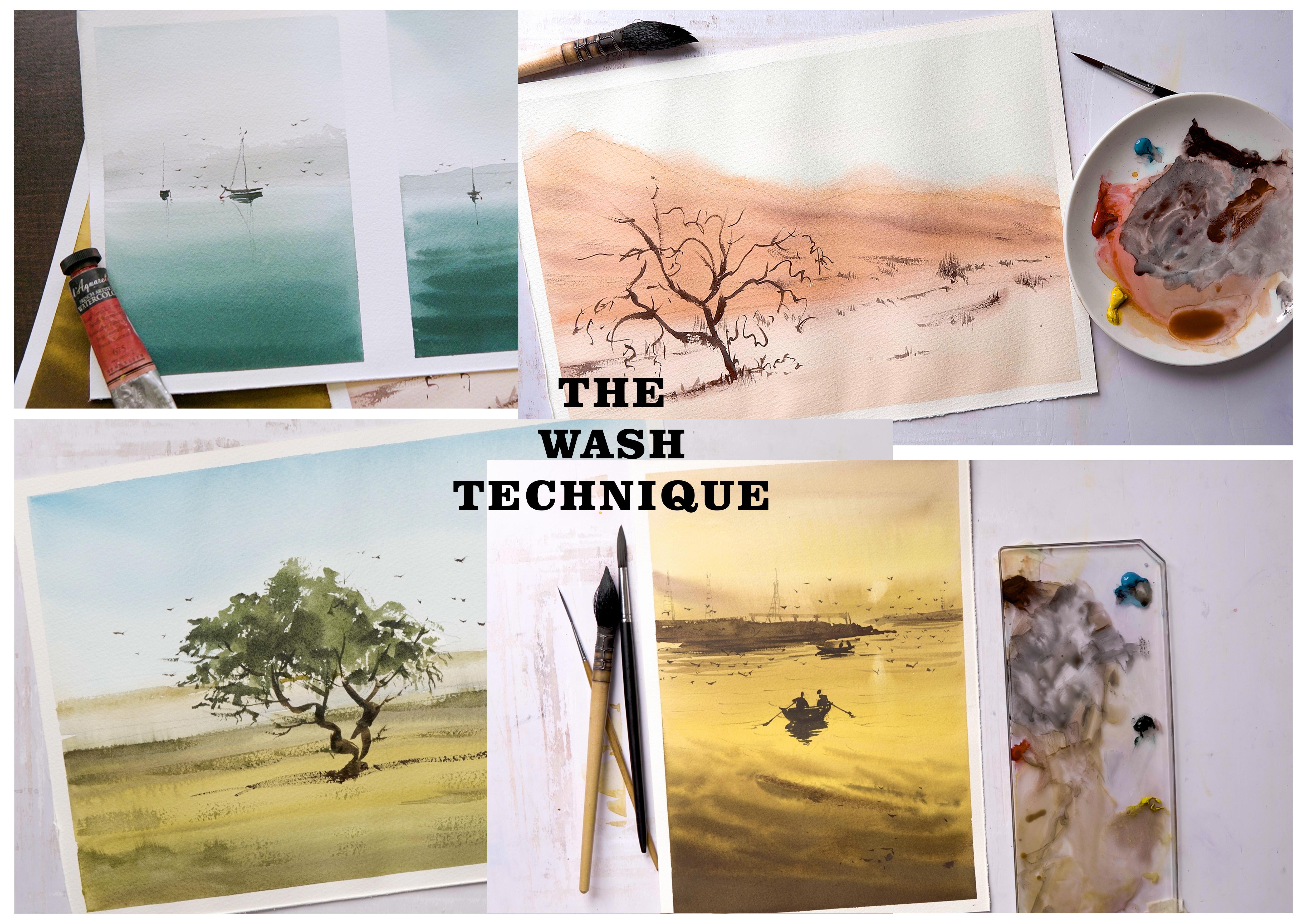
learn the wash technique, which is the most essential
and fundamental thing to learn in watercolor. What is the wash technique? It's basically the
background of your painting, the first code in a nutshell. There'll be three kinds of them. One will be the flat wash. It's rarely used.
There'll be graded wash, and they'll be variegated wash. So we are going to
learn all of them. Flat wash, I'll show
you the technique. We are going to focus on graded
wash and variegated wash. They're extremely important
and extremely fun. As we learn the wash techniques, we are going to apply them
and make four paintings, quite simple, minimalistic, but professional
looking paintings. So like I said, we are
going to do four paintings. The first one will
be a couple of boats with still water and
slightly wavy waters. Quite simple, and it'll involve most of the
time grade wash. The second painting will
be a dune painting, there will be a dry
tree over there, and that will involve variegated
wash with grade wash. So it's kind of a combined one. The third painting will
have variegated wash. It'll be a tree, but
with a little bit of greenery and
leaves on the tree. Yeah. The fourth
and the final one, slightly more complicated
than the first three, and it'll be men on board, and it'll be a sunset painting. Quite monochromatic, but still warm, delicate and beautiful. So, yeah, I hope you join
this class of watercolor wash techniques with me and
learn something new.
3. Fundamentals to Water and Pigment ratio: Okay, very, so let's
just start with the understanding of
water and pigment ratio. So it's basically the amount of water and amount of pigment. It's quite simple, actually, the quantity of
water on the brush. Let's just calculate as
ten to one in numbers. So ten being quite watery
and one being quite dry. It's really hard to pin
down the exact numbers. So I just put them into
zero to one to four, five to seven and eight to ten. Now, let's just go ahead
and explore exactly how do we use it in a practical scenario.
We have two ways. We'll be calculating
the water to pigment ratio using
only the brush, and then we'll learn how to
use tissue paper for it. Okay, let's just begin with
the brush technique first. Okay, so first things first, let's take a look at the brush. You see, the amount of water I just took will
be quite watery. I'm using a synthetic brush. If you use a more brush,
it'll be quite different. So all I'm doing is I
only took water once, and I'm touching the pigment, making the palette
quite watery there, and this is how
it's going to look. It's just a simple patch just to show you how
water it can be. Now, take a look at this,
cleaning the brush, one, two, three, four. So if I reduce four numbers, it'll be around six,
So it's quite milky. The consistency will
be quite milky. I mean, I I add a touch of
pigment there just like this, now, you see the pigment is quite thick compared
to the first one. Now, I'm just one, two, three, four, five,
six, seven, eight. This time, it's quite
thick. Look at this. Just pure pigment almost. So this particular number
will be around one, one, two, So it's quite creamy. So we have paint,
less number of water, I mean, less amount of water, and it's quite creamish. See. This one, it's
just pure pigment, which is absolutely dry. Four stages, you can
divide them into three, you can divide them into five, however you want, but this
is just to give you an idea. Now, let's just
quickly clean this up. So what we just did is about the ratio of
water and pigment. This time, On the palate, I'm going to keep the water, taking the paint, mixing it up. And this time, as you can see, I just have too much
of water, right? I added more pigment just
to make it slightly darker, but it's still watery. So if you want, you can add more
pigment to the water, still keeping it watery
or dry as your choice. Let's go and learn
the tissue method. Okay, so this time, let's
just understand how to use a tissue paper to control the water
and pigment ratio. Now, first things first,
I'm going to create a plain number ten
watery pigment. And after that, I'm going to show you how to use
the tissue paper. Okay. So this is
basically quite watery. Let's just clean the brush
quickly and see this. If I touch the tissue once, basically, if I pick
the pigment now, the amount of water in the
brush is about seven to eight, which is quite milky
right now, basically. Now, if I add more pigment,
you can see the difference. Now, let's just go ahead
and make another swash. Cleaning one once and twice. So if I touch twice or thrice, basically, we just
made it quite dry. So in a quick time. I mean, if you have less time, and if you want to go fast,
you can use the tissue. So directly from watery, you can just make
your paint look quite buttery or creamy or dry. So it's quite easy. Watery,
then we have milky, and then the final
thing we have will be the dry one or
the buttery one. There's a huge
difference. So rather than using the brush method, if you are in I mean, if you have less time with you, just go ahead with
the tissue method. Now let's go ahead and
make the paintings.
4. Fundamentals of Wash: Okay, so the first
thing, we are going to learn how to do the washes. So we'll start with
the flat wash, then we'll try to
do the graded wash, and then we'll try to
variegate the wash. But I am just going
to use one color, so it'll be easy, and we will actually learn the
technicalities, okay? So here we go. So I'm
going to use a mop brush, and I just have the
crimson red on my palette. And let's just
begin. Okay. So we just try to mix the color
quite well on the palette. And then the first thing
we are going to do is to add a small batch like so. Okay. Now, everything
goes after this. So I'm just trying to make one single patch of
same color everywhere. Okay. So what you have
to do is you try to run down the color from the top
area to the bottom area. So the trick is not to let the paper and the paint
make any edge, basically. So the second one, Take a look. I'm kind of slow because the color is
slightly heavy this time. But still, I'm trying to maintain the color
as I come down. So it'll create a
unified single patch. This specifically will
be called a flat wash, meaning one color, or maybe a couple of
colors mixed together, making one color, and it's
just there in that hire space. That's that. Okay. Now, let's just go ahead and try to
do a grading of color. So basically, I'll be
using slightly diluted, but still slightly coffee or
milky consistency from top, and then I'm going to dilute the color by using
just water like so. Okay. So as you can see, the color
is slightly darker on top, and as I come down, the color is basically
getting slightly diluted, faded, or watery, what
do we want to say? So it's dark to light. This process will be
called grading the color. It can be monochromatic. You can use three
or four colors. But as long as you have one gradation from dark to
light or light to dark, vice versa, it'll be called graded wash as simple as that. The technique is to run down the colors along with
water from top to bottom. Always top to bottom. All right. Let's try
another variation. Okay. So in this one, we
are dividing the paper. So on left and right, we are going to do two
different style of things. So I just want to show you how the colors can vary
from extremely watery, which is light, and then mixing up a tiny
bit of color like so. Again, the trick is same, run down the colors
from top to bottom. So as I'm coming down, I'm adding a bit of color to the mix and still
horizontal strokes, and I'm mixing it well. I'm not letting the water stay there and create any kind of
edge, and that's the trick. So the more you practice,
it'll be easy for you. It's not a big deal,
but the thing is, you just have to pay
attention in the beginning. So you see it's just like drawing dragging horizontal
lines with colors. So as they come down, you will automatically have a very smooth transition
from light to dark, or if you want, We can just do a dark
to light transition. This particular technique will be used for our board painting. So let's just see how it goes. Mm hmm. Okay. That's a good patch. Now, let's just add a bit of
water directly. I'm not using any color. Just try to dilute it as I come down and
cleaning up the brush, picking a little more
water, and here we go. See this? As smooth as it can be. It can be even more smooth,
but that's not the point. The point is to dilute the
colors from light to dark or dark to light. Grided wash. Okay. In the same way, if you use a little more color, it'll be a very gated wash. It's very simple. Okay. Let's just do another patch over here, and I'm going to show you. I'm just adding a little
bit of water first. And this time, I'm trying
to vary the strokes, but still trying to maintain
the color spectrum. I mean, in our case, the monochromatic spectrum, which is dark to light
or light to dark. But I'm just trying
to go faster, so you can see what exactly
happens when you do that, and I'm trying to keep on adding colors and a little bit of wet and wet
strokes right there. But still, I'm not
letting the paper dry up, so it'll create any
kind of hard edge, you know? That's
not good for us. This will be called
wearing your strokes and wearing the tonality of your wash and that will
be called variated wash. The only difference
is we are doing monochromatic and you can
use any color you want. So it can be two
colors, three colors from dark to light
light to dark. There we go. This is absolutely
essential to learn. There is no need to hurry. You know, give it a go, be bold, just like this, you know, experiment and see
how things work. Once you're ready with this, try to attempt the paintings, but if you're confident, you
can just directly do it. It's actually not very difficult,
but the only thing is, you just have to pay
attention to your strokes and the blending and not to
let the paper dry up.
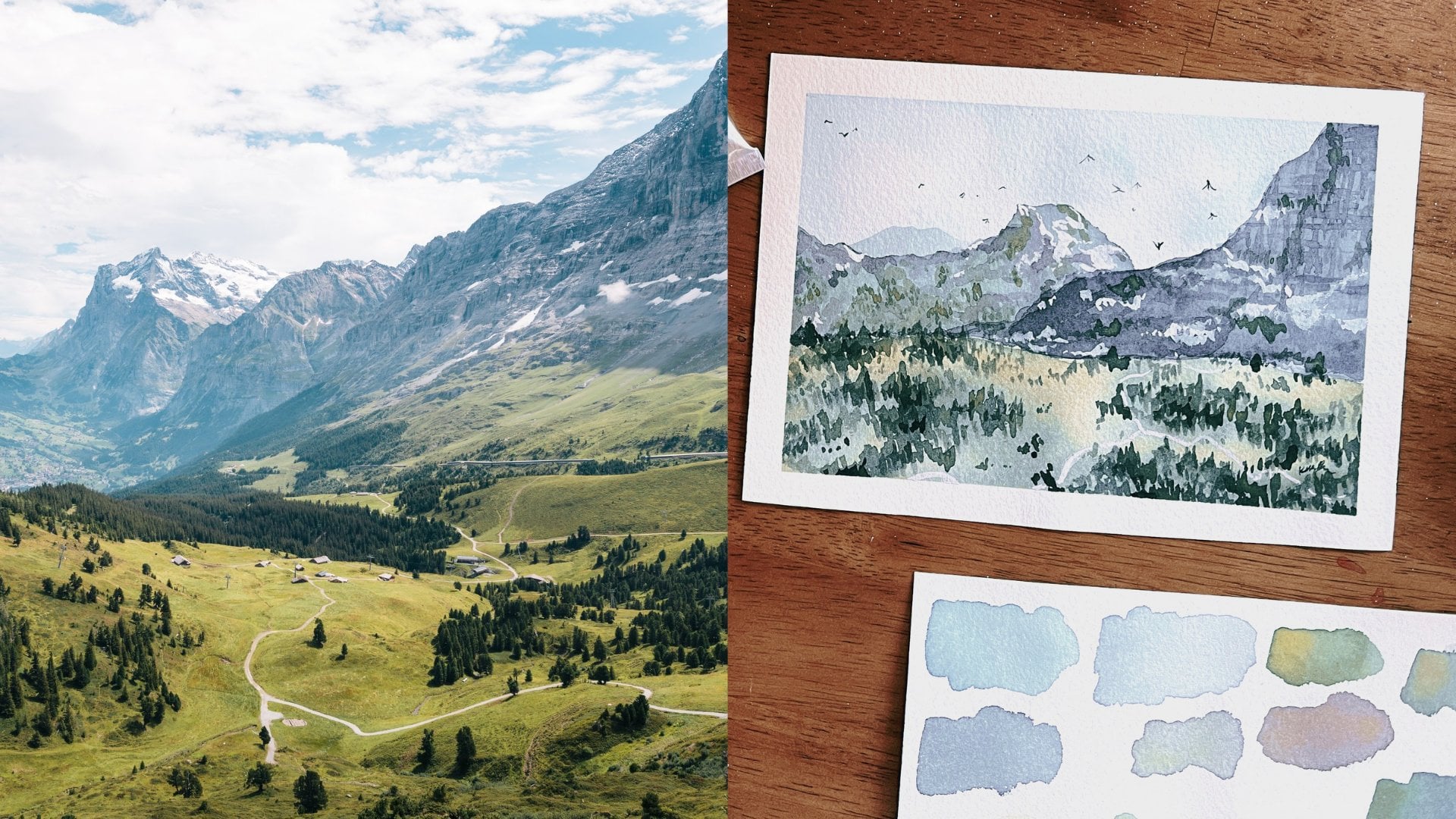
5. Two Boats: All right. So first
things first. I'm just going to put some
tape quickly, and we'll begin. Okay. Okay, so the reference
is quite stunning, and I'll just draw the horizon
line slightly on the top for the left one and in the
middle of the right side one. Let's just have some
variations, you know? So the left side, I'm thinking
to have a cloud effect. We'll just add a touch
of cloud over there, a distant mountain also. I got this artistic
license, you see. So, of course, the boats there. Great. And that's
done looking good. Okay? Pretty easy to draw. There's nothing much
there. Let's paint. Okay, so now I'll be
using Sinis blue, forest green, crimson,
and Van **** brown. For the first things first,
we'll be adding water. A nine to ten ratio, quite watery, extremely
watery, in my opinion. I'm adding a touch
of blue and touch of forest green to make
slightly dull blue. Now, we start from the top. The basic idea is when you start the painting,
start from the top. It's basically background, then the middle ground
and the foreground. Sometimes background,
the foreground, and then the middle
ground depends. But in our case, it'll
be top to bottom, which is background,
middleground, and foreground. So obviously, we are
learning how to do wash wash is basically the
background for any painting. So this is how we begin. Okay, okay, okay. All right. Let's just start
with quick long strokes. As the board is slightly tilted, the paint will
automatically come down. So as we come down
with the water, I'll be using very little water to do lighter washes
to the horizon. So it's a graded wash
from top to the horizon. So once we touch the horizon, we'll be continuing
with the same value and slowly build
the wash further. Automatically, the gradation
will be in reverse now. So it'll be light to dark
from the horizon till bottom. So from the top, it's dark to light till horizon, and from horizon till the bottom area,
it'll be in reverse. As I'm coming down, I'm adding more paint and
making the value, slightly stronger about
eight level watery. Now, the values will be even
more stronger and thicker. Enter the milky consistency. Great. Now, let's just add a little wet
unvet ocean waves, pay attention to the strokes. They're quite long
and horizontal. We want this painting to have a slightly settled
water and not to wavy because this is not a very advanced painting.
Still water style. So let's just wait for the painting to dry and
we'll begin the next one. Okay, for the right side one, I want to have a little
gradation in the sky, so I'm adding more paint. So automatically, it'll be slightly darker than
the left painting. See? Awesome. So I'm putting I'm just So I'm
just putting some paint on top so they can flow down
and create a nice flow of colors and created
sky Simple and clean. I'm not really bothered about the clouds for these ones because they're not
necessary, you know. Okay. Exactly, like the
first painting, we'll have a lighter tone
at the horizon and slowly build the stronger tonal value as we go towards the bottom. Okay, you see that?
Oops. Look at that. Okay, just get rid of that. Now, beg my friend. Okay. Here we go. All right. See this, slightly
curved strokes, because we want this water
body to be wavy and deep. I'll try that. I hope so. So let's just add more
green and blue. Tick paint. Nice, very juicy.
Awesome awesome awesome. Awesome awesome
awesome. Looks good. Yeah. Looks good. See, it's very important to play around now because it's wet. After it dries up, and then, if you apply any pain, it'll have marks, hard edges, so it'll be very
difficult to create a natural looking waves. So no need to look
for perfection here, but still, you know, have fun. Now, let's just go ahead
and add the boat on the first painting because
it's dry, so no problem. We'll wait for the second one
to dry up in the meantime. This time, let's just
make some dark gray. I'm mixing red with some leftover bluish
green on the palette. Now, that's too dark.
Adding a bit of water. Okay, this looks fine.
All right. See this. Press the brush fully and drag. That's good. You see? That looks good. Let's just
add a bit of dark here. I'll be wiping the extra
pain and cleaning the brush. I'm going to make the
edges softer a bit. In reality, the
edge will be there, and it'll be visible a little. But, you know,
it's almost faded. Step For our learning purposes, it's not really required,
but, you know what? Let's just add a little bit of distant faded waves as
well. How about that. Nice, simple strokes. Cleaning the brush
with water right now. Okay, so we'll do the
same for the top to create a distant
mounted structure. You must be thinking, but
it's almost invisible, right? You're right. But it's there. Very,
very, very light. Very, very faded. It's almost
invisible, but it's there. See now, snowy style mountains. Now, let's just
do the right one. It's not totally dry, so we can add some more waves and slightly thicker
paint for depth, Tin strokes on top and
thick at the bottom. Pay attention. Thin strokes, always thin strokes on the top and thick
strokes at the bottom. That will make that'll
make a lot of difference. Believe me. If it is water, thin strokes on the top, thick strokes at the bottom. Okay, the paper is dry now. Let's just go ahead and
add the mountain here. Same style composition,
slightly gray, and the water ratio will
be around seven to eight. Again, press and drag. Now, a bit of
softening the horizon. It's important. Tiny changes might make a lot of difference.
Okay, let's wait for it. We need a smaller
size brush now. Okay. I'll be using a size
four synthetic brush. All right. So from now
on, if you notice, we need thicker paint and
darker paint as well. So I'm mixing and making dark
colors to make the boats. The water and pigment ratio
thick about one to three. Fantastic gray. You see that? That
looks awesome. Let's just go ahead and look
at in a close, shall we? There looks good. Okay, so
now we will do the boat. Simple, small strokes. There. Now, a smaller
front facing one here, just a mark is enough. Now, for this one, same thing, small strokes with a
little random highlight. Now, I'm just playing around with the leftover
paint, basically, to keep the graze
with slightly extra green to match the
water. Nothing much. Okay. Okay, now the
reflection in shadows. Notice, some simple
small strokes. Remember, try to have a unified patch rather than
strokes with gaps in between. Now I'm going to
use my rhinar or a brush to make some
details, as you see. Very simple thing to
do, but controlled. Look at them so thin and clean. Now, same thing
for all the boats. I mean, we just have to bots. By the way, you know, let's just add a bit of
color. What is good. Also, let's just add
some reflection, and we are done. Almost done. Let's just
add some friends there. Birds. Oh, yeah. Birds will make your
landscape painting look quite realistic
and natural. They're like ornamentals
for landscape painting. They give life and realism. Absolutely fabulous. Two is good, 20
better, but random. They cannot be a pack of, you know, like a group, like a bunch, straight
line or something. So be free and add lots of them. All right, the
painting is finished. Let's just do a quick
recap. Here's the thing. The first one we
did a graded wash, graded wash to create
a still water effect. The second one, we try
to do graded wash, but we also added waves, Tin strokes on the top, thick strokes at the bottom
to give that dimension to the water to the
water body and depth. After that, we did the boats. The boats in this
particular painting will be quite small and quite
minimalistic and simple. But still, overall,
we get a minimal, absolutely simple
basic painting. So that's that?
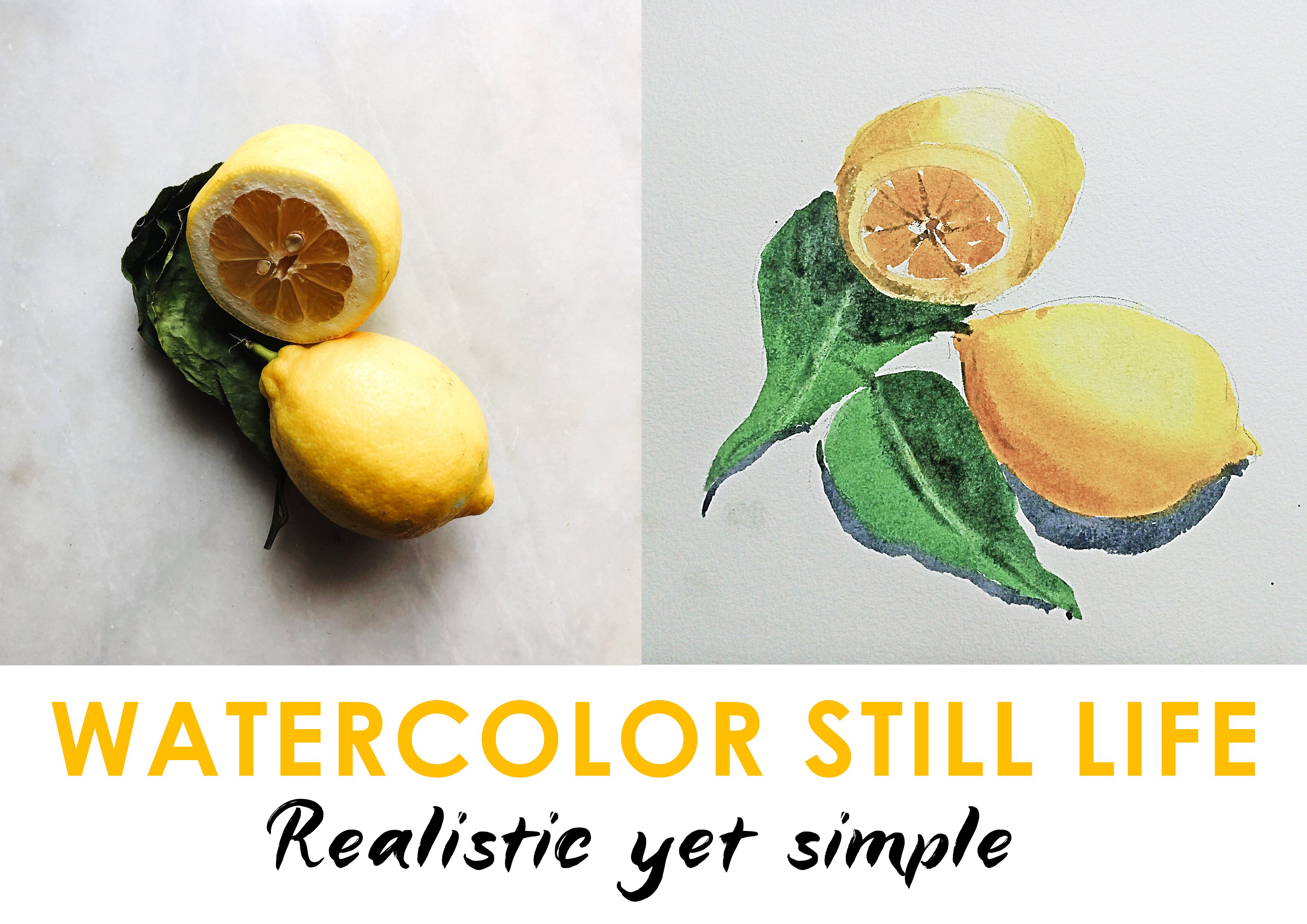
6. Dune tree: Okay. This painting
is fairly simple. However, the essential
thing would be the colors. The charm really
lies in the colors. They will provide life and give atmosphere
to the painting. Let's start with the basic
drawing, the big shapes. We are going to start
with the dunes, fairly simple
outline and they'll look quite slant once the
painting is finished. There we go. Now, over here, we have a small tree. The tree doesn't
have any leaves, quite dry because it's
a desert, you know. So yeah, that's that.
Okay. Okay, now, let's talk about the colors. So I'll be using Sophie
yellow, Vandy brown, I'll be using a little bit
of vermlion and of course, touch of the singulars blue. Okay. So now let's start with the big shape, the sky area. The sky is very, very light, as you can see. It's basically doesn't even
have any more blue in there. So I'll mix a little bit
of blue quite faded to give it a washed out effect. So the wash in here
will be quite flat, meaning the top area and
the bottom area till the due will be quite similar
in terms of the shade. If you notice, uh, I mean, the reference is
quite pastle I mean, the colors are quite pastle
like I said earlier, but we'll be adding warmth. So now as we go about the tans, we are going to add slightly more yellow and reddish
tinge to the mix, so it'll be quite
warm in nature. Girl. So first, we will
make a mark and see. We will know whether to make
the colors slightly darker, lighter, more dull, bright, warm, and cool, etc, et. Okay, so in our case, we need to cool
the colors a bit. We mix a touch of
brown, red and yellow. This looks fine to me. Maybe maybe a bit
more brown and red. Perfect. That looks good. So a simple wash with grading of tonal values will make
a lot of difference. The top areas will
be quite light, and the bottom areas will be slightly darker
as we come down. Also, around the bottom, we make the colors a
bit more just to give a little bit of to the
reference that we have. So. Now, mixing up the brown with red with Tata fellow
to do these lines. It's wet, so they'll mix, but still creating
those light textures. Now, here's the
thing. When the paper is wet and you are trying to
add more texture in them, I'll give a little more
dimension and depth, but still they'll be quite soft. Now, you might feel tempted to apply a lot of heavy and
dark pigment in there. But belief me, if
you do lighter, you can also make them darker. But if you just apply dark
colors in the beginning, things might look quite
awkward, you know? So yeah, anyway, that's that,
see, it's quite simple. Now, let's just go ahead
and do the ground. It's quite faded and
colorless, as you can see, but because we are
making a painting, let's just add a touch
of color, you know. Let's just not make
it quite whitish, but creamish is the best term I can use of the word
creamish. There, quite faded. It looks quite
awesome, you know. Anyway, when the painting is going to be totally dried up, we will be able to
see the actual color. Now I'm going to switch to the synthetic brush size
ten for some detailing. Actually, the painting
is kind of finished, we are going to add only
the necessary details to give life and death.
Okay, here we go. All right, let's make
some lines and create textures on the hills
to add more depth. Okay, here's the
tip. Don't forget. Do feather touches. Apply gently and lightly because
you can make them darker anytime you
want afterwards, but. In the beginning, as we are
practicing and learning, it's better to stick to
feather and light touches. Okay. So for the ground, I'm going to lift a
little bit of paint. This will be called a
soft edge demarcation, meaning the paper will be damp. I'll be using a damp brush, so I'll just lift some paint. Of course, we are going
to show the paper. But if we use a tissue paper or something like that,
then automatically, the dry paper will
be visible and there'll be a edge right there. Won't look good, so
we are going to do only a soft edge soft lifting. Okay. Now, some textures
for the ground. These marks will be
quite rough and uneven. So why are we doing it? We can add more depth
to the painting. Great. Look at that. That looks really good. Moving on. Now,
let's just wait for the painting to dry up and
we'll do the final touches. Okay, the painting is dry. Let's move on to do the tree, the shrubs, and all
those tiny things. I'll be using the size
eight synthetic brush. Very light painting is required. Look at the tip.
I'm crushing it. If you do this, it'll
create a random shape, which is really helpful for
creating dry brush effect. Now, with the dry brush effect, we can do a lot of
different things. For now, we are going to use the dry brush effect
to create twigs, grasses, dry shrubs, et cetera. Okay, here's the
thing. Look at this. Use the tip, light touches and vertical touches,
most of the times. The trick is to vary
the stroke sizes, make big ones, small
ones, medium ones. This is something
you can practice on your own separately. Rather than this painting,
you can just take a paper, take some paint and
try to do all sorts of different textures by
creating less pigment and, you know, and, you know, uh, using the drivers effect, you can try to do a lot of different shapes
than everything. That's fantastic
practice, by the way. B. Great. That looks good. Now let's do the tree.
Okay, so it'll bit darker and but not very thick
like butter, but creamy. We will maintain the light and the dark strokes to give a
realistic feel to the tree, round and random shapes for the branches. Okay,
so here's the thing. If you're not confident enough, then you should practice
on a different paper, you know, and then try the
painting. No problem at all. And by the way, just have fun, so no need to worry and no need to worry about the
perfection and everything. Less, everybody, less
more. Slow, go steady. Start with less strokes
and add more slowly. You can add more
anytime you want, but start with less
and minimal strokes. Only if you really
require add more. Otherwise, it'll be too much. M. You know what, I should
share this with you. Generally, I used to overdo
my paintings before. So what I used to do, I
used to add a lot of paint, a lot of pigment, lots of random strokes because I used
to think, You know what? This is not enough. I should add more and more
and more and more. And finally, all
the paintings that I did basically went
into the garbage well. Because thing is, rather than self convincing ourselves that we are
creating a masterpiece, it's about the experiment. Slowly, and eventually, you will be doing
masterpieces anyway. At least that's what I think. Okay, so let's just move on. Okay, we're done here. The
painting looks clean and nice. Let's take the tapes
out and we'll see. Okay, so let's just
do a quick recap. We did the painting in one go. We just dried the painting once, and we did not apply a second layer or any kind
of third layer on top. It was having a
wash for the sky, for the tunes, for the ground. We uh, dried the painting up, and then we did the tree. So as you saw using a
basic wash technique, you can create simple
and medalistic painting, and definitely you can
frame them if you want to. But like I said,
go slow, practice, and also try to do light colors first so you can build it
rather than using too many, uh mixes, too much color here
and there and ruining it. So that's that.
7. Tree with leaves: Okay, welcome, welcome, welcome. This is the tree
painting blue skies and warm green and yellowish land. So anyway, let's start
with the drawing. The horizon line, and then
we are going to do the tree. So just like that.
Quite rough, you know, try to do the outline of it, and that should do
it. Here we go. That looks okay. That's
more than enough for us. Let's talk about the colors. Okay, so we'll be
using cinerous blue. Quantity around same as
nine and ten because we have to do a sky wash.
That's the big shape, yeah. So we'll be using a slightly
graded wash for the sky. And that will be
slightly darker, and then slightly lighter as
we come down to the horizon. You see, I'm just
going left to right, left to right, left to right. Very simple and just
keep bringing them down, keep bringing them down. I'm adding a touch of water. There we go. I didn't
take any color you saw. Just plain water, basically. Okay, a touch of color
and around the tree, just like that, and
that should do it. In one go, if you just
go slowly and nicely, you can actually finish your wash. You don't really have to add any more
color on top, you know? That should do it.
Okay. Now it's time for the ground area. Simple. Yellow, touch of red, and no I mean, no fancy mixing and movement. I'm sorry about that. So
just a straight line, like so, quite light, quite faded and should do it. Yeah, so I should do it. So picking up a
little bit of blue, you know, touch of
brown, touch of blue. Basically, the colors will look quite neutral at this
particular stage, meaning they don't
really have any color. They're basically
black and white. But You see? It's grayish. It's just plain water, but it has a gray tone to it. Okay. So as we come down,
we are going to make a lot of warm colors
to start with yellow. Touch of red. Touch a forest
green. Forest green is a fantastic color, you know? If you don't have, you
should actually have one. Okay, here we go. Light horizontal wash,
half pressed style. Just slider. Quite diluted. We have to make it heavier, but slowly and steadily and
nicely and smoothly. So many ads and so many
words. Okay, here we go. Anyway. Okay. All right. Slightly wearing the colors. Now, please pay attention. This is mostly a
variegated kind of a wash where we are
wearing the colors. So slightly warmer, sometimes it's green,
sometimes it's yellow. This is mainly yellow as of now. Okay. Looks good.
Touch of green now, like I said, greenish, greenish. Look at that. Now, generally, when
we do the ground, exactly like the water body, the horizon area will
obviously be lighter in color. And as we come down, colors
will be slightly and. But in our case, I'm trying
to show you layers of washes, so I did not add
heavy colors for now. Okay. So the tree. So this is just a little bit of color that was
there on the paper. I'm trying to lift so I can do the tree nicely and easily. So I'll be using a
small mop brush. Now, pay attention to what I do. Picking up the color
yellow, yellow. Touch of brown. Paint ratio will be
around five to six. So it's not exactly
quite watery and it's not exactly dry. Look at this. Now, I'm adding a touch of
darker green at the bottom, like I said earlier, that the bottom area
of the foreground. I mean, the foreground area in your painting should be slightly darker than the background. Look at this. The paper is slightly wet, not exactly completely dry. So I can still do touch
of wet and wet strokes. Just like that. This is basically to create the textures like we did with
the Dune tree, you know? Okay, let me see.
Hm. I'm thinking I should do a little bit of textures. I
should not require. Okay, so the painting is dry. I'll be using a mop brush. Now we are back to the tree. Tree is the one that
we are going to do. That's the focal point.
We have to pay attention. We have to go slow,
nice and easy. So the ratio will be quite dry. I mean, mm. Let's say, the amount of water in the brush will be
around two to three. But the colors will
be slightly thicker. So that'll be milky. Milky to creamy
consistency. Take a look. That is seriously
killing the brush. But that's what's going
to make our tree. So here we go. Look at this. Chick. Just random. And killing again. I'm so sorry. There's no way. Maybe this is. I don't know. Okay,
so here's the thing. You can do any kind of
movement touching the edge. I mean, the tip of the brush. You can go left to left, right to right, circle, circle, and just basically trying to define the
outline of the tree. Now, when you do this, so many white spots
will be created, and they are basically
the gap between leaves. It's so obvious that
I don't have to really explain, and I'm
so sorry about that. Anyway, so now we are
going to add depth. That means we have to have
light areas and dark areas. So take a look at this. So when you're watching
this, pause and see. What we are doing is, we
are making darker colors to create a bunch of
leaves kind of effect. So if you squint and see and choose certain spaces and just do the dark
colors in that area, you will automatically have
light areas and darker areas. So to create the bunch
of leaves effect, you squint and you try to see. Wherever you add the first
black dark not black. I mean, the darker patch. You can just do the same thing around the whole tree
at some random places. So when you do that,
you automatically create a dark area
and the light area. Automatically, the bunch of leaves areas specifically will look like a realistic
leaf bunch. I don't know how
to explain this, but you get what I'm
trying to say, I think so. Okay. So now, if
you squint and see, you'll actually see the effect. Squint and C, squint and C, squint and C. And if you
can, squint and paint. And try not to put the darks everywhere all at
once and mix them up. That's bad. That
will just ruin it. Now these are extremely
tiny random strokes or touches using the
tip of the brush to create those edge leaves, you know, I don't know
how to explain it. So I'm very sorry, people, if I'm not making sense, but I hope I'm trying
to put my ideas across. Okay, so now it's time to create the middle ground darker lines, as you can see in
the reference. Okay. Here's the thing, people. So when you practice, please go ahead and practice on a separate paper and then come on and do the
painting if you have to. So if you're confident, which I would really like
you to be, just go ahead. Even if you ruined the painting, that's fine. Do another one. Or take a break
and do another one or take a break and
do another one. This is my synthetic flat
brush. Look at this. When you do this upward
throwing kind of strokes, they create kind of
a dry grass effect. Very simple thing to do, and
you must practice actually. Okay, that looks good. Switching to a smaller
size synthetic brush, which is size four. If you have size four, go ahead. If you don't, size
two. Just like that. This is heavy
pigment, guys, okay? Like three to four and a
touch of heavy pigment, brownish, but not
exactly brownish. It has green in it. Make a mark. And there. That looks good. So we'll
just go ahead and do it. Pay attention to the movement. Tiny strokes, okay?
Tiny strokes. There is no need to go for
big strokes in one go. You can do that when
you have a pro, but if you feel
confident, okay, do it. If you're not, then
just go slow and, you know, tiny small strokes. Adding green. So we have to
make slightly darker pigment so we can have light
and dark effect on the tree trunk and
branches as well. Look at that. I'm just
using a touch of darkness. That sounds like a rock song. Touch of darkness.
Okay. There we go. Okay. That looks good. Yeah, yeah. Yeah, yeah. Okay. Good. There we
go, a little more here. I'm using the reference, but I'm not exactly copying it. Because like I said, I have my artistic license,
and so do you. So please just go ahead and do whatever
you want, you know? Look at that. The tree
actually looks good. I mean, I'm happy. Yeah, iny strokes, iny
strokes at the edges. They're quite curved and tiny. Light, also, not very dark. A little bit of touch
up for the ground. Iddly speaking, there should
be a shadow of the tree. But for some reason,
in the reference, also, there's no shadow. Probably because
there's some kind of a ground that is dug and the
shadow is inside that area, you know, I'm not sure. So, you know what,
if I add a shadow, it might get complicated
for you too. So let's just leave it at that. And it's not really bortan Okay. This is going to be the
yellow horizon area. I'm using the same brush, quite light pigment,
light touches. I have a feeling that I might
overdo the painting. Okay. Okay. Okay. The edges are slightly rough. So there. That's good. Clean painting. Very important. Just like that. Horizontal stroke. Okay? Yeah. On the top a little. Okay. Good. Looks good, actually,
you know? Looks good. Okay. So basically, we
have finished here, and I feel I'm kind
of hungry as well. I know, I'll finish this first. Switching to a size
one synthetic brush. If you have, good, no, if you have zero, use it. If you don't have anything,
you have a line of brush. Use that. Whatever you have. B See them? Check it out. So when I
do landscape paintings, most of them, I add birds. They are like jewelry
to your painting, you know, fine touches, and it adds finsse to not the painting
style or the quality, but the reality, I
should be a poet. That doesn't make
sense, but Yeah. I should stop myself right now. Yeah. Enough of them. To too much we'll just in. So touch of branches. Mm hmm. There, one
more, one more. Okay. We shop. We should ideally stop. If we do anything,
we'll do in it. Okay, let's just
do a quick recap. What did we do? We did the sky. Let's start with
the drawing, yeah. So I just did the horizon line. Choosing the horizon line is
really, really important. Once you finish with that, make the outline of the subject. In our case, this is the tree. Okay. Then we started with
the sky, gridit wash, darker at the top, and then slowly
towards the horizon, it became quite light. Then we did the horizon area, which is quite yellowish, and then we started with the colors which are
meant for the ground. Sometimes yellow,
sometimes brownish yellow, and sometimes greenish
yellow. Then we let it dry. Okay. Actually, before we actually let it
dry in the middle, we added some fine brownish, greenish wet and wet
strokes to add more texture just like exactly like the
dune painting we did before. After that, we let it dry. Once the painting was dried, we started with the
main focal point, the tree bunch effect, light strokes, and then on top, darker strokes so we can create a leafy bunch kind of
effect for the tree. Leaving the white spores will create realistic
effect to the tree. So the light is basically passing through
all those leaves. So you know, a realism
is what we really need to show with a very minimal
strokes and effect. I think that's the best
way to describe it. And then we started with
the trunk, the branches. We added dark and light effect
to the branches as well. And then we did a lot of
tiny, tiny, tiny branches. And then finally, we left the shadow, which
is unrealistic. But in our case, I
don't really bother, and you don't you
shouldn't bother. You know? So it's okay. And then we did the birds. Yeah. There we go. Fantastic looking simple
painting. Let's move on.
8. Men on Boat: Okay. All right. So we begin with
the drawing first, horizon line slightly above the middle area of the
page. There we go. And this is the mass land area, as you can see here,
just like that. Okay. So I'll just consider this like a land area. Nothing much. So it'll be a simple
thing to paint. Simplifying the
thing is the key. Look at this. This is the board
front facing back facing, you can say, because
the men will be sitting and facing
to the horizon. So yeah, that'll do. It's a very simple thing to do. Just draw some
oval shape and put heads to them, and that's that. Now, let's see. I'll be
using the colors, right? Sinus blue, Sophie yellow, Vmlion and also I'll be
using van **** brown. And maybe I'll just
keep the green handy, and that's the forest green. All of them are Seneia
paints, watercolor. They're quite professional.
Okay. Now, moving on, first, we will make the
yellow color properly. Mixing up on the palette is
really, really important. The ratio will be
around nine to ten. It will be quite watery. So I'm just adding a
touch of red there, just like that, touch of yellow, mixing it up pretty well. And here we go. So it's a big mop brush. Look at that. Nice colors from top to bottom to
the horizon area. So here we go. That looks good. Quite evened out. Wash. I'm trying to leave
a space on the top, so I can blend more colors. It'll have a variegated
wash, basically. Okay. So now, touch of brown on top, just like that and blending
in with the yellow. Yeah. That looks good. Go with light mixes first
and see how they work out. Please don't be afraid, okay. Okay. That looks good. At the horizon, the
colors will be slightly heavy, like coffee consistency. So let me just clean the brush. We'll take a little bit of heavy antic brown and dilute it. We'll just see, a wet on wet. And yeah, that looks good. Just like that.
Yeah, that'll do. That'll do. Okay. So now, we'll be using
pure water on the brush. So adding a little bit
of yellow into the mix. Sophie yellow is
quite bright yellow. So if you have Sophie
yellow, it's fine, if you have any other yellow, it'll just do, so
no problem there. Now, we will finish just
at this particular spot, and now we have to run
the same yellow blend, mixed with red, mixed with brown again and again and again. So let's just take a look
at this particular place. We are trying to see if the land mass will have the
same bright effect or not. Yeah, that looks good. So
let's just run it down now. You know, I should
tell you something. It's very satisfying when
the colors mix with each other and they create a certain
blend, certain tonality. It really feels quite nice. Now, this is a slightly
more complicated painting than the other ones
that we did before. So please make sure
you practice enough. This is going to be the rays or, you know, the highlights
on the water by the sun. Okay. Okay. So as we come down, colors will be heavy
like we did before. Colors will be
slightly darker and thicker with more heavier
style of strokes at the bottom with
heavier colors. Okay. Great. Okay. So now, let me just add more
brown, just like that. And let's see. Okay. That looks. Yeah. That's good. So that's the first
layer on water to create the deepest waves that we basically
can't really see. So now we are going to apply heavier pigment,
brown and yellow. So it'll be quite warm brown. Here we go, just like that, slightly curved and
slant shaped lines. The strokes are fat. You can say thick
and fat strokes, so they are not
quite thin because the thin strokes will
be around the horizon, and at the bottom
of the water body, the lines will be
quite heavy and thick. So just like that, and
play around with it. Don't have to, you know, think about how perfect
your lines should be. This is just practice,
experiment, your learning. So just go and
apply lots of them. Because for the waves,
it comes with practice, and there's nothing else, color, consistency, and practice. So touch of red here. Okay. That looks good. Maybe a touch of blue
so we can make it slightly darker and cooler. So even though it's brownish,
because it's water, we're adding a touch of
blue so it'll create kind of a dark brownish
grayish kind of effect. Not exactly a pure
gray or pure brown. But still, you know. That
looks good. Look at that. More dark, more
dark. Lots of dark. As you can see, it's
not quite detailed, but just enough
enough suggestion, and it will do the
trick, actually. Okay. Okay. That looks good. Now, let's just make the painting dry
and we'll come back. Okay. All right.
Back to painting. I'll be using synthetic
brush size eight. Okay. So now we are going
to do the landmass, right? So I'm just using some
leftover brown pigment and pre pay attention.
Look at those lines. Quite rough jaggedy
with hard edges. Now, let's just mix
a little bit of warmth and that's
too much actually. Let me just clean the brush. Okay, that's good.
Touch up blue. Okay. Here we go. Yeah. That looks
good. So what we are going to do now is we are
going to add more color. Now, when we do this, these kind of dry brush effect, you have a natural
realistic formation. But the thing is, they
might look quite light, or they might look quite dark. In these cases, keep a tissue
handy, just like that. I just lifted a little
bit of pigment so the distant things will look slightly lighter than
the middle ground. Okay, that looks okay. Let me just add a
touch of water. Yeah, yeah. Yeah.
Yeah. That looks good. So it's basically
touching the tip of it, using horizontal strokes just enough to suggest that there is some kind of a
land mass and nothing much. Now, the distant ones
should be lighter, always. Because they are far and
we can't really see them. So on top, let me just add
some kind of a bridge, kind of a pathway, maybe. I'm not really sure, you
know, It's not exactly there, but, you know, I have
my artistic license. I'm just using my imagination. And so should you, actually. Okay, so now it's time to
work on the water body. So this is basically kind of a reflection
and also the shadows, like we did before the previous
paintings, thin lines, Tin lines on these areas and very minimal
strokes required. You don't really have to
do too much here is more. And if you feel there,
they look quite darker. Use the tissue, lift them up, and you're good
to go. So for me. It's okay. It's not. It's
good. Let's move on. Okay. So now we will just take a look at these kind
of thing. Look at this. I just added a touch of
water in a circle of motion. Now I'm going to use a tissue, dab it over there
and lift the paint. Look at this. So
now we have a sun. And again, at this
particular area. Just a tiny vertical nudge, with a little bit of
water, lift it up. There you go. Lift,
lift. Yeah. You see? For me, as creating an impression of a painting
or what am I saying? For this kind of impressionism, we don't really have to
go in quite a lot of detailing of how exact the ray or the
reflection should be. So a little bit of
touch is enough. Okay. Look at this. I'm making a dark color using my size four synthetic brush. That's some serious dark color. Now, closer, take a
look. Tiny touch. Just like the previous painting there and a little
bit of a reflection. And yeah. That looks good. Okay. So let's just go ahead and add a touch
of bottom area, the shape of the board, and a tiny bit of reflection
just like that. There we go. That looks good. Okay. Here's the thing. Less is more. So just a touch of
oval and two heads, meaning two tiny circles. Just good enough. No need
to do kind of a drawing, you know, you don't
really have to draw them. So that should do it
because they are far away, and you really don't
have to, you know, focus and do a lot of
detailing on them. Absolutely not required. Anyway. This is a beginner's
painting, you're practicing. So just keep it slow,
keep it nice, you know. No need to worry. Have fun and just experiment, basically. Tiny lines. Just to give a little more
suggestion of the landmarks. And maybe, yeah, a
little more water waves. Actually, they are kind
of dark, you know? So I'll just do this, yeah. Okay. Okay. So now we are coming down to the main
focused boat over here, just like this, it is. So just picking up
the same paint. The ratio will be
around three to four, quite heavy, less water. This is the back
portion of the boat. I'm really not concerned
about the shape too much. Just enough suggestion,
and that works for me. So touch of oval. And fill that up
basically and a dot. So this is a man who's probably looking towards
his left to the other guy. And the other guy has
his back towards us, so he's facing to the horizon. That's his head, the two hands, and we're going to give
them the roll and, you know, the reflection here. Look at this. The painting actually looks quite
good even now. Maybe I'm bragging too much, but, you know, I'm liking it. There. That looks good. Okay. Okay. So now
let's just add, you know, two quick
lines over here, one. And yeah, let's do it and
another one over here. So he's like, trying to, you know, row and go forward. I don't know. Maybe he's
just trying to stay there and look at the
birds. I really don't know. But this looks good to me. Some kind of a story
in your painting will actually add a
lot of dimension. So basically, the painting is
kind of finished, you see. But let's just add a couple of dots on the water.
Not quite a bit. Just just a tiny bit, just like that. A
couple of them. And here and there. You can also sprinkle if you want to. It's totally on you. No problem there.
Okay, let's see. We should add birds, birds. Birds are my favorite, as I said, before
they give life. So before we do that,
let's just finish with some of the forward. I mean, I mean, to say
the birds near the sun, you know, and they will give us the idea should we
add more or not. As you can see in the reference, they're like billions
of them, probably. There. That looks good. Yeah. Yeah. Use a line of brush.
They'll help. If you don't have
a line of brush, try to use a size zero, size one or two,
synthetic brush. Always use synthetic
for making birds. They really help. You know what? Let me just tell you about
the shapes of birds. It's just two strokes,
left and right. What you can do is you can
practice them before you add. So they are quite
delicate touches you see. Also add in random
rather than symmetric. Continue adding a lot of them. There are so many, you know, like you can see, and they look quite beautiful, actually. Okay. Some of them are
quite close to the people, and they're just
almost on the water. They're basically
everywhere, you know, feel free and add
whatever you want them. Tiny, tiny, tiny, Diny strokes, tiny strokes, tiny
strokes. Just like that. You should always
differ. The sizes. Obviously, vary them. You can't just make a same
size bird everywhere. They look like clones, right? They anyway look
like clones, but, you know what? You
understand what I mean? Okay. So these are tiny water lines, very thin, very light. And, y. Try not to go
overboard over here, even I'm trying to
control myself. I will shake, please
control and stop. Stop. Yeah. Stop. Yeah, so. Do it. This is something that happens
to every artist, I think, so you just have to know how
to do the creative control. Okay. Now, what
I'm thinking is to add some tension towers. I don't know what exactly
electrical towers or whatever you
want to call them. They are quite far away,
but they are there. So this is something
that happens to a lot of areas in my country. So this is like a thing that
we have seen, you know? So just adding they
give a little bit of architectural touch
and they give a little more dimension
and a little more, you know, reality
to your painting, basically, now that we
are done, let's see this. Okay, so the painting
is finished. Now, let's just
do a quick recap. What we did is we
started with the sky, and then we started
with the horizon area, and then we did the water body. Okay. So after that, we waited, we tried
the painting, then we did all the
details like the landmass, the darker water body areas, and then we did the boats. After the boats, we did the
small towers. We added birds. We also lifted a little bit of pigment so we
can show the sun and also the reflection and the shiny parts
on the water body. This is not a very
simple painting, but this is definitely a
advanced beginner's painting. Something I wanted
to share with you. I hope it really helped,
please practice and, you know, put that in your project, and
let me take a look. Do the birds separately. Do the birds separately
if you have to and just play around with
the colors and have fun, you know, I mean, have fun. Good or bad doesn't
really matter. Just now I'm bragging a lot. So all the best. And I'll just see
your paintings.
9. Final thoughts: Okay, so let's do a quick recap. The first one, we did the boats. The first one, the
left side fed. It has still water, simple grading of colors. The sky is quite faded
with a snowy mountain, and also the water body is quite simple,
still, and minimal. We added the boats,
and it's that. The right side one has a little bit of
depth in the water. We added a little bit of waves. Again, the same boats, but the sky is slightly graded. Also, the mountain range, I mean, the landmarks or
whatever you can call it. They are slightly darker
than the left one. So no snowy mountains, but still quite faded
as per the horizon. We did What do you call it, a soft edge for both of them. So we have the edges. I mean, we can actually see the demarcation between
the water and the mountain, but it's quite faded. So that is the first painting. The second one, we
did the dune tree. The sky was pretty flat, quite faded, no clouds,
nothing whatsoever. But the dunes had textures. Overall, the painting has
a pastal color effect, quite reddish brownish
kind of colors. The ground was slightly
faded in the dunes. Then we dried it up.
We added the tree. We made some tiny shrubs and those textures
for the ground. The main thing is
the tree, right? So the tree was quite dry, quite curved and swirly kind
of branches. So that's that. A very simple
painting that we can actually create just by
using the wash technique. No need to fuss
about it, you know. The third painting, again, a tree but with leaves. The sky was quite bluish. The ground has textures in them. So the ground was like, brownish, yellowish,
slightly greenish. We did some dry brush
effect with a flat brush. We learned how to squint
and see and make leaves. So if you have to
squint and do, do that. That's just going
to help you a lot. Now, the last painting
was the men on boats. Like I said in the beginning, it'll be a little complicated. It's not exactly
quite complicated, but it is complicated. So you have to practice maybe a couple of
times to get it right. And if you get it right in once, time to move on and do some hardcore painting
afterwards, right? Anyway, here's the thing.
The entire painting has mostly yellow,
red and brown. The distant areas like the
antenna or the tension towers, I don't know what to call
them. They're slightly faded. The landmass is
slightly darker than that because it's
the middle ground and then the water body. Always light areas
at the horizon. And as we come down around the bottom area
of the water body, always, most of the time will
be darker than the horizon. For the waves, thick lines, you know, thick curved
strokes at the bottom. Again, you can add
them on top two, but the top areas will be
slightly lighter and thinner. And the bottom areas
will be quite thicker and darker, thick paint. So that's that. What else? Now, all the paintings, besides the tune
painting, we added birds. Birds are like ornamentals, they're like jewelry
for your painting. So if you add them, they give a realistic feel and more
life to your painting. So just feel free and add how much ever you want,
but keep them random. That's the learning
today in wash technique. So I think that's that. Now, please go ahead and practice and make your
paintings look cool. I'm pretty sure
they will be cool. So we just put them
into the project hab, and I'll take a look at them. If you need any feedback, just, you know, type in
whatever you want to know. I'm pretty sure I'll get
back to you all the best, and I hope you do great in
your watercolor journey. See you in some of the class. Take care.
 Abhishek Rout, Water colorist and film maker