Transcripts
1. Intro: Everybody, this is Mon, I'll come to myother
skill sheet class. Now this time around we'll be painting Japanese
pattern planets. The reason why I came across this class was because
I remember the time I tried to paint in oils a Jupiter back in
Beijing in 2019, and it didn't turn out the
way I imagined it to be. I just thought the
difficulties that I had with that was because I don't know. I just thought watercolor
medium will just be the best way to go about
it because it's so fluid. That's why I started painting some planets like
I did right here, and then I just
enjoyed so much of it. Then I thought, wait a minute, I could even layer on top of them with watercolor paint or acrylics or some metallic pens and play around creating
Japanese patterns over them. Yeah, that's how I came about
this class and I thought, Okay, then how can
I personalize it? It feels like it's
your own thing. I don't know if you
came across this, but there's this very
popular Japanese astrology called Lage. It's a six star astrology. Yeah. Basic and it's
only in Japanese, but I will explain for
those who love astrology, how you can look up
your own and it'll tell you which planet is
your sign and so forth. My husband will tell me
that's tot bull crap, but I have a love and
hate relationship with astrology sign. I just think it's fun
at the end of the day. You can either do that, you
can look up your sign or you can either choose one
planet that you just love, or you can just paint the
whole planets that I explain. So hope you enjoy the class. And sorry, I'm position in
a weird place of the house because we're
planning to move to Washington State out of
Germany in a month or so. So yeah, this is the only
spot that's not hectic. Okay. So basically, enough of me
talking and let's get started.
2. Whats your planet?: I'd like to explain how you
can look up your planet sign. First of all, when you go
to the resources section, you will see this PDF file
called six Star Astrology. You will click on that and
download it to your computer. Once you open it, I have a short description of what
Digits is and so forth. Then right here, the link to the Fortune telling
is has this link. I have my birthday for the
eight digits right here. You'll have to change
this birthday to yours. It's the year, the month,
and then the date. And then you'll finally copy the whole link and then
search that online. And then it will pop direct you to what
planet sign you are. And you'll have to see, look at this character right here, and then go back to the PDF file to find your own planet and then see in short what I wrote
down for each planet sign. I kind of translated all this, so it's very short,
but hope it helps.
3. Materials: I Okay Let's go over the
materials that you would need. These materials
will be able to be downloaded in the materials
resources section. I'll have a material
list right there. You'll need some erasers, a compass, a pencil, some watercolor brushes,
I'll be using these four. Then you'll need a
waterproof black pen. I'll be using this
vapor castle one. Then the sacuda
calligrapher pens, they're metallics, but
they're really fun to use. If you have any metallic
watercolor paint or same kind lying
around, use those. Masking fluid. I
love this drawing. It's very thin pointed,
so I'll be using this. A white pen. I'll be using
Jelly row by Sakura. If you have some paint
brush holder, that's cool. I'll be using this
cancen paper for sketching purposes like warm
ups because they're cheaper. For the final project,
I'll be using this B Hong Academy
Watercolor paper pad. If you have cops hot
press, it doesn't matter. Use anything that you
are used to painting on. Then a ruler would be good. A paper towel to clean
off your brushes, clean glass or jar of water, and then some watercolor
paints and palette. That's all you need.
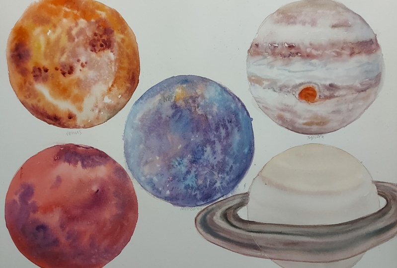
4. Warm up: Get started on the warm up. First of all, we
will be looking over the basic watercolor techniques like wet on wet and wet on dry and mainly
focus on working on circles because that's what our final project
is going to be. First of all, before we begin, I want to make sure that the masking is ready to go
once we finish all of this. Like it's completely dry. So let me go over. And one that I want to
use this masking fluid, it's going to be a cloud effect. It's going to be a
cloud Japanese pattern. So I will try to do that. I'm going to start getting
this drawing gum out. Let's test it here.
It's coming out. So it's going to be a curl mark. So just trying to
focus on creating, like curls all around. I hope you can see it yes again. Okay, so that's good enough. Okay, so first, we're going to start off with the wet
on wet techniques. There's quite a lot, and I'm
a big fan of wet on wet. So we are going to
water this entire area. And then we are going to immediately drop in a
color onto this area. And just be mindful of the
colors that you might want to use for your final project when you think about Saturn, Jupiter, Mercury, and so forth. So I will try to use blue here. So that's like putting
laying down wet on wet. That's immediate reaction of the pigment on a wet surface. And then we are going
to lay this down. And we're going to
give it a bit of time to dry and as
well as this one. We are going to wet
that surface as well. And slightly damp. We're
going to wait for these. This one, we're going to wet the surface and it says pull colors while wet and
the other one is dots. Why I added this poll colors is because of the
fact that Jupiter, you have to pull color
that you lay down one. Say, I'm going to use
this lavender color. You have to get a lot of
pigment on your brush. And then you can kind
of pull that color. You can't really see too much. I think I need to get
a stronger pigment. Let's get the rows
of ultramarine. What I mean is like pulling
the color, like that. You kind of lay a color, and then you pull it around
in different directions. And then for dots, we are going ops I forgot
about this one. Okay. It started drying, and this
one is slightly dap still, so I think I'll try to
use the same color. So that one started to dry, and then this one
is slightly damp. I mean, this is more
wet than this one, so it kind of looks
a bit different. Maybe it's the other way
around, but you get the idea. This one is just out of control. It just spreads out so much. And then the next one, this is a lot of water. This is slightly damp, and this one is like
spreading out even further. Then this one, which
has started drying, so you can see the difference. And then dots. I want to create the dots, but I'll just add
a bit of water. And then I will create dots. So you have to have quite
a lot of pigment and less water because the
surface is kind of wet, you don't need it to have water in order to
push it through. So the next one, we're going to work wet on wet. Again, we're going
to wet the surface. But we are going to be mindful creating a space
right in the middle. So then we can connect it later. That's one wet surface and another semi
circle wet surface. And I'm going to use maybe complimentaries for this and what I mean is the opposites. I'm going to put a
purple at the top. And then I'm going to put
a yellow at the bottom. And then I am going to connect. I think I need more
of these colors. Okay. And then I am going to connect them
right there. Okay. And then I think I So you can see how the
pigment reacts together. Some are not as
flowy, so to speak, as the other one, and some could be really strong in character. So you can see that here. I think the granulating purple that I use is not as
strong as this one, so it kind of the
yellow overtakes it, which usually is not the case. Yellow tends to be a
les stronger pigment. But I think the yellow ochre, yellow ochre dominates
the cobalt violet here. And the next, we're
going to work on dry because we'll be
layering two colors. Now, for this one, I want
to use to give you an idea. I'm going to create a venous
looking circle right here. And this may look not
as vibrant right now, but you'll see how
vibrant it can get later. M. So I'm working wet on dry. I've not added any
water right there. Okay. So next, we are going to basically wet
each of the surface, but once we wet it,
we're going to tie it. So this would be after 1 minute of laying the
water, we'll add a pigment. 2 minutes after
laying the water, we're going to add pigment. 5 minutes later, we're
going to add the pigment. So I will wet the surface. And I will t it. And kind of making sure that it's kind of
like the same amount. Timer for 1 minute. I'm going to get ready with
the color that I will use. I really love Smalt
by Windsor Newton, so I'm going to make
some pigment for this. And I know there's
going to be tons of variable in terms of how
much water you lay down, how much pigment to water
ratio there is in near brush, but try to control
that as as possible. Still waiting on that 1 minute. Okay. Is 1 minute. When I tilt my paper, it kind of moves relatively. I mean, it's super hot
here in Munich today, so maybe it's not
as a good example. But at least you know
what it's like in your environment because everybody's climate
is quite different. So I've wet that surface. Timer for 2 minutes. And I'll wait for that. But then I'll just add additional
3 minutes for that one. Okay. So while we're waiting, I am going to work
on the blooms. So how do you get a bloom? We are first going
to lay down a color. And then I am going
to make a bloom. Well, the way you can
make a bloom is by dropping in some clean water or another color of your choice. Um another color of your choice when it's
starting to dry. This one, you have to be mindful by tilting the
paper or looking it from a different
angle so you can see the surface of the paper
and it's not drying yet. It's drying from like
the corners already. It's going to be
32 degrees here in Munich today, it's
quite something. I am going to also do
a salt experiment. This is not such a strong color, so let's I mean,
Tundra isn't either, but maybe I'll get another color. Okay. And the salt also has, this is drying, so I'm
going to add some water. I'm just going to
add water there. I'm very busy. 2 minutes came up, so I'm
going to add some water there. Tilt my paper. The
same way I did. Then timer for 2 minutes and
a half. I can do that one. And I'm going to
add a bit of salt. I mean, bit of water here. It's almost drying,
so I think it's good. Let me show you with a camera. You can see these bits right
here are starting to dry. And I dropped in
the water and it's creating those lovely blooms. For the one
experimenting with salt, it's not quite dry yet. I want it when it has a
slight like shear sheen. I don't know which word it is, but we'll wait for that. For the masking fluid, I believe it's al, so I am going to
use a bit of blue. And then spread that around. Then add a darker
blue rate there. And let that completely dry, then we can lift off
the masking fluid. For the salt experiment, I think we can add it a
bit where it's drying. He right there. Okay. And let that sit far. While. I think the
five minute one should be going off
any moment now. I don't think the timer was on. Okay. Let me ask. What's the timer at now? There are no timer set. Okay. Maybe I might have
been a bit late, but you get the idea.
It's quite different. And even if I tilt it, it's not going to move as
much as the other ones. Okay. So basically,
we're going to wait for the smalt and the
maskine fluid to dry, and then I'll show
you the results. They've completely dry now, so I'm going to
rub off the salt. It's very subtle as the pigment that I use
was quite subtle too, but you can see the
lovely salt effects. Here. For the masking fluid, sometimes these gum
ones that are very thin pointed are quite
thin on applications. Sometimes they don't
quit work as nice, but I think they've come
up pretty good this time. I think my eraser
wasn't as clean, so it's left a bit
of the black mark, but sometimes those
effect could look nice without it being too
whitish, that's pretty good. Finally, I haven't forgot about the layering
of two colors. This one's dry as well, so I like to layer quin gold, which is like a
vibrant yellow to make it look shinier.
Look at that. It's almost like layering another colored glass
over another glass. Look at that. That is so pretty. Looks like venus now,
don't you think? Yeah, that's pretty much it. You could even go some areas. You can go darker
because I think the venous has darker
areas like the moon. You could do that. You
can even add a bit of black. So areas. There we're done
with the warm ups. Now, let's get into the drawing
of the Japanese patterns.
5. Planets and Patterns: Like to go over the
Japanese patterns. For some of these
like the Asanoha, and the Segaha, I've already explained it in detail
in another class. So if you'd like to go into, using the rulers and
the compass for these, then please check
out that class. But otherwise, I'm just
going to draw them by hand. So they're not going
to be quite accurate. And then I'm also
going to explain each of these in
detail on the side of this video so you can have a grasp of what they
mean on kimonos. But they basically good fortune. You always want to wear
something that brings you luck. I'm going to first of all, just paint with watercolor, each of these like the
ripeter the saturn, the venous, and so forth. Using watercolor, let it dry, and then we're going to
be working on it with whatever pens or the metallic
colors that we'll be using. Except, I'd like to start using the masking fluid
for the acumo right here. I didn't have much space
talk about bad planning. But I'm going to
create a Wakumo. How you draw acumo
usually depends. There are different kinds
of acumo out there. But basically the idea
is just drawing like a circular like a circular motion, and then almost like
flowers like that, but they could have
a bit of a tail. So that is vacuo. Sometimes they're also
kind of like that, and then kind curly like that, even round like that, and then you get out a tail. So that's a acum. For the anus the tens, I chose the wam because ten means above the Yeah, above us. I thought Clouds, sky, that works idea wise. I am going to draw
these right now. You might even want to use a pencil that might be nice just to get the outline of how
you want them to look like. Then you can even
group them up a bit. I'm going to stylize them
later for the final, but I'm just trying to get the idea of how to draw them
and for the composition, I'll be thinking
about that later. I'm just making it
clear for you to see what it looks like. Then I'm going to
add masking fluid. This is also going to be
a bit of a test for me because I've realized that I've realized that using the
masking fluid on top of the pencils made them get
muddy looking and quite dirty. You may not want to do that. I will see if I
can cleanly erase it or it doesn't bug
me when I do this. Testing right now. This testing will also be apart from drawing
the patterns. It'll also be a good way to
know your colors and see which planets suit
a specific color that you may have with you. Keeping that in mind. Okay. So I'll let that dry. And first of all, I'm going
to be working on Jupiter. So for this one, I am going to use
my shadow violet, which I really love as well
as I think I'll use seran, which I have here as well
as this whitish color. Think that should do. First, I am going to let that
surface at the top. You can look up pinterest to see what colors you'd like
to use for the planets. They really got great references there for you to have a look, but I am going to use. This and then even doing
that wet on wet technique. And then another
Jupiters are quite fun. They're almost like marbles. I think watercolor is a great medium to
get that feel out. Here I'm using John brilliant. It's a whole by color. It's a very opaque
white big watercolor, but I like using that
for the Jupiter. I'm the paint mingle
with it together. I'm not doing any
color mixing on my palette and then I'm going
to use that serian blue. And pulling that color around. Then I'm going to let
that sit and wait. That's it. Like the Jupiter
is pretty straightforward. You can even add if you want
more depth at the bottom, you can add a bit of
that grayish color. But yeah, I just like
how it looks like that. I'm going to leave that.
For the Kiko, the Saturn. The reason, first of all, let
me explain the reason why I chose Aha to do on top of the Jupiter and so for later on after I finished the
whole planets first. For Saturn, as you know, they have this ring around it. Saturn is quite difficult
with its color. I wasn't too sure what to do
with it, but I thought, Hey, why not just go with fun colors
of pinks and the yellows. So That's what
I've chosen to do. And then just really
randomly adding colors here. I'm using Rose Dora from Windsor and Newton
that I really love. It's got this very
beautiful vibrancy to it. Then I'm going to add a
bit of maybe even orange. I'm just going crazy
right here with colors, and then using Nick I don't know how you pronounce
it, yellow as well. D Then a bit of sap green because I did
see some greens in it, then again, some reds the rose dory then maybe adding that yellow
again at the bottom. For this one, we're going
to leave and for the ring, we'll be using the
calligrapher metallic pens and the black ink pens because I just thought
that's quite pretty. Yeah. Then for the venous, we are going to use the yellow. I'm going to use
this tundra, orange, which is a yellow and a red mix, hence the name orange. But I'm also going to add this mahogany brown to some areas. Again, Tundra orange. This is going to be the one
that you layer later with a very vibrant yellow
if you have around. I think nickel azo
should work as well, but I tend to like to
use the quin gold. I don't like that greenness
that az yellows have. Yeah, that's just my
preference because I don't think there's any green
on venous really. Then also adding a bit
of that mahogany brown randomly Then I'm going to add this color
called aps brown. It's got a bit of
that blue black field to it just to get that
separation going. We're going to layer
that venus later on. Actually, I might even
add a black pigment. Mars black. No, I
don't like that. Okay. Even might create
some blooms later. Okay, so this is for the Mars. I'm going to use a
Phoenix basically later. But Mars, Let's get
going and so first. I'm going to use that
John brilliant again. It's a white opaque
color that run around. Then I'm going to get
volcano red by Schika. This is a great red to have. Reds don't come
very granulating, apparently, but this one
is super granulating. It's just amazing and
I really love it. I'm going to use that
piral like scarlet red. If you have a cad
red, that'll be cool, you just want to get
that redness going. Maybe even pulling
it around randomly. Then like a dark red, almost like a bloody red color, would be as well. I'm adding it just
to get some depth. That. I think I quite like it. I'll just leave it to that. Using tons of water
is really important. I just love how it
just moves randomly, intuitively without me
doing much of the work. Then I'm going to give this
urus a bit of time to dry. We're going to work
on mercury right now. For Mercury, Yeah, I don't
know. Maybe it's the name. Mercury. I always thought it
was more like a blue color. I don't know why, but
it's basically gray. Grays are not really fun
when it comes to watercolor. First of all, I'll be
using the Lapis brown. Lapis brown is from rockwall paints and it's
a really beautiful color. You could also use
something like hematite violet, which I love. It's the prima tex series
from the Daniel Smith, but they tend to have a
very interesting glow. This is hematite. It's really close
to Lapis brown, but Lapis brown could give
you more darker values. Yeah. But yeah, I don't know. I don't like that too much
of a coldness to the gray. This one has a bit of
warmth, and I don't know. That's just my preference.
I tend to like it. I am interested in the
Daniel Smith graphite gray. Seems like a really
cool color to get. I'm still waiting until the
time I arrive in the US. We'll be making a move
to the US real soon. It's the end of July. Today is the last day of July, but we'll be moving in
September to Seattle, the state of where
Daniel Smith is, so that'll be cool. I'm going to add a bit of
black Mars black, actually. Maybe I should have added
there, but it's fine. Mars Black. Just for some fun, I'm going to add a bit of like lunar blue because it's more of that cool tone
blue, black color. I think it should
balance it a bit. I'm going to add more black here just to create that depth. I think I like it. It's going to be quite simple,
but it's fine. For the uranus, I'm going to keep on trying to
say it correctly. I don't know. It takes me back to those days
at school when the boys used to make fun
of how to pronounce this. Anyways. First, I'm going to use this lavender
color right here. And then basically
go over this area. Then again, the John brilliant
whitish color Big color. She also had this color
called the Naples Yellow, I believe it was, but
that works as well. Something close enough. Then I'm going to use the
lavender again come in there. Then well, actually
French ultramarine blue, but ultramarine
blues work as well. French ultramarine gets me more in terms of I
just love this color because it's more granulating I feel and more intense in color. Okay. Then I'm going to
get that lavender again, working my way around, use a lot of water,
and then finally, I'm going to use
that daterne deep, like deep rich blue. Then finally, they
have a ring as well, so I'm going to wring it. I'm going to pull while it's wet like a small
ring right there. Okay. That's it. I'm going
to let that dry. These are the planets. We've got the base. I don't quite like the saturn right now, but maybe I need some job to do. I don't know. I'm not a big fan of bright colors, I suppose, but we'll let this dry and then we'll come
back and then we'll start doing the Japanese
patterns on top of. So now that they have tried, I want to go through
each one drawing them. For the Jupiter,
I've chose Asanoha. Jupiter has basically,
this is my sign as well. But Jupiter being this word right here is
Jupiter in Japanese, but basically it has
the tree character. So Asaha is, like,
basically hemp leaf. So I just thought, it's tree. It's a plant. It's
kind of related. And plus, this is just
my favorite pattern. So what else is
there a reason to, like, you know, I had to
choose this one for myself. So you can also choose whatever sign that
comes up as yours, like, you can choose
whatever pattern that you just feel connected to. It doesn't really matter. I just chose these
because these are quite what I like in Japanese patterns, and they're pretty. So I just thought, Okay,
I'll go with that. So for the Asanoha, I've already explained this
in the different video. But the basic idea is, I'm just going to dry draw. Maybe I'll align them into these lines that
already kind of exist. And I'm being quite rough here, but we're going to
draw horizontal lines, and then we're going
to draw a zig zag. This is another way of
drawing the Asanoha, but you just draw a zig zag. Making sure it kind of connects with the
top bit right there. I'm being quite rough here, so It's not quite perfect, actually, but h, it's
quite wide here, oops. It's gonna not look as nice, but you get the idea. And then you draw like a circle in the middle
of these triangles. And then you come down, you come to the side, you come down to the side. Again, top side side. There's a circle,
top side, side. There's a circle, top, side, side, top, side, side. And then you just continue, and then it'll become like
a star kind of shape. I think you kind
of get the idea. And I've noticed that going
stronger on the lines, like, say I'm going to go all
strong on these lines, like the V V here, then it'll create like a different kind of
look compared to if you go kind of like a dark
value for a specific area. So for the final project, what I'm going to do is
I'm going to create, like almost this
a diamond shape. I'm going to create a
diamond shape in the middle as if it's like the
iris of an eye, and I'm going to
create the Asanoh within that. That's my goal. Because I saw
something on Petris, I'll show you that
I quite loved, and I wanted to create that on this Jupiter. That's the idea. And then for the Kiko. So for Saturn, I chose Kiko Kiko is basically
a toward toys shell. And I just thought because
Saturn's lettering is Earth. Basically this is
stand or Earth. And so it's kind of
related to how they're grounded on the Earth in
a good way, of course. So I've decided to
choose Kiko for this. And so Kiko, very easy. It's basically a hexagon. So I think you know
how to draw a hexagon. The, there, there. That's it. What I'm planning to do for
this one is because I'll be drawing the outer lines using these
calligraphy pen touch. That's my first. Then maybe I'm going over
this quite loose right now, but just bear with me. I just love how There's many kind of lines right there, maybe even outside. And then maybe even the black
a bit gives a modern look. I might not use it. I don't know. Then for the Kiko, I will' make it a bit slanted, so I'm just going to then
I'm going to create a lot of the Hexa gos or the
Kiko around the Saturn. And although they look quite
random because hand drawn. I kind of like that effect. It gives it an organic
look. I think. And then so I'm just
going to doing that. And basically for these marks, I'm going to go over them with
my calligraphy pen touch. And I will y, basically just draw
them out like that. I might even not do the
underlying sketches. It really depends. But Yeah. I don't know. I I don't quite Maybe
it's the background, but I'm not really enjoying that very strong look
of the gold on that. I know it's going to
take me quite some time, but I might even
decide to use like, something like a yellow ochre. With a Yeah, with these
very thin liners. Hm. Actually, I might do that. So I will use yellow ochre
to draw these hexagons. And maybe add in No. No, I don't think
that quite does it. I think I'll just use the yellow ocher for most of these hexagons
all over the saturn. Then basically I might add in
that silver here and there, but I don't know. I might not, but
that's the idea. For, for the venous,
K means gold. Basically, co patterns are usually about
fortune with money. That kind of fortune, so I just thought, it kind of fits it. So I've chosen Utoko.
For the venus. It's basically fish scales, and they're kind of glittery, and venus is glittery, so and shiny and all that. Oh, I forgot to layer
the quin gold over it. But Mm Okay, let's do that. I think it'll dry by the time. I'm just going very
thin with the layer, and then let that dry,
and then come back. See how it shines.
It's so pretty. Maybe even at a bit of black. I'm still testing this, but Mm. No, I don't like that black. How about the Rose Dory? Mm. That might be kind of good. No, I'll just keep
it with Quinld. Okay. And then I'll come
over this venus later. And for the Mars, because this character
right here means fire. Fire connected me with
the pattern hole. Which is basically Phoenix. It's like, imaginary animal, but it kind of has its
own meaning a fortune, like, second chance
and so forth. So that's what I'm
going to draw. So this one is not going to be like I didn't like that idea
of having tons of phoenixes. I just want one single Phoenix. And in a very like oriental
calligraphy style, Phoenix. So for this one, I will
use a yellow ochre, For the Phoenix,
and I'm going to just mark some areas
and also laps brown. Think I is too much of
that yellow ok there. Um Okay. So I want to get out that
kind of like a hair, a beak. And then we even
use cobalt blue. Now, actually, I'm using
that as brown again. And coming in and then use a blue against Mm, maybe I wouldn't use
the blue, really. And then coming down. There was a imagery on
pines that I really loved. So I'll probably using
that as a reference. And then blue. I'm thinking even coming down out of the planet would
be really pretty. So I'll probably do that. The yellow Ochre again, even that oh brilliant. I smushed it too much. Yeah. But, being quite subtle. Oh, no. I'll probably
do that one over again. It's kind of bring in that
kind of feel of the beak. And the eyes. Okay. So that's the Phoenix. For the ur, I'll be
think it's by now. I'm going to this off, see how it turned out. So I think I have to be
careful for this as well, but I think this paper
hasn't completely dried. Maybe that's why, but it has to completely dry in order
to ops much my Phoenix. Completely dry to kind
of come off completely. But, I think I had to
wait a bit longer. It's not quite coming
off as I wanted to. Or maybe it's that
reason of using, like, a pencil beneath it. Okay. So I quite like that.
That's really pretty. I think it turned
out quite right. Oh, sorry, I forgot to mention. For the Asanoa, I'll
be For the Asano Ha, I'll be using the
gold Coligraphy, Inc, the pen, actually. Because I'm a hue
advocate for gold. So it'll be like that. Okay. And for the last one is Mercury. So Mercury, because it has
that letter water in it, I've decided to use the Segi ut, which is basically the
pattern for the waves. It's basically blue. S waves. So I'm thinking about
creating a pattern Actually, I'm thinking
about creating a pattern vertically,
right there. Just quite subtly. And then I am going to let's
just say I'm going to make. So how you draw these patterns is make like a equal block. Make a equal block. And and then a curve. Oh, did I do that right?
No, that's not right. The bottom in the bottom square, it should have, like,
a different curve. So the curve will be there. And then Hm. Wait a minute. Oh, that's right. The
same curve is fine. Make a mistake. So just
let me do that over again. My head's quite
somewhere right now. Okay, so for the final Sega ha, I am going to only do Like a
vertical line of Segi hop. And basically, you're
going to split it into equal squares as possible and
basically create a curve, a curve, a curve, a curve. And then a curve a half curve, half curve, half curve. I guess it's a bit not
equal square right here, but hopefully you get the idea. And then Okay. And then basically, these are can have
multiple layers, depending on what kind of
look you are going for. It can have multiple
layers of these waves, or you can simply
just make it as it is and not add any more layers, but here I am
adding more layers. And then finally, for this one, I will be adding silver
or silver blue wave. I might even just go with two, not too sure because
of the tight spacing, but I'll decide on that
in the final project. See how it looks. Okay. So that's kind
of how it looks. Yeah, and I think
the toco is not quite the venus is
not quite dry yet, but I think I'll
just try doing it. So how you draw toco
is quite simple. It's basically a triangle. So just like a triangle in the pattern just
means that's a toco. And the way that I
want to do it is basically making it diagonal. And then having the triangles, almost like that sanoha. This part is a bit still. I will select few
triangles, I think. I might erase some
of them later. But basically, I'm going
to have some gold. And the gold ones, I thought I'll have a
double triangle inside. So go double triangle. And then also some silver. Oh, that's right. But I wanted the silver to be the
opposite direction. I kind of want the silver to be downwards. But I don't know. I quite like that
kind of I don't know. I might make it the same and
even add some Not too sure. Actually, I think I'll go with the silver double triangle, and the gold will be
just like a single. I think. But yeah. Okay, that's uroco I might
even do a zigzag motion, but we'll see how that goes. I'll just think about
the composition later. That's the overall examples of the patterns and how
I'll paint the planets. I think we're ready
for the final project.
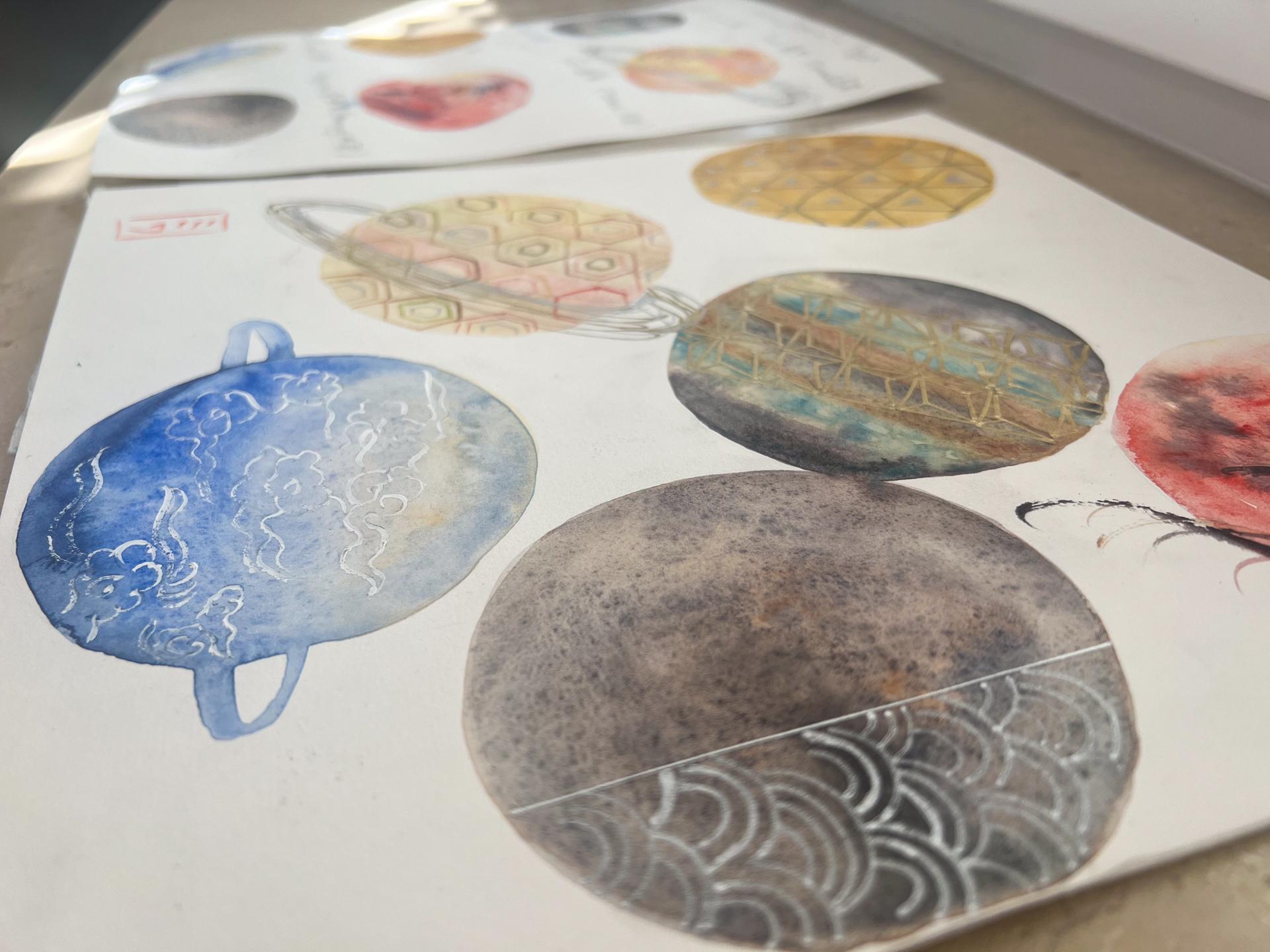
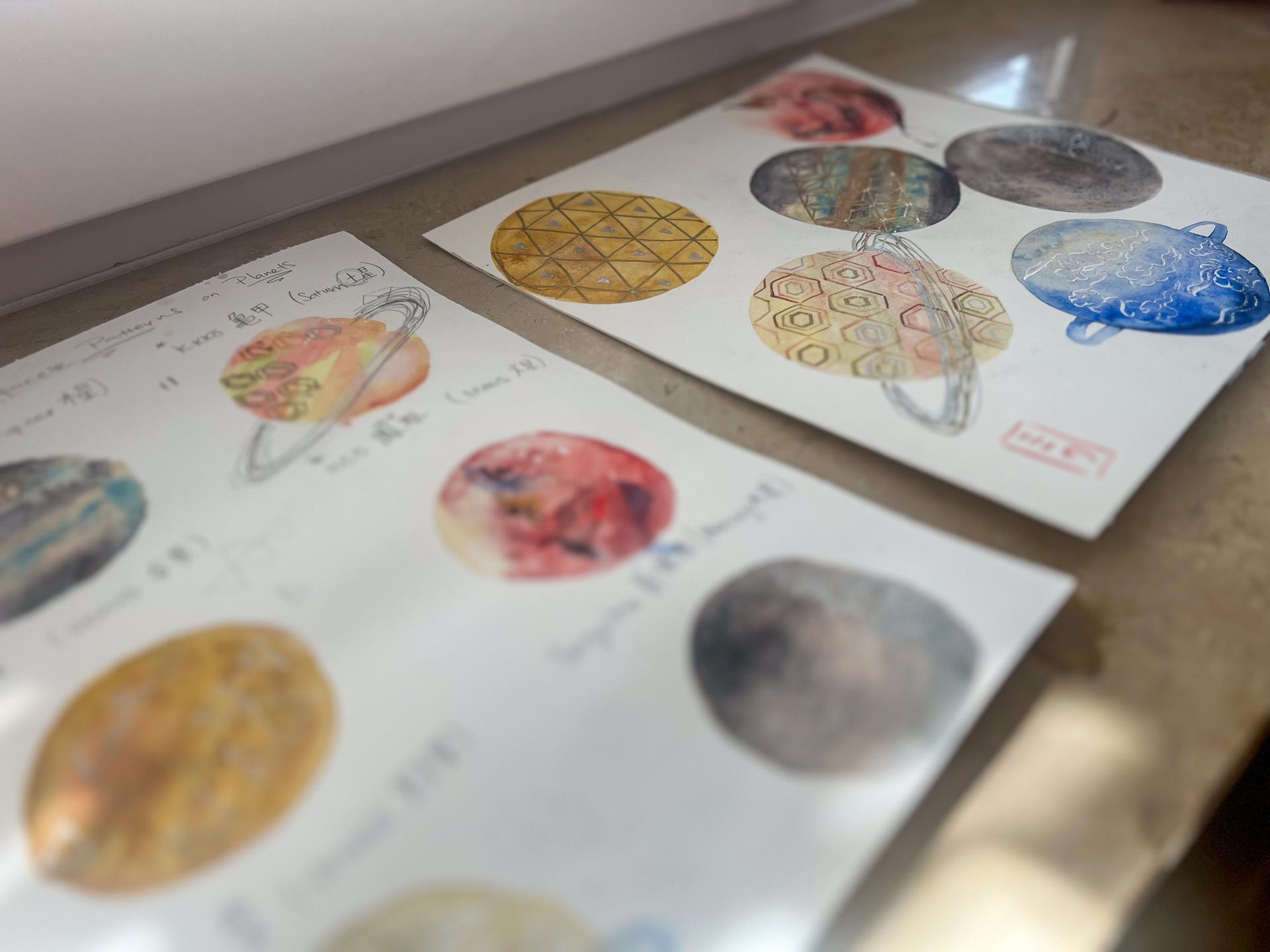
6. Final Project- Painting Planets: I've all included the circles that I'll be doing
in this one sheet. But you can always choose
one and just do one planet. It doesn't really matter. Because I have to explain all of them and kind of
show how I do it. I've put them all in one block. And some of these are
going to get quite tight, but I like the
randomness of them. And yeah, I'm just going to try working on
them like this. Here I'm going to
do the venus, Mars, Jupiter, Saturn, Mercury,
and then uranus. First of all, I want to
start with the left top. I'm going to work
on the venus first. So let's get painting. I wrote venus like a
small V right there. First of all, I'm going to
use a bigger brush for this, and then we're going to work
in with the Tundra orange. It's cooking here. It's getting really hot, so I don't know, my head's almost
not like working. Yeah, I wonder what other
color I used for this, but I think I'll go
quite simple with the color scheme and just use this tundra because it's
really looking pretty. I just had a water
color workshop at my house here this
weekend on Sunday. I mean, last weekend. Yeah, there was a student who
said, basically, if like, a feedback of they'd
rather have a scrapbook, or work on the paper that they'll be working for the final project
as a warm up. But that kind of
comes quite pricey. So I did give them some scrap
papers of the same kind, but yeah, that's a good thing because now it kind of
looks pretty on its own. I don't want to, like, work on it too much. Like, add any other color, so to speak. But yeah. Okay. And I'm going to let
it do its magic and wait. I might even come
in a bit more and create like a movement. Okay. So that's venus. And next, I'll work on the Saturn, which I wasn't too sure
about. Quite tricky. I didn't quite like the
colors that I used, but I know it's like kind
of that yellow and pink. It's okay. I'll just use
what I've used before. And it's kind of nice to be
mindful of the circle line. Maybe you can try to create
the planet inside of it, so then you can completely
erase it later. Maybe I'll try using
both titanium, actually. It might be less in your face. Yeah, quite like that. And then a bit of sap
green dropping in. And if you create some
movement with the bruroks, it's going to the pigments
are going to move that way, so try to be mindful of that. A bit of red again. Maybe add it here as well. And then yellow. And then the buff titanium. Oh, I forgot to erase that S. Okay. And then some sap. And then the yellow again. Okay. I like that subtle t of this. I'm going to let that dry. Next, I'll be working
on on Jupiter. So I'm going this is going to be a bit working on different zones, so to speak. I'm going to use this
small tiny brush in But loads of water. And I'm trying to be mindful of that space leaving
the pencil mark. And then John Brilliant. Let those two mingle and maybe even add a bit more of that shadow violet at the top to create more depth. Kind of wetting enough
surface right here, so it doesn't dry out. And then I will go
in the cerlian. Make a bit of up pulling
of this color around. Maybe even add a
bit of water. Okay. And then I am going in
the shadow let again, but even making it a bit
lighter toned, add more water. Kind of create that layer and then mingle it with the top. You got to work fast. Well, at least where I am. I might even add this color called Haze blue by Shinka just to give it a bit of fun. Lo to that. And then I will add Just enjoy mixing
different colors. I mean, I have quite
a lot of colors, but you don't have to have
them in order to make them. It's just going to be more
convenient if you do have it, so you don't have to mix it. But if you do want to
create something similar, then I suggest you
kind of create them on your palette before you start
working on your planet. And then can I add
that cereal in. And then the shadow violet. Again, right there
to let it spread. Okay. I don't quite like this middle
layer, but it's okay. I think I'll come into it
later once it's totally dried. But I may even add that one brilliant a bit
more because it's losing its whiteness.
So to speak. Okay, and I'm moving next. So I'll be doing the mars next. We'll be adding the
John brilliant again. First, around here. I should change brushes, and I should erase
my M right there. So trying to keep it
as wet as possible. And then I will come in with that rose Day color
beautiful color. Maybe even get in a
bit of that there. And then the scarlet
kind of cad red color. And I am trying to be mindful of adding this very strong
pigment away from where the phoenix might go
because it can kind of clash and because it's very
watercolor is so translucent. I you know, layering on top
of a very strong pigment might not really
work out as well. So work out as much. I mean, so trying to
be mindful of that And then I am going to add a
bit of lapis brown just to get a feel of planet look. Okay. And then I'm going to
do the uranus right here. So, for this one, again, I'm using the drawn
brilliant over the top. Gives that creamy
Beautiful look. And then what color did I use? That's right, lavender. Kind of going over that area. And then French Tmarin. Letting it kind of
flow into that area. It might even add a bit of
more of that lavender a bit. And then finally, in, which is a very rich color. I'm trying to work relatively quick because things are
drying quite fast here. Okay. And then finally, I'm going to create
that ops, the ring. But when I do this,
me just wipe that. When I do this, I want to
be mindful of that space. I've created right here. So I am going to kind of
maybe go over like that. So it's going to hit
the mercury a bit, I think, actually, the san's
going to be like that, so it's fine. Just
go to create one. Right there. And that's enough. And
then for the mercury, we're going to use
the laps brown, maybe even the
hematite, genuine. And then finally, I'm going
to cover it a bit with that Mrs black from Schmka. So let's go. Like, for the warm up, I've kind of placed the
segui hot. On the left. And maybe I might even make that area on the left
hand side a bit darker. So then the silver metallics
that I lay over later. Oh, no, I totally
forgot to mask this. Oh, dear. I totally forgot. Okay. Well, that means we'll
have to use acrylic instead. You can always use the masking fluid and don't make the same
mistake as I did. To be honest, I don't use
masking fluid as much. I really use like
white acrylics. So maybe that's why I'm
just used to it. Okay. And then what did I use? I thought I used something
before to gift that Oh, yeah, lunar blue, that's right. But I'll use a bit
of that black. And I don't want to
get this to dried up. So I've used lapis brown, and I'm layering some
black right now. And then I'll add that
lunar blue as well. This is going to take time
to dry. But it's fine. We've got it. I think
this one's oops. It's not dried yet. We're going to let this
dry a bit and then come back for whatever second
layers we need to work on. Now they've dried. I am going over
this first of all, I'm going to the pencil marks that are around each
of these planets. And because I'm using
hot press paper, the outside lines of the planets are going
to be very visible. So you can see the
edge of these planets are not quite like
a perfect circle, but I tend to kind of
like that imperfection. So I don't mind too much. But if you do mind it, then I would say you can go over it with like a
pastel color pencil even or even with your
thin liner brushes and work on the color that
you've used in that area. But Yeah. Okay, so I am going
over this with the quinac gold to kind
of brighten it up. And I am going to stick with this color unlike
what I did before. I am not going to experiment. I just love that color. Layered. On the top. L a dark bird there. Quite like that bloom that it
had over on that top right, but it's covered now. Oh, well. It's kind of, like, a good thing to be mindful of
what you want to keep and what you don't want to keep when you're
layering as well. I forgot to be kind
of mindful of that. As I'm layering, I just totally dismissed the showing the
underneath layer in some areas. More visibly, without
layering could create, like a wonderful look as well. Okay. So I'll leave that to dry. And then next, I will go over some of these that I
think needs a bit of layering. I quite like the
saturn actually. I like that subtle colors. But for the Jupiter, I think I could even add a bit. I looked back and
realized that there was, like, like, like, orange area, brownish orange
area in the middle to layer, so I'm going to add
that right now. And then I'm going to
add a bit of that. John, again, but maybe
even kind of go over it with the cerrillan more. I don't know, I
just don't like how it turned out as
much, I suppose. Um, making sure it's what? And then I'm going
to add I think. Yeah. That's much better. And then in to add
that shadow, violet. A like that area that I have underneath. I'm not going to disturb that. Then I'm going to go very subtly like as if there's a layer right there
underneath that brown. Then there is actually another layer of that orange
that I was talking about. I'm just going to
layer that area. Make it even darker. Okay. And then I will
add that can blue zone. So to speak, and kind of kind of moving
it around as well. And I am going to
add that white. Okay. And then I'm going
to add a bit of that. Dark. I think there's
a bug needing my help. Anyways, clean. Okay. I think I kind of kind of didn't do a good
job at that bottom. But we can probably clean it by layering over some
of this later. So it's fine. For the Mars, I really don't want to change. I think it's good as it is, so I'm just going to that. For the urinus, I think
it's good as well. I want to leave it. And then
finally, this one, okay. This one has to
wait for a while. So yeah, I think I'll
leave it to try. Unless I don't mind it
kind of coming in a bit. Like, you know, like
planets like meeting together and just almost go
to explode or something. Yeah. I think I kind
of like that idea. Let's do it. So I'm going to go into the rockwall
laps brown again. I don't want to
disturb that area, though as much because I
quite like how it looks. And just almost having, like, a clean brush. Not connecting it yet. But I thought for this one, I can kind of make it
into a bitter circle. Okay. Okay. And finally, think I'll think I
went too dark there. I've not come in too early. Like, too soon because
I wanted to kind of ooze in rather
than gush down in. Okay, so I'll leave this to dry. And then we're finally
going to work on the final Japanese
pattern layering with using pens and inks and even white acrylic
for this one, unfortunately.
7. Final Project- Japanese Patterns: Come back and I've drawn. I mean, I kind of went in detail with this toco the saturn. But I drew everything pretty
much, and I'm ready to go. So first of all, I like to go over the venus
that I've done. And I'm going to use
the metallic pens. And I decided to do the silver. For the triangle and
the double triangle. I might even just
color the inside, and then the outer layer of that opposite triangle,
I'm going to leave. And then I'll do the gold, and for that, I'll be outlining
these whole triangle. So I'm going to do
the gold first. Okay. So I'm going
over the gold, and I'm not too
sure whether I will be basically going over
the whole thing or not, but just going to randomly pick the triangles that
I'll be covering. And for the pencil marks, I'll be erasing that later. Hm. The silver one. Silver one is to fill out that small
triangle in the middle. And these are not complete
in terms of size. I kind of went, like, a hand their hand drawn. I didn't use a ruler
for the whole thing. I kind of like the
randomness of that one. Hm. But I think I might cover
up more of that silver. Mm. I think I'll go for the
whole whole look actually. I'm trying to figure
out which one I'm gonna cover. Maybe that one. Hm, I might cover
the whole thing. See how that looks. Well, there's no
turning back now, so, I might as
well give it a go. Today I'm feeling quite
tight with my paintings. I'm not in the right state. Oops. That's where it had that
problem, I suppose. Oops. I made a mistake with that one. My sketch was not correct, Okay. I'm done with my. Uh I left the online. Okay. There's quite a few things I probably wouldn't have done. I thought I think like
leaving it a bit alone, like a few areas would have
looked better for that one, but it is what it is. I'll be erasing those
lines later on. So I'll leave it as
it is right now. And then next, I'll be
working on the saturn. So for the Saturn, I've
drawn a couple of ds, but basically, I've
created a compass circle. So it'll be easy for me
to create this hexagon. This time around,
I'm going to use a very light yellow
ochre and go in over. I think I think I could even use the same nick
that I used at the bottom. Actually, I'll just say
the yellow ochre. I think. That's okay for now, or even the Tundra orange
that I've used for this one. Yes, that looks a bit better. Kind of light. No
too saturate it. Then I'm going to create that the inner hexagon as well for some of these
ones, not all of it. Hm. I'm forgetting
my hexagon shape. I think I might even
use the rose Dory that I use for the
background in some areas. Even that green I think I'm going to end up
coloring the whole thing, but some are going to try to make some of these
very light in value, then it wouldn't look as strange when you
cover dentally up. So basically, I'm mixing up the colors with what I've
used in the background. So it still looks it's still
got that cohesiveness. Oops, I made a mistake
with that one. Just kind of blend it out. I like nothing happened. I must admit that I'm kind of running out
of time right now. Yeah, I didn't think The drawing of these would take so
much time, actually. It was like my miscalculation of, like, Oh, it's
going to work. And I'm having a
friend come over. Since it's quite hot, I thought we'll have a bit of a pool party in the
balcony with my son. So I have to go pick him
up a bit early. Today. Okay, I think I should
stop talking as I'm forgetting my
accident in shape. Okay. I think I'm done. Maybe I can color in that bit
since I covered most of it. Oh, I want a lighter. Maybe. Okay. I think I I think it's okay. Okay, so we'll wait for that to dry before I do the
ring around the saturn. And for the Asanoha, I already drew very
lightly with a pencil. For this one, I will be using gold because that's one
of my favorite color. And I did mention
I'm going to do certain areas, but not sure. Like my head is not in
the right place today, so it might change. I might use the silver actually to switch
things up a bit. Oh Okay, so, hold on. Okay, so it kind of
became a slanted version. I think I quite
like it actually. I think I'll keep it like that. And next, we will be
working on the Mars. Now, I've sketched
the bird a bit. So let's start painting this. I'm going to use the bro a bit. Looking at my reference. It's got a tiny
flick of the hair. Then it comes down and has that flick of the the beak. And then it's got a bit of
a big cheek almost there. And then using a bit of orange. And I will use that same tundra. I used in other places
for the other projects. Kind of winking it a bit. Then I am using Maybe I'll use the Lapis
brown again for that wing. You make that bit a bit too big. Then And then I used to to drag
him for this area. Even pulling it down. And then I will use some of the Maybe I'll use that red same bloody
kind of look of red. Flicking a bit of
tail right there. And then the same
Rockwell Lap is brown. Even a bit thicker. Pull that in a bit. It's not too obvious. Even a bit of shadow violet. Be nice. And then shadow violet in this area where it's
creating a bit of shadow. Maybe get rid of that. And then, again, the
rock will lap us brown. Even the shadow violet. Pulling that it. Okay. Okay. I think
that's good enough. And next, We will go into. Maybe we'll do the clouds. No. Let's do the Sega so I can move like this and work
on this one at the end. I've painted a few already. I mean, I sketched
out a few right here, and it's on a third
of the circle. And then I will just this one, I'm going to take
a bit of my time. And hopefully, L et me get a
close up camera view so you can kind of follow if I get
in the way of painting this. This is gonna be a
very subtle work. In terms of color. I think it can do a
bit of more strokes. Quite perfect. Okay. I think I'm
done with that one. And then finally,
we're going to work, actually, not finally, but
we're going to work on this. The, the clouds. And since I forgot to
use the masking fluid, we're going to use
this white acrylic. Okay. So I've already
sketched the clouds. H. I do prefer using white acrylics
over masking fluids. I just feel like they give a like a crisp like they're more malleable because
they can give you crisp edges or they
can give you a look. C. The downside of using these white acrylic is that they tend to
dry up really fast. So I have to wash my
brush here and there, or else the paint just sticks and starts to not flow as much. What do we do what do Okay. So I'm done with that. And finally, for the saturn. We are going to erase
all of this once. I think the Saturn turned out quite having that
Japanesque kind of look. I think it might be
the colors that I. Some of these can't
quite come off. L et me use the s as sir. Hm. Strange. Some of these can't seem to come off
anymore, but it's okay. Okay. So finally,
we are going to create that like a ring. And I don't mind if
it's a bit wobbly. But I think I went a to
overboard right there, but it's Okay, so I'm done
with the saturn. I think somehow
something is missing. And I have a feeling that
I could even go in with the metallic pens just to
give it more a cohesive look. I think I'm ruining the work. Oh, no. I think I'm
running the work. But I just can't stop. Oh, actually, okay.
It looks fine. Oh Okay. And then finally, I'm going to erase
this one as well. This one. And finally, this one. And I guess this
one is dry as well. Okay. So I've completed
overall thoughts. I, maybe I'll actually put I think having a line
there kind of works more. But I hope I can get it straight. Okay. I managed it with a ruler. So, overall thoughts,
I think Yeah, I think I don't
quite like this one. I wish I had more
space probably. I should have created
more space between these. But overall, they're okay. This really looks extraly, like some kind of Japanese toy. Like a retro toy. So, maybe it's just I just
don't like very vibrant color, so it might just be me. For the final finish, I think I'll even create a
Japanese seal right here. Or should I create it here? I just feel like it's out
of balance right now, so I'll just create
one right there. I'll use like a scarlet, like a cadmium red
sort of color. So I explain how to create your own Japanese seal
in a different class. So if you like to
do that as well, try to look up
that class, c one. It's quite fun to do so. Okay, so I hope you
enjoyed this class.
8. Final Thoughts: Thank you so much for
taking this class. It really means a lot to me, and I hope you enjoyed creating these Japanese
pattern planets. Now, final thoughts, I think I should have created each of these planets on a
different watercolor paper, but I think I'll work
on it digitally and see if I can just cut them
out and how they look. If I do so, maybe I'll
create more of these. But hope you enjoyed it, and don't forget to share
your final projects. That's creating either one of the planets or creating all
of them, creating two, three. Whatever you create, post
them on the project section, I'd love to see what
you can create. Until next class, see you by by.
 Miwa Gardner, Watercolorist- Watercolor for Relaxation