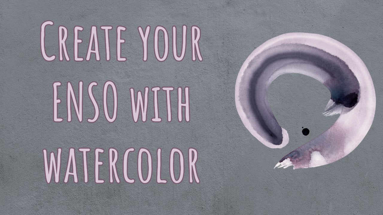
Transcripts
1. Intro: It helps me know where my state of mind is because at the end of the
day we're all artists. There are days that
it works well, there are days that it doesn't. But to understand where your
mind is at is very helpful. Maybe today I might do re painting because my mind is not quite there
or it could be like, Oh, wow, I'm creating such
a beautiful enz today. Everything seems perfect. Now, let's get into difficult portrait painting
or something like that. Yeah, if you're very interested
in this nz creating, there's a class that I
did before this class. Go check out that class first because it's a very
short video explaining what an enz is and getting into the details
of the classical nz, using watercolor paint, because traditionally they use
Japanese calligraphy in. That being said, actually, this was a class that I created first with that basic ends. What happened was that I wasn't really happy
with the outcome of adding these classical
elements onto the ends. This is what this class
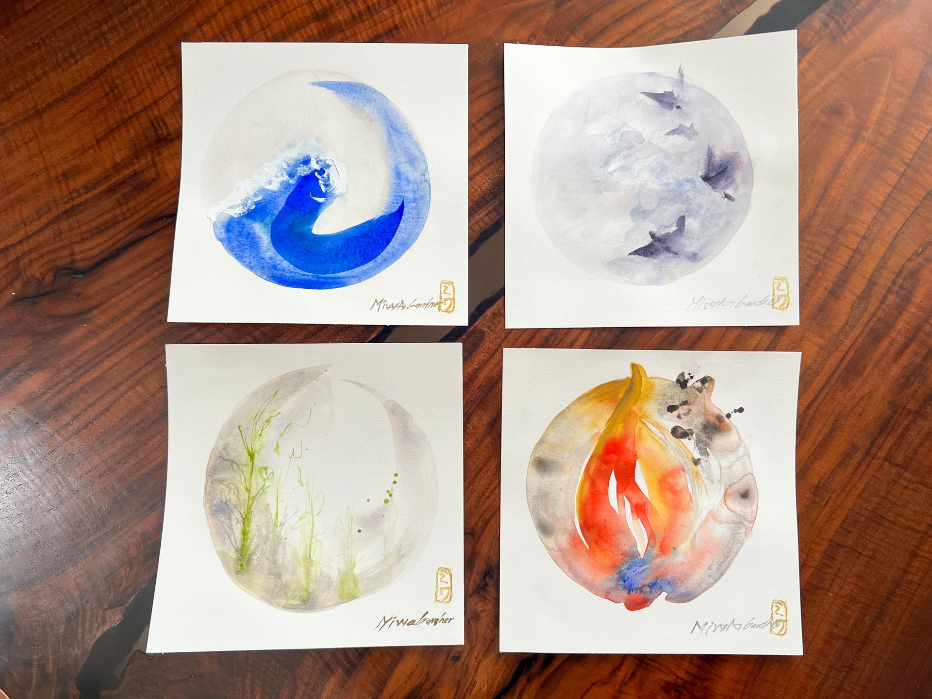
is going to be about. It's going to be doing the ens first and then adding the classical element
like the fire, water, wind, and earth. So we're going to add that. But when I added it, when I took this whole class
before, it didn't work out. I didn't know why. I kept on practicing, it
didn't work out. So I thought, I
had to let it go. I was like, it's fine. I'm just going to let it go. Literally today, I was eating
breakfast with my son, and then I thought,
Wait a minute. And so it's on Japanese
Colgraphy paper, right? And then I looked up at
GPT and I wrote down, what's the closest
watercolor paper to Japanese calligraphy paper? The answer was hot press. So there it was I
use cold press for the final project last time that didn't work out. So
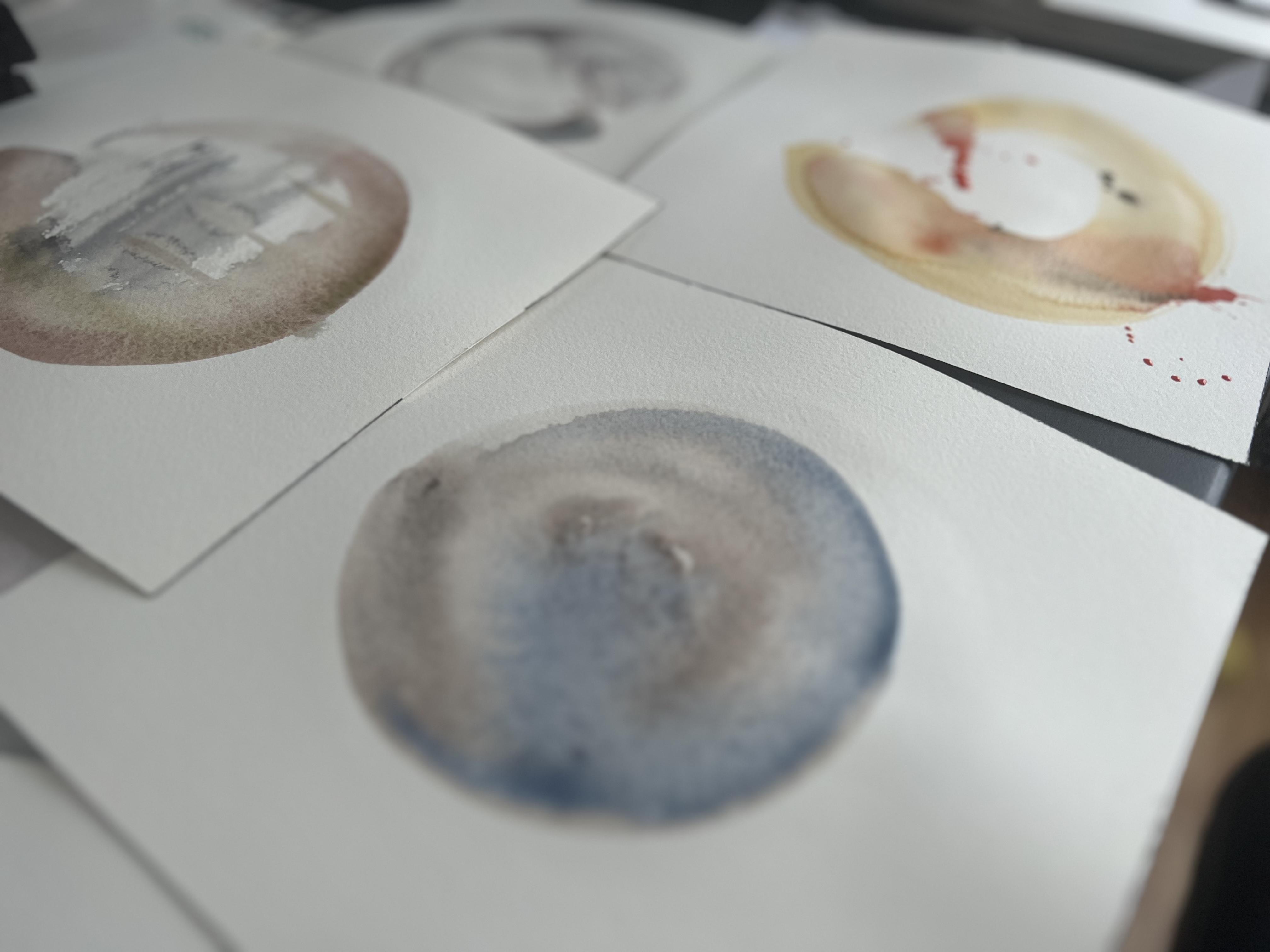
let me show you. This is fire. I
didn't quite like it. This is Earth. It's
okay. Not so good. This is wind. It went terrible. Well, fair enough
because I moved it around when it
was not dry yet. But the final project of the ens like the basic ens worked
out. It was really pretty. And the paper, you bet it's
hot press paper. Here I am. I'm going to record
this class with a hot press and
wish me luck on it. Yeah, I hope you enjoy it. The final project would
be to post elements added on top of the watercolor NSL
painting that you've done. If you're up to it, please
share it on Instagram with the Hashtag my NSL watercolor and I'd like to see
what you can create. Okay. Now, let's get started.
2. Materials: Let's go over the materials
that you would need. First of all, you
need some pencil. Maybe a compass
would be helpful, need a eraser, and a separate
palette would be handy. Some watercolor scraps that are lying around to test your color. And I'll be using this fabriano sketchbook for the
sketching purposes. And this is very
important trying to get hot press paper
for the final project. This is the mistake that I made a few weeks ago when I tried initially to
create this class. And now I realize that it's probably because I
was using cold press. Now, it reacts more closely to Japanese calligraphy
traditional papers because it has that
smooth surface. But if you don't have a
hot press laying around, then try to use a paper that's
quite thick but smooth. Next, you'll need some
paper towels to clean off your brushes and
some clean water. Then you'll need some
watercolor paints. I have tons, but I'll be
using very specific colors, and the swatches will be
in the resources section. If you want to look into
the pigment information, I have all that out there
so you can follow along. You can always check out the resources section where I have a PDF file of all the
materials that I'll be using. Finally, I forgot to
mention these three, we'll be using the
white acrylic, and also these Japanese
calligraphy pens are really nice for
signing the artworks, which I normally do, and then the magic eraser on the far right to
clean your artworks.
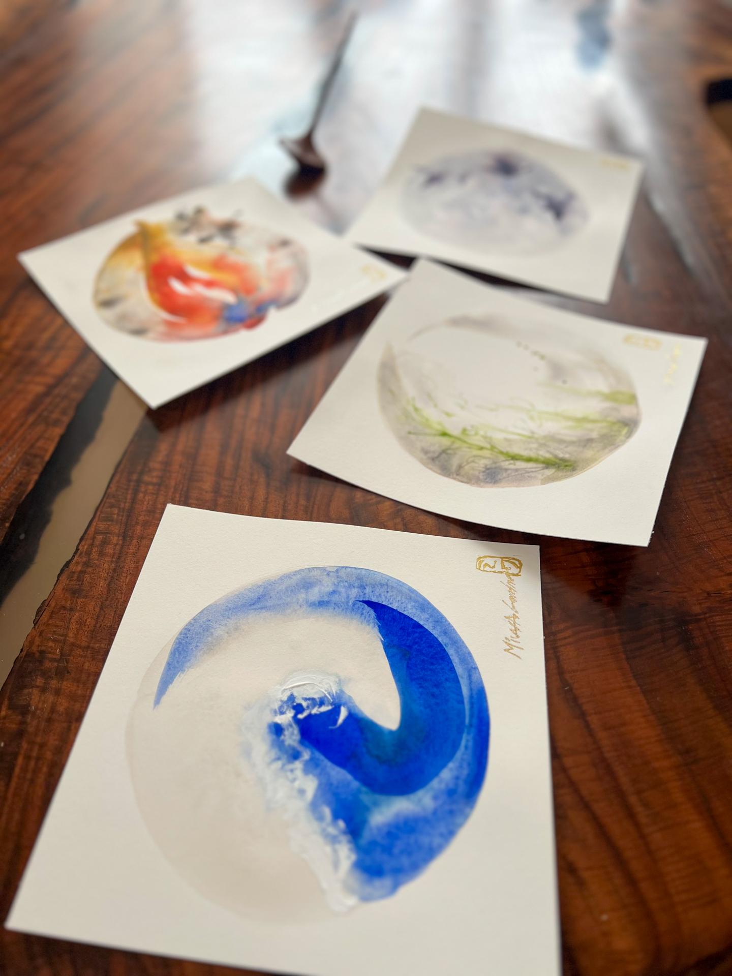
3. Inspiration: Look into inspirations. I have my Pinterest boards here. We'll look into the earth first. I often for inspiration, go into Pinterest and
look at some ideas. I looked up Japanese uk art. This one, I quite like the
muddy earthiness of the color. I'll be using that. Also
the one with the snake. I quite like how the
grass is vertically long on the left hand side
and gradually gets shorter. While it goes to the
right hand side. But I am not going to
include the snake, but I just thought I quite
like that composition. Then other than
that, I like these almost like calligraphy
looking leaves. These will be my inspirations to kind of draw over the ens. Next, let's look into the
water board. Into water. Now, for the water, I have
this board right here. As you know, I quite like, I think everybody
knows this art, but it's by hooky
and it has the wave. So I want to incorporate that because it's
a water element. And for a circle, I thought I quite like
that composition of the wave kind of curling up from the middle to the bottom of the circle and then to
the left top section. And if you're left handed, you can always flip this. So for the wind,
this is my board. It was quite tricky as I didn't know what to
kind of narrow down to, but I quite like the grayish
look of the overall tone to be like almost like
in the storm at dawn. So I'm going to do
that. And then I quite love these birds, like flying in the air. So I thought I'll
incorporate that Japanese calligraphy kind of brush stroke works
into the artwork. And then for the fire, this is my pin board, and fire was a tricky
one as it didn't have quite enough
examples of fire itself. It was a lot of fireworks
because Japan just, you know, we just
love fireworks. But I quite like the flames
on the left hand side. These two were
quite I don't know. Something just got me
and I thought, Okay, why don't I make it into a
japanesque kind of feel by using the colors that they
often use in their Ukioi art, which is like yellow ochre, maybe Prussian blue
with ultramarine, and I think that
will create that Japanesque flare,
enough of that. Okay. And if you
haven't looked at my Japanese minimum
watercolor hearts class, you might want to check
that out first because I do explain about how to create a Japanese looking palette inspired by all the uki
arts that exist out there. So I hope that helps. Okay. Now let's get started.
4. Sketching: Okay, let's get into the
sketching of what to expect so you can get into the sy
elements like quick enough. So I will show you my plan. So first of all, for the Earth, we will create a dry brush of
neutral tint in the middle. And once that's dry, we're going to use
aps brown from top way up to right here
on the right hand corner. And then we're going
to use sap green to create these plants and even add the same background
color of laps brown to add more
values to these plants. For the water element, we are going to be mindful
of this triangle right here. But first of all, we're going to create a circle with a compass. Go in with the same lapis
brown, very slightly, make a wash. Let that
dry, almost dry. And then we are going to create an enzyl with
otra Marine from here, going down with that
angle, and then going up. And then finally, adding that darker pression blue here
to create more depth, and then that white acrylic
at the top for the wave. Okay. For the wind, we are going to create a circle with a compass, and then we are going to create a slight lighter wash than
this with shadow violet. Then we are going to use
Monglo and add the birds, and we are just going
to make that darker, adding more paint, more value
of Monglo to the birds. And finally, we'll
get a flat brush to create some dry
brush technique to create that
movement of wind here. For the fire, it'll look a
bit different from this, but we'll create a black, actually a black pigment, to go from top and then
come Actually, no. No, no, no, that's wrong. Actually, we are going
to start out from the bottom with a black paint, go around, coming back here. And then we are going
to get yellow ochre, put a brush at the top, a bit slightly above
the black paint, the ens that you created, coming down halfway,
and then adding a red from the bottom here up to connect
with the yellow ochre, so it kind of flows into the
yellow ochre at the top. And then we are going
to do the same thing, come down a bit with
the yellow ochre. And then finally, we are going to add the blue right here. A bit, the ultramar blue. And then for the final bit, we'll add this black kind of almost like ashes right here, like splatter or black
at the right hand top. And that's pretty much it. Okay. So let's get into
the earth element.
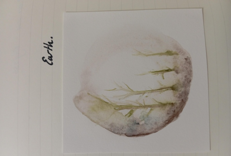
5. Earth: Okay. So I'd like
to get started. And first, we will be
creating the Earth. Now, I am using my
hot press paper, but it's quite big and I
want it to be a square, so I'll cut it off later. And here, I will use it for testing purposes
on the bottom. If I have to do some testing. First, I'm creating
this lap is brown. I'm activating it with water. It is heavily
diluted with water, and I've also
created this circle. Then it helps me
to be controlled. I am going in from more time. Okay, I so far like
how it's looking, and I will get my point pointed
long brown brush and get inside the sap green. Create some lines. I'm trying to keep it
loose as possible. If you get too much paint
that seems too heavy. You can just add some
water to loosen it up. A bit more here. And for composition wise, I want to make the lines here long and
smaller like shorter here. But don't make that too obvious
when you're doing that. And I will throw in a bit
of lab pose brown here and there to darken some areas. So far, I quite like it, so I'll keep it
like this and very important to let
it dry on its own. Now, you could use a hair dryer, but I've seen other artists
show you the end result in comparison with the hair dryer and non hair dryer, and
it makes different. Let's let it dry as possible and come
back when it is dry. I had to use the dryer a bit because I'm
running out of time. Yeah, because I have to take this class by today,
so allow me to. Now I am going to go in. Yeah, just look at
your painting and just analyze where you
want to darken it a bit. I want to have more
depth right over here. So I'm going to come in. And just dark in that area. And then, again, I will use this thin brush almost like a liner and go in the s green, go in darker with it and leave
marks like it's abstract like leaf and keep it loose, some strong, even add a darker same background
color on some areas. And again, I'm going
to get that sap green. It really works when
you go inside wet and wet and make it quite loose. And even in spotter a bit of
that darker color over here. Draw up some of these paints. Maybe even go even
darker on that bottom. I'm going in the
sap green again. Maybe make it lighter here because I want more contrast on the left hand area and the right hand being
lighter and shorter. I might even leave that space on the right hand side as it is
because I don't want to add too much because it almost
look like it's made up. So instead, I might add a bit of like blot of that
sap green right there. I want to leave that
mark right there. So kind of think where
you want to keep and what you don't mind adding to a certain area that
you don't like as much. I'm covering this
area with this paper, so it doesn't go on that
bottom right corner. And now there's some puddle
going on right there, so I'm going to tilt
my paper a bit and move the paint around a bit
up and letting it flow. Moving the water a bit. And I might even
help that water, that puddle will
just move slightly. Okay, I think I quite like it. I don't know if I'm quite
finished with it or not, but I'll let it dry and then
see what comes out of it. Okay, so now it's dry, and I'm going to look
at what I like here. I think this part here
can be a bit darker, this plant here, so I'm going
in with sap green again. Maybe even connecting that
green a bit right there. And even going up a bit. And then adding a bit of that background
that brown color. And to slop this color, it's from the Rockwell
painting company. I almost springing
days out a bit more. Okay, I quite like it. And I am going to bring that background color again here on the bottom
connecting these plants. Maybe I overdid that one. Creating a bruh textures and a bit of that green
with the dry brush again. Okay, I think I'm
pretty down with this. I like the effect
that it has now. Just make sure that
kind of look at it at different stages and kind of think where you want
your eyes to be drawn into. I made this bit darker and and worked we into went
and worked through three different stages in
this painting and creating that contrast so I can make a flow where the ice goes
through the painting. Later on, I would be erasing all the pencil marks
that I've made, and I would be adding the here to mark the
completion of the work.
6. Water: First, we will be going over this whole area with laps brown. We will cover the entire paper where I've drawn the circle. I really suggest you
create the circle with a compass first to
make your life easier. I'm trying to create this
color as light as possible. It might be a better idea to try to keep it inside of that
pencil mark if you're planning to erase it later because once
it's underneath that watercolor you wouldn't
be able to erase it anymore. Ops to darker there, but just add some water. But it doesn't matter
because we will be covering it with the
blue of the wave. Now we are not going
to let it totally dry, but let it dry enough, so it doesn't create
that wet into wet technique where it
makes it look too fuzzy. We'll wait for a bit longer. The way to tell if the paper is basically in what
stages they are at. I recall where I read this, but there's like a
shareness to it. If there's a puddle,
it's very wet. So it'll be wet and wet, and the whatever paint you put on top of it will just
spread. Without control. But when there's a shear, but not quite dry yet. So when you add a paint
there at that time, then it will cause that cool flower effect,
which I quite like. Now I can see that the areas
are getting completely dry and some have that
sheare I think I'm ready. So we will have to be mindful of a triangle that we want to create right there for the wave. So I will go in right here
with my blue in an angle, going down to the left, and then turning my
brush to the right around the edge of
that circle to the up. And you can tell that I
didn't have much paint, so it didn't spread to, so I'm going in again with more paint and water next time, and in that angle, come in and go up. I'm not too worried about
the movement right there because we can always cover it with paint white paint later. But I do want the option to be able to not
putting the paint. I am sucking up the paint water. I'm squeezing as much
water and paint out of my brush and making it
become like a sponge. I quite like how it looks
right now, so I'll leave it. Actually, I'm going to
get a smaller brush next. I'm going to get that
brush in blue and add it right here where I want
to have some more depth. Try to make it come
down in an angle again, aligned with the first
ultramarine blue that we've laid. Okay, I like how it looks, so I'm going to leave it
as it is and let it dry. On a sign note,
there's a few puddles, and it's very hard because I do like this
puddle right here, as well as this one right here. But I'm not very happy about this puddle
or this one right here. So what do you do? Do
you tilt the paper? No, because what happens
is that if I tilt it, ones that I like and the ones that I
don't like will change. So what you can do again
is squeeze out your brush. Try to collect gently some of that paint
that's right there, the puddles that you don't like. I think I took too much
paint here right now, so I'm going to gently even create some other brush strokes right there and let
it do its thing. Again, for this puddle
that I don't like, I'm just tapping in a bit, being very mindful not
to disturb it too much. I think I'll keep it to
that and let it dry. We're back and to be honest. I think I went in too soon. It's created very nice
textures right here, but I don't quite like how it hasn't created that
strong line right here, and I would like to go more straight right here at the top. So I am going to go over
this one more time. When I initially tried this, I really like the outcome of it. It was just complete for me. But this is the thing. You just have to adjust
with what you see and what you have at that
time at that moment. But just try it out again. So I'm going in straight in an angle and then turning
the brush around. I quite like that. I'm going to make it a bit. I'm just going to drop
in that Prussian blue while it's still damp. So it becomes a wet
and wet technique, but make sure there's enough
water and strong pigment of Prussian blue compared to how much water there
is right here. I think I used a bit too
much little rush for that, but I think that's okay. Now I will I don't want to create a very
strong line right there. I quite like how it is. I just want to add a bit of
just a slight value to it. I'm going to go down here a bit. Maybe I'll use a
smaller brush act and the work my way up
slightly, very gently. I like how it's creating that two translucent
layer there. Okay. I quite like
how it turned out. Maybe it's a bit uneven, so it doesn't look
good right now. I think I put in, I'm going
to squeeze a bit out. This is the thing. Don't
touch it too much. Okay, I think it's good, so let's leave it to dry. For the final stage, I would think whether I
will add the whites or not, depending on the final
look comes out to be like Here in the
dissecting phase. We are going to look
at what is needed, or what do you like
about the painting. I really like the
line right here. I quite like these
subtle splashes that are going at
the top right there. But it just looks quite n. So I think I'll try to add
some whites. Let's do this. So I'm going to first
lay down the texture. I want it to be quite
textos, get a bit, a lot of white paint and try to create more texture
at the front, which is quite
close to the wave. And almost curling
up right here. I think I did too much
there, but, it's okay. Curling up right there. I don't need that
bit right there. Then this bit right here
could be quite flat. Okay, I think I
should stop here. But I'm just adding
a bit more here. And finally curling right
here with thick paint. Okay, so I like how it looks. It's good. So just use tons of white paint if you are going
further with adding the whites and trying
to make it textured by making it thick and putting
a lot of breast strokes, like pushing down
the paint here, close enough to this area, try to curl it in, really close to the wave here, try to make it, and at the top, try to make it
flat and diagonal. So we are done with
this painting.
7. Wind: This and the fire are one of the projects
that I struggled until I realized it could be because of the paper because I was using coal press before. So let's see how this goes and by making this
change, it becomes better. First of all, I am going
in picked the wrong color. So I'm going to dilute
it and you can see. It looks like a quint
coral underneath. We are going to with the
whole surface like we did for the water. I've created the circle with
the compass and I'm going in with this color
called shadow violet. And I'm trying to be mindful
of that pencil mark again. I'm trying to paint within that pencil mark so I
can erase it later. But, it doesn't
have to be perfect. Sometimes I like that almost like a bit of woppiness
in the circle. Okay, so I'll let it set in a bit and then we'll go inside with a wet
in wet technique. The reason why I chose to
use the shadow violet from the Daniel Smith is for the wind is because
it's the image of Dawn. Where there's that
pinkish light and the Shadows are in
its light tone. It has that pinkyness to it with the underlying
blue gray color. So I just thought
that was quite pretty and matches the scene
that I want to depict. And the birds that we're
adding to make it even darker, I'll use the moon moon
glow by Daniel Smith. I use it a lot for shadows. I like to drop in
some noon glow, but but quite light. Just to create But let's
just actually, okay, I'm kind of creating
this by intuition now, but I'm just trying to create a more sort of darker
areas right here. Because the paper dried up
too soon than expected. And I want to get into wet in wet technique first before
adding those parts. Okay. So first bird that I would be creating
would be right here. It's going to be a very
strong thick layer like that. I think I went too dark to sin. I don't want to create
the same mistake that I've done before many times. I'm going to wet
my brush again and tap it to soak up some
of that paint and water. But I didn't want to
make the same mistake. So let's go a bit lighter this time with a bit of
that pigment glow. We're just trying to create
the fuzziness of that there's a bird existing
in this specific area. I'm just going to drop in the paint in
there and like that. It's going to have a
tail. Then at the top. I am going to create a bird
that is a bit vertical, and this one should be
divided out of the three. I've created a bit of fuzzy Mestins of birds
existence on the paper, so we'll let it try and
go to the next layer. So I'm checking to see which brushes are the best
size for each of these. I think I might even
choose that size of brush. It's really important to
know your brushes because, especially when it
comes to calligraphy, if you go back to my part one of this class of the ensl class
that I've taught before, on the actual z bit only. I go over warm most of how to understand what
your brush can do, what kind of strokes
you can create. This is going to be useful
for this part of the class, the wind that we're creating. We're going to get into the moon glue and
being mindful of the inspiration the
strokes of the bird. I am first going to start
from here, go a bit small. And then I'm going
to create one wing, and then the second
wing. Like that. I don't quite like
the tail here, so I'm just going to
add a bit of water. Add even some splashes there. Next, I'm going to
use this brush. It's a smaller brush. I'm being mindful of the values. The pigment to water ratio
because you want the eyes to go to that first one I
painted there and then go up. I'm going to make it a bit lighter than the first one
that I've painted so far. Like that, and like that. And a bit darker in
the middle to get that body in there and a tail that comes out
like that, maybe. I guess that bit was
still wet so it didn't. I'm just trying to connect
it with water a bit. For the final one, I'm going to make it a bit lighter again. It should be around here. We already marked it
vaguely where it should be. I will go inside it in the middle and
make it a bit darker. And then go up with
one brush stroke, and then the second
breast stroke. Try bruh even go
outside of that circle. It's okay. It's
fine. Looks good. Then add a bit of
that leg a bit. I feel like there should be
another one right there. But I just feel like
this base right here is sad, just too empty. Just by intuition, I'm
going to use this color, which I wasn't quite
thinking about using, but it's called
glacier green by. I'm just going to splatter
a bit right there. I splatter a bit more. I didn't quite like it, so I'm trying my best here to
make it look nicer, but it didn't quite work. I don't know. I'm not
too happy with it. I don't know what it is yet. Maybe I should just add I'm struggling because
I usually go for 33 because three
is an odd number. I just with paintings, it just works most of the time if you stick
with the odd numbers, but I don't know, I could be wrong, so I'm just going to add
another bird right here. Actually, I think it
made it look better. I might come back to work on that one for the final stage. Actually, I'll just add
a bit of a dar value. Okay. I think that's better. I feel like I could have
done gone a bit darker. To be honest with this bit
right here, the background. I think I went to light
for the final touches. I will add a dry
brush a bit like a angular that way with the same shadow violet for some effect as if
there's strong wind. I might even come
out of that circle. Let's see how it
goes and it looks. It's completely dried. I will go in with
dry brushing a bit. With the same background color, the shadow violet,
with my ankle brush. I don't know how
it will turn out, but I want it to be a
bit sideways like that. Just to add a bit
of that there might be some wind present. Even using a bit of the
different side of that brush. Not overworking it. And I think that's good enough. And to be honest, I'm still not quite happy
with the darkness of it. It doesn't have enough. I don't know. I just
doesn't enough something. I just can't quite explain. I did explain about
the glacier green, but I might even try
this haze blue by Shima again from the
granulating series. I'm just praying that
this will go well. Actually, this is the color
that I wanted to use before. I'm coming in with that paint Maybe even coming in a bit that bit
and just creating again, those dry brush techniques
on the left corner. Again, I don't want to overdo
it over blending it again. Yeah, I think that's better. It's almost like clouds. Maybe I'll even add
a bit of water. This color is from the
super granulating set. I didn't buy it as I said, but it's the super
granulating colors of Shimka, and they are so
extremely beautiful, especially when you
add water to it. Okay. I think I'm done. I would just add a bit to
that second bird right there. I'm just going to add
a bit of paint to that part because I don't
think it was strong enough. It almost looks like a
butterfly to me, but it's fine. I don't want to touch
the rest, actually. So finally, I'm just going to add a bit of movement by adding
the moon glow that w. A like a splash actually. I like how it's moving
that way, like a wind. Maybe even up. This is something you
just have to see, try out for yourself. What speaks to you, what do you want to
change, add and so forth. I like how it turned
out way better than the cold press paper
versions that I have. I just couldn't get it right. I'm very used to working with hot press paintings with portraits as well
in a daily basis. But actually, this was. But yeah, I just Yeah, maybe that could have worked. But I used the Qin coral for that one and added the shadow violet
and the Haze blue. Okay, so we're going to leave
that and we're going to get into the final project,
classical element fire.
8. Fire: This would be the final
classical element and so that we will
be creating fire. First of all, let's
know what the plan is. The plan is a big circle, black, a bit on the light side. We're going to create that
black stroke right there. The black is going
to start up from the bottom right here actually. Black from here being mindful. Having the mindful
space in the middle. Space in the middle here again
and finishing right there. Then we are going to add
a bit of the yellow. But the yellow is
going to be picking out a bit and then
going to the left down, Mingling in with the
yellow ocher and giving another stroke to that
way and adding the blue. That's the plan. I'm going to create the black
mixture right here. And then I'm going to go in quite light with the black
starting off from here, being mindful of the space that I want to create
in the middle. So oops. Then even going
in one more time. Oh, dear. I forgot about the mindful space in
the middle right there. Okay, let's be careful. And I'm going in with my yellow ocher, quite strong, pigmented. And then starting
in right there, going down to the left, I think I should have used
a bigger brush for this. B, I forgot to create
the paint for this. Then going in, a big stroke of red connecting with
the yellow ochre. Let's go a bit darker than that. Connecting with
the yellow ochre. And then getting into
the yellow again. Connecting from
that top bit right there and then going down. Maybe that was a bit
too strong yellow, and then adding that
re right there. And then I'm going to create
some thin lines right inside of I like a bit more
curved shaped right there, so I'm going in making it a
bit more curved than it is, and I think that should
be enough for now. And then I'm going to add blue. Let's use ultramarine. I'm going to tap in a bit right there and let it do its thing. And once you look at this, I would say just look
at it objectively and try to see what you don't
like and do like about it. I don't quite like the
shape right there. So I would like to see it
more curved and right here. So I'm just going to scoop up that bit of paint and water
with my squeezed brush. Almost taking those
areas off of the paper. Then I would let it
do its thing, wait, let it dry, and we will come in and we'll work on
the second layer. There's something
that I forgot to do. I forgot to create
a big splatter of black at the top bit. Well it's wet. Let's take a bit of that off. Next, we will be going in with
a bit darker yellow ocher. And then I like it
when there's a bit of Fire is not able to Control. What am
I saying? Sorry. I'm somewhere else
probably right now just enjoying that flow of
water and pigment. I'm also just Well, just look at your painting
and start to question again, what do I want to keep? What do I want to let go? I I'm quite enjoying a lot
of elements right here. This movement going on here. I want to even keep
this side as it is. Quite simple. Making sure that eye
goes more to left side. But I want to add a bit of
that laps brown actually. I want to leave that
space right here before. But I think now I want to connect it and
don't mind losing that white space
and just leaving a bit of that thin line
white space there. Because I just don't want to let that yellow ocher male to the left side because the
paint will go to the water is, and I quite like a bit of a curve here for
the yellow ochre. I'm just going to put
down my brush in a bit of a angular stroke right there. I would use whatever
paint that is here. Draw it down, bringing it down almost like
spreading it all across. But I want it quite
light. Very delicate. But I do want to keep
that black right there. So again, being mindful
of what you want to keep. That might become quite
interesting that right there, so I'm going to keep that. I'm going to add in
Prussian blue. Right here. Just to add a bit more value. Maybe even dry
brushing right there. I think I like it, but let's see the final stage
and see how it turns out. Okay. So for the fire, it's not completely dry yet, but there are certain
areas that I don't like, and I think I can maneuver a b. So I don't like how there's
no red coming up here as. I'm going to pull that up. And let it blend out a bit. Maybe even here, I would make this rib come down here a
bit and then blend it out. And again, try brushing. Up. I like everything. I think I like
everything else except here and I created a bit
of line right there, but it doesn't seem like
what it's supposed to be, which is supposed to be this
plane coming down here. I want to add in mixed yellow ocher a
bit with that black. And create that like sense that it's actually that flame
part of that flame. Same goes with this because
I splatter that black pine, and it's very difficult
to control obviously, but I want to create more intentional
marks right there to give it a sense that
it's maybe the ashes. I would use this paper just
to cover enough of that area. Make sure that there's enough
in the brush and the paint. Again, that looks more like it. But I don't think we
need that bit again. Quite difficult to get
it to the right place, but we just have
to keep on trying. Okay. And I'm going to pick up the ones
that I don't need. I don't need that
one and that one. Okay. I think I don't know. I think I need a big splatter. Maybe even here. Okay. I
think I'm happy with that. Don't need ops. Okay? Don't like
that black in there. Okay. This is good. I think I'm done. It's a mix
of, I'm going to keep that. I'm not going to keep that.
I'm going to add that. I'm going to flow the
plane in certain areas, and there comes a time. It's enough. You
got to let it go. I think I'm good with this one. And, I hope you enjoy the class. And now the final bit
would be a bonus, how clean up my artworks.
9. Bonus: For this section, I will be exp how I tidy up my
paintings at the end. I use a needed eraser
and a magic eraser, basically, I will also
be signing my work, which I normally do for
commission porches and whatnot, and I'll use the
seal seal of my name in Japanese made from an eraser at the end
to mark my completion. If you want to do this
hand written way, I explain this in another class, so check that out. First of all, I will just whatever that
is under the paint, I cannot take off, but at least I can
take the rest off. That looks pretty good. And then I tap in a
bit of clean water. Although this is
not quite clean and scrub off ever so gently, you don't want to go in too hard because it is quite abrasive, so you want to go in gentle with the spots you
have with the paints. And that's pretty much it. And I love signing
my artworks with these Sakoda pen touch
calligraphy pens. For this one, I think
I'll use the gold. I think that'll look good. And I'll test it out first
on a piece of paper. And it looks good. This is super scary because
once it's on the table, you can never seem
to get it off. Okay. And then I'm going in with
my Daka in stamp, my seal. It's complete. It's completed. My signature is horrible
here, but it is what it is. I was out of ink with
that clicker fin pen. I'm also thinking about adding
these collage elements. I've created these
paper. It's so. They are basically mommy gum. But if you want to know this tie for some
class in the future, please leave a review
and comment on it. I'll see, I'd like to
see what you guys think. Thank you for watching.
10. Outro: Sorry, this is
going to be a voice over because the recording
was not so good. I hope you enjoyed the class
and at the end of the day. I think I've done better. I've done better because
I use hot press paper. But on hindsight, I think the cold press
paper did work out. Basically, if you look up these, this is the hot press.
This is the cold press. I think the cold press
looks actually much better. Maybe it was just the
technique that I use, I don't know. And for the Earth. I think I quite like the
hot press one better, but it could have been
my looseness of the day. I felt just pretty
comfortable doing it. And I do like this darker
background so for the earth. The wind or the earth
was still tricky. This is the hot press.
This is the cold press. I definitely don't
like the cold press, but I not too sure
about the hot press. Maybe I need to work on
this more, but it's okay. I let it go. I think. Now it's not the right
not the right time. Finally, the fire. Now, I do like the hot press one way better more than
the cold press one. I haven't still cut it
and signed it off yet. I'm still waiting for it to dry, but I'm quite happy with that. So I hope you enjoy
the class and I hope you can share your
beautiful artworks in the project section. And if you're sharing
on Instagram again, use the hashtag M s watercolor. Check out my websites
Mu gardner.com. I hope you enjoy the class
and I see you next time.
 Miwa Gardner, Watercolorist- Watercolor for Relaxation