Transcripts
1. Intro: Hello, this is a and welcome to my another
Skillshare class. We'll be painting
minimal Japanese stones. Now, I created this
course before. It was my first course ever
published on Skillshare. But what happened was
unfortunately not much reviews, so Skillshare
decided to close it. What initially got
me to be inspired to create this class was I
had a huge creative block. I was very scared to stop painting last year that I made over 240 something paintings. And it was because I
thought I'll lose it. And that's exactly what I felt
like when I came back from Japan after two weeks of staying with my parents. I didn't paint. And that's why this happened. So when I got back,
I couldn't paint. I just lost it. I
didn't know what to do. So what I got to
thinking was, okay, what inspired me like when I
just started like painting. What brought me
relaxation paintings. So that was the Karen's,
these stacked stones. So I've decided to
create many of them. I created over 30 of these
same paintings over and over. Like a crazy person,
my husband will say. But basically while
I was doing this, I realized some points
that I thought, oh, I could share these
tips. So here I am. I've created this class, hope you enjoy it. And the final project
would be to post the stacked stones that you've
created during this class. Without further
ado, let's dive in.
2. Materials: I'll go over the materials
that I'll be using. If you want them as a list, it's provided in the
resources section. First of all, you
need needed eraser. Needed erasers are good because they don't
damage the paper. And then pencils,
watercolor brushes, I have three different sizes, then I'll be using this Fabriano sketchbook
watercolor pad for the sketching or warm ups that I do because
they're more affordable. But they are cotton 25% which basically means that it's not going to
take much beating. If you, I want to use the same paper that you'll be using for the final project,
that's totally fine. It's up to you, but I prefer
to do it on this paper. And then for the final project, I'll be using this
watercolor paper pad is a paper block by Bow Hong. It's hot press, 300 GCM. I've heard a lot of good
reviews about this. Like it almost is like *****. And I love *****. It's really expensive, But I
wanted to give this a shot. I really like it at the moment. The only problem I see is the block papers are
usually glued on all sides. That's totally normal. But what makes a difference here is that it's really harsh, like they put a lot
of glue on it or something that it's really
difficult for me to tear. I've been tearing the paper when I take it off of this path, but regardless, I'm using it. And then you need some
watercolor paints. I'm going to use
this guns thumb, that was a gift from my
parents who live in Japan. I will provide the
pigment information like the colors
that I'll be using. So then you can probably find those easily available with
what you already have. Okay, and then the
next thing that you will need is a palette. You need a mixing area for
your paints and also water. So I'll be using this because the Gunsie thumb watercolors
doesn't come with a palette. You need some clean water
as well as paper towel. And then finally, I'll be using this brush holder because
it's quite convenient. And you'll also
need a spray bottle to activate your paints
before you start. Okay, so let's dive
into the class.
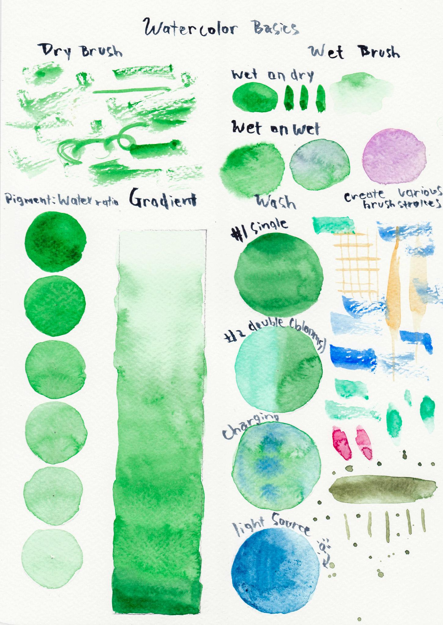
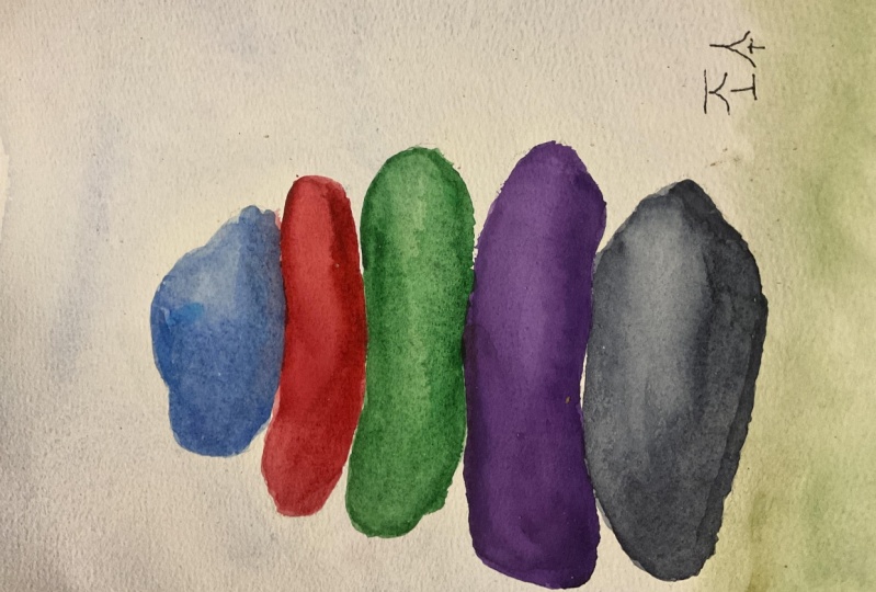
3. Warm Up : We will be going over some different
watercolor techniques, watercolor basics to warm up. First of all, dry brush
refers to a technique where marks are made with
a sparsely loaded brush, resulting in broken edges
and textured effects. Here I am using
this green and not loading too much water,
but more pigment. And then creating different
strokes with my brush. Now, different brushes will give you different techniques. Just play around and see what kind of paint
marks you can make. We will be working on
wet, on dry necks. When wet paint is applied onto dry paper or onto
areas of dry paint, the pigment will
spread less than if you apply paint
on a wet surface. This gives us more control. So here I am creating
like different circles and even some lines
try to do that. This gives you more
control than wet on wet, which we will be working next. But I would say dry
brush technique is the one that gives
you more control. But learning how the
watercolor paint with different ratios of
water works is quite helpful. Okay? So we will
be working on wet, on wet sign, wetting
the paper first, and then applying a green
pigment over this wetted area. So wet and wet is
an effect that you can create by
applying paint to wet paper or into a wet
wash water color, pigments will merge and
blur together naturally in a way that no other
paint medium can achieve. This is one of my favorite
ways of working with watercolor because
really you can't do this with any other medium.
And I just love it. Usually I work on wet, on wet first for my initial
stage of creating a painting. Usually this is the
technique that I do here. Basically, I laid a area, I laid a green paint
over this area, and then I'm adding charging into this area with
different colors. Here I'm working with
a red paint and then I'm going to apply
another pigment inside. So I'm using a lavender
here in pretty much going wet in wet technique. Next we will be going over
this pigment to water ratio. This is very important, It's basically to understand how you control the water
to pigment ratio. This is how you get
the values to make a two D dimensional surface look three D. Because the
more values you add, the more realistic
paintings get. You need to know how
much water is in my brush and how much
pigment is in my brush. Or either how much water
is on the surface and how much water and pigment
is my brush holding. This all changes how the surface will look once you apply
your brush onto the surface. Now I'm going to be working
on a scale of six here, but I really recommend
you do a seven scale, because that's seven to nine is considered the scales
that you would need here. I'm starting off
with more pigment. The most pigment I
can hold in my brush. And less water, almost
no water. Just a bit. And I'm working to
create this circle. This practice I think is the most important
thing that you would do in this
warm up section. I still struggle to do it
after years of practicing. You'll see me struggle
a bit here and there. If you have hard time detecting how much water or
pigment is in your brush, I suggest you have
a scrap paper, a watercolor scrap paper on the side so you can
test your colors there and check if it's the right value that you
need for your next circle. Yeah, that's a
suggestion I can give. This is really, you just need
to practice over and over. Yeah, here, I'm really sorry. Like a bit of the bottom
section is going to be cut off. I've created six, but
it only shows five. I apologize for that. The way that you can control
the pigment to water ratio is basically by adding water to the pigment that you have here. I started really dark, as I said, it was less water. More pigment then
on the palette. This is why pallet is really. Important to have a mixing area. You can add water or either clean your brush
and add more water. That's how you control
the amount of pigment. Now for the gradient bit, we are going to
work the same way. We're going to create a
gradient by going next, really light and
then getting darker. Now if you did the
other way around by going very light first
and then getting darker, which might be easier, I personally think that
would be a easier way. You can go dark first
and then go light here. I'm using the pulling technique
where you basically have a pool at that bottom bit and then just dragging it down here, I'm adding more pigment as I go and not much water because I put enough water
to make create that pool that I can drag down. This is one of my
favorite activities to do because it's
like super fun. This act of you
holding the paper to use the gravity to pull down the water is
just so beautiful. I don't know. I often do it
with my paintings as well. For portraits that I
create on a daily basis, when there's so much
water on my paper, then I'll just tilt the paper
so the water comes down. And sometimes you can create that tear effect like
somebody is crying. Not that all my portraits
are sad portraits, but it's really pretty.
I like that effect. I'm using more pigment than water and then
finishing the gradient up. Okay, next we will be
looking at wash. Basically, a wash is a smooth flat layer, which is also a good base
for adding details in darker mixes or building
layers to vary the tone. Basically, I will be
creating a wash just like how I created
in the gradient. It's basically very similar, but basically I'll use less water so I can
control it more better. I want the whole surface to pretty much be
in the same value. Being mindful of how much
water and pigment I have, that it's even when I work on this flat surface of
this circular shape, you don't want to rework
some areas because that will create uneven
layers, I would say. Okay, for the second bit. I'm going to use two colors
to create a flat wash. I'm going to use this Malachite, because I just love this color. I will be creating a wash
on one half of the circle, and then I'll clean my brush
out and use another color, this green, to create another
wash from the other side. I try to mingle them
at the end together. Actually, this
mingling is a term that is used in
watercolor techniques. But you're basically
putting them together. Just connecting them.
At the last moment, there is my wash
with two colors. Now I'll be explaining how
to charge this technique. I do love as well. You will first wet the surface. You can either use
clear water or use a pigment and then
wet the surface first. You don't have to make
it even or anything, just wet the surface. And then I will go get
a different pigment. If I want, you can
use the same pigment, but you want to understand the pigment to water
ratio in your brush. Because sometimes if you
have not much water in your pigment compared to how
much the surface has water, then it might suck up
and not spread as much. But here I'm charging in with equally the same amount of water in my brush as well
as the surface. It's spreading the pigment inside the wash
that I've created. And you could do with different colors just to
test out how it looks like. Use more water for
some more pigment, for some charging
to see what kind of different effects it will
create. It's quite fun. For this last bit, the light source, I've marked
this sun mark right here. Because that's where I want to imagine the light
source coming from. Which means that you'll create
the lightest light there. The value has to be like
a one or a zero almost. Then on the other side, you'll have the
darkest dark here. I think I was using
a Prussian blue. Then mixing more water at the
midpoint and less pigment, then I can create this light source coming in
from the right hand side. Yeah, I've used quite
a lot of water. You can even use less
water than I did right here to have more control
over your water color. But I tend to just like
using a lot of water. Yeah. Try to do this. You could also do it
in a different way. I'm adding more pigment on the left hand side because I just thought it wasn't enough. But another way to
create this light source is by going in on
the right hand side, wherever that light source is, you can flush the whole
area out by adding water. That's one way of doing it. And you can also just
like squeeze out. This is what I'm doing. I'm adding water so it flushes out all the pigments
to the other side. But another way is to
clean out your brush. It becomes like a sponge, like squeeze out the water and then suck up the pigment and water on the right hand side
or the light source area. This helps as well. Now we're going to create
various brushstrokes here. I'm just going to
be working with different brushes that I have that I'll be using for
the final project. I'll create different
brushstrokes. Some can be mimicking what like petals might look
like a leaf might look. You can play around
with very thin lines, but also create really
thick lines as well. So try to just play
around with what your brushes you have
in handy can create. I'm pretty happy with
the various brush trucks that was able to create. I hope you were able to learn more about your
paint brushes too. Now let's dive into
the next class.
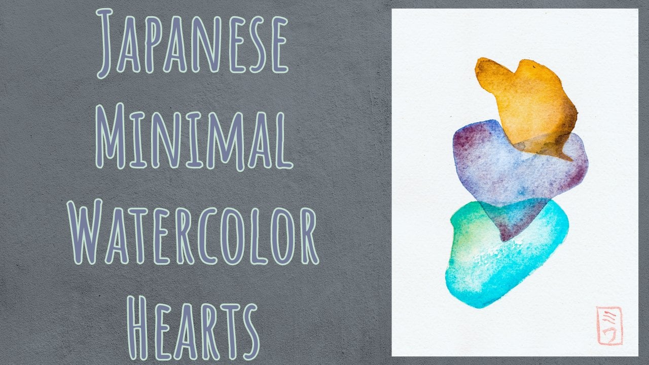
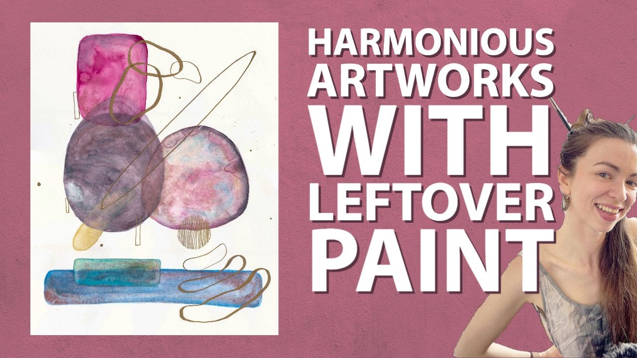
4. Tips On Color: I've done a class where
I explain how to do your own Japanese inspired color palette, like
creating them. If you haven't checked
that class out, please check the Japanese
minimum watercolor hearts. It'll teach you how to create your own palette that's
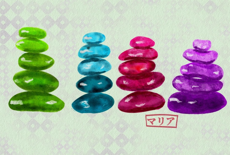
inspired by Japan. Here I've created
different U palettes that I've looked into. Pintras, just scroll through different paintings
that I liked, and then I jotted down
what colors they've used. So I created them with my own
watercolor paints that was close enough to the
color that I've seen through all
these paintings. And then basically, I created a tally of
all these colors, how many times it's come up a lot in Japanese
paintings that I liked. And then I created my own
stones with those colors. I have three, but this one right here was created
with just like a Japanese sumi ink palette
that I had already. So it's already been made and I don't think that's
quite fun to use, although it does look pretty, so I'm not going
to be using that. I've looked through these
three and I think I prefer this one on
the left, basically. I've created even an Instagram
post to ask votes on it, but I'll have to scrape
that out and be like, okay, I need to go with this. So initially I've used
Malachite for this, and then later on I use
this red called Carmine. Carmine. And then I
thought those don't work. And then I went for
this gold color. I use pen touch Acura
calligrapher pen. And I still don't like the goal, so I'll kind of think of
which goal to use later. But I've created so many stones, I just went with three. Sometimes I use five. I looked at the composition, I use different colors,
and I just thought, okay, this is the final that
I'll be going for here. I've created a Japanese, aka it's like a Japanese, your own signature in
Japanese language. And basically, I've created
this with that class that I've introduced to you in this beginning of the
lesson, so check that out. First, I'll be using
this yellow ochre. It's usually P Y 42, and then I'll use a gold
and then Prussian Blue, which I believe is PB 27. And I'm sure you have this around in your house somewhere
if you're watercolorist. And also I'll be using
this color called indigo. But it's really close
to pines black. So if you have any pines
black, it should do. And then finally
I'll be using black, which is, I believe, PBK
11 most of the time. But any black will. I'm not too sure if I like the
order that I have here. So I'll be testing
that out, this gold, I don't know if it
really works to be right there
underneath the yellow. But let's see, so we'll test
this out in the next class. I really suggest you go through your inspirations
through pintras. Just check out the color
palettes that they have and then swatch them out and come down to like few
colors that you like. And then for the next class, we'll be going over those swatches that you've
created, those palettes, and then actually
create the stones and see which one you like the most to do for your
final project.
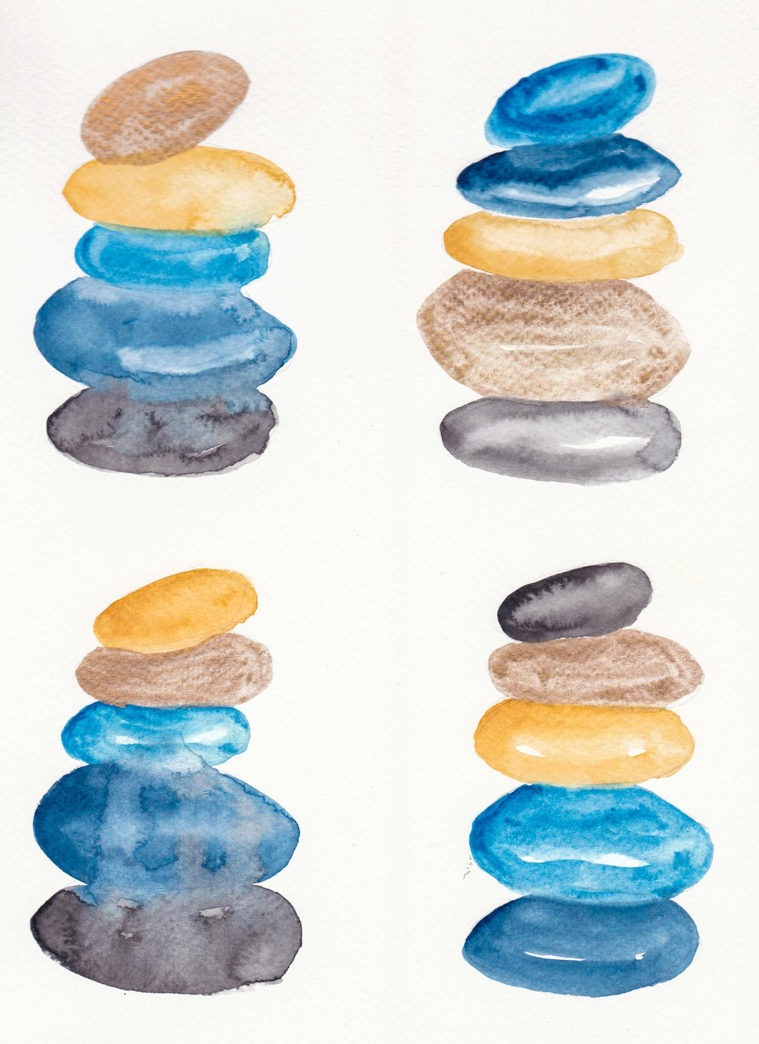
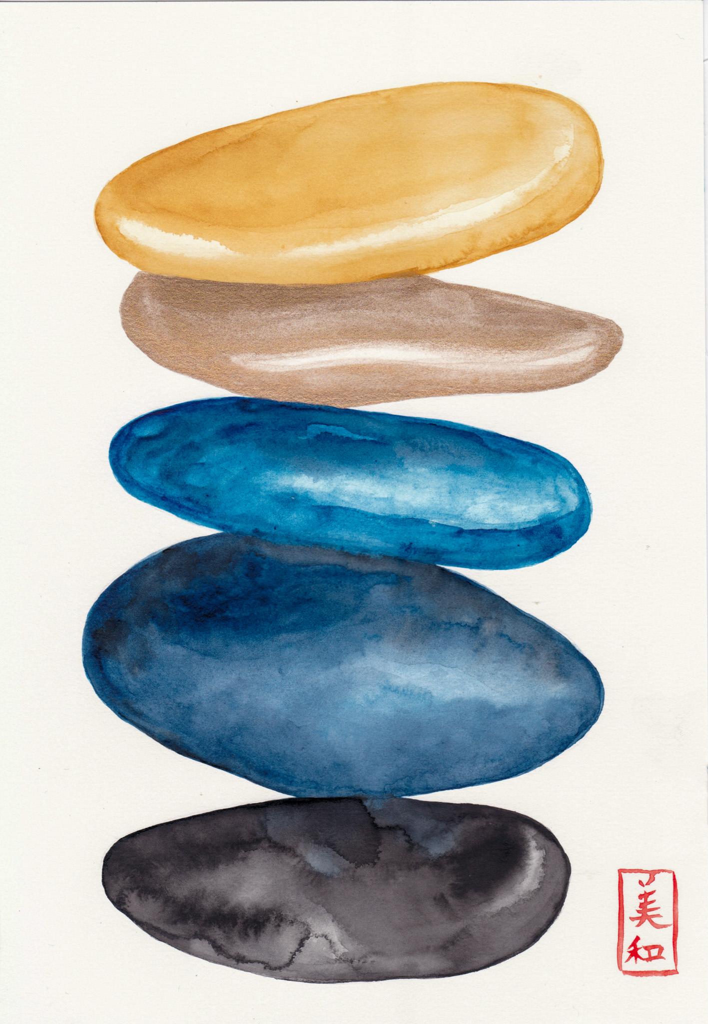
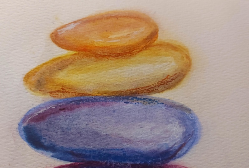
5. Testing: I'm definitely going
with the yellow ochre, Prussian blue, indigo
and black, and the gold. But the gold, I'm not too sure where
I'm going to place this. I'm going to test out
a few different ways and see which one
speaks to me the most. This is like a good
way of testing out to see what speaks
to you the most. Because sometimes we just
have to do it in order to see it and then come up with
which ones you like the most. Now I've free handed the
sketch of the stones. They're not perfect, but it should do what I keep
in mind when painting. Is that also spacing? It is quite important
because water color, you just need to let it
dry sometimes or else the color goes flowing
into the different areas. But sometimes that
could be pretty too, because here you could see that I mingled these two right here. So the black is seeping
into the indigo. So that could be
quite pretty as well. This one I'm going
to put the gold at the top and then
yellow ochre here. Then I think the
Prussian blue should just be next to the athe, the indigo, because
I don't know, just those two look quite nice together and then
maybe stronger there. And then I'm going to mingle
these two right there. The indigo, I don't mind the indigo mixing in
a bit with the C, but I'm going to
create the space right here just to
give it a bit of time. Then usually it's very important to be mindful of where the
light might hit on the stones. You could look at the
resources section and download the PDF of the stones
for reference. Then you can create these points that the light is hitting and it's
the lightest light. You can leave it like that. Or you could even just
tap in that water a bit and let it move.
And then the black. Now, I tend to not
use as much black. I think you've
heard this before, but sometimes the
black just does it. It's just like, so powerful. It could be blunt, I think might be the good word, because it doesn't have
interesting colors inside and whatnot. But if you don't
like using black, you could even just
mingle that bit of indigo into it and
see how that works. It's mingling and I
quite like that effect. Then the darkest darks
might be like right here. Okay, I'll let that dry and then I'm working in with
this gold at the top. I'm also going to test to
see whether I like using the calligraphy pen ink because gold could
be quite powerful. Or if I'm just going to use
this watercolor paint gold. Okay? And then the next one I
will go the blues first. And then maybe I might
try the blues first, and then maybe even the
gold at the bottom. Let's see, this is personal taste. I suppose being mindful of where to put the darkest dark when
you're practicing this and testing out the
colors is very useful. I tend to like it when there's
that strong line right here and also right there. Being mindful of where
you place the dark. While doing the test could
be helpful in the Daron. I don't mind these two mixing. Creating a bit of
space there for now. And then being mindful of the lightest space
as you practice, you're going to get way
better for the final piece. And then I'm going to connect
that bit, mingle it, okay. And I somehow, I think it works better when the black is placed
at the bottom, just to give like the weight. I'm going to place
that right there. I don't know, I don't
think I quite want to change the black around. But sometimes that imbalance
could make it look like, feel like it's Japan inspired. Like the asymmetricalness
of things. But I think I'll choose
gold for that middle. See how that looks, creating that light
space right there? Even going in with a dry brush with less
water could help then. I don't like quite
mingling the yellow with the dark blue because
I don't know. I just don't like
the look of it. So I'll just leave it there and then I'm going in with the. Now, golds are
difficult to create, the darkest, the lightest
lights to that matter. Just going in between
that wiggly thing to create the light source here. There. Okay. I don't like the
bluish gold as much, but let me see if it
can create more depth. No, I don't like it. Okay. And then next I'll do the same thing I did with this
one because I do like it. I'm just not too sure yet. Leave the cold,
the Persian blue. If you're struggling to
keep that negative space, you can do this technique
of going in with like a brush and then charging
in into those dark and then the end throne. I think I'm going
to be playful with this one as I've
done it before and see what kind of textures I can create
by moving the paper around to let almost
the water do its thing. Nick that bit. What I'm going to
do is I'll quickly, while that indigo is what I'm going to
create the shape right here and touch some areas and get a lot of
water and pigment, put it there and
then we're going to flip the paper downwards. And if it's not moving, then we're going to
all it is a bit, we're going to connect
it with water. I think I went a bit over
there, but it's fine. You can always clean squeeze
your brush and use it as a sponge to clear up any areas that you don't
want the plate to flow. Okay. I think I quite like it. We might need to work
with layers for that one. As I put a lot of
water at the end, then we're going over with gold. Okay, so the next final one, I'm not too sure. Hmm, I might even try test to see whether black on top does
look weird or not. Just testing. Why not? So the lightest bit
should be right there and right there. And then black. I might choose a
gold for that one. Yellow. Let's go. Yellow ocher in there. Very dark there, there. And then we're going
with the Prussian Blue. Minding a bit of that. Yeah, right there. I'm not touching it
as much right now because I don't want them
again to mix together. I never like greens, that's just me and
then dark right there. Okay, going to touch it and then we're
going to get the digo. Now that I've completed the
test for different scenarios, I think I still prefer this one. I will choose this for
the final project. Once you're done with testing out and seeing
different scenarios, you ready for the final
project. Let's get going.
6. Final Project First Layer: Okay, so we'll be getting
into the final project. The first layer, I am creating this yellow ochre pigment
on the watercolor palette, and I'll be starting
from the top. The yellow ochre is a PY
42, I believe, usually. So if you want to
use the same colors, go ahead and follow. And now I'm going to
be mindful of where I am going to place
the lightest lights. I do have the pencil marks for this sketch of
the stones a bit darker than I normally want
because I thought it'll help for you to follow
through together. But I am be mindful of the lightest lights of where the sun will be
hitting these stones. Here, I'm creating like a
negative space right here. Because I've created so
many of these stones, I know where the lightest
lights should be placed and what makes
them look really pretty. I really suggest you to
test things out and see for yourself what works
best for you and what you visually like here. Because I don't want
this hard edge lines. I'm adding a bit of water and blending those lines together. You could just soften
it the way I just did with placing some
clean water over the top and just
swiping it over here. I'm dabbing in more pigment than water and creating a
darker value at the top. And moving it across if you don't like the
lines that you've created. Because we'll be working in layers and we'll be adding
more and more layers. We'll be working on second layer and the
final detail layer. You don't have to be too careful of making that
crisp line at this point. It doesn't have
to be quite even, it's more like an abstract painting painting
stage at this point. You don't have to
care too much of how things look not as right. It's very good to embrace those imperfections
that you see. Like here you could see there's like imperfection
on the bottom line. It's not straight, but we're painting stones and they're
not straight, they're curvy. You don't have to mind too
much of that right now. Okay. Next I'll be working with Prussian Blue for the
third stone right here. This is the third stone. I'm going to work
first on the Prussian, and then I'll work my way
down because I still want to leave that stone
for the gold later. And I'm working in with the lightest light of
this Prussian blue as the first layer. And let me tell you,
Prussian blue is one of those really tricky
watercolor paints that I use. Like, I don't know, maybe it's my personal feeling towards this specific color, but they just don't move
the way I want it to. I think it's something to do with the maybe big particles in the pigment that it can't be crushed too much or
something. It never goes. Even if you think like while I'm using
this Prussian blue, especially on hot press paper, it just doesn't look
right at first. But it's okay, We'll
be working in layers. And the more more layers he
put on it, it'll look better. And also I've been doing like a light fast test with all the pigaments
that I own because I do do commissions
through s because of that, I want to know what
specific paints I have and what I'll
use so the client can be notified with
all these pigments that if they choose are quite
light fast, then it's fine. But if they're prone to
getting faded away over time, then I don't want to use that. And I want to let the
client know there was one client that said they
wanted to use Opera Pink. Now Opera Pink is like
one of those colors that definitely fades over time. And I heard it was
quite fugitive. So I am wanting to
know for myself what all my paints react
to, like direct sunlight. So that's what I'm doing
and Prussian Blue is really interesting because they
just changed over a month. They completely changed,
but once I put them into a dark corner of the room and left
them, they went back. So it's almost like a mood ring. So it's quite interesting.
I thought I'll share that. Here, I want to explain
about the shareness of the watercolor
painting surface. So once you've laid out the watercolor paint and the water and it's
starting to dry out, there's like a moment where there is like a sheerness to it. You can kind of tilt your
paper and look at it, but when it's shear, it's like right in between
getting dried and a bit wet when you put a bit
of clean water on that, that's when you can create these really
interesting effects. Because it'll push
the pigment away. That is called like a back run, a cauliflower, a bloom effect. I quite like those. You can
try that out if you'd like. Here, I'm going in
with the indigo. I am working with a big brush and you have to
be really quick when you work on big areas because they can really dry up
really fast and you really need tons of water if you don't
want to have to think about the time that you'll need to finish
it quickly here, I've created again that
light source like I did at the top, Prussian blue one. And now I'm dropping in some
water to create that blooms, pushing out the
pigments away because it was getting into
that shear stage. Now, I'm adding a
bit more dark value on this bit right here of the indigo because that's where the shadow
would be hitting. Um, the shadow of the
pression blue stones. Then I'm working, this is
like a gradient almost. Because I'm working down and I'm adding some more depth
at the bottom bit. I'm adding even more and
more values to some area. Do remember that It might
look dark right now, but once it dries up, it's going to be lighter
than it looks right now. It just looks much more
darker when it's wet. Okay, next I would be working
on the bottom black stone. Now I'll try to wet this
indigo because I want to have enough time to be able to mingle that indigo with the black
that I'll be working next. Okay, I'm going to dig into this black and I'm going to be, again, mindful of
the light source that is coming from
the right hand side. I'm not just going to
mingle the top stone yet to this black as I don't want
the colors to mix yet. Now I'm coming, leaving a bit of a negative space right there
on the right hand corner. Coming down these area
on the left should be the darkest darks because of the shadow again
of the stone above. Then I'm coming over here
to outline the stone. Now I am going to connect these two and
just look at that. It's so pretty when it
mingles in with the black. Sometimes black again doesn't quite move the way I wanted to. It's just like the
Prussian Blue. Maybe it's more obvious, maybe that's why
I don't like it. But now I'm connecting
this light source area with as much clean water as
possible just to soften it. But I think I went
overboard a bit here and it just looks a bit muddy. I don't
like that look. When you don't like
the look and you want to regain that whites, you are going to get
the paper towel, squeeze out excess
water from your brush, and use it as a sponge to get out that paint out of that line. Now, I think it looks
prettier and clean. I can soften the edges a
bit with my paintbrush. I think I will then
go into the gold. The second stone gold is
again, as I mentioned, quite tricky because
it's hard to get the lightest light
in the darkest dark. I think the lightest bit
is not much of a problem. But because this
metallic shimmery basically color doesn't
quite have too much value. It's not dark enough, it's just difficult to make it dark. But anyhow, I'll give it a shot. Again, being mindful of
where the light source is, this is easy, I hope, because once you sketch it, you can see the outline. I really highly recommend using the sketch that I have
in the resources section to outline the sketch for yourself on the final
project, because it'll help. It actually has those lines
where the light source hits. I hope that helps. Again, I'm using the paint
brush as a sponge to clear out the space where the light is hitting
it the most. And I'm trying to get those dark value areas
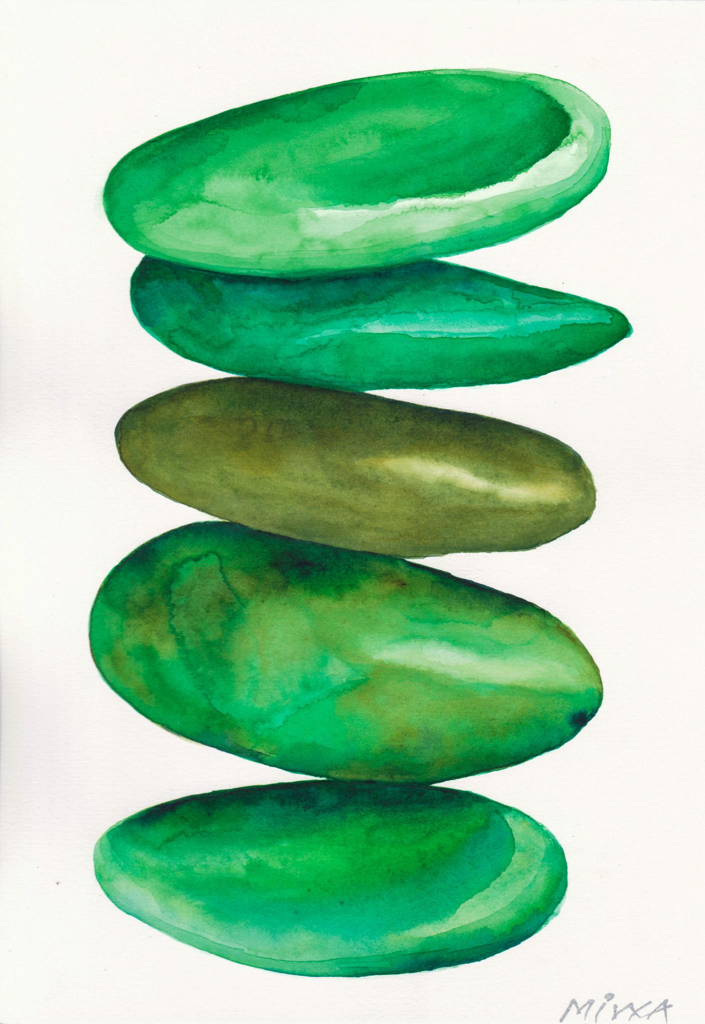
as much as possible. These stones were actually
inspired by this brand love. I don't know if you
heard about it, but I really like Loev. It's one of my favorite brands, not that I own so much of it. Having a toddler, it's
not the best thing to be hanging around your
shoulders and not that I can afford
too many of them. But I was flipping through
their catalog and it was so pretty and there were these cans stacked up like
stones stacked up like this. It was actually
inspired by that, and I just sketch those with
the actual light source, like the lightest
lights that they had. And yeah, it kind of worked. I just love it to this day and I just
paint it over and over. Okay, so my first layer
of this painting is done. So I will let them dry. Completely dry, and we will be getting into the second
layer and after that, we'll be getting
into the details.
7. Final Project Second Layer: We will be working on the
final project, second layer. Now I am going to say that you want to leave the areas
that are very pretty. Now what I mean by this is that while I'm working
on this yellow carpet, there's areas that
I really love, like how maybe I've
created some blooms. There's some effects going on that I really like to leave. I would leave, I wouldn't
paint over it necessarily. And I will be mindful of that. And also, again, the lightest light area
that I want to leave with the light values,
I'll be mindful of that. And then I'll be working
on my second layer. Now I am working on these edges right here because basically using
a hot press paper, one of the good things
is that I can be U, there's no, uh, it's
not a rough surface, it's very smooth, right? So basically, you
can use a pencil to make like a very smooth line. Same goes with paint brush. You can make a very smooth
line, smooth strokes, but then on the other side, it means that it's
going to show those really edges quite
distinctively. Which means that
you have to make those edges really
crisp as possible. Because we are painting stones and it does have
this minimal feel, then you can go quite
loose in some ways, but I'd like to keep it crisp and detailed and
very finely aligned. I don't know how to explain
this for some areas and some you can work
more abstractly. I hope you get what I'm
trying to see here. But anyhow, that's how I feel and that's
how I do my works. Okay, I'm working on
this yellow ocher. The second layer of this. Being mindful, I'm
going to mention again where I want to leave
to the light source three. I'm also adding values
where the dark darks are. I'm adding more pigment
to that area here. I'm just trying to
create like a bit of a dry brush stroke technique to create some effects that I might want just playing
around with that. Next I'll be working
on this third rock, the Prussian Blue rock. Again, being mindful of where I want to leave and
the light source, and making the edges crisper by making
it a smoother line. I'm being mindful of also I'm going to
say this warm time, the light source area
has to be curved. It doesn't have to be, but
if you think about it, the rocks are curved, likely the lightest light
areas will be curved as well. I really recommend keeping those light source areas curvy. It'll look more realistic, I think in my opinion, because the Prussian Flu
doesn't quite create the very strong value that I
want that I'm seeking for. I will be adding the
indigo that I'll be using for the bottom stone for the second layer as well. Why am I using indigo and
not a black, let's say, is because these two create a harmony in the color palette
that you'll be using. Because indigo is
naturally darker than the Prussian blue and
it's much more stronger, I just thought, okay, I'll use that to add more
value to the Prussian blue. And I think it quite works here. I'm tapping in, charging in with the indigo and adding it
at the bottom bit here, where it's probably much more darker because
of some shadows. Here I am struggling with a bit of the buckling
of the paper. Now, if you're using blocks, it doesn't really
buckle as much. But because I'm using so much water for
this final project, it's starting to buckle. What happens when it
buckles is that the water will pull in areas that
you don't want it to pull. I'm struggling here to keep the water even
as much as possible, and moving it around
to those areas that it wouldn't quite
necessarily pull. Sometimes these could create like really interesting effects. I just let it be at times. But I try to control as much as what I want to
make it look like. Also, if you're taping down
your paper, that's fine. That's also a good
way of working. But I just love
using these blocks. Although it does
buckle here and there, I assume that even taping
down a water color paper will still buckle if you use as much water
as I am right here. As I added some indigo
for the Prussian blue. To add those darkest darks, I am adding black because I will be using the same black for the bottom stone,
the black one. I thought this will keep
that harmonious palette together because it's just
using a limited palette. But I wanted to go
stronger on some areas to create dark shadowy areas. I've added the black
here and here. I'm struggling again
with another problem. Basically, my light went off. I was recording it
with lights on, but the light source
just went off. I am explaining here that I need to basically stop
this recording, but wanted to tilt the paper here and there to create
the effect that I wanted. Because sometimes
tilting your paper just creates such
a lovely effect. Like this, drippiness. But here, I didn't yeah, it didn't work as much
as I wanted it to, So I'm just trying to move the paint around
here and there. And because this is such
a time sensitive medium, watercolor is just one of
those mediums, like oil paint, you can just leave
it because it dries. It doesn't stay, you can't
move it around anymore. Once it's dry here, it's quite time sensitive. So I'm just working
into these areas that need some bit of work even
without the light source. I hope you don't mind. Yeah. Then I've decided that
I am not going to stop the recording because again, it's time sensitive
and I still want the indigo to mingle in with the black that I'll
be working for the bottom. I just went ahead and I've dipped my paint brush
into the black. To start with the
Blackstone painting again, I love the blooms that I have for this Blackstone right here. Just look at those blooms. It's so pretty. Just being
mindful of where I want to leave and where I
want to darken and where I want to
make crispy edges. I'm being mindful
of that and I'll be working forward for
the second layer of the black stone painting. Just look at that. It's so
pretty. I just love it. Especially the black. I guess it buckled a lot because I
use quite a lot of water. It's created these effects. Now I'm trying to mingle
in that indigo with the black and try to
work a bit faster. But it's not moving
around too much. I'm just around the areas
that need to be darkened. Definitely, this area needs
to be darkened a bit more, but I want to leave that beautiful cauliflower
back run bloom, whatever you call it there. I'm trying to work
around those areas, but being mindful
of where to darken, I'll be just working ahead. Again, being mindful of
where I want to leave out, adding values and also making the edges crisper
with clean lines. Hope you enjoy the rest of
the video and I'll give some final thoughts before we
move on to the next class. Okay, now that I've
completed my second layer, I'll be waiting for
this to completely try to work on my third layer. And then I'll be, once I've done the details
for the third layer, then I'm going to work on an
on the right bottom here. If you don't know what
a di signature to mark completions seal actually you can check this class
out to create your own.
8. Final Details: Final details. Okay, We're going to be looking into two ways of cleaning
out unwanted paint. Now what I mean by that is that here I have unwanted
paint marks, and here two probably dripped
while I was painting. I'll explain to although
there are three ways, then. Number two, we're going to make the out lines of these
stones more crisp. We'll be adding
more values there. I do like the looseness, but I might have to
come into work for the details over the
top of this camera. So I have a second angle
camera recording right here. Hello. So I'll use both recordings for this
last bit and then we'll be working on a to mark the
completion of the work, which is a signature, but in the seal kind of style. If you don't know how
to create that, again, look at my Japanese
Minimal Watercolor hearts class to learn how
to create that. First I'll be working to get rid of that
paint mark right there. I'll use the synthetic brush. And then put a bit of water
and then scrub it off. Now, why I use synthetic is
because if it's natural hair, it's usually much softer. It might break the point, and you don't want that with synthetics, it's much stronger. You can go more rough with it, but I do recommend using a bristle brush that usually
does the job better, or you can use
this magic eraser. Now I put a bit of water and
then rub the area a bit. It does seem to damage
the paper a bit, but sometimes you
just want to get some paint marks out of the
way this will do the job. Or you can get guash, a white paint to
cover up the areas. But I don't necessarily do that way of covering up
the paint marks because it just creates that area of very white patches
which I don't like. Okay. So I'm going to go over these outlines of the stones with this Raphael brush I have. I have what series it is specifically in
the material list, in the resources section. If you want to check what
exact paint brushes I use, but this is so thin, I just love this brush because I can work on very thin areas. Yeah, I don't know. I just wanted this paint
brush once I saw it, used by this Japanese
illustration artist that was working on really, really thin details, like small details of
mini characters. That's where I looked
into it and then got it. Okay, we'll be going over all the outlines
of these stones. And basically just being
mindful of those outlines, you want to make it as smooth as possible so there's
no dented edges. If you don't like those really crisp
lines and it's creating this really
strong edges, then you can soften
it with water, more adding water and
blurring those edges. I'm just going to do
that for all the stones. I hope you enjoy this
process and yeah, I'll be using the recording from the front as well because you might not be able to see some areas with my head
coming over the camera. So I hope you enjoy the rest of the videos and I'll give my
final thoughts at the end. What I do want to say about
when it comes to clearing up these edges is that you do want to make some areas
really crisp and strong, and almost like directly
having the paint, like the pigment
onto some areas. But some areas, you
want to make it less sharp by doing some areas, some areas not as
sharp and blurring the edges creates more
like a realistic look. I really suggest you try
this technique out Also. Finally, I'm clearing up these edges and I'm
pretty much done. I just love how it looks. Now we finally are
going to create the seal to mark completion of the work.
But it's not a seal. We're going to be
just writing our name in Japanese with our
watercolor brushes. Also, I like to be mindful of what the size
is going to be like. I am not writing in Katakana, but I'll be writing me my name in Chinese
characters in Japan. This is how we write down. If we use kanji, I'm
writing that and also being mindful of
the size of my name, I'm writing down
with cadmium red. Then to create that
like seal look, I'm going to put an outline
outside of my name, like this rectangle that just
pretty much fits my knee. That's my. Okay. I really quite
like how it looks. I like how I chose this
color order as well. Yeah. I hope you enjoyed creating your final
project in as well. Please, please share
this final project. On the resources section, I quite like to see what kind of variations you
all come up with. Okay, I hope you
enjoy the class.
9. Final Thoughts: Well done for
making it this far. Please give yourself
a pat on the back and please upload your
projects that you've done. The final project is to paint this Japanese minimal stone. And if you have the warm
ups that you've done, as well as like checking
into the palette that you want to play with and
also the testing out. If you've done that, that'll
be nice to share as well. So I can see the variations that many of you
can come up with. It's really cool seeing other people express themselves
in a very different way. I hope you enjoy
the class and yeah, please leave a review that'll help and comment on the class. And I'll be happy to reply
and comment on that as well. Okay, so thank you so much for watching and
see you next line. Bye bye.
10. Bonus: Okay, so this is going
to be a bonus content. Although I do have another
class explaining on how to do the Japanese
pattern called Segi Ha. I thought I showed you my
process in the short video. So first, as you can see, I added the pencil lines. I added horizontal lines
2 centimeters apart. And then I created these dots in the middle, 2
centimeters apart. And the next one, I kind of went one centimeters apart from
the top and created another 2 centimeters apart. A dots, it's diagonal. And then with a compass, I went 2 centimeters
first and then created a semicircle
and eventually made them shorter semicircles as I went inside those semicircles. Finally, I was thinking
about using a white ink, but ended up using the silver saca pent touch calligrapher
to do the lines. It went well until there was a moment that the
ink just gushed out, creating a big circle
on the top of the work. I had to cover a lot of the
areas with similar circles, although I would have wanted the work to have a clean look. I think it looks okay. So hope you enjoy this. See you next time. Bye bye.
 Miwa Gardner, Watercolorist- Watercolor for Relaxation