Transcripts
1. Intro: Hi everybody. This is mu and welcome to my Skillshare class. I finally got all my
equipment is from Singapore to hear
Munich, Germany. And I'm just enjoying
this atmosphere. And end. I've noticed something
aha moment that I had while watercolor painting that I thought I'd
share with you. Now, I'm sure you
all came across. This might be a problem
for some of you, might be a not a problem. Watercolor paint leftover
on your palette. Now sunlight just mix
it and just say, Hey, I just make it into
some neutral color because mixing everything
will become great. Um, if you have all the
pigments on the color wheel, of course, but yeah, I have no problem with
it, so that's fine. But while I was painting, I realized what I specifically do to use the leftover paint. And then I do something very
simple, very simple indeed. But I thought, well, some of you might find it quite interesting
and informative. So here I am. I'm going to share that this class will go over the basic
techniques as well. So it is definitely for beginners out there who are just starting with watercolor. But as well as those
who are experienced, sometimes even for me, going through all these
warm-ups was quite hard. It's not easy. I've been painting watercolor
for a few years now, but I still find these like basic techniques as a
warm-up and really hard, but also you, it's
like a refreshment. So I hope even for those who are quite experienced
would find it useful. And finally, for the
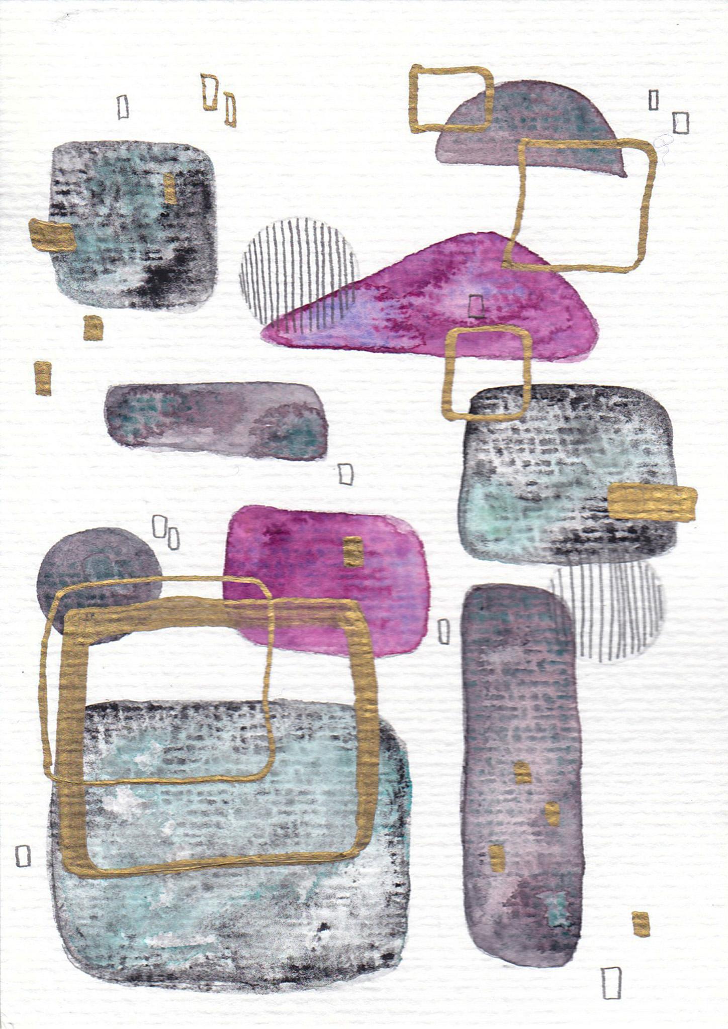
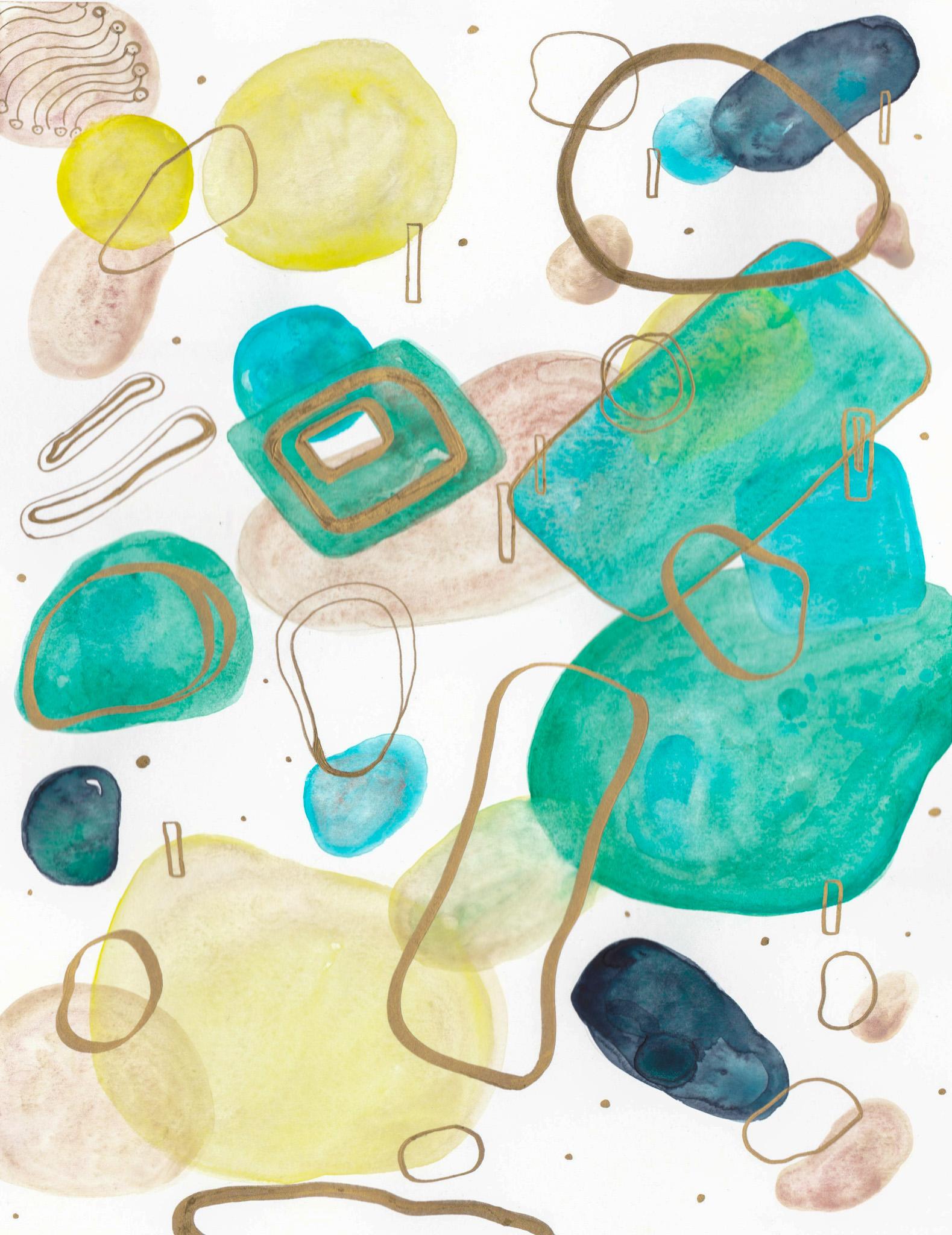
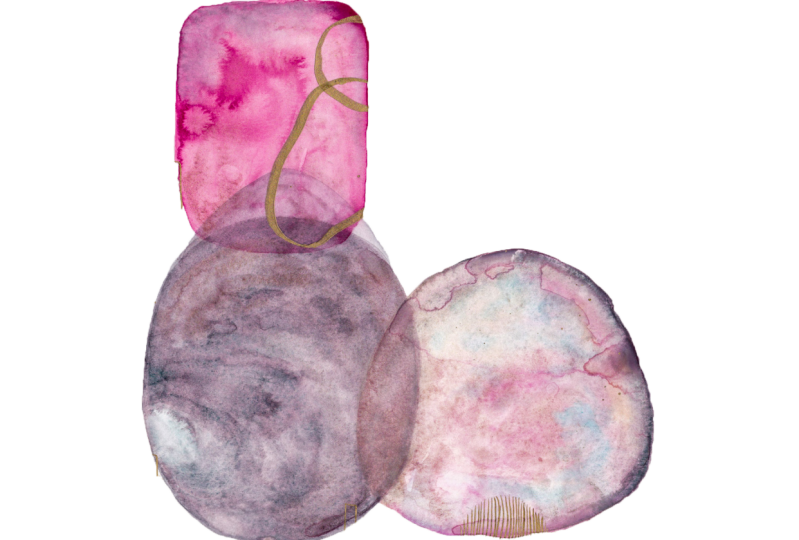
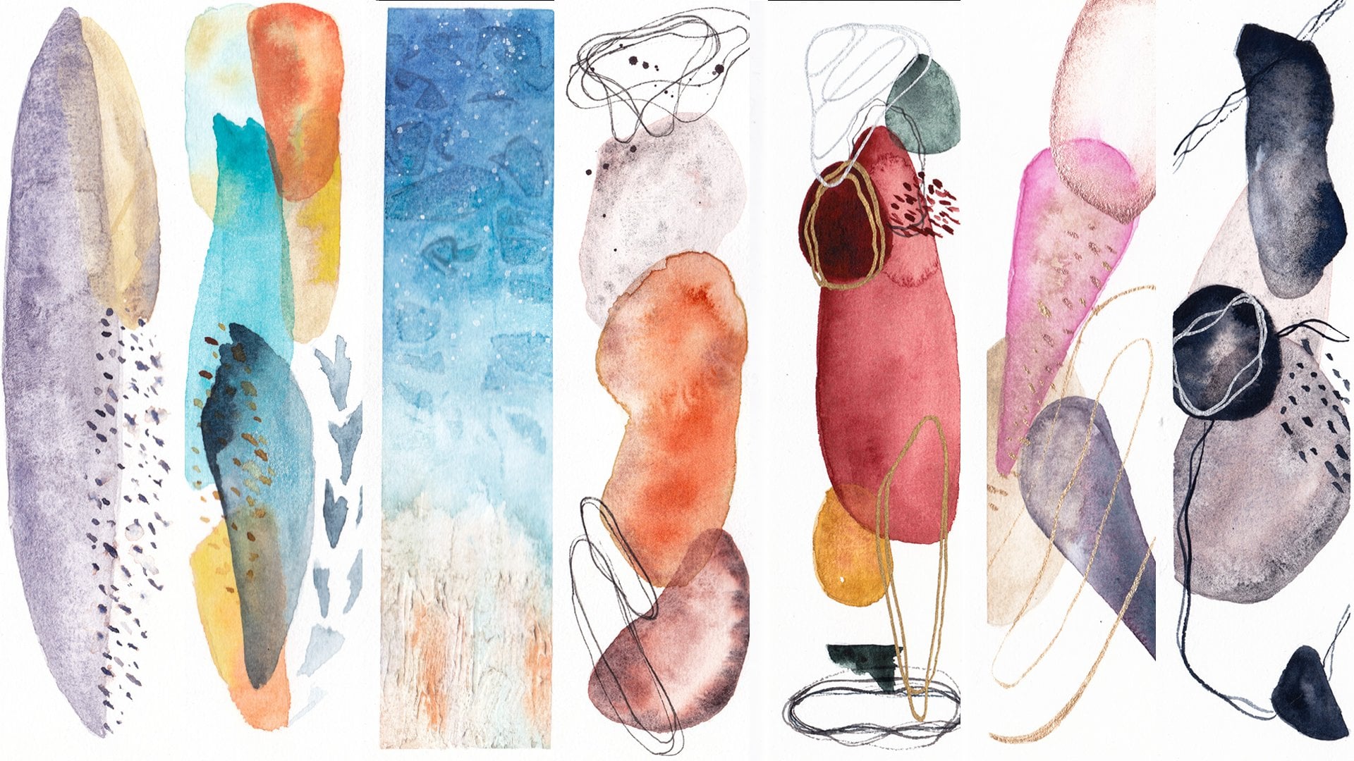
final project will be making these abstract
watercolor paintings. I was inspired by artists on Instagram that I found
called Jocelyn bend forward. Now she creates these kind of artworks I just
loved, loved them. So try check her out. She's so amazing. So at the end of the day, I am a portrait painter to say I just love
portrait painting. But at the end of
the day, sometimes I just don't want to use so
much of my brainpower. So here I am. These are not easy, but they are so relaxing because it's more like doodling and
painting over them really. At the end we'll add
these gold accents. Because I'm quite inspired
by clipped going to amuse looking at his work
at the museum recently. So we're going to add these
clips like gold accents at the end just to give
it a bit of shimmer. And I hope you enjoy the class and find it quite
informative and useful. So let's dive in.
2. Materials: So I like to get into the
materials that you would need. So first of all, you need a pencil and an eraser. Now I'm going to be
using the kneaded eraser because it's less damaging
to the watercolor paper. You'll need some paintbrushes. It's nice to have
different sizes because we'll be creating
different shapes. And it's nice to have
some big shapes, some small shapes and so forth. So that's better to have around. And then you'll
need a paper towel to wipe off the brushes. And then you'll have to have a jar of clean water or
preferably two jars, but mine's like super big, so this should be enough. And then I'll be using
these leftover paints that's in my shaky
watercolor paints. Now I do. I will mention that
it's better to have, like an artist grade
watercolor because oh my god, this does it make a difference? So that's the watercolor paint. If you don't have these
kind of gold pen, this is the Sakura pen
calligraphy for gold. If you don't have these around, which I'm really into right now, so I really recommend
getting it. It's so fun. But if you don't have them,
then maybe you might have some metallic watercolor paints around that you can use instead. And just use your
paintbrush like thin paint brushes to
make the small accents, gold accents at the end. But if you don't have that, then you can always use a jelly
Jelly Roll pen like this, like a white pen or even
the sacra black pens. Whatever pen you might
have around that'll be nice to make cool
marks at the end. And then you'll need
watercolor paper now for the sketching part and the
warm ups that I'll be doing, I'll be using this acrylic
watercolor by Canson. And for the final project, I'll be using the Winsor and Newton watercolor cold pressed the hundred 140 pound
paper at the end. So that's pretty much
everything you need. Now let's get started.
3. Color Theory: Okay, so we're quickly going
to go over the color theory. I've taught this
in other classes, but I think it's
quite important. And the reason why I'm
doing it first before doing any warm ups like wet on
wet technique and so forth, is because I believe that
color is very important. I just love color. I just think that's the most important part
of a lot of my paintings. So I like to go over
it quickly so it then we can use
the colors that we like and we are set to use for the final
project in the warm ups. So for the color wheel, it starts off with the yellow and then the red and the blue. So just imagine there's a triangle and now
we're going to the, these are called the primaries
and without the primary, so you can't make
any other color. So often when you get a
basic watercolor palette, they often have these three in some painters and
artists basically out there use these
three and then make their own colors in-between. So that's even possible. So, okay, so the yellow and
the red creates an orange. So I'm just going to, I'm
not even going to mix these first for explanation purposes. And then that's the orange, a typical orange
that you think of. And then the red and the blue mixed together makes a purple. So I'm going to get
this purple right here. This meant it's called, I think the manganese. I don't know how you
pronounce pronounce that. But this manganese is quite
thick and granulating. A bit weird, but anyhow, okay, and then the yellow and
the blue creates a green. I think this is
quite typical green that people imagine. Okay? So that's what you call
the secondary colors. So they are, that's these three, the orange, the
purple, the green. And these are only made, created by mixing the primaries. Then there's the tertiary colors which go in-between these. So this, I'm not going to go over it because there's
not much space. But you get the idea.
Basically it'll be if it's between here, it'll be a orange-yellow. So kind of in-between. In-between here, it'll
be an orangey red. So that would be the
tertiary Kotler's. Now, there's also
within these colors, there's the warm and the calls. I think you've heard about this. So let's try creating that. Because I can have it was a great refreshment to my to my knowledge because
just going over this, I was like, Oh yeah, because I got kinda got
stuck with the orange, but you'll see what I mean. So we'll make the warm colors. So when we say warm, when we create a yellow, means that it has to be
more towards the red side. So for this, I'll
use yellow ocher because I believe that's
quite like a warm yellow. And I'm not going to
mix these at all. I'm not going to mix it
because then you'll kinda get, I think more of the idea. So that's the yellow
ocher for the orange. I'm going to use quinacridone, burnt orange by shrink, because I think that
looks like a yellow, but it's actually a
orange, believe it or not. And then I'm going
to get Rosie Dory, I think that's what you call it. So that's like a
warm red because it's quite like more towards, I would say the yellow
than it is to the purple. So that's warm red. And then we're going
to get warm purple, which I will use
this Quinacridone. Quinacridone, violet. So that's a warm purple when
it's more towards the red, It's a warm purple. And then next we'll
get a warm blue. Ultramarine blue is
warm because it's more towards the red than
it is towards the green. Then for the green, I'm going to get sap
green by Daniel Smith. Now, this is supposed to be a warm green because it's more towards the yellow than
it is towards blue. And then finally, um, I think I did it, I did at all. Okay, Sorry. But I would say not
to think of it. These are quite close, so okay. So I think I'll need to I'll
need to change this a bit. Maybe for the orange, I'll make it even
more different. So I'm just adding
a bit of Ozzie. Red gold. It's called, I think
it's basically a yellow, a red, and a violet. So I shouldn't be
really using it for it, but just for the purposes of explanation that they're
quite different now. Okay, and then next, I'll go to the cool colors. Now for the cool colors, I'll start off with
the yellow again. So this is called bist yellow. I'm not too sure how to
pronounce that one either, but it's more towards
the green rather than it is towards the orange. So it's supposed to
be a cool color. And then for the cool orange. Now this is the bit that
I got a bit confused. Even painting for a few
years now with watercolor, I was like so what
is a cool orange? Now? A cool oranges supposed
to be more towards the yellow than it
is towards the red. And this chrome, orange is pretty much supposed to be more
towards the cool side, like really it
could go both ways. But I personally, with all the oranges that
I have on my palette, I believe this is the closest
that I can get to it. So that's cool orange. And then for the red
quinacridone, magenta. So believe it or not, although this is
called magenta and some people may
consider it pink. I mean, not pink, but consider it more purple. It's actually a red. It's a PR. I think it was a
pigment, BR2, CO2. That's right. So quinacridone, magenta. Now that's a red color. It's more towards the, it looks more towards the
purple, towards blue. So it's considered cooler. And then for the purple, I will use the smart. I just love this color. This is one of my favorites
and my granulating colors. It's by Winsor and Newton. But this is a violet. It may look more like a blue, but believe me or not, it's a violet, but it's
towards the cool side. So that's smart. And then next we'll
go to the cool blue. I am going to use
the cerulean blue. Now some people would call
this like a failover, blue, green shade, because basically it's a
blue more towards the green, so it's a cool green. And then finally, the green, I always have more space here. Okay, so for the green, cool green, I would
use the viridian. Maybe viridian from, I
think this was a gradient. So a cool green would
be more towards the blue rather than the yellow
here for the warm ones. So this is where
it changes a bit. You're like, which
way around is it? Basically this one would be
more towards the yellow. For the cool green,
it'll be towards, more towards the blue. Okay, so that's the cool and
warm and as you can see, it creates a different
field to it. What was interesting
for me when I tried to create this class
was that my palette really mostly consists
of warm colors. I don't really go
for the cool colors. But then for the purples, I would go for the cool. It's a bit weird. But also another thing I
realized is I use more of the granulating colors more than the quinacridone,
very bright colors. I think it just creates a happy tone when you
use more bright colors. And I just don't seem to
prefer that personally. So it's interesting, just try to create these basic color. We'll just go with what you
think is considered the norm. And then the warm and cool and see what kinda feel
you might like. Between these, It's
a good exercise to do once in a while, even if you've painted
for a couple of years. Okay, So now we're going to
create a complimentary color. I think I'll do maybe
three examples here. So a complimentary
means opposites. So when we look at
the color wheel, I'm just going to quickly draw something here
so it's easier. This is going to look a
bit dirty, but it's fine. So when we say opposites, it means it's right opposite
from the color wheel. So for a yellow,
it'll be purple. For, for our blue, it'll be orange for a
red, it'll be in green. So let's just pick
like colors and just try to align them
next to each other. So a complimentary of read will be a green side-by-side. They just create
so much contrast. And when you mix these, it'll create a neutral color, basically a gray,
which some people just mix their blocks by mixing
these complimentary colors. And one of my favorite here
is with ultramarine blue. This is quite popular
among watercolor, is, is with, I think
it was burnt sienna. Because it's burnt sienna, although it's a neutral color, it's more towards the orange
in the color wheel if you think about it. So that's quite beautiful. Let's just try blue with
quinacridone, burnt orange. That's also quite pretty. Okay. And what else? Let's try purple and yellow. This is a mixture I
don't quite often like, but let's try with the
yellow ocher here. And then shrinking violet. Those are complimentary
side-by-side. They create contrast. Next one, for more of
a harmonious look. We're gonna look at
analogous monochromatic and try adding color schemes. Analogous means
basically when it's the three colors
next to each other. So say this one would be
yellow, orange, and red. It could also be orange,
red, and purple. It could be red,
purple, and blue. So one of my favorites, Let's just try with
this violet smoke. So that's purple. And then my favorite read, one of my favorite
grit is potters pink. So it happens to be both
a granulating color. And then let's choose an orange. My favorite orange is
transparent pyrrole, orange by Winsor and Newton. They are quite different. And why this happens is because these small and the violet and the orange
is quite vibrant. But the potters is quite, quite more muddy and kink
and that's not a nice word, but it's more neutral tone. It's not vibrant as the other, so it could look off a bit. So when that happens, you just need to probably use the same cool colors or
the warm colors here, maybe I should've
used a cooler red. But either way is we'll go
over that later on and I'll explain how you can create
a more harmonious look. Okay, so what else? Let's try a blue, a green, and a yellow. My favorite blue. I have quite a few. But let's go with
this cobalt blue. And then green. Let's go with the
viridian green. And then for a yellow, I don't like yellows, but let's go with the
nickel type. Tain it. Yellow. I don't even know
how to pronounce this. So that's quite analogous,
That's quite pretty. Then let's try the
yellow, orange, and red. So for yellow, I'll use this. Or was it called? I always forget this one. The nickel azo yellow. So this is quite a yellow, more towards the green. It's more cooler. And then for orange, let's try using
the chrome orange. And then for the red, let's try using
the scarlet Perl. I think it's called the parole
Scarlett by Daniel Smith. Okay, so those are
analogous colors. They have more harmony than the complimentary
contrasting look of the colors over here. Now for the monochromatic, this is quite important
for watercolor because watercolor you can
get the darks by using more pigment
and the water. And the opposite goes for, if you want to go
for a lighter look, it's more water
and less pigment. And monochromatic
means you just use one color to get
the whole scale. So let's pick that smart
that I like quite a lot. So I'll just start off
with a very light color. Then I'll go much
more darker here. And then I'll go actually
just dry brush almost and filled with pretty
much only the pigment. Okay, Next one, the triadic. Now this would be, that's why I put a
line for the stars. So it'll be okay using
the yellow, the blue, the red, or it could go
okay, using the orange, green, and purple,
it's basically, you skipped one color
from the pigment. So it's like, it looks like a triangle when you
choose those colors. So that would be, let me get my favorite orange, the
transparent pyrrole. Pyrrole. I don't know how to
pronounce these. And the purple, let me
get imperial purple. And it's called quite a pretty
name for a pretty purple. And then let me get
the green. Now. I just like radian green
now that creates a harmony. Could see that, oh, okay, it's, it's giving a different feel to from the rest of the
color selection. Okay, So next, I'm going
to choose a different one. Let's go with red,
blue, and yellow. I'll choose a red that I quite like It's called
quinacridone coral. I think it was the, so this is a red. And then I will choose
a blue that I like. I do like seriously,
and blue chromium. So let's choose that. And then let's choose a yellow, which I quite like any yellows except for yellow ocher
is always my favorite. So that's quite
pretty. And you put C. Okay, so let's go
to the next bit. So now we're going
to be mixing colors. Now I put a heart mark
here because I was like, Okay, I'm going to choose
one color that I love. And then I'm going
to choose colors that I don't quite like. And then I'm going
to see how I can make them into something
that I would like. This is quite
helpful when you're using the leftover
paint on your palette. Because basically by using one, by adding basically one color, what happens is that you
discovered the secret to harmonious watercolor
paintings by choosing one color to mix into
all other colors, creating a unified and
cohesive art work. Okay, so for the next bit, we will be mixing colors. Now, this bit, I'm going to
select one color that I love. So we're going into
mixing colors. Now, I've discovered
the secret to harmonious watercolor
paintings by choosing one. That's right, just one color to mix into all your other colors, creating a unified and
cohesive color scheme. So this is what I will do first, I'll choose one color that I love and the colors that
I don't quite love. And try mixing the color that
I love to each one of them. And then they'll
look harmonious. Let's do it. So one of the colors that I love will be English,
Venetian red. Now this is, I chose that color. That's not granulating because I don't think everybody has granulating paints as much as I loved them, like
I just loved them. So basically this here is
all granulating paints, but I wanted to choose one from my non granulating
palette that I just, I don't know why, but it
became English Venetian red, which is which is
basically a brown color. Right here. English Venetian
red is a PBR one-on-one. So I'm going to use that brown, although it's not quite
from the color wheel, but I just don't find any
colors that I really love from, from the other colors
that I have here. So anyway, so I'll be using
English, Venetian red. So that's the color that I love. It's quite ready. It's quite ready for the colors
that I don't quite like. I will be using lemon yellow, which is p y three. I think this often comes with a very basic
appellate that you'd get. So this is lemon yellow. Now, you can tell
that I don't quite like it because I
don't often use it. I will be mixing my
English Venetian red, and try to not mix too much pigment into yellows
because they're quite, they're not that strong. A lot of them are quite transparent and they're
not quite opaque. So a bit goes a long way. So now it looks a bit like
a yellow, but anyways, so that color, I love
more than it it was. So that's lemon yellow. Now, I don't quite
like cadmium red, although I have kind of seen how I can work with it
recently with portraits. But anyways, so that's cadmium
red light, It's PR 18. I'm going to add a bit of
English, Venetian red here. Cats are quite
strong and opaque, so adding a bit more
than yellow is okay. Now I'm going to use
cerulean blue tone. This is a PW for with PB 153. Now, it's basically at
the low blue-green shade, but I don't quite like
this blue either. So I'll just mix a bit this English Venetian
red, and look at that. It almost looks like
there's a pigment that shrink mixed
called glacier green. I think it was. But it just looks like that. Yeah, so it's pretty I
just love these colors. I would definitely
like Krita artwork. That's basically these colors. Okay, so let me put
so I don't forget, try to write these down so you don't forget which
colors are what? That's English. Venetian, red, lemon yellow. And then that's cad red light. And that severely in blue tone. Okay. So, um, okay, so I'll be
using the leftover paint now. You could see I have
quite a bit right here. So first, I'd like to write
what colors are leftover. So first of all, let's just
draw the color wheel again. So yellow, red, and blue. And then next comes purple and then orange
and then green. And what happens here is
that I would want to write, okay, that's yellow
ocher that I have left. So I got this chick. I got That's cobalt
turquoise light. So that's actually a
green pigment and white. So I got that. Then I also got another
green that's permanent. Permanent green, I
believe, green olives. So I got another
green and then I got burnt English, Venetian red. So that's more like orange, yellow, it's right here. And then I got purple. Now, I would look at
what I have the most. So the bit that I have
a lot is right here. So once I get that and I'm like, okay, I have a lot of these. I only have one
that's right here. So I don't have any blues. I have a purple. Then this, the one
that's furthest away would be the one that I would
mix with the other colors. So here it will be something that's quite apart
from the rest, which is this violet. So this is the shimming go. Violet. So that would be there. And then I would use the others. That's right here. So that
will be the yellow ocher. I would mix this up a bit with shimming
because I'm violet. Just a bit goes a long
way with the yellows. And then I'm just going to
mix these two blues together because they could always mix together and still
look quite pretty. So that's the ultramarine violet with cobalt turquoise light. It's a green blue. And then I'm going to mix a bit of this shimming color violet. And then next I would mix
this permanent green, olive, green olive, and then mix just a bit of
this shrinking violet again. And then finally the
English Venetian red. This could basically be my red, although it's a brown. And then mix a bit of
this Schumann go violet. So there, I could basically
use the leftover paint that's in my palette and they
still look quite cohesive. Like there's some kind of like harmonious power
almost going on. So this is how I use
my leftover paint. Now, this There's
another tip that I would I would add to this. Now, if you have like a
swatches like I do here, I have all my new to our reds and greens and
yellows and oranges. You could always like, swatch these out
and be like, okay, what color kinda
goes together with which it's more
easier to look at. Like the harmony and how, what colors might go together. Also, another tip,
my second tip would be like sometimes you have, okay, there's a bit
of an orange here. What I would do is
to make into them, into one, I would just mix them. And if these are
pretty much reds, then I'll just mix
this whole section and create its own
kind of orange color. Now again here, it's
like a bit of a green, blue with a purple. They would kind of go
along together there. Then that would create
a bit of a purple, no, like a blue-green almost
because the green ones. But you can kind of make
like your leftover paint into more blocks of
bigger paint if pigment, if you know what I
mean, that would be a purple right there. And then here I think
they're all pretty much set into their yellows,
blues, greens, reds. So when you do mix colors and you have to
take out some pigments, I really recommend just
grouping them into the same kind of color schemes so it's easier
to use them later on. But definitely using one color to mix with the others will help you and help you to use your leftover paint that you can't you don't
want to throw out. Okay, so let's go
to the next class.
4. Essential Watercolor Techniques: So now I'd like to go over
some warm ups with watercolor, and that's quite important for creating the
final project piece. So the pigment water to
ratio is very important. What it basically means
is because watercolor needs water to make
the, all the values. You need to be able
to understand that more water means less pigment. So it'll be like
the lightest light of what you can get out
of the watercolor paint. And basically, less
water means it's going to be very dark in value. So you'll be
basically getting the darkest of that
watercolor paint. I like to use one
color from here. I think. I'll use a red because it's more easier for
everybody to see. So first of all,
I'm going to use the lightest light and then
more water to start off with. And then I will get it to
become the darkest darks. You don't have to create a
perfect circle or anything. We're just trying
to get the pigment. Correct. So once you get
the hang of this, then you'll be able to really
understand watercolor. I wouldn't say how many
you would need to create, just create as many as you can. And then for the final one, I would basically wipe off
the water in my brush. I'm basically only have pigment. And then now we're going to go very dark and then work on, okay, What I've done. Emergency. Looks better. Okay. So we're gonna get I think
this one is not light enough. It's not good to go back at
something and rework it. But, oops, okay, So now we're gonna do more pigment and then
it'll become less. I think I used this cobalt turquoise light because I just love this color. So that's the
darkest it can get. It should be a bit darker. As they say, just
practice makes perfect. So just have to do it many
times until you are happy. Adding a bit more water here. Getting white paint all over. Okay, now we're going
to create flat washes. Now what that is is that you
take one color and you make the color like stay in
one same value across. And with watercolor,
it's just difficult to make it have a clean look if you go over it
again and again. So understanding how
much water is inside your brush is very important. Now, you could see there's a
bit of a puddle right here. You can always
scoop it up a bit, but see, I think I'm trying
to work it a bit too much. Were you working it
over and over causes it to become less vibrant. So that's a flat wash. Let's try it in the other color. Now you can also create a flat. I'm a variegated wash. And you can do this by adding a different
color on the other side. So I can use that
red I was using. And basically don't
touch it until the end. And then try to blend it here. These are quite the
opposite because the, although it looks like a cobalt, cobalt blue, turquoise
looks like a blue. It's actually green, so it
is complimentary colors, so it's not the best
to kinda do a wash. And then I'll do another wash just in case
because their space. So it's always good to
pull the pigment and the water out to wherever
there isn't any water. You haven't lead your brush on, just pull it and then you have a flat wash. Now we're
gonna do gradation washes, which is basically
having pigment and then making it less with pigment
and the more water. So I would use this red again because I
don't want to use it up. More pigment here. Then just keep on
adding a bit of water. Again, a bit of water. Again, a bit of water. Again, a bit of water. And then clean your brush. You can make this
aligned if you want. Okay. I think I went over, it. Looks dirty, but thank you. So let me try it with
a different color. Can just cobalt turquoise light, wiping my brush,
adding some water. Adding some water again. Okay. So that's my gradation. Again. Let me use the
English Venetian red. Starts off quite dark. And then more water or water. Okay. Okay. So those are
my gradations. Now, brush size matters. So I put this end
because we'll be working with big size shapes in small slice and we
want those variations. So first, I'll be using this
brush and create a circle. Now, I'm going to use
the serially in blue. So to fill up that much space. This brush kinda was perfect. It create it pretty
much an even layer like a wash. And I'm going to use this slides brush and
then create a bigger, a bigger circle with it. And it makes my life easier and it makes
it more controlled. And it would create
an even wash. Next, I would use this small brush
and see what I can do. So that's like the perfect
size that it would create. Now, if I try to make a bigger circle with
the small brush, it would be quite difficult
for me to get an even wash. I would have to work very fast. Move the paint around. Although it's not impossible. It is quite difficult. So that's why breast
size matters. Now, we will work wet on wet, which means that we'll put water first and then we'll
put in some colors. Now, I just loved this way of working with watercolor paints. Because it's almost like
you have to lose control. But that losing control
and knowing what might happen and what might
not is just, I just love it. I flipped my water first
and then I'll come in and I'll put some
pigment inside. Just drop it. Okay. And I'll let that dry. And also what you
can do is you can create you can put the water, and then you can put
different colors within this water you'd late on. So I might add yellow
ocher on one side, and then the cobalt turquoise
light on the other side. Excuse me. And I could let it just see how that blends in. I could also, firstly the yellow ocher and then more pigment of
the yellow ocher. And then I could go over it with the cobalt turquoise light and just drop it in
a bit like that. So it already has the
yellow ocher underneath, which with green it'll make
it turn more like a green. A yellow green, which is
quite a beautiful too. So you could, that's a
wet on wet technique, a blending wet on wet technique, which I already did over here. But okay, let's try
shrinking violet. Then I would get a red. And I could blend this red into the
Schumann key, violet. So I'm working and quite
working with the pigment, thinking, Oh, how
much water is there? How much water can I lay over to get the
look that I want? Because basically if my brush
was very dry and I squeeze everything out and laid my brush over it than it would've
sucked up a lot of it. And the red wouldn't
have got onto the violet that I
laid underneath. So water and pigment
ratios vary. Quite important. Okay, so let's do another one. Let's get this cobalt green
and make the area what? I am going to blend
a cerulean blue. I'm going to drop
that right there. And then I'm going to try to blend it
with a bit of water, not overworking it. Okay. Now creating whitespace,
I don't know if I would actually use this too much
for the final project, but I still want to do it. It's kinda neat and cool. So I am going to mix
like a red here. So initially the white
is only created a few. I'm keeping a
whitespace available. Like open. So what I do is I'll create
this circle right here. But I'll create another circle using a complimentary color. Basically come over here. Be mindful of this
whitespace right here. Just lay there. I would go using like a really watered down
pigment first, like this. And then, oops, I kinda blended it on the
sides, but it's fine. And then I would come over
with a darker pigment. This needs more water to flow. So there's a bit of
whitespace right there that's been created. We can try doing more of these because doing more
is always good. You'll get the hang of it. I'm going to have a very
light watered down pigment, again, trying to be mindful
of that space in between. And then I'm going to drop. So if I have less
water inside my brush, it's going to suck up a lot of the water that's on the paper. And then it will only give me a bit of the pigment
onto the water. So having more or
less equal amount, like quite a bit of water on
my brush and then dropping in colors would make the
pigment spread more. Okay. So that's
creating whitespace. Now, we're going to
work with blooms. It's also called
backgrounds or cauliflower. So we could see some
of them already here. Some people don't
want this effect, but I just feel like
it's really beautiful, so I like to create
them intentionally. So we'll do that. I'll use granulating
colors or more. It just feel like they're more likely to create these blooms. I'm going to use a viridian. Basically it's like they're pigment particles
are like bitter, bigger with granulating colors. That's why they're
called granulating. So they go into the creases of the paper more like
these particles. And it'll look like as if they're kinda like a stone or something and
so pretty I just love it. Okay, So here I laid
down a viridian. Now also laid down a cobalt
turquoise green right here. And I'm just going
to let it dry a bit. How you create
backgrounds is once it's almost dry but not completely and you
touch it and it's damp. Some people just try
to look at it with some angle and see if
it's share or not. And if it's share and
it's still kinda doubt, that's the moment that you put water and extra water on top. And what happens is that
the water would then push the pigment outwards to
wherever the water runs, and then that will create the, the blooms or
cauliflower back runs. So let's just wait a bit more because it's still kind
of shiny right now. I would like to do layering. So I would for layering, what I mean is that
we're gonna do one wash. And then on top of that, we're going to put different
colors and see what layering kinda mix the
colors beneath look like. So try to pick a color
that's not too opaque. Now there are transparent
colors and more opaque colors. So here I have my
opaque stent are kind of like the squares
will be covered, will be black basically. So this will be opaque, this would be transparent. This would be semi-opaque
and so forth. So I would I mean, for the first wash, I don't think it quite matters. It matters what you put
on top of it really. But I'm just going to choose
a color that I quite like, which is this yellow ocher. So yellow ocher. Okay, I think this
one is drying out, so I'm going to dump a
bit of water right here. Right there. Okay. I might have been a bit
too slow, but okay. There you go. It's getting that
blooms right there. It's kinda pushing. I could have been a bit earlier, but it's quite hot today. I guess it's dried
up pretty quickly. I'll use this cobalt
turquoise light. So create a wash. And
then once this is dry, we'll do a bit of layering. This is a great
exercise to also work with your strokes like
lines, making thin links. In the last one is create. So I think for my final project, I'm not set yet, but I'll just use these
paints that are left here. And I'll go with that mixture of using the shimming
color violet, which I don't quite
like because it's too vibrant with the other
colors that are left here. So I'm just going to create
a bit of a mix right here. Just see how that
looks together. Big circles. Then adding a bit of this violet is they had it too much with
the purple screen. Here, just like experiment with whatever you have on
your palette that's leftover and try
to mix one color. That would be the color
that you wouldn't mix to the rest to
make it harmonious. I think I went too much. The purple. One else, English, Venetian red. Even sometimes
connecting these circles make it look quite pretty. Okay. So I'll try to do the
layering bit right now. Would just use the colors
that I'm expecting to use. Just touch it and see if
it's kinda what still, it's a bit weird, but
it should be okay. So that's permanent green
olive. It's pretty. And tried to make the the watercolor that you use more pigment and less
water because it might, if the underlayer is not
quite dry and might try to blend into the layer underneath so it's better
if it's completely dry, but I'm just going to work
on top of this right? Then that's the violet. It's quite pretty. And then I'll just
add one that's just basically the same
color that's underneath. Now that's really pretty. I like that color
combination right there. Now I'm going to work over
the cobalt turquoise light. I'm going to use the
same color right here. It's quite opaque
as you can see. It's permanent, green all live. So you could tell
which colors are quite opaque compared
to the others. Okay, so I'm done with
layering as well. I like how that connected
right there and created a kind of like a
bloom of its own. The blooms here just so pretty. Okay. So I hope you learnt, got to do some warm ups and got the hang of
watercolor a bit more. So now we'll be working on the sketches and the
color selection.
5. Sketching and Color Selection: Okay, so for this
class we'll be doing sketching on for the
final project ideas. I've created six squares
and this is pretty much the ratio of the
final project paper that I'll be working on. And I've also put a bit of
wine here, three lines. So basically this is
the rule of thirds. Maybe you've heard of it. It's basically to have
a better composition. Where the two lines meet
is supposed to have, if you put like a sheep there than it's supposed
to work overall. So we'll just create sketches
and see which one is best. Now, as I mentioned, we'll be working
on abstract shapes like circles and squares. So I'll just start
off with here. Think. Make a circle. So there's no really
rules that I go by. But I'm just going to draw whatever I feel
like it at the moment. Okay. So this is my first one. Then I'm going with
my second one. Really doesn't matter like
where things should really be. As long as it kinda feels
like it looks right. Hey, BL, create a
circle right here. She paper sheep. Maybe small circles added. Okay, that looks nice. Then for the next one, I'm going to make
it quite simple. Maybe just using three shapes. Three of something quite works. I don't know why, but
it's because it's one of the things that just
seemed to work. Three circles. Maybe just where
those lines meet. I can put like a smaller circle, maybe even a rectangle
like clips style, and maybe even a
smaller one inside it. Okay? And here I'm going
to do another one. Small rectangle. Maybe sheep like that. Maybe like a circle again. I would say just create
many as you can. Without thinking too much. Try to be spontaneous
for this one. Now. For this one, just start out with a
big one in the middle. Maybe small circles around. Yeah, I think that's enough. Okay. So for this one
I think I'll try to make maybe even circles that seem to be cut off here. But then maybe, maybe shapes that are weakly bigger shape. That x here with a rectangle goes here. Then maybe small
circles around there. It looks heavy,
quite right here. So I might even get like a semicircle here is
limestone, go vertical. Okay? And then for the next one, I'm wanna make it quite
simple compared to the rest. So what I'll do is I'll get a very huge rectangle
right on the side. And then get a bit
of square there. And then another
rectangle actually, and then maybe a semicircle,
just those three. And then D is could be connected with a circle
that goes like that. And then I could put some rectangles like that. And like that. Small circles around. And then for the
next one, make it. Let's see what else
can I play with? Maybe I could do one big
rectangle, rounded rectangle. And then the gold
x coming down like a circle with a bit of another circle here
with the goals accent. And then I can connect these, but come to this
third point here. Alright, Maybe you in there. Maybe it could be like
a two circles together. And then then this could be a long rectangle. And then their coop. Maybe there could be another like circles that
come like that. Okay, And the final one. So the key really is just
to go with the flow. You're feeling like. It's better to intuitively just draw whatever
crosses your mind. And just use the three
rule of thirds as like a help to come and get you going and thinking
of where allocate, things, like allocate
this shapes. Okay. I think I'm done. So I'm going to look over these. I'm going to first select which one's going to
select which ones. Kinda speak to me the most, maybe three or four. This one. I don't quite like
it doesn't seem like it kind of speaks
to Me too much. This one I do like, yes. This one Not really. This one. Not really. This one seems okay
to me. This one? Not really. This one. Yes. This one I quite like
and maybe this one now. So for me it's this one and
you can't really explain why the fit is just seems like it's working
like visually for me. There's no really like rural
of why these are working. But now I would use
my leftover paint and see how the ones that I've selected
look with the colors. So I will be using the colors
that I've already selected, which are all my palette. This shimming get violet, purple would be the one that's furthest away from
all of the rest. So that would be the
main color that I'll be mixing the rest width. So it creates this, it'll pull all the colors
together in one piece. Okay, So let's get
started. Then. I'll try to let's
just get started. So there's no really rules that I would go with when it comes to where do you
place the colors, I was going to explain well, where the rule of thirds
meet, the lines meet. That's the place
that I would put like one specific color. But not really, it doesn't
really work that way. I would rather put the gold
accents that we'll be working on in the final
project for that area. Rather than just working that area with the
one specific color. So sometimes these circle shapes could connect with
one another because that could create
quite like a color. I need to add more
of this green here. And moral right here. So now I'm looking with blue and green are the biggest
colors right here. So I kinda wanna work like this In analogous color scheme. So the red should be less used. So I'm going to put the red in the smaller ones so it doesn't
fight much with the rest. So that might help with how
you allocate the colors. I'm going to bring
that green back in. Some could be even
darker green and some could be a lighter green. And you can kind of
play around with the values of these colors. I'm going to add a
bit of violet here. Maybe I'll use
yellow right there. Add a bit of that. Shrinking violet. Now that kind of
went a bit too much, but you get the idea. Okay, And then next one, I'll work on that. So again, the same
idea over this bit with the green, violet. And then when you do place
the the colors, you do want to thank all. Do I want to blend that into
the other color or not? And if you don't,
you have to wait until it completely dries. Here I'm not thinking too much. I might add my own
critique later saying, Oh, I might want to swap that
color around and so forth. But for now, I'm just
layering all the colors in. Use. The yellows right there. Then I'm running out of
the swimming pool violet now from doing all
these testing. For that one, it'll be
the English Venetian red. So now I might have to
go over to this pellet and use this violet instead. So for my next one
that I'll create, I'll be using a different
file at the smoked. So I'll be working on
this one right here. The yellow, because
there this small blue. And then use the
cobalt turquoise. I'm running out here. So this then I'll use the
English Venetian red. Add the smoke a bit. Okay, so basically, I've created those out of the
paints that was leftover. But because testing purposes, I've already tested quite
a lot with the colors in there pretty
much running out. So now what I will do is I've got a lot of paint
here that I want to use. And obviously whatever
paints leftover means, those are the pins
that I quite love and I just use overthrown over. So I'm going to use that, I'm going to group it up now. So that's the reds. Although they look
a bit like purples. That's another red I
could use right there. That's another red, the
quinacridone coral. I'm not sure what
that thread is, but I believe it's still
a red so I can use that. And those are a bit of oranges. And I don't have much blue left, but I do have this
warm green right here. Okay, so my mission would be pretty much to
use all these colors. So now I basically have more reds and oranges
rather than green. So I would mix the green
or the blues into these at the top to make like a
colored that would fit. But since I want to use
quite a lot of color, I'm beginning to think
that I might just use this paint right here
that I really want to use up. This is the ultimate mystery. I think it was called on. I think this was the copper
actually of Daniel Smith. So I'll just mix these instead. So this will be my
main mixing medium. And I'll create one right here. The colors that are basically
left over on my palette. Because there's quite a
lot of bit to fill up, but I'll still beekeeping. I think I'll stick
with the let's see, we'll stick with the reds and oranges and then the purple. Now the red, purple, and blue. I just love this color
scheme right here. I think that's one
of my favorites, so I'll just use those. So it still creates
some harmony. And I wouldn't quite used
the yellow, I believe. Okay, So let's get into it. So I'll use this
pink right here. But I'll always tried to
mix this color right here. And then then this shimmer a bit. And then I'll use think we've
got pretty much the reds. So I'm going to use
some violets here. Then I'll use this
blue right here. Now I'll mix shimmer. Think I quite like this. Okay, So I've created this
and I really liked the color, the red, purple,
and then the blue. But I'm just going to further, I'm just going to play out with the other sketches that
I didn't quite like. And see. I'm just kinda practice, see which other colors
might work as well. So I'm just adding these
blues and greens right here. Even might bring in
this blue right there. I'm just combining all the
colors will work together. If they're not complimentary. I mean, you can combine the complementaries
if you want Greece, but I don't really want grace
for this final project. So I'm just combining whatever colors that
will work together. On keys. There, I have it. I might try to see if I
can combine all these. Let's try this one out. And then I'm just going to add a shimmer to each one of them. See if that will still
combine them all together. Using this. That's a red. The quin Magenta, I believe. Bit of simmer. And then let's use
this green right here. Maybe I can use this
dark green right here. And maybe even this foolish, it looks blue, but
it's actually a green. Put a bit of summer. And then what else
haven't I use? I haven't used this. Let me add that blue. It's not strong enough. Ebl, this gray right here. Then I'll add this yellow. All right here.
Then the shimmer. Okay, So that kinda
pulled everything in. Just using the shimmer
kind of worked as well. Okay. So I think personally, I do. I like this color right here. It was the cobalt turquoise
light with a bit of, I think it was a
civilian blue mix with the shoemaker violet. I think that's pretty, I like this kind of analogous colors of
red, purple, and blue. I think that speaks
to me the most, but I might add a bit of
that blue, the green blue. Just for an accent because
I just like that contrast. My main goal would
be to use these. They're pretty much
watered down now and I don't know how much
would be left, but I'll use those and
maybe just directly add straight pigments into
the final project once it's kinda
pretty much drawing. So then it has a bit of
that pop kinda look. So I don't use more paint. But yeah, I think now I'm
pretty much sitting with them. What I want to do, I'll go with this composition right here because I just feel like
that speaks to me the most. And the colors as well.
6. FInal Project: This will be the final Project. Now I was supposed to be using this Winsor Newton
cold press paper, but I've decided to
use a different brand, Fabriano, but a hot press paper. The difference here would
be that it'll be hot press. Cold press now is hot press. And that the size
would be a bit bigger. But the cotton ratio is
25%. This one is 25%. That's the same. I would really recommend
using hundred percent, but because I dislike using
as much paper leftover, that's not hundred percent
right now at the moment. I'm trying to use it all up, so I'm just going
to use this one. I just love how the hot
press works with granulating colors and even just non
Granulating as well. They just leave this
really interesting marks rather than cold press. And my husband said,
it looks messy. I just love it. So I'm
just going to use depth. And I did put two lines, two lines across as well. Then I can do the
rule of thirds. I placed all my
lines that I'll be working with in the
sketching stage. I mentioned that
I'll be doing this. That hasn't changed. I'll be doing exactly the color. Will, the colors would be
exactly the same I suppose. But because my palette is almost the paint on my palette
is almost gone. But I'll be using the
same kind of ideas, as well as narrowing down under analogous colors of
red, purples and blues. Okay, so let's get started. I would highly suggest you to tap on your paper after
you get so you don't see so much pen marks
because after you lay that watercolor paint
is not going to come off. Okay, so first, you do need
to plan out which ones you're going to lay
the paint later on, which one is further back and which one you want
to face towards you. And for this one, I'm going to go with I think this one
would be farther back, so I'll start with that. And then I'll do
this one because I want that to be in
the back as well. And this one would
be in the front? Actually, no, because I'm using the neutral culpa purple here, which if you study color a lot, then you'll notice that the
things that are further back are more neutral
or more cool toned. And then the warmer colors will relatively
compared to this one. This one is much warmer, although it is a cool red. So I'll make that to the front. So that would be first, this would be second, and then this would be third. And this I would do at the end because I don't want
any paint to get on my arms while I'm
working on the rest. Okay. So this will be relatively
like a big paper. So I'm going to work
with my big paintbrush. Here I go. The first using maybe I'll just use this red
that's leftover here. And I'm also using
this shimmer to unify all the colors and
get them all together. Looking more cohesive. Actually need a bigger brush, but I don't have
much big brushes. So I do like to use
very light Paint first. What I mean by light paint is more water than the pigment. Then get the area white. And then I'll come in
with a darker magenta. And if you overwork your paint, then it'll start looking
like if overwork them. So try not to do too much. I'm laying that
copper shimmer paint Now I'll be working
on this one up, but I'll have to let it dry. So I'll have to wait until this dries so then I can work
on this layer right here. Which means that I'm
going to work on the bottom one because that
one could be done right now. Okay. So for this one I'm going with a blue and I don't have
much blues left. So I'll have to dig into this
a bit, this cobalt blue, because we've done the sketches and kinda selected our colors. The final project will
be relatively quick. If you get any paint, then just tap on some
water in that area and just let it dry on its own. The problem with
using 25% cotton is that it kinda looks
very uneven and it doesn't really
soak too much of the water because it's
less quality paper. So you do have to control
the use of your water, which I'm not quite
doing right now. Then I'm going to go in
with the second layer here. Maybe even let the
paint do its job of it. And then I'm going
to add the shimmer. And because this looks too
vibrant at the moment, I'm just going to add a bit of water and also even a bit of that magenta
that I used over here. Okay, I'll let this dry a
bit and come back later. So now that it's not
completely dry but almost dry, I would go to the next layer. Now, for this bit, I actually are, I'm actually thinking for
this, for this bit. I'm actually thinking
there's one circle here, but also one soccer circle here. And I'm thinking about creating
more deaths by layering one layer of watercolor pigment and then a second
layer after it dries. So for this, I will be using this shadow
violet by Daniel Smith. I just love this color, so I tend to have a lot
on my palette left. So I'm going to go
with quite a watered down color of this and make a big circle. Now I got some paint there. Just tap it. So working with a big paper
is quite hard because you have to work quickly before
the paint really rise up, which is quite difficult, especially when using
a paper that's not hundred percent hundred
percent cotton. So why did you use it? Miwa. Yeah. I just want to use up
all my Art materials. So I'm very
determined to use it. Okay? And one of the key things about watercolor is to not
overwork and area. Once it's done, you just
gotta let it do its thing. So now it's creating
all these blooms that I just so-so love. This is the fund bit of granulating colors.
Can you see that? It's just wonderful and
this shadow violet is very interesting because
it's like a mixture of, well, it's a violet, but it's a mixture of, I think it was orange and a
blue which creates a neutral. And then it's got
a bit of violet. I think that's what it was. I have to double-check. Let me see. So the shadow violet. Oh, okay. No, I was
completely wrong. So DC, this granulation going on here is
just so wonderful. It's because there's water, more water here and the other parts are pretty
much drying faster. But this one has
still like a puddle. Oops, I touched it. A
puddle of water right here that's basically
pushing the pigments, the pigment particles
that's underneath and that's engraved in
the paper underneath. And with hot press, it even is more. It comes out even more
because I guess it's more finer paper
with less creases. Creases but more kind
of like how would I say more bumps basically where the pigments
can go inside. So it just shows so beautifully. So this is one of the
things that I would try to avoid covering another layer off and work around it once it's completely dry. And it's best. Just, the key with watercolor
is to not overwork it. And using paper that's not quite hundred percent is
quite difficult and tricky, but it just creates these parts that you can't really control too much. And I just love it. Okay? So I would think this
is not quite dry, so I would want to wait until that one dries and
then I'll work on the second layer of this
circle right here. Okay. So the papers dried pretty much. And because the paper's
not hundred percent it's like kind of buckling a bit. What I mean by
buckling is that it doesn't quite hold
enough water that it's looping a bit and creating these different bumps
here and there, which is not really
nice to work on. But I was planning to make
another layer right here, like a circle, more
of a circle rather than an egg shape, an oval. And basically, I
still see my paper. I mean, my pencil
mark right here. I like to quite go a
bit darker right here, but I want to avoid covering this
beautiful granulation that's going on right here. So what I'll do is first, I'll lay water around
it because pigment only goes around would only flow
towards word there is water. There. I have a
border right here. Cannot quite see, but I
have a border right there. So I'm going to lay my paint and this time I'm
going to go a bit darker and work around
this beautiful area. And I'll just create, just go quite fast. And here. And I'll have a
really dark edge right there. I don't want to show
any pencil lines. Should have kind of
erase that a bit more, but I have more water to blend this pigment around
as quick as I can. And then I'm gonna make a
bit of a circle right there. Circle right there. Then covered this whole area
as quickly as possible. Then I don't worry too much
about how the lines are. Some areas could be quite light. In some areas could be
quite dark and war. Fine. But yeah. Okay. So I quite like how
that is looking. I think I'll leave it to dry
again and I'll come back. Next. I want to go
over this blue again. Now, I just think that it's quite different in
colors right now. This is quite vibrant compared
to these two right here. What I'm gonna do
is I'm going to use a bit of more shimmer, but also I'm going to use a thin layer of the
shadow violet on top just to make it
look more cohesive. So the problem with
the sketching phase is because we've used
the Leftover Paint. Obviously, if you have
a lot on your palette, then it's fine,
you can use that. But because I didn't
have quite enough, is they looked quite
light in value. So when that happens, everything does look quite
cohesive because it's quite light and you don't see that much difference
between the colors, but when you kind of okay, once you've used up your leftover paint and you
kinda dig into the pans, then it does make sometimes that quite a difference
between colors. But just keep on mixing other
colors into one another in and try to make
cohesive look. I think I quite like
how that turned out. So I'll leave that to dry. I just added the same shadow, violet on top, quite
thinly from here. And then I added the shimmer. Now this doesn't
have a shimmer yet, but I might add it at the
final stage because for me, that's just like the main
part of this whole painting. That's where I want
to draw the eyes. Okay. So I think that's still wet. So we'll come back. I've run into a problem. As I was looking
at this painting, I've realized that
I didn't create enough depth into the
first layer of that, which is a problem because
the more I lay this one, then this will be hard
to go back to to work on because it'll get mingled and they wouldn't
create that depth. When I'm planning to do is
I'm going to work on this alone first until I
get the correct depth. And then I'll rework on this one for the final
layer at the end, because now this one
is also too far away. I mean, I kinda like it, but I think once I lay
this bit over this wall, basically not really
be existing anymore. Okay, so let's go to working
on this layer right here. So I have to go really
dark for this one. But at the same time as
I did with the blue, it's already popping
more than the rest. And I'll need to dilute it. And for that, again, I'll use the shimmer, but also I'll use the shadow violet and
see how that goes. Okay. So now I'll probably put
the shadow violet here. So it's a bit away from
the shadow violet, the main one right there. And then I'll add a bit
of shimmer right here. And then I'll get more
pigment in my brush, less water, and just go
over the edges a bit. So what's happening
here is that there's less water in my brush and more pigment compared to what's on the surface
of the paper. So it's creating this kind
of kinda like a bleed Look Okay, So I think I quite
like how it's turning out. So let's let that one dry. And I really, really love
how this blue turn out. So I don't think I'll go over
that and touch it at all. I'll have to wait for this. And once this is dry, then I will rework
this whole oval shape. And then finally
the circle shape. And then only then will go
to this shape right here, this bit, it's
pretty much dried. This top bit is not tried, but my oval shape will
only go a bit above. So here I go. I'm going to use this color as well as this color right here, if it helps at all. I don't really have
any colors left on my palette from
testing and all sorts. So bear with me. I'm just going to
mix that, use that. Okay. And then use some
of that as well. Okay? So I'm going to do a
thin layer right here. Getting that layer back. And using too much water would then reactivate
the underneath layer which might be something
you are going for. But yeah, I mean, I don't really
mind at this point because it'll kinda
blend in with the shadow violet
and that'll create another kind of harmonious look. I think I got that sphere back. I just feel like
this bit looks a bit like not really blending into the hole looks I'm
going to work with a smaller brush
and wet that area, but I forgot some of these bits are what I'm working. I'm trying to work around it
again because I don't want to destroy that pretty
granulation that's going on. Blending here. Okay. So I kept that bit. Okay, and now I'll have to
wait for this to dry out. And then I'll work
my final layer of that circle right there and then work on
this bit right here. I'm going to work with the
circle shape that I have here. This would be the final layer. So I'm going to keep
in mind that I really, I'm want that cohesive look and for that we're going to mix that one color to kinda
tie everything together. I haven't quite
tested it out yet. How the copper will look
with this shadow violet. But I'm sure it all
look pretty so I'm not scared about using it. So again, I'm going to work
around that granulation, but and how I'll do that is I'll have more water, less pigment and just
blended in with just water. Not really touch that. As much. Gotta work quite
fast when doing this. And then now I'm
going to add that shimmer a bit, maybe a way. Right here. It's already drying. It's quite warm where
I am right now. Spring has finally
seem to be coming. I've been waiting
for quite awhile. Okay, so I'm not going
to touch it anymore, so we're back. Now. I realize another
problem. Basically. First, I was planning to make this pop out and this
was gonna be a cool red. And basically this was going to be much more of a lighter color. But because of the
problem of layering, this became quite strong. Now, if I do the same thing, It's I mean, it's okay. I just probably wouldn't
like it as much. I believe. I was thinking, okay, I have to come up
with another plan. So I want to use
the same cool red, so it stays cool color,
nothing warm here. So I want to keep that kinda cohesive with also using
that shimmer that I use. So I thought, okay, Then how about this opera pink? So this is where this kind
of like swatching kinda comes to play is that you
can place it and think, okay, that would work. I'm thinking about using this
red called the opera pink. It really stands out. I quite like how
that might look. But because it's quite
transparent color. And I want this layer to
be coming at the top, meaning that this has
to pop to the front. I am thinking about
using an opaque color. Now opaque color has a bit
of white inside of it. So I was thinking about using
the white buff titanium. This is really a good
color for bringing opaqueness and kinda like
whatever you mix it with it, It's a granulate everything, but it also creates
this kind of like neutral organic
look to everything. I am going to try use that. But first of all, I want
to see and test it. So it's really good to have
some scrap papers laying around and see how
the colors mixes. Now I'm wetting a bit
of buff titanium. I'm thinking about
layering that layer first. And then I will add
the opera pink a bit. So this is quite a
transparent color. Then I'll add that
copper shimmer. And then I could even bring cohesion by adding a bit
of shadow violet again. So I think that would
work and worst-case, I would also just basically use everything on my palette to see if it kinda brings
everything together. Okay, so let's go with it. Let's see how it goes. I am getting the buff
titanium here. I need a lot. And I'm going to layer on top first. And I still have these
pencil lines right here as a guidance. For me. At least I'm not like a very detailed work person and my Art is quite rough looking. I don't mind a few
here and they're like pencil marks to kind
of I'm showing. So I don't mind this bit
blending as much either. That could be quite nice. So watercolor is a lot
about also letting go. At least the style that
I like to paint in. And I just love how
it has its own mind. Okay, So now I'm going to get
a bit of that opera pink. Kind of lay it. Go quickly. It's already kind of drawing. I add more here. Okay. So I am going to add the
magenta as well because I think it's a bit
too much actually. And hearing their son Paint on there. Oops. Okay. When that happens,
it just lifted off with your paper towel. Okay. And I'm going to add a bit of shadow
violet, maybe a way. That's not a bit. It wouldn't do any harm really. Okay, So I bet I added a bit of shadow violet right there
and let it do its thing. And I'm also going to
add this shimmer a bit. Probably add it right here. Okay? And because this shadow violet
is quite strong this bit, does it seem to pop
out as much like it's as if the shadow violet
is the one to the front, which I didn't want, but I'll need to kinda
layer it again and again. And I don't quite want to do that because of the fact that I'm probably the shadow
violet is going to be waste stronger than
the white buff titanium. And maybe this is
something I should have did in the sketching
process and layering, but this got to play with
it, see how it goes. But overall, I really
liked the look. I can't really say for sure
yet because it hasn't dried. But let me also add this
leftover blue here. A bit. Maybe even closer to here. So I'm pretty much
done with my paint. I didn't use the oranges
because I wanted to use more of these
magentas here. But I mean, it
can't really create any painting with these
because it's mostly water. So I'm kinda happy I didn't use this palette as
much, but it's fine. Okay, So let's wait
until it dries. I am going over another layer and I'm going to look
at this and I come up, I'd like this area, so I think I might keep
this area, but the rest. I'm not too worried
about covering. So I'm going over with
the buff titanium. Again. I don't find to
get quite a lot of it work my way around that area that
I just mentioned. I don't mind getting rid
of that area covering it. So now I'm going over with
some left over paint here. It's going to tap some hair. And then I'm getting that
opera pink randomly putting it even towards there. Then I'm putting
that copper again. Then I'm getting
dark shadow violet. Then putting it right there. And I'm being mindful about
creating some finer lines. Where it's a bit kind of looking like it's
all over the place. And then maybe a
bit more of that. Pink here. And up here. A bit too much of
that shadow violet. Okay, I think I like
how that looks. I don't have much
paint left here. You can see I might use
this green that I have. That's pretty cool. I think it'll kinda work. I'm just going to
add a bit of that. Gonna go overboard. That yellow is warm
but might work a bit, just a hint here and there
wouldn't be that bad. And I'm done. I'm
going to oh, no. Sorry. While I was painting the
camera pretty much moved around and it's
pretty much done. I'm going to wait
until these dry. And then finally we'll get
into the final Project. Well aware will use the gold
as an accent at the end.
7. Final Project Adding Gold Accents: Okay, so now we're at the final bit of the
project where we'll be adding gold accents with this sucker up and
touch calligrapher. It hasn't completely dried, but the bit that hasn't dried
wouldn't affect my work. So I think I'll just
try to stay away from touching this bit
and just work my way. I'll just flip the paper and work on this bit
right here first. So I'm going to get the, I might use the smaller size. I'll use the big size first and then I'll work into
the smaller side. I'm going to oh my God. Oh my God, that
thing just fell off and sprinkled all
over my heart. Lord. How did that happen? That usually never happens. Things happen. It's fine. Let's just call it art. Okay, so I'm going to work my big sized calligraphy brush and trying to be mindful, going in one round. And with this one, I think I'll use
a smaller brush. I'm trying to be mindful of trying to go in one loop. Okay? So that kinda creates
a different thickness. Well, obviously because
you're using a different pen, which has a different thickness, but it just creates
a more depth book. And then I am going
to make a thin line. I've created this circle
right here with a compass. I'm just going to make really thin lines from the
edge of the circle down. Does it have to be
completely straight? Sometimes, when you're drawing these lines that shows the
state of your mind, it could be kinda
curvy at times, it could be super straight. And I just feel like
that's where you are. Minus a bit curvy. It's fine. I'm just going to
go with the flow. The accident could have
caught me a bit windy. Then I might start to be mindful of getting
it a bit straighter. King. So that kinda creates
like a circle right there. And then I'm going to
create little wiggly worm here that didn't connect. And then I'll probably use a bigger marker
for the next one. Create a wiggly worm. That bit. There. And then another wiggly worm. And that's pretty much it. So I'm going to look away, look at it a bit
away and see what needs some adding a
kinda like how it looks. But I would say the accident makes me want
to touch it a bit more. So I'm going to create a
bigger circle here and there. Maybe even like Clint style rectangles, pinnacle here and there. Maybe a bigger one here. Just pretty much playing
what feels right. Rather than actually
really thinking too much. But okay, I think I'm done. I could go quite overboard. But I just feel like something
is quite missing there. I might add a bit of circle. Oops, touch that area. Goes like maybe I should
draw it with a pencil first. Yeah. Maybe not. Maybe this should
be curved inwards. Yeah, that looks much better. So I can always erase the pencil
marks with an eraser. I don't worry too much. Okay. So I quite like how
this turned out. I wasn't expecting that accident to happen. Well, who does? But I hope I was able to
still create a good piece. I quite like it. I probably framed this
somewhere in my room. I love how the
colors turned out. The layers didn't work as
much as I want it at first, but I managed to
work through it. It's always like when
something doesn't work, you just got to push through it. I just learned that lesson
after few years of painting. Just push through it and
might look not the best, but don't give up.
8. Thank you: Well done for
making it this far. Please give yourself a pat on the back as that's what I always did to myself when I make
something that's not easy. Art is not easy, but it's fun. So we create, right? Just one node. Changed. I just felt like something
was missing here. Something was
missing right here, something was missing here. So I add it three things. I added the goal accent, a bit of circle,
oval right there, and a little
rectangle right here. Because something was missing. You just look at a piece
and you'll probably think something is
missing right there. So it's always good to go back
and try to work on things. I might leave it for a few days and then I'll
come back and be like, Oh, okay, I need
to add something. So that's fine. What if it makes you happy, then it's good, right? It looks right now. And I just love
how it turned out. So congrats to myself. Okay, so please share
your final projects. On the final project
that I would love to see what kind of variations
you can come up with. It's so lovely to see our other artists
share their works. It's quite inspiring for me. And also one. Please, please, please, please leave a review if possible. I'll really appreciate
it if you can. It's always good to
know what kind of things I should change
or become better at so I can make better
quality videos in the future. Okay, So thank you very
much and see you next time. Bye bye.
 Miwa Gardner, Watercolorist- Watercolor for Relaxation