Transcripts
1. Intro: All right, this
is O, and welcome to another skill short class. This time around, we're going
to be creating very loose, very relaxing
watercolor paintings, but they will be abstract. And this is for all seasons. If you have a event
coming up like Christmas, Valentine's, what else? Just like seasons, then
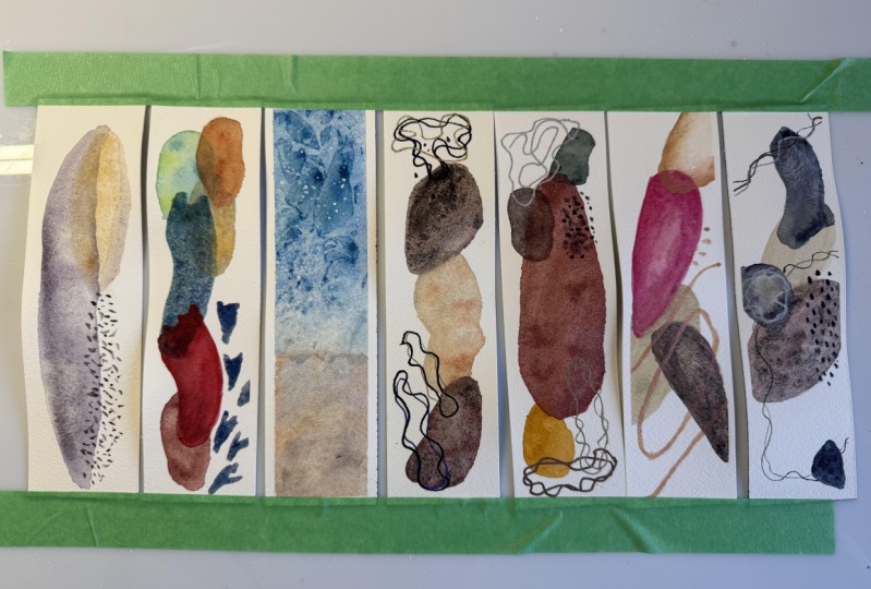
this class is for you. I'll be creating
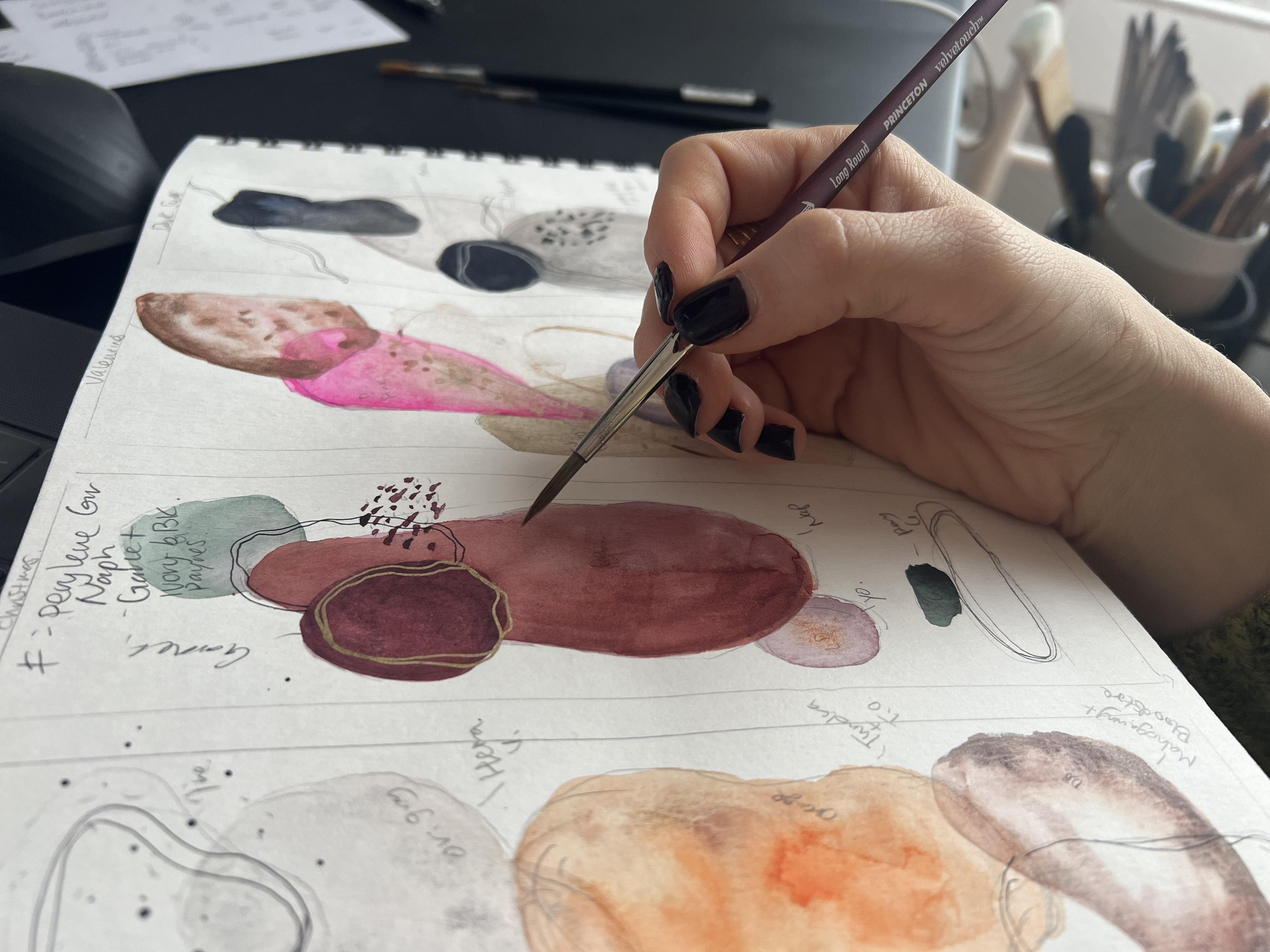
watercolor bookmark pads because I just found
these really cool, ready made bookmark pads from the Turner exhibition
that I went recently. But anyways, you don't
have to have this. You can create
your own bookmark, a long square like this,
rectangle like this. Or you can just create
paintings that you just feel like in whatever
size you want. But these are all seasonal
holiday ideas as well. It could be a excellent gift. This class is from beginner to advance any level. Here I go. This is my image of winter. The next one was Spring, this was my abstract
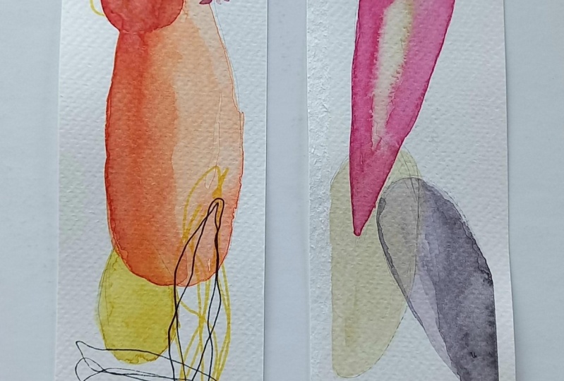
image of Spring. Then we'll be making Summer, which was pretty cool but yet a bit challenging
with the textures. The next one was
Autumn, very pretty. Next, trying to keep it track. This one my image of Christmas, then this one was this
way around, Valentine's. Then this one, final one is
just dark sumi because I just love the color black and I wanted to create something
quite interesting with it. These are all the book markers
that we'll be creating. You can just pick one
and just follow along. I hope you enjoy it. Please upload the art that
you create from this class. I'll be really happy to see
what you can come up with. Yeah, let's enjoy.
Let's get started.
2. Materials: Let's get into the materials that you would definitely need, followed by the materials
that you might want. First of all, you'll
need some eraser. Any eraser, we'll do a pencil. Then you'll need
some paint brushes. I'll have these materials
on the resources section. If you want to look
deeper into it, then you'll need some
spray bottles or pippets. You call them like anything
to activate the water colors. Then you'll need some paper
towel or a rug we'll do. And then you'll need some water to rinse
out your brushes. I'll use two jars. Then if you do have some salt, I'm sure you have some salt. So this is not caviar, it's just in a caviar container. But get some salt, it'll be nice to
create some textures, and then you'll need
watercolor paper. Now you can have
any kind of paper, I would recommend getting
a 300 GCM, at least. And then this one
is really nice. It's a mule. I don't know how to say it, but I'm in Germany, so I can get this
brand quite easily. So these are bookmark pads,
so they're really nice. I'll just be using these papers, you can cut them out for your
own size that you'll like. I'll use these masking
tapes to mask off the corners for some of
the works that I'll do. Then of course, you'll need
some watercolor paints. Now I'll be using a few different
watercolor paints that I have because
they're specific colors that I want to use. I'll also be using this
Cholero pearl colors. They're handmade in Germany. They're really good
for the metallics accents that I want to put. Also talking about
the metallics, I really like the Saca pen
touch calligrapher pens. They're really vibrant
in the colors. I'll be using these as well. If you don't have
them, it's fine just use some metallic
colors that you have around then I'll be using
the Saca Pigma Micron pens. I'm not quite sure
what size this was, but it's 0.2 MM. I'll be using these for fine line art that
I'll be creating. Also, it's nice to have
a paint brush holder. I use these that I've
made for myself. Then you'll need a palette
knife and a fiber paste. Now, these are optional, but these really
create fun textures. I recommend it. If you don't have them
around, it's fine. Try to just use salt or
just be creative and think of what kind of textures you
can create and a cling wrap. I'm sure you have these around, so these are really fun
to create textures with, so I'll be using that as well. Now I'll also be using a hair dryer because I want to make these
art relatively quickly. Because that's the
whole purpose. I really want to
create these bookmarks within a few hours from now. Let's see how that goes. Okay, that's pretty
much all you need. Now let's get into the class.
3. Winter: Okay, for our first berke mark, we're going to work
on the theme winter. Now I'm going to use a pencil first to draw out the shapes
that I want to create. My first layer, initial
layer is going to be something like a semi oval oval shape. And then next layer
is going to be a, a long oval shape like that. Then finally I'm going to
create a dotted area right here that extends like that. That would be my initial layer. Now I'm going to use very specific colors
obviously, but um, you could always
feel free to create your own colors if you want
the pigment information, then it's all in the materials. You can find it in the
resources section, because some brands
have different names, but the pigment number, if you know that, then
you can't get it wrong. But some colors like I'm
going to be using now, which is the I'm going
to use the Suki light, which is basically a semi
precious stone mineral pigment made made by Daniel Smith, which comes from
the primate theory that color you can't really
find a pigment information. Yeah. Just try to
get something close enough or you can
make your own mixes, whichever works for you. I'm going to be using
this whole color called the John Brilliant
Two, I think it is. Then I'm going to create
my first layer right here. Then I'm also going to mix
a bit of buff titanium by Daniel Smith into this
mix just to create that very interesting
look to it. The layers matter,
like which layer you work on first really
matters in water color. Because basically it's
a transparent medium, translucent, meaning that
whatever you lay on top of it, it's going to seep through. But if you basically
use a very opaque color on top of a transparent,
then it's opaque. It stands out if you do
it the other way around. Meaning you go with
the opaque layer first and then put a
transparent layer on top. Then you can see that
opaque layer underneath. It's quite interesting, creates this very see through effect. I made this first layer here. I have to let that dry
because I want to create the next layer that will overlap on top of this
layer right here. We want to dry it. I'm going to speed it
up with the dryer. Now that that layer has dried, I'm going inside the Suki light, the Daniel Smith semi
precious stone series. Okay, I just feel like this
color just works well for this theme winter because
it has that grayish, but slightly violet look of winter when it's
like snowing outside. I don't know. It just seemed
to connect it with winter. I'm making quite a
light wash right here and then I'll
go down a bit like, it looks almost like a iceberg. Okay. Then I'll add some very
pigmented areas right here. The pigment is
quite unpredictable because of the fact
that I use the dryer. The paper is still
hot when you do it. I recommend that you wait until the paper pretty much cool down, or else you'll have a lot of
trouble working around with trying to keep the wash wet while you work in
specific areas. I'm going to put more
pigment in some areas. Just randomly, the
Suki light is really pretty because it has like a
glittery shimmeriness to it. I guess just quite
a shimmery stone. Okay, we'll let that wait a bit. I'm going to add
drops of clean water. When the paper is almost
drying now, you could see, I don't know if
you could see it, but there's like you can
totally see that it's wet. Sheen shear. I don't know how
you see it in English but when that slightly
gets less wet here, look that's when we're going
to drop in the fresh water. What that does is that
the water will push out the pigments, pigment
particles outwards. The water is basically winning over this battle of staying on the
surface of the paper. We're going to drop a bit of those water to
create that effect. Like it's almost
like snowflakes. You could also use salt, whichever works for you, but I like to use just water. We're going to wait for
a while until it Rice. Okay, I'm going to
drop in some water. Just flick it on there, try to keep some distance
when you do this, the water particles
are quite small. Now you could see that it's
pushing some pigment out. Okay, The pigment
is completely dry. But it's dry enough that I can work on this area right here. I'm going to erase that line
that I see. I have the idea. It's fine. I'm going
to use this brush. I'm going inside this
color called lapis brown. What we're going to do is
we're going to make dots. But being mindful of the
area you want to create it. Also also adding some water as you go for water. Now, maybe more water. I'm creating this with
a bit of a angle with the brush because I just don't want it to be
like quite round. Then I'm adding more water. The reason why I want to work very quickly is
because before it completely we want to
splash a bit of water. I'm just going to
flick some water. It randomly touches some areas, then it'll create a bit of
effect like it's oozing out. Okay, I think that's enough. Then I'll work in a bit more now because some areas
have water and you can't really see it when I lay
down some of this pigment, then it doesn't create
a very controlled look, which is what I'm looking
for to create more texture. Okay, I'm going to
let that dry and then I should have
created another area, area to be longer. Now I want to fill
up that space. I think I would
create another shape like that and use
a different color. Okay. This wasn't
quite thought out, but I'm going to use a mixture of the first color that I've
used, the John Brilliant. Go under here. Actually, that looks good. I might not want to do anything more. Yeah,
that looks good. Okay. But just for
the fun of it, I might add a bit of that
right there then blended in. Basically what I'm doing here is trying to keep it
a limited palette, using the same
lapis brown that I use for these dots and putting it on that edge to create
a very interesting look. Even maybe add that same
silt I use right here it in create almost like
another layer right here. Okay, I quite like that. That's basically it.
It's very simple, but I really like
the look of it. So I'm going to let this dry. That's the first
bookmark winter. It's not dry yet, but we'll just let it set for a while and move
on to the next class.
4. Spring: We'll be working on
the second bookmark, which we'll be
working on spring. Now first again, I'll
start drawing the shapes. Watercolor is all
about layering. It looks really pretty. When it's layers,
I'm just going to draw the first shape
that I'll be working on, which is like almost like a
oval but a bit squary right there if you can't really see it as I don't want to put
too much of a dark mark. That'll be my first layer. And then my second layer I'll
draw another oval shape, maybe like around there. For my third, I'll be
working down here like that. Then one I'll just put a
bit 12 and then three, how they overlap each other is going to
be quite important. That will be three. Then
for the fourth one, I'll come into here, maybe even create like
a bit of a glacier. Look right there, come down
here and then go like that. Then for my fifth one, pretty much the final layer, I'll come in like that and then make it curve
and go like that. At the end I'll be
making a bit of a similar to a heart shape right there that
comes down a bit. Cherry blossom flying here. Okay, I've drawn that first. I'm going to be working
on the first layer. I'll be using John Brilliant, which is like a hole bind color. He can't quite see it, but it's a very skin
tone white mixture. Quite opaque actually,
but I'll be using that. This aqua green from
Windsor and Newton. I'll mix those two. We're going to go very light. We're not going to
mix so much pigment. Now, I don't really
like the look that it has right now because you
can clearly see the outline. So I'm going to get
a needed eraser. You can totally use
like a normal eraser, but just because I
don't want to get all these dust around
and dirty as much, I'm going to roll the needed eraser on top
to make it quite light. Okay, so I'm going to go over, okay, so I'm going to go over
it with a very light color. The aqua green, that's quite light. Now, I'm going to add a bit of that skin tone
right there a bit, maybe here even then, I want to go in with that a bit more to create some textures. Okay, that's good. Then for my second layer, it overlaps with the first layer that I've created right there. I'm going to use a blow
dryer and quickly dry this. Okay, I think that's quite dry. Now, we're going to work
on the second layer. For the second layer
I'll be working on, I forgot to put the
sixth shape right there, but for the second layer, it'll be right here. I will be going over with this. It's called the wizard, I think the magic wizard, but I'll be using that color with some buff
titanium right there. This color is relatively
light as well. You don't want to go too dark. But I'm going to add a bit
more of that magic wizard. Maybe top, right there. Okay. Then for my third layer, now you want to work
from top to bottom. If you're right handed, you want to work
from left to right. You don't cover your hand over the pigment
that's not drying yet. Here. I'm going to work at
the bottom because I'll be using the hair dryer. Anyway, I'm going to
work on my third layer, which is going to be right here. Now, I will, I will use the John brilliant skin tone
color for creating a wash. First there goes my wash. And then I'll add a bit of that magic wizard
in certain areas. And then I'll also use this
transparent pearl orange, which is quite bright. It reminds me of that spring
breaking into the winter. It's quite pretty. I'm
going to make it a bit more intense just randomly putting
more orange right there. Okay, I think that's good. I'm going to dry it again. Now that it's dry, I will work on my fourth layer, which would be right here. I'll be using again
that aqua blue. Maybe a bit stronger go in, maybe I might make
it a bit lighter. Actually, then add
a bit more water. You can always change up
the colors if you want to. This is just my
perception of Spring. Um, be open to exploring
what you feel necessary. Okay, and then I'm going
to add this couple blue, it's like a bit of a shimmer. I think I might even
extend that bit a bit. I don't quite like it. It looks like a
slug, right? Okay. So sluggy. Okay, so that's my fourth layer. Okay. And then next I'll be working on the fifth layer
and the six layer right here. But I want this to dry
as that six layer. And the fifth layer will
be over on top of this, and we don't want that color to bleed into the other layer. I'm going to dry that again. Okay. Now that it's dry, we're going to work on this
other layer right here. Now this is going to be where
I want to put my focus in. It's going to be quite
bright in orange. But first of all, again, I'm going to use that skin
tone and create a layer first. Then I don't mind too
much of making a mistake. Because like with watercolor, you can't undo things really. But you could go light enough that it's not
as obvious first, and then you'll feel much
safer doing it this way. Okay, Then I'm
going to go in with a vibrant, strong orange. Just tap my weight
in right there. Try to work very, relatively fast because
you want those colors to bleed within that wash
that you've created. Maybe I'll add a
bit of white right there to make the edges clean. You can go in while it's
still wet with a clean, with some water
to spread it out. Okay, I think I quite like that. The next I'm going to create
another layer right here, but I'm going to be
using pains gray. But we want to, again, start off quite light, then I'll create a
shape right there. Can't quite see my pencil mark. Then try again to work
relatively quick, spread the wash around. It's amazing how watercolor is, like a translucent medium.
It's so beautiful. When you can actually see
the layers underneath, then I'm going to go in with a darker paints, gray pigment. Create like a strong
edge right there. Just to get more contrast, I'll put a line
just across there. And then I'll put
that cable blue, that very shimmery
color right there. Even maybe I don't know, I quite like how I can see
the underneath layers. Let's just leave it to there. Okay, I'm done with
that layer now. Let's quickly dry Next, I will go into making the final designs on top
with strong, opaque colors. Okay, now that the pigments, the water color has
pretty much dried, I'm going over to make the cherry blossoms now
They're not going to be pink, but they're going
to be paints gray. Then I'm just going to create
a random lines like that. Almost like a heart
shape, but not quite. I'm not going to dark with the colors but also
creating contrast. Maybe I went too dark for, I'll add a bit there and then it works well when you almost have this feel to it that you're
drawing rather than painting, I think those are okay. Maybe I want to create more art like shapes
for some of these, but again, they're abstract, they're not supposed to
look like it's playing. Then I'm going over this
orange color, red mix. It's called a magic wizard. I'm going to go over these
areas and create like at some, just play around with
the opacity of them. Some could be quite light, but I just want to create
oval shape right here. Maybe I'll create that first. It's much easier
to work around it. I think I'll stop right
there and then go up. It's going to be just
like small dots. Some are lighter than others, some are stronger in pigment. Just play with the opacity of the pigments. Okay? Okay. So that's
pretty much done. It's quite pretty,
it's quite abstract, but I just love the look of it. Okay. So let's get
into the next class.
5. Summer: This is my take to actually
for this bookmark summer. What happened? I'll tell you, you don't make a
mistake. Same mistake. We'll be working on fiber
paste for the bottom. Maybe three, half of it. That would be like the sand, and then we'll create
the beach texture. But what happens is
that because I use a fiber paste first and then basically dried
it with a dryer, the paper was really, the whole area was really warm. What happened? I wanted to try to make some textures
with cling wrap, but because the place
was already dried, it didn't cling wrap
didn't quite stick and stay in a specific crushed look. I don't know how to explain it, but it softened because it was warm and it didn't
create much texture. And I don't like this effect. I Let me show you. This is my sketch for the class, but this is the effect
that we're looking after. That's the sandy look. First, we'll be taping
this down because I want that edge Um, look to it. I will use the dryer, but because it's lunchtime, I'm going to leave
the fire paste to dry first with the hair
dryer and then leave it for a while before I
come back to work on it. Again, fiber paste.
If you don't have it, just skip this section. Just create like a wash. I want to create about that. Maybe a third of the
paper will be sand. You don't need much fiber paste. Really just create that texture. Look, we're using a palette
knife and going in. It's good to create a texture
that goes up vertically, but can play around with whatever texture
you want to create. Okay, I think
that's good enough. Kind of creating some lines. Okay, some lines. That's enough. Now that the fiber
paste has fully dried, I am going to work into this
with some buff titanium. I'm going to drag that buff titanium above the
line of the fiber paste, adding a bit more buff
titanium here and there. Now the sand is not just white, I feel like there's a
certain oranges in it. I'm using transparent
pyal orange. Then I'm going to add the
duo Chrome all to mystery. I think it's called
just a bit of glitter. Then I'll be adding moon glow, which is basically
like a purple, just to create
that grayish look. Again, the sand is not white, it's got different shades. Then I'm going to add
a bit of the blue that will be for the ocean, but less, Don't
want it too much. Okay. I think
that's good enough. We're going to let
that completely dry, then we're going to let
the whole thing cool down. And then we'll be working
on the wash layer of the ocean that the paper has completely dried and cool down. I like to, we'll be
using cling wrap, crinkle it as much as you can. I think I went up a
stingy on this length. The width, but okay, then putting that aside, I'm going inside this color called a quad grain
by Windsor Newton. It's a really pretty
blue color actually, we don't know the pigment
information of this one. Windsor Newton
keeps it a secret. That being said, try to use less water for
this one because we want to speed up the drying process
as much as possible. Here. I'm just going to blend in a bit of that buff titanium
that we used before. Add a bit here just to make that transition
a bit smoother. Then once all areas are covered, I'm just going to
add a bit more. We're creating a wash, but I want to keep
the gradient going. Okay, Then I'm going to get this Ath Blue
by Daniel Smith. It's a very rich blue color, the less water and then go in. Again, being mindful
of the water, I'm going to go in
darker a bit here. I feel like it's lacking a
bit of color right there. So I'm just going to
add that green again. Okay, And then adding some
dark pigment of that green. Maybe even creating
this worldly effect then with the throw as well, keeping that bit quite dark. Okay, now I think it's ready. I'm going to put
the cling wrap on top, creating some textures. The more smaller the textures
you see here, the better. I think that's quite
nice right there. I'm just going to
leave it like this. Don't use a hair dryer for this. Leave it to do its own thing, or else the C is
going to smooth out, not keep its shape
and flatten out, Just leave it as it is now that it's probably completely dry. I'm going to take off
the cling wrap and yes, it's not as strong
as my other one. I'm not too sure why, but I like the effect
that it's created. Now what I'm going to do, I am going to get
a bit of white. I'm going to wet this a bit, try to make it more
pigment and less water. Then we're going to flick
it a bit at the top. Flick. I'm going to tap on it. Okay. I think that's enough. Then I'm going to try it with a blow dryer and then
we're going to tape it off. Now that it's dried, I think I still want to
add a bit more white, so I'm going to a bit more. Okay. Okay. And then I will. Okay. And then I'll get the
dryer and dry it a bit more. Okay. So now that it's
completely dried, I'm going to take off the tape and that's the summer
that I've created. It's got that lovely fiber here, it could be salt again with the cling wrap texture
at the top. So pretty.
6. Autumn: We'll be working
on the next book. Which would be at now. First, I want to just draw out some shapes
before we start. Let's see. This would be my first layer that
I'll be working on. This would be okay, so that would be my first. My second would be this. This would be this would
be the focal point or focal interest where
the ice would go and this would be So I would bring it, yes. Okay, that's good. First, I'll be working on
this layer right here. Second, I'll be working on this. And the third would be the
centerpiece right here. Maybe I might even go like that. Okay, I don't want the
line to show too much. I'll be wrapping this off a bit, basically at the end. These would be the
watercolor layers, but I would also add like a pen mark right here very
thinly, as well as right here. For this first layer, I'll be
using the hematite violet. Such a pretty color. It's from Daniel Smith's
Prima Tech series which basically is like made from minerals or semi
precious stones. They're just so pretty. I just love them so much making these
shapes a bit organic. And I'm just creating that
first layer right here. I think. I want to
make it a bit rounder. Okay. That looks more like it. Yeah, I like that shape. Okay, then I'm going to make some areas
look a bit darker. Okay, it's good for
this bottom bit. I'm going to use Mahogany Brown, this color right here. And also bloodstone, which is again from
the Daniel Smith. Mahogany Brown I believe
was actually from say it's really pretty. Schmka's granulating
colors I heard were the super granulation sets where a lot of them were
a mixture of this color, because it's super granulating. Next, while I'm creating this, I'm going to create a very
light area in the middle. On purpose I'm going
to go around again. I have to work up it quickly. It's winter here in
Munich, Germany. But yeah, it's so dry inside the house
because we just started turning on the radiator and
it's been snowing recently. Yeah, autumn has passed by. It's winter. I'm adding more pigment right there.
Might even create. Yeah, that looks a bit
like a stone feel. Then I'm going inside
that bloods stone again, this is from the primates
made from actual minerals. Just going to add a
bit more here to let it bleed into that color
to the mahogany brown. Okay, now I'm going to leave this to dry and
then finally we're going inside the final
layer which I'll be using a very strong
orange but also transparent plan to Sure
tundra orange from Ska, which is super pretty. Well. Okay. I'm going
to let this dry. Okay. Now that the
layers are dry, I'm going inside tundra
orange very lightly. Now, this is not
such a strong color, I would say it's
like a reddy orangy, almost a brownie, very light. But again, I don't want
to go into this wash with a very heavy loaded
pigmented water color just because if I
mistaken something, I still have the ability to kind of redo some things or
even add some things. Okay. So I'm going in with
a darker tundra orange in some areas just to
kind of play around. And then I'm going to use the
transparent pearl orange. This is from, this is
from Windsor and Newton, the one that I'm using. Then I'm going to create a darker spot right
in the middle. I don't quite like
how that looks, so I'm just going to spread it so it doesn't have
that bleed look as much. Think I quite like how
it looks right now. Then I'm going to let it
dry but have a shear. It's completely
wet, you can see. But when it starts getting
a bit of a sheer sheen, I don't know how to say, but the water is still there,
but almost drying up. That's when I'm
going to drop fresh, clean water on top of
certain areas to let the pigments push out and
create like this bloom effect, also called cauliflower effect. We'll let it sit and
just wait for a while. This area is dry. I'm going to create a
shape right here with a very thin pen I'm going
to use to suck it up. This is 0.2 millimeters. I'm going to create a random
line and then go around. It's fine. This
one is out of ink, so let me get another one. Okay. I hope these in this is going to be a bit thicker
but I'm going over it again. This is 0.5 Yeah, Faber Castle, Just going to define that shape a bit. I don't know if
it's the dryness, but I feel like all the inks are kind
of like almost gone. Okay. So I don't quite
like that look yet, so I'm just going to go over it with the different shape until
I feel like it's enough. Okay. Okay, I think that's enough. Then I'm going to create another shape
right here as well, which will kind of go like that. I think again, I'm trying to be mindful
of that area that's still, I don't know why all the
pens are drying out. What's going on might be the rough textured paper
that's not quite working. Okay. Okay. I quite like
that. That's good. So I'm going to look at
how d this is right now. I think it should dry a
bit more, but let's see. Okay. I'm going to
get some clean water. It right there because I
want to create that bloom. Okay. It's working.
Can you see it? It's like pushing out the pigments right
there, creating a bloom. It was almost drying,
but it's like, okay, I'm going to push out and it's pushing it out, that's good. Then finally I'm going to create a bit of splatter of
black right here. I'll need a block pigment. Think I'll use that bloods stone because that's the
darkest color right here. Then what I'm going to do is
just tap on it like that. Okay. I think that's enough. It kind of got on
that right here. I should have waited, don't make that mistake like I
did, but it should be. Okay. Now that it's
completely dry, I do feel like something
is missing right there. So I'm just going to create another mark using the same pen, a bit thicker one, and I
think I'll create something. Yeah, something like
that right there. These pens are just driving
me crazy. I don't know why. I think it's the
roughness of the paper and I'll create a thinner
line as well. Okay. Okay. And I think that's done. Let's move on to the next class.
7. Christmas: Okay, for this next class, we will be making a bookmark
with the theme Christmas. Now I'm going to outline the layers that
I'll be working on. The first layer
will be right here. It will be like a
circle, almost a circle. Then my second layer will be this big long
shape right here. Actually, this layer I think
I want to work on first. After this will be
my second layer, then there'll be a small
shape right here like that. Then they'll be like a
pen mark right there. Okay, let's work on
this. Oh, I forgot. And there'll be another
shape right here. Okay. For this one, I'll be using this Perlin Green. It's almost like a black, but it looks like a green. But it's actually
a black pigment made from a black pigment. But we're going very
light with this color, the first initial layer. And then I might
even dip a bit of a dark pigment at the
top just for some fun. Then I will go inside Shamika's
yellow ochre right here. It's quite an pig color, but this color does remind me
a lot of Christmas as well, with the gold ornaments that, that fills in a
Christmas environment. Because that's so vibrant, I might even tone it down
with some different, with a French ochre, which sometimes looks
less saturated. Okay, then I will let that dry. Maybe I might even work
on this layer right here. Actually, wait a minute, let me add this dual
atomistry inside this yellow ochre to give
it a bit of glitter. Then I'll work on this
layer right here. We want to go dark for this
one and it's not much space. Okay. Then I'll go
dark for that one. Just let it bleed. Okay. Then I'm going to use
a blow dryer and let it dry. Now that the paper has dried, we're going over this
big shape right here. I'm using um, Garnet from the Prima
Tech Daniel Smith series. Again, this is such
a beautiful color mentioned in the other class. This is basically made from semi precious to mineral stones. Yeah, it's actually
derived from them, that's why it has such. This one is garnet. This
is actually a garnet. And I just love how it looks. Going to switch my brush
because I don't think that brush is quite needed for the initial stage where I'm trying to lay out a wash
right here really quickly. Again, I'm trying to be mindful of layering it down
first like a wash. It could have gone light, but I was too busy
owing the color. Okay. Now I'm going in with
more of the color here. Adding a bit more pigment
into this first layer. Okay. And I will let that
dry, but wait a minute. I think I want to add a bit more at this corner right here, just to give it more depth. Okay. And I'm going
to let this dry. Actually, I think I'll push
out the pigment again. It's almost dry but it's
still not complete. Um, right here I could
see a bit of a shear. So I'm going to drop in
clean water, clean water, and let it bloom because I quite like
that effect of blooms. And I'm going to let it dry. Now that it's completely dried, I am going to do this
layer right here. I'm going to get a more darker, heavy load of that garnet. I've also created portraits
recently with this garnet and I sell them on
Etsy on my Etsy shop. But like they are super pretty. They're so could be one of my, one of my favorite
prima tech colors out there after Hematite violet. Genuine. Okay. I think I quite want this B to be
a bit more. Okay. I think that looks good. I want that rich, much richer, Like purple, tilting toward the purple. For this, I'm going to add
a bit of Naomi maroon. I forgot the name
of this pigment, but it's basically more
like a wine color, but it gives that
different depth to it. Okay, I'll let this
dry and then we are going to work on
this section right here. I'm just going to create
a pen mark again. Going to get the thinnest one. Make a circular, random
lines right here. Again, I guess it's
just a paper. Really? Hm. I'm starting to think
maybe I should use paints gray to create those thin lines because my pen isn't
working with this paper. Okay. I think that
looks a bit better. I might even use some
black pigment for this, but I'm going to go over that. Yeah, With water color,
there's less control. But in this case, because of the fact that the paper is quite
textured and rough, my pen marks aren't quite creating the
effect that I want it. Okay. Okay. I quite like that. Now, I
will let this dry completely. Okay. Now that it's dried, I am going to create again, a line with my brush
and not a pen. Although I do want to use
a brush and I'm going to create a line, a wiggly line. Oh, that's much better. Wiggly line right there, and another wiggly line. Right there. Okay. And then I
will let that dry. And while I'm letting that dry, now that it's completely dry, I am going to use this succua
touch calligrapher and make sure while you shake it
before using the cap doesn't come off or
it's going to just splatter from the whole area. I'm using the 1.8
millimeters gold and going to create a round ine. I could have gone a
bit thinner there. You can always create a thin
line by using the tip of it. I want a bit too thick
right there, but it's fine. Then next I am going to create dots right
here with the garnet. Now you don't want much water, and I'm just going to create like a random
dot right there. Even using this
dinner brush maybe, and then giving it
different textures. Although I don't
quite like that. Let's see. Okay,
think that's good, and then I'm using
this one again. Okay, that's good enough. I just feel like something's missing at this final
stage right here. I guess I should have created this one a bit above,
but it's okay. We can always
create a line here. I think I'll use this gold pen because I just love the effect. And create a circle that, that takes you down
this path right here, almost like an oval shape. And I'll go for a second line going deeper in, coming back in. Yep, I think that
looks a bit better. When I look at this. I feel like something's quite
missing right here, but I don't want it to
take all the attention. I'm going to use the silver
caligrapher pen and create a shape that extends here, but goes around there. I don't take away so much, but I feel like it put
everything together. Okay, so that's my
Christmas bookmark. Now let's get to
the next lesson.
8. Valentines: For this project.
For Valentine's, we are going to put masking tape on the corners
because we'll be going over the corners and
it'll look clean and nicer if it's taped to create that crisp edge. I'll first draw, this project
will be using metallics. I would metallic watercolors. I would go like this, that'll be the metallic bit. And then we'll create
like a half heart right here that goes down
sharply again. You can always at justice. This is just my interpretation of what Valentine's
feels and looks like. This shape will be going, I would say, until maybe here. Okay? And there'll be
another heart shape that goes down like, okay. And then there'll be like a shape that comes
here later on. Okay? I'm going to
get a needed eraser. Make these lines less visible. Okay? I will go over the
first with Opera pink color, which is a PR one to two. This one is light fast, it's the best color. When I say it's no, it's not quite life fast,
Is that how you see it? Yeah. Basically with sun, the color will fade eventually. And it's not the best thing to use for something that you want to last for
quite some time. But book markers are usually
in between your books. Hopefully, less
light will hit it and enjoy working
with this color. Okay, that's my heart. I think I put a darker pigment. Uh, okay, this is a good example of when
you don't mix your, mix your pigment on the palette before putting it on your paper. Sometimes you get those
big blocks of pigment, just not good. Okay. I think I like that. I might even add a bit
of buff titanium just for that playful kind
of feel in the middle. Okay. And then, actually, oops, I wanted to work on
the under layer right there, but it is what it is. I think I'll let this
dry and then I'll work on that bottom layer
that I wanted to work first. Okay, Once that's stride, I'm going to work
on that under layer that I wish I worked
on beforehand. I'm going to go right down here. The reason why I wanted
to work on this layer first was because that
opera pink is quite strong. If you work with layers
and do this one after, it just creates that look like, oh, I don't know. It's just like it doesn't work. You have to go to dark
with water color. I just don't like the fact that I forgot
about it, but it's fine. I'm going to create a bit of a darker pigment area
right there and go down. Okay. And I'm going
to let that dry. Okay. Because I made a
mistake with the layering. I am going to actually work
on a second layer here, but I have to be quite quick. This one looks like it's
coming forward a bit more. I'm especially going to add a
lot of pigment right there. Okay. I think I managed to make it look
like it's coming forward. Then I'm adding some buff
titanium in the middle, but also adding some
water, some fun effects. Adding some Opera
pink right there. Okay. And I'm going
to let this dry. Actually, I'm going
to work on this layer because it will not bleed
in even if I work on that. This is one of my
favorite colors. It's called Moon glow
for Daniel Smith. It's like a mixture of, well, basically it's a
purple but it's so pretty. We'll use that. I think it needs a bit
more sharper look. It's almost touching
but not quite with that other other half heart. Okay. And then I'm going to, once I'm happy with the shape, I'm going to add
a darker pigment of that moon glow
and drag it up. I'm being mindful of where I'm actually putting the
darker shade of it. Oops, I'll work into that one
right there. I don't know. I don't quite like the shape of this heart somehow,
but it's point. Okay. Thank this one has to come more down,
sharper like that. Okay. It looks a bit better. Okay. And then I'm
adding more pigment, less water right there when you just feel like
there's too much water. Like I feel like I've
done right here. The best way is to blow out
that water, excess water. And lift it up with your, again, lift it up with blot it out to sweep it out and then go
in with more pigment. I still don't want that shape. Go down a bit more. Okay, that looks way better. Okay. Next I'm
going to let this, we are going to work
with metallic colors. Now, if you don't have these metallic watercolors, it's fine. You can just use any other
maybe kind of light, um, colors because it's the final layer, it
might be pretty. I just want that
translucent effect of a see through effect here. I'm going to create a shape. I'm going to use this
cholerol pearl color called the cotton candy. I'm going to create a pretty
thick layer right here, going around, and then a
straight line right there. Then I'm going to clean up
my brush with some water. I'm going to try to blend out. That pigment. So it's like creating a wash if you feel like it's
not moving as much. It's probably because
I haven't waited between the time
I've dried this with a dryer and then the
paper is quite still warm then it's drying
up the pigments. It's good to kind
some time in between. But I'm trying to get this video taken within today
because I'm a one man show. I do it all the
editing and stuff by myself to work quickly
before my son comes back. It's created this see through look inside the circle.
That's quite pretty. I want to now use the same color and create
some dots right here. Dot because it's not showing
as much as I wanted to, I'm going to use a different
color called the Moon gold, trying to create more dots that are opaque,
right down here. Then next I am going to create
like a bit of a circular, long circle line that goes
right there, right down. Try to be loose as
much as you can. And then with the moon gold, I'm going to create
another circle. Then look at that. Think I might even go like that, so it looks like
it's connecting. Okay. And then, okay. Okay. So that would be my
Valentine's bookmark.
9. Dark Sumi: For this final project, we're working on the
theme Dark Sumi. Now with watercolor, I
just realized often that the black pigments are
not quite black enough, they're not opaque enough. I really like using these sumi Japanese like inks basically because they have a very rich dark color to it. Okay, I'll be using this, I'll be using the bluish
black color because I like that color quite a lot. Then I'll also be using this laps brown color
which is from the rock. Well brand as well as mate violet is always good to use as
a very light layer. Okay, Then I'm going
to start sketching. Before I start, I want
to take this down because I'm going to go
over the edges a bit. I'm going to take down my paper. So first I'll have
a shape like that. And then, but my
first layer will have this oval shape right here. And then I think my second layer actually
will be right here, a big circle that doesn't
quite fit the page almost the. Wait a minute, I think
I would make this a bit shorter because there's a shape I want to get down below there. There's going to be
the shape right here. Shape like that, small shape. I would say I'll end
the shape right here. I'll just extend that bit. Okay, and then it kind reminds me a bit
of that Christmas, the Christmas card that we made. But nevertheless,
this is another one. Maybe even this
could be a rounder. Okay. Maybe this one could
be even bigger. Okay, That looks good. Okay. We're going to
start coloring this in. I'm just going to
use my needed eraser because we're going to
be working with black. I don't need to be too scared
of it showing through. Okay. My first layer is
going to be very light. I'm going to use the
hematite violet. That'll be the lightest
color that I'll use. This color doesn't
quite get too dark. That's the good part of it. Sometimes you want to use
colors that are very light. And as a beginner, it might take you a while to get the hang of the pigment
to water ratio. Just having pigments that
can't really go to dark. It's like an easy way
to work around with. Yeah. Okay. That's my first layer. Before letting it dry, I think I'll work
on this bottom bit because that could be worked on. See how dark that black
is is just amazing. You can't really get that
with water color unless you go like really heavy pigmented. But even yet, like it's just
Yeah, you can't get that. Okay. I like that edge. I think I like a bit
more rough look to it, so I'm going to use a dry bush, kind of rough at it out a bit. Okay. Okay. And then I'm going
to let it dry. Okay. So next I'll
be using Mars block. Going over the second
layer right here. Now this is basically
like a neutral color. I apologize, the camera
went out of battery. I initially made
a very thin layer right here with the Mars black. Then I've added the
bluish black ink in this corner right here, and dragged it down
to create a blend, and also added it right here. Now we'll be working on
this round circle again, I'll do pretty much
the same thing that I did for that top right shape. I'll use the Mars black, like a black water
color pigment. Create that initial layer, then you're not too scared to make any marks
that's not wanted. Okay. And then I'll get that really deep pigment
and then get it all around. I think I'll leave a bit that layer inside open because I like that
effect that you could actually see
through a bit then adding more of that semi ink right there then. Yeah, I don't quite like
that shape right there, but it might work once
I put another layer. But let's just work
on that one a bit. I think I'll just
make it into like a more defined shape rather than trying to create
like a texture. Texture to look Yeah, that's more clean. I like it that way, I think. Okay. And then I might even add a bit of
water in the middle, just see how I guess it's
not changing as much but even lift off a bit
of that color. Okay. I think I like that. And then we're going to let this dry. Okay. Now that is dry, I'm going to work from
top to bottom so we don't smudge the pigment at all. I would get my very
thin brush go inside the Sumi ink or black ink and I'm going to create like
a texture right here. I'm just going to go
and create these lines. I mean, I'd like to use
the pen if I could, but since I don't have like, I'm not using a very
smooth paper here, I'm just going to do what I can. Okay, I think I
like that effect. Now, I'm going to create like a big wobbly circle
that goes like here. I might even draw a thin line just so I
know where it goes. I'm going to go like that. And then I'm going
to come across here, go down, and then go like
that and then go up. That would be my
layer right there. But before I go to drawing
that line right there, I'm going to use my calligrapher
Sakoda pen, shake it. Before I use it, I'm going to create a way line right here gives a very nice touch to it. Then I'm going to use in again, then go down, make
it a bit wobbly. And then go over
like that again. I'm going to create
another line not so far off K. And then finally I'm going to use Sum Mix with
white right there. I'm going to use this to
create doted lines right here, randomly placed, almost like it could be
creating yet another circle. Okay, I'm done. We're going to dry this and
take off the masking tape. Now that it's dry, I am going to take off the masking tape. Okay, This is my final bookmark. Dark sumi. Yep. And we're done.
10. Final Thoughts: Great job everybody. And I hope you enjoyed the class we've done winter, spring, summer, Autumn,
Christmas, Valentine's, and finally the Dark Sumi. I hope you really enjoy
this class and I'd like to see what you all create. Please upload your
finished projects or even what you've created from this class.
It could be cards. Again, it doesn't
have to be bookmarks, but I just thought
it was nice to use these bookmark papers that I've got at the Turner
Exhibition few days ago. Okay. I hope you
enjoyed the class. Please leave me a review. It really helps me make
better videos in the future. And I'll see you again
in the next class. By
 Miwa Gardner, Watercolorist- Watercolor for Relaxation