Transcripts
1. Welcome to this Class: With watercolors, knowing when to let go and when
to take control is an essential skill for both beginners and
experienced artists. Combining these two techniques will allow you to
paint confidently and create stunning
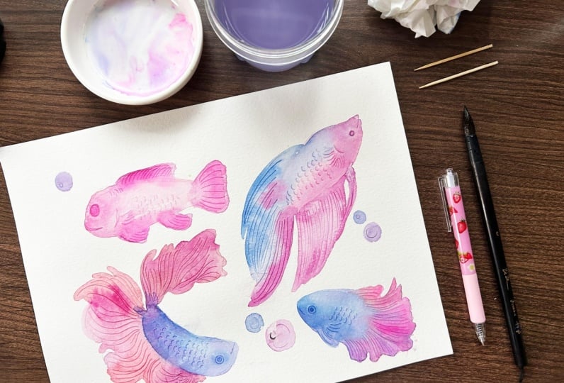
illustrations like this colorful fishes. That's what we'll
do in this class. Hello fellow Creatives. My name is Ban, an aspiring watercolor artist from
Banga, Philippines. I found rest and relaxation
with watercolors in 2018. And ever since then, I committed to painting
every single day for a few minutes
for my well being. I'm also passionate
about teaching and I'm in constant
research on how to make students first encounter with watercolors as easy and
as rewarding as possible. This class is one of those designed for beginners
and hobbyists, which combines the
art of letting go and taking back control. In this online course, we will utilize the watercolor technique called scratching and we'll be creating this
vibrant fish illustrations. We'll learn how to
let the pigments blend with water naturally, the letting go part and then take back control by
drawing in patterns and marks with a
sharp pointy object like a pan brush or tooth peak. By the end of this class, you will have the confidence
needed in painting these fishes and
the knowledge on how and where to
apply this technique. When you're ready, grab your materials and
let's get started.
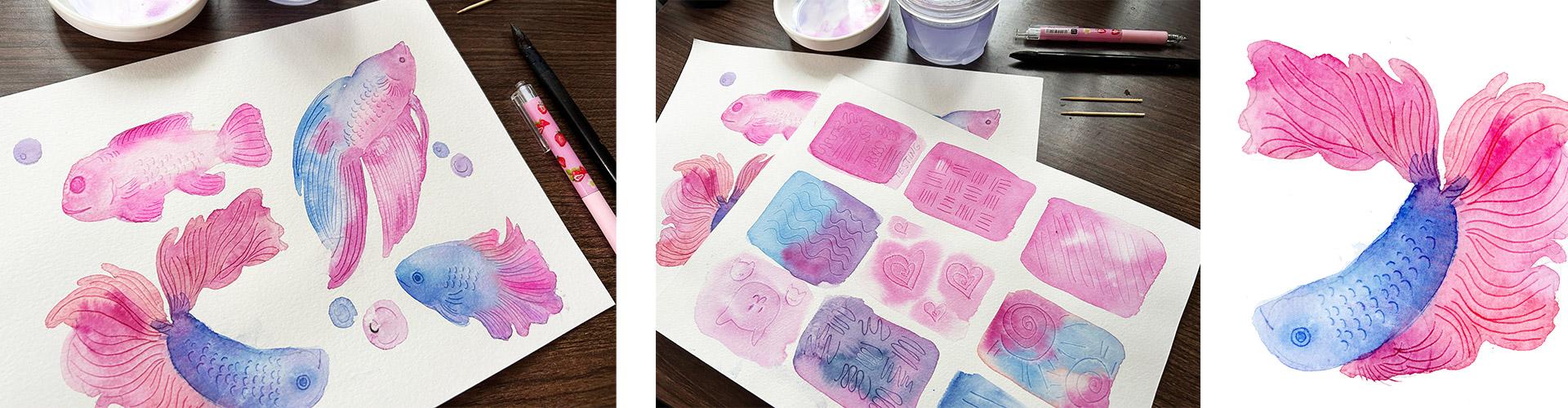
2. Class Project: Our goal for this
class is to create watercolor fish
illustrations using the technique called scratching. To get started, please prepare the following watercolor paper
a student grade will do. I am using Kansas starter pack
300 GSM watercolor brush. One size eight or ten
round brush would do. Please remember that
the size of your brush is relevant to the size
of your illustration. A pointed tool for scratching
or scoring the paper, which is the technique that we will highlight in this class. I like using a
used pen for this. Alternatively, you can use
the other side of a brush or some toothpicks,
water color paint. Here's my travel palette for our simple
fish illustration. Three to four colors will do a palette where you
can mix your pigments. Water jars, one for
rinsing your brush, and the other for
getting clean water. As always, I have prepared a class guide available for download in the resources tab. It has a scanned copies of my paintings,
summary of lessons, list of materials
and colors used, and additional paintings that will serve as an inspiration. I will demo how to paint these four vibrant
fish illustrations, which you can choose
whether you want to paint one or get the most out of
this class and paint them all. I would be looking forward
to your illustrations, so don't forget to share them in the Projects gallery where I will leave a feedback
as soon as I can. I want you to have the best
experience in this class. If you have questions
related to the topic, please don't hesitate to start conversation
via discussion. Stab also to help other students decide whether this class is for them or not. Leaving a review is very
helpful to them and to me to ensure that I am
creating quality classes. Let's head over to
the next video to discuss what scratching
is all about.
3. What is Scratching: Scratching, or what
others call graffito, is a watercolor technique
used to create textures. This involves using
a pointy object to draw on a still wet paper. With paint, the scratched areas will appear more defined
and darker than the rest of the wash. Now let's use the backside of this paper to
demonstrate this technique. For comparison purposes. I'll paint a small wash of Quinacridone magenta over here. Use any color that you want
for this simple exercise. And leave this to dry and
do not touch it beside it. Let's make a fairly similar
size of wash this time. Instead of allowing
this to dry completely, use a sharp object to scratch some marks while the
paper is still wet. I love using a used pen
with this technique as it's very easy
to hold and well, it's obviously
designed for writing. Draw any pattern that you
like and fill in the shape. You may also write some
words or go abstract. Of course, please make
sure to test if there's no longer ink or you might end
up with something like this. When the pen suddenly
released some ink, can you see the difference? The scratch areas
are darker and more defined compared to using a small brush to
paint these details, this approach is easier
and obviously more fun. You can also start off with clean water to
paint a rectangle, and drop your paint
to fill in the shape, but leaving some
parts untouched. Now for this wash, I will use the other side of this generic calligraphy
brush to draw some patterns. This is thinner than a pen. It's a bit more challenging to hold compared to a writing tool, but you can see that defects
are pretty much the same. Now let's try using
a tooth pick. This would be the
most challenging to use because of the size, but in case the
other two options are not available to you, this is a good
alternative that is accessible and
fairly cheap to try. But as you can see,
it also creates those wonderful defined
lines that would have been intimidating and stressful
to create with a brush. If you are a watercolor
beginner pen brush, or a toothpick, whatever
is available to you. Have fun trying out
this technique. We've worked with a
single color so far. Let's see what happens
when you use two colors. I'll cover one half with blue and the other
half with purple. Watch closely as I make marks
from one side to the other. Color of the darkened
areas will also change. When the pen is pressed
on the left side, it will produce dark blue marks, while it will create dark purple patterns
at the right side. It's as if you change pigments while painting it with a
brush, But not really. There will be times
when the pen might also drag some colors to other parts. But I think that
is beautiful too. Like what happened here when
I worked with three colors. Those are helping
pagentaaloblue. I would recommend that once the pigments are
dropped on the paper, just let them blend with each other and as much as possible, Please refrain from dragging
your brush excessively. Practice the art of letting
go with the first step of dropping your colors
and take back control. Once you are adding the details, have fun with these
warm up exercises. In the next video, let's discuss some common mistakes to avoid when scratching
with water colors.
4. Setup for Success: As simple as this
technique may look, it is also good to know the five most common mistakes to set yourself up for success. Number one, the paint
has already dried. If you work on a shape that is too big for your painting space, chances are some parts will
start sooner than expected. When that happens, you
can no longer scratch the area to leave marks.
See the difference? I tried scratching this shape when the paper has
already dried, but there are no visible
marks compared to this one where I scratched the paper
when it was still wet. What do we do when this happens? Observe the paper
tilt if needed. And check if the
paper is still shiny. Wait for it to completely dry, then re wet again. For example, I'll re wet
this shape again and scratch to see if it will
fix the error It does, but those marks I made
earlier while this was dry also shows a bit to
avoid this mistake. You can also try working
section by section, which I'll demonstrate
through our projects later. Number two, color
used is too dark. The scratch marks will
not be visible if you use a pigment that is too
dark or too thick. Meaning there's more
paint than water. As we discussed earlier, scratching works by drawing
on a steel wet paper, and therefore produces a mark darker than the
paint that you used. If you painted with
a really dark wash, the scratched areas will not be that visible as
shown in this demo. To fix this while the
paper is still wet, you can simply use a clean, wet brush and lift up some
paint to lighten the area. Now you can see
the marks you have created or when that
has already dried, Then use a clean, wet brush to lightly
scrub on the area and pat the reactivated
pigments with a paper towel to
reveal the patterns. Number three pen
used is too sharp. To demonstrate this, I'll use a thinner and cheaper student
grade watercolor paper. I never thought the kind of pen I'm using when
working with this technique matters until I
accidentally messed up a painting because the
point was just too sharp, which damaged my paper. You can see here how
pointy this other pen is compared to what I'm using
earlier. Let's give it a try. I'll paint a slipping cat shape here just to follow the
theme of this sketch book. This is not meant for faces. Since the paper is still wet, it is more prone to damage. If you use a really
sharp pen like this and accidentally put more pressure
when drawing those marks, see how it damages the paper, and this is what it
looks like when dry. To avoid this mistake, please make sure to test
the pen that you are using first before painting to
your heart's content. Number four, accidentally
leaning on wet paint. This is my most common mistake. I often forget to
rotate my paper when working on the left side
of my paintings that I accidentally lean on the
wet paint and therefore mess up some shapes to
fix this immediately. Use a clean, wet
brush to reactivate the paint and pat it
dry with paper towel. Don't forget to clean
your hands as well. Avoid this. Make sure to rotate your paper when
working on the opposite side. And find an angle that
you're comfortable with so that you can still see
which parts are still wet. You may also retouch this
shape that you're working on as long as it's still
wet to fix this area. Lastly, there's not enough
paint on the paper. We saw earlier that when
a paper is scratched, it appears darker than
the rest of the wash. If you use too little paint, say only painting the border
of this rectangle and scratch the inner part where
there's not enough paint, then there will be
no obvious marks. If you notice that you're
not producing any marks, just drop more colors on the still wet paper and it
should fix the mistake. Retouch the marks if needed. Those are the most
common mistakes that you need to keep in mind to set yourself up for
success in our projects. In the next video, let's practice scratching
with coral shapes.
5. Corals Practice: I know you're excited
to paint the fishes, but let's do a
quick warm up with corals first and get familiar with scratching technique on
a separate sheet of paper. Try painting some of these wavy corals and draw some lines on
it while still wet. Working on a more defined
shape is more challenging than just painting a rectangle and scratching patterns inside. This is also a good
time to test out the colors that you
plan using on the fish. I personally picked out these cool colors because
I really love them. I have Quinacridone
magenta, thalo blue, shell pink, and bright pink to work with my
fish illustrations. Later here I painted the coral and drew lines
following the shape. Now it's also a good
time to estimate how fast you can scratch
before the paint dries. Keep a mantle node on the size
of the shape that you can easily manage the paint and
then scratch the details on. For an easier approach, you can also just paint a circle and then draw
something at the center. These are two different
ways to use this method. But for the projects I highly
encourage you to paint the actual shape of the fish and scratch patterns
of the scales and the fins. Instead of painting a
big geometric shape like a circle or a rectangle, and then drawing the fish shape
with a scratching method. This will give you lots of
opportunities to practice your brushwork and
therefore giving you more confidence on
your painting projects. Try it again with the different color combination and keep practicing as needed
when you're ready. I'll see you in the next video
to work on the first fish.
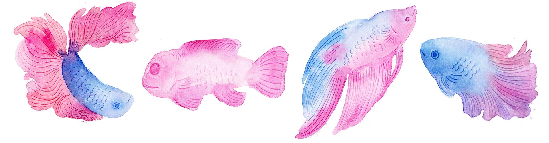
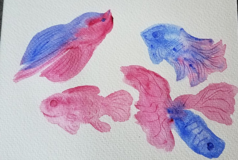
6. Fish 1: Pinky: The first fish is the simplest illustration
we'll work on. To make it even easier, I will draw some light
guidelines for the big shapes, which will help me decide
where to place my paint later. Looking at this
reference image from unsplash.com the pose of this little body is a bit
static and that's fine. Our goal on this
first project is to just get acquainted
with the process. Feel free to skip sketching
if you want to be spontaneous and add a little more challenge
on this project. Now that I have established
where the body, the fins and the tail are, I'll grab my brush and
start painting right away. Don't worry if some of those pencil marks will show
through the final word. I think it adds
character and interest. Leave them be. I'll work on the body first and make
sure that it is wet enough, giving me time to scratch
scale and fin patterns. No need to draw all the scales. Okay. Our brains will
automatically fill in the gaps that we could
see those tiny details, the scale marks, even if
they're not actually there. I also drop darker
paint near its eye and mouth to make those
marks more noticeable. Relax and take your
time on this process. Since we cannot erase those
marks once we scratch them. I'll start by defining the
eyes in the mouth and give it a tiny fin near the eye and work on the
scales from left to right. This is what I meant
earlier when I suggested that we
work section by section to avoid
the paper drying out before we could even
scratch the patterns. Keep adding details as long
as the paper is still wet. Once you are satisfied
with the body, we can now work on the
fins and the tail one by one just to make sure that we'll have enough time
to scratch the marks. Add darker paint for variety. And when I say darker, I only meant more paint of the
same color and less water. The two fins at the bottom
are smaller than the top. They're easier to paint and
scratch simultaneously. Do the same with the
tail and we're done. Don't get too caught
up on painting inside the lines that you
drew as your guidelines. Okay. They are there as
guides and not to limit you. It's totally fine if
you painted outside, the lines embrace
these happy accidents and enjoy the process. Here's our first project. How do you feel
about your artwork? I'll see in the next video. And let's work on a
more challenging piece.
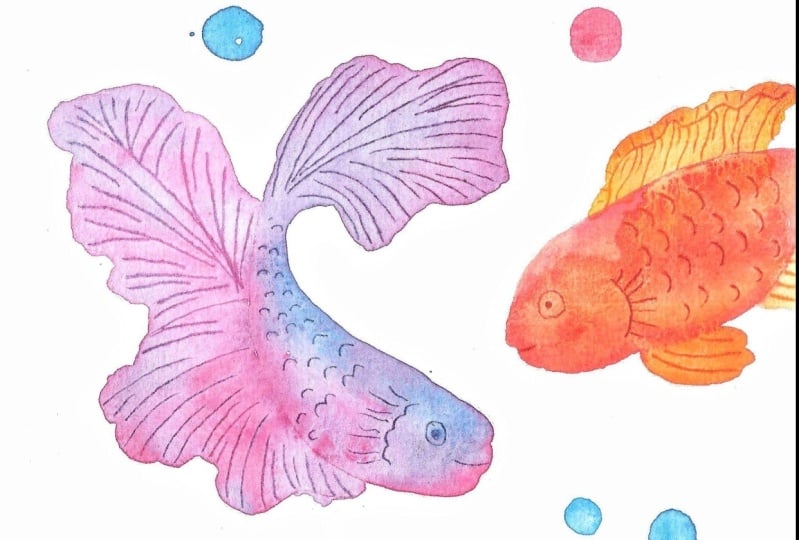
7. Fish 2: Pinky Blue: We will paint the second fish by following the same
steps with the first, but its pose is more dynamic. And we will use more colors to practice letting go
of the pigments, blending on the paper. The art of letting
go, I'll sketch lightly for the
guidelines and use edgy geometric shapes
to simplify it. It's totally up to
you if you want guidelines or would like to
jump straight to painting. Once done with the guidelines and overall sketch of our fish, don't forget to
prepare your colors. L use blue as my
secondary color, specifically lo blue, which really goes
well with magenta. Like the first fish, I'll work on the
body and start with a light mixture of pink
to cover the whole shape. Rinse my brush, and grab blue
to drop on the upper part. Don't forget to darken the part where the eye and mouth are. As tempted as we might to mix the paint that are
already on the paper, I highly encourage
you to let go and let the pigments blend with
each other with water. You can take back control only when we're doing
the details later. Try not to overwork this stage. Next, I'll grab my trusty used pen and draw the eye mouth, a small fin and of
course the scales. I won't even bother drawing
perfectly aligned scales too. I'd rather embrace imperfections and be satisfied
with how this looks. This fin is larger and more complicated compared
to the first fish. But don't you worry too much on producing the perfect
replica of this shape? Just pay attention to making it proportional with the
body of the fish. Not too big. Not too small. I'll use the same blue color, but from time to time
mix it with pink for this pretty purple color to
add variety on the fins. Making it darker at
the end of the fins also adds interest
in our illustration. I'll stop just about here and start scratching following
the shape of the fin, cutting it just before
it meets the body. Don't rush and be careful not
to lean on the wet paint. You can rotate your paper if needed and carry on
with the process. This is looking so
pretty and I like it. Lastly, this fin is all that's left and we're done
with our second project. Again, you can choose
which fish to paint, but I encourage you to
take time to work on all four to get really familiar
with this technique. Because once you've mastered scratching and find the
perfect tool to do it, you'll surely get addicted to it and have lots of
ideas on where to apply this illustration
style, to name a few. I love scratching dresses, animal fur hair and patterns, and dresses houses and literally anything
that requires small, thin defined details
and line work. I hope you're enjoying
this class so far. In the next video, let's work on the third fish which has the most dynamic and
interesting pose.
8. Fish 3: Wiggly Blue: Fish number three has the most
exciting and dynamic post. For me, we will
do the same steps and begin with a light sketch
for the overall shape. Start painting and
scratching with the body and work
on the fins by one. This time, I'll make sure to
make some parts of the body darker to make a three D effect. You can do it by
darkening both sides and leaving the center part
lighter than the rest. Don't forget to darken
the area where the eyes are and start adding details. Relax as you scratch
the scale shapes. But work fast enough
that the paint will not dry out before you
could add the patterns. The body of this fish is
longer than the first two. I am working faster If you
painted the first two fishes, you should also have
this confidence by now and get familiar with the process now for the fins, connect it with the body
and paint outwards. The fins of this fish have a more dynamic shape
and I really like it. You can vary the colors too. I added a bit of red
and pink on mine. For complexity, observe the shape of the fin and draw parallel lines
following that shape. The body of the fish might
also start drying now, and we might accidentally create blooms or cauliflower
effect on the blue part. But that's totally fine. I'll show you how
to fix that later. Keep working on the fins by following the
shape of the sketch, but don't get to carried away in painting
inside the shape. Feel free to paint outside. Just make sure to
observe the proportion. What's more challenging
about this fish is the fins are definitely
larger than the previous two. I want you to plan
out and estimate how much you can scratch
before the paint dries. If you think you can't finish adding the patterns
on this big shape, then consider
breaking it down into smaller shapes and work
in a relaxing manner. I am so used to this technique now that I am pretty
confident that I can cover the whole
fin shape without the paint drying
first or without me accidentally leaning
on the wet paint work at your own pace and be proud that you've made
the progress so far. In the next video, we will add just a little bit more challenge by painting the last fish.
9. Fish 4: Static Blue: The shape of this fish is fairly static
like the first one. But the challenge this time is instead of relying
on a light sketch, as our guides, try and paint directly by
observing the shapes, the size, and their
relationship with each other. This practice will really
teach you how to let go of the pigments and
let them do their magic. Don't worry if it
doesn't look perfect, keep going and you'll
surely improve. In fact, mine looks a little chubbier compared
to the reference photo, but I find it really cute. I used blue and shell
pink for this fish. Unlike the first three, after working on the body
shape and scratching the eye, I painted the fins and tails all at once and scratch
the patterns later. This is because this body here is the smallest
of them all. It's easier to draw the scales
and fins using scratching. That is also a bold move for me, since I have to work extra
fast this time you may do the same or feel free to
divide the shapes and work in smaller
areas one at a time. Once done with the patterns, we've completed
all the projects. I'll see you in the
next video where we'll discuss how to touch these up and make them more vibrant since Watercolor
dries lighter.
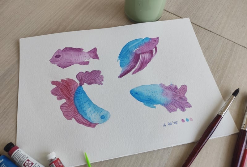
10. Touch Up: Watercolor dries lighter and
there will be times when the finished artwork doesn't
seem complete at all. For instance, some of
the fishes here are too light my liking if it
happened to you too. You can touch up
these illustrations simply by repeating the
steps that we did earlier. With the same color
palette I worked on, I will retouch some of the
parts that I find light and rather dull red,
those areas drop. The colors can be the same
or different pigments and then scratch if you want
to add even more details. For example, I'll make the
fins of the first fish just a tiny bit darker and more
vibrant using brilliant pink. This is not on my
palette earlier, but I think this
color will really pop out and make this
body more vibrant. For the third fish, you can see visible blooms
on the body, it looks pale. To fix that, I
will layer it with a slightly darker mixture
of pink and blue, My magenta and thalo blue, creating a pretty
purple mixture, just like what I did earlier. I'll also make sure to keep
the middle part lighter than the two sides of the body
to create a three D effect. When adding another
layer of water color, make sure that the
first layer has dried completely or else you might disturb the
layer underneath, And you will end up with
an overworked artwork. Do this until you're satisfied, and I'll see you in the next
video for the final steps.
11. Sharing Your Work: Great job on coming. As far as this video, I would like to commend your eagerness to learn
more about this medium. In this class, we have explored the watercolor
technique called scratching to add details to our watercolor illustrations. And we tried it on four
different poses and color combinations to get
familiar with the technique. Now that you know how to add details and patterns
using scratching, you can now try it on
other painting subjects. I love to use it on grasses, animal fur hair, and
even other sea elements. If there's one key lesson that I want you to take
away from this class, that would be the combination of letting go and letting
watercolors do as magic and taking back control only when
you're adding details. The combination of these
techniques does not only reward us with pretty
cool illustrations, but also teaches us the value of knowing when to take control. I'll look forward
to your projects, so don't forget to upload them
in the project's gallery. Our review of this
class will also help other students decide if
this is for them or not. Leave one and earn a
badge via the review tab. Any questions,
clarifications, suggestions, or even if you just
want to say hi, please make use of
the discussion stab. Do follow me on skillshare
and I'll see on my other classes together. Let's make this world
a little bit more colorful with our artworks.
 Bianca Luztre, Watercolor, Productivity, Color Mixing