Transcripts
1. Welcome to this Class: [MUSIC] Loose and expressive. That's how I like my
watercolor florals. This style is so liberating, or shall I say, forgiving. If the fear of making mistakes with watercolors
is what's holding you back from picking up your brush and creating
another artwork, then this class is for you. We'll try find and messy watercolor
techniques where we will have full control, semi control, and no control at all with the shapes
that we will reduce. Hello, I'm Bianca Luztre an aspiring watercolor artist
from the Philippines. It's always been a dream
of mine to teach arts. Thankfully, we have
this kind of platform. I've been working with watercolors for almost
four years now. They made it a habit
and a commitment to myself to paint
every single day, even for just a few minutes. We'll begin with a series of mini exercises where
we will explore three different
watercolor techniques in painting loose florals. These warm-ups are designed
to help you prepare for class project, painting this. I have also uploaded a short
guide via the Resources tab. Please go ahead and download
that for your reference. Upon completing this class, you can now try your most
favorite technique and paint your own loose florals or
use them for landscape, abstract painting, or even
your calligraphy projects. This class welcomes
watercolor beginners, hobbyists, and even experienced
ones to join the fine. If you're ready,
let's get started. [MUSIC]
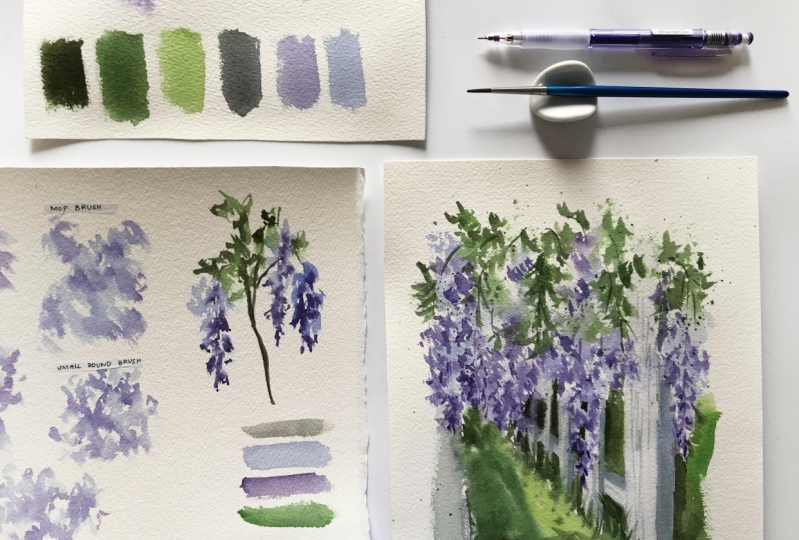
2. Class Project: [MUSIC] For our class project, you have two
options: Paint along during the mini painting
exercise demos where we will produce three versions of this single mysterious stem and consider that your project. Or if you want more challenge, then you can paint
this full composition of Listeria along the fence. Please prepare these colors. If not available, you
can use other colors in your palette or come up with
your very own combination. Grab your usual building
materials too, paint, brushes, paper, water jar, paper towel, or a rag, and pencil and eraser. But for this special tricks,
I'll be demonstrating, you'll need additional
household items such as claim or plastic
wrap and spray bottle. I have also uploaded a PDF with the scanned copies
of the mini exercise, class project, reference photo, list of materials, and colors which can be downloaded from
the Resources tab. If you're ready to make this
world a bit more colorful, let's get started with the first technique
in the next video.
3. Full Control with Scumbling : The first method
is where we have full control by using the
technique called scumbling. Scumbling is a
technique where you apply a thin layer of paint over a dry surface by lightly lobbing your brush to create
these random shapes. For this demo, I will use different brush
shapes and sizes, and let's see the
difference with the shapes they will create. I will prepare my
colors on this side. Lavender, carbazole violet, Hooker's green, and
my neutral mixture, ultramarine blue plus sepia. Let's try it first with
a round brush size 8. I'm lightly tapping my brush
over my dry paper to create this haphazard shape
that will serve as the base of my foliage
of flower cluster. While it's still
wet I'll drop in my darker purple to vary the colors and make
it more interesting. What will happen if we
use a bigger brush, like my mop brush here? Obviously we'll be able to
cover a larger area faster. If you're working on a bigger
painting or a subject, you can switch to
a bigger brush. Doing the same with
the first one and adding darker shades
on this foliage. [MUSIC] Let's switch
to a flat brush. From the first strokes, you can already see
the difference of the shapes created
by this brush. I want us to be resourceful and make use of whatever
material is available to us. I'm just demonstrating that each brush shape and size can produce a different
abstract shape. No need to purchase
new materials. Just use what's on
your kit already. When I'm working on a tight
area or a tiny shape, I love using a
smaller round brush. This one is size 3 and is perfect when
working with details. Compare that with the mop brush shape
we produced earlier. This is pretty much defined. Just keep in mind that when
using a smaller brush, you would need to reload it more often than when working
with sizes 8 and above. Look at that shape. I love how it turned out. [MUSIC] We can also use two brushes, say a size 8 for the base, then switch to my size 3 or smaller for the darker colors. This is what I usually do
when painting loose florals. I go bigger for the base shape, which allows me to create
a more random output. Once done, define
the darker areas by dropping wet paint
using a smaller brush. [MUSIC] You may also wait for the base shape to fully
dry before switching to a smaller brush and scumbling another layer of darker
paint for the details. [MUSIC] Here's our lovely
abstract shapes created with different
brush shapes and sizes. Next, to apply what
we just learned, let's paint a single
mysterious stem. I'll start by sketching a simple guideline for the
branches and the flowers. I'll have three flowing flowers with varying height and length. For this mini exercise, I'll use two brushes, just like what we did earlier. The base will be painted
with the bigger one, and the darker parts will be created using the smaller one. You can also achieve the same effect by using the
tip of your bigger brush to paint the tinier details as a substitute for
a smaller brush. Notice also that when scumbling, I am deliberately
leaving white spaces in-between and being careful not to cover the whole
area with paint. I'll continue working on the other two flowers
using the same approach. To achieve a more random shape, you may also try rotating
your brush with every stroke. I remember when I
was a beginner, I was so confused
with this technique. I thought that the shapes
should be perfect and uniform. But as I gain experience and get to
know my materials better, I learned how to let the
brush do its work and make it dance on the paper to create
this lovely abstract shapes. That serves as a reminder for
you that you don't need to create an exact copy of
what you see me doing here. Depending on your materials, experience, and maybe
even on your mood, you will definitely create an artwork different from mine, but I'm sure it's a lovely one if you
put your heart on it. I painted the branches with sepia and a bit of
ultramarine blue. Now, I'll use the same
technique with the leaves. I'm preparing two shades here. My Hookers green as the base and that same color mixed with
sepia to make it darker. I mentioned earlier that
the shapes we're painting a random and done in
a haphazard way. But when I painted the flowers, notice that most of the edges
are pointing downwards. But now when I'm
working on the leaves, I'll have most of them
pointing upwards or sidewards. Now switching to a smaller
brush for the darker areas. That's scumbling for us. In the next video, we'll
practice stamping, where we have semi control over the shapes that
we're painting. You'll find a copy of this practice sheet
in the Resources tab. If you have it already, please go there and feel free to download for your reference.
4. Semi Control with Stamping: Let's explore stamping where
we have semi control over the shapes we'll be painting and combine that with other
watercolor techniques. Same color palette for
this mini exercise. For this method, I will be using a cling wrap or a plastic wrap cut into
a manageable size. You may also substitute
other plastic products, but the results may
look different. I will crumple it like these. I will dip my crumpled
wrap on my paint then press it on my paper just
like how a stamp works. This is an easy and messy
non-brush technique which I love so much when
I want to achieve a more organic look
for my foliage, flowers, background, and
sometimes abstract pieces. I'll grab my other
wrap and use that for the darker purple color and press it on my
still wet paint. It looks so different
from scumbling. Next, let's try combining
stamping and scumbling. I will paint the base with my light violet color
using my plastic wrap. You may need to rotate
the wrap as you work to get out as
much paint as you can. Then I will switch to my brush and retouch the shape and
connect some of them. Basically, we're
fixing it and guiding the shape to look more like a foliage or
a flower cluster. This time, I'll also use my brush to add the
darker purple color. Now, for a more fun approach, lets use a spray bottle. I'll build the base of my flower cluster with
the stamping technique, add dark colors with
the same approach, and spray some water
to soften the edges. Yes, this is a messy technique, but the results
are so satisfying. Time to spray. Depending on the size
of your atomizer or spray bottle and how close
or far it is from the paper, the results will vary. For the final exercise, let's combine the three, stamping with the cling wrap, softening the edge
with a spray bottle, and retouching the shape
with a small brush. It's one of my go-to
combination technique for loose floral clusters. Messy, but fun and it feels
liberating. Give this a try. I'll spray it a couple of times just to soften
some of the edges, but not as soft as
the one on the left, and I'm fine with back. Then using a brush, let's retouch and
add darker colors. Time to apply these
techniques that we practiced on our mini [inaudible]
painting exercise. Using the same colors again and painting
the same subject, but this time with stamping and a bit of spraying
and scumbling, I'll use the same wrap
that I used earlier. You can rinse this
and let it dry if you want to try out
other colors too. Speaking of colors,
if you don't have lavender and carbazole
violet on your palette, try substituting it with
white plus purple for the base color and
use whatever shade of purple you have for
the darker areas. In case you ran out of purple, then try a combination
of blue and pink. Yes, pink is better than
red based on my experience. I just sprits a bit of
water to soften some edges, not all, and then use my small round brush
to add darker purple. If you want to try a
different palette, say a warm pallet with pinks, oranges, reds, and
yellows, please go ahead. This is your painting, so I want you to own it. In fact, I'm so excited
to see your version of these mini exercises and
later, our class project. Using the same color
for the branches, sepia plus ultramarine blue. You can also try ultramarine
blue with burnt umber or any combination of browns and blues to produce a
lovely neutral color. Or if you want a
brighter branch color, then you can use
your convenience mix of brown straight from the tube. For the leaves, I'll use the same technique, stamp with plastic wrap
and create the base shape. I'll skip the spraying
part since I don't want to disturb my flowers which are
already starting to dry. Then switch to my brush
and scumble here and there to retouch the shape
and add darker colors. I'll continue doing this
until I'm satisfied. In the next video, we'll explore splattering
and try painting foliage and cluster shapes with a combination of
watercolor techniques. Here's our stamping art. See you in the next one.
5. No Control with Splattering: [MUSIC] Time to
explore splattering, where we have almost no control over the shape that
we are painting. This will be the messiest
method of the tree. It would be the
best time to move your smartphone away
from your working area, and you might also want
to cover your table with a placemat or a newspaper. I'll begin splattering with my small brush and
tap it lightly with my finger to allow the paint to drop and create random
splatter shapes. You'll also notice that
I'm using my other hand as a barrier to cover the areas
I don't want splattered on. Depending on the
load of your brush, you might produce bigger
or smaller droplets. I've switched to
another brush hoping that I could cover a
bigger area faster. I'll do the same for
the darker violet one. This isn't looking
like a vase of flower cluster or a foliage, but I'll show you how
it looks like when combined with the other
techniques we tried earlier. Next, I'll switch to my
synthetic flat brush. Instead of tapping it
lightly to produce droplets, I will flick the brush
hair with my finger. You can also substitute a
toothbrush for this technique. Splattering is also perfect as a last touch in
the galaxy painting. You might have seen
other artists do that, splattering white paint on their galaxy paintings
that represent the stars. Now, to soften some edges
and for more movement, I'll spread some
water on this one, then grab my brush, load it with purple, and splatter some more
to complete the look. [MUSIC] Next, let's try combining
it with scumbling. If you want to splatter on a certain area of your painting, you can also grab a scrap paper, use it to cover the other parts
that you want to protect. This way you won't be too conscious as to where
the droplets will land, and you can splatter to
your heart's content. Try tapping your brush with another brush to get
more paint on the paper. The sound is relapsing and the whole spattering
game is so liberating. I hope you're having fun too, because I did when I was
crafting this class for you. Once done splattering, retouch the shape and connect
them with each other with this scumbling technique to create a cluster
or foliage shape. You may add more
paint if you want, or just use what's
already on the paper. We'll complete it with a
splatter of darker violet paint. Since the paper is still wet and the shapes are connected, the purple color will
have more movement and spread beautifully
on the random shape. Last would be flattering
on a wet area. I'll use my mop brush
here to prepare the area by painting it
with clean water only. Next, grab your brush, load it with paint, and splatter on the wet surface. You can immediately see
the difference and how the droplets cover a larger
area with less effort. This is perfect in
creating backgrounds, adding texture, and even in
your calligraphy projects. Now it's time to test out this watercolor technique on our mini-mysterious painting. I'll cover my painting area with scap papers and get started. Compared to the two previous
techniques discussed, you'll definitely have
no or minimal control where the paint lands on
your paper as you scatter. I want you to embrace that freedom and have
fun with this technique. You can always combine it
with other methods like scumbling to create the
shape that you want. If you'll notice, I'm
deliberately leaving the other droplets untouched
for a more expressive look. No need to scumble
too much and to connect all of those
tiny droplets of paint. Doing the same as I add the
darker colors for my flower. You may paint the leaves with the same technique
or use scumbling or even stamping to complete our wisteria watercolor
illustration. I'll splatter then
scumble my leaves away, messy but fine. Directly painting
on the branches and retouching the
flowers as I see fit. By now, you should have an idea of which
method works for you. Is it scumbling,
stamping, or splattering? In the next video, let's work on a full
painting composition and start our class project. I'm excited to paint with you, so let's jump in. Here's our splattering
watercolor exercise sheet.
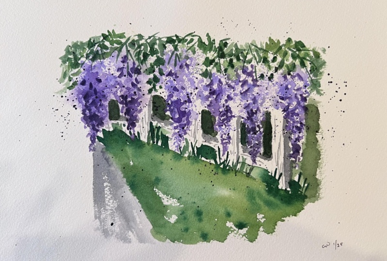
6. Project Wisteria Fence | Part 1: It's time for our class project. We'll be painting
a full composition of this wisteria by the fence. Let's analyze this
project first. Over here, I did some splattering while
the paper is still wet. To build the base
of the flowers, I used stamping plus
spraying a bit of water and scumbling to retouch the shape and did the same for the leaves. Then I defined the
other areas with direct painting or what
you call wet on dry. It is also important to note that the light comes
from the left side, so the shadows should be
sitting on the right side. Here's a simple
sketch I made from Carson's beautiful
wisteria photo. The colors will be the same with our mini exercises earlier. Lavender or violet, plus white, carbazole violet or any
purple that you have. Neutral mixture of
ultramarine blue and sepia. Depending on the amount of
blue or brown on your mixture, you can create
different shades of this cool neutral color. Yellow green, that's
hooker's green and the yellow for me and
plain hookers green. But from time to time, I'd like to add sepia to
give it an olive green look. This works well for
the darker areas. You should notice
by now how much you can create from a
limited palette. It just takes a bit of mixing and getting
to know your colors. I will reuse the plastic wrap
for the base of my wisteria and slowly build the shapes following the
guidelines I sketched. I'll embrace the organic and unpredictable shapes
it will create and won't worry too
much if they look like flowers or not at this stage. This is just the first layer. Enjoy the process and
trust in yourself. In a while, I will
spritz some water to soften the edges of
these flowers and use my brush to scumble
away and retouch the shapes to make them
look more like wisteria. I remember when I watched
a tutorial before where the artist was using a natural sponge to paint trees. I was so amazed that I literally searched where I could
buy this magic item. But I was surprised
how pricey it was. Well, at least for me
and during that time, we don't have much options
like online shopping, so I was a bit
disappointed that I won't be able to create those
lovely organic shapes. Then, after a couple of months, I came across a YouTuber
creating tree silhouettes using this handy plastic wrap and immediately I
ran to the kitchen, grabbed myself a small piece
of this household item. Since then it's been one of my magic items in
my painting kit. [MUSIC]. What's more amazing
is that when I first shared this trick in one of my workshops where we were painting
Christmas reeds, my students were so
grateful to have discovered this technique and were
so addicted to it. I am hoping that
you're also enjoying this little trick in painting loose and expressive florals, or even trees in
your landscape and background in your
calligraphy projects. When I'm spraying, I am
being careful not to overdo it or I will lose
those shapes in the process. I'm also making sure that my spray bottle
is not too close on the paper or I will disturb the other areas I
worked on earlier. I'll continue building up the
base shape of my flowers, repeating the same
approach we discussed earlier during our
mini exercises. Notice also that I am dropping my darker purple specifically near the bottom of the flowers to mimic how a
wisteria looks like. [MUSIC] The same approach will
be used for the leaves. I switched to another
clean wrap or plastic wrap since I'm
working with another color, but you can just reuse the other one without
even rinsing. Notice that I also started
with my light shade of green, yellow green for the base shape. I find it easier to start with the lighter colors first and
add the darker ones later. You might have observed
that this version is looking far from the
original reference photo. The flowers and
leaves are not as defined as they
are in the image, the colors aren't spot-on, and the details are not exactly
as how they should look. But that is the
goal of this class; to help you interpret
a reference image into your own version of loose
and expressive florals. This reference photo is just how it should be, a reference. For the road on the left side, I'm using my favorite
neutral mixture, loaded my brush and directly
paint on the paper. I'm just following
the guidelines I sketched earlier to do this. I wasn't able to fully
cover that area. I have a bit of dry
brush effect here, and I'm happy with that, so I'll leave it be. Then with a mop brush, I will soften the right side. This is also to prepare
the area for the grass, which I will be adding
texture through splattering while the
paper is still wet. I'll color in the grassy area with another shade of green, and negative lead
paint on the fence. Meaning, I am deliberately
avoiding the fence shapes and using the color
of the grass to define them. To avoid a monotonous
or boring look, you can also vary the colors
by mixing in some yellows or making the bottom part darker with your green
plus brown mixture. [MUSIC] Then go ahead and splatter
using a small brush, which I will also use to define some grass blades with
a quick upward motion. [MUSIC] This scrap paper is helping me avoid splattering dark
green on the flowers, but you can also use
your other hand. [MUSIC] I will splatter a bit of purple to add
texture on my flowers too. This will look a bit messy, but I like that loose
and expressive field. It is so liberating for me. [MUSIC] Now with
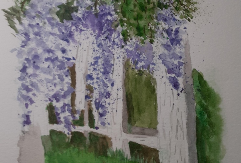
direct painting again, let us define the fence
by painting around it. Basically I am painting
the grassy area beside and behind the
fence with my round brush. [MUSIC] You'll also notice that my fence is not perfectly shaped, some of the parts look crooked, but I'll leave that for
now and in a while, once this has dried, I'll show you a trick
on how to correct that. [MUSIC] For now, don't worry too much in
getting the shapes perfect, but at least let's aim to
make it look like a fence. No need to be too conscious
about it since this is a loose painting and
not a realistic one. A few more splatters here and there, then I'll leave this to dry before adding another
layer of paint. [MUSIC] Now that this has dried, I'll grab my flat synthetic
brush and a paper towel to correct or fix
these fenced shapes. What I'll do is I'll wet the
brush with clean water and carefully scrub over the
area that I wanted to erase. With the paper towel, I will pick up the
reactivated paint, and that should do the trick. If you don't have a flat brush, a round brush also works
well as a substitute. [MUSIC] Going darker on
the areas between the fence to further define it. This is Hooker's green
mixed with a bit of sepia. [MUSIC] I'll use the same mixture
to further darken the lower part of
the grassy area to create an illusion of
depth and make us focus on the center part of
this artwork more. [MUSIC] Now our fence is
looking flat, right? To give this some volume, I will paint the right side, the shadowed area
with my neutral mix, but this time there's a bit more water and more
blue on the mixture. [MUSIC] These shadows are not too evident on
the reference photo, but that's what I
love with painting. You can always use your artistic license and
paint to your heart's content, instead of just recreating a complete replica
of what you see. [MUSIC] Having said that, looking back at the reference
photo from time to time to help me decide where
to place your shadows, where to add more details, and what to leave
behind is also helpful. It's not visible in the camera, but I have the reference photo
beside my painting area. [MUSIC] We're nearly done
with the first part. I hope you're still with me and not giving up on yourself. I will see you on the next video and we'll
wrap this project up. [MUSIC]
7. Project Wisteria Fence | Part 2: [MUSIC] Great job on completing the first
part of the project. For the next five minutes or so, we'll be focusing on details, darkening some areas
to help define shapes, and some more final touch. You may skip this step if you're already satisfied with
your painting so far. Don't forget to look
at the reference photo from time-to-time to
help you make decisions. Here, I'm defining some petals
with my car puzzle violet. I'm doing that with quick
motion, almost like scumbling. To connect the leaves and define the pattern
of Listeria flowers, I'll draw some stems and define some leaves with short lines. No need to connect all, as long as they
look like they're flowing from the
top, that will do. This painting is a
combination of no control, semi control and full
control techniques. You can also use your
favorite combination of techniques that we
practiced earlier. This is your painting, so feel free to
experiment with it. Our goal is to learn how to paint flowers expressively and loosely without being tied to the reference photo too much. Perhaps you want
to try splattering plus spraying for the
base of the flowers or the leaves or use
stamping instead of scumbling on dry
paper for the details. Trust your creativity and
paint with a growth mindset. Now, we don't want this
fence to look too white, so let's create a pale
blue violet mixture, which we'll use to
lightly cover the fence and reinforce the shadows
while this is still wet. That way, the fence won't stand out too much
and it would give a harmonious look since we used the same colors
over and over again. A limited palette looks
great. Would you agree? Watercolor dries
a shade lighter, so I will add another
layer of dark colors on the flowers and grassy area
to help define the fence. At this point, the fence
has already dried a bit. Again, looking back at the
reference photo to help me decide where to put
more layers of colors. How are you feeling about
your class project so far? I hope you're enjoying the
process and not worrying too much if you're creating
a perfect art or not. I am really excited to see
your version of this project. Please go ahead
and share it with us through the projects gallery. Let us also appreciate the
works of our fellow artists, by leaving a comment, or simply liking their artwork. I will see you in the
next video where we'll wrap everything and give
you some final thoughts on how you can use
these techniques on your other painting
projects. See you.
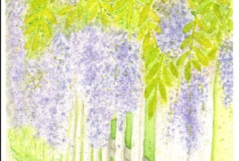
8. Before You Go: [MUSIC] I am so proud of you
for finishing this class. We explored three different
watercolor techniques in painting loose and
expressive florals, which one's your
favorite so far? Is it scumbling
with full control, stamping with semi control, or splattering with
almost no control over the shapes that
we are producing? Now, that you have
tried these techniques, you can go ahead and create your own floral composition
or illustrations. Here are some of my
old works where I use the very same tricks I shared with you
through this class. You could probably guess my favorite colors from
this examples, can you? I hope to see your versions
of illustrator painting, whether it be the
mini exercises or the full composition
artwork so don't forget to upload it in
our projects gallery. Leave a review to
help me improve my classes and follow me
on Skillshare for more. Keep creating and together
let's make this world a little bit more colorful
with our artworks [MUSIC]
 Bianca Luztre, Watercolor, Productivity, Color Mixing