Transcripts
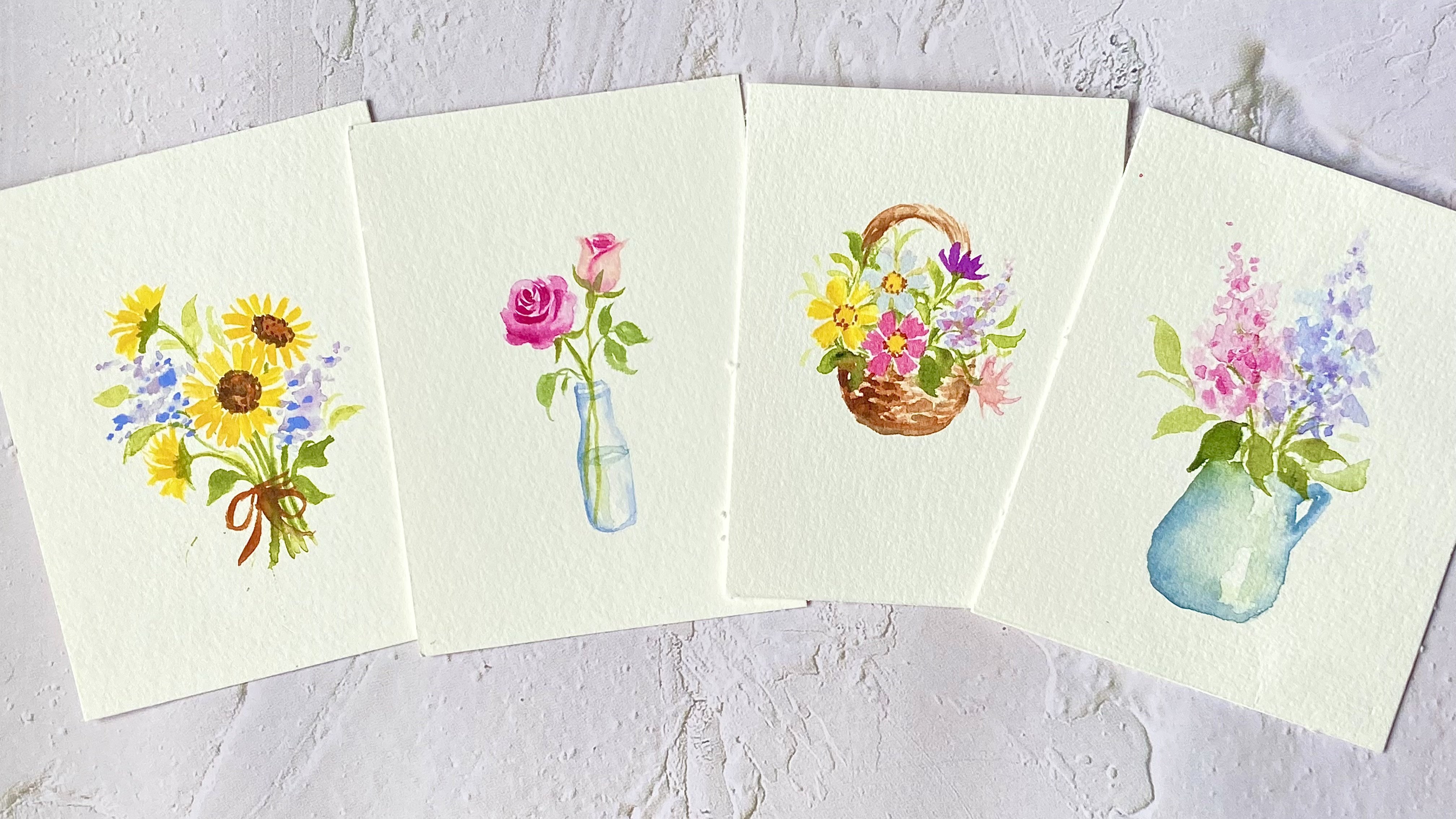
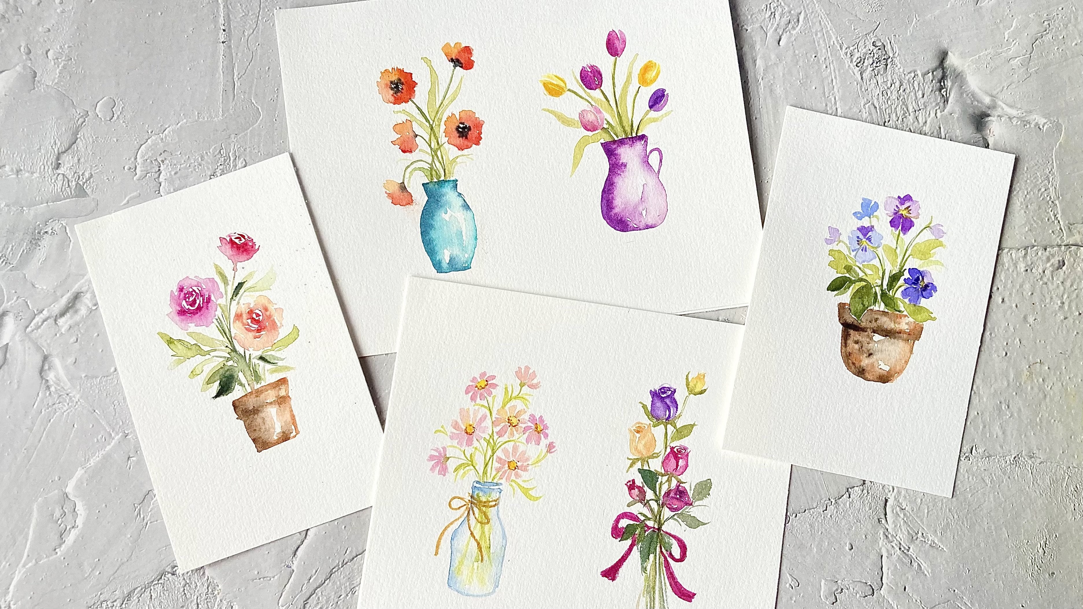
1. About This Class: Hi, everyone. Welcome
to this class. My name is Lisa, and I'm a watercolor artist
based in Malaysia. I started watercolors
seven years ago and florals are one of my
favorite subjects to paint. In this beginner friendly class, you will learn how
to paint beautiful watercolor florals with ease. We'll start by going over
the basic supplies you need. I'll introduce you to essential watercolor techniques
such as wet and dry. Wet on wet, lifting
and dry brush, which are perfect for
painting beautiful floorals. You will then apply
these techniques to paint three lovely
floral projects. We'll start with
cherry blossoms, followed by a lovely
cosmos flower garden and finish with some colorful
and vibrant pansies. I'll guide you through each step and provide helpful
tips along the way. This class is perfect
for beginners, and also for those looking to refresh their skills
or try something new. By the end of this class, you will have learned essential
watercolor techniques that you can use in your
own floral paintings. Grab your brushes and
let's get started.
2. Supplies Needed For This Class: All right. So for paper, I'll be using this Bau Hong
Academy watercolor paper. This is 100% co pressed
watercolor paper in 300 GSM. You can also use a paper
with a lower weight, such as 200 GSM. And if you don't have
any cotton paper, you can use whatever
you have available. But do keep in mind that
your results may vary, especially when
painting wet on wet. Now, since this is
a beginner's class, we'll paint on a
smallest sheet of paper to make it
easier to manage. So I'll be cutting
this paper in half. We'll be using round
brushes in this class. Be using these medium
sized round brushes. I have a size eight from
silver black velvet, a size three and four from Altu. You will also need some
smaller round brushes, like a size one or two. I'll be using this size one from Altneu and a Chinese
calligraphy brush. You also need some
paper towels to remove excess moisture
from your brush, a mixing plate or palette to mix your colors and
some clean water. And for colors, I'll list them out in the individual
class projects.
3. Essential Watercolor Techniques: In this lesson, we'll cover some basic watercolor techniques that we'll use in
our class projects. The first technique is
the wet on dry technique. This technique involves
applying wet paint onto dry paper and is great for creating hard
and defined edges. Now you can use this
technique when you want to achieve sharp clear lines
and precise details. For example, we can use this technique to
paint fine veins on the petals and also to create finer details
in a flower center. The next technique is the
wet on wet technique. This is where you apply
wet paint onto wet paper, allowing the colors to blend
and flow into each other. When using the wet
on wet technique, always make sure there
is a nice even layer of sheen on the paper without
any water puddles. This allows the colors
to blend smoothly without creating any unwanted
splotches or pulling. This technique is
great for achieving soft edges and a
dreamy diffuse look. Now one thing to note about this technique is that the
thicker the paint mixture, the less it will spray
on the wet surface. For instance, when I drop this thicker mix of
violet on the paper, it doesn't spread as much
as the watery mixture. Keep this in mind when you're
painting your flowers. Now this technique is
great for creating soft color transitions
in the petals. Now let's move on to
the lifting technique. This technique involves
removing paint from the paper to create highlights
or correct mistakes. We can use a clean dam brush to gently lift off some of the
paint while it's still wet. After each lift, rinse your
brush and repeat the process. We can also use the tissue to lift off some of the colors. All right now let's move
on to the next technique, which is the dry
brush technique. Now, I'll first paint a stroke
using a regular wet brush. With this dry brush technique, we use a brush with very
little water and more pigment. I'm going to remove
excess moisture from my brush by dabbing
it on a tissue. This allows me to create rough texture strokes where some of the white
paper shows true. By using a brush with minimal
water and more pigment, we can achieve these
rough textures, which add depth and
character to our painting. We're going to use
this technique to paint the cherry blossom branch. Now, if you want a more in depth lesson on watercolor techniques, I highly recommend checking out my nine day watercolor
floral challenge class. It covers the wet on wet
technique in detail and also includes a practical
exercise to help you master it. I believe this will be very beneficial for beginners
taking this class.
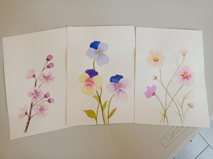
4. Cherry Blossoms: In this lesson, we
are going to paint a very simple composition
of cherry blossom, and I'm going to show you how to use the dry brush technique. Let's start by preparing our
colors for the base color. I'm going to use shell pink. Now, if you don't
have this, feel free to use any
dark pink or red. Just make sure to use a watery mixture because we want the base color
to be very light. The second color is
quinacriton magenta. Now, this is a dark pink. Again, if you don't have this, feel free to use any pink
or red in your palette. For the next color, I'm going to mix quinacriton magenta with a bit of sepia to create
a reddish brown color. Now, if you don't have sepa, feel free to use any dark
browns in your palette, such as vean dye
brown or burnt umber. All right, so I'll start
by lightly sketching the main branch of
our cherry blossom with some shell pink. So I'm just painting
some broken lines to serve as a guide for
placing the flowers. Once we have all the
flowers painted, we'll come back and paint in
the branch with some spa. All right. Let's start with
our first cherry blossom. I'm going to paint a front
facing cherry blossom. I'll paint five small petals and leave a gap for the center. Now, while the petals
are still wet, I'll gently tap in
some magenta on the inner parts of the petals and let it bleed
into the wet petals. Now, feel free to switch to a smaller brush for this step. For the second cherry blossom, we'll paint it from
an angle perspective, and this will face the
upper right corner. This means that the front petals here will look smaller
due to the angle. While the petals towards the
back will appear larger. While these are still wet, let's tap in some magenta
on the three back petals. Now let's add more cherry blossoms along this main branch. We can paint a side flower here. I'm just painting a very simple side flower
with three petals. The other two petals are not visible because it's
viewed from the side. And then I'll add some
flower bts on the right. Now let's move on to the lower
part of the main branch. I'll start with a side
flower on the left, and I'll paint another
cherry blossom on the right, which will also be at an angle. To make it easier, I'll
ma the center with the so I know where
to place the petals. Now, to add contrast
to the painting, I'm going to darken
the flower buds at the top with the
reddish brown mixture. This will make them
stand out a bit more, and then I'll paint two more
flower buds at the bottom. Now we'll paint the
main branch with sepia using the dry
brush technique. For this technique, we need the right amount of
paint on our brush. It shouldn't be too
wet or too dry. I'll first test it on a
scraped piece of paper and use a tissue to remove excess paint until I get
the texture that I want. Once I'm happy with it, I'll paint in the
main branch and connect the flowers and
flower butts to it. Next, I'll paint the sepals of the flower buds using the
reddish brown mixture. And I'll also add a base to the side flowers where
they connect to the stem. All right now, I'll add some
shading to the flowers to give them more dimension and prevent them
from looking flat. Here I'm using a watery of magenta and I'm just adding a
few strokes here and there. Next, I'll darken
the flower centers with a reddish brown mixture. Here I'm just
making little dots. Now, before adding
the statements, we need to make sure that
the petals are completely dry to avoid any color
bleeds into the petals. For this, I'll use a reddish brown mixture that
has more red than brown, making it re than the mixture
I used for the centers. Now, this flower is still wet, so I'm going to leave it to dry. And while waiting
for this to dry, I'll just paint some fine lines to complete the statements on the other flowers. All right. Now let's go back to this flower to paint in the statements. And we need a stem
for this flower here to connect it
to the main branch. This completes our
cherry blossom painting. I hope you have
enjoyed this lesson, and I look forward to
seeing your class projects.
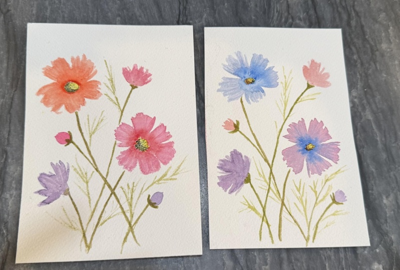
5. Cosmos Flower Garden : In this lesson,
we're going to paint this lovely cosmos
flower garden. For our first cosmos flower, we'll use a watery mix of
shell pink for the base layer. If you don't have shell pink, you can use any red or pink. Just make sure to prepare a
light and watery mixture. While the base
layer is still wet, we're going to drop in a bit of quinagudon magenta to create some color variation
in the petals. We also use this to paint some shadow lines on the petals. So far, first flower, we're going to paint a
front facing cosmos flower. I'll start by
painting the petals, leaving a space here
for the flower center. Now, to create
those jagged edges, I'll combine my brush
strokes to form each petal, making sure that the edges
are slightly uneven. Now, it's okay if the
petals don't look uniform, this will make them look
more natural and organic. Now, since we're going
to use the wet on wet technique to
drop in our magenta. We need our base
layer to stay wet. I'm going to go over
the petals a few times just to make sure
they stay wet longer. Next, I'll tap in a bit of
magenta around the center, letting it bleed
into the wet petals. This creates a soft and lovely color variation
in our flower. Now, for this step, feel free to switch to a
smaller brush for better control and to avoid overloading the
flower with paint. You can use a smaller
brush like a size two. Now, as long as the
flower remains wet, I can still adjust and refine
the shape of the petals. We'll let this dry completely before painting in
the flower center. Now let's move on to
our second cosmos. Now, for our second
cosmos flower, I'm going to use John
Brilliant as the base layer. Now, if you don't
have this color, you can either use Naples
yellow or yellow ocher. Just make sure to
use a watery mix. I'm going to start with
the petals and I'm going to leave an empty space
here for our flower center. Now, this cosmos flower will be painted at an
angle from the side, where the two lower petals appear slightly curled upwards, making them look shorter
than the petals at the back. To make sure the
petals stay wet, I'll go over them a few times before dropping
in my next color. While the petals are still wet, I'll quickly drop in some
shell pink around the center, letting it bleed
into the wet petals. This creates a soft and lovely color transition
in the flower. Now, for our next cosmos flower, we'll paint a side
view of the flower. I'll mix quinacridone
magenta with some violet to create a reddish violet
hue for the petals. But before we paint this flower, let's paint in the stems
for our first two cosmos. I'll use olive green to paint two thin stems that
overlap each other. Now let's paint in our
side view cosmos flower. I'll start by placing a dot so that I'll know where
to paint the petals. Then I'll load my brush with the reddish violet mixture
and start adding the petals. I make sure all my brush
strokes converge at this dot. Now to prevent the flower
from looking flat, I'll use a clean dm brush to lift some color
from the petals. Now let's paint the stem and the base of this cosmos flower. Now that we have our
main flowers painted. Let's add some flower buds and some smaller cosmos flowers
to fill in the composition. Since these flowers are
not the focal point, we'll paint them
in lighter colors. Now, feel free to use any
colors for these flowers. I'll start with
some flower buds. I'll use shell pink
for the first bud. For the second flower bud, I'll use a watery mix of
the reddish violet hue. Next, I'll paint the
smaller side view cosmos in the upper
right corner. Here I'm using Jean Brilliant
with a bit of shell pink. And then I'll paint the base
and add a thin long stem. Next, we'll paint the sepals and stems for the flower buds. Now let's paint some leaves
to complete the composition. I'll use a lighter green by mixing yellow with olive green. Then using the tip of my brush, I'll paint some thin lines
to mimic the leaves. To add contrast to the painting, I'll darken the stems of the main cosmos flowers
with some olive green. This will make the stems stand out more clearly
against the leaves. Now that we've
painted the leaves, let's go back to the flowers. I'll start by filling in the flower centers
with some yellow. Now, at this stage, the
petals are already dry. So we're going to add
some texture by painting some thin lines to give the illusion of petal
folds and shadows. For this side angle cosmos, I'll use shell pink. I'm just using the tip of my brush to paint
some thin lines. Now, feel free to switch to
a smaller brush like a size. All right. Now let's move
on to the front facing. For this, I'll use
a way of a Ma. I'll also add some shadows to this cosmos to
give it dimension. Next, we'll add dimension
to the flower centers. Since the pain is already dry, we'll use the wet
on dry technique. I'll begin by adding little dots of sepia around the edge of the center to create
shadows and to replicate the brownish
statements of the cosmos. Then I'll add some burnt ciena. Oh. Next, I'll lighten the color by using a
tissue to gently dap on the center to remove some of
these wet brown pigments. For the finishing touches, I'll darken and
refine the sepals on the flower buds and the base
of the sit view cosmos. This completes our
Cosmos flower garden. I hope you enjoyed this, and I can't wait to see
your class projects. A.
6. Colorful Pansies: In this lesson, we are going to paint these colorful pansies, using the wet on wet technique. Let's start with the first pans. For this pansy, we
are going to use a watery mix of violet
as a base color. Now, pansy petals usually
have multiple colors, some with a darker
color near the center. To achieve this darker shade, we'll use a thicker consistency
of the same violet. Let's start with
the side petals. We'll position this
pensi slightly tuted to the left to create a more
interesting composition. And we'll leave an empty space here for the flower center. Since we'll be using the wet on wet technique to
darken the petals, we need this space
layer to stay wet. To ensure this, we can go over the petals a few times
just to keep them moist. A now let's paint
the frontal petal. Now, switching to my
sized tree brush, I'll gently tap in the
thicker mix of violet at the base of the petals just
outside the flower center, letting it bleed
into the wet petals. I'm just slowly tapping in the color with the
tip of my brush. Now, feel free to switch
to a smaller brush for better control and to avoid overloading the
flower with paint. You also want to make sure
that your mixture isn't too watery because you don't want this color to spread
all over the petals. Now we'll paint the back petals once the side flowers
are completely dry. This will prevent
any unwanted color bleeds into the wet petals. For our second pansy, we'll use yellow
as a base color. And we'll use
Quinacroton magenta for the darker color
near the center. We'll tilt this pence
slightly to the right, creating an opposite angle
from our first pansy. This makes the composition
more dynamic and interesting. Let's start with
the side petals and we'll leave an empty space
for the flower center. I'll go over this a few times to make sure they stay wet
for a longer period. Now, I'll go over
this a few times just to make sure they stay
wet for a longer period, and I'll do the same
for the frontal petal, and I'll do the same
for the frontal petal. Next, we'll drop in some
quinacridone magenta near the center and let it blew
blending with the base color. I also use the tip of my brush to gently
s out the pigments. For our third pansy, I'll start with a watery mix of shell pink for
the base layer. Now, if you don't
have shell pink, you can use any red
or pink and just add some water to create
a watery mixture. For the darker shade, I'll mix quinacridone
magenta with a bit of violet to create a
reddish violet hue. For this third pans,
we're going to repeat the same steps we use for
our first two pansies. Now, let's drop in that
reddish violet mixture. Now let's paint in
the back petals. The side petals of
our first two pansies should be dry by now. For this first pansy, I'll mix violet and ultramarine blue to create a
bluish violet color. Now, although there
are two back petals, we'll combine them into
one large petal to give the appearance of
overlapping petals. Making the painting process easier for this beginners class. For the second pansy, I'll mix quinacridone
magenta with a bit of violet to create a
reddish violet hue. And while this is still wet, I'll tap in a bit of violet on the right to create
a shadow effect. And for the last pens, I'll use violet to
paint the back petals. Now let's pin some
lines on the penses. These are lines radiating
from the center of the pans. I'll use the same color as the
back petals for each pans. For this second pans, we'll use the
reddish violet hue. For the last pans,
we'll use violet. Next, we'll fill in
the flower centers with some yellow to
complete the look. All right. Now let's
pin in the stems. I'm using olive green here, but feel free to use any
green in your palette. Y. I'll paint some leaves at the bottom, varying their size
and direction. To create depth in the painting, I'll use different
shades of green. I'll mix in a bit of yellow for a lighter tone and add some
violet for a darker green. All right, so this
completes our painting. I hope you enjoyed
painting this and do share your projects in
the project gallery so that I can give
you some feedback.
7. Final Thoughts: So congratulations for
completing this class. I hope you've enjoyed
painting along with me and that you've
learned something new. I can't wait to see
a class project, so please upload them in the project gallery so that I
can give you some feedback. Now, if you have any questions, you can post them in
the discussion section, and I'll get back to you
as soon as possible. Now, if you find
this class helpful, I would really appreciate it if you could leave
a class review. This will help this
class gain more views. So thank you so much
for taking this class. I really appreciate
your support, and I hope to see you
soon in my next class.
 Lisa Lam, Watercolor Artist