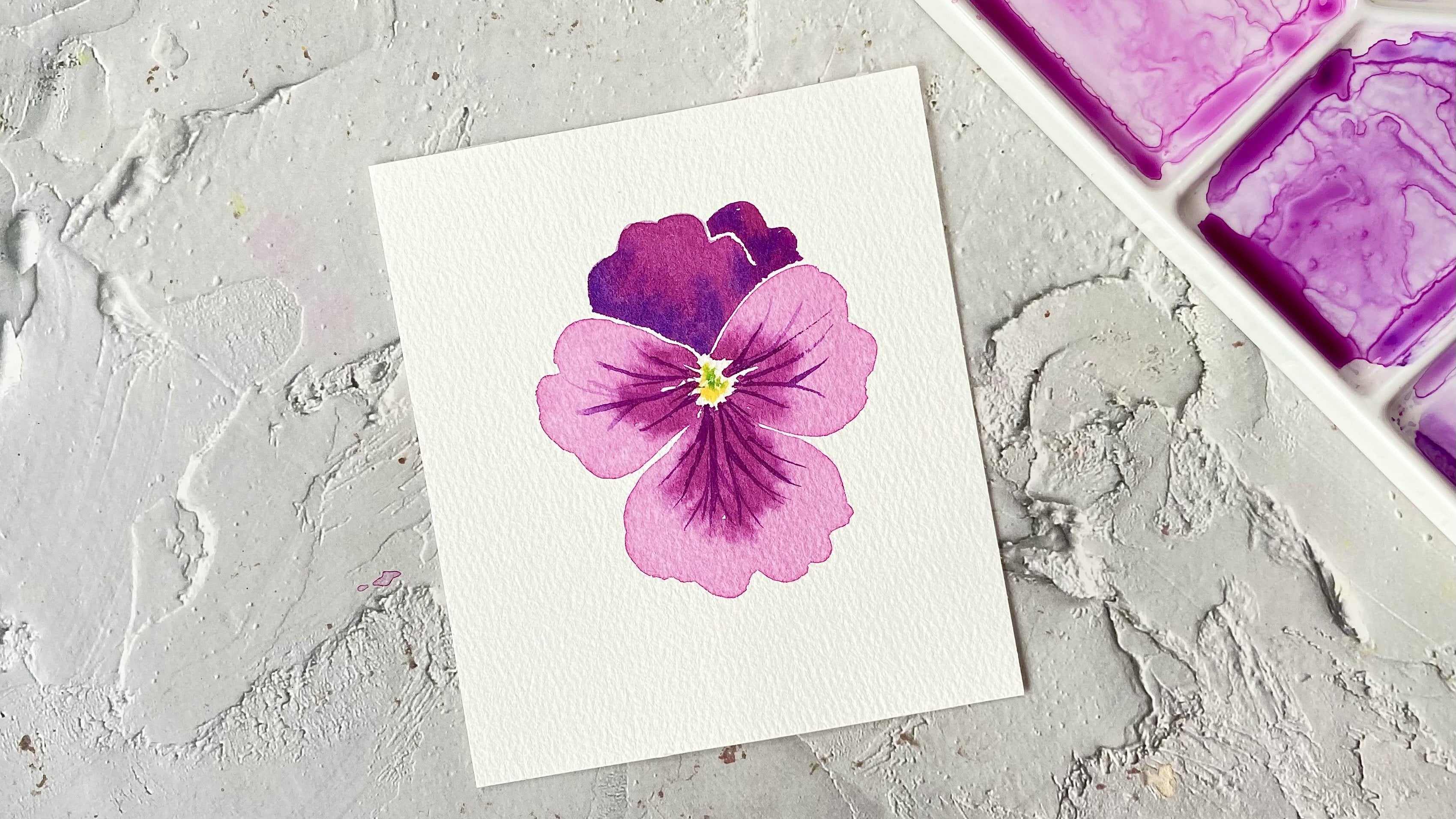
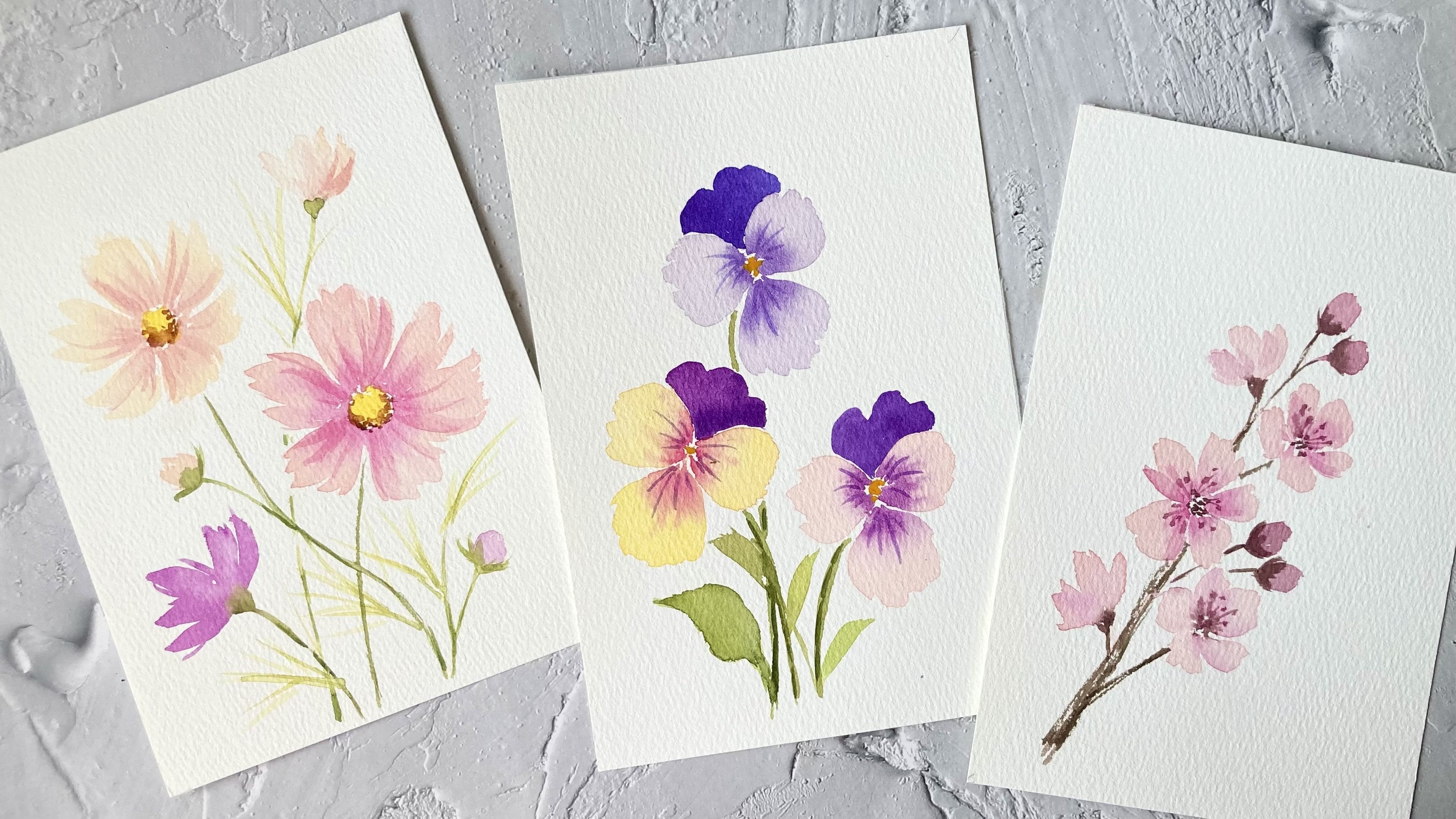
Transcripts
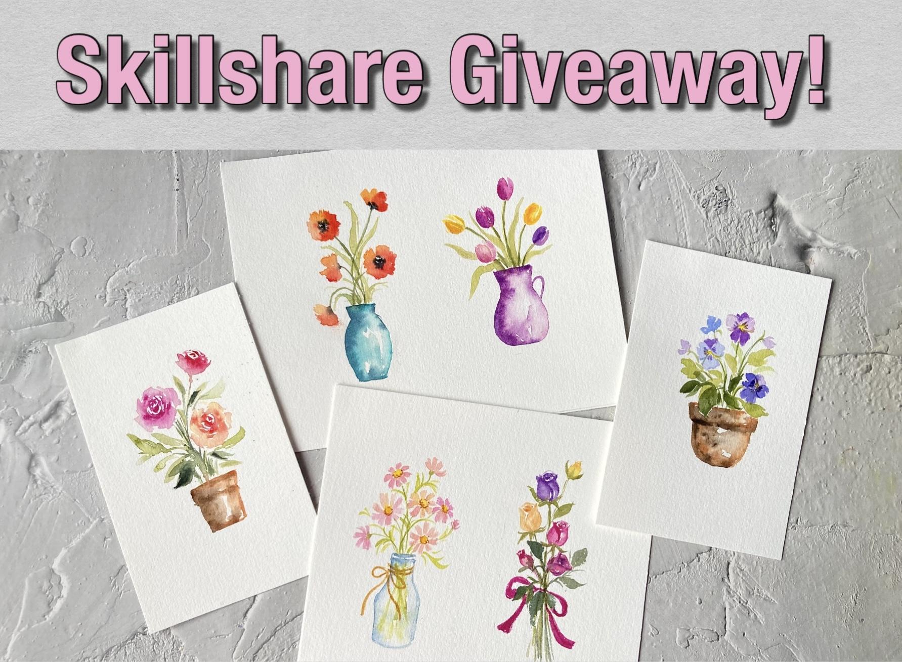
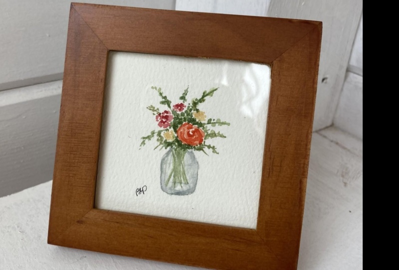
1. About This Class: Hi, everyone. Welcome
to this class. My name is Lisa, and I'm a watercolor artist
from Malaysia. Florals are one of my
favorite subjects to paint. And in this class,
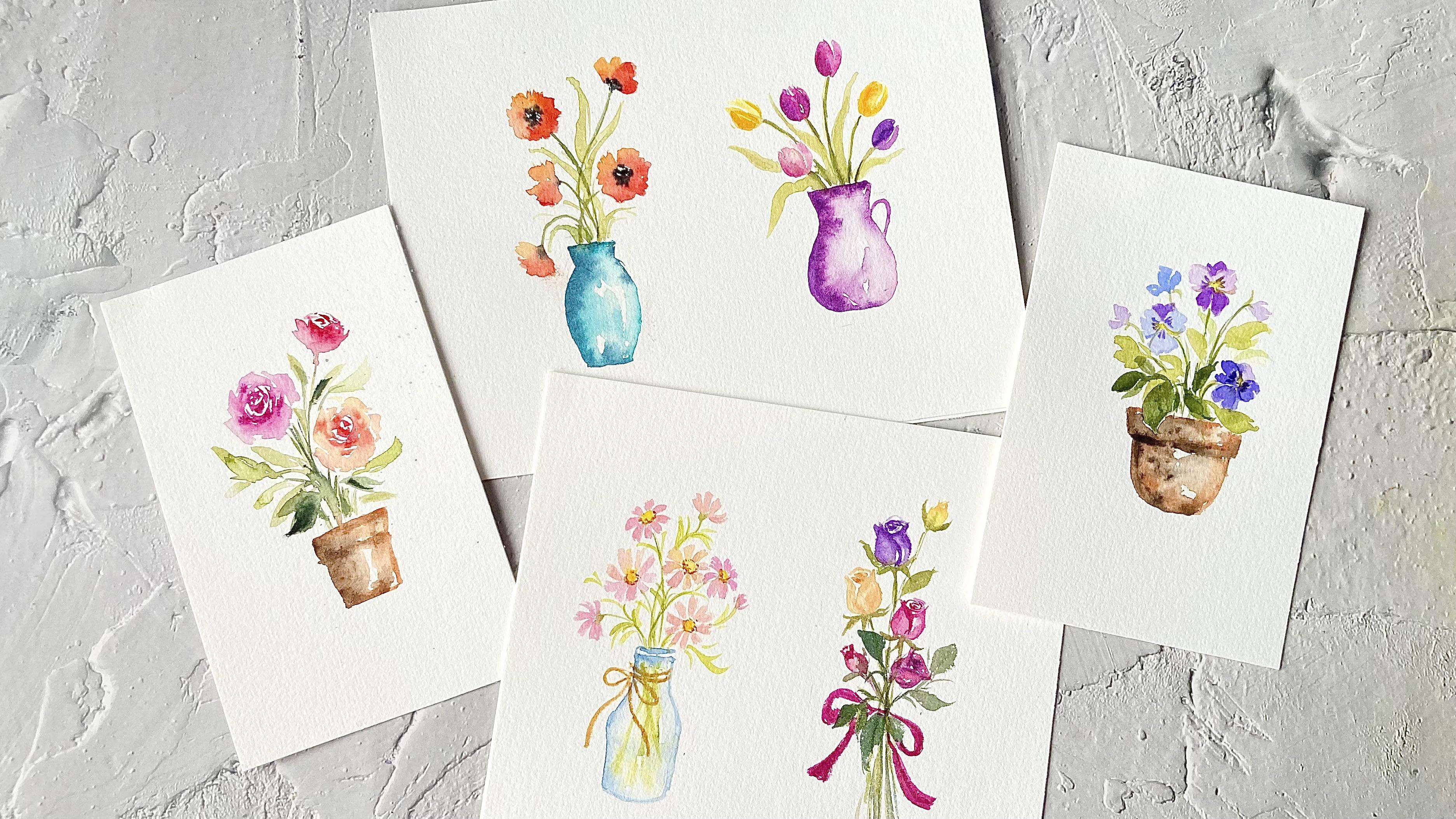
we'll be creating six lovely mini watercolor
florals in pots and vases. We'll start by going over
the supplies you need, followed by some essential
watercolor techniques that we'll use
throughout the projects. I'll also teach you
how to paint pots and vases to compliment
your flowers. By the end of this class, you will have completed six
beautiful floral projects and gained the skills to create your own mini floral
masterpieces. This class is suitable
for all levels, so grab your brushes, and let's get started.
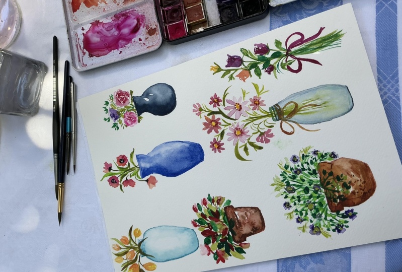
2. Supplies Needed For This Class: Let's go over the materials
you need for this class. Starting with the
paper, I'll be using this 100% cotton student
grade watercolor paper in 300 GSM, which is coal press. Now, since we're painting tiny florals and won't
be using much water, you can use a lighter
weight paper like a 200 GSM or even a half
cotton half cellulose paper. Now, if you have cellulose paper on hand, you can try using that. But just keep in mind that your results may differ
slightly from mine. But just keep in mind that your results may differ
slightly from mine. For brushes, we'll mainly
use small round brushes. I'll mainly be using these
size one and size two brushes, but any small round brushes
ranging 0-2 will work. I'll also use a size
six round brush and a calligraphy brush, but these are optional. Feel free to use whatever
small round brushes you have. Next, we'll need a palette
for mixing colors, some clean water,
and a paper towel to dap off excess paint
from our brushes and paper. For the paints, any 12 color
water color set will do. I'll provide specific
colors for each project, but you're free to use
similar colors from your palette or even choose your own color palette
for the flowers.
3. Watercolor Techniques: I'll show you the watercolor techniques we'll be using
in our class projects. Let's start with the first one, the wet on wet technique. This simply involves applying
wet paint onto wet paper. I'll begin by applying
clean water to the paper. Then I'll tap in
some burnt sienna. When pain is applied
on wet paper, the color spreads and creates
a soft lovely effect. Next, I'll grab
some burnt sienna directly from the
pen, so it's sticker. This thicker mix will spread less compared to the
more watery mixture. The more watery the paint,
there it will spread. If you want the paint to spread, just use a thicker mix and a smaller brush
for better control. We'll be using this
technique to add shadows to our pots and vases. Here I use a thicker mixture to keep the paint from
spreading all over the vase, which gives me more control. Now let's move on to
the next technique. This is where we will soften the edges and blend
out the colors. I'm going to use
a clean brush to soften this edge and gently
blend out the color. Now, the key thing to remember is that the edge must stay wet. If it dries, we won't be able
to blend it out smoothly. Let's try that again with
the smallest stroke. We'll be using this technique
to paint our roses. This technique can also be
used for our pots and vases. Finally, we have the
lifting technique. This is great for creating highlights or
correcting mistakes. You can use a clean brush
to lift off the paint. Or even use a paper towel
to that off excess color. Since we're painting
tiny florals, it's easy to accidentally
apply too much paint. We'll use this lifting technique to remove any excess paint.
4. How To Paint A Transparent Glass Vase: In this lesson, I'll show you
how to paint a glass vase. Before we begin, it's helpful
to have two brushes ready, one for applying paint, and the clean dam brush
for softening edges. The dam brush will help blend out any harsh lines and create the soft transparent effect we need for painting
glass containers. Now, if you want
a looser effect, you can use more
water in this brush. In some of the class projects, I'll be using a clean wet brush instead of a dam brush
to soften the edges. But this is entirely up to your preference and the
style you're going for. For this glass vase, I'm going to use turquoise
blue and Indigo. If you don't have
turquoise blue, you can use cerlian blue or
any light shade of blue. We'll assume the light is
coming from the right. I'll start by painting
the outline of the vase using turquoise blue. And I'll apply more paint along the edges
to keep them wet. This will allow me
to soften and blend out the color using
my clean brush. Now, I'll bland out the
color with my clean brush. I'll also likely wet
the right side and add a touch of blue to suggest
form and dimension. Since the light is
coming from the right, we'll focus the shadows on
the left side of this vas. I'll drop in more blue here. Next, I'll tap in some
indigo here to deepen the shadows and to add
more depth and dimension. To control the
spread of the color, I'll dap off any excess paint from my brush using
a paper towel. Next, I'll blend the color
with my clean damp brush, making sure I leave
a white space in the middle to
create a reflection. Finally, to showcase the
transparency of the glass, we'll paint in the stamps and add the water
level inside the vs. Now, as long as the
pain remains wet, we can keep adding
color to intensify the shadows and enhance the depth and
dimension of the vase. This is how you
paint a glass vase. With this technique, you can apply it to any
glass containers. You can experiment with
different colors and angles of light for even
more creative results.
5. How To Paint A Ceramic Vase: In this lesson,
I'll show you how to paint a blue ceramic vase. Now, I'll only use one
color to paint the vase, which is ultramarine blue, and we'll assume the light source is
coming from the right. I'll start by
outlining the vase. And then I'll go over it
again to keep the edge wet so I can soften it
with a clean dam brush. Now I'll soften
the left edge with my dam brush gently
pulling the color out. Since the light is
coming from the right, I'll add more blue
on the left to create shadows, giving the. I'll also likely
wet the right side and add a touch of
blue to suggest form. Now, while the left
side is still wet, I'll darken it with
a thicker mix of ultramarine to
enhance the shadows. I'll also add a bit of this to the upper right side of the vase to create form and give
the vase more dimension. I'll then blend out the color
with a clean dam brush, making sure to leave
some white spaces to suggest light reflections. As long as the
pain is still wet, I can continue dropping
in more colors to deepen the shadows and keep blending the edges until I'm
happy with the results. So by softening the edges and blending out the color
with a clean dam brush, we can achieve a
smooth transition between light and shadow, which will make the vase
look more dimensional. All right. This is how we'll approach painting the vase
in our class projects. For this one, we use
only ultramarine, adjusting its tonal values to
create depth and dimension. You can also use two
different shades of blue with a darker one for the
shadows to enhance the depth. The important thing
to remember is to leave some white
spaces on the vase for the reflections as
this will give it a more realistic glossy look. T
6. How To Paint A Flower Pot: Now, I'll show you how to paint a flower pot using
burn Ciena and sepia. You can also use any other browns as long as you have a light
brown and a dark brown. I'll start by outlining
the pot with burn Siena. And then I'll soften and
blend the edges using a clean dam brush while leaving some white
spaces for high lights. Again, we are going to assume that the light is
coming from the right, so we're going to
add more shadows on the left side of the pot. I'm going to in sia here. And then I'll apply
a fake mix of CPA to enhance the
shadows and to add depth. Now I'll bland it out
with my clean damp brush. Now, if you want
a looser effect, you can use more
water in your brush. For some of the class projects, I prefer to use a wet brush, but this is entirely up to your preference and the
style you're going for. As long as the pain remains wet, we can continue adding
in burn Ciena and sepia to build depth and
dimension in our pot. The key is to remember to leave some white spaces
for highlights. This completes our
flower pot painting. Now, remember the key is in layering and blending
while the pain is still wet and leaving those
white spaces for highlights. Keep practicing and feel free to experiment with different
colors to make it your own.
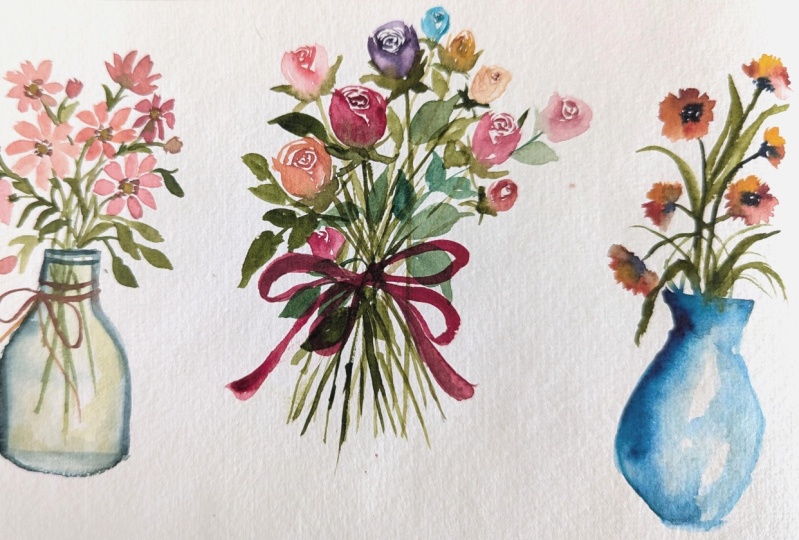
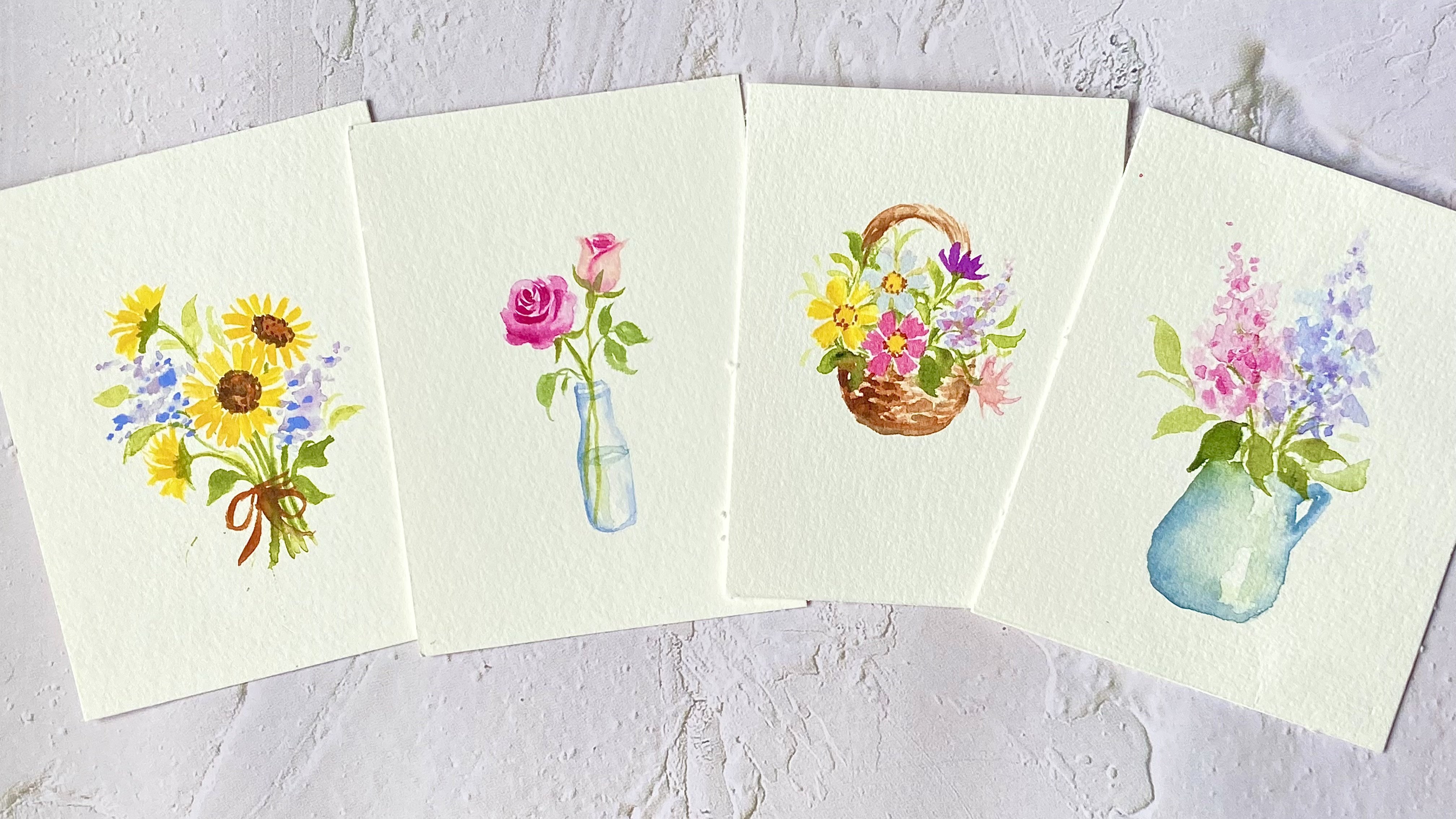
7. Daisies In A Transparent Glass Vase: Hi, everyone. Welcome to
our first class project. We're going to start with
something simple and easy. Dass in a transparent vase. I'll show you how to create a transparent glass effect for your vase using some basic
watercolor techniques. Now, for this project, I'll
be using these colors. Feel free to substitute any similar colors if you
don't have these exact ones. We're going to start by painting our daisies and once we
have completed that, we'll paint the
transparent vase. For the flower center, I'll use permanent yellow deep. For this first dai, I'll use
shell pink for the petals. I'm just using the tip of my size one brush to paint
those delicate petals. M. Now, for this second daisy, I'm going to add
some permanent rolls to create some color
variation in the flower. This adds interest and
dimension to the flower. Now let's move on
to our third daisy. I'll attach some stamps to
these dies before moving on to the others. All right. Now let's paint a side here. To give this bouquet of
daisies a more organic feel. We'll paint them from
different angles and let them face
different directions. Some will face sideways while
others will be at an angle. For those which are at an angle, the petals will vary in length. The petals in the
background will appear shorter than the
ones in the foreground. This will add variety and
interest to the composition. We'll also mix up the
colors of our daisies. Some will be painted
with shell pink, while others will
use permanent rows. This variation will add depth and make the bouquet
feel more dynamic. Let's fill in this upper part of the bouquet with
another side daisy. All right now, I'll
add some leaves along the stems to complete the. I'll also darken the stems to make them appear
more defined. Now let's move on to our vase. I'll start by painting two horizontal lines to
outline the rim of the vase. Then I'll sketch the
outline of the vase, making sure it's
slightly wet so that we can later use a clean dam
brush to blend out the color. Here I'm using indigo. I'm going to add in a bit
more paint on the left. Now I'm going to rinse out my brush and bland out
the color from the side. While this is still wet, I'll tap in a bit of indigo on the side to create some shadows. This will give
dimension to our vase. Now, while this middle section here is still slightly damp, I'm going to draw in the stems so that we can have
a blurry effect. Next, I'll add a water level
here. To complete the look. I'm going to add in a
bit more shadows at the top by dropping
in a bit more indigo. Now let's go back
to our bouquet. I'm going to add more leaves
to make it look more fuller. I also add a daisy bt here to add some variety to
the composition. Now let's add some contrast
to our flower centers. I'm going to paint
little dots of burn ciena around
the yellow centers. Now, to complete this bouquet, I'm going to paint some
petals using permanent. This will add dimension
and depth to the bouquet. Now, since the stems
have faded quite a bit, I'm going to darken the stems. Now let's paint
the bow around our v. I'm using burn sienna and I'm just painting
a simple bow. All right, so this
completes our project. I hope you enjoy painting this, and I'll see you in
the next lesson.
8. A Bouquet Of RoseBuds: In this lesson,
we'll be painting a lovely bouquet of rose buds. I'll be using the
following colors, but feel free to choose your
own palette for your roses. Now, for our first rose, I'll use quinacridone rose. I'll start by
painting the center with some overlapping
sea strokes, leaving a bit of white
space between them. Then I'll paint an
a stroke to suggest the petal fold and outline
the shape of the rose bud. Next, I'll use a clean dm brush to soften the lines and to pull out the color to add dimension and
volume to our rolls. I'll also tap in a bit
more quinacridone rows to create some dimension and volume while leaving
a white space just next to the petal
fold for highlights. Finally, I'll attach a stem and some sepals to
complete the rod. Now let's move on
to our second rows. I'll place this slightly
higher than the first, and I'll start with some
overlapping s strokes for the center using
permanent yellow deep. Then I'll add an a stroke this time facing the
opposite direction. Next, I'll outline
the rows and use a clean damp brush to soften the edges and
pull out the color. I'll leave a white space
next to the petal fold. To add more volume, I'll drop in a bit more yellow, and then I'll darken the
center and one side of the rose with some orange
to create dimension. Finally, I'll add the
sepals and the stem. Now for our next rose, I'll place it on the
right lower than our first two roses and I'll angle it towards
the upper right corner. To make the composition
more dynamic, it's important to y the height and
direction of each rose. For this ros, I'll start with
a dark pink for the base. And then I'll add some violet to build up volume
and dimension. Then I'll finish
by adding a stem. Next, we'll paint
a smaller s b on the left to add some
variation to the composition. I'll start with shell pink. S. And then I'll add some dark pink to the center and on the
edges of the butt. After that, I'll add
the sepal and stem. And to create more dimension, I'll tap in a thicker mix of inogudon rows for
the darker areas. Now let's add one more rose before we move
on to the leaves. I'll p the purple rose, placing it been and slightly
above our first two roses. To create dimension,
I'll gradually darken the petals using
a thicker mix of violet. If the color feels too intense, I'll lift off some of
it with a paper towel. Now let's paint the sepals. I'll also extend the stems
of the other rose buds. For the leaves, we will
vary their size, direction, and tonal values to add depth and to keep the
composition dynamic. I'll paint some lighter
and darker leaves to add depth and to create
more contrast. Now, feel free to use any
green in your palette, make sure that you have
a light and dark green. I'll also lengthen
the stems a bit more because we're going
to paint a red bowl here. Now, to fill in the
empty space at the top, I'll paint a small
yellow rose bud and I'll tap in a bit of orange at the top before adding
the sepals and stem. All right. Now let's complete our bouquet of roses with
a red bowl at the bottom. I'll position the bowl
behind the leaves. So it adds a nice
finishing touch without overwhelming
the flowers. For the finishing touches, I'll add more stems at the base. This completes our
bouquet of roses. I hope you enjoy painting
this as as I did, and I can't wait to see your
beautiful creations. M.
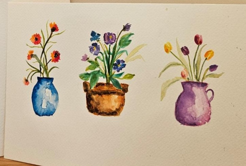
9. Poppies In A Blue Vase: In this video, we're going to paint some poppies
in the blue vase. For this project, I'll be
using the following colors. If you don't have
these exact colors, feel free to use any similar
colors in your palette. Let's start with a
front facing poppy. First, I'll grab some orange and we're going to
paint a circular shape. Now, while this is still wet, I'll grab some permanent red and let it blend
with the orange. This creates a similar color
transition in our flower. Next, I'll use a clean
damp brush to blend out the color to create a
lighter tone in the flower. I'll also drop in a bit more red while the flower
is still wet. Next, I'll grab some paints
gray straight from the pan, keeping the mixture thick, so it doesn't spread
over the wet poppy. I'll paint little
dots in the center, leaving a bit of white space. Now alternatively, you can wait for the poppy to fully dry. Before adding in
the dark center, which will prevent it from
bleeding into the wet petals. Now let's add the stem before
we paint our next poppy. I'll paint another front facing poppy using the same colors. Now let's add the dark center. I'll add my brush on
the paper towel to remove excess moisture so
that it doesn't s too. To add variation to
the composition, we'll paint a side poppy in the upper right corner with one half in orange and
the other half in red. Now let's attach a curvy
stem to this poppy, followed by some paints gray
at the base of the flower. We'll paint two more side
poppies on the left, varying their shapes with one of them dropping downward
for added interest. Now, I'll paint the stem and tap in some paints
gray at the base. And let's add a dropping
side poppy here. Next, I'll deepen the color of the stems to make
them stand out more. Now, I'll redo my pencil
sketch for the vas repositioning it to create better balance in
the composition. Now, for the vase, I'll
be using turquoise blue. I'll start by outlining
the top and left side. Then using a clean wet brush, I'll soften the edges and
gently pull out the color. Then I'll drop in
a bit more blue to this wet area and finish
outlining the vase on the right. Next, I'll fill in the
vase with a light value of blue while leaving
some white spaces to represent the reflection. Since the light is
coming from the right, I'll focus the
shadows on the left. While the pain is still wet, I'll drop in some indigo on the left to create
deeper shadows, giving the dimension and volume. I'll also likely da some on the right side and at
the base of the vase. Next, I'll add more blue
to the center of the vase, carefully preserving the
white spaces for highlights. For the final step, I'll add some leaves to complete
the composition. We will vary their direction and length to create
flow and balance. All right. So this
completes our painting. I hope you enjoy painting this, and I'll see you in
the next lesson.
10. Pansies In A Flower Pot: But This lesson, we're going to paint these lovely
pansies in a pot. I'll be using the
following colors, but feel free to use any
similar colors in your palette. Now, you can also choose your own color palette
for the pansies. For the first pans, I'll start with lilac for
the side petals. And then I'll use
dioxsine violet for the lower and back petals. Next, I'll paint the
second pans on the left, slightly lower than the first. I'll use lavender for
the three front petals. And violet for the back petal. Now let's add the
stems for our pancs. For the third pans, I'll
place it lower than the first two and have it bend
slightly towards the right. I'll use blue leg
for the front petals and a light mixture of
violet for the back petals. Then I'll add a stem. I'm just using a very light
mixture of olive green. Next, let's fill in the composition with
leaves and stems. I'll vary the size
and direction of the leaves to create more
visual interests and movement. I also darken the stems to
give them more definition. Now, to add variation
to the composition, we'll paint a pansy
butt on the right, and some side
pansies on the left. Feel free to use any
colors of your choice. I'm going to add some
darker leaves to create more contrast
and depth. P. Next, with my size one brush, I'll paint some fine
lines on the penses. Here, I'm using violet
for the details. I'll also add some yellow
centers to the penses. Next, I'll likely outline the petals to give
them more definition. I'll also add some seples
to the side pansies. Okay, now let's move
on to the flower pot. I'll start by painting an
outline with Burn Siena. And then I'll use
a clean dam brush to soften the edges and pull out the color and I'll leave some white
spaces unpainted. Next, I'll drop in some
sepia for the shadows. I'll focus more on the left
side where the shadows are stronger since the light
is coming from the right. I'll also tap in a
bit more bred sienna on the left side
for extra depth. Now going back to the flowers, I'll paint some
lighter leaves to give the impression
they're in the background. This adds depth to the
overall composition. Now back to the flower pot, I'll use my size one brush and I'll grab a thick mix of and add more shadows and ture while still preserving the
white spaces for highlights. And this completes our painting. I hope you've
enjoyed the process and I can't wait to see
your finished piece.
11. Tulips In A Ceramic Jug: In this lesson, we
are going to paint these colorful tulips in
the pink ceramic jug. I'll be using the
following colors, but feel free to use similar
ones from your palette. I'll mark the top part of the
jug with a horizontal line. Now we'll start by painting the tulips and once we're
finished with that, we'll move on to painting
the ceramic jug. For our first tup, I'll
be using Quagridon rolls. Paint the tulip with one
petal larger than the other, leaving a bit of
white space between them and then paint the
smaller one on the right. Now let's add a slightly
curvy stem to this tulip. Next, I'll paint
the second tulip on the right with a slight
band to the side. We'll start with yellow
for the overall shape, and then I'll add some orange to create dimension and volume. To create an interesting
composition, it is important to have your tu lips facing in
different directions. For our next tulip, we'll place it on
the left facing the opposite direction
from our second tulip. I'll start with nogdon rows and then add some violet
for depth and dimension. Now let's paint the
stem for this tail lip. We'll paint another
til lip on the left, placing it slightly lower
closer to the top of the jug. By painting our til lips
at different heights, we are able to create a more dynamic and
interesting composition. For this, I'll start
with shell pink, and then I'll add
some quinacridone to give it dimension and volume. Now let's paint one more tulp before moving on to the jug. We'll start with yellow and then add some orange
to create volume. Now let's move on to
painting the jug. Keeping in mind that the light
is coming from the right. I'll start by using
a light wash of quinacridone rolls
to outline the jug. Then I'll soften the edges with a clean wet brush and
pull out the color, leaving some white space in the center to
suggest reflection. Now while the pain is still wet, I'll add a mix of quacdon rolls and violet on the left for the shadows and lightly da a bit on the right. And then I'll paint
the handle on the jug. Now, using the
same dark mixture, I'll adjust the shape of the jug on the
left to refine it. Now you can skip this step if you're satisfied with
the shape of your jug. All right now that
we've painted the jug, let's go back to the tulips. I'll add one more tup on the right using a
shade of purple. Now, let's paint some
long wavy leaves. We'll vary their direction to create movement
and interests. I'll also paint a
drooping leaf on the left here for
extra variation. Next, I'll darken
the stems to give them more definition and
to make them stand out. So for the final touches, I'll deepen the
shadows on some of the tu lips to bring up
more dimension and volume. So I'll add a bit of
permanent yellow deep here and some quinacridone
rows for this tip. And some violet here. All right, so this
completes our project. I hope you enjoy painting this and I'll see you
in the next lesson.
12. Roses In A Flower Pot: In this project,
we'll be painting these lovely roses in a pot. I'll show you how to add
depth and dimension to your roses and we'll be working with the
following colors. Now, if you don't
have these colors, feel free to use any similar
colors in your palette. I'll be using my size six brush because
it has a sharp tip, but feel free to use a smaller brush like
a size one or two. Let's start with our first rows. I'll start with
quinacridone rows to create a dark center, painting overlapping se strokes and leaving a bit of
white space between them. Then I'll switch to
shell pink to paint larger overlapping petals
around this dark center. Again, I'm leaving some white
spaces between my strokes. Now, while this is still wet, I'll tap in a bit of quinagridon
rolls onto the petals. If you find that the color has spread too much
on the petals, you can use a clean dam brush to lift off the excess paint. I'll darken the center with a thicker mix of
quinacridone rolls. Now, if you're not
confident with a wet on wet technique on
such a small flower, feel free to skip this step. As long as you
have a dark center and lighter outer petals, your rolls will
still look great. By painting a darker center and lighter surrounding petals, we create depth and
dimension for our rows, making it appear more
tree dimensional. All right now let's move
on to the second rose. I'll start with polyden
red for the center, and I'll use yellow
for the outer petals. I'm repeating the same process as we did with our first rose. Now, I'll tap in some red while the yellow petals are still wet. If you don't want the
color to spread too much, use a thicker mixture
and a smaller brush. You can also lift off any excess paint if it spreads
too much over the petals. But make sure to leave those
white spaces unpainted. Now, as long as the outer
petals are still wet, I can alter the shape. Now I'll tap in a bit
more red to the center. But you can skip this step if you're happy with
how your rose looks. Now let's add some stems. And we paint the side rows
in the upper right corner. I'll start by painting the overall shape of the
rose with some car mine. Then I'll make short
strokes for the center, leaving some white spaces
between these strokes. Next, I'll darken this
center with a thicker mix of and it bleed slightly
into the petals. Now, let's add some
leaves around our roses. I'll vary the size,
total values, and direction of
the leaves to add depth and make the composition
look more dynamic. This way, we'll have a mix of darker and lighter leaves
for added contrasts. Now let's paint the flower pot. I'll start by using
burnt sienna, to paint the outline of the pot. Then with a clean wet brush, I'll soften and blend the color, leaving a bit of high light in the center for a
light reflection. While the pin is still wet, I'll drop in to create
shadows and add dimension. For the finishing touches, I'll fill in any
remaining gaps with some stems and leaves to
complete the composition. I'll also darken some of
the stems and paint in a few darker leaves to add contrast and balance
to the painting. For the darker green, I'm using shadow green. All right. I hope you enjoyed this process and feel confident to
try it on your own. Feel free to experiment with different colors for your roses. And don't forget to upload your class projects in
the project gallery.
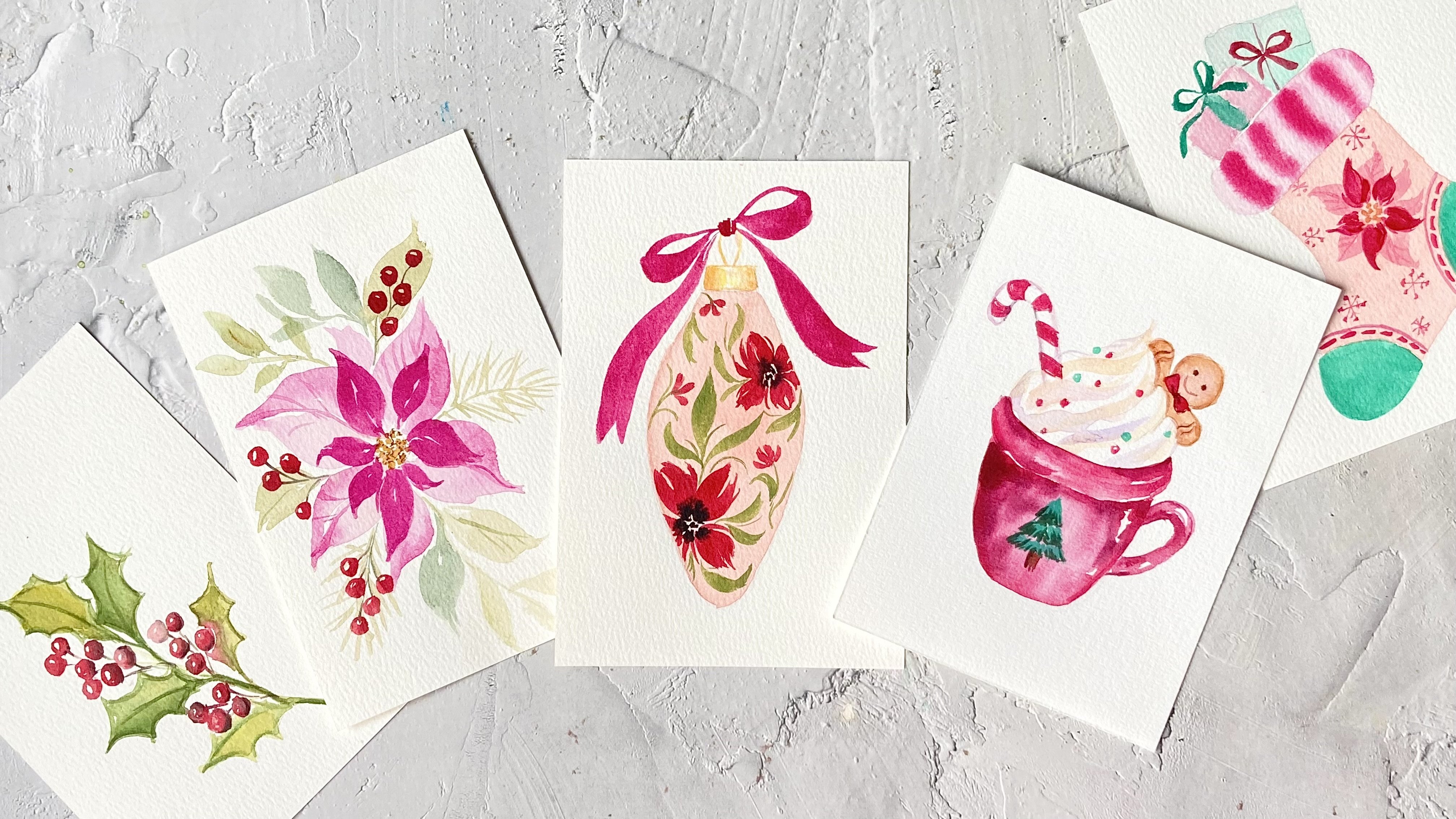
13. Final Thoughts: Congratulations on
completing the class. I hope you had fun painting these mini watercolor florals and gain some new
skills along the way. Now, if you have any questions, feel free to post them
in a discussion section, and I'll get back to you
as soon as possible. I would also love to see
your class projects, so please upload them to the project gallery so that I
can give you some feedback. I would also really
appreciate it if you could leave a
review for this class. Thank you so much
for joining me, and I hope to see you
in my next class.
 Lisa Lam, Watercolor Artist