Transcripts
1. Introduction: Hi, I'm Pooja. I'm a
watercolor artist, a surface designer, and
an online educator. Through my radius
teaching sources such as Skillshare and
Instagram and YouTube. I teach watercolors
to all those who wish to learn from my
watercolor techniques, especially the way
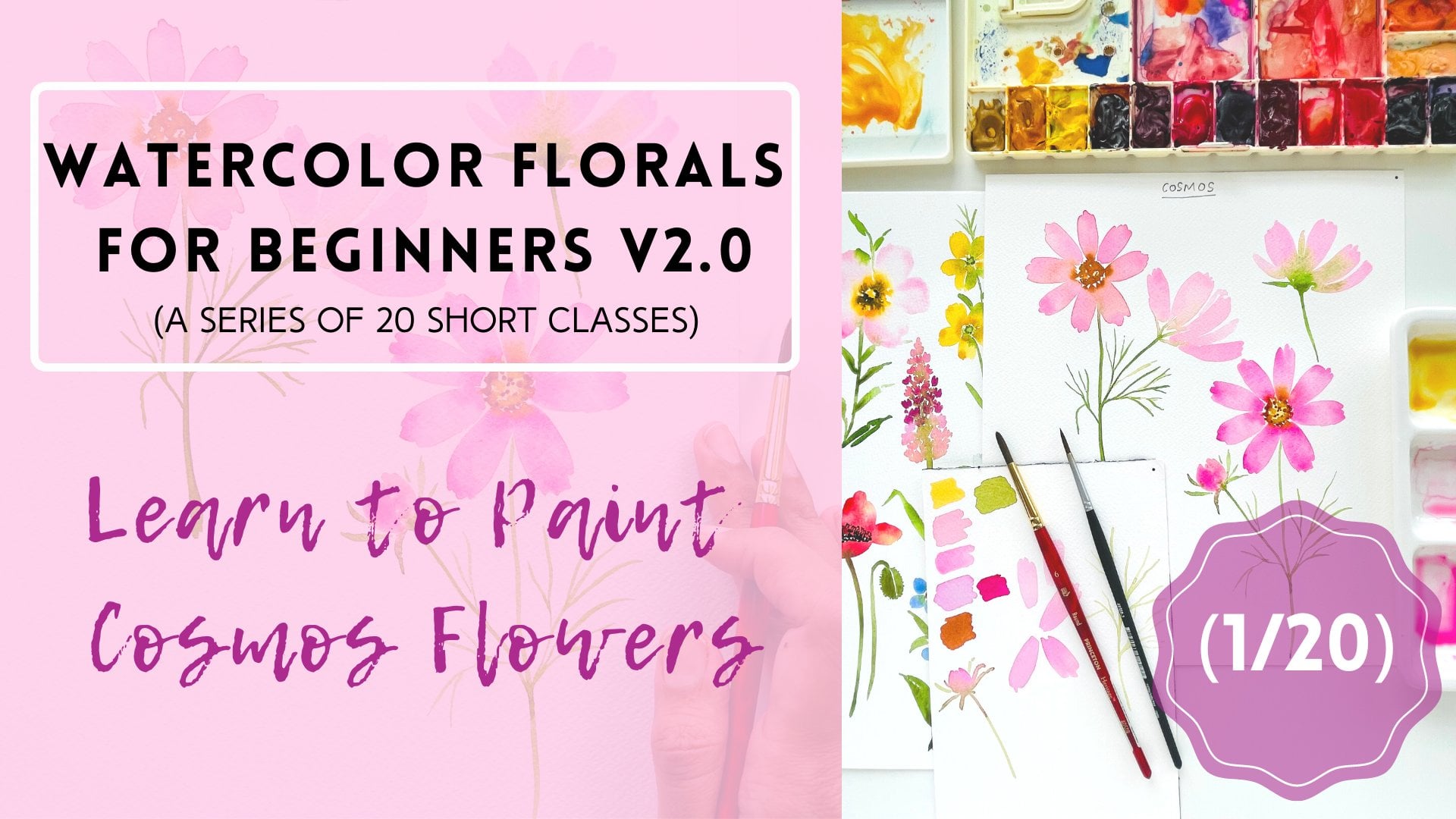
I think Florence, this is my fourth class and the watercolor florals series comprising 20 short classes. The first three
classes of the CDs are already posted
here on Skillshare. If you visit my
Skillshare profile, you will see a separate
section where I posted on the Classes
belonging to the CDS. So be sure to check those out. Today in this class, we are going to paint a
watercolor go pretty easy. Or Jupiter, as some
of you may call it. Now, whatever you may call it, I think it's a beautiful flower. And those who have already been following the series,
you'll drink. We begin by exploring different
images of the flower, followed by some kind of mixing. And then we do some
warm-up exercises to study different
parts of the flower. And then finally together, step-by-step through
being the actual plot. As a class project, I
would like you to pay, go for that disease using
colors of your choice. And then take a picture
and post your project under the projects and
resources section of the class. Also posting projects
will help us compare your growth and improvement as you progress through the CDs. And I think it's a
wonderful way to see how far you've come
with these glasses. Are you ready to paint
some photos with me? Let's begin.
2. Supplies: Let's look at the art
supplies that we are going to need for today's class. Now the art supplies overall that I'm using are
pretty much going to be the same for all the classes
in this flawed and CDs. And if there's anything
different that I will be using in
a particular class, I will cover a quick section in which I will describe
all those art supplies, which I haven't
mentioned in this class. So let's begin with
the paper first. I'm going to use Canson
Heritage Cold Pressed paper. Now this is a really huge blog. It's about 18 " by 24 ", so it covers pretty much more
than half of my desk size. So what I'm going to do is
I'm going to cut the sheets into smaller chunks and
then use this paper. So these are the sheets which I have got into different sizes just to make sure that I don't
waste any leftover people. These are the sheets
now this paper has beautiful texture. It's I think close to Arches, cold pressed paper if I have to compare two papers together. But this has recently
become one of my favorites. And I really like to paint
florals on this paper. For all the projects in this series are all the
classes in the series. I will be using this
particular brand of people. Now let's look at the brushes. I'm going to use my good old Princeton brushes in size six. This is the Heritage Series. And then I'm going to use a size six from the
Neptune series, size four from the
Neptune series. And I've got this size three
for all the detail work. And this is from the Aqua
Elite Series by Princeton. I will also be using bigger
brushes such as round 12, size 12, and size eight. But for today's class in
particular, these two sizes, particularly size six and
size three, are sufficient. For paints. I'm primarily using my dealer Romney
act refined set of 48 half pans and also a few assaulted tubes
from my Maddie Blue. So I'll be mostly using all my color choices or shades
from these two pallets. But I also have
my usual palette, which I've prepared from
assorted brands for the sheets that are
particularly not in either of these two pallets. I'll either mix it myself
using my custom palette, and I will let you know
the shades I use on the fly as we mix our colors. So these are the three pallets. You don't have to
restrict yourself to using a particular
brand that I'm using. Feel free to have any watercolors or you would
like to use for this class. But the main idea is to have
all the primary colors. Few shades of greens
are few shades of blue and reds and
pinks and a few Brown. So this is all you need
for painting pretty much all the flowers
that we are going to explore in this series. You're also going to need two cups of clean water to clean your brushes and a ballot. And you can also use one of these or
palette mixing trays. Or even a clean blend
ceramic dish is sufficient.
3. Gerbera Reference Study: Gerber daisies are most
commonly used flowers for cut flower arrangements. The reason is quite
obvious since they come in a variety of colors to
match any decor style. As you can see in this image, they are available in almost
every possible color, especially bright
and pistol Carlos. They have really dense, overlapping petals, which
are too many to even count. So we surely want to consider that aspect while painting them. Now, if you notice, each of the gerbils
in this photo have slightly different
colored centers, from yellow to brown
to deep browns. Let's look at the next picture. In this photo, you can notice that they have
pretty long stems. And most of the times these flowers are used
without their leaves. For the core purposes, we will skip the leaves as the main hero here is
the flower head itself. I'm really drawn to a
dark pink Gerber data. So we will paint a deep pink colored one as our main project. And I will also paint a pistol colored one as a
bonus in the end. But feel free to choose any other color while painting the project
for this class.
4. Color Mixing & Swatches: As always, we begin
by mixing some colors and making some color swatches before we paint the main flower, as I mentioned earlier, I'm going to paint a dark
pink colored group era dizzy. So I'm going to mix
a couple of pings, some brown and a shade of green. So let's look at all the colors that I'm going to use to
paint this flower today. The very first color that
I'm mixing is a bright pink, opera pink by Daniel Smith,
extra fine watercolors. So I'm just going to mix some
extra paint in my palette. And I'm also diluting
this color with some water to reduce
the saturation, but I still want to
use it as it is. The next shear that I'm using is the quinacridone, magenta. From my memory, blue. It's the same shade
that I used to paint, going flowers as well as the cosmos flowers if you followed the earlier
classes with me. So I'm mixing the exact shade. Again. I'm going to use this
for layering of the petals. Okay, Now the next
shear that I'm using is crimson or alizarin crimson. Just to add some shadows. And I may or may not use this color directly
onto the petals. But I still feel that I
need to have deeper color. So I'm just mixing it
and keeping it ready. I may mix this color
into my pinks. So that's the darkest shade that I'm going to
use on the petals. And lastly, we are going to need some green for the stems. I'm using a bit of
green, golden sap green. In my previous class, I have explained how you
can mix your own shade of green gold if you don't
have it on your palate. So make sure you check out
all your classes where I share all other tips
to mix your colors. I'm also adding a bit
of brown to my green, just to make it look a lot
more natural and organic. Make sure your greens are not
very bright or saturated. That looks quite artificial. So I would ask you to pay
attention in swatching your green color carefully so that you get a
more natural color. Now let's go ahead and swatch all the colors that we mixed. It's a fairly easy color
palette to try out. I can already tell
that my flower is going to be quite
bright and nice. And in order to get
bright florals, make sure your palate is
clean and also the water in which you're dipping
your brush is clean. So make sure you use
a separate cup of water for rinsing your brush, for the pink color, and a separate cup
of water to rinse your brush with green color that we won't get muddy colors
or really dull colors. That is trick that I always
use while rinsing my brushes. Then I'm mixing
some brown color. These are pretty much
all the colors that I'm going to use to paint my goal. But our flower.
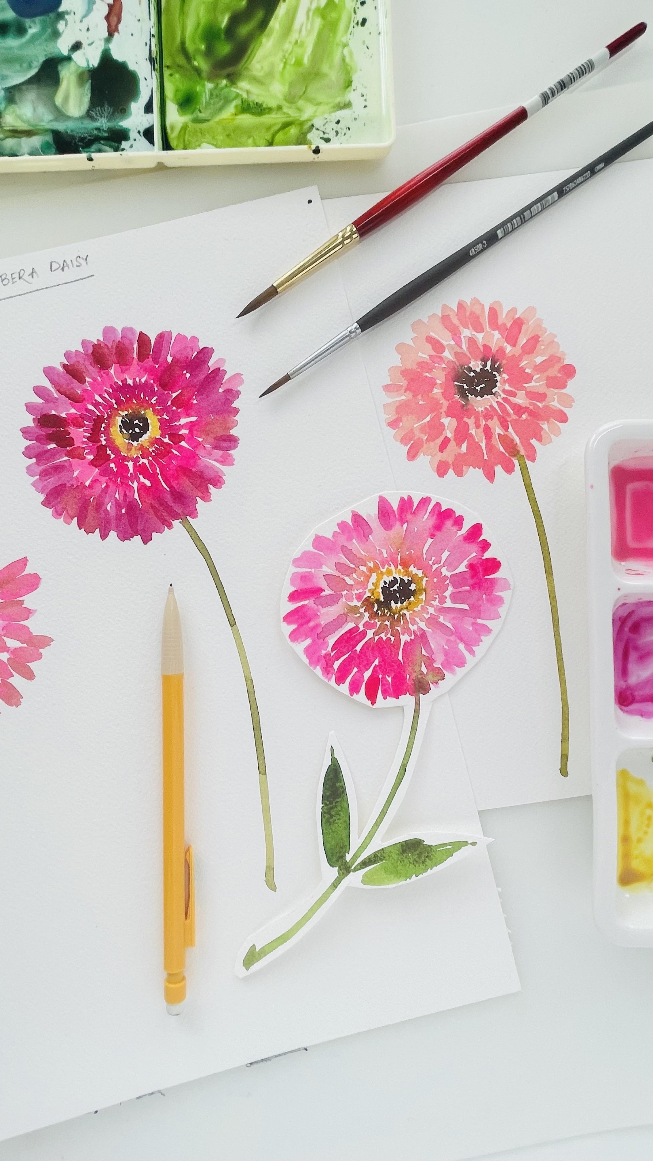
5. Warm-up : Let's begin by painting the
center of the flower first, and then we will come outwards. I'm going to start
out by stippling some dots using a
darker brown color. I'm going to divide painting this flower head or the main flower into
four different sections. The first section is the deepest center in
the core of the flower. Now, if you observe very
closely in some of the flowers, there is also a bit of yellow color around
the dark center. So I'm mixing a bit of yellow ocher and chrome yellow together or
cadmium yellow. I forgot to actually
swatch that before, but we also need
a bit of yellow. So I'm just going to
quickly mix that color. Then we are going to
stipple some yellow dots around the dark brown dots
that we stippled earlier. Okay, so that's the
first section of the center around this that are, again, small brush marks which are in pink color
or brown color. There as good as
very tiny petals, or simply brush marks that go around the main center that we just painted above, the brown and the yellow part. So surrounding that,
we're also going to make this small brush marks like so. This is the part
two of the flower. Like I said, we're dissecting
the flower into four parts. Now, let's move ahead. For the third part,
we are going to increase the size
of the brush marks. And please these brush marks around the smaller
pink brush marks that we painted before this. So we are going to layer
the flower like so. And then finally
the bigger petals, which are not really strokes, but I'm going to paint
them again as marks. I'm using my size
six round brush. This is the brush mark
that you want to try before you paint the
main flower. That's it. So when we paint
the main flower, we are going to layer these
four different brush marks, or brush marks are
four different sizes, one after the other, and thereby form a circular
shape or the flower head. So try to practice these brush marks before you begin painting
the main flower. Then it'll be fairly
easy for you to layer your brush marks
on top of each other. I used the same brush
from starting to the n, right from the stippling
to the petals. So this is how we are going
to frame our garbage or DZ.
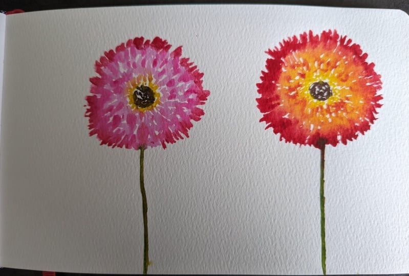
6. Let's Paint the Main Flower: Pink: Okay, Now that we have painted various
parts of the flower, it will be fairly easy to
paint the main flower. So I'm going to start
with the center, like we did earlier. I'm going to stipple some dots using the darkest
brown that I have. Then I'm going to add a ring
of yellow dots around it. So that's step number two. I'm using my size
six round brush. I'm going to not let them bleed too much
into the brown color, but still paying
them very close to the first layer or
the first section. Okay, so that's going to be your first part of
painting the flower. In the next step, we
are going to draw some pink brush marks
around the yellow ring. I'm using my size three
round brush for that. Again, I'm making sure
that not too much of the pink bleeds into
the yellow portion. But just a little bit. This time I'm not
making stippling dots, but I just made
these small lines which do not look
perfect at all. And that's the whole point. We don't want them
to look symmetric. Then I'm moving on to draw a few more lines which are a bit longer than the
previous ones that we drew. I'm still going in
around so-called concentrated around the
mean center of the flower. And I'm making these small lines using my size three round brush. We don't want these lines to be equidistant or similar looking. So we are going
to ensure that we have a natural and
organic flow to painting. And then I'm switching to
my size six round brush. And I'm making slightly
thicker and bigger brush marks around the earlier ones. We just have to go
about in circles. I'm just swiping my
brush into strokes. As you can see, I'm
intentionally making sure that not all of my strokes
look exactly the same. So far, the flower
looks like this. And now we're going to make
some bigger brush marks. And that's how we're going to continually make the
flower look bigger. Now Grb era disease are
quite big that way. So we want to make sure that we stay within
the proportions. And it's neither too
small nor very big. They're definitely smaller
in size than the sunflowers. So if we really have to keep
the proportions in mind, you could compare two
different flowers. And just think of how big or small you want
your flower to be. My brush marks are still
very close to each other. Like we discussed
earlier that Grb2 or disease have way
too many petals. So we want to make sure
that we portray that from our impression of painting
this flower in a loose style. Okay, I think we can add
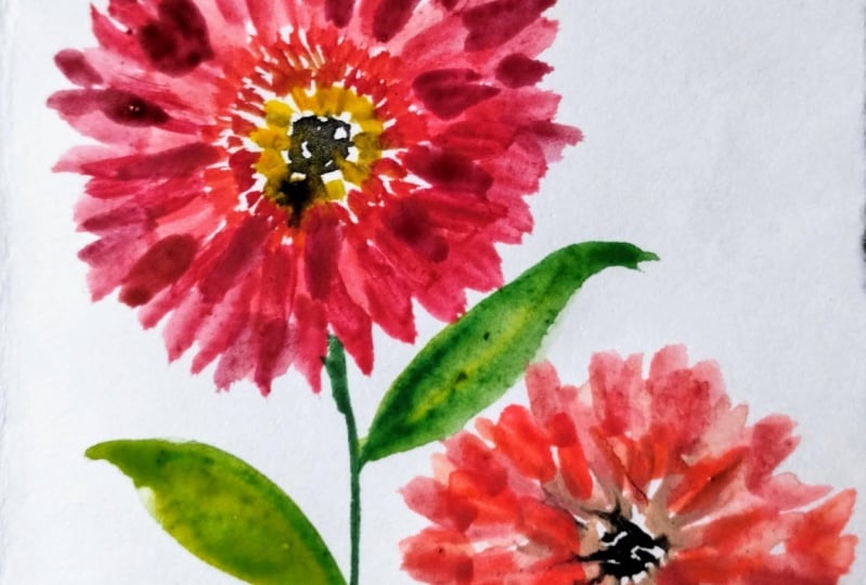
one more layer of petals. Maybe just a bigger size
or slightly bigger size, then this could look better. I'm also using a bit of my darker pink color that I mixed earlier, the
crimson shade. I'm just going to add it on a few petals and let
it bleed by itself. We're pretty much
done with the flower, but I want to add these last-minute details to make sure that the flower
is of the correct size. It's already coming together. And I really liked
this shade of pink. If you see too many gaps
between your petals, just step back and take a
closer look at your flower and then add the details
wherever necessary. While adding the darker color, make sure that you
don't bring down the brightness and
saturation of the flower. We still want the flower to
look very fresh and bright. And now I mixed some sap
green onto my palette. And I'm just adding a long stem. Using my size six round brush. I've kept this stem just a bit thicker than the usual ones. I'm going to take a
closer look at my flower and add some final details. Those are all the
details I want to add. And that's how my God
Buddha DZ looks like. In the next section, I also have a bonus
video in which I'm going to show you how to paint or pastel
colored girls are DZ
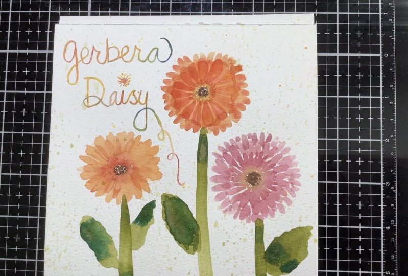
7. Bonus: Pastel Gerbera: To paint a pastel colored
gerbil DZ I mixed two colors. One is the opera pink, and the other one is the
flesh tint by Winsor and Newton to create a
nice peachy pink shade. Now, some of you may not
have this flesh tint. Exact match or exact shade
from Winsor and Newton, but that's completely okay. You can paint your
own peachy Gerber d z by mixing two colors. One is yellow and the other one is any shade
of pink that you may have. Now there's no exact proportion of how much yellow and
how much pink to mix. But try to mix a combination
that is lighter than orange. So you want your
peach color to be far lighter than a warm orange. And that's how you can
achieve your own PESTEL. Peachy color. So other
than mixing the shade, all the other steps
are exactly the same. Like the main group euro Desi that we painted in
the previous section. So I'm just going to let you observe how I paint this flower. And of course you can follow along and paint another
flower with me. Now, if you're not really
drawn to this pasta, Lee Corbett are Daisy, You could attempt to paint any other color that
draws your attention. Maybe a yellow one, or maybe an orange or a red one. So just try to paint
one more flower and see how two flowers look
into different colors. Now I wish to keep this
flower very light, so I'm using the
same peachy color throughout the
entire base layer. Then I'm probably going
to just add a bit of more pink and darken the shades a bit and then add
some layering petals. Like I said earlier, I'm just mixing a slightly
darker shade now by adding some permanent rose
and a bit of opera pink. Just to enhance the petals
with a darker shade. And that's all I'm
going to do with this. And I'm just going to
layer this darker color. I really like how it
looks and the way it bleeds at certain places
where the paint is still wet. So try to play around with the shapes that
you're comfortable to mix and see what
results you get. Now, let's add a stem. The moment you add a stem, I think the whole flower just
comes together and it gives a character to the flower with the contrasting
green color. I'm just going to
take a step back, take a look at the flower and to start some
details wherever I think the flower needs some
touch ups. And that's it. That's my version of a
pestilence corporate easy.
 Pooja Kenjale-Umrani, Author of MODERN WATERCOLOR WORKSHOP