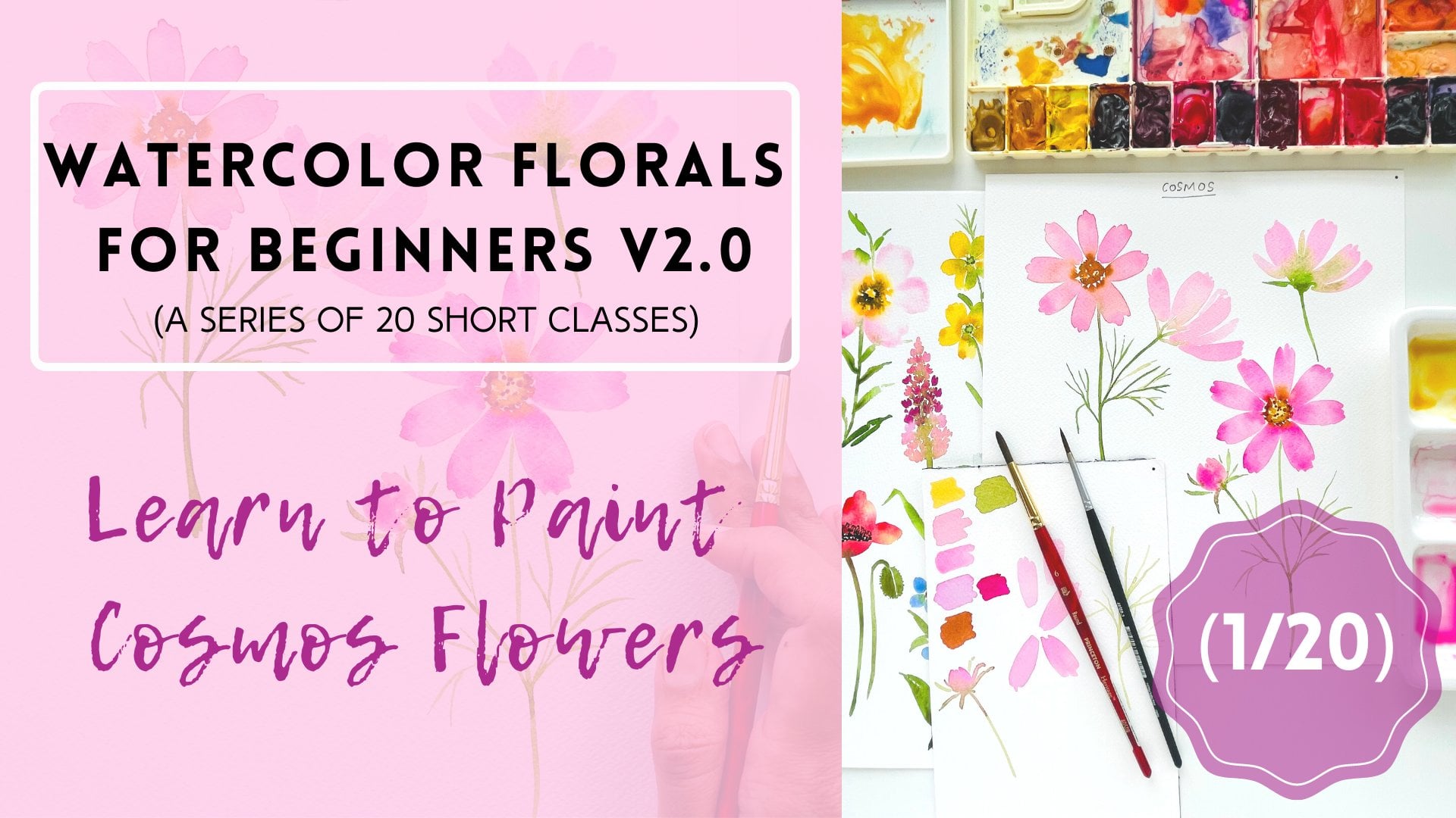
Transcripts
1. Watercolor Floral Series: 20 Short Classes: Hi, I'm Pooja. I'm a wonderful artist and
designer based out of Canada. I've been painting
what, telephones and other subjects and it's
more than six years now. And my photos are
the re-posting. You will notice if it was
at my Instagram page. This is my second class in
the watercolor florals CDs. During the short classes. The first class, which is
about building courses, flower, is only posted
here on Skillshare. If you visit my
Skillshare profile, you will see a separate section. But I'm posting all the classes belonging to this
particular sequence. So be sure to check
those classes out. Each class is dedicated to painting one
particular firewall. And my main intention here is
to break down and otherwise lengthy class into short
bite-size classes, which will be easy
to follow and they will overwhelm you with
too many projects. Today we are going to
paint a cone flower. We're going to begin by
exploring pictures of this flower by some warm-up
exercises and color mixing. And then together we
reframe the flowers step-by-step as a class project, I would like you to
paint this flower. Then take a picture of
the flower and posted under the projects and resources
section of this class. I'll be more than happy to
provide you a feedback. If you liked this class, please do consider
leaving a review. So this glass can reach
maximum students. And I can leave your
comments and suggestions. I eat, I need to paint
florals with me. Let's get started.
2. Everything You Need For This Class: Let's look at the art
supplies that we are going to need for today's class. Now the art supplies overall that I'm using are
pretty much going to be the same for all the
classes in this floral CDS. And if there's anything
different that I will be using in
a particular class, I will cover a quick section in which I will describe
all those art supplies, which I haven't
mentioned in this class. So let's begin with
the paper first. I'm going to use Canson
Heritage Cold Pressed paper. Now this is a really huge blog. It's about 18 " by 24 ", so it covers pretty much more
than half of my desk size. So what I'm going to do is
I'm going to cut the sheets into smaller chunks and
then use this paper. So these are the sheets which I have got into different sizes just to make sure that I don't
waste any leftover people. These are the sheets
now this paper has beautiful texture. It's I think close to Arches, cold pressed paper if I have to compare two papers together. But this has recently
become one of my favorites. And I really like to paint
florals on this paper. For all the projects in this series are all the
classes in this series. I will be using this
particular brand of people. Now let's look at the brushes. I'm going to use my good old Princeton brushes in size six. This is the Heritage Series. And then I'm going to use a size six from the
Neptune series, size four from the
Neptune series. And I've got this size three
for all the detail work. And this is from the aqua
edit series by Princeton. I will also be using a bigger brushes
such as or round 12, size 12 and size eight. But for today's class in
particular, these two sizes, particularly size six and
size three, are sufficient. For paints. I'm primarily using my dealer Romney
act refined set of 48 half pans and also a few assaulted tubes
from my Maddie Blue. So I'll be mostly using all my color choices or sheets
from these two pallets. But I also have
my usual palette, which I've prepared from
assorted brands for the sheets that are
particularly not in either of these two pallets. I'll either mix it myself
using my custom palette, and I will let you know
the shades I use on the fly as we mix our colors. So these are the three pallets. You don't have to
restrict yourself to using a particular
brand that I'm using. Feel free to have any watercolors or you would
like to use for this class. But the main idea is to have
all the primary colors. Few shades of greens
are few shades of blue and reds and pinks
and a few browns. So this is all you need
for painting pretty much all the flowers
that we are going to explore in this series. I'm also going to use some white gouache to add some details on the flower head. In the end. You're also going to need two cups
of clean water to clean your brushes and abandoned. And you can also use one of these or
palette mixing trays. Or even a clean, clean ceramic dish
is sufficient.
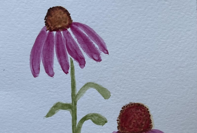
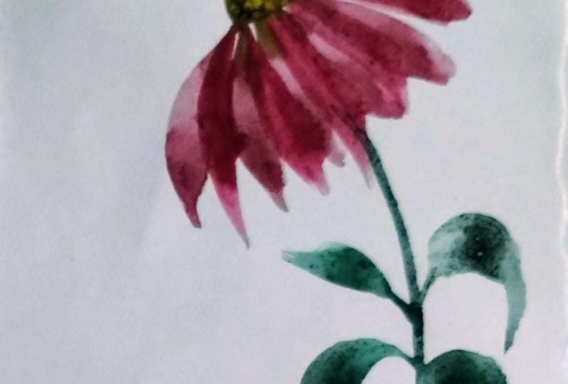
3. Let's Study The Flower: Let's take a quick look at
some pictures of cone flowers. In the very first glance, you will notice the
big flower head that cone flowers have. They are quite prominent
and this is one feature of the flower that we should
definitely capture. The other thing to notice
is that the petals of this flower are always drooping down away from the flower head. We certainly need to paint petals that are in
downward direction. The stems of this flower are somewhat thick and street with a slight curve and the leaves are simple and away
from the flower. Now that we have made
these observations, it'll be fairly easy to paint our version
of the cone flower. So let's go ahead and do
some warm-up exercises.
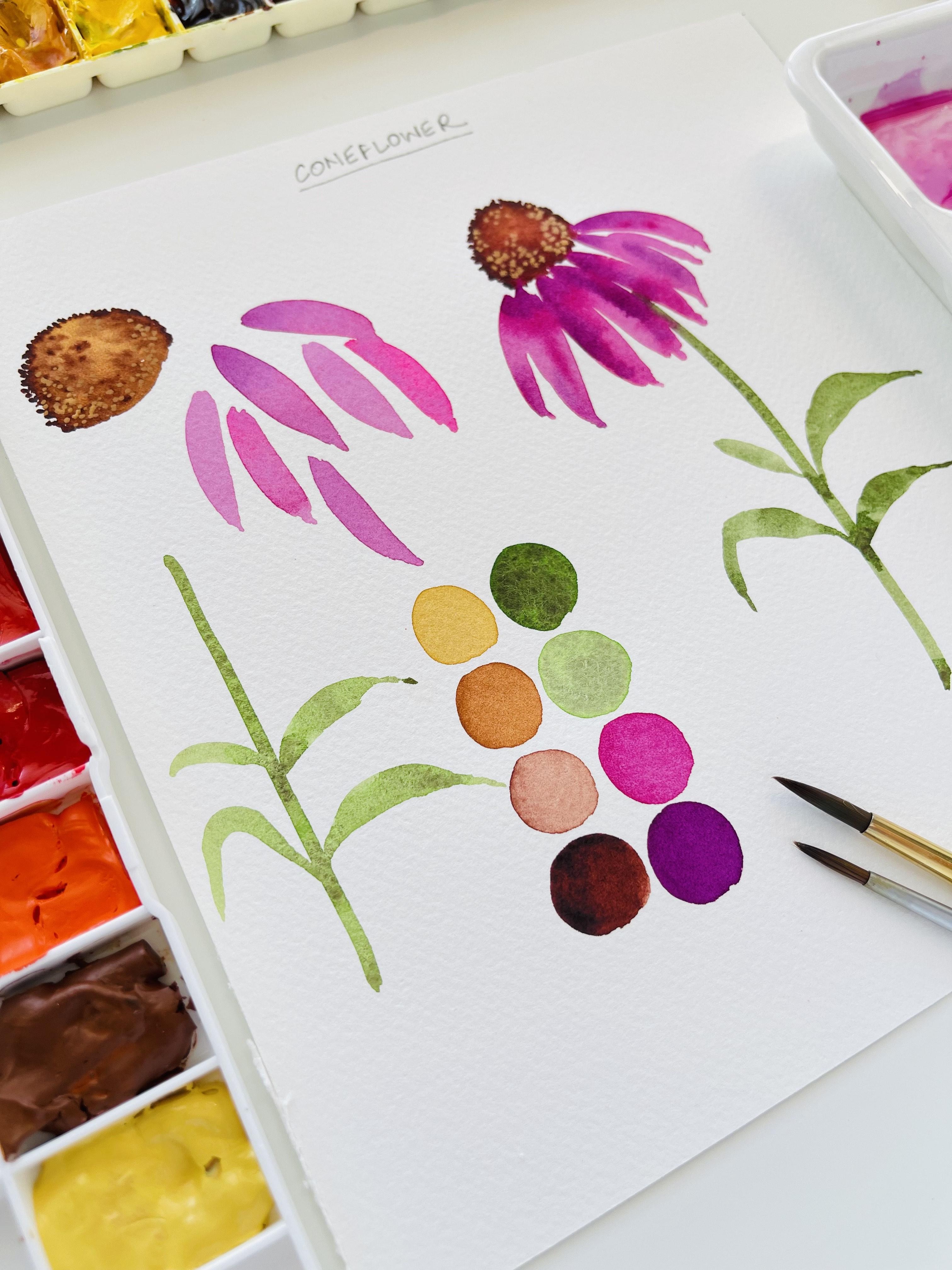
4. Color Mixing: Let's begin the warm-up
exercises by mixing some colors. The way first color
I'm going to use is the quinacridone, violet. It's a beautiful magenta shade. I'm going to make
some of this paint onto my palette by
adding some water. And then I'm also going to
use a brighter shade of pink. This is opera pink
by Daniel Smith. So I'm going to use
this pain just to add a bit of saturation and
vibrancy to the flower. I want my cone flower
to look quite bright. The next two colors are going
to be a bit of yellow ocher and a bit of burnt sienna
to paint the flower head, which is quite
prominent and dark. So let's start with
these two colors. And then if we need
something else, we will mix those
colors on the fly. But you're going to
need some yellow ocher and a darker shade of brown. So I have these four colors ready to begin
painting the flower. And then when we're painting
the leaves and the stem, we're also going to make some
sap green onto the palette.
5. Warm up Exercise: Now that we have
mixed our colors, let's begin with the
warm-up exercise. We will start by painting different parts of the
cone flower one-by-one. And then we will put
together the main flower. I'm using some yellow ocher and I'm going to try and paint the flower head that we saw
earlier in the pitchers. Like I mentioned, it's
quite big and prominent. So I'm starting out by
painting a spherical shape, which is not exactly a sphere, but slightly conical
near the top. So I'm using my size six round
brush to paint the shape. And then I'm dropping in a darker shade of
yellow ocher on the sides and letting it
blend into the first layer. Then I'm using burnt sienna that we mixed along
with the yellow ocher. And I'm just making these dots. And because the
color is still wet, it's simply going to bleed
into the previous color. And using a moist, clean brush. I'm going to just spread the color and lift the
color at certain places. And then I'm using an even
darker shade of brown. By adding very less
water to the color. This way you won't have a watery mix and
it won't instantly bleed into the previous colors
and give it a flat look. So to avoid that, add very less water in the
darker shade of brown. So that's the flower head. Now I switched to my
round three brush. And then I'm just
adding these ridges or spikes on the surface of the flower head because
it's not really smooth. If you look at the pictures, it's a bit rough on the edges. So I'm just spiking
that flower head a bit using a darker
shade of brown. So that's how it looks now, a lot more natural and organic. I'm just adding a
few more dots or stippling on the surface. Just to bring about that beautiful texture
the flower head has. So try to hold your brush perpendicular to the
surface of the people. And I made it a bit more
intense than what it was. That's the flower head. Now I switched to my round six brush and I'm
warming up with the petals. Like we discussed earlier, the petals are drooping
in downward direction. So hold your brush slightly at an angle and then pull it down to form a downward
stroke like so. And then complete the stroke by painting another
stroke next to it. So I'm using two
downward strokes to make one pattern if
you observe closely. So I'm just swiping my brush
twice to make a petal. And then I'm adding
a darker shade of pink to have a
lovely dual effect of the opera pink and
quinacridone violet. So practice a few petals. And then I loaded my brush
with some sap green. And using a size six brush, I'm drawing a slightly
thicker stem and just bringing out a few leaves from the side of the stems. Now if you observe
the stroke that I'm using for painting the leaves is exactly the same to the one I used for
painting the petals. So try to paint some leaves that are facing in both the
directions left and right, and draw a stem along with it. So these are the different parts of the flower that we
are going to need. The flower head, petals
and a stem with leaves. So I'm quickly going
to swatch the colors. I forgot to do that initially, so I'm just going to
swatch my colors here. So you can go ahead and mix your colors if you
haven't done it as yet. So that's the lighter
shade of burnt sienna. And then a darker shade
without using much water. And then I'm also going
to use some sap green, a lighter shade and
a darker shade. The two things that
we mixed earlier, shade of violet and
a shade of pink. So these are the colors
that we are going to use to paint our cone flower. Let's go ahead and
paint the main flower.
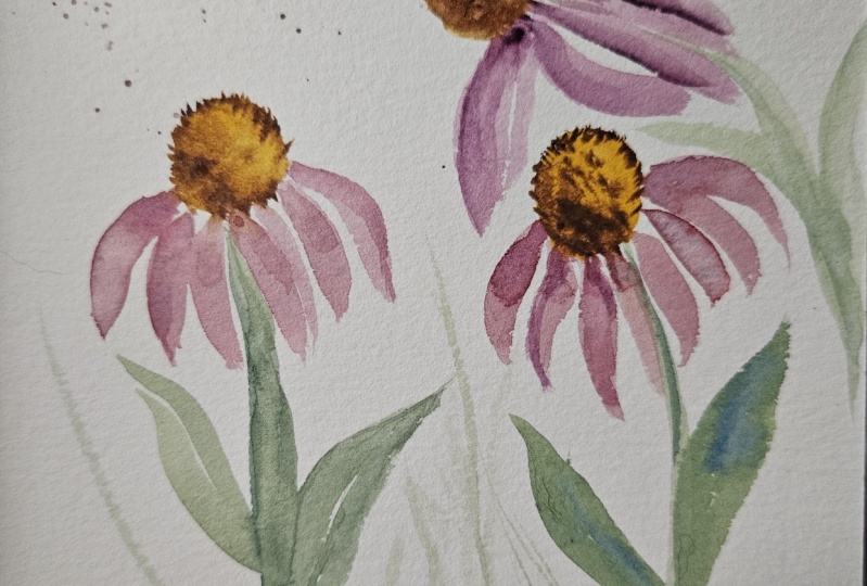
6. Main Flower: Okay, so now let's put together all the parts of the flower that we painted in the
earlier section. And let's paint the main flower. So I'm going to start with the flower head by using
some yellow ocher. Onto my size six round brush. I'm laying down a
darker shade of brown, burnt sienna along the sides and letting it blend on its own. I'm just going to ever so
lightly merge the colors into each other
using a moist brush. Then you can intensify by adding an even darker
shade of brown. And just like I showed you
in the previous section, I'm also going to add some dots around the
edges of the flower head. And I'm going to intensify
the flower head like so. Now I'm loading my brush with
the quinacridone, violet. I'm just watering it down a bit. And then I'm going to attach petals to this flower
head, drooping down. I'm going to start
from the site. And then one-by-one, I'm
going to lay down the petals. I'm going to use a mix of both the shades of
pink that we've mixed. And then I'm just going
to make sure that all the petals are really
tight and close to each other. And I'm going to swipe my brush downward while
painting every button. I'm going to curve
out the petals a bit. As I go along the sides. I'm just going to
make the petals look really dense and fluffy. Has of their calling outward. So that's the angle we want. And then I'm loading my
brush with the darker shade and I'm just
dropping in a bit of the darker color towards the center and towards the outer edge and
I'm letting it bleed. Then I loaded my brush with
sap green and I drew a stem, a slightly curved stem. I taught that the curved stem would give it a beautiful angle. So I just called it a bit. And then I'm drawing some leaves just the way we
practiced earlier, using the exact same
style of stroke. I'm going to add like about
three to five leaves. And that's about it. We have laid down an
impression of the cone flower. I'm mixing a darker shade of the same while
loop I used earlier. And I'm going to drop in some color where the petals
touch the flower head. And I'm just pulling
that color down a bit to add some shadows near the
site of the patterns. Okay, So the petals
look quite complete. Now, I'm going to lift some color from the flower head just to show some highlight. To do this, you have
to use a clean, moist brush and just
lift the color off. You'll be able to do this as
long as the color is wet. If your color has dried out, you won't be able to
lift it so easily. And then I'm using my size
three round brush to add those ridges or spikes
on the flower head. I'm just intensifying
it a bit on the site to give
it a nice texture, like we discussed earlier. Just adding some final touches. So here's a closer look
at the cone flower. It's almost complete except
for the fact that I want to add a few more dots
using my gouache paint. So I'm mixing a bit of yellow and brown into my white gouache. I took like a pea-sized
white gouache paint and then I mixed some
yellow ocher into it. You could also makes new
gamboge or cadmium yellow. And then I made a thick
creamy paint and I put it as an added layer on
top of the flower head. Okay, So this is how
I mix the color, some white gouache and a sheet of darker
yellow and some brown. You could also make some
yellow ocher or even a bit of red and yellow ocher just to get that lighter shade of brown, Matt Brown in gouache. And then I'm just stippling
on top of the flower head. I really liked that contrast and the texture that the
girl she's bringing out. This is completely optional. If you have white gouache paint, you can try this. I really liked this. Change of medium or change of
texture on the flower hair. So I thought of adding this extra thing to my corn
flour and I really like it. So if you have an option
of using gouache, please try this out. And that's about it. This is how our cone
flower looks like.
7. Next Steps: As a class project, I would like you to
paint cone flowers using different shades
of pink and magenta. Once you're done with
your class project, take a picture of it and
submit your projects under the Project and Resources
section of the class. I would be glad to provide
detailed feedback. Be sure to check out
other classes in the series and paint
along with me. If you'd like this series, do please leave a review under the review section of the class? Also drop in your
suggestions if you would like to learn any
flower in particular. Thank you so much for joining
me in this class today, and I'll see you
in the next one.
 Pooja Kenjale-Umrani, Author of MODERN WATERCOLOR WORKSHOP