Transcripts
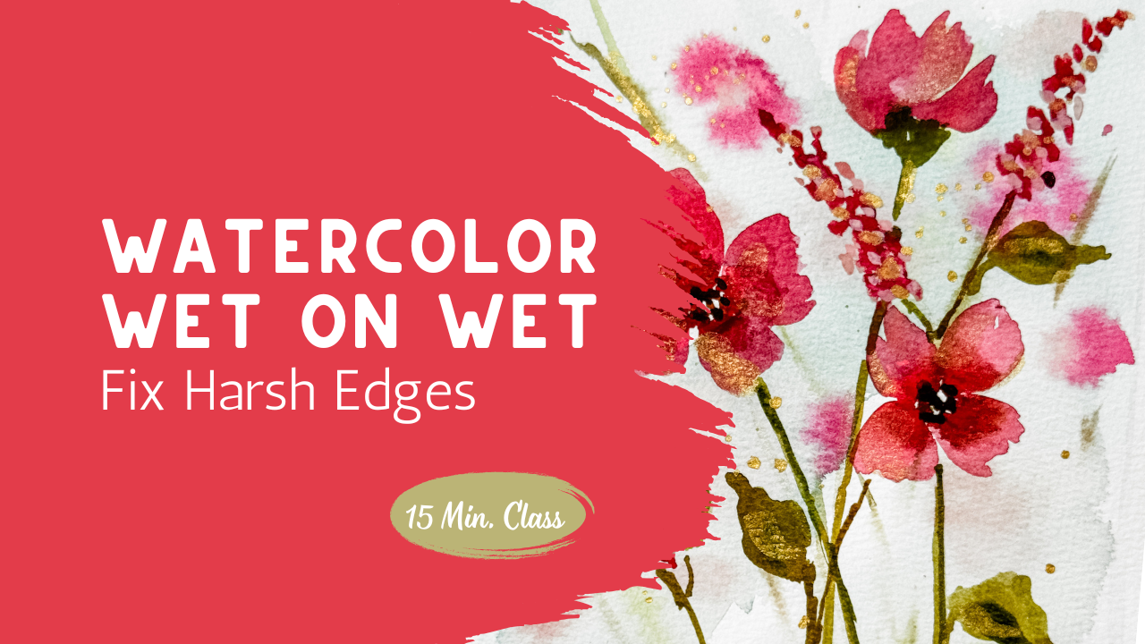
1. Welcome and What We’re Creating: In today's class,
we're going to create a soft loose watercolor
floral using a combination of wet-on-damp
and wet-on-dry techniques. This is a really
gentle step forward if you've been exploring more
fluid, wet on wet painting, because we're starting to bring just a little more control while still keeping that
soft expressive feel. We'll begin working on a slightly damp surface to build a blurred atmospheric
background. This helps everything feel light and connected and takes away the pressure of
needing to define every single shape right away. Then once that has
settled a bit, we'll layer on additional
color on dry paper and start bringing some of those florals forward and adding a bit
of depth and dimension. I'm keeping everything really simple and approachable here. You can use whatever
colors you have on hand, and even a small
palette will work perfectly for this
kind of painting. The goal here isn't to
create something perfect, but to get comfortable
letting the paint move while you're also learning
when to guide just a little. As we work through this week, you'll start to see how these
techniques build on each other from very loose beginning
to more depth and focus. Whenever you're ready,
let's get started.
2. Understanding Wet-on-Damp (Practice): If you join me in my last class, you already practice the wet on wet and wet damp technique. But today, we're
going to practice it again and this time it's more of a wet on damp where we're just adding a
little bit of water, not painting the entire
piece of paper with water. There you saw that I just paint a little bit of water on
in just a random way, clearly not filling
in the entire page. Then I added in just a soft
pink with lots of water and just a little bit of pigment just to keep
it very diluted. Dropping in just a little bit more of the darker
pigment here and there, but not coating the whole page. My page is not soaking wet. It's just damp. Here you can see
that it's shiny in some areas and a little
duller than others. That's what I want
you to practice. Getting it to that spot. Because this is
just wet on damp, I'm now able to go in
with a darker pigment, which would just be with
more paint, less water, more of a milky consistency, almost cream, in fact, I'm just dropping
in on top to create that background effect that we're going to be creating
in our finished project. Painting on the left is
what you and I are going to be painting together
in the next lesson. But for this one,
I just want you to practice putting
on little drops of creamy paint onto your
already damp page and watching that bloom. You can even add in some leaves
and some stems into this. This is creating
the three D effect where you're getting that
background technique going on. You're getting a
chance to create a little background
that's almost blurred. And then later,
once this page is completely dry in
our final project, you'll be painting a wet on dry effect where you're putting
your petals right on top. So now we're ready to go get started on our
class project. Hopefully, you've
practiced this, figured out how much
water should be on your page to create this
soft background effect. I'll see you over in the next lesson where we're going to be creating this finished piece
for our class project. Learning wet on what
is so much fun.
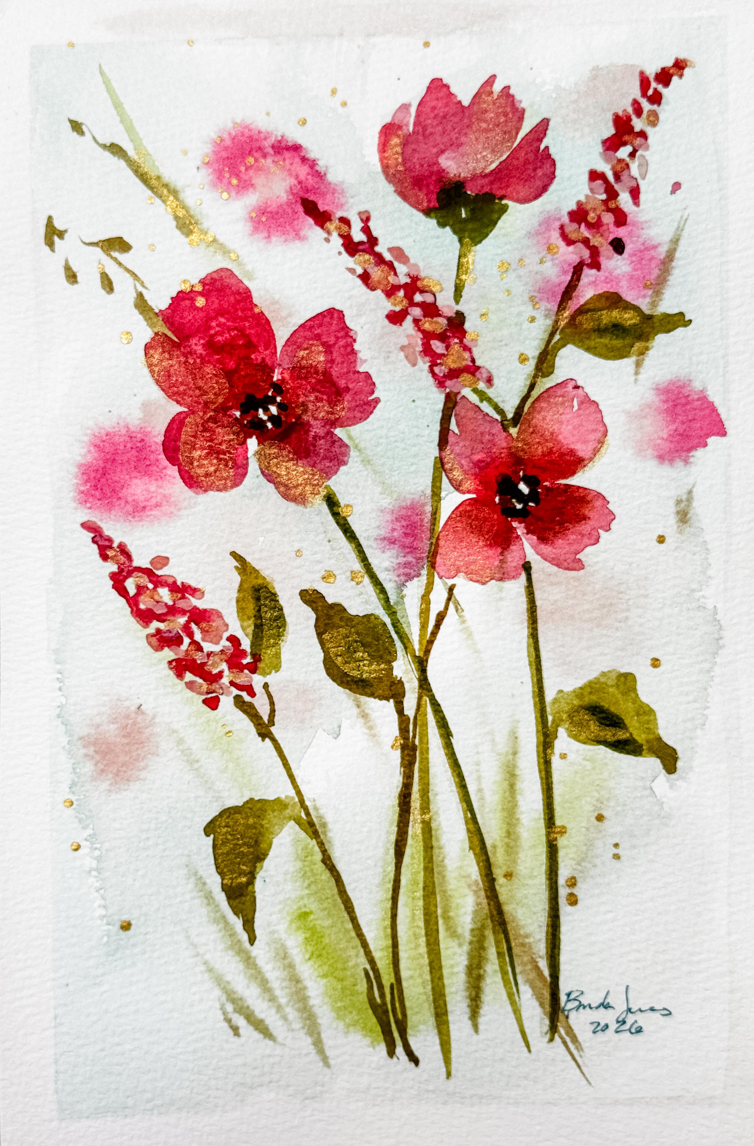
3. Class Project Building Soft Florals: Welcome to the class project. Let's get started. I'm going
to tape down my paper. It just helps keep everything
in place while I'm working, especially since we'll be
using quite a bit of water. It also helps the paper dry
a little more even and flat, which will make a big difference once everything is finished. The paper is dry to begin with, and I'm going to start by adding a very light wash
to the background. For this first layer, I'm using a very watery mixture, almost like a t consistency, there's a lot more water
than pigment here. You can even use leftover paint from your
palette for this. It works beautifully for
soft backgrounds like this because the colors are already slightly
mixed and muted. You can see that that
first layer I put down was just water
using a 1 " brush. I did not completely
coat the paper in water. I left white spaces. I only pushed the water
around a little bit. Now I'm adding in that
background effect. Again, not going edge to edge, just sporadically putting
some water and paint down. Letting it flow, letting
it be its own creation. Some areas will be darker,
some will be lighter. Remember that watercolor
dries lighter, it's okay if yours is a
little on the dark side. I will dry lighter. Before I add any more color, I'm just going to check
the surface of the paper. You want it to be slightly damp, not shiny wet with puddles. One easy way to test this is to drop a little bit of paint
and watch how it behaves. If you need to wait for it to dry a little bit, that's fine. Now I'm starting to
play in some flowers. For this, I'm switching to
a thicker paint mixture, closer to a cream consistency, so there's less water
and more paint. You can pull this
paint directly from your palette if the
color is what you want, or you can mix it fresh, be careful not to
add too much water. This will help the
color hold its shape a little bit more and
keep those soft edges. I'm working on a
slightly damp area so the edges stay blurred, but I still have control
over where the paint goes. I'm not outlining petals. I'm just suggesting them
with a few simple strokes. Less is really more here. You don't need a lot of details to create the
feeling of a flower. You could use several
different colors like I am. Just two shades of pink
is what I decided on. You can think of this
as a photograph that has some depth where the
background is blurred, and then you have the
foreground object that is crisp and bright. Right now, we're painting
that background effect. As if the background is a field of several different
colors of pink flowers. Now it's time to add a
little bit of green. I do want to mix my two
different greens that I have in this small palette just to create something that feels
a little bit more natural. You'll notice that I am just
using a small palette here. This is my travel size palette. I want you to see
that you don't need the big expensive palette
to be able to do art. Use what you have on hand. Mix your paints if you need
to have a specific color. You can paint with
whatever you have on hand. Adding in this soft green
of two different shades of green is such a beautiful
way to create a background. It's just that
blurred out effect of grasses or stems or branches. I like to add in a little bit of brown here and there, too. It just adds such a
nice depth of color. While I'm waiting for my
painting to dry a little bit, I will mix up a
little bit more pink so that I am ready to
paint the top layer. Because I'm working
with a limited palette, I do feel like I need to soften
some of my paint colors. I mixed two or three different
reds pinks or oranges, added in a touch
of brown or blue. Or green just to mute it a
little bit, just a touch. I do want to have
a second color, so I added in a nice light pink. You choose your colors. Maybe yours are
yellow and purple. Whatever colors you choose will be beautiful
for your art piece. I can't wait to see
what you've created. You'll notice that
the texture of this paint is like
a liquidy cream, not too much water,
not too much paint. Just kind of in the middle. I'm just creating a
simple four petal flower. You can create
whatever shape flower you want yours to be. But because a four petal
flower is fairly simple, I want it to start there to meet everyone where they're at. Four petals around
the outside edge. So can be touching. Maybe one petal
doesn't touch the other leaving a white
space in the center. Then I also want to
paint a flower where you see just the side of the
flower, not the center. So just pushing my paint brush
up to create that effect. A wispy, beautiful flower head that you can only see
the side, not the center. Working in a triangle
composition, I wanted to add one
more big flower that has more of the
center showing again. These flowers don't
have to be perfect. Four simple petals
around in a circle. You could make some of the
petals a shorter petal so that it gives that petal and flower some dimension and shape. Maybe it's leaning one
direction or the other. It's okay if these top flowers go on top of any of
your background. That's not going
to be a problem. Now I want to add
in a little center. I'm using a brown. You use whatever
color you'd like to. Because I'm doing wet on wet, the petals are still wet. So when I add that brown, it bleeds up into the petals, which gives such a nice effect. As that center dries, if you want to come back and
add a little bit more depth, you can always add a
little more brown paint to the very center. That will really make
the flower stand out. You'll notice I haven't added
any leaves or stems yet. I do want to wait until later to add those because I
want to make sure I have room for all
my flower heads before I start adding
in the greenery. But that being
said, I do want to add the base to the
one flower at the top. Remember how flowers, when
you look at the bottoms, they always have
that thicker area. I want to make sure I
have room to add that in. But I'm not going
to pull the stem all the way down to the
bottom because I have a feeling I might be
adding a flower in there somewhere and I don't want to put it where I
don't need that stem. Mixing some light pink, I can't wait to add in a different shape flower into
my field of wildflowers. Whenever I paint something
that looks like a field, I like to add in at least two different styles of flowers. It really adds to the texture and the
dimension of your art piece. This is just a long line of little tiny dots that
are close to each other, some touching, some
not, very simple. Start with a tip very pointy and then make it just a little bit
wider as you go down. Putting in three or so
different little areas wherever you feel your
painting is needing something. Maybe it's peeking out from
behind the other flower. Maybe it's dancing above
the top of your flowers. You choose where you feel a
little extra might be needed. If that's had a moment
to dry a little bit, I still want it to be damp. Go in with a second color. Maybe it's a darker pink
and add just a touch of that darker color here and there throughout those
little spiky flowers. This adds in such a
beautiful effect. You get this two to
flower on a spike. I love this flower. Now it's time to
mix up those greens again because we're going
to add in our stems. I want to give you a
warning not to feel like every flower
head needs a stem. A little goes a long way. Not every flower needs
to have a dominant stem, and they certainly
don't all need leaves. You can very quickly make
your painting too busy and too leaf heavy if you try to put a stem and leaves
on every single flower. Take your time, decide
what is helpful. Where do you need a leaf? Where do you need a stem? If one flower is
sitting in front of the other and you want
to add that stem, maybe it's just the top stem that you can see
above the flower, but you don't see where it
continues on the other side. That's okay. There
will be enough other stems to give you the
illusion of plenty of stems. Your leaves can be different
shapes, different colors. They can be going in
different directions. Showing movement
in your leaves is really beneficial for
your finished painting. While those leaves and
stems are still wet, go ahead and drop in it's a little bit of a
different color green. Maybe it's a darker green, maybe it's a bluer green
or a yellower green. You choose the color that
works best for your painting. Come back to the next lesson where we add in some details.
4. Optional Details for Depth and Interest: Welcome back. We're going to
start by removing the tape, which is always
my favorite part. There's something
really satisfying about seeing those clean edges, especially when you've
been working with such a soft flowing background. It just gives everything
a nice finished frame. Now, at this point, you
could absolutely stop here. If you're happy with your piece, it's complete, just as it is. But I'm going to add
one more small detail. I've been eyeing up that
gold metallic paint I have, and I'm just going to use a little bit as
just as an accent. This is completely optional, and if you don't
have metallic paint or you prefer to keep
things soft and simple, you can just leave the piece
exactly as you have it. I'll be keeping it
light and intentional. Just adding a few touches into some of the petals and
some of the leaves, you don't need to add much. A little goes a long
way here and it's just meant to catch the light and add a
little bit of interest. I'm also using a fairly controlled
amount of water so that the metallic paint stays where I place it rather than
spreading too much. Now to finish, I'm going to
add a little bit of splatter. This again, of course, is an optional step, but it can bring a
little extra movement and energy to the piece. I love the way the metallic sparkles and catches your eye. I'm keeping it light,
a few small splatters, so it complements the softness rather than overpowering it. That's it for this piece. I hope you had a great time. I'll see you in the
next video where we discuss the next class, where we're going to be
building on what we've already done and taking it
just a step further, adding a bit more
depth and focus.
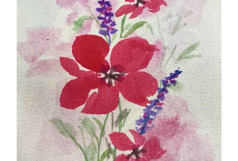
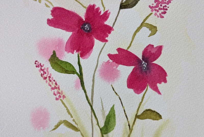
5. Final Thoughts and Next Steps: As you finish up this piece, take a moment and step back and really look at
what you created. This style of painting
is less about perfect shapes and more about allowing the water and
pigment to work together. That softness you see those blurred edges and
gentle transitions, that's where so much of
the beauty comes from. In this class, we worked with slightly damp surface to
create the soft background, and then we layered
in more details with dryer paper to bring a little
more depth and definition. It's a simple shift, but it makes such
a difference in how your flowers begin
to come forward. Your piece feels a
little different from mine, that's
completely expected. This technique is
meant to be fluid and expressive and every painting will have its own personality. Now, I'll show you the
projects from this week. You can start to see how these techniques
build on each other. We begin with a very
loose wet background, just getting comfortable
letting the paint move. Then in today's class, we added a bit more control
working wet on damp and then wet on dry to start
shaping those soft florals. Then in the upcoming class, we'll take this a step further, adding more depth, contrast, and a stronger focal point. If you're really
enjoying this process, I really encourage you to continue on with
the next class. It's a natural progression, and it'll help everything
you practiced here start to come together into
a more complete piece. I'd love to see
what you created. So please consider uploading your project to
the class gallery. It's always so
inspiring to see how everyone interprets the
techniques in their own way. If you enjoyed this class, you can follow me
here on Skillshare and continue building on
these skills with me. I'll see you in the next class.
 Brenda Jones, Watercolor Artist & Teacher