Transcripts
1. Introduction: Hello and welcome. My
name is Natalie Martin, and I'm a watercolor
artist and educator based on the Surf Coast
in Victoria, Australia. I am so excited
to welcome you to watercolor Explorations Spring
Florals in Mixed Media. In this course, we're going
to learn how to loosen up, get a little experimental, and also discover
how mixed media can bring a whole new life
and energy to your work. Watercolor was one
of my first loves. I love its fluidity,
its unpredictability, its gentle softness. When I mix it with other
mediums such as pencil, pen or pastel, it takes it
to another whole dimension. It's something that I've
always explored with. If you take a little tour
back through my own work, you'll see that right
from the very beginning, I've actually
always incorporated a little bit of mixed
media here and there. Mixed media is brilliant
for adding layers, creating some form or
definition in your work, and you also get to play with some spontaneous expressive
marks in what you don't generally you can't
really generate that with watercolor in
the same kind of way. It's a beautiful balance
of control and freedom. So it's your chance to
have a little let go to perfection and dive straight
into the joy of the process. Going to guide you through a
series of techniques today, exploring our wonderful
world of mixed media. I mean, ultimately, it can
be almost overwhelming because mixed media is there is unlimited
potential with mixed media. But when I'm talking about it, I'm thinking about
my own process, and watercolor is
always the base, but I would love you
to introduce today, we're going to
explore some pencil, pen, and pastel as some
combinations that really, really work well
with watercolor. We'll explore some
beautiful spring florals. You'll see them
around me here today. I've got some fresh ones
for us to work with. I'll also supply
some photos, too. You don't need to be an expert. All I want you to bring is
a little bit of curiosity, some willingness to
play, and, of course, you'll paints and brushes and all of those
kinds of things. By the end of this course,
you will have created your very own collection of spring florals with
your own voice, and I hope you walk away feeling confident and ready
to paint more. Alright, grab your
brushes, grab your pastil, that little pinch of courage, and let's get painting together.
2. Let's Talk Materials: When we talk mixed media, materials can be a totally
overwhelming thing. We walk into the art store. There's so many goodies.
It's like a lolly shop. We want to buy everything, and I honestly have bought
way too many things. So today, I want to make
sure that everything is less about what you actually have and more about
using what you have. So it's not so much worrying about having the exact
same brand as me, but if you have
some oil pastels, some water soluble pencils, I've got these beautiful
Karen dach pastel. And array of other things. That is going to be
enough. I'd much rather you play with
what you have on hand. And then if you see something throughout the course
that you're dying to try, then go to the art
store and buy stuff. Don't let the materials be the thing that prevents
you from getting started. Please. I promise you it's
not the end of the world. Okay, so I've got
my paint set here. This is array of professional
watercolor tube paints that I've squeezed
into a palette, and I use this central
area as my mixing palette. If you have these
set here that I bought that I recommended
from Welcome to Watercolor, they are also just
perfectly fine. Just roll with those.
It's all good. I've got an eraser. I'm pointing into
the wrong. An eraser and a pencil sharpener, piece of paper towel
for your blotting, a nice clean jar of water. To, if you're that kind of wide person that
likes to have the two and is really good
at keeping one clean and one for rinsing,
doesn't work for my brain. When it comes to brushes, I'm going to work pretty This
is my big array of brushes, but I'm pretty much going
to work exclusively with these three Paulina round
synthetic round brushes today. It's a side, zero, one and
two. I really like these. They've got a beautiful,
long tip, a really, really long bristle,
and you have a beautiful held line with
these particular brushes. You can see I have a whole
host of other brushes, but I pretty much lean on
these to do most of the work, as you would have
heard if you've done any of my other courses. So I'll close up those
and probably put them off to the side so I
don't confuse anyone. Now, the thing that
I wanted to focus this little conversation on
is the mixed media itself. I'm going to start
off really simply, and we're just going to do watercolor with one other media. So that could be a pencil. It could be a water
soluble pencil. So I've got this
progresso here that's a water soluble graphite, which is pretty
cool to play with. It could be a fine liner pen. It could be a water pen that
you have Indian ink in. That's also totally fine.
Could be a fountain pen. Oh, I've got these
two brush pens, so they're UIPin brush pens, so you kind of get a brushy
mark as you paint with them. This UIpin brand you'll
see that I kind of hold dearly because they are
pigment ink in there, which makes a huge
difference because when we introduce water to the
work, they don't bleed. They're totally
fixed. So you can get them super readily
at any news agents, and they hands down my favorite pen to work with
in a mixed media sense. And this little sneaky guy,
you would be surprised. It's just charcoal,
but I can promise you with every testing group
that I did this course with, the charcoal was the hands down winner for
everyone's favorite. I think it's because
it's a little bit dirty, a little bit fun. And it's not something you
pick up every single day, like a pens, whatever. But the charcoolal really starts to make you feel get a bit arty. If you have some so the first part of the
course is going to be working with a singular
black or colored media. And then we go and move into
kind of brain explosion, but we go from a singular
color to as many as you like. And that can be a really
difficult transition. So I recommend you could
either go with colored pencil. That's just a I've got
prisma color there. Any colored pencil will be fine. These are the D and
ink tens pencil, so they are a water soluble
watercolor style pencil. Super pigmented, but expensive. So if you don't have
these, it's fine. Just use your colored pencils. Use your kids colored pencil. Doesn't matter. These ones here. These are what I'm
going to work with in terms of colored media. So this is my Carin dash
set of No Color two. So neo Color two is the
water soluble kind. You might see in the art
store some neocolor ones, and I think I actually
have one neocolor one that's snuck in here because I love the color of it so much. But anyway, the neocolorO
isn't water soluble. It's just a beautiful,
really, richly pigmented wax pastil. These are the water
soluble ones, so I can use them in really interesting and intriguing ways what we're actually
going to explore next. They are like top dollar
premium products, though. So And also, this
is the mega tin. Honestly, don't feel like you have
to go and purchase this. I think this is the
84 set or 86 set. I can't remember
the exact number. You don't need this one.
They come in smaller sets. I'm actually going to
provide you a list of my favorite colors you can even just buy
them individually, and that can get your
collection started as opposing to unless you've got a really nice birthday
coming up or Christmas, these are a bit of
a big purchase. However, I just got these, and I was really intrigued
because they are water soluble oil
pastel and they are much more friendlier
on your wallet. And I had a play
with these recently, and they were sensational. They are really, really liquidy, silky color, and heaps of really lovely
colors to play with. It's not super limited in
your I find the pre made smaller sets are often
very restricted in a more traditional palette but there's some really
yummy colors in there. So I definitely don't want you to feel like
you have to go and bust your budget over really fancy Caron dache
neo colors if you can run off and get some of these at a much more
affordable price. I really don't want the focus to be on what you're working. I said this before, but
what you're working with. I'd rather you get on with
the content and enjoy it, and then maybe buy a few
things as you really discover mixed media because there is a whole realm of things
to play with here, and I really can't wait to show you where we're going next. The last thing I want
to cover is our paper. So I've got some
torn down sheets of Saunders cold press white
paper here, 300 JSM. You could work in a
sketchbook for this class. I think it really
naturally would work well in a watercolor sketchbook
if you had one of those. I love the loose sheets
because I'm a bit free flowing and put one over here and do
this and do that. And I feel a sketchbook sometimes is a bit
limiting for me, but that's just me and my brain. I've also just got, like, a really lightweight
lightweight paper sketchbook where I can just do some
thumbnails or that kind of thing or notes or anything
like that might come in handy. Other than that, we have
some beautiful flowers, and I cannot wait, like, have a look at these beautiful things.
Oh, my goodness. I have spent far too much time sourcing some beautiful flowers for us to paint at the moment. It was honestly, the most challenging part
of putting this course together was deciding
which flowers to paint 'cause we're in
spring here in Australia, and there's just this huge
array to select from. But why not celebrate
color and joy and new life and all the
things that flowers represent? Okay, enough of me waffling about materials.
Let's get into it.
3. Testing & Swatching: To help us rule out some
of the whos, what's, hows, whens, and whys, we're going to do some testing
and swatching now. I know that is not a very
sexy way of explaining this, but it honestly helps so much
with our pathway forwards. So we're going to work out
what media works well, direct with water, not water on top of water
in wash, dah dah dah. There's a whole lot
of things, and we're going to explore all
our different media. If you only have one or
two of those things, that's totally fine, as well. For the moment, I'm just going
to do our singular media, so I'm going to test
out our pencil, watercolor graphite
pencil, charcoal, our pens, and fountain pen. And I'm just going
to demonstrate different ways of exploring how these things
interact together. So I've done myself a service here where I've
pre made a template for you. There are seven columns, and we're going to create several rows as we go down here. In the first column, we
list down our media, and then it's six different
ways of applying them. And I'll do a first one
as a demonstration so that you can see how
it all comes together. So I'm going to grab our
pencil, and on here, I'm just going to
write pencil to B, so I know what I'm working
with. It's very scientific. It's like going back
to high school. And then direct literally
means grab your media, direct onto the paper. I really want you to
consider working on the paper that you will work
on down the track, as well, because if you're working
on cheap paper here because you're doing
some testing and swatching and blood whatever, you'll find that it will perform quite differently on
different papers. So it's actually a
fun thing to explore. I'm on it's actually a block, but it is the same paper that I would be
using down the line. I love saundas. It's a very lovely soft paper. With a beautiful texture. Now, the next one is
called water on top. So, literally, I'm going
to do pencil again, and I'm going to grab my brush, and I'm going to
see what happens to pencil when I put water on top. Not a whole lot. Just disrupted a little bit of pigment
here and there. Then I'm going to
grab my wet brush again and I'm going to do
it the other way round. I'm going to do water
first, and then I'm going to do pencil into
water and see what happens. It's a little bit
lighter, not a big deal. And then I'm going
to grab some wash. So I'm just going to
grab some mucky color that's on my palette,
to be honest. This is, like, a cool
sort of light wash. I think it's largely
like a palo blue, along with a Paine's gray, a little bit of green in
there, it looks like, too. But just whatever
you kind of got lying around on your palette and into a wet colour wash. O. And then I've done these so that I could keep
working alongside. This fifth column is layering, and this is on a dark wash. And then the second column is
layering on a light wash. So it's when you work your media on top of dried watercolor. So in this instance, I'm just going to go like this again so we can see how it all works. It works really well on
top of dried medium, less so into a wet wash. It's a really good
exercise to start feeling out how
different mediums work in different ways in different times places and how much water comes into
play with it as well. In our next one, I've got the progresso the
watercolor progresso. So this one is a progresso acral and I'm going to
do direct water on top. I like doing a scribble because you'll get
a little bit of different surface
area and you just get a bit of a range of different
things to play with there. So with this, I'm going to take the water on top
and see what activates. I'm going to keep rubing there a little bit
to see how it goes. So I've actually almost
erased the entire mark, apart from where I gouged it with a little too much pressure. But you've activated
all that pigment on top, which is
really interesting. So now I'm going to get
clean water. Like this. And then I'm going
to do the progresso directly into clean water. Mm, I didn't disperse like I was anticipating it too,
which is really interesting. I feel like that might
actually dry like that. And then we're gonna
grab our wash again. And this will probably
do something similar. But the way that pigments, so this is just clean water. The reason why we do into
a wet wash, as well, is because that wash has pigment in it, and this is pigment. And sometimes the way that two pigments interact
is really interesting. Like, sometimes you'll
get a crazy dispersion and you cannot create it in any other combination of paint, and other times you might get a really interesting
color mix happening. So it's a very, very
fun thing to play with. Next like we've got charcoal. I'm just going to write charcoal
here because otherwise, that's going to
get really messy. I don't want you to
fret about making mess with charcoal.
It is so much fun. And this is just one
of those boxes of willow charcoal that you
get from the art store. What I tend to do is just
snap it straightaway, 'cause honestly I'm
gonna snap it in about 15 seconds anyway,
'cause it is quite fragile. And so direct water on top. Do another one, getting
ahead of myself there. So water on top. So I've activated some of
the pigment there, but it really hasn't
lifted the line, though. And then, oh, into
water. Do that again. Oh, I had a nice softness as I was painting,
which was interesting. Grab that little bit
of wash. There we go. Oh, I've forgotten to do our
layered on both of those. Well. Okay, here we go. Do layer it here
and lay it there. Not a huge difference to the two B pencil, if I'm
really thinking about it. And here's our charcoal.
Charcoal obviously is gonna layer really nicely. Lovely. Alright. There's
out is our charcoal. Next up, we've got
our pigment pen. So this is the unipin
pigment pen pigment pen. I've bought two of these.
One's a brush one, and one's just the 0.5 mil nib. So when I've used the
pigment pen in the past, I've always used 0.2, which is here, it's
a much finer line. But if you tend to
be heavy handed with your when you're writing, you'll just push the near
bit and straightaway. They're not the most
resilient little things. So I recommend the 0.5 until you get familiar with
how it starts to feel. So we've got direct
and Like this, a fine liner on a
textured paper as well, is not going to be as smooth and luscious as what
you'll find on, like, a typical office paper
or something like that. Just something to bear in mind. You won't get you'll get a
bit more texture in there, I guess, is what
I'm trying to say. And then water on top. So, interestingly, I
put water on almost immediately after drawing it, and that is going to activate
that pigment a little bit. But if I had waited for it
to dry for a longer time, it would be totally fixed, and I would be able to do it. I might even do a second one, a little one where I dry
a little bit longer. So that's immediately, and then I might just make
a note for myself. And so pen into water. That already screams
to me, like, slightly problematic.
Let's see what happens. Didn't really work. But
this is why we do this, right? This just
doesn't look right. So we know that the wash is probably not gonna look
quite right, either, but we'll do it anyway
because the sake of experimentation,
literally nothing at all. And now I'm probably
going to have to blot that water off the
end of my pen. And here we go into this one, and on top of a layered dark
and a layered light wash, it actually looks quite nice. So just something to
think about. Next up, we have the brush pen, which is a recent
discovery for me, but it is such a lovely way to create really interesting lines. It's a bit more versatile than the just straight up
pigment pen, brush pen. And it's also still brush. It's still pigment ink in there, so it's still super
resilient when it comes to being on the paper. So direct so I have a lot more texture
and a lot more play there, water on top. So this time around,
I've learnt my lesson. I'm just going to wait
a little bit longer. I'll come back to those two,
and I'll put water on them shortly. Next one into water. Now, we know that the last lot of pen ones didn't really go so well with the pen into water. So let's just see
how we do here. Well, okay, yeah, I wasn't
even expecting that. We'll see how we go, hey, and
then we're going to do into our wash. Like so. And again, so it's
really just taking that pigment ink and just dispersing it
absolutely everywhere. And then on top of
our layered dark, we're just going
to go like this. And like this. So actually
quite nice again. It's got a lot more control once the paint is
dry underneath. Lots of control here when
we're going into water. Alright. Finally, for our
little testing and swatching, I will do the fountain pen. Oh, I just said fountain
pen. That's weird. Fountain pen. So this has
a really bog standard. Find it at the news agent. I think it was like 20 bucks ink cartridge and fountain pen. If you might I mean, you already might be
down this road already, but if you are really into fountain pens and you like
this mixed media vibe, it's worth investing in
some carbon ink cartridges. They are much similar to the pigment ink pens where the ink doesn't bleed
once you put water on top. Whereas if I put water on top of just your average Joe ink
that you get at the store, then it's definitely
gonna bleed everywhere. Just something for you to
note. Alright, fountain pen. Fountain pen is one
of my favorite ways to do mixed media. It was back in the day when I first started releasing
prints and selling artwork, it was all about the combination of watercolor and fountain pen. Alright. So that's my ink bleeding everywhere.
Rinse that off. Ooh, I just sproted ink
everywhere. And we go. So the fount pen really
doesn't work into wet water. And I'll just grab a little
bit of my wash here. Into that. Again, we know the kind of results
gonna happen there, but then on our ledge, dark and light, it's
looking nice again. So you can see that we've
got that much more control there when it comes
to mixed media. But then if you say you've got some watercolor pencils
or things like that, then that wet stuff is actually when it starts
to get really interesting. So I'm going to leave
a gap here because I'm going to come back
to this section when we get to our
colored media. I think this is a really
nice place to start. Make sure you leave
lots of space because you can always
keep adding to this. You might go to the
store and go, Oh, my God, I just found this thing, and I want to try it out. This is the best
way to try it out. You're going to see every avenue that it's
really successful, and it's going to really
obviously take you to the places where you really shouldn't bother using
it in the first place. So I've got some
extension work for you. You know I love a little
extension project, and this is the
best way to enhance your whole experience today. But I've got two
options for you. First one is a chart where you focus on your
mixed media colors, and we're going to go and
do every single color in there or every color
that you reach for. And that's a really nice way to explore the whole palette, and you get to have a reference chart
that you then put on your studio wall or
workspace wall or whatever. And you'll see that
I start to build up all these interesting things
where you can kind of go, Oh, when I put those
two things together, it eradicates that whole, confusion about what to do when helps you work out how and when to apply the
mixed medias together, especially when we've got
so much water in the play. Now, this is the one for
the people that don't have watercolor pencils or
water soluble pastiles. This is a colored
pencil only one. So I've stripped out all
the watercolor stuff because it's not going to
mix with water at all. It's a wax based pencil. So if you've only got a set of plain colored pencils and you're absolutely welcome
to use them today, there's not going to be
any hindrance there. But this demonstrates my favorite selection
of colors across a cool dark wash and a light cool wash and a warm dark wash and
a warm light wash. So you can see how the
colors represent across. So in this instance, where, say, blue and orange are
opposite to one another, they don't really
sing out very well. They kind of don't support each other very well
in this instance. It's not a great combination. But say this hot pink on
top of the dark wash, I'm like, Whoa, that is good. I want to use that right now. Like, get me into the
studio. Let's go. So it's a really good thing
for inspiration as well. You might just find
combinations that you're like, I really need to work at how I want to make
this into a work. I want to use it now. So they're
your extension projects. Is Eon as excited
to start painting as I am 'cause I sure
am. I cannot wait. Next up, we are going
to go into our peony. I know that feels like we're jumping off the edge of a cliff, but I'm gonna break
it down for you, make it as seamless as possible, and you'll be painting peonies in the next 30 minutes or so.
4. Simple Mixed Media: Peony: When I discovered that
peonies were going to be in season when I was going
to film this course, it was just too good to resist. You might be looking
at me like, Oh, my God, no, I can't do
this. I can't paint this. I will get you there. I promise I'm going to break it
right down for you, although they look
like a complex flower painting with watercolor,
and in this instance, I'm going to use a pencil,
just simple to materials, we're going to get this
beautiful rendition of a peony on the page. But we're going to strip
it right back, start, start, and I'm going to
demonstrate how to draw it. We're in this instance, we're going to draw the
pencil lines first. I think sometimes,
especially when I did, like, welcome to watercolor and
some of my other courses, and I discourage all
the pencil work. I love that freestyle
free flowing kind of aspect of watercolor. In this instance,
because we're going to have the pencil
linework down first, it gives you that little
bit more structure and confidence to go in
with the watercolor. So it can be a really
nice way of exploring that loose quality of watercolor with a little bit of help from the mixed media. So, penny, I know. You're looking at me, like, Nah, I'm not doing that,
but, I promise. I just going to leave
it there for you so you can just, like, keep it in mind. Like, we will get there.
Alright. I've got a pencil. This, like, humble
little dude is like a super duper incredible tool. And what you may not
realize or you haven't played with probably since high school is its versatility. So what I want you to do in
any media that you have, you may not even have
a pencil on hand. You might have, say,
water soluble progresso or the fountain pen or whatever. I just want you to
have a little play with the marks you
can make first. So initially, I'm going to
try and just do light marks. I'm going to do dark marks. I'm going to try and
do a variegated mark, so lightly press and
then darkly press. So you get a bit more
variety in your line. That can be a lot
could be called a lost and found line
or a variegated line. You can lay the pencil right down flat and
you can do shady. And you can do little
tiny marks, as well. And it's really sort of endless the way that you
can sort of explore this. I really love, especially in florals, this variegated line. This guy here is a bit
of a workhorse because it can really help inform
the three D shape, as well as give it a really
delicate petally feel. And as you can see
here, we've got lots of beautiful delicate
petals to work with. The first thing I
like to do is break down the shapes of
each of the flowers. So this works for any
flower in front of you. If you had, say, a rose or
this Ixia or any of it, the carnation, this
applies the same. It's all about breaking it
down into simplified shapes, looking at things individually, and then putting it
all back together again so it makes
sense as a flower. So I've got a leaf.
I've got a petal. They're probably the two main
things that I'll look at, as well as the structure
of the flower as a whole. So initially, I'm
just going to start with the leaf just to
get warmed up, you know? These leaves down the bottom here are a little bit broader. So I'll go with that
one, and then they get a little bit narrower
as we get to the top. That one's a split
one. So that's a lovely little
one just up there, and they go right up to
the base as a flower. I will supply photos of
these beauties, as well. Although I encourage you to work with things
in front of you, I know sometimes it's just
easy to follow along for now, and then you can do this
for yourself when you say, the exciting things in your garden have
come out or you've bought yourself a beautiful
bunch of blossoms. You can paint them to
keep them forever. So leaks I'm going to
try and do this with this variegated line
so that I can get really feel confident
with how that might look. So I like to try and place the darkest part of the leaf
where the shadow would fall. So in this instance,
I'm just drawing a singular leaf, so it's
a bit of a practice. But something to bear in mind is that that little
bit of heaviness in the line is actually going
to help inform that shape, and it's going to give
it dimension as well. And then it's got
some lovely veins. It's got a central vein and then some little
side ones as well. Whether I get too hung up on those or not, I'm
not really sure. But sometimes it's nice to
sort of explore it out. I'll keep them quite faint, quite like that. So. And then I know this
is a bit strange, but I'm just gonna pull a petal out because understanding
the petal shape is actually a really
important thing because it's not
dissimilar to a rose, to be honest, but it's got a few of these little
wiggles at the top, and not all peonies
are like this, but that's one of those
really clustered, beautiful. I love the color.
It's just outrageous. But this shape is part of what makes it
look like a peony. So I'm just going
to do the petal, the similar kind of way. And I'm going to look at all
those crucial little aspects of it being a peony petal. So it comes right down I've
done the wrong way around, like so, and it comes
right down to a point. And it's got a
lovely vein there, and it also spreads
out like this. So, yeah, I think that's kind of what I'm working
with there. Got some petals. The buds are super lovely, too, but I'm going to focus
on the peony for now. The next up is sort of
exploring the shape, the form of the flower itself. I think that's the thing
that can often go wrong, and it often makes your
paintings look totally flat. So my idea here is to help you really generate
form and liveliness. This thing is blooming
off the page. So how I break this down, especially with any new flower. And I still do this
for myself, as well. Anytime I'm approached
with something new or a little bit difficult, this is the best
way to go about it. Just draw it out. Which
is why we're starting with the pencil as our
first mixed media. It might seem almost too simple, but I feel like sometimes
simple is best, and it's the ultimate
combination. So I'm just going to have a
look at this flower again. So we've actually got
almost a flat top and a cup shape underneath, but it's quite a
boxy kind of shape, and it's got three sort of areas of petals that are quite
clustered around the base. I don't know if you
can see that there. It's not perfectly round,
is what I'm trying to say. So I'm going to try and generate
that shape on the page, which is basically
like a disc on top. I'm going to have it
pointing this way. Disc on top. And then we got this general
kind of cup shape, but it's quite a flat wide cup. This is why it's
so helpful having the flowers right here
because I can pick them up, look at them different
ways, that kind of thing. And also, you get to have
nice fresh flowers around. But if you don't, I understand you can work from
the photos, too. Okay, flat. And then we've got we've got these sort of going to break it down the
next stage again, which is the we need to
round it out a bit more. And then this one sort
of goes like this, and then we've got
some shapes up here. So I'm going to sort
of break it down into the next round of shapes. And there's a really
night still petals. This is still coming out. So there's still some petals in the center there that are
protecting those samen. So it will be in there. And then now that I've got this
basic little form here, that's where
I'm going to start. So the point of axis, which is where the stem attaches through the stamen the
flower is pointing, which is this thing
here, it actually drives right through the
center of the flower. So the stem is always
going to exit at the bottom directly from
where the flower is looking. Sometimes it can
be tempting to put it off to the side or
that kind of thing. So we're going to start putting
some of these details in. Okay, so I've got
my basic forms in, and now I'm going to start giving them life
with these petals. So I don't know if
you can see that, but there's layers and
layers and layers of petals. And that's what's
really going to, like, make the pony come to life. So that's what I'm going
to really focus on. Gonna start in the
center in this instance. Alright, and then around. And then I might do some
of these back pedals. Working out where to start is often the most
difficult part. I need to hold it with me so I can make sure I get
my petals right. Like, for a flower that's
built from a central point, I often find the
center the easiest. If you start from
the outermost thing, it tends to look a little
disproportionate once you get to the center if you
don't get it totally right. And it's also okay to not totally get it right
the first time. Like, we're just, you know, sketching things
out at this point, and if it's totally
not working for you, get rid of it and start fresh. It can really affect
your mental state. So just, like, if you're getting irritated by it or if
you're not feeling it, just get rid of it out
of your visual line, and you'll feel so much happier. Alright, keep building
up these petals. There's lots of these
wiggles at the top, so I really want to focus on those. It's that
working on there? You with me still? You're
not freaking out totally. You haven't gone off and made yourself a cup of tea
because you're like, too much. It's too much. The petals that fold in
on themselves can be quite challenging,
but it's a really, really lovely way of getting a real expression of
the flower on the page. So I'm only really
focusing on the tops of the petals in this instance at the moment because otherwise, I'm not going to be
able to see much more. I can't get to the base
of the flower petals. So I'm looking at I'm working exclusively
from observation, knowing that each petal has
these sort of ridges at the top here. Okay. Getting there. There's
some longer ones out there might
lighten them off. I've gotten quite heavy
for the central part. And then as I get out lower, I want to try and lighten
them up a little bit. Let them free flow a little bit. And that's gonna get that
liveliness and energy in there the minute that you
stop caring and just let go. You know what? That's when it's gonna
really start working. So let's make that the goal. Go to keep working down. It could have been
so tempting to start down here,
and I almost did, but I think working
from the center, you get a bit more control, and that's where your eye
wants to go, right? Eye will always it
naturally seeks out things that look
like eyes or centers. It's a pattern that we
recognize with our brains. And what tends to
happen is that you don't start at the base of the flower and take
it into the top. You look from the top down. And when you start drawing, your energy and excitement for the subject goes into that, as well, and it totally
reads on the page. You can try both versions
if you want and see if you can get the gist
of what I mean there. Correct. Now I'll do
some more little petals. Now I'm going to do
this big one here. And there's a little cup
one there going around. And then there's a leaf here, so I'm going to draw that leaf. So I've gone darker on the underside and
lighter on the top side, and that's going to
help get that form and essential
feelings on the page. Is there another leaf down
there? You know what? I kind of want to
add one, so I'm just gonna add it just for fun. And then more of these
split petals here. And another nice
big scoop one here. And then I just go
to fill in this gap. I've kind of left this rim around the middle here that
needs a bit more detail. I think I'm nearly there,
though. How are you guys going? I'm dying to see how you
go with this flower. I know it's super challenging, but I think, why
not? Give it go. You can always retreat back and try something
simpler if you want. Just gonna do a little
vein in there for funzies. And then we know how
the stems coming off because I've
drawn sort of it in. So I'm just going to draw myself a little stem in there and
add another couple of leaves. So I've got a nice sort of
thing to work with here. In this instance, the leaf
goes under and behind, but maybe I'll do something else, or maybe
I'll put it under. Let's go. Maybe I'll do
one bigger one up here. I think when you
leave little gaps and breakages in your line, that can make really
interesting rather than if you have a really
heavy outline over everything, it ends up looking quite dense, very illustrated,
very overworked. And my whole goal when I'm
working with mixed media, is thinking about things in
a really light and airy way. When I look, even if you
just Google mixed media, you're going to see
some very overworked, heavily laden artworks. And it just irks me. I think you can
use it in a really subtle way that can
be really beautiful. So I think we're nearly there. It's time to throw
some coloring, which might just feel bizarre. The only thing I'm
going to do is I'm going to grab my eraser. A little rub on my pants. It's always nice to just get all that little bit of
grub off there. My bench is way not clean
enough to try and normally I just go like this
on the bench and that cleans it up, but
it's not the case. I'm just going to quickly erase the really faint
lines that I use for structural purposes
because when we put watercolor over
our pencil lines, they show through, and
you can't erase them anymore unless it's a
really, really light wash. So I'm just going to really
gently erase all this. I'm gonna get rid of
my axis line there. You guys know what I
mean. And there we go. It's almost there. I think some lines are quite
lovely to leave in. Others, I don't want there. I wanted to make sure it's
still got that light, airy, not overworked feeling. I tend to be very heavy handed
with the pencil, as well. So if you're someone like me, I would just recommend going so much lighter than you
would imagine because it will mean that you don't gouge the paper and erasing it will mean you don't have trenches
for your water to fall in. Can be very problematic. A right. Nearly
there. There we go. So, I could sit here and do
a full colour by numbers, fill this in perfectly, but that's gonna
lose that light, fresh, airy feeling that
I was just talking about. I really want to keep it
really fresh and vibrant. I know I've just said
fresh like ten times, but that's something that
is really important to me, especially when we're talking about such beautiful flowers. Where's another
brush over there. I'm gonna set myself
up for painting now. I've got this reference, obviously right in front of me. What I recommend
when we're painting in flowers is that we go quite dark with the center
that helps it look like it's gonna
pop out and open, and then the outermost
petals can be a bit lighter. Here we go. I'm going
to grab a big brush. This is, like, a
close to a size ten. Paulina bright brushes are
mop sizes in everything. So it's a bit harder to
articulate. This is the size two. So I'm going to
grab some really, really lovely rich
pink, some purple. Make a little mix for myself. The other thing I
really love doing is making sure
that I'm not using the same assortment
of colors and mixes and blends for
every part of the flower. I'm even going to add
some Pains gray, I think, into this to make it
really deep in the center. So I've got really,
really dark purple here. And for the center,
most petals, like, I've got this pink
ball in the middle. And then it's this
dark outside area that I'm really interested in lifting with the dark paint. And I'm going to do these
little upward motion strokes like this, enhancing
that center. And then I'm gonna
wash it all off a little bit, get the next lot. Just a little blot there
to take off some excess. And you know what?
I'm just going to ignore all that line
work that I just did, but that's gonna give
it that looseness and carefree nature that
I'm really going for. If I get too stickler
about making it perfect, then I'm going to lose
all the fun out of it. And every little error or mistake is gonna
be heartbreaking, whereas I'm just gonna slosh
some paint on and have fun. Alright and some pink
for that center. Keep going kind of looking at this and trying to find the directions
of all the petals. And that's one of
the things that I really like working with the most is making sure that like, the directions of the petals
are going the right way. So for me now, most
of them are going almost straight up just
slightly out when I look at it, and that's going to
help me articulate this better than if I was
to sit there and, like, count petals and get all particular about
the way it's all sitting. I'm gonna put some more dark in there cause the dark is
going to sit in there. And I'm going to use not just not going to just use the pencil for helping to create form. I'm also going to use the color. So those two in
combination is when you start to get really
interesting dynamic shapes. Not filling it in all
perfectly. Very, very key. And on this lighter side here, I probably just go
quite light with my paint like it's getting
caught in the sun, basically, and then go a little
bit darker for the base. And a few little
horizontal lines here, mimicking those little
petals that we painted in. And gonna go really, really hard with this
really vibrant pink. It's basically straight
cinacridon rose to get this really,
really vibrant color. Kind of want to do a little
bit more dark in the center. The littler marks in the center always help it feel
like a center, as well. And this last one can be quite dark 'cause
he's going to be the little one that's gonna send everything else forwards. Lovely pretty happy with that. Just go to do a couple
of other details. Going outside, I can't iterate enough how powerful going
outside the lines can feel. Like, it's quite
empowering and strange. Like, you've been
told all your life that going outside
the lines is bad. And then when you do it in your own work and in
your own playtime, it's so rewarding 'cause it's so much fun and feels like
you're breaking the rules, but you get the most
beautiful results for it. Now, this here is
Perl and green. I'm going to mix
it with a bit of, I just grabbed three
different blues at once. That was a bit mad. The peril and green I really
enjoying at the moment. It's a really nice
deep bottle green. It does dry a bit flatter. If you don't have that
particular green because, I mean, it's such a beautiful, natural I just look
at that and go, that deep green is a
really lovely thing. You don't have to run off
and buy a tube of it. You can mix it yourself. I would use a
combination of, say, a turquoise, Paine's gray, and a little bit of
umber, and you're going to get that lovely color. Maybe even with a little
bit of the coracudon gold, and you're going to get
basically a Perl and green. So you don't have to mix up. You don't have to buy
every tube of paint. I love to experiment with
different tubes of paint, but I also don't like I don't want to make everyone buy exactly the
same palette as me. It's such a unique and special
journey to go on yourself. And if it's something
that you're really invested in and interested in, jump on my magic of color
mixing workshop workshop, online course because we go totally deep dive into color and learn how to make
all these colors yourself. You can do the whole course with just three colors. Alright. Now, I'm going to paint
this backmost leaf here. Again, trying not to worry
too much about the lines. I know that's just so
weird for our brains. I go to get a slightly
different green here. I'm actually not the biggest fan of green, but in this instance, where we've got a really
rich pinky purple flower, it actually makes
a lot of sense. That was another one
there, and I'm just going to really lightly
touch in the stem. I don't really want
to get too heavy or focused on the stem at all, because the flower is
where all the actions at. It's where I want people
to look. And this is just a support act to help iterate the
flower on the page. A little bit there, I might
just throw in a little bit of blue or even a little bit of purple might be nice
in the base of that. It'll help tie the top of the flower to the
bottom of the flower, drop in a little
bit of colour and maybe in there where
it touches the stem, and that will help adhere those leaves into
the stem, as well. Alright. You still with
me because we did it. We made it, we painted
and Drew a peony in, like, not even that long. I cannot simply wait to see you. They're such a popular
flower right now. I feel like they're
quite readily available, although the season is so short, but what a way to celebrate them when you can
paint them yourself. As an extension project, I'd be really interested. So today, we focused on
the pencil and watercolor. I'd be really interested for you to go back to our
testing and swatching and pick one of
the other mediums that you really enjoyed working with and create some further peonies
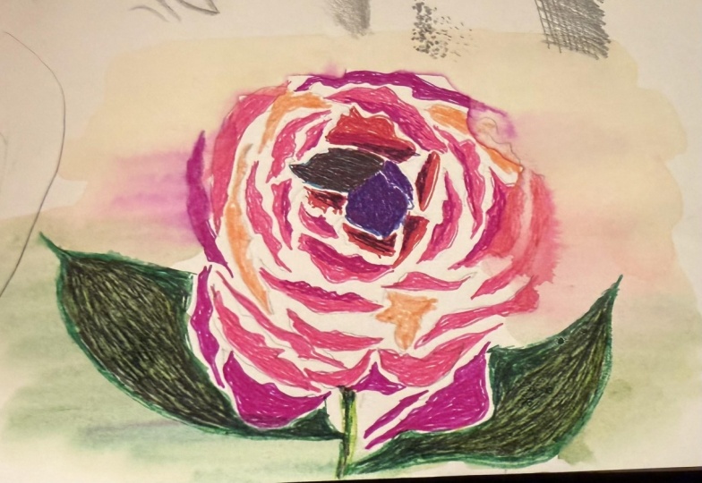
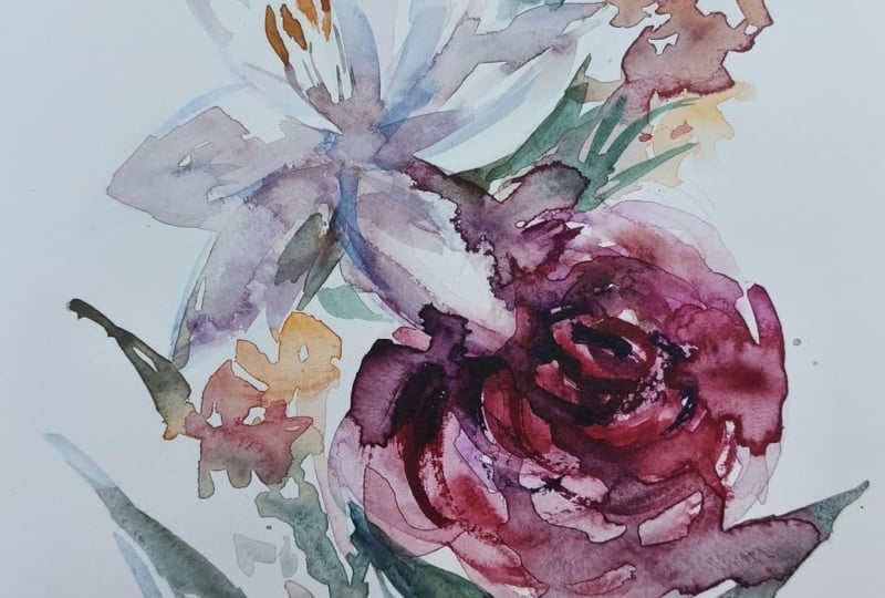
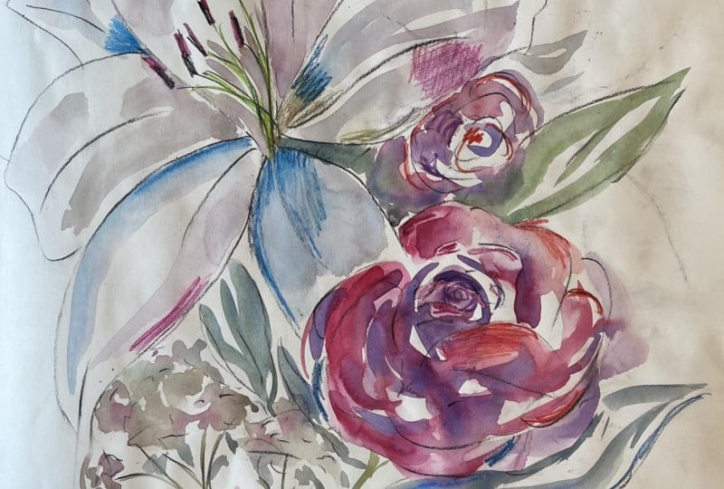
using the other mediums. I've got some examples for you. So I did the brush pen
for one over here. And that was a really
lovely painterly mark. So I had a little play here with the different
marks I could make, and then I penciled in a
structure just like we did here, and then I painted the rest in. And then this one was a really
interesting one because I wanted to see what a single
colour addition would be. So I used the dark purple pencil and I used that as my base, and it was just a
straight colored pencil. So it was a wax base. I could paint over the top
of it. No problem. And then you get a
totally different feeling compared to a black line. The black line or
the gray lead line can feel very illustrative, but I feel like you
start to explore really interesting things when you get into more color play. So there we have it. Next up, we're going to go
and reverse everything, and we're going to paint first
and then do our line work. I know that is mind boggling, and I feel like it can
be a bit intimidating, but I simply can't wait
to share where we go.
5. Loosening Up: Yarrow: No. It felt pretty nice to have some structure
there, didn't it? We're going to flip the
script now, though, and we're going to do the
paint first and then put the pen lines or our
structure in after the fact. And this is going to be really confronting
for some people because we really lean on those lines to make it
feel like the thing, and I think we feel like it's
going to make it better. But I can promise you
you're going to end up with a much looser, more
lively result. This is something
that I employed in my practice for
a really long time. I often would get asked, at what point do I do the pen? Obviously,
you do it first. Sounds like, actually, no, I get a painting that I'm
really happy with first, and then I add the pen line in, and it can be really subtle. This only has one, two, three, four, five, likes. Less than ten little pen marks, and that is still a
mixed media piece, but has a really light
and fresh feeling. Same with this one here,
the little hakeer bud. I've really just used it to create a little
bit of movement, some definition here and there, and that sort of illustrative fun kind of feeling overall. So that's what we're
going to explore now. Our flower of choice
is going to be yarrow because I want to make sure that we cover a
few different bases here. The pony was that big
lush full flower. And a bitty flower,
actually, well, a bitty flower can be it's
not the nicest phrase for it, but, you know, it kind
of is what it is. It can be a really
interesting thing to explore how you
simplify that, how do you make it
a more interesting and curious presentation
on the page. If you'll obviously take some
photos of this f to share. But you say Yarrow
is not your thing, so this is yarrow or achille depending on I don't
even know why, but that seems to be 50 50,
what people call this one. So I call it Yarrow,
and you could also replace that with baby's breath or what else do I have the
Queen anne's lace here. Even a hydraner would
really work for this one, because you want those
little tiny petals all clustered together to
make an interesting. That's the challenge in this one is to have
a little fun there. So I'm going to grab my
paper. And let's get started. My weapon of choice today is going to be the fountain
pen because that's what I used in the past to create those really fresh
free flowing lines. So once again, I'm
just going to explore a little bit this pen before I dive into the painting part. Okay, I've got my pen here. I'm just going to do a
similar kind of thing. I'm going to try and
do really light. I do a little wiggle
because the pen at different directions or
the pencil or whatever can really react quite differently
to the direction you have on the page and then
do a bit of a hard line. And then maybe a hard and soft And then maybe
I'll do some dots. See? I'm trying to make that pen
splurt a little bit, too. This is honestly a really
cheap fountain pen. It's nothing fancy. I do have a really
good one somewhere. I've totally lost it. But I think this one is actually it's really lovely in
my hand and I enjoy. You don't need fancy things. You can just work
with what you've got. What else can I do
here? I want to do some just even little dots
and then some fast line. I often draw quite fast. So I want to make
sure this works in terms of drawing fast. I'm kind of liking
how that's feeling. Then what I could do is
explore a few little lines on, like if I'm looking at
these flowers here, they are almost like a little quintessential flower like
a little kid would draw, but there's hundreds of
them on every branch. How do I distill that
so that I've got that light and fresh feeling and it's not going to
feel overworked? So my go to method would
be, where's my pencil. I'm gonna do a little
bit of pencil work as a structural component as well. These are like little umbrellas. So each little stem is
gonna pull one out here. Like a little umbrella,
a little tree. And that's why I find
them so enchanting. I really love these flowers. So I'm going to try and
draw a little umbrella, and I'm going to structure
that use that as the basis. So I've got these oval again and then comes down
into a funnel like this, and then I might do another
one over here like this. And then it joins in the stems. And then it's just a matter of populating that with a
little bit of information. I don't want to go
overboard, though. I'm not going to
sit here and go, Alright, one, two, three, four, flashes and boring, and you're going to get so bogged down in detail and lose
all the fun in it. So just gonna slide that one back in so it
doesn't wilt on me. I'm going to try and
just do a little bit of penwk to generate that feeling without getting too
concerned with details. I might even do a few that
feel quite like a flower, but then I might skip
over a few details and just get a little
bit sketchy with it. There we go, a few more petals. It's like implying
shapes without getting overly worked about it. Out on the outer edges, I kind of want to
have a bit more form. I'm only going to
really have a few real flowery flowery flowers,
flower leaf flowers. That's hard to say. It's good. I'm big on tongue
twisters today. Alright. And on the lower side, I'm going to have
more information, and on the upper side where
the light would be hitting, I'm gonna do that same kind of theory where it's a
little bit lighter, I put less detail. You can do this with any media. If you don't have
a fountain pen, use your charcoal,
use your pigment pen. Go back to the pencil
if you want to. You're going to get
the same result, but you're just going to
have a different medium. I've chosen a
different one so I can demonstrate the benefits of working with various
different mediums. Now, they're in little grouping, so I want to make sure I
get that feeling as well. And then we're going to
start drawing in some of these little branchlets which they cluster together first, and then they go
into another one, and then they go
down even further. So it's just a matter of
getting that feeling. They almost flop out a
little bit. And then down. And I'm trying not to be
pressing too hard with my pen so that it's not
looking like a fully outlined coloring
book situation. I want to try and get lots
of little details in there, but it's still feeling
arty and sketchy and fun, as opposed to too bogged
down in the details. And next side might
just do those in for prosperity's
sake whilst I'm there. I'm just going to do two little
branchlets of these ones. You get the idea. I mean, you could go to town and
do a whole page of this. Is this something
you really enjoy? I think there's a lot
of therapeutic benefit to just rhythm and pattern
in your mark-making. So you might actually just
really sink into doing these little marks and
really enjoy this process. Getting more detail down there. I love a few little,
token flyaway marks, 'cause it kind of feels like it's bursting with energy then. It looks less static. You might have noticed
that in, like, much of my work has a few
things that are like, that doesn't really make sense, but when you look
at it as a whole, you're like, it gives it
an energy and a vibe. So I'm having a
little practice here, doing my flowers. Do, do, do. Alright, and then
gonna do the little stems I'm kind of enjoying that
scratchy nature when you do the fountain
pen quite fast. And again, yeah, just use the pigment pen or
what have you got on hand? It doesn't matter. Starting to look
a little bit like a broccoli if I'm not too careful. Alright, so there. I've really tried to strip
all the information out. Now my challenge is to generate I now I have
my little practice. I'm going to put the
color down first. So without pencil or
without anything, using this as my
guide, my framework. I'm going to start over here, and I'm going to show you
how loose you can get with the watercolor before
you can add the pen. Okay, just gonna mix some
colors first because we've obviously got a bit of a different color going on here. I did love the rich
purple with the pony, but I think I'm going to focus on this softer pink because I think it's gonna complement it better when we bring
them all together. Sh, I didn't tell you that, but that's what
we're doing later. Um, brush. I'm going to go down
to a one this time, so that is the equivalent of about a size eight round brush. It's a bit complicated with
the old different sizes. To get that lovely peach color, many people get stumped by this, but it's often just
a red diluted heaps or a burnt sienna makes
a really soft peach. Or sometimes I'll just add the tiniest touch of pink if you need it to be a bit
more softy, pinky. I'm going to put a little
more orange in there, and then just heaps of water, more water than you
could possibly think. And then you're going to get this really beautiful soft pink. So this is the kind of
color I'm going for. That's the darkest
version I'm going to use, and then I'm going
to use my brush and the water load to
dilute it, as well. So it's going to point
this one away to me again. That's kind of went the
other way in the end, but oh, I never did the little
leaves in there. I should have done those. Alright, so I'm going to follow this sketch here and
I'm going to start by just simply really lightly
washing in these flowers. And I'm not getting
too detailed again, because by the time you
bring the two together, you actually get a
really cool result. Again, I'm not going to try and just do
the whole thing in one color load because that's going to look
quite strange and flat. I'm going to keep
shifting those colors a little bit so that it doesn't look
too manufactured. I might even steal
a little bit of that purple from the peony. That's why I love having
my palette as an absolute. Well, a lot of people would be like, Can I clean it, please? Can I clean it, please? I love having that because I can
reference past paintings. I can link paintings together because that peony mix there is from when I
painted the peony. But if I wanted these
to sit together, I can put a little bit of
that pink into this one. Doesn't have to be much, and that will automatically link it. It's like creating a DNA inside your paintings if you have
a really messy palette. Really blobby and fun here. That's starting to
look pretty good. I just kind of want to go a bit darker in the corner there. So that's a burnt sienna
with a little bit of pink. To get that really
dirty colour colour, I'm going to use wet on wet in there to create
a little bit of those forms so you
can see that there's the little clusters of
flowers inside each one. I'm going to leave that,
like, so I'm going to focus on the second little cluster of flowers before I move
on to the branches. That'll give that a chance
to dry a little bit, because if I painted the
little stems in next, the green will run everywhere, and it'll be a bit of a mess. So let's go with this one now. This one's a little bit
more in shadow because it's sitting underneath
the other one. So I'm going to go a
little bit darker. I try not to put my
fingers on the page because you get little
white, you know, the oils from your
fingers go on the page, and then oil resists water, which we're wearing
painting with watercolor. And it causes a lot of problems. The amount of times
I've gotten into a painting and then you're
trying to work around, you know, these
resistant little spots because you've put your
fingers all over them. So I really try and train
myself to put my fingers right on the very edges if I have to if it's bouncing around. People often ask me, why don't you tape
your paper down? I find a lot of people demonstrate with
just masking tape, but that doesn't successfully
stretch the paper. All it does is stop the paper from moving around
as you're painting, and often tears the edges. And I so love the decled edge of a piece of
paper, so I don't do that. So I prefer to just sort of
gently hold it, I guess. It's just something
that I've worked with rather than against. I'm going to switch
down to my lilla brush, my little size zero, and
grab some greens here. I'm going to go quite a dirty, sort of sappy olive green. Get a little bit of
that color in there. So again, another
benefit of having a really dirty palette is you can just steal bits
here and there. So that was a little
bit of our musty pink with some other yellow
and greeny colors to make a quite olivi green
cause I think that'll give that nice vintagy
kind of floral look. And then go to put in some
of these little stems. I can go overboard with stems, and I definitely I can't
say this often enough. I think I say in
every online course, don't go too heavy with
your stems like half, if that half the wits of what you think you
want to paint them in at. Otherwise, you'll just
be so devastated when they just look funny and wrong
'cause they're so heavy. So delicate and pretty
this stuff. I love it. Alright, gonna go a little
bit darker for download and then maybe bring them together. I think that's looking nice. Now, what I didn't do here was I forgot the little leaves. So on here, I've
got these beautiful little fern like leaves, which are very quintessential
of the yarrow. So I'm just going to
paint those in as well. With just another bit
more of that green, I think it'll help with holding it together a little bit more. Really just want that more
sort of feathery feeling. A little bit more
color in there. Give more yellow. A
little bit more in there. I just amazing what you can do with just a littlest
touch of pain. It can bring a whole thing
to life. Alright. Yeah. I'm going to just quickly blow dry this so that I
can keep moving for you. That's not an essential
ingredient at all. I would suggest, if anything, go make yourself a cup of tea rather than blow dry
because what tends to happen is you artificially
dry the paper. The paper becomes more brittle and it doesn't perform as nice. I don't think there's much
benefit to blow drying, apart from keeping
you moving faster. If anything, go back and
practice something else, go make cup of tea or walk
around block. Come back. It'll be dry, ready to go again. For this instance, so I'm just going to dry
it so that we can keep painting together.
And we're back. So, you may have missed the importance of
drying off our work, but if you refer back to
testing and swatching, fountain pen does not do
very well in wet paint. So we really need to make
sure that we're doing a secondary layer and painting
on top of not painting, drawing on top of
totally dry paint for that successful,
really crisp look. So this is totally
dry now for us. I can get in with
the fountain pen. I'll just make sure that it's definitely flowing nicely
because, you know, sometimes these things
can dry up on us, especially in a
warm environment, like in here. But it's all good. So I'm basically going to replicate what I've done here on here and try and get the
two like two dimensions, the two levels working
really nicely together, so I don't have to add
too much information. It's more about
getting the gist and the essence of this beautiful
flower on the page. So I'm going to
start off where I kind of did before,
go over here. So really cute little
pedily things. I love them. They're so sweet. Try and
do the stems last again. Be really tempting when we have those clustered dense,
bitty kind of flowers, especially like a hydrangerT do stamped out the same
flour all over. Getting irregular shapes and some variety in there
is so important. Having more play. If you find that your paint is very heavy and you've
gone for, say, the darker yarrow or
something like that, it can really sort of play
with the balance of things. I think it's
important to sort of identify that you'll be
drawing over the top of it, so you don't need
to make the paint as heavy as what you
might think you need to. So one of my pet peeves
with mixed media is just how overworked it can look because it can
be really exciting, testing and trialing
all these things. But then by the time
you have, then you've, bungled up an area, so
you try and fix it, and then you do this
and you do that, you'll end up with
something that looks super dense and
laden with paint. And it's just not
my favorite look. I really love that
vibrant, fresh feeling. A little bit lighter
on the top there, and I'll just build up
a bit more down here. Oh, this is looking cute. Can totally see this is like a wallpaper or
something like that. Little daisy shapes. Make sure
we get some regs in there, little friends, imperfects, lots and lots of
imperfect, little shapes. If you ever find that
your medium of choice, especially if you've got a
pen in your hand starts to, like, glitch out a little bit, or it's just not quite
working properly, don't keep testing
it on your artwork. Go back to your little sketchpad
somewhere and just go, Hang on, are you
working properly? Hello. Uh, no mine stop
drying out just a little bit. So just something
to bear in mind, get it working again before
you take it back here. Otherwise, you're going
to persist and end up, making a little meal of it. So just take your time. We're not rushed. This is a really enjoyable,
pleasurable process. And you've got time. Time is on your side. My hand
is all over the page again. Right. A little bit more. So I'm doing little
circles, petal shapes. My pens starting to go again. Might just give the
tube a little squeeze. This is so naughty. It sort of pumps the
ink down into the nib. There we go. And then definitely don't take
that to your work because it'll be a
bit of ink explosion. There we go. A rash. Now. The last time I did
that, I put the pen down because I was just doing
some trial work with it, and the nib just went
all over the page. So you definitely
don't want to do that. So it takes a little bit of time to build up these little marks, but you get that
really luscious, full feeling with
lots and lots of things without having to cover every single detail on the work. Might just do a few more And then I'm going to very
lightly draw in these stems. So I might even
just do one side. Might be enough to
generate that line work there without having
it fully outlined, because that's what I
want to avoid I want to avoid that heavy
outlined kind of look. Might even do all of them, might even do some
without, you know, some free flowing without the watercolor there, and
then down into there. And then I might just do, say, the underside of the
leaf or something like that or just some light
pen work through there. Just do one little final review. Final fun few marks. Sometimes when we
get towards the end, we can either go
one of two ways. We can go, Oh, just, like, quickly get this done.
That never goes well. So don't do that to yourself.
But if you're like, in the floor and just
having a lovely time, then definitely just go for
those last kind of marks because I think sometimes that's the glue that brings
everything together. Alright. There we go. I think we're pretty much there now. I might even just give a little yarrow kind of makes me want to do seed packets
or something like that. It's a really lovely
little illustration. So that is our exploration
of watercolor first, then our media on top. And we're still talking
singular mediums. So here I just did
the fountain pen. Initially, I did the pencil. You can choose
whichever you like. As I've articulated, my challenge to you as an
extension project would be to then go back to your other
mediums and have a play again with what other mediums
you could generate here. I did these as well.
And I went wild. I did the sepia colored brush pen because that
has a really soft country, very girly, feminine
kind of feel. And then I went the complete opposte
and I did the charcoal. So the charcoal is very, very, like, bold and
energized and fun. I really loved it for the
small marks because you obviously don't have such
a fine nib to work with. So you have to be
more thoughtful about the marks you make and
how they all come together. So I can't wait to see what
you come up with here. I would love you at least try two different mediums
so that you can kind of get a feel for how all the different ones
can work and interact. And you just never know which one you might fall in love with. Honestly, it could the amount of people that fall in love with charcoal just blows my mind. You might have noticed
that I've smudged a bunch here as well. If you fall in love
with charcoal, you don't have to go off
and buy the fancy fixative. Just use hair spray. And that means it won't rub
off everywhere, and it can also you can
store it all pretty safely. Next up, we're going to explore a little thing I call
the Goldilocks Effect, because working out where the sweet spot is the just
right spot when it comes to when and where to utilize all these different things is something that I find most
people struggle with. So we're going to give you a couple of
little things to have a little trial with so you
can find where works for you. It may not be the same
sweet spot for me, but you will find your
little sweet spot, and I can't wait to
see where you take it.
6. The Goldilocks Effect: Okay, I mentioned we're going to investigate this Goldilocks
Effect in this video. But first, I want to
introduce you to our subject, which is this white
oriental lily. And if you've ever attempted
painting a white flower, you'll understand my
absolute fear right now. Painting white
flowers in watercolor is seriously challenging
because we rely on the white of the page to articulate our um whites?
Well, I do, anyway. It's my preference.
So you have to really work your shadows very well and very hard to really get a white flower to
lift off the page. And I thought, What a perfect way to marry now mixed media, which really can help
enhance that shape as opposed to reduce it of just playing with
the leaves here. I'm going to shuffle this
off to the side, though, because I'm going
to run us through a few of these little things, few tips and tricks to get us to the point where we can feel confident about
approaching this. I don't know about you, but
it can be quite intimidating. And I feel like, yes, the pony was maybe tricky, but this guy's a
whole another level. Like, I kind of
put the white lily in a bit of an
advanced category. So I'm really excited to share this with you
because I couldn't think of a better flower
to really delve into colored mixed media
with our watercolor. So I'm gonna slide
this on Opit's side. Hopefully I don't knock
it everywhere. Excuse me. What a ginormous, cumbersome
vase to deal with. There we go. I'm gonna leave you there so I can
see this beautiful thing. Alright. So before we jump too deep into
anything further, I'm going to pull out my trusty testing and swatches chart. I'm going to just quickly
throw in some of my colors. So for this final few videos, I'm going to work
with my carnas No Color two, which
is this set here. Might even go like this so
you can see all the colors. I obviously don't use all however 80 something
colors in one thing. I do have some colors that
I really lean on a lot, and I will provide you a list
of my absolute favorites. I especially love the lighter
colors on dark laid washes. So let's have a little
play with that one first. I'm going to grab the this one's called light cobalt blue,
and I need a pencil. What have I done with my pencil? Hidden it from myself. Alright,
so this is No color, too. When we do mixed so when
we talk about color media, I like to write the media
and the color name 'cause it actually can be quite mystifying when you
come back and go, Oh, I can't remember
exactly that color. I'll pick up that one.
Didn't really work. So, this one's light, cobalt. Blue. Oops, still can't spell. And I'm gonna do direct and
direct with water on top. So let's crab that water. Just light that over there.
Alright. So water on top. As you can see, this liquefies
in a really nice way. You still have a little
mark left behind, but really the pigment activates and it smooths
out just beautifully. This will also occur with
other water soluble media. So if you've got watercolor
pencils or if you've got those beautiful water
soluble oil pastels, do this same exercise. I'm just going to do
a few colors here. But as you saw earlier, I did have all of the colors. I mean, you can do
as many as you like. But this is one that I did where you can really experiment. This is your colored
media of choice, then you go through and
you do your whole palette. So this is only, say 12, but then you'd have to do a few more sheets
for the other one. But I think it's well
worth the exercise because although you're in
the same sort of bracket, you're in this water
soluble crayon bracket. Each pigment actually can perform quite differently
to one another. So say ultramarine blue, has a tendency to granulate
in our watercolor media, but it also can do unusual things when
you mix it into wet. So it's just
something really fun and interesting to
play with as you go. Pop that down away. Alright, got
distracted into water. I need to get some water
on here. Into water. So you get this really
nice syrupy kind of feeling as you're
drawing into the water. Now, I've mucked
up my wash here, but I'll try and find something
similar. There we go. And into the wet, which I sometimes, especially
with this blue, I love it when you do it on dark you get that opaque nature, which you cannot replicate in any other way
with watercolor. But I also really
like similar tone. So that's a cool
blue background wash with a warm blue on top. And it can just create, like, a different kind of sort of magic, and I
really enjoy that. Let's just do another
couple of colors, do a couple of my favorites. Now, this one is the What is it called?
I've got it up here. It's called Sky blue, but I honestly
think of it more of a cornflower blue or
a periwinkle blue. So sky blue. And we'll do this. This is, like, my
favorite all rounder when in doubt, use this color. I don't know why it's this one, but it just seems to work in so many instances and
tie things together. If you take a look
through some of my work, you'll see this color
everywhere, like in everything. Alright, see how that
one activates up. Nice. It's not often that I paint
into these after the fact, but I do really enjoy the fact that you can,
if that makes sense. I do like drawing
into wet, though, that gets you get some really interesting
effects when you can do that. And that's a really fun
thing to play with. Like so. I like sew. So, again, it turns out
really nice on the dark wash, which is always
something I'm sort of intrigued to explore. Now, this is another
favorite here. This is Sahara yellow. I think I lean towards because they're so
beautiful and opaque, I lean towards the
the lighter colors because you can get
that freshness back in without necessarily
throwing white in, you know, like it can bring in a little pop of
color cause it's this really saturated,
rich color. And it plays off the
watercolor so beautifully. Mix that up. And then we're
gonna rinse this off. And each brand, it doesn't
matter what you use. If you have the
ink tense pencils, that is so hard to say. The Derwent ink tense pencils or any other brand of
watercolor pencils, still do this exercise because
you're going to see just how different a lot
of these pigments can perform as you're working. Alright, we'll just do this one. I'm going to do one
last color after here, where I'll do see, that one I sort of takes a minute to peek through,
and then it's like, Tara. I'm here. Alright. Where's my other little
favorite dark chocolatey brown? This one. I've forgotten
the color of this one. And once you get into them, they can be really tricky to remember because you peel the papers off, and
then you got it. So this is why I did this
chart here, to be honest, because I end up with all
these little tiny nubs, and I have no idea of the names, but you can reorder
the singular units, which is super helpful. It's just burnt sienna. Probably should have known that. Alright. And just as a dark
color, as a reference. Ooh, do the same thing again
here. Rinse that one off. Alright. And then into water, you can see that the blues have dispersed a lot more,
but the yellow hasn't. So it's really interesting and important part
of the process, I think, is understanding how they perform in
different conditions. Mm hm, do this, last
one. There we go. You might just really enjoy
this process, as well, and you can do it
with any combination of media and just enjoy it. Like, you could do a
color pencil trial and you can do a
watercolor pencil trial, and then you can do oil pastel would
totally work as well. It's just a really good thing
and it's really good for cataloguing how things
will work in practice. So there we go. We've
got a little bit of a feel of our media
happening on the page now. I can sort of see
where I really like. So, I mean, I just always love this sky blue,
cornflower blue. I really, really like this really light blue
on top of the dark wash, and I can kind of see how that
might come into play here. And then the yellow is
a lovely warm yellow, and it might bring
a little bit of extra warmth into this, as well. And then the brown could be the perfect fit for
these stamen here. So I've started
to play and think about some of the colors
that I might be using. Right. Next part of the process
is having a little go at drawing this beautiful lily before we get into the
Goldilocks Effect, because the Goldilocks one, we're going to have to
do the same drawing a few times so that we can
kind of get a feel for where we fall in terms of our tastes for
mixing our medias. So from here, just gonna
do a bit of drawing. Grab my piece of paper. I might even need two. Alright. I'm going to do
pencil knowing that eventually I'm going to be
doing colored media on top. So I'm not going to do any
mark make or anything. I'm just going to get
to the bones of how to structurally get
this on the page. So basically, we've got
a circular shape here, and the petals meet to the
edge of the circular shape. So I'm just going to draw
a really light big circle. I want to go quite big
because these are big, glorious queen bee flowers
that we really want to make the enormous centerpiece
of our sort of work here. I'm going to do it
direct on straightaway, and then we'll do a
little bit more of an angle so we can see
how we shift that angle. So direct on. I'm going to draw just some
very basic shapes for petals. And they come off in
threes like this on top. And then on the bottom layer
is another three petals. So we've got the very, very basics of a flower
shape happening there. The next thing I want you
to do is very lightly sketch in the vein down the center of each
one of those petals. Like that. And then we've got the stamen, which we can kind of
just throw in for now because they all
go to the center. And then there's
the little senago. There we go. So now go
to try and sketch in these petals with a little bit more
vitality and excitement. So I'm just going
to do that light lightw light and dark line, starting with the
topmost petals. I've got a little
bit of a crinkle and a curl happening on the
edges of the petal, so I'm just going to roll
with that a little bit. And then we're gonna
do this lower level, which we'll do sort of darker because it's sitting down low. And then we can just do a
little bit more of a firm line for this center vein. And there we have a
very simplistic Wi. I bet you didn't know
you could draw that, but I promise you, it is like when you break things down into much simpler shapes, it can get you a
long, long way ahead. The next trial I want you to do is we're going to put
it on a bit of an angle. So it's the same principle, but we're just conforming, changing the shape a little bit. So I'm going to actually change the shape so that the
lily points outwards. So it's going to point this way. And I've got more
of an oval shape because the opening is
gonna shut a little bit, and we're not going to probably seeing any stem or leaf still because it's hiding. But then the bottom of the base where the
petals start is going to sit back
lower, as well. And the same kind of
thing, I'm going to put my three top petals in I'm going to move that
paper towel because I keep carrying it around
with me, like this. And then like this
for the back row. And look, we've got one pointing in a
whole new direction. I'm going to try and draw
this one with a little bit more uh specifics as well. So I'm going to really
try to get into those more crinkly shapes and stuff because it will help me articulate it with color because I really start to look at where the shadows fall when I'm sketching, especially
when I'm drawing. It's one of the key
things to help you translate this flower
onto the paper. If you go straight in and just go with the
colors straight away, you might end up with, like, quite a disproportionate
looking thing. If you want to get
it a little bit accurate to what you're
seeing in real life, a drawing in between
steps one and two will actually
help you so much. So I'm just going to
have a look here, get these we got these
beautiful crinkles right on the edge and it's
got a bluntish kind of petal and more wrinkles here. And we'll do this other
one up here again. It's quite broad
petal, this one. But then it curls
over at the end. So we don't see the whole thing. And then this one is
quite the challenge because we want to make sure that we're getting it
accurate to what I'm seeing. So it's going to have
to have a bit of a curl that way. Like so. And then this one it is a bit shorter because that's going to help create the
sense of form there. This one, again, is going to
curl outwards a little bit. And this one gonna curl Alva. It might even curl
completely over. And then we're going to do
those central veins again, just lightly sketch
them in. Like so. And then I'm going
to do it a little bit more formally
because they actually have quite strong central veins. It's almost like a double. And The central vein to the flower is one of the
key defining things for helping you understand the way that the petal is
flowing in space. If you just do dead straight, it's going to look totally flat. You really need to think
about the way that it's moving along the
edge of the petal, so it might be a bit
more of a curve, and that's going to give
it that undulating shape. And now for the stamen again. So this time around,
this will quite central. I'm going to point them in
the direction because they generally shoot with
the access point, so I'm going to
put them up here. I love these for being that little bit random
eccentric part of a lily. And go right down to
the central point. So as you can see,
our first sketch, it feels like a lily, but it's probably a bit straight
on and a bit flat. And then the minute you give it a little bit of angle and
a little bit more thought, you have something
that has a lot more energy and vitality. So I think I'm
going to roll with this one as we go along, and I'm going to take this
into our Goldilocks Effect. Might need to throw a
little few leaves in there. Actually, now I'm
thinking about it. So knowing that that's
the access point, that's the base, I'm going
to do a stem out here, and I might just throw a
couple of leaves in so that I've got something else
to add into the mix here. I might even do a bud
so that we've got, like, more than just a
flower sitting on a page. I think it's always nice to
think about it in context. And then you got more
opportunities to work out what to do with your mixed
media. So there we go. Small amendment,
but we're going to do some leaves in there as well, cause I think it just
gives it a bit more life. Have a bit more creativity. The leaves themselves are
really long and strappy, so they can be a
really designed, interesting compositional
element too there. But for the moment,
I've just sort of thrown them in as I see them. We'll talk about composition
in the next video. From here, we do the
Goldilocks Effect. So we are going to do three thumbnails
across the top here. One, two. Oh, they're definitely
not the same size. You're welcome to rule these. I'm not one for a ruler. But if you're someone
that much prefers a little bit of
neatness to your page, you're welcome to rule them. In our first thumbnail here, we're going to do
watercolor only. In our third box, we're going to have pastel only or color pencil or
whatever medium you are. I'm not judgmental
here. Just work with what you've
got pastel only. And then in the middle, we're going to find the
blend of just right. So I'm going to very loosely pencil in a very rough sketch because
this is thumbnail, right? We're not putting a
lot of energy here. It's more about exploring and
experimenting and finding that sweet balance of
how much watercolor to add and how much
pastel to add. Because I think it can be
overwhelming when you've got this many pastels to
work with and all the colors in the rainbow
and your palette here and what to bring in where, at what point and
when it is really, really tricky to work
your head around. It also can be the
fun part, as well, which is what this exercise
is for is learning and feeling it out before you get to a final work and
just dive in and go, Oh, I've just completely
overcooked for this. How can I fix it? We do
the prework first here. Let's take out all the overwhelm and just make this
inspirational. Alright. So we'll just very lightly sketch
in my lily here. What have I done here?
I've missed a petal there. And then we'll do the leaf, another leaf and the
budge, and the stamens. Do myself a favor and maybe do the little
sketch this time. Do circle right
center of circle. Like so and then
we'll do the branch, do leaf and Alright, so that's just a
little framework, so I don't fuss around too
much and get all anxious about trying to get the
proportions right or whatever. This is very much about
feeling it out in color. We do a lot of prepwork
in this instance. I think the temptation to just dive in and go for
it can be really extreme. But putting in this
prepwork really, really helps with that
overwhelming feeling of, like, what and when and how. So for watercolor, I'm going to try and
throw in some colors, get a feeling for
how I might like these shadows and
this representation of the lily to show up. I might even paint a
background in just for fun. I'm just going to really
lightly wash in some colors. I love a blue for a shadow
rather than just gray. I think gray can
look really flat, but a blue can really
lift and give something a very natural
feeling in the work. I've moved my paper towel now. I've done myself a
disservice. There we go. Alright. Might even work
with the smallest brush, 'cause I've got this teeny,
tiny thumb now, right? Like I don't need
this flopping brush, and then just do a
little bit of colour. I'm not trying to be too
analytical with the color, but it's just a very
little thumbnail to explore what we're
working with here. Might even do a little
bit of brown All right. And then do this branch. Kind of want it a bit darker. There we go. And we'll
pop in this here. So one of the huge advantages of white flowers is that
you can get really playful with how you integrate
them in negative space. So using the leaf or
anything behind them to also help articulate
it on the page. And then I'm going
to go a bit lighter for a branch up there. I think I'll
definitely do a bud. Yet. And I think I'll definitely do a little
background here as well, because of that white flower, when you throw in a background, you can help define it in a
whole other way, as well. So I might even do, like, a dark really dark
navy blue indigo kind of color for a background
might be nice. It'll give it this
lush rich feeling. So really trying to throw it together and not being too pedantic. It's about exploring. And if you don't get your background color
right the first time, don't worry about it.
Just try it again. You got plenty of room.
Do some more thumbnails. I know snails can I don't know. I feel like people poo poo
somenils, but honestly, they are the best little tool
for working out new things. Things that you might go,
Oh, it's gonna take me ages. If you're thinking that, then it's time to do a
little thumbnail, just to make sure
it's definitely go to work before you ruin
your beautiful work? Because you might have
done all the effort of painting in the lily, and then you muck up the background by
picking the wrong color. I mean, I've been a culprit
of that so many times. Cause I, Oh, no, color.
This will be fine. Didn't go to plan.
Alright. So very closely. Just put that in there. So you can see how
that lily form is really starting to sing
with that dark ground. I think that's really going
to work. I like that a lot. It's still got a nice
softness to it, though, without being overly saturated.
Alright, so there we go. You might just do the get a little burnt sienna
umber for the stamen, just so that they're
in there. Cool. Alright, that's my little
all watercolor thumb now. Now I've got to go to the
other end and do all pastel. So as tempting as it
is to do white pastel, I think I'm going to
try and reserve No. I'm trying to
reserve the whites, and I won't use any pastel
in the white areas at all, but I'll use a number
of other colors to articulate this one. For me, the beauty
of mixed media, I think, so it doesn't matter
how many crayons you have. You might have a
set of 24, right? But you only have those
ones to work with. It's not like watercolor, where you can mix any color or any, I can mix any color I want here, but I'm limited to
what I've got here. So it adds a whole new dimension of problem solving in the mix. I find it a really
interesting challenge. So I don't have the colors I
would mix here to put here, but I have to find alternatives and troubleshoot
my way out of it. So I'm going to reach for
some of my favorites. As I mentioned,
really light blue. I've got a silvery gray, my sky blue, cornflower
blue or whatever. There's a sort of warm brown, and I love this cobalt
blue that I've got here. So I've got a little
bluey palette. I might pick a nice teal
as well for the leaf. And the bud might be the green. Yep. Alright See how we go. And if that's not
bright or colorful enough, I might have another go. Alright. Actually, we'll do
the stamen on that, too. And then the do them, 'cause I would struggle
to put them in on top. And then I'm going to use the
power of these little hand drawn marks to help make
the shape happen as opposed to the fluidity
of the watercolor. And I'm going to need
to use bolder colors to inform that form as
opposed to darker shadows. Like, I could do I could add in, like, really deep colors. But then I think that sort
of sucks the life out of it. You can have so much more fun and learn so much more about color when you get more playful in what you think is
just a plain colored thing. Like, it's a white lily, yeah, but I've got like how I got eight colors in my hand to help try and make
it come to life. I love a hand drawn mark. I think that's what always
keeps bringing me back. And it's probably why I haven't
done too much in, like, mixing watercolor and gouache or watercolor and acrylic
ink or anything like that, because I just love
the combination of a hand drawn mark
with watercolor. I think they just
marry so beautifully. Whoops jumping out of my
hand like grasshoppers. Alright. Maybe just do
a little bit like that. Look, I could sit
here all day and keep fussing around with
it, but let's keep moving. I'll just do that stem,
do that one up there. I'll color in these guys
with that dark green, add in some of that
blue to help that one, and then we'll do that
green for the and the bud. It's a nice way of practicing
your drawing marks, as well, I think, in
just small format. You never know
what might happen. Like, you might do
something like, I'm not really sure about this. Let's just see what happens. And I think that's the
right frame of mind to be in because this is
not final work. This is why we're
doing the thumbnails. I think it's a really, really important
thing to just sort of dabble around and give
yourself time to explore. I'm just going to rip the little bit of paper
off this little guy. I end up with all
these teeny tiny nubs because I love these
crayons so much. I call them crayons, because they feel like
crayons in my hand, like I'm a little kid again. But they are
technically pastols. I think crayons probably are
technically pastels, too. All right. I was gonna throw
in a bit of a background. So we got a bit of an idea, like a comparison point for
the watercolor versus pastel. And while I'm doing this, I'm thinking, you know what? I think I really
like the watercolor background more than anything. I think this drawn background
is going to look too messy, and it's gonna be really hard
to use in an effective way. It's a bit harder to control. I don't feel like it's gonna look quite flat
and dimensionless, but maybe there's a way I
can use it at some point. Alright. I'm gonna have really blue fingers
after this. Alright. And back down around again. I mean, there's 1 million
ways that you can bring this to life
on the page as well. Like, if you wanted to show it in a bit more
realistic context, you could get right into doing a lot of leaves and stuff around. For the sake of time today, I'm just going to focus
on a single flower. But of course, if
that's something you're really enjoying and
you're so loving the lily, then start building out more,
have a little experiment. Look at my hands with how
else it might come together. Okay, so from here, I'm going to pick my
favorite bits out of this and my favorite
bits out of this, what felt good, what looks good, what gets me excited. And I'm gonna put them
together in the middle. This is going to be slightly
different for everyone. So you might be leaning. You might just be loving how that pastel looks and how textural and
interesting it feels. Otherwise, you might be like, Oh, I'm more pro watercolor, but I love how that
expressive mark really helps bring it
to life in another way. So, we got to do our little pencil sketch just for a little
favor to ourselves. Do it again. Otherwise,
we cause problems. Gets a little more wild and
loose every time I do this. Right. I mean, it's a
very simple composition, ultimately, but I'm really happy with how it's looking so far. Alright, I'm going to start with that light blue again because
I love that light blue. What the trickiest part here is, do you dive in with
watercolor first, or do you start with pastel, or do you work with
them alternating, or do you do all the pastel first and then do
the watercolor or all the watercolor first,
then do the pastel? That's completely up to you. You'll watch me do
it and you'll go, that just makes no sense because everyone's brain
works differently. So I have a I really enjoy
sort of intermingling them, and I am so familiar with how this media works
that you'll see me like put a mark down
and then quickly work in with a bit of
watercolor and then work into that again, as well. So it's very much more of
a practice hand thing. I think the more
that you experiment with this kind of thing,
I mean, ultimately, you can go and do the pony and the yarrow with this
same technique, and you'll discover all
kinds of different ways to utilize these media together. So I'm going to
try and do this in a little fumnail version first, so we can sort of find what
I find as a sweet spot. Whereas some of you
might be going, I love that colored background.
I'm leaning more this way. So I'm going to try
and do a fair bit of pastel in the flower
because that'll lift it forward and I'll have a mostly solid
watercolor background. Okay. And it's so funny 'cause
it's like, what's that? Like, eight by 10
centimeters oring. It's tiny little artwork and there's so much
to think about. And if you don't get it
right the first time, just give yourself
some grace and a little do another
one. See how you go. Go to use those same
colors again 'cause I really liked how that
blue came into the mix. And there and up
there for the semens. Doing my concentration tongue. You'll see me do that a couple of times in the rest
of this course, I'd say, sticks out whilst
I'm trying to think. Now, I've got a few marks down. That's a good place
to start. I'm then gonna get 'cause this is so much softer and it has
so much more control over what color is on my brush, I'm going to now brush
in a little bit of color to help that
mixing happen. And these upper petals, I'm going to do really
light and washy. And the back ones will
be a little bit less. So I need to get back in
there with my crayon. Make sure it's all harmonious. You really got to have
your play cap on just let your inner child run wild
here and see what happens. But that's already feeling a
little more balanced and a little more fresh to my eye
than what I see elsewhere. I'm then gonna do a little
bit of a Sten down. I feel like I can be
a little bit lighter handed when I have it all
mixed together as well, which might feel a
bit strange to some, but I really do like that sort of lighter touch when it
comes to mixed media. Keeps it all fresh and happy. Now, I might do that one there, and then maybe
I'll go to a green here and do a bit of an
outline for that one. And then maybe I'll do
fully outlined here. It might look cool even
to not have anything filling that and just working with the outlines might be nice. And that's the budge. Might need a little
bit of something. Like so, and then I'm
going to get that lovely, deep indigo kind of color, which would have been a
pains gray and palo mix. I just picked it off
my palette so I don't even know. I'll do. And we'll throw that in again. What do it do? I'm trying not to be
too pedantic here. I want to save my energy. Like, there's I
don't want to see, like, three immaculate, perfectly sketched
out thumbnails. You've missed the point
if you've done that. I think it's more about
really feeling things out, and you'll get an
immediate gut reaction about what's working
and what's not working. There'll be things that you just automatically gravitate
towards and go, Oh, I just love how that feels. But look how much
that white flower pops when we put
a background in. I love that effect so much. Really utilizing I think one of the best things
about watercolor, and I keep gravitating
towards it is that it works so beautifully
with negative space, and it's like a visual puzzle. Alright, rinse that off. And there is our first array. And you might be wondering
what this real estate down here is for because
we're going to do another three because we've got one more Goldilocks
Effect to explore out, which, let me just sketch
out my boxes here. This one's a really
interesting one. This one I get confronted
with in classes all the time. I find that some students
that are really light touch, really hesitant to
use much pigment, really hesitant to get in there and really get
some grunt on the page. And then there's the
heavy handed crew. I tend to err on the
heavy handed side, and it's always me
trying to pull back on the reins as opposed
to add more. So, of course, we got to find the sweet
spot, the just right. When I talk about light touch, I'm talking like extreme
lack of form and contrast. I think that's what
tends to happen is that everything
is too gentle. It can be really easy because you're working
with these washy, soft, lovely colors,
but it ends up flat. Especially when in mixed media, we kind of want that
pizzazz and energy. It's nice to sort of
really delve into that. So I'm just going to do
our little sketches again. I might do myself a favor and
just do all three at once. You'll be pro at sketching
lies by the end of this, and you won't even think
it's a tricky flower. It's gonna roll with that same composition again
because we'll just explore a different idea
across the same layout. And I'm not even
confident I would roll with this in
the final painting, but it is it's just a simple, very simple way of looking
at the lily. Tongue twister. I'm going to put that
one up there just so I've got that for
reference by myself, too. Let's start with
the light touch. I think this is what I
come across the most. It's actually it's actually
probably pretty close. Light touch, very gentle. They might just go with
all very soft colors. What tends to happen? Let's find some nice light colors is we'll end up with a very
colored in flat look. So I'll end up with, like, we'll just go like this,
and we'll just paint the whole thing in 'cause
that's gonna be safer. And there's no risk to be taken. So I'm just gonna
go like the hah. The other thing that can cause a really light
touch or, like, a weaker representation of paint on the page is really
poor quality paints. If you're working with your kids paints that are, you know, sitting in a flat
plastic set and they are really bright
in the palette, that usually indicates
to me there's a lot of chalk and
filler in there, and you're not getting much
representation on the page. It's worth having a look at those Mika door set
because they are the most cost effective set
for vibrancy and color. The cheaper sets just
have less pigment. When you pay more, you're literally just
paying for pigment. That's the most
expensive part of paint. Oh, I've got to do
a little bit of mixed media here, but
I might go really, like, conservative with
it, and I'll go like, around the outside edges. And then I might do, like, a really light
colored vein here. I'm exaggerating this in a
big way, just so you know, but it's just some things that I really noticed in a
lot of my classes. And I'm just gonna
color that in pretty flat 'cause I don't know
what else to do with that. And then I'll go here and then
just do this one up here. And then I'll probably, like, what am I gonna do? Grab this Gregan. Oh, no, I need to put the veins in. This one. It'll be very, very soft, very gentle. And let's go with that one. I mean, it's not the worst
thing in the world, right? It's not the end of the
world if you're painting really lightly and you've
got to go gently with it. I just want to push
you to try and add a little more punch and
flavor to it and see what happens because you might
just trip yourself into, like, the next level of
experimentation and play and really allow yourself to
delve a little deeper. In this one over here,
I've got heavy handed. This is where I tend to fall. If I'm having a bad day, I will gild the lily.
Not even kidding. That is the perfect pun for me when it comes to
working heavy handed. So what tends to happen is I'll go in with
the shadows first, and I'll just go way too hard. And it'll be way too dark. Maybe even this dark blue, and I'll go, Alright, well,
I'm just drawing it in now. I'll just keep
going causes know, it's game over pretty much, and it's looking like a navy
flower, not a white flower. And I'm going to fill
that whole one in. And then I'm going to go
purple because I'm crazy. He chi chi. But I still want to try and
generate that Lily look, so maybe I'll add in some of that blue. Oh, I actually
really like that. Maybe I'll do the
whole thing blue here. I think it's when you're
doing decisions on the fly that you end up really heavy handed
'cause you're like, loving what's happening
in the moment, but then you're not pulling
yourself out to go, Oh, actually, that's
not really working. And then I've forgotten to put these semen in, so
let's do that again. And we'll go like bright orange or something
'cause we love color. And then let's keep going. Let's see how hard I can push heavy handed and make
it look diabolical. I think the other thing that
can happen is you're like, I've just opened up
a whole new world literally with my mixed media, and I'm so excited
about how this is all looking that I want to do
everything all at once. That's not the best
time for this. Let's save that and keep doing more thumbnails to keep
exploring and playing as you go. Alright, I'm gonna do half here. I'm going to do something
else over here. We tend to get really excited with color as well, we're like, look at all these
amazing colors at my fingertips. I'm
going to use them. Oh. Go over here, and then I'm going to color
in this guy or actually, let's go with this mega green. This green is, like, insane. It's like a love hate
that I have for it. Like in the right
time and place, that is the best green on Earth. But in a soft white lily, it's probably going to be
a little bit dominant. Alright, let's do a bit of
a green line over there, and then we got to
throw in a background, and I'm just gonna go
to town with purple. Actually, we're
probably gonna do slightly different
colours everywhere, 'cause that's more
like what I see. Just a bit, everything. I mean, there's a time
and a place for this, and if you can nail
this combination, I think it can look really cool, but it's more a matter of, like, learning your restraint
and knowing when to pull back and going,
You know what? I think I've done my dasher. Like, I don't need
to put anymore on.
7. Coloured Mixed Media: Lily: I may have given the premise of this video away in the past one. We are going to take our
little sketches here and formalize them into
a finished artwork. I couldn't be more excited. It's going to be a little more to it than
when we were doing our peony and yarrow
because we're going to think a little bit about
our backgrounds, as well. I think it's just a nice
way to introduce it, especially when we've got
all these beautiful colors to play with and we
want to explore. So just doing myself a favor. I'm not going to fill this
whole piece of paper. I think that's actually
going to look nice as, like, a smaller sort of insert
with a rough edge. That's kind of what
I'm feeling right now. So I'm going to very
lightly pencil in this lily that we've been
sketching so fondly. I'm gonna basically aim
for something like this. And then, but without the
pencil 'cause I'm gonna use the met the crayons
to do the rest, I'm just gonna very carefully
put in these petals. Yeah, that's gonna look good. And a dam in, and then
we'll do the jute. I might just Do I want
a pencil in the leaf? Noa, I want pencil in the leaf. Okay, that's me
with pencil down. So, same kind of thing. It's gonna be sort of
feeling it out as we go. We have had some time
to experiment here, so I kind of know that
I want to pick up that light blue crayon and start there because that's where
I've started previously. The only consideration I've got that's soil is shaking
me up a little bit is I really want to get
those stamen in nice and early so that I don't accidentally paint put crayon where I can't then draw
them in after the fact. So I'm just going to do
them really quickly. I love those drawing marks for the stamen
it's just so fun. And then I'm going to do I
might even do that very last, the brown bits because they may bleed into the water
if I do it now. I'm going to have
a little glance at my beautiful flower here to play with and start drawing. So it's very much a
sort of intuitive. It's hard. It's an
intuitive process for me. I've practiced this a lot. You may not want to start
there, if that makes sense. You start what feels what
feels the right place for you. And if you're really stuck, I would follow my
guidance there. And that way, you'll have
somewhere to go from. But honestly, so long as you're getting that
beautiful lily form down, I think you can't
really go too wrong. So it's basing it all on
that work we've just done. And sort of leaning into those curiosities and
those chances to play, like, Oh, maybe if I just add in a little bit
of crayon there, I can get that feel like that match that
petal to that petal, I guess is what I'm
trying to do there, and then a little bit more. I love the roughness of it, and that's something
that I'm always trying to generate with it. And I need to get a little
bit darker at the end there. Where's that Biji kind of
color? Get that vein in. And then I kind of want to
do that again elsewhere, so it's not a solo traveler. Alright. Get a little
bit more paint. So you can see I'm really
intermingling the two. It doesn't necessarily
make sense to do that if you have just
straight colored pencils. If you've got a water
soluble medium, they do generally like
to talk to one another, so it can be a really
fun thing to sort of experiment with the way that
you bring them together. If I was just using
colored pencil, I would be doing all
the watercolor first, waiting for it to
dry, and then adding the colored pencil
after the fact. Let's soil. Let's see. Gonna go. Trying to get some of those veins in there so it feels nice
and fresh and free. Okay. And get that blue back. Oops. I like to sort of twist them and maneuver them in
interesting ways as well, then you'll get sort
of more organic marks. I really need that
cobalt. There it is. Go bright. Do a little bit more there. A
little bit more there. Having a darker center always helps the
form of the flour. It can be really easy to not worry about getting it
too dark in the center, but then you end up with
something that looks quite flat. I'm just sort of having a play, filling in little
bits here and there, might even get my favorite favorite blue into the mix now, trying not to be heavy handed because I know
that about myself. I know that I tend to want to add in and add in and
add in and add in. So just bear that in mind. Okay. I might put those in
the orange blue of these stamens are
the opposite color. They play off like a
contrast to the blue, so that's why I like
the blue, as well. But I'm just worried that they might bleed
into one another. So I'm just being a bit cautious about how
I go about that. And then might just do
a couple more strokes of watercolor in there. Get that flowing. Alright. Now I'm going to do my leaf, which I have not placed in
pen or pencil or whatever. I'm just going to try
and dive in and do it. It was my really trying
to come around to green. I've always, you know, not been the biggest
fan of green, but I'm really trying hard
to come around to green. Go to utilize that dark ground to really emphasize
that white shape. I think that's why I was
so desperate to share a white flower with everyone, 'cause you have so much more
opportunity to play and leverage with the media. And then this gonna go up here. I don't want it to
be one big flat green leaf doing nothing, so I want to make
sure I've got some of those strappy feelings going on there and maybe a bit of blue to really enhance that bottom bit there and bring it down into a stem where the
stem would kind of go. Bring that make it a
little bit lighter. Yeah, the stem's quite
a bit lighter than the other The leaves are quite luscious and dark
and the stem's quite lush. Alright. Now, what did I do? I did watercolor
for this next leaf. Gonna try and leave it a
bit rough and ready on the edges because I
think that can have a really nice framing effect. And then this stem over here is going
to go up to the bud. I might just try and extend
it a little bit further, so it's clear of the clear
of the lily a bit more. That was the only thing
that was bugging me with my other composition was that it was sort of competing a little bit too much
with the flower. And let's go like this
and do a bit of green. I think it's like this
childlike quality to it, where you can just sort of get in there and get so absorbed and not worry about
anything that can be a really fun playful to it. Like, I wasn't gonna
pick up that mint green, but something about it just
screamed out to me just then. I'm like, Sure, let's give it a go. I
think it could work. Let's do it. Make sure it goes in a couple
of other places. And then I think I need to have a little ochre or something
to balance that out, so it doesn't look too nuts. Yeah. All right. Now, time to have a little
play with that background. So I think what I want to do
is just go straight in with the crayon because I'm kind
of building this frame at the same time and just
see what happens. And then, you know, if
it doesn't work out, it doesn't work out, we can probably just delete
this video, yeah. Alright. I'm gonna draw
in my little side frame. And this is my little shape
that I'm going to color in. I go quite hard with
it, if you go lighter, you just end up with a
really textured look. I like the look where you can kind of see that
it is definitely hand drawn and it's definitely very
different to watercolor, but most of the background
is disguised with pigment. Alright. And then what did I do? I'm very much using my last
little map as guideline here. Then we did the blue. Oh, I do that all the time. Always shocks me, no
matter what I do. That's why I have jar, just of all the
little nubs of my um, pastels now, don't forget
these little holes in here. I think the not so secret
secret is the less perfect, it actually is, the better. I don't want every little space to be perfectly
filled with color. I think allowing a little
bit of white come through, allowing a little
bit of that handfel come through is
really important. So don't sit here and
go and try and make it so perfect that no
one can tell that it's, you know, made by hand or
whatever or no one can tell where things went
wrong or anything. That's what makes you
human. That's what makes the artwork interesting. It's one of my
mentors once said, Don't shut all the doors. If you make a work too perfect, you've shut all the doors. You can't let anyone
in to enjoy it. So don't shut all the doors. Make sure that there's a
little few imperfections that make the work intriguing
and really exciting. It's actually a really
positive quality in the work. Alright, going to go like this. Alright. I'm probably pulling
some really odd faces. I'm grinding these
pastels into the paper. I did not think about that
when I decided to do this one. Okay. I see so many
of my students in, like, live workshops bending
themselves into pretzels, trying to get around into
the nooks and cranis. Just turn your paper around.
Do yourself a massive favor. This one. Alright.
Don't want to go. I want this sort
of balanced space. The outcomes for this
are sort of infinite. I really am so excited to see
how everyone's turns out. I just have this
picture in my mind, and I don't know if
it's the same for you, but that's what I'm kind of
leaning on here is that, like, lilies sit in
these really lush, beautiful tropical gardens, and that's where I want
this one to belong to. So that's what I'm
kind of leaning on. Is that the same blue?
That's not the same blue? Alright. Alright. There's
my little corner there. Now I got to fill this central space so I know what's going on. Uh, might even do another
leafy kind of shape. It's more just
implied shapes, yeah. Like not everything's gonna
look exactly like a leaf, but there'll be curvatures
and things that sort of go, I look like I'm from
the leaf family. Too. Get right up in there. Alright, now I might go back to watercolor just to fill in
those little holes down there. Got a bit more
bluey. There we go. Right into that tear family. Now that that paint is dry, it shouldn't all run
into one another. The further you hold
your brush back, the less control you have. So if you find just
someone that is, like, really particular about control and wanting everything
to be perfect, I really highly recommend trying holding your
brush way further back. Like, you can hold it
all the way back here. There's no rules. It's just art. It's not there's no particular. No one's gonna come
strap you over the knuckles when you're
holding your brush wrong. Okay, so I feel like I
need one more tear one. Based on my sketch, I just need a little bit more
contrast up here, one more leafy shape. I'm trying to verbalize
my internal monologue. So some of it may or may
not make sense to you. But it's just sort of things,
considerations, thoughts, ideas that happen along the
way for me as I'm painting. And you might come
across similar, or you may not, or this
might help or it may not. You can also turn
off the sound if it's just annoying you
and you can just watch. Alright, that's probably enough. That's going to stick
up out of there. And then I'm going to go and go back into this one
and paint in here. So now it's like a bit
of a puzzle piece here. I'm trying to find
all the colors and all the nice
things that'll help lift this work and make it
feel super lush and jungly. Like the vision in my mind. I think half the
time I'm working with the reference in front
of me and half the time I'm working with my impression of that flower and how
it lives in my mind. I think it's just a nice way to put more personal
imprint in the work. And now get this one. I need to do one
more here somewhere. Maybe here. It might have
been a wrong call. Let's go. Here. I don't really want it
right in the center too I will look weird. And I'm gonna go sort of
lighter for the rest, I think, so that it feels like it's
working its way up to the sky. Stick that little bit out 'cause I think that actually,
you know what? That's giving me an idea. There it is. This one's
gonna stick out a bit more. I love it when things
pop out of the frame. And then bring that back down. Small interlude, idea on the
fly. Keep bringing that up. Really, really not striving
for perfection here, really having a lot
of fun with mixing up some colors and painting
beautiful flowers. Alright. Bring that
one down there. And we're just about there. I am painting at warp
speed right now, as well. There is no pressure for you. That's one of those
times that the paint really interestingly activates. I kind of like that.
I'll make it work a bit more. Maybe in there too. Um, of course, you're more than welcome at any given moment if
you're just like, hang on hang on
hang on too fast. What's going on? Just pause. Hit, stop, catch up on yourself. Take your breath. And
then you can regroup. And you don't even have to paint alongside me. Just hit pause. You do it at your own speed. Make sure you've got a
really yummy cup of tea. Everyone has a really
nice box of tea, stuffed in their cupboard
for a nice special occasion. This is your special
occasion. Have it now. Really enjoy the moment.
There we have it. There's my little lily. I'm kind of licking that
one's pretty fun. I can't wait to show you
what we're doing next. In the meantime, I
have got some examples my challenge to you as a bit
of an extension project is to rewind the clock
and go and do these same exercises with
either the Yarrow or the pony, just as another way of exploring these same skills
over again because every time we practice
is a little bit better. We're going to get
a little bit more confident and we're going to utilize and listen to things
a little bit differently. So I've got these
couple of examples. This is a ponia that I did
that was in mixed media. I did a very roughly
drawn, very, very I was feeling very, very fluid this day, but
I was really enjoying just the rough marks against
such a beautiful flower. I thought the juxtaposition of those two things was
really interesting. And then this is
actually a lily that I did in the first exercise. So this is a pencil version. So I've created the
outlines of the lily, but then I've taken it
a little bit further by putting a ground in. So it's
the same kind of thing. It's actually a similar kind of layout, actually, it's funny. But I've taken I've used the pencil as my media
as opposed to color. So that's just something
you can utilize all these flowers in every which way and really just the whole
if you do this whole thing, and use the flowers each of the flowers in each of
the different techniques, you're going to end up with this incredible mental catalogue of all these different
things to play with and every chance
every time you play is a chance to
learn something new. From here, we've got
our final project, which I have been hanging for. I've sort of hinted
at it along the way, but we are going to
bring all three of the flowers together
in one final painting, and I can't wait to share
the process with you.
8. The Final Project: Thank you for being on this wild adventure with me so far. I know it's been a lot, and I cannot wait to take
you to this final step. First of all, I
thought I'd show you some of the works that
I've created myself where I've got this
combination of the No Color two and
watercolor and the balance that I find as my sweet spot, as we've learned in
the Goldilocks Effect. You may not even
notice it necessarily, but when you look
closely in here, there's all kinds of little
crayon marks that I just love that super spontaneous
expressive mark in and amongst
the watercolor. I think it gives it a
whole extra energy, plus the richness and pigmentation of that
color is just so potent, like this blue just here, and then I've used
a little bit of that teal that we only
just recently used. I wanted to talk
about this because we're sort of talking
final piece here, like there's this huge pressure. I still want you to have
your experimental hat on when you get to the end work. I don't want you to
feel the pressure to create something super final, but I want you to
sort of start to think about other elements
that can come into play, like our background
or just that balance of how much watercolor
versus how much pastel. This is another one
here where I've really gone to town with a lot
of deep blue crayon. It's again, mostly watercolor, but then I've just got these
rough marks throughout, and I just love how that feels. This one here, I utilize the watercolor or
the pastel a lot to give to work my color
balance a bit more. I think this one was a
really interesting exercise where I wanted a little
bit more warmth. It was feeling very cool. So I worked in some of the
peachy past kind of things. If I'd put two layers
of watercolor with a cool toned greeny yellow and then put a
warm toned yellow on top, it just ends up looking muddy, but you get a chance here
to have a little play on with your color blending, balancing, and that
kind of thing. This one here, as
I mentioned that green in the last episode
where I was just like, This green does my head in, but it's also, like, the fun one to bring out
when you just need a little bit to bring a
little party to it all. So I've used that electric
green throughout this one, and I've tried my
best to really have a play with the colors here and balance them out carefully. So for me, a lot of mixed media is coming down to creating really interesting
color dynamics, definition through
expressive marks and helping generate form
because you really can, like, give it a big boost
with those drawn marks. This is a more
recent work of mine. I think the color the pastel is a lot more subtle
until you start looking, and then you realize it's everywhere because
it's the background. And I've worked it
all the way through, and I've done it really roughly. I love that really heavy
texture that comes with it, and it was a gray because it
was all feeling very punchy, too colorful, too silly. And then I put a
gray background in, and it just helped calm
it down because that's definitely something that I'm always trying to
imbue in my work. It's a real sense
of peace and calm, whilst also playing into energy. It's like a bit of
a crazy balance. This one here is actually
an original work. So this one, I've
used that sky blue, that favorite cornflower blue
all throughout this one. You may not see
it straight away, but once you do see it,
you can't unsee it. And it is the best
little counterbalance to all these warm tones
in the bankias. And I really love that. And then I've used it to help define edges of all these
crazy Bankia leaves because they're so
jagged that I found when I was painting it
with watercolur was looking too
soft and friendly. And then I worked in the more
looser free flowing marks, and it just made sense
all of a sudden. And finally, I think
that's finally. Finally, we've got
this one here, which I went for a super
intense background because I had such
a delicate flower. And then I've used
that sky blue again, and it is helping
define those petals. It's put in some of the shape. It's helped some edges here, and I've left a lot of white space around to
help that bring together. I've also used that green again. So although I don't use a
lot of green traditionally, and you can see
here, like I've done everything in my power
to not use much green. I have brought it
in in little pops through the pastel
that I've used there. So I really like a sort of
more restrained feeling. The more I play, though, the
more I go, You know what? Let's give it a little more. Let's try this.
Let's paint into it. So that's just a constant
experimentation for me. So with that in mind, there's lots of different
things to play with here, and you will have
seen a whole bunch of different compositions
that I've just made. I'm going to very quickly
articulate a few things around my thoughts on composition before we get into
our final project. Okay, I've just cracked
open my very fresh, very clean sketchbook here
because I'm going to do a little bit of composition and nutting out how I
want to do this. So essentially, our final project today
is to bring the yarrow, the peony, and the
lily all together into one bouquet ish
kind of composition. I'm going to give you a few
tips and tricks on how I go about it because I love
working from live flowers. But when we do that
in a bouquet sense in, like, a still life, I think it can be
almost overwhelming and you don't know
where to start, but we've just successfully built our little puzzle pieces. It's just a matter of
bringing them together, and that's what I wanted
to explore in this one. So I want to work on a vertical. I know that much. I always love working on a vertical.
I don't even know why. Even a landscape, I love
working on a vertical. And then we've got our lily, our peony and the yarrow. Let's just do a little quick,
little thumbnail there. And we've got our lily. And you can kind
of work with the shapes that you've
already made here. Peony, Very fluffy
and, like, so. And I want to bring
those three things in a composition together. What tends to happen is we get a little bit jumbled on the page and the
hierarchy gets lost. So in my mind, priority
number one is our Lily. Priority number
two is the peony, but we've got to be
careful because it's a very strong dominant color. So playing the
peony off the lily is going to be a little interesting
compositional challenge. And then three is our yarrow, which I've essentially included to be a little bit
of a filler flower. As you can see here
in the bouquet. I've got some roses in here, but the florist has so beautifully put the
yarrow in lower, and it helps really lift
and pop out those roses. So we're going to
use that in that similar kind of context. You may or may not have done compose paint create with me, but that is all
about composition. In the most simplest terms, we're going to have a look
at the rule of thirds. And I'm going to
make sure that I put my key players on
each of the thirds. So you can work on
any of these lines. The intersections are the most powerful places
to place anything. But that could also mean I mean, you can't just put a little
tiny lily on there, right? You've got to think
about what part of the lily is on there, and then I'm going to
put the stamens on there because I
feel like they're the most bold part of the lily. So if I go like that, the
stamens come up there. I'll just nut this
out for myself a little bit. And then
there's the base. And so I've got petal, petal, petal, like so, and then the
stamens go up to that surge. And then I kind of want to
put the pony over here, so it's peeking out from behind. And I'm really interested to see what other compositions you
might come up with as well. I might do a little
bit of yarrow just up here and a little bit
of yarrow in here, and that will be enough. I could keep going further. I could add some foliage in. I could do lots of
different things like maybe even a little bit of leaf might be nice in there,
actually, speaking of. But I really want to have a really beautiful cluster of flowers in the page scented, and that's going to have
a really nice, engaging, free flowing, easy
to look at work. It's not going to be
ultra challenging. I'm going for just
most beautiful and a really playful effect with the mixed media
and the watercolor. So I think I'm pretty
happy with that some now. If I was really concerned,
I'd do another one, or I might even do another
one or another one. But I think I'm kind of happy
with how it's gonna look. When we've only got three
elements and that grid, I feel like there's only
really a couple of ways that you can bring those
things together that work really well, and I'm really happy
with how that's feeling. So I'm just going to
go straight ahead and dive into the
final painting. I hope that's okay with you, and I can't wait to see
what you come up with next. And if you've got
any queries about your composition,
please just sing out. You can drop into the chat on Teachable or hit me up on email. Okay. Next up, need my piece of paper. Oh, I just shut my
book. I need that, too. I can't flip that over. I've
got a blue dot on there. I'm gonna keep that open 'cause that was
a bit silly of me, so I've got that as
my reference point. Aah. I'm going to I know this is not what we do
in welcome to watercolor, but it's kind of what we've
been leaning into here, so we've got that
bit of framework to base our overwhelming amount
of decisions to make. So I'm going to do a
pencil framework here so that I've got a bit of a guideline on how things
are going to go. I'm not going to, though, pencil in my rules of thirds because I find
that they tend to stay, and you can see
them in the work. So let's just try and do a visual kind of
alignment there. So I'm gonna do my lily like
so, really, really softly. Pony over here. And then I
won't even draw in the yarrow. I don't think. I'll kind of just stick to those two for now. So in this one, I really
want to push you. I mean, you can do
anything you want, really. If you really just love
the pencil and how that looked or the brush
pen or the fountain pen, I am happy for you to do
that and explore that further by bringing the
three flowers together. But for me, I'm just going
to go to town with color and have so much fun playing with everything and
pulling it all together. There's a real challenge
in my mind of making the white lily and the peony work together because
they are such a strong, bold contrast between
the two colors. So I think that's going
to be my big challenge. I You know how I lent more blue
in the first lily painting. If I just even move that
to a more purple tone, that is naturally
going to harmonize with that pony a
little bit better. And these sort of things
are always flowing through my mind as I'm starting
to do my sketch workork. So I'll just keep
plotting in here. We don't need beautiful
immaculate sketches that you then fill with color. That's not the game. It's
more about getting a bit of a framework in if you can let that feel
comfortable in your mind. And then I think
I want that lily to go over the top of the pony, which is these little
considerations are really, really important as we go. Because if we then
want to then put a leaf in or that
pedal in or something, you need to know where and what order things are going in. Right. And I think I'm just gonna leave the yarrow for a
bit and the leaves, and I'll get these
two flowers in first, 'cause they're kind
of the big heroes. And then the rest will hopefully
just all come together. You have to unpack my
crayons again here. Ooh, nice loud bang. Aright. With my theory
earlier about where you start is where the energy goes, it's the same thing here. So I really want to probably
start with my hero Lily, because that's going
to be right in your face in the most
prominent spot on the page, which is our top
left intersection. So, where's my favorite
light blue? There you are. Let's get into it. Now, I'm going to work in a
little more purple, though this time, as well.
Don't let me forget. I will make sure I add
in some more purples as opposed to the cobalt
blue that I was doing before because that's going
to help really harmonize in that peony and it's just
those little colour things that if you made it true blue, and then the peony
is really pinky, it's going to look a bit
like lolly and bright. Okay. You know what? I'm gonna put in the veins too. I did suggest doing that, and I didn't listen
to my own advice. It does really help with your
directions of everything. Put in these stamens. Such a cheap way to do
stamens seriously because you um if you were doing this
exclusively in watercolor, you'd probably have
to start there and then so carefully
work around them. Or I could just, like, draw them in first up and
just go around them. It's totally fine. Um Okay. Precious on. It's always a little bit nerve
wracking being filmed, painting this kind of thing, hoping for the best
that it works out. I still make dodgy paintings, guys. You just don't see them. It's such a natural
part of the process. I've got a whole pile that
I just go. You know what? Someday, I'll revisit you
and maybe you'll make sense, and maybe it'll come back to me why the reason I had to do that painting or all
kinds of things. So just be kind to yourself. If you're expecting masterworks after a couple of
hours of trying, then just reframe
those expectations. So my goal here, you
would have seen in my other finished artworks was that they were
they all had grounds. They were all well thought out, like they had plans to them, and they were very much like
a formal finished painting. For this instance here, I'm thinking I might
sort of just keep it a bit more light
and playful and keep a white background because I
think that's going to lift all those colors
in this instance because we're going for that
bouquet kind of feeling, and I want that contemporary
fun watercolor vibe. I think if I had
put too much paint in this instance with three
flowers and a background, it's going to look quite
heavy and overworked. So I'm trying to avoid
that as best I can. I need my little gray guy again. It's the handy dude. Loving how this purple
is coming through. I've already made a splatter. I hope you have two, because that would make me feel better. I'm going quite soft, but then I can always add in a little bit more
dark along the way. Like, if it's still damp, I love to flood in a little bit of dark to add that contrast. It really helps bring
that into the center. Even just a little bit darker than you feel
comfortable with is going to make it feel so
much more contrasty and have so much more three D
form in your final piece. Alright. Trying to
follow those veins. When I'm picking my colors, I'm trying to make everything
feel quite harmonious, but at the same time, I don't
want to feel too Samsi. So I'm always having
a little explore with where I can take
things. What can I push? Where could this go?
It's like things that I'm always asking
myself as I'm painting. In there. Oh, that was good.
I liked that one. Trying to get that nice
and deep in there. Alright. Now I'll go
back to my bluey purple, losing all my beautiful
pani colour 'cause I'm mixing it into my blues. And I could have gone and
erased most of that pencil, but in this case,
I think it's all gonna come out in the
wash, if that makes sense. Like, I'm not really gonna notice it, and
anything that I do, I can erase after the fact, because I've got that edge
that's going to cover it up. If you're worried
about it, you can always erase it sooner
rather than later. That's totally fine. Just
working on those forms. You'll see me glancing this
way every now and again, 'cause I'm just doing a
little check on this, making sure I've
got enough pop and emphasis going on
with my lily shape. And a little bit more gray. And I'm kind of liking
how that's feeling. I might put in the stamens
now with pastel again. Make sure they're a
bit funny and wonky. And then in the
center part here, I'm just gonna It's gonna help
with that depth in there. And then I kind of
just need to put some more shadow in
this petal up here. It keeps bugging
me. Like, whenever something's leaping out
at you and you're like, something's not
quite right here, listen to that intuition. That's telling you something.
That's your practice and your voice coming to life. A bit more shadow under there, too. Like it's popping out. Getting there, little bits
of touching here and there. Alright, very, very close here. I don't want to overwork
it. This is the thing. If I keep poking and prodding, there's every chance that
I'll end up overworking it. Might just put a
littlest bit up there. Oh, no, so there, that's
what I've gone and done. Need to blot that off.
Very professional. I want to take a little
bit out of that. I still wanted to leave
the tip on there, but I didn't want to leave that whole heavy load of paint. Let me just get these
repositioned again. You just see my unconss? Like, that's not even a word, but I'm extraordinarily
unco person. And I just do everything
so awkwardly all the time. Okay. Wii, really happy
with how that's looking. Next challenge, pony. Well, let me just rewind
my brain for a minute. How do we go about that again? We didn't even do it
with the colored crayon. So it's a whole new
kind of challenge. You're welcome to do a
trial run elsewhere where you just do the flower on its own before you
pop it in here. I'm just gonna dive in
and see what happens because I feel
like I don't know. I've been practicing throughout today and it's sort
of fresh with me. If you're doing this course in stages and you're sort of
coming at a few you know, every now and again, I would totally recommend
doing a second, like, a practice pony
before you jump in. So start off with this
ball shape in there. Really want to make sure
that it's not too bold, but I've got a bit
of purple there, so I'm feeling
confident that it'll work and get a bit more
hot hot pink going. Lighten it right off, 'cause
no one is ever going to put these three series of
flowers together and go, Well, that's not
what she painted. Those weren't the instructions. You've got to listen to
your own intuition and go, Too purple, too much. Maybe I should have
made it a soft pink. I can totally do that. You can change it
to your liking. You may not love dark
ponies, that's cool. Change it. I'm not
gonna gripe. It's fine. I would do it myself, as well. You might just be
struggling to find the colors to make this
one work. That's fine. Oh, you know what? I keep
going to do that center, and then I forget this one. Yeah, be very mindful
of that edge there, 'cause that is gonna be a little defining
moment for that lily. And under there. And I want to kind of make it a bit more
shadowy under there, 'cause that's where the
petal would be overhanging. Just little
considerations as you go. And let's just do a
wild ling out there. And just keep going to
fill out this little guy. I think there was
all those beautiful thin shapes through
here as well, make it feel really
pedily and full. Pedally is such a funny word, but I really enjoy
using it right now. I'm gonna sort of let it fade
out a little bit over here, 'cause otherwise it's going
to start feeling too heavy and start competing with
that lily in a big way. So I really want to kind
of just let that almost go and use a few light marks
around it to make that work. Cool. Now, the most
challenging part, I feel like, Well, I haven't
done any crayon in there. I didn't really
think about that. Let's get some crayon, too. This one I'm going
to sort of draw in. You might have seen
how I did it in the example that I showed
earlier in the pastels. But I'm just going to kind of work in some of these pinks. Gonna use them to
define some shapes. Sometimes it's really
nice to just have a few loose guys
hanging out sides, too, because it gives it
that looser, freer feeling. And if you look at it, it
really is this luscious, like, quite irregular,
strange looking thing, but it's so beautiful. Like, I just love them so much. I don't feel like I need as much pastel in
these ones, though. Just a few defining
ones around those. There's that awesome
eggplant color maybe for in this where I could add in some more pedily
shapes in there. Cool. Gonna touch
that any further. Now, probably going to
refer back to my sketch, always a good idea because you can get carried away
at this point and go, Oh, no, that was not
what I was planning. I've gone free range and not really liked what I've done,
and I have to start over. So I'm going to put
a leaf in here. Again, a really nice opportunity to use that to
define your petals. So I'm gonna be cautious
as I put that one in. It's like loose tight at this point because I'm
trying to be a bit careful. Strappy strap feeling. Like so. And put that one in there. Yeah. What color would I
choose to complement that? I actually think I'm
going to reach for my famous sky blue
because I think that's gonna be a really nice balance to what's been going
on in that leaf, and I'll just do
a bit of drawings through there 'cause
I love that look. Now, Yarrow in next fill
this little corner. So I'm always constantly
assessing, like, where's a hole? Where needs some attention? What's the next step? Because if you want things
to bleed in together, it's really important
to sort of identify those things in advance
of time so that you can know that you're going
to go from that leaf to the next module here so that you're not
arriving there going, Oh, no, it's all dried and I won't get that bleeding
effect that I wanted, or I won't be out of work into that color
like I had planned. Just things to consider. I'll make it that
dusky pink again, like the one in the
little vase over here because I think
that's going to be a really nice compliment
to what's happening. It might even end up a
little move because we've got such a strong purple trend in what's
going in the work. I'm just going to
try to go back to my original plan of inserting
some of this yellow. But maybe it's not
even really that much. Let me put a little bit up here. Looks almost dull
compared to the peony. I might have to add a little
bit more color to larvn it. And then I'm going to grab the salmoni color, I
think, potentially. Yeah. W into it or whilst it's wet and it
becomes quite paintly. And then I'll grab the
other pink as well, so it's got lots of
variety in there. There's that tip of that gin. The other thing that
is going on with those yarrow is the centers. So I might just do a little
bit of yellow in the centers. It's gonna kind of muddy
in, but I'm okay with it. Yep. And I'm going to paint in those stems whilst I'm here and
thinking about it. Might have to go quite vibrant compared to what I did
in my trial painting because the vibrancy of the peony is gonna
sort of compete. All these little details
really help like the little considerations
that you have along the way, help the thing come
together as a whole. If you forget to put
in the little stems, then it can kind of look a
little bit lost in there. So it's sort of an
important sort of it's an important thing
to sort of bring to mind as you're painting, especially I love when you add them adding stems in whilst the paint's wet in the flower because you get that
beautiful bleeding happening. Just go to add a little bit
of a shadow in there as well. Yeah. The yarrow has
gone quite abstract, but I kind of want it
to be the Support Act, anyway. So, that's okay. I'm okay with it for now.
And back to my sketch. Alright, so we've
got the pin in. I kind of want to put in
some leaves around that guy. To, to do, two. Get a
slightly different green. Never, ever, ever use greens
straight out of the tube. I just find them, I
can't even tell you. It's not an uncommon
thing with artists, but I find them so sickly. So I really mix
almost all my greens. And if you're really struggling
to find good greens, you can always just
take a little bit of black and put it in
your tube greens, and that's just going to
take the edge off with this ultra vibrancy that
can be a bit problematic. Yeah, how can I
put this in here? So it's going to work nicely
with our composition. I really want a nice
flow to it all, and I've got this
bigger leaf that I planned on putting in here
of the peony, as well. Oh, rush. I think I'm going to have to put some
more of this color in too. When you work into it, it kind of almost mixes in as well. If you had colored pencil, I'd probably be doing this after the fact, it can end up muddy. And it sort of when
you press hard, it compresses in the paper, and we'll leave trenches for
the watercolor to fall in. So I like to have
the paint work dry before I do the the
drawn media on top. But when we've got a
water soluble media, it makes more sense
to work with it whilst it's wet it's
designed for that. And it's super fun. Hopefully, I've convinced you that water soluble
media is the way to go. I do really find it
a lot more playful. But if you wound back the
clock back to, like, 2012, it was all about watercolor and color pencil for me because I just loved those two
textures combining. I found it fascinating and endlessly joyful
bringing works together. Alright, back to
painting. Crack on. Put in a bit of a stem there. And then for the final
little steps here, I'm going to put in a
little bit more yarrow, but I think I'm going to
actually lean towards the darker color for a little
bit of it and maybe have a bit of a variety of
colors coming through with the yarrow so that there's lots of
diversity through there, and I might even include another leaf. We'll
see how we go. I didn't, I did
have one planted in there that comes
from sort of behind. So let's start with
the yarrow first. Um, try this darker color first so that it
ties into the pony. But it might morph more
to the softy pink. Need to make it
lighter. So bobby really trying to make them quite abstract so that they're not the dominant force
in the painting. I'll grab that yellow again
and just work some dots in. I really kind of want them to be quite indistinct, I think, 'cause the hero pieces
are doing the work, and if everything's
in high definition, then it doesn't really
work to the same extent. I'm also just gonna grab a little bit more bluey green for a final leaf
falling out here. And, like, so, yeah, that kind of ties that leaf in. And maybe I'll do
one more up in there or going outside the plan.
No, I'm happy with that. Alright. Now, just to
bring it all together, I need a couple more little
things like I need to put these stems in for the yarrow, which I'm going to make it feel like it's coming
into the bouquet, so it's coming to this
centralized point. I think that always feels nice. It can be a bit tricky to work out where to finalize stems. Sometimes people put
a flower over the top of where the stems would finish so you don't really
see where they go. But in this instance,
I think it's going to look really nice for them
to sort of come together. And gets a stem to. And just for balance, I'm just going to
do a couple of last little dots and blobs. It's a technical term,
very, very important. I'm a big fan of
a dot and a blob, and they really can do a
little bit of extra magic for those final steps.
Even sometimes. And this may not
go to plan because I'm doing this live on camera, but a little splatter can be really nice way of just bringing a few little
things together. So I'm just trying to
really gently do that. And then I'm going to grab
my blue my blue crayon, that's kind of become the
linking factor in all of this. This would have looked
great if I'd used the brown as a linking
factor or anything, but I just prefer
not to be black in this instance because
we've explored all that, and we've got this whole realm
of color in front of us. So why not go to town and have a play with those
color relationships? Just need to do a little
bit of brown in there, just to tie in those stamens. Where else can I put it
a little bit in there? And I think we're very
close to finish, guys, and I literally cannot wait to see how you
go with all this. I know it's a lot
to take on board, and I think, like, the potential inside
mixed media is universal and so there's just
so much realm to play with. And I really, really
think there's a you know, you could take this course and expand it to so
many different places. You could take
Guash into the mix. You could do it through
color pencil first, and then do it again with
your water soluble mediums. There's just so many things, and I really would love to see what you do with your own
flower choices, as well. Obviously, I'm
really celebrating the spring florals today, and they're just so beautiful. But say, if you're absolute Australian natives
nut and like me, like, I love Australian
natives so much. It's just unfortunately the
wrong time of year for me to pick a bunch and have
them in the studio with me. But if you have beautiful garden
where you can pick some things or take
some photos of things, you're more than
welcome to then take this same concept and take it through to the finished product. And I would love to
see that so much. I have a couple of examples
to show you here of I did another version of
this just to show you how different days can
have different feelings. So that is the other
one that I did. So I've used a lot heavier blue. Like, I went with a real
navy feel with this one, and I really wanted that blue
in the lily to sing out. And then I kind of
went, Oh, hang on. It's making me use a
lot of pink elsewhere, but I did balance it
with the bud, as well. And then as an
extension project, you could always go
back and try one of the singular mediums and
create a work using that. So I've done just
plain old pencil here, but you get a whole
different feeling. Like every single one of these options has
such a distinct, unique feeling and so much realm for experimentation and play. Like such a more feminine,
gentle feeling here. You got a bit more fun,
colorful modern here. This one's kind of
got a bit more of the oldie weldi be with
that stronger contrast, but different again, I've got a bit heavier on the
pastel and this one. It just depends, and some
days I'm heavier handed. Sometimes I'm more light touch, and that's okay, as well. Like having that having that versatility is actually a really fun thing and just lean into it when it
happens. It's all good. So I just simply
cannot wait to see where everything goes
from here for you. I hope you've had so
much fun discovering all things watercolor and
mixed media in spring florals.
9. The Wrap Up: Thank you so much
for joining me for watercolor explorations spring
florals in mixed media. I hope you've had
an absolute ball, getting experimental,
making a little mess, discovering new things. I mean, I certainly have, and I simply can't wait to see
what you've created. If you've enjoyed
yourself today, the kindest compliment you can pay me in the world
is word of mouth. So please let a friend know
who might also enjoy it. You're welcome to join
me on my Facebook group. It's called Dannie
Martin Student Forum, where we do regular
creative challenges. We have conversations about art, and it's a really lovely
like minded community. I love a review. A
review means the world. It honestly helps
shape future courses, and it also lets other
people know whether they're going to the
course or not as well. If you've enjoyed the
course with me today, I have several others for
you to explore as well from beginners right through to the more complex subjects
like composition. I've got color mixing, layering, you name it, and I
love your suggestions. They honestly help me
shape all future courses. Your feedback means the world. Happy experimenting. I think
there's no limit here. Honestly, I mean, I did each
medium quite separately, you're more than welcome to
intermingle them, as well. I personally prefer not to. I like the cleaner look of just a singular medium
alongside this. But I know plenty of people that just throw lots of
different things in there, and it can be a really
fun journey to be on. So happy painting and thanks
for painting with me today.
 Natalie Martin, Australian Watercolour Artist