Transcripts
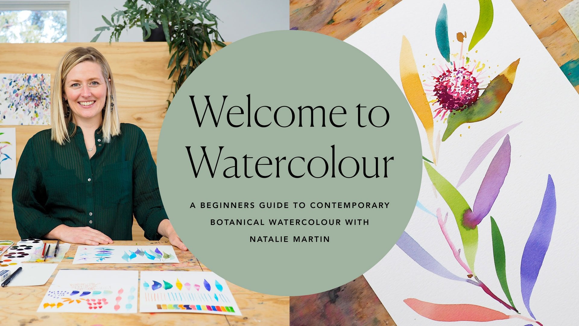
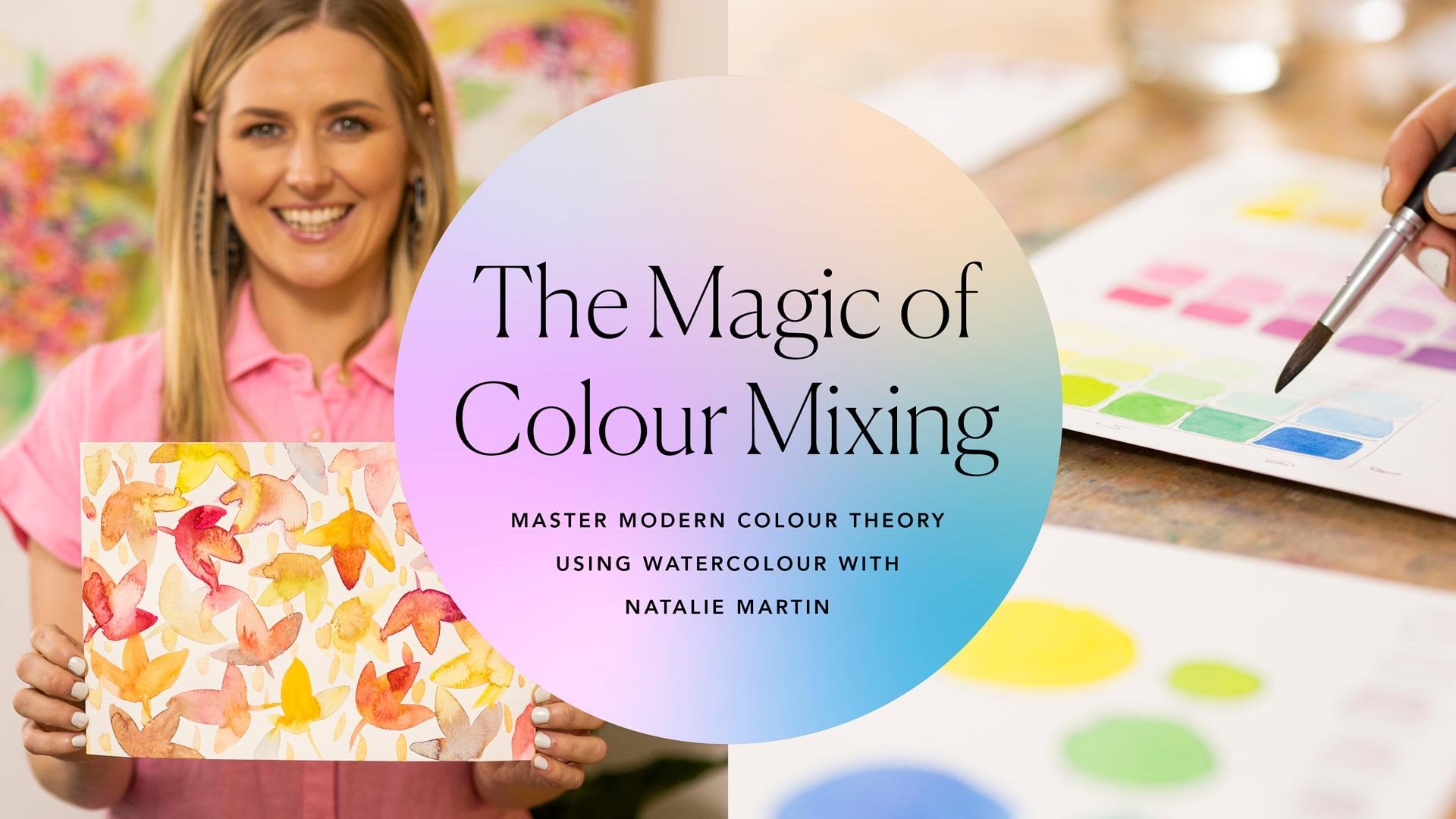
1. Introduction: Hi. My name is Natalie Martin, and I'm an Australian watercolor artist. This is my third online course called Lessons in Layering with Watercolor. If you've joined me for Welcome to Watercolor or the Magic of Color Mixing, welcome back stocked you're here, and if you're joining me for the first time, I can't wait for you to jump on-board. Using layers in watercolor is using watercolor to its greatest potential. It's a super powerful tool to create depth, interest, and detail in your work. I really wanted to call this course Patience Young Grasshopper, because patience is going to be our secret ingredient throughout the whole theme. The benefit of this being an online course is that you are able to stop, take a breath, and put the work away and allow it to dry thoroughly so we can get the best possible outcome for our layering process. It's so important to let your work dry thoroughly. Patience is the big key secret ingredient, and I can't instil in you enough how important it is, but it also has an enjoyable experiences as well. There are so many ways to use layers in watercolor and the limit is truly endless. You can use it to create depth and contrast, lots of interest, and detail, and I think this is the magic that can really elevate your work to the next level. In this course, we're going to cover the most basic concepts of layering and explore in and around that, and then expand out into various areas like negative space, and then how to take things to the next level and create a series of works. We'll also going to cover gaps in the knowledge; things like an expansion on the ideas of where to go with materials, fixing tiny errors and little things that happen on the way through the plot twist, and working from photos, because I think that's such an important and missed thing that happens in our courses when we do work from photos. From here, we're going to get started, I can't wait, and I'm so thrilled to bring this course to you.
2. Materials & Equipment Care: Before we get painting, let's go through the materials we are working with in today's course. I've got them all laid out here in front of me. I'm going to start with our paints. Everything's basically what we worked with in Welcome to Watercolor with a few little additions. The paints I'll be using are the same. It's the Koh I Noor, watercolor paints here. These are unstuck into beautiful vibrant colors. We have synthetic round brushes. I love these brushes and I've actually, in my brush roll here, I have a whole array of other round brushes, but I particularly wanted to show you these two brushes because these are the two that I used in Welcome to Watercolor. They're exactly the same, but I had to buy new ones because they are completely worn out. If you can see here, I might just hover them there, the new ones got this beautiful point and the bristles hold together, whereas this one's completely dullant. It's because of or through overuse that they've just completely worn out, and you can see these little flyaway bits here. He's a bit tired and he needs to get retired and same with these size here. I think the point's even more obvious. You can see I've completely notched the tip of those brushes. They're not going to be have the same amount of control and precision that I have with these new ones. It is something that you do have to replace every now and again. All of these brushes here, are basically, especially these ones at the top, are synthetic round brushes. Every brand has a different taper to the tip, different water capacity. I really love exploring all the different kinds. I've got some Princeton, they're my own Princeton Elite brushes, some Micador Roymac brushes. These are quite a bit softer than what I've been working with. I've got some Princeton Velvetouch brushes. These have an exceptionally fine point. Not ideal for some situations, but brilliant for other situations. I use them occasionally. Then I have started working with these brushes which I absolutely love. They're by another fellow watercolor artist called Polina Bright. She uses these really long bristles. The water-holding capacity is just so awesome, I absolutely love these. Today, I'll be using my Princeton Elite brushes. These are just awesome workforce brushes and I wont need much more than that. Alongside our paints and our brushes, we've got paper. I've got two sizes here because I'm going to do a couple of exercises on smaller paper. You're more than welcome to just work on sheets or whatever you have. I definitely recommend using watercolor paper. I did delve into these a little bit deeper in the Welcome to Watercolor materials section. Paper is obviously a big beast in watercolor and it really defines the outcome of the work so definitely work on watercolor paper. Avoid using just your standard printer paper. I do have some of that there though so I can do some sketching and I'm not wasting my good paper when I'm just feeling out ideas. Besides that, I've got my paint palette. I've cleaned that down. I normally have it all messy and leave all my paint on there because watercolor is reconstitutable. But for purpose of today so you can see what I'm mixing with, I've just cleaned it down. We've got our paper towel. Paper towel is so handy for so many different things. I usually tuck it underneath my palette so that it doesn't move anywhere. I usually have the whole roll close by in case of emergency. Over here, a few of the additional things that we'll need for today, we've got the pencil, eraser and sharpener, just for our sketching and throwing down some of our ideas. I've got this painter's tape or masking tape from the hardware store. It's actually like a commercial painter's tape rather than masking tape like your white tape that most people would use for this kind of thing. I find that it tends to take the surface of the paper and the risk of tearing a paper is really extreme, but with this painter's tape, it can come in, this one's yellow. It's called Frog Tape and I just get it from the local hardware store. It comes in purple, blue. You just want to get the lowest tack one as possible because that means there's less potential issue with it tearing the paper. It can go wrong, but it also creates the most beautiful results. I can't wait to show you what we're going to do with that. The last thing I have here is the brush cleaner. Brush cleaner is so good for maintaining the longevity of your brushes. At the end of a big painting session when I've really used them fair bit, what I tend to do is just grab my brush, wet that down. It's almost like a shaving cream thing where you run your brush around like that. I want to taper it into the shape that I want it to maintain and that's going to condition and preserve that brush and I'll store them flat like that overnight. For my setup, I'm actually going to move that off to the side because I don't need that in immediate reach. When I'm setting up my workstation, I want to put my paper off to the side because I want to avoid any splatters there. I'm going to take two sheets of paper towel, and this is just my personal preference. I like to fold them in half because with four layers of paper there, it's exceptionally absorbent so you don't have to replace it as regularly as what you would if you just had a single sheet. I actually tuck that under my palette and then unstuck my paints on top here so I have this nice little strip here to work with when I'm setting it up. I'm right handed so I'm going to set everything up to my right. Then if you are a left-handed, you do everything the same just in the inverse. You move everything over to the left here. I don't need these ones with me right now. Actually I usually keep my brushes there because it's a nice place to keep them safe. I'll keep them fairly close by. I don't need that one right now and I don't need my ruler right now either. That's my setup. Then I'll get a piece of paper and that's pretty much me ready to go. When we're talking about painting at home, I find one of the big things that is maybe not realize is that you need really high-quality light. When you're working, you don't want to strain your eyes or be working in a dull situation where you can't really see what you're working on. Good natural lights, probably your best option and if that's not an option, I recommend a daylight LED lamp that you can use so you can brightly light your space because being able to see and not to strain your eyes is going to be so important to the outcome of your work and your willingness to get to the table in the first place, because if you're working in the dark, you're probably feeling less. Interested anyway. When we're talking about environment, it's really in here I've got the hater on. It's quite warm. It's freezing outside today in Victoria, but with the heater on, I'm going to have to work quite fast because the temperature in the room is going to affect how quickly that water dries as it hits the page. If I'm working in a cold environment, the water takes a lot longer to dry and this is going to be a big part of where we go with this layering process and one of the brilliant parts of this being an online course is that you can stop, pause the video and make sure your work is thoroughly dry before you move on to the next stage because it's so important for your work to be properly, thoroughly bone dry before you apply the next layer. So please take into account the work in front of you and not just what I'm doing. I'm probably going to be pausing the camera and running off and drying it quickly so we can keep moving, so make sure it's totally dry. If you want to heat it with a hairdryer, that's also okay. I find that it actually, it's a little bit risky, especially if you work wet because you can just blow pigment all over the page, which is certainly less than ideal. I also find, if you're working on a final piece, it tends to make the paper a little more brittle and it enhances the chemical reactions that are happening on the page and makes them more dramatic. I find, I'd rather just practice patience, patience young grasshopper, and put it to the side and maybe distract myself and work on something else, whilst I wait for that to dry. I think as we're getting more familiar with that practice, bringing patience in is actually going to be the key big secret ingredient into this whole mix. That's the environment. I'm going to do a little bit more on equipment care because I think there's a really big gap in knowledge about how to look after your materials as best as possible. These paints, I get so many questions about because as you can see, they're quite dull and dark and because the pans are right next to one another, they look quite dark. First things first, I'm going to grab one extra bit of paper towel here. If they're starting to look messy and really unclear and potentially contaminating one another, I am going to just dab a little bit of paper towel in my water and I'm actually just going to wipe that surface down. It might take a couple of pieces of paper towel because that's obviously a fair amount of pigment that's just coming off right there. Give a little wipe. But basically, you can clean down that whole area and decontaminate them. I find that what tends to happen is paint gets stuck in the edges of the wells there and that's where the contamination is coming from. If you hit that and wipe it right down, you will get it cleaned straight back to white. I don't mind having a little bit of mess there, but if it gets too much and you can't see what you're working with, that's a bit of a problem. I've got blue fingers now too. The other thing with these disks is that if you stack them up on the way when you've packed up for the end of the day, really big problem with these ones, if they're wet and you stick them back together again, they get stuck. If they do get stuck, rather than trying to untwist, which is really difficult, I tend to use a claw technique, so you're almost opening them like a clamshell. So you can just crack them open like that and it breaks the seal and that way you can just bring them apart like this. It might take a little bit of muscle, but it's worthwhile doing. There we go. All right, so there's those ones. What I tend not to do is leave these open overnight because dust can fall in those pans and what tends to happen is you are working away and then all of a sudden you've got these fibers in your work and that can be super annoying because they're difficult to get out. Then you have to use your brush and interfere with your paint to pull out these fibers or little bits of particles of dust, so let's avoid doing that. For brush care, I started on this a little bit early with the brush cleaner. Brush cleaner is brilliant for preserving your brushes. Never, ever leave your brushes in the water like that. That is a trip to the bin. What tends to happen is the tips of the brushes get curved and because they have plastic fibers, they're synthetic fibers, that curve remains and you've basically left that curve in the brush for good and it's very difficult to work with. When I store them overnight, I tend to store them flat like this and if I'm traveling with them or moving around with them, I'll move them in a brush roll like this and I'll tuck them in there and keep them really tidy and safe. This is how I store my brushes and I absolutely love it. My mom made me this so it's a bit precious and I absolutely love it, and I think if you have a sewing machine, they're super easy to whip up at home. Now, one question that did come up recently is once your brushes experience a little bit of wear and tear, they might get a little few flyaways here and these rogue bristles can drive you mad because they will drag through areas that you're not maybe anticipating, so what I recommend is just literally grab your scissors and trim it off. But make sure you try and get it from the base of the brush because otherwise, you're going to have a half bristle in there. I've trimmed a few off this one already, so there's a little stumpy guy's up there, but they tend to influence the work less than if you had it up the top so that one's all done there. When it comes to storing your paper and paint, my best recommendation is putting it away out of direct sunlight because direct sunlight is going to yellow your paper and really damage it. It's going to strip all the longevity out of it as well, so important to store that, especially out of direct sunlight, and even your paints as well can really fade if you just leave them out all the time and get kicked by the UV rays, it really obliterates your colors. One thing I did forget to mention here is our reference chart. If you've joined me, feel welcome to Watercolor. We did our color reference chart here, that's just painted out each one of those colors so we can refer to that nice and clearly and have a visual reference. Then, if you've joined me for the magic of color mixing, these may come in handy as well because we may talk about complementary colors and primaries and things like this. I have them nearby if you think that's important to you. Last but not least, you need a great big pinch of courage because it requires so much courage to work with layers in watercolor. Not only you probably wish using courage to break this white piece of paper, but you'll also be working into parts of paintings that will already be successful, so that's a really big challenge. It takes courage to mix all your colors. It takes courage to even explore new things, so I can't wait to get started with you. I'm so pleased we've just gone through all these materials. We know what we're working with. Next up, we're going to go through a little concept I call building blocks. This is going to be our little warm-up exercise before we jump into the really heavy-duty stuff.
3. Building Blocks: Now that we're more familiar with the materials we're working with, the next step is working on some building blocks. I love this as a warm-up exercise because it gets our brush moving, it makes us start thinking about colors, and if I'm ever stuck and not sure where to go, sometimes just getting some marks on the page is the best way to start. I'm actually going to flip this around this way and I'm going to pick up my large brush, size 10. My challenge to you through this whole day, this whole course, is to mix every single color because it's a habit of a beginner, to just pick paints directly off here, and I think as soon as you start thinking a little bit more sophisticated with your color palette, that's another trick to get your paints and your paintings working better. I'm just going to start throwing a few colors here together and feel free to play with whatever you feel like playing with, and we're going to keep shifting it all along anyway. First of all, I'm going to do it singular little building blocks of different marks that I can make with this brush, and we're not thinking Lego here and it all perfectly assembled, I'm definitely thinking giant pile of Lego and all kinds of chaotic. Just have fun and play with it as getting this brush moving the best way possible. First one is literally just going for the tiniest little marks like this, and just get them a bit jumbled and little disordered. If it's too perfect, then you're going to not have a very organic natural feel in your final work. It's very much just getting a little bit of brush moving and my head's bopping along with it as I go along. Then for my next row, I'm just going to go a little bit more, tiny bit more pressure. All I'm doing is starting to visualize some of these little textures and shapes that I can pull together into our work to create a bigger piece. There we go, some little ones and then I'm going to try a little bit more pressure. Then I might get maybe a little more purple in there, nice purple. I'm going to add a little bit more pressure. I love these particular teardrop shapes because they come in so handy for leaves, petals, all kinds of organic matter. A little bit more, and then I'm going to start joining them together a little bit. See what happens, try and get the shape even bigger. Then we're going to go back again and go down to smaller and just try for different shapes each time. It's amazing all the different shapes that you can get with this one little brush. If you do shapes like that or change the angle of your brush, go slanted, you're going to get a little bit different, go backwards, going to be a little bit different again. You think about it differently as well. You get heaps of variety. I think variety is absolutely essential, especially when I'm thinking about my own work and the way that I like it to represent on the page, anything that's too perfect and rigid, I just end up not liking, and sometimes it takes me a little while to work out why and it's because of being tight when I'm thinking, so this is getting your brush moving loosely. I'm just going to keep playing here, keep everything quite separate for now. A little bit closer. Maybe just get a little more random and just start doing all kinds of shapes together. You can see I've got my finger, just the tip of my finger pressing the paper there because if I have my fingers on the page, I end up with oily fingerprints where the paint resists as I paint down the track when you go paint that area like what on earth and there's no way of fixing that, unfortunately. It's one of those little areas that we can't work around. There's some nice little loose fluidy shapes. The next one I want to do is starting to join some of these together so you can see how marks can create shapes and interests as you painting along. I'm going to add a little bit of brown to my purple mix. Try and start thinking of a more organic palette, less saturated, going to take out little bits here and there. Again, I'm going to start with my littlest shape here. But I'm going to try and collect them a little bit more, build them upon one another and you end up with these tiny brush strokes that can have these beautiful textural effects. Then I'm going to grab, it's a really good chance have a little play with the color mixing as well. I've just basically put the opposite of purple in to make it a more dirty, it ended up almost like a chocolatey brown. Then I'm going to go a little bit bigger with the marks and I'm going to butt them all together. What tends to happen here is all that beautiful negative space, you get heaps of interest happening. Then go bigger again. It's just getting that brush moving, and letting it loosen up, not overthinking it too much. I find that when if I'm a bit stiff or rigid when I pick up the paint brush, something like this is the perfect little exercise to just not worry about the outcome so much and you're just having a little play. I'm going to mix up that color again, go to a different color again, and again just start butting up their shapes like this. Don't forget tonal range too. Tonal range is so important. I've just taken a little bit of this color here and diluted it with water, and that can make beautiful, this one's going to be nice dusky pink. Again, just go a little bit bigger, and you can see some of that beautiful bleeding that can occur when we're imprecise with our brush strokes. If I was too precise, they'd all be standalone shapes and they look quite awkward or almost too perfect. But when we let them running together, you starting to see the real potential of watercolor, letting it bleed, letting that organic natural effect take shape. I'm just might put a little more orange in there. You should start to feel more comfortable with the brush as you move along, and then you start thinking, you're not just thinking about the brush shapes itself, but you're thinking about the colors, the water, the pigment, and it's starting to bring all of the things that we've been learning along the way together. Again, just going to keep butting all those together. That it almost shaping itself. I'm going to go for the maximum stroke that I can get through here. Maybe a bit darker just so we can see that run up the other way. These are little shapes that I tend to work in various layer forms. When I'm working on a final piece, I will be adding all these little building blocks together, not just one layer, but three, four, sometimes up to 15 different layers, and it's not full coverage every time I'm working with layers, it's sometimes just adding a few little darker accents in there, and that can give it a whole new form and a little bit of life. I love working with layers so much because it gives you time and a little bit of space for breathing so that you can pause, put it away, come back to it and look at it with fresh eyes. Because then sometimes you can really analyze where you're at, with how it all comes together. The last thing I'm going to do is just essentially the same concept again but we're going to be spinning the page because this is something that people forget all the time. This page isn't fixed down, and I think it's super important. Starting again with my little marks here, you can see I'm just, again, just grabbing the very edges of the paper to make sure that that's moving around. I'm going to stick with my purples and dusky pinks here. I'm liking this. Every single color I've picked up is a little bit of a mixture of things on here, but that you can see automatically that the saturation level, if you're not working directly off the disks, can be a really interesting way to start playing with color. Color is so important to be thinking about all the time. Just do slightly larger marks. This is how I do a lot of my petal work. Go a lighter color, and I say so often in my students that too scared to allow things to touch, that when you touch, that's when the magic happens, it's where all the bleeding occurs. It's a way you get all those beautiful blends and mixes and that unexpected element, which you need so much courage for. But what creates the beauty is that balance of your abilities plus what the watercolor brings to the table. Keep going like this. This was a fun one, just to have a playlist to warm up because it really makes you move your body, makes you move the paper, makes you move the paint brush. Pick up some yellow, I think. I'm going to keep going around. If you wanted to do some extension work in this exercise, we could do all of this all over again with this little brush, and you're going to get a whole new set of building blocks. It's like Lego and Duplo. You need all of them and you get all these beautiful, you get an extension of all these marks that you can make. Let's finish this one up here. There we go. Now I'm going to show you some examples of how I utilize these building blocks in my own work because I think when we see them like this, yep, got this. Totally got it. But it's then thinking of them in context. I think that can be a really important thing to visualize at this point. One of my favorite things to paint that I use these building blocks for all the time. Actually, I am going to move that out of the way, so I don't damage it. Are these Banksia's over here. You can see the flower heads themselves are literally just made up of all of our smallest building blocks, and I'd say I've done maybe five or six different layers of these building blocks, and because watercolor is translucent, you can always see through to the bottom most layer. Every time you add an additional layer, you add complexity interests in detail, which I think is a super cool part and so unique to watercolor. If I go like this, I have a mixture of circles, dots, little dabs, they're my building blocks, they're my dots and dabs. I think I've confused people in the past. I'm like, no, it's easy, it's just dots and dabs, but it actually is more sophisticated than you think because you need to understand, you need to almost visualize and visually categorize how these things represent on the page. As another example, I've got my paper daisy, I work here. This is all basically small versions of these longer strokes and it's them over and over and over again, and it creates so much detail and those delicate little petals, I've got some just here actually. I really wanted to generate that texture that you see in real life. I think that's so important to grasp that energy of the subject. That's another style of building block, and then the last building block I wanted to show you was the Wattle which is a more round building block. If I'm not painting a circle and then filling it, I'm using the bristles of the brush, really similar to what I've done here, so that I'm creating these round shapes, and then that again has, I'd say probably four or five different layers and I wait for it to dry, walk away, come back to it and then go, okay, I can closely analyze. Does it need more dark? Does it need more contrast? Does it need more coverage? That's when you can apply another layer rather than rushing and working into things and try and get it done in one sitting. That's my building blocks. I hope you enjoyed that. From here, we're going to start learning how to think in layers. We've got some assets to work with here, and now we're going to start building them together and visualizing how does layering thing actually works. See you in the next episode.
4. Thinking in Layers: Okay. We've just had a little explore of our building blocks, and these are little assets that we're going to use down the line. Now, I want us to have a little play with this whole layering idea. I think it's something that really trips people up because they don't know where it's going to go, so they don't want to do it. Layering is building out various layers of pigment on top of one another, but it need to be thoroughly dry for every single layer. That's the most crucial thing and that's where that patience young grasshopper comes in. I can't reiterate that often enough that I wish I could red flag you if you're interrupting your work midway through drying, because it's really going to be interruptive to the outcome. We can do translucent. Watercolor pigment is always translucent, so no matter how many layers you build up on top of one another, you will always going to be at a see through down to the bottom-most layer. We're going to utilize that concept and start to explore a little bit of this translucency but also how layers can look in certain arrangements. I'm going to work on two things simultaneously so that I can let one dry while also work on something else. This is an absolutely key distraction technique for myself because I'm a bit of like a go, go, go, go, go. If I keep working into something whilst it wet, I end up ruining it and get frustrated. I'm going to start one here and then I'm going go to the other. Then I'm going to interchange as I go so I'm allowing things to dry in between. For now, I'm going to work here. The very first one we're going to explore is visual mixing with layers. When we have our translucent layers, and I actually made this guy back here, when you put two layers over one another, you're almost mixing the colors on the page. If you put blue and then with a layer of yellow over the top, you're going to have a shade of green in-between. That's the intersection that happens on the page between layers, and it can be such a beautiful way to shift colors in your work. We're going to have a little play and paint out four bars of that primary colors. I'm going to need them to dry before I can do the next layers. So that's when I'm going to distract myself and work on the next one. You might make it a little bit bigger than that. When we're working with layers, it's best not to go 110 percent with your pigment first up because it removes some of that beautiful translucent ability. What tends to happen is if you layer over the top, all that loose, excess pigment on the paper gets reactivated again, shifts around, and you end up with these blurry, fudgy lines that are less ideal. I'm going to pick this blue here and paint up a blue bar. Again, not maximum volume on the color, just a diluted version. Paint out a blue bar here. All right. Just a nice flat wash. Then for our last one, I'm going to pick the magenta, which is the opposite the blue on our purples and pink's disk. It's not the most beautiful color, unfortunately, because it's not a very nice magenta. But, you know. What will you do? Now, paint that up. Oh, I just clicked a little bit of blue. Okay. I've got that down. But patience, I need to wait for this to totally dry. I'm in a fairly warm room right now, so that may not actually take that long. I'm going to put it to the side and prepare my next set of exercises so I'm working on them simultaneously. I might be at a swing back and come back to that and it will be dry. I'm just going to put that over there, once I get his one's started. All right. These ones have visual color mixing and we're going to be doing layers of alternating colors on top so we can say what happens when we intersect those. This one here is more about the premises and the basic concepts of layering. I'm going to get you to paint six leaves. For this one, I want you to mix a green, by the way. I don't want you to just pick any old green. I want you to start integrating that color mixing and the ideas around your complementaries and you more earthy colors you shades, get that in the programming from day one. I'm going to put a little bit of the magenta in there. Oh now, I've got a really reddy color, need a bit more green. The reason why I encourage you to do this is because the greens in these discs, especially, we're mostly working with leafy and botanical shapes today, is that the greens are just so saturated, and sickly, and definitely not from the natural world. So have got a nice, sort of, olive there that I'm happy to work with. Again, it's not the most intense rich pigment. I'm going for a dilution. As an extension exercise, you could explore with various levels of pigment in your paint, what happens for all individual layers. All right. I'm going to paint six leaves. I'm not even worrying about outlines for these, I'm just going to paint them on, like so. Roughly the same size, because then you got a good gauge of what your working with there, like a sample sheet. Again, got my fingertips off the paper because I am notorious for having little white dots around the edges. It's really annoying when you don't want that to get a little bit more going there. All right. I now need to wait for that to dry. What I'm going to do is switch these two around, distract myself, but checking whether this is dry or not. To check whether something's dry, you can usually hold it up to the light. If I'm looking at that, I can tell there's a little bit of a sheen on these corners in here, so I'd say it's not quite dry enough to work on just yet. I'd say this end is. If you put fingers in it, sometimes you remove some pigments so you'd best not to touch it. The other way you can do is check the back. Because if it's wet, sometimes you can see it through the back of the page. I'm just going to have to pause here for a minute, allow that to dry before I do the next layer. I've just had to put things off to the side for a moment so that they're totally dry. Now, they are 100 percent dry, and I can keep working on top. If I was to work on top with them partially dry, what tends to happen is that it gets old murky, you don't get these beautiful crisp shapes. When you overlay over the top of dry, you get another beautiful crisp dry shape over the top and it's a much more pleasant way to work. From here, I'll just introduced some of that magentry color into my yellow mix, which is now good. What we're going to do is I'm going to paint some leaf shapes over here so we can start to see when we had that intersection of two layers have a visual color mixing can happen. If you put two layers of yellow over the top, and roughly the same dilution, you end up with a strong diversion of the yellow. It's a nice way to encourage a little more strength in your colors when you're working. Actually, what I'm going to do is I'm going to work all the way down. When we put yellow over blue, we're going to actually end up with our secondary green. I'm going to go like that. You see how that's reading as green once we do a layer over the top? Rinse that off, just in case I've picked up anything excess. Then when we go over our magenta, we'll end up with an orangey red. If you're working too wet, you will actually activate that pigment anyway and you'll say a little bit of blurry or shuffling going on. It's not a big deal, usually just means that you need to take a little bit less water on the brush. All right. Now, I'm going to do blue mix and I'm going to paint a blue leaf next to my yellow. Oops, I bled them. It's fine. Then blue over blue, we just get a stronger version of blue. It's a really interesting way of shifting some colors in your painting. If you are someone that tends to work really heavily into a particular area, you just need to have more subtle shifts, this can adjust your colors a little bit. Oh, I need blue again for my bottom one. We should get a bit of a purple vibe, like so. Then grab the magenta. Then I do another one up here. We'll get that red color going again. Because it's not a pure magenta though, it's going to be a little bit dirty. Over here we get a bit of a purple. We'll get a stronger magenta when we do a double layer of magenta. What I'm looking at is this cross-section where the two layers have cross over one another. For our next colors, I'm going to start investigating some complementary colors and your secondary colors. I'm going to add a purple, green, and red. Say when you add a purple layer, which is the opposite to yellow, you actually get a dirtier version of a yellow or it's a really nice way of just shifting the yellow down and desaturating a little bit. I'm going to get some purple. I'm not going to bother mixing a purple. I'm just going to take directly from the disc for this exercise. But again, not too strong. Working with less is usually more because we can add more with layers. But if we go with so much intense pigment straight off the bat, we've got nowhere to go. You can't maximum limit on how much pigment you can get on the page. That's our purple, so you can see the yellow has become this more dirty brown color. That's a bit of a funny tail we got there. Then over the blue, we're going to have a blue mix. Then over here we're going to end up with some really nice plumy purple. Our next secondary color is going to be green, so I'm going to paint out some green leaves next. I'm going to go with the one that I can get closest to this, I've mixed that color. Just get a nice emerald color going there. Then painting your leaves there so you get a beautiful lime. What we're actually ending up with is almost like a tertiary color when we're doing these intersections. It's color mixing. But with layers, it's a whole other concept that we didn't get to touch on in the magical color mixing that much. Here because green is the opposite to magenta on the color wheel, we're going to end up with another browny or more earthy color. Then the final color, what am I missing? I'm missing an orange and red. I'm going to mix up a little bit of my own here. I want a scarlet-y crimson color. Now with the orange, mix them there. When you've got a most subtle color like yellow, it's going to be harder to see that the layers come through because it hasn't got much value on the page. But when we've got blue, you can quite clearly see the line of where the previous layer was, so bear it in mind as well. I just added in my orange there and because orange is opposite of blue, we're going to end up with more muddy color. Then for our final one, we should end up with a fairly reddish color. Here we go. I hope that helps articulate what I mean when I say visual color mixing because the two translucent layers, think like sheets of cellophane, if you hold up the sheets of cellophane up to the light and you put a yellow and a red, you end up with orange. It's that color mixing but through light and the translucency of the pigment, which I just think it's such a cool way to work with watercolor and particularly unique to watercolor because you're working with very much translucent layers as opposed to heavy, thick layers like you would with acrylic or oil. Now we're going to circle back around. We're going to leave that one there. I'm going to circle back around to my leaves exercise, I love a little leaf exercise. I just think it's just a nice way to illustrate lots of different techniques. We're going to keep this one and call it the sample leaf so that we know what we started off with. The next one, I'm going to do increasing value. Increasing value is essentially what we were doing here when we add a secondary layer of the same color and it reads darker on the page because you've added more pigment again. I'm going to go back to my green mix that I made. Hopefully, you guys got some left, I might need to make tiny touch more. Roughly, let's go. I'm going to paint over this, and some people call this glazing. If you've done all the watercolor tutorials and you like, what's the difference between layering and glazing? It's the same thing. It's very much just adding layers to create more depth and interest in your shapes. I'm going to paint over the top. Let me turn a little bit more just to create that obvious effect. If you've painted in a shape in your work and you're not really happy with how it's reading on the page, maybe it's too light. This is the best way to add a little bit more value and it's going to read as a more prominent shape. More carefully go around those edges so that you can see the difference between one and two. Like so. You could increase value to all kinds of degrees. You could add heaps of pigment and end up with a very dark leaf, or you could just subtly shift it if you think it only needs the tiniest adjustment. The next one is called adjusting color. See how I've made a bit of an olive mix for this leaf here and I think this olive isn't working in my piece, I would like to shift it to a more green. You could either because we're working with this olive, the color is like in here. I would probably add a little bit more lime or even a little bit more emerald, and that's going to shift that color to a more bright green. But it's still going to have the undertones of the olive, which is a nice way to think about like creating an undertone through your work, you can actually read through without you realizing. I'm just going to grab some more of this emerald I've got here and a nice dilution again, not too heavy. I'm going to paint over the top. You can see I'm not getting a straight green, so the green is like this, but I'm adding on top, you've got a whole new color because you've visually mixed the two colors. Don't forget to twist your paper around, it's a bit easier to access those angles. There we go. I've adjusted the color and now its reading is a little bit more emerald as opposed to the olive color that we started off with. But you can see that it's still relating to the other colors on the page because it's got the same undertone. The next one is one that I tend to use a lot and I really love this one. It's shading. You can basically do a wet on wet technique on top of an existing layer. I'm going to drop some color in there to create some shading. I'm going to fill it all up with plain clear water. Because I'm working in a bit of a warm room, I'm going to have to work quite quickly because it's going to dry faster than I want it to. I'm going to grab quite a bit of darker pigment, maybe even a bit more of the emerald color, to really show you this one off. I'm going to drop it in to the end here. Maybe brush them in if it's not moving the way I want it to. I could let that dry. Because the whole area is wet it's going to suck and pull across and be a bit more gradient, gradual. I can encourage that a little bit. If you get those drops like this, I think is a bit of a common thing that can happen, the way you've lifted your brush off, you end up with this fat droplet of pigment. You can mop that up with the brush. You can either grab a little bit of paper towel and suck it up. But if it's all wet, it's actually you do have the risk of interference, but if you're very careful, you can actually lift that out. Just a tiniest, a little bit. If it's disrupting the placement of your pigment. I want to write our title down, that is shading. I use it a lot for leaves where I want to generate a curve or attach them to a stem or just have more of that beautiful watercolor effect. I don't often work super flat like this. I would rather have a bit more of a color blend in there. If I have represented a leaf or any other shape too flat in my work, I can add a secondary layer where I bring in more shading. The next one, I'm just going to call it detail. I'm going to grab my little brush for this one actually. Grab some of this orange maybe, a little bit of yellow. You got to think back to your building blocks. This is where the building blocks start to come in, because once you go to lay down and you can add more information to give it more identification. This one I'm going to paint the veins in. It's basically wet on dry. That one's wet on wet and this is wet on dry. We get crisp shapes, specific shapes. Then you've added more detail. It helps that represent better on the page as a leaf. The final one is offset layers, which is another one of my absolute favorites. This is where you start to get a bit more organic flow in your work and you can really loosen up. It's being less restrictive or you can say that I've really pertained to the edges here. Now, adult brains love outlines and fixed shapes. This is tossing all that out the window and we're just going to paint over the top of it. I think that's one of the big groundbreaking things that has to happen when you're building your layers. Be more experimental and use that courage and have a play with what can happen because until you do it, sometimes you don't really understand it, you need to be able to see it. Offset layers is literally, I'm just going to paint maybe a negative space leaf over the top, but not perfectly over. I might actually even do a bit of shading on that one too. You get these more irregular shapes in your work. Imagine many of those around. Then all of a sudden you've got this beautiful fluidity through everything. I hope that clarifies a few of the questions around layering. This is by no means every single opportunity with layering. We've only done two layers here. On all these, once they dry again, we could build a third, fourth, fifth layer. When we're thinking layers, don't always assume that it has to be a full coverage every single time. You can just add tiny details here and there. From here, we've got our basic concepts down pat. Now we're going to start thinking a little bit more organically and start to really see what multiple layers look like on the page.
5. Simple Leafy Layers: We've just started to explore a little bit of this whole layering thing and started to think about how we can use layers in our work. This next little exercise is actually going to be three mini exercises. I've actually got fourth one there. Little bonus round. Get rid of him. We're going to do three different things using layers in different ways, using simple flat washes but with different amounts of pigment, meaning total range through each. You can start to see the benefits of using less pigment versus more pigment. Similar to what we did in the last exercise, I'm going to work on all three simultaneously, and put them off to the side, and let them dry between each layer. I'm going to work on 1, 2, 3, and then circle back around to the first one again so when it's ready to paint on, I'm not painting on damp paper again. I'm just going to put them to the side for a minute. This one, I'm going to focus on light as possible tone, so really, really, really light colors. I use basically these three concepts all in one and all in interchangeable ways in my own work. This one's super delicate, and it's so beautiful to work with, and it really highlights that translucency of the paint. I'm going to do just loose leaf shapes all over here. I'm going to keep varying my greens because I think when we work too flat, it's a bit of a bad habit to get into. I do that sometimes when I'm being a bit lazy, and I think just call yourself out in going out. You got a mix your colors. Keep that moving. We're going to do similar shapes all over. There's a bit of dust in my pigment that I was talking about in materials section. I'm just going to keep that moving, maybe put a little bit of the magenta in the green to get that olive. It's basically three little pressure strokes to create these leaf shapes. Never go in too strong with the color because we're going to build the depth through layering as opposed to going really full on with the color so early. Just keep all these colors mixing. I do this little secret green on disc number 4, often forgotten. So much love for these green. Loving having a new brush to work with. Its got such a nice point compared to the one that I've been battling along with. A couple more down here. Just going so to evenly space them because what I'm going to do is paint future layers on top. I think that's the thing that people struggle with the most, it's projecting where the layers are going to go. I think that's mostly going to be achieved through experience. The more you do it, the more familiar you're going to get with how that's going to work, and you can pre-plan your paintings that way. That's probably good for that one. I'm just going to put that one off to the side and let it dry. Now, for the next one, I'm going to go the complete opposite and work super heavy in my pigment. Go as basically as full volume as you possibly can. I'm actually going to go reach straight for the purples and the blues because they are the strongest pigments on here and the ones that are far too easily able to work heavy with, especially when they're wet. It's just so easy to pick up so much pigment and you got nowhere else to go with it. It's hard to dilute it again. I'm going to get some of these ultra heavies going on. I'm going to just shake up the shape a little bit. We might as well have a play here and expand beyond just doing the same thing over and over. I'm going to paint in a little stem with just my vertical hold like this. Maybe another one over there and over there. I'm going to paint some really heavy, heavy pigmented leaves on here. Another fiber. Where is it all coming from? When I've got my dog in the room, it's impossible because he is a fluff ball and it just goes everywhere. If you think about it, what I'm using here is very much those building blocks where right at the beginning. It's just dots and dabs to represent leaves to not too overthought at this point. Let me shake up the color because I keep end up with the same kind of colors happening there. Go with some purple. I'm going really, really, really heavy with the color. Where am I going to go? Maybe some more blue. Maybe that one. I just really muddied up my paints there so I'm going to have to give them a clean later. I tend to do that a lot. I just go and pick up random colors. Still get bleeds and things happening but there's so much pigment on there that it's actually going to be quite active even when I wet it again later. I just need to balance this one out a little bit. Maybe put one over here. That's that one. Now, I'm going to put that off to the side, allow that to dry as well. Then the third of our exercises in this one. We've got ultralight, very translucent, delicate, heavy, heavy load, lots of pigment, really dark. Then this one's giving you a little bit of combinations of both and you could be able to see how you can start to build some energy with this. But I'm actually going to start for my first layer working quite light and then I'm going to add darker as I go into it. I'm going to change up the exercise slightly again. I'm going to create a cascading effect of leaves coming down, so almost like gum leaves or a big cascade of foliage coming out of the tree. Again, working quite light like this. Get a bit of a mixture of colors. We get these light grey tones when you mix the red and the blue together. Put some larger shapes. Mix all that in together to get a nice mauve. Go back to my greens. You can see, every time I go back to my palette, I'm just utilizing some of the colors I've already mixed. That's how you start to get a language going in your work as well. You can just keep using those same colors. When you keep reaching for the same over and over, it links things together. When I work on a series, I keep the same dirty palette the whole time and that helps like colors appear all through your work. Maybe do a few more here. I need more blue-y. I'm going to put that one to the side now. I've got some really basic shapes here. These are not exciting works to look at right now. They are quite plain, but it's getting the idea of we're not trying to achieve a complete painting in the first sitting. It's more like getting the first layer down, it's very basic, and then we build and build and build upon it to create more interesting detail as we go along as opposed to trying to achieve in one sitting. It was something that I had to rewire in my own practices where I would be impatient and want to get everything finished, but be satisfied with getting a layer down and feeling really happy with how that looks and excited for the next step. It helps generate some energy in your work as well. That's definitely damped and that's just been painted, so that's definitely damp too. What I'm going to do is I'm just going to pause for a moment, put these to the side and let them dry, and then I'll come back to them when they're absolutely thoroughly dry so I can paint that next layer. I've put these to the side now and let it totally, thoroughly dry. I'm going to circle back around and go back to my first painting and work some more translucent layers on. I could look at these and then I think a lot of people would want to then put them all perfectly in between the spaces, but we're actually going to layer them over the top because this is what we're trying to learn here. I'm going to grab some more light translucent layers, a quite diluted pigment we want. I'm going to make sure that I overlap all the leaves when I add the secondary layer on. That one is quite light. It might go a little bit more for the next one. I may put it up here. I've got my fingers on my work again. I'll always have to be conscious of that. I'm going to keep shifting those colors, making sure everything's working together. I'm basically going to use the secondary layer to link all these leaves together. You can start to see those intersections and how they can cause potentially looking work. This is the thing, is that until you visualize it, sometimes you just don't really know how it's going to work. If you did this exercise again, because it's our little friend watercolor, it's going to be totally different, because we have only so much control over. I'll grab some more of that one, I'll link these two. I'm trying to gradually fill gaps as well as get a bit of a balanced composition going on by linking all these together. I'm actually going to do a third layer on this as well. I'm keeping that in the back of my mind as I'm painting because I need to allow room for the next layer of leaves and try and get areas where I can link three layers together. I'll go there. I'm trying to get them all at different angles as well, because you get this nice jumbled feeling. I think lots of mixtures of the same kinds of blues and greens is really effective for this exercise. You can actually do it with all one one color as well and you just have a monotone effect which still looks really nice. Maybe a straightish one there. I reckon that is many as I can squeeze in for a second layer without touching accidentally partially damped layers, because these ones up here that I did first have already started to dry, so I'm going to avoid touching that anymore and put it off to the side again, and dive into this one. I'm aiming for three layers on this one. When I look at this one though, I'm like, "Can I add more? Do I want to add more?" I could probably add a little bit more, but I'm not going to have that translucent effect because the pigment is so heavy that it's got nowhere to go, so all I can really do is now that it's dry is I can add additional leaves because I've had time and space to look at it with fresh eyes, or if I was to then grab a little more of another color, I could maybe add one here, but you can see, don't really get so much of the overlapping effect happening. It can be a little bit disappointing. This is a little reminder that when you work really heavy with your pigment, it can be detrimental from the very beginning. Work lighter and then build into the darks. So I'm just going to add a few more here just to really run that one home. Secondary layers do not always have to overlap previous layers. That's another thing to bear in mind. I'm just going to add in a few little dots and dabs and a little building blocks just to create a little bit more interest because overall these piece is looking a bit flat to me, it's very, very monochrome, very heavy. There are times where this is handy, but maybe not for whole whole work because it's just so dense. Now I'm going to park that one to side. Actually, I'm probably going to put that to the side altogether and not touch it again because if I just went on with the third layer, it's more pigment, more heaviness, and I don't think that's really going to benefit the work. Onto my third one, where I'm going to have an assortment, like a full mix of range of colors. I want to show you a few different things you can do with this exercise. Let's get a blue going here. Now because these leaves are dry, I can paint around them and they're not going to bleed into one another. I can butt right up to the edge and it's not going to bleed. It's really good if you want a really solid shape, but you have varying shades. If that was wet, it will bleed into one another and you'd have just a puddle. So this is one of the beautiful benefits of layering and then having that patience is having the space to allow it to paint around shapes. I'll go over there too. Creates almost like a negative space effect. I've got a bit more. I'm painting some other leaves. I might do another leaf down here which enhances the tip of that one. Paint that down. Grab a bit more green or something. I'm going with a slightly stronger green this time. I might even add another one in here just to create the next tier back of the leaves. Like that. You can get really crisp and precise with this as well. Especially if your littler brush, you can get some really nice shapes going. I'm just going to take that off to the edge of the page. I need another color. Maybe get some brown in the mix. Get more olive going. I'm going to take one off to the edge here. There is a fingerprint. Excuse me. Then I might just do one more here. I'm not too worried about connecting everything. I'm not painting a thing. It's more just to generate the idea of what happens when we introduce multiple layers into a shape. I might just do a little one there. I'm fussing a little bit too much. I just wanted to marry in that blue a little bit because it was standing out all alone. It was lonesome up there. That's my secondary layer down on there. You can see that I actually haven't intersected anything at all, but I've been able to work around shapes that were previously painted because they're dry and there's no risk of them bleeding into one another. Once again, I'm going to pause and let these two dry, and then I'm going to go back and do the third layer. Then they were two. I'm going to go back to this one and attempt the third layer on there. Again, just going with the same light tones on there, and you're going to get this buildup of an additional layer where you're going to get even further intersections and more interest. Going to get some more varieties of greens going on here. I've got all kinds of green soups. Slightly different. Probably going, "Why is she just going between those three?" But I'm collecting the slightest bit of different tone each time. My goal here is to do the occasional three-way intersection, so just there. There's going to be one little tiny area where there's three translucent layers of watercolor. Then I'm basically going to work my way around and feel any awkward spaces with some more leaf shapes. Could do lots of things here. Might do another three-layer intersection. Add a bit of blue in there, maybe here. It's very difficult to preempt how things will look when you're working with layers. So exercises like these are so beneficial because you start to go, okay, if I use even the slightest too much pigment, I'm going to lose that translucency. But you get the most incredible little marks as you move your way through, and I think it's just such a beautiful aspect to watercolors. It's maybe underrated with beginners or misunderstood with beginners. Let's go one here. That one has no three-way intersection, but it's a gap that I wanted to fill. It's not crucial that you fill every single hole, and it's also not crucial that you cover more layers, I could even do one completely off. That's still the third layer because you've given yourself time and space to have a little think, reanalyze what areas you want to have a play with and where you want to work into. Let me put that one there. Little bit of courage there. I think I like that color, so I'm going to put a little bit more of that over here, and round this one out. You can see that I step back sometimes, and a little bit of distance is what can be a real key because if you're working super closely and getting really analytical, I think you lose a little bit of context. Having that space, I can say, okay, there's a hole here, definitely want to fill that, so that's going to be my next step. Then maybe I need to reanalyze where I'm going to go next before placing any more pigment. One of the massive benefits of working with layers is that you can work more gradually, and you can really analyze the work in between each piece as well, and in each layer, you can bring a little bit of something else. There's that one. You know what? I think that's pretty much there, I think that's done. I don't want to touch that anymore. It feels like just a bit of a casual abstract leaf litter kind of picture. I think I particularly like this area here where there's those multiple intersections and it's probably when my eye gets drawn to the most. That's something to bear in mind as well, is when you have multiple layers and you've got lots of information getting generated in a particular area, that creates energy and you'll eye gets drawn to it. You can control where that goes by where and when you intersect your layers. I'm going to pop that one over there and then I'm going to dive back into this one. Get some more of these going. This one I'm going to think really loose. I'm a bit like these ones that I've popped in behind, it makes things a bit stiff and I've probably gone a bit too cautiously with them, so I'm just going to go a little bit loose over the top and maybe with some strong colors as well. Purple in your green is always nice to get these nice blues. I'm going to do offset layers over the top just to create a little bit more interest here. I'm going to go a bit wild and just see what happens. If I do like a random oddball color lot that purple, I usually try and utilize it in a few places so it's not like a standalone like, "Woah, what did she do there?" It can look like a mistake, but as soon as you incorporate a mistake two or three times, then it's not a mistake anymore. It's just a plot twist. Add a few more hits here and there. Building blocks. My building blocks tend to get smaller the deeper I get into a painting. Something to bear in mind is that my base layers are broad structures that I build upon. As I get smaller and smaller, my building blocks get littler and littler. Just get a little bit of flyaway action in there. I need just a couple more dark shapes in there. This one, when you work with so much dynamic color and tone, you generate heaps more energy. I'm actually just going to do something more sienna kind of color. You've got your orange which is opposite to blue, so I'm just going to add that for a little bit of energy, but I'm going to knock down a bit by mixing it with a bit of blue like that and muddy my whole pallet right up. This helps with a little bit and energy as well. A few more tiny little touches of building blocks and dancing around the page. There's our three different techniques of using layers. This one, simple translucent layers very much pointedly laid on top of one another to try and generate those sheets of cellophane like I've described. Our heavy pigment, super handy for when we want to create contrast. But then if we go too heavy, too early, we've got no way to go. Then we've got to have more dynamic high-energy work where we've got color, tone, heaps of movement. You probably looking at all these and going, "Looks awfully a lot like your work back here." It's because that's what I've broken down to create these three little things. When I'm working, I'm integrating all three together. You can see I've got quite heavy tones. I've added them last because they are the things that you can add depth later. It's very hard to work backwards from. You can subtract watercolor, you can only add. So it's sort of an additive method and I build up to it as opposed to going on too heavy too early. Then some of these light tones are super-duper light, and I've allowed them to, even though in nature you can't necessarily always see through them, it creates a really beautiful effect. Then I've used a really dynamic range of color and interplay of complementary colors and tonal range, something like this, to create that flow up to work like that. From here, we've had a little play with how we can play with your layering. I've got one little really fun exercise, I can't wait to teach you. It is related to negative space, which I know a lot of people have a bit of a heart attack about, but I promise you, you're going to really enjoy it.
6. Negative Space: We've just had a look at some simple leafy layers. Now we're going to start to explore another little avenue called negative space with layering and this is such a fun exercise. I can't wait to share it with you. Pretty much I don't want to call it early but guaranteed good results. We're going to need a ruler, pencil, painter's tape, and maybe an eraser just in case. I'm basically going to do a 12 by 12 centimeters square roughly or five inches if you're in the imperial system. I'm just going to actually measure up a square and I'm going to create a floating square in the middle of the page and going to mask out that area. This is a technique that can be super beautiful to work with because you going to be left with this white border around the edges. I've just marking out 4.5 centimeters on each end. I'm going to leave my pencil lines in and erase them very last when everything is bone-dry. Pencil line in there. I don't go very heavy with my pencil lines, lighter is better because it means you are indent the page and when you erase you won't have these channels left in the paper. I'm going as lot as humanly possible. I'm sorry, from the top of my page, I'm going eight centimeters down, which is about three inches, but I'm working A4, so if you're a letter press and then you're going to need to adjust the measurements accordingly. Eight centimeters down. Let me just check that I've definitely got 12 centimeters. I'm making it dizzy by speeding my paper around so much. 12 centimeters. Then I'm going to go 12 centimeters down here and here and measure that up as well. Perfect. There's my square. I put them off to the side because they're done now. Now, I've got a larger area at the bottom and a shorter area at the top there. It's a little bit more at the bottom. That's a really classic framers technique. When you have them a little bit higher in the frame, it looks a bit more balanced, if you had that perfectly centered, it tends to look blank bottom heavy when you put it on the wall. Now for this guy. This is the low tack we can replace it if we need, I'm going to grab a length that goes beyond the width of my square and I'm going to pull it really tight and put it right right to that pencil line there. Then the trick with this one is, if you just use your fingers to go and push that down like that, it's not going to feel every gap from the hill and valley in the paper, so I tend to get the back of my nail and just run that along like that. You can do it with a spoon. My black paint brushes actually leave a black mark, but I used to use my paintbrush to go and go like that along edge. It just helps fill the tape into those hills and valleys so that you can make sure there's no bleeding under the tape because it's very disappointing when you pull up the tape and it's bled underneath. I'm going to work my way round and do that for the rest of the edges, same deal. What was I doing? My nail. I'm avoiding putting my fingers in the central area because that's where I'll be painting. I'm just going to keep focusing like this. The corners are important too because it's doubled taped layer, so that can cause a problem, too much pressure and you'll leave an indentation in the paper though. You don't want to do that either. It's a little bit fiddly, but it's definitely worth the final result. Basically what I've made is this is my canvas area and the rest is going to be masked out. When I peel this up, I'm going to have this beautiful crisp edge to the artwork, it can just really bring a piece together or bring it to a whole new level. To begin this work out, very first layer is actually going to be the layer that's revealed as the topmost layer. The things that are the most positive. I'm going to go very gently and paint in a very light blue color. I'm actually going to do a bit of a color blend. I'm going to continuously shift it from different shades of blue. Just keep mixing it together. I'll bring a little bit of watering, keep it very light at the stage because we're going to get darker and darker as we go along. Just keep shifting little bits of bluely, purply maybe a little bit of greeny. Keep that going. I'm just using my fingers on the tape to brace the page or doesn't go flying off and I ruin it. Maybe a little bit more of that purply color looked nice. Paint right up to the edges. I've missed a couple of spots just there. Then if you love the look of blooms and bleeds in the painting, this is a nice little technique to just generate a little more irregularity without dries because I'm just going to actually put some clean droplets into the water. That's our first layer done. I haven't even explained what we're doing yet, but I want be a little bit mysterious. I'm going to let this one dry and come back once it's again, totally bone-dry. Where is that patience people? It's worth it, I promise. I'll be back soon. I've got this first layer totally dry now, and I'm going to have to give you a little bit of a hint where this is going. I'm going to use an Australian daisy type flower called a flannel flower as my inspiration. Basically we're going to cut out negative space shapes and create this incredible depths effect by doing this. The first penciling that I'm going to do is the very topmost layer of our daisies. Then we're going to paint around the outsides of them to help generate that negative space effect. Basically I'm going to draw a circle and then it's just like the classic flower shape, but a flannel has pointed ends, that's really the main difference. Let's color this. The pencil you wont actually see down the track. This is a handy one to have a play with. I'm just going to add in a few more flowers. Really lightly with the pencil. Maybe a little one hanging off the end there and maybe one more up here. It's better to go and leave a little bit of space because we're going to generate more flowers as we go deeper into the layers. You don't want to fill up the whole space at this stage. I reckon that's pretty good. I'm going to leave it there. Now, for some of these types of spaces, I definitely recommend using your little brush so you can get into those nooks and crannies. For the larger spaces, I'm still going to work with these larger brush. I'm going to do maybe just a slightly bit more pigmented mix here so a little bit darker, but again, keep shifting it around, so that there's plenty of variants in color on the way through. No need just a little bit more. That's good. You have to work pretty quickly because we're working around the shapes that we've drawn and we're going to draw attention to the negative spaces left behind. Doing these three layers is such a beautiful way to use this technique because you just get the most fascinating results. A little bit more blue. The leaves on these flowers are these beautiful silvery blue-gray, that's what the blue reference is for me. I just love how they look in nature because they're stark, grayish-white and they're so beautiful. Takes a little bit of patience. Yes, that's that word again, to actually cover all these spaces well. Whoa, a little too much pigment there, a little bit of purple, just to keep things on the move. If you have to go back into an area that's even a little bit dry like this hardline here, I'll just keep working back into it, and you can keep that edge down, and that will prevent it from fixing on the page, which is going to look a bit funny because you can end up with is awkward line through the middle of your work where you've paused. I'm going to have to switch to my little brush to get through this tight section here. Quick switch. Again, don't forget that that page is not fixed to the table because that's going to really help you get into those tighter corners a bit easier. Keep following around the outside of your pencil lines. At the very end, we're going to erase any visual pencil lines. The most of the times that I've done this exercise, the lines themselves actually disappear into the paint, and you don't even really notice them. The only ones you erase are the box that we're painting around. It's a little time consuming because it's a bit fiddly. I'm just using the very most tip of this brush a lot of this just to get into those tight spaces. Break that line down with a little bit of scrubbing. Scrubbing, I mean I'm literally just teasing the surface of the paper to agitate the pigment that's already existing on there, and it can activate it and bring it back into a workable place. Fill into this little guy. Get down to the bottom here, I've got a bit more of a green color continuation there. Last little section for this one. I haven't done one thing. I want to do these centers because that's going to really make them look more like what they are. I'm just going to define this center a little bit by painting around the edge. It gives it a bit of a 3D effect, and disguises a bit more of that pencil. It's nice if it can collect some of the wet paint from your negative space work as well. Once again, got to wait for that to dry. I'm just going to put that to the side, distract myself for a moment and come back to it when it's thoroughly dry. This is dry now, and this is where the negative space thing can get bit of mind bendy. What we're going to do is pencil in some more flowers, and then we're going to subtract the existing ones and the new ones and only paint that background. It's removing more background, and we're going to paint more pigment in there to create some more depth. I'm going to do maybe one right here, and it overlapping and interacting with the other existing flowers as super effective, because what it's going to do is make the topmost ones the brightest and everything else below them is going to recede. I'm going to pointedly draw in some flowers that cross right over and leave some tricky bits for me to paint. But that's where the good stuff happens. Maybe one in there. I'm going to do this one, and then I'm going to do yet another one, so you'll have this reduction each time. Maybe just a couple of petals up here would look nice. Now, I'm going to get painting again. I might have to reduce myself down to the little brush because I've got even tighter gaps to get into. I'm going to use a similar amount of pigment as the last time. Because we're doing this additive thing, and we're going to keep adding value by adding more pigment on top, I don't need to increase the amount of pigment I'm working with because it multiplies down with all that translucency and get a nice blue going. If I've got a green area here, it's nice to intermix some of the colors, so you could hit a little bit more green and then more blue, and have that shifting happening, and that can create a bit of magic towards the end as well. Through the translucent layers, you can see all the shifts. It's going get this really awkward little bit in there. Having this nice pointy tip on my new brush is very handy right now. Then I'm painting around every shape that isn't penciled in. Rub that on this flurry of pencil lines. Maybe go a bit more purple in there. Here, we've got a paint up into the petal area there, and to help define find receding flower. Keep that going around. It's trying all my patience just being this tight that trying to get all these perfect little intersection happening. I should say I'm not actually the most patient person myself and that's why I've had to come up with so many tricks to distract myself as I'm working, because otherwise I will work into something far too quickly or far too much, and then there's no way back, so I've ruined too many works working this way. I've had train myself to call myself out when I'm working into damp areas, especially because I just want to keep working, so instead I then go and work on another piece rather than soldiering on with something that's too damp. It's very difficult thing to encourage yourself to do. Painting to that little gap in there. I'm going to reveal another flower here. I need some greens as we go down here, fit into these nooks and crannies. I'm not even being too careful about it. I just don't think that's in my nature to be too careful, and you still get a really good result. If you're really super neat and tidy, you can get obviously very crisp shapes, but I'm being as careful as I can be. It's going to be different for everyone. I've missed somewhere. I have missed in there. It just started raining outside. Back up into there. Can you start to see where this is going? I think this is one of those things until it's finished, it's very hard to visualize where it's going to end up. But I can promise you it's just that good. It's very effective, and I love using this in my own work. Keep shifting those colors, it doesn't matter if you run off to the edges because we're going to peel all that paint off, but try not to go past the yellow because obviously you'll hit the page again. I just covered up that point and then I just painted over it. I've got this one little tiny one in there. It's a bit difficult to control if you're someone that works with a lot of water because those puddles are going to overflow into certain areas. It's a good little trick to manage your water volume as well and your water control. Backup into this guy up here. Paint out this corner. There's one more revealed, I've got this little end bit here to go. I don't want to go too dark because then you've got nowhere else to go. You got to leave some doors open for yourself. Do that one. I don't think so. Just do it again just in case. Now just got this last little central area and then I'm going to have to let it dry again. Before I forget, I better paint those centers. I've got one here, one here, one here, and that's it. Time to let that one dry. I'm going to come back and do one final layer, which is going to be the deepest layer of them all and really just pop all these daisy like flowers forward. Once again, nice and dry. I'm going to do one final layer on this. This is going to be the icing on the cake. Again, going to drawing some filler flowers in between and behind the existing ones. I have to get that little brushing working to all these little gaps, but then it's going to just pop all those lighter ones forward and really give it some depth, which I just love about this exercise. This with my pencil jumping back in, drawing some daisy shapes now because there's not much space left. You even don't have to do too many with these last one. You still going to get the effect. I might put one in there. Oops. I need my eraser for that one, it went over. I just want to make sure I've got really nice clear lines for myself to follow. As it gets darker, sometimes you need the light to shine on your grey lead you can see where you've placed your flowers. I'm going to do some shapes off to the side as well. Everything runs off to the side. You don't want it to look too contained. That can really help with this feeling as well. I need to add one more line up here. That's going to be nice and tricky for me, but I'm up for the challenge. Don't put that in there. Once again, I'm going to go with just maybe the slightest bit darker pigment this time because this is going to be the layer that receives the most. It's allowed to be a little bit darker. I'm going to add a bit more. That's going to really pop for the first layers. The ones that we painted initially, that we've actually just painted around the whole time. Cutting in here a bit fiddly this last layer, but it's worth it. It looks like I'm about to head back the paper because my face is so close, but it helps me see exactly where I got to go. I can just get some of this straightforward up here. Where is my next flower? It's not the way up to this. I need to paint this out then. Each layer is less painting but more fiddly because you have to go around more areas. Now we're up to this flower up here. I'm just going to go around him. Into these little corners. What about one there? I need one in there. Perhaps some paint. Where I'm I going to go? Finish up this guy. Make sure you get the always little in-between shapes. That's actually where the magic happens and it really reveals the shape. Going to do that center here, well, it's so wet. I've got another one in here. I draw a line there. I'm actually going to have to get into that little tight gap there as well. It's a previous layer. I've got a little point there to go around. The more cross over, the more intersecting of the flowers. It makes the painting more complex, but it makes the overall effect really good. It's worthwhile going to the effort of getting a lot of crossover between the shapes makes the effect really stand out. As fiddly as it is. There's another center, I need a bit of green in there because I'm using a lot of purple, and it might look too much one way or the other. I'll bring this up here. Do I got anything to cross over? No. Paint into that little tiny gap there. Then I've got to another daisy to go around up here, and around this existing one. I've just gone over one of my petals, that's all right, that just going to have to be a little skinny one or maybe I'll just get rid of it altogether. Just pretend that didn't happen, there we go. Always making little mistakes, but at sometimes it's about rolling with them and accepting them as opposed to thinking of works completely ruins. Only I'm ever going to notice that there's one petal missing on this flower. Into that little tight gap up there too. A bit more concentration with this one now, because I've stuffed it up into some super tight gaps. Next one's there, so I'm just going to pre-plan how I'm going to approach it by bringing it to maybe more purple place because will be the purple will be darker. I want to bring that because it's the lower half of the paper, I'm going to bring that down to darker down there. All right, got to bring that around. Mindful of that upcoming flower. Got so much pigment on my brush, I just needed a bit of water that actually keep it moving. Then bring that around, nearly there. Up in this one, little gap in there. Little bit like a puzzle. I got the bottom half of this one. Better spin it, otherwise I'm going to end it with my hand in it. What have I missed? That of this little bit here and then I think I'm done, I just have to do the centers. I'm just going to paint these centers in. One there. A find painting the centers in, does really enhances the fact that they look like flowers. It's totally not essential if you just want daisy shapes and you can actually do this with anything, any shape. You can do it with hearts, you can do it with leaves, you can do it with anything. That's the work, but it's not really finished until we pull that tape off. Ideally, you'd wait for it to dry because then there's no risk of these wet paint on the edge here getting onto your page, but I'm just too excited, so I want to get into it now. I'm going to pick up this edge here because that is what is already lifted. Make sure you got clean hands, there's nothing more frustrating than going to peel it off, and then you got blue outside there because we want these beautiful crisp lines, and I love this. It's just so satisfying, pulling this off. I tend to pull across the work, in case there is paint on the tape like this. Look at that line, yes. Make sure that tape does not touch the page. Dispose off immediately. Again, make sure your hands are clean. Pull that one off. That's going to go straight into the next bit. I'm just going to roll up down on itself, very carefully. I love this masking technique though, because you just get really beautiful punch of color with this super refined line around the outer edge. Lets fold that back down on itself again. It's tense. Get this last beat off. Intensity going to work. There we go. The very last thing I would do with this one is actually wait for it to be completely dry and erase all of these lines. But you have to wait because if you were to take eraser it to it right now, you would accidentally lift some of that blue and smudge it everywhere. Better to even just leave it for an hour, if you're worried about it at all. I think this is such a beautiful thing to practice and it's very good for wrapping your head around. Not only layering that negative space. That my challenge to you would be to create a little series and think about placing the flowers differently in each one. That can be enough to make a body of work really hang together. But this is so beautiful, I just love this one. I really can't wait to see what you guys come up with it. From here, we're actually going to start a conversation about working with photos. I think this is something that's not discussed often enough, specially in the creative world and people's copyright and things like this. Let's get into that before we start our final project.
7. Working From Photos: We've just had a little play and created some beautiful negative space works. Something I wanted to cover before jumping into our final projects is working from photos. There's a couple of things I wanted to tackle here, because these photos here are all photos I've taken for myself. They're photos that I take on the fly, on my phone, or when I have my camera out, when I'm out in the back, in nature, in people's gardens, everywhere I take photos all the time because this is the safest way to create reference points for you. It is unwise to go on Google and just take someone's photo and work from that, and replicate from that because that's a copyright issue. I'm not going to go too specific into copyright because it's different rules all over the world, but I just don't want to suggest that as a good way to go about creating work. I recommend if you want to work from photos, work from your own photos or work from a safe source that you've found online that the licenses are applicable to you. Working from photos has pros and cons, and we went a lot into the working from a sample or a live cutting and welcome to watercolor. This is why I wanted to focus on working from a photos in this particular course. There's limitations, but there's also opportunities as well and it's just making sure you're working into both of those things as we go. Working from photos, you're working through it from a static thing. It's 2D, it's flat. Yes, you've got life and color in there, but the amount of times that people get so hung up on replicating the identical things and everything that's in there, they get very rigid and tight. It's very difficult to bring an artistic lessons to a photo even when you've taken it yourself because it's an existing light source. We'll start with this one here. The light source is coming from this direction. The crop is quite tight, the colors are super vibrant. You automatically switch off a bit of your creative license as soon as you start working directly from a photo. I have a whole selection here. I'm actually going to pick three to do my final project with. Got all sorts, what do I want to do. Let's see. I'm actually go with these three. These are prettier. I'll include all of these in the download package, so you're welcome to use my photos to paint along with this course. I don't mind if you use them. That's totally okay. These ones, I'm going to pick here a paper daisy, a banksia, and the wattle. For my final project, I'm going to basically do a little miniature with each of these and I want to work with them so that they are linked to one another and it essentially becomes a little bit of a series. Each one has its own unique properties when it comes to layering. I really want to stretch you and make you explore all these avenues. With this whole pile here, there is so many different ways to explore your layers and I really want to challenge you to not just necessarily do the ones that I've picked but pick any ones that appeal to you. When I'm working from a photo, I like to have the photo nearby, but I also like to do a sketch of it because that helps me translate onto the page. It helps me crop, it helps me work out where to start sometimes even. I'm going to do it this way. It's an important part of the process because it eliminates the 2D that we're looking at here and it helps you get a bit more expression on the page. When working from a photo, I think the biggest thing that people run up against is, because I always like to isolate my work on a page, like I pull a part out of a photo as opposed to putting the whole background in and just putting too much color in there. I want to try and it's almost like a botanical illustration when you're popping the subject forward or completely out of its own background. If it's something like this, I may not necessarily paint the entire work. I might isolate a section here that appeals to me and I like those shapes. I like those colors. I think it would crop nicely. Same here with these banksia. Whether or not these top most stem is relevant or necessary, I'll probably sketch it out, assess whether I like it or not. Then the paper daisy is really straightforward but it's awkwardly cropped. What I'm going to do is maybe bring it in a little bit here so it's more central in the figure, on the page. I'm going to do a little sketch of each one and that's going to help me bring things to a final work. Basically, I'm going to do a series and work simultaneously again, so that when one's drying, I've got another thing to work on and I'm distracting myself from fasting anything too much. I'm going to start with maybe the paper daisy. This isn't a drawing class, but drawing is very important to articulating things on the page. When you visualize something, it helps you translate it to a page and get your essence of it. It's a good thing to practice. Life drawing is very essential, I think to everyone. Just drawing still life's or whatever is around you, drawing is really important tool. My paper daisy, I'm going to move it more centrally. It's got this big donut in the middle. I just love these flowers so much. Straw flowers, paper daisies, everlastings. They go to a lot of names. I'm not going to go draw every petal, because I'm also not going to go paint every petal. I want to try and get an idea of how to get on the page some of the angles or directions. I can already start to visualize what strokes that I'm going to use, which building blocks are going to build up this paper daisy texture. Draw a bit more. More layers. Then actually I'm going to put the paint that stem in. I might even use my negative space technique to bring out the whiteness of the flower, because when we're working with a white page, it's very difficult to paint a white flour because you've lost a lot of definition. You've got no depth because ground is white. Let's maybe just do a few of these as well. There's a negative space opportunity in this central element too. Let it be darker in there. I'll make little notes for myself, Nick space. Maybe a bit of more in there. That's pretty much all I want to work with. When I'm doing my painting, I'll have both nearby or if I'm feeling particularly like I really want to get experimental, I'll remove that from the picture at all together and I'll only work with my drawing and that's how you're going to get a really true creative expression because you've basically taken away your crutch. I'm going to take that over there and then I'm going to move on to my banksia. For my banksia, I've got the flower head itself, which is over here and it's got these cone at the center which is where all the stamens stick out of. I've got this. Drawing really helps me actually work out where I want to start a painting as well. Sometimes if I've painted, say, the central element first, that's probably one of the best places to start painting as well. I've got all this texture and all my building blocks are going to come into play here. Few sticky outy one's. Banksias are one of my favorite things to paint. I'm not getting too detailed. Like I'm not doing a beautiful drawing that could be a stand-alone artwork. It's very much like a throw down of ideas. I've got the stem here, I've got that one over there. I'm trying to be nice and loose and free with it all. Some leaves sticking key here. I've got this as my reference, but I don't have to include every element. I just want to include what I think contributes to the work as opposed to the essentials only. I'm not worrying about the periphery stuff. I want a nice flow through there because I think that's what attracts me to this photo, is its got a nice flow for where the flower stem from. I going to run it off the edge of the page for each one of those. That's probably enough info for me to work with that one. For the final one. Lining myself up with little projects here. At my wattle. In comparison to these two, which are two big stand-alone flower heads. This one is more complex and much more dense in information. I'm going to zoom in on it and pick out a section that I think will complement those as opposed to be too busy, because I'm trying to make them a harmonious as a series. I'm basically going to oscillate these little section out here. But for you and when you approach these photo or if it's another one of your choice, it's really up to you, you might prefer up here, or you might actually prefer these whole diagonal shape. I love this photo because of the flow in it. I think when you're working from your own photos, you've taken that photo for a reason, you've taken it from that angle for a reason and you've kept it for a reason. There's an automatic emotional connection to the image. If you just grabbing something off the Internet, it's like very gray zone whether you're actually allowed to use it in the first place and I also, particularly don't recommend Googling watercolor painting of wattle, watercolor painting of banksia, because that's when you're really in the red zone for copyright infringements. It's not even that for me in which it's bad, it's not a great way to approach a painting. But you are limiting your creative capacity because you're just copying. A comparison is a thief of joy. You'll never going to be painting that subject, you're painting someone else's painting of a subject, so the whole thing is just diluted. I just don't think it's the best way to go about it. Most people have a phone in their pocket where they can just shoot snaps off wherever they want. You don't have enough to have printouts. I just have them for the sake of today, I quite often I'm just sketching from my phone or from my laptop. Anyway, back to you my wattle, you've had a little rant. My wattle. I'm going to give it a general shape on here, so I've got something to work with because it's so much detailed. Then these leaves, I love the leaves on these little frogs. It looks amazing. Remember, the other thing with a photo is that a lot of people will go but that leaf is there. I have to put that leaf there. I'm like, who told you to put a leaf there? You can actually omit stuff. This is one of the big restrictions with photos, is you get too literal about what's there, what's not there. You're allowed to omit and have some creative license there and work with what you want to work with as opposed to being stuck with what's in the photo. A bit more leaf. I need to do one leaf down there. Love drawing, its just so freeing. I know a lot of people have hiccups and issues with drawing that. Wattle is one of my favorite things to paint because I think it's one of the most organic and fun and playful and you can have a lot of good times with layers with wattle. Most people get very stuck with that, creating perfectly circular wattles. It looks super odd in watercolor. It's better if it's more fluid in a more organic. So I love more blobby shapes. I've got lots of these buds everywhere and the bee compounds as well. I'm just trying to get that feeling on page. More, big ones, and then buds, a love the little flyaway ones. I call them the magic because it breaks down that stark whitespace in the background. I usually have a few loose random bits lying around. To the common person that's just going to be absolutely gibberish to me. It's a plan forward and I can't wait to get painting because now I've got all this stuff ready to go. My brain is buzzing and I can't wait to show you what comes up next.
8. The Final Project: Now we have a greater understanding of our reference photos and where we should source some from. I want to get stuck into my little painting. I've set them out like this, because in my mind, if I'm creating a bit of a series, the most beneficial way to create a series is actually work on them concurrently. Because you'll pull a green from here into here and into here and it starts to link everything together, and because I'm working on a series of three for here, I wanted to visualize how they might look on a wall together. I felt the pink because it's on its own, it would be best centralized, and then we have two pale yellow ones on the outside. I think that would look nice. It's analyzing how you pull these things together and almost preempting the end result as well. I'm going to go down to an A5 size here for these little works, so it's in-between these two. Just so I can work on them quite swiftly for you-all. The first one I'm going to start with is probably actually going to be, it's really just my preference, but I'm going to start with the banksia. I'm going to move these two off to the side to save them from splutters. Take my little banksia here. I'm going to mix up some colors first to get started. Because I started with these central structure here, I'm going to probably paint that in first and maybe a bit of a pencil line of where the branch is going to go, so I know where the leaves will attach. But really that's almost as much as what I can do for the first layer, and then I'm going to alternate through and work on them all together, and that can be such a lovely way to work. I'm going to get some of these brownie lemony. I almost left a lot room for the yellows on my palette here. A little bit of green would be good too. For my first layers, I'm often just almost blocking shapes in and I get the positioning right, and you can get a feel for how that might sit on the page pretty quickly. For this one, I'm going to pop in a really just a central figure there for the banksia, and I know that everything else around that is going to be the shape of the flower. What I'm actually going to do is get some of my building blocks going. I'm just going to block in where those parameters of the banksia. I've got a good feeling for what that positioning is going to be anyway now. The other advantage to that being, if I wanted to paint a leaf in which I do, I want to paint this little one in here, I can do that now because I haven't got so much information there, and once you put all the information there, we can't paint over the top of it. You can't retract stuff or subtract stuff, but you can always add. I'm going to put that one in there. Maybe just grab a little bit more dark. I'm going to use some shading just on this initial layers to bring that in. Actually, now that I've got my banksia too, I'm feeling pretty good about where that sits. That's bad. It's going to have paint over it, and I might accidentally get it on there. Like what we do in Welcome to Watercolor and I do go into more depth about how I translate from an item to pencils in Welcome to Watercolor. I'm going to just very lightly pencil in a shape here. I think as soon as you start blocking in everything with pencil, you get very restricted again. You've got a restriction here, and then if you take pencil lines here and try and fill them all perfectly, then you're going to have, again, very restricted, which I would preference more organic and natural feeling. Now we're going to get some more green shades going and get bit of my unexpected color that I love so much. Nice little olive there. I'm just going to make sure that everything attaches to that stem and then I'm going to the paint stem in last. Anything that's sitting behind, I'm probably most likely going to do a darker color or a more unexpected color. This ones sitting behind. This one over here, it dance around a little bit because it depends on what colors on my brush, what I'm picking up, how I'm balancing things off. I've got a more purple here, I need to probably integrate that elsewhere. My brain's purring the whole time as I'm painting, even though I may not be having brush to page the entire time, it's still active, I'm still thinking. This one's a little bit backwards, so I'm going to get. Now I need a nice good solid green. Notice that I'm mixing every single color because if we start painting all the leaves the same shade of green, even in this photo here, you can see that there's some light greens, but they're not all the same shaded green, is quite a strong emerald here, it goes more olive here, it goes really quiet dark up here, and quite bright on these end ones. It's something to consider through your color mixing, it's something you're able to articulate through pigment. This one's gone, and now I want quite a bright green I think to get that really bright one on the end going, and then I need to replicate that elsewhere because it's a standalone shape. Where's my drawing? Do the underside of the leaf. I'm going to do a little bit of a light green mixture for that twist shape, and there's a few under leaves. Actually, I'm not going to really paint those, I don't think. I might go back to over here, get a bit of a darker one in there, I need more dark. Opposite of blue is orange so I'm going to pop that in there. Oh I like that color. Pop that in. The leaves because they're the lesser item in this photo, I really want the focal point to be the flower, so that's where I'm going to generate the most layers, the most interest, the most building blocks, and then these leaves a more of a support act that lead you to looking at the flower. I can paint all of these in and then maybe come back and identify a little gaps here and there. But really the focal point is going to be here, so I'm going to probably stop working on the leaves soon and move on to the next painting and allow for all that to dry. What do I need? I need this color again. Just to paint this one in. A little bit of shading. I'm working back into the paint up there, so when the drop falls off, it falls up into the darkest point. I need to create that flow, a little bit of unexpected blue or something in there. I love playing with colors so much. I'm going to park that one for now, put that out of my site, not even think about it because I've got two other paintings to work on and when I come back to it I'll have fresh eyes. I will work on two other paintings, so I'll have more colors and more mixes going on, and I might be able to analyze and find some gaps and holes to work with. I'm going to pop that one off to the side. Actually, I'm not popping up here with that work. Now onto the paper daisy. When I did my drawing, I started with this central part of the flowers. I'm probably going to do similar. I see here with the petals folding in on itself, that it's an opportunity for some negative space. I'm not going to draw it in first this time, I'm going to try and be a little bit painterly with it. The first thing I'm going to do is painting this brown shape in the middle just this light brown. Because I can always add more dark, I'm not going to go too dark. I just need to block that shape in, so I've got something to work with. Then with my orange, I'm going to get a nice yellowy orange mixed here. I want to get quite bright because it's actually quite bright in it so I don't want to light that part of it. A little bit dirty but quite bright still. Then similar to what we were doing with our flannel flowers, is I'm going to work around some of those petal shapes to generate that curved shape that's happening there. I don't mind that it's bleeding into the center either; I think that's fine. I'm just going to try and generate some of these petals curving over. Then, on the far side, we've got more of an actual shape to work with. Got a little bit more of a petal incorporating over here. Then you can see that, in the center here, there's actually some really beautiful texture. I'm going to add that later with building blocks and with the tiniest tip of my brush, add it in later, but it's something that I can't do right now because I'm going to be working this negative space shape in. I'm just going to bring all this around, like so. Then, take your eyes away for a minute, give it a fresh glance. Have I got my shapes right? Maybe not quite right. I want to make sure I've got all of that in there correctly. Is that right again? Knowing that I can come back and add some more detail there, I'm going to leave that there and I'm going to actually start painting in some of these petals. They basically start out a little bit pinker in the center and then extend out to white. That white is going to be, obviously, very difficult to paint in because I've got a white background, so I'm going to use negative space to define those petals down the line. But, for now, I'm just going to start getting some of these colors in. Need to mix up a nice light pink. There we go. I probably need a few variants, to be honest. Then, this is another of our building blocks that we were working with. We need one darker version as well, where we, so it tucks out at about there. tucks in. I'm going to add building blocks by just doing these strokes. I can't obviously layer too many on top of one another because it's going to end up in a giant pool, so I need to just keep adding little bits here and there as I gently go along. I'm going to build into it as opposed to try and get it all done in one foul swoop. Allowing things to touch and bleed; beautiful part of watercolor. It's not something to avoid. I love it. Few dots and that's going to help define those as well. Up there. Now, this is looking pretty odd right now, but knowing we're going to define the outer edge with negative space and then add in some more dark and detail and more layers in there. I think this is about as far as I can take this one for now. I'm going to park this one and move on to my wattle piece. Put that up there. All right, wattle, I'm ready for you. I'm going to get this one a little bit closer to me just so I can see what I'm working on a bit better because I have zoomed into this photo so much. I want to try and make sure that I'm generating the right vibe and I want it to sit harmoniously with these two as well. I've used some lemony yellows here and this wattle itself has a little touch of warms, but then the foliage is quite blue, so I think that's going to be a nice tie-in here. I might need to get a little bit of blue into this one so that they will all sit together nicely. I can see that this one is actually pretty much nearly dry and that one's well under way to dry. I'm going to have to circle back around, swing to my banksia. Wattle, I think I'm going to start with your foliage, which I love doing big bold colors. This is a nice tealy, indigoey kind of color. I'm just going to get into it. It's almost like painting palm fronds, these guys. I'm going to dab in a little bit of unexpected purple into the center there and into the shadow. Then, further over here, there's a little bit more foliage. I'm going to drop that in up here. I'm trying to be really light and delicate because we're working with the foliage here, not the flower again. We want the flower to be the hero. I'm going to be not worrying about too much detail in the foliage at this stage. Get some of this beautiful blue, and we go. Whilst this is all wet, this is when I want to dive in and actually get some more of these bleeding happening, the beautiful aspects of watercolor. We need some bright green as well, just for some of that little highlighted bits. How far did I go down? To about there. I've got a little bit more room for foliage just here. Whilst this is wet, I'm actually going to keep moving because this is going to be important for me to be working into this one whilst it's a little bit wet. I'm going to need a few yellows and I'm going to need to dilute them quite a bit. I love the wattle dance; you can just have so much fun with it. It's one of the easiest flowers to abstract as well. If you're into exploring that balance of abstract and representational, this is a really fun one to work with. I've got a limey yellow, and a bit of a warm yellow, and a bit of a warm brown. They're going to be in last mixture of things to work with. I'm not going to try and achieve the entire impression of the wattle in the first layer. I'm going to try and get the bones of it in there and then build upon that. Go for the big ones first, I think. At some point, I just give up on my drawings and everything and I'm trying to look at the painting as a hole because no one's ever going to sit there and compare a photo to drawing to painting. They're just going to look at the painting and really try and grasp whether they have a good expression of it or not. If I touch too many of the little pompoms together, they're going to start looking like a big mess. I'm going to try and just get an idea of this on the page. Nothing quickly, not overthinking it too much. How far did I go down? The wattle ball, you can see that I'm not drawing a circle and then filling it. I'm really just using the tip of the brush to create a circular shape. It's not even too perfectly circular because I want this loose expression happening. Need a little bit more, I think. Get it a little bit darker under these underneath ones. Get some stronger yellow, I think. If I try and pump that with any more color, you can already start to see how everything's starting to bleed into one another. I'm going to stop there, park it, and then circle back to my banksia so I can keep working on that without muddying this one to oblivion and having to start over. Let's switch that over there. It will look like not much right now, right? But it's because we're going to be working into layers. This is the tricky part because if we were working these into one whole thing, how on earth are we going to get so much detail into that banksia? This is why we like working with layers. They're beautiful little building blocks and it gives you opportunity to really assess where you're going with the work and go more gently as you proceed. Using some of those yellows that I just made for the wattle, I'm going to be diving back into this banksia head and starting to generate some more building blocks to create information and interest there. Really, right back to that building block exercise, literally what we were doing. I'm doing it with a smaller brush for this one. If I start layering too many into one another, they will just turn into a pool. Remember, we can always wait for it to dry, add another layer. My brush is like a little rapid fire movement. I'm trying not to overthink it too much, I'm just responding to the photo. It's got some sort of long stamens in there as well, get that feeling. I'm just using the very tip of the brush to create some fine lines to replicate what's there. You might find another way to paint a banksia. This is, by no means, the only way to paint a banksia. I encourage you to explore and try and work out what system of layers is going to work for you when it comes you painting a banksia. It's not too much more I can do there before it starts getting a little too much. When I'm getting to this point where I'm building up the layers at the flower or the focal point of the painting, I try and avoid doing too much around it because once I get that working, I can make the rest work around it. But if I go and make these super impressive and amazing and then I stuff up the flower or if the flower's not quite working, it's a waste of energy. I'm going to put the energy into the flower and then let everything else blossom around it. Always shaking up those colors. I'm not really fixing too hard on any of the colors. Put a bit dark in there just for extra contrast. If I keep pushing anymore painting to that, that's also going to turn into a puddle. It's time for that one to get parked. I'm going to cycle back to the paper daisy. It's fun working like this because you just never get to stop. It's like speed dating, but speed painting. You obviously don't have to work this fast. This is just me painting it my own. I do let little bits here and then for my last series A Year in Bloom, I had 12 on the go at once and would just duck in and out of various ones that I felt like I wanted to work on. I'm just going to get a little bit of a darker orange so I can increase the texture in here. Like I'd mentioned before, I was going to circle back and just add in a little bit more information just to generate, see how that dotty, beautiful, orange in the texture there. I'm just going to literally add in these tiny dots. If there's any question of your work being damp at this point, park it. You saw that I went from one to the other. It's quite warm in here so this was actually dry and was ready to work on, but make sure your work's dry and don't just do a round robin even though it's not dry. Now we need to do a little dark in a shadow of that same shape. Going to dive in there. I'm adjusting the color in there, and then I'm going to shade it over like what we did in Thinking in Layers. Already you're starting to see a little bit more of that shape come to life, and the flower itself is more present. I'm going to grab some of this dark color here to create the shadows. Being brave with the contrast is actually one way to really improve the impression of a shape on the page, because in reality they're not as dark as what I've put in there, but it helps really pop things forward and it's that little bit of courage that you need, just those little risks that you take. If you go in with confidence, the risk almost always pays off. I'm going to do a few more layers at the sides here. Just shaking up that color again. All right. That one I think is that as far as I'm going to take it until the next layer where I'm going to do the negative space around the outside. I needed to define it first and give it some shape before I do the outline. I'm a nervous person around backgrounds and I'd rather work with the subject rather than force the subject into a shape that I've left behind by painting the background first. I'm going to park that one, ready for the next one. Back to wattle. Wattle is not dry yet. Is this one dry yet? Not quite dry. I'm going to pause for a minute and I'll circle back when everything's dry. I've got some dry works to work with again, I basically have my choice of the lot to start with. I'm going to go to this, I didn't get a second layer on here. Basically, at this point in my painting, I usually start to forget about all of these and try and make it work as a painting. This as my reference if I ever get stuck or if I think something's not quite working, there can be clues here. Sometime we will refer to that if I get really jammed or maybe the colors aren't quite working or not sure where to go next. But I think I'm happy with how we're going so I'm just going to get in there. I'm going to put some odd colors in there because I've just got probably a bit not quite happy with the color palette there. I'm going to get some of these little, tiny building blocks going for the little buds and they're a little bit darker. Again, not drawing circles, just generating little bits of texture with my building blocks. Layer over there a little bit. I find a lot of people get really particular about, oh, but we can't go over the top of that. I'm like, well, listen, no one's going to know that you can, you can do whatever you like. It's maybe just lifting off some of those self-imposed rules a lot of the time that make the painting experience a bit more fun, a bit more lighthearted. More of that one. It's a nice magic going. A little bit more of that reddish color to offset the green, that vibrant green. I'm using this dark red as a shadow color to enhance and give it a bit more life. Just thinking really light and loose with my brush. Think back to your building blocks exercise and see just how lightly and loosely you can move with your brush. Then I'm going to paint some really translucent layers over the top of some of these existing little wattle pom-poms. Just to get that building up of the actual bauble texture. I'm going to work quite lightly and loosely with these. Wattle has to be my favorite thing to paint, I just love it. Feed it with some brights as well. A little bit of blurs here and there. If you accidentally run over wet stuff, sometimes they actually can really work and look nice. I need some of the more deep yellow or a sienna color to get into this darker spaces in underneath. If you're starting to notice like I'm starting to notice a few, too many shapes are running into one another and it's then potentially on the cusp of getting a bit muddy, probably best to put the paint brush down and I can circle back around once it's dry and add anything more that I feel like it needs. I think this one's pretty close to done. Might just add a little bit more contrast around the leaves, but for now because it's wet, I'm going to park it and go back to well, I was just working that color palette, so I think I'm going to circle back around to this one because it would make sense. I've got those colors already and warmed up. More building blocks for my banksia. Going to go with a little bit more deeper color just to create that contrast especially around the base there, just to ground it. I'm not layering things on separately entirely to what was there previously. I'm just going over the top of everything because that's just going to be a buildup of layers and a buildup of building blocks and information. Oops, I accidentally collected some blue on that, I think. A bit more bright in there, on the outer edges. Because it's a conical shape, I find that that's where the information collects on a 3D thing, especially on a cylinder, so I sometimes do a few more building blocks on the outermost edges, can enhance that 3D look to it all. I think this one got to be nearly done. Before ever calling it and just going yes, now it's done, I will always just let it dry out of sight, come back to it with fresh eyes and go, actually I'm probably just missing a little bit more detail here, or what else could I add to just bring it to that next level? But space is your friend when it comes to this. Little bit of time, little bit of space. Time to have a nice, big deep breath of air so you can come back energized and feel good about your work. Whenever I'm not feeling good about my work, it's usually because I'm feeling tensed and I feel too much pressure to keep proceeding, so it's better to just put it to side side and not ruin it. I've ruined plenty of work in my time through impatience. This will be my last little bit, I think. I'm going to come back to that one. I'm feeling pretty good about that banksia head now. It's such a bold shape, but at same time it's made up of so many delicate parts. I really want to try and grasp that from the page. I'm thinking if I'm not looking at this and not looking at this, this as a whole works, not quite working yet. I'd like to introduce a few more leaves just to give it a bit more depth to it all. But I'm going to wait until it's dry so I can come back to it with fresh eyes. The fresh eyes thing is such an important aspect to it all. I can't wait to see how this one turns out, because this is when I'm going to introduce that negative space. With my littlest brush, because I want nice cut corners, I am going to use some of these greens that I have been utilizing everywhere else to create this background that I'm going to work. I don't think I'm going to fill the whole thing. I'm going to go a little bit more artistic with it and maybe just offset it a little bit, and have a blurryish background. I don't want to think about it too much, but I do want to put the stem in so I'm going to actually paint the idea of the stem in first. You'll be surprised how little you can add that will just give it a whole, other dimension. What I'm trying to do with the negative space is create the tips of the daisy petals. I've got to try and make sure I've got a nice defined shape there. Then I'm going to grab my bigger brush. Grab a little bit of this green, whilst it's all wet. Negative space is just so powerful and make sure I get a bit of color for side far side of the stem. Same deal, may not even do the whole way around. I will stop and analyze, see whether I like it halfway around. Just using water to bleed out these edges. It's nearly there. Whenever I'm too adherent to the actual paper, I get quite bound up. I do let the paintbrushes run off the edge of the paper. I think it gives you a bit more freedom in your work. Let us do a little bit more irregular green over there a bit of blob. I'm trying not to get too, because if I'm looking at my photo, the flower itself is quite in focus, but the background is all blurry and unclear what it is. I've run with that, with my painting as well, and just roughly thrown in some details. I might just put it a little bit more in there, but almost ready to call that one. If anything, I might come back and add a little bit more definition in those petals. But for now, I'm just going to park it and see how I feel about it when I come back around. Now back to my wattle which isn't quite dry, but I think I'm going to press on because the areas that I will really want to get into less so in the wet zones. But I really want to add a little bit more contrast in here with these darker tones. I actually spend more time color mixing than I do painting. I really enjoy the process of color mixing and I think it's a missed step in a lot of people's practice because it helps bring a work together. You can harmonize everything just through your color. Get very experimental. Just some lighter touches in there. Now, what are we missing? I think it's some more of this red. Maybe in a little bit of pink or something. Maybe a little bit of pink to tie in my paper daisy helps sync it all up. Nearly there with this one, I reckon. This is a little like our translucent layers that we did in our simple leafy layers project where I'm really just focusing on creating texture and interests with multiple layers of the same over the top. I completely forgot about my photo at this point in time because I really just want to wrap up the painting itself and make sure it's successful all in its own rush. Almost like a wattle party now. Now I'm going to get some hits of straight yellow. No mixing and just do some tiny little details with the tip of my brush. Having lots of diversity in your mark-making can make work super interesting as well. Some way for the eye to be attracted to. It's pretty close, I think. A little bit of magic up here. The real way I'll know that this work is finished or not is basically coming back to it completely with fresh eyes tomorrow because when you work so intensely on something and he can't exhume yourself, you lose perspective a little bit. The best result is actually coming back with an entirely fresh perspective the next day. I think this one's basically done in my mind, I think it's really nice and fun. It harmonizes with this one because of those pinks that I've added in, and now in each, bring this one to the party. Definitely need some more leaves in there. I'm going to completely forget about my reference photo and just try and make this work how I want it to feel. Now I bring some extra layers in there. Well, that's not going to be right right color. A little one in there, Just needed some more going on to what I had originally planned. A little bit of purple. I'm going to add in a little dark base to that one. Adding things in one, say wet can be a little easier with leaves because when you just add all the layers at once, it can be quite challenging because they all blend into one another and they lose their shape and interest. Just going to add a little bit of magic with this reddy color because that seems to be the harmonizing color when I'm looking at these three works together. I've got this pale, burgundy here. I've got all these beautiful pinks and this one. Then I put some pink fits in there. When you're working across three works you tend to harmonize and think more creatively as well because you're like, if you have one stand-alone pink flower how do you link in those other two that aren't quite working. You get to have a little play with how things come together. I do want to put in a little bit more pink into here. I think we got everything wrapped up. If you are someone who, doesn't really feel all the natives, you are more than welcome to try this exercise with any flowers that you want, something out of your garden. You can work from life, or you can work from reference photos. I've provided you a bunch of reference photos, but you can also work from your own. It's the same principles. I pick these particular three because they all show quite distinctive different challenges with layering. One's building blocks. One's translucent layers, one's got negative space. I like these three together as well and then this is going to be part of your creative journey, is selecting three photos that are going to work for you and things you enjoy painting. I don't want to force you to think paintings that you're not super enjoying painting. All right, bring these in a little bit more. Just needed the tiniest bit more translucent tips out here. Blend this background back in again. Maintaining outlines is certainly not one of my strong points on basically always breaking the rules there. I'm going to need some more of this darkish kind of purple just to get into a bit more contrast in there. Super light touches you may have noticed, except for one I've brought in this background here each layer has a reduction of how much pigment I'm adding. I'm adding more and more gradually and with less coverage each time as well. I think that's important is not feeling like you have to hammer on this the equal amount of paint every single layer. This one I think is basically there if I can stop fiddling with it. There you go. That is a three-layered works. That's it, guys. That's my little series. I can't wait to see what you guys come up with. Your selection, your creative voice. It's so exciting.
9. The Wrap Up: Thank you so much for joining me for my third online course lessons in layering with watercolor. I really hope that you've got a really good grasp of where and the potential of what layering can do with your paints. I wanted to just show you a few examples of my own work. Honestly some of these flowers I have found so extremely challenging to paint, especially this one here. This is the final flowers which is what we did in the negative space exercise. This took me so many attempts to get right, and it was a matter of getting that right iteration of layers together to really, really successfully make this feel like a finished work. Each one of these works has a distinctive own set of layers and I've used them in all of the things that we've worked with today. Our little studies that we've done in our final project, I hope that you can take that and roll with that and bring them to finish work yourself and I cannot wait to see what you come up with. Keep practicing. Practicing is key and I have to say that patience is probably a number one word for today. I don't know if I've even said that enough. Have I said it enough? My challenge to you is to practice the flowers you don't enjoy painting or you find a struggle, because that's when you really grow as a painter. I found the waratah extremely difficult when I first approached it, and then the flannels was obviously a big challenge as well. That is a way of really developing as an artist, because if you keep pursuing the ones that you agree with, then you never are going to develop further. You have to challenge yourself. I think trialling different things that you are not familiar with is probably the best way to go about that. If you want to continue your growth as a student, I have a Facebook forum called Natalie Martin Student Forum. It is a really beautiful supportive group where we share our work, there is a monthly creative challenge. You can ask any questions you like and it's a private and all inclusive. If you're unfamiliar or unsteady on some of the color things, I've got my magic of color mixing course. If you want to review the beginning stuff, let's go back to Welcome to Watercolor. I'm always open to suggestions and feedback. I love a review, this helps me shape all my future courses. Thank you so much for learning with me.
 Natalie Martin, Australian Watercolour Artist