Transcripts
1. Welcome!: Hey guys, have you always wanted to paint
crystals and gems, but it seems like it's too hard. Well, in this class I'm going
to show you a breakdown as my process and how maybe it's not as hard
as it might seem. We will touch on how
light interacts with crystals and how you can
mimic that in your painting. It would simple techniques using watercolor, ink and gouache. From simple flat illustrations
to a more delicate, refined the up to a more
illustrators sketchy style. There's no limit to
how you can bring these magical deities to life and have fun
while you're at it. Come on in and let's make some
magical crystals and gems. See you inside.
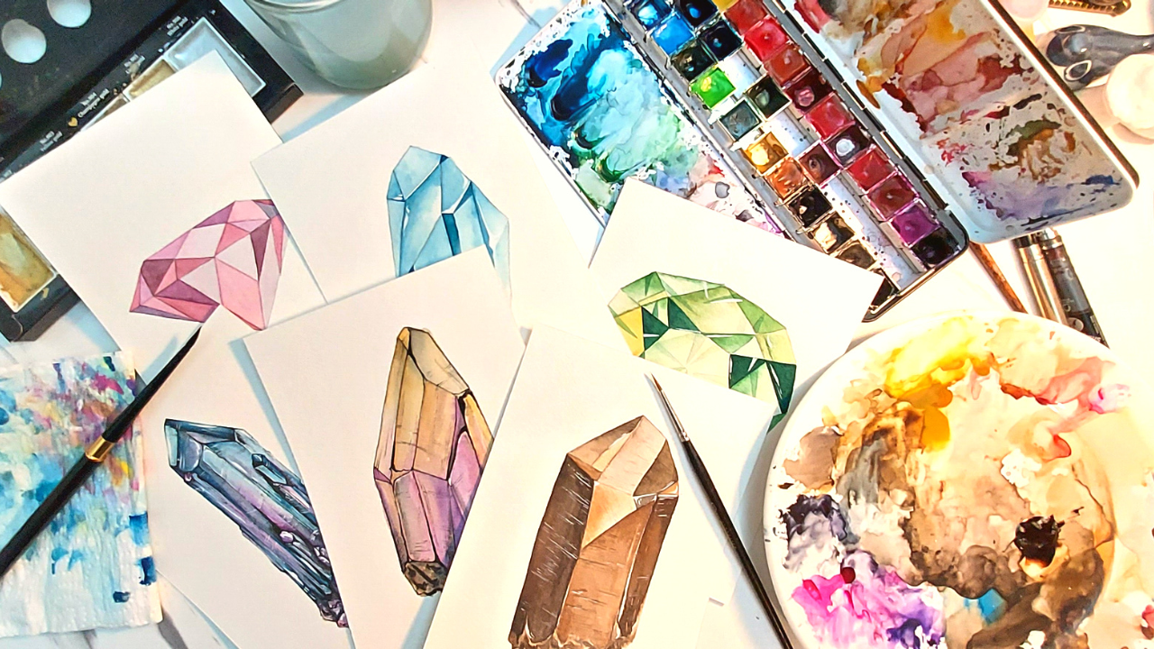
2. MATERIALS: All right, so first
you're obviously going to need your watercolors, some kitchen towels,
your brushes, a couple of jars of water. I have to is me here. And if you like, you can also
use some metallic paint. I also have some white gouache. You can use white
ink if you like, or a white gel pen. Another option is to
use some masking fluid, which these do come a
little bit more expensive, but they're really fun to use. How it works is you put
on the masking fluid onto the surface of your paper that you want to keep white. And that's just going to prevent that area
from being painted. So over here I have
a few crystals and gems from my very
small collection. Now it'll be really
good if you can actually get your
hands on a couple of actual crystals and
gems so that you can see how the light
interacts with it. In real life, you can move it around and actually get a
really good look at it. But if you don't
have these at hand, No worries, You do not have
to go out and purchase them. I have prepared a
Pinterest board with a few references and feel free
to use during this class. One of the first things that
you will want to notice is how light interacts with
these crystals or gems. First of all, depending on how opaque or transparent they are, far more opaque crystals, it's very basic where
the light hits is, where you'll get a reflection. You'll have light and shadow. As with any opaque object. But for more transparent gems
such as this rose quartz, you'll see that light
actually travels through the crystal and you can see it over on the other side. We have a little bit of light bouncing inside and
pulling around it. That can seem counter-intuitive
to how we would normally think about
how light would interact with an object. But it's all just a
matter of observation. And you can certainly do
a lot of observation, even just using whatever
resources you have online.
3. SKETCH: When it comes to drawing
out your crystals are gems. It really helps to just break them down
into simple shapes. So for example, I'm looking at this and says
Crystal over here. While it might look complicated, is really just a bunch of
triangles and rectangles arranged together in a certain
way to give us this shape. So when you're looking at it, if you're drawing from physical reference or
even just a photo, try to break down the whole
thing into smaller shapes. This makes it a lot easier for you to draw out
the whole thing. Don't really worry about any of the other Patreon details. You can just add that
lightly in later on. For this rose quartz pebble, this is more of a
somewhat circular, oval shapes, so it doesn't
have to be very exact. I'm just sketching out
the general shape of it, marking out where that highlight the reflection
of the light would be, and a little bit of where
the cast shadow would be. I'm also marking out a
little bit of the areas on the stone where it would
appear a little bit darker. For this one, it's
basically a cube that is at an angle and we have not very defined edges to the cube where it's been worn down and
polished quite a bit. But essentially the
form of this is a cube, and then we can just mark
on the patterns afterward. This one was a really
fun one to do, and I drew this one a little
bigger than its actual size. But while it does
look a little bit, while it does look a
little bit complicated, it could just really break it
down into a bunch of lines and rectangles that are
all next to each other. I'm not really worrying about the actual form while
I'm sketching this out, I am just drawing what I see in the moment for
something more irregular, like this rose quartz
charge over here. Essentially the basic
shape of it is irregular, sort of a for corner pyramid. And that's the basic shape
that I'm starting with. And then I'm just
going to be adding in the irregularities on the sides
and the surface later on. But it makes it
so much easier to just see the actual basic shape that is formed is taking before worrying about any
of the other minor details.
4. PRACTICE 1: Alright, so we are finally
starting with our watercolor. Now how I sometimes like to
start my painting sessions, I don't do this all the time, but it's good thing to start with is a little
bit of a warm-up. Watercolor is a transparent
medium and you can actually do a lot with
just the one color. If you know how to balance out how much pain to how
much pigment you have versus how much water. Here, I'm just drawing
a few rectangles. And with each rectangle, I'm using more and more
paint compared to water. For this first one,
there's quite a bit of water and not much
paint in there, so it looks very, very light and very transparent. For the second one,
I'm going to be adding a bit more
paint and so on. The next time, moving onto
some circles over here. And I'm doing basically the
same thing for the first one. I have my paint added to one
side compared to the other. For the second one, I'm leaving more of the
paint over on the edges, leaving a nice, much lighter highlight towards the middle. For this third circle, what I'm doing first is I'm wetting the whole
surface with water. And then I'm going to
take some of my paint on my brush and just drop it in. And I'm actually
going to let that bleed and spread as it would, because you sometimes
get some really nice funky organic patterns when you just let the paint and the water do what they would. Next, I'm moving onto some
simple shapes. Over here. I'm keeping the light source
at the upper left side. So I'm assuming that these
crystals are opaque. We would of course
have the lightest side over where the light is, with the darker colors over the shadows
on the other side. We're making use of what
we just practiced a little while ago where I'm
using just the one color, just the one paint pigment. And just by controlling the
amount of paint versus water, I am able to get
these varying tints and shades to use for
these shapes over here. This is really good practice
for you to get the hang of experimenting with controlling
the amount of water versus the amount of paint
that you have in your mixture
and on your brush. And seeing what you are going
to be able to do with that. You can see here
that I am actually layering on top of this
side of the shape here. Since watercolor is a
transparent medium, a lot of your painting
practice will involve waiting and layering and coming back to build on
the color and the opacity. I have a couple of other shapes here and I'm doing more or less the same thing with
the other colors. Feel free to pause and rewind
this as much as you like. You can actually do this
worksheet several times if you like, with different colors. And trying out different
ratios of paint to water. Just have fun with it. You can actually do this
worksheet several times if you like, with different colors. Trying out definite
ratio of paint to water. Just have fun with it. All right.
5. PRACTICE 2: All right, For the second
half, more practice, we're going to see
that there are a few circles over the
bottom of the page. I've just turned
mine over so that it's easier to paint on it. I'm using these circles to
sort of experiment with what I might do when I actually
get into painting crystals. So as we said, the shape of the crystals are
essentially very geometric, regardless of whether
they are cut and polished or if
you're seeing them. And unfinished crystals,
they generally tend to have very geometric look to them. That's why it's going to
make things a whole lot easier if you started looking at them and figuring out
the basic shapes. For this first one, this is more or less
what the bottom of a circular diamond would
look like if we're looking at the bottom and seeing
the tip, the middle. And it's got quite
a few sides to it. These are decides that
I am just painting out in various shades of more
or less the same color. It. The next ones I've drawn in some random shapes into the circle just to mimic what
a crystal might look like. There's not really
any rhyme and reason. I did these ones. And it doesn't really matter while you're still
doing this practice. For the blue one, I just fill it in with
various shades of blue, just flat washes in
each of the shapes. For this green one. I'm doing more or less the same, except that adding in a bit of gradient for each of the shapes. There's more paint on one side of each
shape or one corner. It is more diluted
towards the other end. And doing this will help
you give the illusion of light playing around in
your crystal or your gen. This last one, I'm doing
more or less the same. I am first giving
it a little wash, a very light wash
of purple and gray. You can use any color you like. And once that's dry, I'm going to go back
in and start filling in those random shapes inside with little
gradient as well. And I'm only using
one color here. But since we did put down a
very light wash, begin with. So at the sides of
those are the sides of those shapes where it's a
bit more transparent because there's more water
the previous layer is going to show through. And that's going to give
the crystal that hint. Very light tone color.
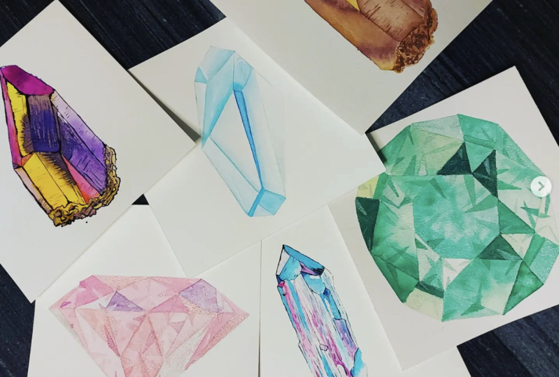
6. PINK DIAMOND - Flat Style: All right, Now that we're done
with our initial practice, you can get started with trying out a few
crystals and gems. I've encoded in the
project resources section. Links to a Pinterest
reference board, as well as some PDFs of the sketches that I
made for these gems. Feel free to head on over
there, download them, and use them as much as
you like for this class. For this first pink diamond
can use any color you want. Actually, this one, I am just going to be painting
it in flat shapes. So I have the diamond and the pattern drawn onto
my watercolor paper. And I am just going
to be filling in the shapes a
little bit at a time. Just a flat wash of color
and I'm going to be using more or less and the
same couple of colors. I think I'll be using pink
and a little bit of purple. For this one. I'm just
going to be painting each each geometric shape in this overall
pool diamond shape, a flat wash of color. I'm going in at random intervals for each of the shapes because I don't
want to be painting. I don't want to fill
in two shapes that are side-by-side with a
very similar color. And also this is watercolor, so it's going to take
a little bit for a, for each wash to dry. So I'm just going
to try and avoid painting directly next
to one that still might be a little bit too wet because that is
going to obviously have the paint bleed into the wash right next
to it and spread in a way that I will
not want it to. In this case. This video is sped up and every now
and then I actually take a step back and
wait for it to dry. So you may need to do that as well while
you're following along. So feel free to just pause, take a break, and wage
for your first layer. It is a couple of
shapes to dry and then come back and continue. In if you haven't. Pretty pink diamond.
7. GREEN GEM - Geometric: For this next screen jam, I'm still going to be
using mostly flat washes, but I'm also going to be
incorporating some of the gradients that we
practiced earlier on. Now in this one,
I'm also going to be taking a little bit more into account the direction of the lighting for this trend. For this one, I'm taking that lighting is almost
directly overhead, but a little bit towards
the left as well. So as we discussed earlier, with gems are crystals that are transparent or
semi-transparent, where the light is
actually able to go through a gym or the crystal. There is going to be
quite a bit of light bouncing inside and
sort of like you could call it collecting within because of refraction
and all that. So contrary to what we might
think and how we're used to seeing light interact
with more opaque objects such as your table
or a wall or a rock. The side that we expect to
have much darker shadows, that is actually where
we will be seeing quite a bit of the
light pooling. And this is the
light that is inside the crystal bouncing
around, inside over there. And also because their crystal again is sort of transparent, light, this flow through, it does bounce around inside and flows
through and comes out over on the other
end while they are still shadows that are
going to be formed. They're not exactly quite how
we're used to seeing them just because the light isn't
being completely blocked. Now it might sound more
complicated than it actually is. But on the bright side, this does actually make
it quite a bit easier to mimic the look of light bouncing
around in your crystal. So because the
bouncing around of this light is very erratic and random also depending on the material of the crystal
itself and the cut, etc. It kind of makes it
rather easy for you to mimic the effect of the light interacting with your crystal as you're painting. You can see, I'm going back into some of those shapes
with a second layer. After that initial
layer has dried, just to add a bit more contrast and a bit more saturation to the color to make
it look like it has a bit more shadow on one side of each shape, then the other. Now once I'm done with the initial shapes
on this crystal, going to go back in. And just using the
similar colors I'm going to paint in a few more, smaller triangles and
shapes in-between. This is because this is a
semi transparent crystal, meaning that it is
a colored crystal, but it's not completely opaque. So sort of like how you would see in a crystal in real life. You can't see through it. You'll be able to see your hand or your finger on
the other side, for example. And you'll also see
bits of the facets, the faces on the other side, the underside or the other side, the crystal while
you're looking at it. So I'm adding these few
shapes over U2 mimic seeing light interacting with Z other sides of the crystals. But we're seeing it through this top view that
we are painting. Unless is definitely more here, you don't want to overdo it. And it does take a
little bit of practice to figure out when
you should stop, but at the same time, just go ahead and have fun. I could leave it at this, but I think I want
to add a little bit of highlights as well. So I'm going to be
using my white gouache. You could use white ink. Or if you have one of those white gel pen set will
work perfectly as well. And I'm just going
to add very few of these white
highlights over here. And some of them are
going to be along the edges of the shapes. And a few are going to be smaller versions
of those triangles that we added earlier. And this is just going
to give the impression, the illusion of more
light being reflected. And it's going to make
it look more like what a gym might actually
look like in real life.
8. BLUE CRYSTAL - White Highlights: Now for our blue
crystal over here, unlike with cut
and polished gems, crystals are going to
be less symmetrical. You still have geometric shapes there of course, as the basis. They're going to be
less, even there's a bit more irregularity and you have a lot more
room to play with. I suppose you could say, I kind of like painting Crystal's. More than that. I enjoy painting
refined cut gems. Just because there's
a lot more room for you to play around
with the shape. I am using. More or less, just the one color here. This is a bit of
turquoise mixed in. Whereas I think a royal blue. Similar to what we did
in our first exercise. I'm just varying the amount of water that I have mixed
in my brush and with the paint to give me these various tints and
shades of the same color. Now once I'm done with
the base color and adding in more of those
shadows that I like. I decided to go back into this one with a bit of
my white gouache paint. Again, just because
I want to add a bit more of those
highlights here and there. And I wanted to be
a bit irregular. And this is just going
to give that crystal, that more reflective look to
make it look more elegant. Well-being, unpolished.
9. AMBER CRYSTAL - Texture: For this brown one, I'm going to be using my complexion skin
tone palette just because this really has a
nice collection of ochres and browns that I wanted to use
in this dark amber crystal. This crystal, I'm using the techniques similar
to the one that we used for blue acquire marine crystal that we painted in
the previous class. Except afterwards for this one, I wanted to be a little
bit more textured. So we're going to be
coming back right after we fill in the bass tones and colors for this shape
to add in a little bit more of the texture. But with it. Because
this is a cut crystal, but it is an unfinished ones. So I want this to have cuffs and scratches
that the surface would have from the tools
before it's actually published. I'm going back in
here and multiple times after leaving it
to dry for a little bit, I'm coming back in with another layer to
deepen the color, to add a little bit more shadow. Painting with watercolor
is quite the process. It can take a little
bit more efficient. So just hang in
there and have fun. I believe, some music playing
an audio book or a podcast, or have something
playing on Netflix in the background when I'm
doing these paintings. Once I am done with the base colors and
I'm happy with that, I'm going back in here
with my brush and taking a color darker
than the section that I'm painting and adding in those very fine lines just
to indicate these GFS and scratches that the surface
of the crystal would have gotten from being
cut with a tool. The darker side, I am using white gouache to add in
those scopes and scratches because because if you would observe in real life anything that's light-colored
once it gets scratched, we usually see the shadows of the scratches and that's why the strategies appear darker. Whereas if you use scuff up something that's darker colored, we see those scratches as much lighter than the base color
of the actual object. More or less. The same
concepts going on here, and I'm also using that white gouache to add in a little bit of highlights as well. Again, more is less here
I'm using very fine lines to indicate those those
fine tools scratches. We don't want to overdo
it. There you go.
10. RAINBOW CRYSTAL - Ink & Watercolour: Sometimes I want my
illustration to be a bit more sketchy
comic book story. And that's when I'd
like to use some ink. I have here a black
and white ink. I will be using gouache instead. You can use liquid ink. If you prefer to use a
pen and nib, you can. I do have these waterproof
pens over here, one with a brush tip and to
his tips in various sizes. And these are the ones that
I'm going to be using. For this rainbow crystal. I'm starting out with doing the lines and some hatching
with my fine liner. First. You could do this before or after and painting
with watercolors. But for this one I'm just
doing the lines first. These pens are waterproof once
dry the ink is waterproof. One's drive, so you
just have to make sure that whichever pen or
fine liner you are using, it is going to stay
waterproof once it's dry. Otherwise, once you start painting over it with
your watercolors, you are going to get a
lot of unwanted smudges. One thing to know that my
initial inking there may be some lines that I
want to thicken out. And I could use fresh
tip one for this or it could just a second my lines by using the
same fine liner pen. Using one with a thicker nib. Then I'm going to
go in and add some of the lines to
indicate texture. This case similar to
the previous one. I do want to add a bit of
scarf and scratch marks. Want this to look like a natural, unpolished,
uncut crystal. There's going to be a
bit of weathering on it. And the legs I'm going
in with a bit of lines and some hatching
just to help with that. Once I'm done with that, we're ready to start
with the painting. First. I'm going in with very light washes of the
colors that I wanted to use. In this case, I'm using
yellow ocher and a bit pink, purple that I had earlier. As that previous
layer is drying, I'm going to be adding
on a little bit of Payne's gray on some
of the areas where I want to emphasize a little
bit more of that shadow or the look of the crystal and being weathered down by
the elements are by time. Going back in and adding
another layer of color to intensify and add saturation
in the areas where I want to some grays. In the areas where I want it to appear a bit more stuffed up a bit word either
dirty or in shadow.
11. BLUE & PURPLE CRYSTAL - Sketchy Illustration Style: For this last one is
the look that I'm going for is sketchy, sort of comic book, graphic novel type of look
which I tend to prefer. When I'm illustrating
crystals like this. I'm going to be using my
fine liners to the inking, but I'm going to
do that after I've finished painting
with watercolors. Once all of the colors
and shadows are done, That's what I'm going to
come back in with my ink. White gouache. Feel free
to follow along and enjoy. In
12. CLASS PROJECT: And our class is done. Your assignment or class
project for this class is to paint at least one crystal and any style or a medium that you like and share it with
us in the project section. If you paint more than one, feel free to share
them all with us. If you'd like. If you have any questions, feel free to post them in the discussion section
of this class. And I will get back to
you as soon as I'm able. If you post your projects
to social media, feel free to tag me
on their results. I can see it and share
it and cheery line. If you guys want to
learn more from me, feel free to take a look at my other classes over here
on Skillshare as well as the thousands of other classes
on this amazing platform. He finds his class valuable. It would be really great
if you could leave a review to help other
students decide. They'd like to take
this class as well. I'm really excited for
you to enjoy this class and I hope you have a fun time. Take care, Have fun. And I'll see you
in the next class.
 Gilchi Rose, AuDHD Storyteller, Writer, Artist