Transcripts
1. Introduction: like so many. You may have a love hate relationship with water colors. It'll have still transparent and delicate, but also has a life of its own and can't seem quite scary and unpredictable. Hi, I'm Laurie, freelance artist, illustrator and have letter behind Glory's Heart box on Welcome to my First skill share. Class leads don't have to be the pain of your watercolor existence. The key is to understand what goes on between the water paper and your paint in this class , who go over the basics of painting with watercolors and then dive into understand relationship that is water and your pains. And for a class project, you'll be painting your favorite marine animal, where they already have experience painting with this medium, or are beginner just starting out in water color. You will no longer fear your water. Kota bleeds but know how to take. In fact, you'll be able to decide and control went, and where it happens, you'll be able to apply these techniques to any watercolor painting language. By the end of this class, you'll have learned to let loose Angela. That's to accept and understand that the unpredictability of watercolor on to embrace and own. You're watercolor pleads to create amazing effects in your illustrations. So let's jump right in and have fun playing with water colors. See you in class.
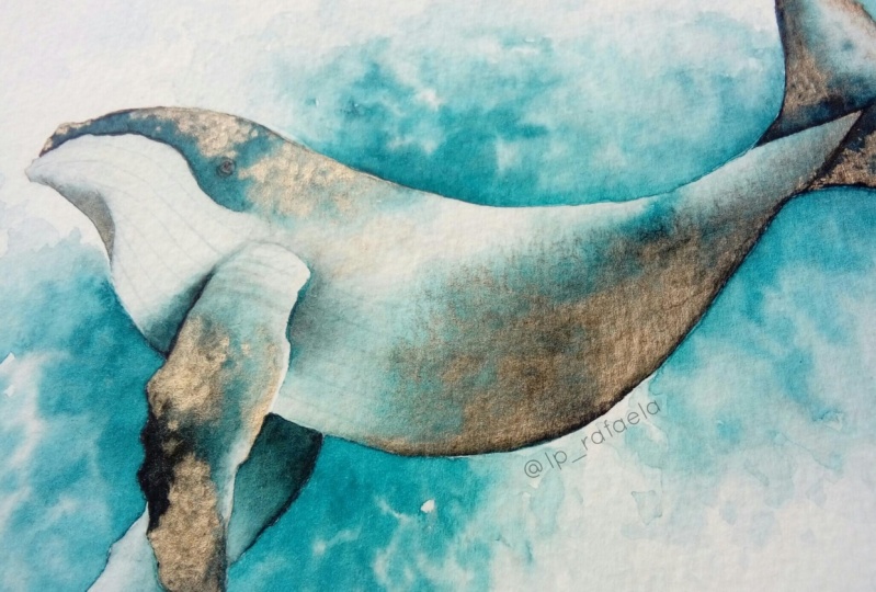
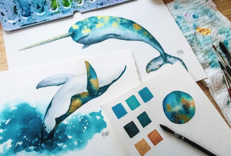
2. 1 Tools & Materials: Let's take a look at the tools and materials you're going to need for this class. First is your paper. I personally prefer to use 300 GSM or £140 or higher of watercolor paper. Whether cold, breast or hard pressed, This number refers to the sickness and sturdiness of the paper, not the actual wheat of the paper sheet. GSM stands for grams per square meter bond paper to text paper or what you might call printer paper is between around 2200 GSM. I recommended that he used the best paper available to you, especially when working with wet mediums like water color. Lighter papers will not be able to withstand the amount of water you'll be putting onto the paper surface, and you might experience buckling and disintegrating of the paper, which will obviously not to give you the results that you're looking for. I have several smaller paper paths here is you can see these air from 200 to 300 GSM, and I used the smaller ones mostly for practice or swatch ing new colors my go to and currently my favorite is this tortious 300 GSM cold pressed 100% cotton acid free watercolor paper. I find that this paper can handle the way I like to paint with watercolors. And I use a lot off what unwed techniques, which involves a lot of water. This brand of paper is, of course, not the cheapest but again argument using the best that you were able to get next. You need your watercolors. Of course, Now you're watercolors could come in different types. Most common is the pan set. You'd be familiar with the sets that come with the watercolor pans in little circle cakes that you can get it most stationery stores. This here is my prima confections set in the complexion palette. My most used right now is this enemy ace it. The advantage of these pants sets is you can have a lot of colors on. They come in a handy little box that you can easily bring around with you. These are liquid watercolor, constant shits on the come in these little bottles with a dropper that you can use to get some of the paint out. And of course, they can come in tubes over here. I also have my gunsight Hamby, such of metallic gold watercolors. They come in these larger individual patents. Next up brushes. Now, I've collected court a few brushes over the past couple of years, but you don't need all the fancy shmancy brushes for this class. Any watercolor brush that you have available to you will do. You will most likely have a round brush. I'm going to be using a soft mop brush as well as a number four round brush. You're watercolor set. Might have come with one of thes water brush pens. These really cool. You can fill the body up with water, and you don't need to have a jar of water with you. You squeeze the water out of the brushes you need, and it's really easy to clean as well. Finally, you're going to need a palette are like using this ceramic plates for my palate, one or two jars of water and, of course, some paper towels or tissue paper.
3. 2 Watercolour Basics + Exercise: Let's quickly go over a few basics when it comes to painting with watercolors. Even with just one brush, you can get a variety of stroke widths. It all depends on the amount of pressure you apply when you're putting your brush to paper . So over here I'm using a number four round brush. I'm picking up some paint and using varying amounts of pressure. I'm just painting a few lines onto the paper on. As you can see, I can get both thick and thin lines. Applying more pressure will result in wider strokes. You can get too much thinner strokes by applying less pressure. You can also vary your line with in a single stroke just by changing the amount of pressure you're applying onto your brush. Wally Paint. - Now let's talk about wet on dry and wet on wet techniques. As the name suggests, wet on dry means. Painting with a wet brush onto a dry surface and wet on wet means painting onto on already wet surface. Here on the left, I'm painting a rectangle, and I'm going to let that dry right. I'm going to paint another rectangle. My brushes dump with paint, but not so wet that the paint puddles on the paper without waiting for it to dry. I'm grabbing another color and painting 1/3 rectangle right next to that pink one, and you can see that the water in each paint layer tends to want to bleed into each other. Now, since the first layer wasn't too wet, they don't bleed into each other as much. If I go over with much wetter pink paint, you can see that it will bleed into the blue much more readily. Now let's see what happens when we use a lot more water. So I'm wetting my brush and grabbing this bright pink paint on just painting onto the paper . You can see that the paint pools in certain areas where there is more water. Now I'm rinsing my brush on grabbing the blue paint. I'm then dropping this into this still very wet pink paint, and you can see that they immediately bleed and blend into each other to make a beautiful lilac color. This is the wet on wet technique that we're going to be using in this class. We're going to take advantage of watercolors, tendency to like to bleed into the Web paint right next to it. Now let's go back for a moment to that first rectangle. It's now completely dry, so I'm grabbing some of that blue again, making sure my brush has picked up that what paint but also that the brush isn't too witch with water. I can then paint over that first rectangle. Now watercolor is a transparent medium on. As you can see, you're going to be able to see that first layer of pink through that new wash of blue. This technique is also called glazing. You could layer washes of the same color or different colors to get different results. Now let's do a quick exercise to practise playing with our water color bleeds on a sheet of watercolor paper. I've drawn a few circles. You could use circles or any shape you want. We're going to play around and see what we can do with wet on wet techniques. In this first circle, I'm grabbing some yellow paint and laying it down onto half of the circle shape, making sure I leave the edges dump. Then I'm dipping my brush into clean water and using that dampness to paint at the edges of my yellow paint, allowing the pain to bleed into the dampness of the water to get the gentle greedy into effect. In the second circle, I'm doing the same, except instead of clean water, I'm picking up some blue paint to lay beside that yellow on, letting them bleed into each other, this technique and give you very organic looking blends. On the third circle, I'm laying down a wash of clean water. First, I've been grabbing some painting my wet brush and just dabbing that onto the wet puddle on paper, letting the paint bleed and spread as it wills. No way I'm doing the same on this next circle, except with different colors. - So take your time. Do this exercise as many times as you like with us many colors as you want. Experiment with what happens when you use more or less water or pains. But most importantly, don't Trickett relax and enjoy the process way, - way
4. 3 Colour Palette: now that you're done with your exercise and got and familiar with the wet on wet technique , let's move on to preparing your color palette on your sketch. One way that's almost always certain to result in muddy, dull colors is having way too many colors in your palette without proper planning. To avoid this, I recommend selecting 3 to 5 colors to use near painting. You can mix between these colors to get other tones and shades of colors that will still be cohesive to your palate. Here I'm picking up four colors a se lo blue. I like this blue as it's a warm, lively sort of blue, a turquoise green, Payne's gray as well as gold from my gold palette. The gold of selected is a dark yellow gold, which will be a complementary color to the blues in the palate. So with these four colors, I'm going to prepare my color swatches on a small piece of watercolor paper. I'm picking up some of the paint and just painting little squares. Now you can choose to paint these in rectangles with Grady instruments saturated to dilute , but I'm just painting flat washers here as I just want to see what's the paint is going to look like on paper. So first I'm swatch ing out, each color on its own. - Then I'm mixing some of the taylor blue and turquoise screen and watching that on to the paper as well. We then do the same with the Paynes Grey. - I also take some of the blue and turquoise screen mix and mix that in with some of the pains great and swatch that as well. Now that I'm happy with my color selection, I'm drawing a circle on the side, similar to what we did in our previous exercise. I'm laying down a wash of playing Clearwater and then dropping in the different colors from my palate thistles, going to let me quickly see a sample of how the colors are going to look when they interact with each other when I use them in my painting. If there's a result I don't like, I'll be able to know this early on that I may want to change a color or two in my palette. This saves a lot of time and frustration because I can be sure that the colors work well together before I even start my painting. So go ahead and play with your own colors or use one similar to what I've picked. If you're unsure, there's a site called coolers that generates color palettes for you. I'll leave the link in the project section of this class in case you want to refer to it. It's a good resource for seeing what colors could look good with each other in a composition.
5. 4 Sketch & Base Wash: Now that you've decided on your color palette, we can get into our sketch. I'm very likely drawing my blue whale onto the watercolor paper. If you have a slightly heavy hand or you like to draw the darker lines, you can draw on a separate piece of printer paper and then transfer it later on to your watercolor paper. But since this painting is not going to have too many details, I'm OK with lightly sketching the outline directly onto my watercolor paper. I've included a link to a Pinterest inspiration board in the project section off this class . So if he still happened decided on your creature to paint for your class project, you can go ahead and take a look at that Pinterest board for some ideas. We want to lightly sketched out the main shapes of the creature, light enough so that we can see but not too dark that it will leave a dark mark later on. When we try to erase or paint over it, - I'm also likely erasing any unnecessary lines way. - Once that's done, we can move on to our base wash for the painting. I'm using a very, very light wash of grave for this whale. If there are areas you will want to be white later on, you will want to leave them unpainted with watercolor is the lightest you will have is the white of the paper for this? Well, though I don't want to leave any areas pure white as I won't be painting any dark background. So instead I'm going over the whole whale shape with this very light wash of gray and then I'm going to let that drive.
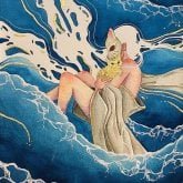
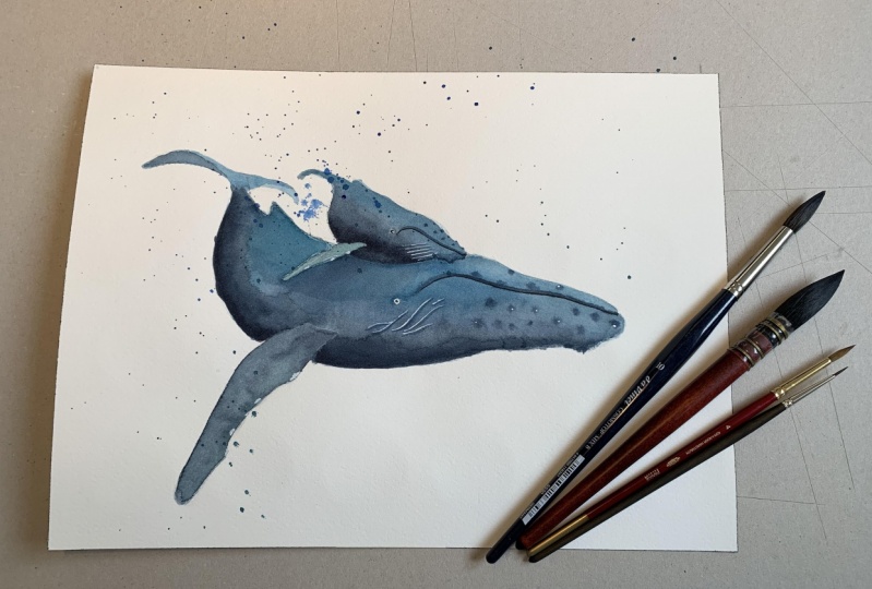
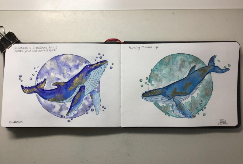
6. 5 Blue Whale: Now we're ready to start painting. Let's jump right in. I'm grabbing some of my dark hair blue gray that I had mixed earlier and laying that down in the areas where I know I'd want this color to be. This doesn't have to be perfect. I'm not creating a realistic painting of this blue whale. I'm using my reference photos to guide me and where the colors should be. And I'm going with my imagination from there way. - I'm laying down what washes off the blue color and then going back in with a damp brush to pull that color out way you can see in the fin. It's a bit darker than I would like. So while the paint is still wet, I brought my brush on the paper towel and then go over the part where I want to pick up some off the paint, the brushes drier than the paint surface. So it sucks up some of that paint, allowing me to lift it off paper. So I get a nice grade and highlight. As you can see here, I'm going over the dark blue with several washes, slowly building up the intensity of the color with water colors. You want to work from light to dark. Watercolor is a transparent medium, so unlike a pig pains like acrylic oil, Zorg, Wash. You cannot paint a lighter color onto a darker color. Well, technically, you could, but the color beneath would still show through way. - Now I'm ready to drop in my gold metallic pains. You want to do this ideally, while the paint beneath it is still a witch. As you can see, there are some areas where the blue paint beneath has started to dry, so the gold is not spreading out as we would like. No problem, though. I'm taking a wet brush, picking up some of the blue paint and painting just at the edges of that gold paint to coax it to bleed out. I can use more or less water, depending on how much I want to let bleed. While I'm waiting for the blue and gold to dry, I'm moving on to the rest of the body of the whale. It's bellies technically white, but in reality no white surface will appears pure white, probably unless it's a flat surface under a direct light source with nothing blocking it But this whale is a big body with a lot of volume, so we are going to see some shatters. Using my reference photos to guide me, I lay down another clear wash of water and start dropping in some great pains to show where the shadows would be way . I'm not painting a full background for this whale, and since the background is the word of the paper, I'm going to paint in the splashes of water, but in blue again. We're going for style eyes and not realistic here, so just let your imagination run free and roll with it. I'm wetting the area around the tail on Ben, dropping in some saturated paint. As you can see, the paint will tend to bleed into the water and spread out. - I'm softening any edges that form with my wet brush. You can see that there's an area near the tail where the water and paint bled onto whale itself. I don't want that, but since it's still wet, it's fairly easy to fix. Just take a paper towel and gently dab on the area to pick up that extra paint, and there you go. You can leave this layer to dry on its own. But sometimes I like to use a hair dryer or this heat gun to speed up the process. I'm then layering darker blues on top to add to the intensity of the color and also to add dimension to the water. The whale is coming up, out off way. Then I try this again with my heat gun and we're all done.
7. 6 Thank You: I hope you enjoyed this class and learned about how you can control and take advantage of your water color. Please don't forget to upload photos of your progress and you're finished artwork in the Project gallery section of this class. And if you post your artwork on Instagram or other social media, please tag me so I can see your work and feature you in my stories as well. Thank you so much for taking this class. I hope you had fun. Andi. Hope you go on creating more art until next time I
8. 7 BONUS VIDEO 4: Hi, everyone. Thanks so much again for taking my class. The previous video lesson where I painted the blue whale was sped up a little bit So I decided to include a bonus video for you. This time I'm painting a normal our real life Unicorn of the Seas. This video is in real time and is about two hours. So if you want to watch and paint along with me, feel free to do so. That would be awesome. So here it goes. Enjoy. No. Oh, - no . Oh, - no , no. Oh, - no .
 Gilchi Rose, AuDHD Storyteller, Writer, Artist