Transcripts
1. Introduction: Hello, I am Zleha. I'm a watercolor
artist and instructor. And over the years,
I had the chance to teach and hold workshops
in different countries, connecting with students
both in person and online. In this class, we
are going to explore something that completely
transform your paintings, how to create depth
and focus by balancing a loose background with
more detailed subjects. One of the most common
challenges in watercolor is knowing what to keep
soft and what to define. When everything has the
same level of detail, the painting can feel
flat and unfocused. But when we learn
how to simplify some areas and bring
clarity to the others, we can guide the
viewer's eye and create a much stronger
visual impact. Through this class,
we will work with a variet of essential
watercolor techniques. You will learn how to build soft flowing backgrounds,
using petit applications, how to control water and pigment to create
natural textures, and how to use
lifting, layering, and edge control to bring
depth into your works. We will explore how to create contrast using color
temperature and values and how to combine soft and
hard edge and how to keep your painting expressive
without losing control. Then we will bring
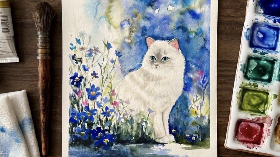
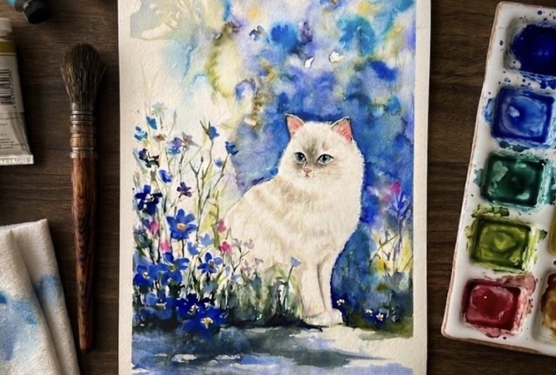
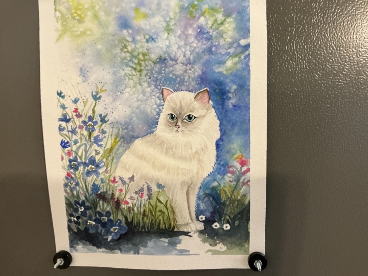
everything together in a final project where we will paint a white cat as
our main subject, starting with a loose
atmospheric background and gradually
building up layers, shadows, and fine details to
bring the subject forward. This class is not only
about techniques, but also about learning
to thrust process, letting go of over control and allowing your painting to
develop more naturally. By the end of this class, you will have a
better understanding of how to create depth, balance, and focus in your
watercolor paintings. So if you are ready
to create more expressive and visually
engaging works, I would love to have
you in this class. Let's get started.
2. Welcome to the class!: Hello, and thank you
for joining this class. I'm so happy to have you here. In this class, we
are going to explore how to create a strong
visual focus in watercolor by building
a clear relationship between the foreground
and the background. We will be working on a
cat, but more importantly, this class is about
understanding how to guide the viewer's eye. Will learn how to
keep your background loose textured and blue with the creative watercolor
techniques while bringing your subjects forward with more detail contrast
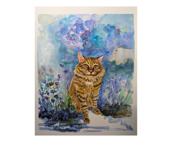
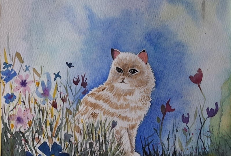
and clarity. Your project for this
class is to create a painting where your subjects stand out from the background. And in your projects, I will be looking at how effectively you create
separation between the foreground and
the background and how you use color value, and age to build de and focus, and how well you balance, loose and detail RL
in your painting. I can wait to see how you interpret this balance
in your own work, and I will be giving
detailed feedback on each project to help
you improve and grow. Now, let's talk about materials. You will need watercolor paper, preferably 100 person cotton. And for colors, we will be using Ultramarine Peacock Blue, troca, Lavender, Br
tamber, Sepia, Indigo, Cobalt Blue, Hansa Yellow,
Permanent Rose, Opera, and meridian, and feel free to use similar colors
from your own palette. As for brushes, you can use
a large and soft brush for the background and smaller and round
brush for the details. You will also need a cup
of water, paper towels, palettes, like this,
a pencil and eraser. By the end of this class, you will have a clear
understanding of how to create depth and focus in
your rotter color paintings. You will learn how to
separate your subject from the background using
colors, values, ads and textures,
and how to balance loose and expressive areas
with more refined details. More importantly, you will
start letting go over control and allowing
the painting to develop more naturally. So gather your materials, trust your process, and let's
enjoy painting together.
3. Background: Hello, everyone. In this lesson, we are going to learn how to create a background
for our subjects, whether it's cats, flowers, or anything you want
to bring into focus. Here, I have drawn my cat, and I'm not going to use
masking flute for this piece. But if you prefer working
in a more controlled way, you can mask the cat
inside the pencil lines. I will start directly
with the painting in the background and take
a large soft brush, something that can
hold a lot of water. And I will begin by
wetting the surface, the paper with clean water. And I'm loading my brush
with water like this. And I am gently
wetting the paper, but I am being careful not
to get too close to the cat. And I'm also leaving a few small white
gaps here and there. And I am moving mars, as well, but won't wet the
lower area completely. I will leave that
part dry for now. And for colors, we will use warmer blues and
slightly purplish tones. And I am starting with
the Ultramarine blue. I will place my colors
more intuitively, just observing how to pigment
suppress in the water. When I get close to the legs, I leave a bit of space here. Now, we are switching to
another color Peacock Blue. This one has a slightly
green undertone, so it's a cooler blue, and we are adding
it like this here. And as you can see, I am not getting too
close to the cat. We are mostly working around it. Now we are going to
add little bit tocas. Like this. You can see how
beautiful this color is. Now I am switching my brush, moving to a smaller Runk brush so we can work more precessly. We are adding a little bit
of rose into the blue color. And as you can see,
we have slightly shifted color to
ours to purple tone. Now, we are picking up
some Peacock Blue again. With this mixture, we are working around the cat
slightly moving in works. As you can see, I'm using
these small jagged strokes and then connecting them towards the right side to the wet side. It's almost feels
like I'm drawing, but I am applying this
into the settle wet area. We are connecting
the bright strokes. So in a way, we are creating
these sogag moments. With these moments, we are
trying to create for effect. Now, we are adding a
little bit of Ultramarine, especially around the leg areas. And we are also
keeping the surface slightly wet so it
doesn't dry too quickly. We are adding water. You really need to do this
while the paper is stil wet. If you try to create this
fur effect after it writes, you will start to see
harsh layered marks, and we don't want that. So we keep working while
the paper is stil wet. Now we're adding a little bit
cobalt into the pico blue. And in somewhere else, it's just start to dry slightly. And again, act moments. Now we are moving
to the ear area, and we are working
gently around the ears, getting close, but city light. And again, we are pulling the
paints slightly in molds. There isn't too much
detail in the ears because cats fur is mostly
concentrated at the tips. We will add more of that
later with the white pencil. Let's add a little
bit more purple here. We are softening the section
with the clean water. And I think the paper is
starting to dry slightly, but not completely,
and the paper is still slightly raised and the
moisture is about 50%. And we are leaving some
spots of clean water here and there into
the painted area. You can see some of the
natural watercolor textures forming almost like little
cauliflower shapes. And we are adding
more clean water. It's like drawing,
not small dots. Now, let's add
some warmer green. I'm using Hansa Yellow. You can use Indian yellow also and a little bit
Viridian together. And we are placing it
under the pow area, and it should look like
there's a little flour growing there and blending
naturally into the background. And a few more
struck in this area. Here a little bit here. And here, and the
paper is settle wet in the section and
more watery texture d. Now, we are going to use
pure yellow in some spots, and we are not taking
too much water. The pigment is thick,
almost creamy texture, and we are applying it
here because later, we are going to tiny
flowers around the Rs. Of course, once the
paper dries a little bit, here and here. Now, let's add some
Lavender color. If you don't have Lavender, you can also use cobalt
in a water form. And now we are going to supply
some clean water again. And this area should be clean, and I am taking excessive
pigments from there. And now we are going to
bring a bit of salt to the background very lightly just to create tiny distance
flowers texture. Be careful. Too much salt will make it look very dotted,
which we don't want. Now, let's add more color Ultramarine with
a creamy texture. These are the shadow areas of the background and
a little bit indigo with Ultramarine
around the pause and trying to create
branches, smalls, like that. You can feel that
some of the areas of the paper dry and the
other areas silhouette. And in this way, we use
the watercolors ability to create both soft and hard
edge at the same time. And we are going to
add Opera color. If you don't have Opera, you can use any
pink color to add some tiny flowers
to the background. And we are going
to ti the paper. See this area, the color here
feels a bit too intense, so I'm going to let it
flow very slightly. And I want to add
more clear water to the background to create
more texture here, and here a little
bit, more water. And the background is done. And in the next
sson we will going to paint four ground plants.
4. Foreground: Hello again. In this lesson, we are going to focus
on the foreground. And this part of
the paper is stil wet and that's completely fine. I can stay wet. Now we are going
to move the part. But before that, I also want to place a secondary
background color here. For this, we are
going to use Peacock, Bulu, Indigo, and
little bit Sepia. We are creating a soft
green Trocos mixture and make sure the
mixture is quite watery. We need to load our
brush with discolor like this. Lots of water. We are trying to create branches for the
background flowers. Now, we are going to focus on
the lower background area. For that, I am picking
Ultramarine and Lavender and we are placing the color directly
here, the lower part. And we are creating
flower shape here. Under the cat. A little
bit touch of green. We need to let the
colors spread. At this stage, we need to
use our colors very watery. For example, if you use Ultramarine and
Lavender here the move to another area and allow
the colors to flow into each other and
Ultramarine again. We are creating the
shadows of the branches, random brisotrks and
covering under the cat, you can feel this
space freely like this and give some
white space also. While the paper is sittil wet, I want to drop a few
small water here again, just to create some
texture and blooms. Now, we are going to add some darker tones Indigo
and a bit of Sepia. At this point, the paper
city needs to be wet. And as you can see, the lower area is citil
wet and because of that, the color spread
beautifully on this place. Now we are going to
paint our flowers, and for this, we are
mixing Ultramarine. And instead of drawing, we are just suggesting the
shape of a flower like this. They look like
small white flower seen from the side
and Lavender here, another petal here, and the flowers facing towards us and another one
from the side. And we are leaving the center
empty because later we will add some yellow in
there and another one here. And more water to
the background. And now let's add some yellow to the centers
of the flowers, and we are going to use slow
straight from the palette, placing it right
inside of the flowers. Now we are moving back to the peacock blue
and trucos color. And we are adding tiny white flowers in
different directions. Let's move on to some purple. I'm adding little bit
rose to the mixture. It is a beautiful,
warm, purple colour. A little one here. And another one here. Small bright strokes. We are layering the flowers. Towards the lower area, I want to slight
the darker flowers, and we can use Ultramarine
and Indigo for this, these flowers sit a bit lower
and closer to the ground. Again, they are
facing towards us. Let's leave some yellow
in their centers. And now we are moving
on to the greens. Let's take sello and reading
again and a bit water. And now we are going to create
tiny branches like this. At the same time,
I'm occasionally pressing my brush down to varie the thickness of the
branches and to create leaves. We are taking a little
bit of trocslor to covering the upper part of
the cat, very light wash. In this way, we
will frame the cat. And now we need to layer some of the flowers
with Ultramarine. I just want them to
stand out a bit more. I'm not completely covering
the colors underneath. We are simply adding
a bit of death and darkness so the flowers
become more visible. It will be there. Let's
take a green color again on the right
side of the paper, you need the little
branches here, very thin rush mags. M Let's prepare
another green color for the stems and leaves. I'll say low meridian. It's like a sub green color. A bit of reden again a little bit ultramarine to
deepen the green slightly. We are applying this color to the lower part of the flowers. These R will look like
they're in the shadow. And other stems. This helps us build more layers
and adapt to do painting. And the flowers at
the bottom should feel slightly darker underneath, and we are adding
a bit more there. At this stage, you can
use a fine tip brush. My brush has a very sharp point and holds together nicely, which makes it quite
easy to control, but it can also feel a
bit tricky at first. So using a fine round
brush is perfectly suitable here for
the leaves, stems. And as you can see, I added some greenery here to help
define the ground area, and that part is now complete. And what we are really
trying to do in this painting is to keep
one side more detailed, richer, and darker in colour, while leaving the other side
softer and more blurred. And this creates a
nice visual emphasis in the composition. We use Opera here and it
turned out beautifully. Now we are going
to pick up Indigo again because there
are still a few ls that need to be darkened and we mix Indigo with the green
we prepared earlier. So here, underneath
these flowers in the areas that fall more
into shadow like this. And what I'm doing is adding
another layer on top of the base layer we
painted earlier here. Now we are eating a bit more
yellow and mixing it with our green colors and creating something closer to
olive green color. Amid this, we want to fill this area around the
cat a bit more using small branches and
leaves, small dots here. And let's add tiny purple
flowers here and there. As you can see, we
are not focusing too much on perfect
flower shapes, let's add a touch
of Opera again. And if you don't have Opera, it is not essential. You can use any rose
or pink colour. It just give a
slightly more vibrant and almost fluorescent touch. I personally like it, so I am using it here. And now let's take a Lavender color to
create flower shapes. And in this way, some of the flowers
tant out a bit more. These kind of brush marks
will also help you break away from citric rules because when we
paint in watercolor, we often try to repeat
exactly what we see, and we tend to work in a
very controlled planned way. And this is actually one of the things students
struggle with the most, trying to replicate
everything perfectly. Sometimes that can be helpful, but other times it can
become quite exhausting. Try to create some
flowers, tiny flowers, and the sitams and
leaves let's add some Ultramarine again and darken some of the
flowers, big flowers. And now we are moving to the
right side of the paper. Here, we are adding small
Ultramarine flowers again, near the ground L because this place also very near to us. We can add the
fine shapes there. We are taking Indigo
again and darken the ground part more
under the pulse. Now we are going to add some really light flowers
into the background. What I want to do is suggest those yellow RLs
we placed earlier. So they read as soft
distance flowers. And for this, we are using a
very light Lavender color. You don't have to follow exactly where you placed
the yellolof before. You can spread your flowers
more freely just following your intation and let's tiny touch of yellow to
the centers like this. And you can always come
back and add more later. But try not to overwork
the background. We don't want too
much detail there. And I want to slightly
darkened area around the cat on the side
and also upper part. Just to complete the
transmission of the colors. By doing that, I have softened that hard
edge around the cat. It was looking a bit
too sharp before. But as I mentioned, your results may look different. It could be much softer
and more diffuse. That really depends
on your paper and your brush and also how the
water behaves on surface. Now we are taking
Ultramarine and Pico pullo. We will do splatter. A very light wash. And if you like, you can cover your head
at the stage to put tag a bit more because the splitter can
spread unpredictably. Let's add a fifth splatter towards the ground area as well. You can't see how
strong the color is. Alright, now we can let
the paper dry completely, and then we will move on
to the painting the cat.
5. Cat: In this lesson, we are
going to paint our cat. And since this is a white cat, we won't be using
too many colors. Instead, we will focus on
painting the shadows between the fur to create a sense
of depth and volume. And for this, we will
mix a warm shadow ton. Since the light suggests
a sunny atmosphere. I'm starting with burnt umber. And if you don't
have burnt umber, you can mix Sepia and
burns in together. A little bit Sepia little
touch of cobalt blue. I don't want to change
the color too much, and the consistence
of the paint should be like TV diluted. And with this light tone, we are building the
first layers of the shadows and
avoiding the nose area. We are applying it
quite watery in these sections under the eyes. Around the nose. A little bit here. And now we are softening
and separating the color, and we are losening the tip of our brush and pulling
the paint outward. And the paint is
still wet and we can easily move the paint
around the head area. And at this stage, don't start too dark. If you go too dark too quickly, the later layers will make the cat look too heavy and dark, and we will lose that
beautiful white luminosity. We are placing the
color lightly in this RL and slightly bringing it down here a little bit here. And now I am taking more burnt umber just to warm the
tone a little bit more. And let's add some
color here too. Now, we are going
to let this part to dry and we are moving
the neck area, starting from the underneath. And again, we are soft on the brush and bland
the color in word. And now we are going to repeat the same techniques across
the entire body of the cat. We will place our
shadows while leaving small and thin white
gaps in between. And we are continuing with the same mixture and we
have diluted it again. This time we are
going a bit darker. We are placing the
color along this area, upper part of the pop because this array is
catching the light, we are darkening just above
this line quite a bit to create contrast and little bit to lower part under the paw we are doing the same thing on
the other side as well. And of course, we
are adding a bit of depth to the left
side of this leg. Now, we are going to strange
and soft gentle expression of the cat a bit more. And we are picking up
a burnt umber, a warm, rich brown, a little
bit of neutral tint. And let's check the value. It is a bit dark. We need to add more water. Because we will be
building this face in three layers and we are
darkening this RL around the nose and under the ice and pulling the
color downward while it's still wet we are bringing the
color slightly into the nose RL like this. And here. And then we are repeating the
same on the other side. That's enough for
the second layer, and now we are going
to let this dry a little and we will
move on the ears. Inside the ears, we will create a soft
delicate pink tone. And for that, we are mixing vermilion and permanent rolls. And this give me exactly
the color I'm looking for. We are placing the pink here. The consistence is like
a tea, very watery. And if you notice I'm leaving a small white area around the
upper part of the ear part. And we are adding permanent rows directly to inside of the
painted area like this. It just make it feel
softer and a bit sweeter. Now we are taking Sepia directly from palette without
diluting it. While the surface is still wet, we are placing it around
the edge like this, and we are moving
on the other ear. The ears are almost
complete now, and let's move on
to the nose part. And we are using the same color on the nose like this a
little bit of the lips. And while this part is drying, and let's move on to the ice, and for the ice, we will prepare a torcos color and taking up some torcos
direct the from palate, less water, the consistence like a cream and little bit of Sepia, and a little bit of
the Peacock Blue also. And of course, you can
use other blu as well. It doesn't have to
exactly discolors. And we are filling
the entire eye shape. We are not separating the
dark purple array yet, just covering it all for now. And while it is still wet, we are taking the
darker mixture, Ntrtin and Sepia for the pupil. We had drawn this before, but your lines might have faded. If you like, you can redefine the shape slightly
before painting. And we are moving
the eye outline. This part is important. We are defining the
frame of the eye, so we need to be a bit
more controlled here. We fine strokes we are working. You can use also a brush, thin brush or a pencil. I've been using the same brush, but a finer brush can definitely
make this tip easier. All right, we have defined
the edge of the nose, and we painted the
left side almost down to that pink area like this. And now we are moving
to the other side and we will repeat the same
steps on the other eye. Oh So what have we done here? While keeping the
background loose and soft, we work on the cat
with more details, and this helps us create
a nice balance in the painting between los
RL and details ones. Now we are taking Sepia. We are going to define
the age of the nose, starting from the inside. We are adding a small
dark touch here. You can think of these
shapes as tiny triangles. The color feels a bit too dark, so I am softening it slightly
with the napkin like this. And now we have to find the nostris using the remaining color on my brush, I have darkened it just
a bit more the face RA. Also we need to add
slight shadow under the mot we are softening
it with the damp brush. Let's a small details like fur using Sepia
inside the ears. It and let's darken this section slightly
upper part of the pause a bit more on
the separation part. Under the eyes. And with that, we have completed our cat. And in the next
sesson we will add the final details and bring the painting to completion. And
6. Final Details: Hello, everyone. We have
almost completed the cat. Now we are going to
add final details. First, I would like to darken this area a little bit more, where two legs meet with the same color sepia and also just slightly here
in between the greenery. Also, we need to enhance
the fur on the top of the head and around the eyes. Also we need to add darkness
around the ear as well here. It turned out to be
such a civic cat and now we are starting
from the eyebrow area. I want to add some
fine white lines to suggest the white fur. At this stage, we are
using a white pan. We need to add a bit of
highlight under the eye around the eye and small
touch for the pupil. We don't want the highlights
to look too harsh. They should be smooth. Now, let's add the whiskers. Sometimes my pan
doesn't flow properly. And yes, here. At this stage, you can also use white watercolor or gouache
with the fine brush. And for the fur, we can add more fine hairs around the cat. Just a few here and here. If you made any small
mistakes in the eye shape, you can correct them with the white pencil And now we will add fine lines
around the ears also. No at more detail. We are making the whiskers
slightly more defined. And where the whiskers
come out from the face. We are adding tiny little
dots with the sepia. I know they look quite strong. Let's take it with napkin. And there was a small
blue paint here, and we will add tiny
flower to cover them. Now we need to add a
bit more detail into some part of the flowers
with the white pencil, especially around
the yellow centers, not directly in the intermiddle, but slightly around them, almost circling
the yellow areas. Just a little bit here. This helps make the
flowers stand out a bit more and brings more
light into their centers. And we need to add a few
delicate white branches here coming out from the ls just to catch
a bit more light. Now we are taking a bit of rose and we are adding a soft
touch of pink under the eye, moving slightly
towards the tear dot. Into the bark umber
and sepia mixture, we are adding a hint of blue. With this very light tone, we are going over the areas
where we previously edit the warm fur and this helps define the fur a bit more
without making too heavy, a little bit here. And yes, with that, our painting is completed. Thank you so much for watching.
7. Conclusion: Hey, everyone. A huge congrats
on completing the class. I hope this journey
has helped you understand how to
create depth and focus in your watercolor
paintings and how to build a stronger relationship between the foreground and background. In this class, we
explore how to use a loose textured
background to create atmosphere while
keeping our subjects more detailed and defined
in the foreground. We learn how colors, videos, ads and layering work
together to guide the viewers eyes and create visual balance
in composition. Most importantly we practice how to simplify the
background and softness and movement and then
bring clarity and detail to the main
subjects, archat. So it neaturally stands out. I hope what you have
learned in this class helps you feel more confident in balancing loose and
detail Rs and in creating depth and focus in your feature
watercolor paintings. If you have any
question, feel free to leave them in the
discussion section. I'm always happy to help. And if you enjoy this class, I would really
appreciate your review your feedback means a lot and helps you improve
my future classes. Don't forget to share
your projects in the gallery so I can see your beautiful works
and give you feedback. And thank you so much
for painting with me, and I can wait to see
what you have created.
 Züleyha Aydoğdu, Artist, Instructor