Transcripts
1. Painting magnolias | intro: Welcome, everyone,
to my painting the Magnolia tree for the
Spring Journal Project. This watercolor botanical
journaling through the seasons has been
so inspiring to me, and I love to do it, especially it's so rewarding because after watching those first
signs of spring arrive, after months of gray skies
and such quiet soil, there is something
deeply hopeful about buds beginning
to swell on this tree. The branches come back to life, and the flowers Oh,
they're just gorgeous. Big saucers of color. Flowers preparing to open is something that
really inspires me, and I want to not
only share with you the beautiful symbol
that the magnolia tree has, but how it goes through its stages and how you
can support its growth, even if you're growing
it in a pot in Canada. My approach is truly just to enjoy nature
for what nature is, and I love to watch them through the
changes of the climate. So container growing
can be wonderful. It's an option for gardeners
who want to control the tree and simply make the
most of their outdoor space. I love having flowers around me, especially
flowering trees. So magnolia is one
of my favorites. So grab yourself a cup of tea or whatever you like to drink
and a nice place to paint. And let's get started. Be sure to watch the video
all the way first before you start painting
because it is very relaxing and you
will learn so much.
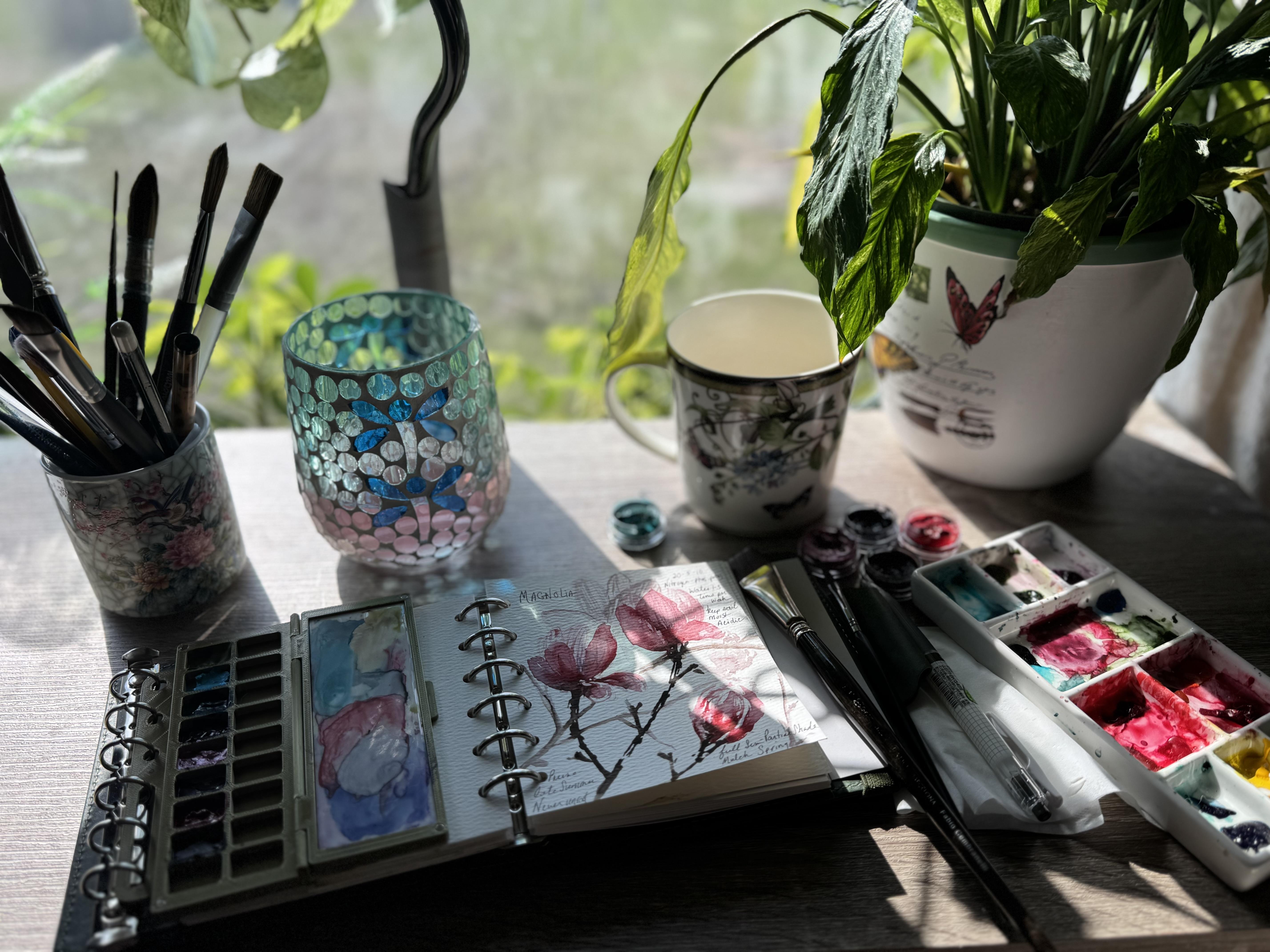
2. Painting magnolias | Supplies: What you'll need
for this sutorial is the magnolia palette, which is a beautiful
pinky blossomy red, and this one is
magnolia blossom. Although you don't need to buy the watercolor from
Jack's watercolor, it is available in a kit with paper if you would like
to go and check it out. And they come in these
lovely little honeypots and also sampler sizes. The magnolia blossom is one
of the colors I'm using. I'm also using
warmember for the wood, which is a warmer version
of sepia without green. I really love it. I think it's such a pretty pretty color. Then to finish this off, I'm going to be using
pink champagne, which is a beautiful
beautiful metallic and a little touch just to add some shadows
of royal flush. Again, this palette of four is available at
Jack's watercolor. For brushes, I'm
going to be using the escota flat.
I love this one. There are other ones out
there by um aqua elite, which are really,
really nice as well that you can use for
this type of tutorial. Then for most of my line work, I'm going to be using the
Portman dagger size four. I love this brush. It
is such a great thing. They come in a set. So I will leave links for you just in case you want to
go pick those up. For my Pen. Tried and tested. I think I have a video on this of all the
pens that you can paint over and this serasa
is really, really great. I can lab links for that. You'll need a
watercolor palette. For this one, I'm using
this set by Lightwish. I love it. Actually I put some of the watercolor in
the palette it comes with. I changed out the paper
to 100% cotton paper. This is Jack's cotton. And a nice cup of coffee, and just 20 minutes to set aside in the morning so that you can do this. I love to do it. Every single morning.
It's part of my ritual and what a gorgeous
day it is to do it. Sit back, relax,
watch the tutorial, and then go and paint something
fun. You will love it.
3. Painting magnolias | Watercolor flower Tutorial: I love to paint what I grow. There's something
so special about painting a subject that
you know so personally, especially with these
gorgeous colors from the Magnolia palette
at Jack's watercolor. You know, when I go for
my walks every day, I observe so much nature, and it is my time. When you've watched the
branches all winter, notice the buds forming and waited for the
first flower to open, you paint with more observation. You paint with connection. And that's where art
really does come from. It has to be connected to you. You can't just say you're
going to paint a leaf. You kind of have to remember
the observation of it. So that's the heart of
botanical journaling to me, and it's not just
documenting a plant, it's recording a relationship with the nature, the
world around you. And as it changes
through the season, no matter how ugly
or how pretty, it's all beautiful to me because it's all
part of the growth. And a lot of times we don't notice all of those little
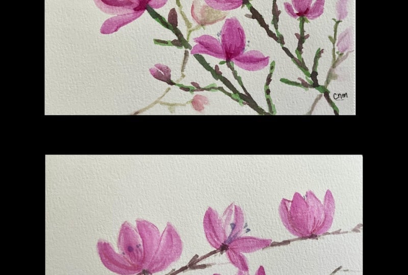
things, even spent flowers. But for this Magnolia page, I began by sketching the shapes of the blooms in a very light
shade of the color and then adding a little
more color as I go along the graceful branches and the bloom shapes just
loosely in my sketchbook, whether you do light
layers of these petals or you do light layers and
then darken the layers, you're going to see that each wash softly defines
the petal shapes, and it establishes the
structure of the flower. This does come with observation. So whether you're
observing by watching this tutorial and how I paint and the pictures
that I've included, or you're out there looking at these lovely flowers yourself. The first stage is
gentle and patient. It's where the composition
begins to breathe. Because magnolias
are just like that. Magnolias ask for patients. They thrive in bright light. They appreciate
consistent moisture and benefit from shelter from
harsh winds when possible. In a pot, they need rich, well draining soil and enough room for the roots
to establish comfortably, but they don't like
to be disturbed. But what they give
back is extraordinary. They're large sculptural blooms that seem almost too
graceful to be real. They're like saucers
in your hand. Whether you pick them to bring them inside or you leave
them flowering on the tree, it is gorgeous and breathtaking. And as you know, one of my favorite
things to paint. So building up the color
here is done in layers. I have two things going on. I have a light layer, wet on dry paper, and this is 100% cotton paper. And then I have charging. Charging begins with
a fineer brushstroke, and then while the
paper is still able to receive color because
it's still wet or damp, you move pigment
naturally into it. That's where the magnolia
starts to come alive. I feel like charging in
color is my mainstay. I always start with
a lighter wash, and then I start charging
in brush strokes. I like this particular brush because the way it
makes the marks, but I encourage
you always to try different brushes and
see what you like best. Every artist has certain shapes and things that brushes do for them that they really love. For me, this flat brush
works really well because the point holds on to color it doesn't deliver
that much water, which I particularly like for myself for this type
of shaping on blooms, and I can build up the
color very easily and then go from a light
layer to a darker layer. Then switching to
a fineer brush, this is the rigor by Portman, and it's the smaller
one of the set. I love the marks. It's almost like when I
don't have a lot of water in the brush and I just have
paint, like, initially, it gives me a stroke, but then it starts to
wear out and I get, like, a dry brush effect, but really, really fine. And even the way that the hairs will split kind
of offers me more texture. So I'm almost drying the painting together, you
know, with the details. And that is good for me. That's something that works with my hand and that I
like the results of. So I encourage you as an
artist as you go along to try the different
supplies that I suggest. But then also whatever
you have on hand, give those a try as well on some paper and
just start playing with wet brushes and
then more dry brushes, letting the color fade out,
seeing what you get there. And, you know, trying
different shapes and hash marks and
different strokes, using different angles of
the brush, flip it around. All that is going to be kind of like your
arsenal of tools. And it's amazing
what you can paint with just two brushes, you know? The magnolia blooms often hold a beautiful
range of tones, too. So they go from a creamy white to blush pinks and
richer rose notes with, you know, some of those
really expressive shadows. So the watercolor is really perfect for expressing
those transitions, and how you want to reflect
it is entirely up to you. So you can do a backwash
on your page and reflect light as you start to paint the blooms
over that backwash, or you can do something
like I've done, which is taking some
light layers of the paint and kind of shadowing in
some of the back petals. I'm also going to
do this ahead in this tutorial to establish a background that gives you
a little more dimension. But these transparent
glazes create the depth. Without losing the luminosity. And that's what I love
about watercolor, right? I can deepen the center
folds of the petals and add border edges where the light
catches less directly, but let the vivid pink settle into the softer base layers
creating those shadows. These transparent
glazes create depth, and that's where that
luminous doesn't get lost. If you add a little
more color here and there and let it just
kind of work its way into the painting or maybe even remove some color with a little
tissue if you feel like, you know, something's
too dark or too stark, then that's all you working the painting,
working in shadows. I often feel that
when I'm painting, my fingers need to
feel like they're pushing the shapes together. And that's how I form my botanicals in the best way
that I feel is effective, you know, and that
I'm happy with. So keep in mind that every artist has a different
hand, and that's okay. You don't necessarily want to have to copy the hand of any
other artist or instructor, you want to take the
techniques and let your hand use those techniques to develop your own
presence in the painting. Magnolia branches have
structures like that, you know, they have that
structural presence. And the blossoms have that
beautiful transparency and luminosity that you want to capture as
your own artist. So whether you're working on
the strong linear elements, that anchor the softness of
the flowers or you're giving, like, the compositional
balance in. It's all about just
kind of standing back, reflecting on those
shadows and remembering that there is light
and there is shadow. And that's basically
what you're painting. Here in my formed bud, I'm just kind of elongating
it more because magnolias are a little longer and
especially the saucer ones. And notice that I'm doing almost like a
scratching effect, you know, in the painting. I love that because
it looks so textural, and it adds depth and dimension
without really trying.
4. Painting Magnolias | Painting Branches: That I'm using the flat brush to just mark in the branches. Now, remember, the
branches have to be strong because they're wood,
and they're confident. But I like the branches
not to look like one line. So in order for me to get
that and really easily, I just tap the edge
of my flat brush. This is where the tool
becomes the wind, right? So, like, if your flat brush has too much water or
holds too much water, you might have to dry that off. If it doesn't come to enough
of a point and it's too thick for the size
of your paper, that's another consideration. So maybe test the flat
brush that you're using if you don't have
this one by Escoda and make sure that the size of the stroke and the mark actually fit the dimensions
of your paper. You could always build up, but it's really difficult
to take away thickness. So if it's too thick for
the size of the blossom, then you're kind of stuck. You have to do something else. So that's what I would test before I actually used my tool. For me, I know this
brush very well. I use it constantly, and I've had it for years. So it's something that
I know will deliver really dark but elegant shapes and give me a lot of motion
and movement and presence, it's almost like
sculptural, right? Like, the way this
is laying down the color feels
like a sculpture. It's adding those strong
linear elements that really make the
wood feel strong. And it gives that balance
to the composition, right? It just added presents. But we're going to go
a step further and add some different details to the wood on the branches because
that's how magnolias grow. And we also want to think about the darkness of the branches as compared to the petals
that you've just done. So if your petals
are ultra light, you want to make sure
that the branches are lighter than
you're seeing here. Now, I have my darkest shadow
lined up with my branch. So my darkest shadow is going
to be the color that is going to lead the strength of the branch color.
Does that make sense? So whatever's in the blossom, is what's got a balance with the other colors
in the painting. It can't be lighter than the other colors or
the blossom will fade. So if you want that blossom to look deep and rich
and beautiful, this is where you play
with lights and darks. Make sure that the strength
of your darkest color doesn't exceed the strength of the
darker shade in the blossom.
5. Painting Magnolias | Painting Backgrounds: Then I can go back
and I can add more. I like to add dimensions. So to make this
look less flat and to take advantage of the white paper instead of
coloring the background, I'm going to pull a wet brush over the
branches to pull some of that color across into other branches that would
serve as a background. So now, these branches
aren't meant to connect with the foreground, but they are using
the color from the foreground to compose them. But what you're going to see here is because they're lighter, in the shade, they're
going to fade into the background and become
the background branches. So they're looking like I'm connecting them,
but they're not. They're actually going to
sit lighter when they dry, and that is going to
make our background. This is one of my
favorite ways to create depth and
watercolor is to add the same kinds of layers
into the background flowers, the branches just in
softer strengths. Instead of outlining everything equally distant elements are suggested with the
lighter values, the softer edges and
the reduced contrast. And that's what we
want to do here. Along with these beautiful
branches and textures, you can also add some
petals in the background. Because if you are using
your phone to take a picture and you
put it on focus, then it would focus on
the foreground first, and the background would
look a little more blurry. So, now there's two
different ways. Well, there's a lot
of different ways, but there's mainly in my book, two different ways
of reflecting that. You can either go lighter with the background images and just kind of add texture to
them in a contrasting way, but in a lighter
shade or you can wet the entire background and
just kind of drop in color, very, very light color
and let it bleed. And that will give you
that glazy kind of, like, gazy effect, right, almost misty effect
in the background. Both are super effective, completely different styles,
but also very fun to do. So maybe try another page
and do it both ways, right? So do it this way the first time and then on
the second page, wet the background after
your foreground is dry and then just start dropping in color and watching
that explode. So if the colors are the same and they're just
very, very light, it's going to give
you that presence of, you know, that foreground
versus background. It looks really cool. This is also a stage at which
people sometimes, if they're going to
paint the background, they can do the book and that's the removing little dots of color in different
sizes and weights, and that gives you kind of
that sparkle bubble effect. That's also very cool. I've also done a lot of work with salt, so you could paint the entire background colors and then throw some salt on it. As long as the
foregrounds already dry, it's not going to
affect those blooms. It's mainly about the
strength of the color. If you go too strong, and again, it's stronger than the darkest
shade in your foreground, you're going to throw off
the balance of the painting. If, as a rule, everything in the background is
a lighter value, not necessarily a lighter color, but the shade of it
is a lighter value, then it's always going to be less competitive
with your foreground, and that's going to help you
to get that nice balance. So you can see, I'm
just kind of adding little shapes and details
as I go. This is by eye. It's just really,
like, something that is relaxing to do,
and I love to do it. So for me, it's not
really planned. It's almost done just by kind of standing back and just being creative because
it's a sketchbook, and it doesn't have
to be perfect, right? It's something that you're just practicing and you want
to get it down with some notes on it as you go through your
gardening journey. But to complete the page, I always add these
layers because I think it's a softer way to do it, and it's got some nice values to it that I really
enjoy looking at. And I think it's, you know, I've done them where I've
just done the foreground, and I feel like it's always just missing
a little something, but that's just for me, it's a personal choice. So you can make your
own decision on that.
6. Painting Magnolias | Final Thoughts: So now that we have
our painting done, it's time to add
some magical notes to our botanical journaling. I like to put notes
in about how I care for the plants to
remind myself of temperatures and how they like to be watered because
they're each so different. I not only put these on little cards that
go in the plant, but I also love to map
it out in the journal. So for this, I'll be
using a waterproof pen. I use this pen because I not
only like the way it writes, but it also is so
convenient because if I do add any water to
it or if anything, spills on it, it never reds. But you want to draw watercolor for Journaling
great pen. Combine that. Two calming practices. Essentially, it's
observation and creativity. It allows you to slow down enough to notice
what's growing. You paint what you see, and you write what you learn. In this Magnolia entry, I also included these
growing notes directly over the painting once it
was dry in the sketchbook. I can go back to this for
years to come and think about the plants that I've
grown and even do updates. You can put additional pages in. You can start new journals on the second year of
growth and the third, creating a page that
is both artistic but practical and something you will love to have over time. They make wonderful keepsakes. They make amazing gifts. And most important,
you can hand these down to generations of loved ones that you think might really enjoy them and want to grow these
things for themselves. For me, they become
a seasonal record, a personal reflection and beautiful archives of what
matters to me in each moment. And I feel like
life is so short, we have to take the moments. You know, so many
people ask me about depression and stress and how
to get over these things, and they say, watercolor really
does help them with that. And it's so true, it does. You have to take these
moments and create the life that feeds your soul because if you don't, things are
going to get to you. So for me, growing
flowers, raising animals, caring for them,
and watching things change from season to
season as you paint it. And as you just express your own creativity is
what makes life so sweet. When you combine the two, you
begin to notice everything, the color shifts and the petals, the shape of new buds, the gestures of the branches, the timing of the bloom cycles, the quiet resilience of plants
returning year after year. That awareness is the true
gift of botanical journaling. Every page becomes a way
of saying, I was here. I enjoyed that day. This bloomed and I noticed. This is how I want
to spend my life, and I hope that
you'll embrace it, too, because it's so
very good for you. It's fulfilling and rewarding. And after all, isn't
that what we all need? Something that feeds us. Something becomes a record and something that we can look back on no matter what
or how we're feeling. And hopefully it
will make us feel better. Have a wonderful day.
 Jacqueline Jax, "Creativity brings peace into your life"