Transcripts
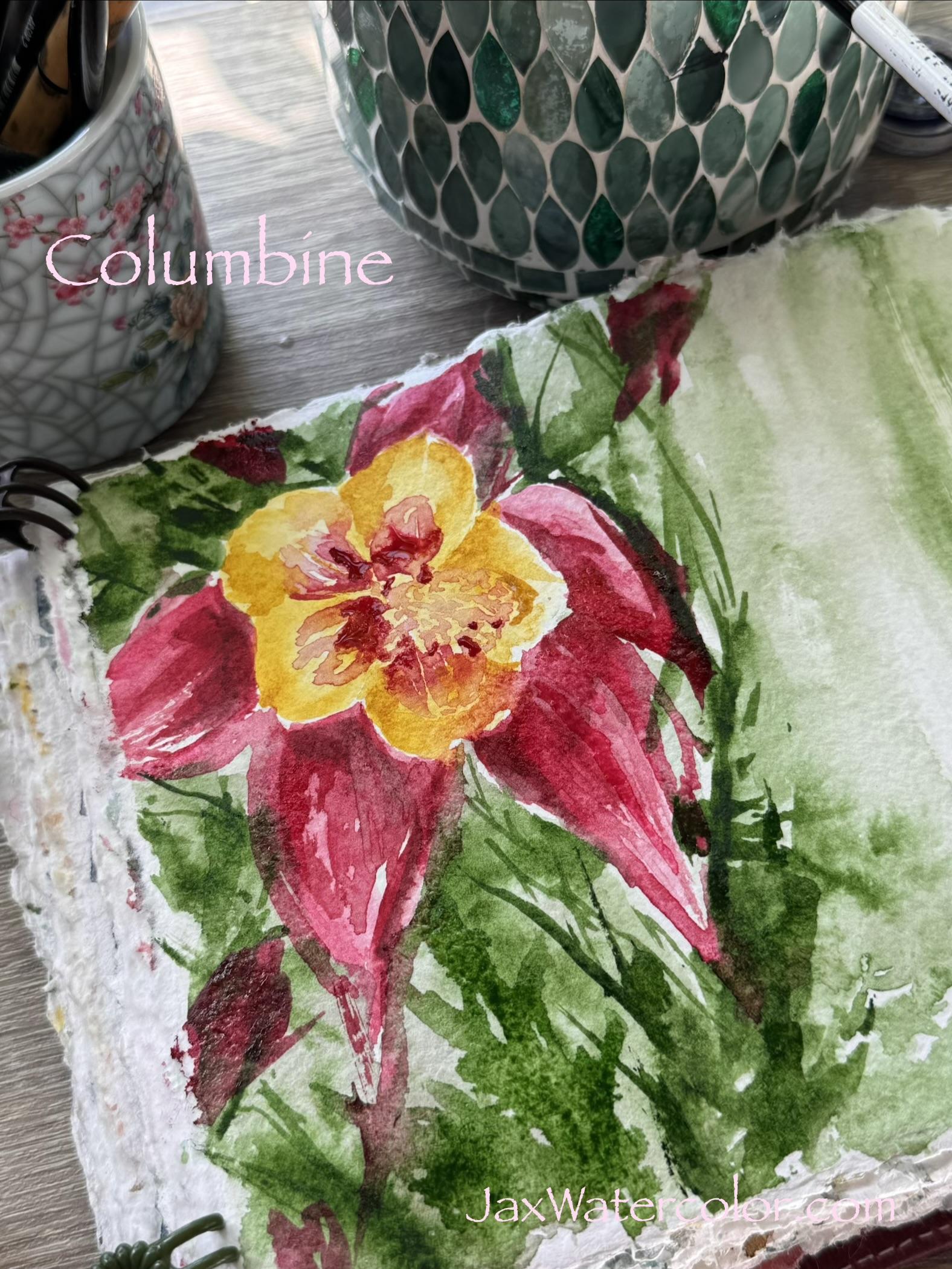
1. Painting Columbine Intro: Hello, everyone. Welcome back. We're going to be painting
these beautiful Columbine. I love these flowers so so much. They're charming perennials with delicate spurred blossoms that bring color and pollinators
to your garden. I have them in yellow
and this beautiful red. And I think I have pink
and purple, as well. I love them. I'm addicted. I'm a big rose person, and these are like, tiny
little miniature blooms. And they are as much like roses, I think, as I've seen
anything else be. They love sun exposure, so you can place
them in the shade or dappled sunlight or
morning full sun, and they will just keep blooming and blooming
all throughout spring, summer, and into the fall.
2. Painting Columbine Tools: But we're going to
paint them today. So let's get our golden yellow
out and some pretty pinks. And let's get to
going. Shall we? So, for this painting, I'm going to be working in
my 100% cotton sketchbook. I'm gonna be using
a golden yellow. It's very, very pretty yellow. I will link that name
for that yellow right below a nice couple
of pinky reds, an angular shader brush,
some clean water, and also a long round brush, which you're gonna see
coming up here very shortly.
3. Painting Columbine | petals: So I'm beginning by
loading my angular shader up with this golden
yellow and lots of water. I want the layers
to be transparent. So I'm not using too much,
but at the same time, this particular color, when you first add
it to your brush, it can give you two options. It gives you a darker
version of the color, kind of like a deeper version, which you can see here,
and a lighter version as the brush kind of runs
out of water and paint. And I kind of utilize
that fact about this paint to make this particular stroke
look the way it does. So it's all about
knowing your paint and using what is available
to you on a certain paint. That's why I love
the golden yellow. An equivalent to this might be something like an Azo yellow, but just make sure it has enough transparency and not
too much brown tone in it. There's a lot of different
azo yellows out there. And some of them that are maybe cheaper student grade paints
would have more filler. So they would be a
little more opaque and maybe not have the ability
of that pure pigment, kind of, like, you know, deeper tone that
you're seeing here. So I'm definitely
using just one color. But again, it is a golden yellow and made by Jack's watercolor
in order to get this. If you don't have this color, you could use two
different colors. So maybe mix a
brighter yellow with a little bit of French
sierra and see if that maybe gives you a little
bit of texture or tone on that dark and that you could kind of work
with that as well. So we're going to
let that layer dry. And as we go through,
I'm going to start adding the back
petals in the pink. This is blossom pink. Now, I do on occasion, dip my brush into a
darker pink, as well. It is not necessary, but I just kind
of like to do it. So the darker pink is
more, I would say, like, a quinacrodm violet pink, right, rather than, like, a really bright,
beautiful blossom. The blossom pink that I'm using is very similar to,
like, a primrose. It's a gorgeous pink
from a palette that we have that came out in June, and that one is the peaches and petals palette available
at Jack's watercolor. It also has a beautiful
fresh emerald. It has the golden yellow, and it has another one called summer nectar that I use a lot, which is a beautiful,
transparent orange. But as far as the deeper color that you're seeing added here, I would say this is
more like a raspberry. If you're familiar with the
Jack's watercolor line, raspberry would be a great one. Like a quinacrod violet would also work to kind of
deepen your pink, and that would really help you kind of get those two tones. Um, I love doing that. I think it's a really
good way to add a little depth and dimension
to your paintings. And as they dry, they're
going to lighten up and shift just a little bit more into the transparency, and then we can go back and add multiple layers
that kind of look like shadows or
look like texture, even get some depth of
field within the petals. And I think that's really
important to establish, also, when you're trying to get these little sketchbook
paintings to look less flat and more
artistic or creative, more loose and artsty. So as you can see, I'm just
taking my angular shader, tapping in some of the
deeper colors and just going around doing that back
fill on those leaves. Now, the idea here is as
you lay those leaves down, you want to make sure
that you're highlighting the shape of the
leaf it sits under. And this is your
opportunity to either get that line really nice
or get that line messy. If you want a more messy look, then you can do it right here. If you want a more defined look, then you can, you know, again, watch those lines
and try and get it as close to the yellow as possible without losing the
definition or that shoreline.
4. Painting Columbine | Negative Painting: Also going through
here and adding that green Love this color
green is so beautiful. It's somewhere a little
darker than a sap green. Not as yellow. It's
got a lot of depth. So cypress is the one I'm using, and it is just such a great
all around green for florals. If I were going to do a
botanical greens palette, this would definitely
be in that palett. So I'm using the edge
of my angular shader to establish some
background foliage. So this is going to be
not really intended to be something that stands out because we want
the flower to stand out. This is more some darker
and lighter areas in the background that
are not going to compete as much with our flower. So you want to kind of mix it up between stems and leaves. I'm kind of going by the picture that I took from my garden. So I'm kind of, like, looking and referencing
that a little bit. And as I go through here, I make sure that I have
different weights of the color right off the bat so that I don't have
to fix that later. Another thing that I do in
painting a lot is a wash. So whether or not I lay it over something
that's already there, like I'm doing here or I
just go ahead and wash over all the white area because I know I'm going to add, like, whether I add text or other flowers or maybe
some collage over it, I just like it better than
the white background. It's just me. It's a
personal preference. You don't have to do this step. But I also made sure to wash over some of the areas that
I did place the green. Doing that, you can
see how it kind of blends it out and
blurs it a bit, and that really helps
to give that, like, background type of thing a pop. I also on some of the wash, mixed it in with some of my blossom color to get a
little more grayish look. And then as I went through, I just kind of
mixed in, you know, dipping my brush into the direct color of the
cypress green and also maybe even trying to get some dry brush effect
as we go through. Now I'm adding more of those
little areas of green, just kind of random splotches, really, that look leafy. You can always go back
in with your pen and ink and kind of define a few leaves later if
that's fun for you. If you feel that you just really don't know how to draw
leaves or paint leaves, then this is actually
a good way to go you know that they're
leaves. It's kind of implied. And if you just get
a little bit of the leaves here and there,
it really does work out. So we're going to let this dry, and then we'll go back
in with our next layer. As you can see over
on the right here, I did do a lot of
drybushing to get that kind of, like,
watery effect, little blur, and that's gonna
be really great to write over or collage over for some
details about our flowers.
5. Painting Columbine | adding Shadows: Now as we're looking
at the dried flower, you can see there's a
lot of dimension already from the way we laid down
the colors initially. I'm going to take
the angular shader, and I'm going to kind
of establish where I want the center of
those petals to be. And we're going to lay
in a little bit of color in the blossom so
that it matches with the, you know, color shades and variations of the flower itself. Going back to my reference
photo is really, really important
here because even though you think you know
what a flower looks like, a reference photo
is really helpful. I'm also using my long round
at this point to kind of give my color a little
bit of a brush out. One brush out, I mean, lay the coloring a little
deeper towards the center and then use the brush to
brush it out into the shape. That gives you another
way of getting different shades of the same
color very, very easily. So once again, I use the angular shader
to lay in the color, and then I take water and my long round and I brush
it out into that shape. It really, really is
helpful and effective. And ultimately, if you mess up, take a little paper
towel, blot it, and you're going to get a neat looking unique version
of this, you know? So you don't have
to be exact here, you don't have to be articulate. With your brush, you don't
have to be, you know, detail minded or even have that much skill to
get this part right. You can really just
do whatever you feel is necessary to get
the effect, you know? And I think every artist
ultimately gets to this area in their
paintings their own way. But for me, I love
using that round brush. It's just, like, so nice, and it drags the color
out really well. You could also even
take your thumb and drag the color out.
That would work as well. So probably of everything I did in this painting, this
is the trickiest part, it was to try and paint around the little center pollinators, you know, those
little pollen areas. And I probably
would have been it would have been so easier just to draw it in from the start, and that way I could
just color around it. But I tried to make
this area a little mix of a bit of shadowy red, as well as yellow, just
so that I would give a bit more dimensions for when I do put in the ink
drawing portion of it. And I think it worked
out well overall. But you could also
do this stage after you ink if that is
easier for you. Now I'm just taking some
more of the blossom color. Some of it is mixed in with that quinacridome
violet kind of color, and I am using that to get some different tones so that
it doesn't lie too flat. Ultimately, at the end, too, I do take a paper towel and just blot out any extra moisture so that
it didn't puddle. But, yeah, it's kind of
just loose, fun, you know, a little relaxing moment in the sketchbook and just don't
take it all too seriously. Remember, we're here to have a good time and just kind
of reflect what we see. Now I'm going to
highlight the petals. We want to make sure that
some of the petals on the flower stand out a little farther forward
than the others. So once you pick which ones will be in front of the others, go ahead and take a little
more of that yellow and add a layer just to highlight
a few little pieces, and that makes those petals
pop forward for you. At this stage, you
can pretty much do anything that
your heart desires. I'm adding a little bit of
color here and there to represent other
flowers that might be turned in the
background or budded. You can add more leaves
if you feel like, or even throw some glitter
over the whole thing. Whatever you feel will make you happy is
what you should do. I'm just kind of
going through and adding some more volume to my petals and just
kind of playing with the color, really just doodling. Which is probably more
relaxing than it looks. It probably feels a little strenuous, like
you're gonna mix it up. But I actually love to do it, and it's kind of part of my artistic process.
So that's it. For this one on the sides, I'm going to be adding some
collage to the final piece. And next, we're just going
to add a little bit of ink.
6. Painting Columbine | adding Ink: Just going to add a
little bit of ink. So I'm not using
a waterproof ink because I didn't intend on
painting over this one. This is more of like just
a basic Nibal rolling pen, which just works. It's got a really nice
kind of feel to it. And I'm using it to
draw little circles in for those pollination areas that we had highlighted before. I'm also going to just
do some style lines to make the flower itself
a little more dimensional. So in doing that, you
kind of want to stick to curved lines and
not straight lines, the curved lines or
swervy lines are gonna give you that
feeling of dimension, you know, like the flower is
bent instead of just flat. So you never want to ink straight lines cause inking straight lines is
definitely going to get you, um, you know, it's not
going to get you to your overall goal of getting more dimension into
your sketchbook. But I really just like to
scribble a lot of things in and do it as quickly as possible because the
more freehand and quick, the better I feel
like the marks are. If I try too hard to
make them purposeful, I feel like it's less artistic
and more I don't know, kind of, like, not
effective at all, you know? So, the quicker I
am as I go through, the better off this is. And that completes my columbine
in the red and yellow. This is such a beautiful
flower and something I enjoy in my garden from early spring
all the way through fall. I hope you enjoyed the tutorial and that you learned something, and you'll give this
a try yourself. Don't forget having plants in your life is part
of being an artist, and it is so wonderful
to see them grow. So I highly encourage you to start your own garden and maybe even follow me over at my garden Channel
Daylight and Daisies. This is Jacqueline Jack
from Jack's Watercolor. Have a lovely day, and I'll see you again soon.
 Jacqueline Jax, "Creativity brings peace into your life"