Transcripts
1. Introduction: welcome to getting started with watercolor. We begin to pay with wire color. It could be very exciting. It's a wonderful medium, is free, loose, colorful and you can achieve a lot in a very short period of time. However, I know it can be very overwhelming as well, and that's exactly why I created this course. Thes tutorials are basically a list of resource is each one will cover a new technique and method, or applying one or colors have also included some step by step demonstrations where you can put those skills to the test. Ah, highly recommend you do those so you can see how you measure up and ultimately find out if you're ready to take your art to a more advanced level. If you take this course is because you're brand new to watercolor painting, you would like one complete resource that you can rely on toe, learn the basic techniques and fundamentals. So, without any further ado, let's get started with watercolor painting
2. How To Use The Platform: In this video, I
just wanted to go over the Skillshare platform. I know some of you
know how to use it, but I know there are
many others that simply don't understand how
to create a project. How to add more photos, texts, and things like that. What I will do now is pull up one of my classes on Skillshare. This may not be the
class you are learning, but it does have everything we need to cover what I wanted to share with
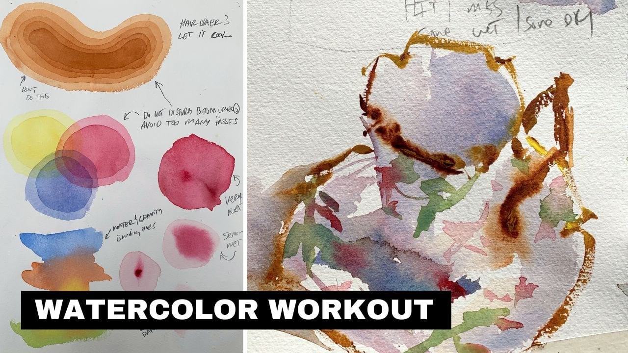
you in this video. This is my watercolor workout
basics and beyond class. And you've got the
main video here. Obviously. If you wanted
to make that video bigger, you can click that and the
top right hand corner, and that will enlarge the video if you want to reduce
that size again, come up here to the top
right-hand corner, click it. And that's going to bring up your navigation menu on
the right-hand side. Now if I hover over
the video with my mouse down here
on the lower left, you have play speed. For some reason you
wanted to slow things down or speed things up. You can always change the speed. Keep in mind if you do change, it just makes sure you
go back and set it to normal if you
want to, in fact, see at a normal speed, you can also rewind
things 15 seconds. If you're watching something
you wanted to see what happened within 15
seconds together, you can click that and
then I'll take you back. And now 1515 second increments. You can click it three
or four times and go back 45 seconds a minute,
whatever you want to do. If you want to make
a note of the video, you can click this little pen That's going to
bring up your note. And that's a good way to remind yourself if something
interesting happen there. And you just wanted to
sort of jot something down that sort of
clicked in your mind. This is your volume. So if it's CBC, this slash like I
have now lets you need to unmute it so you're not going to be able
to see the sound. If I click that now, I can now hear the video
if it were playing, this would be subtitles. So if you wanted to
have a subtitle and the various languages
here, you can do that. You may not like
having subtitles. You can put subtitles
off on the top of that. So if you don't
want to see them, That's how you get rid of them. Again, we can go full screen with that feature in
the lower right-hand corner. So if you wanted to see this and this largest
possible resolution, that is going to be
the option to do it. Okay, So again, that's that one. So that tells you a
little bit about how to navigate some of the
options on the video. Over here on the right. So long as you're in this mode, we can scroll down and
see the different videos. All videos that you
have watched all the way through should
have a checkmark. If you want to again,
get rid of that, you use this button in the top right-hand corner,
you can get rid of it. And then here we see it. Now down here, we
have some tabs. We have the About tab. So that's going to be the class
description that I added. I will often add other classes that you
may be interested in. So throughout the course, I may say if you want to learn more about how to
plan watercolor art, be shorter, checkout the link
in the class description, and that's gonna be right
here in the About tab. So if we scroll down, we can see all of
these are links to different classes I have. So that's a little bit
about the about page. Reviews are where you can see how awesome reviews that the
students left on the class. Here, our discussions, discussions are very
important because that's how I'm
going to notify you about each new lesson of
when they're available. You will see, if you scroll
down, you'll see discussions, you'll see where there's some
different things going on. This is important too. So if you have questions about the class or a
lesson you watched, then you can use this
discussions to get in touch with me and I'll try to respond
to you as soon as possible. You can also share links
and the discussions too. So if you have something
you want to show me, you can always link it up
and I'll be able to see it. Here. You see I can
start a conversation, I can ask a question up and
share project and so on. Speaking up projects,
if I go right here, this tells you a little
bit about the project. So here you'll see each lesson
has a project well almost, but the point is to get
involved and started doing the demos and projects
shared in this class. And here you can scroll down
and see all the students that are posting projects that there's one do
you want to explore? You can click on
that and just see what an awesome job the
students are doing, getting these different
projects and things done. Of course, you can
comment on these two. So over here on the
right-hand side, you can click on that. You can share a little feedbacks and encouragement,
whatever you want to do. If you look at my
project right here, you're going to see that I've got a detailed breakdown
of all my lessons here. So each time I post new
lessons in a class or a demo, I always break it
down and give you a really good description
of what's going on. Now you may want to
create a project. Now, since I already have one, are you going to see
that I don't have the option to make another one. But here is a class that
I don't have a project. You will see this green button
on the right-hand side. To create a project, all you have to do
is click on that. And that's going to bring
up your project option. Now the first thing you'll
see is a cover image. If you want to add
a cover image, just click on that and then
navigate to your image. So I'll just select one here. So I'll select this one. And then that's going
to upload the image. Once it's uploaded. I have the option here on
this slider right there to enlarge it and then
sort of move it around, however I want that to be seen. And once it's done,
click Submit. Again, this is just
the cover image. You can go ahead and add
a title and I'll say, awesome class by Robert. If I can spell that right, that would certainly help. Description. Hey, took a three-week class. And here's what I did. Now if hit Enter, That's going to bring the
cursor down here below. And then I can add an image. You see down here, you can see, you can have three options
to add more content. So if I click on image, I can add another image, so I can click on that and then you have to
give it a second. And then that's going
to upload the image. Now I can click Enter and you see I can write more content. I'm like, This is my
cool fish painting. Now, if I wanted to add a video or link and
maybe you're like, Hey, did you happen to see
this picture, whatever. You can double-click on a word and then you have a
link option here, and you can paste
the link in there. Just make sure you
hit the Check button to make it active. And now I can hit enter again
and then add more images. That's how you can
make your project. If you don't want anyone
to see your project, you can click this button
here to make it private. But once you're done,
very, very important, scroll back to the
top and hit Publish. And as soon as you
publish your project, that's going to be visible
for everyone to see. So that's publishing right now. I'm just going to
give it a moment, alright, and then there
it is, right there. So I just added my projects. So let's say you want
to edit your project, you click on that again. And now you come up here to
the top right-hand corner. You can click Edit, and now you can scroll down. Make sure you put the
cursor where you want it. So if I want the next image or the next video or whatever
to be below the fish. I can come down
here and click on the end of the
sentence, hit Enter. And now again, pull in my images or wherever it
is that I want to do. Again, make sure you hit
published when you're done. And then that's
going to save it. You just have to be patient
and let Skill Share save it. Another thing you may
want to do is share your project on social media. So you have this
Copy Project link. You can copy that and share
that wherever you wish. Over here on the right-hand
side, you can hard thing. So if someone did a project
that you really like, you can give it a heart. You can share a comment and say, those fish are amazing, and then hit posts and
that's going to share your comments with whoever
it is you're talking about. So again, just good
stuff to know. And I think if you learn how to use the projects
is very useful. And teachers can often
see them and hopefully they do and they can give you some feedback on
what you're doing. The last thing I want
to share with you is right here under the again, we've got about reviews, discussions, and then
project and resources. These resources
are downloadable. If the class has images,
resource images, whatever the case may be, you can click on the
link and that's going to download it to your device. So I hope this video helps you out and that you
understand a little bit more about how to navigate
the Skillshare platform. And then of course, the
courses that are taught there.
3. Materials: Let's talk about materials. If you're going a watercolor, you gotta have supplies. And it's important to have the right supplies so that you don't become frustrated or simply don't have what you need to get a job done. Now, the start of the very beginning. This is just simply drawing paper. It's important to have a sketchbook around. This is where you capture your ideas. This is where you can draw things out so that before you even start painting, do you know where you're going? I use a number two pencil of these air. Just standard pencils. I don't spend a lot of money on Ah, huge supply. A variety of pencils I find with a number two probably only work on value. I can get the job done with this by one of work on composition. Obviously, I can lay my paintings out, but if you're going to paint, you need good composition. He didn't know how to draw your subjects. You need to know how your compositions will work. So this is numero uno. If you want a watercolor, you need your drawing materials and you just any paper will do. Really? It doesn't really matter I found this on sale. It's just a £60 paper archival, and you know that that should get the job done for you in addition to that, a pencil sharpener so that you can, of course, sharpened when you need to, and that should cover your drawing supplies. Next, I will talk about paper and this is watercolor paper. What I have is there's two types. I use this sketchbook a lot, So once I lay out to say a basic composition or some ideas that I want to tackle with watercolor, I then use this to lay out some quick sketches. This is nine by 12. So what I generally do is I would take a sheet like this and make a couple of rectangles there on. Then I can work on some quick watercolor sketches, and I may be experimenting with color, maybe working on the overall design value sketches or whatever, but these little small pads or nice it's important to have this because if you simply have , ah, large sheets of watercolor paper, you're working all finished art all the time. Then you're gonna miss out on composition, value studies and things like that. There really essential in creating wonderful art so that having just some small drawing paper up had, like this a spiral bound so you can keep all your sketches and go back and research him and study him is important tohave. Okay. And also, if you go outside and you want to paint if you want to do anything plain air, the science toe have these as well, because they travel really easy on. Certainly better than carrying large sheets of paper on. This is my my standard watercolor paper, and this is a 22 by 30. Sheep is a Saunders brand, which is very, very good quality. I think this runs about $6 a sheet, $7 a sheet and really nice has all the deck alleges on all four sides, and this is £140 cold press, so I don't know if the camera could pick it up, but it's got some nice texture to it. The differences between hot press and cold presses, the cold press will have the texture to it, where hot press is very smooth, almost like drawing paper. So if you want a smoother result working on Portrait's or very detailed work. I would say hot press would probably work better for you if you want something that's a little bit chunkier and rough around the edges. Obviously, the cold press is the way to go. But 100 £40 cold press on these full sheeps, and you know that does a really good job. I don't tend to paint on full sheikhs, so I would take this and you have to buy in the half, full it a few times, brief it down and to whatever size I may want to use. All right, let's talk about brushes. This is a pretty large subject because there's a lot you can do with brushes, and but I'm just going to cover what I use. And if you have any questions about specific brushes, I'll be glad to answer them. But for now, I'll just cover that materials are preferred. I'll tell you why these are squirrel brushes. These air, obviously, Mott brushes the large one is fantastic. If you have a full sheet of paper, you wanna wash a large area. This will certainly hold the pigment. This is a number eight, and these again, as you can see they have a large belly. They hold a tremendous amount of pigment in water. So obviously, I mean, you can really cover some ground quickly. With this size brush, they come in a variety of sizes, and this was really handy. I use this one probably the most. This is a number five, and this is really good for working on the same maybe 11 by 15 sheets of paper, 15 by 22. So really good for kind of the the bulk of the painting I can almost do with this number five. So this is a really handy. Sometimes it's nice to have a smaller one for some detail or some small washes that you want to do. Eso This guy's a number two, and I use that quite often to this is just a different type of squirrel brush. It's a little bit doesn't quite have the point, but sometimes I'll use this just to lay ins up, you know, wash or something, but I mean, it basically does. The same job is this, but less. You don't have the point, but I don't use it very often, but I mean, it's kind of nice. And then The beauty of this one is it's a little bit less expensive than this variety, so you kind of shop around. If you want to try a mop brush, you don't want to invest the money. You can try one. These synthetic blends that get the job done and then you have a decent wash brush. All right, The hate brushes these air really good to a new many artists that only used these. They don't even have anything else, but obviously they come in a variety of sizes, excellent for washes and different sizes so we can tackle smaller works. Larger works get into detail, and they come even a lot smaller than this. This is even smaller one on these air very, very inexpensive. So if you're looking for a good wash brush, you don't want to invest a lot of money. Try these out because they really do. Ah, a wonderful job. And they're really good for texture grass, things like that so you can find many uses for the hate Russians, but again very inexpensive. Great for wash a technique and many other aspects of watercolor painting. All right, now this talk about the round brushes these air. Just standard. There's Escada and this is a number 12 a little bit larger. Have a number 10 and this is a 12 to us, a little bit different shape. That's a Kalinsky. You can see he has a little bit broader belly to it. So if I'm doing an area where I have ah lot of one pigment or color and I have ah, I want to cover some ground. This one holds a little bit mawr pigment to it, so I can kind of cover more ground with it. But in general, these work pretty good, so good for detail, trying to capture figures or anything like that. So these are a number of these rounds are really handy, and you gotta have some. You definitely don't want to go into watercolor painting without some sort of detail. Brush is going to get into the cracks and really help you define certain areas, focal points and things like that. So these air Giner Kuklinski's of good quality. They have cheaper varieties out there, synthetic types of brushes. But the beauty of these are it could take care of them, though the last year, almost forever so We want to have some round brushes there have a few different sizes. This is my needle brush. A needle brush is really good for adding details. Such a za new lines, telephone lines, uh, there's detail lines, telegraphic type lines. So in a watercolor painting and any painting, really, there's always a certain amount of detail on line. Work that goes in, as you can see has a very fine point to it. And the other interesting thing about it is that has his belly to it as well. So you can really load this thing up with pigment and still get a very, very fine point. So, you know, if you would have ah lot of line work to do, this can really go a long way, so long as you're holding it perpendicular to your surface. What a lot of ours will do is they'll hold it like this. It tends to drip down, but any way you want to probably invest in a liner brush again. This is the way these aren't cheap. There are varieties out there. They're a little less expensive. You can also look into like a sword type of brush, but these needle brushes are really wonderful for adding that little bit of detail, and they actually make you would think that these round brushes with the points would make a dif decent thin line. But actually, once you start pressing into the surface, this this really starts to flatten. Now it doesn't quite get the fine line that this would get. So this can really get those hairline marks on your work. So a good needle brushes something I like to have around now. Fan brushes wonderful for foliage, trees, leaves. I mean, you really get some nice, loose, expressive marks with the fan. Typically use it for tree foliage, things like that. But they're really vital for my painting and for the subjects I like to do. So fan brushes. Wonderful. And you'll see me use this quite a bit. This is kind of my wildcard here. You can see this thing's been around probably since 2000 to have had it for a while, and I love it. I use it all the time for abstract marks. Sometimes I'll load it up with pigment and just roll it on the paper like that to get some abs loose shrubbery and foliage and things like that. But it comes in handy. And whenever I need that kind of wild organic stroke, this one does a really good job. And it's always nice to have one of these vile car brushes around, so that covers my brushes. So now let's talk about paints. I think it's important to have quality paint. This is whole buying the beauty of artists grade pigment is it has, ah, really good ratio in there, a pigment to filler. And there's really no substitute for good pain that you really get what you pay for when it comes down to investing and good quality water, color paint and whole body is great. I think any of the top brands out there Windsor Newton, Daniel Smith, those sort of names all do a wonderful job. But investing good paint and you don't really need a lot of Hughes. You can get away with a blue Ah, yellow little poker, Some sienna. Elizabeth Crimson, I mean, probably was six or seven. Hughes, you can really do ah lot with it, but invest in quality because you will certainly get ah much better result out of your work . Also like to have a little bit of wash around. Ah, Gua Shi is great for adding highlights to work. I think it's good for other occasions to Sometimes you just want to add a little bit of some capacity or something like that to a painting. Brother Colors tend to be very transparent. Quash isn't so. It has a little bit of that Look to it. We can dole things out, so it's good to have that around. I use it pretty much in every painting. The next thing I'll talk about is palette. Now again, I mean, we are talking about hundreds and hundreds of different types of pallets you can use. You really just have to kind of sample around and find one that works for you. I use this one because I can. It does find in the studio, have all the mixing area that I need, and it travels, so it has a seal around it, as you can see on both sides. So we need close it. You can turned upside down whenever you want, and it doesn't leak. Now. I would still recommend putting this in a Ziploc bag if you want to travel with it. But for the most part, I've never had any problems with leaking and plus is air tight for the most part. So if I have to walk away from the studio for +45 days, I can't paint. I can come back and all of my pigments are still ready to go. They haven't dried out, and there are other pallets that are open. They don't have a lid to him. But I find, you know, if you do have to leave the studio for several days, you just don't get a chance to paint and you have your pigments laid out. A lot of times they will get wasted simply because there's no way to preserve him. So I prefer this over others again. You'll just have to decide. You try a few things and see what works for you. But this little airtight watertight were approved. Type of ah palette works relieve all for me and again, I could take it on the road if I want to go outdoors and pain or something like that, next thing you'll need is probably take, so I use this to obviously take my paper to a bore on and he really can't get by without it . With watercolor paper, you start to paint on it and you'll notice right away that it's going to buckle or war. So the paint the tape rather will keep it down and flat to the surface that you're painting on. So you want to invest in Cape, and this is not artists. Great tape. This is just regular, regular masking. Kate I buy at Home Depot. Cheapest source off. Found for it, and it does a pretty good job. The next thing I'll talk about it is just a little spray bottle. This is really nice. Sometimes I will use it to spray my watercolors. If I see they are drying out other times, I will use it the safe. I wanna put a light wash down. I want a nice soft edge on it. I can kind of spray an area and then put some Hugh down some color and then it'll dissolve and I'll get a nice soft effect out of it. So a good spray bottle is something useful to have around now. Also, you will want a drawing board of some sort. This is Gator board because you can see it's fairly thick, and it's a really good surface to paint on. It was very firm. So, uh, I had these coming very, very large sheets to combine and smaller sheets, but I have one that can use just 1 11 About 14. I have one slightly bigger that can put 2 11 by fourteens or 1/2 sheet. Have another size that will accommodate a full 22 by 30 when I want to paint larger. But you definitely want a nice drawing board of science toe have actually, or a painting board. I definitely want several of these so that you can start a painting. Maybe this is drying can put it aside and then take bring your next one off and then work on that one and kind of rotate out a little bit. But this is definitely a must have some sort of board you can paint on now real quick, just obviously some water. So we're doing with watercolor, so you gonna wants you need or get some sort of reservoir for your water. I like this. This was again has been around for years and years. I'll use until leaks, but these air collapsible, kind of like an accordion, and they hold plenty of pigments, the water, rather and I don't generally have to. So one I'll use to bosch my brush out. And then when I try to keep clean so that I need very, very uncontaminated water, I can go to that. This is just a old dish towel. This rag. We I use this until they basically get holes in them, and then when they start to wear out, they're no longer useful in the kitchen or wanted. Bring him up here to the studio. These air good for like when you your painting, you have a really wet brush. It's good to set your brush on that. You don't want to set your brush in the water, because once water will seep in beneath ease and start to rot everything, you'll find that the bristles and the tips everything start to bend out as well. So to take care of your brushes, you wanna wash him out and then always set my brushes on it. A towel like this is keeps the kind of the water contained because watercolor can be messy and I don't want to make a big mess, so I try to use one of these. Also have some napkins or tissues around, and this is good for blotting out areas. If I want to lift watercolor or if I simply just need to wipe something down, it's good to have. Ah, some top paper towels around as well is that pretty much covers my materials? If he ever have any questions about this stuff, feel free to ask.
4. Taking Care Of Brushes: so good. Quality watercolor brushes are expensive, but they're well worth the money. So if you can invest in quality brushes, then do it now. Once you purchase them, you have to take care of him. And if you do it right in the last, you a lifetime, so I'll give you a couple of pointers here on how to take care of your brushes. First of all, let's talk about the construction. These brushes have a would handle. They have, ah, basically a plastic feral. And then they had. This is a squirrel, mop brush or the bristles. This has wire on the pharaoh, and what happens is the water will seep down in here and will start to rot the wood. And when that happens, things will get weak. Brussels will start falling out, and the next thing you know, your $300 brush is falling apart. The same can be said for playing rounds, Kalinsky or whatever, so I'll bring in a little bit closer here and then give you a little tip on how you can avoid ruining your brushes before their time is done. As you can see, this one already has tape on it, So we're going to do the same thing to this one. So just simple masking tape. We can use duct tape, anything like that. And where this feral is and it meets the brush or the handle, I will just simply wrap this nice and tight around it. And then that's going to help prevent water from leaking down into that feral same thing here. Ah, water will eventually seeped down into there and ruin the would loosen the Farrell and then your brush. There's no good. So a very easy tip that you can do to preserve your brushes now is next to it is how to dry your brushes. These mob brushes are designed to hold a lot of water. Now, my advice is this. Once there what? And you're assuming you're done for the day, you can clean your brush cap out the water. The excess water is best you can with a towel or sponge, and then that a drive flat. Just lay it down on your cable or flat surface, let it drive. If you do that and the water is less likely, do you see back into the wood and the long run you will get more usage and more time out of your quality watercolor brushes. Okay, those are two good tips to help you out.
5. (NEW) The Sponge: this bunch. So the sponge is a very useful thing to have around what are color feeding, and for a variety of reasons, they can help us with the obvious, which is, if you brush is what you just happen and it will dry at all. And that's a good way to keep your water from dripping in. Other areas of your work stays, of course, on your art as well. And that can cause calling flowers and things like that. So having a sponge right by your water is useful, but we need to understand how the how the sponge works and then how it relieves too other areas of our watercolor painting. So the idea with the sponges on and this is very dry is whenever they are dry, they are very firm, very hard. Okay, And whenever you put water down on something, this is like this cardboard tryingto dry it up. Generally, it would just push it around whenever it's really dry. Eventually, eventually the water will start to soak into this and get it softer and get away. And but for the most part, when a sponge is dry, it doesn't work that well. So in order to get the sponge to work better. It needs to be west. So if I take that sponge, what it and then wring it out. I think so. That waste route. Well, now it's soft, right? What? And if I start to water down, it's going dry it right up with much better results. So quick recap there before the sponge to work in terms of soaking water, it's best to be damned. Now you may be asking yourself why this is important, but I will tell you it can teach us a lot about watercolor painting. Now water is involved when we are creating this sort of art, and we have brushes that absorb water and they're generally wet with water. And when they become very wet, we need to understand. At what point does the paint flow off the brush and into your artwork? Or at what point does it become a sponge and extract paint and water out of your artwork? So let's kind of start with the brush real quick, so this is dry, all right, so if I were to try to paint with a very dry brush and then get in here I mean, obviously, it's gonna pick up pain, and I'm gonna get a dry and brush look, but it doesn't absorb a lot, obviously, right, cause it it's not wet. So there were It's just going to kind of get, um ah, choppy. Look to the work. You're gonna have a lot of opaque areas in some transparent areas. If you're lucky. Now, what happens when we wet the brush? So what? It tapping on the sponge, take the same color and put it down. So now this becoming much more active and absorbing the paint so again, a dry brush simply isn't going to pick up pain as well. You'll get bits and pieces, but it's gonna be very choppy when the but brushes Damn. Okay, then it's going to absorb the pain. So if I just stick this tip of I'm brush into that because the brushes wet, that's going to suck that paint onto the brush and then therefore I have color, and something will work with so important to know, because again, knowing these subtle things about how where color works will help your artwork Now, also, your work can become what all right, so as you're painting your putting down watercolor. I just want to switch brushes here. And, um, now it is kind of start to add a little area here, and it was going to make this really wet. So now I'll clean my brush, cap it on the sponge, okay? And that's going to pull a lot of the moisture out of my brush. And that's because the the sponge is drier than the brush is going to pull that out. Now, if I were to come in here with again a very dry brush and tried to lay down paint well, guess what now? The brush, as you can see is, doesn't have as much moisture in it as the paint on the paper. So even though I pick up color trying to put it down, it doesn't work. Okay, because when the paint we have warm moisture falling your paper being a brush is very dry. Then the brush will act almost like a vacuum. It's going cool water and pigment out of your pain, so that's important to know. Of course, this is working into wet paint. So what happens when Now I'm just going to switch use here I'll get a little bit of Sienna very wet. Now I can put that down. So what does happen there? Well, my brush had more moisture in it. Then what was on the paper? So it flowed into the artwork. So in a sense, your brushes are a sponge. Your paper is a sponge, and depending on how wet or dry they are, would determine which way the paint in order pigment right is flowing. So very, very important to just understand how watercolor works and how what the sponge can teach us . Obviously, when things get too wet, then we want to dry him out and your sponge. If you use a sponging your painting set up, then this will become very wet. At some point, you need to wring it out, because if you don't be constantly going to a very wet sponge like that, then it's gonna get to a point where it's not pulling the moisture you need out of your brush. And then next thing you know, you're working with a very, very wet brush all the time. Air your mixtures or too thin, and that could be a reason why. And if you have a problem with understanding. But why is my color not going into my work? And that sort of thing won't. That may be because if I drown us all in this people with yellow here and maybe because your brushes dryer, then your paper so kind of off something that you may know about, you know, sponge or watercolor painting in general. But I think in terms of bringing it to your attentions, he can see how that works. Well, kind of enlighten you in a way that you have a visual now. Hey, you know what water and paint can run uphill into my brush that saw it on the video and it works. And of course, you can do these little experiments yourself. That sort of knowledge goes a long way. Anyway, just a little F y i for you on the sponge on. We want to keep on for around for obvious reasons, and that's to dry your brush out and get the water off your brush. And again, what I like to do is clean my brush. Now move this over just a little bit. So I clean my brush and then tap tap, and that's pretty good. Some artists will take it and just give it a shake. A tap that's about the right amount of moisture to start putting down a very thin layer so I could get a clean shake tap town, get more pigment on my brush, and that would create a perfect no type mixture. Okay, so, getting up, getting down a little bit thicker, basically. So anyway, that's Ah, sponge Hala. Use it for general purposes and then how it relates to other areas of your watercolor painting.
6. Common Wash Techniques: in this lesson, I will go over the basic wash techniques. This first talk a little bit about what a wash is. What is typical uses four. So wash is basically a very thin, transparent layer that you're applying to an area or sometimes the overall surface of the paper. Now what I'll use for this is £140 cold press paper, and I have a squirrel mop brush. This is a number of five. As you can see, it has a very big belly to it. But when you get a wet, they also comes to a point. But whenever you use them, though, you can see it's not very springing. But that's okay. A mop brush is really intended to put down ah lot of pigment at one time, so you don't have to keep reloading your brush with paint. OK, if you're on a budget and you use wash techniques a lot and you probably will use wash techniques quite a bit, you can look at at a hate brush. These air very affordable. They're obviously very much wider, so they can cover ah larger area. But if you're if you need a wash brush and you probably will for water coloring your own a budget. Then look into these hate brushes. And they come in a lot of different sizes too, So you can get a good wash with those on the Chief. The first demo will be a flat wash and the key, and this is a very small area. This paper is 10 by, I think seven. So, you know, this is not a very big area to deal with, but even still what we're dealing with a larger area I would always want to consider um, the amount of pigment I need. Okay. So whenever I'm pre mixing my wash, you always want to get enough. If not mawr. What do you think you will need now in terms of the water? Because I know this brush holds a lot of water. Generally. Would I do this? I'll get the brush wet at first, Okay. And this is basically starting a session. So all of my brushes at the beginning of a session, this is dry. I wouldn't want toe dip that into my pain right away. I want to get that wet, okay. And then give it a pew. Shakes and maybe tap it and then put that water down on the palate. And then let's say I go with the nice ultra marine here and because, you know, you want your washes to be somewhat thin and transparent, especially in the beginning, when you're doing a very first wash, the mixture I like to use is like key. Okay, so basically, when I have my mixture going on the palate here, I can run my brush through it. You see how you can't really see the Palin at all? Because by the time I run my brush through it, the water moves back in to that area. So kind of keep that mind. I do talk about this a little bit more in depth in another tutorial, but for now, But just know, just keep itself What? Transparent. Okay, so I've got my brush loaded there. I always start at the top. I'm just going to help my paper a little bit, and that's kind of nice, because we tilt it. What happens is you get a little bead going across the bottom, and then you just want to connect to that bead as you go down. Okay, so I just continue that right down the page. You can work left to right, right to left and mix it up. But you can see gravity helps. So it was good to to use it to your advantage. And that, well, dry, of course. A lot lighter. So with the wash yet they're always kind of keep that in mind too. But that is ah, flat wash. So with a flat wash, you're simply trying to get an even layer across the surface or the desired area. OK, so basically, I don't want the color to change or shift anywhere in that area. All right. Now, with the great aided wash, I'd use several, you know, a few different methods for grated wash. So what I would do is just show you one method. And then as I do this, I will tell you near the end how you can do something slightly different now. What I'm doing here is I'm adding a little more pigment into my mixture. But I'm not going right into the middle of where this thinner mixture is. I'm kind of working off to the side, and I'm getting something that's a little more saturated. in color. So I'm going to start with that saturated color first. If I think about the consistency here, I'm thinking milk. OK, so it's a little bit thicker then the t All right. So I will start at the top. As you see, already and again, I've got this tilted. We can see already how that is a much more intense than what I have over here now. Must go a little bit of water, a little shake there, and I'll get into a little bit lighter pigment here and again, trying to get that be gone as I go down. So a little bit of water, a little shake and then continue to do that. So shake could allow that water out now a little bit weaker and almost clean water now. Okay. Now, if you want that a little more intense, the same and at the top or in any area you can't come back while this is what and work into it. And then you can fade it out as you go. But you can see now put this flat. The difference between the two. Obviously, we got very flat. But we also have very transparent And that's because again, there is more water to pigment ratio. OK, so when you're dealing with a key type mixture with your watercolors, you're gonna get more transparency. Okay, so here I've got t the bottom and milk at the top. All right, so here I'm losing some of the transparent quality, but I've got a lot more intense saturated color up at the top and then down towards the bottom. It thins out to this kind of tea mixture. So you get that transparency there, Okay? But you see the great aided washing, the look it gives you. All right. So those two washes, there are things you will probably use Ah, lot in your ah watercolor painting. It's a great idea to practice this. I know. Watching me do it is I will give you some knowledge. Hopefully on. And then, uh, when you practice this on your own, it will give you the experience of actually doing it so that you understand how to control the water, how to control your brush strokes, find that beat and work to be down in the course with the great of washes. A little more technical because you have to control the amount of pigment in your water, and they had to control how that you get into more of a water down mixture as you come to the bottom of your wash anyway. So that's a flat, angry, dated. Now let's talk about very so very good wash. We're dealing with multiple colors, okay? And this is probably the most common wash that I use. Rarely do I put a wash down and keep it the same. I mean by that, Really. Do I do it? Flat gravel on even coat. Typically, I'm doing landscapes for Cityscape Street scenes. Now I want maybe a little bit of Okkert the top, a little bit of crimson, a little bit of blue with the base, so I know tend to mix my washing. So a very good wash is extremely common, I think for most watercolor painters, and it's something that you want to do now. The one thing I will tell you about variegated washes is you want to keep the water to pigment ratio the same. Okay, so in other words, if I'm dealing with the say a T mixture here for my blue and I will go ahead and start at the top. Eso I have a certain pigment toe water ratio they're going. So whatever color I decided to mix with this and I'll just go. Oakar, I want this to be Kia's. Well, okay, so I don't want to get my Oakar more saturated, then my blue. So if I decide to mix even another color so I'll go with a little bit of crimson here, I would try to get the same ratio. OK, so I'm dealing with even wash is about time that wash dries. Those colors have the same luminosity, okay? And they're very equal in terms of how transparent they they are Now you may find that certain pigments have more transparent qualities than others, but in general, you want to try to keep the mixtures the singing, Okay. And that's a really good tip for doing a variegated wash. So that is not showed the variegated wash again. Practice this up a little bit on your own and used to getting your mixtures right and then laying those colors in. Okay? And then once you put him down, you know, try to leave him alone. So the colors dry. Nice and clean, and you don't gray things out too much. Okay? Now, the last wash I would do here from will be a combination. So what I'll do is use a little bit of, ah, wet and dry surface. Okay. So whenever I do that, basically what's going on is I will Prewett the paper, but I'm only gonna wet it in a few places. OK, so if I tilt that a little bit, you can see part of the paper is dry and part of it's wet. And now I can go in with my my pain and just kind of do the same thing. So I'm kind of hitting and missing around that. And what that gives you are kind, a combination of hard and soft edges. So all the washes I've done to this point have been on a dry surface. So here are Prewett the paper in certain areas. And then, of course, I put the wet paint into that. And so where the paper was Prewett than that pigment and color will dissolve a little bit. Okay, so you can kind of come in here now and drop a little more pigment in a few of these areas and you'll start to get a nice little change and kind of almost a grating look to certain areas. And basically you're getting a combination of hard and soft edges. Okay, so where the paper was wet, it's going to dissolve, like in here. So you get a very soft edge where it was dry, and I put the pigment down. That is going to get a very hard edge and you'll see this kind of technique use a lot with clouds and different things like that. But there's something good toe have in your back pocket. You're gonna use it once in a while. So again, this is wet into wet and dry.
7. Soften Edges: Occasionally you will want to soften an edge, so I will give you a quick demonstration on how you can do that. And it's going to get a little pigment mixed up here and with a little color here, so I will go ahead and apply a line or mark there might be willing to get it. I'm going to rinse my brush. It's important that you rent your brush unless you want to work with the same Hugh. But I think for this demonstration to get the point across, I was always rented and get some clean water. Now I will show two different ways to do it, and that's already dry and pretty quick because I have the lights on it. So let me just strengthen that a little bit. And now I'll work a little bit quicker here now that you know what's going on. So clean water on my brush pigments washed out. Now what I've done is not cleaned it. I have a tower down here. I'm just trying to get the moisture out of that brush just enough where can come right below it and soften that edge and he can see as I pull that down using the water, and it's basically bleeding into the clean water. I don't have a hard edge any longer, so soften the edge and that's this is the right way to do it. The mistake a lot of artists make is they have too much water in their brush, so I will water over here. This is my clean water. This is just a raising water. I'm getting the pigment out and now I will use clean water and now I will do the same thing . It's going to soften the edge, but the problem is the water. There were so much water in my brush, the water is going to start to work down into the pigment, and it's going to cause, like, almost like a collie flower type of look to it. And as a drives that will probably become or evidence you can see it's starting to do it already. So you have the be careful when you use this technique on, and I think it's something you will want to use. And again, the main problem is right here. You can see that water working down into the pigment mawr more as I'm talking here, but too much water is going to soften the edge, But you're gonna get a different effect. With the right amount of water dampness on your brush, you're going to see a very subtle softening. And it's not going to affect a lot of what's going on above it. Okay, so you can see this ist already starting a puddle here, and you're getting a little bit more than maybe what you wanted to do. So that is how to soften edge and a little bonus tip on what he want to avoid and kind of the common problem when using this technique.
8. Lifting: Let's look at what lifting can do for your artwork so I could just start with us and this is already wet. Few Supplee West that. But just so I have a camera here, I'll do one more little section there, and I'll just clean my brush off really good. And this. Use a paper towel here toe, get the extra moisture all. And now this is a dry brush and anything any dry brushwood dio about brush will do, too. But the problem is, they're still water on this. If I start to lift with it, then chances are some of the water will disperse into the wet pain. He may end up with some colleagues, flowers or something like that. So I always recommend using Ah, very dry brush. A damn brush may do, but again, you want to get a lot of that moisture out of your brush. So this is a little bit dry X. I put on a little bit a few minutes earlier. I can get in here now and start to just work that wet paint a little bit and then use a drop paper towel toe lift that color now just wet this a little bit. Just so you can kind of see how you can use a damn brush in action here. And I'm just going I clean the pain off first. And then I went to my clean water to make sure all that pigment was off. And now you don't squeeze your brush to tighten pool on it. But I like to just squeeze it a little bit here with a paper towel and get the majority of them wish. Right now they're still a little bit of water in there. You can see the water will loosen that up a little bit. I can get the shape I want and then kind of blocked that out. OK, so you can lift it, especially when it's wet like that. And again, One of the biggest mistake, I think keep artists make. They just had too much water on their brush. They try to lift, and then you end up getting calling flowers because that water is gonna start to bleed a little bit too much and to your pigment. So you want to avoid that? This is dry. This is a demo going bad here. But I think that might be able to use it for this demonstration, so Ah, little bit different animal here. Since again, the pigment is dry. Paper is dry. Have a little bit firmer brush here. Okay. So, unlike the mop, brush is very, very soft. This has a little bit firmer. Bristles to it. And you can get in here sometimes and work a section like this and lift a little bit too. Not quite as effective. If you needed to lift an area for whatever reason. And maybe you want to come back and add a stroke or something to at a person in the shadows of whatever. Then you can do that as well. I tend to use them or here when things are slightly damp because most of drives, then it's very hard to work with. Okay, so, again, that's lifting for you. You can use that for a variety of reasons, but it is available with you. You when you need it. Okay?
9. Bleeding: so occasionally you will want to use bleeding in your artwork. Now bleeding in this case is just simply where your your I'm applying paint to a surface. Okay, so this is dry paper, and I'm going to just take a few different colors here and make a say a car. And let's say there's a shadow Atacama bluish still there She had this sort of thing, so the colors are somewhat stiff, so the orange is staying up here. The darker values air down here, and maybe I want to mingle these colors little bit. Maybe I don't want to be so rigid and how these colors appear. And that's where bleeding is really, really nice, cause while these colors air wet, that's important. You have to do this in the moment. Bus these colors dry, then you're not gonna be able to do this effect now. I'm going to change brushes here now, have a number 10 or rather, number 12 round, and this is clean water. Very, very important not to use the dirty water for this. And now I could just start to kind of run that clean water into the orange and then told my paper a little bit and then let those colors lead a little bit. This is a really good technique for breaking out very rigid edges. So if you ever come into a situation where maybe you want to loosen your edges up a little bit, I would certainly say try this technique because it's really effective and you really get some nice, uh, results from it. And the beauty of water color is allowing things to blend and me go mingle a little bit and don't become so rigid. And I think anything you can do to kind of encourage that works really nice. You can see a kind of dragon it back and forth and just allowing that those colors to break up a little bit. Okay, So in a nutshell, that is bleeding, and you want to experiment with this before you probably try it in your finished artwork. So you start to become more familiar with it, and you know you can even once you start to get it like this, you don't get too wet to get too wet. What's gonna happen is this going drip down and maybe you want the drip. That's fine, but keep in mind. Try, try this moral A flat surface, maybe with a slight angle, depending on which way you want that to drip or bleed. And you'll you know, once you tried a few times, you'll start to get the hang of it. And as this is what maybe I want to as some tail lights. And now I can take my clean water and just start to huddle up in those tail lights a little bit. And that's going to encourage that that mingle and bleed down and to the other. Hughes. Okay, bleeding. Give it a shot.
10. Charging: Now I'm going to go over charging, So charging is basically the blending of colors, and what you're doing is you're putting a hue down, and then you're using another hue directly into that color. So what you're not doing is pre mixing a color. So, for example, if I lied out a yellow at the top of this rectangle here, I'm going to clean my brush really well and then dry that off a little bit. Now I want to add a few to that I can take. That's a little Eliza Rick Crimson and then go right into that. Okay? And that's going to charge and blend into that yellow because both pigments, because the yellow is still wet, of course, applying the crimson wet that is going to blend into that yellow, and I can keep that going as well. So if I wanted to then take a little bit of the burnt Sienna and charge into this color that can do that as well. And this is a really good technique. You don't have to use it in a very broad area like this. I use charging all the time to break up colors and to add variation to that You can see here. I'm just using a little bit of the COBOL into that. And then, of course, you can t tell or tip your paper and things like that, too. Encourage the blending of that. But yeah, he can use it for a variety of things were going to give you an example right here. So let's say I have ah, say a tree trunk. Something like this is coming up. Put a few branches coming off of it. I have my ground down here and let's say my light source is over here. So what I can do is all first lay in my base color for the trunk. So I'll start with some Sienna, a little bit of Oakar, and I can put that in there Now, right away, I can go into my grass area, and that is that. Yellow is charging and blending with the brown mixture that I had for the tree. Now this is still wet as well. So let's say I want to add some holly to this side so I can take that yellow and go right into it. Maybe I want to put a little bit of orange in there and now want a soft shadow on the right side of the tree so I can come in here, maybe mix a little bit of pre mix a little bit of by ultra a little Sienna and so right away. I can kind of charge that into the right hand side to get a little shadow. And of course, that same can be said for these branches as well. Because this is a much smaller area. I would want to probably go with a little bit smaller brush. And maybe I want to take a little bit of this yellow that can charge right into the branches. OK, so that's basically charging. And again I can see how that little bit of already in green is charging all into these colors. And it's just taking the pigment, applying it, combining with another color and gets a nice, soft look to it. So that is charging
11. Dry-brush: So now let's talk about dry brush, so using a dry brush, the idea is you want to add some pigment to the brush and avoid any excess water. I mean just a little bit. Also have a scrap sheet of paper, as I have here to test your stroke and also to get any of the excess pigment and water off . And once you have it where you want it, you can start to apply it to your surface. Dry brush is a good technique to add texture. Teoh surface. It's good for adding sparkle to water. He can add very subtle lines in your work as well, and they're really good for areas that are capturing light where you want to add a line, but you don't want it to be too strong or firm. So a dry brush is really effective for those sort of strokes. We will discuss this a lot more in later demonstrations, but for now, know that dry brush is a technique that you want to master
12. Calligraphic Strokes: in this lesson, I will cover calligraphic strokes. I'm unifying with watercolor. That blind is coming essential, uh, technique that many artists use. Whether you're painting telephone wires, you're adding subtle details, too. Any object or scene you don't want to explore. Cala, Graphic strokes. Now, to demonstrate this, I'm simply going to start with a piece of dry £140 cold press paper and just use a little bit of neutral tent here. And this is ah, synthetic round. I'm just going to create a feeling of, ah, babies, telephone poles or something here and now. The next brush on uses my needle brush, so the needle brush, as you can see, has a nice belly to it, which enables me to hold quite a bit of pigment and water. And then it comes down to a nice point, for this is another one you could use. This is a number 10 round, and it's got a very fine point to it, so that fine point will enable me to get some really thin strokes. The only problem with this is once it gets wet, and I put too much pressure down the disc or the line will get a little bit wider than what out up like for my artwork. So by using this needle brush here, I can get pretty thin lines consistently. Now the mixture. It could be wetter, dry. But if you want very fluid lines, you're gonna want pretty thinned out here. Okay? So again very diluted with water and I have it loaded up. And so now I can come in here and create thes very thin lines. So this is something again. There's a lot off fun to do. It's great for the small details, and you'll find a lot of reasons to use them. But the key to me is you're having the right tools in this case. Ah, very thin brush. You can try a signature brush or really thin liner. Now, those brushes tend to be thin from beginning from the pharaoh all the way to the tip, so you don't get as much moisture onda pigment as you do here. So here I can create a lot of lines where if you're using that sort of brush like a signature or liner brush, that you're not gonna be able to get the distance and go a Sfar as I can with this, but you can still do a lot with it. So again, Kala, graphic strokes. Explore this a little bit, and you will certainly want to add it to your arsenal of techniques.
13. Scraping & Scratching: scratching into paint. This is a technique you may want to use toe ad, tall grass or some sort of texture to your artwork, and you can do it in a few different ways. You can use it on dry paint, so I will demonstrate it here in this dark area here. Ah, lot of artists will use an Exacto knife. I don't have where those but I have a letter opener there here that will scratch and to this'll dark service. So that's going to result in some scratches that you can see in the paint there. You can also use this with wet as well, but I will tell you when you use it on wet paint, it's imported that your your pain isn't too wet because it is too wet. You can scratch into it. But what's going to happen is just gonna leave a dark line instead. And that's what you're looking for. Then that works fine shoe if it is wet, but it just has, like, a slight sheen to it, and you get used to as you start to paint with water color. You'll start to notice that when water color is really wet, and she's extremely saturated. There's a certain Sheena has to it, and this is pulling up and then was almost dry. Have a quite a different look than, Ah, very wet pigment. So now that's pretty wet. Begins tell is dry and look at the different results. So when I scratched into the paint where it was really wet, you can see is just the pigment backfilled into those those little grooves over here because the pigment was dry well, it wasn't 100% drop. It was drier than here. Then it didn't backfill into those little the scratches there, so that's just something to know. If I did that again, you can see it's just simply backfill it into that. But that's kind of interesting to you may want to scratch into your paint. Add these little subtle lines while it's still very wet, but just know the difference when you kind of blocked some of that pigment out, too, and that will leave a nice dark line. But scratching into pain is a really useful tool for many reasons that if anything else, you can add line, and I've seen a lot of artists scratch into grass and different textures like that. It's, ah tool for you and is there when you need it, and you just want to experiment with it a little bit and see how works best with your approach.
14. Negative Space: negative space painting is basically when you're using the background area to define a particular shape, and that shape could be in the background to work to simply be in the foreground. In this case, what I've done is I've just put down a little bit of yellow ochre. A red and orange allowed it to dry. I want to show you real quick how negative space painting works. And this is not necessarily a tool or technique that is exclusive to watercolor. You can use negative space painting with any medium but the same. For example, I wanted to put some flowers in here, and second kind of come in here and catch the edges of some of these flowers. So, basically using the background area here to define a few edges here and there. So about his drop, what could be some centres to the flowers and there, Okay, something like that. So, again, negative space painting is when you want to use the background area to define any particular shape you have in mind. All right, so that case, just a few little daisies or some little whimsical flowers there to kind of capture the edges of my subject. Okay. Negative space painting
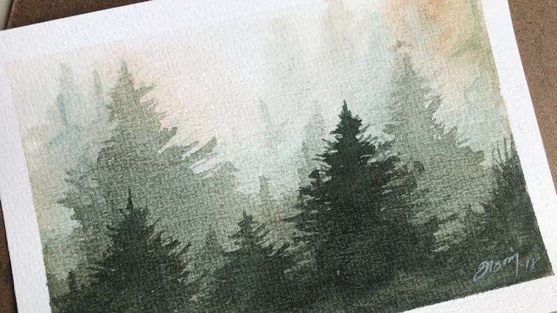
15. Application Demo Trees: in this tutorial, I will strengthen your knowledge for the different ways to apply Watercolor. The idea is, we will do the same subject. But we were gonna do them four different ways on one sheet of paper so you can start to see how these look when compared to each other, and I'll give you a really good reference as well. Something can take on your wall or carry with you in your sketchbook. The idea is, for the first example of this will be dry or excuse me wet and dry. This will be wet, wet. This will be a combination, so you have hard and soft edges, so I will Prewett the area. But I will leave bits and pieces of dry paper, and this will be strictly dry brush. So we'll crack forward with wet and dry. And this is just a number 12 and it's got a little point to it. It's really good for brushes or fir trees and things like that, where you're dealing with points and branches and whatnot. So I will use this and I'll keep the Hughes relatively simple. So just a little bit of failure. Blue, maybe a touch of poker and neutral tent. So I will start with adding some branches and different things like that. And as the tree moves, we moved down a little bit. It will start to spread out some. And the whole purpose of this is really that you start to game control of these different techniques and so that when you start to paint things on your own, you know what to expect. So for this example, you can see very, very hard edges. Okay, so that's very good for creating definition and things like that. And maybe that's, you know, will be your intent. So that's example one. Now, for this example, I will use a brush to Prewett it. This isn't really nice wash brush, but this is this brush is actually very versatile. You get a point on it, you can do a lot of things with it. I won't paint the trees with it, but just know that it's a great brush toe have for a budding areas, and it doesn't holds a lot more pigment than this one now, because I just bled it. The key to Ruli understanding this technique and we're talking about wet and wet is the amount of moisture that's on your paper. How wet is it? And there's a certain glow. There's a certain sheen, that paper Whoa have when it's wet when it's dry, of course you're not gonna get it, but when his wet lights going to reflect off of it and when it is very wet, it will have ah much more intense glued to it. And then as it dries, that would turn into a sheen. And then you will know that it's not quite as damp, so it is very wet. Then you have to know that the color is going to disperse more so so the strokes you dio aren't going to hold shape now. Another thing that's going to affect it is how much moisture is in your brush. Okay, so I can let my brush. But if I take a lot of that moisture off of it and I go into my pain, then that's going to help hold shape. So as you can see his holding shape, it's spreading some, but is still holding a little bit of the shape of that tree. Now if I put more pigment into this brush is going to hold the shape even more so. The more pigment I add to this, the less is going to spread that if I use very little pigment, of course it's going to spread a lot. So now I would take neutral tent a little bit of my Oakar, and it's very dry so that this there's moisture on the brush, but not a lot. And I don't have a lot of water and my mixtures as well. So as I start to add the strokes, because this mixture has a little more dry pigment in it that is going to hold its shape a little bit more, even though I'm putting it into ah wet surface as opposed to the first example. But you still get very, very soft edges. So it's really about managing the water, becoming comfortable with knowing the results you'll get or in the ballpark, we've paid what and wet you're losing control. So over here we have a lot more control or working wet and dry. When the paper is dry, you're not gonna get this spreading a pigment, so when you're working, what and when you lose control, but you can still gain control by knowing how wet the paper is, and then knowing how dry you're pigment is okay. So very, very important to know and something else you can do while it's wet but not too wet. And then we can scratch into that a little bit, create some grass and things like that. Now, over here and this example, just going to clean my brush. I will use clean water, and I'm just going to wet it, believe pockets of drop. So it's not entirely well, and now I can use a mixture and I will use it a little bit of water in it and quite a bit of pigment. And so where the paper is dry, of course I'm going to get Ah, very hard edge And where the paper is wet, then, of course, is going to be a little bit softer edge. And this is again something good to experiment with. And you're painting. So looking down here, I've got a lot of butter in this corner and then over and here. Now you'll notice that it's a much drier condition, so I can kind of get some different effects. Okay, very good to know this is a nice technique toe work with no knowing this really effective for clouds. Things like that. You can use it for trees to and now, last but not least, his dry brush. So I have a damn brush. But my solution my the paint I'm a mixing up here will have just a little bit of water, but not much. Just enough to mix the paint. And now I can come in here and dry brush and you'll see, is just going to get a lot different. Look, then the other methods we discussed. So this may be effective for if it's in son. He wanted to be have a little bit of sparkle to it. This is also effective for water. If applying dry brush over, Uh, maybe it's already staying blue or green. Whatever color you water could be seeking. Use dry brush to go over the water, and it will create a really nice sparkle to it. I want to show you real quick, since I have some scrap paper here that's a little bit of ah, a bluish color, and I've got a dry brush. Make sure that's dry and you kind of see how the ads that could add sparkle to water. And although this pain was already there is dry, so you don't necessarily have to use dry brush on white paper so they can be applied. And on any color, it just needs to be put down when the surface is dry and then use a very, very little mixture in with your your pigments. Okay, so again dry or wet into dry, what in the wet, wet into wet and dry so you get hard and soft edges dry brush. Great exercise to do. It really starts to strengthen your knowledge for these techniques. And the more you do this, the more you practice, especially this these wet conditions, but and wet, the more control you're going to start getting out of your water color. An experiment. Experiment with the amount of pigment you put in your brush and wet conditions and different things, and I think you'll start to get ah, better understanding of water color. And then, of course, your paintings will appreciate that because you'll get a lot better results
16. White Space Demo: in this lesson, I'll talk about weight, space, and when I say white space, I'm referring to the weight of the paper and with watercolor painting is pretty common to reserve the white space of the paper. You could do this for objects on this case to see. I have a figure with a white shirt. I have a crosswalk with some white lines. Maybe one of these vehicles could be white. So before I even put paint on the paper, I want to plan where my white species will be. And generally this is where artists will fail is they simply don't plan. The next thing I want to talk about is the actual technique of putting down a wash. Now wash it simply where your staining the paper. It could be very, very wet process. You You need to keep your white spaces in mind when you're creating a wash, and I don't use any sort of resist. Um, there is masking fluid and different things. You can get to healthy reserve the white space I've never really found that is useful. They always damaged the paper, and I just don't like using it. I would rather plan and then use good application methods to do it. So anyway, there, when you're talking about a wash again, you're staying with your paper, and you're generally putting that down with a wash type of brush. So this is a squirrel ma brush, and when I get that way, you don't come to a decent point, so I could get around some of these little areas that I want to reserve. So whenever I'm selecting a wash brush, always consider the size of my artwork. This is fairly small, seven by 10 and the artwork itself is smaller with the border in mind. Then you know it's small enough that I wouldn't choose a large mop brush, so this is obviously a much bigger mop brush. It's a number eight, and when I get that wet, it's gonna hold Ah, lot of pigment. Even though it comes to a point, I still feel that is an overkill for for this size artwork. I would use this on to say, 1/2 sheet that's maybe 20 to about 15 or full sheet or something like that. But for smaller works, it just doesn't make sense. And the reason why is it will probably get a little too sloppy. I wouldn't be able to manage the amount of water and pigment it puts down, and then I'll lose my white space. This is a pretty good size for this particular size of artwork. If I were working smaller, I may want to go to like a number two, but it may be too small to lay in the wash on these larger areas. So I'm just going to do a quick wash here, and I'm just going to use a little bit of water on a pallet. And let's say I'm staining this with a little bit of poker. So you, some yellow car into that, and I can start to run that down Now a lot of artists and including myself, we'll use an angle on their board so I can use anything to prop the board up, and then that's going to allow gravity to help out a little bit. So now I'm getting you know, the downward pool and gravity is helping do that. And so this water is gonna have a tendency to beat up a little bit, and so out is work this carefully down until I get to the areas that I want to reserve. Maybe I went a little highlight on top of this car. And maybe I want that window tenant so I could do something like that, you know, work around the shirt area, and then I can go into my street and think about my crosswalk. All right, So now I have created a nice little wash here, and I have reserved my some whites piece. Okay? And as I continue to work on this painting that I would continue to always keep in mind where I want my white space to be. OK, Now, I know all of you don't use the sea wash technique, and maybe you prefer to use your watercolor alm or of, ah, dry technique setting or whatever. But in any case, no planning. Your painting will help you. And I kind of took a little paper towel here, and I wiped down the center of where I put the wash. And I did that just to show you that even though we can kind of scrape things back or white things away, there still a slight tent there so you can see the way you can see this light 10. Maybe I could take some clean water and try toe. Get that off or whatever, but you know what? Once you start to stay in the paper, you know that really pure Chris Plate is pretty much impossible to get back. OK, another way you can use white space and achieve it is by using a little bit drier pigment. Let me to say first, you know this is cold press paper with cold press paper. You have a texture to it, and what's happening is the texture that's raised is kind of grabbing the paint off the brush, your the texture. Where is kind of Ah, a little bit lower. It's simply not getting the pigment. I'll demonstrate this with a little bit darker hue here, so just some neutral tent. Now, if I go along the side that do real quick, lightly dragged it across the surface. You'll notice all these little white specks that didn't have paint, then with a dry brush technique and basically not putting too much moisture into my pigment and not putting a lot of moisture on my brush and then lightly dragging that across the paper. But I wanted to use something like that, then you know it. Always consider it was still planning for it like that. Maybe sparkle in a walk and water that could be sparkle on a car or little detail or building like this is pretty dry on my right hand side so I can take a mixture here and drag that down, and then that would help. And dragging it down with a dry brush like that is another technique of kind of reserving, You know, the white space if that were white underneath. But you want to practice these things a little bit before you start to incorporate it in your finished art. If you, of course having questions about any of this, feel free to let me know, and I'll be glad to help you out.
17. PROJECT: Mountain Ranges Demo: in this tutorial, I will simply show you how we can apply a few techniques to get some really interesting results. This is a very easy demonstration and something you certainly want to try so you can start to master some of these basic techniques. Now, what I have here is this is a piece of £60 drawing paper. I'm going to quickly layout my design. I think it supported to just spend a little bit of time here. And this will help you just create something that's birth painting and maybe that will create a better connection to your artwork. And what I'm doing, really is just creating some mountains. And I'm going to use some basic washes to illustrate this and to bring it forward for the painting. Okay. And this may be one more layer here, and maybe we'll put some texture their rights. We have the sky area, which is one layer. We have 1234 different layers here for the mountains. Okay, so the idea here is for this top section. I'm going to use a light wash. So this will be my life has value as well, and that's pretty common in landscapes. Your sky is typically very, very light and the lightest value, But I'm going to. The technique I'll use is just a light is a light wash. So I'll use a light value. I use a wash technique, and then I'm also going to lift. And the lift will be to indicate some sort of clouds or something like that and just create a little subtle interest in some soft edges in the cloud area. Now, as I moved down these areas, we'll use a wash as well, but they're going to become darker as they move forward. So the idea is this is will be a light. This will be a little bit darker. And then so one. So that's kind of what my intent is. And then also, I think with this one to this third layer, I want to add a feeling of more trees and just give it some definition here. So I'm just going to make a note of that. So I kind of know my design. So all these air fairly smooth line. This will have a little more of a jacket feel and all but all of these were gonna be in layers moving from light Too dark. OK, so if I were to shade that I would want this layer to be darker than my sky. I want this layer to be darker than the furthest away. And now this layer apologize for a little bit of shake there. And then for this last layer, you really want this one to be dark. So that's kind of the idea that's from looking at. So let's go ahead and get started with the painting. £140 cold press. This is roughly nine by 12. I'm just going to sketch out, Come up a square doesn't have to be perfect. The idea for you and for this demonstration is just We're not trying to create finished work or anything. It's just to experiment with these washes. Now, I just find my main shapes here. I want to kind of make these somewhat smooth. Maybe this one comes out a little bit more something like that. Now this is where I want my a little more feeling and detail here, indicating some ridges and things like that, and this one can be relatively smooth. Maybe with a few lines there, all right. I'm just going to bop this this line up just a little minutes, a little bit more, so I could have a little more of a cloud area there in terms of my values scale. I'm going to just lay out what I have in mind in terms of color and everything and then also type of value I want to use for each section there. I'm not going also to think about Hughes, but I'm not really gonna work a lot with color. I'm this one of focus. Moreover, raise so to mix my graze, I can simply takes all of the primary color. So a little ultra, a little yellow joker and then a little bit of red here. And the more water I add to this mixture, the thinner, the value with a lighter. Rather the value is so if I use a lot of water, I'm just going to try this one first. You could have feel for where that's at, so that's whenever you apply watercolor. It's gonna go on a lot darker than what it's going to dry. As so keep in mind that when you apply one or color, it always look intense and dark at first, but it's going Teoh, lighten as a dries. So just kind of, Ah aside, new there and something you want to keep in mind. So now what I've done to Dark in that it just added a little more pigment to it. I'm just going to go a little bit darker with this, and that's getting there. But I think I still want to go a little bit darker, and that's pretty good. Now I want to go even darker. Someone come over here where it's not quite as saturated and wet and go a little bit darker here and now. I can go push that even darker by simply using a lot less water and more pigment and then for the sky area that's going to be extremely light. But I didn't start with the latest value because I wanted to get the other ones late in first, and then I kind of see how they all relate to each other, All right, so I think that works pretty good. That gives me my my value scale there, I think something like that A worked plus it kind of breaks the ice with the colors I'll be using. So now I'm ready to go to the painting because I'm working light to dark, which is what I'll be doing here. And that's also working from top to bottom. A little bit of overlapping isn't going to hurt me a whole life. So what I mean by that is, if I were to take this lighter value and tone the entire paper, that's OK. It's not gonna hurt me because everything is going to get darker from that layer forward. So I think I will go ahead and do that. So I will start with. We'll just pull up, pallet over. So you get a little bit better view of that. We'll start with this very ah, light mixture here, lots of water. I contest that on the side, and I think that'll work good. I mean, at a smidge more blue in here, and I can start to apply that through the entire square. Okay, so it's pretty good. I'm just going to touch a little bit a little bit darker color there just to give it some variation. Now, using a paper towel, I can have a crumble this up a little bit So I get all of these little ridges and crinkles and in the paper and I can start to really grind down into it where I want a big cloud and then soften it where I want the cloud to kind of disappear and drag it across like that. That works pretty good. So that gives you my feeling of clouds. And now the key is to be patient and because I didn't like, put this on really, really wet is going to dry in a couple of minutes. So when this dries were to come back and then do the next layer Alright, dry to the touch. And now I can go ahead and start to add the next layer which is basically the top mountain here, and I will go slightly darker than the original or the sky area. And again, it was going to test where I did a test on the sky. I'll do a quick test for the layer of about the pain. Now what this very subtle means. So there's not gonna be a jump from here to here from the sky to this. But I gotta remember there are four other four total layers that I need to do. So if I go to dark, then I may run out of options when I get near the bottom. Okay, so I think this will work pretty good. So I'm just going toe mark my my ridge here. Now do that very slowly, cause But once I get once I get this in there, then I can kind of work a little bit quicker to do everything else. So I just want to be careful as I laying in my line. And that works pretty good. Now, Aiken, pretty much just come in here and pull that down and again because I'm working light to dark. It's easy. Get that off to do this. If I had areas down below that, I wanted some to reserve some white space for some later values that I wouldn't, of course, use this method. Okay, so now gonna let that dry dry to the touch. Now I want to move down into the second tier. But before I do, I want you to understand something. Because I have I apply. I'm applying this and layers where I'm basically putting the first value down, which was the sky but I toned the entire pay me and did the same thing for this first layer here. So this value went over this one. Now, as you stack values on top of each other as you stack layers on top of each other like that , you have to be careful with how you control the value. Because I don't need much darker value than what's here to change this because I'm already starting with that base. So if I were to go to dark here, then I'm going to run out of room down here to go darker. So the idea is, you know, you want to use watercolor and the transparent qualities that it is common inherent in the medium. And when you're going over a layer like this and I want to go a little bit darker than this one, keep in mind that you really don't need to go too much darker. You can almost use the same mixture and maybe a touch of more pigment. And that will give you what the results I'm looking for, which is simply a little bit darker than what I already have. So just something to note there about what our color so you can see just layering that over that value creates a darker look so I can start to come in here and just kind of make some little squid lease and some interesting edges. But I don't want to be too too rough, and that's good. So that creates a little bit darker value on the second set of mountains and one note shoe and want you to show you where this layer this first layer mountains came down and this one went above it. So this layer mountains that just painted his overlapping. This one, you can see where that wasn't worse overlapping how it's a little bit lighter value and that this again choose you and illustrates how transparent watercolor can be. And you can lose the opacity and blur color about simply going much thicker and not deluding your paint with water. But because these air watered down and diluted, then you have a lot of transparent quality there. Okay, so as with the previous layers, need to dry this and I can speed things up with a hair dryer, so I will go ahead and use this not off camera. Worse and then When I come back and this is dry, we can get rolling again, dry to the touch and this. Go ahead, bring my little sketch up and this remind you and remind myself that this particular layer that I'm getting ready to add this is where I really wanted that show some definition and maybe some trees or something really poking out there. And to do that, I'm going to change brushes. So this is a number 10 round. Really nice point there. So I could get a little bit finer in these little nooks and crannies. Now, as I mentioned earlier, it's I don't need ah, very dark hue here. But because I'm stacking these layers over top of each other is basically I can just simply add a little bit darker value than when I already have. I'm going to end up with a darker result, but I want to go a little bit darker than that, and that will work with the fine brush. I'm gonna do what's called cutting in. So I'm going to kind of come in here and put a little line. Oh, our little edge here where I want these to cut in Basically, I'm not worried about what's underneath that line. I'm basically putting this in, and now that I had the line in, I can start to just cut that in by adding this layer that goes right up to it and down. So that's a really nice little technique to use when you're painting. Is that cutting in because I don't really help you save some time. So basically, I don't need to use this smaller brush to do all of this. I cut, cut in the details and the edge. I want the shape I want and then where I'm going to go. But I just need to put it down with less detail. I can use that larger brush. So again I've got that layer down and it's starting to take shape. I'm going to use my hairdryer dry and we'll be right back. All right, last layer here. So I want to go a little bit darker. I've got a lot of plenty of wiggle room here to do that, so I haven't run out of room having a round of value scale to do it, and so I can go nice and thick with my pigment here, since it's the last one. I want to switch Teoh a little bit bigger brush to so I don't want as much detail in this layer and a little bit. But not not not much. All right, so there you go. That's a great way to introduce yourself to several techniques with watercolor. And that is, um, first of all washes these and this is really nothing but one wash over the other. If you remember correctly in the sky area way started very light. I use a paper towel just to indicate some clouds. And then we just moved our way down by adding one slightly darker layer or wash over the other. So again, a fun way to get to know what our color and all of the lovely qualities that it has along the way. I try to share some other ideas on how you can use it in this understanding, the transparent qualities of it. So over in here, and just kind of how the layers stacked over each other, cutting in and things like that. But again, I would encourage you and really recommend that you do this simple wash technique to create something like this and I couldn't include an image or to for inspiration for you. Of course, you'll have this to look at as well what I've done. So get to know washes there. Really? The bulk of your painting really is in the certainly the beginning of most paintings are all done with washes. But you have to master this and understand how you know, just simply ah dryer pigment will go on more of pat opaque. The more you water down, the more transparent will be. How really wet washes how they take longer to dry. So all of the things you learn this are the skills you have to know to become an excellent watercolor painters. So have fun with this and I hope you enjoy the demonstration.
18. PROJECT: Sail Boats With Burnt Sienna: for this demo, I'm going to use three main techniques and to basically create a simple landscape that has some sales or sailboats. Rather can a silhouetted against a medium tone background and foreground. So I will use button wet in the sky and when a capture. Two main tone so kind of a lighter, mid tone and then use a little bit darker tones coming across to indicate some clouds. And that's gonna help silhouette the late tone sales and for the sales basically going to use white space. So paint around those and then a little bit of dry brush in the water, and that's gonna add a little bit of sparkle to to that foreground area. This'd £140 cold press ahead lightly sketched everything out. And since this is more about technique, I will keep the colors simple and just going to work with some burnt sienna here and the ideas I will work light to dark. So starting with I'm going to grab a little bit bigger brush here. Yeah, test that again, something like that at work. I think the rial challenge with something like this is being able to put the wet washing. What enough that it stays. But while I drop in colors for the other areas because I want to come back and tweak that a little bit with the clouds and with the cloud that I will work. No, I'm working at what and wet as I mentioned, so I need to put this on damp enough. That allows me time to do that. It will put a little guy back there, and that's pretty good inside my palate error for just second thoughts going to tilt this board a little bit just to encourage this wash to come down into this. But now, with the water, I wanted to creates a dry brush, so still have pigment on my brush here point to dry that off on the paper towel and if she's still enough to get that feeling of sparkle there on the water. So now comes the tricky part. And as I mentioned before, when you're dealing with what a wet techniques, this is the most challenging method for working with watercolor because there are more variables when things are wet. As I've mentioned, the pigment will disperse, so it's knowing at the right moment basically when to come in with your next wash, and I'm still reading a little bit here. So I feel like it's a little too wet. And while I do it, I'll just create a little bit of detail here and these boats. I'm just doing that. This is by dragging some of that pigment and is touching what could be a little bit of airspace here on the sales. That's what I don't need much more detail than that. It's starting to dry, still have quite a bit of pigment. Oh, our Mr over here. But looking at our sketch Theo idea was to create a little darker value coming through here and then the darkest in here. So that may not hurt me too much. So for now, I would just grab some pigment here and looks pretty strong. But I'm actually thinking that should be about Ray. So, of course, the whole while I have toe be careful here to not ruin that white space now, just adding some touches in here that dark under the boats when the sales Good. Now this is still slightly damp. Aziz. Well, going to dry that brush off just a little bit. There's still some pigment in there. So now I could just add a feeling of this Little War wave action, perhaps, and in the water squished to, uh, smaller brush here. And that's the idea. So, as you can see, just one simple go here one wash and again it's all about knowing the wetness of your paper and then also knowing that if you want the weather, if the pigment is really wet, then you really have to come in here with some thick paint to get the the look. You're at their. So this is no a technique, your help the master. And it's one of the more difficult things to do with watercolor. And just tackling simple, simple paintings like this can be the way to go. Now I am going to let this dry off camera and we'll come back and have a look at it because things are gonna change as it drives nice and dry. But before I take the tape, all I want to add a little bit of value to the sales and very, very weak so they don't compete too much with the background and that just keep him from looking kind of like they're cut out and pasted in there and something like that is fine. Go a little bit darker. One little guys here in the background. Let's get so again, their wedding wet for the sky, some dry brush down the water area so we can get that feeling of sparkling and maybe a low sign hitting the water for study. And really, ah, learning sketch like this, you don't need much more. I find the problem. Many artists present for themselves as they go to big so that they're trying to tackle too much and create work that they I want to put in a museum or, you know, things they're influenced by maybe on the Internet or whatever to replicate. Ah, complex painting. When you don't really understand the necessary skills and your lack of experience working with certain conditions, it's gonna come back and bite every time. So you will waste a lot of money. You will waste a lot of time, so keep it simple, master, especially this wet and wet technique for water color. It is something you will use Ah lot. It is very, very useful for many situations, so you would you want to be able to spend some time getting to know it a little bit, and then eventually you can start to do. There's more complex paintings with no problem at all, and you will certainly not waste as much time and materials. Okay, that concludes his demo, and I will see you in the next one.
19. PROJECT: Misty Pine Trees Demo: in this demo we're going to create. Why didn't wet painting based on an image off pine trees and fog or mist? Something like that. It's really a good atmosphere and a good opportunity to work with blood and let techniques . Now this is a very loose sketches you can see. But the idea is to do one too. Three layers of trees and then as they gradually move forward, they will get a slightly darker and value and they will get a little more definition. Aziz. Well, okay, so that's the idea. And the challenge here will be to manage the wetness of the paper and then to manage the amount of pigment in the brush. So how much dry pigment I need to work into a particular condition to achieve a desired effect? OK, as I've mentioned before, when wet is extremely challenging, but with a little bit of practice and experience, we can make this happen. So let's get started, right? For the demo, I will use neutral tent a yellow Oakar for my colors. Since they are trees in the fog, they're gonna be very gray. I don't think we need much more than that in terms of color for brushes. I have a number of five mop brush. I have somewhat of, Ah, needle brush here. It's got a nice point to it, but a nice little belly as well, and that's a whole pigment. But give me some good edges. I think that would be a appropriate brush for the trees. Also have a spray bottle. This is handy for obviously spraying the paper, but the reason I don't use my brush in some cases because me what things with a brush, there was friction and that rubbing of pain most sometimes ruin what's already there. So the idea of a spray brought bottle is you can spray something and I won't disturb the strokes in the drive paint that are already on the paper for pre wedding the paper. I'll use my mop brush. This is we're working wet in the wet. I don't want hard edges. In this particular painting, I will go ahead and Prewett the entire surface. And if you're curious about my paper, this is 100 £40 cold press holding at an angle just to make sure that I cover the entire surface and that it doesn't become too wet. Now that's not bad. I think I can go ahead and put my initial wash on, and I already have some graze on my palette from a previous demo and painting. So I will just go ahead and use that. I don't want this to go on to wet do. We'll have to wait a little bit too long. Four to dry and go. So the idea is just to kind of go slightly damp with the mixture, but not too much. I'm just adding some warmth there in the but will be the sky area. That's pretty good. And I'm gonna hold it an angle again so I can get a feel for how wet things are and to see how even Liran, even the distribution of water is. That looks pretty good. So this stage, if I work, you crack forward and put the first layer of trees. I think it would dissolve and lose shape a little too much, and here's the tricky part. The trees in the distance will be very toned down, so the value will be very, very light. In order for me to get that value, I need a mixture of paint toe the water pigment ratio for my paint rather needs to be weak . Eso. In order to do that, I have to put water and probably use a really wet mixture into wet paint or wet wet surface like this now going to completely lose form. And I want the trees in the very background have form. So I have to just be a little bit patient and letting this dry. I'm looking for a certain sheen and wetness that will allow me to put the wet wash into this. Okay, so I'm going to let this drive for a few minutes off camera and we'll come right back drive , but still a slightly damp. I think it's a good time to move forward with this next layer. And truthfully, this is probably the most difficult one because of his too wet, you know, it's gonna bleed into the paper too much, and then I'm gonna have cauliflowers and everything else in here. It looks a little stiff right now, but I'm going to take care of that with my little spray bottle and just trying to keep this loose too, you know, the idea is ah, make it Interesting study. But, you know, I don't want my anything to be to defined and Ben in the background. I think for that stage for this stage, Rather is pretty good. So now this kind of getting this spray bottle in action here, and that's going to help loosen up some of those edges. The only problem with spray bottle is you can't control the water. Obviously that comes out. So you think the paper's gonna become very saturated and you're gonna have toe be a little more patient terms of drying it off eso? That's pretty good. I think we've got some soft edges, but we have enough hard edges. Their toe kind of strike a balance between the two so that we can see there's a hint of trees back there. But the tone is good. The value is good. Rather, and I think that's going to do OK for this particular wash. I'll let this dry off camera will come right back, all right, pretty dry. And now I can go ahead, move forward. I want a little bit stronger mixture here, So this a little bit more pigment in the paint. Good to have a test piece of paper around. It's not bad. Think that's gonna be a little too watery, though I may have some issues with colored flowers and stuff like that popping up in my work. So I have to remember to. This is only the second layer, and so I want four total. So again, just kind of going very weak and trying to save some room there for the layers to follow. Now I'm just putting a little more water on my brush now, and it's going to encourage a little bit of bleeding. And here, so blending and kind of lost and found edges and things like that and just drop a little more pigment. And that almost a charging effect there that may be a little bit stronger mixture here that maybe a little bit too strong. I kind of pull that into a different area of my palette and some water, or see if I can soften that up a little bit. That's pretty good. Now we've got some hard edges up here they don't really want, so that's where the spray bottle comes in handy. I really couldn't do that with a brush. I just want something really weak here. Good, I think, just to encourage that Blake bleeding a little bit. We just use a wet brush to run some of that down. I think that's OK, and it's gonna drop a little more pigment right in here. So whenever I sprayed it, I think I did the good thing of softening the edges. But I think it diluted my pigment just a little bit too much there. That's when I get a slight indication there. Cem Treetops Good. I'll dry That off camera will come back moving right along dry. But I mean, it's still a slightly damp, but certainly not 100% dry. I can start to get my next layer going here and let's see we can drop a tree here. I'm just dipping in water now and getting just diluting that mixture a little bit that I have, and that's going to let's make it so I have a little bit of wiggle room to go darker for my last layer. Yeah, I think that layer is fine. Spray bottle, Little summer. Soften those edges on and this work is pretty good. I'll drive this off camera in case I didn't say I am using a hair dryer, but to dry it in between. All right, so I'll be right back. Final layer, so slightly damp, but not 100% dry I can use. It doesn't need to be ultra thick. And now I can start to add these last little trees here in the foreground. And it's going to now use some water, encourage a little bit of bleeding. And now that water deliver my brush. I have to be careful and decide if I want to be that wet over here, too. And this is working out pretty good. Yeah, I think that's fine. Do a little bit of charging here second well, but Oakar and then a little bit of I neutral tent and just kind of dropped some color. This bits and pieces here and there break up some of the values that were kinda old, kind of clinging together. There you can use a dry brush to kind of create a little. I want everything to be dark on the bottom either. So this a little interest there, you hard edges, which is OK. These trees are a little bit closer to us. I don't want to Too stiff. That's looking pretty good. So dry that off camera and be right back. Well, let's take the tape off and see what we have. We did it all with that simple technique of but when you're wet and wet and the challenge was to create that feeling of distance and fog. But also we had to always think about managing that water to pigment ratio. We have to always gauge how wet the paper is and decide how much how thick of a delusion solution do we need and then also, if we think back to the room started. So we had the very beginning where I put down the background area pretty much had to let that dry because I don't really. I don't have a pigment weak enough in terms of value that could have put the first layer of trees in there. So I had to let that dry so that the the mixture I needed, which was a lot of water to pigment, didn't bleed or new collie flower into the original wash. And then I was able to defuse it and soften it with the spray bottle there, and I know you saw me use this quite a bit here and there to help create those edges, but with the soft edges anyway. But for the most part, I think this demonstration will help you with an approachable subject that is just simple trees. It will help you gain hopefully a lot of control over your wet and wet washes, which is common. You only have to get used to him. You don't have to master him if you want to become a really good at watercolor artist. So that concludes the demo. I hope you enjoy it, and I hope it improves your artwork.
20. Circles: Alright, for this lesson, I'm going to draw some circles and introduce you to the idea of negative space painting. And then we'll do some more exercises to show you how you can do this in a more organically. And, but first, let's just kinda get on the same page here. So I will just draw a couple of circles using the inside of my tape. Maybe I'll do wanna sorta half off. And then I'll use this one to get a few smaller circles. And the sort of go. Let's go over here as fun. Now at this point, the circles don't touch. Okay? And I'm going to use my large mop brush to stain it. Mix up a decent color here. Let's go with a green. So a little bit of cobol, little bit of my lemon, yellow, and lots of water. I wanted to stay in everything first does so we don't have these bright circles. Negative space painting. A lot of fun to work with. And if you've never done it, or maybe even if you have, you know what I mean, but we've never done it, then it's going to be a tree because you can really use this and many different ways once you understand the concept. Alright, so at all that's nice and wet. So really thin tea like mixture there. And now I'll take a dryer to it. Alright, so that should do it. And now we're going to do another layer. I'll just use the same mixture I have, so I don't need to go any darker right now. And I'll paint around the circles. And they don't have to be perfect circles unless of course you want them to be perfect. It's just, we're getting on the same page so to speak. And you're just going to learn what it is. And then we're going to really have fun exploiting the idea and the sort of approach, I guess. All right, that should do it. And I'll use a hairdryer once again. Right before I go any further, just to be clear, the only reason can see these circles. Is because I added the second layer around them. Okay, so making you see a circle by painting around the subject. So that's the gist of negative space painting. And now I'm going to do some more circles and overlap them. And when I draw my circle, I'm not gonna draw into the circles that are already there. So I'll just kinda draw up to it. So one see this do and here. And they are kind of blind, had a blind spot. And we'll do one more right in here. So that'll work. Now I'll mix up a little bit darker color here by just adding a little more pigment to it. And again, painting around everything but the circles that I've already drawn. So and obviously still using my large brush here to do it. And there this isn't exciting to watch, but I will get through it as quick as I can here. And you're gonna start to see this sort of layering and depth that you can get. This technique and of course, making things up here by painting around them. And that's the, again, the gist of it. Alright, so you're already starting to see two layers, right? So you're starting to see actually three layers. You started to see 12 and then three. So again, I'll draw this off. Okay. You know the drill here. Some more circles. See ya do she was small one down in here. And I'm kinda have a blind spot there. So I think it's going to be roughly in there. We'll do see another small one. Let's do another small one here. And then we'll do a larger one here. Alright, so mixing up. More hw here, so I'll have to go a little bit darker, a little bit thicker, so less water. And again, painting around everything. I'll actually use a little bit of ultra marine and this one got a pretty easy across the top here, not much to think about until I get over in here. And we have our large circle connecting several of these. And almost done here. Alright, now we're seeing in one to three layers. Ok, so it's, they're starting to stack them on top of each other. I think we have room for one more. Not just do a couple more to finish it off here. So I'm going to read it like this. Go here and here. And let's do one small one off to the side here. Alright, so, you know the drill. I'm proud to go a little deeper towards the blue here. And I'll go a little bit of yellow ochre just to make that nice and dark. And know what's going to draw it a little bit lighter. So I'll go a little bit darker still. Am sticking with my large mom here. And I think this last layer is really going to add some depth to it. Get those really rich, deep colors, dark and value. So pretty easy concept here in this stage. But again, this can get really sophisticated and much more advanced as we introduce more complex shapes and things of that nature, which we will do of course. But it's really a strategy. Negative space painting is a technique. But it can be done intentionally or you can do it in a strategy where you see a subject and you're like, oh yeah, I can negative space paint and stack these layers and achieve this. But for now, I think this sort of gets the point across. So we have our base to work from. We have a clear, hopefully a clear understanding of what negative space painting is. So basically taking a color, which is what we did. And painting around it. Like so. And of course we did it with varying degrees of green to achieve circles. Okay.
21. Simple Landscape: Alright, so let's do another study here. So we'll do to sort of do some buildings and will, let's just say we've got some white buildings and here a bunch of them. And then maybe there's some water and beach or whatever. And then behind it we've got, you know, some mountains. Like so. So the buildings and here are lightened value. The water is a say, a gray blue with a maybe a little bit of this sort of muddy brown And here. So basically we have a light value surrounded by darker values. So what you can do is basically paint the buildings and negative space by painting the mountains and the water. Well, this sort of experiment with that idea. So I have some neutrals, all my palate allowed. This has just left over from previous demos. And I'll warm that out just a little bit by using a little bit of ochre. So something like that or should work pretty good. So now even just go ahead and just for giggles here. I'll add a really pale blew up in here for like the sky. And I'll draw that off real quick. Okay, now we get back to where it was before. Will go a smudge darker. Alright, so again, buildings in here and then mountains over in here. So I'll just sort of kinda quick strokes in there and then leave all of this alone because this is where all of our buildings are going to be. And then on this side, kind of a similar thing. So something like that. And then maybe as we get down in here, we start seeing a hint of some greens or something. Alright, we have all these shapes in here, down in there. And let's add, will go orange and ochre, fairly dark. My Noah's gonna dry a lot lighter. And we'll just sort of pretend we've got this little beach. I'll go a little bit more yellow and a lighter and value. As we were creep off the page here. And neutral tent, burnt sienna real thick. And maybe in here. And we've got that beach, some shadows and stuff like that going on. And just to sort of make it more complete painting here. And this is just a quick studies, quick sketch. The goal wasn't to, to do a finished painting at the stage. But it's just to sort of explore these ideas. Negative space painting. I'm leaving some little white gaps in here. What you will see why. And water. Maybe another small one in here. And maybe this will get a little bit grayer. Let Assad did around the shape that's gonna come in handy. That sort of negative space painting as well. Which again, I'll show you about that in just a moment. Okay, so we've got all this happening again for our buildings and the start with the rooftops. So I had this sort of orange. And here I'll touch a little bit of red. And let's say we've got a little something up here, maybe down in here. And what I'm doing is creating rooftops. And all the while. We are sort of negative space painting these buildings. And a lot of this is just sort of random strokes. So not worried about copying an image or anything like that. That's just working with the idea of buildings and sort of use them. What I have. And I'll switch up the colors just a little bit. So maybe some of these rooms and here are sort of a slightly different color. So just like a little village, right? And now I can go with a really light gray. So again, a really light gray. So let's say here, maybe this one sort of builds up and goes down in there, sort of connects that shape. And just kinda making shadows along these buildings here. That's sort are painting themselves just BAD dawn, negative space. And maybe we have a shadow here on that building. Maybe things get less descript as we go back in space a little bit. And is bringing these right ONE down, I guess into the bank is fine. And it will put a couple more. And here, now I can go slightly darker and add a few details. So maybe a few windows. May still be you too wet to do that. I'm back in touch a little bit. Detail there maybe. And say we've got, maybe I got that little bit. It, it's all spread in there, but I can still see it. So say we have no little red boat there. Maybe this one's got a little detail on it. So it kinda negative space painting some boats. Again, a nice, easy way. To do it without sitting there trying to needle and get every little detail. And so we're just sort of suggesting things. Yeah, I'll go back into these windows now and let's see if we can maybe drop a shadow and here couple of Windows. So getting them in the shadows first, I'll lift the load a bit of that shadow there. It's got a little bit too dark. Think I'll kinda connect. Connect these two. Maybe another little building there. I'll switch to my smaller brush here. And it will put a few windows on the light side of these buildings. Maybe a little circle there. Maybe had little sort of detail. Alright? So kind of a quick, easy sketch. Something easy. You can do a simple idea. And maybe I guess I'm kind of more dry brush and stuff in here. Alright. So a little shadow here. Again, just, you know, you know, their boats there now. So you don't have to guess what they are. There's enough information there. Say what it is. But that's it. So again, you can sort of get the idea that this can be a very powerful tool. So even in quick little landscape like this, we can look at the different ways. We use that negative space painting to carve out the whites of the buildings. So we use the mountains, a little bit of the beach. And then as I painted the water on, just let some whitespaces, four areas that could be a boat and went around. The shapes are no different than what we did here. The only difference, I guess being as the shapes are a little more elaborate. You know, we got buildings and boats and different things, but we're basically using the same concept. And just to make this may be a little more balanced. We're all balanced. I should say. I'll just throw some dark over there. This is little bit heavier over here that is, are there alright, as that.
22. Mushrooms: Alright, we're going to add a level of complexity here. Things eventually we'll get a little more challenging for you. So instead of doing circles, we're going to do some mushrooms sold. The idea is to sort maybe start with obviously light. So same as we did last time. You have to work. Light to dark. And we'll keep that throughout the course. And maybe we'll do one more sort of. And here we'll make this actually will make that a little bit taller. And here, I'll take this up a little bit more. So we've got more above. Come with three-dimensional object there because you can see underneath it. So we, we can't get away with what we were doing before with the green circles. Okay, we have to be a little more clever and thoughtful when it comes to our values. So I'm not going to worry about the other layers of mushrooms. Well, do it start with very, very pale magenta? Will actually, i, this give more of a violet? It's all work with some violets and maybe golden yellows. So very watery. So always good to test it out. Make sure you're happy with it. I think something like this should work and put that down. So MOD ticket all the way down to my corners and take it right on up. And I'll go ahead and staying the entire paper here. And keeping it fairly weak. Again, we have to always remember watercolor is going to draw a lighter. But also we had to leave. Think about the range of Hughes since we're working in light to dark. So we go to dark on the first one. That means we want to have to push it to probably more of an opaque wash towards the end. And we don't wanna do that. So the stain up, put down now, it's just really for these mushrooms. Now this is still very wet. The wash. So what I'll do is start working in a little bit of this gold into this wash. I'll just drop that into the top here. Something like that. And wherever it goes as fine, I won't try to control that too much, but I do want that situated up towards the top. And a little bit richer and more pigment. And hear about as much as I want to go. And putting a little bit on the side to balance it out. And now is hairdryer time or heat gun Tom, and I'll draw it off. So R three mushrooms, that'll pretty much remain that color. I will add a little bit of value underneath once I get to the next level. So I'll have another one maybe coming off in here from the corner. You know, try to keep your lines fairly light. Actually, I want to extend it up a little bit better keep with what I have. And let's see, we can go with maybe another one, creep and up in here. And it's kinda hovering behind all of this. And we got, let's do another one back in, back in here. Open like that. Alright. So we'll go a little bit darker with the magenta. So that means I will use a similar mixture. So Alizarin, crimson, ultramarine blue. What's probably a little bit to read, so I'll just pop a little more blue under that. But still I don't wanna go too dark. We can see we're quite a bit darker than the last one, so we're in the range. So I want to go around. These guys. So my original mushrooms, the first layer, probably could have used a little bit smaller brush. But I think I can get my own way through this round. But remind me to go smaller next round. Total. Let me forget. All right, so just a little bit trickier here because our shapes are less predictable. Starting to touch each other a little bit differently. And it's got to be careful with it. Now as I get up and here, I'll go with another coat of yellow ochre by Mongo with a little bit of Sienna end to that as well. And kind of work that in something like that. Maybe even touched a little bit. And here, because it's the kind of blend it to the bottom as well. And now I will take my smaller brush. I'm gonna go a little bit lighter than this second layer and go underneath these guys trying to leave a little whitespace there. And if it touches, I'm not going to panic. But just know if it touches, it's gonna bleed a little bit into it. I'll touch it in a few places just so doesn't look too stiff. Alright, so that's working good. You can't really see that second layer yet, and you won't really see those until we get that next layer on. But now here's what I'm gonna do. I've got a little area up here. I'm going to lift a little bit and sort of get this other little mushroom up here. And sort of up hearing out of the shadows there. And we'll do one more. Maybe lurking over in here. Like so. I'll lift it a little bit more. And that looks good. So hairdryer time.
23. Mushrooms Continued: And thanks for reminding me to grab my smaller brush. So now I want to go around all of these. I won't do anymore mushrooms. So I'll just go with what I have. So i'll need something a little bit darker here. So a lot of pigment there. And we'll put that more towards a blue. And so now I want to go around these. So I've got one here, I've got this little drift d mushroom Here. I'll leave a few little gaps in there. And I want to come back and do a few soft edges to sow some hard and soft edges. So this one, I'm going to put behind this guy. This one, this kind of drift. You want someone to go with something like this and maybe like that. And we had this other one here. So again, kinda tricky. I need to work quick too, because I want to come in there and blend some of that color and hear what? Brown. So again, this one's coming down and the stem is coming like this. So now you'll be able to see the other side of it coming underneath. You can see it's sort of messing it up in there now. And we have another one over in this corner. Well, what that more brown now and now, more ochre and sort of kind of blending those off. As it moves around off the page there. So I've got all those colors down here mixing on their own now on my palate. And so I'm going to use that mix down in here where these colors are starting to sort of merge together here. Maybe a little bit. And here. All right. Now, I think we need a darker value in here for this mushroom underneath. So we were barely see you in that one. And I'm going to lift some of that and a little bit of this. So I'm going to get some of those rich brown now mix up a little more magenta. So we've got our mushroom coming off here. I think I'm just going to try to define that just to bring it back on the page and there. And that kinda move it off into the corner here. So then we need a darker value underneath this one. So this will be in front of this one, but behind that one. And I can drop a little bit darker in there if I want to do the same thing here, you just have the blend it with faded a little bit with your brush. And just make sure you don't drag it too hard. Just a light feather. Dislike that. So it doesn't disrupt the wash underneath. And something a little darker here. Maybe something a little darker there. And we got this mushroom, this mushroom, and then we've got one sort of coming off in there. And I can run a little dry brush. And there just to get a little separation from those. Alright. Maybe a little bit darker on this one. This because it's near the edge of the page. I don't want those corners to be too active. Lifting a little bit there. And now just go a little bit darker and a few spots. Don't be afraid to use those darks. And it was good. I'll take a hair dryer to it one more time, but I think before I do add a little bit of a little bit of color and a few spots on these. And this soften a couple of those edges there. While that's wet. I like I like how some of these have hard edges and then some will be more diffused. Alright? I'm gonna do the same thing real quick before I get ahead of myself. And that she's taken a wet brush. And no, I've got paint around. These things that are wet. I would just encourage that to sort of blend in there and now will just give it again, kinda just break up a few of those hard edges. Really thick at the tube here. On that one. Alright, while it slightly damp, take my sword. And we can do a few a details in here just kinda underneath. Some of these. Now sort of keep the blue with the blue. Kinda get a grey Maybe. And this lose lines are too hard while they're wet. And I'll just soften and a few spots. Alright, so again, a little more complex then what we did before. And we're sort of working with two colors and trying to balance that out. Yeah, little messy over here. I wish I would have clean that design up a little bit, but it's alright, it's not bad. I can live with it. But at this point, you know, you don't want to go in there and try to fix anything. I think, you know, everything is pretty well where it's going to be. And I'm just gonna tie this brown in to a few places. But yeah, get in there and started known too much right now and and we'll start to look fuzzy. And right now it doesn't think it's a good little negative space study. And that's that.
 ROBERT JOYNER, Make Art Fun