Transcripts
1. Introduction: Welcome to the
characteristics of watercolor painting
basics and beyond. This is the ideal class for
beginners and anyone that wants to understand the intricacies of
watercolor painting. My name is Robert Joyner. I have been a full time
artist since 2003. I've worked for popular
brands such as Carnival Cruz, Kentucky Derby, CBS
sitcoms and more. You can break this class
down into two sections. Section one, I will cover an
in depth look at materials. We'll look at the basic Bosches. We'll also explore brushwork
mechanics and have a deep dive into understanding wet and wet
watercolor techniques. Then we will begin part two, which is all about projects. Some of these are very simple, but the whole idea is we will
take these skills that we have learned in part one and we will put
them to the test. And then you will have a good
idea of where you stand, so you will know which ones
you need to focus on a little bit more and others that you're starting to master. If you're excited to
learn the characteristics of watercolor painting, learn how to manage water. Get your workspace
set up correctly, then let's get started. I can't wait to share
this class with you.
2. Materials: Let's go over some materials. These are the supplies
I used in this class. We will begin with the brushes. All of these are extremely affordable and have
lasted me years. The mop brush, this is a number
eight Princeton Neptune. This is wonderful for
laying down large areas of pigment when I need
to paint a large area. This is my go to brush that brings us to the Princeton
Neptune number four round. Ideal for details, and it can do some really
good line work as well. Princeton, Neptune
number four round. A great brush for adding
small details and accents. You definitely want to have
a small brush on hand. That brings us to
the last brush, which is the Princeton
Neptune 34 inch sword. A very versatile brush, as you can see by the
shape of the bristles. It can do some very
fine line work and some wonderful
calligraphic strokes. I also keep a graphite pencil to B and a needed eraser on hand. Obviously, we'll be doing
a little bit of drawing later on as we move
forward into the projects. Now we have paper, I use Blick premium
watercolor paper, 140 pound cold press. Cold press has a little
bit of texture to it as opposed to hot press
which is very smooth. I think this is an
ideal surface and Blick papers are very
durable and very affordable. That brings us to foam core. I will use this for backing, I will tape my watercolor
paper to this, and then I will give me a
firm surface to paint on. I usually cut these so they're just slightly bigger than
the paper I'm painting on. That brings us to the paint. I use holbine. This is artist gray paint. This is one area you want
to splurge a little bit. My colors are cobalt turquoise, ultramarine blue,
cerulean blue, cad, red light Alizarin,
crimson yellow ochre, cadmium yellow, lemon,
burnt sienna, neutral tent. And then a little
bit of white guash. I've used Hole Bye paints
since the year 2000. I highly recommend them, but any artists gray
paint will do again. You do want to splurge
a little bit and have premium paint because it does make a huge difference
in your colors. That brings us to some
miscellaneous items. This is a roll of two inch
archival masking tape. I use that to tape the paper. I have a small Mr. This is good for
having to spray paper, then also to spray your paints. If they dry up in the palette, I recommend having
one of those around. Next up is a water reservoir. I have two of these. This is a one quart
plastic reservoir. I like plastic because I
tend to be a little clumsy. And if I knock it
over and it's glass, it'll break and that's just a mess I don't
want to deal with. Next up is my palette. This is a John Pike
deep well palette. It has plenty of reservoirs, which I rarely use. I tend to keep my palette
limited to about nine colors. As you can see, I have a
large top area there as well. The John Pike gives me
plenty of mixing area, and I've had this one
for about seven years. I highly recommend having
an old towel around, or you can opt to buy
some paper towels. You will need this to wipe out any excess water
on your brush. Also, it can help remove water and pigment
from your surface. Then there's the hair dryer. This is good for speeding
up the drying time. I will use that as
well in some of the demos that covers
all of the materials. I will leave a link in the description in case
you have any questions.
3. Palette 101: Palette tips. In this lesson, I will cover some
ideas on how to get better usage out
of your palette. I will begin by putting
the colors in the wells. Along the top will
be my main hues, and then along the
right hand side there will be my neutrals. I will cover that more
as we move forward. It's important that when you
put paint in your wells, you squeeze out a lot. Do not be too stingy
with your paint. If you only put a small amount
of paint in your wells, it's going to dry
up much quicker. The more paint you put in there, the less likely it is to dry
up again. Do not do this. Go ahead and squeeze out
some more and move on. Going over my palette here, starting left to right, I have ultramarine blue, cerulean blue, cobalt
turquoise, cad, yellow, lemon yellow ochre, a lizard
and crimson and then cadmium red light on the
right hand side is my burnt sienna and
then my neutral tint. The white gas I do
not put in the wells. I keep that separate. Basically, if I need it, I will use it straight
out of the two. As I mentioned earlier, all my colors are
grouped together. So the blues, yellows and
reds, that's pretty much it. Now let's look at the top. The top is good for
mixing a large wash, but also I use it
to tilt my board. As you can see, I will
put my palette in there, but stagger it in a way that
the board is angled down. This allows the paint and the excess water to settle
towards the bottom. Eventually, you're going to have a lot of water settling there, which is a much
better place for it. Then moving back up into
the wells of your paint, Always angle your board
downwards away from your paint. You can also prop it
up with an object. If you don't want to use the top or if you
don't have a lid, just opt for something else. But again, make sure that your palette is angled
away from your hues. As we move forward, my palette will always look like this. If you are ever curious
about my colors, it will always be set
up in the same order.
4. How to Manage Palette and Water : This is a very
important lesson about managing palette and water. Believe me, as we move forward, you will quickly
understand and realize water plays a huge role in
the outcome of your art. The first thing
we'll talk about is avoid excess water build
up in your mixing area. We did touch on this and the
previous lesson, but again, I want to remind you that your
mixing area is important. You always want to
have full control over how much water is mixing
with your paints. The next thing is
always be aware of how much water
your brushes absorb. So basically, I
have a mop brush. Whenever I dip that into water, it's going to be fully
loaded with water. Which is good because,
let's face it, in order to paint it well, your bristles should be wet. It's the only way
they're going to absorb pigment and water. This is a dry brush and
you would not want to dip that right into your
paints when it's 100% dry. If you wanted to
work effectively, you want to wet it and then
tap out the excess water. We'll talk about that
more in just a moment. Obviously, the larger
the brush or bristles, the more water it's
going to hold. As you can see, that's a lot of water building up in
the palm of my hand. If I were to put that
brush in my wells, all that water would
discharge into my colors. Again, for best results, wet it and then use your
towel or paper towel to remove the excess water before going to the
palette or paint. This seems like a very
simple lesson to learn, but it does take a little bit of time to form these habits. Use good technique.
And always remember, water can easily invade your
colors and your palette, making it difficult
to paint effectively. Bad technique, again, you'll see my brush is
fully loaded here. And look how that
water is already starting to pull
up into that well, and that's just one
brush full of water. Imagine doing that over the course of an entire
painting, a mess. I will repeat myself, Clean the brush or get water, tap out the excess water and then you're
ready to mix paint. Always pre wet your brushes and avoid bristles
that are 100% dry. You will notice that your
towel or paper towel will start to build up a little bit of
excess pigment there, which is normal, but your palette and paint
are in great shape.
5. How to Prepare Watercolor Paper: Lesson I will cover how to
prepare your watercolor paper. As you may or may not know, watercolor paper
tends to buckle and warp when it gets wet,
perfectly normal. And all paper does
this in order to avoid some of the buckling
we want to stretch it. This will help reduce some of the warping and give you a little more control
over your washes. First, you want to
use clean water. And the largest mop
brush that you possess, again, wet your brush. It's nice and saturated. And this is where
some excess water in your bristles isn't
going to hurt you. The goal here is to cover the entire surface but
avoid too much water. The goal is just to wet it and not for it to puddle or pull up. Also, you want to do
the front and the back. This will give you
the best results and the least
amount of buckling, which is pretty much what
we're after in this lesson. Once you're finished,
let it dry. A hair dryer works
well right here, so if you have one handy, use your hair dryer to
speed up the drying time. Now this paper is 100% dry. It's been stretched
and I'm ready to go. I will use some archival tape and tape that to my foam core. Some artists like to go around all of the edges
with their tape, which I think is fine
for finished art. But for small studies and the things we're
doing this course, I'm just going to
tape my corners. Sometimes I will roll
the tape up and then put that underneath the paper
as well so it's hidden. Now I'm ready to paint all the demos that I
do in this course. The paper will be
prepared this way. Let's talk about how to re
size large sheets of paper. I tend to order full sheets. A full sheet is 22 by 30
". That's pretty big. I don't often paint that size, but when you buy large
sheets of paper like this, you tend to get a better deal than buying very small sheets. Again, 30 by 22. And what I will do is fold
that on the long side. Once I fold it, I'm
going to crease it firmly with my fingers. Once I had the first side done, I will fold it and then do it
in the opposite direction. Again, crease it and
press it firmly, which will help me when I'm
tearing the paper later on. Repeat this process a few times until you feel you
have a really good crease. Once you're done,
tear it very slowly. I tend to hold my
hand right there, the crease, that will
be the left hand. And then use my
right hand to pull slightly until the
paper starts to tear. This is a really
good way to take large sheets and reduce
them to smaller sizes. Now I have 22 sheets. They are 11 by 15. I will reduce that
to quarter sheets, folding it in half along
the long side there. I will end up with 211 by
15 inch pieces of paper. Again, repeating that process, making sure I get a good crease, and then pulling ever so slightly until that
paper starts to tear, I end up with these
really nice rough edges. Those are my quarter sheets. I'm going to reduce those. Again, folding it on the long side and then
repeating the crease process. I will end up with 27.5
by 5.5 sheets of paper, which is what I will
use for my demos.
6. Color Mixing Basics: Color mixing basics. A very important lesson to understand some basic
color theories. I will start with
introducing you to the six primary palette. Back in grade school, they told us there were
only three primary colors. But truthfully, to
mix color, well, you're going to need six, basically, not every blue and
yellow make a good green. I will prove that later on. Let's turn our attention to
the chart I have drawn out. I have my circle up top, I have a smaller circle. The Y will stand for yellow, the R will stand for red. And of course, the
B stands for blue. I have a smaller circle for
each of those primary colors. I've drawn a line
down the middle. On one side is a C, which stands for cool. The W on the other side will
stand for warm More on this. As we move forward, you will always start with
a clean palette. If you have other
colors on your palette, it's going to taint our hues. We don't really want
that for this exercise. Let's begin with our yellows. Again, we had the C on the
left and the W on the right. On my palette, I
have two yellows. One is a yellow ochre, which I am using right now. The yellow ochre
is a warm yellow. The cad yellow lemon, which I'm using now
is my cool yellow. You're asking, well why is that? That's because yellow
ochre has more red in it. When you compare that to
the Cad yellow lemon, you can see that that makes the Cad yellow lemon
my cool yellow, which I will put in
its appropriate place. Then I will clean my brush. This will give me more
control and the best results. Now that it's clean, I
can use my yellow ochre. Be sure to leave a little
gap in between the hues. We don't want these hues
to mingle with each other, we want them to stay separate. So now we can compare
those side by side and see that these
are both yellows, but they're very different. This will come in
handy later on. Now let's look at our reds. I have a lizard,
crimson and Cad. Red, light. My Alizarin
Crimson will be my cooler red. That's because it has a
little bit of blue in it. I will place that
Alizarin Crimson where the C is in my red swatch area. Then I will take
the Cad red light and place that in my
warm swatch area. Again, leaving a little gap in between so that
they don't mingle. Now we come to the blues. My two blues are och
marine and cerulean blue. Ultramarine, which
I'm pointing at now, is my warmer blue. That's because ultramarine has
a little bit of red in it. I will mix up a thin wash
of that ultramarine blue. Then add that to the W, where the blue swatch area is. As you know now, I will
use the cerulean blue, which is my cooler blue, and then add that to the C. As we look at
these primaries, we start to notice a difference between all of these hues, even though they may be reds and blues and yellows
are all different. These are the six primary hues I will be using in this class, which also happen to
be the main colors I use all the time when I paint. Now let's do the secondary
hues, starting with orange. In order to mix the best orange, I will use my yellow ochre, which is my warm yellow
and then my warm red, which is my Cad red light. Mixing an equal amount of these two will give me a good start. If I need to adjust the color, I can always add more yellow
or more red accordingly. That will give me my orange, which I am adjusting here. And then I can
move to my violet. To mix a good violet, I want my cool red,
which is a lizard, and crimson and my warm blue, which is my ultramarine blue. I will mix an equal amount of those and do the same thing. We'll put my Spotch down. If I needed to adjust that, I will just simply
add either more blue or more of the
Alizarin crimson. Now for my optimal green, I want to mix my cool
blue and my cool yellow, my cerulean blue
and my Cad yellow. Lemon. Should do
the job just fine. Again, an equal amount of these and if I need
to tweak it as you know now you can just add a little more blue
or a little more yellow. By using the correct
primary hue, we were able to mix
the secondary colors. Now we have tertiary hues. These are colors in between the primary and
secondary colors. We will start with our orange. We have a yellow orange. Basically, I have my
base orange there. In order to mix a yellow orange, I will just simply push a little more yellow into that mixture. Then I get to my red orange. By now, I'm sure you're
getting the hang of this, but I'm going to talk my
way through it so I don't leave any guesswork for you
to figure out on your own. I will add a little bit
of my Cad red light to that base orange
until I get something that pushes it more
towards a red orange. Now I get to my violets, I want a magenta, which is also considered a violet that has a
little more red in it. To push that more towards a red, I would just add a lizarin
crimson to make a blue violet. I would just simply push that bipe adding
more ultra marine. That brings us to our greens. I want a blue green. I'll add a little
more cerulean to that base green and that'll give us a beautiful turquoise color. Then a lime yellow green by adding a little more
of the Cad yellow, lemon. Those are the best tertiary
hues we can create. But no, none of that will
be possible unless we used the six split primary
color mixing theory. That was a mouthful.
Here I'm mixing ultramarine blue
and yellow ochre. That simply doesn't
make a good green. It makes a good gray,
but not a good green. The little green spot up top, I used cerulean
and yellow ochre, which didn't work too bad if you want something a little
more earthier and gray. Now let's try a violet. I'm going to use Cad, red light and ultramarine
blue and yuck. That is a lovely gray, but certainly not a violet. So those are some tips
on how to mix colors. And I hope that
serves you well as you move forward
through this course.
7. Common Watercolor Washes: Talk about common washes. Water color is basically
a series of washes. That's what we call
them in this business. Here I have drawn
out some rectangles. Each one will be a slightly
different wash technique. Now I'm going to angle
my board downwards using the role of masking
tape multipurpose materials. If you have it flat, the wash tends to
sit on the paper, which isn't ideal
because you can't get a good bead going
more on that later. The first technique is
the wet and dry wash. In this case, the
paper is 100% dry. I am using wet paint, obviously, to apply that
to the first rectangle. Notice because my
board is tilted, how the water starts
to bead towards the bottom of that wash.
With each brush stroke, I will just join to that
bead or the bottom of the wash and guide that in the direction that I wanted
to go, which is downhill. If you do this correctly, you should end up with
a nice even flat wash that is wash number one. Again, working on dry paper, wet and wet wash is basically where you're
dealing with a wet surface. In this case, I'm just using water to pre wet the rectangle. In this example, I will use my cobalt turquoise and a
very thin mixture here, which we will talk about later. And then use the same technique, starting at the top and working downward with each new
loaded brush full of paint. I will just simply
go to the bottom of that bead and then
work downwards again. If you do it correctly, you should end up with a nice flat wash that is
working wet into wet. Very similar to wet and dry, but with a wet surface, the paint tends to disperse quicker than
working on a dry surface. Now again, these
are flat washes. There is no variation of
color or gradation going on, basically one color,
and that's it. Now let's talk about
a variegated wash. A variegated wash means you're
using two or more colors. I will begin with
a dry surface so I haven't pre wet this
particular rectangle. Using Alizarin
Crimson, I will start forming my bead and
working side to side. Now I'm going to
mix a little bit of the turquoise into that. Again, starting with the bottom. Notice how I'm
joining the bottom of that wash with each
new loaded brush. I can blend that back and forth. It's okay to work into
wet paint like that. Again, we will talk about
these techniques much more. As we move forward. I will end with a little more
Alizarin Crimson. As you can see, the
technique was the same. The only difference was
I use more than one hue. Now let's talk about
a gradated wash. This is when you have multiple values in
a particular wash. In this example, I will have a darker value towards
the top of the wash, and then it will get lighter as it goes towards the bottom. You can use multiple
colors on this, but to keep it simple, I'm going to use only one. I will opt to use a little
bit of a violet color, which is ultramarine blue and a lizarin crimson
starting at the top. And again, this is
a dry rectangle. I'm not working
into a wet surface. This is a dry surface, but this can be done on
a wet surface as well. Now as I get to the
bottom of the rectangle, I'm going to add more
water to my base mixture, and that's going to give
me a lighter value. Even with that subtle change, you can start to see how this wash appears a little
bit differently than say, the flat wash. Now I want to increase the value
towards the top. I'm going to mix up a
little more violet. This time there's less water and more pigment into that
particular mixture. I will start at the top and then lightly blend that
towards the bottom. As I get to the middle, I can add a little more
water to my brush and then blend that out
as evenly as I can. That is a gradated wash. I'm having a taped to
the board as I do here, allows me to tilt it in whatever direction that
I want the wash to move. In. Here we are, we can look at all of
these common washes. I do recommend that you grab a sheet of paper, a few hues, and you create a
similar wash study that way as you move forward
through this course, these things become a little
more familiar to you. How you handle your
washes will have a huge impact on your
watercolor paintings.
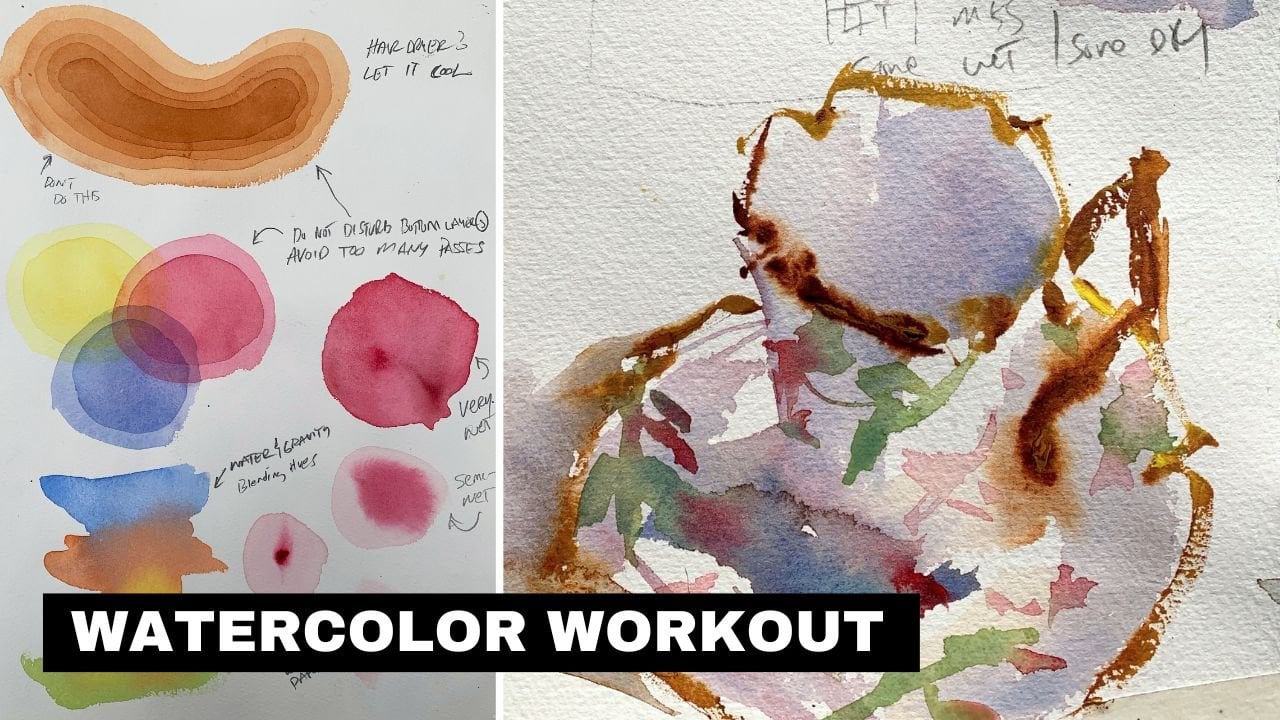
8. Three Common Watercolor Mixtures: Common mixtures. There are three you
need to know about. Let's talk about
how they work and how they will impact
your artwork. The three labels I
give them are a, milk and honey things we
all are familiar with. Each one is slightly different. Let's begin with
the very first one, which is a, is very watery. When I'm mixing a, a mixture, I want to use more
water and less pigment. In this case, I have a lot
of water and a little bit of red light that is very faint. You can barely see
that hue on the paper. Now let's talk about milk. Milk is a little bit
thicker, in this case, I'm using more pigment and
a little bit less water. That brings us to honey. Honey is very thick
and very sticky. A little bit of water
and a lot of paint, that's going to give us the three base mixtures
you need to know about. Each one has its own purpose and a really good
painting has all three. Again, as a reminder, E has more water
and less pigment. It makes it ideal for a
sky or an area where you don't want a lot of color
or a very rich value. We will talk about
that more later on. Milk has less water
and more pigment, as I mentioned earlier. More color, a little more
saturation going on, and very useful for
building up a painting. When we get to honey
is extremely saturated and it tends to show the texture of the
paper a little bit. You can see the
little white specks peeking through some of that paint with a T mixture
is very transparent. You can typically see through that layer with a milk mixture, it's going to be semi transparent and obviously
a little more colorful. You lose a little transparency, but you gain a little
color out of it. With the honey mixture, you're dealing with a very
opaque layer of paint. Typically, you're
going to use all three of these mixtures
in every painting. A painting is built in layers. One layer, stacks on
top of another one. It's important to get
the order correct. Typically, you will
start with a layer. As you know, these
are very watered down and ideal for tone in the paper or adding a very light value to a sky
or something of that nature. Usually you're going to stack
thin to thicker layers. If you start with a
really thin T mixture, the next layer will be slightly thicker and
you will get that by adding a little more pigment and using a little less water. Now, this would be a good
place to use a hair dryer. If you put down a T mixture, use your hair
dryer, speed it up, and then you're ready
for the second layer. As you know, this would be
slightly thicker paint. I want to avoid a really
watered down mixture. If I start stacking too many of those on
top of each other, the painting will
start to read weak. We will discuss that a
little later in this course. As you can see, my violet
is a milk mixture. I can put that down
and it reads really well over top of that
first layer of tea. I will move that
over to the right, and then I'm going to
use a little bit of water in my brush and blend that into the left hand
side of that milk mixture. By adding that water to
that mixture is basically stacking two tea layers on top of each other
just for comparison. Now I will use a hair dryer
to speed up the drying. For the third layer, I'm going to mix up
something close to honey. Now, it doesn't
have to be honey. As long as it's
slightly thicker, it usually works pretty good. In this case, I'll just
use a nice dark green and layer that over top of the
section on the right here, you can see how all
of these layers read. Well, this is basically
an overview or an exercise and how you want
to stack your layers Again, slightly thicker as you go, tends to work better
in most cases. Let me show you a bad example. Here I'm going to put down a T mixture of cobalt turquoise. Again, you can see
it's about the same as I used in the beginning
with the red light. Again, using a hair dryer to
speed up the drying time. Now, instead of going
slightly thicker, I'm going to use a very
watery mix of red light. It'll go on pretty good. It doesn't read bad, but
as watercolor dries, it tends to dry a
little bit lighter. Just for demonstration purposes, I'm going to add
some swatches here. The first swatch is the blue, which is basically the mixture
I used in the beginning. I let that dry, then I added
a swatch of the red light, which I put over top
of that dry blue. As you can see,
it's not too bad. Two mixtures like
this can work, okay? But as I add this third layer, which is a violet, it's going to start to
look washed out. Subtle contrast may work well in some cases
like a background, but you wouldn't want to build your entire painting
around this. Ideally, you would want the
paint to have more variety. So having some tea
mixtures is fine, but if you start stacking too many of those on
top of each other, it will just look washed out. Just be a little bit
careful as we start getting into some of
the projects later on that you're not using too many thin mixtures
just for comparison. I'm going to do that
same little study, but this time build it up
using thicker paint as I go. Again, it's good to
have that comparison trying to match the hues. I started with my weak
cobalt turquoise, and now I'm going to add a little bit slightly
thicker layer of red. Again, there's my swatch, so we can compare that to the other swatches as
well. There goes my red. And already you can see that particular wash has
a little more body to it, so it's a little
bit easier to read. Obviously, I'm
using my hair dryer here just to speed
up the drying time, just so I can stack these
layers more quickly for you. So once this is dry, I'm going to add my violet, and this is a little
bit thicker violet. When you start looking
at my spotches, you can see the difference. Stacking two layers is okay. I think it'll work
fine for most cases. But avoid, again, building your painting around a
bunch of thin mixtures. Once you get into the 34
mixtures and a painting, then it tends to just
fall apart a little bit. There's not enough variety and value there to
make it interesting. Thin to thick is the
rule of thumb we want to use now
for your project. You want to create
a similar study. Explore a little bit of the tea, milk, and honey ideas. Create some small swatches and just stack them so that
you start to build up that connection with the different mixtures and
how they read on the paper.
9. Working Light to Dark: Working light to dark. Another good idea to consider and put to use wind
water color painting. In this lesson, I will give you several examples of what I
mean by working light to dark. I will begin by putting down a mixture of Cad yellow lemon. Again, that's going to be very light in value for two reasons. First of all, cadmium
yellow is a light value. And then also a T
mixture is very weak, as you already know, you're dealing with a color
that's inherently light. And then a T mixture, which will dilute
the color even more. Now this is a little bit
different from what we just discussed in
milk and honey. That's because we're
going to focus more on a color's value. Which as we move
into this lesson, it will start to make
a little more sense to compare the cadmium
yellow to something else. We're going to mix up another
mixture of burnt sienna. I'm using about
the same amount of water and pigment as I
did in the Cad yellow. Lastly, I'm going to put
a Swatch down again. A T mixture of a
lizard and crimson. Now I will take a hair dryer to it to speed up that drying time. The main thing we
want to observe here is that the
cadmium yellow lemon is a very light value
even though I use the same water to pigment
ratio on all three hues. The Cad yellow is just simply
a lighter value and color. Let's talk about
value for a second. To do that, I'm going
to use my neutral tint. I'm going to create a Swatch or a value scale on the left
hand side of the paper. And it's going to work
from light to dark. Obviously The lighter
value is towards the top and then the darker
value is towards the bottom. That cad yellow lemon value is towards the top
of that scale. Pretty much one of the
lighter values you can probably mix with a color. The burnt sienna is
just below that. I would say the Alizarin
crimson is in between the two. The Cad yellow would
be the lightest, then the Lisarin crimson, and then the burnt sienna would probably be the darkest again. Just because you mix
a T mixture doesn't necessarily mean that
you have a light value. As I add a little bit of
burnt sienna over the yellow, you will see it's very effective and that's because
the yellow was so pale. So if I did another layer
over the burnt sienna, which is a lizard
and crimson and about the same water
depigment ratio, it's not as effective because that burnt sienna was simply
a little bit too dark. I'm letting you know
this stuff because it's important to
understand that each color has its own personality and
color characteristics. Oftentimes, we will
get in the habit of mixing the same amount of water with a little
bit of pigment. And we think we
have a T mixture. Because it's a T mixture, we have a light value. But if you're using a color that simply is darker in nature, out of the tube,
like burnt sienna or even a lizard crimson. Then we have to water
that down even more. Where other colors like cad
yellow, light is light. Anyway, so a little bit of
water will go a long way and making that a very
pale wash. Again, you have to remember, a
watercolor painting is a series of washes that are
stacked on top of each other. In the end, we want to have
a painting that works well, and part of that is
just understanding the natural value of a color. You want to use lighter values
in the beginning so you can stack darker values and
thicker paint on top of them. When we look at
Cad, yellow, lemon, that may not be
an ideal color to use in late stages of a
painting because it's so light in value that
it's not going to sit well over thicker
and darker values. Over time, you will
start to develop a better connection
to your colors and how much water it may
need to get it to a certain value
for your project, I would recommend you
do a similar study. Just use the colors you
have on your palette. Do some swatches
and try to mix up some really light values
that you would use for an initial wash.
And take notes and observe how each color is slightly different
than the next. The ultimate goal is to have more control
over a color's value. In order to adjust the value, you may have to decrease or increase the amount of water
you mix into the pigment.
10. Explore Brushes and Brushwork Techniques: Let's have some fun exploring
brushes and brush strokes. Each brush is very different, but there are some similarities
that you need to know. Here's my big old mop brush. I've got my pointed round, my small pointed round, and then my sword brush. Let's begin with a
large mop brush. Obviously, this is
suited for large areas. It has a huge belly on it and it can hold a lot of
water and pigment. A loaded brush means, is holding the maximum
amount of water and pigment. Whenever you have a brush like
this and you fully loaded, it can really cover
a lot of area. Now I can use either the tip and or the
belly, the side of the brush. So there I'm using the
side of the brush, I can hold it more upright
and then use the tip to create these more
callgraphic strokes. Might be nice for trees, adding texture to a building, some details, different
things like that. Let's explore the same thing
with the number ten round, which is suited for small
washes and details. I will load it up again. Loaded means I had the
maximum amount of water and pigment in the bristles and
then apply that to the paper. Now notice again, I can use the belly or the
side of the brush, which will give me
a broader stroke, which obviously will
cover more area. In the tip of the brush will create finer details
and thinner lines. I can hold the
brush more upright, which I know I'm
covering up my strokes. But this will create these
nice linear strokes. I can do that sideways, I
can do that vertically. Whatever works, again, using
the side of the brush to create a different type
of stroke works good. And then using the
point or the tip of that brush to create details. Obviously, a brush like this is suited for more detail
work and smaller washes. That's going to
work better than, let's say using a mop brush for details which wouldn't
really be ideal. Now let's look at the
number four pointed round. I'm dealing with a much
smaller belly, it's very thin. Ideally, we would want to
use it for more details. I can load a brush up like this and create a
series of lines. It's good for adding accent
colors and things like that. Note, with all of these brushes, I'm not just using one
part of the bristle, I'm actually using the tip. I'm using the side. And getting a variety
of brush strokes. Each brush is very versatile. You just have to get out
of the habit if you're in one of using it the same way. Get familiar with applying paint with different
parts of the bristles. Here you can see I'm
adding some small areas of wash then using the tip of that brush to
get some details. But a brush like this is fun to add little dots if
you're trying to add no leaves or some
texturing going on. This would be the
ideal brush to use. Again, number four pointed around is a lovely brush to
have at your fingertips. It can certainly do much
smaller strokes in detail than, let's say a number
four pointed around. But then again, we
wouldn't want to use it to put down a large
area of wash either. Here, I'm painting a couple of telephone poles
here and I'll use the tip of that brush to add some wires and
things like that. Just a little demo here. Just show you the versatility
of these brushes, what they're suited for, then you can explore these
things on your own. That brings us to the wild card, the 34 inch sword. This is a fun brush to explore. We've got the really fine tip, which is suited for thin, callgraphic lines and
strokes you're going to find that's pretty handy in most of your
painting subjects. We've got the side of the brush which can create these really unpredictable, uncontrollable
almost strokes. And results, again, ideal
for a lot of things. If you're doing trees and we're just trying to add
some texture to the ground, you don't want to be too
uniformed or predictable. This is a great
brush to work with. I started using the sword a
lot the last three years. I find it just a very handy
tool to have a round, and I use it in every
single painting if you like to do
thinner line work, if you're doing subjects that
require things like that, then it's great if you like
to do strokes or if you need strokes that are somewhat irregular, they're
good for that too. Here you can see showing
you the tip of the brush. I can add all these nice
little detail strokes. Then of course, I use
the broad side of it as well to put down larger
areas of pigment. Knowing the versatility
of your brushes is key. A painting is basically a
series of brush strokes. Knowing that you have a lot of ways you can use a brush
is important that way it gives you you're painting more interest when you're using a
variety of strokes. It looks more interesting
than just using the same stroke with
different brushes. Again, we've got the
belly of the brush, we've got the tip of the brush. Be sure to experiment
using all sides of it, because this is where you'll
really start to enjoy and embrace applying paint and getting some fun,
spontaneous results. All right, for your project, I want you to create a
similar chart as I did here. And enjoy getting
to know each brush and how versatile
it can be that way. When you get to painting, you have more familiarity with strokes and the range
of strokes you can make.
11. It's All About the Water: It's all about the water. Believe me, the more
you understand how water effects water
color your brushes, the better off you are. Remember these exercises. Tea, milk, honey. Using
water to dilute the paint. We're going to do
something similar, but we're going to do it
in a few different ways. I will do a few spotches. I will do some Alizarin Crimson, and then put it
down on dry paper. Now, dry paper is very thirsty. It's going to absorb that water and pigment
off of the brush. It's going to literally pull
it out of the bristles. Again, that's dry paper. Now I'm going to take a loaded
brush that's loaded with water and pre wet an
area on the paper. Now, I'm not going
to over wet it, I'm just going to
dampen it a little bit. It's wet which means there's
already water there. And I'm going to put the
same wash into that paper. Now the observation
is slightly wet, paper isn't as thirsty
as the dry paper. It's still absorbent. It's still going
to take the paint, but it doesn't extract it as quickly because
it's not as thirsty. All right, because
it's already wet. Two scenarios there of painting on dry
paper and wet paper. Now, for both of those examples, my brush was wet or damp. It wasn't overly wet. We talked about that
earlier when we said, hey, wet your brush. But tap it out a little bit. You don't want all that water
on the paper or palette. Now, with this brush, I'm
not going to do that. I'm going to wet it, but it's going to be
a little bit sloppy. I didn't really take any of
the excess water out of it. Now, I may have some issues on the palette where
things are puddling up. But as far as the
paper is concerned, when I apply it
to the dry paper, it's going to still
slurp it right up. That's because the
paper is very thirsty. It wants that moisture and
it's going to extract it. Now if I use the same wet brush into an area that's
already pre wet, which is what I'm
going to do now. Notice how it doesn't really
slur that pain up as much. It tends to puddle
up a little bit. What we're slowly
observing and learning here is that how
wet a surface or a brush is will greatly impact which way the paint
or water is moving. So in this case, where I had a very wet brush
and very wet paper, the paper almost started
to reject the paint. Almost like there's
a battle going on over which one wants to refuse the paint more so a fully loaded and wet
brush wants to discharge, get rid of the
water and pigment. But if you have a wet surface, it's not going to accept it. We'll do the same idea, but this time with
slightly wet paper. And just to be clear, the paper isn't as wet as the
condition that I just did, but I'm still going to use
a really loaded brush. But the paper accepted
the paint better, and that's because the paper was drier than the fully
saturated brush. One of them was ready to accept the paint more
so than the other. Again, this is all about
understanding how water works. Basically, when the paper
is drier than the brush, it's going to pull water and pigment from it. Simple as that. Just to compare that
to this scenario, I will start with
a very wet swatch. Again, completely saturated and puddling up on the surface here. Then I will add some
wet paint to it. You will see the paint just tends to puddle up
as it did before. We did a very similar swatch when both of them are
equally wet or overly wet, makes a really bad environment
or condition to paint in. Watch as I remove the
moisture from my brush, it will extract paint
from the paper. Yes, water does move uphill
and in the right environment. That just shows you that
if the brush is thirsty, if it's drier than the paper, then it's going to actually
pull pigment from it. Just like if the paper
is drier than the brush, then it's going to pull
pigment from the brush. Remember that brushes need to be slightly damp to work well. Dry paper can accept
paint at any point. But a dry brush, this doesn't release
the paint very well. Make sure you have a damp brush, but always pay attention
to the conditions. Pay attention to how wet your surfaces and how
wet your brushes. Are you trying to extract paint or are you trying
to put paint down? If things are too wet,
you may have to let it dry a little bit to
add more pigment. To explore these ideas, I recommend creating
a similar study. Go back and forth with
really wet paper, really wet brushes,
and just note how the pigment reacts
in certain conditions. Try a really wet paper
in a very dry brush to understand how it extracts
paint in certain conditions. Okay, I hope you
enjoy the lesson. I'll see you in the next one.
12. Timing in Wet Conditions: In this lesson, we will be
working with wet conditions. And learning a lot about timing, when to add paint, and when not to add paint
to a wet wash. To do that, I will begin with a flat wash. I will use my good old mop and some lizard crimson
For this exercise, I'm not going to
overly wet the paper. I will say this is like a T mixture applied
to the surface. I'm not trying to push
it in any direction, whether it be too
dry or too dark. Just your good old
average wash. Now, I sectioned off the area on the left hand side that is very wet because I
just applied the wash. I'm going to
immediately add paint a T mixture to that wash. This blue is a very thin mixture into the wet Alizarin crimson. Now when I work
into that wet wash, and I do it quickly, it's fine. You just have to
know that because I'm working in a
wet environment, it's going to disperse quickly. It's going to really dissolve that mixture to a point where there'll be
a subtle change, but it won't be too much. Now I'm going to mix
up a milk mixture. Then add that again
to the wet wash. Note how the milk mixture
doesn't dissolve as much. The wet paper, I should say, has a more difficult time
eating into the thicker paint. Now, the last swatch
there was honey. I added a very thick mixture into that wet paint and
it barely dissolved it. Now, when we look closely at it, it's going to have soft edges, but it didn't really
dissolve it as much as, of course, the tea mixture. And it didn't dissolve as
much as the milk mixture. The thicker the pain is, we'll determine how
much dissolving or dispersing you get. A thin mixture again, is going to dissolve
and disperse a lot. And then the thicker
paint, not so much. Now as I've done this demo, the middle area has
dried quite a bit. It's probably about 50% dry. So I'm going to repeat
the same three mixtures. Okay, again, it's
slightly drier. Timing is everything. If I mix up a T mixture
and put into this area, now what's going to happen is it's going to start
to cauliflower. I've waited too long
to add the mixture to the slightly drier paint when you're doing a
thin layer like this. And then you add a thin layer
to it that's mostly water. If you're too late, it's going to start to
balloon and Cali flower. You'll get these funny
looking water marks in your washes. Now I will add the milk mixture. Slightly thicker paint going into the surface here
is still semi dry. Notice it works fine. Okay. And that's because
it has less water. The mixture started to Cali
flower and that's because the water is moving
the paint now where the thicker paint didn't really have
that same impact. Now if I add honey to that, that works fine as well. Again, it's going
to have soft edges, but the edges are going to be
harder than the first one. That's because the paper
is a little bit drier. For the last swatch, know that the paper is dry, that is probably 95% dry. And it's going to respond differently than the semi
dry or very wet paper in the previous swatches
starting with my thin e mixture. I will add that to the bottom. Notice no cauliflowering
going on. Again, timing is important
with paint that's almost dry, you can add a T mixture over it and it's just
going to sit on top. And notice the edge
quality to the edges are very hard as opposed to
the very wet conditions. The milk mixture is fine, but because the paper is
pretty much dry at this point, I'm going to have
very hard edges. When we look and compare those
to the previous examples, you will see how
that edge quality is impacted by the wetness of
the paper and the wash. Now, honey, as you know,
is going to be very stiff and it's going
to have very hard edges. At this point, it will probably show some of the
texture of the paper. Again, timing is
important when you're dealing with a wet wash and
you want to work into it. You have to know where
you're at on this scale. When the wash is wet, you can certainly work
into it just fine, Whether it be tea,
milk or honey. It's not going to
have a huge impact or negative impact
on the results. This is probably one of the
more challenging aspects for beginners is getting
their timing right. Working wet into wet with no delay shouldn't
be a problem at all. I just showed you that again real quick in that little demo. In the next example, I put my Swatch down and
I'm going to semi dry it. We're going to get it
to a point where it's, let's say 50 to 60%
dry because it's a very thin wash. You have to know when
it's at this stage. If you go back into it
with another mixture, it's very risky if
you go back into it. At this stage, you
would want to use slightly thicker paint so that you don't risk cauliflowering. Getting those water marks that are oftentimes undesirable. Again, thicker paint, you have no problem going back
into it. All right? And also know that as
you work into wet paint, the drier the washes, the harder the edges are for the paint
that you're applying. That's a really good lesson on understanding how to
work into wet washes. Something you're
going to do a lot as you move forward with
watercolor painting. Have a look at my results here. And then for your project, create a similar wash
study experiment with different conditions. Try to create Cali
flowers so that you understand why
it's happening. And then tweak your timing. And tweak your mixtures so that you understand
how to avoid them. Good luck. Have fun, and I'll see you
in the next one.
13. Odds & Ends: Let's talk about
some odds and ends, various techniques that
you're going to want to use and at least know
about as we move forward. I will go ahead and
put a Swatch down. Now, you've seen this before, but I want to make
sure you understand the proper technique on
how to use it again. A wet wash, I want to lift or remove some of
that wet paint. A good way to do that is
simply to use a brush. You could use a paper
towel or a napkin, but in this case, I
have a damp brush. It's not saturated, it's
only damp, so I'll wet it. I tapped it out because it's drier than the
surface of the paper. It's going to
extract that paint. An easy way to lift
what you will want to do then let me show
you the bad technique. This is where I have
an overly wet brush. As you can see, the
water is dripping off. And I go into that wet paint that's going to create
the cali, flowering. The water is going to eat into that paint and you will
be left with water marks. Try to avoid lifting with a brush or any material
that is too wet. I'm sure by now you know how important
understanding water is to the success of your painting and all
of these techniques. Now let's look at
softening edges. Occasionally, you will
apply a stroke or two. The edge quality is
just a little stiff. In this case, I'm just
putting down a little bit of red and just some other
random color here. The paint is still wet. But notice the both edges
are extremely hard. Now, my desire is to
soften those edges. I have a damp brush, but it's not excessively wet. Again, as you probably
already know, this is the ideal situation for removing or softening edges. That little bit of moisture
in my brush is going to soften the edge and just get that paint to
loosen up a little bit. Now, with an
excessively wet brush, I've got a bad situation
on my hands because all that water is going to
discharge into the paper. That's because the paper is drier than the actual brush
which was really wet. You know which way the water is going to run in
that environment. The last one is scraping
or scratching into paint. You can do this with wet paint. You can also do it
with dry paint if you have the right
material, basically. In a situation like this, maybe you want to create
some texture or maybe you just want some detail
in your painting. I will put down an
area of pigment here, Again, just random color. It's not overly wet. But notice that if you
scratch into it too soon, while the paint is really wet, it may back fill
into that groove. When you scratch into the paint, what you're doing
is you're basically creating a little
groove in the paper. Obviously, wet paint will want to go back into that groove. I'm going to speed up the
drying just a little bit here and get this paint
where it's semi dry. This is a really good
condition to scrape. Now, I can use my fingernail and scratch some marks
into the paint, and it's less
likely to backfill. Another thing you can
try is an Exacto knife. This will give you some
really fine lines. Now that paint on the right
hand side is very dry, but notice how it
lifts and scratches that paper and adds a little
texture that's lifting, softening edges and scraping, or scratching into paint. Three odds and ends you will probably use in your
watercolor painting, create a similar study using
these techniques that way. When it comes time
to needing them, you know exactly how to do it.
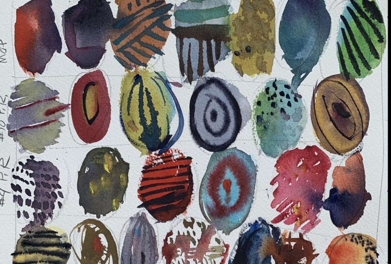
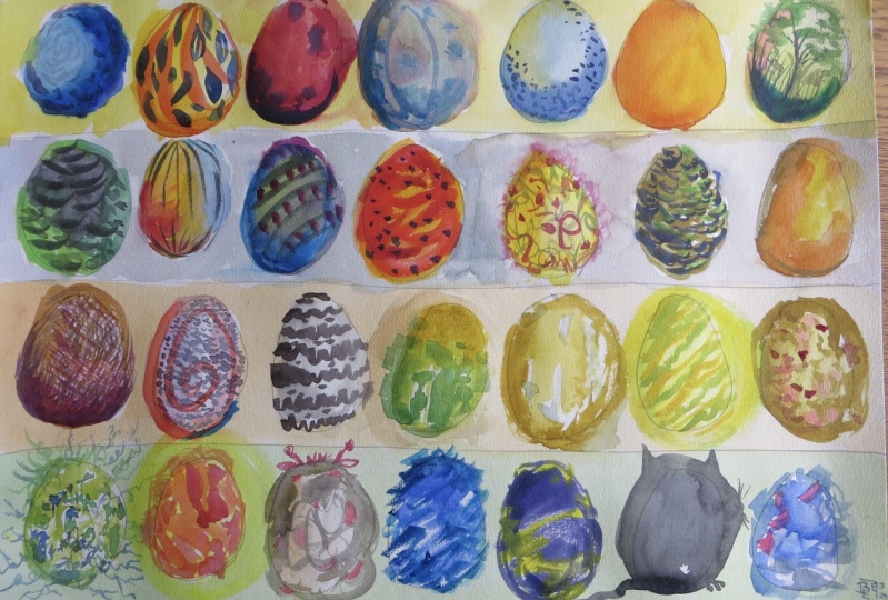
14. Project; Colorful Eggs: Welcome to your first
projects, colorful eggs. This will be a lot of fun. You're going to explore color, You're going to explore all of these techniques
we've been learning. I'm going to create a series of four lines and then fill
those up with some eggs. Obviously, my eggs are
imperfect because I want different sizes to explore. This project is
great for exploring. Remember the brush
strokes we talked about earlier where we use different parts of the brush to create different
variety of lines? That's what we want
to do in this lesson. The first row, I will
dedicate for my mop brush. I will apply some T mixtures, very thin, again,
just very random. Now remember this
lesson about water. I'm keeping all of
these things in mind. How wet is the paper? How wet is the brush? As I add layers, I
need to remember that timing is important. So I want to avoid ballooning. And I want to have
control and at least explore these
different conditions. Here I'm using some neutral
tint, some random colors. As I get into it, I want to think about some of these different
wash varieties too. The gradations, the flat washes, variegated, just mix and mingle all of these different
techniques into it. There I'm working
into the wet paint, adding slightly
thicker paint, again, going back into the red egg, adding slightly richer
pigment into it. Remember, if my
timing is incorrect, then I'm going to start to get
that cauliflower going on. Ideally, I would want to end this project with some
interesting looking eggs. But I don't want the
technique to be poor. I don't want a bunch of
cauliflowers and stuff going on. Now, again, just
working back and forth, doing some variegated eggs, doing some gradations,
different things into that. Now I can work a little
bit more wet into wet. To do this, I can use just random pigments and
just mix into the wet paint, knowing that if I do
it at this stage, it's going to be
pretty safe because all of these washes
are still very wet. Now I'm going to switch
to a smaller brush. I'm going to try lifting the brush was damp and
I'm just going to again, experiment with
that technique now. I'm going to let that dry a little bit and then go
down to my second row. I will dedicate that to my
number ten pointed round. Notice how I used
a series of lines there working back and forth to create a
shape of the egg. Here I painted a big, you can see as I get further and further
into this exercise, I'm doing things more
randomly and spontaneously. All the while trying
to use good technique, timing the amount of
water, and so on. But again, mixing colors, dropping different
pigments into it. It's a great exercise to explore color combinations
because painting and learning sometimes
can be so rigid. It's good to have these
really expressive projects to do and exercises. We'll just loosen you up a little bit and
bring a little bit of that spontaneous energy and fun back into the
creative process. Again, these washes are still wet enough
that I can work into it with even a mixtures
or milk mixtures or even thicker paint with my
number four pointed around. I will do another row, again doing the same thing. Now I'm experimenting with dots. Instead of painting a
flat wash or gradated was basically filling the egg and making the shape using dots. Now I can use a series
of lines and so on. Just having some fun, getting familiar and
exploring brushwork. Letting the colors mix
a little bit, again, a great way to
explore and discover a lot about painting
here without putting a lot of
pressure on yourself. There was nothing but dry brush. I use a damp brush and very little water into that red and created
that dry brush egg. I'm backing that up with
a thin layer of blue. All the while trying to just
come up with more ways and fun ways to paint the egg using some diagonal
strokes there. Getting used to using that
small pointed round for lines. It's wonderful for adding a linear interest
to your art here. Just working that gradation
quickly with some orange. Now again, that
paint is really wet. The timing is perfect
to work wet into wet. That's fine. I won't do
it with every single one. I want each one to be a
little bit different, but Feel free to explore and do whatever feels
right for you here. I'm dropping thicker red
paint into that blue. Just observing how that thicker paint doesn't
disperse as much, it tends to hold that shape, that brush stroke
a little bit more. Now I get to my wild card, one of my favorite brushes, and that is my sword. This one is a little
bit harder to control. It's flimsy, it doesn't have that snap back that a
good pointed round has. But that's what I like about it. There are times when
you don't want to control every stroke and you're looking for
something a little more abstract and random here, just exploring some curly lines, a little curly cues, dropping thick paint into it. Having a good time, just
getting to know the brush. A little bit of exploring and trying to refine
techniques and timing. Thin washes, thick washes, mix and matching paints. Not every egg has to be
colorful and beautiful. Some can be gray, dark, sketchy. That thing here, experimenting
with short lines, long lines, and whatever
else I can come up with. But the main thing I want you to explore is just
good technique and just getting familiar
with putting paint down and getting
the timing right. All the things that we've
talked about up to this point, there's been a lot of
information thrown at you. Experiment with like this, putting really dry paint down, that thick honey
mixture, dropping water, just really thin
mixtures into it, seeing how it mingles, because that's a huge
part of being a beginner, is just getting familiar
with the medium itself. Now that the eggs
are mostly dry, I want to work into
it a little bit. Obviously, timing is risky here. If you do it wrong, then you're going to end up with a
bunch of cauliflowers. If your mixtures are
too thin and weak. Again, you're going
to have cauliflower depending on how wet the egg is, will depend on how thick
paint you need to apply. Just make sure you
pay attention to the conditions and then
apply accordingly. Remember, when working
into wet paint like this, the thicker you go, the safer you are. But at the same time, you don't want to just put a bunch
of thick paint down. You want to just
know like, okay, well can I be in between
tea and milk somewhere? And put it into this
wet paint and still do? Okay. You're starting to find and discover
those boundaries, those areas where it made the timing or paint could have
been a bad choice or like, hey, I got away with something that I didn't
realize I could do. That's what this
exercise is all about. And the whole time
you're creating some pretty fun
artwork, I must say. But these are the conditions you're going to be painting in. Working wet into wet. Again, the timing and
getting your mixtures right. That's the key to
understanding watercolor. There's other things
like drawing and composition design
and all those things, but for now it's just about
getting your feet wet. The lessons in this course
are really dedicated to eliminating a lot of the things that I don't want
you to think about now. So that you can focus
on what's important. And that's just simply becoming
familiar with watercolor. I notice how I just use water in that one egg
where all the dots, just to blend that
up a little bit, all those dots stay there because they've
stained the paper. Water color has pigment. And those pigments
are like de, almost. If they sit on the
paper long enough, it's going to permanently mark the paper even though I
dissolved it with the water. Some of those marks stayed because they've stained
the paper and they're dry enough to where they're
not going to be impacted as if I wet it right when
I had painted it. Anyway, again, using my sword
here to explore some dots, do some different line work. So much fun. Again, so much you can learn from this exercise. That should pretty
much wrap it up. There's a look at my eggs. You want to create
a similar project? Just have some fun. I look forward to seeing
what you do again. If you start to see a lot of cauliflowers and different
things happening in your eggs, then you know you need to
go back and think about your timing and your mixtures.
15. Project; Birch Trees: Now we're going to
paint some birch trees. A nice, easy, approachable
project you can do. You'll end up with a
nice little painting, something you can
keep for yourself, hang on the fridge, or
give out come holidays, Using my number ten,
point it around. I'm going to mix up a
little bit of neutral tent. Think about a milk mixture here. We don't want it to be too thin, slightly thicker than
T. And I'll create some random dots and I'm going to work vertically
up the paper here. I want the dots to be, have a nice variety to them. You don't want all of your
dots to look the same. Birch trees have a
certain texture to them, all that texture is just
very random looking. I'll curve the
tree a little bit. I don't want it to be
too upright and stiff. A lot of that will
become more apparent and obvious as we move
into the demo. Again, different sizes,
different shapes, but all fairly small. Then give it a minute to
dry, but not too long. You want the paint
to still be wet, but we don't want
it to be so dry. That's not going to be impacted by using a
wet brush over it. Again, I've wet my brush and
then I've tapped it out. I'm using a slightly
wet brush here. I'm going to drag that down
on the birch tree now. I'm using a good amount
of pressure there too. I've got that brush
into the surface pretty firmly so that it will dissolve
some of those strokes. As you can see, it's
nice and blurry looking. We got a little bit of
tone on the birch tree, now I'll go back into it with thicker paint and just
the neutral tent. Add a little bit of value, some darker dots into some
of those areas of the tree. Not all of them,
just a few of them. And be very random about it. Don't try to predict it or go back and forth
in a zigzact pattern. Just do A random
nature is very random. There's no sense in trying
to control it too much. Now using my number
four pointed around, I will add just branches and different details to the tree. Try not to have all of the
branches the same size or the same angle or shape,
all slightly different. Now using again, my number
four pointed around a really light key
mixture of yellow ochre, just to break up the gray a little bit and to add a little bit of
earthy color to it. Some of that yellow
ochre is thinner. You can use even
more water if it starts to look too yellow this, add a little more water
to it and then I'll just tone that color down
a little bit for you. Just dropping that into
certain places because the tree is still wet from where I drag the water
down into the trunk. It's just taking that paint and dissolving it nicely here. Just a little bit
of burnt sienna mixed in with that ochre that will create a subtle
variety of yellow. And just make it a little
more interesting to look at the purpose
of this one is just to experiment with
working with wet paint, getting your timing right, and also manipulating the wash a little bit so that you get it to do a
certain job for you. Here I'll do the same thing, creating a series
of dots and lines. But this time I'm
using my brush, I'm going to have
different quality marks. Things aren't going to be
quite as predictable as using my pointed round because I
have an irregular tip on that, but the technique will
be pretty much the same. Again, letting these dry
just a little bit so that we don't too blurry, we don't lose that texture
of the birch tree. This is semi dry now, so I'll let it dry a little bit. I've got my wet brush
and dragging that down, I really like how
that brush works. This version of the tree, I think looks a
little more natural, perhaps more believable
than the first one, but here using a little bit of the yellows into
that, just to, again, just break up the grays
and to warm it up some, there's a little
bit of that color and yellows and browns
in birch trees. If you look closely enough
now I'm lifting a damp brush, extracting just a little
bit of that paint here. I'm just using some
more intense yellows along that trunk.
Looking pretty good. Again, this is a really
subtle, graceful, almost fun painting to do where you're
manipulating a wet wash. We put down a series
of dots basically, and then we used a wet
brush and drag it along that damp paint to
create the trees. Again, interesting
way to paint and explore and to work with
these subtle wash techniques. Even though this
isn't paint that's applied to a rectangle or to the entire sheet,
it's still a wash. I'm basically working now, wet into wet in that
wash. My wash is just simply a straight line as
opposed to a rectangle. Anyway, the techniques we worked with there was
just basically putting down a paint and then
working wet into wet. We had that light gray trunk and we dropped a little
bit of darker and perhaps more intense
pigment into it to create our lovely
little birch trees here. A fun thing for you to
try for your project. Create two similar studies. Again, this is all about timing. Then using that wet
brush to drag along into it with just enough pressure where it dissolves that
paint just a little bit, and then you can start to drop
a little bit of paint into that gray to give it some
more interest in color.
16. Project Moody Forest: Welcome to the Moody
Forest Project. This one we will explore
some wash techniques, mostly wet into wet
or wet into damp, and then also working
with some dry conditions. I'm going to use my large mop to pre wet the painting area. For this particular demo, I will leave a little
border around the edges. I'm not going to wet the
paper from edge to edge. If you decide you want to do
that, that's perfectly fine. I'm trying to evenly
coat the water. There's not one area
that is pulling up. Using my neutral tent, I will mix up a mixture to
lightly stain the paper. Keep in mind that
water color is going to dry a little bit
lighter in value. Some people say even up to 20% maybe a little
more than a little, but the point is, go slightly darker than
you think you need. Once I have the paint down, I'm going to encourage
the wash to go downhill. To do that, I'm
just going to use my tape to encourage that. But before I break away
from this wet wash, I'm going to use water
to run down into it. What that's going to do is
give me a lighter value up top and then slightly
darker as it goes down. I want this to be semi dry
before moving forward. Again, we're talking about
maybe 75 to 80% dry. At this point, It's
still slightly damp. Now, at this stage, I cannot use a mixture
that's too weak. I have to make sure that
my brush isn't too wet, that the paint is slightly thicker than what I
put on originally. If my brush has too much
water and not enough pigment, I'm going to get
those cauliflowers. I want to avoid that having a wet surface or wet
wash like I do now. You can see those
edges are very soft, that's dispersing a little bit, which creates soft edges. I'm going to allow
that to dry about, again, 85 to 90% As you can see. It's lighter but it's
still slightly damp. I'm going to keep that
tape under my board. I want to go a little bit darker and more saturated
with my mixture. Somewhere in between
probably and milk. I'm not quite like in
the milk stage yet. I will say I'm
somewhere close to it. But because my wash
is still damp, you can see those
edges are dissolving. I'm not getting a lot of
detail with my strokes. Each brush stroke has
gone down and then it's dispersing into the wet paint
from the previous layer. This is a very challenging
condition to work in, but because we're doing
this random forest and there's not
much detail to it, and there's a lot of wiggle
room for interpretation, we don't have to get
too fussy with it. Here again, I've got
semi dry conditions. Again, about 80 to 85% dry. I'm going to use my
smaller point around my number four and
slightly thicker paint. Right. Each time I go into it, it's going slightly thicker. I want to start to create
these lines that have a little more
representational quality to it of a pine tree. I'll explore that on the
left hand side over there. And now I'm comfortable, I'm going to move
into my painting now because the paint
is still wet obviously, it's still going to
dissolve a little bit, but these particular trees have a little more detail than the previous layers which
are really just blobs. But it's intended to be that
way by adding more detail to the trees that get
closer to us and then less detail of the
trees that are farther away, we get the illusion of
depth and distance. Now I will take a hair
dryer to it and I want it to be 100% dry. This will give me full control
for the last layer there. I've got my sword brush. I want this paint to be in
between milk and honey. I don't want it to be too thick, but I don't want it
too thin either. Somewhere in the middle
should work just fine. Now, I'm using that sword to
quickly add my pine trees. Notice I'm nice
and loose with it. I'm not trying to
control it too much, I just want to create
the illusion of a pine tree and
not get caught up into doing too many details and anything that's too exact. The whole point of this exercise
is to work with washes, to understand the water
to rigment ratio, getting the right color
value with the pine trees. Again, it's such
a random subject, or should I say, the subject
has all these random shapes. We can get away with a lot of imperfection
here at this point. I've got a lot of water on that wash and I'm going
to tilt my board in various directions that I'll end courage the wash to move around and not settle into
these pockets. Now I'm showing you how I'm
using my small number four, Point around to splatter paint. I'm going to load it up with
a nice watery mixture here. Just put a few little dots
and splatters on the paper. I'll just turn
those into birds by adding some wings to those dots. This is an easy
watercolor painting, but the challenge here, again, is working with
those wet conditions. That's why I put this project in there because it can be very challenging to get these
layers the way you want them. So that when they,
they read well. What we learned here and
this lesson and what we explored was this idea
of using a thin wash, a T like mixture. Of course, as we went into it, we went thicker with our paint. Even though we were
working wet into wet, we didn't end up with
those cauliflowers. Hopefully, we ended up with
a nice little painting and a very moody looking
forest with a few birds. For your project, you will
create a similar study. For this study and the
other ones moving forward, I have a template that I
included with the assets. Be sure to download those there. You will get all of the artwork and demonstrations I created. Plus you'll get these
templates that will help you draw these designs. But again, they don't
have to be like mine. Something similar
should do just fine.
17. Project Feathers: The feathers project. Another really fun
exercise we can do to help you explore
color wash techniques. Putting down thin lines, thick lines, and
all that fun stuff. I will begin by drawing two
vertical s down the paper. You can think of this as
three rows of feathers. Now each feather should
be slightly different. Some big, some medium, some small random shapes, But they're going to curve. Do I have a lot of
feathers to draw? What I will do right now is cue the music And then let
you guys check it out. And when we're done, we will start with the
painting process. Obviously if you
don't like a feather, you can always erase
it and draw it again. That was a lot of feathers, I know, but it'll be worth it. In the end, I have my
two small brushes, which is number four pointed
around and my number eight. I will use the larger pointed around to fill in the feathers. And again, we will
use random colors. Because these
feathers have points, it's important to
get a good point on your brush as you're
loading it up, give it a little turn, rotate it like that, and that should keep your point together. If you have a really
good point around, it should come or snap
back to a point anyway. But sometimes when
you load a brush, that point will get
a little bit messy. But if you rotate it like
that as you're loading it, it should come back to a
pretty good point for you. Now, I've got a ton
of feathers to paint. Again, I'm using random colors. I encourage you to mix
hues that appeal to you, but then also mix some colors that you
wouldn't ordinarily do. That way, you get used to
seeing how certain colors mix. In the end, you may discover a color mixture combination
that you really like. Use this time to explore
a little bit and then also use it to obviously work
on some of your technique. So as I'm painting
these feathers, I'm trying to cut them in along the edges
and paint them well. But, you know, if
something is imperfect, I'm not going to panic about it. So I'm going to speed things up, cue the music and just kind
of paint some feathers here. And when we get to
the next stage, I will slow it down and we
will go over what's happening. So a lot of painting,
but a lot of fun. Now, I'm going to
take a hair dryer to this and make sure everything is 100% D. If you want to be
semi wet, that's fine. That's completely up to you. But for this one, I want
everything to be dry. I'm going to use my number
four round and go around some of these edges and create some texture to these feathers. Again, this is
really good exercise for working on your
brush control. Understanding that you don't
need but just the point or the tip of those bristles on the paper to create
a really thin line. In the end, you'll have
a really cool piece of art to hang on the fridge or in your bedroom or wherever
you want to put it anyway. Cue the music. See when this is. Ok. All right, so in this lesson, we learned to put
down a thin wash, hopefully that you can
explore colors this way. And once things
dried a little bit, we came back over that
and worked on some of our line drawing skills
using a paintbrush. Fun stuff, hopefully yours
turns out really well. Here is my demo image
for your project. You want to create a
similar feather study. A great time to experiment with color mixing brushwork and just have a little bit of fun
with the learning process.
18. Project Colorful Forest: Welcome to the Colorful
Forest Project. We created our moody forest. Now it's time to do something a little more bright and cheery. I will start with my large mop. I'm going to pre wet the paper, but there are certain areas
I'm going to leave dry. I'm going to use my number two pencil here
and draw everything out. It's going to be very light, but I think you should be
able to see what's going on. Those marks I just made
are going to be bushes. I want to wet the paper. But go around those bushes, there are a total of three. As I wet the paper here, I notice how I'm not wetting
those three little areas. The key is I want
to put a wash down, but keep the bushes
dry for the moment. Having the water first will allow the wash to go
down a little bit weaker. Of course, I'll use a mixture. But also notice how I'm leaving random areas of the paper dry. I'm only wetting mainly the top. Then as I get to the bushes
and down towards the bottom, certain areas are left dry. Encouraging that water just
to move around a little bit so it doesn't settle
into a pocket. That's what I want to do.
That looks pretty good. Now, I'm ready for
my first wash. You can see it is still puddling there and I'm going to tilt that board and get that water
to get out of those ruts. Even though you
stretch the paper, sometimes it, that water can still settle into
these little pockets. This is cerulean blue. And then a little touch
of cobalt turquoise. I want to get a nice cheery
looking blue to put down. Initially. Again, going
around those bushes. And once I paint
this first wash, you'll see where some
of those dry areas are. But I want the edges around
those bushes to be white, the white of the paper,
but also to be hard edges, which is why I kept them dry. You can see I'm only putting blue towards the middle
of the paper there. I'm adding a little bit of ultramarine to that
wash. Obviously, working wet into wet, The strokes I'm adding
now will disperse and bleed into the other blue paint, which is what I want here. I'm just tapping the board and getting that blue to move
around a little bit. Now that that is
starting to dry, I can add the orange, red color that I
want for my bushes. I would even say
they're probably lean towards a brown, yellow ochre. Cad yellow, lemon
should work fine. A little touch of
Cad, red light, then I'll leave a little bit
of white above those bushes. I'm trying to avoid
all areas of the bush to bleed into that
wet blue wash. Again, having that little bit of
a dry paper there towards the top will allow me to maintain the white space
between the two washes. For now, now I'm getting a little more burnt
sienna into that, making that a little bit
more intense by adding more pigment and
also a darker hue in general with
the burnt sienna. Now I've got that water on
the bottom of the paper. I'm encouraging that
brownish yellow color to bleed and blend into
that water a little bit. A little more abstract
approach here, I'm using the tape to keep that wash moving
downhill a little bit. Once the majority of that water has moved
down towards the bottom, I can go back into it with some slightly
more saturated colors, just adding a little more
pigment to the yellow. And you can see there, I'm just splattering some of that
paint along the bottom. Now I'm working a little
bit into that blue, just softening some of
the edges a little bit, but I still have
the hard edges to the top of those bushes
that's looking pretty good and I let that dry 100% Nothing on that
artwork is wet. I've got full control
over the artwork. Again, I will use my number
eight pointed round, a little bit of
Alizarin Crimson. Into my yellows. You can see I'm just
testing that a little bit. Now, I want to use the
side of the brush. I don't want to use the point the side of the brush
is going to give me, allow me to cover a
little more area, it's going to give
me a little more texture with my strokes. That's because the side of the brush is going
to graze along the paper without putting too much pressure
into the surface. Plus, I want these
strokes to look nice and bold and not too thin. There you can see I'm
using the side of that brush and just dragging
that along the surface. That's given me some
really random strokes and overlapping that
orange bush a little bit. This is a strong magenta color. The pigment itself is thicker than anything
I've used so far. I'm building the painting
up from thin to thick. I will use another
magenta mixture there, but I don't want that to be as intense as the
one on the left. I use a little bit wet
brush to get that effect. That's looking pretty good. You can see I'm loose
with my brush strokes, letting things blend and bleed a little bit and not trying
to control it so much. Now taking a little bit
of Cad red into this, I'm going to get
something that's in the orange family and I'll work that into some of the yellows and browns
and magentas I already have. Again, very loose
with the brushwork. I don't try to
control it too much. This is one of those
paintings that it's not as defined, so to speak. And sometimes with art, it's good to have some studies
that are more detailed and some that let the medium just work and flow a
little differently. This is one where
I want it to be, I wanted to flow a
little bit more, and I want the colors and
shapes to mingle a little bit. I need that to dry, but not all the way. It's about 85% dry. Now I'm going to use my
sword brush and mix up a little bit of a bluish gray ultramarine with
some neutral tint. Should work fine. I'm
probably going to take a little bit of yellow and orange that's on the
palette end of that. Just to soften it
up a little bit, this mixture needs to be weak. I'm going to paint
my vertical trees. But I want the trees to have a ghosted
appearance to them. I don't want them to
be too dark in value. I want them to look
very transparent. Here I have some shadows that I put along the left hand side. Now I'm adding my tree trunk, this will probably be one
of the darker trunks. I will clean my brush. Now I've got a mixture that
has more water into it. You can see this trunk reads a little bit
more transparent. We're getting a variety, not all of my trees are the same color and they're
not the same value. This painting works
better if you have variety versus painting
all the objects the same. Just like I have
one magenta bush that is more defined and
a little more intense. And then another
one that's a little bit faded and drifty
a little bit. You get a variety of
everything in this painting versus all the bushes and all of the trees being
looking the same now, adding some shadows,
some loose marks. And now lifting a little bit, using my sword to remove
some of that paint. Now doing some of those
callgraphic strokes, nice and loose into
the wet paint. There you go. There's
the finished product. Now your job is to create a similar colorful for study using the
techniques I've shared. In this video, I
have the template included with the assets
for this project.
19. Project Variegated Leaves: Welcome to the Variegated
Botanicals Project. Another fond and
enjoyable painting that should be fairly
easy and we're going to explore some wet conditions. Just a reminder, all of my
paper is prepared this way. I know I didn't tell you
on the other projects, but I do want to remind you that to prepare your paper
so it doesn't buckle, I will start with drawing
some stems and leaves. You will get the template for my drawing and the
project assets. Be sure to download those. These can be random sizes. When you draw, yours doesn't
have to look like mine. You can go on pins. You can go out in your yard. The idea is you have a little stem or a stick with some leaves
coming off of it. I think I have a total of seven. I will go behind my work here and remove some
of the unwanted lines. Now this particular project, we're going to pre
wet our mixing area. The paper is 100% dry. I'm going to use my number
eight pointed round and just some clean water and pre wet all the
leaves and the stems. And this will give
us an environment or condition where we'll be
painting wet into wet. Even though there
won't be any paint down, there is water. That water will
act as a sponge or a conduit to move the water in a particular
shape or direction. Because the shapes are pre wet, all I can have to
do is just drop pigment into that and it's going to disperse and move into the shape of whatever
I just put down. It's a fun way to paint.
It's more random. You can't control the
water and color as much. It's going to have
a mind of its own. The only control I have really is just what colors
go into the leaves. There's no science or anything premeditated here about what
I want to do with colors. I'm going random and just letting things go
or unfold as I go, using some magentas, gray, blue, grays, navy blues. Whatever comes to mind? Just letting the water and
the pigment do what's magic. Let them decide how they want to mix and mingle and in what direction
they want to go. I should say that my
paper and board are flat. I don't have anything propping
my paper up in an angle. Having it flat like that
allows the paint to mingle in different directions
as opposed to moving just downhill
in one direction. An easy project,
something fun to do. Again, I encourage you to not be predictable with
all of your colors. Mix and match a little bit. You can lift some
of the color too. I have a damp brush, but it's very dry
because the brush is drier then the leaves, then it's easily used to extract paint and
pigment from the leaves. We talked about that in the
lifting area of this course. Now I'm going back in lifting, adding a little color randomly. I guess the key is not
to overwork the paint. If you overwork it all, the colors will start to blend into each other and
you won't have any variety. I have my sword,
fairly dry brush, but again, slightly damp. I'm using just the tip of it
to create these finer lines, mostly grays, but I'm mixing
in a little bit of yellow. And then now connecting
the leaves with some thin stems starting
to come together. Like I said, it's
an easy project. All levels can certainly
experiment with this and all the other projects I've added in this course. Each one is designed to teach you a new skill
and to help remind you of a lot of the things
that we've learned in this course so that you can
practice and get better. In the end, you
will probably have a good idea where your
strengths and weaknesses are. The skills we used were
pre wetting the paper in a particular shape and then dropping paint into that shape, letting the water and the
paint mingle as it wishes. And then, of course,
we use some line work. If you have a small brush, you can do that as well. There's my finished
project and now it's your turn to create
a similar study. Use a lot of the ideas
I shared with you. Good luck. Have fun, and I look forward to
seeing what you do.
20. Project Negative Space Forest: Welcome to the negative
painting Forest Project. We painted a moody forest. This will be very similar. We're going to keep
the colors very muted, but we're going to do a lot
of negative space painting. I'll talk about that
more as we move forward. The idea is we will
do a series of gradated washes and leaving some white space of
the paper there. I have a couple of
triangles at the bottom, and I'm going to
paint around those. I want to leave that area white. Again, I'll remind
you the templates for these projects are
in the assets for you. So you will have
something to work with when you're ready
to try it on your own. For my wash, I'm using neutral
tent and a little bit of ultramarine blue that will
give me an indigo color. I've got my large mop brush. I'm using plain water
to pre wet the area. Notice I did not wet the area
that I want to keep white. I went around that very
thin T like mixture, goes into the first
wash and let it dry. Now the paper is
100% dry and I'm ready for the second
layer To do that, I'm going to use a piece of paper and basically protect the area that I
want to keep white. And I use my Mr. bottle to
wet the rest of the paper. This is going to allow the
wash to have soft edges. The Mr. bottle comes in handy, especially when you want to target particular areas
of your painting. Having that paper
there, of course, will help protect
the white areas. I want some soft edges
which is why I pre wet it. I'm creating this illusion of
some pine trees back there. I use a Mr. bottle there to miss the top of the
edges of the trees. Now of course, I can
use my brush and tilt the board to encourage
that wash to move around. Again, I'm going to let that dry 100% which is where I'm at now. I want a slightly thicker
layer than what I used before. I will add a another
layer of pine trees here. Because I'm using darker paint, these trees will appear a
little bit closer to us. Now, I've got my good
old Mr. bottle there. I'm allowing that to
bleed down a little bit. Then also it will give
it some soft edges. I want this to be
a similar moody, misty environment that
we painted before, but the technique we're using will be slightly
different because we're going to really go fool on with some
negative space painting. All that's looking pretty
good at this stage. I'm going to work
a little bit of thicker paint into these trees and that'll give it
a little more body. It's so easy for things
to disperse too much, but you can always work into the wet paint with
thicker paint. As we've talked about
in previous lessons, I will encourage that
water to move down. Now, here we are 100% dry. As you may have guessed, I'm going to use much thicker paint. I will be in between
milk and honey. Nice and thick,
nice and intense. I really want this white tree to pop with negative
space painting. Basically what you're
doing is you're going around the edges
or the contour of your subject that's going
to paint what it is. In this case, I'm using
a very dark value. I'm going around the
edges of this tree. Now, in nature,
this doesn't exist. You don't really have
a bright white tree in front of a bunch
of other gray trees. But this particular piece is more random and
it's more abstract. As artists, we can get away
with doing things like this and manipulating
colors just for the effect. In the short time you can see I'm randomly
adding some strokes. I shouldn't say randomly, some of these are
fairly calculated. I know the idea of the
contour that I want. And then there'll be certain
areas where I'll let it go a little bit and just put down
some more random strokes. Anyway, there'll be
a larger tree on the left and then it'll have a smaller version on the right. As I get around
the contours here, I can start to loosen up
a little bit and then create this other row of
dark trees behind it. Basically, I'm using
that dark value of trees as a way to
paint the white trees. Hence, what I named
this project, which was negative
space painting. A fun way to paint negative space painting
is a very effective tool. I didn't want to go into it too deep in
this beginner course. But you can use
negative space painting in a variety of ways. It really is an
effective way to do a lot and create a lot
of interesting effects, I should say, with your artwork. But as you can see, we used layers of washes, mainly working wet into dry. But that little Mr. Bottle helped to give
us some soft edges. Then we use that negative
space painting to create the lovely white
trees in the foreground. You can go back in and
refine some of the details, but the key is to
keep this somewhat abstract and don't
try to get too fussy. But however you
finish it and however much detail you put into it, of course, is totally up to you. But a fun project to try. In my opinion, it can be
challenging to control the washes and then to get the negative space
painting to work well. But I'm sure with a little bit of practice,
you can pull this off. There's my finished project. Now it's your turn to give
this one a shot again. Moody, forced here,
but we threw in the added twist and challenge of the
negative space painting.
21. Project Three Threes: Three Trees Project. I will begin using my two B pencil and I will
quickly lay out the design. As I've mentioned before, I will include all of these templates in
the resource assets. Be sure to download
those so you can easily paint along with me or
at your own convenience. The beauty of this simple
landscape is that we're going to focus on some simple
variegated washes. You remember those from
the common washes lesson? And now we can put
those ideas to work. Using my large mop brush, I'm going to mix up a mixture of ultramarine blue and a
little bit of cerulean blue. Obviously work in the wash
from the top to the bottom. Important to try to join each main stroke at
the bottom of the wash. Eventually I'm going to mix in a little bit of
Alizarin Crimson. I will tell you that
Alizarin crimson is a very intense color. You have to water that
down quite a bit. Once I get this
wash to the bottom, I will do a mix of both the
blue and the lizard and crimson at the very
top of the blue. I want to make a gradation
so it's a little bit darker towards the top of the sky and then lighter as we get down
towards the middle. Now the key here
is to let it dry, but I'm going to
leave it propped like this to encourage the
wash to run down. Now it's 100% dry and I'm going to switch to my number
eight pointed around. I'm going to use the side of my brush for most of
the tree foliage. Of course, you may
remember we cover that in the brushwork lesson. You can use the tip of the
brush, the side of the brush, different areas of the bristles to create a certain
effect for my green. I'm using cerulean
and a little bit of the cadmium yellow lemon. But I'm also mixing in some ultra marine
and burnt sienna. Because I want the green to be a little bit on
the brown side. I don't want a
pure bright green. I also need the value of the
green to be slightly darker. To do that, I'm going to add
a little bit of red light. Red light will immediately make that green a little bit darker and a little bit gray. Now you can see that's a little bit too pale
for what I need. I'm going to go into
my neutral tent, which is a good color
for grain it out, but also to add a little
bit of value to it. The leaves need to stand
out against that blue sky. If it's too pale, then it's just not going to make
enough impact because the trees are the
main focal point they need to be done well. Again, getting a value that is the right darkness is key
to making this piece work. Here you can see me exploit the side of the
brush a little bit. The beauty of using the side
of that brush is going to give you more, less
predictable stroke. That way you get some interesting foliage and shapes versus things that
are too predictable. I did put a little bit of
burnt sienna into that green. That's going to make it
a little bit darker, but it's also going to
brown it out a little bit. Now that I've got the base
green and hue for the leaves, I'm going to go back in
with some darker values. Remember, working wet into wet
can be a little bit risky. You have to get
your timing right. Also, lifting paint, which
is what I'm doing here, is all about timing. As you're putting
this wash down, it's a good time to do that. If I wait a little bit too long, it could easily ruin
the wash and I'll end up with the cauliflowers
and the watermarks. Now, I'm going to go with
something a little bit on the brown side or can I use yellow ochre and
a touch of the red. That was cad, red light. I'm going to obviously paint the ground plane getting
a little more sienna, a little more yellow ochre. Now, because I feel that wash
is a little bit too pale, I want to push that more towards a milk consistency so that
it stands out a little bit. The ground plane is important, it's going to anchor the piece. If the ground is
too light in value, it just won't have
enough there to make it believable that the Foliage is starting
to dry a little bit, but again, it's not too dry. I can drop a little bit
of color into that, and that's just going to help create a little
bit of variation. Now I'm going to
add a little bit of a dark value there
to the ground plane, and that's going to break it up, but it's also going to suggest
shadows under the trees. This is only the second layer
and there will be a third. But the key with this layer is to make sure I
get some variation. I don't want the trees or
the foliage in the trees. I don't want the
ground plane to be a flat wash. That's why I'm mixing up a little bit
different earth tones. And now I'm mixing up a
little bit different green. And I'm going to drop that into the foliage that
way when it dries, it'll have a little
more interest to it. Now I'm 100% dry. I've got complete control over
the colors and the washes. Again, I'm going to use my sword brush and create
the trunks for the trees. As you remember, the
sword brush is pretty interesting because you can get some unpredictable strokes. I think for tree trunks, it's a good brush to use because tree trunks
are very abstract. They are nothing
more than a line. But the line is often has kinks in it and
very subtle angles. It's not just a
straight boring line. I've got a slightly darker value there for the trunk
on the right. Now I want some variation. I'm making the next trunk
a little bit leaner. You don't want all of the
trunks to be the same symmetry and it just doesn't work
well with painting. You always want variety. The more variety you can
have in your subjects, the more interest you're going to get from the end results. Now, I'm using the tip of the brush and I know
my hand is in a way, I have to apologize for that. But this is where I only want to use the very
tip of my sword brush. That's going to give
me these really thin, faint lines, which works well for some of
the branch work. Now I can use my towel that is dry and it is clean to just
touch into those trunks. And that's going to break
up the line a little bit. And we'll add a little bit of variation to the overall
transparency of it. Here I will strengthen
the shadow a little bit. That's working pretty well. Again, this is just a dry brush. I'm just moving that wash
around a little bit, trying to get a little
bit of texture going. That's looking good, but I feel like a little bit
of red in there would just pop the focal
point a little bit. Just bring a little more color and excitement to the piece. All in all this is
coming together, as you can see, pretty quickly. This is just a wet
brush with no color. And I'm just touching
that into the wash while it's wet to encourage
it to run a little bit. That was just a
little bit of green, I splashed into it. Again, that's just
going to indicate shadows and make a little
interest in the focal point. And in the foreground, I have some trees or
shrubs and bushes. In the very back, I can use a very thin key like
mixture to indicate those. Maybe hit it again towards the bottom in the
base just to indicate some shadows and
some a cast shadow. That should work pretty good. That is a good way and a good project to exploit
variegated washes. Also working wet into
wet using layers, building up the painting
from thin to thick. Hopefully you enjoy the project. There it is, that
photo was taken a natural light so you get a
better feel for the colors. Good luck and have
fun with this one.
22. Project Water's Edge : Welcome to the
Water's Edge Project. Don't be intimidated
by this one. It's just a series of washes, some variegated washes,
working wet into wet, and all those fun, basic
watercolor techniques you're starting to become
very familiar with. Again, using my two B, I will lay out my design, starting with the edge
or the land edge, basically almost a z
going across the page. Once I have that, I can
add the mountain or the hills in the background.
That's pretty much it. I will quickly map out
the foliage towards the top and then
make a few lines that will eventually
be the tree trunks. I use light lines just because I don't want them to
show through too much. On the final piece, you
will get the templates. As I mentioned before, I will begin with a
variegated wash. As you may remember that as a wash that has multiple colors, I will use the cerulean blue
like mixture for the sky, then quickly change to a yellow, a little bit of ochre
and cad yellow, lemon, before switching to a
little bit darker blue, some ultramarine into
that for the water. It's okay if that
bleeds a little bit, it shouldn't bleed too much. I've got the board and the
paper pointed downwards, so that should
encourage the wash and any blending to come
down as opposed to up. Now I will get a nice
bright green using the cerulean with
my Cad yellow lemon to get that vibrant green. Later on, I'm going to add
some variation into that. It's okay if these colors, the blues and the
greens bleed just a little bit because again, this is the initial
wash and we're going to go over it
a few times now. I've got a damp brush. This is my number
eight pointed round, no color, just damp, pure water. I'm lifting a little bit
of blue into that water. I will also do the same
thing for the sky. That's just going to create a subtle variation
for those two areas. That is a variegated wash. Even though we controlled a little bit about
where it goes, we still use multiple colors. Now this painting is 100% dry, and I will move into
the second layer again using my number
eight pointed round. I will also go with
some neutral tint, a little bit of ultramarine
blue yellow ochre and burnt sienna. I have a little area at the bottom that's great
for testing my colors. I'm really paying attention to the hue but also the value, how light or dark
is this mixture. Because this will be applied to the mountains and the
land in the background. I want it to be a T like
mixture, so very weak. But I needed to be
dark enough that it's going to stand
out a little bit. I wanted to be a little
bit darker than the water. That's working pretty good. And now I can add the hills or the mountains and then let
that dry a little bit. Again, pretty simple. And to encourage
the drying time, I'm going to use the hair dryer. Obviously that's about 85% dry. Remember, when you start to
work into slightly wet paint, you've got to go thicker. If you have too much water
in your mixture here, you're going to get the
cauliflower and ballooning. Don't always dry your
brush, Tap it out, and then make sure your paint
that you're laying over top is thicker than
what you started with. That gives me a little
bit of layering and a little bit of interest
in the background. This is not going to
be the focal point. We don't need to do too much, It's just a little bit there
to anchor the background. Now I've got the trees which
will be going along the top. I want those to be isolated. I don't want them to really touch the background in any way. I'm going to mix up my green. I need this mixture to be milk. Okay? It needs to be thick enough to where it's
going to look solid. The trees are the focal point, because it's a vertical element. It needs to be a little bit
darker and richer in color. Plus it's a little more
in the foreground. The trees are obviously closer to us than
the distant hills. Therefore, they should be
a little more vibrant. They should have a
little more color then they should be a little
bit darker in value as well. As things move away from
you in a landscape, they tend to get
lighter and more muted or grayed out
or even more blue. That's working pretty good. You can see I'm mixing some burnt siennas
and browns into that. Again, I don't want this to be a flat wash. Like I said
in the very beginning, a watercolor painting
is a series of washes, even though this wash isn't
covering the whole paper, it's just to
indicate the leaves. I still treat it as
a wash. And I always ask myself, where
does it need to be? Does it need to be
tea, milk or honey? And then, do I want
it to be flat, variegated, and so on. Most washes I do, and that you will
do especially for landscaping will be variegated. Here you can see I'm
working the browns into it. Some neutral tens,
even some blues, Anything to give me a slightly darker value
to create variation. Also switch to my number
four pointed round to paint. In some smaller leaves, again we have the big tree mass. Then we have some
smaller shapes and then some even smaller shapes that will indicate the leaves. You don't want a lot of detail in the tree mass
that's farther away from you. Be sure to keep it a little bit chunky in the
back on the left hand side. As the trees come closer to you, they should break
up a little bit. You should start to see
a little more detail. That's typically how
things work here. Just again, working
some variation, making sure the underbellies of the trees are
slightly darker, the light source is
coming from the top. Therefore, underneath the trees, the leaves tend to be a
little bit darker green. Now everything is 100% dry again and I can move
into the fourth layer. This will require a number
eight pointed round. I could easily use my sword
brush for this as well, but I figured I would just
mix it up a little bit. I'm using some neutral tents and browns that are
on the palette, along with some reds. I want this to be fairly dark, but I also need to be
fairly transparent. I don't want the tree trunks
to be too heavy and opaque. Again, a milk mixture. At this point, you
have to remember, I'm only layering
over a mixture. The water, the sky,
the distant mountains, even the grass in
the foreground. Everything I've done
to this point has been very thin and water down. Just building it
up a little bit at this stage but yet still
keeping it very transparent. That's just going to, again, make the trunks not so heavy. Keeping a little bit
of that transparency will just keep it
light and airy. As I move back to
the distant trunks, I'm using a little more
water and less pigment into the mixture so that the trunks appear a little bit darker
as they come towards us. Now I'm using some dark green there to add a little bit of texture to the grass as
it comes closer to us. Again, just a little bit, you're trying to suggest
things at this point and not necessarily trying to hammer
out a ton of details. All of this is the
imagination in general. If you just observe landscapes, you'll always find that the
detail is closer to you. As things move away, they tend to flatten out
a little bit, all right? Adding a little bit of a
texture to the grass area. Just a few splashes and
splatters of color. That's all looking pretty good. I've got a fly on the board
there, excuse me for that. Now, using thicker paint, it's still in the milk area but a little bit thicker
than what I've used so far to create some shadows and texture
in some of the trunks. Again, using my hair dryer
to speed up the drying time, I've got everything
working pretty good. A few more shadows and
texture on the trees. I should be ready to
add the final detail, which will be the cache shadows. Again, a simple series of
washes is all it takes a lot of times to pull off even a slightly more
complicated design. It's all about the process, trying to envision the washes and how you will use
them and layer them. That's what this
painting is all about. It's a series of washes. Understanding the basic
characteristics of water color, how to layer the paintings and the paint so that it
doesn't read too weak. Then of course, getting some
value hierarchy in there. So things that are closer to us are slightly darker
and more detail. All these things we pretty much have talked about,
there may be some, a few subtle details there about landscapes in general that I shared with you
in this course. I do have an excellent landscape painting fundamental course. I created that when
painting with acrylics. But all of the ideas I
shared with you can be applied to water color
digital painting. It doesn't matter. It's
just a really good course for understanding how to
paint landscapes as well. Anyhow, this is coming
together pretty quickly. I think it's all done. There it is, the final piece. That picture taken
a natural light so you get a better feel for the colors and good
luck with this one. I hope you have fun. I enjoyed sharing it with you and
I enjoy painting it. So I'll see you in the next one.
23. Project Friends: Welcome to the final
project title. This one, Friends.
This is a lot of fun. Again, don't be intimidated,
it's a lot of easy. It's just a series of washes. Like all other
watercolor paintings, I will use my number two
pencil to lay in my drawing. I always start with
the longest line, which is the distant background. Adding now the trees
or the big tree, I should say in the foreground. That tree just needs to
have an interesting shape. So important, but yet so many people miss out
on something so simple. Because that focal point, it will be on the
right hand side with the two figures walking
under the tree. That really needs to grab
the attention of the viewer. If you just have
a boring blob or balloon shaped tree canopy, then it's just going
to work again. You have the templates
that I use for these. Be sure to check that out
and just spend a little bit of time looking at
the overall shape. Again, pretty easy. A few lines. Again, noticed with my drawings, I don't use a lot of details. I just put the main shapes
and elements in there. And that's all you need. The paint brush can do the rest if you add
too many details. And then you're
going to paint like a coloring book and we don't
need all of those lines. I think watercolor in general
should be spontaneous. A little bit of neutral tint, a little bit of yellow ochre, a very gray, warm wash here, as I've mentioned before. It's going to dry even lighter. Now, I will put a little
more pigment into that. I'm talking just a touch because I want a little bit
of a gradated wash, a little bit more saturation and color towards the
top of the painting, and then let it get weak as it comes down
to the foreground. That's it, at this point, we've got to let that dry, and now it's 100% dry. And I can move on
to the next layer. I will work from the
very back to the front. So I'm going to tackle the
distant background area. That's pretty simple.
Just some grays, almost the same colors. I've already used, very
simple, minimalistic palette. But I'm going to build the
paint up just a little bit. I will still say we're easily within that
key mixture range, is just slightly thicker. I want that to be dark enough
to where it stands out. It catches your attention, but it doesn't distract from what's going on
in the foreground, which is where our
focal point is. I want the shape
to be interesting. I'm using a lot of
random strokes. I don't want it
to be too boring. Just enough information there where it looks like some trees, maybe a building or
something like that. Now, using a little bit of my
cerulean blue to that gray, that's going to cool it
off just a little bit. I can do that even more or add a little bit of green to it by using the turquoise
and cad yellow, lemon. Again, I'm mixing that into
the gray that I already had. Just another version
of the gray mixture. I left a little bit of a space there between the
background and the water. It's good to have just a
few gaps in there just so the water and the background
don't blend too much here. Using a dry brush and just dragging that along the surface to create some texture
in that water. The water is not going to
really be a huge interest here. Again, all of our
focus is going to be on the bottom or the right
hand side, I should say. Now I'm coming up with a green. Using the base mixture, which is cerulean, a little cad, yellow, lemon, and then using some of the grays that are
already on the palette. Using a little bit
of gray into that, we'll just keep it from
being too vibrant. I don't want this color to
be colorful and too punchy. I want it to be very
subtle and grayed out. Color harmony is
something that it takes a little bit of time to
develop and work on. But in general, you have a vision for what you want to say
with your color. Like if you want to go very
chromatic and high color, or do you want to
play it down and do something more subdued? You can do that as well
and do a tonal painting. All right. At this point,
things are still damp. I'm going a little bit thicker. Very important, Okay. If it's too much
water at this point, it could easily start
to cauliflower. Because I'm painting under
bright film lights too. That makes things
dry really fast. Always pay attention to
how wet your paper is, how wet the washes. Know that when you start working into something that's
wet and starting to dry, then you have to decide, do you need to go thicker or can you still get
away with dropping a little bit of the same
mixture into it? Variations. I'm using some darker greens, using some more neutral
tint into that. I just want to create
the illusion of detail. Some grasses, different
things going on. On the left hand side, I'm going to use that same color to drop into the
grass under the tree. Starting to indicate
some shadows. Now using that again and putting that
towards the background, just tying that color
in a little bit. And this adding some subtle details to what I already have. Working wet into wet
is something you're going to do a lot
with water color. As you move forward, I can't stress enough
how important it is to just regulate your washes
and how much pigment you're putting into it and
the timing. All right. As you can see
here, I'm 100% dry. I'm ready for my third layer. When things are dry, you've got control back in your corner. You can mix up the color and
go for it and you shouldn't really shouldn't have a lot of impact or disturb what's
already on the paper. I'm going to go
with a deep gray, but it's got a little
hint of green into it. Probably still in between that
tea and milk consistency, I'm keeping it still
very light and color, still very light
and transparency. I want a lot as much
transparent quality at this stage as I can keep. And then as I move forward, I will go darker if
I need to and more opaque using the side of the brush I'll
laid in that foliage. And then I use the
tip of the brush to add or suggest some details. Now I'm going a
little bit darker, but using the same colors, yellow, ocher, neutral tint. Of course, this is
all still very wet, so I can easily add into it. Now I'm coming at you
with my sword brush. I will build up this
paint a little bit more using some siennas, which is a nice rich
brown, some ochres. And then pulling that
into my neutral tent. I will think about what
I want to do here. Get an interesting
shape with my trunk, curve it in there, an S shape, and then suggests
a few branches. Then I'll add another main
trunk here, coming down. And right away that tree
is starting to develop. That's really a main shape in this design and composition, and that's why you want
that to be interesting. Again, if it was just a blob, then it wouldn't be enough
to hold your attention and the painting as a whole
would just fall apart. And it really wouldn't be a
striking when it's all done. All that's looking pretty
good at this point. It's easy to overwork things. You have to find that balance sometimes between is
it enough detail, is it enough small shapes? Is there enough going on there
that it's going to work? Because once it dries, then we're committed,
we're done. This is an important
stage of that tree. I'm going to just let that
rest for a second, let it dry, and then gauge it how it was doing later on using
that same color. Okay, basically graze with a little bit of
turquoise in there. Again, keeping this
palette very minimalistic. I will come up with a reddish
tone using my yellow ochre, Alizar and Crimson still
in the milk mixture. I haven't really even
thought about going into anything thicker
at this point. Keeping it very light
and transparent. Yeah, everything is
coming together. I've got the upper
bodies painted in. I'm going to add a few
cast shadows here. Just get those down
first and then I will indicate or suggest some
legs to anchor that in. But as this foreground
is dry here, I can add a little bit
of a darker value, slightly thicker paint,
pretty much the same colors, and maybe some case shadows. But yeah. A nice little ways to
explore landscape painting also to really get good
control of your values. To me, that's what this
painting is all about. It's not about splashing
a bunch of color down. It's about handling the wet. It's about understanding values, getting the right amount of color into your,
working wet into wet. Challenging but
certainly doable. I'm sure you can handle it here. Just a finishing touches. I will work around in the
green, brown, green area, touch a blue and get
something that's going to add a little bit of
life to the lawn area. I just want to suggest
a few details. You can see I like to splatter a little bit that can be
risky to splash paint down, but if you do it
minimalisticly'll do the job. It'll suggest texture and detail without getting
too fussy now, just dropping a few dark
values into a few areas. Yeah, that's all coming
together pretty good. I'm going to That's
a clean brush. It is damp but it doesn't
have a lot of water. And just lifting a few areas in the shadows and in the trunk and just to let
that breathe a little bit. I hope you enjoy this one. I think it's really a
good piece to work with. It's a good piece to end
with because I think it's a little more challenging. Here is the final piece, obviously taken
in natural light, so you're seeing a little
more of the true colors. There it is, project
water's edge. Good luck with this one.
I hope you enjoyed it, and I look forward to
seeing what you do.
24. Recap & Projects : Just a quick recap and a few
notes about your projects. You definitely
want to go through and complete all of them. And not just the projects, but also the demonstrations
where I showed you the techniques and how
to explore brushwork, the different washes, layering, understanding the tea, milk, and honey mixtures, so important that you follow through,
learning online can feel a little lonely
because you're trying to absorb this information
and apply it on your own. But just know too,
that I'm here for you. If you have questions about
anything that you've learned, things I've shared with you, don't hesitate to reach out. I look forward to
seeing what you do. Please follow through
with those projects. I want you to get a lot out
of this course because I know I've put a lot into making it take care and I will
see you next time.
 ROBERT JOYNER, Make Art Fun