Transcripts
1. Introduction: What's up, you guys? Robert Joyner here and welcome to landscape painting fundamentals, a course for all levels and all mediums. No matter if you're a beginner e like Fastow's, perhaps you've been around painting for a while. You work in watercolor. It doesn't matter. You're going to find very useful tips in this course is broken down into many sections from understanding abstract masses. Two trees cloud stifle. But each section has a highly detailed breakdown of what I want you to learn the big picture. And then I show you how some of the masters use these ideas in their paintings from the NATO Isaac Labaton to ST. And then you will be asked to roll your sleeves up and get to work. So each section has an assignment for you to complete. And don't worry, I'm not really leave you hanging because I complete the same assignment as you. That gives you something to compare your work to. I film everything in real time talking through my thought process along the way. So included are 40 plus lessons I guarantee will improve your landscape artwork profoundly . So if you're excited, you're raving get started. We're going to kick things off with materials and then we're going to discuss abstract Mass . See you on the inside. Thanks for watching.
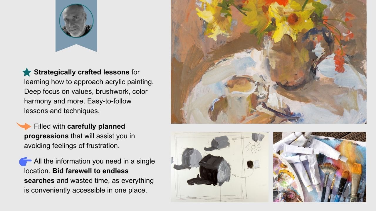
2. How To Use The Platform: In this video, I
just wanted to go over the Skillshare platform. I know some of you
know how to use it, but I know there are
many others that simply don't understand how
to create a project. How to add more photos, text, and things like that. What I will do now is pull up one of my classes on Skillshare. This may not be the
class you are learning, but it does have everything we need to cover what I wanted to share with
you in this video. This is my watercolor workout
basics and beyond class. And you've got the main
video here. Obviously. If you wanted to make
that video bigger, you can click that and the
top right hand corner, and that will enlarge the video if you want to reduce
that size again, come up here to the top
right-hand corner, click it. And that's going to bring up your navigation menu on
the right-hand side. Now if I hover over
the video with my mouse down here
on the lower left, you have play speed. For some reason you
wanted to slow things down or speed things up. You can always change the speed. Keep in mind if you do change, it just makes sure you
go back and set it to normal if you
want to, in fact, see at a normal speed, you can also rewind
things 15 seconds. If you're watching something
you wanted to see what happened within 15
seconds together, you can click that and
then I'll take you back. And now 1515 second increments. You can click it three
or four times and go back 45 seconds a minute,
whatever you want to do. If you want to make
a note of the video, you can click this little pen That's going to
bring up your note. And that's a good way to remind yourself if something
interesting happen there. And you just wanted to
sort of jot something down that sort of
clicked in your mind. This is your volume. So if it's CBC, this slash like I
have now lets you need to unmute it so you're not going to be able
to see the sound. If I click that now, I can now hear the video
if it were playing, this would be subtitles. So if you wanted to
have a subtitle and the various languages
here, you can do that. You may not like
having subtitles. You can put subtitles
off on the top of that. So if you don't
want to see them, That's how you get rid of them. Again, we can go full screen with that feature in the
lower right-hand corner. So if you wanted to see this and this largest
possible resolution, that is going to be
the option to do it. Okay, So again, that's that one. So that tells you a
little bit about how to navigate some of the
options on the video. Over here on the right. So long as you're in this mode, we can scroll down and
see the different videos. All videos that you
have watched all the way through should
have a checkmark. If you want to again,
get rid of that, you use this button in the top right-hand corner,
you can get rid of it. And then here we see it. Now down here, we
have some tabs. We have the About tab. So that's going to be the class
description that I added. I will often add other classes that you
may be interested in. So throughout the course, I may say if you want to learn more about how to
plan watercolor art, be shorter, checkout the link
in the class description, and that's gonna be right
here in the About tab. So if we scroll down, we can see all of
these are links to different classes I have. So that's a little bit
about the about page. Reviews are where you can see how awesome reviews that the
students left on the class. Here, our discussions, discussions are very
important because that's how I'm
going to notify you about each new lesson of
when they're available. You will see, if you scroll
down, you'll see discussions, you'll see where there's some
different things going on. This is important too. So if you have questions about the class or a
lesson you watched, then you can use this
discussions to get in touch with me and I'll try to respond
to you as soon as possible. You can also share links
and the discussions too. So if you have something
you want to show me, you can always link
it up and I'll be able to see it. Here. You see I can start
a conversation, I can ask a question up and
share project and so on. Speaking up projects,
if I go right here, this tells you a little
bit about the project. So here you'll see each lesson
has a project well almost, but the point is to get
involved and started doing the demos and projects
shared in this class. And here you can scroll down
and see all the students that are posting projects that there's one do
you want to explore? You can click on
that and just see what an awesome job the
students are doing, getting these different
projects and things done. Of course, you can
comment on these two. So over here on the
right-hand side, you can click on that. You can share a little feedbacks and encouragement,
whatever you want to do. If you look at my
project right here, you're going to see that I've got a detailed breakdown
of all my lessons here. So each time I post new
lessons in a class or a demo, I always break it
down and give you a really good description
of what's going on. Now you may want to
create a project. Now, since I already have one, are you going to see
that I don't have the option to make another one. But here is a class that
I don't have a project. You will see this green button
on the right-hand side. To create a project, all you have to do
is click on that. And that's going to bring
up your project option. Now the first thing you'll
see is a cover image. If you want to add
a cover image, just click on that and then
navigate to your image. So I'll just select one here. So I'll select this one. And then that's going
to upload the image. Once it's uploaded. I have the option here on
this slider right there to enlarge it and then
sort of move it around, however I want that to be seen. And once it's done,
click Submit. Again, this is just
the cover image. You can go ahead and add
a title and I'll say, awesome class by Robert. If I can spell that right, that would certainly
help. Description. Hey, took a three-week class
and here's what I did. Now if I hit Enter, That's going to bring the
cursor down here below. And then I can add an image. You see down here, you can see, you can have three options
to add more content. So if I click on image, I can add another image, so I can click on that and then you have to
give it a second. And then that's going
to upload the image. Now I can click Enter and you see I can write more content. I'm like, This is my
cool fish painting. Now, if I wanted to add a video or link and
maybe you're like, Hey, did you happen to see
this picture, whatever. You can double-click on a word and then you have a
link option here, and you can paste
the link in there. Just make sure you
hit the Check button to make it active. And now I can hit enter again
and then add more images. That's how you can
make your project. If you don't want anyone
to see your project, you can click this button
here to make it private. But once you're done,
very, very important, scroll back to the
top and hit Publish. And as soon as you
publish your project, that's going to be visible
for everyone to see. So that's publishing right now. I'm just going to
give it a moment, alright, and then there
it is, right there. So I just added my projects. So let's say you want
to edit your project, you click on that again. And now you come up here to
the top right-hand corner. You can click Edit, and now you can scroll down. Make sure you put the
cursor where you want it. So if I want the next image or the next video or whatever
to be below the fish. I can come down
here and click on the end of the
sentence, hit Enter. And now again, pull in my images or wherever it
is that I want to do. Again, make sure you hit
published when you're done. And then that's
going to save it. You just have to be patient
and let Skill Share save it. Another thing you may
want to do is share your project on social media. So you have this
Copy Project link. You can copy that and share
that wherever you wish. Over here on the right-hand
side, you can hard thing. So if someone did a project
that you really like, you can give it a heart. You can share a comment and say, those fish are amazing, and then hit posts and
that's going to share your comments with whoever
it is you're talking about. So again, just good
stuff to know. And I think if you learn how to use the projects
is very useful. And teachers can often
see them and hopefully they do and they can give you some feedback on
what you're doing. The last thing I want
to share with you is right here under the again, we've got about reviews, discussions, and then
project and resources. These resources
are downloadable. If the class has images,
resource images, whatever the case may be, you can click on the
link and that's going to download it to your device. So I hope this video helps you out and that you
understand a little bit more about how to navigate
the Skillshare platform. And then of course, the
courses that are taught there.
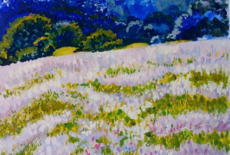
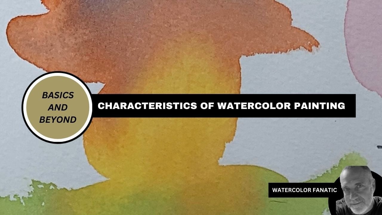
3. Masses 101: welcome to landscape fundamentals. And in this section we're going to talk about masses. There are several ways we can define a mass and use it as a tool, but the first way we're going to use it is to simplify. So as I do this contour drawing, which basically is what it is, I'm going to talk my way through how to simplify a scene. So here you can clearly see we have a sky clouds. We've got trees on the left. We have some smaller trees there where the path leads up into and then in the distance we have a group of trees as well. We also have a ground plane. So my goal before I have even considered doing a painting or any sort of value study or color study is to simply look at the scene and try to understand how I'm going to group all of these shapes together. So ultimately, what you want to do when you simplify groups is you want to reduce it to about you know, six or seven groups, if you possibly can. If you get up in the 10 to 12 range, oftentimes it means you haven't done a good enough job and simplifying and grouping all of these shapes and to, um, less groups. All right, so what you can see here even though it looks like I'm doing a a contour drawing of everything, I'm really taking objects. Ah, group of trees. And I'm making it into one cohesive flowing shape that's going to be better described as we move forward. But for now, I'm going to talk my way through it. If you're a little bit unclear. Still, that's okay, because at once we finish for the section. We're going to certainly cover all of this. I'm great in much greater detail. So what you see here is I've got a collection of shapes. So let's look at the finish drawing here, and you will see that everything is very, very clear and reduced Simplified. So I haven't started drawing blades of grass, flowers, leaves, branches, and so one. I've got everything reduced to its simplest form. And in the next section here I am going to show you exactly what that means. So just below this drawing, I'm going to do a second drawing. I'm going to speed through this because how are draw really isn't that important. I'm just simply copying the main groups that have already drawn and that you saw me do in the first part. Then what I will do is define these groups and to help make this even clear, I will use crayons and the crayons. Each color will represent a group. So here I'm using the red and defining the shape of those trees and the shadow. Because when I look at those trees and shadow that basically all merge into one group in the distance I've got or in the sky rather I've got the one big shape. And then I had the distant hills and then we have the tree and the bush. They're basically on either side of the path. And then we have the ground plane. So here you see me now, putting the blue into the sky and it doesn't really matter what color I use here. It could have been any color. I've got the purple representing the distant trees. And now I'm using the red to define the canopies and then the trunk and in the shadow underneath. Now I have the yellow which will represent the ground plane. I had the orange for the path and in the blue for the two trees. Again, this is how you want to see your subjects. If you don't understand how to simplify, then you need to spend time here before moving on. And now I would define it. So the sky is one. We got the distant trees, which is to the ground plane, which is three. The middle ground trees, which is four. We had the path which is five, and then the trees on the left and the shadows underneath for six. So they're my groups, and I hope that this lesson gives you some idea on how to simplify. We are going to discuss this in greater detail as we move forward.
4. Masses With Light & Shadow: to take simplifying masses to the next level. We're going to begin to look at light and shadow when I say Look at it, we're going to begin to simplify it, but we want to consider it in our drawing now. So beside the 1st 2 demos you're going to see, I'm just simply putting the same exact drawing into the artwork here have defined my light source on the top left hand side. I will reintroduce the inspiration image for you, and what I will start to do now is to simplify the light and shadow first, starting with shadow underneath the trees. They're on the path again. It's not about getting every single detail or subtle nuance is just simply about understanding where the shadows are going and then how they impact the shape itself. Often times you will find that light and shadow can join shapes together. Other times, it may break them apart. So you always have to consider how the light and shadow are impacting these shapes, and there's no better way to do it than to do a little study like this. So here you can see, I began to consider the shadows on the tree in the bush dead ahead. And now I'm going to look at how the light is impacting that particular bush there. And then I will also do the same on all the other shapes. Starting with this looks like a group of trees here on the right hand side and again, we're going to keep it very, very simple. We just want to understand how those shapes look and often times you may find that the inspiration, image, the light, the shape of the light, the way is hitting a bush. Maybe a little bit boring and maybe, Ah, very geometric or predictable. So you may have to tweak things. So as I I am doing this, I am simply looking at the image and then making decisions. Okay on how I want to interpret the light. Is it giving me something good and interesting to look at? Or do I need to consider changing some of these shapes to make it more interesting? And in this case, everything is working pretty well, so there's not a lot of changes I need to make now. There's some other interpretations and decisions I need to make. I can see There's a little bit of a shadow there where the grass is that is casting a shadow on the path. There's also a darker section of grass that runs along that path. I've decided to not make that its own separate shape. So that dark strip of grass there I'm going to keep it as is and just simply ignore it for now, to finish it off. I'm going to add a few shapes of the clouds, and that's going to give me pretty much everything I need and ordered to create my light and shadow color sketch. So this point, you always want to look at your shapes, make sure you have something that works because if it's not working here than it certainly will not work in the finish painting.
5. Masses With Light & Shadow Demo: Now you will learn how to simplify color masses. To do that, I'm going to introduce you to my palette Yellow Oakar, cat orange cad, red light, cadmium, yellow light, fellow blue and titanium white. And I am just using a piece of archival foam core as my palate. So the goal here and just for this section right here is just to put a little bit of tone down on my drawing, and that's just going to give me a base to work from whether or not you do this is up to you. Some artists like the tone a neutral gray, a mid tone grey. But for this one, I'm just going to use the poker, the orange and a little bit of white. Now that is dry. I will start to mix my first color mass, starting with a little bit of fellow blue, orange and red. I'm looking for something in the green family, but I want that to be a little bit darker, some trying to define an add color to the shadow side of these trees and mainly the underneath the canopy. There is going to always be a little bit darker, obviously, because the sun is higher, so when the sun is high, is casting light down on the top of the canopy of the trees. Therefore, you're getting shadow underneath, so now I'm going to continue with that shape. Remember, I've already defined and simplified my shape pattern. So now I'm trying to join it through color and trying to keep the shadows of the trees the trunks. And then it's cash. Shadows on on the ground, basically the same color, have decided to interpret the shadow of the tree there in the path area the same thing because they're roughly the same distance away from the viewer. If, for example, the canopy of trees was pushed further in the background, that would mean that dark shadow would be lighter and value and perhaps less saturated, then the trees that are closer to you. But in this case, I determined and decided they're roughly the same distance from the view or as we see it Now, what I would do is use a little bit of poker, a little touch of the fail Oh, and basically coming up with a nice light value and color here to use for the sky at this juncture, you can decide where I could decide to just skip the clouds, because again, this is all about simplifying the color mass and not necessarily trying to capture every single detail. But you'll see that I go around some of the shapes of the trees. I'm going to go ahead and paint through the clouds and we'll add those later on when we work with great Asians. So basically, when you're doing this sort of exercise, he always have to kind of remember what the lesson is about. And that's about masses and, more importantly, about simplifying. So we're basically taking the very first stop, an idea we learned and we're applying it to this study. And the only difference is we're using a little bit of color now. I decided to show you on my palette as I'm mixing it. So for that reason, I'm going to take the inspiration away for right now. So what I'm trying to do here is get a base green. I'm going to add to my palette a little bit of a lizard crimson that you will see in between the yellow and the red basically in the middle, and I'm dipping into that right now. That's going to give me a little bit cooler red to work with, and I'll explain that in just a second. So basically what I'm trying to do is mix up a hue for the distant trees. So we are looking all the way behind the hill of the ground level in the very back of the background. So my thinking is to completely push that more to a cool green eso. If I use the cat orange or the cad red light, that's a much warmer color, and in this this case, it just simply wouldn't work. Has tried to mix that with the blue. It's going to grade out a little bit too much. So having that cool red, the Eliza in Crimson will allow me to push that mawr to a violent. I know this course isn't about color mixing theory, but I just wanted to talk you through some of these things as I go, and perhaps you can pick up a few extra tips. So once I get the distant trees in there that I can start to address the next one, which will be the foreground Now I know the foreground will be very lightened value, and it will also be fairly warm. So I'll go ahead and get my warm hues down, which will be the yellow and the Oakar at a little bit of fail. Oh, to it. Now, if you haven't used Fellow comes in and green as well. I may come in other colors or Hughes, but it's a very, very potent color. You only need a little bit of it, so I'll mix all that up and then add a little bit of titanium white to it, and that's going to give me my base color. And as you can see, everything is very flat. So what? We're not dealing with gradations. We're not dealing with all the subtle changes from the distant background to the foreground on the ground plane or simply grouping and simplifying it into one particular Hugh eso. At this stage, it's important to do that because these are the steps that you want to take whenever you approach a painting. If you get caught up too soon and details and the great Asians and all the things that really don't matter than you eventually miss out on the big picture, and that's understanding how these big shapes relate to each other, how the colors relate to each other and so one. So anyway, you can see I'm just applying that to the entire ground plane there and no working in between the trunks. And it's OK at this point to decide if certain things don't work as well. So I decided that the trunks of the trees on the left hand side they were too predictable. They were equally spaced apart, so I painted over a few of them just to have some irregular distance gaps in between them. So that covers the ground playing there. And now it was time to move on, and the next stage will be the light on the trees. Now I can look at the image and tell that the light on top of the trees that particular color is lighter and value than that of the ground. So I'm just trying to be sure I understand that through simplification, Um, no. We get a reduced amount of Hughes, but I want to also understand that getting the hue in the ballpark at this stage is important. So simplifying doesn't always mean not doing it correctly, of course, or doing it without taking note as to which value is darker than the other and so on and allow. This comes with experience. So if you've never worked a lot with color and understand how certain colors have its own value, then that's something that will take some time but basically the canopy of the tree here. Even though that's hitting, you know, a direct light is coming on top of those leaves. I knew that the leaves themselves are much darker collectively that air in the sun than that of the ground and the grass on the ground plane. So that gives me the, uh, color for the trees. And now I can start to address the next shape there. And that's going to be this s shaped curve, which I am using a little bit of the crimson touch of the cad red light orange tan or the Oakar Rather and even a touch of the blue just to gray it up a little bit. And then, of course, the titanium white. It's got a little bit of a pinkish hue to it, so I will do my best to get that particular color in there but again, always thinking along the lines of simplifying it versus trying to overcomplicate it. So now I can use a little bit of the grays that I have on my palette. There I will add the shadow going across the path, basically coming from the bush on the left hand side there. And now I can use that same Hugh to give the indication of a cash shadow from the grass onto the path. So at this stage, I can determine or decide if anything needs to be tweet. So for me, I wanted to bring a little bit lighter color to the ground plane. I thought that would kind of and also wants to dole it down just a little bit. So felt that color was a little bit, um, too bright. Or perhaps this had too much chroma. So I just wanted to neutralize that a little bit with some grays and give it a better sense of light and just make it so where it's not quite as, um as green as it wa. So just reducing the green, adding a little bit neutral to it and then kind is knocking that colored back, a little bit fault thought that would just kind of quiet the painting down because a lot of times it's so easy to put this this really bright, intense color down and then it just becomes distracting. That's in a nutshell is basically what I thought was happening. So hopefully this looks a little bit quieter, but yet it still gets the point across, and the colors are still simplified. Now what I would do is get a little bit of a lighter value white there, and I'm going to add or indicate some of the clouds. Now again, very important. If you decide to add certain details and shapes that you have to, you know, ask yourself. You know, do I want this to be within the same group as I originally planned? Or is this going to be a separate shape? Remember, this is all about simplifying things, and oftentimes artists will make good decisions in the beginning. But then as the painting progresses, they start to make edits. And then next thing you know, they're putting values there too light or too dark into a group when it starts to break it up. But I thought adding some later value clouds there wouldn't altered too much. So long as you know I didn't go, Ah, too late or too dark with it. And obviously I didn't put any gray into the clouds yet. But when I do, I'll be sure that I keep Keep in mind that I do not want that group to be broken up, so you have to decide accordingly and be smart about making the sort of changes and additions to these simplified masses. So what do you see me doing here? Is making a change. And I didn't like the Hill line. I felt like it was a little bit too high, so I'm going to fall back and knock that down a little bit. I'm also putting in some little sky holes there into the trees, and I think pushing that down a little better, knocking that hill down a little bit, I will actually bring the trees in the middle ground there. Forward eso is just going Teoh, I feel make the overall feeling of the painting. Ah, little bit better and again, Um, you always go back and edit things accordingly again if if the things aren't working at this level or if you simply feel they're working. But they could be tweaked a little bit. Now is the time to do it. These small studies like this are great because you can really learn a lot about your landscape painting or any sort of genre, because the little changes and these little tweaks you make are going to help you with future paintings as well. You know, it's just a matter of taking the time to look at what you're doing. And then to make those changes without, of course, going too far and the lessons you learned we'll just continue to stick with you as you continue to paint. So here I'm just changing the sky color, adding a little touch of blue there into that, just to see if I can get away with still putting that in there, still keeping, um, the addition of the clouds and that into one group. And I felt like I could push that just a little bit to a blue hue and then keep my clouds in there without chopping things up too much again. You know, sick. This has, I think we decided or counted six groups, which is good again if he started getting into 89 10 groups. In a lot of times, you just haven't simplified it enough. So off with you. Fall back and add the trees. Now I'm working very dry, so I'm not putting much water into these this acrylic, so this these colors air drying pretty quick. And plus, I have film lights on as well. So I'm getting that, um, kind of that violet green hue, and I want to add the trees I painted over on, and then that will pretty much complete my groupings. And then I can decide if that's working well enough to proceed and so on. But getting things right is important. Always take your time. If you have some scrap paper, that's a good idea to keep that handy. And then that way you can always test your colors because a lot of times when you're mixing things up on a pallet, they may look like the right color as you're mixing it. But once you actually added to your painting, you may find that it's too light or too dark, but having a little piece of test paper there, you could put it on and hold it next to your painting sometimes is a good shortcut, so just take your time and make sure you get it right on now to finish it off. I'm just going to add a little bit or define the shape underneath the cannon canopies. A little bit cleaner. I want to lower that a little bit, so it looks like they're The trunks aren't as tall, and that should pretty much give me where I need to be. And here's a look at the final piece, as you can see is very flat, is very graphic looking, and it should be at this stage. This is exactly what we're looking for, and the next lesson we're going to start to break this up with some great Asians.
6. Gradations & Variations Within Masses: Now we will take this to the next level, which is introducing gradations. So with great Asians, what we're trying to do is add subtle changes or shifts in a hue. For example, most guys air slightly darker towards the top of uber picture plane, and then it will get a little bit faded or slightly less blue. We'll say in this case as it gets to the horizon, so that is a great Asian. Now again, with a great Asian, you have to be very careful. You don't want the great Asian to be so intense or such a change that it breaks up the group very, very easy to do that. So if I would have gone a little bit too intense on the blue, then it would have been easy to simply take that the group of the sky and the clouds and make that into, or to take that group and break it up. And then I'm dealing with something different. So you always want to remember Ah, you're simplified masses and then respect it. In some cases, you may need to break it up and it may be OK, but if you don't, But if you can not break it up and still pull it off than a lot of times. That's a better solution. Another great Asian we can look at is the foreground or the ground plane. So in this case, I can. I want to intensify some of the Hughes in the foreground so I can do that by getting something a little bit warmer so I can take a green that is a little more saturated and a little bit a slight shift, if you will, into the yellow family, but again respecting the fact that the ground plane of our, he decided is a group. So when you start adding blades of grass and then you start looking closer at their shadows , and then next thing you know, you start seeing these little flowers and it's you get carried away, so you have to respect the group, and then whatever great Asians you decide to make need to stay within a shift that is comfortable and it doesn't break it up. So here you can see I'm working that a little bit pushing that great Asian so that everything isn't all that same, Hugh, so that's working pretty good and now I will go to the left hand side or the right hand side here. Then add those subtle changes. So again, whenever you're working with things like this, always you think about what you're doing and and what you could possibly. What could possibly go wrong? But then always take time to just look at what at your work. So if you start making these great Asian shifts, it's a good idea to add a little bit and then back away, back away and see if the group still holds together or if it's starting to break up so that those air, this great Asian tool is a wonderful tool toe having to use, and you're going to want to use it to get away from that graphic look where everything is flat, but at the same time you have to use it us appropriately and smartly, or it would be easy to break up your paintings and then it's It's a completely different animal, then you you've got a whole new group of problems. So now I'm pushing the greens a little bit, so I'm trying to figure out if I can add a little splash here in the air of a different shade of green in the distance there, too. Make that mass interesting, but still keep it connected. So now I'm adding a little bit warmer green off, some going to go into the trees here and see if I can capture a little bit better light and all of those canopies. So I want to just warm it up. I want to get away a little bit from that bluish green on these on this particular section of trees. And oftentimes you'll find that what is working in the image or what you're seeing in the image has to be altered a little bit. So these were some of the decisions and that you will have to bake as you're working with your painting. Now what I'm doing is testing some greens in that group cannot get away with pushing a little bit of green in there because there is that row of green that follows along that path. Perhaps I don't want it to be as hard of a line or such a change and color, but I'm thinking a little bit of that green in there might be kind of nice, so I'm just testing the waters a little, a little bit here to see what I can get away with in terms of a great Asian. So these are all different tools in ways you can work great Asians, and now I'm pushing the gradation in the path a little bit. I can see there's a little change and some of it, So I want to see if I can do that without breaking it up. I mean, for the most part, I think all of that's working pretty well. So now I can push it a little bit more and then see if I can push, take it more to a neutral and work with some of the shadows of the grass that's going along the edge here. So that's working pretty good. It's certainly not breaking it up to bad. So, yeah, I think all of these slight gradation changes in additions are enhancing the group's without breaking them up. So here, working with some neutrals, so just basically graying that pink out a little bit and just dot in that in there to get a little variation, So variations are good, they're all over in your images. You're going to see a ton of variations within certain sections. If you look at the millions and millions of leaves, all the blades of grass, there's tons of variation there, and we're going to talk a lot more about that as we move forward. But basically, no, it's one of those areas where artists give themselves in trouble if you don't stick to this very first lesson, which is basically simplifying your masses, so variation is good. Variety is good, but we have to use it, um, sparingly and then very wisely. So now I'm going back in here and I will define that background, the little section of trees, and then we're going to now go ahead and look at the final image, so hopefully you can see how these gradations help Teoh get rid of some of that flat appearance it had, and this makes it a little more interesting, but yet we still have our main groups
7. Common Mistakes: so a few common gradation mistakes is what I will show you here. So let's just take this little section the bottom left quadrant of this painting. It's in the foreground. So it will be easy to get caught up in all the details because most cameras going to pick up all the details and subtle nuances in this area of the photograph. So let's say, for example, um, painting away at this corner and all of a sudden I started looking at my subject. I'm like, Oh, I see this. I see that and I started getting carried away, adding, All of these lighter and darker Hughes that just break up the mass. Next thing you know, you you're ahead of yourself and perhaps you even too late and you realize that things just aren't working anymore. And your beautifully simplified groups are getting broken up. And if you did this all around the painting, you can see how easy it is for things to fall apart. So here the image I cleaned all that up so we no longer have to worry about that happening .
8. Master's Analysis: Now we will have a look at Isaac Levittown, one of the masters that did some fantastic landscapes. I think this will be a great way to learn how the Masters simplified their masses. So starting with a square layout, which is basically what I'm seeing here, I can add a sense of the horizon line or the distant middle ground. And that's going to be my longest line from here. I have to start making decisions, have to interpret what I'm seeing now. He's already done the interpretation for the painting, but I still have to look a his artwork and determined and decide how he group things. Now. This is not about doing exactly the way he did it, but this is ah, good way to try to understand, Know how artists are, use certain techniques. So for me, what I'm seeing there is I have the field, which is coming off to the left, which is a darker green. Then there is that lighter patch on the left hand bottom left hand side. From there, I'm going to get into the middle ground, which is basically a series of trees. Looks like some farmhouses or perhaps, um, Barnes, and they're kind of grouped to the left. And then we have one or two others kind of scattered along the hilltop there. From there, I can decide how I want or how he group the trees again. This is all about interpretation and then making some decisions just simply trying to learn how other artists use this technique. So we know it's not about trying to get it perfect. It's just simply to add on to what you already know. So now I can make a few little changes here to the groups. But as you can see, it's very, very simplified. There is not a lot there, if you know, and understand how to simplify all of the information. So again, this is about reducing things to its simplest form, simplest shape, and you can see that all the trees and the barns and the buildings and whatnot in the background or middle ground. We're all bunched together in a group, so I probably had the sky, the clouds, the middle ground group. So that's three. The field on the left for the lower left hand corner five and the rest of its six. I got up to about six groups of Masses to do the painting. I'm going to start with the middle ground here and come up with a color that I feel will get the job done. So it's fairly dark back in there. So I know that could possibly be one of the darkest values I use in this particular scene. As I look at this, I can see the field they're coming off of that background or the middle ground of the buildings on this slight is lighter, but it's almost the same. That can almost be a great Asian of the middle ground buildings and tree is coming into that row of soybeans or whatever that is. But that could easily be joined together. But now is pretty clear that the patch of green and the lower left here that I'm working on is lighter. So that's going to be a separate group to that, we could see how gradations work now we like if you start to squint, especially at the distant buildings and trees, somehow that can merge, sometimes enjoying other groups. So what here adding the ground plane on the right hand side. I'm starting out with just a basic mid value here. This is going to be a grayscale demo. Then I will go over this with some Hughes later on. But this is just to understand the main groups. And then I will, um I can take it to the next level once I'm ready. Now I'm adding the group, which is the clouds. And if you really look at his painting, there are hundreds of different values and shades, tents and what not going on in those clouds. But at this juncture, we simplify that as best we can in order to to get that group, which is basically what I'm doing there. From there, we know we can do the great Asians and make subtle changes. Later on, however we see fit. But here you can see it's, you know it's coming together pretty quick, you know, not after every single detail in the barn, and nor should you be this is again about simplifying. Simplifying the masses were going back to the very beginning stages of understanding and simplifying masses. I started out with the the drawing, which is nothing more than a basic contour type drawing that defined my groups on then I start to take it to the next level, and all I'm doing here is applying a value, um, to each group. So I'm basically in joining them through values here. So as I continued to work on my group's here, you can see I'm just cleaning some edges up and blending things myself. I feel certain areas just start to break up and they're getting too many different hues and values. I'll just take my brush and is blended just to smooth things out. I want to see this simply as I can before moving on. Since allow these lines were painted over. I'm going to go back with a charcoal pencil here and go over some of these groups so you can see the clouds, which are mainly up towards the top there, and they kind of drift and then come down to the ah horizon. They're the top of the hill, so I want to make sure I get that nice and defined. And then I'm going to use, um, some lighter value now to change the color of the blue and the gray in that sky. And that's just going Teoh just keep things. So there's not keeping simple on. That's exactly what is going to do. And I just saw it was getting a little too dark, a little too busy up in there. So now, um, looking at what I have and I'll start to, I know again keep simplify things. Um, and that's what the stage is all about and just want to lighten that value up in the sky a little bit. And I think that's going to help me see this a little bit cleaner. And I think just being thorough, I could easily skip it and get right into the applying some color. But I wanted to be nice and thorough. I want to make sure that you understand how I'm interpreting these groups, and you may look at this and see things differently. That's fine. A czart ists. You know, we always you know, we have to make those decisions on our own, and there are probably a lot of different solutions and interpretations that would work just fine. All right, so that's working a little bit better for the sky, and I can start to just take my time, as I mentioned before, and just look at it just kind of pay attention to what you're doing. Always ask yourself in York, there any changes that need to be made here, you can see going back in, I'm drawing my contours and my groups a little bit cleaner. Now I'm noticing how things are shaped, making sure each shape is interesting, making sure things are broken up if they needed to be, and so long. So I will put a label now on these. So I've got my clouds, which is one that sky area, which is to now I can look at the other groups here. So I've got the A distant trees and hills, which it looks like I will go into it now a little bit and make a little change. And really, what this is doing, just defining this a little bit better. So I want to just make these shapes a little more interesting. And that's that's what it's all about, you know, is simplifying the masses is one thing. But making sure things are interesting to look at is the next thing. If you have shapes that air too much like each other, so if you have, you know, two buildings that are identical and shape, for example, that wouldn't work if you had clouds. There were all similar in size than that wouldn't work. So you always have to make sure that age group is interesting. And this is the part of learning this of learning, period, that, um, especially landscape painting that can be challenging. So there I've got my next group, which was my background. So I feel better about those shapes now. I think they're more interesting, but it's also the field. So I'm thinking that field how it runs down into the foreground. There is a group. There's a great Asian there, right there in the foreground, but is definitely a group. So now I'm adding a little bit of great Asian to the right hand side of that field, and you can see in the image which I will show at the end here of the demo. How that there's some gradation happening there. There's also some great Asian and details in the foreground there, but I just want to indicate that and making sure that I'm understanding how that great Asian isn't breaking up that group. We've got the foreground field. We've got another field in that lower left hand corner, and I'm just trying to decide, You know, that is that the same group as the one on the right or is is different and I think is different. I think it's much lighter in value. Well, not much lighter, but it's light enough in value or lighter in value, that feel it has its own group. So I want to bring that around and create a group by itself. So I'm here. I'm just making sure you understand. This is the middle foreground, um, and foreground. So all of this section on the right here and then we've got our foreground on the lower left hand side. So that's Ah, good interpretation so far of on the Levittown landscape. And I think that gives me a really good base for understanding how he group things. At this stage. I can go ahead and kind of continue to make a few changes. And again, as I make these edits and changes very cognizant of the change. Andi, I always asked myself, Well, how does that affect the group, if any? If I feel like the great Asian and the changes I'm making are affecting the group, Then I have to ask myself, Does that still work? It's OK to add a group or a change as you go, but you just have toe back up, look at the whole and make sure you're not losing the big picture. And that's basically exactly what I'm doing right here. So I'm going back in now and making some changes to the clouds, adding some lighter values there and then trying to determine if that's something that's going to affect the group and throw the harmony off on everything else. So so far, this is all I think, working really well, let's go ahead and, um, have a look at the demo image and you can see for yourself how taking some of the Masters work like this, and doing these little sketches can help you learn a lot about some of the lessons that I will be teaching you in this course. And we're going to do this extra size throughout every section
9. Master's Analysis With Color: all right. Now that this is dry, I can start to take it to the next level. And that's simplifying the color masses. If you remember, right, the goal here was to group him group your colors and masses. Tried Teoh understand that each group you know has its own value has its own color. There may again be subtle details and nuances that you want to include, but you always have to know how they affect the mass and if it's going to break it up and so on. So I'm gonna go ahead and dive into this darker green that's coming down through the left hand side and block it in. That's kind of what you want to do with this stage. As I've said many times, I don't get caught up then trying to get every single detail about it. Just get the big picture. Um, and then we could go back in and do gradations to get a little bit cleaner and even stay. Just not you're not gonna have all the information that is in the final painting. We're not quite at that stage yet, but we will get there. So here, just working with some different greens. I've got a little swatch happening there at the bottom, just kind of looking at those comparing things side by side just to get a feel for what they are. And again, a lot of times when you're mixing things up on your palate, you may think it's a certain color and it may be. But you do a swatch. You put it next to something, uh, and may or may not work. So I always like to have a little Swatch there helping me to make those decisions. I'm here. I'm going to change that you up a little bit. You can see. I'm adding some yellow Oakar trying to warm it up and again. I'm not going to get to heavy into color mixing and things like that. We'll talk a little bit about that as this course progresses, Um, but I'm or interested in just understanding and teaching you the the basics of massing at this point and not so much every everything about color mixing. So just f Y I hear I'm blocking in the section is you can see on the right getting that down, uh, asking myself, you know, is that close enough to the right color eyes putting a little bit of this Gonen, our type of color, that soaker. And two, we're gonna mess it up. So I'll go ahead, ad that leader alone for now. And once I'm finished getting that blocked in to my liking, I can start to address the next big shape, and that's going to be the sky. And of course, when we combine that with the clouds, there's a lot of information there. But for the most part, I think the clouds I don't need a lot of work at this stage. They're going to be of a white or gray scale anyway, which is what we started with. But I know we got a nice punch of blue into this certain sections of the clouds or the sky . And it's also coming down into the, um, hillside. So I want to Sprinkle that in there at this juncture. And then again, I kind of see how that effects that group. Does it break it apart or, you know, if not, then what do I need to do to kind of clean all that up? So now, um, pretty happy with that? I can start to look at the graze a little bit, so I've got a little roof line there again. It's not. I'm not punching that color so much. So that is breaking everything up. And I've got another a little roof catching light there as well. So I'm just kind of adding that in the air, seeing how it impacts everything. And now I have that gray mixed up. There's neutrals. I can get in here and start Teoh work out the groups in the sky. So with sky, we've got a lot of these clouds or they're breaking up into these darker green masses. Um, kind of running into the blues, merging a little bit. So just trying to feel my way around that activity there in the sky, very complex sky going on there. Eso it's it's important to try to get a feel for it, but again not to get sucked into all of the details. They're just get the big picture down. So I will continue to dabble around and find my way through those shapes and groups and pulling some of those on Grey's into the blues into the clouds near the trees and the buildings again. There's a lot of change and activity are going on in here, and we're not going to get all of that stuff put down. This is not about painting a replica of it. It's just simply trying to study masses. So don't get caught up in trying to think I'm tryingto basically want to copy his work. It's not really about that at all. I just want to understand to the best of my ability, how he used masses within his landscape painting process. I should say so, um again continuing Teoh work back and forth here trying to get some of these, um, groups tweak a little bit, adding, starting to now, consider some great Asians how certain areas here are have some of those changes. And if so, you know, how can I You add some of this information without breaking the group up and so on. You can generally take these ah, studies like this when you're working from other artists, their ideas and artwork, and you can take it to whatever level that makes you feel comfortable. But for me, you know, I like to just kind of ballpark it. Um, again, I don't like to copy everything. Trying to ah, exact replication of the artist work. I'm more interested in learning, You know, my fundamentals from some of them really like music. Levittown. I think he's, Ah, fantastic landscape painter. It was able to simplify his subjects very well. So now just getting some of these earth tones in their sprinkling them around again, I'll do a little bit. You'll see me kind of disappear from the screen there on. I'm just kind of looking backing away and looking at what I'm doing. I can see little white flowers on things there, some just kind of playing with that idea a little bit, getting a little information in there and again trying to pull this, pull this thing together so that I get to a point where I'm I'm happy with what I've learned and what I understand. I can see those. Ah Green is kind of lacing its way up into that feel with a little bit, um, so I kind of wanted to indicate that it's kind of breaking that mass up a little bit, too. So I know that when if ever decided to do something like this, you want to to not make it so obvious like that to where breaks up that green. So here I'm thinking In that foreground, there is just, ah more of a dominant, um, Earth tone there brownish, warm Hugh that's making its way in there. So that could possibly be 1/6 that's working its way through that area of the painting that still working fine. It's still the painting is still as a whole holding together. I don't think anything is lost by adding that. But these air certainly things and decisions and I'm trying to make as I go. So you see, now I'm going back in with these greens. I will clean that area up just a little bit. I felt like I lost that group. I can see that Green is is splashed here in there as well, so I would put a little bit of that in there. I'm seeing a distant little shape. They're coming off to the right as well. So all of this is working pretty good at this stage, and I'm thinking, you know, certain really feel good about knowing how Isaac possibly used some of these ideas and his work and again This is all part of the learning process. For me is taking these ideas, you know, making them your own doing these studies by yourself, with whatever subjects you confined that are good and useful and suitable, I guess, for the exercise. Ah, and then taking into another level by simply understanding how some of your fame favorite Lee escape painters, you're possibly used them on their own. So all part of the learning tree and reinforcing ideas that you're trying to understand and so on. All right, so now just some gradations there in the foreground and slowly but surely bringing this one together. And at this stage, I think it's working pretty good, I think, adding the color masses, um, was been official. And I also think, you know, I was able to keep things pretty much keep these groups intact, making the decisions I made. So let's have a look at the finished art, and again this is not finished in terms of I would take it out to gallery and try to sell it or put it online is simply a finished study based on understanding the masses that live Aton used in this painting
10. Practice Reel Assignment: Welcome to the practice, riel. And this. Really, There are five images. Each image is four minutes long. You want to add a contour of each of the masses. Limit yourself 27 masses. Try not to go over that number. Keep your shapes interesting. That's the main thing we want to focus on. Combined shapes don't draw individual trees. Onley focus on shape. So do not add color or light and shadow. At this stage, I will show you how you can do that later on. Eliminate details. You do not need them for this exercise. Use your medium of choice. I did use compressed charcoal. Now, whenever the image has 15 seconds left, you will hear a notification that sounds like this That way. You understand? You need to wrap things up and get ready for the next one. If you need more time, that's fine. Just hit the pause button and take a much time as you need. But the overall goal here is to work quickly and intuitively so that you don't get stuck on unnecessary details. Good luck and have fun. The first image starts now
11. Robert's Take On Practice Reel Part 1: all right, welcome to my version of the practice. Real again. This is intended just for some extra learning. You can compare how I approached this. Each scene to yours doesn't mean anyone's right or wrong. It's just simply a way to enhance the online learning experience and perhaps add to what you already know or learn something new. You can see I am. I started with my horizon line there, and then I started with the next biggest shape, which was the rock formations, or perhaps or lower mountains or something on the right hand side. From there, I'm adding the next biggest shape, and I'm going to always work my images in that manner so I won't have to repeat that in every single one. Um, here I'm adding the getting into the middle and foreground, and I wanted to make sure that the shape ah basically gave the water feature the water in the distance There, almost in l shape. It's like it's coming across the scene, and there's wrapping around the bend of the mountain and then fading off into the distance . I wanted to make sure the formations and the shapes that I put down said exactly that. So I'm using the sky as my first shape. I'm not going to do any of the clouds or anything there. I think it's just they're not very important and they're not going to matter. In the final piece, the distant hill, there will be three. I've got the hills on the right, the larger mountains as to, ah, the distant hills and left will be my fourth shape. You can see the fifth would be the mountain of the rock there and more of the foreground. And I've got the water as six. So that's going to leave the foreground, a middle of foreground, a seven. But now I need I have ah issue because I've got these trees that are going along the bank and decided to join those into the shape of number five, which is the rock on the left hand side. I feel they're very similar and value. They're about the same distance from the perspective we have, and I can easily dot and kind of try to join those through value as I move forward, some kind of including that, uh, in So although the six is pointing to that little tree. Now that six was actually the water. So here I'm going to start adding a little value. And I'm not, You know, even though I'm looking at the darkest darks and the lightest lights, I'm doing this mawr for the sake of understanding and illustrating my shape. So you can see I use a similar value there for my five, which is joining all alone the the bank there. I've got a lighter value here, going in for my foreground so that I'll kind of show it. That foreground is a very simple shape. You can see I'm kind of cutting that rock back into it a little bit, so it's not so rectangular. But I do know in the painting that's going to change a lot because I'm gonna have some great Asians and changes in Hue there as well. So adding a lighter value to the shape on the right, and they will continue to add slightly lighter values as I get back into the background and in the sky by fuel. This is a good way of joining those shapes, simplifying it, and I think for a painting this is a great start and I could certainly work with something like this. Now that that's done will move on to my 2nd 1 So we got more of a variety here of shapes. Well, maybe not of writing so much, but we got in the war in the foreground. So we have this path that's going to take us into it. So you can see I started by always locating my horizon, and then I kind of weasel my way or get worked my way through the shapes here. Um, you know that this one doesn't really have a lot of information. So it's to me. It will be very difficult to come up with more than seven shapes. But I do know we had the sky in the sky has a very distinct cloud formation there. So I think I'm going to use that in my design process. So, you see, I added the path I've got my ground plane pretty well identified. I've got the mass of the tree or the bush on the left hand side, and now I'm adding the shape of the middle ground trees there, and you can see in the distance there some structure, perhaps, and may even be trees. You could even turn that into a little house or a country dwelling or something. But for now, I'm just going to add it as a shape you can see. Now I'm working those cloud shapes into my design. So this is a good case where you can easily show off clouds. I don't think there's so much, so many shapes going on in the overall design that you, um that you can't not take advantage of an opportunity like this. So this is a really good example to me of how I would enhance and improve the shape quality by making sure these clouds are part of it. So really making him into an interesting mass and had them interact with the other shapes of things. So now you see, I'm defining my masses here so feel like this that there's distant trees are going through , perhaps even have some of the darkest darks. The ground plane, even eyes, is somewhat darker than usual. But now I've got my one, my two on the left, which are the big mass of the trees, ground playing three and path for, and I believe that distant hill, the distant dwelling or the trees there could easily join with one. So I'm going to add a little bit of value to the sky going around those clouds and the sky will give me five. And the cloud formations would give me six I now. Perhaps I could go with the lighter blue or a little bit different shape if I wanted to work some sort of interesting shaper with that distance. So I'll go ahead and add that as a seven. But that gives me some really interesting shapes and nothing is the same. I think this would work perfect. So now let's go on to my next one. So here we again have a path leading us ends. We got a very dominant shape on the right hand side again. Looking at that, it will be easy to just make make it into a big snowball shaped. But you want to avoid that. You have to make your shapes interesting again. We're joining things, so I think it's always good to look at opportunities where similar values can join together . They could be trees. It could be a tree and a fence. It could be a path in a corn field. It doesn't matter. We're looking at opportunities to make things into one shape. To simplify it, we can either simplify it through value. We can simplify it through color on so one. So here you can see I'm basically getting in the big chunks here again. We have another situation here with cloud formations. Could could easily be, ah, part of my masses. Um, so that has to be considered and things get too busy. If there If there were three barns in the middle ground and figures walking and pose and telephone poles and different rocks, then I would have to ask myself with the clouds clouds ah, introduced to many masses, would I be able to join all these different masses and so on? So these are questions and issues you're going to come across when you do this, we can see Now I've got some interesting shapes going on and on the ground plane here. So not just generic, um, geometric shapes that they're very they're carefully designed, even though I'm working quick here and things are very crude, and it should be at the stage of I'm always thinking about how those edges and how those shapes look, So any time I can make things more interesting by making a little shift or a change here they're not. Do it. Also want to point to your attention that, as I mentioned in the practice riel, um, directions, no light and shadow. So this is all about simplifying and two masses. Um, I am going to in the next video, show you how I use tracing paper and added the light and shadow. But I'm just simply focusing on the shapes, um, here adding my shapes now the one for the bush to for the distant trees. Three would be the ground plane here. I'm starting to think I can connect the values of the tree on the in the middle there with the value of the fence so that that would be one shape. So that tree in the middle ground connecting to the value the brownish value of the fence and extending it out. So the fence is part of that shape, and it's a very abstract, interesting shape. So I joined those, and they're not separate. I want to make sure you understand that so four will be my path coming in five are my clouds. So I'm thinking, Yeah, it's pretty simple in terms of shapes. I've got some wiggle room here, so I'm going to try toe at a Mass here for the blue, which is basically going negative shape. The clouds are very simple. Seen here are not a lot going on. We've got some interesting cloud activity happening there. So, um, that son could easily be coming down from the very top. Could be coming down behind the trees. I kind of think it's coming down from the top. You know, not much of a hint of light and shadow here, but yet you can see I'm tackling it the same way, working large to small, placing the horizon and that sort of thing to, uh, help guide me along this. And so I think part of this the challenge in this one is it's so simple that, you know, we need to consider each of those shapes. So the trees coming across the distant tree lines that lying these to be interesting, you can just make it bland. The angles have to mingle with each other, the overlapping and so on. I think this one is going to be improved quite a bit once we get into the light and shadow , even though it's a very subtle. So here, you see, I'm defining a shape now, looking at how that interacts with everything else trying to figure out, well, does that connect to the distant trees? Could that be one? I decided to make those separate, so we've got number two there and I have my trees or the distant hills here. And I decided to make all that one big shape. So that's gonna be three. So that's going to be There is a division there between the two hills. So you got the foreground and then we've got, you know, some sort of dip in the landscape there, and it goes down into the next area by figure. Those can easily be the same. So I'm thinking there's a shadow, a really dark mass from under the number one that one shape, and that's kind of coming over a little bit. I'm gonna blend that into the tree on the lower left hand side. Some kind of including that into one now feel they're very similar in terms of distance between us. I mean the trees on the right could be slightly farther away from our perspective, but I think we could probably get that where they're the same. So four b, the distant hill there. And we've got our sky, which is just gonna be a simple gradation. And I'm going to darken this set of hills here just to distinguish the shape and did her that for the one in front souls. See, I'm going to make this a little more clearer for you, but, yeah, very simple shape design here. I think this again what the success of a painting like this would depend on. You know how well you organize those angles and depict them in the final artwork. So six will be the distant hill. So I got away with six shapes on this one. So that works. It works pretty well. So last but not least here. So we finally have a definite Well, I guess the fence earlier was a manmade object, but we got the telephone pole was here which were in play a role. I think in the shape of this piece, I think out they would have to be considered and do note I haven't introduced barns and houses and different things you would see in a landscape. Yet we're gonna get to things like that later on. Ah, but here you can see ah working the same manner and then getting this path in there that's going to lead us in. I can see that That is a rolling path. I mean, it's going up and down there, some shadows going across about simplified. It s a We don't need to get the ribbon effect going up in that in that path. Not right now. That's not what this stage is about. Ah, here, out in Nicosia added the distant trees on the right, which your farther back and I've got some middle ground trees better kind of going along the horizon. They're definitely situated slightly behind the cornfield or something there. But this is such a, you know, simple design that I know I can get away with using the cloud formation as part of the interest in the masses. And then I can take the telephone pole and run it up into the cloud, and that's going to connect the ground with the sky plane. That's kind of interesting way to think about it. So it's kind of joining things and is giving it Ah, little more asymmetrical quality, too. So it's kind of putting some weight on the right hand side, pulling your little more to the right as it leads you in. Uh, didn't really have to add those wires. Probably I shouldn't have. Should have kept this simple, but I did add those. And now I'm going to go in and start to add a little bit of value to these, and there is gonna be a little bit of a shake. Their I'm having to press into the paper a little bit. So you wanna get that? So here you can see I've got my values and my mass and defying there. That is gonna be my one. Telephone poles will be live tube, and all those polls are connected through the wires as well. So that's kind of why I added that. Just suck it. Show you how it's not each individual poll there. Those polls are actually connected through the wires. So that's just one continuous shape. The way I'm seeing it and interpreting it So again. One two for the poles, three for the field, four for the path, um, five would be for the clouds. Ah, six for the distant trees. And now I can add a little bit of value to the to the sky, to the blue of the sky on That's going to help me see these shapes a little bit better. Make sure nothing is the same. Make sure everything is interesting to look at. And there you see it. So, um you know, working with masses is important. It is, You know, I know design and composition are part of it, too. Well, we'll talk about those things later on, but, uh, having interesting masses is the first step. If you're not successful here than like I've mentioned before, you simply stop until it is. So here's a look at the image. You can see what I did, and hopefully it will help you with yours as well.
12. Robert's Take On Practice Reel Part 2: Okay. Um, I have already got the outline here. As you can see, I'm using my tracing paper. How do you recommend you do the same thing? You can go back and draw him again if you like. If you feel like you need the practice. But for the most part, tracing over your shapes if you like him is all you need. So here I'm adding light to the minute middle ground there. So on the rock formation, I can see some light hitting areas, the very distant or the middle ground hill behind that can see it as well. The hill on the right, the rocks that can see there there. It's more of a change. I see. And the terrain. So we have more green trees and stuff growing on that one. And then you're you're seeing in some of the rock in the ground, through the trees eso. Anyway, I want to make sure that the shapes and the design of that the trees on that in the growth on that hill on the right, the mountain, it could be a rock. I don't know. That is interesting. And it doesn't clash with what I have now the foreground is very blend. I mean, there's just not a lot happening there. I did change the rocks on the left, and I kind of cut into that a little bit, so we didn't have a rectangle. But I'm going to add a dis a sense, a slight hit of light and shadow. They're hitting some of the the field, but that's about it for the 2nd 1 again, I'm going to speed through this part of it. Just tracing the main shapes with their light and shadow gives me a good chance to have a second look at everything as well. But now that I'm into the light and shadow, um, I'm going to define some of the light areas. So sunlight hitting some of these leaves again, not drawing every single leaf, just patches of light. I can see the middle ground trees have a little bit of a light hitting the tops of the trees. Can't really see the light. Here it is coming straight down. Really, you can see the light, but the direction is very tough because I think the light is coming not left and right. But straight down on our object some probably high noon or something like that. So again were very subtle shifts. Not much to work with here. So I think again, this would be ah, really good piece to go and get a nice gradation in the sky. Make that more appealing and interesting. So it would need some work on the finish to really bring this out. So anyway, um, that pretty much, I think, covers a lot of the light and shadow on this, but I think to really maybe add a little more interest in shapes. I'm going to add some light and shadow hit in the clouds and define ah again how those shapes could possibly interact and mingle with the others. And then also to give me a little more to latch onto with light and shadow so that if I get to a piece of finished piece, I know where to go with it. It's the 3rd 1 here. I will do the same thing. Go over this quickly. Here. This is about 400 times the speed, but I've got my light put in there, so I know the direction I'm dealing with. It's good idea to do that as Well, I would think most. Most of you probably do, but you're having the light source as a reminder is good. Now I'm looking at the cash shadows going across the path here trying to understand, You know, if that's going to be something I need to simplify or enhance, you can see the tree here has some interesting light hitting that very subtle change, though. But it is there you can see change and color and value. So the tree on the right again getting some light hitting the left hand side. They're not really much on this tree in the middle, just a slight little bit on a few few of those branches where they're sticking out, but not a whole lot to latch on to there. Um now can look at these distant trees and see there some light hitting some of those, but because they're gonna be in the distance again. Very subtle change between the light and the shadow. And now I've got the fence and I'm thinking, Well, maybe you'll be a good idea to enhance the shadow here. So even though I can't see a strong shadow coming off the fence post, then I'm thinking maybe it will be good to add that. I mean, just because it's not there doesn't mean we can't change things a little bit as we go. So I'm thinking about maybe a shadow going across the grass here would break up that patch and give us some interesting shapes and the the shape on the right hand side. That grass shape can be very simple and clean. Where the other the shape of the grass on the left hand side is broken up a little bit more , All right, moving on to this one again. We're dealing with light. It's really hard to tell, but I think there's been a lot of, ah filtering, I believe to this piece in the editing process. But once I get my my direction down, which is coming straight down, that's my decision. That's my interpretation, and that's what I'm working with. I can start to add my light. I did draw through the tree here in the foreground that's going to be very dark. There's not really much light hitting that at all, so I'm not going to add any sense of light there. Ah, slight. I could see a little bit of light hitting the lower bush here, and I think it be interesting to add that because I think it's going to break that shape up a little bit. I think, really, the beauty of this piece is going to be in the the atmospheric perspective on how it's basically changing the value and saturation of these colors. But looking at the field, I think I can add some good light to indicate the top of the hill there in the foreground and then some of the distant hills there just to give it some interest. But moving on to the final one here again, we'll get through my outline here quickly. The tracing. Ah, and then we can look at this one. But it also, you know, this one is tough because, I mean, we obviously have a lot of clouds. They're very big cloud. So they're casting a shadow down onto the earth. They're very far away from the earth. So the very fuzzy where the light and shadow is all that's really diffused because light is bouncing around in that dome, you know, of the sky and softening everything. But I'm going to decide to add a little bit of the light source rather from the top right hand side coming down. I want to add a little bit of shadow to divide. I guess that's a cornfield or something there and to give that a change in elevation. So the grass field on the left will be somewhat flat. And then we've got the higher ward guessed golden green of that cornfield There in the middle ground, on the left hand side, the upright telephone poles here will be casting a shadow over it. And as I draw this, notice how that shadow is this enhanced. So I know it's not really what's there but is going up in over the road. So showing almost the it's across contour lines or showing volume of the road and start is going straight across. So adding a little sense of light on the middle ground trees there probably even call them background. But again, that would be a very, very soft change and color. That wouldn't be a distinct change between shade and light in that middle ground, but also on the right hand side. I can see there's a where the Mullan is so right there the front of the telephone poles as they approach the street. Uh, it's low, so that means the fields on the right are getting that change. An elevation. So that is casting, putting a shadow on that side of the form. So the clouds have some interesting light and shadow here because this is a again, a very, ah, simple design here with the masses, I feel like I can we can use. Or I could use the shapes, the bellies of those clouds where the shadows are and the moisture and how that's kind of building up. But I don't want all those that look the same. You can see I had like those three arches. They're up inverted arches. They're all the same. So you gotta watch out for stuff like that. And that's the whole purpose of designing masses is to avoid repetition and make things interesting. So you conjoined different shapes and things like that to avoid it. But anyway, on that pretty much covers mine, light and shadow version. Here's a look at my final drawings, and I hope that helps you along your landscape painting journey
13. Value Hierarchy 101: So we've talked about masses and general and how to reduce them or interpret them to simple shapes. And then we add on top of that, the shapes for the light and shadow. And now we want to introduce value hierarchy. So for those of you that understand what value is, you may just want to watch and maybe perhaps pick up on something that maybe you didn't know. But for those of you that don't, I'm going to make a value scale. So on one end of the scale is going to be black and the other end it is white. So let's go ahead and do that. So I'm going to use ah, lamp black to mix. I could easily mix up my own black by using a combination of the three primaries. But since I want to make this a little bit quicker, I'm going to just take a shortcut and it will be here. We have pure white. I'm going to bring some of my black down now, in between black and white, there are infinite number of values that we can have so as ah, as a painter, um, you're simply trying to reduce that number to a more manageable amount so that when you go to doing a value scale painting like this, um, you're not trying to choose between, you know, thousands of values. So what you want to do is look at a value scale and the perhaps 10 scale range. Let me add a little bit of white over here, so I'm gonna bring that over in there, so that's pretty good. I think we've got something to work with. I'm just going to kind of blend this and then work it back this way, and we got our pure black here. All right, so 10 10 is kind of a nice number to work with. So we'll say our five is in or Midpoint is here, so let's see to three for 123 Uh, I was hoping that charcoal wood woodwork Muslim it's to me do this. So we got going to divide this now so that we can see hopefully a little more clearly. That's eight and then 9 10 All right, so basically, um, when you're thinking about a value scale and thinking about value hierarchy, which is what we're gonna get into your simply trying to make decisions on where your darkest dark is. Your light is light, and so one. So imagine if you're looking at a photograph. Or perhaps you're even outdoors looking at a scene and you start to notice all these subtle changes and value. And just to be clear, whenever you start thinking and doing a value hierarchy study, you have to switch off color, and it's important to do that. And, of course, if you're at home on your computer, you can take your image and duplicate it and then de saturated into a gray scale. But if you're working outdoors, you you will have to visually make that shift. So where you're no longer looking at color and Hughes, you're thinking you're you turned that off. You try to look at things in a gray scale, and what you want to do, of course, is start to identify, as I was saying before the lightest lights and the darkest darks. Now, ideally, when you paint, you want to kind of stay in this range so that this is a pretty good range to work with. So in other words, you don't always have to use black, you don't always have to use white. Typically, um, these are used. The white and the really, really dark hues are used as accents versus big blocks of color, so and often times you can get a landscape painting that has really good light and shadow by using this range.
14. Value Hierarchy Demo: Now I can start to apply some values. And in general, you know, Ah, seven value plan is perfect. So reducing what you see in front of you all these shapes, the light and shadows and so on into seven that's that's the ultimate go. A lot of times, if you can't reduce it to seven, then they just haven't worked enough. He haven't merged your value certain values and shapes into one. So again, seven is a good number to shoot for, and you also have to start deciding, you know, certain things like nowhere. How dark is going to be my darkest dark. Where's my life is like going to be eso in general again. I like to work. You know, I think working from about here to here is pretty good. So in whenever you're outside, there's so much light bouncing around even on a cloudy day that nothing is really black and so dark. And I think you you want to try to avoid working the full range and kind of like I said before, bring it in here. In general, the sky is usually the light is late, and then you may have to make some decisions like Well, are the clouds so light? And is the sky so dark or perhaps blew a certain shade of blue that I need to values or cannot make this one? I think for the most part, there was a little bit of light hitting the clouds. Um, but I'm shooting for it. Looks like one value for the ground. I'm thinking, too. Let's just get back to the sky One for this guy, Two for the ground. Um, three and four will make up the tree. It's a four being the shade three being the light Probably have five and maybe six here because they're a little bit further away. So I don't want them to be Is darker as light is this And I've got the road and ah, the street to deal with So I think this shade of these, the grass or wherever this is coming off and then the road I'm thinking the road can be these distant hills So maybe the value add to these hills can kind of trickle down into the street. So I'm thinking, I've got my seven values right there. So that's kind of what I'm gonna shoot for So I can start using my white again. Probably. I'm looking in here somewhere. Might be a little bit too dark. And I can start to at a little something here. A distant hills, things like that. We don't need a ton of edges on that stuff. I will talk about this as we go forward. But if you start putting to me jagged edges in the distant hills, then you're going to ruin the depth of the painting. Put a little bit of water on my brush. They're trying to put this on dry. So what drives faster and checking my values? I want to make the shape of that tree a little more interesting when I get there. Can see we got this Mickey Mouse ears going on here that's going to stop. All right. So, as you can see, I just concluded that the clouds in the sky are connected for now. And I'll make this a spook. Had a little bit of a little bit agree on that I didn't know about. So I'm gonna switch to a bigger brush. Basically. What? I was getting that there. All right, now I can look at adding a little bit of land black to that, I'm thinking for the distant hills. Maybe in this range you'll probably find he had tendencies to either paint things to light or too dark. It was always good to have your value scale there to keep you in check. So again, bringing that and to the road it's fine. So then I can say, Well, can I use that same value for the shadow in the tree, or can I use it for the light on this side? If you could make some of those decisions now, then that's fine again when you do the final painting, Uh, there's a me a shift in hue. So again the mountains could be a cool blue. He may have a cool green over here, so they're going there. There will be some division there through Hugh in the final painting, but perhaps the colors are so close that we can merge the values. I'm going to see how that works, So I know I have a light side hitting that I'll go ahead and put it here is Well, I now I'm getting into the ground plane. So for the ground plane, I want it, Um, in lighter or slightly darker than the sky. I may have the good back into that sky and lightened that up a little bit. I'm going to pull this tree down a little bit too in here. So it will be a little bit staggered forward from all of this, a little bit more cleanly. And what I have here getting your job here is to simplify and not try to represent everything that you see in nature. We do that often times you're painting becomes too busy and nothing is really connected or have is cohesive. Now, I'm going to go a little bit later here. We have a little bit of that in there, but I'm not going to worry about that. That's more of a great Asian thing. So now I'm looking at my tree. I'm thinking that I want I've got this kind of neutral Hamlin, try this a little bit of light hitting that tree there, perhaps running down into connecting with the value here and maybe a little light hitting this thing. So back to the tree. Um, just say this is a really dark leaves on this tree, so I'm going to try the light and this range and I'm gonna try the dark. This will be my darkest dark. I'll probably have to lighten that just a little bit. So we'll go something like this. And maybe we got something ever in here catching some light and trying to stay him. Maybe we could do a little branch or something in here. That's fine. Now I've got a shadow. We can't see it because of the grass, but we'll say that's moving across the road. I think it's a little bit lighter as it hits the value of the grass on the other side. That's pretty good. I would like to make a correction with the sky. I will get a little more white, but again, I don't think I need to go here. You know, something like that should do fine. Knocked the hill down a little bit, accentuate that tree. And of course, you can get in here and do some sky holes or whatever. I'm going to go a little bit later for this and that I can connect. You know that shadow into this shadow on Assad. So I think that works pretty good and that gives me a good I think, hierarchy for this painting. Try it again. So one for the sky to three for the tree, four for the distant mountains, five for the light, six for the ground and then our foreground of seven. So that's that's pretty good. Um, if I wanted to, I could use some of this value here to make a subtle change. Maybe in that tree, just to bring it forward a little bit. Maybe there's some other little role of trees and there and then there. So that's staying within that value family. And, of course, at the end of it all, um, you have to ask yourself, Doesn't work, you know? Is this a good simplified value plan? Is it something? Ah, that field would make a good painting. Is it interesting to look at and so on? So those air the questions that probably teeter on design. We are going to talk a little bit about that. I'm just clean up some of these values real quick, but at this stage, you know, as I mentioned before, that should be working. You should have something there that represents something that you'll be interested in moving forward with. So I think that works. Okay. I mean, I could clean up a little bit of the sky and the edge of the tree, something like that, just to give it a nice abstract shape. But for the most part, I think that covers a lot about understanding value hierarchy and introducing you to the idea again. It's about simplifying so that when you start to add color and move into the actual painting, ah, it's much easier to digest and to make decisions versus not understanding how you want to playing your values.
15. Value Hierarchy - Common Mistakes: so I wanted to cover some common mistakes that are often made and hopefully show you how to avoid them. Eso basically I'll just take the sky, for example. So we'll pretend we're looking at the same things. We have our hillsdown here tree path, so on. So a student may start to dissect the tree and really look at it or the sky rather. And instead of simplifying and really taking the whole scene and as a whole, um, they get caught up in little areas of the painting again, not paying any mind to where the darkest dark is mid tones, lightest light and so on. So what they do is they cram entire range. Oh, sorry about that. All right, so here we go. So this is our sky. And then a student would look at that and go, Well, I mean, I see these really dark areas under the clouds, and then I see these really light lights and, uh, I'll see a great Asian, so it's very blue up top, and then it gets to lighter blue down below. And so what happens is they basically use up an entire range of values in a very small space, and it starts when the painting starts to come together in a student as the trees, the ground, the and the the entire thing there looks choppy. Eso so nothing's really planned or organized eso that you're going to lose light, and it's going to be very hard to read the painting, so over here may look over simplified. But if you start to add notes of blue green, greenish yellow, yellow is green, dark green, yellowish green and so on a great noah bluish tan for the road all the same value. Then it starts to hold together and it starts to read. Ah, much cleaner so that those were some of the things that you want to avoid because it'll really ruin and over complicate the painting. So again, always look at the scene as a whole. First, I know where your darkest darks are going to be No, where your lightest lights are going to be and then work around that, um, in one quick change I will make is adding a lighter value to the sky and I'll show you why . So if I add, come back, add this lighter value to the sky A nice, interesting shape there with that tree. Something like that. See if I can get in here now and do a few clouds. Maybe that are there. And then if I wanted to or perhaps accentuate underneath like Okay, well, the clouds air, no catching light on top or whatever and shadows underneath. I can add those shadows without destroying the entire ah value plan. So that's just something, um you have to watch out for and allow. That's just getting, you know, ahead of yourself, not really looking at the the entire image and planning accordingly. OK, so hopefully that old help you resolve some of the common errors. And, as with, you know, acrylic painting, how as acrylic painting goes, it always tends to dry a little bit darker. So I'm just going to lighten this field up a little bit. There you go. So avoid that common trap
16. Master's Analysis Demo - Low Key: all right. What I would do now is do a demonstration of a Monet. And he was. Money was famous for variation within a Mass. So he was, he would. There's just so many different color variations with the mass that I can be very difficult to see values. And could you get locked in or caught up in all those details? So I will do is take the image and d saturated. So once we see that on a great scale, you're going to find that it just all of those values and those intricate changes in color merged together. Eso They're very similar and valued. I think that's where beginners and unexperienced artists landscape painters will fail because they go out in nature. They see all these details and they don't understand how, um, how to use color correctly. So each color has his own value. And I think the experience painters understand that where in experienced artists will tend to just throw colors down without any sort of, um, awareness to the value of that color. So anyway, what I would do is take this and do ah, very easy scaled down version. Actually, two of them to demonstrate, Um, not only new learning from his grouping of values and the simplification of values, but also I want to show you a low key and then a high key value scale. So if you look at a low key, we're going to say that the dark's are the lowest. All right? So a dark, it would be a very low key. Ah, Hugh. And I'm going to put a little bit of weight on my palette here, and we'll talk about how white that would demonstrate. Really? How white is a very high key color. It's referred to as a high key. So in a low key painting, what you're dealing with our Hughes that are in that very dark range. So we got dark black, black own down. I will say, maybe a little bit later in here. I just blend that with my finger. All right, so you kind of get the point there, So that is a very, um, limited range. Don't make that even a little bit darker. And it's towards the darker range where a high key, as you probably know by now, will tend to be in this sort of range So this particular painting, it doesn't have ah, lot of very light notes there some waves, some white caps and on the waves that have white in. Um, but for the most part, you know that that painting is done in a very almost. You could probably let's just group it, you know, it's just start right there. So let's just look it some of these, um, shapes and we're going, We're going to do a hierarchy here. Yes, we've got the house, the sea coming off here. I'll just leave this out as quickly as I can on show me a little thing here, okay? And we've got this wrapping around, then all to the corner, and it looks like just like, uh, some grasses or something going up along the shore. Here's a hill texture going on their distant horizon, birds and so on. And we can see, uh, some shadow underneath. We've got the doors, something going on here and then off to the side. Here. We've got these shapes just again some activity there and on the shore. So for the most part, when I see this, I mean, there aren't a lot of value changes their There's a great Asian between, like we got the look of the sky and then it meets the horizon or the water line. Here. There's a great Asian there. But when I squint down, I mean, you could almost take this entire mass right here. And even even up through the cottage got a little lying coming in here. But through the roof line down, back around all of this to me, there's some a dark mass coming in here for the shadows on these grasses, kind of falling on the road here. All of this I mean the sky down into the here, into the cottage, into this lawn. Maybe there's a change here, and then it's a little bit darker, and then it kind of trickles in to these air locking shapes and are moving back. So this just do that real quick. Just fill that in. I'll move to a bigger brush, and I'll do the low key first, even though I think this one how does a pretty good range, but I'll just show you how to do this, Loki high key thing here you have. Ah, something else you can work with. A little bit. I'm going to do these grass is a little bit darker. I would take that right into the cottage. Uh oh. Right into these coming. So you got this massive, massive block, They're of value. Yeah, there some gradations going on and all that stuff. But, I mean, you could pretty monkeys argue, could you could do exactly what I did right there. And that's just simply make it in the one. I'm gonna lighten that up just a little bit, but not much. So I wanna work in this range here, Something like that. And you're the winner here. And how we pull this off was through the ability to wear with using variation within a mass . So now I'm going to establish some of these darker darks. I'm going to push the darks a little bit. So I wanted to be Ah, this very Loki painting, Lukey. And so it's not quite is a little bit of, ah, darker something happening here, and it's pretty much connecting right with that shadow on the roof. And then we've got that moving into the chimney shadow running down. You got this kind of connecting with a little something in here, so I'll go a little bit later, hit that mass, and then bring that over into this stuff. If you really break that down, That's kind of what we're looking at. Yeah, we can go in here. I'm not gonna go too much lighter and get these, um, waves again. This is Ah, low key. So everything is pushed to a darker value. Of course, he's got birds going around in here. But you could You could easily do that. I mean, we can get in here and their push a few darks like that tweet things, but for a low key value simplification. So ah, hierarchy. That's what we're dealing with. And of course, if we look at this ah, the color version, there's gonna be changes. So in the sky, there's a great Asian that's slightly warmer, and then it gets into this teal green of the waters, and then it gets into these warmer notes in the shore and there's warmer notes get more intense here and into the cottage. So the separation really came in the use of color. But we really start to simplify a hierarchy there for value. I mean, you could probably go right here. So, you know, 12 one two for the dark's, um three and then four. I mean, you could simplify that to four if you absolutely had to. Maybe you would want to come in here and at a lighter value for the sky, but and of course, you could do the same thing throughout, You know, a few other pieces here and maybe a little bit later here and so on. But for the most part, I'm being 4 to 5 values woodwork and again, this is low key. So this is kind of pushing everything to a very dark set, a group of colors. So let's take the same thing and do a high key.
17. Master's Analysis Demo - High Key: now start just basically doing the same thing. So just lay out this and what's going on now. Like that. Look taller. Interesting shapes. Too simple, but interesting how he composed this painting. I think it's pretty fascinating when you can go back and break the stuff down just to learn . No, get more information for yourself. Try to understand what other artists did. All right, So now, reminding you this is Mawr high key. So looking at the painting, deciding that the lightest lights will probably be the caps in here same is in there out that the camera's picking up on the subtle changes. So I'll start with the big Mass here. I'm gonna go a little bit lighter bringing that right down. You can see already a big difference between that key and this key. So for my dark, I can clearly see in the images is probably close to that. But for this painting, I want my darkest dark to be in here. You'll start to see that's how they create different moods. And I don't really think Manet did any of this in this picture. I don't really think, um, he was after a higher Loki or anything. So I think he used a pretty good range, Probably a standard range. I don't think it was ah pushed to either, or I think the beauty of this one is in his ability to work the variations, the variety within a mass through color. That's gonna be too dark. That's gonna be too dark. That's probably more what I want. Of course, I can speak with that in. Take that into whatever is happening here on the bank. We could do a little great Asian if we want, maybe add the another the fifth value and now pushing for the waves and the brakes So I could even come in here and to a little variation on the roof. Merry go. So basically taking the same idea, same composition and working in a high key to get there. So that is basically basically a breakdown. I feel of, you know, the value planning within this, how I see it, how I interpret it. If you see it differently, that's fine. That's that's what makes it when I think interesting. And, you know, all of the stuff is up for debate. If money was here, he could fill us in on what really happened. But for the most part, that's my take on it. But then also throwing in this idea of Loki high key. And you don't necessarily have to do a painting in a low key. You don't have to do in the high key, but just know that it exists something you can easily do. Should you decide that you want to do that. So you don't, you know, basically have to use the full range, uh, values. I'm you can stick here. You can stick here. You can stick there. I like this idea of being in the middle and they're getting these lights and then bring that down in here for landscaping. If you have to use these little dark notes, then use them sparingly.
18. Value Hierarchy Practice Reel: Welcome to the practice, riel and this, Really, there are five images. Each image is four minutes long. You want to add a contour of each of the masses. Each image has a landscape layout as opposed to portrait. I also recommend that you limit yourself to seven total values. I like to start with my lightest light or my darkest dark. If I add the darkest dark, I would then go to the lightest late and then add everything in between. Avoid excessive details and use your medium of choice. I prefer to use charcoal for this exercise. Eliminate details. You do not need them for this exercise. Now, whenever the image has 15 seconds left, you will hear a notification that sounds like this. So that way you understand. You need to wrap things up and get ready for the next one. If you need more time, that's fine. Just hit the pause button and take a much time as you need. But the overall goal here is to work quickly and intuitively, so that you don't get stuck on unnecessary details. Good luck and have fun. The first image starts now
19. Robert's Value Hierarchy Practice Reel: All right. So this 1st 1 we've got good aerial perspective here. Uh, these don't necessarily have to be award winning photographs or anything to get our exercise done. The key is to always take what you have and try to make it interesting. Anyway, So it is changing a little bit of the formations here, but not not much on and will say, there's, you know, im cropping some of this out. Say, there's an elevation change in here that maybe this is coming up, something like that. And then we have these trees and bushes. They're kind of going uber and connecting here. Something like that. Skies pretty, uh, claims. I'm going to leave it there, someone to start with my darkest darks again, trying to avoid getting to too dark. So I'm going to say it's roughly in here on this rock and then perhaps even connects with ah, these bushes and trees that are going along in here. Uh, so we're gonna step back from here in space a little bit. Let's go. And this one, As you can see, I'm this one doesn't have too much light, but I'm going to simplify this exercise. The purpose of a time really like this. Is this really to get your ideas down quick? I'm gonna say that value is probably the same value that's hitting the top of this rock. You can see we got some different things in there, and that's probably even the same value as the water from a go, a smidge lighter on the water. And I think that is catching a little bit of that reflection from the sky. They want to step back a little bit more for this mountain or rock, whatever it is. So we got something like this As we get into the foreground, I'm going to really just make all of this about same. This would be a change between this little piece and this piece. And Q. I'm going to say they're roughly the same value. I only have a few seconds left. I'm just going to put a light value in this guy. I'll recap these once I'm done and just kind of go over some of the things I may have left out in terms of explanation. All right, Um, all right, so I'll go ahead and I can't see the horizon because of the Tareen, but I'm going to start with. My longest line is always again. Things will be exaggerated. A little bit simplified as well. So I'm not gonna worry about all the hills and all the gradations and the different things happening. Um, and the landscape. I'm just going to keep a very, very simple for reasons we've already talked about throughout this course. Gonna have to work quick. Obviously, I'm not even going to worry much. Um, about the house in the background. Well, to say this is kind of going off in this direction. So I'll see. I've got very background to get her foreground. With road leading us in, we've got the tree and my even gonna worry about this Hill, I'll just do something like this light source coming from here again. I'll start with my darkest dark. Um, gonna be on this tree again. Very simple, with my shapes. Not worried about capturing every nuance. I'm going to step that back a little bit now for these trees. That's gonna be about the next value there. Um, and probably even a touch later. Maybe for this light plane here, we're gonna go. Probably a little bit darker, but very, very close and value to the light on the tree would be maybe this distant elevation. I'm going to say course our ground plane will be very light. See, I'm not doing the great Asians or anything fancy here. When you're doing this, you know these exercises again. Let's keep it simple. And we want to work quick and try to get through these values so that you start making quick decisions and that's going to eliminate in theory. Ah, getting fussy with details. Someone save my path is a little bit darker. Get the cash shadow just going to darker than tree. All right, so that's looking pretty good. Just kind of looking around now. I don't have much time. I can put a little bit darker value. Maybe on that tree. And then here I have time, which I do got just a few more seconds. I can add a little feeling of late. All right, Next up. Pretty simple design here. Yes, we have, say the main Drop that down a little bit and then this one's coming up over and down. Just talking my way through this. Basically elevate that tree a little bit here. Air, some barns and different things happening back here. Uh, we have a low growing tree, It looks like likes dominant shape here. And we could put a little trunk, maybe, and then a shadow. Looks like we have a high son. Probably coming down. And here, When I started this time of the sky, I left it out Last time. I I'll go back and put that in, and we're gonna count the values and all that stuff. Now I'm going to step it forward, So I'm going to come right in here. Grab that one. And it looks to me, looks to me like there's maybe been some photo shop even going on with what's going on here so I'm going to do is say, that's just some sort of maybe some wild sunflowers or whatever. Some just for contrast. I'm going to make this distant hill darker. Maybe that's a field of dark growing soybean or something. So now has become full word. Um, I don't know if this cloud coverage or what, but it looks to me like we've got a darker Tareen coming through here, so I'm going to lighten this. I'll try toe tryto get what I see here. All right. Getting into the tree here again? Not much, Not much. Um, shadow in that. So I'm going to make the value somewhat darker. So we have our vertical plane here on and put a few little bit of light hitting that, and I'm going to accentuate the dark in the belly underneath plane here, that tree, and then I'll lighten the value a little bit for cash shadow. We'll connect that. So that's pretty good. I'm going to get a second here, going to lighten this just a little bit, so it doesn't compete with these. All right, so that's pretty good. Let's move on. So again, um, we can kind of start right in here, and then it moves back. We have our tree line, see on that painting, every single tree, we have our hills. I'm gonna change that shape a little bit and then bring and this one from this side, and then we have a very distant still There again, I'm going to go ahead and just start with my sky. I know it's very blue, but there is not much value in that. So if you were to gray scale that. That's what I'm trying to see. Bring it forward a little bit. That's probably a little too dark coming forward. A little bit more. It was down in here. Now we have our vertical plane. Can you can see I'm not getting too fussy here. And now we have the next latest to the sky. Something like that. Going to move my palate up a little bit. So I have room for this 3rd 1 as I have a little bit of time here. Fall back and at the light here. And I'm also going to that one. Came together pretty quick. Light in the sky, up a little bit. All right, so I think that's pretty good. So I've got my last one coming up here. All of these are looking pretty good. Might get back in dark and some of this when I'm done. All right, I guess. Country back roads. Here we have this. We've got some distant trees. Very low elevation, maybe disappears. It comes up. Maybe a little geometric form there. I'm gonna bump this section of trees a little bit closer. We've got the ah road coming in here and we have some verticals. So they're kind of starting. And here, working their way back, I'll just do three. I think that's plenty. And we have cornfield or something here on and another tree. I'm kind of in here like that. I got some light values on my brush. Try to get this down a little bit. I can see some clouds in the sky there and depending if I have time, I may go back and include that. I think I've got plenty of room with my shapes again out his work light to dark. I've got laid on my brush so we have a very light, um ground plane. Slight change. Um, maybe where this field is and what I'll do is I'll make this part a little bit darker. What? I'm painting now. I'm going to try to highlight, highlight this cornfield or just say, make a lighter value. Hi. Um, it's good with the trees back there again. There in the distance. It's probably a little too dark, but we need we need a dark, you know? I mean, the darks air. Really? What? Anchor things. Well, I'm going to say all this is pretty much maybe what's in the distance there is slightly lighter, but I feel like I feel like they're so close. You can almost bring them into one or make them one. All right. Vertical planes like that, Um, seeing a little bit of cash shadow. But not much When I say this half is lighter in value. Ah, Then the grass and time ago This a little bit of light hidden those.
20. Light & Shadow Planes 101: Okay, let's talk about light and planes. And but, McConnell, we will focus on basically light and shadow. And then how that interacts with form. And there are three principal planes you're going to, I want to know. So let's go ahead and put in a simple scene. Here. We have our ground plane or flat plane, and we're gonna put just put a simple tree here. Um, we have sky hole, make that a little bit bigger, and then we have vertical planes. Now, before I get into all of them this just imagine you're outside. Maybe you're doing some plain air painting. Or maybe even you have a landscape image in front of you a photograph and you want to start exploring Ah, painting with it. So the idea behind this is that we are dealing with a sunny day. So coming from the say this direction and you want to make a distinction, you have to decide if something is in light or not. There's nothing in between. Um, if you start looking at details so let's say you're looking at this tree. You can see the light is hitting. Maybe part of the top decides and then where the light kind of meets the shadow, there's gonna be a bunch of variations, not variations. But there would be a bunch of leaves and different details that may be in light. So the easiest way to understand this, as with everything we've discussed this point is you have to simplify. You can always go back and add details later. But for now we're just simply going to draw Ah, very kind of crude division between what's in light and then what's in shadow. And of course, you have to see this light and shadow and division and every object that you're painting. So for now, um, I'm going to simplify the details. I'll do it first by adding, ah, line for my shadow. So I'll say the line is coming in here something like that. Maybe we have ah, a little touch of light there. Where is catching some light? So now what kind of scrub this area out, and same that is in shadow. So vertical planes in the landscape like this are generally the darkest plane. And that's because, and I'm getting to all explain a little more when we start talking about cash shadow But as the sun comes down, that's hitting the object, getting light. And then whatever is not getting that light is very dark. And because it's vertical this way and the sun's coming down at an angle, this is going to be the darkest of all. And so let me kind of explain that a little bit more about, um as I draw a cash shadow. So because the sun is coming down, we have a cash shadow on the ground plane now, important to know that cash shadows are going to follow the plane that is hitting. So in this case, we have a flat field. But maybe you were dealing with this tree that was maybe growing on a bank. So it was It was maybe going up right here. So in that case, the shadow would go up following the plane. Now, with cash shadows, they're going to be a little bit lighter. And that's because you have what's called, um, this. Just say this is our ground playing in here. No. Well, it is our ground plane, So let's just say this is the horizon. And outside you had this dome effect. The sun may come up right here, casting a very low light on the landscape. I'm going to get back to that in a second, but basically as the sun comes up, it's moving around in this direction. But Ambien light is everywhere, so let's say our son is here now. Light is bouncing around everywhere up here. This is getting direct impact from the sun, but the sun is still bouncing off different objects. Clouds. It's in the sky. And because of that cash shadows are going to be lighter in a landscape. And we just add a little bit agreeing to this. And I say lighter. I mean lighter than the shadow on the vertical plane. And that's because again, it's really is getting its shadow from the tree and the light hitting the tree, but is getting bounced. Light effects from the different things in this don't so, basically, this is receiving mawr light in different directions, then what? This is because there's not much light coming directly at this, but there's a lot of light coming down on this grass plane. So now let's go ahead. Start making painting this adding a little bit of color basically to this tree maybe we have a little bit of shadow there. Now add a little bit of a light to this tree, just a touch of white here. As I put this on, let me explain to you that vertical elements and a landscape the lighter side is generally the darkest of the lights for the same reasons we've already talked about. So basically, the vertical planes are going to read. Generally be the darkest darks and the the lights. It will have the darkest of the lights as well. And that again is because it's vertical and it's not getting the same amount of light as a flat plane. It's getting less bounced, like on it as well, So basically we have few types of shadows. We have the shadow on the tree coming from the sun, where the object is either in lighter at a light, and now we have a cash shadow. Let's look at another plane. But before I do that, we also have two planes here as well. We've got the ground plane for Ah, horizontal plane, and then we had the vertical plane of the tree. I'm going to introduce 1/3 plane, but before I do. There are times when this general we've doesn't apply. Um, let's say the sun is coming up and you're here. So the light source his way down here, and it's sending, like, very low across the plane. In this case, these rules wouldn't always stick and they wouldn't stick. But for the sake of this demonstration again, we're going to say the sun is up here. And of course, as the sun goes up in around and we're down here, then you're still dealing with a slightly different set of rules than what I'm talking about for this demonstration. So, um, the next plane we're going to talk about will be a come on angular plane. So let's say we have something like this. I am. We have mountains and some hills back there. So a mountain or hill can be anywhere. Let's say from ah, 20 degree to like, a 45 degree angle must be start getting greater than 45. Then we're dealing with more of a vertical plane. So let's say if we're looking at this, you know, um, the angle relative to the ground, okay, is receiving light differently. So the lights up here coming down crashing basically on the ground. So that's gonna receive a lot of light. And the the angled planes are going to receive that light a little bit differently. So they're going to be not as light as the ground plane. Okay, so in value and they're not. But they're going to be lighter in general. Then the ah, light hitting a vertical plane. So let's add that still a little bit too dark test. That's pretty good. I even go a little bit lighter here, a little bit cooler, and I'll push this more to a green in the very distant here because it's more atmospheric at that point is further away. That's going to be lighter in the hills. And of course we're losing are green, perhaps because is more rocky. And also perhaps because as more elevation, further away from us as well. So flat plane, horizontal plane, vertical plane angled planes. All right, Right now I'm going to go ahead and add a value to the ground plane. And as, um, you may know on as I mentioned, this is going to be the lightest plane. And that, of course, is because receiving that directly So at this point, we can look at the planes again. Again, We've got three distinct planes. Vertical, flat, angular. You also have distinct values. Um, the light value of the ground plane. For the reasons I've mentioned, we've got the dark value on the vertical plane. We have a light value on the vertical side is getting the light. But that isn't as light as the flat plane. We have our angular planes in the distance, all different values, so I can go ahead and I'll just make this a little bit lighter. We get that nice distinction. So the background, I'll make this a little more green, so we we start to see it. So even though this is receiving light, um, well, well at that. But it's not going to be the vertical light here. It's still gonna be darker than this. So this light, this value will be darker than this, but slightly lighter than that. So I can make that touch more clear. A little bit of yellow here. I could go a little bit lighter back there from this guy. Warm this up just slightly Here. I'll just make this ah distant, distant hill a little bit lighter here in value, and I'll push that a little bit of cool into that as well. And even with the distant hill, take that and push it back This a little bit more in space again dealing with atmosphere, perspective here, a little more so maybe the kind of smooth it out. So maybe our distant hills here, closer to us in the mountains, the same has a flat from you. So maybe it's starting to level out. In that case, we can do something like that, Uh, and it would be catching light, Uh, something like this in certain places. So hopefully, um, you can start to understand the planes, Um, some of the characteristics of them in light and shadow again, these air general rules there are exceptions, as I've discussed, but hopefully we'll bring start to bring a little bit of clarity to some of your light and shadow and so on. So now there are such things as, uh, you know, half tones, things like that. Um, in general, um, you don't want to add to many of those. So, for example, let's say we look at this vertical plane, you start to examine it a little bit more in detail and you see all these subtle variations . So maybe we can get Ah, a little more of a bluish green. Well, I can kind of see that blue in that. So But if you start to do a lot of this modeling, what's gonna happen is going to destroy it. Um, as a general rule, I would say avoid You're the half tones and over modeling, complicating certain planes. Keep it simple. There's another little thing we can look at, which there like highlights. So maybe when you're looking into this tree, we can see little specks of color like and but that is is a reflection. So it's like a mirror, you know, the sun is coming down, the sunlight coming down and hitting the leave. That's reflecting light. So if you want to get in here and then this can be this sort of thing can be pretty pretty helpful. But again, um, you want to use these things sparingly, uh, again, over complicating things with too many details can again destroy the planes and how you should organize the values. Hughes, the light and shadow and so on so far to get in here and paint, you know, 1000 or, you know, let's just say 25 little dots in there. Then you can see how that would destroy um, what I have. But again, it can be effective when used appropriately, strategically, and not ever done. So just to recap here, we've got our three planes. So we have our flat plane. We have, ah, vertical plane, and then we have the angular planes. All right, so 123 We also have a division, uh, light and shadow. Very simple. Um, concept. But when you're I mean, when you're painting and you're dealing with no one image, you have to make these distinctions on. That's not always easy. Um, but within all of that, I mean, you have kind of the sub. The sub categories. There's there's a couple to think about. You're the half tones which can be subtle changes in a light or dark area. One area didn't mention which I will cover. A real quick here will be a subcategory of a vertical plane, and it's called the, um, be under plane. So let's say the canopy of this tree has an under plane. Ah, and it's down in here so that in General Kim and is usually, you know, the darkest of that dark category, Um, so that that's kind of subcategory. We have the reflection, the mirroring of the sun, the light of the sun coming down, hitting some of these leaves which act as a mirror, and they shine like light Ambien or light towards you. So you're seeing you're seeing that Andi that again can be useful was like mentioned. Ah, you just, you know, use with caution, as with anything else, um, sparingly. And you should be in good shape. And now I'll just, um, add the sky and maybe have a little sky hold there, and this really has no relevance to the plane lesson. Um, that's when I kind of finish it in. And hopefully these things will start to make sense for you, um, and kind of take your landscaping to the next level. So whenever you are learning things like this, like anything else, always take it simple. You can do a simple a design like this just to go through the motions and teach yourself the physical part of applying paint, mixing pain, getting your values right, as you saw me do in this demo, you know, had to make a lot of changes, shifts, and you're gonna have to do the same thing. So go through those motions and make those changes and do him on your own. And that way it's going to give you the physical part of actually doing it. The exercise.
21. Light & Shadow Planes - Master's Analysis Part One: All right. So let's look at this one. First, we've got on a bigger pain landscape here. So to me, the sun is maybe up high in the sky here and analyzing the planes. And I kind of made that, um, observation or decision based on how these shadows are coming almost towards us or just straight down. So we've got all of this. Um, I won't even include the tree right now. All of this would be the cash shadow. We have us. Ah, Cash shadow back in here. Not getting much over in here. Uh, all of that. And here is in shadow, even. And here so we can see the very distinct division in here of where some of these lights and shadows are. So as I draw this even going around the rocks and here, this is all in shadow. So here we have the cash shadow, so I just kind of make that a little bit different here. And then we have the shadow back in here. Where was happening in these bushes. And then, of course, the vertical planes. I'll make this color a little bit different. So these vertical planes here? Oh, dark and we can start to see these How? This vertical plane is very dark. And obviously, this is probably not in sunlight, either. We're seeing specks of sunlight. I'm gonna get to that in a second. But it's not much over over in here if I follow all of this. I mean, it looks to me like all of that is probably mostly in shadow as well. Um, So we have that we can look at, uh, light here for a second. So the distant hills looks like they're in sunlight, but notice the change in value. So whenever we see the sunlight hitting, I was close to us here. Like all of this, We're getting a few changes in here, but for the most part, and we can say all of this is in shadow were in light. Rather, we've got a little late over in here. So all of this is hitting the plane of the ground so very light. Um, probably to me, the lightest, um, of all of it of the plains. Anyway, we do have light hitting part of the tree here, so we're seeing a distinct change. We can see possibly some light hitting these, but is very close to us. I mean, so this tree is mainly getting light on the outer leaves, so that's and is very close to us. So we're getting a little bit more vivid change in that. But, you know, a few half tones in here. So we're looking this shadow. I'm going to switch to Shadow Light. I'm getting away from the light, hitting the leaves for a second. I'm looking the shadow shadows here. We got some. I don't know if that's a branch coming up in there, but, you know, you don't see a ton of modeling going on in here, you know, it's, ah, little change here and there. And Hugh, for the most part, everything is within that same value range. The last thing I want to talk about. Um, actually, another thing I want to talk about when we look at this middle ground here, This looks to me like it's in light, but it's is darker and value than what's closer to us. So all of these leaves air more intense, possibly some light hitting this, but we there is a change. Their very subtle very and done so he could have easily pop that with some of the greens, these intense greens in the tree, the leaves of the tree. But I think to create division separation in space. And I think that was done in a very subtle way. Last thing you are the the planes. We have a plane of diagonal plane here in the mountains. So all of this is running of diagonally. Uh, of course, we have atmosphere conditions to because these air, um at play here or the atmosphere isn't play here because the distances as much farther away, Um, from from us, then obviously the foreground here. So those values are, um, darker colors or dole down a little bit. And to me, this is a good example of the planes We got the vertical planes, ground plane, diagonal plane, and then we've got the play of light and shadow as well.
22. Light & Shadow Planes - Master's Analysis Part Two: Okay, So another Edgar Pain here. Well, first look at some planes so we can see the vertical planes here on the trees. Obviously, what's closer to us? Very dark and even, um, as we start to evaluate some of the light and shadow in the tree, we're going to circle these for a second. We just kind of focused on these verticals. I guess that could be considered a vertical to for now, that's fun. So whenever we start to look at these verticals again, that is the darkest darks air in This is where they live. We've got the cash shadow of these coming across here right? Like this. Very interesting shapes that it's not really part of it. Uh, so hopefully can see the change. So the darkest darks live here, and the upright and shadow and the cash shadow, um, isn't quite as dark. So these values air are lighter for that kind of no atmosphere. That dome where light is kind of bouncing around as we move in the distance. Um, well, let's look at the light on the leaves up. But if you look at the light hitting some of this sorry for the move. Let me see if I can lock that down. Um, we can see where the what's in light and what's in shadow. But this the values there chosen here, um, aren't as light as some of these values hitting the ground plane the flat plane here. So we have that as the trees move away, the colors are less saturated, more, more neutral, more grade our tones. But again, um, you know, I think some of these light colors these choices in here are probably a little more intense , A little more perhaps a little more vivid than what's there. So there's a clear, distinct distinction there. Like where light and shadow was going. The color is used in light, aren't as intense again as the ground plane. And we had that, um, we can look at the distant hills. You can see these air probably. Ah, Dagnall plane. Here I was. Colors are getting muted and not as brightly say as, and value, not as late has a lot of what we're dealing with in this flat plane. So that's that
23. Light & Shadow Planes - Master's Analysis Part Three: All right. This one a Z could see is ah, lot looser. Um, but and we were dealing with more May made objects, so it looks like we have some buildings. Some figures. Did you have a tree? It looks like here. So it's still a landscape. I mean, it doesn't have as many natural elements as I mentioned, but we're still dealing with planes, light and shadow. So when we look at this, um, we can define perhaps that ah allowed. This is perhaps buildings that air in shadow. Um, if we look at the figures, another vertical element, um, we can see the shapes of them here slowed by parents like the shadows, Cash shadows from those kind of moving towards us. So who knows? I mean, it could be after the rain, a little bit of glow coming on the street, casting a reflection towards us. Or it could be a very low light. Um, situation lights may be coming from back here. Ah, low light again. Moving shadows towards us. But the vertical planes of the figures are, you know, the stick, the darker we've got. The vertical plane of the tree, the darkest dark in here as well. Um, if we look at the you know, uh, light and moving in and around some of these figures in the shadows, reflections, whatever they possibly could be. These values are layer. So are, you know, the some of the things we we've talked about here exist, even with style really loose like this. So, uh, so we got our our ground plane, which is lightest in value. We got this shadows and the operate. Well, say vertical. I'll just abbreviate that since I'm running at a room. Uh, so these are the Dark's, uh, again, our darkest is right right in there. So kind of holding true. Some of the things we've got some of the darker values and here but noticed the, uh, a little modeling. Okay, he could have. I'm sure there's probably ah, you know, 50 windows, perhaps even some lighter values. Ah, lot of details there. There were more than likely ah, excluded because of perhaps the effect, but also because you want to make sure that things read simply, I'm so there's a lot of kind of small, sketchy marks, some detail, some specs, but for the most part, I think a lot of the details and information were omitted in here in the shadows. Ah, very clean, very simple. Ah, little bit of variation, but not much. Not so much that it broke it up. So again, um, taking a slightly different subject, very different style and trying to observe and understand the light, the shadow, the effects of it, and then the different planes and how they relate to each other.
24. Three Planes and Light & Shadow Assignment: for the light and shadow in the three planes assignment, I have furnished three images of the masters to find them. Just simply look in the downloadable is that I have linked to this course. So what you will do is create two studies for each image, so there should be a total of six studies. The first study will be of the three main planes. Look at the image and just simply break it down into a flat plain of vertical plane or an angled plane. Your second study will be a breakdown of the light and shadow planes. So just think about doing a contour drawing of where the light and shadow are in the image again. Don't feel like you have to capture every little single detail. Keep it simple and try to work quickly. If you're unsure what these studies will look like, here's a quick look at two of my images. One image is 43 planes, and the other is for the light and shadow. But it helps me understand and acknowledge that these ideas exist. So good luck with the assignment, and I hope that it helps you along your creative journey
25. Light & Shadow Planes - Robert's Assignment Demo: Okay. I am using a pastel pencil here. I've got this grid off this top row will be my planes, and then down below will be on light and shadow. So with the 1st 1 I'm using the same images you are. So this is Marion Walk. Tell playing the air painter. I believe she was from California. Think she and her husband were clean air painters? Um, so again, is a ground. Is it vertical, or is it angled so I can see the ground plane and very simple here. We're just simply were only trying to identify what's here. So, ground plane, pretty much right in here. And then we get into the the angle of planes here, and I'll just I'll do a few of these. I won't do every one of them, but we've got obvious mountains angled planes going on in this area here. You know, as you're doing these things just always take note. You know how, um how some of the ideas we've discussed so far are coming into play? Um, you could see, you know, some of the values and some of the colors of things moving away from us. How How they're changing. And so just you can always get more out of it, then a lot of time, but the exercise is even intended to do or your assignment. Anyway, So we have this, um we have some a little elevation here, some verticals with the grass, but I don't think we really need that. We've got our riverbank going in here, something like that. That's it s o pretty quick exercise. But this these things just reinforce what we already know. And just to clean it off a little bit or just to finish it up, I'm going to for my dominant vertical plane here. I get that a little bit of value, and this is not any sort of value hierarchy. It's just simply too. I go back and look at this a few years from now, you know, these values and all this stuff we were kind of remind me what this exercise was all about . This is catching light from the sky and also again, I'm not gonna worry about it. So my angular planes here, I'll give him a slightly darker value. Saw this go room twice. So I have three distinct values. All right, So we've got one vertical, right. Get our vertical planes here. You've got our ground plane, and then we have our angled. So now I'll go right over to the next one here while I'm thinking about planes. And I'm just going to get my next image, which I believe once a eso William went. But I'll leave than the exact name there for you for tea, on the descriptions for you to look at. I see a signature along this one, but anyway, so here we have ground plane, but everything is kind of Helly. Um we were not getting a lot, but we do have a road coming in through here. So Rolling hills kind of interesting. Um, so I don't really consider any of that. A horizontal plane s. We have a hill like this. And then there's one coming up in here. I mean, this is about as close as we get ready here to a flat plane on the ground. And then we had this high peak coming in here. And then we have our mountain back here. Ah, in this area here, you've got our verticals overlapping going on. I love how he simplified the shapes on everything in the distance. Very clean edges, easy to read. And again I mean, you don't you can be a specific and is detailed as you want with the stuff you're interpret . How you interpret things is up to you. I'm just here to point things out and let you know they could exist. And then you can kind of do what you want with him there. I got a little symmetry going with this one. Someone changed a little bit, so I'm going to do the same thing. So So even though I can see these are different variety of tree there also catching quite a bit of light on the top. They're vertical planes. And this is the goal for this exercise. Again, it's not a value hierarchy. This is simply trying to distinguish and remind ourselves what the three planes are. So that's what I'm doing here. Ah, back to these hills. I'm going to say all of this is really angular means really, I don't see much here. That's flat. Everything is kind of a rolling hill. So we have angry, angular, and then our verticals. What's that? So Yeah, I'm pretty sure This is a William went that Believe this one is too. You know this eso a little a lot more clearer in here with what's going on to get a ground plane coming in here. You have ah, different type of ground plane in here. You have this large tree going off in an angle here. Very interesting shape. We've got some other verticals. I'm going to add this one first. Me get this distant hell in so I don't run out of room. So again, nothing. We've got two sets of hills here, so we've got this one in the foreground. We got a little peek back there. Probably another one in here. So on. So this is coming up. You know, I always take note to shapes, masses, the things you that we've talked about and just continue to pound those things into your head and get those visuals and just take a Muchas You can't have this exercise. So ground plane And here Ah, clearly we have our angular plane planes, and here we gotta Siri's vertical planes, lots of ah, trees. There's trees, kind of move up into the hills. And that sort of thing, I'm not going to do every single one of them, Of course, working on print paper. This gives me plenty of room to do. Siris of drawings like this Absolutely perfect for this exercise. You know, Have some get some, you know, does make this a little bit darker. All right, so Oh, angular vertical ground. So I've got this one working here. I'm a bump. The board up so means we'll leave it up and I'll work my way back. Light and shadow. What we want to do is try to identify, um, what's in light and then what's in shadow? Crude? You know, this is a very crude exercise. Eso again. I don't feel like you have to get every single nuance and detail again. You can recreate the painting in a photo realistic manner, if that's what you want to do. But for me, I just want to focus on getting a quick idea down the quick impression and that that's kind of what I'm after. So I've got the trees and then we've got this in here. So, looking at the distant hills, we've got this one that's coming in here. It looks like we have a mix. So we have some light cutting in through here. Then it is going up. You can see it connecting into this tree. We got light hitting the top of that tree and things. If you're shapes, join all that stuff like I'm doing here. That's fine. So I can put for now. And there's a lot of variation in here. You'll see light hitting the top of this tree, and we've got a light hitting some things in there. So I just kind of I worked my way around that. So you've got that big tree coming down and here, which is in shadow and then is casting a shadow this way and again, I'm not going to even try to get everything. I'm going to say all of this back here is pretty much, um, and Shadow. He's got a few light planes in here. You can see a couple of them, and then when we get to these hills that are closer to us, got some light hitting the top, they kind of coming down into the valley. Here. This tree probably a Serie A group of trees here, almost like a thumb with a glove. But we got light hitting the top, hitting the edge here, kind of coming down the side. And you don't even have to shave things in. You can just going to do now. Mr can work a little bit quicker. It just kind of go around some of these lights. Um, and they're basically, um, was backlit back lit some of this stuff. Course the ground is in light underneath the tree. Got the shadow coming across again. Very easy. Clean lines, negative shape in there where light is hitting your light Hitting some of these edges here again, Just identifying Ah, what's in light and what's in shadow this variety here. What's in the foreground? It's ah, it's a darker value. It's hard to tell if you're in shadow or in light, but I'm going to say they're in shadow. Could be a cloud or something moving across his. But you know, the masters were famous for, um, putting something dark or shadow coming across this foreground. And what that does, it kind of pushes you into the painting. And then you've got more room to work those yellows and stuff and here versus pushing those yellows. And here so you give the yellows working back in here. Then as you step back, you don't run out of room, so to speak. So that's kind of my take on some of the light for that one. And now Well, look at this one here. If you want to go back through these things and, you know, shade in some of that stuff, Just so you understand what it was about, then you can do that, obviously, but I'm not gonna worry about it, So this to me, looks like it's all in shadow. Um, we got some very distinct light and shadow coming on the hill, The mountain back there. It almost seems like he wanted to put ah, lot of this and shadow. And here, this this light shape is really interesting to watch that see that light shape come across and then it catches the edge of that tree like that, and then it comes up so that that's a really nice interlocking shape done pretty well there . And these are the things you know. You wanna take note off? So this is, um, a little bush back there and again, he's got a lot of intricate. It's light and shadow details going on in that mountain. But it looks to me like all of this here to the left is in shadow. The light comes down, hits the ground. Definitely some sort of cloud in there. So to me, you've got these trees coming up in here and the tops and the edges are in light. But everything else all the way over. And you know, this trees the same thing. He's got the outline and light, but all of this drops back and shadow. This is in shadow. He's got a little bit of light hitting that Trian here. Probably want to clean that up just a little bit. We have something like that. So all of this again is in light. We've got this won't put every bush in or anything but the The Shadow is coming underneath that all of this. You know, the shape of the all that's in light. Then we get to the mountains. Mary's got shadow going on here. I mean, all over the place. Really? Um, he's got these really interesting abstract shapes coming in through shadow, everything. They're working really well and playing, playing nice with each other interlocking. Really good piece here. Um, and then we've got a shadow moving up this side. All right, so I think that's pretty good for that one. Ah, again, you can break that down to whatever detail. And you were like, but that gets the point across for me. And last but not least so all of this mountain here, uh, and shadow, um, this peak here's in shadow Little Valley to me, all of this shadow got the mountain in the background. Ah, lot of light hitting that. So over here, you can see Ah, the plane of the light or the shadow moving off here. Got another shadow cutting in little specks of shadow in there. But you know, some of these all these peaks are going to repeat the shadow pattern that shadow comes up that connects with this big shadow. And this is just about identifying, acknowledging the light patterns so that shadows shape. I mean, it's more intricate than what I have, but you can see it coming down and then kind of connecting all in here. I got a little bit of light hitting this tall tree here, but the rest of these pretty much? Not much. It might be a little bit of light hitting these trees. And here get some distant trees back in there. They're catching light, but what's in front of it all in shadow. So these vertical planes here, pretty much all in shadow call in shadow at the light of that, whoever is happening, something back here, catching light. Then the shadow connects with all of this value in the vertical planes, runs down through the bank, probably runs up along this edge and then comes down like this. The reflections in the water where the shadow is getting cast in the water a little bit of light hitting some of this area like that. Um, everything on the right side here is pretty much in light. We've got these verticals, that air breaking everything up. So we've got this vertical strong vertical here with a cash shadow. Obviously, half of it is in shadow. This half is in light, and we've got a lot of strong shadows on this tree. And this tree on the right left here is catching a little bit. So all of this is in light, picking a few edges on the riverbank I think they're probably in shadow. So for a quick breakdown and just simply trying to understand the light and shade patterns Ah, for these particular masters on, then understanding their planes, this is a really good way to reinforce some of the ideas that we've talked about, some of the things you're learning, and that way you start to get used to seeing things this way. And then as you're out in nature painting or you're working with your own images or whatever, you start to identify him quicker because you know they exist.
26. Atmospheric Perspective 101: Okay, let's have a look at atmosphere perspective and we're going to focus first on value. So how does value or how is value of certain shapes light and shadow foreground, so on, impacted by atmosphere, Perspective. So as I go through this, I am going Teoh, create this quick, easy sketch or design and it should give us everything we need here. So let's say we've got our A path. Ah, road or something Moving moving along And we've got our horizon The sale on this side there . Group of trees moving into the distance on this side. Let's say we have another set of group of trees. Maybe it stops right in here and something like that, we can go ahead and put a few clouds in here. Okay. Ah, that's say the trees. The sun rather is coming from this angle and casting a shadow here. So that would mean this side is in full light or sunlight. Maybe we have some shadow right here. So we look at the shadow first. Let's just take that one. And as you may have no, already, Um, what's closest to you and Shadow is going to be the darkest value as the shadow moves away from you and not the shadow. I'm sorry. The it is a shadow, but it's the shadow on a vertical object. And remember, the vertical object is going to usually be the darkest. So as that moves away from us, his line of trees, it will get lighter in value. The light side is still vertical. So for the most part, we're going to keep it lighter. Then obviously, what's in shadow, but not his light as perhaps the ground plane and just for the sake of simplicity. And this demonstration will say these this is all the same variety of tree. This is all the same variety of tree, all of the grass, all kind of very similar grass. Nothing is really different or unique about any of this. So what will happen with the light side is there is very little change and value, very little change in value, very small and sometimes often hard to see changes. The biggest change you're going to have here is going to be changing Hue. So maybe you have more saturated greenish yellows here. Maybe as it goes away, the value still the same. But maybe the colors dole a little bit. So all of this will, if you could see far enough the shadows from the trees coming going into the distance that value will almost merge into one and with what's in light, if he could see far enough. So I'm going to put a little bit of light hitting the top of these trees. And again it's in light, so it's very little change. But is there So again you'll see almost where the shadow merges with light and on the top of the tree that almost become one value. So let's put the ground playing in so the ground plane. I'm going to make this slightly darker, so the ground plane is slightly lighter than the vertical light of the trees. And because it's in light, they'll be changed and value. But not a lot of they'll be changing hue, but not a lot of change in value, so the grass is no different. The ground plane is no different than what's happening here in the vertical plane noticed. The grass is a little bit lighter in the vertical plane of the tree. All right, so we've got that again. All kind of merging almost into one values. We get back so I can go ahead now and put in a cast shadow so the cash shadow will be lighter than the shadow and then on the tree. But then, as that shadow moves back in a distant in the distance here again, it's going to Murch is going to lose value while the light almost stays the same. But eventually it's all going to merge and to one value. I will say the street is a lighter value, kind of going off here. Well, say lighter than the grass and looking at it, I can probably afford to make some of this even a little bit darker. Some of this cash shadow and we had this. And maybe there are some pockets of dark here so we can or I can add a value to the sky again. Probably the lighter value. There will be some, you know, great Asian and different things happening here. But for the sake of simplifying this lesson, we're going to keep it very simple, very flat, and I'll put a little bit of shadow on these clouds, so that brings me to my next point if you if I were to give you a pencil and paper and say There's a tree in the Saviour outside and there's a you're in a field or forest and there's a tree really close to you, I say, OK, I want you to trace an outline of that tree that's 10 feet from you. You're gonna have a hard time discerning what? Where that outline is because there's something. There's millions of leaves, thousands of branches. It was all over the place. There's some somebody details and if so much information there that you're not going to be able to find a clean edge everywhere. And the outlines gonna be very challenging to do now if I ever see okay, now I want you to look in the distance way out in the mountains over there and that tree that's a mile away half a mile away or whatever. I want your drawing l on around that tree so you can probably look at the the outline that tree and do it pretty quickly and easily. So basically what I'm getting at here are the things that are closer to you. You can see more detail just like we talked about with variation with variation or variety , you can see variety and variation that's closer to you, so you can see the blades of grass. He can see the little flowers and things like that with trees and vertical elements like this very organic shapes. You can probably see sky holes so you can get in here and start to see. There's light poking through some of this, and the edges aren't as crisp and easy to define as what's in the distance. So maybe you can also see, um, that there are branches, you know, trees, leaves rather sticking through here. You can also see ah, subtle changes in the shadows. Maybe you can see a little bit lighter value in there, So same thing for the grass, so you can probably see some darker, darker things happening in here. But as as it goes away, you're not gonna be able to see that. I think things are going to get fuzzy. The same can be said for highlights May. Maybe we were lighter values in here. Maybe you can also see light coming through these trees. So, you know, the shadow even has, like in here. The shadow itself has variation. Maybe the grass the field starts to get in there, so same can be said here. The same can be said for the light. So again, as it all moves away from us than those details and the variation disappears, the same can be said for cloud. So maybe here the cloud, the edge, it's harder to define. We're over here, we say, Well, no, there, that's it, right there. This is closer to us. So maybe underneath the clouds, all of this a little bit harder to define. These were some of the value, principles and rules that are useful. And you want to know them again if you work too. If I were to recap this, then there is even a variety could be in here to. But again, as we move away, it's not there. So if I were a recap here, remember, um I think the shadow, the darks like this will get lighter and value. The light itself typically will have a very soft, subtle change in value. The change happens mawr through color and d saturation of color. Things that are closer to you are harder. Have more intricate edges as it moves away from you, it smooths out. It's easier to define shadows of the same way. If all this again were to move and merge with the lights and the grass, the trees, it's all going to almost become, ah, one one value. It would be hard to tell the difference between the shadow in the tree, the cash shadow and everything. All of this will be same. Hopefully that old, you know, bring a little bit of clarity. Um, too atmospheric perspective. And then, of course, simplifying it and breaking it down in a few different ways. So again understand the difference between light and shadow. Understand the difference between edges closer to you, farther away and so on. All right.
27. Atmospheric Perspective - Color Charts: So now let's look at color and atmospheric perspective. And before I get into the demonstration, I just want to talk a little bit about some of the theories about color. I'm going to discuss color a little bit more later on in this course, but I just want to go over some of the two ideas about atmosphere, perspective and, um, the impact that has on your color and the two theories are one is that the colors tend to get a little more blue, Um, as it goes into the background. Another theory is that the colors tend to get less yellow, so the yellow will be more prominent in the mixtures. The saying the foreground As a moves towards the background, the yellow will be completely removed from your mix. Eso this. Look at that. I will do too two examples here of one of each. So to start, I will use or mix a relatively intense green. Um, that would represent Maura of the say Ah based green you will find in your foreground, so I'll just get a little something going here. Eso This would be very lightened value, so maybe we can use something like this. That's fine. Now what kind of work this Inslee swatches, They say the up in the sky here, that's gonna be the horizon line. All right, so? Well, this is the sky. This is the foreground, going back in distance here. Now, on the blue. Um, pretty easy here. I will use, say, a touch of just some cerulean here. And also a touch lighter and value. So as this moves back in space here, it will get more blue and lighter in value. So we're getting there. So now I can not, just to of blend. This may be a little bit something like that. Almost to the point where is leaning Mawr blue than anything else? All right, So if you were curious weaken put a little swatch that blue beside this, you can start to see the difference there. And maybe we could even add a little more yellow. So that's one and then the other is that again we the yellow comes out of the the color, so I'll give this a little bit lighter. Here, go something like that. So as it goes up in space or in the distance, I should say um, I can add a little bit of orange, and what that's going to do is make your color your value a little bit darker. So I'm gonna add a little bit of white there. Maybe as it goes back again, it's gonna add a little more red, Little red to that. So maybe we get in here, Let's go a little bit of crimson, So a little bit cooler red. And maybe we get here. And then maybe lastly, a little bit of blue. I'm going to lighten this value just a little bit here. I was like a clean brush, and we can kind of blend that a little bit. I still think that Ah, a little bit like a little bit dark and value. So if we were to take a swatch there, you can see the difference when you compare them next to each other. So one slightly more sophisticated version of less yellow and then this would just simply have more blue. And it's going like that. Even a touch more
28. Atmospheric Perspective Demonstration: some going to do the same scene here, X up a little bit of ah bigs color Here, get my sketch in again. The same scene. We have our road coming in saying here trees, son, these will be Ah, in light. We have our distant trees here, coming into the foreground. Look at the tree line and here somewhere. And we have, ah, cast shadow. So put like that, we can do our clouds if we want. Look, I'm not gonna worry too much about that, All right? So, uh, taking these ideas we can use either or we can use a combination of two. So that some Let's look at the shadow Assad first here and I'll go right into the green so we'll get a value fairly dark. I think something like that at work. Now, as it gets to the distance, I'm gonna want that to get more of a blue. I was kind of blend in with some of the Hughes I have here. It's going to get lighter and value, and we want to phase out of the yellow crimson red. So that's that's the great Asian I'm looking for. So maybe as we move out a little more green into here, but still have some blue on my brush in there. That might be a little bit too late. So that's the shadow moving into the distance there again, going from saturated green, two more of a blue, less and less yellow. We could look at the light, so as the get a based clean here, push that to a yellow so we'll get a lot of yellow. But remember, if his light on the vertical object like that is going to be lighter and value, we'll go push that more to a yellow than the ground plane. So I have to always kind of take that into consideration as that, um, again, these edges get a little more harder to define. As this goes into the distance, it's going to get less and less yellow. Yeah, look what a red now to that. And then we can even go into some crimson and almost into a blue so we can take a little bit of that blue. We'll go right into it to the point where it's hard to discern the difference between what's enlightened, what what's in shadow. So the light side over here. Same thing. So we have. It was very difficult to see my palate. With this one. It's hard to get everything for the sake of, um, just showing it on some of this. I'll just move it over. So again, more yellow here in the foreground, That may be a little bit too. A little bit too, too late. I just blew it up there with the blue. So we're going here, so something like that might be good. You could even push the yellows and there if you wanted to. And as I goes to the background there, So as it feeds away, we're not going to get a big shift and value a very, very subtle. But you'll get a shift and yellow so we can add a little red there, get a little bit of a shadow green here. I like that. And maybe that we get a few variations in there. Um, ground plane lighter and value. But to blue, something ago, A little more yellow. Here, touch orange. Loker, I know I again. I haven't talked much about color, but we'll get more more into that as we go on. So I pushed that more to a yellow here, drop a little orange in there as well, and I'll go a little bit later. So we have our ground plane and as we go back in the distance there again, roughly the same value beginning less and less yellow as we get back there kind of use the same thing on this one. Since it's on my brush, I've got it mixed up and we'll get more yellow as it comes towards us. Um, shadow, go a little bit more orange in that. Maybe a touch darker as well. Probably even so A little bit darker like that. But and as as it moves away from us, we can pull the yellow out of it. I think it was just be a little bit darker, A little bit of failure. Blue here read and little bit Oakar, Here we go. So now we have our shadow working a little bit stronger. Now I can start to push that with less yellow more blue later on value until, of course, everything kind emerges. So the ST I'm gonna do that in just a second we get a little bit Ah, over stronger shadow here for the tree. Well, all right. So the road, um, can push that more to Ah, you know, reddish orange. Uh, go little bit. That blue in there as it comes closer to us. Um, a little bit of yellow into if you want a little orange a little bit later on value. I'm sorry. Little bit darker again. We can push that a little bit more. If we look at the sky, we can get a nice and light again. These edges harder to define closer to us as it moves away. Much easier to see. Much easier to have an edge back there than it is to have an edge like this in the foreground. So again, we can put in the sky holes. Maybe one here. So we start to hopefully see how you know, color can shift like that. Um, start to experiment Some great Asians, more variety, um, more variety oranges. Whatever, uh, closer to us, even be in the street less and less as it gets away from us. If you wanted to start to I see some violets. We live in the shadows to a little bit. I'm making even live up here to suspend. So yeah, that's just an example. Um, of how color is impacted through atmosphere. Distance. So, in general, colors tend to get lighter as they go away in value. As things come get closer to us, I'm gonna Seymour more detail. Um, there are exceptions. Umm, if if you look at a white house Ah, White house, um that's closer to you would be lighter and value as they moved away as as the shadow house move, a white house moved into the distance than that would get darker so the white would actually get a darker And as you move into the distance and that's something that kind of keep in mind that we haven't really touched on that Ah lot yet. But there are exceptions here and there, but ah, hopefully this will bring a little bit of clarity, um, and start to get you to understand more about atmosphere. I'm just going to lighten the value on this guy's I as I recap about atmosphere. Um, how colors shift, uh, change how they're impacted when they move away from us and get closer towards us. So hopefully this will, um again keep adding, um more layers to your landscape painting and And the next demo, We're going to look at this idea, uh, even in more detail.
29. Atmospheric Perspective - Closer Look Part One: okay for this demo, I'm going to use a similar or a familiar image. This is Ah, good seen, I think to use to understand atmospheric perspective. Okay, part a few layers going on and we got some distant mountains and hills and stuff like that . So I would I would do was just laid out the same way as we talked about and the very beginning. So understanding masses sticking to the idea of, um, using that as our starting point. So we got this path as base. I can't really tell exactly where it's going. Someone going to say this is moving back towards that corner and this kind of moves off this way. Go. And then we have ah, bush here. Siri's off bushes and stuff going along in here, off to the right, moving back in perspective. Here we have that Siris of trees make this big one here, and then they start to stage down. We get in here and then we have ah, slightly bigger, perhaps a different variety of tree there. And then all of these kind of move into it distant hill. And then we have the mountains in the background. Something like that? No, we've got some possible buildings and stuff in here. There's a kind of like that patch of yellow back there breaks up the green a little bit. So now I need to consider light so we can see lights, shadows coming across, hitting the road back up. And I have been going to worry about this foreground. Well, maybe I will. Maybe I'll add Carlie's heavy shadow moving across here. You can see I cropped it a little bit differently. So back in here, shadows get less prominent. Maybe I'll put a shadow under this bush here, I'm going to say, because still see Layton shadow on some of this stuff back here. Maybe a little bit of light hitting top of that one, and maybe in here, I think that's pretty good. So what I will do first is look at shadows and try to go with some of the ideas that we talked about in the previous lesson about atmosphere, perspective, understanding the darkest darks and how they work as they moved back from us. So have a little test sheet up here, So I like Teoh always looking those values before I put him down from a go a little bit later. You don't always have to use white to lighten the color you can always. For this case, I'm using green so I can go in with those yellows brokers and get running. All right, so we have this foreground tree so obviously dark in value, I'm thinking edgewise. We could probably see some scattered edge quality there. As it moves back into space. It's going to get lighter and value so I can make a small jump here. I'm going to go less yellow, maybe a touch of blue. As I get back to this tree, I can even go a touch more blue, maybe even a touch lighter. And last but not least, go a little bit darker in there. I'm lighting that value up just a little bit. I don't mean to put that yellow on there just slowly taking the yellow out of that. Now, as I get back to the shadows and probably I can use something like this on this tree. Bush, whatever it is. Same idea. Now, as I get back here, there's going to be a pretty good shift. We're going to clean my brush here. So we're getting that jump that we talked about. I'll grab my a demo image to kind of remind you what we're dealing with. So we want that jump from, you know, and here, two in here. So we're getting a lot less yellow. Lighter value, perhaps more blue. So maybe the shadows give a little more green into that. Perhaps the shadow shadows in here a little more orange. What? You read the lettering crimson. So maybe we get something like this again, these air shadow colors working with shadow for right now. Now, for this hill, I can see it's a vertical plane, as with everything else I've painted so far and I can also see it's relatively close in value to these. So I'm gonna get a little bit of red, But the, um, color slightly different. So I'll go just change the color. Just very, very subtle. There. We can give something like that as we get back here very hard to distinguish light and shadow. So I mean, we're really getting into very, um a different color altogether. So I'm going to go with a little bit of crimson. We'll get more of a Violet and, of course, is getting much lighter in value. Definitely has more blue in it. As I look at it here, maybe a touch lighter. Maybe we're seeing a little bit of that through this guy over there and leaving a few gaps there for light heading those trees back there. So that's staging it back a little bit as we go, and it's going to take a second look at the values. I think I would like to, uh, push, push that a little bit further back. So I'm going to lighten the value a little bit here. I could probably even go just a touch later. Okay, Shadows. Before I get into that, I'm going to just pop this a little bit more. No, um, shadows. If you remember, we don't want them as dark as this. So are vertical plane closest to us is going to be are dominant dark. I know what's going across grass. So I'm looking for something, you know, in that family, going up on the hill like this, we got another one. And here and then maybe shadow closest to us. Slightly darker, slightly darker, slightly darker than the just cause It's the space we're dealing with things that air closer to the viewer. So therefore, that so I can add the trunks here as the shadows moved back. In a way, they get less and less yellow. Maybe a touch bluer, of course, lighter and value. Okay, we can kind of determined this one's in here like that. So that's, I think, looking pretty good. See, this is drying a little bit darker, I had hoped. That's kind of the nature of acrylics like that. All right, so I think the other shadow plane is going to be in here. So I'm gonna push that, um, come back in here and get these blues. Maybe a touch of warmth. There it was, dropping down a little bit again, slightly lighter as it goes back there. No. Lightened that shadow a little bit here and push that green and then take a little bit of that yellow out of it, even though I can see in the image, it's, um, pretty dark of the The idea here is that we really try toe capture the atmosphere, so that's ah, a little bit better. All right. So that takes care of the shadow planes for now. And the next step is going to be adding the lights
30. Atmospheric Perspective - Closer Look Part Two: so pretty dry now, but I'm going to again change that just a little bit. I just wanted a little more blue. Um, it's just a reading. Still a little bit too dark. So before I get into the lights, I just want to address that real quick. And of course I can tell. It's the images telling me it's a little bit darker. Probably then what I have. But this is all about capturing the idea of atmosphere. Are working with some of the ideas we talked about, and that's what we're after. So that's that's getting there. That's getting mawr to the value I wanted. And now I'll start working with the lights. So the idea, uh, you're pushing the yellows as they get closer to us, leaving that yellow out a little bit gradually as we go, we're gonna have a huge change back here with some of the golden browns. And if you look at the image, um, obviously we've gotten more detail in the foreground. Um, but as the field goes back, that kind of off to the side here. I know we lose the detail, but the color and the image itself eyes almost the same. So what I want to do is push the idea, you know, pushed the idea of more yellow, less yellow. There will still be obviously be yellow back here. But we're going to use that. I'm going to go with the ground plane first and again. I want something. It's going to pack a little punch here and maybe something like that at work. I could even push it to a little more yellow here. More variety, so I can start to mix that in. Probably through through this morning. They're going to get through the shadow here. We're gonna get little glimpses of light coming through the shadows. I can start, had little specks, but won't here and again pushing the yellow. And as we start to move back a little bit, we're going to go a little bit of orange, and we need to start knocking that intensity down a little bit. And now I can go a little more red, and that's going to darken the color a little bit. So you wanna keep all that in mind? I'll be a little too quick on the yellow. I could start to move some of these over as well. Teoh. Other son. A little bit of white. I can even cool that down with some crimson. A little bit cooler red and well, I had this on my brush. Have it mixed up here. I just want to tone that down. So I've got some grease over here, and I kind of just pull that over in here, get a little more of a greener mixture here. And maybe we're seeing, um, again, more variety closer to us. Getting my based green again. See, that's pretty blue. Pretty dark. No, I can ah, just get some of that color working in here a little bit. Something like that. The last horizontal ground plane is going to be this path. So I'm going to use have a based pink and get maybe a little brown here. Very light value again. Closer to us, we can start to see more detail. Little specks, slightly, even darker and value. Um, like coming through some of this as it fades away. We can call that off a little bit. If we want. We can add some variation who variety in here. I'll probably do it. So, looking at the trees I'm not seeing much here. We've got some Ah, light dabbling on or hitting some of these. So, um, just a little bit of orange just for the sake of, ah, get a variety in here a little more, but we can kind of work with that. I'm a cool this off a little bit, with some more of a bluish green disagreeable separation into that gold in the area. So for the light, I remember the light isn't going to be as light as the ground plane. So going to get something a little more yellow? Perhaps hitting this that may even be a little too dark. Maybe it's popping that here a zit moves back. It would be a change in hue the little orange in it. And we've got ah, shadow on this guy or light. I should say, hitting this tree as we get to the I guess I can use the same Hugh and here and maybe we have ah, push their something as we get back here will be less of a contrast. You're not gonna notice the light is much it's going to get. So it's hard to discern the the light and shadow. Where? Here you have. Ah, the contrast. So less yellow as well. So little crimson, little orange and red. So maybe we're gonna get something like this. And maybe on the distant mountain, A little bit of red. A little orange, Little crimson. Not much detail, obviously. Um, but maybe you can see a little bit of light hidden some of these areas. Maybe down in here, foot of the mountain, things level off a little bit more, we can add. That's pretty good. Get back in now. Kind of clean things up. So remember the playing under the tree here? Um, the underneath plane could be a little bit darker. Maybe we're getting a few really dark notes in here. A little bit of writing in that one.
31. Atmospheric Perspective - Closer Look Part Three: All right. So let this thing dry a little bit. If you work with acrylics, you you kind of know that's the dry quality. Sometimes is a little bit different. So and just getting a little bit more contrast, A little bit of light hitting that, Um, Now let's do the sky. I didn't do it yet, but let's just say I'm not gonna put every single cloud on this. Oh, but it's let's just do a couple. We got long and closer to us and then something like that. So to see a very warm sky touch of blue not gonna put the same intensity that I see for now , just keep it simple. So very light in value, um, edge quality. So as we look at the mountains here, very little, there should be very little contrast. So you can see, I think you know, the mountains aren't so far away from us that there I'm gonna be that's so far away from us that they're going to be any lighter than this. But if they were further away, there'll be less contrast between the value of the sky, um, and the mountains themselves. Uh, so but we want those the edges to be very well defined. But the contrast is what toes that down. So basically, we can draw the idea of being able to draw the edges around something in the distance versus trying to define the edge of something that's closer to you. So we talked about that earlier, and maybe we're getting a little gradation tours the top here. But also, this is where I think it gets interesting because, you know, in here we've got some sky holes. The edge becomes harder to define again. A little bit of gradation. Oh, I see you got some sun hitting these clouds. But again, um, I'm going to keep this part fairly simple. But as the cloud gets closer to us again, these edges order to discern as the plows move away from us, they're going to get easier to define. Maybe this hill will be the same thing. So we can really see the edge easily defined. Um, against some great Asian maybe happening in here, Maybe a sky hole there. I'm going to put a little bit more yellow here. Turn that down just a little bit. I can push. You know, the yellow a little bit across the foreground here, maybe some popping in the shadows. Just add a little more contrast. Maybe that yellow gets less and less that moves away from us, Mixing some of these grazing. And with that to get this kind of gold ish color maybe peeking through here. Lima brush. Um, and for the fun of it, define these. Ah, play with these edges on the clouds a little bit, just so you can kind of see how that works. So anyway, that's a quick demo here, kind of employing some of these ideas of atmosphere, Atmospheric perspective. Have a hard time saying that for some reason. Ah, using some of the rules. And obviously, um, it is all about interpretation. These everything else year here is really, um, designed for giving you, ah, good base to work with. And then you can experiment with them on your own and decide. You know what? You those really work for you. And then, you know, you'll probably find that you will start to even some yellow on this path, maybe even more of ah, golden color. You will eventually start to make these things your own. The idea is to I understand that some of the foundational principles of aerial perspective and then give it a try. We're going to have a practice real illness. Before we do that, we'll look at some of the masters work and see how they possibly employed some of these some of these ideas. And I'm just going to add a little bit lighter value here on that tree. I'm getting a little bit of a glare. That's all right. So anyway, I'll see you guys in the next one.
32. Atmospheric Perspective - Master's Analysis: we're going to look at some William went paintings and just kind of noticed some some of the atmosphere, perspective ideas we talked about and quality color values, saturation and so on. I've got some swatches here that I took out. So I will go over these. Let's look at this one first. So this watch was taking taken from this lower right hand corner. So basically right in here. And when we talked about the vertical planes being darker, you can see the light hitting some of the area here while other other leaves are in shadow . So if you just compare some of that value to even this, say this bush right here in the middle ground, you can see a distinct difference there. And as we go back, we can start to see the shadows get lighter and value are they get more blue. So we're definitely seeing that in this picture. The distant trees here are very blue. I apologize for the moving here, but that is definitely happening. This look at some of the late here, so this section was taken from about right into here and lives. Let's move this back a little bit and we can start to see were some of this golden brown earth tones or right by the house or starting to shift so there, giving a little lighter, more less saturated. So a lot of the local Hugh is getting Don't out a little bit. So we've got that going on and even though this to the edge quality So if we just kind of look at this foreground here we have a shadow coming across with so grass, some different details and things like that. Um, as we move back in here, we can see that all those details are basically disappearing. So we have the shadow here in the trees. So we bring that down and start comparing that two upright vertical planes. I could just say vertical planes. Um, we started to see a major shift in value and of course, color. So Ah, a lot of that is that green is almost gone. So that's one example of just understanding, atmosphere, perspective and how that works. Let's go to this one. Um, this girl with this swap So this watch was taken from about right in here, one of the darkest darks vertical element. We can start to move that to Sorry about that to some of these trees. Bushes back in here. You can see this one looks really dark. And it is. But they have more blue in it. Certainly than what this has, um, delights a little bit of light heading. This is very soft. It's almost like a cloud is diffusing the light a little bit. We've got this section, which is the ground plane or the flat plain here. So taken from about Ray here as we start to move this up, um, in comparing it to other ground planes, you'll start to see this is getting bluer as you go back. Ah, as we go back here, the values definitely getting lighter. Some of these browns aren't as intense, but I do think there's a little shadow coming across his foreground. Kind of see it here. And that could possibly be from the clouds. Let's look at the edge quality here. So this bit was taken from about Ray here. Ah, and then we've got this which is taken from here. I enlarged him a little bit and they're getting pixelated. But if you just look at the edge quality here. How is kind of hard to define? We're over and on that one. Here, you're you're getting very sharp, distinct shapes. And that's something else. I think it is worth noting. We can also look at the edge quality Ray here. So if I were to get a sample of that and we start to just look at all the different slight variations on that edge and comparing it to even like a tree that's somewhat closed to a book getting pushback so all worth noting there and we can look at the blues in the distant background. Very, um, different shadow color. If you look, we can look at the value of that. And let's see. I mean, move it up, bear with me. Here we go. We bring that value down in here and start comparing it. You'll see it's a lighter value, very intense color that really stands out. But if you just really look at value, you'll start to notice how things get lighter back there and more blue. All right, let's look at this one. I'm going to start in the background, so I've got a swatch here. Pull that over from about roughly in here. You'll see as we start moving this even to this set of mountains and hills. How? How much more blues in that? And even the transitions, a subtle light hitting it, which is in here. How? How? How little change and value there is. We get to, Ah, this mountain. Here you can see changing huge change in value, a little more distinct. As we move into these hills, you start to see a little bit of blue in the tree shadows or bushes, but you're really starting to get warmer and greener. More yellow, I should say, even as we as we come down to the middle ground as we get here, you know, that's much lighter and value, of course, and much more blue in the background. Eso this tree here. So we've got roughly in that area. Let's just compare those colors to what we have here in the foreground. You'll see this light playing. There is, ah, more yellow and a little bit later, and value a little bit darker and value and then the shadows or darker. So this shadow I'm moving around. Now the distance is more blue, less yellow and look at the edge quality, Sophie, Kind of look at the edge of the tree back here. I'm dragging over and to start looking at the subtle yellow placed here. Ah, few holes and the you can see through Aziz. Well, all in here. So you're not really seen a lot of that. And this one So again, attention to detail and then lack thereof. Of course, as we move back. So here we've got Swatch taken from about right here. So if we start to compare those values two other vertical planes are you gonna see a huge difference. And just look at the saturation to that saturated color. Definitely more noticeable here. As you move back, things get great out more blue mutuals and so on. So we've got a swatch taken from the foreground about right in here and this kind of compare that to what we're seeing back here a little bit. So things get lighter as they go back. How they tend to get less and less yellow. But this look at the shadow of the tree the shadow coming from this tree Do you see a big difference in the color and value and Of course, Um, as we get back in here, you'll see a huge shift in and the color choices and the saturation and quality contrast shadow light back here. We're not seeing as much so all right, Something that's about three good examples of how other artists used values. Um, in their aerial perspective or atmosphere perspective, we could look edge quality, all that stuff these things exist. Views looking the attention to detail. Ah, variations within a mass. Things like that exist here in the foreground as we go back of those things are pretty much disappear. So hopefully this will help you understand a little bit more about how this works and I'll see you guys in the next lesson.
33. Atmospheric Perspective Assignment: For this assignment, you will create two color scales in one color scale. Just simply add a little more blue in the great Asian. So start with a pure color. As you see, I use green for my example and then add a little bit of blue as you go up the scale in the second scale. Think about doing it, but this time reducing the amount of yellow as you go up the scale. So good luck and have fun with this.
34. Trees & Sky Holes Part One: all right. Now we will look at trees and sky holds, and trees are probably one of more difficult things to paint in a landscape. Simply because if you're dealing with trees in the middle ground or foreground, you have millions of leaves, hundreds of branches, tons of sky holes. So the difficulty would be and simplifying. And I say simplifying. I'm really talking about reducing the amount of sky holes, of course, simplifying the tree itself. The light and shadow planes on the vertical playing itself is very, very hard, and it's challenging to paint a tree and not have it looked cut out and pasted on the paper . So I'm going to do here is sketch out an imaginary tree and a little scene here. So So the tree comes up. Um, I'm going to again simplify much of this as we go. And even at this stage, it's hard to even make these decisions on the edge quality and deciding you know what? EJ gets included. What what EJ doesn't and so on. So now I can perhaps add a few branches, maybe coming up in here like so to help with all of this too well sketch out Ah, little ground plane here. Something like that is fine with our light source coming from the top left. And of course, we have our shadow. And that's that's good. I was going to add this may be a row of trees back there, but we're going to focus right here. I'm going to add just one more bigger kind of tree looking shape in here. I can even make this a little bit taller per impact. This is going to be the center of what we're going to do here. All right, So with the light source coming from the top left, I can assume I can even use this line. I have here for my shadow plane. It would to say all of this is in shadow. Maybe all this is in shadow. And now I can look at the or imagine all of the sky holes in this tree. And again there are probably 100. So I want to pick out some of the area. So maybe we have sky coming through. And here maybe we have ah, sky hole in here. Maybe something in here. And it's this too. Another one there and just for the sake of having one lower risk it one in here. So it's kind of what we're dealing with here and now. I'm going to lay out some color all my palate, and we're going to start Ah, blocking this thing in with some light and shadow. Hughes. All right, let me go for my palate with you. This is already in Green Canyon Yellow light. Hello, Oakar cat orange cat, red light, red oxide lizard crimson This is cobalt blue. And then we have a little bit of titanium white. As I mentioned, I will do a block in starting with the tree trying to keep all the things we've talked about in mind here. So dealing with light and shadow dealing with are vertical planes, all that stuff. So it's important to kind of remind yourself as you go that we want to keep a sense of good organization for everything because it's easy to get involved in this stuff. And then you kind of maybe a little more red in that we kind of forget our way. Uh, some going to simplify this. And here for now, I may make some changes to some of this as we go to. So some of these shapes, maybe the it's coming down here. I'll make that a little bit smaller, leaving a few sky holes here and there. So ah, couple of reminders as I do this, um, with shapes, your shape quality needs to be interesting. We need to be simplified. Um, and of course, every tree is ah, unique. So, um, you know, oak trees, birch trees, all those different varieties are gonna have their own unique shape characteristics, I should say and point out, and we know you want to capture those characteristics of each one. So, in your quest to simplify, we want to make sure we capture the unique the uniqueness of the variety of the tree. It is, um, of course, you know, when you're painting landscapes, there's always the question off what I paint. First, paint the They'll paint the sky than the tree. The tree's in the sky. So in this case, you can see I'm painting the tree first. But that doesn't necessarily mean that's that's the way it has to be. So these air, this is just kind of one example of how something can be done So now getting into my light for the tree. Maybe we got light hitting over in here trying to get the clean line where it's light or is not, except a little bit more. Here, Touch orange and that stop bad, so I'll give. This was called blocked in eso Artists considered the stage I'm at now as a block in stage , so it was not not trying to render too many details or anything like that. So that's pretty good. Maybe that's catching a little bit of light, and we've got that part done.
35. Trees & Sky Holes Part Two: Now I'm going to just block in the rest of this and I'm going to start with sky. Just get a base color here. We touch some of that reading in there. It's pretty good as I do this. Of course I want to. I get some of the shape here. Some of the sky hole shapes, I should say. - My little great Asian in there just for funds will push a little bit more of the blue as it goes up, trying to keep my brush really dry. So this stuff doesn't shine too much. You don't get too much of a glare. No, that's makes it difficult to see, but it's really hard to get away from. I want to say this is getting a little bit lighter. Maybe as it gets down in here. 10. Maybe we have some branches forming in here, so I'm just going to indicate that and maybe a little more this blue come here. That's all going to change. They're all kind of the same size. Um, just do away with that one, going to cover that up pretty quickly here like that, and I'm going to make maybe this one a little bit bigger and here like that, we'll get to what? I'm going to simplify this hill. That really doesn't need to be, uh, quite so complex. I'll just, um, just say is coming in through here. We'll get rid of that tree and then just really reduce this to a ground plane. Basically, I will say that's kept getting more of this color. And then we need our ground plane, and then we'll have our block in just about finished here. So maybe a little more red towards the background here. 10. We have a low, low groan tree there or a little part of it. Anyway, start pushing a little bit of orange, this touch of variety in there, coming here, break it up with some greens, something like that. And I'm going to push more neutrals kind of back and here just to push that background back a little bit. Ground plane. Anyway. All right, that's pretty good for now, um, going to and our cast shadow for the tree, even cool that off a little bit. - I'm going and just adjust the vertical plane on our tree that make this a little more interesting. Maybe, and at a little bit of, ah, darker value to this. Catch a little dark here, and we'll catch a little bit of dark on that. All right, that's our block in, um, and now we're going to go back in and start adjusting the sky holds.
36. Trees & Sky Holes Part Three: Okay. Now we can look at the next step of this and going to dive a little bit deeper into the sky holes. So the holes inside the tree, some of the point points I want to make out before I get into the next phase, I guess, would be. Make sure all your shapes aren't the same size. Um, make sure there aren't. They are all the same shape. So you don't want all your sky holes to be similar shapes. You want some too? Um, you want them all to be interesting, so they don't look, I think All right, Um, other than that, let's go ahead and look at these. And to do that, we're going to talk about refraction. So refraction is basically when something dark, you have a dark mass over something light. So the dark masses sitting in front of something very light So we have a sky which is light in value in this darker mass of the tree sitting over top of it. And what happens in this situation is we started looking at the sky holes they get effected by the dark mass of the tree. And so what That does is, it makes the color inside the sky holes a little bit darker. So here you can see these colors are about the same. So that blues about the same. This is actually lighter and value than this. And this is about the same. This is the same color as this area. And what happens is the tree looks a little bit cut out and pasted. And in nature, the dark Hugh around that light hole is going to have an effect that will make these colors slightly darker. Let's go ahead and do that. So I'm going to mix up a similar sky color, and then I'll show you kind of how that works. Maybe a little bit too great. Let me get a little more blue into that. All right, so that's roughly the same color. So what we want to do is pushed this a little bit darker. So we want to take that may be too dark. And to gray, maybe something like that. I would go a little bit more blue into this. So here. I mean, we're gonna push that a little bit darker, and the same could be said for that. So we're going to go darker, then the blue that surround it. Maybe there's another little ah, sky hole in here Now. The bigger the whole, the less dark is going to be OK. Smaller, their whole the more is going to get affected by the dark mass, and that's going to push the color even slightly darker. So to do that, I'm just going to add a little bit of blue and we'll go something like this. So then let's look at this one down here. So this has a touch of reading in it. Maybe a little bit more. I probably have too much bloom. One brush, something like that. All that would touch a warm in there. That's that's pretty good. So now let's go a little bit darker. So I'm going to push a little more green into this. Maybe a touch of just a touch of crimson touch of blue. It will go a touch of orange. So we're here. We have something darker, and I could probably even push that a little bit darker. Yeah, or something like that. And of course, um, I'm going Just shows allow a few branches here. Um, so maybe this is coming down. So I got a little stock there again. You can see all those of the same size off Pretty much did exactly what I told you not to do. I'll change that when I go back over it. So what you're starting to see now is the effects of fractured A refraction and how that works. So at this stage, it still looks a little bit, um, paste it on. Um, and to get that to sit better, what you want to do is kind of go back over that now. So I'll go with my tree Dark would go a little bit of read into that. Maybe a little more green. And so what I want to do now is take this and kind of go back into that a little bit, smudge it, blend it just to make these appear a little more natural. So maybe we got dark under this. The same can be done for the lights. Get in here and take some of these lights and just kind of go into those sky holes just a little bit. And that will, in theory, maketh, um seem a little more unnatural and comfortable So another thing I want to point out before I stop here is this idea of refraction can apply to other other areas. So let's take this cash shadow. Actually, before I do that, I'm going to before I forget to want to add. What's that? A little bit of light hitting this tree. Maybe it's got another little branch up in here. So as that light moves up into the tree and this kind of peeking out of, ah little sky hole like this again, it will be affected by the refraction. So we want to keep some of that a little bit darker are the shadows. So the shadows are the same thing. So, basically, if you if you have a shadow like this and you have this these, um, light coming through the tree and some of that light is coming through and you're catching some of the the light that's hitting the ground plane. So in that case, if you're dealing with a ground plane that's in this value like this, then you have to know what's going to be a little bit darker. Um, here. So let me get a hue that works. So let's say this is where I'm at, so this is a little bit darker than this, and I can even accentuate that a little bit just to make a point and put some lighter than air, surround the edges. And again, what's what's inside? The dark mass of the shadow is going to be, ah, darker than what's what's back? What's what's around it, you know, here. So those are some of the things you want, Teoh. Keep in mind, um, about trees again. It's it's not going to teach you everything you need to know. It's gonna model this a little bit better. Um, and then you can start to know slowly, piece together some of this, some of this information. But look at that. A little someone your own. We're going to now. Uh oh. Let me point this out to almost forgot the most. Switched to a smaller brush. So the backgrounds, the same thing. So if we get into, we mix up a hue here, so I might be a little bit too light. All right, that's about the same color. So let's say we're dealing with the sky hole here. We can see that that mountain the hill coming through. So as you can imagine now that's going to be darker. So that's going to have some effects of the refraction. Let me go a little bit darker here. There we go, something like that again, the smaller the whole, the more the darker is going to be. So we could even get into an area like this and go a lot darker again, as I mentioned before, you can go back in there and kind of work. The light work the shadows into that so it doesn't look too stiff. But that's some tips about painting trees and sky holes and understanding the effects of refraction.
37. Trees & Sky Holes - Master's Analysis: we're going to first look at a Tim cough. And although there doesn't appear to be a lot of sky holes and refraction and things of that nature, I want to point out some of the ideas we've talked about with trees and sky holds and show you where this piece is kind of similar or interesting or some of the things that we've discussed apply. So let's look back here. These trees. I mean, that is an artist, um, decision interpretation to simplify. So imagine that when he this piece was painted, there were probably lots of Sky Hole was back in here, and the artist choose to probably leave them out so that treeline probably continues over and here as well. So that's kind of something to kind of point out how grammar, where we can pull that attention right here to these trees in this area, we're getting more shape aren't way. So the edge quality is different than the background. So it turned that background off. It would turn this on, doesn't notice how they're just there's more going on with the edges. There's more shape, uh, as opposed to being simplified, and you can see that right here underneath the canopy or the bottom of the trees How we're starting to get definition for the trunks. And then we even have a different variety of tree here. Probably on this getting a little more detail. Um, so some other things I want to point out to you. And again, that's all about interpretation. That's all about looking at your subject in deciding how you're going to paint it on day. This is a great example. Off simplification. This look, though, at some of this refraction going on. So even though we don't have a ton of sky holes, we can point or turn our attention right here to the light coming through the trunk. So again, we had this light mass of the snow, probably. Ah, and the darker mass sitting on top of that of these trees. If you start to really examined some of these colors, you're going to find there more there a little bit bluer and darker and value. Then what's around it. So that's a good example of refraction. Even in a simplify painting like this that we're works, you can see how we used kind of this blended hue of the dark of the branches of this tree with the dark background of the blue and kind of came up with this que That's probably in the middle of that blue and the white of the snow. So we basically mix that so that the branch in the volume of the tree appear. But it wasn't stick and cut out looking. Ah, this look again. That's it. Tim Cough, Isaac are Nikolai Tim Cough, I believe, is how you his full name. So again, let's look at this one. So he decided to put a lot more detail into this one. Our subject is much, much closer to us as well. But, um, we started looking at the sky holes here in the trees and he really examine the blues, and here they're probably gonna be darker. Then what is in this one? And that's a larger sky hole. So the smaller of the sky whole remember that the more refraction it's going to receive. But all in all, there is darker than what's around it here. We're giving a lot of refraction, and there's probably a, you know, thousands of branches and little leaves and stuff going on in here. And the artist has went with a darker blue even in here to to indicate, um, the idea of refraction refracted light and perhaps a little bit of detail in the tree. But you can see these darker blues throughout the sky Holes, look, A you know, this one right here. Be do that. So I think this is a really good example of how that works. Even with a more impressionistic, loose style, um, to look at the amount of detail, uh, and Edgett edge quality. Ah, and all of this, these trees here, we've got tons of just edge quality and more marks Where these arm or simplified as it gets away from us. So a little bit of aerial perspective in there as well. All right, so right. This particular piece, I think, is a good example of refraction. So when we look at this, you know, sky color right there and then we look at what's happening in all of this, you'll see that that color is darker than what's in the sky around it, and that can be said, You know, for all of these, pretty much if you really start to study and break it down. So I think it kind of see that inaction there as well. Ah, this is a street. So, um, kind of look a little bit at the amount of detail and the amount of sky holes on some of these trees, they were closer to us compared to the ones they're farther away. So you see, these edges are much more simplified left sky holes as we get closer there, more details, more sky holes, maybe not as much refraction. And some of these so when I'm seeing is, um almost the same value as what's in the background. So, um, I'm not seeing as much of that there, but I think the lesson about simplification as things move away from us more sky holes as things come near us is certainly holds true in this one. So anyway, these are just some examples of trees, sky holes, how different artists handle them and how some of the ideas I shared with you kind of come into play
38. Trees & Sky Holes Assignment: and this assignment, you're going to create two studies that include tree and sky. Hold again. Don't feel like you have to capture the ground plane and everything else. Just focus on the sky, holes and the trees. Now I've included four images, but you only need to pick to. Of course, if you want extra credit, do all four. If you're curious what your assignment may look like when you're finished, here's an example of mine. So good luck and have fun with this.
39. Trees & Sky Holes - Robert's Take Part One: all right. So I'll start right here. You know, were quick work small. Try to think about being studies and more importantly, think about you know, some of the ideas we've talked about. So with this 1st 1 we've got a treat in the foreground. So we have ah, Hill that's coming up through here. And I'm not going to worry about all of this stuff by any stretch. I'm just going to focus more on the trees and try to capture the things we discussed. So the idea is we have a tree in the foreground. So I picked this tree out because has a foreground tree. We have some distant trees, so we want the shapes be interesting. We want them. The trees in the foreground to, you know, have that feeling of more sky holes we want to simplify. And the trees, of course, in the distance will have less guy holes. But we can still have some if we feel that's unnecessary. So here you can see with this tree. We've got tons of sky holds from Seoul. I can start to place a few, but again, not getting too fussy with, um, every single one Obviously, it's the kind of the thing we want to avoid. Maybe I got one coming in there that will show the branch of the tree we've got, you know, a few branches moving off through here. We can see all that stuff. So you know, again we're focused more on the tree. But these studies, I'll go ahead at a feeling of, Ah, sky. What kind of start? There? Maybe a little bit later course towards the bottom. I'm not really worried about what's there, so I want the sky toe. Have a little bit of a punch to it. I'm just going to change it. Teoh Green. Just for variety sake. And I'll go ahead and add the sky holes according to the band of color that it has. So here I'm working with a blue green and we'll let you get back to a blue. Maybe as it gets up here, work a little gradation in that and towards the bottom, I even switch that mawr to a lighter. Ah, warmer, Hugh. Something like this that's fine. And trying to appoint the right Hugh for the sky hole are the distant trees, the ground I'll go and do the ground real quick. Um, remember, Um, actually, I'll start with these trees, so I'm gonna get more of a a violent going here, and then I'll mix a little bit of blue into that. I know the trees are probably more of a green than all of what I have here, but again, it's It's about interpretation and capturing distance and the landscape. So here now, actually, extend this over just a little bit and just simplify this foreground. So as the foreground comes near us, whereas the ground plane I should say comes near us, it will get more yellow. That means as it's farther away back here, I kind of get thes, um, or brownish tones. Maybe. So. Now I'll push it more to agreeing on this bank. I'm gonna go a little bit darker value and these air coming down the bank here again. I don't want this to be about the foreground, anything other than really the tree. So maybe I have something like that. All right, so let's go ahead and look at the shadow of the tree. So it looks like it's a very soft light because of the atmosphere and the weather conditions. We have a lot of clouds in there. I won't pretend the sky is more vivid, more bright and full of light so that I can have a better sense of light and shadow a little bit better light and shadow plane so very dark. You can see this variety of tree as, ah, ton of dark leaves on it. Very because of the day. I know it's it's not really receiving a lot of light either, so that makes it even darker. But I'm going to again at a little bit of ah, little bit of light to this. I'll go with a little bit of orange and yellow Oakar trying to avoid that yellow, and we'll go touch a white and in this more Oakar. All right, so I'll try to get a little band of light hitting some of this just for interest, something that's pretty good and was going to make this a little more of Ah Green. I feel like it's a little bit too blue, so I'll get that little sky hole in the air. There we go. Okay, so let's just go ahead and focus on the big picture here and that's the lesson. And we've got a lighter hue in the sky. But because of the refraction, um, we know now that's going to dole a little bit, A little bit of violet mixing here so we can go something like this. And with these, maybe this one over and here I can see a few sky holes are getting a little bit darker then as they fade away. Um, I don't think we need anything back in there, so I'll do one more and there may be pushing here. So we kind of have this lighter hue going, and we have some darker. You have some sky holes hanging low here. So what can come in here and at a few of these now as it goes into the Green Band, I can work a little bit of green back into this, and it's not much green test that actually gonna put a little more color back into this. It's a little blue little green or something like that, I think could work pretty good. So working these and that was like, go up a little bit higher. We obviously want to get a little bit darker. I could go back in now and we can ah, touch these up a little bit. Paint new room. And we want these shapes back there to be simple because they are away from us. They're just gonna be simplified tree holds. I can go in with my darks. Same thing, just kind of cut into these just a little bit. Blend into him for reasons we talked about. So maybe we can with that truck a little bit bigger. May we have a little shadow there at a little yellow little Oakar as probably Maybe a little more Oakar Clean my brush. Let me go Orange touch of red, I think something like that at work. So again, just kind of working into these A smidge like that even go back into the sky. Hope I want make a couple of years a little bit darker, Ray, in this out just a little bit. And there I think I got a little bit too dark, so that's pretty good. So think for for this little exercise, I think that's pretty good. So we've got the sky holes work in, we got less guy holds towards the back. Um, if you wanted to simplify that even more. I can just give that feeling of distance a little bit cleaner by losing some of these simplifying. Ah, some of those edges in there and making these maybe a little more prominent. So I'm not gonna worry about all of the foreground or anything like that. This is more of an exercise about trees, sky holes. So I think for this one, we're pretty good. Let's move on to one more.
40. Trees & Sky Holes - Robert's Take Part Two: so again, another simple scene. And again we've got this shape of that tree that's almost symmetrical. So this is a really good example where you, you know, I feel you're going to I want to change an altar, the shape of the tree, you know, without going too far. You know, again, we want to capture the characteristic of the tree. Um, but at the same time, we have to understand we want our art in our shapes to be interesting. So that has to take precedence. You know, that has to be a priority for for art. Oh, so I can kind of do something like that. Maybe there's a sky hole in here. It's interesting tree that there's definitely some sky holes. But there is a lot like small, dense leaves and their and our comics think I'll extend that down here. Now, excuse me. Another thing I like about this was the fact that we had a couple of distant trees back there. So I'm gonna I will put this one here, and then we've got a line of trees here, and then we've got looks like, um, like a Siris of evergreens or pine trees. I go back there. So again, we don't want Teoh get a lot of detail or information back there. We want the shape to be clean, easy to describe, easy to draw. But we want to capture the character of things. So I'm not gonna worry about the barn. We'll get into some man made objects as we go into this. So it looks like to me, the the sun is almost coming straight down on our subject. So that means we're going to get a lot of, you know, shade underneath. We're going to get perhaps, um, a lot of light coming down on the top of the tree. I'm not worried about what's in the distance here or those, so I think that I would do it. We've got into some dirt patches in the air, dirt coming along here. But again, I want to focus more on the tree itself. So I'm going to start this time with the background. So I'm kind of start with putting a band of, say, lighter Hughes. And here and now I'll do a great Asian, a little bit of this meridian and a little bit of the blue way too dark. Something like that at work again, Running that band into Sky Hole. I've got a sky whole coming in here for the trunk. One here, one here. Maybe all subject to change and then a little more great Asian to the top as we get into our blues. Let it out a little bit again. These air studies We don't want Teoh get fussy with these. I'll go a little bit lighter, you hear? All right, so that's pretty good. Now I'm going to take the distant pine trees there again. Pine trees are very dark and value if you look at the tree or the the local color of pine needles, Um, they're going to be extremely dark. But again, there in the distance eso I want to simplify and then always remember the goal of the landscaper. And that's to capture distance. So I am going to push them a little bit darker, then a safe. They were the same variety of this tree. All right now I'll get into the distant grass again. Things go lighter, less you yellow perhaps even more blue as they get away and fade away into the distance, pushing the Reds It's probably a little too dark go something like that for now. Began working some variety in there. We could go a little more yellow, perhaps as it comes towards us not going to worry again about trying to get every little subtle change and the terrain you can see that's very red, very red and orange, even as it approaches us here. And then we have some, ah, shadow under that tree. Well, let's go and get this distant tree so kind of the same variety. That's what I'm seeing as this one. So a little more blue, I think a touch lighter, Get a little more Oakar A little more blue. So maybe something like that for now is good. So I've got that Oh, my brush. I'm going to go a touch more yellow an orange as it gets closer to us. Touch a red and orange into that just to darken it up a little bit, trying to follow some of the these shapes I have going on. Apologize for the bump there again. The lights come almost coming down on these. We're going to get light hitting the top. I want to show Mawr shadow underneath the canopy. Change that you up a little bit just to get some variety here. Okay, So triangular. But not too. Not too boxy. All right, Now work on some shadow. I don't go with some of this. Redd's orange mixed in with these greens. Lighten that just a little bit. No. Add the trunk first. We can see you know, bits and pieces of the trunk as it moves through treat. We'll go a little more of this yellows. Now Push this more to agreeing. All right, so I'll start down here and it's got a lot of a lot of shadow into it. The more and more I look at it and I'll try to keep it somewhat connected, the shadow shapes. We'll go with something like that. I'm going to lighten this color just a little bit. Indicate the shadow, the distant tree. I could even connect those little bit to make that more interesting. All right, so now let's look at the sky holes. I have my blues already in. I would touch a little more littering into that, a little more blue, just too saturated and get a little bit darker. And then I'll go into here. Ah, I think a touch darker here for that one again, as the whole was. Get smaller. The Hughes get mawr mawr get darker because they're getting less light says we get up in here. These really small holes, you start to really dark and those up. I'm not gonna worry about any of that. No, I could go back in. Excuse me. Colors are drying up. Been under the late too long, just getting more of a yellow. Then I'm going to dole that down a little bit. A little more orange and red. Let me clean my brush. I think that's half the problem. Start again. Yellow. All right. So again, we can go in here and kind of paint over these just a little bit, uh, to make some of those holes, like a little more sitting in there a little bit nicer as I did it with the lights. Do it with the darks as well. Now I can get into the shadow cast, shadow the tree real quick, a little bit too dark. You can't see much light breaking into that shadow. But maybe a little bit in there. I'm just going to make that darker. All right, so hopefully hey. Ah, decent example of working with sky holes and the effects of distance simplified shapes. And you'll notice that sometimes you get these little outline looking things. You always go back in the air and, uh, straighten those things out a little bit. A little bit of blue on this. Probably not the best color, but I think it will work. I just want to clean that up so it doesn't look like it's an outline. Blue outline going around it to get another one there Come Completely missed. I'll get a ah blue That's fairly dark when you go. So that's ah, again another demo there for you. Um, some were going to leave. I believe these images available. Eso you can try it for yourself. All right, so I hope this brings a little bit of clarity a little more, um, structure information to your process. And and now hopefully you know a little bit more. I'm not change that shape. Hopefully, no, a little bit more about landscape painting and of course, painting treats. So see you guys in the next one
41. Sky & Clouds - Part One: Okay, We're going to look at clouds in the sky and also Italian. Some linear perspective. Now, linear perspective is something that you should study by itself. There's a lot to learn there, and this is by no means a linear perspective. Course. That's something you should always study separately on its own. But again, I think I'm going to just give you some of the basics as I and go over the sky and clouds basics. So to do that, um, this just I'm going to lay out a imaginary seen here goes something like that and that, Say, our ground plane Is it going to be in here? I'm going to carry that over. So on the side, I'm going to create to charts one will beam or of a value chart. Then this will be more of a color chart. And really, um, you Well, this just just go start here. So I'm going to focus right here first. And then we're going to get into linear perspective and laying out the the design here. So when you look at the sky, you can break it down into four sections. The first section is very small, so This is where the sky meets the horizon. Typically, you don't see this section because it's covered up by trees or a mountain or hill. So we never quite see that part of the sky in the next section which they say is in here. We start to see then as we as we get up there higher and higher Um, each section will get slightly bigger. So we'll kind of look like this. I'm going to carry these over like so. Okay, so again, uhm, I'm going to do the value. Ah, chart first. And the thing that I want to point out is with value. And of course, this is what value is all about is where the lightest light is and where the darkest dark is in the sky. Now, this is a model. This is something that you're going to use as kind of a baseline. So this, like anything else I've taught you, is a general idea that you can apply eso Each sky is going to be different. Each day is different. The atmosphere is different that cloud formations are going to be different light and shadow. All that stuff is going to come into play. So just know that this is a general model that you can use to compare things to. So you may think that the lowest or the lightest light is going to be at the bottom. But that's really isn't true. I'm going to mix up a little bit of a violent here, actually, just going to go home or to Ah, Gray. So I'm gonna get some of these Reds, blues, greens, poker's and I just get something that kind of works. So would you clean my brush? So we're going to say this first band here is the second lightest. All right, the lightest area. There's little bit of green in that white. Apologize for that. The light is value in the sky will be here. The next lightest value is going to be in here. I'm not going to, you know, these values would be great aided, or you would have a great Asian. So obviously, when we look out there, you're not going to see a division as prominent as what I'm showing you here. But for the sake of learning, we're going to keep going to keep everything separated, and then we get up into the darker area of the sky. So that's going to be a little bit darker value like that. Okay, let's flip our attention to the color side, and what we're going to do is look at how color is distributed throughout the sky again, this is our horizon. Now remind you that the horizon this strip ray here is rarely seen. This usually is usually obscured by hills, mountains, trees and so on. But if you're in a flat, a plane type of landscape, um, then you can certainly see the this band occasionally as well. But anyhow, so what I will do is run up to side here, so I will add a V going to change markers. So we're going to have a little violet down here. Then it's going to switch to more of a yellow. Then it will switch to more of a green before switching to more of a blue. And then if you could look up beyond all of this way up, it would actually switch back to more of a violent. I want to remind you this is just a model. I'm not saying this is going to apply to every sky because, as you know, skies can be very complex. They change with the atmosphere, the weather, the time of day, the area that you are and so on. All right, having said that and having reminded you, I am going to first mix up a base Violet, I have to remind myself that this isn't the darkest value in the sky. Now that we have that we're going to switch that tomb or of a yellow. So, um, going to go with more of an Oakar in this case? So it is to touch. I can drag a little bit of that violent into it just to tone it down. We could go with something like this, maybe even touch smidge of this green in there. All right? And this is all in the context of a blue sky. So I'm going to go with a little bit of blue into that. I'm going to touch a little bit of the green into this as well and go back over this to get mawr of a color that would probably you would probably see Now, as we get up into the next level, that's going to go to more agreeing this is Meridian. Mixing with the white, as I mentioned earlier, is going to get a little bit darker and value and because we're going to start to move into the blues up here. Oh, even add something a little bit of blue into that as well touch a little bit is yellow. As acrylics go, they always seem to dry a little bit darker. Now I'm going to start pushing this to a blue, maybe even push a little bit of crimson into this. This to darken it. We start getting into something like this and again, if we look up high enough towards top of the sky, it would, um, that would start to get back to more of a violet be color. So this is a really good model again to take out to the field with you to kind of compare things to. And now that we understand this a little bit better, we're going to take some of this, these colors and these values and kind of drag over into our scene
42. Sky & Clouds - Part Two: melons. Look at some linear perspective, I think to do that. Holy Out. A composition here it's a I don't make that a little bit bigger, and we'll bring B Horizon right here again that will probably be covered up. But so linear perspective is basically the illusion of depth on a flat surface. So the flat surface being the paper and what you're trying to do is create the idea that there is space, you know, moving back into the distance. Now I will say, this is not a linear perspective course. That is a very, very big topic and something that you want to study by itself. But I'm going to give you just some general basic ideas about how linear perspective works and then how it has an effect on some of the elements within your landscape. And, of course, we're gonna be dealing with clouds, so I will tie that in to that as well. I'll also introduce May made object, so man made objects tend to be very boxy and square. I think there's make for really good perspective subjects, so let's let's do that first, let's add a I would say there's the barn's or something in here and Beacon Treece. Or follow the bottom of that barn to perhaps here and find a point on the horizon. So kind of like a finishing point. Let's say the top of that barn is in here, Okay, so that's going to go back to the same point so our bottom and tops could be in there. So it's a we have a roof line, and that's like this now off to this side, it moves back. So this will be two point perspective again. I'm not going to get crazy into it here, but we'll just try to touch on some of the basics. So now this would go back to that point, which would be off the paper. So you can't really see that it is common for, you know, one side to perhaps be on the paper and the other side to run off. So just imagine where that point would be. It would be something like this. So now all we have to do on the center again. What that does that gives the illusion of depth and how things sit on a two dimensional or flat surface. Rather. So let's say there is a road and that road kind of wines say it goes under something basic like that. So maybe we have like this. So if you follow this line here, it's going to be curved. So a road or path or something always look curved. But what kind of break down that curve into a series of like segments? And there's segments, just basic lines at ST Lines. You can kind of do the same things weaken, follow that point and then use that. And maybe it curves back this way. Use that point to draw the line and maybe it starts to move off this way. And then again, we take these lines and we kind of imagine where the finishing point would be for those angles that can kind of start to give us a little more information and accuracy, perhaps for how that works. That's another way you can use this idea. Um, let's say we find a vanishing point right here in the center of our horizon. So I can do is create this almost a burst or sun rays or something coming from that point like that, and these can be drawn. They don't have to be drawn equally apart, but the we aren't random because they go back to this point. So now let's say we have two layers of clouds. So for that I'll use a little diagram here. So let's say this is our ground plane here. Okay, so that's all. All the ground. So in this section here you have cumulus clouds. So the cumulus clouds are helpful for landscape painting because they all tend to were lower in the sky in their heavy like thunder clouds, rain clouds. And they're very boxy, which I'll kind of get into. But let's say these clouds kind of float around the 2000 foot mark in the sky. Um, they typically tend to be at the same height on the bottom. They may be, you know, different heights on top, but the bottoms tend to line up this way now, above that way above that, let's say it 30,000 feet. You have cirrus clouds, these air. These just tend to be bands of very thin clouds. So there are 30,000 and it's kind of nice to when you have a sky that has both, because it kind of gives some more layers to the painting that makes the sky and more interesting. So back to the cumulus clouds. Um, we're going to imagine these or like, boxes. I'm going to use these perspective lines, linear perspective, lines that I have all going back to this vanishing point. So let's say we have a big one here. And so what I'm doing now is basically drawing these boxes in the sky. Um, they can be slightly different shaped, but for now, I'm just going to keep it very simple. Just give you the idea. So noticed how, as they get back into the distance here, they get smaller. Also notice that as they get back into the distance, the under planes Okay, so the underneath the box, it gets smaller too. Okay, so we don't see as much because of the perspective as the box gives closer to us. We're starting to see more of that under plane. Um, so let's let's put a medium sized cloud and here, and I'm going to do some maybe overlapping. So maybe this one that C Yeah, I'll put it behind. So imagine there's another one right behind it. Okay, that's kind of nice. because any time you can overlap things, the show's death, How much in theory makes it more interesting? We have another one. Actually, I'll do this one like this. Thank you. I would do one more off to decide here. I'll just do one more in here just to kind of show you how again, remind you how underneath you just don't see that much. And maybe there's one more kind of moving off in the corner. So again, these very box like shapes moving through the sky. And then we have these serious clouds, cirrus clouds again or bands, and we can start to kind of weave a man to this. So maybe as they get closer to us, maybe we can see they're starting to break up a little bit. As they move away, they get thinner as opposed to here, where they're a little bit whiter. So again, that's the atmosphere, basically playing a role in into the landscape design. All right, so let's say we have, ah, a bush or something here I say we have, you know, Hill Mountain. There's another distant mountain there, and then maybe often here there's another little tree or Bush or something. So let's say two. We have a little cornfield, so the cornfield has rose and maybe the rows are moving in this angle. So if we determine that a row is going to this point, then we can kind of use that point to lay in the kind of the grid. If you want. Well, for the Rose will say there's no corn growing. Maybe it's just like a field. And there's just some things plowed and ready to plant or something like that. So that's just a few ideas about, um, linear perspective again, This is not a course about that, Um, and you know, it certainly is something you want to study on its own for a long time. So anyway, that's just, um, the design we're going to start working with, and I think we're going to start to and these great Asian, these values and colors to this guy
43. Sky & Clouds - Part Three: Okay, So pretty similar palate than from what you have used before. So we have I can't read laid canyon yellow light yellow Oakar, cat orange, cerulean blue, A lizard in crimson, verity and green and then some titanium white. So let's revisit this these bands. And remember, we have our value side, and then we have our colors Eso as you can see, everything kind of lines up here. But you can also see that the first band sorry for the move. Take that down. That first band is covered, and it typically is. So we can kind of move up into the sky a little bit and start to look at these. So if I were to say, start with, start with this green here. So I like to use, um a little bit of veridian for that to warm it up. You can always at some okra orange. It just has a green bias. You see, Have you been mixing in some blues and stuff? That's probably even This is probably even a little bit dark. Um, so it's just kind of start whacking this in here. I think I've said it before, but in case I missed it. Um, yeah, This is by no means a ah formula or anything that plugs in to every single landscape. Obviously, the sky, um, is affected by other elements in the atmosphere. And the landscape, uh, is going to change. This is just simply a model that you can use as kind of a something to compare the sky to, and I'm just going to break that up a little bit. So that's that's good for now. So let's get into some blues now. God will bear that crimson on my brush again, just touching some of these warmer hues into it. It's a little bit later than I think I need just because it's acrylic and it likes to dry a little bit darker. So again, maybe these bands are starting to break up a little bit. It was getting around some of these shapes, so we don't really want a stripe. We don't want to strike a blue stripe of green and so on. We want things to to blend. Um, so we can kind of get in here. Um, and this do exactly that. So it is. You can see just kind of working, working a back and forth a little bit, but then again, you don't want toe blended bath e there, So I think that will do for now. So now let's get into the yellow. Now notice I'm not going into the yellow Oakar orange even. Well, often do. Fine. I'm also going to touch some of these greens and blues into it. So again, this dry a little bit darker, wanted. So let's add the idea of this later value here, something like that. Um, so that's kind of a simple technique and idea again for saving some of those great Asians. Obviously, if we could keep new looking up and curves around your way up, it would possibly go back to a violet. But I think I think for now this this will get us where we need to go. And we can start to kind of look at these clouds a little bit. And the underneath plane is what I wanna work with first. So to do that, I'm going to mix up this base gray here. So maybe some red, yellow, orange, little bit blue. Get away. Come down in here. As we've talked about before with values. Um if you really start to look at the clouds underneath the underneath plane here of these cumulus clouds, Um, because they are kind, these boxes floating in the sky underneath it's going to be more shadow. So the closer the boxes to you for this one, for example, the darker that value will be. So we discussed that in previous lessons and all of the supplies to our sky or clouds, so we can also look at how, underneath the value of the what's on any of the cloud here. Sometimes that value will be darker in the sky beside it. Sometimes the sky itself will be darker and value, then the actual underneath the sky plane. So sometimes it's just you never know what's going to be darker or lighter. You just simply have to compare things to each other. So let's say, for example, we had this. So maybe underneath that cloud, it's a little bit, um, even later, then the value of the blue beside it. That's because the sky starts to get a little bit darker. Um, maybe, as this cloud gets closer to us, there is even a more yellowish Hugh and it. And remember the yellow sometimes well, be more prominent as objects get closer to us. And we talked about that when we looked at ground planes when we looked at atmosphere perspective, perhaps things get a little more bluer and lighter and value as it goes back almost to the point where it's hard to tell. So maybe this one, it's in the middle here. So maybe this one has more orange to it, kind of losing that yellow. So hopefully this starts to tie some things in with you a little bit that we have discussed before. And of course, you can always go back and adjust these things a little bit, maybe need to. But that's a little bit too green, getting a little more a little more yellow in that and maybe a little bit more darker. All right, so that's just some of the the basic ideas that we can work with with clouds. How we can use atmosphere perspective to understand the values also understanding, um, cold. The values are going to shift. Sometimes like I mentioned, um, underneath the cloud will be Eric er in this guy itself. So just take some observation a little bit of awareness, and then you can start to kind of make those decisions a little bit better. Now that you know, you have a little more information to go with.
44. Sky & Clouds - Part Four: All right. So I think just for impact, I'm going to make this cloud just a little bit bigger. So, again, um, this one could be a little more yellow We But it doesn't mean we have to put yellow in it. That could be orange. Little bit of poker. I'm just going to get a little more read into this, balance it out, and then push that. Hello? Back into it. So just for impact, um, we'll say this one really big. I'll just go over these shapes just as a reminder of the box forms kind of floating in space here sky. But all with this idea, Um, letting your perspective again, we can see these fans of clouds moving, starting to break up. At this point, I think I will start to work with our landscape a little bit more someone to basically basically try to consider blocking in some of the other areas in this painting or in the sketch so I can maybe start with the distant mountain there again. We're dealing with aerial perspective here. So, um, we say this one is lighter and value been perhaps the one in front of it. Maybe more, Maybe more blue. I'm going to raise this or push this bush shrub or whatever in the background a little bit . So that means the one in front of us would be slightly darker, perhaps bringing it a little more red. I'm introduced more of a cool red with this crimson people like that. So very subtle change there. And I think what I can do introduce a little bit of yellow there is make this a little bit later, something like that. So something to keep in mind about clouds and again if you notice you know, the Hughes get, you know, a little bit cooler, a little bit lighter in value underneath these cloud planes as they go back again. That's aerial perspective. Atmospheric perspective. I'm sorry on. And then the clouds can cast shadows on the landscape. I'm just like any other cast shadow and there are nice to include in landscapes. So that's a home. Maybe we have a shadow moving across this mountain in the very background, I think a little bit darker, maybe a little bit too dark. Eso Then maybe this one is catching some shadow as well. So it is very subtle. Very no. A hint, if you will of, ah, shadow hitting those. So introduce maybe a little bit of orange and red into this color. Just make it stand out a little bit more something like that. And we don't want those edges to defined. We don't want a lot of contrast home. Keep that mine. I think, um, blocking in the rest of this said this point is a good idea. Start with his ground plane. So keeping in mind as I goes back into the distance there, he'll get perhaps less yellow, perhaps, Um, a little bit lighter value. We can mix in some of these neutrals, break it up a little bit as it comes to us or closer to us, we could start bringing in a little more yellow. And typically, I don't like to put too much yellow in the foreground. I think that kind of is pulled. Your I add the image so, like, kind of like to get those yellows up in here a little bit. This for just to keep the interest in the painting and not on the edge of the painting again, we can put a little bit of variety and some of this if you want mix innocent neutrals, something like that. So, um to lighten up this back here just a little bit. Go ahead and block in our field. So we have a say we have. Ah, some rose here. Maybe push a little bit of read into this Gilo. Kind of getting that idea of Ah, you know, this, um, farmer or little something ready to be planted. I can introduce a little more red, you know, just a variety Go ahead and good light value for no road kind of peeking back. Uh, now I can look at the vertical planes. We could have a little bit of like bouncing light. So is the light comes down, it's gonna bounce. Go back up into the building a little bit. Um, so that and then as it gets closer to the ground plane, maybe it gets a little more green in there. Probably a little too dark. Maybe a little bit lighter value. So just ah, little effect. There may be of some bouncing light. I will keep this, um, the start. A little bit warmer. Maybe it's kidding. More light. Then what's in shadow I want to get a little bit of that green out of there. Something to mix a little bit of red. You know what, Orange. I'm just gonna break that up a little bit, all right? Eso getting Teoh the trees here. Um, before I do that, just like in this value, just a smidge, Uh, get a little bit of this. A little bit of green touch of red. And it's kind of just like that. A little bit too. Just just a little bit. So let's go ahead and look at the vertical planes of the bush here again. They're going to be a little bit darker. Maybe a little more orange. Remind you to our light source coming down here. So now I can poor little Oakar little orange, drag this white into it and kind of get some sun on that. I condole that out a little bit. Now. A little bit of blue lettering crimps and even we'll get some light on this one. We'll make this a little bit bluer as it goes into the background. There. Ever cast shadow moving off into here. Maybe it's gonna get a little bit later. Obviously, When it goes away. We have a little bit of grass plane maybe in here waken change that color Now Change the hue for the path shadow Just to show, um, some variation and a difference in and in the surface. So we're no longer dealing with grass. You know, we've got the path, so that's what we want. Teoh. Indicate that. And I think it's just a little bit too much with the same. So I'm going to actually change that a little bit. Get back to my grandma ground playing here with orange on like that up. It will say this shadow isn't quake casting as far just so it's not. They're not both the same. So maybe a little bit of value. Um no. But a color on the roof. I was going to be darker than what's hitting. Getting the light. Maybe I can add a little bit of blue into that so the, um, clouds can cast a shadow along the land. So again we could, because, see, a shadow may be coming in here. I'll get a value. That's something like this. So we could see that maybe a little more red. Maybe we could see something like this maybe even kind of moving off here If it fact was another one, maybe. And even in here, um, I could do something like that. We'll get a little bit darker and value can also go back and think about some of the ideas of sky holes. Um, you may have something, you know, poking through that tree, bush. Whatever it is, I'm going to lighten that a little bit, just so I can kind of put a shadow over there. So let's say we have a little sky hole there. Obviously, we're gonna make that a little bit darker than the it was back there. Kind of make that impact a little bit stronger, make it a little more obvious by changing the value of this. So we have all that to consider as well. So that kind of gives us the block in stage. And now we can start, uh, maybe at a little bit of, um, a little bit more to these clouds.
45. Sky & Clouds - Part Five: so I'm gonna make just one quick change just for impact. So I'm going to say this path is coming down Mawr here. So we got. And that's just going to make Give me a little more room for breathing space there for that road and condole that out a little bit. Maybe we can see a hint to that moving off into their Here we go. So basically running and that direction now, that shadow on the road, just one have a little bit of room there. You get the right value. Maybe something like that. All right. So hopefully you can start to see some of this come together. Ah, little bit. I'm just going to go over some of these shapes, seeing kind of see how there organized, um, kind of go over some of these subtle near linear perspective. See the shadow hitting that melt in there. Another subtle show. A shadow hitting this one again, seeing these perspective lines two point perspective. This way, that way. All those moving in perspective as well. All right. A few corrections. And then, um, come a few additions to So let's let's look at something. So the vertical planes. You want them generally a little more darker. Ah, than the ground plain. You can see here, This barn, whatever it is in the ground plane where the meat are almost the same. So I can handle that a few different ways. I can obviously make the ground playing a little bit darker or the side of the structure a little bit darker. I could make the ground playing a little bit later. I can do both. I'm going to start first with that ground plane, and I'm gonna push that a little more into a reddish orange green. I'm going to try there. So maybe something like that gonna make that little bit bluer a little bit lighter of value . A zit goes back. That helps a little bit. I still think that probably needs to be a little bit darker. Gonna get a little more white on my palette and then should be good to go. So I want that kind of idea of a little bit of green bouncing back up into the structure so we can get something like that that's starting to look a little bit better. So we're starting to see that division a little bit and me see, that's like a pretty good I got always dealing with a little bit of glare. So at the kind of look at it on the monitor, sometimes to see what what I have. So now we can kind of just blend that a little bit. I don't think something like that at work. Okay? We're starting to see a clear division between, um, what's in between the ground plane and are vertical element there. I'm going to get correct that shadow. Just clean that up. And so it's not so choppy. Ah, maybe Where the cloud shadow coming across our path there. Maybe we can change that to a slightly slightly bluer violet e type of hue, same as we did in here. And we want to make this one just a little bit a little bit darker and here. All right, so where the sky starts to meet the mountains back there a lot of times, it's hard to discern where one ends where one begins so that the Hughes will sometimes start to kind of blend in with each other a little bit. So And also, um, with this mountain, this hill and the closer to us, and it's going to go over that. So you know what I'm talking about. So there's, you know, this one that probably should have maybe raised that over there. Those peaks on top of each other would like they were. But let's say we get the shadow hitting here. I'll make that correction first. I'm just going to put a little bit of warm warm, um, Hughes into that. This so we start to see. One would make it a little bit earthier. Still, we start just kind of see where maybe what's in light and what is getting that cloud. So this kind of good back to this one. So we have this kind of yellowy band yellowish, bluish, greenish it banned in the sky, and that starts to to meet the mountain there. So it's sometimes it's good to take a little bit of that sky Q. And blend that in two the range a little bit. So, um, say we got a shadow hitting it there. Maybe there's a shadow hitting it there. So I knew I have ah, cloud shadow. Maybe in here. So there you can see. I'm just kind of softening that edge just a little bit. I don't want to lose the color, but well, say, that's our kind of cloud shadow there. So again, just kind of making that a little bit softer transition there. And so you'll see that kind of happen in the landscape and clean up a few of these edges. And then I think we'll be ready. Teoh Rated take take on the rest of that sky. Just want to make a little bit of division here between you know, the shadow in the distance there, the plane way back there in the shadow, the cash shadow of that tree. And now just Aiken, make that a little bit better. It's kind of pop in this dark on that one. Cool it off and lighten it up just a little bit for the shadow. All right, so I started to look a little bit better. Um, you'll go back and forth as you block things in, Um, everything starts to relate to each other. So it's the mistakes. I've become a little more obvious. Some just kind of cleaning some of those up right now. So maybe this lightning is a pop. A little bit more here
46. Sky & Clouds - Part Six: All right, so now this is moving along pretty good. Um, make sure we got a green indicate difference between the road and, uh, path. There we go. So our shadow is back to a green. So now we get Teoh. I want to start to look a little bit at the clouds and start to determine you know, the values of them. The main thing You don't want to understand about these cumulus clouds. I'm sorry you have the cumulus clouds. The box is the under plane. That's that's what's so vital. That's what's going to make the painting interesting. I think if you get that part right, it's you're pretty good. Um, some observations you'll probably want to start to make our you know, is the are the clouds and lighter and value. Then, let's say the the White House here, Where is the house? In fact, later, Um, so these are some things you want to do, and then also you have to think about the artwork itself. So if in fact, you find the clouds or lighter, but you feel like it may be better to key them down a little bit and make the house a little more prominent by giving the house the lightest value. I mean, you're the artists, your you have to make those interpretations. But observation is the beginning, and and just trying to see what's out there, what's in front of you and then don't make decisions based on that, um, the the common thing for clouds. And I think amateurs and beginners painting clouds is there either white or they're gray. But you know, when you're dealing with atmospheric perspective like we talked about before, things that are closer to you tend to be more yellow of the yellow starts to decrease. As we go into the distance Blue start, you can introduce blue. You can do a combination of all the above and everything, so the veils of atmosphere are going to have an effect on the color. So this take these cumulus clouds, for example, and again we've got the light coming down at an angle. So if we have determined that these shapes are somewhat of a box for simplification, the note how some of the side planes here would be in shadow while other side planes would be in light. Okay, so the lights coming down and we're getting that sort of direction. So that's just something you know you want to consider when you're painting clouds. You know, they're not obviously going to be this boxed in real life, but they do have more form, you know? Then you know the bands of Cirrus Clouds. So anyway, I'm so let's take this idea. So I'll take a little bit of orange. We don't really need to introduce a lot of pure yellow and this go with something really lightened value here, Um, I take a little bit of blue into that. Maybe. And for now, I'm going to say, um, what's closer to us is going to have more yellow, Um, as it starts to go back, maybe we can We can take that down by introducing a little bit of orange. So maybe we have that going on. Um, then we can start to introduce, perhaps evening even. Ah, a little bit of red. So these ah sai planes I wanna make there's a little bit darker in a second. But so you got that, um, And then as it goes back, uh, let's say this was getting a little bit of light we're here that can be said. The same goes for you to the front of the clouds. So you know, we have this sort of thing going on. Maybe this is Atmore more the shadow, but it's still getting that bounce like effect. So introducing maybe a little more orange and just for impact all make that a little more yellow. And then maybe horns will be yellow touch of this blue and we got a side plate like that. So maybe a little more. Read a little more orange, introduce a little bit of blue even as we go as we step it back again. These air not really intended to be that exact formula for painting. Clouds obviously cloudzone in boxes like this, but there could be interpreted that way, and there's a lot we can learn from simplifying it. Now the band's these guys are just basically there's not much form to them, So, um, we can just add a little bit of value. Having that lighter value of the Cirrus cloud kind of moving behind the cumulus clouds is a good effect for creating depth, really showing again kind of breaking up in here, maybe getting a little bit bluer. I'll say this time just for a variety. A little bit bluer as it and moves into into the background. So that's all pretty good. Um, I think just for just to capture a little more light, I cannot get this path, give a little more value a little more color, come to this one. See our shape moving in there. And then again, the bounce light, You know, the light coming down, hitting the earth, bouncing back up into the building. Um, that's gonna happen. Um, so I can accentuate that just a little bit. A little bit more than what? I have a little bit darker. What? Um, maybe just add a little bit of a little bit of value to to the house like that is good again for impact. Um, you can always play with ease. Clouds your values, try to, you know, just kind of understand you're shapes. Look at the big picture. If you've got a situation where you can make something a little bit later just to show the depth in a landscape, um, or a little bit darker even and you can always see the seize those opportunities
47. Sky & Clouds - Part Seven: all right. I think we can go ahead and start to finish this off a little bit. And, um, I really wanted to not put that shadow on the road, but it just didn't work out that way. Um, so let's let's look at, um, real quick how we can maybe model a little bit of these cumulus clouds and turn them into more of a cloud looking shape. So that's get a little BCE mix here. I can work with running at, ah, running out of mixing room here, but I think we can squeeze it in. All right, so let's say a reminder, I guess to, um, the Kemalist clouds. They tend to be flat on the bottom, so kind of all of the same height, but the from the ground, same distance from the ground. The height of them tend to vary. So we can, uh, start to, you know, maybe cut in a little bit and, uh, maybe start to shape the tops of some of these clouds. Um, go back in now and we can. We worked with some of these a little bit blending in them in as we go. So that's Ah, that's something that there could be done. Um, but just showing you, um you know, if you had to, If you're curious how to turn these into a more perhaps realistic cloud, I mean, that's it was basically shaping them a little bit alone, the tops. And we're going to look at this a little bit closer and some of the masters examples to So So that's, um it is getting a little bit of great Asian now in this again, the bottoms are and the about bottoms air fairly, um, flat. I mean, we can come in here and change him up a little bit, but and we couldn't do it work this all the way down into the rising and everything. So anyway, that's I think that's pretty good for now. I have taken this about as far as I can take it, so hopefully it'll bring a little bit of clarity. Um, too skies, um, different ideas and techniques on how you can approach it. Um, so just quick recap, I guess, um, you consider the gradation in the skies that the different color color bands obviously again, we're not going to see these bands. Things are going to be blended. Always consider your, ah, linear perspective. You know how things, um, how you have a vanishing point? Things kind of get a are designed from that point to show the perspective that illustrate distance and depth. You want to always have some of that in your landscape special, especially if you're doing in a very large, you know, scenery like this You're capturing, Ah, large amount of space and, you know, thinking about the values, how things change in space. More yellows, less yellows, more blue, less blue or whatever. And, um, yeah, I think these air awesome, good ideas that you want to work with in the next lesson, we're going to have a look at some of the masters and see how some of some of these ideas were possibly used in their artwork.
48. Sky & Clouds - Master's Analysis: Okay, let's look at a Tim cough and let's first look at some of the gradations. So basically, we can see well in the sky. The we have, ah, near the Deir Value towards the top. So we home was greyish, almost getting to a by Libya's well as that. As we look deeper and in the distance here, you can see is getting a lighter value coming from maybe, ah, Violet e que sorry for the move there to a Les Bleu, and as we get even further back, it's getting lighter. Um, we're seeing a little bit of, ah, light blue there. But the clouds themselves, I think, are so dense in the distance there towards the horizon that not able to see much of the anything further back than you know. Probably Ah, that height there. So everything from here down is is covered in cloud. There's that. There's a few little holes, but not much. So we got the gradation. That's one thing. Um, you're the next thing I think we can easily see. Here are the cumulus clouds in the belly easing of the bottoms. So we're kind of seeing this underneath the plane. Ah, here we can see almost the indication through those clouds because it's not really much shadow. There's a little bit of shadow may be on the side of this structure, but to me, the sun would be coming from this angle roughly because we're getting a little bit of color a little bit of value on the sides of some of these clouds underneath. You know as well a little more orange. Azzawi. Look at some of these in here. Perhaps a little bit lighter value as they go back. Eso we started comparing. You know that you to some of the darker values as a closet closer to us. Um, because these clouds are so dense back here is hard to separate them. But I think if we work too kind of, uh and some of these could even be joined. You know, like in this case, if we start to look a, uh, the shapes of some of these and how the bellies were getting a little more perhaps. Ah, wider This way. So you can see more underneath. Um, and as they go away, we're getting less and less. We're getting more narrow underneath. So there's that Obviously, every cloud that's closer to you doesn't necessarily need to be bigger. So here's an indication, you know, like we have a kind of a small or medium cloud. This is probably a small media, you know, a smaller cloud, and then we kind of have these larger clouds. And here, um, and then it's really again. It's hard to tell in the background, but there are some smaller clouds closer to use. All these clouds in the cloud formations themselves. You could have large, small, medium size is, and between those sizes you could have, you know, obviously larger ones closer to you. You have large one's farther away. In that case, you know, everything is going to necessarily get smaller. But there's enough indication here, enough suggestion, where there's a feeling of larger and then smaller varieties as it goes back to look at some of the ah angle. So here we can see the sides of things a little bit as we get to over here, Um, we're not getting ah, much of a science were not able to see much of the to say this side of the plane. That's also could be because the light is hitting this side because of the light source. But the suggestion of shadow on some of this could easily give you that feeling off. Linear perspective lasting, I'll point out, Are these serious, serious, serious cloud? Sorry. Moving across these bands kind of coming across here. You can see him start to break up a little bit as they get closer to you, and they're breaking up all over the place. It's just when things were farther away, you just separate. You don't see that much information. You don't see that amount of detail. I kind of see that happening. But anyway, just some of the ideas that we talked about, I think our least in this piece I thought it was a good example to show you from. We got another Tim cough and you have anything I'm gonna show you here is You know how dark , Um, how dark all of this is. And value pretty much is darker than the sky itself, so that the cloud value is darker than the sky. Here we get the same thing. So we got a much darker value underneath the cloud here as well in this guy as we get away into the distance here. Still underneath the bellies of these cumulus clouds. Um, the values remain darker than the sky itself. Perhaps on this cloud here, that could possibly be the same value as the sky that's beside it. Hi. Darker. Probably the same. So get that feeling. I get that feeling of this cloud passing over my head here so I can really almost only see the underneath plane. Perhaps we could see a little side playing there. Variation. So different sizes, different shapes. All kind of, um, these lines suggest you know how the linear perspective could be suggested as well. Um, sighs getting smaller as we go back in space. Clearly, we have a great Asian, the dark blue, um, and then getting lighter as we get down here. So a nice gradation there throughout the sky. Ah, look at this one. So we have a Monet. So here I think we could see evidence of a little more of the yellow, um, tours the horizon. Uh, getting more of a darker blue here, Possibly even some greens in this area. Um, so we have that, and then we've got this kind of underbelly here. Right. The bottom plane, few of the clouds. They're very They didn't really want to accentuate it here. And perhaps trying to keep the value changes within this guy subtle so that the I gets down in here by you. See, you know, some smaller ones here. We can see the yellowish Hughes towards us, closer to us, perhaps getting so we could see some of the yellow back in here. But we're getting a little bit cooler with some of these options and color choices as we go back. So good variety. Good gradation. There a nice example of getting that almost yellowish violently. Kinda. You getting up to the light part of the sky? Um, no. And then the subtle gradation as we as we go up into the blues air. But let's look at one more. Um, this to me is Ah, beautiful example of this is Isaac Labaton. So we're getting this really large cloud formation here as it passes over. Ah, very yellow, dark and value. But his lighter, you know, that's interesting. Um, it's lighter and value than the sky. So if I squint down, this is going to be lighter than the dark blues aside it as we have a smaller cloud here, which is a nice variety again, Not not every cloud has to be. That doesn't have to be near large, medium small as we go down so mixed up pretty well. But we can see the underneath these clouds. Really nice. Uh, I kind of see how they get more this warmer, yellowish Hugh and then perhaps gets a little bit cooler as we go back, we could see the yellowish warmth in the sky, the clouds here in the later part, you can see that very intense in this area and this cloud, and then it kind of fizzles out a little bit as we go back again. A nice idea and suggestion to me off perspective. Linear perspective. How things are not spelled out for you. They're not so obvious. But I think when we start to you really understand these things exist. We can start to see how edges are lined up in certain gaps are lined up to kind of give us that feeling of distance in space We can see a gradation in the sky So dark blue we go over here So we have the dark blue. Um, getting down into this kind of lighter almost could start to see little by Livy. Color on here is we have a different kind of by the violently blue Teoh here and then we kind of get down to this kind of violated the color. I would see the lightest part of the sky is probably right in here. So, yeah, again, A really good example of size, right? Getting smaller, bigger. They come to us, but not getting too predictable, We can see a big cloud. I haven't talked about this yet, but the cloud hitting the landscape all right. We can see a probably cloud hitting that landscape back there. So we're getting that. And look how the cloud formation follows the the landscape. So here we have an angle, you know, probably a hill or something that's going up this way. So the cloud is probably on the The league here is going up the bank. And then I was going up the grade and the hill. So, like I talked about before, you know, cast shadows. So this is a tree or something? Here we have our ground plane that we have a hill. Yeah, the cash shadow is gonna go. We have a son coming from over here. It's gonna hit the ground plain flat, and there's gonna follow the contour. Follow the the ground plane there. So that's that's exactly what's happening here. So anyway, you probably even say this is a cloud coming at us here. You know, we're seeing shadows basically of a cloud as it moves passive shadows and kind of move across the landscape. Here we have some sun peeking through, and so long, so again, just a very good example of some of the things we talked about and that's going to wrap up this part of just kind of dissecting the masters. It's always good to research this on your own, find some other images, see how other artists took these ideas, played with it, working into their art. But also they took liberty to make things their own and and so on. A lot of this probably depends on the landscape, this in front of them and that sort of thing. So all right, I'll do it. I'll see you the next one
49. Sky & Clouds - Assignment: So for this assignment, I'm going to furnish you with this diagram. And I want you to first work with the values and using the ideas that we talked about. So second, lightest, lightest, next, darkest, darkest. And they were going to do a color gradation. Following the same formula is the value. And then I have a basic landscape layout here. So this imagine that the ground plane, if somewhat flat and then it slopes up and then we have a new a distant hill and then the even ah further held back there. So we got 123 layers of playing there. Then I have a dot right in the center. You're going to use that for a vanishing point. And when I want you to do on your own is lay out a series of lines that all go back to the vanishing point. This like I did in the previous demonstration and you're going to use those lines to draw your cumulus clouds. Do them however you see fit. I would encourage you to draw your lines first. Obviously, this is at there. You do your great Asian, but draw your lines, then draw your clouds, and once you have your drawing, then you can start to apply color to it. I realize this is very graphic. Very Ah, simple kind of crude drawing. But you don't really need much more than this. Now, once you have the cumulus clouds and at a few cirrus clouds in there, some some that are high up in the sky. The band's the thin bands and you know, so you have the two different types of clouds. You have a vertical gradation within this sky that you're using this for, and then when you're done, fill in the ground plane, the distant hills according to what you have learned, and then consider shadows from the clouds. So how are they? Could they be on the landscape itself? And if it's on the landscape, make sure that if follows the plane of the landscape so the cloud is coming down. It's not gonna be the shadows. Not gonna be coming this way, or the shadow of the cloud is coming down. Then it's going to follow the plane of your of the ground itself. So if it's flat, then obviously the cash shadow will be flat cash out. It was flat, and then it curves up the hill. Then so be it. The sun can be from any direction. You can put the sun coming in from the right, the left straight down up to you if you do a low sun. So let's say a sunset. You have to keep in mind that underneath the clouds are going to be lit up because now the sun is below the clouds. We haven't really discussed that time of day yet, so I recommend just sticking to some of the ideas we've talked about. As we move into some of the other courses and lessons later on, I will introduce you to the effects of light and different times of the day and so on. So that is your assignment again. You have this diagram and good luck, and of course I'm going to complete the same one as well.
50. Sky & Clouds - Robert's Take Part One: Okay, I'm going to use That's like a four B or go ahead, lay in my linear perspective lines. Now, I'll get start to get in some of these clouds. I'm a biggie. Going overhead. You don't have to stick to these lines either. I mean, if you want to continue over a little bit, that's fine. Just know that that line should follow the same perspective idea. You know, the same linear perspective. So just bring it back to the vanishing point. I'm going to do another one behind that. Do you want do some small ones back in here? See, I'm adding these lines, making sure the bellies underneath the the underneath plane, I should say a more narrow. OK, so they get longer here and almost disappear back here. So this was further away. We'll put a couple with one here. Perhaps, um, maybe one in this direction or in this location? A little bit smaller. Okay. Oh, ad like cumulus cloud here again. That that can be breaking up a little bit. Little pieces of one. And here, even we want going across in here. All right. I'm just for the fun of it. I'm going to go ahead and playing out my shadows. I've got my light source coming in. So I'll say a shadow is kind of hitting this mountain. Maybe we have another one here, maybe have a cloud going across the landscape here. So maybe starting out, they're running across. Maybe, and we'll pretend we've got a cloud may be hitting in here. I'm not worried about a man made object right now going to keep this very simple. I don't like that designed too much. So pretend we got something like that. All right. Now, I'll go ahead and start blocking everything in, starting with the great Asian ah, value thing here. So I'll do my chart first. Always good to start there. That's going to give me by my base baseline for all of my colors to follow values, of course. A little bit of orange. And I think we'll be ready to roll. Not gonna be able to see all my colors. And this 1 may be maybe a little bit, but you know the drill. You know what's going on? I'll talk you through some of it we get, uh I think that really it will be good so for value. I'm going to little Brittany and it's drawing up on me, All right, Verdean. Some breads Were these yellows? Touch of Blue. We'll get that a little bit later. I'll get into my lightest part of the sky. And as you know now, we go a little bit darker and how critics go. So I am going to lightened this. It's a little bit and then I'll be my basic value plan and I'll go ahead and get my violet going, touching a little bit of yellow into it, warm it up a little bit. Yes, she's a means a little more violent in there. Now I'll get into my yellow, which was really more of an okra orangish type color. I'm gonna drag that right into some of these, violated. The mixture is here and push that more to agreement. It's got some green in it, but I think I can. Here we go. It's a little bit better and now lose. So there's my great Asian and I'm going to They just carry that right on over. Now
51. Sky & Clouds - Robert's Take Part Two: got these colors my palate ready to go. So let's do it a little more of a yellowy color here and a little bit later. All right? Light is part of the sky in here getting keeping in mind that we're not trying to get bands . Ha. So I'm going to just kind of want we don't want to. Distinct are getting into some greens. Get rid of that. Start to introduce some blues into this and a little bit darker now, perhaps even touch. Smell o I'm a push this blue a little bit I'm really Trotta Pop cloud here, Scott. Anyway, here's our big cloud coming underneath, which I just painted over, but I'll fix that up. Serious cloud. Serious, serious, serious, serious cloud Doing a good job of staying within the lines. But I never was good at that anyway. All right, that's good for my sky. Now I'll go ahead and get into my clouds. I'll get a baseline here. I will push that more yellow. Maybe even push some orange into that and we'll start to lighten that value up a little bit . Um, ago, little crimson. Well, more blue. And I'm just going to go later and even lighter here again. Barely Even. This is barely registering here. Maybe I put one more, more right in here, considering my source. Where is that light Coming from? Underneath is going to be darker. Maybe a little bit later on that one. This was a little bit closer to us. Keeping these very boxy again. Maybe introducing more red. Clean my brush now a little bit later. Value. Be good back. Maybe we can see the side of that one Pretty good. Get more weight for my palate. Be too dark, maybe. And breaking up a little bit. Slightly darker, slightly darker said. There we go. There's a good back. I need to put a front. A little bit of layering going on with these clouds. That's pretty good. Now I could move into my distant ground playing there more of a mountain plane. And I've got something like that that is coming forward. Maybe I'm seeing more earthy colors. Perhaps a little bit of orange will be read. Maybe it flattens out right there. Now I can maybe try to get something, indicates we can see some warmth and on the ground in there, we'll go ahead and get into this ground plane. So I'll say there was a little bit of just a boring old grass field. So more red yellows, less more red orange Coker's Unless yellows back here introducing more orange Now it gets closer to us Probably little bit light, dork brother, There's our cloud shadow Not where I like my yellows to be And then kind of smooth that out maybe. Okay, we go a little crimson alot variety in So listen Crimson Meridian Touch of the blue touch Oakar And then we'll go a little bit later Little bit bluer as it goes back Can clouds shadow The clouds coming down bluer More violet e less yellow So maybe we got a cloud heading this one Maybe kind of coming down through here So maybe a little crimson. This is well and maybe we got a cloud hitting this one. Someone is much contrast on that Good adjusting this value just a smidge here and then last but not least, I just work a little bit Take this a little more on the yellow side and just want to touch a little bit of this. Uh, that's a little bit too strong there, touching that horizon color. Just kind of blending that a little bit better. And maybe we can something like that. I've got little bit Oakar and maybe we're seeing a little bit more. Uh uh. Didn't know I had that on my finger back to It s so maybe seeing a little more the earthy tones as more of a red bias to it. I like that. Maybe we're starting to see some of that in here. What was that? It's a little bit of fun stuff there. So I think that's going Teoh Pretty much. Do it. Um, change shot a little bit of crimson, maybe, but crimson. Maybe a little more green. That's pretty good. And one other change I get Get it right. Everything's messy. Running out of room to do anything here lightened that value just a little bit. I'll make these underneath. That leaves a little more bluer as they go back and a little bit later Value. All right, so that pretty much covers it. Um I hope this my version of the sky helped out a little bit. If you want to go back in and of course, shape yours. You can always, of course, go back and make a more realistic looking clouds. That really wasn't the purpose of this demonstration, so I will leave it at that. So that's my version of the assignment. Thanks for watching. See you guys in the next.
52. Assignments & Final Thoughts: congratulations on making it This far I know was a lot of lessons. Many hours were spent viewing them, and hopefully you were able to complete all the assignments. If you didn't, I highly recommend you go back and get that work done. It's the best way to learn. I promise you it will benefit your landscape artwork. He can upload these images and these assignments along the way. I would love to see your artwork and hear any feedback he may have about how this course impacted your landscape paintings. My name is Robert Joyner again. I want to thank you for your support. He better believe Mawr. Fabulous content is on the way by
53. Intro To Lighting Effects & Design: This course is broken down
into three main sections. To get started, I'll
go over my materials. But just know you can use
whatever medium you like, whether it's
watercolor, pastels, or even digital painting. The ideas and techniques
I share in this class are perfectly fine
for all mediums. Now, in the section one, I'm going to cover
lighting conditions. This will cover a lot of the common light conditions that you will experience
in the landscape, such as sunrise,
sunset, cloudy days, the golden hour, backlit and
frontal lighting scenarios. Now keep in mind these are just general bottles and
they're intended to give you a, something to compare
other subjects too. So not every landscape are seeing will have all
the exact elements. But it should give you
enough content so that you feel confident about taking
on any lighting condition. And then you can compare other lighting
conditions that you are seeing in the landscape to
some of these general models. And section two, I'm going to cover some of the color basics. Color is a vast subject is
something that should be studied by itself
for a long time. But for landscape painting, I'm going to cover some of the things you're
going to need to know. And hopefully that'll answer some other questions about
color that you may have. In section three,
I'm going to go over landscape painting compositions and different composition types. This will hopefully
help you avoid some of the common traps many artists
have about compositions. And it will replace
them with really good, useful ideas for
creating good designs. And that's because we don't
want to get into the painting only to figure out that the composition just
simply doesn't work. The wasted a lot of time
and valuable resources. I hope this course enhances
your landscape painting. So let's kick things off
with lighting conditions.
54. Materials For This Section: Okay, I wanted to now go
over some materials I'll be using for some of
the drawing lessons. You'll see that in the
composition section. I'm using 18 by 24 print paper. A Forbes. This is artist's
pencil, but I mean, if you just want to use
a regular standard tube, you can use a sharpie,
any sort of ink, pen and paper, print
paper, or doesn't matter. Wherever you had to draw on two, so you can work with some of the composition ideas later on. In this section, we'll do fine. But this is what I'm using for some of the painting demos. This is a 123 pound
drawing paper. It's made by Canson. So a 123 pounds,
again, pure white. It's again suited for drawing, but it works really well
for quick sketches. Really smooth surface. But feel free to paint
on whatever you have. If you're a watercolor artists, you may opt for a 140 pound cold press or whatever your standard paper is. If you paint on acrylics, you may even like using
boards over paper. But again, this is
just a quick look at some of the things
I'm using. For brushes. I'll be using these
royal link nickel. These are the Zen models. And this is a number
four and then this is a number eight. So I'll have a small medium. You can see they're kind of
a square there, but again, you use wherever brushes you like so that you're comfortable. I'm going to include
a list of my hues. But I'd prefer you
track heavy body paint. Cerulean have some yellows. And again, I'll include all the list or the
list with all the hues. Using an obviously
like I said before, if you are a pastel artists, you can do this digitally with
however you want to do it. It doesn't really matter. Probably a good idea to
have some tape around, especially if you like
to paint on paper. That way you can tape
your painting surface to affirm board. That's what this is, is
just a firm drawing board. Always good to have that. Whenever, whenever I'm drawing
and painting on my table, I have a stack where a ream of paper I will use
to angle my board. Good angle with board
or will oftentimes give you a better perspective
of what you're drawing. You'll probably need a
reservoir for your water. If you paint with acrylic
or watercolor, obviously, wouldn't hurt to
have some napkins, tissue SIP things like
that, sitting around. But yeah, that about covers it. And again, use your
medium of choice. I just wanted to clarify some of the things I'm using
in this course. But feel free to
substitute according to your desired medium and your approach to
drawing and painting. And I will see you guys
in the next lesson. We're going to kick things off
with common light effects.
55. Sunset Tips: Alright, so the first thing
we're going to look at for the different light effects
is going to be sunset. This could also be a sunrise
are pretty much the same. Before I get into my drawing, just know that sunsets are basically composition or design. That is, the illuminated
sky playing against the darker tones of the what's in the
shadow or the land. Node to sunsets are the same. Obviously, really impossible to even think that anyone formula is going to work
for every single scene. But what we can do is take some of the ideas
that we have learned so far and apply them to the scene. So that will be
atmospheric perspective, sky gradations, different
things like that. That we started to understand how all of
that kind of plugs in this particular
lighting situation. This just kind of look
at that for a second. And let's just say we
have a composition here where we kind of use this theme of a house
or a barn or whatever. Maybe we'll put some sort
of bush or something here. And they have some
hills back here. That's fine. Maybe we'll do a little lake. Maybe getting over to this side. We have a large mass of trees or bushes or something happening
on the right here. We'll put a road leading and maybe Something like that would do a few cumulus
clouds in here. They're going to play a key role in this particular design. Make sure they're not
all the same size. Maybe they're breaking up. As they get closer to us. That'll give us what we need. As I mentioned before, no to sunsets are the same. But we can kinda look at this idea of the
sky gradation and kind of start blocking out some of these horizontal masses. And, but before we do that, let's say we have
our ground plane. So pretty much everything in everything that is ground plane here is
going to be in shadow. No light hitting this. If you had a shiny object, maybe it will be
catching a glare. But for the most part, I'll put maybe a slightly
closer hill here. Maybe that's a
little bit darker. Like this lake, for example,
it could be catching, will be catching a glare, a reflection from the sky. But for the most part, all of this is this kind
of darker valued area. And all the values are
really close together. So for example, if we look at this little idea
of this section, That's represents the value of the ground plane
or the ground here, that's the verticals,
the horizontals, the angular planes, all that. You may get some darker
values like this. You may get it like
that for the most part, but all of these values
are close to each other. That's very important
because you don't want a big amount of different gradations
value masses in the land. Because if you start to do that, that's going to ruin the light. And again, as I
mentioned before, with a sunrise and sunset, you're basically
playing the the light, the illuminated sky against the darkness or
the darker values and the the land. Fair, very important
to understand that. Cover my colors here. I've got a titanium
white, viridian green, cerulean blue, alizarin crimson cad yellow light cad
Orange cad red light. Then it's some yellow ocher. Use the Sharpie there
as you can see, to put in some darker values. The one other thing that you
need to know is that the, let's say the sun is maybe
behind over in here. Okay, so that's, that's done. We can, we can no longer
see the sun because it's below the horizon and
the eye level line, we'll just say that there
is below that area. That means these cumulus clouds have light showing
on the under plain. All of this, this
catching light. Where the tops of the
clouds and the sides of them are going to be in shadow. That's one thing to know
because the light is shining up underneath those objects. Let me go ahead and
block in something. For our landmass here. As we've talked before, it's not about SHA, say. You want to be careful about using something
that's too dark. Because if you go too dark, then you have
nowhere else to go. So just keep that in mind. As you do this. Always leave a
little wiggle room to go darker or lighter
if you need it. We'll say this path, even kind of a dirt light
color, a light value. I can get a light value that goes in there and let's
say the building is light. So remember some
of the ideas we've talked about previously in that the vertical planes tend to be lighter or darker rather
than the ground plane. So those are all things
that I'm going to take into consideration
when I do this. So hopefully you've, you've taken the first part
of this series. If you haven't, I highly, highly encourage you
to, to have a look, but vertical planes are going to be darker than the
ground plane and so on. So I'm not going to go back into those lessons because that's something I've already
covered in the series. So again, if you haven't
watch that part of it, go back and check out
those those lessons. Now I'm getting into my
vertical plane here. Mixing in some different colors. Again, maybe more blue. As that goes back, maybe a touch lighter in value. But again, keeping in mind all those atmospheric
perspective ideas that we've talked about. I can maybe push that
more to a violet. But again, keeping the
values in mind as I go. I want everything tight. We don't want a broad
range of values. We have an angular plane here. Maybe I can suggest
a few windows or something, But again. Not much. All right, so that,
that'll work. So now let us look at the sky. The first thing we need
to start to understand here is going to
be the gradations. Think of a rainbow. You have, we are going to have the strip
of violet, the color here. But again, as I talked about with the sky and
the clouds in part one of landscape fundamentals. You can really see that, see the strip because there's always
something in the way. Then we have another thin band. And we're going to, this is more red. And then we have another
band is slightly bigger. Orange. Then just like a
rainbow, we have yellow. Then it gets bigger. Then we get this big green band. Then as blue, and then perhaps even back
to a violet blue. Once we get way up in the sky. Again, I'm going to say this, but this is a general model. This is something you take, you compare things too. It's not going to work for every single sunset, but in general, this is a good way to
organize the bands. So you have these
horizontal bands of color. Obviously, we don't want that. We want those to kind of blend into each other
so they're not, we don't see stripes of color. Obviously, nature
doesn't do that. But we also need to understand that
there's a second kind of gradation going on. And that's what makes I think sunsets a little
challenging because of our Sun is here around. That is going to be
another gradation. So let's say for example, we have our horizontal
gradation in the sky. That's kind of a vertical
thing happened in here, either from top to bottom, bottom to top, depending on
how you want to look at it. Then there's this kind of this gradation happening that is
darker towards the outside, then lighter as it
gets towards the sun. That's happening too. I'm sure you've seen sunsets and you probably can relate to
that idea a little bit. If this was our sun
behind the mountain here, you can think of this kind
of these arcs like that. So there's gradation happening
from the outside n. Then of course we had
these bands like that that are kinda
getting bigger. That's the idea with sunsets. And two, there's always a general overall color
scheme in the sky. So when we start to add
these gradations to it, it's going to be in the context of whatever the
general color theme is. So for example,
I'll use a yellow, green, maybe more yellow
towards the sun obviously. And then maybe as it gets away, it gets more green. I'm dealing with these
bands, these arcs. Maybe that's the general idea, the general color of the sky. So yellow, green,
it could be blue, it could be red and orange. I mean, it just depends
on the atmosphere, how much water is in the air. A lot of other
variables that would determine what's the
colors in the sky. So again, this is NO2
sunsets are the same, so I can't tell you this
is how you paint a sunset. I'm just giving you a general
idea of how to approach it. Okay. All right. Let me go ahead first
and let me just say two. So this is a yellowish
green theme in the sky. All of these colors are
in the context of that. I'll add red to that idea. I'll add more orange
to that idea. As we get up into
the other bands, I'll continue to add it, but kind of all in that context. Let me go ahead
and now I'll start with the red that say we can
start to see that in here. I'll kinda get a
color that'll work. Read is a very dark color. Is so easy to, I think to misinterpret
the value of red. Got a little bit of green now, just mixing, mixing
them with that. So you kinda have to
be careful with it. You don't want to go too
light in the sky and value, you don't want to go too dark. You know that the
lighter you go, the lighter in value you go, the less color you end
up putting into it. So basically if you
if you start to blast really intense or if you start to saturate a mixed
everything with too much white, then what's going to happen is it's going to start
to look pasty and, and to, to dull. And that's easy to do. That. The way to avoid that is to you have your dark
mass of the land, but don't add too much white. Because again, if you go there, then things will start to get too light in value and then you're
going to lose the ability, ability to add color. I want color in the sky. I know they have to be
of a lighter value, but I have to also be careful that I don't go
too light or too dark. It's kind of something
that you want to have to practice and work
with as you go. I've kinda getting these
general bands now. And what I'll do
here is I'm going to start to work the outside color. I told you this is
all in the context of a of a yellowish green sky. Not going to even add
some blue into that. I'm going to do now before
I get ahead of myself, is kinda start to mix a
little bit of that idea. Out to the edges. It's going to get darker
as we get up in here. I cannot cover these
ideas and the first part, so now we're kind of getting
into this greenish area. So I'm pretty safe to
work these greens. But you have to understand too, that the yellow starts to
get out of the sky here. I'm using orange and reds and
some of these other hues. And the sky now, kind of
avoiding going to yellow. I can go a little bit
darker, maybe up here. Now I'll start to work
a little bit of this. More yellow as I get to the sun. Now, getting into this
yellow band, clean my brush. I think I'll get a little
more white for the palate. Going to switch
brushes a little bit. Let's go a little
bit smaller here. Getting into these
yellowish areas. But you can see I'm blending
that in a little bit with these reds, oranges. We're getting some of
that effect going on. I can probably go a little
bit lighter in value. I'm gonna get a little
bit of this red, orange, maybe a little
more red and yellow. We'll try something like that. I think we all do now
is get a little bit of color on the clouds. Again. Taking into consideration the atmospheric
perspective of everything. Things getting more yellow
as they get near you. Again, the underneath
of these clouds. I can go a little
more orange now, a little more yellow. We're seeing a little bit
under these clouds as well. Now what I'll do is
add a little bit of dark to the Cloud itself so I can get mixed up a little violet, grayish color here. And I'm going to put a
little bit of red in there. So I got this idea. Kind of had these red glow going on underneath the clouds. Things get lighter in value
as they go away from us. I want to make sure
I get some of that. And then slightly
darker, more yellowy. As a neuron. Maybe a little bit
lighter in here. Maybe a little bit lighter
in value on this guy. Pushing that red a little bit. Now it is pushing this yellow
a little bit in here. Now. Get a little glare,
little reflection. Maybe. Maybe we got a little see-through
a little bit there. Maybe we're getting a little
sky hole there as well. Little more. Yellow, just going to
go a little bit darker. Maybe on a couple
of these in here. Go back in now. We can add a few accents. I think, especially in the foreground here,
something back there. And just kinda silly, tying things in a little bit. Maybe I can go a little
bit darker in here. Little more blue, a
little bit cooler. Be a little bit lightened value. Maybe, uh, maybe
something like this. So that's the idea. For a sunset. The less, Like I said before, don't go too light and
value of these guys. If you, again, if you do that, you're going to find
you're going to lose the ability to work your color. So if things get too much
white in them, then. In general, you run out of room to work your
color in there. Anyway. All right, So let this
thing dry a little bit. I've also added the
swatches for you. Nothing really exciting. They're just went in and added
some of the base colors. Violet, red, orange,
yellow, green, blue, and then more violet. Violet. As we go to the top. As this thing has dried, the sky got a little dark, so I've got plenty
of room to go. I mean, look, compare that
to the white of the paper. You'll see There's a
lot more value left. I can, I can push. We're kind of getting up
into this green band. And I'm just thinking
here, as you can see here, that's going to add a little more light
to this area. Then I'm going to try to pop the underneath the
clouds a little bit. I can even push a little more, kind of this
yellowish green sky. I want to get a little more of these yellows going in here. And kind of define some of these tops of the clouds
just a little bit. It doesn't need much definition. But now as I get
up into the blues, again, you'll see I got
a lot of room to go. I can continue to add lighter values because
I didn't go too dark. We're going to add
darker values because I didn't go to light. All this is doing it. I'm still adding color. You know, I can go even lighter. I can get up in here. Maybe more orange reds. I'm still pushing that
color has not washed out. As I get down into my yellows. I can layer that
right in there and then bring that under the sky. Get that reddish glow
of the cloud there. Such as manipulating those
values a little bit more. Now I'm getting into
the reds and orange. I'll leave a little bit
of that underneath. I'll come back and
touch that up. Now I'm just pushing that
blue a little bit more. That red is really dark. Could even suggest a little
window or something here. I can get under the clouds now. That underneath playing more yellowy, more orange. Now as that comes closer to us, but in the overall context of just read a little
bit lighter in value, I think for this one, bringing that Scott
of life a little bit more through some
lighter values. And again, that's only
possible because I left room. So I didn't go to light
in the beginning. I'm just going to work a little more red
into these clouds. I think it's just going to
blend a little bit better. Also more yellowy, a little bit darker. Kind of changing that
value a little bit there. All right, so just again, cleaning things up a little bit. But for the most part, we're still kind of work in the ideas. And that will pretty
much wrap up this one. Kinda keep these gradations
in mind as you go forward. Like I've said before,
nature's your teacher. You can always go outside, observe the sunsets and
these conditions on your own and you'll start to see how these all kind of this kind of fits in
with that sort of scenario.
56. Frontal Lighting Tips: All right, For this
particular scene, we're going to do a frontal
lighting condition. This is going to
mean is let's say you're you're standing here. You're painting.
This is your easel. And your subject, you're
looking this way. Your subject is right here. It can be a barn tree, whatever the sun is
directly behind you, is blasting light directly
onto your subject. It can be a very beautiful
scene and painting. If it's done well. It can be very challenging to because most of your objects tend to be of similar value because the sun is
hitting everything. So unlike, let's say a sunset, where you have a lot of contrast and this particular scene. You're not going to
have a lot of contrast. Also when you're painting, you tend to have that sun
right on your canvas. But there are some things
that you can try to do when you are in a
situation like this. You want to perhaps just try a painting with
this sort of condition. Lighting condition is look
for contrast in the object. So things have a local color. So for my example, I'm going to do, I'm going
to add a White House. It'll have a light
path, grass around it. Then it'll have a dark tree
in front of the lighthouse. And then behind the
lighthouse it's going to be a background
with some houses. There'll be a mid tone value because the homes are
kind of a darker wood. The contrast that
I'm creating is basically capturing the
local color of the object. Objects. Basically looking for a situation that
would work well. For example, if
you don't have it, if your subject is, all of your subjects in the
scene are of similar value, you don't have contrast
that I would tend to avoid. Painting like that because you want to look around and
find the right setup. It can be bright yellow grass against a dark
vertical row of trees. It can be a dead stock, a very light value, dead stock in front
of a dark value. Again, vertical trees
or something like that. Light against dark,
dark against light. Always kinda keep that in mind. When you're considering
your subjects. Feel like it's easy to get set up and
excited to paint. And then next thing you know, your you're in it. But the scene just as an going to work for that
sort of lighting condition. I've talked enough, I'm
going to just make a path. Let's say, we'll say
the path is coming in. Something like that. Kind of cutting in and
maybe winding back like so. We'll bring it out here. Now, just bring it in this way. Let me get a little more
paint mixed up here. We have this sort of thing. Back here. We can
just do some homes, like a dark, darker value home. Then this will be right in here, is really light valued house. So we'll say the side, we can really see the
side of this one. So that'll be our distant home. We'll make that a
little bit bigger. Then kind of off in here. Kind of right on the
side here is where we get this bigger tree. Let's say there is my even be, let's say a smaller one
in here that might be of a lighter value,
something like that. Then over in here, what is to just do some grass? Kind kinda do a few more homes. Maybe we'll do one like this. Maybe one more here. Maybe a nice strong vertical. And we'll do a kind of a
triangular looking shape tree. There. This is all kind of be grass, grass path coming
around and so on. Few clouds I think
just for contrast. So this put a few,
what kind of dot? Some clouds in there. The clouds are nice
because you're in an a lighting
situation like this. It tends to be a darker sky. I'll get more into that
as I talk about it. So like when you're looking, when the sun is behind you
and you're looking at it. Can sometimes be, the sky, can sometimes be as
dark as the ground. Alright, so let's start. Let's start with
the ground plane. Using some of my viridian. We'll touch a yellow ocher. I'll go with a little
bit of red in that. Now, a little bit
of white. Let's get let's get a little
something going in here. Maybe I'll make it
a little more of a reddish orange brown
type of hue over in here. Then we'll say maybe
there were some kind of greener looking grass kind of trickling in here somewhere. But this will be really,
really dominant. Kind of pale green. As it goes back. It may get a little lighter
in value like that. Now, I have this tree, but again, the
light's hitting it. Even though it's going to be
one of the darker values. Still have to keep in mind, the sun is blasting that tree. It's probably a
little too light. Will go, something like that. So I'm really feeling
the sun on it. Maybe we have slightly
different variety of bush or something in here. Now we have another
vertical back here. And we'll say that's a little
bit different varieties. So let's say this is like
a cedar tree or something. Maybe this one. The local color is
just very, very dark. Gets me to these
background homes. I'm going to just use a little bit kind of violet color first. Then we'll go with a
little bit of this brown. Let's go with
something like this. Maybe one of them has more
of a greenish hue to it. We can say maybe the roof. This one is a little bit too green. Clean my brush. We'll say this roof is really
catching some light here. Then maybe it has more of a reddish tint to it. Maybe that plane side
of the house is more. Shadow. Soften that edge up. Now, We're moving, moving
into the home here. Little kind of impact. Let's say we've got
this side which isn't isn't quite
indirect light. And then this side
is then we get a little bit of few holes in
here, Something like that. Then let's just say we have
a really dark, dark roof. Will say underneath, underneath all of this. This really dark. That's our contrast. Excuse me. Maybe we can see a shadow
running away from us on that. Maybe we can even see
it on the house too. Go with little more of a warmer, almost reddish violet
color on this house. Then let's say behind it. Here's some stuff happening, but we don't quite
really get that. We can put some Windows. Shadow, give it. Give it a little vertical there. Maybe we can catch another
vertical on those. And then we have our path, which I'll kinda keep it this reddish color mixing
some of these grades. But let's just say this
is really light in value. Maybe it gets a little bit lighter as it goes back.
Something like that. That gets us to the sky. Now, I'm going to use a
little bit of cerulean. Maybe a touch of
viridian will get, get something happening in here. Maybe a little bit
darker towards the top. Perhaps little bit lighter. As we get down. Maybe
we have some sky holes. We obviously make those
a little bit darker. Now. Maybe underneath. Honest though a little
value on our clouds. That can get a little
bit of an airplane. Very faint, doesn't
need to be much. You wouldn't see a ton in here. Maybe a little bit of light
hitting some of these pieces. Maybe we're seeing a
little bit of detail in the grass. Something like that. That's something you may expect whenever you're dealing with this lighting condition. Again, if you're
in this situation, always kind of look
for that contrast. Something light against
something dark, something dark against
something light. See. See if it's there. If not, try to, try
to search it out. And I think that's going to give you what you need
to pull it off. Just kinda search around
until you find something. But hopefully, this
gives you a few tips on how to handle a
situation like this. I'm just going to
pull out a few edges. Maybe something a little
bit darker in the air. Yeah, hopefully it gives you some ideas on how you can
approach a scene like this, okay, so I'll wrap it up and I'll see
you in the next one.
57. Back Lighting Part One: All right, welcome
to the demo and this one I will do a back-lit scene. Imagine you're standing there, the sun is in front of you. And it's really up in
the sky a little bit. So it's not like a
sunset where you have a really low sign.
It's up in the sky. Maybe two or three
o'clock is coming at you. All the shadows
coming towards you. The vertical elements that are facing you are in
shadow and so on. This, it's a popular
kind of setup with many artists because it's really nice to
have all the contrast. So you're going to have a lot of things that are in shadow. You're gonna have
been because of that. There's going to be
really good contrast with all of your different
elements in the composition. And the shadows make it
kind of interesting. They can kind of
leaves you in as well. And of course, with this sort of condition has its own
unique characteristics. So that's what I want to
go over in this video. Let's say we have a
similar composition as the previous one. So let's say we have our
path that's in there, maybe coming in,
circling around. Like so. We have our little house here. Something like that. This make the tree a
little bit bigger. Something like this
off to the side. And let's say back here though, there's a little water feature, so maybe it's a lake or
something back there. We can crop it
maybe right there. I'll just kinda run
it off this one. So let's say we have
another little house here, little building. I'm going to change
that design real quick. We'll say bump this
up just a little bit. Path. Then back here is our
little water feature. Let's just say this house is bumped back a little
bit in the background. Maybe we have a tall tree here. Then maybe back here there's
a little hill or something. Something like that will work. Lastly, I'll just sprinkle in a few clouds because I wanted to talk a little bit about
about those as well. We'll say there's another
little few little homes scattered on the hill. The first thing I want to
talk about is the sky. And the sky in this condition
is going to be a lot lighter than what I showed you. The front lit demonstration. I wanted to show you
that again real quick. Just a reminder. In this condition, you
have a very darker sky. It's very blue,
very vivid color, more intense in this case, because you're
looking into the sun. That's going to make the sky oftentimes
appear much lighter. I'm going to start there. What does kinda get
a base value gone? And then as always, as we work into it, I'll come back and make
changes and all that stuff. If I need to, which
I usually do. Like everybody. It's hard to
get it right the first time. But once you get all
your block in finished, you can start to compare
things back and forth. We'll say maybe
towards the horizon. Maybe it's getting a
little bit lighter, slightly more yellow
due to the atmosphere. Maybe a little more green. And parts of it, maybe a touch of that blue. Towards the top. Again. Very, very light sky. Now let's start doing
the vertical elements. The vertical elements
will again be in shadow there backlit. Let's say this house is white. We're still dealing, dealing
with a white object. I didn't get any
Alizarin crimson out, so let me grab a little bit
of my Alizarin crimson. And then once I get that a
little hue on the palette, I can mix up really nice violet. Violet is going to work. Well. For my vertical element, though, a little bit of
yellow ocher into that. For now. I'll go with
something like this. I'm thinking I'm going to
go a little bit of red. Something like that is fine. Now on the front of
the house is probably catching little more
light than the side. So in that case is
going to be a little bit lighter in value. I'm just going to say this
is a brown house over here. I'll go with my Sienna red. Let me to get that
yellow in there. We're seeing a red ocher. Touch it. The ultra, little more green, little more red push
the browns. Again. We're going to make the front of this a little bit
lighter in value. Now let's look at
the tree. The tree. This condition is
going to be very dark. Red. Ocher. Viridian. Say it's got a really low, It's really low. Under hand up there. I'll kind of bump this up
into the sky. Like that. The trunk be very dark. Then on this side, we'll say this is
more of a shrub. Righty. I'm going to just make
this a little more yellow. Then we have the distant hills. Something like that. Maybe we're getting
a little hole there. Something like this. Now we can get into
the water feature. It's all go blue, green, red. The water will be affected by the light as well. You tend to get a lot
more reflections, which I'll do in a minute. Then on the roof, they'll be slightly darker, slightly lighter than
the vertical elements. Again, I'm just going to
get something down here. I'll make this roof
a little more. The light hue versus the green. Now I want to start
with the ground plane. More red. The distance a little bit
lighter in value as well. Talked about that. The first part of this series. I'll start in here. Maybe every now and then we're
getting a burst of yellow. I'm going to get a little
more ocher out as well. Never seem to have enough
ocher on my palette. Let's say as getting near us. Really starting to kind of
see that yellow come out. Now just near the
foreground here. I'll go back to the green. I don't want it to be
too bright and intense. Maybe in the very
distant hills there. Maybe we're seeing a
hint of something. There. Could be, you know, a little, a couple of homes
sprinkled back in there. Kinda play with that idea for a second. Go a little bit darker. All right, Let's talk a little
bit about these clouds. Because the clouds are
lit up from behind. We get this ring effect. The center of the clouds tend, tend to be darker. Kind of get this. Probably a little too dark, maybe a little too red.
58. Back Lighting Part Two: Now that I've got this
white gray on the palette, I'm going to say we'll go
ahead and put in the path. I'll make it a grayish or
reddish rather. Look in path. Maybe we're seeing a little more yellow in the foreground. That'll get it a
little bit darker. The light values
tend to get darker. As they move away. Go back into the sky. Just clean up a few
of these edges. Now, I'm gonna go a
little more ocher. Touch a green. Think about a really warm sky. I'm going to go a little
bit darker in there because you're gonna
get some refraction for this building that's a
little bit closer to us. Here. I'm gonna go a little
bit darker on that one. Maybe we're getting
something like that. So now let's do a
few cast shadows. The cast shadows
should be a little bit lighter than the
darkest on the tree. A little bit of blue into that. Perhaps more red wasn't quite dark enough. I could probably go a little bit lighter on that building. Like I'll just do away with
that building actually. I think it would be a little
more effective without it. So let's say we have our
hill coming through. This is our water feature. Let's just say we
got some more trees. Here. Push a little more
blue under this. Touch, lighter. Then a little bit darker maybe
for these holes and then clean up a few edges here. Now. The ring effect I was
talking about earlier. Basically. If you look at this clouds, they'll have the gray
in the middle almost. Then have this ring
of light around it. When if you know a little bit
about linear perspective, the light is coming at you. What's going to happen is the objects on the
left-hand side. We'll start to get light. On this side. The right side with the
objects on the right will have more sun on the left. I'm going to put that in. So I'm basically starting
to add little bit of light on these objects. Maybe as it goes away
from us on this tree. Starting to get
that sort of thing. That's something
you want to keep in mind for your vertical objects. Because there's a little bit
of ring lighting going on, you may start to see a little
bit of a glow on this side. So the idea is
that you have this really, really dark center with this kind of little bit of light affecting the outside. I'll add a little bit of light. Perhaps on this bush. You may start seeing a little
bit of detail in here. I just want to make the
impact a little bit stronger on that tree there. Now let's get to the water. The water in this case is going to have a little
bit of a sparkle to it. I know you're getting a
little bit of a glare here. I'm going to try to take that glare off of
it a little bit. That'll give you a little
bit better sense of the colors I'm looking at. The spark wolves are kind
of hitting the waves. Maybe you can think a little bit of a little breathe is going on. Maybe you're getting this kind of sparkle going
on in the water. Something like that. A little more white path to bring a little bit of red. Now I'm just going to
lighten the value. Distant hill. Again, just maybe we're
seeing a little bit of that peak through windows. Typically in shadow. You don't want a ton of detail because usually
it doesn't exist. Now it is strengthening
a few of these darks. Too much detail and shadow can ruin the light a little bit. So be careful with that. Maybe there is little
vertical element, there. Is adding a few little
sparkles on the water. Getting a little more
light around these clouds. Kind of really showing
that illumination effect. Again, keeping it really
light. And value. Perhaps a little bit of green. We stepped down. Perhaps even more yellow, lighter even towards the bottom. Again, getting that sky
blue sky holes in there. Maybe we're starting
to see a little bit of detail in here. All right, clean my brush off. Like this. Pretty good. I think. Again, you're gonna start to see details and different things happening as it
gets closer to you. That's all part of the
atmospheric perspective, things we talked about. But that's the idea. Again, a back-lit
scene giving you some ideas on how you
can approach that. Hopefully it'll
give you some ideas on how to do this next time. Next time you're out and about. This is the beauty of, I think landscape painting. I'm gonna get this a
little bit lighter. But the beauty of I
think landscapes is that you just never know what Mother Nature
is going to throw at you. So having a general model, something you can count on when you go out doors or when you start
to work from your images. Helps. Because it's like everything. You want, that little
bit of a base, you know, uh, start
a general model. Like with figure
painting, everything. Figure drawing. Because it really
helps you save time. It gives you something
to compare to. And then you can kind of take what you got
and go from there. All right, so anyway, I hope you enjoyed the demo. I hope it will help you in your landscape
painting journey. I'm just going to lighten
that just a little bit. There are several
other conditions we're going to look at. I think all in all, you know, it'll start to slowly
start to build up the arsenal of different ideas you can use to take out into
the landscape with you. Alright, thanks for watching. I'll see you in the next one.
59. Golden Hour Part One: Welcome to the demo. And this one we will do what's called the golden,
golden hour demo. It's a tough one to do
for a variety of reasons. And I'll explain that. Let me lay out what
I'll have here. Say this is our gonna
be our demo area. With the golden hour. What happens is, let's
say this is our horizon. Then the dome of the sky. We have something like this. Say we have a house sitting there on
the ground level. So again, ground-level, I can extend that
out a little bit. The sun whenever rises or
let's say after it sets in, before rises is below
the ground level, eye level and we'll just color ground level since that's what we're dealing with
here for right now. In that case, the sun's
rays are going upward. And as I talked about in the sunrise sunset
demonstration is basically illuminating
the sky and the clouds, especially the belly of the
clouds underneath plane and on the tops of the
clouds are grayed out. As the sun starts to rise. And it gets over
the horizon here. And I'm gonna kinda
connect all of those. But the shape, will
there be backup? Let's say down in
here is going to be a very red light. The temperature of the sun down here is going to be in the reds. Maybe a hint of orange into that as it breaks the horizon. And so we start to
see the sun here. So this is like minutes
after a sunrise or sunset. I'm just going to add a little
bit of cad yellow to that. Then as we get up in here, it gets more of an orange glow. Then as we go a
little bit higher, it will start to yellow out and eventually it'll get white. It won't look at the sun,
it won't appear white. But in terms of the temperature, it's not going to have
a lot of effect on our objects in our scene. Like this low sun. Basically. When you're dealing
with a low sun, is casting light across the
ground, across this way. And then as you get up in here, is kind of pushing down. And it's illuminating the sky and shining down on
your objects off. Obviously here
it's coming across the land when you're dealing
with this sort of idea. Whereas coming
across, you've got these different
vales of atmosphere. Depending on where you're at. And as the sun. The sun, as the sun penetrates and it goes through
all of these vales, it'll just appear very
red here as it breaks. And this area right
in here is what we call the golden hour. The golden time. It can
be one to two hours. Depending on a variety of conditions. It really has a lot to do
with your environment, the atmosphere where
you're at and so on, as to how long it holds, that yellow golden color. But up in here, this is again about an hour to two hours after the sun rises, will say an hour to two
hours after the sun sets. It's a very, very
difficult thing to paint. That's because you
have to be quick. You don't have a lot of
time to capture this. So if you're outside. You want to paint this sort
of idea and this time of day, you want to be out there setup. Have your, your
composition all drawn in prior to this time
a day even starting. And then once it starts, then you have to work quickly to get your
ideas down on paper. Anyway, I'm willing to again talk about this
sort of scenario. To do it. I'll mix up a little bit of we'll get a darker
color going here. We'll use a similar
idea as I had before. Let's, let's go with
this kind of path idea. Then curling around
and then back. I'm going to put it, put the house or the
barn or whatever it is With its side. Here. We'll say it's kinda
going off the page, even something like that. We may have a little tree
or bush or something here. We can kind of put a little
water feature back in here. That's fine. We're gonna say this
is a white barn. Then maybe back in here, there are some
hills or something. Let's see. We'll say we maybe we have a little bit bigger tree and here casting a shadow. Maybe we have a shadow
moving across. And here. Then maybe another
little distant set of trees or something in here. Again, when you're dealing
with a time of day like this, your shadows will become
part of your design. You're going to
have a lot of them. You have these
really long shadows cutting across the landscape. I'll even put I'll put another little tree or shrub or something here that may be casting a shadow
upon the house. But you're gonna have a lot of contrast with the heavy shadows. All of your vertical elements. I'm shuts things, things, some of the rules and ideas we've talked about
leading up to this may change because
the sun is so low. Oftentimes, the ground plane can even be a little bit
darker in value. Then some of the Sun planes that are hitting the verticals. Even with the sky, sometimes the sky can even be a little bit
darker in value, sometimes the ground. So you have to look at
your subject a little bit closer to get an idea Of compare those
values back and forth. Where's your lights
whereas your darkest dark. How do these vertical
shadows compared to the shadows coming across
the landscape and so on. That's the idea that
we're going to go with. Because I'm going to mix
up a little orange here. Because we are dealing
with this very low sun. That's calcium, this
golden yellow tone. You're going to have this sort of glow on everything that's
getting light from the sun. Let's go with that. I'll work through it. Let's talk about the
ground plane first. Let me mix up a little
bit of a base green. I'll get a little bit
of this going on. So a viridian with a
little bit of ocher, I can touch a little
bit of my reds and oranges and the air. You're going to
notice that these Again that the ground, the green grass and so on, will probably be affected. And value with the sun
higher in the sky. A little more on the white
side or pale yellow. It's coming down more
on the ground plane. So that ground plane is getting a direct sun where
here with the low sun, It's not getting as much. But a lot of the ideas that
we've talked about before. With atmospheric
perspective, things get a little bit lighter
as they go back. On. All of those will
still hold true. But you're going to just notice lot more of this sort of
orange kind of glazing and bouncing into a lot of this green area. Again, you may
observe a little more yellow into that
golden in color. As it gets a little
bit closer to you. We'll kind of go with
something like that. For now. Then let's go ahead and do the upright vertical walls
of the ground plane. Actually what I'll do
first is do this path. So the path in this case, let's say we're still
dealing with a white path. I'll get this golden yellow, maybe a touch of blue in there. Let's say this was something that a color we would use in a normal lighting condition with the sun coming
down on the path. But because we're the
path isn't getting that direct light down on it is going to be a little
bit darker in value. Now I'll go with a little
bit of this ultramarine. We can mix in a few little
golden colors and so on. It'll get a little bit lighter. Actually, things that are
light get a little bit darker. Had that backwards
as they go back. I can get a little bit
of violet, the color. Maybe touch a little bit
of this gold into it. We're going to start to
notice this sort of thing. I'll go ahead and
do a shadow coming across that and it's going
to be more of a warm violet. Because again, as getting this warm sunlight into it. Shadow here we'll say we've got a little bush here casting a shadow onto the path. So we've got
something like that. I can even start to use ball. I won't do the house yet. Let me go ahead and do. I'll do the shadows
and the ground plane. So I'm going to mix
up a fairly dark green to make the shadow a little bit warmer. So let's say if you
were dealing with a situation where you're
painting into the light, light is back here
in his casting these long shadows
against, towards you. Those shadows may appear
a little bit cooler. In a situation like this, you're probably going to have shadows that are perhaps
a little bit warmer. Again, this is just a base
model that I'm teaching you. And you need to kind of
make these observations. When you're out there.
A little more yellow, perhaps little more red
and gold into that. As this shadow gets near you. I didn't mean to paint
over my white path. That's pretty good. So now let's go ahead and
move into the shadows.
60. Golden Hour Part Two: On the upright verticals. Again, dealing with more of this kind of warmer
effect on everything. If you start to really observe some of the
shadows in your verticals, you'll probably find
that they are starting to appear a little bit warmer. And even looking at this, I may have to lighten just a little bit the value
of the ground, but let me get
everything in first and then we'll make some
of those decisions. I'll do something like that. Maybe smudge lighter. As that goes back. Maybe a little more red, little more green into that. Maybe this is kind
of about the same. I'll go a little
bit darker here. That gives me a little
more wiggle room. Think to make anything darker in value right now,
I'll just leave it like that. Okay, so now let's get into
the light of the tree. Mixing up a base
yellow, let's say. Now, can take some
of this ocher, perhaps a little red and yellow, until I feel like
I'm getting nice. Golden, yellow. And that's probably
not even enough. Enough that golden
color into it. Because these verticals
are really going to show that idea really happening. I just want to make
sure I get something of what I'm after here. Like a little more ocher, a little more green. I think I put a
little too much red. Little more of the yellow. All right, so let's go
with something like this. Maybe that gets a
little bit lighter. Maybe we can save this as a
different variety of tree. That's getting a little more, even more yellow on that. See, this is all getting affected by that blast of color. Some of this, I may even be
exaggerating a little bit. But k2. Now, with the tree trunks, going to notice these
are illuminated with that golden idea as well. Maybe we're seeing pockets of shading here. I'm just going to
maybe lighten a few of those shadows there. Now I'm going to get
a little more of this golden color gone. Perhaps even a
little more yellow. Just to really make
the point on this. We'll say all this is really getting
effected by that Sun. Low sun lightness. Just a little bit. Not too bad. Let me get a little
bit of red into that. Just a little more
gold here we go. Something like this. Maybe over here. Seeing more of a
greenish glow to it. There's pockets of all right. I'm just going to move or pool
some of that golden color. Down towards the
foreground a little bit. Lots of ochres, lots
of those warm reds. For scene like this. I'll kinda, I'll paint
that shadow again. Maybe we're seeing
a little bit of shadow here on that side or that path kind of
casting on there. I'll just kinda lightness
just a little bit in here. Perhaps a little bit
darker as it gets there. Now let's look at the water is going to
even be the same thing. So I can take a little
ultra little cobalt, touch a little bit of these
reds and ochres into it. You may find that the water may even appear a little bit darker and then perhaps
even a little bit warmer and temperature.
This time a day. The distant hills, again
receiving that pop of gold. But trying to make it a little bit lighter. Value there. Now
let's get to the sky. The sky will be won't be as dark as like if
you're looking, if the light is behind you, when the light is behind you, and I'll grab the demo I
did for you real quick. So if we look at this one, this is where that light is going with the sky is
gonna be fairly dark, so the sun is behind
you and you're getting that kind of flat light
and shadow condition. This other scene
I'm going to show you is where the light, you're looking into the light. So in that case, the sky is very
light and a value. So this guy is gonna be
somewhere in-between. It won't be as light as looking into the light where the shadows are
coming towards you, but it won't be as dark. As if the light is, sun is behind you. So again, somewhere in-between. It may be a little bit bluer. Towards the top of the sky. Something like that. You may see a little more green maybe a little sky hole there. Again Observation.
Going to get you there. And we'll take a little bit
of that gold in their ochres. Perhaps even go a
little bit bluer. A little bit darker even up in here. The clouds, we'll have a
little bit of that load, that orange glow to it as well. Maybe be a little bit
of pink in there. Underneath. You may see that a warm gray, but definitely on the side. So if the sun is
coming from over here, That's our source. So as casting light, the side of this cloud, cumulus clouds, if you
remember right from part one. This left hand side, you may see a
little more shadow. If you think about
that box idea. The house, The, remember
this house was white. And it's going to get impacted by that warm glow. You're going to see
that golden color. That. Then maybe on the back side. We'll get a little
more cad yellow light. Maybe on that backside, there's going to
be a plane change. It's going to be a
little bit darker. Something like that. You may even want to break
that up a little bit. Now, the I'll use some of these warm grays
for a cast shadow. Maybe we're getting a little
bit of a cast shadow here. Something like that.
Maybe this roof. Has that same idea to kind of get a little bit of
this green going. Maybe a touch more
of that red into it. Every little more yellow even. I'm gonna kinda
pop some of this, this tree here that's
closest to us. Then I can get a little bit
of that on this as well. Maybe this warm
color little shadow up from this bush
onto the house. A little more of a
golden light color. Those hills back there. And now just kinda
cleaning up a few things. Maybe we got a little
vertical element there. I'll get a touch more. I'll get it a little bit
of green going here. I will pull this into
this golden color. Kind of go back and forth until I get a decent kind of a warm green. Something like that may work. Just sprinkle some
of that in here. We don't completely lose it. I'll just go back and work a little bit of these
ocher than their last but not least. I want to punch this trunk
a little bit stronger here. Something like that. And just bringing a little
bit more golden whites into these clouds. All right, so hopefully
that'll give you some ideas on how to approach. This time of day. Again, it can be a
challenging situation, but I think with some practice, as I'm kinda closing up here, I'm just going to
get these shadows working a little bit stronger. But again, it's, it can be a
challenging time of the day. But if you just know it takes
some time and observe it, just understand the
big picture to kind of knowing having a base
model I think helps. So kind of what we
discussed here, I'm going to take that
a little bit darker, even cooled off just to
touch a little bit cooler. Having a base model like this, I think will help you start
to learn a little bit more about how to tackle
something like this. We have one more to go. The last one we will do will
be a kind of a great Eocene. What kind of deal with a situation that's
also very challenging. That's basically trying to make I'm just going to make
that a little bit darker. Coming across. Maybe we got another little
shadow moving in here. All right. I'll leave you with
this one and then I will see you guys
for the last one. On the cloudy day seen.
61. Gray Day Tips: Alright, in this demo, I'm going to do a
cloudy day effect. And before I get into the demo, I just wanted to talk
about some things that you want to know that are common are synonymous
with this lighting condition. First of all, because
you're not dealing with a lot of direct light. Whenever you have a
cloudy day effect, the dome of the sky tends to bounce around what
little bit of light there is. Because of that,
you're not getting a direct light source like that coming from one direction. The shadows tend to be diffused. There, there some cases. In other cases you may be, may be a little bit more
apparent or obvious. But for the most part, again, they're
very soft shadows. You'd generally generally
don't have a lot of hard lines around the
edges of the shadow. The land is always
darker than the sky. Again, I'm going to demonstrate
that as I get into it. Let's start with. We'll do a similar design
that we've worked with. So again, like if I were to
put a little something here, let's say this is our
house coming off here. There's our background. Maybe there's a little
lake back there. Big tree. But all of this is land. That's what you're dealing with. And again, it's similar
to a sunrise and sunset, where you're dealing
with the play of the lighter value in the
sky, what's receiving light? And then the land
which is getting that really diffused light. But nevertheless, and
because of that effect, you don't want the sky to light. In other words, if
on a cloudy day, you're probably going
to have gray clouds. And the sun, the light source, the sun is getting covered
up by layers of clouds, like a really dense, cloudy day, then obviously
the sky will be even darker. Whereas if it says partly
cloudy or semi cloudy day, it will be a lighter value sky, but still darker than a few
cases like backlit sky. And I'll bring that up
real quick and show you. The backlit sky tends to
be pretty light in value. It's going to be
darker than that. It's just something
to keep in mind as you're designing and
thinking about values. Let's just lay something
out real quick here. Little more blue to this. Let's, let's use
this one right here. I'll just lay this
in really quick. So we have our path coming. Circling back. Again. I'll use a man-made
structure here because they're not nice to understand. Because they have
very hard edges. They're very boxy. Therefore those edges, the planes front side, top, etc, all received light a
little bit differently. They're good, good for
teaching and for painting. Let's say we have
our lake back there. Maybe a few bushes. Here's our big tree that we
use in the back-lit scene. We'll bring that down in here. Then we have a little bush here. Obviously, you can make
whatever decision you want in terms of how you
want to start the painting. But just know again that you're, you're always
comparing the values of the sky and the land. Let's start with the
start with the sky. So I'll go ahead and establish
some sort of value here. So a little red back and get a little bit of
this green in there, orange, yellow. Touch us cerulean. There will be
different temperatures to looking around at the sky. It could be a cool sky. I'm going to do a combination. A little bit of, little bit of warm, a little bit of cool. I will eventually add some
clouds to that as well. A lot of the things
we talked about and discussed in landscape painting
fundamentals, Part One. Terms of value is
getting lighter, they go away from you. Those things apply still. The atmospheric
perspective ideas. You may even find a little
bit of green in there. I'm going to put a few lighter
values in here as well. Getting too dark, too fast. So that's pretty good. Again, I can take some of
these blues, reds, orange, maybe a little more red to take some
of that blue out. Touch with that green to maybe touch of this ocher. Not too bad. So I'm going to add a feeling of
some clouds in here. Something like that. Now that I've established a
value for my sky, I want to play
everything against that. Let's, let's get a little
bit of violet going. Again, slightly
darker than the sky. It's in the distance. Maybe we're seeing even some
Few warmer hues in there. Basically just trying to make sure we get some
broken color there. So it's not too
boring to look at. We get into the ground plane. It's important to
note the colors. A cloudy day actually tend to
be a little more saturated. If you look at a
really sunny day, that sun tends to kind of
gray things out a little bit. That's something you
want to keep an eye on. But again, each
lighting conditions is going to be a
little bit different. As we talked about, and I mentioned in part one of the landscape
painting series, you may see a little more yellow towards you as it
gets closer to you. Values tend to get a little
more grayed out, perhaps. Maybe even a little more blue. As it goes back in space here. Again, you can push
the saturation of the colors a little bit. Maybe I want to really add some nice greens to this tree or bush. It could be. I'll change that up a little bit. On this one. As you start to add these different areas
of the painting, we can start to compare them back and forth to each other. I'm going to add a little
bit of lighter value here. I won't get into the tops. I'm not going to get into the
light areas of the trees. All right, so that's something
like that is fine for now. Again, very difficult to see a big, big change in some values will go with
something like that. Maybe we got a large patch of
dirt or something in here. The house. Again, a cloudy day effect. I'm just going to be
a little bit darker than if it had sun hitting it. We'll even say because
there's a plane change. The front, there may be a
slight difference in value. But again, depending
on the situation, your subject is going
to be very subtle. So our white path is
going to be darker than a situation where
it was receiving light. For all the same reasons. We've kind of touched on. It's going to be
darker than the sky. You may see a little
more yellow towards you. Then that yellow starts to fade. Since it's a light
colored object, it may even get a little bit darker as
it goes away from you. The diagonal plane here. There's going to be
a little bit darker. Then usual as well. I'll push that to
more of a bluish red. Are our little water
feature back there. Could be catching reflection
from that very gray sky. It's gonna be a little
bit darker in value. Then this guy, sorry for the shape. The tops of the trees, bushes and so on, will be receiving a
little bit of light. Again. You want to keep
that down a little bit. You don't want a tremendous
amount of contrast. This one, probably a little
bit too much contrast. The tone that down a little bit. Still pretty dark. Better. I think what I'll do is make that shadow a
little bit lighter. Maybe a little bit grayer. We may have some Few
sky holes in there. Any sort of vertical plane, as I mentioned earlier, is going to be darker underneath the planes. So let's say
underneath the tree, maybe a little bit darker just because it's not really
receiving much light at all. So let's look at the shadows. And as I mentioned, you don't want a lot of hard edges here. You're going to
want very little. I'll put another little
tree back there, little bush or something. Kind of forgot about it. Edges maybe catching a
little bit of light. But again, some of these colors maybe a little
bit richer, like I mentioned. You may see more of these deeper green colors
versus grain them down. I think this add a little hint of
some blue in here. Maybe. That sky is kind of starting
to peek through and places that just for the sake of heaven. Little bit of contrast. I can again put some
kind of yellows more that are a little bit closer for things that are a little
bit closer to us. Probably see some more
detail on here as well. All those things again, may see a little bit
of green back there. Again, lighter in value. That is a great effect, can be very, very
difficult to achieve. But I think with these
kind of guidelines and ideas that should give you some tips on how you
can approach it.
62. Master's Examples: All right, Welcome
to the lesson. We're going to look at the impact of lighting
using some of the masters. So basically the
lighting effects that we can spot and identify. This point. Here. I believe this is it, Tim cough, I'm not a 100% sure. But anyway, basically we're
looking into the light. So notice the light sky here. Typical of a scene like this. Also notice most of the
vertical planes and looks like we have a into the light, but also I would say the light source
is favoring this side. It's coming in at
a slight angle. And we have some light hitting the features
over here on this side. But we can see here
all the verticals, trees, buildings, structures, so on, are darker in value and we know we can see the
shadows coming towards us. Also note the cool shadows. So typically an a into the
light seemed like this. You'll have slightly
cooler shadows. So we're seeing that as well. I think a good example of that
particular type of light. Let's look at this one. With this one. This
is a Tim cough, but we can see the shadow from the
foreground moving this way. So this shadow isn't coming from the tree that's
coming up in the middle. These shadows are all
actually working as a lead in as if it were a path or something
taken us in there. Obviously, this is a
frontal light seen. The sun would be behind us, add the bat our backs. We can see these
shadows again going up the house roof, so on. We can also see the structure, how we have a lot of
light hitting that. We've got a slight
cast shadow here, which means the sun
is behind this, but probably slightly
to the left hand side. And I, we're seeing a darker blue sky as
compared to before. So a good example of how
when the sun is behind you, you're looking away
from it like this, how you're going to get
a slightly bluer sky. Also note how the artist has his lighter value area
in the background here. And these grayer,
brownish homes or tones are especially this
one right here, is kind of a dark against light, light that like that. Also a good use of layers here. We've got a light
value of the road. Then we got a thin
strip of brown, green, and then Brown
went up into the house. Also note the lighter trim on the Windows resting
against a darker volume. So I think a good example of frontal lighting here
and how that works. This is another example
of light behind us. So a frontal lighting scene. Again, the artists used the shadows are
coming in this way, getting us in almost
as like a subtle path. But then we had this path here that a little bit lighter
value taken us in. But because it's
this snow scene, you're getting great contrast. So you're getting these darker
brown wood buildings and fence posts against the
light value of the snow. Again, a darker
blue sky up here. Obviously some cloud
structure there too, but we can see the light
hitting these trees. But it's a little bit toned
down compared to some of the values and the richness
of some of the colors here. The middle ground. But you can see the darker
green trees behind it. So kind of layering a
little bit of light against something
slightly darker. Again, we can see that the source light sources behind us, but probably it's
slightly off to the left. So the shadows are
running away from us, but slightly back
into the right. So again, another good example. Of that lighting effect. Here we have a William
went painting. What I'm seeing here
is a tuplet painting. We can see the light hitting
the top of the clouds. I'm thinking more like
noon, something like that. Again, we can kind of see
how the light sources hitting mostly the top a
little bit on the right. So you can see even in
this tree right here, how that everything is
silhouetted a little bit. It could possibly even be a little later
than noon or earlier. So the sun is above us but slightly in front of us as well. Starting to get a
slight feeling of the shadows running more
towards us than away from us. Would probably say two or three o'clock, something like that. Scott sun is still
high in the sky. We're getting a lot of top
lighting on all of this. We can look even
back in here and see the light is hallowed
around these things. Ring lighting effect. But then we can look
at the clouds to and see this kind of gray
area in the middle, which tells me it's
starting to move slightly back but still still
kinda high in the sky. But probably faith
facing a little bit more towards the
sun, but not much. But this is a good
example of that great use of aerial perspective
with all of these colors. Because of the lighter value in the sky to these lighter blues. And then it tells me the
sun is, we're looking more, slightly more towards the sun, then the sun is
towards our back. So dealing with more of
a gray day effect here, we're not getting heavy shadows. You can see the colors
are a little more rich, little more saturated. Now we're getting that play of the darker value of that
near the ground plane. Playing against the
lighter value of the sky. We see all of this and here, due on all the positive space. So these trees coming down through the foreground here and up all that's darker in value. We get some darker values up in here from the clouds
that are closer to us, but definitely more of a
cloudy day effect there. And that's a good
example of that. With this one, we can see it seems to be more
of a cloudy day as well. We're seeing a little
bit of sun perking up back here the distance. So it tells me there
could be a cloud at a massive cloud covering a
lot of this foreground stuff. So it's putting a lot of
this in shadow and maybe that sun is lighting up
that distance a little bit. A distant middle ground
background area. Because we're not seeing a
tremendous amount of light on any of this stuff here. But yet we can see
a little bit of light affecting the
Cloud back there. So I would say a cloudy day, but it's starting to
break up a little bit. And we're getting some sun again hitting some of the
areas in the background. But in this foreground, we're getting a more shadow. Someone that could
be the dense forest. But because it
allowed these leaves, branches and here, don't
have leaves on them yet. Tells me it's it could be
a cooler time of the year, fall, winter time, but anyway, I would say definitely a
cloudy day more than likely. And then dealing with an area that's partly lit up probably
either after the storm, maybe even before it starts,
something like that. Here's a good example of
looking into the light. This is also, we can, we can see the light
source up here. So it's fairly low in the sky, so it made it into the frame. So the sun is either just
popped up or it's going down. We can see all these
verticals are clearly shadow. We're dealing with a low sun. We're seeing that orange effect, yellowish orange
effect of a lower sun. So looking into the light
with a very low sun. So that's pretty much
what's going on here. This is another example of probably sunrise, sunset action. Really see those reds, oranges and some blues
in there. That sky. That's very strong
example of that effect. This is one more
I wanted to show. Clearly the artist wanted to make an impact
with that red sun. We can really see how that, those warm hues and the sky. Obviously, we can see all
the golds, reds, oranges, and stuff impacting what's
getting hit with that light. So really good example of that. So that again, gives
you some examples of how other artists use
these lighting effects. And hopefully it'll help
you start to identify them. Either in your photographs
or in other artists work. And then you can start to make some notes and comparisons to your general models that you learned with the
different effects of light in this section.
63. Warm & Cool Hues: All right, Now we're
gonna look at color. Again. We're talking
about a massive topic, requires many years
of exploration. Putting those miles in
to learn more about it. But I wanted to
cover some basics that kinda go over some of the terms and ideas you're
going to hear quite a bit. Just some things you
may need to know. This is not a complete
course on color. I'm just going to give
you some ideas on how to, how to use them and how you may work with some
landscape painting. The first thing I'm
going to talk about is color temperature. Orange is going to be
obviously a very warm color. But by itself, it may not register anything. That's kinda why I want to
get into if we look at blue, if we compare that and put
a blue swatch beside it, then the orange
becomes very warm. Then the blue becomes very cool. Let's, let's explore
that idea a little bit. Let's go with say a green. I'll get a base green here. You can see I'm putting little
bit of ocher into that. Yellow ocher tends to be a very, considered a very warm color. So by putting the ocher into it, I have to assume that's
going to be warmer than if I took that same green and
just added white to it. Obviously, that's
going to be cooler, but the main point I
want to drive home is a color by itself. Okay, So if a color that cover
up that swatch or green, that green by itself isn't
really warm or cool. Because what you always
want to keep in mind as a painter is the relationships. Is this color warm
or cool compare to this color, and so on. So for example, I can
take that same green, add a little bit of blue to it. It's going to get even
push that more to a green. Going to have to add a
little bit of white to that. But that's still gonna be
warmer than this green. If you take that same green. Just go right into what
I've gotten mixed up here. Now add a little
bit of red to it. I have to add a little
bit of white to even add a touch of orange. I'm going to bring
in a little bit more of the greens here. Maybe a touch more of the white. Got a dirty brush. So
let me clean that. Let me get a little
bit more of a pure hue here to work with. So if you're curious
as fellow green, I don't talk too much
about stuff like that because I feel like as easy
as too easy to influence. Other artists. Always like to kind of give you the gist of
what you need to know. Then let you kind of
take it from there. Again, I'm not thinking value. I'm not trying to make
it even any darker. Although this one is I'm going to lighten
that a little bit. I'm just thinking in
terms of temperature. That's gonna be, that's
gonna read as a much warmer green compared to this one
because it has more red in it. The same can be done for another color. I mean, it doesn't
matter. I'm just gonna give you two examples. But we can do the
same for our blue. Let's get our base blew down. If I wanted to cool that off, I can just even add a little
bit more white to it. Add a little bit of crimson. Alizarin, crimson. Very cool. Red. Very powerful too. I can make that warmer. Warmer, blue Bye. I'm adding a touch
of red and orange. Now I have even put
crimson into that. Let's go and give it
more of a violet color. A little bit of
blue, ultramarine because it all I'm trying to do is create a warmer blue. Then I had before. That's just got a
little bit too dark. So there's your warmer blue. It's warmer again because you
can see more of that red. N2 it, That's your green. Blue. This would be cool. This would be warm
relative to each other. That's just something
you need to understand. Again, I think really under to learn more
about these ideas. Nose, good to just do
a series of swatches. Start with any any base color. I like to add a
little bit of white. The base color. Let's just
say this is my base color. Now, I want to cool that all so I can add a
little bit of blue to it. It's going to push
that more to a green because it's in
the yellow family. Then I can take that same color. A little bit of lemon yellow, a little bit of
red, even orange. Then that's going to warm it up. If I wanted that to be not
so much of a transition, if I can put a little bit
of ocher back into that. Again, this is not about values lighter,
dark or anything. This is just about understanding color relationships and
how you need to put in your mind that how colors compare to each other
is really the big picture. And that's what determines if a color tends to
be warm or cool.
64. Color Saturation, Intensity & Chroma: The next thing I want
to talk about is chroma or saturation and
color intensity. These terms get tossed
around a lot. For me. They all mean the same thing. And I'm going to
demonstrate what I basically mean by that. Let me move my swatch here
a little bit higher so I can get a little bit
of a clean palette. Let's take, let's take orange. Basically, if I take this orange and that's
straight out of the tube, so that is uncut, unmixed. I put I'll put a
swatch right here. That is as orange as I can possibly make a
cake that is cat orange. And I really can't make
anything more intense, higher chroma, more color intensity with
orange and mind than that. In order to decrease saturation. There's a few ways to do it, but you can just mix it
with a gray and I'll mix it with a gray that is roughly the same
value as the orange. I'll get a little bit of this, a little pile go on here. And I will try to match the same value
as what I see there. And let's gonna be closer. I'm just going to step
back and look at it. I may even go a
little bit lighter. I think I'll just need
a little bit more. So let me let me get
more of this going here. Maybe a little more blue. Now, a little bit lighter. Pretty close. All right, so let's say we
had this on the other scale that is completely desaturated. Now if we start to take a gradation from here to there, I'm going to start to see that you'll see the orange completely disappear out
of that color. Again. What I'm doing here basically
is removing the saturation, but it means the same thing
to me as removing the chroma. If you started here
and your work in this way to the
intensity orange, then you're adding chroma. Here, you're decreasing it. Here's saturated,
less saturated, less saturated, or
more saturated. Here the color is intense. It's becoming less intense. So that's something you
want to keep in mind. Discussed a little
bit about taking color intensity out of your hues in landscape
painting, part one. I'm not going to
repeat that here. But always keep this in mind. You can do this sort
of scale with any hue. It doesn't really matter. As long as it's a red,
blue, yellow. So on. If you're dealing
with a grayscale, then you can work values, but you can't really take gray out of gray
because it's not a high chromatic
or saturated hue. That's the idea. So that's going to cover
those three things. Chroma or saturation
and color intensity. Again, I view them
all as the same.
65. Hues VS Colors: Another thing we
can look at is hue. Hue and color are
interchangeable. But sometimes color
can be used more broadly and for other
things. Besides you. I'm just going to
say hue for now. Let's just stick with the
orange. For this example. I'm just going to explain
what this may mean. I'll put a little
bit of orange down. I can do a swatch of red. Now. I'll do something in between. Don't know if the camera
can pick up on that. But basically, in
terms of a hue, this will be orange,
this will be red. This will be a red orange. But when you're
thinking about Hugh, you're just thinking
about the family. A color is n. You're going to, oftentimes get a color
that is a mixed forest, not highly saturated or no, you don't have a high
chroma to it. Like here. For example, if we
compare orange or, or just look at this scale, Let's say that's orange, that's orange, that's orange,
orange, orange, orange, orange until about right here, where it starts to
shift more to a gray. That is something I'm going
to lighten that a little bit. So we're kind of
in the same value. Just got a little dark on me. Right up until, I'd say
here maybe the right, it would be more gray over here, tends to be more in
the Orange family. But just on his saturated, Let's say as this. That's just my definition
of hue and how I use it. Let's say with this, all of these would
basically be green, green, green, green,
green, green. Even though this
is a blue-green, red-green, the hue
would be a green, blue, same thing here. Orange, blue, green, green. I will put this
more in the yellow, so it's kind of teetering more on a yellow than it is a green. That's just again hue. Again, you can say
color as well. That's fine. But a hue tends to
be a little more. Kneels down the idea
for what is typically, typically use for artists.
66. Local Color: Another term you'll hear
a lot is local color. And local color refers
to the color or overall dominant hue
of a given object. For example, if you ask, let's say a non painter, what color their
Apple is and maybe, I don't know if it's
a Fuji or something. A common red apple. They say, okay, well that's
clearly a red apple. But for painter, that they're going
to look at that a little bit differently. They're going to look at that. Probably. If you were to ask a
painter like, Hey, you know what, what color is that Apple or what
color is an apple? They're gonna say, well,
I don't know. I mean, it depends on the
lighting conditions. What kind of light
is hitting it? Is it a warm light?
Is it a cool light? What's it sitting
on? The sitting on a neutral tablecloth as it's
sitting on something yellow. And so on. They're going to look at it
from a different perspective. They're going to
look at it in terms of the conditions that are, that could be affecting it. But, but maybe still the
apple itself could be red. But they don't assume
that is for head. They could probably
paint an apple. That maybe a red apple even that has very little red in it. Because maybe it's sitting
on something very blue. Sorry if that light
changed there. Let me see. I've got a bulb burning out, but I think we're okay. If a sitting on
something very blue that could be reflecting
light that blew up into it, causing it to gray out. And some places you could have
a very harsh light on it. And so that means a lot of the apple itself
could be in shadow. So basically you can
have a red apple. But because of the conditions, the light on it, you actually campaign it with
very little red at all. Because of that nutshell,
I guess, you know, local color is always
referred to as whatever the overall
dominant hue of the object may appear to be. But the artist will always
probably manipulate that color because
they're trying to create an effect for their painting. But anyway, that
hopefully you will describe a little bit
about local color. If you take that red apple after the artist has painted it and you compare it
to their artwork. They will probably never
really looked the same. Again because the artist
wants to create an effect. A lot of times they're
trying to copy. Nature would be a good
way to ruin that effect. Anyway. That's local color.
67. Color Mixing Basics: The next thing we will
look at is color mixing. Let me slide this over
just a little bit. So we have everything
in the palette. There are a lot of different
ideas about mixing colors. But let's say it
all starts with you observing or looking
at your subject. Then you make a decision
on the color you need. Let's say I need a kind of
a muddy greenish color. Maybe a little more
red into that. Maybe I want that
little bit darker. So you can put that
down on your canvas. Then. You want to ask yourself, is it the right value? Value is always going to be the most important
aspect of your color. That's not how
saturated it is or how colorful or
vibrant and it is. Typically it's the right value
first, that's a priority. And then if it's the right
value, you can ask yourself, is it the right temperature
doesn't need to be warmer or cooler? If it needs to be
maybe a little warmer, you can get in there and then add a little bit
of orange to it. Red ocher. If you find yourself, For example, kind of
going back and forth. Well, that's two yellow. That's to read or muddy. And you still can't
quite get that right. Then you go more
and more and more. What will happen sometimes? It'll just get muddy on the canvas and then
the mixture becomes soul, kind of muddy and so much going on that you may
need to start over. I recommend doing
is first of all, identifying that you're
in that position. Then you can either take
a clean brush or you can cleaned the one you have. You can always take
what's on the Canvas, wipe it off a little bit, and try to get the bulk
of the paint off of it. And then start a new mixture. So come over here to a
clean spot on your palette. And try again. That's going to be sometimes the quickest way to find
the color you need. If you can put that down and decide if that's
what you got. Have our faceted
exactly what you need. Sometimes, if
another idea to do, let's just stay here. Let's say this is
the color you want. He started putting it
down and then you decide, well that's maybe too saturated. It's just too colorful. What you can do is take something that's
already on your palate. That's up. Similar, similar value. A lot of what I have on
my palette. Dry it up. Um, so let's say I just
mix anything here. I just started
throwing colors here. And I can take something
of similar value. Just kinda go right into it. And what that's going
to do is automatically reduce the saturation,
the chroma. That's one idea you can do. And again, it works best if you are working in
the same value. So whatever you, whatever
you gray or other Whew you mix into it. I'll make sure if a sub
similar value and then that's, can sometimes reduce a
high chroma painting or saturated area of a painting. Talked about if things get out of control and the palate you're mixing your
mixing, you can't get it. Clean your brush, find a
new area on your palette. If you don't have a new area on your palette, wipe it off, start over and do the same thing for
whatever is on the canvas. Let's say you're,
you're mixing another, another idea is you
want to mix a green. You can start with
something very, very saturated and
very high chroma. Let's say, I want this
really wanted a green. What you can do is
you can start with this really high chromatic
green on your palate. Then again, we can take similar color or a similar
value of another color. So let's just go with
this blue, for example. Then we can kind of work
that into it a little bit. Then that's a good way to get the color mix, right, get it and how
you want to do it. But that's just some
ideas about color mixing. Some of it has to do with understanding how to stay
in control of your palate. Also how to stay in
control of your brush. So if your brush
starts to get too much on there and you're mixing your mixing and
mixing it and you can have this brush
loaded with muddy. Hughes. Sometimes it's
best to get a new brush. Or what I like to do is just take the one I'm
using and then clean it. I've given you the idea
of just starting with a very saturated mix because the easiest thing to do is to take the chroma out of a color, starting with this
really intense blue. So now any color
I'll put into that, besides that blue is going to reduce the chroma of that blue. You have to. You can also
work your colors like that. Then of course, understanding how to warm and cool the colors. That just observation. Knowing that maybe
there's this kind of a general rule sometimes
that the things that are in sun there were
getting hit with sunlight. The say this is a tree that's
getting hit with the sun. That will probably be oftentimes more a
little bit warmer. Green. You would want that
to show a warmer hue. Other times. You can look at how shadows
sometimes and green is, it can be a very
cool looking color. I can add a little
bit of blue to that. You can look at your shadows
as being a bit cooler. Light being a little bit warmer, getting hit with the sun. Shadows tend to be sometimes
more cooler, but not always. Again, when it comes to color mixing. Lot of
different things. A good thing to do
is just experiment, do some sketches, do
some small studies. Just kinda know where
you're at and you'll know if you have
a messy palette, MSU brush, a messy
Canvas, and so on.
68. Mixing Blacks: Now we'll look at
mixing some blacks. I'll make sure we got
everything in there. I've introduced another
color to the palate. This is transparent red oxide. I think it's a
really good color to use when mixing blacks. Depending on how
much black you need. You could easily mixed
with your brush. If you need to. If you need a lot of black, then he may opt to
use a palette knife. Generally, generally do
not use a palette knife. I'm a preferred just
to use my brush. But again, it's
totally up to you. I'm going to use a
little bit of phthalo green as a starting point. A little bit of the
ultramarine blue. The transparent red oxide, which is more of a brown. And then a little bit
of alizarin crimson. You'll notice as you
mix these colors, almost like it gets darker. As you mix it. Just
really hard to tell sometimes exactly what
temperature This black is. Until if I'll put a
little swatch up here, for example, you add a
little bit of white to it. As I look at that. I'll bring that down just a little bit
so you can see my swatch. I'll act as matter of fact, I'll just put it on the paper. I'll put a little swatch there. I'll make that even a
little bit lighter so we can you can see it. So we'll have this
kind of a base. This is actually a great now since I added the white to it. But again, adding the
white to it will tell you exactly which way you're black is leaning
as a leading cool, whereas it leaning warm. Cool, meaning a
little more blue. Warm meaning a little more red. If there were, if you wanted
this cooler, for example, I can take a little
bit of the black, some blue and mix it up. And then what you're gonna notice is a gray that starts to lean a little more
to the cooler side. If I wanted it to be
a little bit warmer, I can even use a crimson. Crimson is all of these
are fairly strong colors, but crimson is
considered a cooler red. But again, compared to blue is going to read a little
bit, little bit warmer. If you wanted to even warmer, we could take the
transparent brown. Then I'll put a little
more white into that. So again, you can really
see the effects of that. Red that's going to lean
a little bit warmer. That's some good tips
on mixing your grays. Now let's look at some greens.
69. Mixing Greens: Let's talk a little bit
about mixing greens. I'll use two greens as a base. I'm on my palette. Generally will
recommend and also have for myself a cooler green. So in this case all my palette, I have viridian green. Then I have a phthalo green. What I will do with
these two greens is mixed them with
my cad yellow. I can just start
with my cad yellow. I'll just kinda
get something like that. Something like that. Now I can take my fellow. I started mixing that into it. You see you get a
really vibrant green. Phthalo is more transparent. Then the viridian. Viridian. Now, you'll probably notice that it may probably come
out a little more intense. Basically, when you're
dealing with fellow, you're not going to
want to use quite as much because it is a
very powerful color. But I think you'll see that both of them give you some really good starting points for greens. Then from there, you can
always ask yourself, didn't want to warmer, cooler and so on. And then you can start to add
whatever other color to it. Depending on the desire
or what you want to do. Another way you can mix green
is two. This try this one. Let's try a blue,
ultramarine blue. Actually, let me
start with the green. I'll wipe that off.
I can kind of keep it consistent. Fix that. I'll start with
swatch of yellow. Let me put a little
bit more down. Not going to take a
little bit of ultramarine here and work into it. What you'll notice about
this combination is it's a little bit grayer. And that's because ultramarine
has a red bias to it. So let's say warmer blue. But again, that may be a very good starting
point for what you want. I'll mark these just so
you know what they are. Here. We have our three grids with the, if you remember
right with a fellow. It's more of a warm yellow. So I'm just gonna put
P for phthalo green. With the viridian. It's a more opaque color. I'm a little bit cooler. Then you have your ultramarine
blue mixed with yellow. So these are all good starting
points for mixing greens. And these were all mixed
with cad yellow light. You can use cadmium yellow
to get very similar results. Another way you
can mix greens is to use some yellow ocher. As you may know, already, yellow
ocher is a yellow, but obviously it's going to be have a little more red in it than the yellow
itself, the cad yellow. If we just start with
a few swatches here. Actually, I'll do three. You can mix a little
bit of ultra with that. And you'll start to
notice very gray green. If you want to use your cobalt, you can do that to
cobalt mixed with this. Again will give you a very
toned down green. Obviously. I'll do two swatches here. We can go with our viridian here and mixed with the fellow with the
yellow ocher, I'm sorry. Then we can go with the phthalo. So again, these are mob, basic recommendations
for mixing greens. The ultramarine marine,
ultramarine blue with ocher is gonna be the greatest green you'll probably
need to mix. It will have hints
of green to it. But again, very grayed out. If you just kinda new to mixing greens, me always want to, in my opinion, do these swatches and get used to mixing the
colors on your own. But what I like to do when I'm painting is start with
the most vibrant, intense color I can
on the palette. For example. Let's say I wanted to use a.
I will go with the phthalo. If I wanted to go up here and start mixing very intense
green first on my palette. Then from there, I can start to decide
what I wanted to do. And now I can take something of similar tone or
value, I should say. I can even take something down in here and
start mixing in with it. There are some, you can
have your base gray like this on your palette or
black, I should say. So you have your
black on your palate. He can mix that into it. That's kind of an
unsophisticated way of doing it, but very effective. You can decide if you want
something cool, mix into it. You can decide if you
want something warmer, you can mix into it. And then depending
on if you want that to be warm, cool or whatever, but more red, less yellow
and that sort of thing. So just a few tips
there on mixing greens.
70. Color Vibration Part One: Okay, Let's talk about this
idea of color vibrations. Something not everyone uses, but I think it can be used. And I think when it's used well, adds a lot of life
to your landscapes. Let's say we've got a
little drawing here. We've got some mountains in
the back, some grass, sky. I did two different ideas about a starting point
for your canvas. So this on the left
obviously is white. I haven't used the ground or
anything to tone the Canvas. Some artists like to start
with a toned canvas. So I wanted to give
you two versions of color vibrations on
toned or a toned canvas. Let's just talk about
what color vibration is. And I think to do that, I'm just going to mix up a
little bit of blue here. Maybe I want to put it a
little bit of ocher in that. Warm it up just a bit. On. Started with the white. Whenever you're thinking
about color vibrations, you're basically
putting down the color, but you're leaving little specs. The white or the original
color of the canvas, or it could even be the color under it if you're
starting here. Some, some artists
do this unknowingly. I mean, they just don't blend
and they don't try to cover every single square
inch of the painting. Another way this can be done. So that's one way you can
achieve color vibration. I'll just give you something
to compare it to here. I'll do that on the toned side that we kind of see what they
looked like side-by-side. This, this version
may work a little bit better because the
values are very similar. So the tone of the canvas, having this kind of warm, yellowish brown color underneath a blue doesn't have
as much contrast. While this with the white
has a lot of contrast. One way to achieve it,
but then of course, you want to understand
the difference between having something that
has some tone to it or value to it versus
something that doesn't. Another way it can be achieved. And again, artists do this without knowing is they
do this idea of scrubbing. Scrub. You can probably
pick it up on the camera. You're gonna see places
where you can see through the transparency of the scrub because this paint is a
little bit thinner here, I was using the side of my
brush to be basically scrub. You can see here
working with the White. Because of that technique
of applying paint, you're gonna get some
areas that are thicker, that are more opaque, and other areas that are
more transparent and have less paint there. So you're getting a
vibration as well, but it just is done in a slightly different
way. Typically. Another thing beginners
and many artists will do without even knowing or realizing
they're doing it, is they'll have something that's working really well like this. And I'm not saying this is bad. I like painting on
a white surface. That's kind of my thing. But not everyone likes it. Some people like to
have that sort of look. But what some
amateurs will do is they'll get in
here and I'll have an area that is
working really well. And then they'll just start covering and
blending everything. What that does is that basically that's going
to kill the vibration. You want to kind of
watch out for that. You can't really bring
back the white or the tone of what was
underneath it unless, you know, wipe it off. With oils that probably
is more effective. With watercolor and acrylic. You're going to get to have a little bit harder
time getting that. Because the median is dry faster than they
stain differently. But let's say you
have an area where you let's say over here, where you've killed
that vibration. And it's very flat. So when I say it's
very flat, I mean, everything is applied
evenly so you don't have this broken looking color. Let me get in there with some warm tones and kind of
break that up a little bit. Now, the area is
vibrating again with the two similar values or the two colors kind of
working back and forth. So basically what's
painted and what isn't. The same can be said. For a grassy plane. I'll mix something now, I've got my base green. Let's say we have this
sort of thing happening. Now. Maybe like that. But that's too much
of a similar green. I can make this little
more interesting by getting those colors to vibrate a little bit
against each other so that warmer green mixed
with the base green. Some of that broken
color underneath. I can also mix up something a
little bit cooler. So I can add a little
bit of blue to it. Excellently get some
crimson on my brush. This is a good place
to start over. I'll get my biggest green. Add a little bit of blue. I'm going to lower that value. Maybe even a little bit more. You can see kinda
breaking that up. I'll do a different
version here. I'll go with some
3D in this time. Base green, knock it down a
little bit with some ocher. So what I've done there
is I've flattened it out. I didn't really leave any
of that area underneath. But as I've demonstrated, we can bring a little bit
of that vibration back. Just by getting
something very similar. I've got too much white on
the side of my brush here. So I'll go with
little more ocher. Then maybe a little
bit of red in there. Again, bringing that
vibration back to the area. Some artists like to paint
and dads to achieve it. Again, there, there
are a lot of ways to achieve color vibration. I'm just going to
introduce you to the idea. Then you can run with it. And, um, so kind
of a base green. Let's say I've got a
light area in here. Then coming in here. And putting a different color. Maybe something slightly warmer. That can go a little bit cooler. Again, mixing that up. Maybe something a little more. Red, lighter in value, maybe as it heads back towards
the hills a little bit. You're getting color
vibration that way as well. So it kind of interesting
ideas, different techniques. You can think about. I'm just going to get
our areas back here, this so we can see our
original diagram case. You want to explore some
of this on your own. And we can remember what that originally drawn looked like. Little heavy on
the outline there. You can even go
bolder than that. Let's say you want even
more broken color. You can get in here
with no greens at all. And this splash, those
other colors in there, again, getting that
vibration feeling.
71. Color Vibration Part Two: I think I'm going
to get a little more vibration in the sky. So just might be a little
bit too dark or too light. That's bringing back
a little bit of that. Maybe I want to come back and kind of lighten
some of the values, especially as it,
as it heads back. Again leaving specs. I'll do the same idea here on the whites just so you have something to compare it to. I'll get a base green. Lighten that up a little bit. Take a little ocher,
knock it down. A little bit of orange maybe. With broken color,
unmute again and you're just adding specs. Color like so. Then maybe you want a completely different
version of that. Now you're doing this number. Maybe getting a little bit
of this bluer mixture go on. And just kind of
working back and forth, achieving that vibration feel using a little bit of
broken, broken color method. So you just kind of mixing
up different colors of similar value for a depending
on where you want to be, further away or closer
to you or whatever. Anyway. I'll just show
you one more time. So easy to kill a value or to kill a vibration
while it's wet. Blend it all out. You can put that back in. Getting things of similar value and putting that back into
the color to the area. Anyway. Again, just a few ideas
there on understanding. Sometimes that maybe what you need is a different
color or whatever, maybe the area just to flat. You need to just add
some vibration to it. Because I mean, if you're
dealing with landscapes, maybe you're, maybe
you have a situation. Whereas there's a big field or maybe a big patch of blue sky since we're working with that. And you put that
in there and you realize I lost my
sight the right value. So you start making all these
adjustments, adjustments, and then you realize that everything's too much
the same for that area. And sometimes color vibration, I'm adding this blue
now to the field. You can see how that is
making that vibrate, but the same can be said for
that flat area in the sky, the cornfield or whatever. So that's that.
72. Color Vibration Part Three: All right, The last
thing I'll show you is this other idea on achieving color vibration. This has done more
on the palette. What you can do is not
over mixture colors. For example, let's say
I wanted to green. So I can get it a
little bit of yellow, a little bit of orange,
a little bit of orange, a little bit of yellow, a
little bit of my viridian. And you put that down and now if you actually I'll do
it, I'll do it here. Now. If you do it right. Now, can mix a
little bit of red. And with that as well.
If you do a right, Whenever you put it down, you're gonna see all my brush. I'll try to show it to you
where it's not blurry, but it's basically
you will see green, yellow, orange, maybe another
little darker green here. I'm letting my brush
is kind of turn. I'm turning it and just kind of letting a dance a little
bit back and forth. On the paper. It could be Canvas
and that's giving you this broken color here. Now obviously, the more you
go in here and fudge with it, the more blended going to be. An interesting way to do it. Let's say I'm willing to change
this to more of a violet. I can get some Alizarin
mixed with my blue. I want to knock that
down with some orange. Can do that and leave little
bits and pieces of that. Let's say, as I'm putting
this violet down, remember you can scrub it. I'm going to take a little
bit in my paint off and scrub it so you can get
that kind of thin look. Let's say you accidentally
dip your brush and orange. Like No, Maybe that's too dark or too much and they kinda
soften it up a little bit. But sometime, but that's
creating color vibration. That mass. Different
ways to achieve it. Let me just kinda have to
work with assemble your own. I think it's a fun concept. It's a fun technique I should
say really to work with. Let's say another thing. You, you decide you want
a cloud in the sky. Touch a little orange
and you kinda go here. You put that down and you're like, Well, hold on a second. It works just like that. Maybe I don't need
anything else to it. Because the way
the edges broken, the way some of those
strokes are more transparent because it has less paint on
the brush than the say here. That has giving that really
nice feeling of vibration. That's again, just things
you have to visually recognize whenever you're you're painting and then
make a decision, a conscious decision
once you see it too, to leave it alone. Again, just a few ideas
on, I think color. Again, this is a massive topic. A lot like many others with painting that
require some doing. Put it in the miles. The knowledge, getting
some knowledge. Hopefully, which is what
you're getting here, something to work with. But just to recap, thinking about the different ideas that we talked about at the beginning of the
cold color section. The idea of warm and cool
Amin, it's all relative. Warm and cool colors tend to be relative to whatever
it is that next to. So you always have to kind
of keep that in mind. How red is something compared to the other thing and so on. If you wanted to knock it down, mix something of
similar value with it. You can knock it down that way. You can use your grades, your blacks mix up
a generic black. Then premix, some
different grays in there. You can use your
grades to come in here and mix with your colors. The tone them down, take out some of the saturation
and all that stuff. So hopefully I gave you some
good ideas on definitions, basic things you're going
to want to know, hue, local color mixing
some green, mixing, some blacks and
grays, and so on. So with the color vibration is a little more of an
advanced technique with color, but an idea of color. Nevertheless. Hopefully, you got
some more tools to use a more things
to think about and explore and hopefully to add to your landscape
painting journey.
73. Cropping Techniques: Okay, In this video, we're going to
start to break down some design and
composition ideas are composing your
painting again, it's a huge subject, but I want to cover some of
the basics in this course. I talked a little bit
about massing and part one of landscape
painting fundamentals. How to group various
objects into one mass. Also talked about
value hierarchy, how you can start to
plan darker, darks, lighter lights and join shapes and different objects
through values. And now what I wanted to look at is some different
ideas about cropping. Basically, when you're,
let's say you're out in a landscape or your rural
scene, for example. I'm going to draw this rather
big, let's say you're, you can see really
large area obviously. Because whenever
you're standing there, you're seeing a 30 degree angle left and right, up and down. So you have this cone of vision. You're taking in a tremendous
amount of information. And it was huge portion of
the scene. For example. I guess what you have to
do from that point on, what you have to understand now is that obviously
needs to be cropped. He could crop crop it and
a lot of different ways. There are various formats. You have a square format. We have vertical. We have the horizontal. Look. There's panoramic where you get these long rectangular
looking scenes and others. This could be a different ratio, three to 4123 or whatever. So it's just you have a
lot of options when you, when you're starting
to look at a scene. In terms of cropping. Let's just take a
few situations. So let's say for example, we have seen with,
Let's go here. Take a, take a
mountain or something. I'll put it along the middle. Let's say we have
a distant hill. Maybe that ground plane is moving and dipping
in different places. So slightly sloping. Let's say we have large tree. Maybe in here. We can even have, let's say a path or
a road or something. You've taken us into the scene. Can be kind of irregular, would just call this
like a dirt path. And maybe back in here. We have move it over a little
bit, another small tree. Then on the left-hand
side we can put put something just
kinda small here. Something like that. There can
be other things happening. There may be another
kind of level of batch of trees here. Maybe we're seeing it a
little bit in here too. Again, kind of a
made-up scene here, but I want to give you just
some ideas on what you may find when you're
outdoors painting or even when you're
looking at a photograph. I'm just going to make
these a little bit darker so you can see them. And that way you can start to understand a little bit
about this idea of cropping. There you are standing
in this field. You're looking around, you're
scanning back and forth. And then you see
this tree against maybe a darker set
of trees behind it. I mean, this could be a
yellowish leave tree. So you're seeing a nice
contrast between this tree, the darker foliage
in the back and maybe this violet
looking hill here. There may even be some clouds. That are catching your eye. We're getting some overlapping and different things
going on and you go, well, I kind of like this. So you look at
painting this scene, that tree, but you could be
300 yards from that tree. The tree is really far away from your station point
where you're standing. This is a common scenario. When you're that far away. Either tree is only making up a very small portion of
your field of vision. And because you're so far away, you may not see these
interesting edges. You may not see some of the branch work that
could be going on in here. So things tend to be that
are farther away from you tend to be simplified
and reduced. In terms of details
and contrast. If I were this person, I wanted to paint that c, Then I will probably
say I'm gonna walk up and stand here. That way I can see more
information on the tree. And it takes up more
of my field of vision. I can probably compose
better because again, I'm starting to see
more information and edge quality about that tree. That's one idea. Always. Consider getting a little
bit closer to your subject, as close as you can. If in fact you want to paint this one tree and
you're not interested in the entire section. You're not interested
in painting everything in this particular scene. That's one thing you
want to think about. The other thing is just
kinda understanding. I like to break things down
into three categories. For example, if I
took this whole, entire scene, painted
this kind of broad area, I would consider that. Let me just write this down. I'll make sure you
guys can see that. Let me pull this
down a little bit. So I'll put three main types. Again, there's, there's a
lot of different ideas, but you've got different
formats and there are many, viscerally just covers a few. But let's say a big
scene like this would be more of a they
call that a longshot. Filming. You're getting again, this vast amount of information. You can do a medium shot. So a medium shot is basically where maybe let's say you're going to do
something close to you. But you, maybe you want
this tree in this mountain. Maybe in a medium shot. You could possibly do. Now I'll do that a
different color. That way. It will show
up a little bit better. Your medium shot here. Maybe in red. You'll say, Oh, I want that
tree on the edge. I want a little bit of
this, a little bit of that. So you're cropping out
obviously a quite a bit of it. But you're still, you still have a decent amount of
information on this blue one. We'll call that I'm sorry, the blue one and we'll
call that long shot. So we're getting this again. Vast amount of information. Then a close-up could even be
something very, very small. It could even be
smaller than this. But I'll just call this. Because relative to everything else that you're seeing here, a close-up compared
to the other things. You're basically going to 0
when on just a little bit. And that close-up
could be even smaller. It could be just a branch with some leaves or
something like that. But again, this kind of taken this idea and breaking it down into three different
types of shots, hopefully will give you a
little bit of information about how you can look at
the scene and decide, do you want to show
this expanse of land, this big grand scene? Or do you want to kind of crop it down and
just show the tree, the distant hills and a path. Or do you want to get zeroed in and zoom in on something
very, very small. That's three main shots
you can think about. The all offer a
different perspective. They're all useful. There's no really right or
wrong way to really do this. There's no definitive
answer as two, That's the correct answer. But at least we started looking at your images
and your scenery. You can think in terms of
this and it'll give you a little bit of a
base model to go by. This, talk to you about
another idea of cropping. Let's say we have a scene. And I'll do this two ways. This will be a similar scene. I'll keep it simple here. Let's say we have our
ground plane here. We have a tree going on here
on the right-hand side. We can have a hill back in here. Maybe a distant hill here. We can have little
bush or something. In a scene like this. What's happening is we're getting a lot more of the sky. Then the land. If you had
this beautiful blue sky, you wanted to show this
beautiful gradation going on in the sky. You wanted the impact and the attention to be
on that maybe had this beautiful cloud
formation going on with these bands of cirrus clouds
and the way up in the sky. In a case like that, obviously, you're cropping intentionally. To show us a certain
perspective, an idea that includes the sky as more of the
dominant focal point. It's taking up more than
half of the composition. Typically when I crop this way, we want the sky roughly
about two-thirds, with the ground plane
being roughly a third. That's, that's an idea. Let's take this same scene. Let's say I really like it, but I'll want to show more of this tree and
what's going on here. You may have to make the
tree little bit bigger. In this case, maybe got these interesting
little shrubs here. We've got our hill. I've got my hill coming down. I got my second one here. And then we have
our ground here. So here you've got
are the same tree. Maybe you're going to see a little more detail here because you're a little
bit closer to it, the way you cropped it. Maybe you see a few branches
and that sort of thing. But here you are making
the focal point. More of the land. You're getting less
sky, more land. I'll just give you one
more example of cropping. And then we can start to get the point about
what's happening here. I'll just kinda go
right off to the side. So let's say you have this mountain back
there and you wanted to make the mountain the
main focal point. So what you would
want to do is put that mountain up
towards the top. And what that's going to do
is give you this feeling, this illusion of this
massive mountain. Maybe there's a little lake or something in here and so on. We get some trees down towards
the base of the mountain. Now you've got this mountain from this sort of perspective, in this sort of cropping. You're getting this illusion
again that you're looking up at this huge mountain. You can see back
here maybe this is the same mountain
and the distance, but it doesn't really say, look at the massive mountain, this thing as well. Again, if you are trying to put the impact and the focus here, obviously you would
have less sky. Dominant mountain. Um, that's taking up a
big portion of the frame. That's just some different ideas about cropping that
you need to know and perhaps you want to think
about when you start looking at your
inspiration images. A little bit harder
when you're out on the site looking at
things in real life. Because everything is changing,
everything is moving. And you will have to start
making some decisions. And I think this is a kind
of a good way to do it. Some artists have a viewfinder, so they'll cut a
piece of cardboard or something like this. And maybe they'll
cut a little square or rectangle different
shapes out of it. And just kinda put
that near their face, their eyes and look around
to see some potential shots, some potential compositions that are cropped and they
just fit well together. I tend to not use those. I like to just look around and kind of figure
things out on my own. Alright, so that's cropping.
74. Linear & Mass Compositions: Okay, Let's look
at another idea. We're going to
basically compare like linear composition to
a mass composition. Linear composition is
something new to this course. So let's start there. Let's say we have seen and that scene offers
various things. There could be a hill path
and all that sort of stuff. But what you're trying to
do is only focus on lines. You're looking at
the edges of things, the flow of things, the angles. Not necessarily masses.
In landscape painting, fundamentalist part one, I
talked about value massing. Even massing in general, your groups of things. So this is a little bit different because
you're going to not, you're going to turn
that switch off. And you're only
again looking at how things flow and a line quality. So let's say for example, we had this mountain
coming in this way. Maybe the ground is
kind of swooping, hill, sort of thing like this. Let's say there's
another landmass that's coming down and here and kind of
moving off this way. And then you have this path That's kinda going off
into the distance there. Again, in a case like this, you want, you can look at it. And then ask yourself, is this an interesting, is this interesting to look at? You don't really have to
go any further than that. Is this something that would
work well in a painting? Just on the direction of the
lines, the line composition. You may say, well, I like it and you could even
just before I do that, let's just say we've
got some clouds. You're kind of looking at the direction lines
of these clouds. So you are looking at
it in that manner. And again, ask yourself,
Do I like this? Is this something that would
be interesting to paint, interesting to look at? And that's a really
good way to compose. You may reply or
answer yourself like, I like it, but I would like
something to intersect. These lines. Maybe you can look around
and you see a tree. So you can kind of put this interesting of
vertical here that may flow nicely and contrast against the more
horizontal lines. Again, this is not, this is not massing
through values, is not trying to mass through colors or shapes or
anything like that. This is something that's again, a little bit different
way of composing. Now let's look at how we
can take another idea. Or let's just say, let's kind of
compare this sort of thinking to a mass composition. Now we will turn
our attention to this idea of using really comparing mass composition to more of a linear composition. Let's say we have our
composition or format here. Incidentally, you'll hear me oftentimes consider
this the frame. From a design. And composing standpoint. That doesn't mean a frame that
goes around finished art. Just referring to
the four main lines. The edges. Let's say we have a scene where it's maybe
a farm or something. I'm just using this
idea just so we can do something man-made but
still keep it a landscape. Maybe we have a hill. I'll make that a little more
rounded off in the distance. And then from the left. And then we had this
series of, let's say, barns, different sort
of dwellings happening. But you know, they're
all fairly dark. Maybe it cuts up in here. This one maybe is a
bigger like that. There could be some
details in there. This this may have a
little a pitch to it, but it's all in shadow. And maybe this is more of an, a like this, like that. And then maybe off
in the hill here, there's another set of trees, but there were up
on top of the hill. Will say they're kinda
dark and maybe the shadow, it's kinda running along
the landscape here, catching a few shrubs. We're seeing maybe
some shadows and here. And then maybe one
kind of running off. This. Again, all of this, Let's say these are kind of reddish blue look in buildings. We may even have a few
more trees back in there. Let's just put all
of this in shadow. So we'll say all of this is
going to be a dark mass. All of this is going
to be a darker mass. Then right in here, maybe we have this little
bit of light. Basically you're getting this. Maybe we can even put a chimney
or something up here just to give it some
little edge quality. We have this kind of dark mass
moving in. From the left. There could be a path or
something taken us into it. Maybe on the terrain, there's a hill or
something here. So maybe we're starting to see a little bit of
dark mass there. But let's say everything else
was pretty much in light. Maybe a back-lit scene, right? So we can have some clouds
up here that are kind of had this little bit of
dark mass in there. Talked about the ring
lighting type of look. Maybe. That's good. You might have some
verticals in here, that could be some
posts or something. But for the most part
what I want to get at is you're playing masses, you're playing dark or dark mass like this against something. Perhaps that's catching light. There can be subtle
shadows in here. I'm not saying everything
has to be lit up, but there could be subtle
shadows for the most part. But this really interesting
man-made looking mass here, very geometric shapes playing against these kind
of organic shapes. Then plus you're getting this big portion of the painting That's a
lot lighter in value. So you have the same
three-quarters and light. That's one of the masses. Then we have a quarter of it. Shadow. That's gonna be the other. Is that a good balance? I bring that up because typically when you're designing your thinking about
these things, nature doesn't always
give this to you. There can be a big
dark tree over here, a big dark stone. And dark stone, stone or
tree could take up like this huge portion of your frame. Then you're going to
end up with equal. What you'll have
instead of asymmetry is you'll have a
symmetrical masses. That's going to typically
not work as well as having one more dominant
than the other. That's just something to think about when you're doing this. But you could also look
at this as a more of a linear composition to if that's how you want
to look at it. You would maybe look
at this and say, well, can I approach this from a linear perspective and
work with more of the lines? Or do I want to kind of think
more about masses playing dark masses against light
value masses and so on. But again, just to ideas about masses and kind of
how that can work. In terms of composing and
designing your paintings.
75. Light & Dark Massing: Let's look at another scenario. This is similar to what I talked about here, light versus dark. But it's gonna be done in a
little bit different way. And what we want
to focus more on is that asymmetry or asymmetry that
we're looking for. Maybe point out a few things where it could be good
and it could be bad. Let's say we have a scene. Let's say we, as I draw this in, I think I'm going to cover some of the ideas that we talked about with linear composition. Remember, linear,
linear composition, I should say, is where you're using line as your
tool to compose. Linear. Linear perspective
is the idea of using different
tools and drawing techniques to create depth on
a two-dimensional surface. So I don't want you
to confuse those two. But let's just say, for example, as I start to draw this, you have our path. So the beginning of the
path was going to be wider. And then it kind of
takes us into to say our ground is down
here, excuse me here. It's all going back
to that point. Maybe it starts to turn here and then it
kind of moves off. So that's all going to a point that's going
to appoint so on. Also, I want to point
out that the width, the width of this gets more narrow as it moves away from us. So that's all different ideas
about linear perspective. Let's say we have a big
tree off to the side here. And let's say it comes real low. Likes that. It kind of looked
at the edge quality of this since it's closer to us. Decide if that's something
that's decent to look at. For me, I would maybe consider changing
that a little bit so I can grab my eraser here. We have this line
going up the side. And all of that is
on that same line. You, if that's what's
happening in nature, I'd want to change that to where that shape just appears a little more
interesting to look at. We had Getting had this
dominant shape tree. The foreground. Let's say over here. We have this other little
smaller tree, the distance. And it's again, very, very small compared to this one. That creates a sense of depth. Let's say we have a hill
back here like that. We're starting to get a little
bit of overlapping now. So this tree, this little tree here in front of the mountain. And we can even say the clouds. So when we look at clouds, even if the cloud masses that you're looking at in
your image or in the scene. Had these big clouds back
here against the the hill. Sometimes you can
alter that by making sure you put a few
really big ones here in the foreground
that's closer to you. Then a few, a few
small ones in here, and then maybe you've got this really big mass
of Cloud back there. But what's happening
there is you're giving that illusion of
linear perspective. If you've got these clouds
that are closer to you, and then as they step away, some of them get smaller. That again is a
feeling of depth. This cloud is behind this one. So again, that gives
that feeling of overlapping kind of making
depth the painting. Again, another really good way to create
linear perspective. We could even have some, let's say we can have
some telephone poles. So maybe we've got one. Here. And then as they move
back, they get smaller. We have this sort
of thing happening. Again, that's creating that same idea of
linear perspective. That's just some reminders
about linear perspective. Now I'm gonna get to this idea of working dark against light. I'm very similar to
what I did up here. Let's say, for example, you had this strong shadow moving across the
foreground here. And that's going to put
the sun fairly low. Maybe moving in this direction. Let's say maybe even the top of that tree is getting light. But even before I do that, let's look at some of the
questions you can ask yourself. Based on what I've
already shared with you. Looking at this,
you can say, Well, is this, is this a good
linear composition? Is this something that's
interesting to look at? Even though I may want to play. They're really light shadow, dark shadow, areas
against the light. Still can analyze your work
and linear composition. And There'll before you even
go to I'm about to show you. But anyway, let's say we all
of this again is in shadow. Moving across the foreground. Like so. Then maybe over here. We're getting that same feeling. We got a little shadow here. But pretty much except
for these verticals. These could have a little detail on maybe little different things happening on the poll here. But for the most part, these could have a
little cast shadow. This may be even be
darker, closer to us. But what you're essentially
doing here is looking at this portion of the
design that's in shadow. Whereas the rest of this
stuff is getting light. I mean, this is a vertical
plane or let's say an angular plane that
may have a value here. But for the most part what
you wanna do is think, where are my really
heavy and acts and a dark is gonna be. As opposed to where
the bulk of my light, lighter values will be. In this case, I think a design like this would
probably work pretty good. As you may know, That's
because we're dealing with a design that's not equal. So you have the same a quarter
of this that's in shadow, heavy shadow, then the
other three-quarters is going to be light. So let's take that same design. We have our tree shadow. We have our hill. Back here. We have our path. Something like that. It doesn't have to
be exactly the same. We have our little bush here. Then we get into our verticals. Tall, medium, short
type of thing. Then we can look at
another possible scenario. Let's say the, say the
sun is behind you. I'll make this a
little bit taller. Make this a little bit shorter. That means we don't have a
shadow coming across anymore. But let's say the
sun is behind you, so it's at your back. You're looking this direction. That means all of this
is going to be lit up. That's going to typically
give you a darker value sky. I'll bump this down even more. So I'm going to move this ground plane down just a little bit just for
impact and to make my point. So again, this tree on the
right is going to be in Sun. Now. You may even get a
little shadow there, maybe a little
shadow behind that. Even though a similar design as we used here. In this case, this
lighting condition, not quite as effective as some
shadows running that way. And that's because you're dealing with symmetry and
hopefully you can spot it. You're dealing with
an area that has a dark that's equal to
the area that's in light. Basically it's half
and half, okay, So these are, these are
equal, equal parts. So basically it's just something that you're going to
want to work out for. If you don't if you don't or SHA say is
something excuse me, should you need to look out for? Because it's easy to fall
in love with a scene. Then you start painting it. Then you realize
that you're dealing with a symmetrical design
where you have equal parts. So you kinda have
to keep your eye out for stuff like that.
76. Pulling Viewer In To Painting: Or this talk about a few ideas on leading the viewer
into the painting. And then I'll share with you
kind of a common mistake sometimes artists will make. So let's look at the first idea. We've used this one
a lot in the course, is basically a path. So I'll actually
do a few of these. I'll just do all keep
it at one. Again. Hill, whatever tree in the foreground are
somewhere in this area. You have this path
or some sort of road that leads, leads you in. The reason I think
this works is you had that idea of linear perspective. So you're getting
this feeling of depth as the path is wider, as leading you in and
it's getting more narrow and then even more
narrow as it goes back. The path. Could be river, it could be a road. Again, very common tool to use for getting your
viewers into the painting. So another idea is using a
diagonal in the foreground. You have something like that. There could be another
little hill back, back here. Then lastly, some giant
mountain in the back and then perch maybe up here
could be little tree. What this does is it basically says that
this corner where basically you could be
standing is closer, closer to you than over here. The way this happens,
but typically will, the viewer will do, is they'll kind of come
into the painting here. Then kind of move diagonally
into the painting. Again. It could be a diagonal
this way or whatever. But again, a very useful
way to give the viewer in. Just call that a
diagonal foreground. You can label it
however you wish. Another common
technique, you will see. It could be like a
diagonal foreground. It starts and then
maybe it switches back. So maybe this could be a hill or could be a piece of
grass, who knows? Then maybe back in here
there's another little hill. That means often hear, you know, there
could be something. Again, there may be a distant mountain or
something happening back here. So what you're getting is a zigzag kind of brings
you into the picture. Lot of different ways
you can manipulate this little call
this the zigzag. But anyway, so that's something
to keep your eye out for. There's this last
idea that we've got another square
sort of layout. And this is based on basically
a foreground shadow. Let's say there was a
foreground moving across. Maybe this tree could
be the shadow from this tree or something that could just be a big
shot of moving across. And all of this is in shadow. So basically that will kind of leaves you
in to the scene. Then maybe there's
a distant hill. Who knows there could
be some clouds, since we have a big sky. But this is put all
of this and shadow. This left-hand side could be
catching some light here. It's moving in shadow. And so on. Kind of an interesting one here. It can be subtle to this
could be another example. Let's say it doesn't have to kinda come
across the whole front. Let's put our tree
back a little bit. We'll put our tree back in here, move the ground plane back. Do a few clouds. We can have a little
shadow here and then maybe another
little something there. And then off here, there's just this mysterious
shadow moving like that. We don't really know
where the sources are, what the sources of that shadow. But it just helps you can even use a
diagonal to it like this. Slight diagonal moves
you into the painting. That's another good
way to do that. I'll just say this
as an example to. Those are all very common
things you can use. To lead a viewer in this. Talk a little bit real
quick about what not to do. And this will be my last thing, is avoid the wall. So a wall could be, let's say we've got a tree
here, something like that. Then behind it, it could
be a row of trees. Maybe it's going across
the foreground like that. Kind of the middle
slash foreground. There could be some mountains
or something back there. What's happening here is you're
getting this really dark, Let's say mass looking. Shape. Moving across the foreground. As you start to enter. Their couldn't even, there
may not be anything else. He may just have this tree, these distant hills or
whatever you want to get in, but you're like you get blocked and you feel like
you're in this room, jail or something in
this enclosed space, you just can't
penetrate it away. He could've possibly fix that is to put your path or
something in there. Give the viewer in. Then
consider removing part of it. Let's say for example, this is some trees. Maybe that path leads
you through this. And then you have a
way to kind of get in and explore the
rest of the painting. This could be, this
could be trees. It could be a stone wall
or anything like that. It's not uncommon to come across situations where you're
dealing with the wall effect. Again, consider
putting an opening some sort of way you can get
past it. You can crop it. So basically, this would
involve making some changes. I'll do this real small. Let's say we have our wall
here and that's where it is. And the scene. We have
our distant hills, clouds, all this beautiful
stuff happening. But this wall here is a problem. You can take this brick wall, row trees and just end it here. It would come through. And maybe I really dark hedge. And just kind of ended here that the viewer fuels
like they can get in and behind that wall. Explore. The rest
of the painting. Could be some other more
distant hills back here. Now the viewer can kind
of zigzag through that. So hopefully, some good examples on how you can lead a
viewer into the painting. Course. Maybe an example or
an idea of what to avoid.
77. Composition Types Part One: All right, Let's look at
some different ideas. Shall say types of
compositions. In my opinion. I mean, there are I think keeping it as simple as
always, the best approach. I mean by that is fine two or three workable
composition types and try to fit your subjects into
those kind of formats. Sometimes that's easier
than having 50 ideas. And you'd have too many
options to choose from. And you can spend a lot of
time spinning your wheels, trying to figure things out. Let me just share a couple
with you and I think just having maybe even these
two would be enough. The first one could be like an L. So you can think
about it as a, basically this L
shape like this. Let me obviously this
could be a tree, could be a building with
a shadow going across. Could be a tree with whatever, something that some value, a darker value happening. But what this does is it kind
of frames within a frame, you have this outside
frame for main edges. And it's kind of
like pushing you into a particular
area of the painting. Again, this could be a tree with a shadow or something like that, but the L can be
turned different ways. It doesn't have to
be on the right and here can be left
moving over and so on. It can work in a more
vertical format as well. It doesn't have to be taken. So literally, the ELL
may start in here. Work over. Maybe at the top,
there's a little gap. You're kind of getting
that sort of thing. That's just one general idea. You can think about. This other is kind of a fulcrum idea. I've heard some people
call it a steel yard and let's say you have
your fulcrum here. And let's say on the right, you have this heavy-weight. There's a really large
shape like that. What you're looking
for is balance with a big heavy kind of
shape on the right. You're looking to balance that. So in other words, you
wouldn't want to put a small shape right
here close to it because it's going to be too heavy on the
right-hand side. What you could do is
take a smaller shape and move it way over here. Something like that. What that does is
that creates balance. Even though you're dealing
with a larger shape here. And we have a smaller
one over there. So how does that
translate to your work? The first thing I'll say is that these things can represent, just say this one right here. I mean, that could
represent an object. It could represent an
interesting shape. It could also represent a color. So this is kind of
bold color that's offsetting this
really large shape. Let's take some of
those ideas real quick. And so I'll put this large
shape off to the right here. The composition. We can have some hills
or mountains back there. So again, this
represents the tree. Just to give it some weight. I'll add a little bit of
volume to it or value, I should say, to it. We have that this take the
idea of another object. So I'll do this real lightly. It could be maybe a series of smaller
trees in the distance. Something like that. We're pulling this. I'll move this a little
bit closer to us even we really feel
the impact of it. Kinda drop that
down a little bit. You really see that this is
much closer to us than that. That could, that shape, that object could offset this. This is off to the right. This is way off to the left. If we took that
and moved to here, it wouldn't really
balance outright. There'll be too close by
moving it over in here. Has a better chance of offsetting the big
bulky weight of this. Again, it could be an
interesting shape. Say we have field there. It could be two
figures standing here. Even then they're
joined like this. That is the same thing. So two figures walking. It can be a path taking us
in and everything would be the idea of using an
interesting shape to do it. The object. Number one was this idea of a group of trees to offset it. So something small that's
farther off to the left. The idea was an
interesting shape. That could be two
figures kind of talking. Maybe one has a little dog. The last thing is it
could be a color. Maybe over in here
there's this kind of who knows what it could be. It could be a little red barn. But it needs to be bold,
needs to stand out. So let's say we have
this green grass that's moving along in here. We've got this big
dark mass here. You could have a
little red barn. And the distance,
that bold color sometimes is enough
to offset the tree, the mass of the large
mass of the tree. Again, I like this one
because it's very versatile. Generally speaking, when you're
dealing with landscapes, you got a lot of objects that
you could probably use that are around to create this sort of composition. If you're not one
of those artists, I get stuck to painting and
copying everything you see. Then you had the liberty to take something
and move it left, move it right, bring it
forward, push it back. Generally speaking in nature, with most scenes,
you're going to have to do something like that. So a couple of ideas. Working with some basic
compositions. A couple of types. Now let's talk about
a few mistakes and things are scenarios
that you may want to avoid. And I'm cautious when I say
that because I don't want to limit your compositions
or your vision. But sometimes scenarios that
I'll introduce you to now will usually be a little more
challenging to pull off.
78. Composition Types Part Two: A look at some other
composition types. And then I think in this
one we're going to look at some good examples of some bad examples of
composition and design. These are the common
mistakes beginners make, but their wholesale
a lot of mistakes experienced artists
make is so easy to lose sight of good
and bad designs. So let's go ahead
and dive into it. What I have here are
two quick designs. They're very similar. They're intended to be
similar at this point. Let's say you got
the big idea down. You've got your ground plane, got our vertical plane here. And maybe you have
some mountains and stuff in the background. Now it comes time to
put in your clouds. Just for clarity here. We'll say this is
good, this is bad. Over here. You decided to put some, put your clouds and maybe you
have a cloud right in here, but there's some
overlapping going on. And maybe you even decide to
put start with a nice Cloud. And here, now over here, you're going to do
the same thing. But instead of the overlapping, you decide to put it
right next to it. Like that. What happens is what you're really trying to do with landscapes
in particular, and cityscapes see escapes
that sort of thing. Even with still life painting, you're trying to create depth in this idea of
overlapping works. Well, when you
overlap something, what you're saying
is this object, the tree is in
front of the Cloud. This is good to, This is fine. Favors the left a little bit. So there's less space
from here to here, then from here to the
edge of the tree. So in other words, if I were
to put the same cloud here, and we'll just kinda skip this
for a second and I'll move it over just slightly like this. What I'm doing is I'm
putting the Cloud in the middle of the space
between here and here. You're better off to favorite
one way or the other. Of course, with this not
pleasing to look at, you have two objects that
are kissing each other. And that's just not a
very good effect that you want in your designs. So that's something you
definitely want to watch out for. Another. Let's go ahead and
maybe let's look at a foreground example. Then we'll get back
into the clouds. I'm the say there is a pole or some other vertical element
moving up the side. It could be anywhere the pole, the vertical element could
be kissing your object, where you're staying, you
from your station point, from where you're standing. But experienced
artists knows they're not going to draw it that way. They're not going to put
that in their design, even though they
can clearly see. That's what's going on. You could also put the poll, the safe is, it is kissing. In fact here. You could put the poll here. What you're doing. And I'm going to
actually move this over a little bit because I had
it right in the center. But let's say I move it over
to the right a little bit. Now I'll get rid of these
lines, these intersections. Now the poll in front of the tree, or not touching the tree at all. And there's less space here. There's more space there. We're going to talk about
one other thing in a minute. And of course with
a bad example. There's two things I'm
going to mention here. Again, we're dealing with
the idea of kissing. Alright, so no overlapping. Again, you start to see it
just doesn't look good. The other thing I want to point
out to you is the idea of depth through aware how close something is to
linear perspective. Here, you can see I've
dropped the poll lower. Here. When you're
looking at this, what that's telling you is
the pole is closer to me, then the tree here, they're roughly the same. So there's no depth here. You're dealing with
something similar. So you're, you're kissing here. Then you're telling the
viewer that they're, they're the same so
that they're flat. So either take the
telephone pole up in here where it's farther
away from you, then the tree or you
drop it down here. But trying to put them here
is not a very good design. Now let's look at, let's go back to the Clouds for a second. I'll give you another example. I think to do that, I'll get rid of this one. Let's say you, again, you're putting in your clouds. We'll pretend that isn't
even here right now. And you start to look around and you see a
cloud that's like this shape. And then you're like, well, I'm going to put another
Cloud and you're here. Next thing you know. You're clouds are similar
shaped and they're, they're the same size. Again, you're dealing
with something that's not very pleasing to look at. We're over here. Maybe you have a large cloud. The clouds that are towards the top of your design
are closer to you. Then as you move back, the clouds can't get
smaller and smaller. And of course we can
overlap clouds as well. We can get in here and maybe
there's another cloud there. But of course you
can see I drew that poorly on purpose to show you that the
clouds are kissing. Probably a better idea would be to pick a slightly
different shape and size, something smaller than this one, that you get a
better cloud shape. Again, just kind of things
you want to watch out for. Here. There's no
depth, but again, make that smaller or different shape and then you
start to get depth and you started to get this
feeling of distance. Now another thing you
have to watch out for is where you start
to do this thing where you basically are
going around a shape. So maybe there's a
distinct hill and the background here you start
to do this sort of thing. There are clouds back there. You want to avoid the idea
of going around them. You get some overlapping
or something like that in the course that
can be done here as well. Anybody going around
your subject? Just some things you want to watch out for when
you're designing.
79. Composition Types Part Three: Alright, let's look at a few other good and bad ideas through composition and design. This one I'll look at, let's say we have a situation. I'll just make this square. Maybe you have a
vertical element that could be trees coming down. Here. You have a foreground, and then you have
another tree maybe here. You're kinda do this. I'll make this a
little bit darker. The frame. We can get a better idea. What you're dealing
with there is symmetry. Who am I to say you can't put
symmetry in your painting. But I would say don't
do it unknowingly. You don't want to
be naive about it. Maybe you're doing
it for a purpose. But oftentimes it's done
more as an accident. So a better approach if you
want to do the two trees would be maybe you could slot this one over
a little bit like this. Then maybe this one. We're getting just
a piece of it here. Now this is going to
find this shade that in. So we start to see the
negative space going on there. This May 1 work a little bit better because it's not equal. There's some asymmetry,
asymmetrical qualities going on there. So that's one thing you
want to look out for. And it's always a good idea when you're designing painting, whether you're in
the studio doing, working from an image
or in the field. Step back and look at
what you're doing. That way you get a better, much better visual
of what's going on. Another thing that
happens a lot is, let's say there's maybe some
hills or something back here and maybe there's a
mountain or something here. Actually, I'd put that
in the wrong spot, so let me back that up. So let's say there's a row of flowers or something and then we have another
hill back here. Did it again, try again. So this will be the bad version. So again, a row of something there and then
maybe there's something here. What we're dealing
with is equal. The space from here to here
is equal here and equal. They're all, all of
these are the same. This happens a lot. You can go to instagram Pinterest and just
start scrolling through, looking at everyone's art. You'll see a ton of situations where you're
dealing with equal planes, things are divided
into thirds equally. Better idea maybe would be to say we make this one a
little bit shorter here. And then we have a
much bigger one here. So now we've got 123. Again, your, your subject
may not give this to you. It may not have this. But when you're designing
and you're composing, you can always look for it. So we can scan the area
where you're at or you can create it
imaginatively on your own. So few other things I
want to point out to you. Make sure I'm on
the screen here. Slide this up here. Is look at angles real quick. Touched on this a little bit when we talked about
linear composition. But I just want to
point this out here. So let's say again, we have our good here, we have our bad above it. I'll say this is good. Maybe instead of bad, I can say avoid perhaps. And then again, you
can decide on your own what works and what doesn't. And let's say
you're dealing with a situation where
you're thinking more about linear composition. And you're looking around and let's say you see the
ground plane is going here. I'll even take this
right to the corner. I'll talk about
that in a second. Then you have another
hill back here. Then maybe, let's say we'll even give
this some variation there. So maybe there's a
little bump and then maybe we see these clouds. What you're dealing
with, you may have three spaces
that are different. So this is different.
This is different. So you've avoided that problem. But a few things you've
got to watch out for. Here is this goes
right to the corner. Try to bring that either
above it or below it. So I'll start it. You want to start that here? Let's say stop that. I've broken it here. Another thing that's
happening here, so I'll say that's one is
we've got all the same angles. When we follow the
line of our clouds. All of these lines for the mountain and the ground
plane. They're all the same. We're dealing with equal
angles throughout. What I would do is again, look around, see
what's going on. And maybe with this mountain, It's a slightly different angle. Then what the clouds. Maybe you can come up with a scenario where there
was a feeling of this, this, and then this. You're getting some
variation there. The clouds or in the main
angles of everything. Again, thinking in terms
of angles is good. Let's say there's some
vertical elements going on. Over here. You're like, All right, well, I see a little tree or a
stick or something coming up. And then over here
you see another one. You do that. What's
happening again is you got angles
that are the same. Maybe there's more space here to here than there is here to here. So you did a good job
of dividing the space, but the angles are too similar. What you can do is maybe create the feeling that this
one is doing more of that. And then you have another one. And also note that I've
put them the same. I'll make that a
little more obvious. Now I want to put one slightly a feeling of
slightly closer to me. Then maybe it runs off this way. Now, my vertical
elements are different. The angles are more
interesting to look at. That's, that's something you want to keep an eye
out for as well. See, I think that's good. Let me just go over
one thing here. That happens a lot too. Let's say you have a tree. Again, let me make sure
I'm on the screen here. I can probably dropped
down a little bit lower. So we have our tree here going around and you
see a clump of leaves. You see another clump of leaves, and you see another
clump of leaves. You're dealing with a
situation where all of these clumps the same, they're almost
equally spaced apart. You kind of have to
watch out for that. This kind of creeps
up a lot too. So again, always look
at your shapes and try to find a situation where
you have a big clump here, maybe smaller clump there,
medium-sized clump. Your your tree shape, even. There's the asymmetrical
quality going on to the edges. There's that. Then lastly, you know,
if I were designing something with that in mind, There's this idea too, of if you have two trees, let's say, always avoid
putting them at the same size. I'm running out of space. We don't want that. Another thing you
don't want or just say something to keep in mind is that maybe you have
one tree that's really big, noticeably bigger here. Kinda running here
towards the foreground. And it's off the page. So as getting cropped there, then your next tree can
be more in the distance. Slightly different shape
even if you can get it. Then this one is
actually in the picture. One is getting
cropped and one is n. So if both trees were
getting cropped, if you were here, and this
is your design now this is getting small bile do this really dark and really quick. Where you have a
situation where you have two trees, they're equal. Or I'll put this one either smaller here and they're sitting in there
sitting in the frame. That doesn't work too bad. But if you can again, think about this
idea versus that, then that may work a
little bit better. So again, creating distance, kind of creating this feeling of symmetry through trees equal
distance from the edges. They may be different sizes, but we can see there are still a hint of symmetry going on. So anyway, these are just some ideas about
composition types, things to watch out for your, in your designs, and so on.
80. Master's Analysis: All right, we're going to
look at Tim cough here. This is really good example of your three different size areas. You've got this really
large area of the sky, rather a thin strip of
we'll just call that trees. And then we have another
medium-size for the ground. We have large, small, and then we have medium. That's kind of interesting
to see it like this very simple composition. There's not many elements here. But because everything
is spaced out well and thought about
it just, it just works. Also, you have this
like really thin, dark. If he were to even
grayscale this. If you took this
area right here, the ground, the trees,
and the ground. And again, if you were
to gray scale that, that this would be
a darker value. Everything right
there and all of this you would find
would be much lighter. There's that idea of masses understanding your darker values against your lighter
values and making sure there are some,
they're not equal. You can see the lighter
clearly is much bigger. So again, simple paint painting, but I thought it was pulled off really well through
composition and design. This is what I'm
going to show you. That actually let
me take this off. Show it to you in
a grayscale first. As I alluded to earlier. Sometimes it's hard to
see values that this way, but you can see this darker mass here of
the trees and the ground. So again, that's very large. That's playing nicely with the smaller mass
of the light sky. Let's go ahead and look at
a color version of that. You'll see what I mean. I mean, it's not a tremendous change in value and sometimes
it's even harder, harder to see with color. But there's very
much that play going on with the larger dark, darker mass and a
lighter light mass. Again, these can
flip flop as well. That's kind of
interesting to note. Lot of variation in size here. You get the smaller
tree, medium, large, you have a
different variety here. Edge quality is pretty good. These two trees here, this one and this one
are very similar. But the fact that this
one has two stocks, trunks, maybe even three
they're coming up. Makes it unique. This one has very
simplified edges here, especially in the background,
very minimalistic. As you get to the
trees closer to us, the shapes are more detailed, but all of these
shapes are different. There is no repeating
a pattern or shape. And I thought that
was pretty good. You can look at these little
shacks here to this one. This one, they're very
similar triangles top, but this one's got more
of the side showing, again similar shapes but
different sizes overlapping. So this tree, clearly
in front of this. You can see all that
overlapping nicely. These trees a lighter
values hitting the sides, front of the darker
trees in the back. So good, good example
of overlapping. Here. We've got
the lighter green in front of this darker green in front of this
reddish looking barn. Some good overlapping
quality there as well. I'm a big fan of this artist for a lot of the reasons
that I enjoy painting, like simplifying things and doing it in a way
that is interesting. And I thought that this artist just does that really well in a very abstract way. Here. Well, we can see
the unique shapes. So we had this large
mass coming down. Interesting shape. We've got little figure
or something there. Again, coming out with a very hard geometric angle into a more smoother
angle and an off here, this whole area coming down
into the ground and backup. Then we have a
darker strip here. All very interesting, those
simple, simple, simple. But again, these
little subtle shifts and changes in the sizes of
everything, what makes it? But if you combine this area
here with this area here, you'll start to notice
the small light mass. Here. It could be
August a lake or water. We have a very narrow
strip here in the sky. Then this band of dark
going in-between. Variety, look at the angle. So the angle of this
building here in the foreground playing
against this one, this off to the side. And this one is turned back towards us a little
bit this way. All different sizes,
this one is overlapping, this one, this one is
staggered behind this one. And then maybe we even have
a third one or fourth one back there are different sizes, slightly different values
and the overlapping here, very subtle light greens in front of the darks of the barn. These dark green is going
up over this barn here, give it that sense of depth. Another really good example of some of the design
ideas we talked about. This is why I
wanted to point out for our linear composition. We've got, let me
get rid of that. Here we go. All right. We've got this line
coming over here. We've got linear path. I'm coming in here. We've got this idea
of these trees. They're all moving down
with the angle of the land. But by looking at this, I think this is a
really good example of that, is very clear. But pull it off very well. This angle of the Cloud, that angle is playing
against these angles. So you had this angle of the land and everything
is moving here. And then we've got
the clear angle moving up and out
towards the right. Then there's linear
composition idea where the path is leading us in. We've got a little
snow strip there, all this grass in the middle, all playing a role in getting
us in the artist's left. Different heights,
different ways to get in. There's a little
space right there, even you can sneak around
and get behind that bush. Good example of a lead in the example of linear
composition as well. Last one. Good variety here on this
is an example of a mass. Let me turn that off. Here we go. So a good example of
a mass here that's cropped going off the page. And then we have a
very similar object that's right here
that's on the page. So we get this larger mass is counterbalanced
like a fulcrum idea. Here, with a smaller mass of a similar object
spaced away from it. Again, a feeling of a path
swooping in and moving around. And then back here
with some figures. It's kinda nice. We've got these angles here. Other crops maybe here. Here. We've got that angle happen in. We have this angle happening and we have that angle happen in. And then we had these angles of the clouds moving down this way. So it's a really good play
there and angles as well. Another good example of a
lead in that sort of thing. So again, I just wanted to
point out just a few paintings there that employs some
of the ideas we covered. And hopefully it will strengthen
your knowledge a little bit and gets you thinking
a little bit about yours. So that's that.
81. Composition Assignments: For your composition assignment, you're going to have two parts. Part one wants you to
visit a museum, gallery, whatever, or check out your favorite landscape
painting art book. I want you to spend time
looking at the art and determine what composition
type they used. You can ask yourself, did they use an L shape? Was there a diagonal foreground? Did you see path or some sort of indication that there is that sort of road or something
that this leads you in. The painting. Also look at some of
the other ideas that we shared about design
and composition. Do you see where there's
a larger object? Then there's a similar
object that's smaller. And perhaps in the background. Do you see the light and dark value masses and how
they play against each other? Is the artwork symmetrical or does it leave
more asymmetrical? Those are all good
reinforcements that you're going to
need to see an absorbed. But again, just visiting
a museum or picking up a landscape painting
art book is a great way to learn from some
of the masters. Then That's going to help you move forward and tack with
some of your subjects. So again, this is part
one and part two. I want you to take a walk
through your neighborhood. You can take a walk
through the city, whatever, wherever you want
to go and look around, observe how you can use some of the ideas that we shared to compose paintings in your head. Again, you can take a walk
or another idea is you can simply look at some
landscape images. So you can find or pick a city you
really like or an area, let's say the coast of Maine. I live here in the
United States. I can pull up a bunch of images on the Internet and
I can look at those images and try to figure out how you can use some of the ideas
about composition design. To create good compositions. I'll oftentimes you have
to move objects around. Other times, you may have to add things so you
can add objects. You can delete them. Other times, you can
just simply crop it. Remember these
whole section about cropping where you're
looking at a scene. There's all this information
in front of you. Is there a section of
it that works better? And it has that
asymmetry going on. And if so, again, how can you take that section and make it even
better through some of the design and
composition techniques we shared in this course. So I think if you
complete this assignment, that's going to help you create really good composition
so that when you start to tackle your paintings, you're going to be ahead
of the curve, so to speak. And you'll be able to not only identify
good compositions, but you'll be able
to take your images, the subjects that
really speak to you. And you'll be able
to adjust them, make changes that will
enhance the composition. So that when you get to
putting paint on the paper, you know exactly where
you're gonna go. You know the message
you're trying to send with your artwork. That's your assignment. For this section.
82. Congrats: Congratulations on
finishing the course. I know that was a lot of work. It was a lot of
video to watch and taken tons of ideas for you to absorb and to try
to comprehend so that you can get the most out
of your landscape painting. Hopefully by now, you've
finished your assignments. If not, I highly recommend
you go back and you do that. That is the critical
part of this course. Watching me and
listening to me go over the process and
share the ideas with you is a very small
portion of it. That's just so I can transfer the knowledge to you and then demonstrate
some of those ideas. But it's up to you
to do your part. So you had to roll your
sleeves up and get to work book for those of you that did complete
the assignment. Congratulations, and I really appreciate
your support and of course, I hope these lessons enhance
your landscape painting. For now, it's
goodbye, believe me, I will add more content to this landscape
painting series. So I will see you
then. Take care.
 ROBERT JOYNER, Make Art Fun