Transcripts
1. Welcome back!: Henry Ward said. Every
artist dips his brush in his own soul and paints
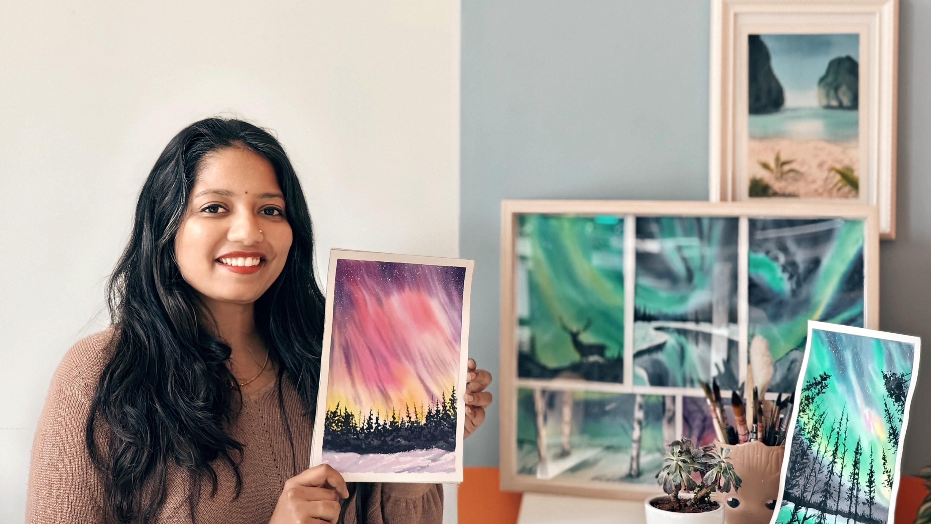
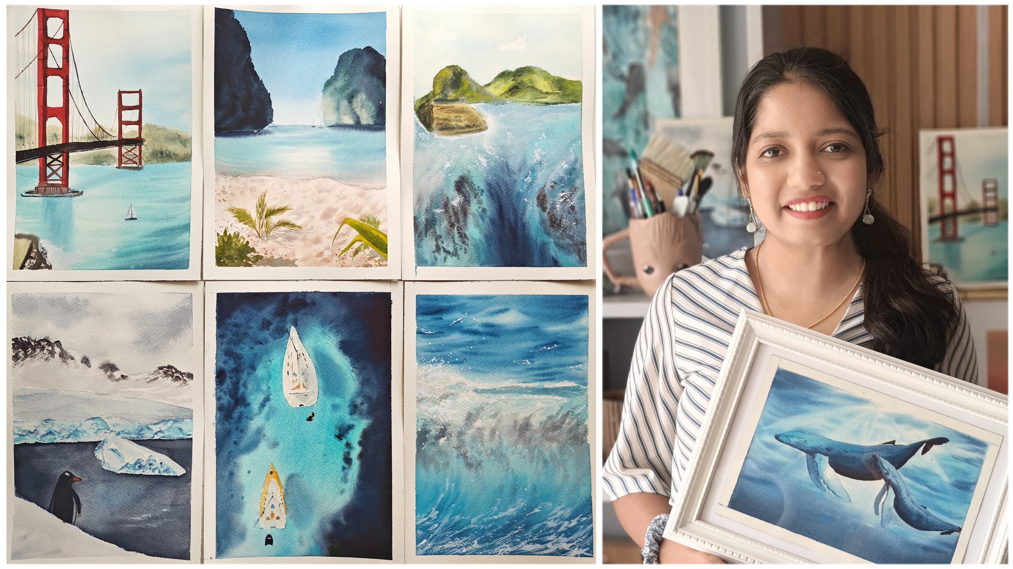
his nature into his pictures. Hi, I'm Swati, a
watercolor artist by passion and a product manager by profession based out
of Bangalore, India. I go by the handle tinted
turtles on Instagram. I welcome you into
this vibrant journey of ethereal beauty of Aurora, often referred to as
nature's own light show. The Aurora is a
mesmerizing display of colors that dance
across the night sky. Think of it as universes canvas, painted with strokes
of electric greens, deepest purples
and radiant pinks. The colors of aurora are
so livid and breathtaking, it's as if they were tailor
made for watercolor palette. Speaking of watercolors,
this medium is perfect companion to capture
the essence of the aurora. Its fluidity and transparency allow for a seamless
blend of colors, creating that luminous effect that mirrors the real thing. Plus the unpredictable nature of watercolors adds on
to our advantage. It perfectly captures the dynamic and ever changing
patterns of Aurora. Now, why is there a
15 day challenge? Developing a habit of painting regularly not only
increases your skills, but also deepens your
connection with the subject. It's like building
a relationship with Aurora one brushstroke
at a time. With my tips and techniques, you will be able to paint any Aurora band you
see or experience. For this challenge, we'll be using 185 GSM watercolor people, a steady yet versatile choice that can handle the
wet on wet techniques. We'll be exploring, gear up, grab your brushes and get started with me on
this challenge.
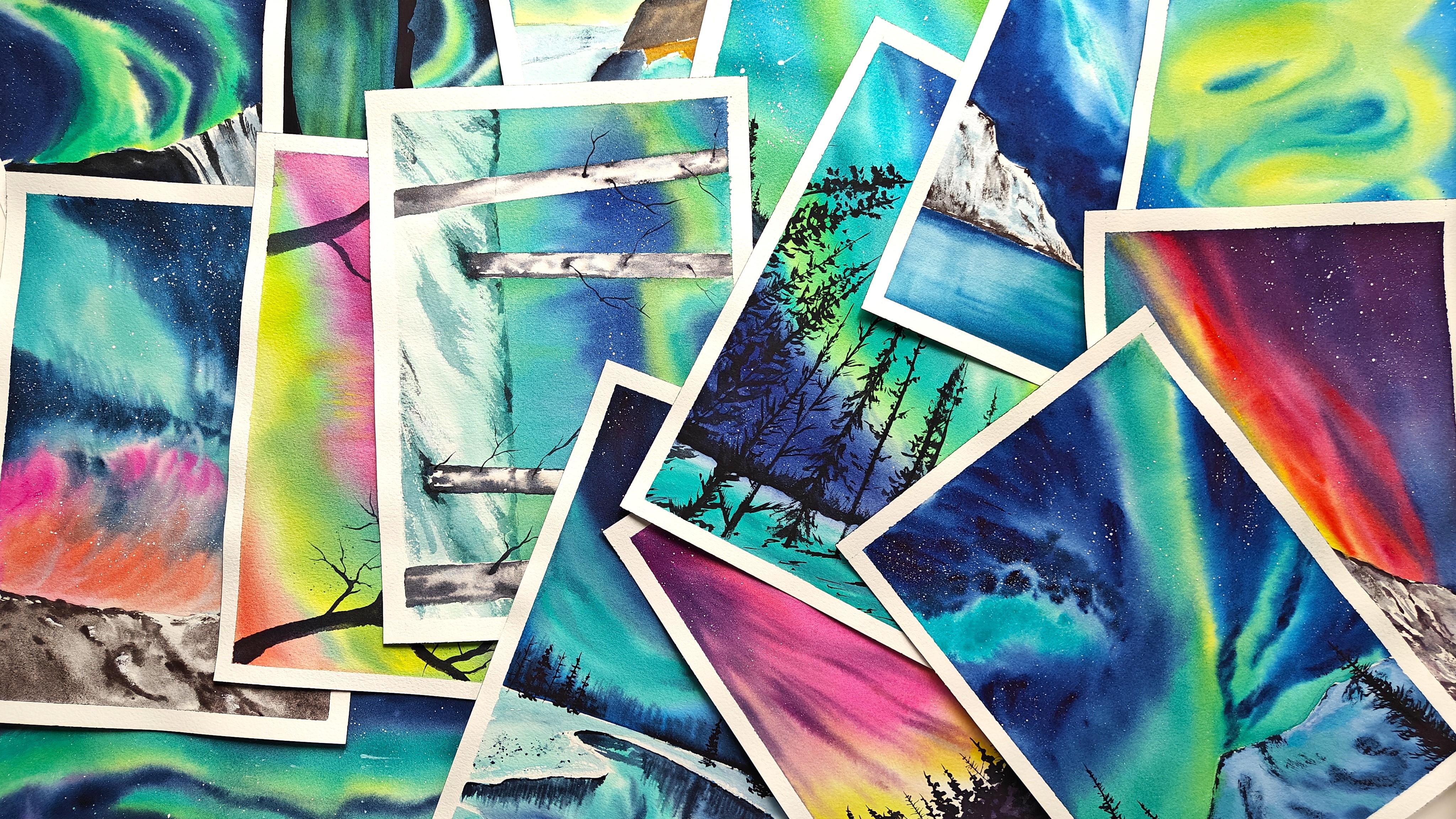
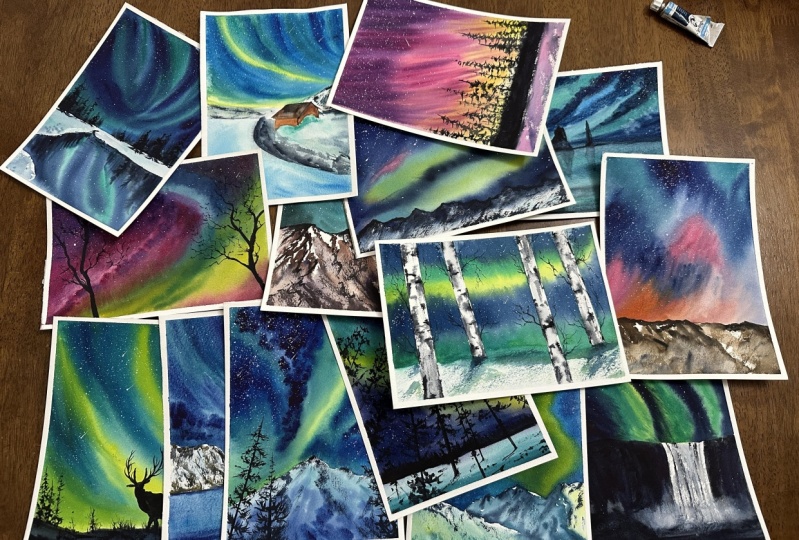
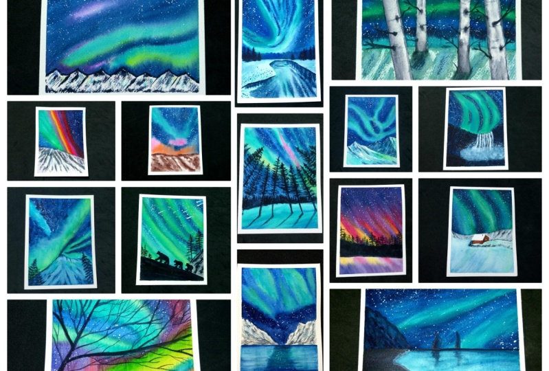
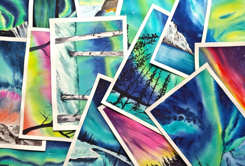
2. All about class projects: Welcome to the watercolor
painting challenge. For 15 days, we're diving
into the mesmerizing world of aurora painting in Aticolors to capture the dance of
flights in the night sky. Why? Because it's not
just about painting. It's about expressing the awe inspiring beauty
of nature through vibrant hues and all
those vibrant shades in an Aurora band. Get ready for daily
dose of creativity. I'll be uploading one class
every day, five days a week, into a journey that unfloads, gradually allowing you to savor each moment and build
your skills consistently. After the three weeks, you'll be having an
incredible collection of Aurora paintings. Each of it showcasing diverse landscape and
color combinations, unleash your
creativity, and feel free to use the colors
that resonate with you. I'll be covering all
the basic concepts and techniques required
for a watercolor painting on 185
GSM paper as well. Since 185 GSM paper is not
traditionally preferred, I will be teaching
you techniques and tips on how to overcome and use the same paper
in under 30 minutes. Daily, you will
learn how to create the beautiful and
vibrant bands of Aurora. It's a quick yet
impactful way to bring these celestial wonders
into life on your canvas. Beyond the art, this
challenge is an opportunity to build a daily habit
of watercolor painting. Let the mesmerizing theme
of Aurora be your guide. As you develop your skills and fall in love with the
art of watercolors, get ready for a journey
of self exploration, creativity, and joy of painting. Grab all your supplies and meet me in the
techniques class.
3. Supplies needed for the class: Let's look at all the supplies that is required for this class. Starting with, I
have masking tape. This is to take down
the sides of my paper. The smaller size I have
used in one class project, only this is optional. This is one inches of height
and this is half an inch. Next up, there is a
transparent block for giving some elevation for
my painting so that all the colors can
flow in one direction. A needable eraser so
that I can erase any extra or excess of graphite from the reference drawing
that I'm doing, pencil for drawing the images. Most of our projects are
going to be freehand drawing, but for some where I'm
drawing a reference, a pencil will be
required brushes. Here are some of the
brushes that I have used. This would be a flatwah
brush from Princeton, this is of size three fourth, and from Princeton, Neptune. This is very good for
applying all the washes or even the first coat
of water that I apply. It's really good
for all of that. This is a synthetic
brush of size two. You can use any other
synthetic brush. I mainly use it for adding stars or basically
the white splatters because it will not
hold too much of water and I'll get those crisp stars that I'm
looking for in the painting. Next up is two round brushes
from silver brush, okay? One is of size eight and the
other one is of size four. These are black velvet
series 3,000 They have a finite tip and it is really
helpful while painting. I preferred this and
they hold good amount of water as well as color
whenever I'm painting. This is Princeton Aqua Elite
Liner brush of size one. This is very helpful for adding finer details
in your painting. The branches or any finer
details for that matter. Okay, these are all the
brushes now coming to paint. Um, I'm using different
brands of paints here, starting with cobalt
green from the brand. They and bright rose as
well from the brand. The next up is balter cis, dark blue shadows, lemon yellow. This shade lemon yellow. I have used in most
of the paintings, wherever we have a greener
shade of aurora band. This really helps
with the blending because the sky is
going to be blue. When you're mixing that
with this lemon yellow, it forms a very beautiful, vibrant green that resonates
with our aura band as well. Then indigo, cadmium red light. Other shade is a
pastel shade called mint green that I have
used from the same brand. Okay, next up from the brand, Mission Gold, I'm
using composed blue. This is also I've used
for the band part mainly. Okay, from Schimike, I'm
using tundra violet. This is only for one of the class projects
that have used. It turns out to be a very
good granulating pigment as well for adding any of the textures that is
required from Brand Celine. I'm using dthrine blue. This is very good for painting Northern light sky because this blue resonates very
beautifully with the colors that are
used in your brands, in your bands, I would
highly recommend to use indthrane blue,
acrodone magenta. This is from Q, R. This is also for all the pink, vibrant bands that I'm using. White wash from hemi. You can use any white wash or a white opaque
watercolor as well for adding the stars
and details mainly. Okay. Some of the
other colors that I have here which are
not part of the tube, it is part of my set. Let me bring that up. Yeah. Okay. The other shades that I have used
here are carmine. Bright blue and paints gray. Okay? So these are
all the shades that I have used for the class project. You can use any of the brands of your choice or you can also take some substitutes of
these colors if you're familiar with the sky and the
colors that we are using. Okay, This is all
about the colors. Next up is the paper I'm using. Arches, watercolor paper. This is cotton, hundred
percent cotton papers. But the weight of the
paper is 185 GSM. It is usually thinner
than traditionally use, which is a 300 GSM paper. But what I've observed
is it works fine with harmony ever washes that I'm doing for these
class projects. Since the washes won't go
about two to three numbers, I think the paper retains the panes and
the water beautifully. And it works for my work, for this entire class. During the class as well, I'll be telling some
techniques in which you can make sure that
the paper holds everything properly
and how we can use the buckling of this paper into our advantage while painting
the northern lights. I'll be sharing those steps as when we go through the class. Okay, this is a cold plus paper. I'm also using a
palette knife for separating the paper once
the painting is done. Next up is mixing palette. I'm using a ceramic one
because I like how you can see that I can just
activate by adding some water and it
works beautifully. And I've also
squeezed out some of the mostly used paints
into one of these wells. This is a transparent
board that I'm using for sticking the paper. Most of the times I'm using it directly from the
arches block itself. But whenever I'm not,
I'm sticking it onto this acrylic board, paper cloth. This is very much important for removing excess of
water so that you don't get blooms from
the edges or even to remove excess of
water from your brushes. I would highly recommend to keep a paper cloth or a paper towel. Okay, and more
importantly, water. I'm using a jar of
water for this class. Along with all these supplies, I'm also using a spray bottle. This is completely optional. This helps you to keep your paper hydrated
at certain times. If I feel like my paper is
getting dry from a corner, I'll just pray some water
onto it and this helps. Fifth water controlled. Okay. You can see that it's not activating all of my pigments, but just a little
bit here and there. This avoids creating
any harsh edges. That's the reason I'm
using a spray bottle, but this is completely optional. You may choose not
to use it as well. These are all the supplies
that are required. Um, now that you have all the supplies with you to getting started
with this challenge, let's go through the basic
techniques required. I will go through
all the water color, basic techniques as well
as somewhat curated for using it on the
185 GSM arches paper. Let's get started
with the techniques.
4. Techniques: Welcome to the
techniques lesson. For this particular class, I would be mainly covering ton wet and ton dry technique
of water color. This can be covered in multiple different
sections of dry, dry, or control ton wet or
how to retain more water and mixing colors directly during the ton
technique, et cetera. I have covered it
in different ways in the other classes as well. For our current
concept, which is um, the Aurora Watercolor
Ton wet technique will be used intensively, along with all the blending and how to retain water better. Also, because we're
using a 185 GSM paper, it is important to understand
how quickly and how to make the paper stay wet for
a longer duration of time in case the paper
starts to dry off from side. How do we manage to
keep it wet without forming any watercolor
blooms or any harsh edges? I'll be covering those
concepts a little bit during the lesson. To get started with
the wet wet technique, I'm going to take some
water and apply it here. This is a technique in which
the paper is wet as well. We will be using the paint, which will be in its wet form. That is, it will
have water in it. The pigment will
have water in it. Okay. I have applied water
for watercolor paper. This is a cotton paper. The water needs to seep
into the paper so that it can retain that water and stay wet for longer
duration of time. What happens when we
get more time to paint? What happens when
we get more time? The painting becomes easy,
blending becomes easy. The pains that we apply, they blend together easily without forming any harsh edges. That's why retaining of water becomes important in the
watercolor technique, I've applied water and I can see a light thin glaze on my paper. In fact, I am seeing
more than a glaze. Okay. With this consistency itself, I'm going to get started, I'm going to show you
all these techniques with the shades that I'll be
using mostly in the class, one of which is in
the threin blue. Okay, So you can see that here
I have not applied water. As soon as I come in touch
with water, how it disperses. Right? This is the
ton wet technique. I have water in the paint, I have water on the paper. Once it completely dries off, we can see a very
smooth blending between the paint and paper. Now let me just show with
one single color. Okay. If I want to add more depth, I can just keep on
adding more values of the same pigment
wherever I need depth. Okay, so this is Ton T. Now for the controlled Ton wet and how to retain water and
how to do the blending. I'll show all that
in this segment. Again, I'm applying some water. Okay, so next up, control on technique in
which I will apply water and I want to retain some of those sections or some of the breast strokes
that I'm applying. Say for example here, even though I applied A.it got merged completely
with the background, right? But I do want to maintain
it and retain the dot. This section, I'll keep
it for showing control. Ton, I let it dry for about half of
it and then come back. Now for blending techniques. Let me start with
the lighter shade. I would start with
a lighter shade, something like
lemon yellow. Okay. Next to it. Another color. Just for the sake of showing, I'm taking the same
colors of the band. I'm taking some of cobalt green. Okay. I'm applying
completely here. And the next color I would
take is composed blue, a darker shade. Okay? Now, this section of the
paper is very small, but our actual size of paper is going to be double the size. Consider that from
one end of the paper, the water has
started to dry off. Right, until you complete
adding the bands, it has started to dry off. In such cases, what
you have to do is do not worry because you still have to
finish your band first. Now I'll start with
adding more of water onto the next colors here. The water has started
to dry. Okay. With more water on my brush, I'll start bringing that in. Okay? And I'll bring it here. You can see that here
there was more water. So I need not have
this much dilute water here and keep it everywhere. Okay. Now, I do not want all these
strands that are coming. What I would do is I
will take a paper cloth, apply some pressure, and blend these color
directly on the paper itself. Again, remove all
the excess water in a brush onto a paper cloth. Apply very gentle
pressure and mix these. Take those excess paint onto
the paper cloth as well, and continue to
repeat this process. Okay, Say here, let me cover up the
controlled wet on wet. Now the paper is damp, it is not having
too much of water. Say I want to add a tree here, You see how it is not
spreading too much. Even if I paint a tree here, it will make sure to retain
that tree structure, whatever we need in order for you to get beautiful
Aurora band linings. You can follow two approaches. One is to place your
paper in this direction where the blue that you will be adding will
mix into the green. But sometimes it
might merge too much. What you can do is when
the paper is still damp, you can, with very
swift motions, add these breast strokes. Okay? You can follow
this as well. Okay? So the next tower
technique is wet. On dry, the paper
is completely dry. Right on this, we are going to take some paint which
will have water in it. So that is the wet part and
we will start to apply. Okay? You can see that here, the intensity of these colors
are much brighter than how this will end up. We can use dry for blending the pigments asphalt
directly on the paper. Like how I'm showing
here though, I have not used this technique for adding any of the bands. I have used this for some of
the mountains or to cover up the other elements
of the paintings. Okay, it is extensively used
to add the finer details or the landscape part which is usually a silhouette
in these paintings. There you can use now,
even within this, the techniques which is used is Db stroke and the stars as well. For Db stroke, say you have good amount of
painting in your brush. You have started to paint, you see all this water. This has to completely cool. This is basically
also called as dry. On dry, you have absolutely equivalent
to no water in your, or the paint also is too much concentrated and your paper
also do not have any water. In that case, you will get
these beautiful strokes. This is nothing but
all the tooth of paper that has been highlighted
by pigment in your brush. Okay. In order to test, you can always use a paper cloth to
check if you have obtained that consistency and then go about doing
it on your painting. You can also use a
synthetic brush for dry brush technique because
that is much easier. Whereas in this brush where
it is squirrel brush, it will be a bit difficult because it retains a
good amount of water, which is actually
a very good trait. But for just this
technique alone, you can go ahead and use it. Once all this is added, you can still use
a spray bottle. Just spray like this. Now, what happens
where initial stroke, initial pigment where added? It will still retain
but disperse on a very limited quantity into wherever the water
has been sprayed. This also gives a
very good texture once the painting is complete. You can use this for
adding mountains, terrains, wherever you want to show some of the
terrains on mountain. You can add these B strokes
first and then some water. Then it will beautifully
merge with the background. You don't have to redo
the terrain part again. But since having a spray
bottle is optional, I am not using this
technique a lot. Okay, the next step is stars. I have used white
wash for stars, but for techniques
purpose I'm going to show with help of
the blue itself. There are multiple ways to get
few people use toothbrush. Whichever way is
comfortable to you, I would recommend
you to do with that. But for me, how I do
is I'll take a brush. It is having a good
amount of water. Okay. Now I will start to dab
on this part of the brush. I see that the stars
are splattered. Now, if I want bigger stars, I can take a bigger
size brush or more water in the brush and
it will form bigger stars. But it just looks bigger. But once it dries off, it will again dry
with a diluted, um, state itself,
it will be lighter. What you have to do if you want a bigger star with a
concentrated pigment, you have to switch the brush
to a bigger size brush. Now, this type of splattering
happens randomly, wherever the water wants to go. If you want to do a
controlled splattering, what you can do is take
some paint in your brush, take the help of another brush, and now you can control
where you want to add. Let me just for trial purposes, I'll add this line and
I want to make sure that all my drops stay
within that. Okay. Now I'll take another color. Okay, Now I go a little bit nearer to paper and try to maintain in
those two lines itself. You see I'm getting
very tiny stars, which is very important because in this kind of aurora or
northern lights painting, you see very minute stars
which are very far away. Adding this definitely
helps your painting. Say if you want a
bit bigger star, I'll take more
water and continue the same very carefully. I'll first observe where
it is all going, right? Then if I do the same, if I just try to
dab with my hand, you can see it can go anywhere. Right? This is one se that I use. You can try out that as well. These are main techniques that I have used in all
of the paintings. In this challenge, you can practice some of these with
different color combinations. But mostly this particular
band color that we have used. I'm going to be using it a lot. Even if your blue
mixes with the green, it is totally fine
because that is expected. Definitely practice all this. Let's get started with our
day, one of the challenge.
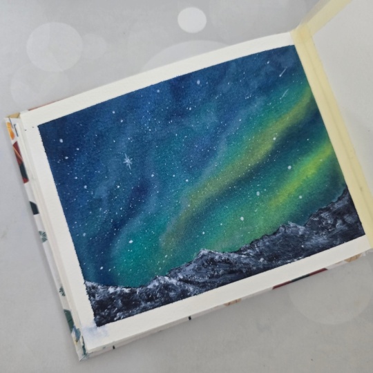
5. Day 1 : Mountain Chain: So I have the paper block here. I would start by covering four sides of the paper
with a masking tape. So I'll go in a clockwise or anti clockwise direction because I feel then it's easy
to remove as well when we are done
with the painting. Okay. Is it straight? I believe so. Okay. So I have taped it
down on all the sides. Now, next step would be to first apply lots
and lots of water. Before that, I'll take down all the colors required
onto my palette. Okay, to get started, it would be a free
hand painting, so I'm not drawing
anything here. Now. I'll start by
applying water onto paper. I have a spray
bottle for seeing. You can use just the brush
and water that you have. Okay. Once this matter is here, let me even out this water to create some elevation. I would be using a
glass block here. Okay, This looks good
to get started with. I will be using the lighter
sheets in my paintings first, so that would be a little
bit of cadmium yellow. Okay, this is one of
the Aurora lines. And the next one is here. Okay, on top of it, I would take some compose blue and cobalt green. I'll run it along the same. This is cobalt green
that I have taken and it is in a very much
liquid consistency. I'll run it along in
the same direction, mixing it with this cadmium
yellow that I have added. Okay, on top of it I
will add compose blue the same here as well. Okay, once this is done, I'm going to take
a good amount of indithrain blue
and mix indigo to it and start applying it
on all the other sides. You can see that a paper is
drying up at some places. I'll again use spray bottle
to keep the paper, we taking some more X. Okay, So now, once this
sort of layer is over, what I'm going to do next
is I'm going to spray water randomly so that all the pans merge with each other without any harsh
edges beautifully, and we get a very
nice transition. Okay, the water is not running means it's
not too much on my paper, but it's in good amount
so that it can make all this mix with
each other nicely. In order to add some contrast, I'm going to take a
pastel sheet, pink here. Okay? With this, I'm going to add to make some more carmine
onto it, okay? And here as well, wherever
I have this white, a little bit lighter sheet, I'm going to add it here. You can see that here the water is too much and it is flowing. In order to avoid the creation of a crease or a line on here, I'm going to tilt my
board in such a way that I'm going to tilt my board in such a
way that it doesn't form a crease and just flows neatly. And u gets mixed with all each other. Okay? Now I can also take some extra color here
where I feel like there is too much
of blue and mix it. Now I'll take some bright
pink and just give a little bit of nunca. Okay, we have to do this until all
those water collection that has happened moves across and creates a complete
flatly on the paper. I think this looks good for now. If there is too much
of water as well, what you can do is you can
lift off some of that water. So you can take your dry brush
and lift it off like this. Okay. So I'll place
it again here. The next step is my
paper is still wet. I will take a
smaller size brush, this is size four, and try to remove all these harsh edges that
are getting created here. With this fifth kind of motion, I'm going to there is little to no water
in my brush in fact. Okay. So please be mindful of that here what it has
already done its work. I'll not touch that much there here I feel I
can mix a bit more. Take some more of
the mix that you have and you can add it here. You can do this only if
your paper is having water. If not, I would
highly recommend that you just stop however
it is looking. It is Northern
lights, so of course, it will look gorgeous
no matter what. Okay, so now that
this is getting, I would just draw what I would say I would
just draw the outline of my mountains here, so. So now with this outline, I can just add more
paint wherever required. If somewhere it's dried up, I would be more cautious
on that part for sure. Okay, this looks good. I'll take a very thin
wash with the same brush. You can see how diluted it is. With this, I will be adding
random strokes here. We can definitely come
back once it's completely. But I do want this soft edge
for the mountains as well. After a point, I'll also take cobalt green that we
have used so that we can depict there is a reflection
on the snow that's happening from these
northern lights. Okay, so this looks good. Let's come back once
it's completely dry and see what
can be done next. Okay. If the paints are seeping in onto your
mountains, don't worry. We will just cover it up
however weight that flows. Yeah, let's come back
once it's completely dry. Now it's completely dry, I'll just go ahead and
add the mountains part. For that, I'm going to take a smaller round size
brush of size four. Okay, I'm going to take
some paints, gray or black, whichever that you have, and mix it with a little bit of the
mix that we have here, which is in the thin
blue and indico. And I'm just going to
add the mountains, you can see that already. The lighter shade of snow that we have tried to
show is already there. All I have to do is add the
dino texture on the mountain. I'm going to do a semi
dry brush technique here based on how all these
shades have turned up. You can randomly
change the way that I'm adding these terrain. Okay, It doesn't have to be exactly similar or
something like that. Wherever there is
some good amount of white space like
this one here. I have not added the boundary or the outline, so
keep it that way. It looks good once the
painting is complete. If you have a lot of paints
that has come down over already and you don't have this much white tone,
do not worry at all. Just take white guash and add all these highlights later on
onto your mountains, okay? Okay, so this looks good. Now for the last
part, it's the stars and I'm going to take a
synthetic brush here. Okay. For stars, I would be using pastel shade of
watercolor or white quash. Okay, let me do both. For starters, I'm going to take some white quash onto my brush. I'm taking directly
from the tube here. Okay, dip it in some water
and start with this plating. You can also splatter
using a toothbrush or any other way that you
are comfortable with. In fact, I have shown there
is a detailed lesson in the Milky Way Galaxy
Project Skillshare class, wherein I teach how to easily create all these
stars using toothbrushes. Okay, more the water
in your brushes. It actually dries up a little
bit darker, I would say. Once all these stars are added, I'm going to just
remove a few of these from the top of my band. Okay? Just it because they are still there
but behind the band. Okay. Next I'm going to mix it with the mint color. Okay, this is mint
water color shade. This is a pistol shade, and I'm applying stars. For the final one, because
I want more minute stars, I'm going to just
take another brush, and this is a controlled
way of adding stars. Okay? So take some more, okay? And here, since
this is a big one, let me just add a
shooting star as well. Okay? So this looks good for me. And if you need any additional highlights with white course, you can add it on
your mountains. But for me, this is
looking pretty much good. So now I'm going to
remove the masking tape. And this is the last of the
table that I had added, so I'll remove it from this end. Okay, this is done. So let me open up
the block here. I'm taking a palette
knife for that. Be very careful because
this is 85 GSM paper, so it is a bit thin. And you can see that it's not completely,
like, crisp, dry. It needs a day, right? That's why be very careful so
that you don't tear it off. In fact, you can remove it
after it's crisp and dry. So this is the final
painting of how it looks. We can see that even though the paper thickness is 185 GSM, I think it worked out
pretty well in this. Okay. Make sure I love the colors in this. Has a touch of pink and the other classic
aurora colors in this. So once you are done
with the painting, I would really request
you to upload it in the project section
so that we can all see and admire your works. If you have any other
doubts or inquiries, you can reach out to me on
the discussions as well. Meet you in the next class
with another project.
6. Day 2 : Aurora Swirl: Welcome back to the
next class project. In this we are going to
paint another mountain. Highlight of this
particular painting would be the shape of aurora
that I'm planning for. It's going to be one single band but spread across almost
the entire sky part here. I'm excited to see how that
would turn out. In the end, I'm going in one
particular direction while applying the tape so that it's easier for
me to remove as well. Okay. This looks good. So this would be primarily technique entirely even for
the mountains this time. Let me first the reference, just the outline
for our mountain. This part I would
be covering with the mountain range here. There is one peak
of this mountain, this is completely
covered with snow. You can see there is
another mountain a little bit in the background that
will start from here. Here, I have kept
it a bit straight, you can see from there itself. I will go ahead and this is the entirely smooth
surface on the mountain peak. Okay. Yeah, this is good enough
now to get started with. I will start with
the sky part first. I'm taking a spray bottle
and applying water, I'm not applying water
onto the mountains part. Now with a flat brush, I will start to spread the
water that I have sprayed. And continue this
until you feel that the water has seeped in
completely onto the paper. And you can see a
very thin line, shiny layer of water on
the surface of paper. Okay. Since this is 185 GSM
cotton paper that I'm using, I would be careful not to
over do the water part. That is, I'll not
add excess of water, but I'll keep adding
water whenever required with the help
of a spray bottle or along with the paints itself so that it doesn't get
completely dried off. Okay, I would need
some support for all this Northern Lights band to neatly flow in one direction, but that would not
be in the middle. Usually we keep it here, right, so that everything flows in one direction. That
is towards down. But for this
particular painting, my entire Northern light
will be starting from here. It goes onto a beautiful swirl. There is a complete
blast here on top. I would keep it in
this angle a bit, just so that I can get some additional lift that
is required for the band. Okay, adding some more water. Make sure to add good amount
of water in the edges, mainly because that's
where it starts to dry since I'm
following the approach where I'm adding lighter
shades first and then I go on towards the darker shades
or the sky shades. The end of my papers tend
to have dried up by then. Okay, for this, I'm going to start by taking some
lemon yellow itself. I'll just draw that big swirl
that I was talking about. It is going to start from here. Okay? It will be this, I would say the entire sky. I'm just adding a little
bit more paint here. Okay, next up, I'm going to take cobalt turquoise
and add it long. Okay. Next I will take
some walled green as well and just add to the top part here as well. Okay, Next up I'll take
some composed blue. Okay. This also I'll
add just to the top. Okay. Now I'll quickly get started with painting the
other parts of the sky. First to get started with, I'm taking good amount of
bright blue or intense blue. And I'll first add
that entirely here. I'm making sure to not mix it completely with the
lemon yellow that I have adding for the
upper part as well. And here also. Yeah, I'm adding for the curves
in this will as well. I'll gently mix it with the composed blue
that I have here. Okay, now that one
layer is over. Next up is I'll take the
stray bottle and Okay, with this, I let
water do its magic. In the meantime, I will take
a smaller size brush and try to add wherever
blue is required. Okay, now I'm going to take this flat brush and remove
excess of water from it. And take some water and just start going in this particular swril motion
which we have created. I can see how I'm twisting my hand in the same
direction itself. I'll remove this
green that is on my brush and repeat it again. Remove excess of water, and I'm not applying
too much pressure. If I apply too much
pressure, what will happen? I'll show in a while. I'm just very swiftly moving this across. Okay. If I move too
strongly, what happens? There will be a white scene. This will get created and we
don't want that to happen. Okay? Okay. Now, very quickly,
I will just make sure to see if there are any other corrections
I would need to do. So I'll take a smaller
size brush and take take some lemon and see if I need to add
highlights anywhere. Okay. Now I switch back
to the bigger size brush, taking some bright blue because that's the only colors that we have used for the sky. Right? I'll just increase
the intensity here, if you can see that
here the paper is. Almost right. This was a good
time for me to add. But if it was completely
dry and I'm adding, that would have
created harsh edges. So be careful and add
it only if your paper is semi wet or having
some water in it. I'm just fixing all this here. Just take some more and make this curve
a bit more evident. With this, you can try
to define the shape, even any other shape
that you like. Removing excess of water. And slowly with
not much pressure, more pressure, you'll get that white grease,
which we don't want. Now, I'll take some
compose blue and okay, this looks good. So I will wait for
it to completely, I see that there
is too much water here on the masking tape. And while drying, it can
go back and create blooms. We don't want that. I'm removing all this excess of water here. Okay, this looks good. I wait for this to
completely dry and then come back for painting
the other parts. In fact, I think here this
is completely dry, is it? Yeah, I can get started. I'm taking a small brush
and very carefully applying water only to this
surface which is here. That this flat surface. Okay. On this, what we have to see here is
this is a reflecting surface. This part of the mountain. This is the reflecting surface. It is reflecting these
aurora colors of it. This particular mountain
range which is here. This is particularly in shadow, which means it should be beat. Any color of sky
that you're using, you should use a darker
tone for that here. Okay, So now for this, since this is a
reflecting surface, I will take this
compose blue a bit and add it here. I'll take
some lemon yellow as well. The same should be
done here as well. So carefully I'm
going to apply water, making sure that it
doesn't come in touch with this particular space here. I'll take cobalt green for this and start adding
it randomly here, now some composed blue, and add that as well,
and finally, mellow. Now I want to take
of our bright blue. And the same for death. I'll also make sure to leave
some white spaces here so that we can see some snow settlements
here and there snow, obviously everything is snow, but fresh ice settlement
here and there. For this part, I
would like to add a darker shade of
this blue here. So what I'm going to do is
take some intense blue, add a bit of compose blue to it, some more intense blue. I'll start from here. I know using a bigger brush would have been
much, much easier, faster, but I want to be very
crisp on this details here. Okay. Onto this I'm going
to also take some indigo. Add it to the edges. It will create the depth that
is required for us here. Okay, so the same indico color. I'm also taking and
adding it here. I'll remove all the excess
of paint from the brush and just adding it randomly
at some places. I'll remove all the
success of, uh, paint here on the
masking tape and keep the same in, um, indigo, we have to
add here as well. So adding details like this gives it a very
good texture in the end. And we get somewhat
realistic paintings without just the plain blue
color or green color added. I'm happy with both
the mountains as well. All that is left is
adding the stars. Okay, for adding stars,
what I would do, I would take a smaller
size round brush. This is a synthetic brush. I'll take some white quash. I like to squeeze out the fresh
batch of wash every time, but if you are
comfortable using the existing from the pants
or anywhere else, you can try your
preferable way as well. I'll take the heck
of another brush for all the minute stars
that I need here. I will remove all these white
quash from the mountains. Okay, I'm happy with how
this has turned out. And after completely drying, if the starts here
gets a bit dull, I'll add one more layer of star. But for now I think
this is good. So let me start to
remove the tape. There is some water here
on the masking tape, so I'll remove it with the help of tissue paper
before peeling it out, because I don't want that to
come back onto my paper and create any more
blooms from the side. Right? So this is how it finally looks. This is how it finally looks. In case you're painting
along with me. Make sure to post your works in the project section
on a daily basis. I will love to see
all your works and all your color
combinations as well. I absolutely love how
this rill has come out and this combination
is my all time favorite. Thanks for joining me on this class project and see
you in the next class.
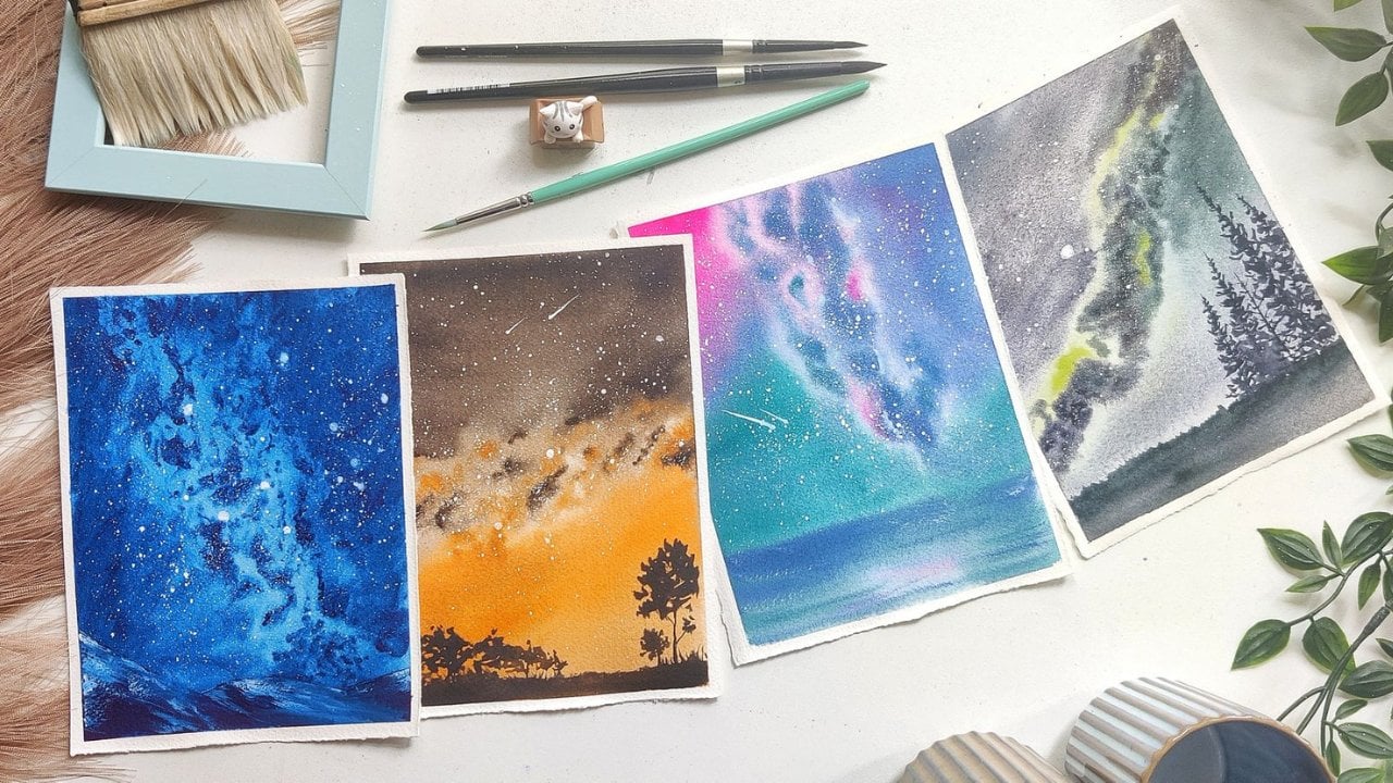
7. Day 3 : Milkyway Aurora: Welcome back to last project. In this we're going to paint a very simple
mountain range with pine trees and a beautiful
sky with a twist of So with the twist of
adding a milky wave band. Yes, that's right.
A milky wave band along with northern lights. If your question of this, I have seen photos and definitely I believe as
a natural phenomenon, it is possible, but there might be some
edits, et cetera, done. I'm not sure if it is visually available to see with our eyes. Okay, this looks good. I'm going to keep
some elevation here, so I will use a
transparent block. Okay, this looks good
for rough sketch. I'm going to draw a
simple mountain here. Okay? This side we will have all the Northern
lights coming in. From here to here, I would have a Milky Way band. Okay, so to get started with, I will apply water with
help of a spray bottle. Okay. Next I'm going to
spread this water with help of my flat brush spray bottle
is completely optional. If you want to use, I just keep it handy for this particular
painting because we will need to add retting the paper at certain
places I'm using this. If you are using 300 GSM paper, you can just apply
good amount of water, any number of codes. You may not use the spray
bottle at all altogether. Okay, this looks good
to get started with. I'm going to start with
lemon yellow for this. Okay, here entirely, I
will add lemon yellow. Next up as well, I'm going to take one
straight line up until here. Okay, next I'm taking some cobalt turquoise and adding it here. Okay, next up I'll
take some cobalt green and run it along
the pant as usual. Okay, next step, I'm going
to take composed blue and just mix everything here. I'm going to extend this
as well a little bit. Okay, I'll switch back
to Mike Walter Coy and add a small layer here. Okay, this looks good. Before I come back and
fix the other places with different tonal shades, et cetera, I will get started
with adding the sky part. Okay, for sky, I'm
going to use mix of bright blue and in blue. Let me first take it. Okay. This side,
wherever I had to cover. Just a little bit.
Here and there I have covered with right blue. Now I'll mix it
with dithering blue and just start applying it here. Here you can see that
I'm applying it in the straight lines itself so that even when
the paint dries, I can get the band
effect with this. As soon as I come here I will. So curve the brush to go in
the direction of the band. I'm just going to extend
this here a little bit. That now that the
paper is semi dry, I can add additional clouds
or other textures onto here. I'll take a small brush and remove excess
of water from it. And this movements here. Okay, I'm going to
apply some water here. Okay, this should be good. Now for the Milky Way band, I'm going to take
dark blue shadows, because it gives
me a darker tone. And start adding it here. And end it right about here. Okay? Even that gets lost within this curve
that we have here. What you have to do
is I'll switch to a smaller brush so
that it's easier. I take good amount
of this paint and start to add it randomly
at places here. You can see that I have left some wide space and
that's on purpose, so I'll just use that negative
space and add it here. Okay. Now I'll switch back to dethrone blue, but stronger mix, not too much dilute and just try to mix it along. This one here can see that when I'm going
nearby this curve, I'm reducing the
pressure on my brush. This helps in two ways. One is the mixture will be very much lighter in shape because I'm not applying
too much pressure. Also, it will be very thin, giving us the illusion of the Milky Way band getting
back into the horizon. Okay, I'll just take
some more in death, in blue and come
back this side for adding a bit more depth. What I'm doing here
is just applying pressure like this,
when it dries off, it won't be too dark, but it will definitely
give us the illusion of some clouds, structures
happening there. Here I can see definitely a bit of space, so let me add some. Composed blue. Okay,
so this looks great. It's just that here I feel there is too much
of a thicker band. So let me see how
I can manage that. Next up what I'll do is I'll
just try to merge these all together so that there's a very smooth transition.
We're here as well. Okay. Okay, this looks good. I'm happy with how
this has turned out. Just for this last
bit of darkness, I'm going to take consistency
of endthrine blue and just add it to the grooves
of my milky way band here that once it
completely dries, we can see a very
beautiful transition from the groove to
the other sides. It creates a outline where I
can accumulate more stars. Okay, until the sky dries off. Let me start with the mountains. For mountains, I'm going
to take the same mix that we had that is bright
blue and dothrine blue. But add a and a lot of
water to it, basically. Okay, This is good. Now, I need to make sure
that the paper is a bit dry here before I start because I do not want the
paint to merge back with this. I'll be very careful of that. Okay, I have an
outline here now. Just mixing it with just lots and lots of water. Okay, of course, here also we need to add some
additional depths, adding a little bit more
pigments in the borders. Okay, next up, I will take
our dark blue shadows and use the granulating property of it to add very beautiful
textures onto my mountain. I'm just adding this randomly, but I'm making sure to
press my brush in at certain places so that
once it dries off we will get some
granulation over there. Okay, so I'll take a
smaller size brush and dab off excess
of paint water from it and just merge it with here. This is very controlled
way of doing because we won't have too much of paints on either
of the sides, so it is good. At some places I would like to add some reflection
of the band as well. I'm taking composed blue and Adding it here and there. When this is very
dilute, I must see. Okay, so for this style, I'll take some bolter cols and just add it
here as highlights. Okay, this looks good, and somehow there is
a big drop of water, so I'm just removing it. Okay. Overall, this
looks very good. I'll come back once the
paper is dry in order to add stars and even some
texture on our mountain. Now this is completely dry and I'll start to add stars first. For that, I'm going to
take a round size brush, which is a smaller size
brush, a synthetic brush. I will take some
white wash onto this, directly from the tube itself. I'll start to add wherever
there is blue sky. Okay, I'll take a pot off, another brush to add. Okay, I'll take some more. Okay, now for this
Milky Way band, I would need a lot of stars. So I'll dip it in some more
water and take it nearby. This first let me try. If I'm getting tiny
stars. Yes, I am. I'll take it to here and start adding the stars. Okay. You can see that it's completely in this direction itself. Okay. I feel like I would
need more stars there. But let me first cater to the mountain and come
back to that later. I'll keep it here for mountains. I'll take the smaller size brush and I will add some
texture onto it. For texture, I'm going
to take indigo itself. I'll take this paper
cloth and remove excess water from it. Here, there is still
excess of water. Okay, so now starting from here, let me just a bit of
texture here and there. This is purely dry
brush technique itself. Wherever I had initially
added dark blue shadows, only there I'm adding this
texture and not to completely, just some places to show more depth or grooves
in the mountain. I'll go along this
outline as well. You can see that it looks
like there is a slope here. Right? And that's
exactly what we wanted. Okay, for the tip, I'm definitely
going to add more. Okay, this looks very good. Now, I do want to add
one pine tree here, the side it is looking
completely plain. I'll take some more indigo and mix it bit
with blue as well. And start for a pine
tree here, I would say, from here, starting
up with a tiny point, next few lines here. Then I'm first drawing the outline for my pine where
all the boxes are coming. Now, for the other places, I'm just extending a
little bit here and there. First completing the Yeah, this is good. So now I'll add the
other parts as well, extending a little
bit here and there. Just make sure to not
make this one bigger than though languages below. Okay. So this is one of
the detailed pines I'm painting in this series. I'll add one more
small one here. You just have to practice with the strokes of how
they are coming up. It is a gentle swift
and the brush, I would highly recommend
for you to practice it on some other paper before directly coming for
this detailed pints. Because you just have
to make sure that every branch is coming
somewhat similar. Whichever way you take, be it round edged pine trees or the pine branches that are going downwards like a Christmas
tree, anything is fine. All you have to do
is just maintain that particular
rhythm throughout. Okay, I'll take
some more indigo. I do want to add one more here, so let me just go
ahead and do that. I'm just making sure that
the triangle that I had drawn before is not
completely visible. It should be randomly, just
branches coming out of that. Okay. So this looks good. Even the stars that
I had added has dried up and they're
not lighter. So I'll go ahead and
just add a few more. Okay. Now I'll take
support of another brush. Okay. So this is it. Now, I'll start
with the tape peel. I do love the Milky Way a lot, and this is my first
Kilshare class, even that I have
published last year. If you're interested,
you can go through that. It does follow a very
interesting approach of crawl, walk and run, where you will be painting first painting with
just one shade and the second one
with two shades, third one with three shades, and the fourth one
with multiple colors. This definitely makes you understand the entire concept of the paintings with monochrome up until using multiple
colors for your painting. So you can give it a try if you're painting
along with me. I would love to see all your works and your different combinations
that you are using. So make sure to post it in
the project section as well. If you have any further doubts, you can reach out to me on
Instagram or on Discussions. Okay, so this is
our final painting. I just love how beautiful this
Milky Way has turned out. Okay, see you in the
next class project.
8. Day 4 : Cosmic Night Sky: Welcome back to
next class project. And in this we are going
to paint a mountain with some beautiful colors
of aurora in the sky. It also includes other shades
like red, orange, pink. Let's get started. I will
start to take down my paper. One thing different
in this painting is the colors that I would
be using for the sky. I'm using granulating pigment, but you can definitely go ahead and use the
existing colors that you have and not worry of the
perfect shade that I'm using. If you follow me on Instagram, you would know that
I love to explore different works with
granulating pigments. How I can use, where
all I can use. And this is recreation of one
of my existing paintings. Actually, because I
truly love it a lot, I thought of, why not teach
that to you guys as well. Okay, good to go. First up, I'll start by applying some water
onto the paper. Before that, let me just do
a very quick rough sketch. So there will be mountains, much is the mountain
ranges that you can have and this entire
part is for the sky. Okay, so I'll start applying water and won't apply
onto the mountains part. So for the sky, I'm going to use dark blue shadows
from white nights, and this would be my
granulating pigment. I'll mix other shades with
this as well if required. Okay. So to get started with, I'm taking my round brush and I'll create some
elevation here so that the pines all flow in
one single direction. I'm keeping my spray
bottle handy so that I can keep
spraying water onto the corners wherever I feel that the pines and water
are getting dried up. To get started with,
I'm going to take some cadmium red light
and apply it here. I'm applying this in this curved direction
that once it dries off, you feel like there is a
aurora band that is going in, uh, this angle, okay? It's coming towards you, kind of white, big heat with
it. So I'm applying that. I'll take some of bright pink and apply
that as well here. Okay, Next up I'll be taking
cobalt green and add it, you know, next I'll take some composed blue as
well and add depth to this. Okay? And I'll just extend this in this fashion. Okay. Now I'll take this
dark blue shadows, it's a gorgeous sheet, I must say, and
start applying that. You can see that here I am. Just with a very gentle touch, I am bringing all this back on to this band
that I have here. I'm just doing that. Even on top, I'm doing the same. Okay. And for this
I'll be doing the same with some little bit of
cobol green in my brush. I'll take a small size brush, take some bright pink, and add these bands
at the distance. Okay? The same with dark green, dark blue shadows as well. Now I'll take, I'll start
to lift off the paints in this direction. Once I feel that the paint
here has started to dry, I'll come back and extend
this strands over to here. I'll take some more of
cadmium red light, and now I'll take some blue again
on my brush and just go on these both colors here, okay? Extending this here as well. Okay, looks great. I'm happy with how
the sky has turned out before adding stars to it. I let it completely dry. Now coming to the mountain, let me apply some
water onto it as well. I'm just applying water onto
the parts where, I mean, I'm leaving a wide space
here and not applying water to the entire
part because I do not want the paint here to go
back and mix with the sky. Now I'm taking another
granulating pigment, Blood stone, genuine, and applying it here. You can use burnt
umber or CP as well. For this just with some dry brush, I am trying to
cover the outline. Okay, this looks good. So I'm going to wait till
this completely dries off to add some stars and
then we should be good. Okay, now this is dry. I'll start by adding
stars onto it. Wherever there is blue, I'm going to add more stars
for the other places. Also, only for this painting, I'm going to add stars
throughout the sky. Okay, I'm going to
take a round brush. This is a small one of size two. I'm taking some
white quash onto it. Again, dipping it in some water. And splattering stars, this kind of a splattering. I'm getting somewhat good drops. Okay. And once I'm
happy with this, I will dip again in water. Take help of another
brush and start, so this has more water in it. So they will dry off a
shade lighter, I would say. Taking some more white quo
and continuing the same in this place. You can also add a MilkyV band if
you are interested, when that is possible. Okay, looks good. Now I'll continue with the
white and add some snow here. With pure dry brush technique, I'm adding there
is less water in my brush and I'm just adding
some texture here and there. I do not wish to use much
of whiteh because I feel that it doesn't
well with my style. But definitely you can add white as highlights in your
other works as well. Okay, so I want to add more
of stars for this painting. So let me take and Okay. So even though I had told that this is recreation of
one of my previous paintings, I can assure you that it has not come exactly similar to it. And that's the beauty
of watercolors. Whatever you paint
each and every time, even if you are trying
to paint your old works, you will learn
something different, maybe because of
the difference in paper or difference in weather. There are so many
parameters to it, and I love how it always produces a different
style and texture. Every time I recreate, let me show the granulation
here. If it's visible, this is the final product. I definitely like how it looks. It has the granulation that is visible here
very beautifully. Even the mountains
have a certain good amount of granulation. If you don't have
the same color, you can just use
indico or dithrine blue instead of
dark blue shadows. Even for mountains, you
can go and use Sapia. I'm excited to see your
work in project section, so make sure to post there and see you in the
next class project.
9. Day 5 : Aurora Peaks: Come back to next class project. In this again, I'm going to be painting in the portrait mode. So let me start to
take down the paper. This is another one of the mountains that
I'll be painting, but it will be having a lot of beautiful colors and I'm also using red in this
particular painting. It's interesting
for me also to see how the end result will come out because some of it is definitely just
in my imagination. Right? Okay, so this is done. I would start by
drawing a rough sketch. So there is one big mountain that we are seeing here. Okay? And I'll just draw the
slopes of the mountain as well so that when I'm
painting I know where to add, which kind of breach strokes. Okay. This looks good
to get started with. Let me apply water. I'm using a spray bottle here. I'm applying water only
to the sky part and not towards the mountain. I applying good amount
of water because I want the sky to be completed
within the first layer of tone technique itself, okay? Until this water is seeping in, let me prepare all the
paints that are required, because this has
a lot of colors. So let me go ahead
and prepare that. First up, Carmine. Okay? I would need car, mine. Next would be cadmium red light. In fact, I would mix carmine and cadmium
red light later on. Then of course we
have lemon yellow. Okay, next up we have the
greens that we usually use. But in this I would be mixing up the same lemon yellow wit in the train blue to get
the band color as well. Okay, now that the basics
of this are ready, let me apply just one more layer before I start with painting. Okay, this is all good. Now just make sure to follow one particular line in whichever line you choose
to initially start with. I'm starting in the
straight direction. This entire part would be the band starting
with lemon yellow. I would start from here and
it goes all the way till up. Make sure that there
is a good amount of paint in your brush, else when it dries off, it will be very light
and you will not be able to fix it then, okay. Next up, mixing
the same laminyl, which I have a bit into, cadmium red light and carmine. Okay, once this is done, I will take just
carmine directly, and. Apply here. I'm
still maintaining that outline that we have
drawn for our mountains. I'm still keeping that. I'll take some more cadmium
red light and try to apply here more of car mine and just a single strand here, like it's going that way. Okay, I'll stop with
this shades right now. Now, I'll come back to painting the green
part of our band. With this shade, I have mixed in the trim blue with lemon yellow, and I'm adding it here. I thought I can use the same
green for the band as well. But that is looking more
like the night sky, so I'm going to use
cobalt green here. Okay, I'll take
cobalt turquoise. Let me take it and
add that as well. I'll take this mix here,
which is available, and add some strokes here to give some depth else it becomes too plain
once it dries off. Right, So I'm just
adding some lines back. Now, I do see that the paints
here are getting mixed. Let me try to lift it away
before it's too late. I will also take some lemon
yellow and apply it here. This should stop the paint from mixing it
with lemon yellow. Okay, this looks good now. Good amount of carmine. Mix it with a little
bit of derm blue. You see this gorgeous purple
violet shade that we get. I'm going to use that
dab off excess of paint and add one line here. Okay. I'll come
back to this later. Now, I'll continue to add the same here as well. Just apply the same mix everywhere for this
much of space. I will take just the in
the three in blue and okay, now mainly I want a
sharp edge to be visible here. Let me just bring back
some of this paint. I have to make sure that there's not too much of water in this, else it will create a bloom
that I'm not interested to. I'm just being very careful
there at some places, I'll also mix more carmine onto this and use the same shade. I'll take another round brush, which is a small
size round brush, and try to lift off. So you can see that with equal
to no water in my brush, I'm just removing
all these strands which are getting created because I do want a straight
line kind of the band here. Okay. If required, I can add more of these shades
wherever it's required. Continuing with the same mix. Hell, I will take just some car, mine because I do
want to add here. Okay, this looks good to me. And once it dries off, we can come back to see how beautifully all mixed
together to form this band. But make sure in
the intervals to check if some of these blooms are very big and
evident so that you can remove it and fix it again. I'll show how I'm doing. I'm wiping off the excess of water from my brush
onto a paper towel. Wherever I feel
like there is too much of paints coming and
mixing on with the other one, with not applying
too much pressure, I'm just moving the brush across whatever paint has
come up on the brush. I'll take it back onto
the masking tape, the tissue paper, and
continue doing the process. Make sure to do this only
when your paper is still wet and not when it has dried off. See, this part has dried off. Now, I'm not going
to touch or do this lifting because if I try to do a strong lifting here, there will be a white line
created, which I don't want. Okay. I'll take
this sheet and add some because the paper
was still a bit wet. Okay, This looks good. If you want, you can also add a bit more
darker shade here. I will stop here and come
once it's completely dry, to add stars and
the mountain spot. Now this is completely dry and look how beautiful
this has turned out. Right? Coming back, I will
start by adding stars to it. I have taken round size brush, a synthetic, one small size. I will take some
white quash onto it, directly from the tube itself, dip it in water again,
come back here. I don't want the consistency
to be too thick because then it will not drop
on paper easily. It should be a semi liquid. A consistency if it has
having too much water, then we will get a
good amount of stars. But it will dry very feed and
we won't be able to see it. Anyways, I'm dipping it in water a little bit. Yes, this is good. Now, I'll take help of another brush for splattering of these stars. Okay, I'll add some here
as well, very tiny ones. But it's okay if
we just skip that. I'm happy with these stars now. I'll get started
with the mountain. Okay. To get started with, I'll take the same mix
which is available here. To this, I will be mixing
Blackstone, Genuine. Okay? To the same mix. That means the mix of
carmine and thin blue. Mixing some blood stone genuine. It's a granulating pigment. Expectation here
would be that it'll granulate a bit
more on and create the texture required for all
the grooves of my mountains. I'll start covering this Po, okay, some places I'm keeping
it blank, sorry, white. Now along with these
reference lines that I have, I will start adding
all these textures. I'm just randomly adding
all these textures. So I'm starting with the tip
here and gently pressing my brush and just
dragging it along here. I would be using
layering, that is, with different shades
of the paint I would be applying once it's dry, even when it's wet
with layering, I'll be just adding some
depths onto all this. Okay. Going back. Okay. So very carefully I'm going to just spray
from the top. If there is any water here, I'll just remove it with
this. What will happen? The granulation that I'm
expecting to see will be clearly visible
Along with this, I'll also use some tundra
violet for granulation. Okay. What I'm doing is I'm just trying to add additional
layer of color contrast here. I have not mixed this with the carmine and
dethrine blue mix. It is just directly. I'm taking and applying it some places. I'm taking a very
light shade here and adding some highlights here. Okay, to this, I'll also take
some very light shade of car mine and add it
here at places only. Okay, that should
be good enough. Now, I'll continue the
same for the other sides. Just make sure to put this
in the same direction that the previous strokes were so that we can see
that continuity for this. I'll take
some of this red and take some orange here. That is sorry,
cadmium red light. And yeah, that should be good. Okay, now again, I will take
the spray bottle and dress, just applying one last layer wherever I feel is necessary. I'm not liking how these
harsh edges are created here. So since the paper is now wet, let me just drag
them along a bit and mix it. I'll take some
bloods stone genuine. And with just dry brush
or the dry brush strokes, I'm going to add some
highlights here. This is just for the texture
because it's too plain. It's just for that
I'm adding here. For the final part,
I'm going to take some blood stone genuine and splatter it very carefully, even if it goes onto the sky. Just quickly dab it off
with help off a tissue. Let me take help
off a tissue here. Right. I'm happy with how
this has turned out, so let me start to
peel off the tape. If you don't have the exact
shades that I'm using, you can completely skip and
just use the other sheets, like Spa or bright violet, et cetera, for adding these. I'm happy absolutely with how
this has turned out and you see the granulation that's
getting created here. Once it completely dries off, we will be able to see
even more granulation. The sky part also
you can see that there are all the stat
stands and not much, um, shades have mixed or merged completely
onto the other one. I like how this has
turned out as well. Here also though we have
used the shades of green, it is not just completely green, we have some shades
of blue coming in. This gives a very realistic
look to the sky as well. Okay, if you're
painting along with me, make sure to paint your projects
in the project section. And if you have any
other doubts or queries, you can reach out to
me on discussions or on Instagram as well. So see you in the
next class project.
10. Day 6 : Color Blast in Sky: Okay. So for this, I
have kept the paper here and I'll tape it
down on an acrylic board. Yeah. This is the front. I'm just checking before
I start painting. Yeah. Okay. Now, I'll just apply some additional pressure to make sure along with the
outline of my paper here. Okay. Looks good. So I would need elevation. So I'll already keep this here. I'll start by applying water. I'm taking a flat brush and evening out the water
that I have applied. You can use a Mob brush or any other brush
of your choice. For this spray bottle
is completely optional. But for painting this
kind of blended skies, I would definitely try to keep the spray bottle
handy because I can just apply water onto specific areas without
disturbing um, or creating any harsh edges
or watercolor blooms. In case of using brush, sometimes we will
dilute the paints that are available and we
tend to create blooms. That's the reason I
have kept spray bottle, but like I said, that's
completely optional. Start applying all the
paints to get started with. I'm starting with lemon yellow, and that ends here. Okay, Next up I'm taking some cobalt green and adding it here. I'll also take some leaf green. Okay, Leaf green, or a very
lighter shade of green. And add it. If you don't have leaf
green, no worries. You can just directly mix your cobalt green
onto this as well. Okay, next I would take
some compose blue and add it from here up until
here like this. Take some cobalt green again and add it here to
the mix as well. Now I'll take some
Quinacodone, magenta, and add that onto this spot. Okay, next up I'll shift to bright pink and apply it here. Next I'll take some car mine and add it just at some
random places here. Okay, next I will
take some ended in blue and mix it with Quinacridone magenta to form
a beautiful purple sheet. And I apply that
over here more of clone magento and mixing it here. Okay, and for here as well, I'm going to take ended
blue and apply it. Okay. Now that all
the colors are here, I'll take my spray bottle
and just pray everywhere. Okay. So now we can
see that it has the water has started
to do its magic and the pigments are all
flowing here and there. This is the good
time for me to add a little bit more depth
wherever required. Now I'll switch on
to a lighter shade. Okay, take some lemon
yellow in it. I would start to merge all these together with just
this kind of strokes. Okay? So taking some more
Connacridone magenta, and here as well we can do the same. I'll take some more car, mine. You can see how beautifully
and bright it is. I'm going to add
strokes again here. For that, I want to retain
this curve that it is forming. I'll keep it as it is. Make sure to just move your brush in one
single direction. Okay, that's the
main thing here. Here I can see that there
is too much of water, so I have removed excess of water and I'm going to
just merge all of this. Okay? And here I
would add some of the cadmium red light because this is just
the sky part and somewhere in the horizon
we can see the color. I'll take the same
and just apply it a bit here as well on top. Okay, this looks lovely. I will let it dry
completely and come back to add a lone tree that would
be standing here in the sky. Okay. Before that,
if you want to add any particular depths
with any of the color, you can go ahead and do that. Uh, the lines that are
coming from the aurora. You can do that as well. For me, I think this is
pretty much looking good, or let me just stand back a bit and see what else
can be done here. I think I would like to add
some white lines effect here. For that, I would
take a liner brush, add some water to it, and yeah, once it dries off, it will come out beautifully. Yeah, that should be good. The same for here as well. Again, this is
completely optional and you don't have to
do this at all. I'm just doing it because I really just want to see
how this will turn out. Yeah, Okay, perfect. So I'll stop it right now and come back
once it is completely dry in order to add stars
and other elements. Now this is completely dry, let me show you it's
completely dry, and I just love how it looks. All the colors are beautiful. Okay, so I'll go ahead
and add the object here. And that's a lone tree. So either we can add from
this site or from this site. This is a good decision
point for you guys. If anywhere you want
to cover up some of the mistakes or any
blooms that are created, you can add your
tree at that side. For me, I like both the places, but I think I would
be adding two trees, one small one here,
basically two trees. Let me see how it goes. First
one I'll be adding here. Before that, make
sure to add stars. Wherever we have purple or
the blue sky is visible, we need to add stars there. For that, I'm going to take some white gush and
a small brush. Okay. And okay. So once I have it with the
help of another brush, I'm going to splatter very
minute and detailed stars. You can see how these stars
are getting currently added. It should be this tiny. Okay. And for here as well. For my next step, I will take some
mint green that is a pastel shade of water
color and continue the same. Now, when this dries off, it won't be this evident. It will be a lighter shade because it has a
lot of water in it. So, I'm going to
add quite a few. The reason we do have stars, it's just that because
of the nutilized layer, we're not able to
see them evidently. I will go ahead and add the lightest shade
of stars. Okay. This looks good. If you want to remove any
excess of stars, addedge just go ahead
and wrap it off. Okay, good to go. So now forward, the trees part. I'm going to take some
paints gray Onto this, I will add some bright violet. Okay, this is the sheet. So let me start from here first. I just want to add
the outline here. And with another brush, I will be adding
all the details. Okay, this is my one tree. I want to add another tree. So for that, let me again mix paints gray and bright violet. I will add it this side, so starting from here. Okay, this looks good. So now with the smaller brush, I'm going to add
all the details, all the branches
that we can add. This can go as detail as you
wish or less detail as well. Okay, the next step is even smaller branches
that are coming out. So I'll take a liner and just extend all of these
endings that I have here. You can use any other small
brush that you have for this. You see in the
angles in which I am moving the brushes that definitely helps for
getting this rigid texture. Or they will be all curves and the branches
are not that curve. It should have some harsh
edges here and there as well. Okay. Now the next
part is of course the splatters some
splatters here as well. So I'm going to take I'm going to splatter with
the small brush itself. Yeah, I think this looks good. I'm happy with how
this has turned out, and I believe the stars added here have
almost dried off to be completely not visible. So let me take some white
quash again and drop it in. Okay. Looks good. So that is it. I'll start removing the
tape so it's from the side. Make sure to wipe this excess of water and
paints which are here, else it will come back and
it may ruin your painting. Okay, so the next one is here. We can see that these lines that we created here have
come out very beautifully. Even this lines,
it does seem like those bands of
Aurora just moving around in a hurry perhaps. I'm happy with how
this has turned out. I would request you all to post your projects in the
project section as well, so that I can see
your variations and how and what
colors you have used. Thanks for joining the project and see you in the next class.
11. Day 7 : Glimmering Canopy: So for our next painting
in the Forest series, I will tape down the paper first I'm following the clockwise
kind of a direction, or the anti clockwise anyways, but just in a
circle so that when I'm feeling off the tape, it is easier for me. Okay. So this looks good. Now, I would need to draw
a basic horizon here, so this would be my horizon. In fact, we can go ahead and just start painting and make it a free
hand painting as well, but this is for my
reference only, and this will be my
horizon and we'll have trees all over here. Okay? So this is like from the bottom angle
of a photograph. Okay. Next up is adding
water, Lots and lots of it. Okay, Next up, I will
start with painting. I will keep this for elevation. Okay? So now to get started
with taking cadmium lo, and adding it onto here. Okay, next up, I'm taking, next up, I'm taking compost
blue and adding it onto here. Here is some ca, bald green, and
that would go here. Okay, Now I'll take some cobalt turquoise
and add it over here. This is a granulating pigment, so you might have to
not dilute it much while adding else it will
create some wide spaces. Even that adds up
to your painting, but just be careful that
it's not too much diluted. Okay, a little bit here as well. Okay, so for this I'm going
to take some indethrent blue and mix it with permanent
violet and that would be okay. Next up I would
take some bright blue or intense blue and I would
be adding that here. See the angle in which I'm
moving my brush here really matters because I'm not changing it in whichever angle I start, I'm continuing with
the same angle here. When I'm coming down, I'm
going in this direction. That is in the
straight direction, but on top it's always in
one single direction itself. Okay. This looks good
for the horizon, the ground that we have here. For that, I would be using a little bit of mint
green to start with. This is a pistol sheet. If you don't have,
you can just use a very thin layer of
bald green as well. That's totally fine. Okay, then following with cobalt green. Okay, on this as well, you can add some
textures here and there. Okay, I'll take some pink here. This is bright pink and okay, so there is this wide space
that I have created for that. I'll be adding a little
bit of bright pink. I've taken bright pink. And very carefully I'm
just adding it here. Okay. So I'm able
to do this because I have water still on my paper. As you can just skip
this step and keep it only with the colors that
we have used initially. Okay, This looks good. Wherever I need to
merge it neatly, I'm just going to move my brush in this
direction so that it all gets mixed up
very beautifully. Okay, this looks pretty good. Uh, now I'm going
to wait until it's completely dry and
then come back for adding all the foreground trees and the other details,
even the stars. Okay, now I'm going
to add stars. I'm a synthetic, A small
size brush of size two and loading it with white
gash directly from the tube. Taking some more here. Okay, now I'll be taking
another brush for support and. Adding very tiny stars here. I would need this for a
controlled view of adding stars. So I'm taking support
from another brush else. I can add stars with
free hand itself, taking some more white quash. Taking a little bit of water, not enough. So a little bit more water. Wherever there is blue in the
thrym blue or bright blue, I'm going to add stars
which should be prominent. And at other places I will
not add stars so much. Now I'm going to take
some mint green, which is a pistol watercolor, and add the same here. This will really add a lot of very tiny stars
which is required. Okay, so this is a lot of
stars and I'm happy with this. Next step is adding
all the trees. Okay, So for that I'm
going to take pre. I would start by adding
some of the trees, so this is our land part. I would drag it and
bring it up until here. And I would add a layer
of some trees here. So let me take more
of pins gray and Okay. And for adding all this, I will be taking another
synthetic brush. So this is a synthetic brush, so I'm going to take I want to do a dry
brush technique here. So I'm trying how to, you know, get that done. I'm just going to add some
pine trees over here. In whichever angle
you're adding, make sure to keep your
strokes in that angle itself. Extend few, few should,
can be ending here, a few can be end extending
till you know someplace else. So keep that so you can decide to
go how much ever in detail you want for
adding these pine trees. I'll keep it a
little bit minimal. Okay, This is mostly done, so I'm going to add
some splatters here. Okay. So this looks good. You can go any much as
detail like I said, you want for your painting. Let me start with the tape
peel starting from here. Next would be this, and this is done. I will go ahead
and open up this. Be very careful because it's just 185 GSM paper
that I'm using. I'll make sure that
the paper doesn't off. See, this is what you
should be careful about. Okay, This is complete and you can see that all
these stars and everything, they are so beautifully looking. Even I love how the
ground has turned out. We have a very slight tint
of this pink as we'll hear, which is adding a lot to
our painting overall. I'm very happy with how
this has turned out. Make sure to post your works in the project section so
that we can all see. I would like to see
if you have used any other color variants
in your paintings as well. Thank you for following along and see you in the
next class project.
12. Day 8 : Nightfall with the Stag: Welcome back to
another class project. In this, I have already taken out the people
from my block. And you can see that
I've also traced out a very thin outline of the required element
for this painting. It's going to be a reindeer. Or to get started with, let me this out, This will have a
very beautiful sky and I'm using only the
basic aurora colors here, restricting it to
only shades of green. I have kept this paper
on top of my mobile, or I can also use any laptop screen as well to trace out just
the outline of it. If draw really well, you can also go ahead and just copy or you can just draw a reindeer or any
other animal of your choice. Yeah, this is good for now. I'll just secure the edges as well with the help of
a brush. I'm doing it. Okay. So this looks good. Now, I'll complete the
other parts of the picture. There is land here. Okay. Of course it is. Standing on that. Yeah, this should be good. Now, you can also add
some pine trees here along sideways of
the deer as well. Those all we can definitely
add to get started with, I'm going to create
some elevation here and use the transparent block. Okay. So now I'll start
by applying water. It's going to be a
wet on wet technique. So now with another flat brush, I'm just spreading the water
that we have already added. I'm making sure that the paper stays wet for a longer
duration of time. So I'm applying multiple
coats of water here. Okay. Now, so the colors
that I would be using are U, starting with cobalt green. I'll just keep adding
this sort of lines here. Okay? All you have to make sure is to take good
amount of paint. It looks very bright now, but once the paint dries off, it will usually dry one
or two shades lighter. We know that about
water colors, right? That's why I put good amount
of paint on the paper. For here, I will take mix of lemon yellow and compost blue. Okay. This is the green
that I'm going to apply here as well as. On all the bands, make sure to keep just
one particular direction in which all this is going. You can see that I'm maintaining
one direction itself. Now, I'll take some
more lemon yellow and just add it wherever I feel like additional touch of this particular shade
is required here. I'm just completely
going with the flu. I would say for you also to go with any
direction you wish, a different combinations
of colors you want. I'll also take some
Baltercis and add it here. I'll take more of Compost
blue and add it here. Next up I will take some bright blue and add that
also in the same direction. Okay, it can be part of the
sky that is visible to us, but I want to keep
it very subtle and just the shade of
it here and there, this blending what we are doing. I want to emphasize more
on that in this painting. That's why I'm taking
multiple shades, different colors and adding one worthy of other
again and again. All through the while,
the water consistency in my paint and the brush
is minimal, too much. Because if I had too much water, it will start to flow in a direction and I
want to avoid that. I'll take some more of bright blue and Okay. I'm happy with how
this has turned out. I will wait for this to
completely dry so that I can come back and add the elements
as well as add the stars. Okay. So just make
sure that there are no harsh edges that are
going to get created. Okay. So I let it dry and it
is on the elevation here. I will remove any excess of water on my masking
tape as well, so that they don't
create blooms. Yeah. Okay. This is good. So I'll let it dry
and come back later. Okay, Now this is
completely dry, and of course the outline is
very much faded right now. So let me go ahead and
add the boundary first. So for that I'm going to
take some paints, gray. Okay. To this paints gray, I'm going to add some
dark blue shadows. Okay, so with this sheet I'm going to start applying here. I'm just filling entire of this piece with the same
sheet that I have created. Let me switch to a
larger size brush. You can skip adding dark blue shadows
and also add indigo. Or just continue with
paints gray only. I'll come back to paint this. Before that I want to complete
adding all the stars. Okay, so for that
I'm going to take some white quash fresh from the tube and
start applying it now for additional support, I'm going to take another brush and splatter. With
the help of that, I'm going to add stars
everywhere throughout the sky. Because all the aurora bands
are really faded bands, the stars will be
clearly visible. Okay. Also I'm going to add some bigger stars wherever I see that there are
at random places, I'm going to add a bigger
star here and there. Okay. I'll also add a couple of met yours for that. I'm going to take
the line up brush and keep it on one of these
big stars and just drag it. Okay? Say I'm going to
do another one here. Keeping my hand on this
is not a good idea. So here I have and that's it. Okay? I'll add one
more here as well. I'll add one more in
coming in this direction. Okay. Now, to add this part, I can see that mostly the pencil marks are
covered by the colors. I just to see this
part I had missed. Let me go ahead and add it here. Now, what I will do, before
it creates the harsh edge, I will just dab it away. Okay. This matches with
the colors as well. Okay, Let me start by
adding the body here. First, this entirely. This also extends to the neck, and this becomes the ears. Okay? So for this, I'm going
to add the legs. Now. Next up is here. Okay? So the next one is
coming from the ending of this back side. I'll take it like this
and just drop it here. Okay, there is one more leg
that's coming like this. I will add a tiny curve. Okay, So this is here. I have to add the tail. Okay, this looks good. So I'll take some
more paints and start with adding these horns. This would be our
entire perimeter. Okay, within this, you
can add any number of horns as well as
in any direction. Just make sure to keep them in this kind of a structure,
wherever possible. And to from here as well, these are its ears. Okay. This looks good here. I'm going to add
some pine trees. So I'll take some
more paint, scrape, and just add some
zigzag leaves here. I'm adding a straight line
next, zigzag lines here. How I'm adding is I will apply a little bit of pressure
onto the belly of my, wherever I want to add the
branches and then twist it. And this way it's complete having some tiny ones here, a tiny one here as well. In fact, this entire place, there are some
grasses available, so we can show that here. Just adding some grass all over. Okay. Now, wherever we
have these white dots, I'm just going to add some
paint and cover it up. Okay, with the liner brush, what I'll do is I'll just add, um, Chris edges to all these to make it
a bit more realistic. Okay, here as well, I'm just adding these tiny
grasses here and there. Okay, this looks complete and I'm happy with how
this has turned out. It definitely does look like the enchanted forest,
and there's a deer. There's a meto shiver
going on as well here. Okay. So now I have started
to remove the tape. I hope you're painting
along with me. And please make sure to post your works in the project
section so that I can see all your combinations
and what animal you have used for any other
doubts or quieties. You can reach out to me on discussions or on
Instagram as well. Here, there has
been some spillage. What I will do to fix that is
I'll take some white quash. Okay. Before that, the first step would be to add some water and see if
that can be lifted off. So I'm going to try
with the tissue itself. No, add some more
water lift off. Since it's the blue color, it's always difficult
to do the lifting. I would say, yeah, we
can just go ahead add the qua should cover it up. I'll do the same for the
other side as we see here. Here. This looks good. And this is how our final painting looks. You can see how beautiful
the sky has turned out. Okay, so thank you for
joining this class project. See in the next lesson.
13. Day 9 : Celestial Dance: Welcome back to
another class project. In this, we are going to paint a very bright and
pink dominant sky. That is, it'll have
different shades of paint than violet. It would be a very
simple forest scene. Or you can say that there
are lots of pine trees. You can replace the pine trees with any other trees of
your choice as well. And it is going to be
a free hand painting, starting by taping
down the paper. Okay. I will need
some elevation so I'm keeping a transparent block
beneath the paper like this. Okay, looks good. Now, I'll go ahead and add
some water onto paper. I'm applying water also in a diagonal stroke
like you can see. The reason being
the aurora lines that I plan to draw is also
in the diagonal stroke, though it doesn't
make much difference. I'm just following my hand
movements in the same so that when I actually start
to paint the bands, my hand will be a little
bit accustomed to it. I'm leaving some space
here for the ground part. Okay. I'm not
applying water there. Okay. Once this is done, I'm going to start by
the lighter sheets. For starters, I'm going
to take some leaf green and apply it
in the bottom parts. Okay, Next up I'm taking some bright pink and
applying it here. It's all in one direction only. That is in this entire
direction of the band. Okay. So okay,
next up I'm taking some car mine and applying it. Okay. Before this
completely dries off, I'm going to take some
more leaf green and just try to take it back like this. Take fresh batch and again, just mix it back. Okay, Even if these strokes are visible, that's
completely fine. Now I'm going to take
some lilac and apply that as well because it's a bit of a color that
everyone probably has. So that's why I'm using here. If you have any
other piecel shared, you can definitely go
ahead and try adding that. Initially the band is
a bit straight here. As it goes, it will be
turning on to this direction. Okay. I'm trying to show
that this is good enough. Now, before the pain
completely dries off, let me go ahead and
start adding our violet. For that, I'm digging in blue, mixing that with car mine to get a beautiful violet that should be warmer tone, that is towards pink itself. I'm mixing this mix with
bright pink that I have. And starting off
first with this side, you see I'm just keeping
it in this angle and adding it here. I will add more of
this shade itself here. Again, I'm going to start with the
straight line and then slowly move it in
this direction. Since I'm using page
weight of 185 GSM, it is buckling a bit here. But nevertheless, I
will just switch on to a smaller P brush size and
start applying it here, some from you. Okay, this looks absolutely
gorgeous, I would say. And I'm happy with
how this has turned out before it
completely dries off. I can see that this part
of my paper is already, So I'll just go ahead and
start adding pine trees. Instead of directly going with pains gray
for the same mix. I'm going to be adding paints gray and Yeah, so this would be okay. I'm adding
random pine trees here because first I want
to make sure that all this, whatever white patch
that we have here should be completely covered. So for that reason, okay, we'll come back to paint this once this is
completely tried off. Okay, for this part I would
like to add a little bit of, I'm going to give a
snowy texture to it, so for this I'm going
to take a very, let me just this first. This is bright pink. A very diluted shade. And I'm just running
it like this. I'm bringing some of the other mix that we
have as well here. Okay, this looks good. Even though this is leaf
green that I have used here, it does look like some
of the lemon sheet, which I think should
be completely okay. Not an issue at all. Now, before it's completely dry, I would like to fix
if any of the bands are too much mixing off with the sky or anything
here a little bit. That's it. I wait till
this is completely dry so that I can come back
and add the pine trees. This is completely dry. You can see I'll start painting all these pine trees For that, I'll be taking the
mixture of pain scray, mixing it to the existing
mix that I have here. If not, you can just add
some Tacon magenta in theran blue paint scray to it. Okay? This is good enough. I'll start by adding
the pine trees. You can add pines
of your choice. The direction or the leaves. It's all of your choice. I'm just adding some
random strokes. The first one would be to add a line for the park of
the pine tree and then starting with some tiny
lines here on the top and then extending that into
a triangular shape. You might as well
mix and match on two different types of
fines available, et cetera. This is the first layer
that I'm applying. I'll come back to add ride off pine trees or just
the barks part as well. Later on this side, I'm going to add some
longer pine trees. So I'll start from here. Again just to street lines and
then extend to a triangle. These are all just ground banks and there are no
background on midground. They're just on the same level. Okay. Once done, I'm just
going to extend some of the brush strokes on
the side as well, though we can see
that it is very busy. And that's why it's a,
it's completely opaque. We still need to give some strokes so that
once it dries off, we can see that trees
extending to the ground, else it will not
look much realistic. I want to give a realistic touch once the paper
completely dries off. Okay, so for adding the box, I will just take
some beans cream. And I'm doing all this with just one brush that
is size four rod brush because it has a great,
it has a great tip. But you can definitely use any other brush
or a liner brush. Let me show how I can use my
liner brush as well here. This looks good. So
now I'm going to add stars wherever I have this
violet color in the sky. Okay, for that I'm going to, I'm going to take a round brush and take some paint onto it. Now, I'm just going to
splatter free hand. Okay. Next up I'll take some more with the
help of another brush. I'll just platter this will
form very small stars. I'm not squeezing out the
paint onto my palette because it often rise off and if I add water
to activate it again, it loses its consistency. As well as the brightness. I want to retain that
brightness of white wash, taking some more here. Okay, this looks good. I'm happy with how
this has turned out. I'll go ahead and start
taking off the tape. If you're joining me
and painting along, I would request you to post
it in the project section on a daily basis so that we can all see and track
each of our progress. I hope you're a
few new techniques and also having fun while painting all this along with me. This is how the final
painting looks. So you can see all these stars are retained very beautifully. I do love how the direction of all the aurora lines are in
one particular direction. I guess the paper
bloating that we had because of using thin paper, it worked in my
favor because I did get a beautiful curved
lines all over. And they are also
consistent, right? I am liking overall
how it has turned out and seeing the
next class project.
14. Day 10 : Auroras Whispering Woods: Welcome back to
next class project. In this we are going
to paint a bit of trees that are usually having a white park
for the winters. Okay. I'm going
to add a tape for all the four sides of
the paper as usual, but also for the trees. I'm going to use a
smaller width tape that is 0.5 centimeter tape, a half an inch of tape, so that we can get those
beautiful trees as well. I'm going to show
how to add that. Okay. This is good
for the trees part. Now for the trees part, let me get started with
first the horizon line here. I do have the land part. Okay, here they
will all be trees. I'm adding masking tape. Not to worry, if you don't have the smaller size
of masking tape, you can also use a
masking fluid else. You could also just leave that much particular
space blank in your painting or in the
end of the painting. You can also come back and
add this with white quash. If I want a bigger tree, I'll just take another strand here and just a
little like this. Okay. On top of another. Okay, so this should
be good enough, um, to get started with. I'm going to spray
water all over. Okay. I'm applying water only to the sky part where
we'll be painting, the Northern light sky. Okay. This looks good enough. I'm going to start by
taking some compose blue. Okay? And applying it completely
over to this horizon. I lift it like this a bit, okay? Taking some more paint, some more compose blue itself. And I'm applying it here. Okay? So to this only to the place
where there is horizon, I'm going to take some cobalt
green and add that as well. Okay, Now for the top part, I'm going to start
with lemon yellow. Okay. There is a
beautiful band that is going and it has a
swill motion as well. You can see on top of this I'll take some cobalt
green and move it along. Next I'll take
composed blue again and move it along as well. Yeah, so for next, the other remaining places I'm going to take
some endithrine blue, just the direct mix. And I'm going to apply it everywhere. My paper is still wet of course, because we are going to
do with technique, right? If you're not using
masking tape, you can be very
careful of where to not add the paints as well here. I'm just mixing this with the paints here
on the bottom side, with applying very minimal, what you can say pressure, taking some more blue and
adding it here as well. Okay, on this, what
I'll do again, I'll take some lemon yellow
and again go along with it. Okay. When the paper is still wet, I'm just going to do
another small layer of composed blue as well here so that when it
completely dries off, I get a very
beautiful transition. Okay? I'll add lemon
yellow here as well. A very dilute form. Okay? Here and there. Okay, this looks good. And whatever these
paints are now, I'll just take some water in my brush and start
to bring them down. Okay, you can see I'm just adding
some random strokes and there are some white
spaces here as well. So I'm just adding some
random strokes and bringing all those colors down here. I see that there is a deposit of blue because I won't be
able to fix it entirely. So let me just pick
that color off a bit here as well. I'll just move that
blue back to the band. Now, the paper was ser, it will not create any blooms, but it'll not have the distinct blue that
was getting created. Since these are all are the same colors that we
have used for the sky, we might as well say that this is a reflection
from the snow, and we can definitely
use the same colors. Okay. That's the reason Now that my paper is starting
to get a bit dry, I'm going to lift off these paints so that they don't come anymore. Okay, so this looks good. I'm going to wait
till this completely dries off and then
come back to paint the details on the snow trees
and even add the stars. Now this is completely dry. Before I start to add the trees, I'm going to also add some
texture onto our land part. Okay. For that I'm going to
take some dithrine blue. Okay. And mix it with
our lemon yellow. And just start to
add the border. This is a very light
shade that I have here. Okay? And this much
is more than enough. Just as an outline I'm adding
and with the same paint, I will just add these
dry brush strokes and extended till here. Okay, I'm taking
some more mix here. We have two trees that
are ending here itself. So I'm going to add some
depth here for those two. Okay, so this looks good. Now I'm going to add the stars. For that, I'm going to take a synthetic brush and I'll squeeze out some
fresh white quash. I'm going to splatter
wherever we have though, blue sky, I'll take help of another brush
for splattering. Okay. There is more of
paint and less of water, so I added some
more water onto it. Okay. In this space right here, I'm going to add shooting star. That is, just add a head to it and drag it across to
make a tape. Okay? So some more stars here. Okay. This looks good. So
now I'm going to start off peeling the tape. Will very carefully remove it. If the paper is not
completely dry, there is a chance
that it will affect your paper and there
will be a tear. So make sure that it's
completely dry and only then you start off to peel. Okay, This looks good. And I'm just going to remove
if there are any wet paint. Okay, next up for these two, wherever you know we have
these two endings happening, I'm going to take some more mix of dither blue
with lemon yellow. Just add this here for now. Okay, we'll come back
to that part later. Now, for adding paint
to three tongues, I'm going to use a
granulating pigment. Is this is tundra violet. First up, I'm going to apply
some paint, some water. Okay, Next I will
take this paint and I'll start applying it at random places
trying to cover wherever if there are any
things that have come in, I will cover all that and try to give a definite border to it. Because I have added water, it will very nicely cover all the places and it will beautifully disperse into water as well to show
its granulation, adding some depths
here and there. For the part where it is
actually coming off of ground, I will just add
some random here. Okay, so this should be good. I'll repeat the same
four other 2 bars as well, adding water first. With this, you can also alter
the definite sharp edge that our masking tape
has created, right? So you can add the
colors next to it, and if there are
any visible blooms created because of
the masking tape, you can cover that as well. Here also, I'll
extend this a bit, and this texture can
differ a lot, you know, by how we are adding and how much granulation
it's getting created. So I really like how naturally
it comes up at the end. You can also give any
texture that you want. If you're following stripes, I can follow that as well. Okay. If you don't have tundra violet, you can just go ahead and
use a CPR or even black. Okay. If you have any
other granulating pigment, you can just add a
violet shade to that. And I mean, just try to
create a violet shade with that existing
granulating pigment and you can use the same here. Okay, so this looks
good as well. Now for the final one, I'm going to add and
repeat the same process. You can see that it's absolutely random that I'm adding here and just dropping some random
flea here and there. Okay, this looks good. And you can also add some
branches coming out of it with the same shade as well
as with white for example. From here I would just
add some branches. So from all these
groups that are randomly generated, you know, from there only I
would be adding all this repeat the same here. I'll just switch to a
line of brush for this. Switching back to smaller
size of round brush. Okay. With the same shade, I'm going to add some strokes. So here and here as well, and some places here. Okay, so this looks done. I'm happy with how
this has turned out, so I'm going to go
and remove the tape. I love exploring
granulating pigment. Sometimes I tend to use it
in my day to day works. This is one of which, where
the entire subject is not about granulation
but just the effect of how it is getting created. If you're painting
along with me, I would love to see what are your different colors
used and your approaches. Make sure to post it in
the project section. This is how the final
painting looks. Even the band here has
come out beautifully. I'm happy with how
this has turned out. See you in the next
class project, where we'll be painting
another beautiful aurora.
15. Day 11 : Waterfall of Light: Welcome back to the
next class project. So I'm going to start by
taping down the paper. In this painting, we are going to attempt for a waterfall
along with Aurora. I'll be using the
negative painting method for painting the waterfall, which means the white of
my paper, which is there. I will try to retain it to give it the look of waterfall
in the night sky. Perfect. Okay, let me
do a quick sketch. Okay, I'll do a quick sketch. Basically half of the paper, I'm waterfall, this is where
my waterfall is going to be. This is just a reference
that I'm drawing. This part, I'm going
to add the fall. Okay, here we can expect that there is rocks. The land part, this is where the waterfall is
meeting the river. We'll give some fog
an effect here. And this is also water
in the night sky. Okay, this looks good. I will paint it in two different
parts. One is the sky. Once it's done, I'll come for painting the other elements. Okay, To get started with, I'm going to take a flat
brush and apply water onto the sky part. Okay. I have applied
good amount of water, so this is good to
get started with. I'm taking a round
brush of size eight. Okay. I'll also keep
the elevation with help of this block of
mine. Okay. Looks good. Now to get started with, I will take some lemon yellow. Okay? I'll start. This particular Aurora band is going from here to
like this, okay? Keeping that in mind, okay? Now, it will converge
here like this, and the other one goes
all the way like this. Okay? Yeah, this is
pretty much the band. You can add your own bands of the shapes of
your choice as well. Next up I'll be taking
some cobalt green, just about the same
layout that I have added. Next, I'll take some
composed blue and add it just to the edges that is
in only in one direction. I'm going to add it
here and cover up almost all of my lemon yellow. Okay, I'm adding these
strands like you see here, but let's see if it retains once we add the
sky part as well. Okay, this is good.
Now for the sky, I want a very dark and good sky. So I'm going to take a
very good mixture of indigo and indithryn blue. Okay. I'll start from here and apply it completely evenly. Okay? It's already
getting dried up, so I'm just going to
apply it here as well. One layer before
everything dries up here, there is some water. I have some time to
come back to this. I'm going to first switch to
a smaller size round brush and start mixing it here. Here, I want to add those
strands that we have. I'm going to go above the masking tape as
well to give that effect. Okay, here as well. The same. Now, I'll come back
to the remaining part here. Now switching back to the
smaller size brush and just off excess of water, try to add these
strands here like this. Keep the same one I have
to do for here as well. I'm using the technique of control on technique for
adding this, right? If there is too much water, definitely it will spread. And you see how it
is spreading here. It will start
spreading like that. You have to be in that state where the paint is controlled, even the water on your
paper is limited. Add to strand here as
well and slowly mix it. Once I have demo
excess of water, I'll just continue to
add these trans here. Okay? You see I'm going
in one single direction. That is here, It's coming like this and here it's
going this way. The same thing I will. Okay, this looks good. If you want, you can
add more depths here and a darker shade of
indigo or paints gray here. But I'm happy with how the
filter out once it is dried, so I will stop it. Okay, so next is coming
to painting the falls. So let me add some
water as well. I'll make sure not to add
water onto this part, which is our water fall. Okay. I'll apply some water here
as well, for the edges of. Okay. Now I have to take lots
and lots of paints. Gray. I'll mix it with the same
indigo and in mix that we have. Okay? And I'll start when I'm adding this, I'm
making sure to move my brush in this direction because
once it dries off, it will dry in the same strokes. And we can see that
there is a curve in this, in this area, which means there is rock
which is in this structure. It gives a third dimension
to your painting as well. And here I'm going
to add rests in the straight strokes because
this is where we have u, the ball is meeting the water. I'm just adding the
straight lines here. Once it writes, we'll also get that water
effect that we want. Okay, Now I'll remove
excess of water. What I will do is I want
to create that fog effect, so I'll take fresh batch. This is good here. Also, let me try to cover up. Okay, now I'll just
lift off some of the, you know, paints which is
still wet with the same. I've not taken any extra
paint in my brush. I'm just going to
merge it like this. Clean your brush,
remove excess of water, and continue with the same. Okay. You see this gives
this fork an effect. With the same one,
I'm going to go up. Okay, Now I'll switch
to a smaller size. Now it's the time to add o negative painting
for this waterfall. Wherever I want the
water to be available, I will leave it white. And the other places where we
have the rock in the back, I will be adding black. And I'll take this
very diluted form and I'll mix it back with Okay. I'm taking again
this very diluted form and Also adding it here. Because even within
our water falls, we will definitely have
some reflection or the shades that is forming.
So we need to show that. So this is our falls. Now I will mix into blue, to the same mix
that I have here, and switch to a
bigger size brush and add another layer. This layer is optional. Why I'm adding, I want to show the same blue
tint here as well. So for that reason, I'm just trying to
bring that harmony. If you're not following
along with me, your mix that you initially, you can add more dithrm
blue directly there. Okay. Okay. Now I'll take lots of
water, more diluted form. Remove excess of water and just Okay. And the place where
we have our false meeting, this river, I'm going to lift off some pains and keep that part
particularly a bit dark. Now for the final touches, I'm just adding wherever we
have too much of white space. Okay, this looks good. Now I'm going to add
stars to the sky. For that, I'm taking a
smaller size round brush, squeezing out some
fresh white wash, a little amount of water, and with the help
of another brush first, let me try it here. Okay, so now I'm
going to add it. At the places where
I have blew majorly. Take some more, we
can drop it here. Good consistency.
So I'll continue. Okay, this looks good. Now wherever we have
these white spots here, I'm just going to take
this mix that we have and close it up. Okay. So this is complete. I'm happy with how
this has turned out. Let me start to
peel off the tape. I will very carefully remove
this with the tissue. Okay. Sure. As well. So this is our final painting. It is still wet at
certain places, but I'm absolutely happy with
how this has turned out, and definitely the
sky could have been a bit more darker in. The blue is definitely
overpowering here, which is an amazing shade. If it had more of indigo, then probably it would look
completely like a picture. But definitely here we are, trying to express our colors
through the painting. I'm happy with the
color combination here because it has all
my favorite colors. Yeah, let me try to remove this carefully with a paper
with a palette knife. Okay, this is our
final painting. You can see that the waterfall, the water is flowing
with the force. And we have this all
folk structure created. And we have a beautiful aro as well here with lots
and lots of stars. I'm absolutely happy with
how this has come out. Hopefully you're
painting along with me. So make sure to post your
works in the project section. If you have any doubts, you can reach out to me on Instagram or in the discussions. Okay, I hope you're having fun along with me.
See the next lesson.
16. Day 12 : Aurora's Reflection: Welcome back to the
next class project, and this would be a lake
with the Northern lights. I would be painting
a scene where we also have reflection
of the pine trees as well as a beautiful
aurora band in the sky. I would be using the shades of blue aurora for this,
but if you want, you can switch to the shades of pink and purple applying
tape to get started with. Okay, here you go. This one is all set. Okay, to get started with. I'm going to first draw the reference lines
for my painting. It is going to be a free hand, but still we would like to have the reference for
where is the horizon, where is the leak, et cetera. More than half of my paper, you can say 23 of my paper. I will leave it for the sky. Okay. This part
entirely for the sky. This entire part is for the
reflection that this is the river or leak and here we would have reflection
from the sky. Okay. You can have all the
pine trees, et cetera, here and the same
reflection of pine trees. We will paint here as well. Okay. To get started with first, I'll create some elevation. Okay. Looks good to get started with. I will first paint,
um, just the sky part. And I'll make sure if I
mix any of the colors, I will retain that color. So that I can use the same
shades for reflection as well. So I'm applying a good amount of water because it is going to
be a wet on wet technique, like you would already know. Since we have the reflection and too many elements
in this painting, I'm going to keep
band to a minimal, that is just one curve, beautiful, elegant band here. Okay, this seems good
enough to get started with. I will start with taking
a pastel shade for this. I'll first start by
taking some mint green. I will draw a reference
for Aurora as well. So this would be my Aurora band. Okay, next I'm going to
take some cobalt green. Let me activate this. Okay, I'm going to
take some cobalt green and move it across in the
same direction as well. Okay, to add a little
bit more depth, I'm just adding some
water here so that it doesn't get dried
off completely. To add more depth, I'm taking some composed blue and
mixing that as well. All these are going in
the same direction. Wherever I have left
these white highlights. I'm retaining that because I'm going to add the
sky color there so that we get a bit of
natural looking band. Okay, I'm going to
take some more of compost blue and add it here. Just adding depth at
a certain few places. Okay, this looks good. Now for the sky part, I'm going to start by taking
bright blue for the horizon. This part would be
for the horizon. Okay, Next up I will take
my di thrym blue itself, and mix some indigo
to it. And add that, okay, here where we
have this curve, be very careful and
just add some paint. I'll take some more
indigo, the darker sheet. And add it from the top here as well to the side of edges. I'm taking some
more of into three blue and just pulling it along. Okay. Now I would take the same shade and add it for the other parts as well. Because there are so
many small small bands that we need to show that
the risk here as well. That's the reason adding, and this is a very light shade of the color that
I'm using here. Okay, I'm also mixing it with
the greens available here. Since it's a pastel shade, it will merge very beautifully. Now I'll switch to a
smaller size brush and try to add some more depth. I'll not drag it entirely just at certain places.
Okay, here and there. Okay, this is good enough. Now, I'll take Cob, turquoise, cobal green again, and bring it like
this once more. So I'm taking some cobalt
green running it along here. Okay, again, one more time. Some cobalt green running
it along till here. And just mixing this so that there are no harsh edges or the fur texture
that it creates. I mean, of course,
in some paintings we have done that deliberately, but for this one I do not
want to have that kind of. Okay, so this band
looks good for me. Next up I'm going to add some pine trees when
the paper is still wet. Okay? So for that I'm going
to take some indigo again and turn my paper around. Okay? This would be very easy. So I have turned my paper
around and there is a line. And I would just just straight strokes. Okay? And for the middle part
where I have left it a bit, there is a space here for that. I'm going to take
indithrine blue and continue with the same. Okay. Now I'll take some
more of dithrine blue and just make those pointy structures
for the pines. Okay. This looks good. So I will turn it back. So now with the same Indigo, I'm going to add some pines. Okay? Just some zigzag
lines here and there. And if there is too much water, I would highly recommend
you to pause for some time, wait till the water is semi dry, and then only come
and paint this part. Okay? So for now,
this looks good. I will start with painting
the other places. So first up, let me try to
lift off this paint here. You can just spread the same. I will just spread the same. But, um, anyways, I
need to show snow here. So I'm just going to go ahead and do it with the shade itself. Okay, good enough for
this part of snow. I'm going to take a mix
of cobalt green and compost green because
I want to show the reflection of
the aurora as well. Okay, very light dry brush kind of technique
I'm using here. This can be completely up
to you how much you need to add mixing this along with the shade here so that
there is a smooth transition. Okay, This looks good. So I will start with
the reflection part. Now, again, I will apply
water onto this part. Okay, I have applied a
good amount of water. I would say two to three
layers I have added. Now I'll start with the same. I had started here
with mint green. Right? I'll start with
the same here as well. So here I have this layer
of mint green going on. It covers the side,
this portion entirely. This portion entirely is
covered with those colors. The reflection of this
bright blue which is here, that will be showing up here. Okay. So now switching
to cobalt green, I will do like this.
I will turn my paper. Yeah. Now this would be
much easier. Right? So next up is composed blue. After the band is done, I will take some bright blue
and start applying it here. Let me switch back
to a break, a brush, so that I can, I can
cover more surface area. Right. Okay. So this becomes the
bright blue part. I will merge it
with you as well. Okay, Next up is taking
indethblue, Adding it here. Adding the same here as well. I'll take some indigo and indi three mix and add
some depth here as well. Bring it all towards this
band in this direction. Okay? The same one. Similar to how I have done here, I would like to do it. So if it is coming like this, it would be coming
from here to here taking some more blue and okay, I will now turn it again. Okay. So I do have this particular
reflection for this here, and a few of the others as well. Okay, This looks good. Now, before this
completely dries off, you have to add the reflection
for the pine trees. So I'm taking some indigo here. And I'll start by
applying it from, you know, let me start at the
place where we have water. I'll come back to this later. So here I'm going to add
one major pine tree. So let me add the reflection
for that now itself. Okay. And similar one
here. Similar one here. Okay. This looks good And okay. Now for this part, what I'm going to do
is I'm going to take a very thin layer of my indithrine blue indigo mix and just take it across here and just mix it here like
this, pine trees like this. Okay. Now I'm going to add, I will shift it again
because I need to add the pine trees here. I'm going to add some
structure to it. Same thing goes for
the other 1.1 here. Just stop it here. Just moving it like this here so that there are no
pointy harsh edges. For the Pines ending, Same I would do
for here as well. Just take a little
bit of the mix and remove excess of water. Just Okay. I'll turn it back. And now for the final part, the snow part which is
left up is this one here. I'm going to take
some Walt Green, and leaving a white space. I'm just going to add it here. Okay. To add a bit more depth, I'm also adding composed
blue at the edges. This looks good. And I
also feel like here I can add additional pine
trees that I wanted to add. I'll take the indigo. This one, I'll make
it a bit more strong, it's not too much diluted. I'll add one here from here. Okay, now I'll just go zigzag. I'm going to add one
more here for this one, and again, just zag lines. Okay? So for other one, I'm
just going to add one more and stop it till here. For this one here we can, any type of
pine that you wish. Okay. I'm going to add a
couple more here as well, but just up until the horizon. So the previous
part that we added, that becomes the background pine when the paper was still wet. And now what we are adding
becomes the four ground pines. I'm adding some pines
without the leaves, just the bark of it. Okay. Now, for the next part, what we need to add is here. We need to strengthen
this outline here. I'm going to take indigo
and add the outline. Same for here as well. I'm leaving some
spaces here and there. And making sure that the white space that we have
left, we don't touch that. Okay, Here at the
curve, I will not add. Okay? I'll just stop
it here because we want to show that
there is a reflection. And for the snow, we don't have to
follow that entirely. This part of it. I'm not
going to add the depth again. I start from here. Okay, this looks good
For the final pitches. I'm going to take some
indigo and splatter it here. Same for here as well. And I'm going to
use my fingers and just dab them wherever
the water has dropped. I'm removing it from my tissue. Okay. So this looks good. Now, for the final part, we have to add stars. Okay. So for stars, I'm going to take my
white guash here. And. Dip it in water again, come back here and mix
it. This seems good. I'm going to add
some stars here. If I'm adding stars here, I need to add stars in
the reflection as well. Okay, now that I've added
all the major stars, I'm going to take
another brush support and I will add small
stars for that. I'll remove excess of
water from my brush by tapping it on some other place. And now once I'm good, I'll come back with
the consistency. Okay, I'm taking a synthetic brush. For this synthetic
round size brush. Okay, so this looks complete. I'm happy with how
this has turned out. Okay. I'll start by
removing the tape. If you're painting
along with me, I would be happy to see all your trials and your
color combinations as well. So make sure to post that
in the project section. If you have any further
questions about how to handle thin paper
for watercolors, you can definitely
reach out to me on discussions or on
Instagram as well. I would be happy to
clarify all the doubts. Of course, I understand
that we are accustomed to using heavier weight of paper, but since we do not have much
washes in our paintings, I think we can definitely use a smaller
weight paper as well. I'm not saying that this
becomes the best result of it, but if I definitely try this
painting on 300 GSM paper, it might come out even brighter. Or if I try this on
a 300 GSM paper, it might come out
a bit differently. But that's the beauty
of water colors, every parameter
counts, and each one of it has its own
individuality, right? This is how the final
painting looks. See how beautiful this
reflection has turned out? Okay? I'm happy with how
this has turned out. See you in the next
class project.
17. Day 13 : Cabin with View: Welcome back to
another class project. In this we are going
to paint a cabin in midst of a snowy landscape and a beautiful aurora over it. For that, let me first
tape down my paper. This particular
painting reference is very warm and it gives the cozy cabin dreams that I would say that even that is in my bucket list for sure, to be in it and experience the aurora wherever
and whenever I can. I have even kept the
colors of aurora for this, the common ones, that is
the shades of blue itself. Okay. So for the sketching part, let me start from here. This would be a horizon, kind of a line. This would be a pit kind of a thing where there is a ground and on this
there is a cabin. So for the cabin, so this cabin is
tilted in this phase. And of course there is
collection of ice and snow. E, e, try everything here. Okay, so with a needle eraser, I'm just going to remove
some of the references here. I would like this
to be a bit more down, extending it here. Okay, so this looks good. Now let me go ahead and start
applying water onto it. First I'll be painting the
sky part and then I'll come back to painting cabin
and the ground part. I'm taking my flat brush
and applying water. I'm making sure
that water is not applied on to any other
parts other than the sky. That's because the snow here. I want to give it a
different pistol shear. Okay. This is over. Next up. I'll start with
painting the band for that first I'm going
to apply lemon yellow. As you would already know. This is just for the
outline of our band, like where it is coming, this would be the outline here. Also in the horizon
there is a band. Okay, next up, I'm going
to take Cobot Green and apply it over here on both the bands. Okay, Next up I'm going to take some composed blue and
apply that as well. The other places there can be a very tiny tint
of compose blue. Next up I'm going to take bright blue because that would be
the sky that I want to use. It is this gorgeous blue. And I'm going to apply for
the rest part of the sky. Now with this darker sheet, you can give the
dimension to your Ada. I want this to be
a tiny one here. You know, I'm bringing
in more blue, adding a little bit more
depth with the same shade. I'm not using any other color like indigo or anything else. Here it is just one
plain blue shade. Okay. This looks good now. Let me just mix it all, okay? With just one swift motion with water in my brush so
that now the water will try to mix both of this
lemon yellow and blue and it creates that line effect
that we would need. Okay, now I'll just
take some paint in my brush that is bright blue
and make some strokes here. Take some more and add depth wherever you
feel like is required. Okay. The sky part looks good. Let me just when
the paper, I mean, when the paints are still wet, let me just remove this, which is coming on here. Okay? And I'll extend the same, the same blue shirt
that I had in my even if it is coming
and mixing with here, that should be completely
fine because even the color of the snowcapped mountain is going to be the color itself. Okay. Now let me paint this side because I do not
want this color to mix with the mountain here. So I'll apply water. The main focus in this painting
is my sky or somewhere. My ground and the cabin is definitely not my
main part. Okay. That's why I'll give
very less detail to it, but if you would like to have your cabin also with
very much detail, you are free to do so. Okay, for the ground part, I will start by taking
some cobalt green. Apply it here. Okay. Now switching back to
the bright blue that I have, just a very light shade. Okay, Very light shade. And I'll mix it. Then I'll take some compose blue and apply it here. I'm going in a particular
direction, like here, I am going in parallel
to the end of paper. But when I come here,
I'm doing it in a diagonal way that once
the paint on the paper, we can still see that there is some texture created
in the snow where it's all going towards the
cabin, which is there. Okay. Now I'll take
some bright blue, not too much because definitely snow reflects
the color of sky. Right? So I'll just add some
blue only to the edges. Okay, now let me paint
this part as well. I'll start by taking this
very diluted bright blue. Apply here, and then I'll take some compost blue and
apply it to this side. Now next I'll take this walled
green and apply it here. For those settlements that have happened in
front of the cabin. I'll extend the same so
that we can also complete painting this particular
snow mountain here. I'll extend that with
the cobalt green itself. We already have a
base color here that is the blue. That's okay. I'll just apply some
green here and there. There is some water here. Let me slowly pick that off. Hopefully, that will
not create any blooms. If it does, will see how I can cover it while
creating the mountain. Okay, This is the challenging
part in water colors. We never know when the
water flows, right? But all we should know
is how to fix it. Even for here, I switch to a smaller brush and I need to show that there
is a depression here. There is some depth for that. I will be taking some indigo and a light here. Okay, I'll take some more indigo. And just, okay, let's
come back to this. Once this completely dries off, I thought this was dry
here, but apparently not. In the meantime, I'll also
cover up this mountain. I'm taking just bright blue and adding it here. Take some balled green and
add that to the top part as well because there is a Aand just right over it and I
want to show the reflection. Okay. So this should be
good for the cabin. I'll be adding using burn and Indian gold. So taking some Indian gold
first and applying it here. Okay, onto this next. I'm taking some
burned Siena here. Okay. Now for this shadow part, because, um, we need to
show some depth there. I'm going to use paint
Scra itself, so just okay, once it dries off, it will have a very good shape. So that should be okay. And I'm just extending
the same too, the other side as well. Okay. Now all I'm left with
is to add the roof part. So for that I'll switch back to my bigger size brush and the roof I would
like to keep it. I see there is some blooms
getting created here. Let me see if I can. Yeah. Now this is
not completely dry. So what I did is I just
took a paper cloth or a tissue paper and
try to mix it. This will avoid the bloom to be very much evident.
That should be good. Okay. Yeah. Coming
back to the roof, I would take Spa for that. Okay. On top of this I'm going to take some paint scra and
add that as well. Okay. So this is good
enough for my cabin. Now, I'll take back my
smaller size brush. I'm taking some indigo and
starting with, you know, I'm extending the scene to the other parts
of the pit as well. Just adding some random
strokes here and there. Okay, The same indigo. I'm going to add some details here with the dry brush, I will add the mountain
and its rigged structures. Same for this side
of the mountains, but I'll keep it very
limited on the other side. Okay, this looks good. Now I'm going to add stars. Either you can cover
this part of the paper. Then add stars, but for now, I'll just go ahead
and add stars. For that, I'm going to take some white gash
into a round brush, p it in water, and
test it out here. The stars are good.
Let me take support of another brush and start applying only where there is
blue parts of the sky. If it goes on to
the other parts, you can just dab it off. The more you take, the more precise it would be. But you have to be very
careful because it might just get contact with
your paper very easily. Okay. Along with this, I would also like to
add some pastel stars, that is mint green color stars. I'm extending this also onto this lighter band
which is available. This one has lots and lots
of stars. I would say, okay, this looks good. So with the same that
mixes that I have, I'm going to add
some highlights. Okay, so this looks good. I'm happy with how
this has turned out and let me start
peeling off the tape. I hope you're liking this
series and joining me along. Make sure to post your works in the project section
so that we can all see and admired your work. This is how the final
painting looks. You can see how tiny
minute these stars are. There are lots and lots of them. Make sure to post your work in the project section and
see you in the next class.
18. Day 14 : Dreamy Beach: Welcome back to
next class project. I have already taped down the paper like I have shown
in my other class projects, so you can do the same for this. I'm going to take in
the landscape mode, and I'll start by drawing
a very rough sketch. This is going to
be a beach aurora, so we can assume that
it's an island beach. We can say that here. I'm just going to
draw a horizon line. This would be our. Okay. Here we have a big cliff
that is near to us. Okay. And here we have a
few distant cliffs. This is just for
reference while painting. Actually, you can make sure that these are more relevant
to the actual figure. This is the beach part, the wave that I'm going to draw. Okay, This is good
to get started with. I'll start by applying
water for full of my paper. I'm using a flat brush
for applying water. And of course, this is
185 GSM paper, right? Definitely applying water helps a lot to keep the paper wet for a longer
duration of time. Since I'm going
to use it on with technique throughout
it would help. If the paper is wet
for a longer duration, I'll make sure that the paper doesn't buckle very swiftly. I'm removing water, excess of water wherever it
is accumulated. Okay, this looks good. Next I'm going to take a
round brush of size eight and I'll get started
with bright blue. Okay. Taking some good amount of bright blue here to this, I'll also take cobalt turquoise. Okay? So this one
I'm going to just start applying it here. You can see that this is a very big sky that
we have got here. So we can add these
multiple bands of Aurora. I'll take some compose blue next and apply that also here. We definitely need a tint
of green shade, right? So for that I'm going to
take some ball to green. The same for the
blue band as well. Okay, this is good. Now I'll take this bright
blue, which is here, and just add one small layer
for both of these bands. Okay, next for the entire sky, I'm going to take
dark blue shadows and apply it throughout. Okay, now I'm going to switch to a smaller size round brush. Take the same shade, that is dark blue shadows and add some strokes here and there in the sky
so that once it dries off, right, We do get a good sky with a little bit of clouds
as well here and there. A little bit of night sky
as well as the Aurora band just adding a little bit
more to the horizon. Okay, This good. I'll just take some more
green here to mix this. Okay. This looks good. We have to replicate
the same colors for the beach as well
because it's the reflection. Instead of doing the same band, what I will be doing now is
I'll take composed blue, add it to half of the sea. For the next one, I will
take some cobalt turquoise and mix it with bright blue and use that for the rest. Other part, the beach
colors go to the other. Even if the sea color
goes to beach side, it is totally okay
because we'll come back and cover it with
a darker shade. Once we are painting the
beach. It's completely dry. That should be okay. Once this is over,
I'll again take some dark blue shadows and
add it here and there. Okay, this looks good. Now what I'll do is I'll let it completely
dry and then I'll come back to add
these two rocks and the Mejor rock that we
have, as well as the beach. Now this is
completely dried off. What I'll do next,
I will first apply stars onto wherever there
is our dark blue sky. And you can see that
I have not used or activated much of
the granulating properties of this shade, which is dark blue shadows. Because I wanted to
use it as it is within its darker shade and not just use the
granulating properties. That's why I have not
focused on adding more water or showing
the granulation here. It is just a with whatever water I have
as the base layer, it has activated and it has formed this some black
spots here and there, which is actually adding a very good texture to my sky as well. If you don't have this shade, you can just use any other
darker shade of blue, like indigo or
dithrine blue as well. Instead of using
dark blue shadows for adding of the stars, I'm going to first
take white quash and I'll be taking
some good amount. Okay. Once I have white quash, what I'm going to do is
first drop it here itself. Yeah. And now let me
just tap off this. Okay. Also if there is any
water on my brush, I'll just take it away. Okay. Yeah. With this now
I am just gently tapping on the brush
to drop in some of the random stars
here and there. Once that part is done, for adding stars
in a limited line, like how we have learned
in the techniques class, I'm going to start adding stars with help of
a brush as well. The stars that are
coming on to see, I'll just directly dab them
off when they're still wet. Mix them off like this. Okay, You can also use another paper here to cover this region and add stars. Okay, so this is good. Yeah. Okay, so this looks good. Now, to start with the S, what I'm going to do
is I'll first take a smaller size of round brush. Okay, now we have
to observe that this part is exposed to the reflection from
northern lights as well. Here, I'm going to start
with the lighter shade, to the other side, I'm
going to add darker shade. Okay. For both of that, I'm going to use dark
blue shadows itself. I'll first start by Yeah, this is a good consistency. I have it here along the
outline that I had drawn. Right. I'll just go ahead and once this much is done, I'm going to dip my brush in some water and I'm just going to drag that along, so Okay. And for the
other one as well. So here is our dark shade. And next with the same diluted
paint which I have here. I'm going to. Okay, now that we
have added the blue, I want to reflect some
part of the green here. I'll take some composed blue and add it to the
side of the rock. Same with here as well. This won't be prominent
much once it dries off. I'm good with how these
both have turned out. Now to start with the
big rock that we have, I will start by taking
some dark blue shadows. Now I'll take the
dilute form of it and use it here. Okay, so I'm just adding
some drops here and there so that once it dries off it'll also enhance
its granulation as well as it will give me the texture that
a rock has. Okay. For this, I also want to
add some of compose blue. I'm taking some compose blue and adding just a little bit here and there
probably like highlight. Okay, this seems a bit too much, so I'm just going
to lift it off by applying one more layer of
dark blue shadows here. Okay, now let's
come to the beach. Okay, so for beach also, I'm going to use the
same dark blue shadows. So let me very carefully
make this separation first. So for that I will take a smaller size brush and
start by adding the outline. Now I'll just take fully the dark blue shadows
which I have here and I'll bring it along. Since here we have some
black sand, right? Because this is a
black sand beach. I'll also add a little
bit of paints gray here. I'm taking pains
creer as well in this mix and very carefully. Okay. Now this doesn't look like that much of
a wave on the beach. So I'm just going to add, take a small brush and fix that. So it's going to be just adding, you know, um, some very minute strands here so that it doesn't
look very sharp. One straight line that is coming Okay. On this. What I would
like to do is just sprinkle some water because
there is a reflection. The black sand has a very beautiful reflective
surface, right? For that, since I cannot show so much reflection using
just water colors. In a 30 minute video, I'll just add some splats here so that it creates
beautiful blooms. Blooms. And let's see
how it turns out. In the end now with
the same color, I would like to add a
proper horizon line here. Okay, This same, we also need to have
the reflection of it, but we're not focusing
much on that part. So what I will do is I'll just
take very lighter shade of the dark blue shadows and I'll just extend the
reflection to the other side. Same for here as well. This is dry, right? My paper is currently dry, but still, I'm going ahead
and adding this reflection. It doesn't have to be too much. Um, what do you say very
perfect reflection. It is at the edges. Also, I'm taking some water
and mixing it up with Y, with the background, so
that it looks very subtle. And this is our background. Sorry, reflection. Okay. Okay, so this looks good. I'm happy with how
this has turned out. I'll just see if I have
to add any additional, you know, strokes or
lines on the beach. But I think I'm happy with
how this has turned out. So what I will do
next is I'll start to peel off the tape. This is our fourth painting
in the water series and I'm really liking
this entire concept. And of course, loving
painting, water color auroras. If you're joining along
and paint along with me, I would love to see your works. So make sure to post your
works in the project section. Let me show you the
final painting, how it has turned out. Even the stars are very
beautifully evident. Here we see the
reflection as well, the stints of green also, they're coming
across very nicely. It has not completely dried off, but you can see how this green
reflects of these rocks. Instead of using white, I have just used the same
shade that we have used here. Compost blue here for
creating of the blooms. Though it has not created much, I do see some variation in the color shade that
is good enough. Yeah, this is the
final painting. So make sure to
post your works in the project section and I'll see you in the next
class project.
19. Day 15 : Mountains by the lake: Welcome back to next
class project and I'm going to start by
taping down the paper. In this one we are going to Paint Mountain by the lake
or Mountain by the river. That scene of course
with an aurora. Okay, this is going to
be last of our series. I can't believe it that
our challenge is coming to an end and this is last one. Okay, this looks good. I will draw the reference
for my painting. Here is just, this
part is the lake. Okay? So we are
not going to draw the reflection of
the aurora here. It's just the colors like how we did for the beach one, right? It's going to be
something similar. This much part is my lake. Okay? And here I have one mountain and here I have
another mountain. Okay? This is our
basic reference image. I'm going to get started. I'll apply, I'll make sure to not apply water
onto this mountains part. If you are familiar with
using a masking fluid, you can go ahead and apply that. At least for the corners. But even without
that, if you are very careful enough in adding water, I think that should
also be good enough. Okay, I definitely need
some elevation here, so I'm going to keep this. Okay. This is good enough. And I'll come back
to the painting the lake later on a bit. Now I feel like this
lake is not straight. Yeah. Okay. For painting
the Aurora Band, I'm going to start with
taking some cobol turquoise. Okay. Starting from here. This will be one of the strong band. I'll
take some more of. Bolter is again
coming from here. Okay, one more coming from here. You can see that I'm keeping
in this angle, you can see. And I'm just bringing
my brush like this, I'm following the same
in all the three bands. Okay. Now I switch to
a smaller size brush. Take cobalt green
and do the same. Okay? Even here in the same
direction, I'll do the same. And I'll extend it till here. Since it was
starting to dry off. I have taken some
water and I've applied it at the edges and
dragged it along. Okay. Now. I'll take some cobalt
turquoise again and repeat the same. Okay? Okay? Next up, I'll take
this dithrine blue. Add good amount of water. Okay? To this, to this, I'm next going to add
some bright blue. Okay, this is the
bright blue first. Starting with the darker
tone of dethrine blue, I'll mix it with some of
this cobalt green as well, taking this cobalt green here. Now I'll mix with this and
this shade I'm going to apply to the starting
off our sky. Okay. Next I'll take the darker
shade of dethrin blue and add it here. Okay. Now I'll take some bright
blue that I have here and start adding it again in the same direction and in the same way
I'm holding my brush, you can see that, right? So I will start flying that. Okay, Next step, I'll switch to the smaller
size brush that I have. Take more of bright blue. This has more of water. So let me just concentrate it a bit more and continue. See all through this file, My paper is okay on
wet paper itself. I'm adding all this now. I'm taking some dithrine blue and I want to add some clouds. Okay? Whichever is
your favorite way of adding clouds,
you can do that. My way is to bring it onto a, this will be a cone
like this here. I just dab my brush like this to form those fluffy
clouds that we have. Okay, one other
cloud here as well. So for that I'll take
some more of dethrine and just add it here. Okay. This looks good. Now with this dethrine, I'm just going to add
at some places only, and of course, wherever there is some water on my paper,
I'm going to add it. This is the cloud one. Okay. So I'll take the salter cos that I have and just add
a few more strokes here. Okay, this looks good. Now I have to start with
adding the mountains. Before that I'll start, I'll complete my,
this reflection leak. Okay, so I'm going to mix
balls with this blue. Okay, here we have
the mountains. We don't have to do the exact replica as a reflection here, But what I would be doing, what I would be doing,
I will put the paint. I'll put the paint and
then I'll lift off some of the paint so that we can see the white reflection of
the white mountains. Okay, to get started with, let me add a layer
of water here. Okay? Now I'll start adding this color. Also I'll take
some cobalt green. And for the middle part, I'll just spread it
across like this. Come back to this mixture
here that I have. And it's all going in the straight line, right? You have to maintain
that straight line. We have added almost
all the colors that we used. What
did we didn't add? That is bright blues. I'm going to take
some bright blue again, added to the mix here. And just a few strokes, I'll switch back to a
smaller size brush. I'll take some cobalt
green and I want to add good amount of
cobalt green here. Okay, that's also done. Now for the lifting part, I'm switching to this brush, keeping the paper cloth ready. Now I will. There is no water in my brush. I'm just lifting of the paints here,
applying some pressure. Let me show it. This
side, I'm applying some pressure and pulling it, remove excess of paint
onto the paper cloth. Repeat the same, apply
some pressure, remove it. In fact, we could
have still kept this one layer here. Okay. Now back to this, because even here
we have to add it. This is because we do
have the mountain. Doesn't just start here, right? It has its own shadows. I would say not the reflection
but the shadow part. So we have to show that as well. Okay. Now, I'll keep
it aside and continue lifting with the other around. Now, I'll also pull these
pants a bit onto where we have lifted and that's because we want to show the
water ripples as well. The waves of water for that I'm in the same to
and fro motion. Okay, this is good.
I'm happy with this. Okay, Next up to
add our mountains. I'm going to start by
adding some water. Let me take a big good rush. Only I'm going to
add some water. And you can see that
my water that I'm using is already having
this blue tint, right? If you are using a
fresh patch of water, then you can go ahead
and add a very, very diluted form of
bright blue or thr blue. Okay? But I do have it already in my
water that I'm using, so I will skip that. Okay. Now, next I'm going to
take some blood stone genuine and apply to the base of my mountain. Okay? The same. I'll also apply at some places. For the tip, I'll
remove excess of water. And just you can also use CPR because
if you're not working with any granulation
particularly here, I didn't want to introduce a new color on to over palette. So that's why I'm just
continuing to use this. I'm just adding that
here and there. Okay, now I'll switch to this
mix that we have here of our blue dilute. Okay. And remove excess of water. Yeah. Now I'll just add some additional
depths with the color. Once it dries off, it looks like there are some
shadows created. Okay. Okay. Now I'll wait for this also to
completely dry and come back to add the final dry bred
strokes on these mountains. Okay. So I think
until that dries, I can add stars again. The stars for this will be limited and I'll be
using mint green. Okay, I'll be using mint
green for this. Adding stars, I want to add even
where the paper is not dry because it
will disperse a bit. That gives a good texture. Now I'll take another
brush support and just add tiny stars. Okay, I'll wait for
it to completely dry and come back to paint. Okay, the mountains are dry now. I'm going to take my synthetic
brush itself for this, to add those dry brush strokes and removing excess of water. Testing it on the masking
tape and adding here. Here. Also here. I'm still keeping in this angle, we can show that
there is a slope. We have also done the same
slope for other color as well, so I will retain that here. You can add anyways a bits and pieces
here and there. You don't have to follow the exact same know
places to add. You can take the reference
of mine and you can add in your own way and I'm done. So I'll start by
opening the tape. I really can't believe
that we're done with our final painting
of this challenge. That too, it has turned
out so beautiful. I just love all these colors. How much I like blue, right? It has all those
beautiful shades. A mountain and a
water body as well. I had amazing time
painting all this. If you're joining along with me, make sure to post your works
in the project section. There is some water here, so let me just dab off. Okay. Make sure to post your
work in the project section, and if you have
any other doubts, please reach out
to me on Instagram or on the discussions
in Skillshare. You can take this challenge
at your own pace. It need not be on a
daily basis as well. You can paint and you can upload all your projects as
in when they're ready. Okay, so let me show you
how this finally looks. You see how beautiful this reflection is coming
off the mountains. Even though we have not
added the mountains, we definitely can see that there is some
change in the color. That subtle is what
I wanted to show. It doesn't have much
stars and I want to keep it that way
only for this painting. But if you like stars, you can just go ahead and add multiple stars with
white quash itself. This is our final painting
of the entire challenge. Meet me in the next lesson for thank you and
some final thoughts.
20. Final Thoughts: Thank you each and everyone
for joining this challenge. I had an amazing time painting all these
beautiful aurora, night skies with
different shades and different combinations
with you all. Make sure to post
all your works in the project section so
that we can all see the different combinations and the different colors that you have used in your paintings. I'll be very glad to
clarify any of your doubts. You can reach out to
me on discussions or on Instagram as well, until I come up with
something interesting and creative the next
time. Bye, bye.
 Swathi Hegde, Watercolor artist | Aqua | Night sky