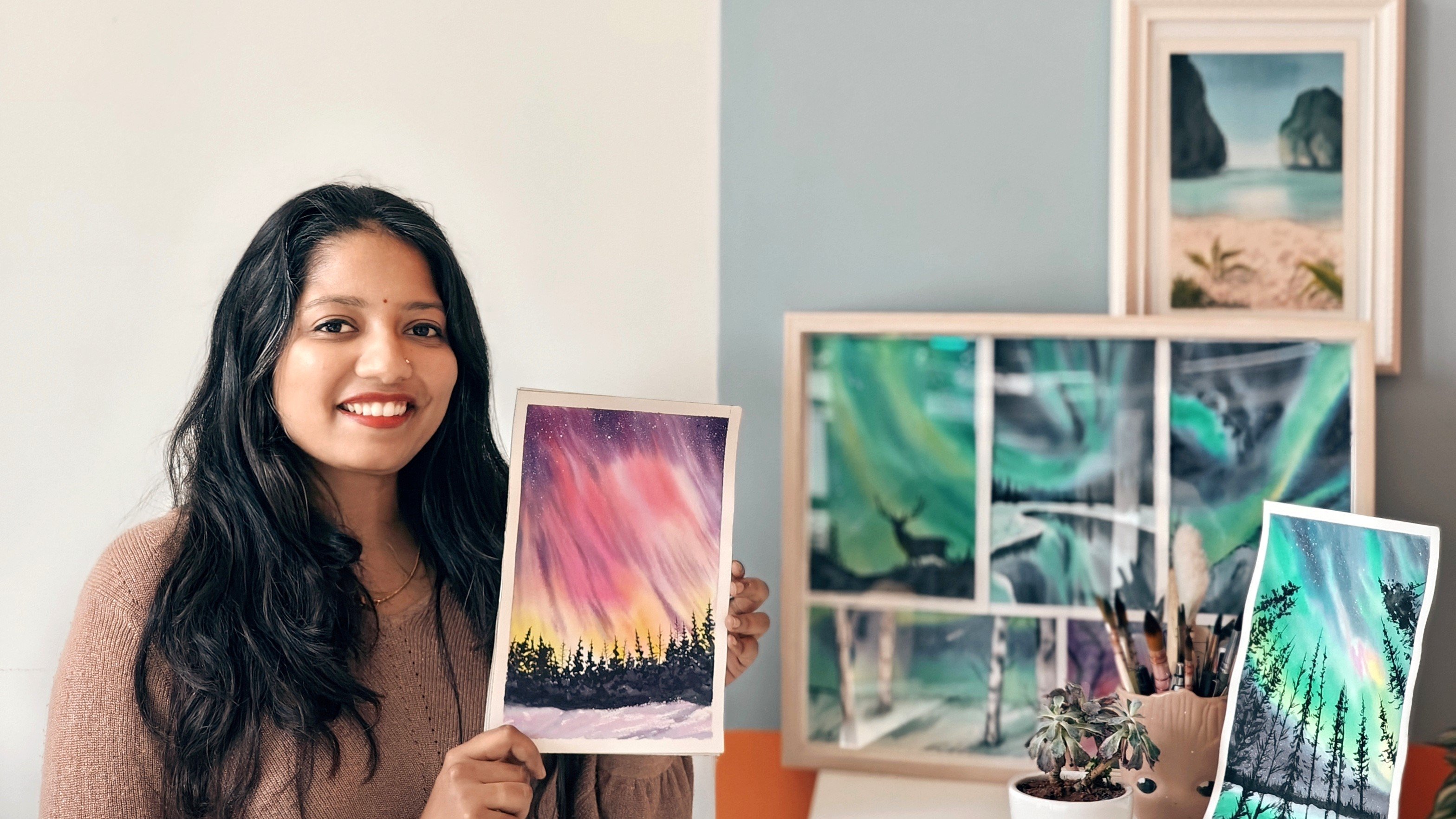
Transcripts
1. Whats this class about ?: Be it early morning walk in the winter or all-time
favorite hill station. Misty weather makes
me want to go back and experienced the
same again and again. Hi, I'm sweaty jihadi of
watercolor artists by passion and a
software engineer by profession based out
of Bangalore, India. I go by the handle, tinted doodles on Instagram. As you can see, my
feed is filled with various teams and different
watercolor techniques, which says a lot about
my love for watercolors. Some of these themes
are my favorite and some just give me
a lot of comfort. Misty landscape is one
such concept that fills my heart with soft thoughts and helped me overcome any busy. I'm sure all the artists and the art enthusiasts
would love to try out Mr. landscape painting and have it in their collection. Best part about painting or misty landscape is
in its process. Since there is no defined
edges are defined. Shape for the fog and
also the pine trees can be off any different shades. You are open to try out
your imagination on paper. There are many
different techniques out there to paint
the misty landscape. So first, we will go through
some of the techniques and also understand the
concept of area of space. Based on it, we will try to see with the tonal value
of watercolors how to implement and achieve
different areas of space using watercolors. Once this is done, we
will get started with our class projects
in which we will be painting three beautiful
misty landscapes. One with just one layer of pine, second day with
two layers of pine and David multiple
layers of pine. By end of this class, I will be pretty
sure that you can try out any misty landscape with a reference on your own using different colors and tonal
values of your choice. So what are we waiting for? Let's get through
the techniques, supplies and get
started with the class.
2. All that you need to get started: Let's go through all
the materials that is required for the
class, shall we? So here I have some
watercolor tubes. I'll be explaining in detail about them in the next lesson. So here I'm just showing
all the supplies needed. So watercolor paints
and have bought it inside a palette
for easy access. You can also use
watercolor pans. If you have two jars of water, one for clean and one
for removing excess of pigments. Mixing palette. This is a ceramic one. You can use any that you have, a pencil for doing a rough sketch during the
class projects, a pen. I'm mainly using it for
writing down the colors. A paper cloth or a paper towel. 300 years, 100% cotton paper. This is cold pressed and
from Archie's some brushes, that is watercolor brushes. Here, I'm using silver brush, black velvet round brushes, and a princeton flat brush. Round brushes are of size 8.4. You can use any round
brushes that you have. If you do not have a flat brush, you can also use
a more pressure. Coming to the acrylic board. Here, I will be using acrylic
board to stick my paper on. I'll show how I'll stick my
paper on during the classes. So these are all the
supplies needed. Let's get through each of
the pigments in next lesson.
3. Colors and their substitutes: So let's see all the colors that I will be using
for this class, and also there are substitutes. So here in the left
I have spread out all the colors and
the same brands that I'm going to be using. And I have bought it into a
small pallet so that it can be off easy access for me
throughout the class projects. Okay. These are just for quick
access and nothing else. And I was watching out
all these colors here. And also I'll be showing
from other basic colors of your palate how you can create these colors that I'm
going to be using. Okay, so to get started with, I'm starting with peacock blue. This is from brand
Mission Gold. Okay. So the next one is leaf green, again from the
brand Mission Gold. This color is greenish, amber from brand Sennelier. Next is Payne's gray from
Winsor and Newton Cotman. You can use any brand
of Payne's gray. And the next is sepia. This is from White Nights. All these colors. I
have taken a couple of months or years to get these differentiates
and collection. So I will not expect
you all to have all these exact sheets. So I'll be showing the adjustments are
the substitutes of those shades as well. So using some of
the basic colors, like bright blue or yellow blue, I'm using from to me here. So in order to make become blue, let's take some of
this bright blue. And onto it. I will be adding green. You can use any shade of green. This is from White Nights. Okay? Now I'm going to bring
it into consistency, which will be linear
to peacock blue. Okay? So this looks near enough. So let me scratch
it out for you. By end of this lesson, you will also see very rough estimate of the ratio of colors
that I have used. So here is the green I used, and here is though, they look blue that I've used. Now for leaf green, this is really tricky because this is a very vibrant
color and it's very difficult to get the exact
replica of this color. You can also use
Naples yellow instead of leaf green to get
a little bit cooler, shade off the yellow
and green mix. But here I have tried to use the existing colors using
cad yellow, cadmium yellow, and the green that we used before to get the nearest
substitute of this color. But since I do not have
the brightest pigments, the color is expected to
be a little bit dull. Not to worry. Wherever
you're using this color, you can still go ahead and
use it in your paintings. It will give similar look and feel to your
painting as well. Okay? So you can see this is a little bit darker in shade. So let's see what
else can be done. I'm adding few more pigments
of cadmium yellow to it. And it's still going
to be the same. So I'll come back to it in the end and see if something
else can be done. Okay. So scratching out all the
colors that I used for it, which is green and
cadmium yellow. Now coming to greenish amber, I'm going to be taking green. Okay. And along with it, I'm taking this is burnt umber. Okay? This is ultramarine blue. Taking some of it
on my palette here. Okay, so now I'll
start to mix until I get the desired color
of greenish amber. We can observe that
the pigment is having more of a
green tint to it, along with all cooler
shade of green. That is, it is having
blue tint in it as well. So that's why I have
taken ultramarine in order to give that
cooler shade look. Adding ultramarine until I
get the desired shade Hill. Okay, This became a little
bit more green in shade. So let me add a bit
more of ultramarine. Just clicking some more watered. Yes, this color is
more resonating with greenish amber. Okay. So the colors used ultramarine, green, and burnt umber. Okay, Coming to Payne's gray, this is quite easy to create. Usually, you might already have a shade near
to Payne's gray. There is some shades of
black in your palate. So all we have to do is mix
black with any shade of blue. Here. I'm going to be
using ultramarine for it. Let me just clean my
palette here for mixing. I'm just taking a
tissue paper and wiping it off after applying
some water onto it. Okay, so here is the black. Okay, and I'm adding
ultramarine to it. So I'm going to be using a lot of Payne's gray in all the three class projects. So you can either have this mix and keep it in
your palette already, or you can also mix it
on the day of painting. Okay, So that is lamp black
and this is ultramarine. Okay. Now for CPO, I'm going to just clean
the palate. Once again. I'm taking burnt
umber here and mixing it with lamp black. Also adding a tint
of ultramarine so that we get 0 cooler
shade of this color. If CPR is applied in a
very concentrated form, it would be of the same color. So I'm happy with
this result as well. So let's watch out all the
shapes that I have used. That would be lamp black, burnt umber, and ultramarine. Okay, so other
alternative colors that I have used here are green, cadmium yellow,
the yellow, blue, ultramarine, and burnt umber. And of course, our lamp black. Okay, we using all these
basic colors also, you can get the other colors that I've used in this class. These are all the alternatives. Now coming back to leaf green, I'm trying to add small Tinto of ultramarine there and
see if I can get 0. Cooler color of
this theme sheet. If you have Naples yellow, I would suggest to replace cadmium yellow with
Naples yellow and try it. It should also give
you the same result. Okay? So this is the
closest I could get. Let me quickly add all
the ratios that is rough estimates of the ratios that have used all
of these colors. And I will also add this picture in the resources section so
that you can make use of it. Okay, so now let's go through the other
parts of the lessons, understand areas of space, and then get started
with the class projects.
4. Watercolor techniques you need to know: So for the techniques lesson, I'm going to be showing
six different techniques that I'm going to use a
lot in my class projects. So starting off with a very
basic wet on wet technique. Wet-on-wet technique
is a technique wherein both the surface and the watercolor pigments are both having a lot
of water in it. Wet on wet technique
always results in soft, spontaneous and complex effects within watercolors that
are well-known for. In order to create
and show the scene, I'm going to be using
multiple colors here. So you can see I've taken a dilute form of these pigments. I have more water in my brush as well as the rest running
water on my paper. So I'm going to take a couple of other pigments and just drop it everywhere on the surface where I have already
applied water. Okay. You can choose any color
for this practice. I'm just using the
same colors that I will be using in
my class projects. This also helps me to understand how the colors blend
along with each other. Okay, so now you can
see there is lot of whitespaces on my paper, but let's come back and see the result when it
completely dries off. Okay. I'm going to name it wet on wet and move on to the
next technique. Now coming to the
second technique that I will be showing, it is an extension on
wet-on-wet technique only. So I'm going to apply
water onto my paper. This technique is nothing
but a gradation or watercolor radiation
or graduated wash. You can call it anything. Graduated wash incorporates
a gradual change in value or the intensity of the color used as
the wash progresses. This creates a very
beautiful background for your paintings. Be graduated sky, or even any other background that you want to add
Paine's later on. So for this technique, I'm going to be taking lots of pains initially in my brush, starting with one
corner of the paper, bringing it down eventually without mixing any additional
paints onto my brush. So you can see the tonal values
here on top of my paper. It is at the highest. This way we will get
a very smooth voice from top to bottom. Once it dries off, we can see
a beautiful gradation here. Before I move on
to my third block. Let's focus on the
fourth block off. Here. You can see already wet on wet technique that
we have tried. It's almost dry and the paints
have dispersed into water. And to my background completely. I'm prepping my paper to show controlled
wet-on-wet technique wherein based on how much water is already there and how
much the paper is dry. We're going to apply
pigments and absorbed the difference of how
the pigments behave when the paper is
completely wet and the paper is a little bit dry. I'm prepping the paper for that. And once I feel that
there is enough of water, I will not straight
away add the pigments. I will wait for some time
for the paper to dry, for water to seep in. In the meantime, let's try out our fourth technique. Here. I'm going to be showing
how we can lift the pigments already that
is on the people here also, I'm going to be using
wet on wet itself. So I'm just prepping
the background here. I'll take any color
of the choice and create even or uneven Bosch. So let's try two colors. Gradation here,
okay, so I'm taking one color from top until
mid off the paper. And I'll take another color from bottom to again,
mud off the paper. And just how we
did for gradation, I'm going to be doing the
same with my brush and mixing those two directly
on the paper itself. Just make sure that the colors
are still distinctive in the top and the bottom middle
portion of this segment, you will have the mix
of the paints visible. Okay, that looks good. Now, let's come back
to our control. Wet-on-wet. I feel the paper
is a little bit dry now. So I'll take same pigments
and start to drop. Now you can see that
the paints are not dispersing too much and we still see the corners of the paint that is
getting dispersed. So if we want to compare from
about wet-on-wet technique, the dispersion is not
too much and we get a controlled way to
show our pigments. So this helps us to achieve any small figures
in the background, or even sometimes a bouquet effect that
we want to create. For that, this controlled wet on wet is very
much essential. You went for adding pints. We will be using this
technique little bit. I'll be explaining
more about that in our foreground and
background pines class. So coming back to
lifting and taking a tissue paper and
just dabbing it off, you can see the paint
that is there on the paper has already been
absorbed by tissue paper. And we can see a
distinct shape created. Now this shape can be
as per your choice, be cloud, a sun, or moon. We can achieve it in multiple
ways by adding masking tape or not applying
water to that place. But even a tissue paper helps. And I really like this
effect more that it creates. Okay? Now I'm going to be
showing wet on dry, which means that the
paper is dry and I have the paint which is
having a lot of water in it. Along with this, I'm going to
be showing with two colors how we can achieve
gradation that we did. But using a wet
on dry technique. From bottom, I'm going to start with another color and stop right there and not mix
the two colors at once. You can still see the
white whitespace there. They water in my brush and slowly mix the two
colors together. If it is mixing too much, again, remove water, clean the brush, remove excess of
water from the brush, and repeat the process. Now for our last technique, if this is dry on dry, which means I have
very less water in my brush and there is
no water on my paper. Now once this is done, there are harsh edges. So I want to show
how to get rid of that harsh edge that
is very important for our misty landscapes, right? I'm going to take
some water onto my brush and slowly
smudge this off. So you can see if you apply a little bit more pressure
onto the belly of your brush. It lifts off that
particular space where the paint is there. Then you can slowly
move it across and smudge that with
the background. People. Select me,
repeat this here. With a smaller brush. I have applied water, cleaning my brush again. And now. It's merging
that with my background. Okay. Using the tissue paper to
remove excess of water. Here, my water is
little bit pigment it. So I wanted to show
how I'm doing it. But when we do it
with the freshwater, it won't leave any such marks. I'm using the same technique
to merge these two, to merge a void space that was there between these two strokes. And that is it. This is dry on dry plus smudging
technique in watercolor. So now that we have gone
through all the basics, techniques that we'd need for
painting a misty landscape. Let's get started with
the aid of subspace.
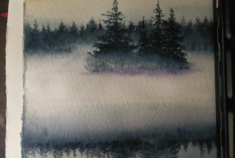
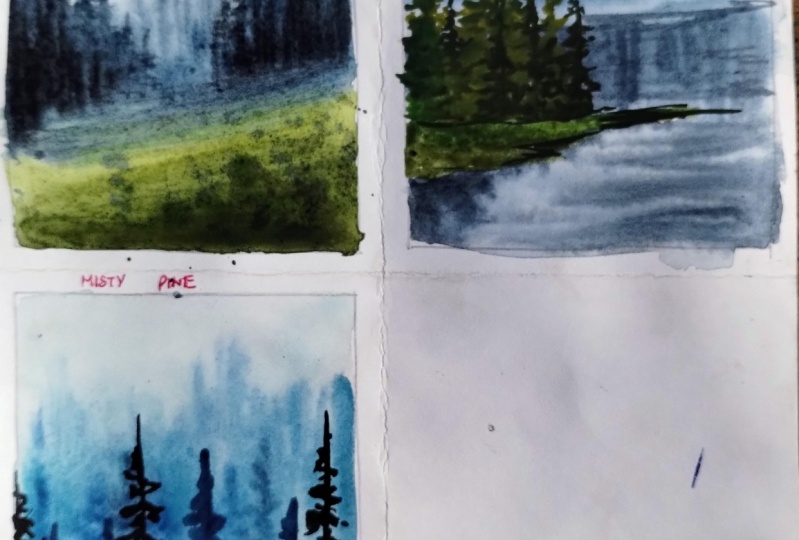
5. Areas of space: Okay, so now to get
started with our lesson, here is the first reference. And I'm going to be using multiple such references
to understand different areas of space and also different
layers in the mess. In our first reference, you can see the highest
tonal values are around here in this
part of the picture. So this becomes our foreground. There is a double layer of trees which are not yet due details. They are way further
behind in the picture. This becomes over background. In this picture we have
just two areas of space. Let's see another image. Coming to our second picture. We can see clearly
that these trees are very vibrant and they are
having high tonal values. So this becomes our foreground binds the foreground
area of space. Trees here in the
bag or less detail. They are dull in color and they seems to be smashed
with the background. So this becomes our background. Video of space coming to the
remaining part of the trees. They're in their
little brighter than the background and get dull
than our friend ground. So this becomes
our middle ground. Now coming to our
third reference here you can see there are multiple layers of missed. Multiple layers are available
as a radio of space. Considering the highest
tonal values which are towards the bottom
of the picture, this clearly becomes
our foreground. We can qualify the furthest
trees as our background. And the middle portion of it, though there is difference in their tonal values of
we can call them as middle ground part one
and middle gown part to. This differentiation is
just for you to understand their tones and their details. So showing variations in this, we can clearly show multiple layers in between background and
foreground as well.
6. Background and middleground pines in watercolor: Let's learn how to paint
background and midground pines. I'm starting with the
background binds first. I have taken a big sheet of paper that I'll be
practicing these on. And I have got the same
people that I'm going to be using for my
class projects. Because it's very important
and crucial to understand the kind of paper
that you're using and to do practices
on the same people. Understand its
properties and how the techniques turnout and
how the end result will be. I'm using the term
wet technique here. So I have applied water onto
paper using my flat brush. You can do it with any brush
that you have for backing. My choice of color for this
practice would be CPR. You can choose any
color of your choice. I will dilute the paint
because I want the tonal value of the background binds to be a little bit dull or
lighter in shade. We know that watercolors
will always dry a shade or two lighter
than it is dried off. But still, I want
to make sure that I add good enough of water onto this mix so that I have a very good and
very dilute shade of paint in my background. Let me show you the consistency. This is the consistency
of the paint that I would be using for painting
Bad going pints. Starting off with the base. This is the ground of above which the pines
will be available. This is the way I'm
holding the brush that is observed how I'm holding
the bag, the brush. And just with ones with moment, I will be pulling the brush up. I'm dabbing with the
pointed tip of my brush, pressing the belly a little
bit and bringing it down. I continue with the same. If I want a little bit of a thicker pine cone that
is getting created, I would apply a little bit of
more pressure on the brush. You can also use a
bigger brush to achieve. I'm using a size
four brush here. You can use a bigger size
brush aspect for the practice. I have already applied this one layer of
background pints, and I'll just wait
for a while to see how this has turned out. You can stand up, look at the paper and see if it has turned
out really well, or do you need to add additional find somewhere if there
is too much whitespace? But I'm going to be
adding another layer or another tonal shade off
the background binds here. Because if it shows a very beautiful change
or create an illusion of multiple trees being
there in the back of different sizes and different
growth of the binds. Because of the texture. To quickly recap, we have done background pints on
wet-on-wet technique with pointed brush strokes and used tonal depth for
radiations and binds. Now coming to painting
made gland pints, there are two different ways in which you can achieve this. I'll be showing both of
them in the same segment. So I'm again applying water because this could be
wet on wet technique for the first type of midground binds
that we're creating. I'm showing both of the types here only because
during class project, you can always
choose to go ahead with either one of
the techniques here. Even if I'm following a
particular technique, you are very, very much welcome to try or
the other technique. So now the paper is, I have applied water onto paper, but I have to wait until
the water is saved. And unless unlike
the background pints where we started it right away, I need to wait for some time
so that the water seeps in and that's how it happens even when you start
the painting, you do background binds first. And until you come
to meet Ron pints, that is already water
received in and you can see this glaze
on the people. And that is when you can
start off with painting. The midground binds. So right now it's, I think it's a good
time to start, So I will prepare my paint. Again. I'm taking
the same color, CPR, this shape now, I'm keeping it a little
bit dark because I don't want the paint to disperse completely like how it
happened in background pints. Okay? So with a very
swift motion again, you have to create
one straight line. I will dab it on tissue to
remove any excess water. Okay. So just once with length. So here it is. I think there was a little
bit more water in here. Nobody's either. Pick up some more
paint in the brush. And one more swift. Now, this is good, but
some random zigzag manner. You can add midground pints. Make sure to make that
shapes on the trees, water and paint will
disperse itself and create this beautiful
pines for you. Okay? This is one way wherein
you can create the binds. Once it dries off, it
will be giving you the illusion of being in back, but still the
details are visible. You can see the
shape of the pine. And for another type, we would go ahead with
dry on wet on dry, which is the pupil is
now completely dry. I have used a tissue
paper to dab off auto. I will go ahead and paint
one pine tree here. In the next lesson, I'll be explaining in detail
of how to paint. But here it's again, just use this exact
manner and create a pine tree before it
is completely dry. Take a tissue paper
and dabbed off. You can see that tissue
paper takes off excess of paint and smudge some of the branches with the background so that the details are not
completely visible. For that, take some
water in your brush, gently push it against
the branches where you want to remove and dab it
off on the dish should be. But this is how you can achieve another kind of midground pan. You can probably use
it for midground been withdrawn to like we discussed in the previous class. But either ways, it
looks beautiful. Now to recap, we can
do both wet on wet, wet on dry technique. And we just have to make
sure there are few details visible so that we can
have our midground pints.
7. Foreground pines in watercolors: Now let's see about how to
paint for ground pines. In previous lessons
we have seen about how to paint background
pines and midground binds. Now I'll be showing how to paint a detailed pine tree in
three different ways. There can be other ways as well, depending on how the branches
and leaves you want to add. I'm going to be using
the same color CPR here, but with a little bit
concentrated mix of the pigments. So to get started with, I'm going to start with
a bark of the pine. And in this space I will be showing how we will be
painting the foreground pints. Okay? So to start with one swift motion and there is a straight line
of the pine hill. As I go down, you can have a little bit thicker
bark of the pine. Now starting from the top or three horizontal lines are
parallel line to the ground. And then I slowly start
increasing the size of the branches so that it forms a triangular shape as it
moves from top to bottom. Okay. So gradually increasing the size of the
branch as I go ahead. So first let me just
add random branches. And then we'll come back and
fill the void spaces here. Okay, So this would be the final version of
the pine, I would say. Now, to get started
with the branches, seeing the angle in which
I'm holding my brush. It's a little bit
Neo towards the tip. Whenever I want a
detailed stroke, I will hold the brush nearby. It's stiff. When I come towards down, I keep on increasing the
width of the branches as with adding some random branches
strokes here and there. This is one kind of a pine tree that I'm
going to be showing. You can see that it does
not completely filled. So we can have these spines
in places in-between to fully filled finds in order to fill up the
space in the painting. Now, the second of
it, again, the same. There is a straight
line and starting with very minute horizontal
strokes in the top. Now, I'm applying a little
bit more pressure to the belly of my brush and adding strokes in this
particular angle. So you can see I start
from one direction and pull it across
so that it forms these kind of shapes up
so it is just round. You can use any round brush
for doing this Technique. And similarly, I'm doing
it on both the sides. Again, this is in a
triangular shape. So as I go down, I'm increasing the
number of those strokes that are getting added
onto the pine spread, we get a triangular
shape of the pipe. You can also add details
to the tip of each of the branch endings using
another detailer brush. But I'm going to be using
the same tip of the brush that I'm using to add
the details as well. Okay, So now for the third one, again with this fifth line. In fact, you can practice adding these lines in a different
sheet of paper altogether. Or you can tilt the paper in which the angle suits
you to draw a line. This is more of a
Christmas tree, kind of a pine that
I'm drawing here. So this is worth all the strokes of the branches
you can see are pointing downward to the ground. Similarly like the other two, increasing the width of the branches or the
size of the branches as we move downward to form a triangular
shape for the pipe. The third pine as well. You can see it is
completely filled and it's also forming
a triangular shape. Just adding these triangle
shape for reference here. Okay, So once this is done, once you can see how detailed
all these pine trees, or if you want to add another layer of missed
in front of the spines. You can also do that by lifting technique or by
creating some whitespace over the pints so
that it looks like there is a small swift off Cloud or missed following
across these binds. So I'll be showing
how to achieve that using another pine tree here. So I'm taking the same color
and bigger size brush, size eight, round brush. I'm taking mixing some colors. I'm going to keep it a
little bit diluted in this so that it helps me
with the lifting technique. Like we had blonde in the techniques class
is about lifting. It's the same. I'll be
using a tissue paper in order to lift the paint. Ok. So here below I'll be drawing of one
of the pine trees. I can do the same
with background as well as my ground pines
as well with the lifting. So even for the foreground pine, I'm going to show how you
can create that effect. Adding some zigzag lines here. Now, this is my tone dry, which means that the paper
is still dry and my paint is having water in it
before it dries off. Either I'll take tissue paper and liftoff the
paints from there. Or what I can also do is lift it got directly
from the brush. Also. See seems if you're
painting is already dry, you can use your brush
to revert that part of the papers using water
and then lift it off. This way you can
create a misty effect over the pine trees for the
foreground, pines as well. Okay, so now that
we have learned different kinds of pints in
all other areas of spaces. Let's start with
the class projects.
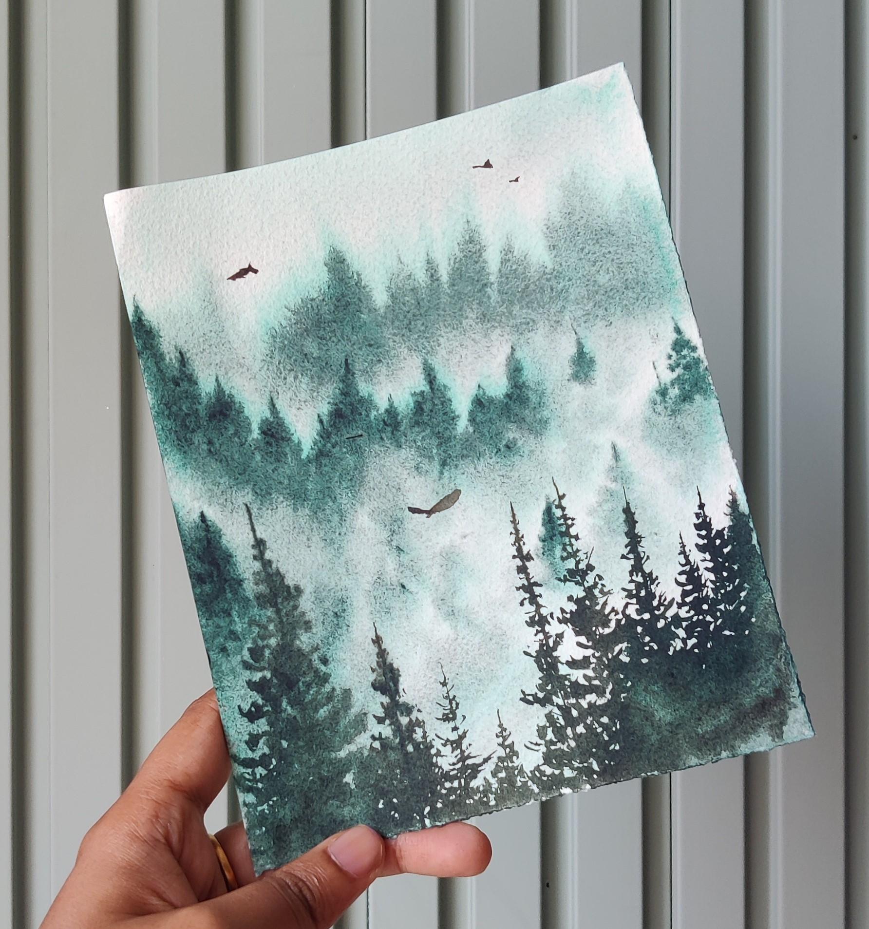
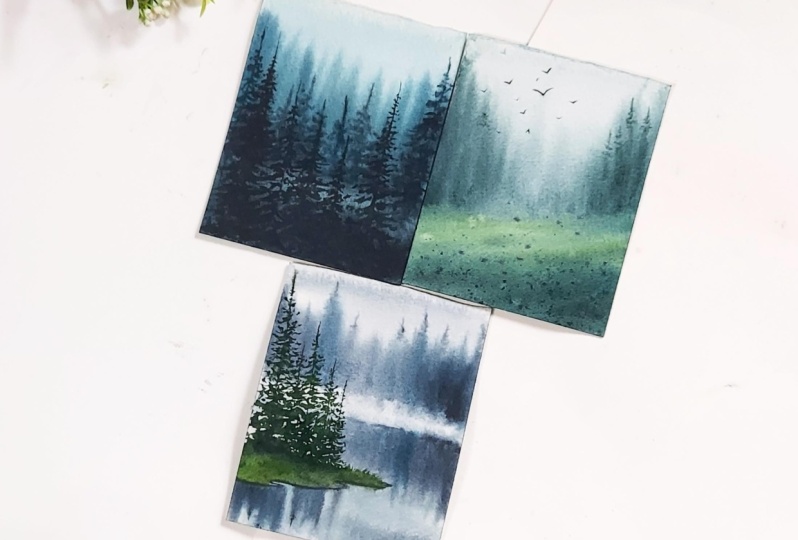
8. Misty Wonderland: Colors used in this lesson, our Payne's gray, leaf green, greenish, amber,
and peacock blue. So let's get started. Here. I have all the
supplies laid out. I have pulled in my
paints into my palette. You can use the tubes.
Are they directly? I have two jars of
clean water and brushes and 0 hundred percent 300
years some cold press paper. I'm trying to determine
which is the front side of my paper so that I can
just draw a quick outline. This is my friends side of the paper and pencil. I'll just draw a very
rough horizon line. This is supposed to be a part of elevated surface you can see. And I'm just drawing to show where I will add a little bit more depth
for that elevated space. It can be of any shape. In your painting. We don't
have to follow the same. Once this is done, I'll
flip my paper over and start to apply water onto
the backside of my people. Here, I will try to keep the paper damp for as
much time as possible. So I'm going to be applying water on backside of my people, stick it to a surface. So I would request you all to keep a surface
which would not absorb the water like
cardboard or any people, any people or medium surface. So I have taken
an acrylic sheet, I would suggest you
do something similar. Now once I see it beautifully sticks this
acrylic sheet here, right? And once it is done, I will start to apply water on the front side of
my paper as well. It is definitely going to be a wet-on-wet
technique on hold. So I'm applying a lot
of water and making sure that the papers taste dam
for a long period of time. Trying to even apply water on the edges so that the
paper doesn't come off. Here. I'm actually tilting in
an angle to see if there is a thin layer of
water on my paper. That's not getting
recorded here. But you can imagine me. I'm just trying to bend over and see how much water is there on my paper so that
there are no blooms. I'll take a tissue
paper and removing the excess water on
my surface so that it doesn't come back onto paper and create a quality
called fervor effect, or watercolor blooms when
the paper starts to dry off, creating an elevation here so that when I start
to apply paint, it will all be in one
flow towards the down, downwards off my paper. Now to start off with
the background pints, I'm going to mix some,
I'm going to mix. This is peacock
blue, Payne's gray. And having a beautiful
mixture here. So you can add a
little bit more of blue or a little bit more of
Payne's gray if you wish. It is just the color or the mix of your
choice that you want. I will be applying even wash for the sky
with the same color. So I'm taking a flat
brush for this. You can also apply it using a
round brush or a mop brush. You can see it's really a very thin wash of a very
diluted wash, I will say. Just to create a miss the sky
background for my painting. Again, taking the tissue
and removing excess of water and pigments
that game on the board. Leveling it up. Okay, so now I'll mix
paint for my next layer. So adding some greenish, amber and peacock blue, as well as Payne's gray
and creating a little bit of more pigmented mix
here to add pine trees. Flip my board so that I can have elongated strokes with my brush for
the pine trees. So here, like we did in the practice class for
background pints, it's the same. I'm going to be
holding my brush in an angle and I'm pulling it across to create
these elongated lines in middle of the paper. I'm going to be having a very dilute pine
trees so that it looks to be even more distant than the pine trees that are
in those sides of my paper. You can also create different tones in
order to achieve this. So that you can give that
illusion of a pine trees being at different areas of
spaces in your painting. They're all background trees, but still some of
them are nearby. Some of them are
very far or there's a very strong layer of
messed in front of it. Adding some more strokes here. Once it dries off, we know that it
will be drying with the shade or two lighter
than what's on your pupil. So feel free to add pigments that you feel they are actually
strong to look at. My paper is still wet, and hence I'm able to add
multiple such layers. And once the paper is dry, we will not be able to add it without
creating a harsh edge. Make sure you add all these
when the paper is still wet. If you have followed the same
approach of adding water to backside of the paper and to
the front your paper will definitely stay wet for a
longer duration of time. Now, adding the land
part with the same mix, but a little bit
of darker pigment. Now I'll be taking leaf
green and adding it to the front part of the and
adding it to the front part. Now coming to paint
the fog layer, which is right above your
land part and the pines. Make sure the color
mix is having a dilute sheets of both
binds and your grass. This will ensure to
create an illusion of the fog being
just above the land, as well as having the colors
of the pints so that you can feel the dispersion of the colors happening through the water droplets in the midst. I'm adding some small strokes
with the same color here. In this, you cannot
see where the land is ending and where the
pines are actually starting. This is exactly what we
need for this painting. We don't need to show the
actual line of difference, differentiation for the land. So it's okay if we can just
create this kind of effect or illusion that we
can show there is a layer of a dense mist
or fog in the painting. Okay, now, I feel like the major part of
my painting is done. So before I do any
other changes or conclude that my
painting is complete, I would stand up and analyze
the painting and see from different
perspectives to see if I'm getting the feeling
of completeness for my painting or not. You can also do it
by either looking at the painting
through your mirror or even through the
lens of your mobile. But usually helps us to see it from a
different perspective. Adding tip for few of the pines here with very gentle strokes and are less pigment, of course. Dabbing off the excess of
paint using a tissue paper. Analyzing the painting again. Now it looks mostly done. So I will just conclude
this by adding some paint droplets
for the end of my land part because it feels a little bit incomplete here. So I'm going to be holding my hand to make sure the droplets do not
go on the pines part. If you want to learn how to
add these droplets I have covered I've covered this specifically in one
of my other classes. That is a four-day Milky
Way watercolor challenge. So you can go through the class and follow the
same process here. Now for the final touches, I'm going to add few
boats in distance. Okay? So this is a test. This is our painting from
just one layer of pints. So see you in the next class with the next
beautiful painting.
9. Misty Lake: Welcome back to day two
of the class project. We are going to paint
beautiful misty leak using two areas of
space for the pints. Colors used for this
project, our Payne's gray, leaf green, greenish,
amber, and peacock blue. Let's get started. Here. I have the paper. I'm going to be using
the same technique of sticking this paper after
applying water onto my board. You can see the
different texture of front and back side of
a cold press paper. Here are the grooves
are pressed in. Here the grooves are popping up. So this becomes
our friend earlier and this is our
backside of the people. So first, I'm going to apply water to backside of the people. Oops, there is some paint
from previous class, but not to worry. Just wash it away. Yeah. I'm applying water
onto backside of the people. Once this is done, I will flip it over and
stick it onto the acrylic. Before it starts to come up. I'll again apply water onto
all sides of the people, as well as to the center part of the people to make sure
that water is applied onto the paper can retain water for a
longer duration of time. So simple logic behind it is that there is a section
that has been created between the people and
acrylic board due to which the people will not
be drying anytime soon. So it will reduce or decrease the time in which
the people will dry. Okay, so now I want
to show you how there is a thin layer of
water on the paper. And also am removing
excess of water that has come out from the brush so that they don't
see back in and create any watercolor blooms or cauliflower effect once
the paper dries off. Okay. I'm re-wetting the people a little bit before I
start with the painting. This is the palette here. I'm going to be first creating
the background for it. I'm taking Payne's gray onto it. I'm adding peacock blue, a very small little tint
of peacock blue to it may create some elevation
heal because it just helps me create
a very gradual gradient. In the background of my paper. I'm picking up my flat brush and I'll first create with
one swift 0 horizon line. Here. There will be a
horizon line, okay? And this is the sky part of it. For sky, I'm going to be doing a very diluted wash
just to show that there is coloration or moody
sky for this painting. And the bottom part
of it is going to be the water or the
lake part of it. Okay. The type of flat brush, I'm just adding a
very dilute wash. I'll be adding more
depth to it and additional tonal values with the help of a round brush on it. Okay, So it is done. Now I have the paint in my brush using a size
eight round brush, I'm going to add the waves are some watery effect
onto the lake. Okay. So this is though water, but I'm just leaving some
spaces or whitespaces. I'm whitespaces in middle. And adding these brushstrokes, which will give us an
illusion of waves, are very tiny
ripples on the lake. Now, on top of the
horizon we have our land. So this is the horizon line. Now first, I'll start
with turning off the paper like this so that I can add the
background pints. We have already
practiced this in our background pines lesson. So all you have to do is just tilt your paper if
that is easier. And add binds with
these brush strokes. As you can see, I'm adding these with different
tonal shades, not with just one single color. You can also do the same. Now, I will turn it back and
add the reflection of these. Now for the reflection part, I'm leaving some space
there, as you can see, and adding the
reflection in the same sizes as about to create the
measure of the reflection. So here is the tip
of the above buying. So you can see there is a triangle kind of
shape happening above. So I am going to mimic
the same below as well. In the reflection also have to follow the same
tonal differences that you have created
on top of the painting. And here as well, I'm going to add small lines
to show the water waves. Even about the pints. I'm going to add it so
that when the paper dries, it will dry in such a
way that it will create a small void spaces to show white waves are the
reflection of the waves. Now creating some more
mixture of the same pigment. And I'm going to add details to one or two of the
pines in my bag. Now I'm going to take a
test should be put and dab it off some of the spaces here. This can be depicted as a thin layer of messed
about the leak. It gives a very
beautiful representation once the paper and
paint dries off. So make sure to just lift
some spaces of the paint and not entirely just dab very slightly onto people
and take it apart. Of course it doesn't
have any definite shape, so you can extend it to
any extent that you want. Now with this same x, I'm going to add the foreground land
part of the painting. This is a rough freehand
drawing that I'm doing. You can also sketch it out using the resources section
where I have added the painting and trace it out. Okay, so this becomes the land. Now there is also
a reflection from the pine trees that
are coming from, which are above though ground. So I'm going to add
this reflection when my paper is still wet. You can see that most
of it is already dry. So I'm going to
add it here first. There are harsh edges
getting formed, which is completely
fine because I'm going to add the details for these foreground
pints anyway. So having the harsh
edges here will not make much of a difference. Okay? So I'm going to
add the reflection where the pines will be present in the upper ground level. So I'm assuming I will
have a few pints here. And he'll searching on to a smaller brush. I'm going to add a detail
edge to the land part. For the next part. In order to add the land, I'm going to take leave
Green, lot of it. And then I'm going to add a little bit of a
greenish amber. I'm going to add a little
bit of greenish amber here. And I'm going to start with
though land part of it. This may seem like
a sap green color, but leaf green adds on to a very specific vibrancy
that I'm looking for. That contrast perfectly
well for the color palette. Adding some tonal values changes middle new values here in there. So this becomes the land part. Now for the foreground pints, I'm going to again start with adding the bark
of the pine tree. So with size eight round brush, I'm going to add a
straight line here. Okay? Let me tell you
this in an angle. I work well with this angle, so you can tilt your paper as whichever you feel
less comfortable. So based on the
reflection below, I'm also adding the lines are very word the
trees are available. Now adding lots of
greenish amber to the mix. And I'm, we'll start with
the detailed pine trees. We're going to create any one of the pine tree that
we have learned in foreground pines lesson. You can follow any one
off to pine trees here. I keep my small brush ready
with mics off Payne's gray. And wherever I feel
that there is a depth required in the tree,
I'm going to add it. You can see with the
brush itself how I add the horizontal lines. It all depends on how the water is forming the
structure of the brush. So while picking up
the brush itself, you can dab it in such an angle that it
forms a flat depth to it. And with that tip, you can start adding though horizontal lines. And as you go down, you can change the angle. A little bit more pressure on the belly of the brush and then start to add those strokes
that looks like branches. You can practice this before adding directly
onto the painting. But since these are not specific
to any species of binds, you might as well just
add a zigzag lines to give it a feeling
of pine trees, do it need not be the same? Or how I'm following. Now I'm mixing Payne's gray to though olive green
me that I have. And I'm going to add it to the bottom of each of the pine tree that
it meets the land part. The tips, I'm going to
add that darker shade. I'm going to again
add some depth to the left part of the tree
here so that we can, It seems like it's in
the shadow part of it. So you can see just by adding a different or dark shade
to the pine tree is adding or giving it a completely different
look to our pine trees. So this is very much important
when you are working. In order to create the realistic
effects in watercolors, you need to play around with tonal values at depth here
and there in order to show where you want to depict the detonates
in your objects. I'm taking Payne's
gray and adding some of greenish Humberto it. And this forms a little bit
darker shade of green mix. And I'm going to create some more depth here in
there for the pine trees. Majority of it in the bottom part of the pints where it meets the land part. Now taking even darker
mix of it and forming the outline for where
land meets the leak. This is because it will elevate the land and we will
get a 3D effect for the land part here
seems like there is a tad bit of shadow forming
of the land as well. This creates an
illusion of elevated. But for the land that
we have created, adding some grass
objects here and there. Just move your brush
in horizontal or a vertical strokes so that you
can get that grass effect. And again, we will
continue with adding depth to the part where
land meets the leak. Even in the shadows, you can see that foregrounds
shadows are having highest tonal values and the background binds
which are there. They are having a
lighter shade off. I'm tonal value. So when we see this painting, we can clearly see
that those are the background or they are
far behind in our picture. And the ones that are
there in the foreground are coming out very clearly
to be very detailed. And higher tonal value of pints. Just maddening some of
those brush strokes here. Now adding some tonal values
for the trees as well. As you can see, the
tree is really big, so I want to cover
it up completely. And for the other
points I want to add branches because
it is detailed. If it helps. You can also completely tilt your
paper while doing this. This is a dry on dry
technique that I'm using in order to add the
maximum or tonal values onto foreground pine reflection. The paper is almost dry and my brush also has very
limited water in it. Now for the last detail part, I will turn my paper because this is easier
for me to add pints. Okay? Yeah, this is
detailed enough. This is the last step
that I'm adding. This williams, good for me. Thank you for joining
the class and make sure to post your work
in the project section. Once you try, do
not hesitate to use any other different combinations or different pints in
different areas of spaces. So see you in the next
class where we'll be painting multiple
layers of pine trees.
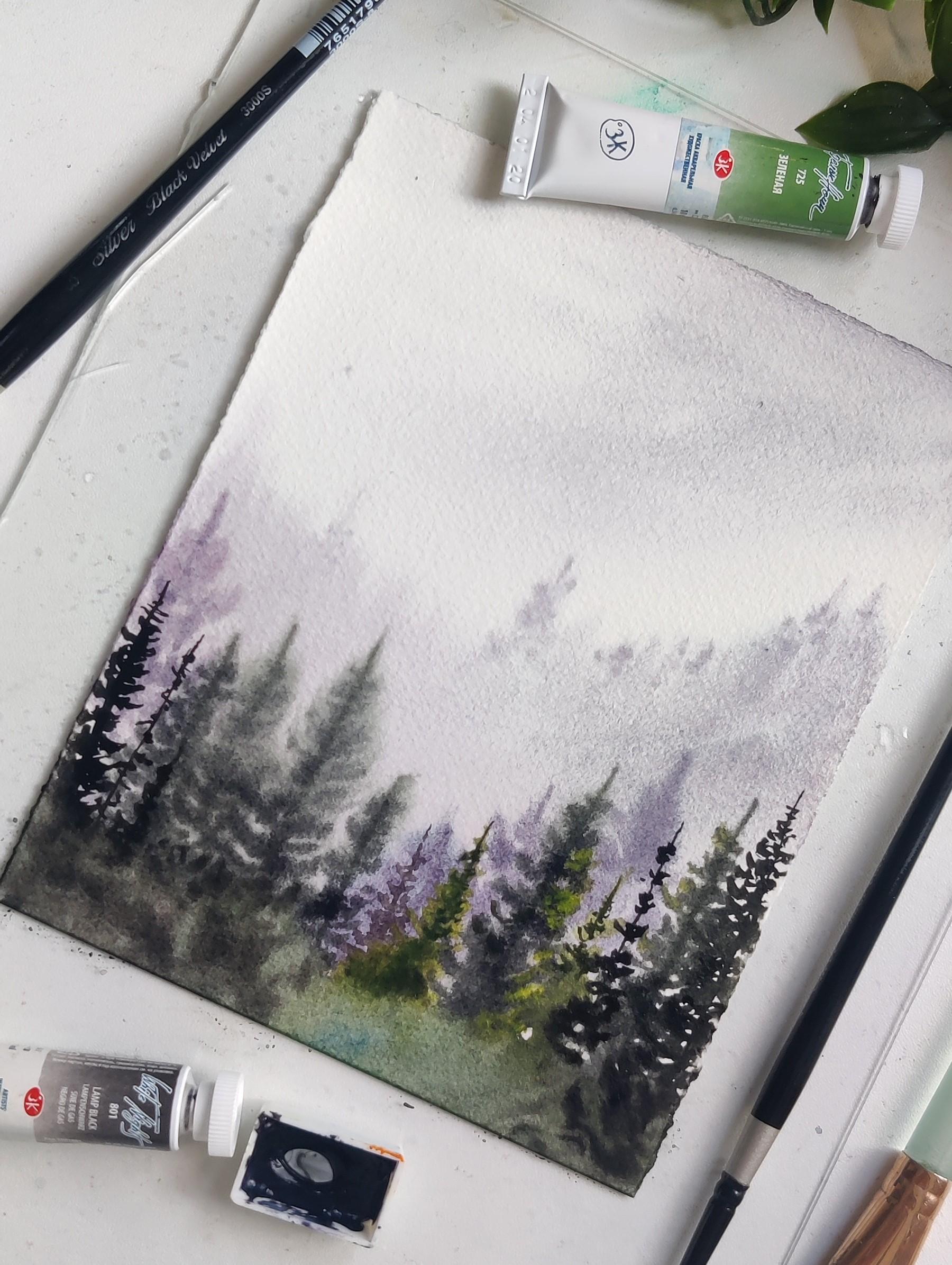
10. Misty Pinetum: Welcome back for the
class project three. And here we are going to
be painting lots of minds. So colors used in this
class are Payne's gray, peacock blue, and the
little bit of sepia. Okay, so to get started with, I, again have my paper
on my acrylic board, and I have the paints here
and the palate is here. Now to get started with, I will first see what is
the front side of my paper. And it is going to be
a freehand painting. So I'm not going to
draw any lines onto it. So based on the
grooves of the people, I'm going to determine which is the front side and I'm
going to apply paint to the backside of my
paper first so that I can stick it onto
the acrylic board. Okay, so applying water here. Now, flipping it over and sticking it to
the acrylic board. Taking some more water
and applying onto all the edges first so that it gets properly
stuck to the board. Applying water on the sides of the paper so that my paper can remain damped for a
longer period of time. We are going to be using wet-on-wet technique
for painting the background pines and the
mid ground pines as well. So I want to make
sure the people remains damped for a
longer duration of time. And this ensures that the
paper stakes that way. Okay, so now I'm going to take a tissue paper or the paper
cloth and remove excess of water from sites so that
they do not see back and create watercolor blooms or cauliflower effect once
the paper starts to dry. Now I'm going to create an elevation with the
help of any object. So just so that
when I'm creating the gradation for
the background, it flows inappropriately. Mixing of colors
I'm going to take because blue onto my palette. This is for this guy part of it. So I wanted to have
a tint of blue. It will be a very diluted wash. But still I'm going to
mix blue with Payne's gray and create a mixture. Now with the help
of a flat brush, I'm going to be adding
the background sky. You can also use a
mop brush, auto, round brush off a larger
size for doing this. I'm bringing till only half off my paper because the rest half will be covered with
binds once we start. So I'm just creating
the upper half of the people. But the shape. Okay. Taking some more water and mixing it so this, so that there is no
harsh edge on the paper. So you can see it's
a very diluted wash off that particular mix
that we had created. Now I'll turn over my people and start painting
from the other side. Now, I will mix some more of Payne's gray little
bit of sepia to, to create a darker
mix of this sheet and start painting from the
opposite side of the people. Here is where we will
have a lot of pine trees. So we'll have to show that of the picture that
there is a lot of space that is already filled with either land
or binds or forest area. So that's why we are adding this width or very
dark shade of color. Aniline. I'm going to stop it once I come to the
middle part of my paper. So now I'm going to start
creating this effect on the paper so that we don't get a straight line once
the paper dries off. Because in watercolors, the
way the brush strokes remain, That's the weight
is going to dry. So I have just created
some rest strokes in upper direction so that once
when the paper dries off, it's still, we can feel
like there are some trees, are some structures that
are vertical to the land. Now I'm taking some
peacock blue to create the background pints. And just going to add quite a few number of
pine trees in the back, like we had practiced in
background pines lesson. Why adding these strokes? Make sure to add a pigment with little bit of Payne's gray, little bit of sepia, just to show some
tonal variations so that we can see different
tree shapes in the back. I'm not going to add any details for these
background pints, so it is going to stay
in this same manage adding some lines
here and there. To show on the tip of the pines. I'm adding Payne's gray
to the same mix and some CPL and starting off it,
middle ground pines. So here you can see the
paper is still wet, so it is dispersing
into the background, creating a very subtle texture to the pints and not
giving a very harsh edge. So you have to be quick
or make sure that the paper is having
a lot of water so that you can add the middle ground pines without them being
a lot of detailed. Like we had practiced in our
middle ground pines lesson. You can go ahead and add
the pints in zigzag minor. Based on the videos, water retained on
the different parts of your people or the pints. And the water can
disperse and create different textures of
either very acetyl pine or a detailed pine. But they're still middle
ground pines only. So you don't have to
worry about if it is getting dispersed too much
or if it is too detailed, it is totally fine. We are using the tonal
values here in order to create the middle ground pines and foreground
pints effect. Okay, So when we come to
paint the foreground pints, we will take a
very dark shade of Payne's gray pinto
foreground pints. So even if your paper is dry, right now, when you are
painting middle brand binds with the help
of tonal values. We can show the difference. Okay, So this is the second
layer of pines that I added. Now, I will make sure to
take some water in my brush and smudge the ending of the pine with people because we do not want the
harsh edge to be visible. Okay. Now I'm switching brush to a four size
brush in order to add some details at
the top of the pints. Okay, so now this looks
good for my second layer. And I'm going to remove the elevation that
they had created. I'll be adding a third layer of pints in the
corners of the paper. That is to the left and right most void space that you have. I'm going to add in there. So I'm adding a little
bit darker shade of the same color and
adding those pine trees. I'm still using size
four brush here. And bringing it to the
bottom where we have two darkest part of the land. Similarly, I'm going to
add one more, the side. Since they are going to be a lot of binaries in this painting, I'm not going to be adding very detailed branches
for each of it. When we come to the final layer, that is the foreground layer, there we can add
one or two binaries with lots of details. Okay, rest of those, it can just be the brush
strokes that we have practiced and we can complete the pine
trees using just that. This becomes my third
layer of the pine tree. Okay, so now this looks good. Now for the final layer and
the foreground, pine trees, I'm going to be taking a lot of CPR Hill and Payne's gray. And start with the
front foreground pints. So first I'll start
by adding the horizontal, the vertical lines. We can also tilt or
replace your paper in different way in order. Now I'm going to be adding
the foreground pines. So adding some pine
box here where I feel like my pine
trees will be there. And this is with a very
concentrated mixture of Payne's gray, blue and CPR. So my z we're currently is mixed with some
of greenish amber from my previous
before in this well, I had greenish on bulk but
then I added CPI to it. So that's why you can see a
little bit changing color. But you can still
go ahead and use a CPR for similar results. I'm using a size eight brush for adding pine branches to
the lower part of the trees. With smaller size brush, I will be adding
the upper part of the pine trees for
more detailed finish. Now adding branches to
the last of my pine tree. And this would be
our final painting. That total four layers of pine. Hopefully, you have had a lot of fun painting all these
three paintings with me. See you in the final thoughts. Make sure to post your work in the projects and
resources section so that we can all see and
admire your work. Thank you.
11. Looking forward ...: Thank you everyone for
watching my class. And I literally had put
all my heart to give all these techniques
that I had learned while painting of
misty landscape. I had a lot of fun curating this entire
experience for you and making sure all
the concepts are covered for painting any
watercolor misty landscape. So I would encourage you to post your projects
that you have tried in the projects and
resources section so that everyone out here can
admire your work. Also, make sure to leave a
review or feedback for me that would help me also to grow further and helped me
build my next classes. So until I bring something
fun the next time.
 Swathi Hegde, Watercolor artist | Aqua | Night sky