Transcripts
1. Welcome back !: Hi, I'm Swati Ji Grey, a watercolor artist based
out of Bangalore, India. I go by the handle tinted
totals on Instagram. I'm thrilled to welcome you to a creative journey
like no other. Over the next ten days, we are going to dive into the world of watercolor,
silhouettes. And trust me, this is going
to be magical experience. This series, we'll explore
the art of painting stunning silhouettes using the mesmerizing medium
of watercolors. Before we start writing, let me give you a sneak peek into what you can expect out of this class and how you can use it to level up
your watercolor game. You will get to unleash
your creativity and learn how to capture the interplay
of light and shadows. We're simplifying things,
allowing you to focus on the essence of your
subject matter and refine your
composition skills. Color lovers gets
ready to experiment. We'll be diving into
the world of gradients, contrast, and vibrant use. Your brush control will
reach new heights as you paint intricate details
within the silhouettes. But it's not just
about the technique, it's about storytelling too. Silhouettes offer
a unique way to express emotions and
narratives through your art. The best part is you get to choose to be on a journey
of daily practice. Trust me, consistency
is the key. To master watercolors each day I'll be providing
with the step by step tutorial and tips required for painting the background
and our silhouette subject. By the end of this series, you will be amazed by
the transformation in your skills and the confidence that you have gained as
a watercolor artist. Let's pick up our brushes, fill our palettes, and paint our way into
vibrant silhouettes.
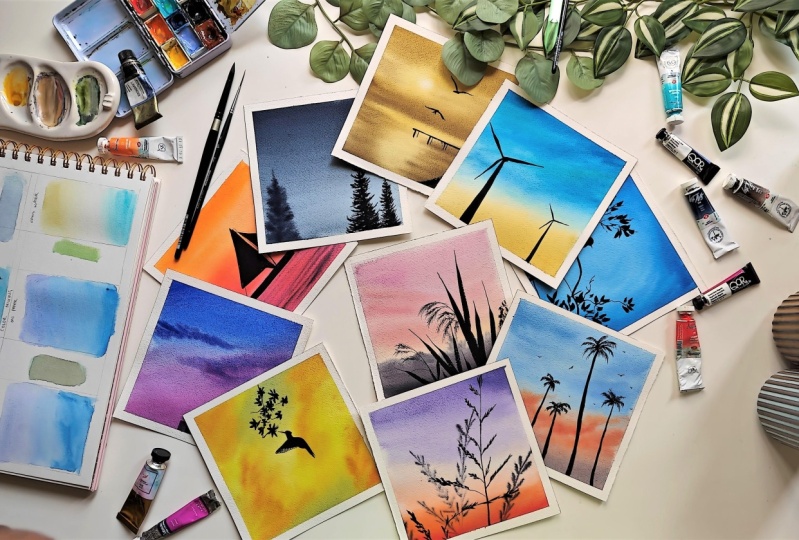
2. Supplies and color swatches: Let's go through all
the supplies that is required for
this class shell. To sort off it,
I'm using arches. Paper is cold pressed and
300 GSM, the weight of it. It is of size 15
centimeter into 30. I have cut them into square. That is half of it and this is the size by the wells of it. You can see that it
is a cold pressed paper and I'll be painting on
one side of the paper only. Okay, Next coming up, I have all these brushes that
I'll be using in the class. First up is Princeton Neptune series flat brush of size 34. These are synthetic brushes, but the bristles are
really very good for any washes or even for
lifting of some of the paints. These are some of
the round brushes, silver from the
series black velvet. These are of size
8.4 respectively. I'll also be using
a detail Er brush. This is from
Princeton liner brush from series Aqua Elite. This liner brush really helps when applying
minute details, even when applying
some midground objects with the paper is
semi dry, et cetera. I love it a lot. Masking, taping down your paper. Two jars for holding water. One jar is to clean up
the paints in your brush, and the other one
is to remove excess of the remaining
paint from the brush. These are some of the watercolor paints that I'll be using
from various brands. I have also poured
some of these paints back to metal tin. I also have a transparent
boat where I will take the paper down so that
it is easy for me to paint. Let's go through all the
colors patches for this class. Definitely, each of
the background has its own vibrant hue or a vibrant unique
combination to it. But I'll be swatching
all the colors. I have written down the colors here and the brand against them. You can definitely
use any color that you have a different brand of. If you do not have
a particular color, you can definitely mix and match with any other shades
and try it on your own. Okay. I will start
ahead with my swatches. I have bright blue and more
from Winsor and Newton. Lilac, bright violet
from the lavender, leaf green from Mission Gold, magenta, ultramarine
from QR rest. All of the colors are
from white nights, they are lilac, they are golden, deep cadmium red, light
cobalt turquoise paints, gray, indigo, and Indian yellow. So let's start with our Swatch. So here is all over swatches. I'm really excited to get
started with the class, So let's go through
the techniques on and then get started.
3. Helpful techniques: Welcome to the techniques class. Here I'll be teaching
some of the basic, particular techniques that
we will be requiring for going through this series of painting, relaxing
vaticlar silhouettes. Some of the basic ones
are ton, ton, right? That we'll be using
extensively for adding all of the silhouettes. And then there is Tl lifting. While painting all these
beautiful backgrounds, there are obviously
different colors used. And we will go through some of the different ways
of color mixing. One is directly on the palette
and one is on the paper. How we can mix two colors
and the other one is on the paper itself
but also using water. Okay, let's get started with it. It would be taking a flat brush. Since I'm going to be using flat brush for all my lessons, I think it's better to
show in flat brush itself. This is the border
that I have here. Whenever I'm applying
water onto my paper, I make sure to go in
certain direction. That is one from left to right and the next one would
be from top to bottom. This is just to
make sure there are no puddles created on my paper, as well as water is
soaked into paper easily based on the type
of paper you are using. You are free to apply a number of water washes on the paper. I will be applying around three to four such washes because for painting
a background, we will need to be, we will need the paper to be wet for a longer
duration of time. Okay. In order to
show wet on wet, now the paper is wet even. I will take some wet
pigments on my palette here. Okay, I'll start by applying it. This is our wet, wet technique where the
paper as well as paints, both are having water in it. This gives us ample amount
of time to other colors for the background or form our main objects that
as required, et cetera. Say, for example, I do want to add some shades of,
say, different color. Here I'm taking indigo. See, this is having water. The colors will mix
with each other easily, and once it dries off, there won't be any
harsh edges coming out of this strokes here. The next one is wet on dry, which means I need to prepare my paper first with one particular color
or multiple colors. Once it completely dries off, then we'll come back to add silhouette or any other
foreground object, wet color. Okay, for background, let me take one of my favorite
pastel colors. I'm applying it here
directly on my paper. Now, also my paper
is dry, right? I didn't apply water. This is also a ton dry itself. The only limitation in this
technique is you need to be very quick in adding all the different colors
and layers onto your paper. Since this is just
a techniques class and the surface
area is very small, I'm able to go ahead with this
try directly on the paper. Definitely compared
to wet and wet dry, we do get a vibrant color at the end when the
paper dries off. But like I said, it has
its own limitations. Each of the techniques
have its own pros and cons and depends on how you're implementing that
in your painting. Now this background is ready. I will wait for some
time and let it completely dry and come back to add our foreground object. Okay, now for the lifting part. For that, I'm
taking some indigo. Okay, now this is still
having some water in it. In order to start the lifting, I'm going to take my off
excess of water from it because there's already
water in this area. Now, I will apply some pressure wherever I want to lift
and lift the brush off. You see, you can definitely make out that here I have
lifted some paints. Now this paint is on my brush. So let me remove
that paint again, dab my paper on the
paper towel, and again. Okay, this is our
lifting technique, when the paper is now
coming to color mixing. We have three different
types here on palette. That is, I want to
mix two of my colors. Let's, let's say lavender
and bright blue. Okay, these two colors, if I'm using these two
colors on my background. Let's see how to mix the
different ways of mixing. First, I will show with
wet on wet, how we can do. Okay? So I have taken
some water on the paper. Now I'll start by
applying lavender first. Okay? This is
definitely going to be a rated wash from
one color to other. We have lavender here, we
will have bright blue here. In the middle part, we need
to make sure that they are combining in a
very beautiful way without creating any
muddy pigments. Right? What I'll do is I'll
mix these two colors. Here. You can decide if lavender needs to be more
or blue needs to be more. I'm going to keep a bit
on blue shade here. That becomes middle part. Okay? And then the final
is again going to be blue. Okay. So now you
can see that there is lavender and there is
mix of these two colors. And then there is the
bright blue as well. This is also a good way
of testing if two of the colors that you have chosen creates a muddy pigment or not. You mix the colors out once, and then only you can proceed. Let me try to mix
yellow with blue. This definitely gives
a muddy color, right? When I try that, you'll get
to know that this is a bit of a moody color and you
can decide if you want this mix in your
painting or not. Okay, so the next one is
color mixing on paper. This is a very
good choice if you are having colors that do
not create muddy pigments. Let me again show this
with a wet on wet itself. So let me apply water first. Okay. For the next, let's take
both these colors only. First, I'll start by taking
lavender onto my paper. And bring it to half
of the paper or wherever you want to have
the mixed until there. Next, I will take bright blue as well and start
from the opposite side. Gradually move up. Okay, I'll mix them both
directly on the paper itself. If you feel there is
too much pigment, all you have to do
is mix from one end, remove excess of water
again from the other end. Okay, Next one is using water. Of course, we have
been using water for all these techniques, right? When I mean using water, let's say we want to mix
this yellow and blue. And definitely we get a green, but we do not want to green
directly on our paper. So in this method,
what we will be doing is let me take some water first. Okay, now I'll start with
the yellow shade here. I will stop not in
the middle but a bit above the
middle of my paper. Then next, wash my brush. Take a shade of blue here. Again, start from the
bottom and stop until here. We need this white space here. Now what we will do is slowly remove excess of
water from your brush, and then slowly move
it up until half. Do the same from above as well, and go it all the way down. This is our strong
color here and this is our warmer color. Right? That's why make sure
to start from your color and then okay, this way. Let me try to mix these two here and show what
color we would get. In case we had not
followed this technique, we would be getting this green here, which we didn't want. We avoided it by using water, gradually mixing
it on the paper. The next, let me go
back to wet on dry and show how we can
add the silhouette. I'll be taking some
paints gray for it, bringing it to a good
consistency so that I can apply my silhouette or
the object here. Now I can start with applying. Okay, so this is our wet on dry. We'll be using all
these techniques in our ten day series. I cannot wait to get started
with our series of silt. It is going to be relaxing
and definitely very much fun. Let's get started
with the class.
4. P1 | Twilight | Background: Hello, welcome to the
first day of the class. Here we are going to paint a beautiful silhouette
with a bird in it. Paints used in this
class are bright blue, indigo, and paints gray. I have taped down the paper as shown here on a
transparent board. This is going to be a
wet on wet technique. I'm applying a good amount of water with the help of my flat. You can use any other brush of your choice for applying water. Since I need some time to paint a good and a
gradient background, I'm going to apply
two to three layers of water with the brush. And wait until water seeps in
completely into the paper. Until the water
seeps into paper, I'm going to keep
the colors ready. I have taken bright
blue on my palette, adding water in
one of the wells, so that I can get a good contrast while I'm
applying it on the paper. In this side of the well, I have a concentrated
pigment to start with. I'm going to take the diluted
mix here on my brush, which is around
brush size eight, and start with circular
motion on the paper. Brush movements matter a lot in watercolor paintings because
once the paint dries off, the strokes of the brush
are always retained. And we can follow
in which direction the brush was moved or
the paint was applied. For this painting, I do want a circular motion throughout, I'm going to retain it. Next, I have taken the
concentrated pigment and applying it on all the
four corners of the paper. I'm making sure that there are no harsh edges that are created. And we get a very
good ingredient mix on all the four corners. We have concentrated mix of
the same color, bright blue. When it comes to the middle, we have a diluted wash
of the same color. Since my paper is still wet, I can continue to apply multiple layers on
top of it so that we can get that good gradient and the tonal difference
on the painting. If your paper has
started to dry, you can stop with whatever gradient you have
because every silhouette is different and the background for it can definitely
be different from how it is coming
up for my painting. A, I'm happy with how the background
has turned out. I let it completely dry and come back to paint
the main object.
5. P1| Twilight | Silhouette: Now the paper is completely dry, I'm going to take some
paints gray on my palette. Since the background
is in a shade of blue. I'm going to also make some indigo onto my
mix of paints, gray. This is just so that when
it completely dries off, we do get a tint of blue
in the silhouette as well. The reason for doing
this is sometimes if you're using any shade of
black or neutral tint, sometimes it desaturates
your painting. And it may look a
bit dull or pale. In order to retain the
vibrancy in my painting, I'm adding some indigo
onto pain screen. You can skip this and also
use just the pain screen, or neutral tint as
well, if you like. The final outcome, this is going to be my stem on
which the bird is nesting. I'm using a size four round
brush for adding this, adding some branches
on the tree here. I will be showing
very simple ways of doing a free hand painting
of these birds here. But in case if you need a
reference image for the same, you can trace out or have a look at the paintings uploaded in in resources section
for the initial sketch. To start with the bird
first add one line in the inclination of
45 degrees and add a curve here that it becomes the body of the bird. The bulge of the bird can definitely vary as
per your choice. Now, I'm going to fill it in with the same
mix that I have. Now slowly I will connect both the head and the body
part along with the beak. One of the best parts about
painting a silhouette is we do not have to worry about
the features of a bird. But still, it's good to remember the perspective and proportions
of its body as well. Since there are different
kinds of bird and everything, you are free to explore different sizes and shapes of the bird
in silhouettes. Going to add a good
long tail wing for it and one small stroke here for its leg because it's resting peacefully
on our branch. I'll continue to add the details that is the
branches and leaves. For the other parts
of the silhouette for adding leaves,
I'm going to place the tip of my brush
on the paper. And adding a little bit of pressure on belly
of the brush so that I get leaf
structure on my paper. This is very simple, lose hand painting
for the leaves. If you want a specific type of maple leaf or any
other specific leaf, you can do it in that
particular shape. The I'm happy with how this has turned out, so it's time for the tape peel. Even though the background
is completely dry. You can see the circular strokes that has been retained and it gives a good presentation of a twilight or a full
moon there behind. I hope you give this a try. It's really quick
and super easy. I would love to see all your entries in the project section, So see you in the next lesson.
6. P2 | Windmill magic | Background: Welcome back to day two of relaxing Watercolor
Silhouettes. Colors required for
this class are, Walter is bright blue, Indian yellow, and paints gray. I have taped down the paper onto a transparent board and I will apply water for
ton with technique. Since I want water
to be retained for a longer duration
of time so that the background turns better, I'm applying water
multiple times. And in the same process that is once from top to bottom and then next
from left to right, removing excess of water
from my masking tape. I'm taking Indian yellow onto my palette and
diluting it a bit. Okay, and this is the darkest sheet and I'll applied from
bottom of my paper, just still one fourth of its, of my people's ***gth. Next I'm taking some
next on my palette. I'm taking some bar coils. I'll just keep it ready. I'll take bright blue as well. I'll start by applying bright blue lines from
top of the paper. I'll take a balter coils and mix it with the pieces
that I have left. I won't be adding
any clouds in here. The difference in
this color shades will be speaking
in this painting. Make sure to add these colors
with different tunel hates. As I said, I won't be adding
any clouds directly here. But with these breast strokes, definitely once it dries off, it will occur as a thin
line of cloud itself. Now this is a shade of blue, and below we have
a shade of yellow. We have to mix very carefully when the
paper is still wet. I have made sure not to
mix both of these colors. Now, I'll take some water on my brush it to remove
excess of water. Basically, my brush is
just damp right now. And I will slowly go through the outline
of my blue shade, Gradually bringing it down and mixing it with
Indian yellow. I'll repeat the same step, removing these paints
and excess of water from my on a towel and
bringing it down. Okay, I'm good with it. So I'm going back to
the sky and adding some lines of bright
blue and balter cis. This type of mixing also we have done in our
techniques lessons, so make sure to practice it, because if these two colors mix, there will be a muddy
texture created. I'll remove excess
of this painting using a paper clot
so that there are no watercolor blooms created
once it starts to die off. Okay, I'm happy with how this
background has turned out, so I will let it completely dry and come back for
adding our silhouette.
7. P2 | Windmill magic | Silhouette: Add specific clouds. We do see a variation in sky that does look like
a cloud, right? That is what we
completely anticipated. Now the silhouette object here is really fascinating for me. Those are windmills using size eight round brush
with a pointed brush. Of course, I'm going to start from three fourth of my paper. Slowly put pressure on belly of my brush
and bring it down. This forms the tower
of my windmill. There is no foundation
visible for us, just the blades and
tower of our wind mill. Similarly, I'll add another one, but a smaller in size, so that we can feel that it's a bit backward in our painting. Now, I'll make sure to give it a straight line To
start with the blade, I'm adding three of the blades. Some of the windmill blades
are not completely straight, they do have a
curvature in them, and my windmill has that curve. So I'm going to add a
tiny curve in middle of the blades body so you can sketch it out using the completed painting
from resources section. I'm going to do a free
hand painting here, I think. A rot or herb where three
of the blades meet. Okay, This one is done. So I switch two size four brush and add blades for another. Well, I'm very happy with how this has turned out. This is a windmill that
I see most of the time. If you're from different
parts of the world and you have a different
windmill there, feel free to paint the seam. And I would love to see all
that in your project section. I hope you're having a
fun and relaxing time. See you in the next lesson.
8. P3 | Moody grass | Background: Welcome back to painting relaxing Silhouettes
along with me. And to rave, you're
already on day three. Colors required for this
class are bright violet, cadmium yellow, cadmium red, light and paints gray. I have taped on my paper
on the transparent bold as it is going to be
a wet on wet technique. I'm going to apply water on it. I'm using Princeton three pi four flat brush from
the series Neptune. For this, you can use any brush or flat brush that
you have for applying water. Since I wanted the paper to retain water for a
longer duration of time, I'm repeating the
steps again and again, 0, creating some elevation with the help of a seashell, so that paints can merge or
mix with each other easily. I'm going to take some
bright violet on my palette here using a comfortable
round brush here. For this, I'll start by applying a gradient wash
from top of the paper. Take some water on the B, and bring down the pigments. Gradually mixing them with
the bagger on of paper, adding some more paint
on the top of paper so that we can have
a smooth gradient. Next I'm taking some
cadmium red light and applying it from
bottom of the paper. I'll take some
cadmium yellow and mix it with cadmium red
light that is in my palette. And continue applying
on the same wash here. As you can see, there is a good amount of water on my paper to keep the
paper still wet. Now all I have to do is take some water in my
brush and slowly mix that with the pigment that is bright violet that is coming from
top of my paper. This is similar to what we have learned in techniques lesson, how to mix two colors
directly on the paper. Adding some cadmium red light to give a tonal value
in the end of paper, and adding some cadmium
yellow as well. There is a chance of a muddy color creation if
this is not mixed properly. I would say it definitely takes some practice
in order to do this. But you can give it a try on any scrap paper before you
directly apply the paints on your paper while the paper is still wet, I'm going to add some
background leaves or stems of the plant. And for this I'm going
to use a lineup brush. Take pines gray onto my
palette and start by applying a very distant and blurred image of the plant that we are
going to try on our siloe. This will just add
another layer in the back of our silhouette, adding a very good illusion and playfulness to our painting. If your choice of silhouette for this particular day is
something different, it doesn't include
adding a background or middle ground, um, layer. Then you can skip this step
and wait for it to completely dry and then apply or
paint your silhouette. The basic water I
follow here while using a liner brush is
not to hold a lot of water in it because it will
create watercolor blooms on my paper and that is totally not required
currently in my painting, you can see that it is getting
mixed with the background beautifully and we can see a bloody structure is
getting created already. I'm happy with how
this is turning out. Once this is complete, I will wait for
some time and come back for painting the
foreground plants.
9. P3 | Moody grass | Silhouette: This is completely dry. Now, I'm going to
take some paints gray on my palette using
any other round brush, because it is very difficult to do that with the help
of a liner brush. Now, by adding a little
bit of water to it, I'm bringing it to a consistency which is favorable for me. In order to add the
foreground silhouette, I do want to line from top
end corner to the bottom. In this direction, let me do
it with one swift direction, taking some support
with my hand here. My mix needed a bit more water. So I'm just going to reapply
on the same line here, adding few more lines
here for the plant stem. I'm still using the
Lineup brush here, but you are free to use any round brush of
a smaller size. The reason for
choosing a liner brush here is because for this grass, I do want a very minute um, lines to be created to give
that good effect of a grass. And that's the only reason
I'm choosing line of brush. But if your choice of
a lot is something different or the plant that
you're choosing is different, you are free to use any
other brush of your choice. D, adding the other stem
lines with line up brush. Now I'll switch to size four round brush to
add the other details. I'm just adding, adding lines one at a time on left and right side
of each of the stem. I'm happy with how
this has turned out. Now it's time to
remove the tape. This does give a nice border
to our painting, isn't it? This is our day three silhouette and I really like the color
combination in this one. It is a bit moody and
a bit bright as well. I hope you do, give it a try and post your works in
the project section. See you in the next lesson.
10. P4 | Boat in the sea | Background: Welcome back to day four of relaxing water
color silhouettes. In this class, we
are going to paint a beautiful boot silhouette
against a vibrant sunset. Colors required for
this class are golden, deep cadmium red, light
magenta, and paints gray. I have taped down the paper
on a transparent pode. We had done freehand
paintings in our previous lessons,
but in this lesson, I will draw a basic outline so that we know where
the boat is coming. Though it doesn't matter. I want to make sure we have a very crisp outline
for the boat. Hence, I'm adding the horizon and a rough sketch
of the boat here. I'm using a ruler
here along with my pencil to make sure that the lines
are straight enough. If you're confident
in your drawing, unlike me, then you can go ahead and use freehand as well. Complete sketch is available
in the resources section B. I'm happy with
the sketch now. I'll start by applying water forever wet
on wet background, using the flat here. Again, adding multiple layers so that paper retains
water for longer duration. And there will be a
beautiful ingredient of all the colors that
we are going to use. I have taken some golden
deep on my palette. And I will start by applying
it from top of the paper, bringing it until
almost three fourth. I can tell. Now I
do want a sun here. I will mark a circle
and make sure to not fill the circle with paint. Next, I'll take some cadmium
red light and mix it to golden deep that is there
already on my palette. And start with,
I'm plying it onto paper until horizon
of our sketch. Taking some more
cadmium red light and adding on to our painting. Next, I'll take some
magenta, cadmium red light. Then I will start adding
it from our horizon. Here you can see that I have been adding on top of colors. First was golden, deep. I mixed it with
cadmium red light. Then I mix cadmium red
light with magenta. This way, when you try to mix
these colors on the paper, they will merge beautifully. And we'll get a very nice, we'll get a very nice
gradient on paper. Now for painting the Sea Pot, I'm going to take magento without mixing it
with any other shade. And will directly
apply it completely. And will directly apply it
after the horizon line. Let me create some elevation here because I want
the paints to flow. Okay, now I'll take
the mix of golden, deep cadmium red light, and apply it on center
of the sea as well. Okay, this looks good. Now, when the paper
is still wet, I want to apply some waves so that it merges with
the background nicely. I'm taking some paints, gray onto the mix of cadmium
red light and golden leap. You do not need to
mix that separately. It was just there on my palette. So I'm mixing it there
with the liner brush. I'm applying some
lines over here. These are some straight lines
that I'm applying here. So you can use any brush with a good tip
for adding these. Please observe that I have not added a straight line
from one corner to the other. I have made sure to leave some space in the
middle of the painting. Now, I leave it for drying
and come back to add the boat once it's
completely dry. Now the paper is completely dry. We can see the sun
that is there. And we also see that all the colors have dried
off like how I had imagined. Now I'll start by applying
the boot silhouette. I'm taking paints, gray, lot of it on my palette, and bringing it to
a nice consistency.
11. P4 | Boat in the sea | Silhouette: Now I'll start by adding it to our drawing, which
is still visible. I'm using a size four
round brush for this. You can use any brush of your comfort for
adding all the details. The A D. Now I'll switch to a line while adding very thin detail lines. This is for the rope that
are usually there on both, adding a tiny flag here. So this is it. I'm happy with
how this has turned out. It's really vibrant and giving
the perfect sunset vibes. I hope you do give
it a try and I hope you're learning different
techniques while doing so. Along with having
a relaxed time. Make sure to post your works in project section and I'll
see you in the next lesson.
12. P5 | Serene palms | Background: Welcome back to day five of painting Relaxing
Watercolor Silhouettes. Colors required for this
lesson are bright blue, lavender, cadmium red,
light golden, deep. And paint screen, I have taped on the paper onto a transparent board
like shown here. It is going to be a
ton wet technique. For background, I'll apply at least two to three
layers of water. And I'll keep moving my
brush to make sure there are no water puddles formed and the water seeps
in completely. You can use any brush of
your choice for this. I prefer flat brush because it evenly distributes
water on my paper until the water
seeps into my paper. Let me prepare the mixes first. I'm taking bright blue and
mixing some lavender to it creates a beautiful
pastel shade. It can also be kind of a
royal blue if you have, but I wanted to show how to this with using some of the
basic colors in our palette. Hence, I'm mixing
it directly here. I'll start to apply
this for the sky part, starting with the darkest
values on top of the paper. And while I come down, there is more water in my paint. Now I'm going to add
some lavender to it to get a diluted tone of the mix. And adding some clouds here. This is just with
the brush movements, I'm adding these
cloud structures that once the paint dries off, we get to see the
clouds form there. For the part of the cloud, I'm going to take
a mix of lavender, bright blue, cadmium red light, and a bit of paints gray. This forms a
beautiful moody shade that will be the
lower part of my sky. Next, I'll take
cadmium red light and mix them directly
on the paper itself. This is just another one
layer of this color. Since our earlier mix
had cadmium red light, it will not form any muddy
mixture on the paper Slowly, Gradually, I'll mix it with our blue sky that
is there on top. In order to add clouds, I'll switch to a smaller
size brush of round four. Okay, this is golden deep, but I did want
cadmium red light. Let me take that and
start to add clouds. These are very basic clouds
that I'm adding here. Just with movements of my brush, like how you can see, if you are specific about the type of cloud
you want to add, you can feel free to
do so to the same mix, I add some golden, deep and apply it on
top of this cloud here, extending this cloud to our
blue part of the sky as well. Once this is done, I
will switch back to cadmium red light and add some deeper values
onto the clouds. Make sure to mix it with
our moody mix down so that they all cohesively
resonate with each other. I think I'm good
with the background, so I let it dry completely and come back to add our silhouette.
13. P5 | Serene palms | Silhouette: It is tried completely. I'm taking some paints,
gray on my palette. And we'll start by
adding the silhouette. It is one of the most common
ones where I live and it is a coconut tree
or a palm tree. For the tree part, I'm going to take a
small size brush of size four and add the tree from it. I'm going to mark these leaves after the outline. I'm going to add or
extend the leaves here. You can also use the
lineup brush to do this. In order to get a
very thin lines that are required
for our leaves, I'll move on to the
next tree and it is going to be a bigger one at
the center of our painting. You can vary the sizes of
coconut tree that you're adding or even stop at one
or two as per your choice. Continuing the same here, se straight line and I'm not keeping it
completely straight because usually the clones they are not
completely straight. They do have some
depressions here and there. It can be wobbly a bit. Once it is done from
the starting tip, I will take out a
few curved lines, say five to six, and then extend each of those to
have leaves coming out A. Adding my third tree here, 0 and the fourth tree here as well. I'm keeping all these trees
with different sizes so that we can depict that these are in different areas of
space in our painting. Since it is completely in a spatial zone and we are
not able to see the ground, we do not know how
far distant they are. With the help of sizes, we can make out that which trees are near us and which
trees are far behind. For final touches,
I'm a few birds here. These are very minute ones, so just a structure itself. But when adding the
second part of, make sure to dab it a little so that we can also get
body of the bird. I'm happy with how this has
turned out and it does seem like some of the pastel shades
came out when it tried. I do have a bright side of the sky as well as
the pastel side. I hope you're also painting
all this along with me, so make sure to post it
in the project section. If you have any doubts, you can reach out to me on
discussions or on Instagram. See you in the next lesson.
14. P6 | Humming bird | Background: Welcome back to sects of painting relaxing at
Color Silhouettes. Colors used in this
lesson are leaf green, Indian yellow, indigo,
and paints gray. I have taped on my paper and as it is a wet on wet
technique for background, I'm applying water
a generous amount and moving my brush until the waters in properly
onto my paper, removing excess of
water that is formed or coming out on my masking tape. Let's get the colors ready
until water seeps in. I'm taking leaf green in one
of the wells on my palette. For the second, I'm
taking leaf green and mixing some
Indian yellow to it. In the top bill, I'm
taking just Indian yellow. Now that my paints are ready
and in a good consistency, I will go ahead and start
with my background, starting with the lightest
shade here that is leaf green, and adding it completely
randomly on my paper. Since all of these three
shades that we have taken here have a cohesive
mix with each other, even if you apply them randomly, they will not mix and
create a muddy paint. You will get a vibrant
shade at the end. I like to retain it in
such a way so that we get a cohesive language that all
these colors are speaking. Once the paint
completely dries off, I'm making sure to leave some bright space in middle of the painting
where I'm planning to add the silhouette now
with golden yellow, that is the darkest sheet. I'm adding some strokes
here and there. I'm making sure to keep all of those strokes in one
single direction. Adding some splatters as
well with the same sheet. I'm using a und
res, of size eight. Through this entire
background process, along with all these
bright colors, I want to give a pop of a
desaturated color here, taking some indigo on my palette and mixing
leaf green again. But this is in a diluted format. I'll apply it just at two
places here and there. Once it dries off,
you can see how this will create a contrast
in our painting. Along with all these
bright colors, we will see a desaturated color, making our other
colors even more. I'm happy with how this
background has turned out. I'll just remove excess
of paint and water that is coming on my
masking tape to make sure there are no watercolor
blooms created with those paints or water
flowing back onto my paper. I'm really excited to
see how this will, if it comes up to
my imagination. Let's wait for some
time and come back.
15. P6 | Humming bird | Silhouette: Painting is
completely dry and it did match up to my
imagination and expectation. You can see that the
desaturation color that we have used has
worked beautifully here. Now I'm going to
take some paints, gray, and start
with my silhouette. I'm taking a round
brush of size here, adding some branches
to get started with. If you want to trace out the silhouette before you
start with the background, there is a completed version of this painting in
resources section. You can refer that and
start with the background, but here I will show you
how to paint this bird. I'm going to make
a long curve here. It will be divided
into head and body. So this small
triangular structure is its head and another
big curve is its body. Let me fill that up completely. Now, extending the same for its tail feather and adding a elongated beak. Now to start with its wing, I'm going to add a triangle. Again, I'm a person who find it very hard
to draw any structures. I tend to break my objects down into specific shapes that
I'm comfortable painting. This entire process is
to make sure you also become very familiar and comfortable with freehand
painting as well. I'll switch to a lineup
brush because there are some feathers here that
will be translucent. That is at the end of the wing. I'm adding that shape
first with liner brush. And in order to retain
the transparency, the translucent property of it, I will take some water in the same line of bush and
will give a small wash there. Okay, this looks good. So now I'll start by adding
leaves on any other details, you can add any other type of branches or leaves
onto the silhouette. I'm just moving my in 34
or five different sides, keeping it same center so that I get a flower
structure here. This would be a very
minimalist silhouette because I do love how the
background house turned out, So this would be it. And let's start
with the tape peel. I hope that you're
painting along with me and learning
different techniques. How to mix the colors, how to choose the colors
for your background. If you have any doubts, you can reach out to
me on the discussions. Also, make sure to
post your works in the project section and I'll
see you in the next lesson.
16. P7 | Sunset in the city | Background: Welcome back to seven of
relaxing vertical silhouettes. Colors used in this lesson are ultramarine morph
and paints gray. I have taped on
the paper as shown on one of the transparent pod. And I keep repeating
this because there might be some of
the students who have joined in middle of the entire class because they wanted to paint a
specific silhouette. As this is going to be a ton with technique, I'm
applying water, I'll make sure to add
multiple layers of it until the water seeps in properly into my paper so that water is retained for a
longer duration of time. If you're someone who want to have the sketch
ready before you paint, I would suggest you can have a look at the
completed painting from resources section and do a small sketch before you
start with the background wash until Porter saves.
I'm going to take these pigments on my
palette, Altmar, and move, apply some water onto ultramarine to bring it
to a good consistency. Start by applying it from top of the paper until three fourth. I'm going to keep a sea
shelf for elevation here. I'm, I'm going to reapply ultramarine
there so that I get a vibrant color or sheet. Once the paint dries off, I'll take mix it
with ultramarine to get this beautiful purple shade. And I'll apply it in the middle where both
of these colors meet. Next, I'll switch back to map, mix it with good amount of water and start applying from
bottom of the paper. This is a very simple wash
that we have learned in techniques were using
the mix of two colors, We try to get a gradient wash where with
the mix of two colors, we try to get a radiated wash. Again, mix some
ultramarine morph. And here this mix has
more of the morph shade. I'm applying some
clouds structures here with just ultramarine. I'm applying one more
layer of cloud on top, bringing the same color on
to the bottom cloud as well. I'm moving my brush
in a certain way so that once the paint
completely dries off, we still will be able to see those strokes that are
added onto clouds and we will definitely see
those puffy clouds in creation with the help
of a paper cloth, I'm removing excess of water
and paint that is there on my masking tape. This is to make sure
that they do not go back onto my painting
and create any blooms. Now, I'm going to
do some lifting of the paint from
my second cloud, removing excess of water from my brush using
a paper cloth. And I will just lift
some of the paint here like we have launch
in techniques clause. I'm happy with this background. I'll wait for it
to completely dry and come back to
add my silhouette.
17. P7 | Sunset in the city | Silhouette: Okay, this is completely dry. Now, to start with
the silhouette, I'm going to take a
flat brush and make some paints gray to the
ultramarine itself here, which I have in my will. I'm choosing a flat brush here because the
buildings that I'm adding are in the same
size of my flat brush. You can go ahead and use
any brush that you have, even a round brush for adding
these building structures. It becomes really easy
with this flat brush. With one swift motion, you can get all these
buildings created easily. Difference in tonal values or the pigments of the
pain screen mix. You can get different
shades of buildings as well after this. First, I'll wait for
some time for this to completely dry off and come back to add a darker
shade of buildings. We can see that these are
the background buildings, hence, are reflecting back
the colors of our sky. Now this is completely dry, so let me take some more paints, gray, dark mix, and add
four ground buildings. Yeah, I'm happy with this as well, how this has turned out. You can also add
some lights onto the building or any
other detailing, A tree here and there, but I'm going to stop it right here. This series is all about relaxing and just
going with the flow. Let me start by removing
the masking tape. I hope you're painting
all this along with me. Make sure to post your works and project section and if
you have any doubts, you can reach out to
me on discussion. You can see that since ultramarine is a
granulating pigment, we do get a nice granulation
here as well on the paper. See you in the next lesson
with another silhouette.
18. P8 | Misty pines | Background: Welcome back to day eight of Relaxing Watercolor
Silhouettes. Colors used in this lesson
are indigo and paints gray. I have taped on the paper
on a transparent board. This is going to be a wet on wet technique for background. Since it is just indigo
and paint screen, it can qualify for a
monochrome painting. For background, I'm applying multiple layers of water
to make sure that water seeps in and there are no
puddles of water on my paper. I'm using flat brush for this, but you can choose any
brush of your choice until the water seeps. And let's keep our
paint pigments ready. I'm taking some indigo on my well and adding some
water and diluting it, taking support of my seashell. Again, here I'm using a size eight round brush. We'll start with the background. This is going to be
a gradient wash with the darkest value
of the color on top and with the lightest
value in the bottom of people. All you have to do
is start from top of your people and
gradually move the brush along the sides and bring it down if your paper doesn't support back and forth. Movement of brush, you can move your brush just
in one direction. Since I'm using arches, I am moving my brush
back and forth. I'll repeat this process two to three times
until I'm happy with the tonal variation
of my painting. Since the elevation of
seashell isn't enough, I'm taking help off my
hand so that there is no straight line that
is created of indigo and the pigments
flow down neatly, creating a beautiful gradient. I'm happy with the back ground. I will wait for some time
until my paper is semi dry so that I can add a middle
ground pine tree. This concept is completely in
detail explained in one of my other classes to know more about different areas of space
and painting pines in it. There is a detailed skillshare
class of mine paint, gorgeous, articular misty pines. A beginner's guide do give it a try to understand
the differences. Now that my paper is semi dry, I will take a darkest
tone of indico and apply it onto my
paper in a z motion, adding a stroke
left and to right, making sure that the center
is also completely filled, giving its structure
of a pine tree. When this dries off, it
will be appearing as if it's a little bit back
in the area of space. And that is exactly
what we want here. Now I let it completely dry and come back to add
our foreground pine.
19. P8 | Misty pines | Silhouette: Isn't it gorgeous how it has
turned out after its try. I can also see the
bark of my pine tree, along with some
differences, tonal shades, in the pines, which is exactly
what I was aiming for. Now, for foreground pine, I'm going to take some paints, gray and mix it with indigo. And start by adding
the pine tree. I would start by adding one straight line using the tip of round brush and slightly applying pressure on
belly of my brush, pulling it down so that I get a very elongated triangle adding some lines on top. And then as I come down, I'll increase the ***gth of those pine branches so that I get a beautiful
triangular pine tree D 0, adding another tree
just next to it. Make sure to fill in the gaps of these pines with smaller strokes so that it looks like the
pine tree is completely full and not shedding. I'm very happy with how
this has turned out, so I will start by
peeling off the tape. We can add some
snow on as well for this painting if you're using any other shade
for this color, I would love to see that. Please make sure to
post your work in project section if you
have any doubts regarding painting the pines or both background foreground and middle ground that is in
different areas of space, you can have a look
at my other class or ask me any questions
in the discussions. I hope you're having fun
and relaxing time as well. See you in the next lesson.
20. P9 | Pastel dream | Background: Welcome back to day nine of Relaxing Vertical
Silhouettes. Colors used in this
class are golden, deep, lilac, cadmium, red, light and pain screen. I have taped on the paper onto a transparent board
as shown here. It is going to be a
ton with technique. Hence, I'm applying water
multiple times onto the paper. Using a flat brush really helps the water sep into
paper a bit faster. I'm using one particular
motion so that there are no water puddles
created on the paper and still I have good
amount of water retained. The, I'm taking some golden
deep on my palette. And we'll start by applying
it onto middle of the paper. Start by applying
lilac from top of the paper till where
you have golden deep. In order to mix
these two colors, we will create a mix of both the colors
that are used here. With this mixture, we'll
directly apply it. That is, cadmium red
light and lilac. Using that color, we'll
be applying it here. I'm adding some strokes that can depict clouds, taking some cadmium red
light again onto my palette, mixing it with lilac. And continuing
with the same step of adding these
strokes for clouds. Now for the bottom part, I'm going to mix paints gray for the same mix that
we already have. And we'll apply that here. It's not too dark of the shade. I will apply some more pains
for the bottom of my paper and apply it to the
top part of it. This itself, I'm trying to
create a ground kind of structure here with
random movements. There is no need to mix the colors here with
pains gray as this is the ground so it can have
any outline or structure. I will add some random structures here when my paper is still wet. These might be background grass or some plants or
rock formations. Okay, this looks good. I will wait till
it is completely dry and come back to
add our main sylhet.
21. P9 | Pastel dream | Silhouette: Now this is completely dry. To start with, I want a grass from almost 34 of the paper. I'm using a size
four round brush, only for this with a sharp tip. I will start from top of
the paper and slowly apply pressure on my brush to
get bulge in the grass. And of course, I'm adding all
this with just pens gray. I'll continue this for a couple of grasses starting
from tip of the brush and adding some pressure for
continuation of the leaf. Next I want to add
the flowers part or the weed with a tiny grasses
or the tiny leaves in it. For that, I will take a
detailer liner brush and we'll add a very thin branch here. I will mark the
extensions from it. B, I continue to add one
more such grass on the other side as well. He, I switch back to round brush. Here I'm adding some random
strokes with my brush. This can also be depicted as
one of one kind of a weed or a plant with different
leaves coming out of it. This painting looks
complete to me and it's a very beautiful pastel
background that we have here. You can see that the cadmium red light
strokes are visible, very evidently, along
with the lilac sky. Let's go ahead and
remove the tape. Make sure to give this beautiful
pastel silhouette a try. And make sure to post it
in the project section. See you in the next
and our last lesson.
22. P10 | Golden hour | Background: Welcome back to ton of painting, Relaxing
Vertical Silhouettes. This is our last day. Today we are going to paint a beautiful sunset by the leak. Colors used in this class are Indian yellow sepia
and paints gray. I have taped on the paper on a transparent board
as shown here. It is going to be a Toni
technique for background, hence I'm applying a lot
of water onto it a flat. But you feel free to use any of your comfort
for applying water. Just make sure to apply two
to three layers of water and keep moving them so that there are no
water puddles formed. And also it makes sure
that water seeps inside of your people that will help it retain more water for
longer duration of time until water seeps in. Let me prepare the
pigments first. I'm taking Indian
yellow onto my palette, mixing it some water to
give it a good consistency. I'll start by applying it for
the first background wash. This is the lightest
tone in my painting, hence I'll be applying it for the sky above as
well as the lake part. Leave some white space in sky for showing that
there is a sun. For the next wash, I
will start by taking sepia on my palette and my
paper is still wet here. I will start by adding the far away background
trees or forest there, that is by the leak. And that will form
the background part. Even the waves and ripples of the leaks I'll be adding
with the CPA itself. Here I have a bit
more water in CPA, hence it is not too
dark off a shade. This forms my second wash, concentrated pa on the painting to show some tonal variations. I'm leaving a thin
line where horizon meets the lake and I'm not adding any
contrast color there. It's just with the first
background wash that we had make some Indiana lots Pia and I'm adding the same
to sky as well. The middle part of
leak where we have not applied any CPR is nothing
but reflection from sun. Make sure to retain that in the same direction that
is the mirror of it. Okay, I'm happy with how the background has
turned out now. I'll wait for it
to completely dry and come back to add silhouette.
23. P10 | Golden hour | Silhouette: Now this is completely dry
Alta beans gray on my palette. And start by adding a
distinct tree hill. Continue to add a. Lake Shore B. Now I'm going to add a
platform on the leak. Maybe that is one
of the viewpoints. So adding few lines here on which the
platform is resting. And this is the platform. I'm using size four on
bridge only for this. Now adding the other side
of legs for the platform when there is a leak
and a beautiful sunset. I think birds are must, so let's add some
birds here as well. These two are the wings
and I'll just extend it a bit more so that we
can see a flying bird adding a for the wings and
extending the tail part. This has turned out so good. I'm really happy how
it has turned out. It's like a golden R for sure. So let me start to take
off the masking tape. I can't believe that
this ten days series is coming to an end, but I would really hope that you all continue with this
practice of silhouettes. They are really relaxing
coming on the mind and they are really my go to
when there is an art block. I'm really excited to see all your works in
the project section. If you have any doubts or
want to connect with me, make sure to reach out on discussions or you can also reach out to
me on my Instagram.
24. Thank you & final thoughts: Thank you each and every one of you for joining me
on this journey. Hopefully this has been
equally fun, exciting, and skillful for you guys
as it has been for me. I really poured my heart in in curating this entire
experience for you. And we have painted
this beautiful ten set of silhouettes. Make sure to post your works
in the project section, and if you have any doubts, reach out to me on the
discussions as well, until I come up with something exciting and fun for
the next time all.
 Swathi Hegde, Watercolor artist | Aqua | Night sky