Transcripts
1. Introduction: Are you someone who
loves pastel colors but just wondering how to
make them with watercolor? If yes, then you have come to the right place
because, in this class, I will be teaching you a
mixing technique that will level up your painting and maximize your watercolor paint. We are going to combine gouache
and watercolor to paint pastel-colored backgrounds
and add mini flowers on top. Watercolor is a
transparent medium. On the other hand, gouache
gives off this opaque texture. Combining these two
mediums will give a different and
interesting texture on paper that you can apply to
your own watercolor style. The result is an
interesting math background that mimics real gouache. Hi, my name is Joly, and I'm a watercolor artist
and Skillshare top teacher. I've been painting for about
nine years already and my art revolves around painting
loose watercolor florals. I've worked with different
art brands such as Etchr Lab, Silver Brush, Cricut,
and Art Philosophy. My art has also been featured by several brands through
their merchandise. My teaching style
focuses on breaking down difficult watercolor
techniques into easy steps for beginners. We will start by talking about the materials
that you need. Next, I will be discussing
the differences and similarities between
gouache and watercolor, as well as the advantages of
combining these two mediums. You'll learn how to
mix pastel colors, add different effects on the background
such as splatters, dry brush technique,
opaque, and uneven washes. We will then proceed to painting warm-up exercises
of many flowers. After learning all
the techniques, we will be painting
six different projects where you will learn different ways on adding
white gouache to watercolor. This class is suitable
for beginners who have been painting with
watercolor and would like to elevate
their painting style by adding more
depth and texture. It is also a good class to get to the gouache without being overwhelmed as we will be using only one color,
which is white. We're bringing something
new to the table, or to the brush and paper
to be more specific. Now, if you want those
of creativity today, then I'll see you in class.
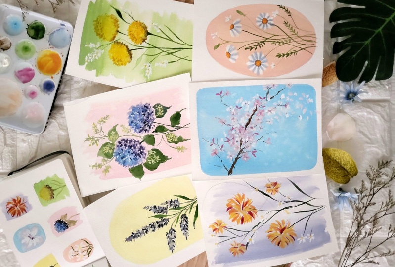
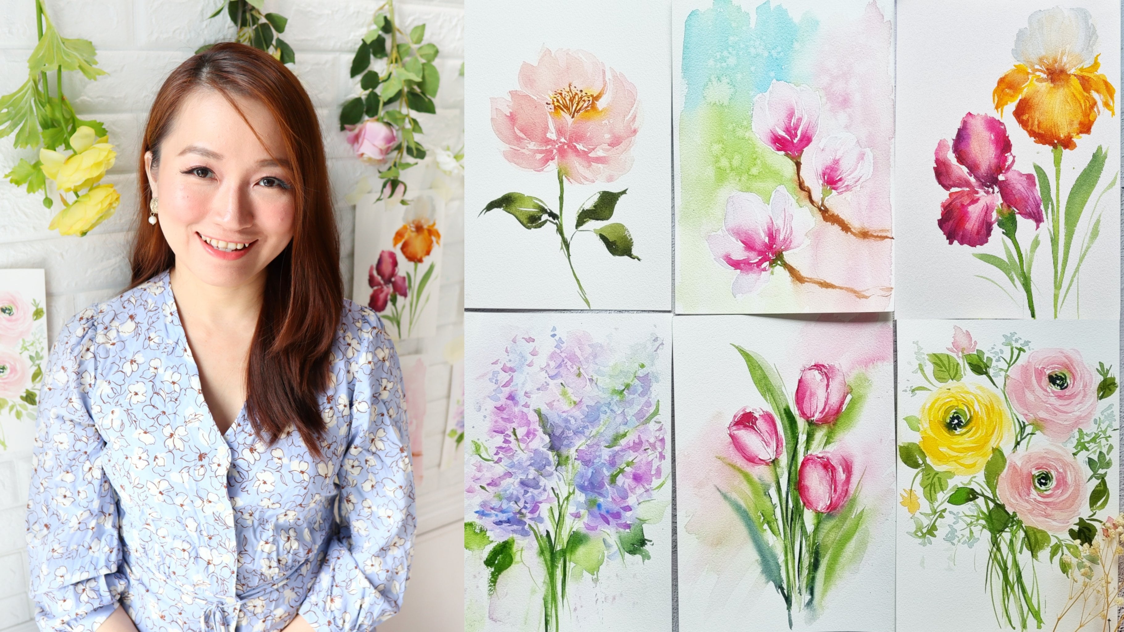
2. Class Overview: In this class, we are going to paint six different projects. The theme of the class is a
little bit different from the usual loose florals that we paint in my previous classes, but just something that I
truly enjoyed painting. I would like to share this
unique technique with you. If you're going through
an art [inaudible], I think this class is also perfect for you
because you'll be able to experiment and just try
new things and have fun. All right, let's check
out the projects. For the first one, we are going to paint this
pastel yellow background, and we're going to paint
lavender on top of it. It is a nice
complimentary color. Next, we're going to paint a pastel pink background
with hydrangeas. In this lesson, we
are going to paint just the essence of the flower. We don't need to paint
all small flowers of the hydrangea. Next, we are going to paint horizontal strokes
for the background, and we are going to paint
this craspedia and learn how to put some shading
and shadow on it. For the fourth project, we are going to do a Chinese brush painting style of dahlia. For the background,
we are going to paint some vertical brushstrokes to
create a different effect. Now because it's spring season, for the fifth
project we are going to paint cherry blossoms. Then we're going to
add some splatters in the background to create
that bulky affect. It goes perfectly well with the background that
looks like the sky, and you also have some white
space that look like clouds. Lastly, this is my
favorite painting. It's a very dainty
salmon pink color in the background with some
small chamomile flowers. Now, all the projects can be finished in about 10 minutes, so it's very quick and
easy for you to do. I hope that you will look
forward to all our projects. Now let's move on to the
materials that we need.
3. Materials: What Do You Need?: Let's talk about the
materials that we need. I'm going to start with paper. I'm going to use bow Academy, this is a watercolor paper
that is called pressed. The thickness is 300 GSM, so it's a bit thick. You can see right
here this paper has some texture because it's
a cold pressed paper. Now this is also good for
painting loose florals. This paper is called a watercolor block which
means that all the sides are glued except for this part where you can slide
off one sheet. For reference, this is
going to be our project. It's a 5 by 7 inch paper which is a
good size for practicing. Of course, you don't need
to buy a watercolor block. You can just buy
one large sheet of watercolor paper and just cut it up to the size that you want. The reason why I'm going to use cold press paper is because
I like the texture of the paper and I want some uneven washes
on the backgrounds. [inaudible] that
you can also use hot press paper which
has a smoother texture. Next for a watercolor, I'm going to use Shinhan PWC. It's a Korean artist grade paint and they come in
tubes just like this, but I just tried to pour them into half bands just
like this in my palette because it's just more
convenient and easier for me to use since I just paint
medium sized paintings. Of course, we need
gouache in this class. I'm using permanent white and it is from the
brand Holbein. Now, this is a big tube. I would suggest getting a smaller one if you
don't really paint with gouache that much because if you don't screw
the cap very well, the gouache will
harden eventually. Next are our brushes. I'm going to use
silver brush black velvet in sizes 4 and 6. We are going to use smaller sized brushes
because we're also going to paint
on smaller paintings. Even if I'm going to use
gouache in our class, I'm also going to use my
usual brushes for watercolor. Now I'm also going
to use a flat brush. This is one half inch in size. If you don't have a
flat brush, it's okay. You can use your
regular round brush. We're going to use
the flat brush to paint the pastel
colored backgrounds. Next, we need a ceramic palette. You can use any
palette even if it's plastic palette or even a
regular plate, that's okay. This is actually just
a soap dish from the [inaudible] and I love the size because it's very handy especially when I'm
painting smaller paintings. Next, we need pencil. Any pencil will do. I'm just using a regular
mechanical pencil. Of course we need tissue
paper in this class because we need to blot out the excess paint in our brush. [inaudible] I'm going
to use a jar of water. You can definitely
use two jars as well, but given my limited
working space I'm okay with one jar of water. That's it. Let's now move
on to the next video.
4. Gouache vs. Watercolor: Let's talk about the
similarities and differences of gouache
and watercolor. Watercolor is a
transparent medium and comes in tube just
like what I'm holding, but I usually just pour
it into half pans. In order to activate watercolor, I'm going to dip my
brush into water and just move it
around on the paint. Now I'm going to mix
it on the palette. I'm going to melt the pigment and then I'm going
to swatch it right here. You'll see that I actually
drew some black lines and that will help us determine if a paint is transparent or not. Since watercolor is transparent, you can still see the
thick black line and also the texture of the
paper underneath the paint. Next, this is gouache it's an opaque medium and I'm going to try to show you guys
what it looks like. This is a colored gouache. But in the class
I'm going to use white and I'm also going to show you a swatch of the white
gouache right here. You can see that it
has a creamy texture. But sometimes gouache dries up pretty quickly
in the tube itself, which you'll see later on. But for now I'm going to show
you this creamy gouache. I'm going to activate it with
just a little bit of water. With gouache depending on
how much water you add, it also determines
the thickness or the opacity of the gouache. You can see right here
we have a thick gouache. You almost cannot
see the black line. Now let's grab the
other colored gouache. You can see that this is pink and really painted on top of the black line you can still see a little bit of the black line. But definitely you will
notice that the color is very thick and
it's also vibrant. Then you'll see a big difference between watercolor and gouache. Now let's see this up close. With gouache if you
paint it really thick, then you won't be able to see much of the texture
of the paper. Now let's move on to the similarities between
these two mediums. Both of them are
water soluble so it means that once they have
dried up on the palette, you can reactivate
it with water. You can see right
here I have dried up gouache paint on the palette and you can easily
water it down. On the left side,
this is watercolor. Again, you can
reactivate with water. Even on paper you can also
re-activate what you've painted on the paper
unlike with acrylics, that stays permanent
once you paint on it or once you squeeze
it out on the palette. Now that you have an idea of what watercolor and gouache is, let's now observe how to
combine these two mediums.
5. Mixing Both Mediums: Now let's mix these two mediums and swatch it on
this black line. I have white gouache and a little bit of yellow
watercolor paint. My mixture is usually 80%
gouache and 20% watercolor. Just grab a wet brush to
activate the gouache, make it creamier, and add a little bit of
watercolor to add some color. You can see how creamy
the consistency is, but it's also not too thick. I'm going to swatch
it and you'll see that it's almost in-between
watercolor and gouache. It's not too transparent
like watercolor, it's also not too
thick like gouache. Now we can also change
the proportion, if you add more gouache, like what I'm doing here, you can see that the color
will look more opaque. Now we almost cannot see
the black line anymore. Now what if we add a
little bit more water? I'm going to grab some
water and add that to my mixture just to seal it down, and let's swatch it again. If you add more water, it will be a little
bit more transparent, but you'll still notice that
it has the chalky texture. That chalky texture comes from the gouache because it
has some white pigment. Mixing these two mediums will
give us a matte texture. It just gives an
interesting texture that you can add to
your watercolor. On the other hand, if
you use just watercolor, you can see how gluey and
transparent it looks. With gouache, the strokes will look bolder because
the color looks richer. What's great about combining these two mediums is
that it will allow us to also adjust the opacity
of our mixture. We can make it a little
bit more transparent or more opaque to get
that gouache feel. Now let's move on
to the next video, where we will learn
about the advantages of adding white gouache to
your watercolor palette.
6. Advantages of Adding White Gouache: In this lesson, I'll be sharing
with you why you should start adding white gouache
to a watercolor palette. The first advantage
is being able to maximize your
watercolor palette. Now what does that mean? It means that we
are going to create different pastel colors that you don't really have in
your palette right now. I just have here gouache and I added a little bit
of cerulean blue, that's a watercolor paint. Mixing these two will give
me this baby blue color. Right here, I have a
pastel yellow color. If I want to change
the shade of blue, I'm going to add just
more cerulean blue. You can see that we have
a darker blue here. Just by adding white gouache, you can definitely create more colors out of your palette. The second advantage
is that we can add more texture
to our painting. I'm going to paint
a thick mixture of gouache with watercolor. Now I'm going to dip my brush in the water jar and just
thin down one side of it. You can see that we can
create some uneven washes and even some dry brush technique and that something nice
to add our background. You will also learn how
to do this later on. Because this dries up Matt, it gives more depth
to our painting. This is just an example of one of the backgrounds
that we will do. You can see you have some
nice brush markings there. It has that rustic feel to it, which is really nice. The third advantage is
that it dries up fast. It also means that you can
finish your artwork faster. This is also important if
you have just a limited time to have the dose of
creativity every day. If you do add more
water, though, of course, it will dry
up a little bit longer. You'll know that it is
already dry when you try to touch the paint on the paper, and it's not supposed to leave some color but as you can see, they're still color
on my finger. It means that it's
not entirely dry yet. When painting on top of it, you also have to be careful with the amount
of water in your brush. Since this is water soluble, you might accidentally
lift off some of the colors in the background as you paint the second layer. The fourth advantage is I
didn't add highlight, depth, and contrast to your painting when you're adding
gouache to your palette. I have this dark
background is already dry, try to observe what
will happen once you paint white gouache
on top of it. Even if I'm painting
just simple petals, you can see how
beautiful it is in contrast to the dark background. This is a simple
technique that you can add to your paintings. Now I also add
these white details to some of the flowers. This is an example. We can add some white dots
near the center of the flower. You'll immediately see
the difference and how it just gives this
flower more depth and more detail compared to the plain flower that
doesn't have white gouache. Now if you have a
darker background, the white gouache will show
up much better but here, let me just show you
what it will look like. We can paint some
tiny flowers in the background that can also
help fill up a small space. The other tip for you is to use white gouache to
paint some veins. This is something I love
to add to my paintings. Can also add some white berries, or maybe some smaller fillers
on top of the leaves. Adding white gouache to your watercolor palette really
levels up your painting. Now let's move on
to the next video.
7. How to Mix Pastel Color: [MUSIC] Let's talk how
to make pastel colors. I have here my gouache, I have this older one, and it has dried
up a little bit, but we can still use it. I'm just going to show you. Let's squeeze out some gouache. You'll notice it looks
like a thick pace, but it is still usable. You'll see me use this gouache
in some of the projects. Next, I have my newer gouache, it is a big tube. You can see that when I
squeeze out this gouache, it's going to look very creamy, a little bit runny. Both will work really well. Now let's try to
activate this gouache. Now I need two brushes. This is a preference. I'm going to use one brush
to grab some watercolor. This is already a wet brush, so you can see it's very easy
to pick up some pigment. I'm going to put it on
one side of the palette. Next, I'm going to
grab my other brush. This is also a wet brush and I'm going to mix this gouache. I want this to be creamy, so we just have to be patient when the gouache is a bit dry. Just make sure that you can
dilute all the gouache there. Now let's try to mix
these two mediums. I'm going to grab a little
bit of that yellow, move it to the right, and slowly mix it to my gouache. The reason why I'm
doing this is because I don't want to overdo the color, I want a certain
shade of yellow. It's best to add the
color little by little. Now let's try the swatch this, it's a nice opaque color. Now, if you want more yellow, then you just grab more of that watercolor paint and
mix it to your mixture. You can see we have
a bolder color. Also right now you will see that the mixture is still very
thick and it's opaque, so we are able to cover
up the paper really well. But what if we want
a thinner mixture? What you need to do is just grab extra water and just add
that to your mixture. You can see the mixture is
now quite thin and runny. I'm going to swatch it. Maybe it's not too obvious here, but in person the color is lighter and you can see more
of the texture of the paper. This is how you mix
your pastel colors. Again, it depends on how thick you want your mixture
to be or how opaque. If you want it to be
a bit translucent, you just add more water. Now let's try it again. This time I'm going to
use the new gouache. You can see that the
gouache is very creamy. I just grab cerulean blue. I'm going to mix
these two mediums. Because the gouache is new, you can see it's very
easy to mix the gouache. Now we're going to grab
just a little bit of that blue because this
is a more intense color. Also the reason why I'm using two brushes is because
I don't want to dip this brush with gouache
onto that watercolor palette. I don't want my
watercolor paint to be contaminated with gouache. But of course, this
is just a preference and sometimes I do accidentally dip this brush
onto my watercolor palette, and that's actually
okay because you can just clean up your
watercolor paints. Now let's swatch this. You can see it's a
nice thick color. Again, if you want more blue, just add more of that watercolor paint and
you'll see the color transform. It's now a deeper blue. Next, let's try to add
more water to our mixture. Grab some more water
and you'll see that the mixture is quite runny. Mixing the ratio or
the proportion of gouache and watercolor
really depends on you. If you want it more opaque, then you add more gouache. If you want it a little
bit translucent, then you add more water. Do take note that this
will dry matte and a bit chalky because there is
gouache in our mixture. Something that I've
noticed with mixing these two mediums
is that the colors don't really feed
that much when they have dried up on the paper. Whatever color you
painted on the paper, it's this pretty much
the same when it dries. Now you can also do more muted or vintage colors by just adding a deeper shade. You can use indigo or
payne's gray and add that to your white gouache. But for now, we're just going to use pastel colors
for this class. I hope that this
will help expand the colors in your
watercolor palette. Now let's move on
to the next video.
8. Different Pastel Background Effects: Now let's try to discover different
effects that we can do on the pastel
colored backgrounds. Now that we have learned how
to mix a pastel background, we are going to use
this mixture is the same yellow and gouache
mixture that we did earlier. For the first effect,
we're going to paint an opaque background. I'm going to add
more white gouache because I want this to
be a thicker mixture. You can see that I'm
just trying to mix right here and add a
little bit of water. You want the mixture
to be still creamy so that you can easily
blend it on the paper. You'll notice that my brush is coated very well with
the gouache mixture. I'm going to use my round brush first to show you that you can also use any brush because we're just
painting the background. I'm going to paint on arc. These practice paintings that
we're going to do now are exercises to equip you in
painting our projects. Now I'm just going to
fill in the center. You'll notice that this
shape is very opaque. You cannot see the
paper anymore because I want you to be able to explore different ways on
applying this background. It looks good. You
can of course, use any color that you want. Next, let's try out
some splatters. I'm just going to
label this effect. For this one, I'm going to
use my half inch flat brush. This is a mixture that we
mixed earlier in the lesson. Just use any color
that you want. It's definitely fine. I want my brush nice and coated. Let's paint a rectangle
with rounded edges. You'll notice that whenever
the brush feels dry, I just add a tiny
bit of water to the mixture to make the
mixture more runny. We're just going
to use this brush to slowly fix the shape. You can of course use other
shapes that you want. It's also easier to use a flat brush when you're
trying to paint backgrounds. But I understand that some
of you might not have this brush so using a round brush, it's
definitely enough. Now while this
background is still wet, I'm going to grab my round
brush and grab some water. Then you're going to tap the
excess water in the jar. Now I'm going to
tap my brush onto this background and you'll
see a different effect. You will see some white specks, and that is because of the splatters of
water that we did. You can use your brush to
add some smaller white dots. This is a nice effect
if you want for snowy effect or a bulky effect. Let me show you our project that we will use the
splatter effect. These white specks will give a nice texture to
your background. Let's now move on to
the next technique. We're just making uneven washes. I really like doing this because it makes the painting
look more elastic. Right here I'm using gouache
with a little bit of color. I'm using permanent violet. You'll notice that I'm
just slowly mixing these two videos
because I don't want it to look too dark. I'm going to first paint a few strokes with
really bold colors. This is a nice thick mixture. Next I'm going to rinse
my brush and going to introduce just water
onto the right side. I'm also slowly trying to blend in some parts of the
first few strokes. You'll notice the left side is more pigmented than
the right side. I do love the imperfections
in this background. You can grab your
brush and maybe add a few more strokes while
this is still wet. You can also add some
dry brush technique. Grab a tissue paper,
dab your brush, and just paint on the sides to create these
fuzzy looking strokes. Next, we're going to experiment
with different shapes. I'm going to mix
first this color. I'm using permanent rose with yellow ocher and a
bit of whitewash. What I want is a nice
salmon pink color. We're going to do
the same project in a bigger format so this is
what we will be painting. It's one of my favorites. Using this color, I'm going
to paint an oval shape. You can play around with
other shapes as well. It looks very tainty and I'm
also using my round brush. It's not really my intention to make it a perfect oval shape. I want it to be imperfect. You can see that I'm just
trying to do it freehand. Also, what I've noticed with
mixing these two mediums is that it's okay to do the outline first and
then fill in the center. I noticed that I
don't have a lot of harsh lines, but of course, it will still be
best to work pretty quick when you're doing
these backgrounds. That's why I still suggest
using a flat brush. Next, let's do
another technique. We're going to do
vertical brushstrokes. Right now I am going to
use permanent rose with white gouache so that we can create these nice
pastel pink color. Now this mixture looks
a little bit thick. You can see a lot of
dry brush technique, but I'm going to add just a
little bit of water just to thin down this mixture and
make it look more uneven. Adding water will also
help me spread that color. Of course, you can
always go back into your palette and grab
some more paint. If you want to make
some fuzzy edges, then just grab your
brush and dab it in tissue paper to
make sure it's dry, and I'm going to just paint the sides and make
it look more rustic. Lastly, let's do a horizontal
brushstroke technique. I am going to use
just sap green with white gouache let's just mix that until we get that
milky green color. I'm going to move my
brush left and right. This looks too dry, so
I added more water. Now, it's easier to move
around their brush. Just keep adding water if
it feels a little bit dry. If you're working on a hot
press paper which is smoother, it might be easier
for you to spread this mixture because cold
press paper is textured, it means that it will also
absorb more of that paint. Let's wait for this to
dry up a little bit, and then you can move
on to the next video where we will paint
many flowers.
9. Mini Floral Exercises: All right, let's paint some
mini floral exercises. I'm going to start
with the first one. We're going to use
permanent violet and I'm going to paint a lavender. We're going to do one stalk. Start by painting the small heart shapes or letter V shapes. You'll notice that I'm
doing two strokes, they're beside each other. Now I'm using lavender just
to change up the color. You can use other violets
in your palette as well. There's too much water, I'm going to dab it
in the tissue paper. Now let's grab a green color. I'm going to use sap green. And you're going to just paint the straight
line over here. Next, we're going to try and
loosen up this painting. I'm going to grab a clean brush, dab the excess water
in tissue paper, and start blurring the
sides of the strokes. You can see that now
it looks softer. I'm going to grab some more
of that permanent violet and make sure that I don't have too much paint in my brush. I'm going to layer another
set of brushstrokes. Don't be afraid to dab your
brush in tissue paper. Next, I'm going to grab
a clean white gouache and just paint on top of
these letter V strokes. By doing this, you
can immediately see how it has more depth now. Let's move on to the next one. I have here, just white
gouache with permanent rose. Then you're going to
paint cherry blossoms. But to make it look simpler, we're going to paint this five or six-petaled
flower right here. Going to leave the center open. So this looks a
little light or pale. I'm going to make
some more of that permanent rose and just
paint on top of it. Now let's grab a clean gouache. I am going to layer
this flower to give it more depth and just
paint on top of it. I'm going to do some
simple strokes. You can still see
the first layer peeking through
the white gouache. Next, let's grab a more
pigmented permanent rose, or you can use
crimson lake and add some thin lines in the center. Hey, let me show you an example of the project
that you will be doing. Right here we're actually
going to do smaller versions. And it will look better when you paint clusters of
cherry blossoms. Now let's move on to
painting a dahlia. I just prepared
here, yellow orange. And you're going to paint
some nice wispy strokes. Just use the tip of your
brush and do it quickly. You can see I'm doing
a curved motion so that I get some
nice organic shapes. I'm also leaving
the center open. Next, we're going to layer
this flower using vermilion. This is a red-orange
color that will give a punch of contrast
with this flower. Try to vary your strokes. You can notice some
are shorter petals, some are longer,
some are thinner, and some are fatter. You'll also notice that, because I'm doing this fast, there is movement in the petals. You can let this dry and
add another layer later on. This is what you'll be
painting in our project. Let's move on to cute flowers. These are chamomile flowers
or daisy-looking flowers. Let's use permanent yellow deep. I'm going to paint
some small circles and maybe one oval shape. The oval shape will
suggest that the flower is on its side or at an angle. Now with a wet brush, you're going to activate
this white gouache. And you want it nice and thick. So you want the
brush to be coated. So what I love about this
brush is that it's also soft and very good for painting
expressive strokes. I'm going to just
press my brush onto the paper to create these
petal-like strokes. I also like leaving
some spaces in between my strokes because later on
we're going to layer it. So these are top-facing flowers. Now let's do the
side-facing one. We want to add petals
only on one side. Then I'm going to use sap
green with burnt umber. Let's paint some stems and
also some small leaves. When the flowers
are already dry, you can grab burnt umber, going to dab the excess
paint in tissue paper. And we're going to
add some detail. Let's put some small dots. Just use the tip of the brush
to create these tiny dots. Let's move on to another flower. This time I'm going to
paint a small hydrangea. We're going to use cerulean blue and also violet later on. So I want colors that will work harmoniously
with the background. So a hydrangea has clusters of small flowers and we're not going to paint
all the details. We just want an impression
that this is a hydrangea. To do that, use the tip
of your brush and just lightly wiggle it until you
create these smaller petals. Now I have here
permanent violet, and going to add this to the lower half of
this hydrangea. You see I want this to be
a multi-colored flower. And you can try to also mix these two colors in some areas. Another important
tip is to leave some spaces in-between
some of your strokes. The shape looks good, but we need to layer that. While we're waiting
for this to dry, I'm going to move
on to the next one where we will be
painting a craspedia. This looks like a small
ball of yellow flower. Let's use permanent
yellow light. And again, this is going to be the same technique
with hydrangea. Except that for this one, it's going to be a
little bit tighter. I'm going to also try
and wiggle my brush to create some nice fuzzy edges. Now let's add a little
bit of shading. I am going to use burnt
umber and we're going to add this color while the base
yellow layer is still wet. You can see that I'm just
trying to blend the two colors. So that it will look
nicer and you can use just the tip of
your brush to do this. We're adding a little bit of shadow here so that it doesn't look too flat since this
is a very simple flower. Can use the tip of your brush to create some smaller strokes, just like what I'm doing here. Next, you can just add a thin
stem using sap green with burnt umber and just add
some elongated leaves. I'm going to go back
to this hydrangea and also add some
leaves and stem. For the leaves of
this hydrangea, it's going to be a lot
bigger and just wider. So this layer is already dry. It's time to add a second layer. This is a cerulean blue with
a little bit of indigo. And I'm just going to
do a tapping motion. And you can see that
I'm also leaving spaces in between my strokes, but my brush looks
like it's too watery, so I'm going to dab it in the tissue paper and
I'm going to just fix those areas and smudge some of the strokes so
that it will look softer. Next, let's add
permanent violet. And we're going to
add that towards the bottom part again
of this hydrangea. We're going to do the
same tapping motion. You can try to wiggle your
brush using just a tip. I think it's looking
really good. You can see more depth now. And we're going to go back
to this craspedia and add a little bit more of
that burnt umber. If you want it to
have more contrast, you can use a darker
color like sepia. So let's try it now. You can see this is a
really dark brown color. Next, we can try to
fade away some of the strokes that we did so that it doesn't look too harsh. Just keep blotting your brush
onto this tissue paper. All right, looking
at this dahlia, I think we need to
add one more layer. I'm just going to use red and I'm going to add
more wispy petals. Okay, I think that we're
ready to start our project, so now let's move on
to the next video.
10. Pastel Yellow and Lavender: Before we start, here are
the colors that we will use. Permanent yellow light,
permanent violet, lavender, permanent rose,
sap green, and burnt umber. For first project
we're going to do a pastel yellow background
with lavenders. We're going to play
around with shapes. I'm going to do an arc shape. I'll be using a
regular pencil and just do a very thin outline. Again, once you paint on
top of a pencil marking, you cannot erase it anymore. I do suggest to draw lightly and erase as much pencil
outline as you can. The sheet doesn't
have to look perfect. That's okay. We're just going to doodle and have
some fun today. To start, we're going to put a little bit of white
gouache onto our palette. Next, I'm going to grab this permanent yellow light and put it on one
side of the palette. Now we can use a brush and just try to dilute this gouache. I don't want a lot of water because I want
this mixture to be quite rich and a
little bit thick. I'm going to grab just a
little bit of that yellow and slowly mix it
into the gouache. You can see that I'm trying
to work slowly instead of adding all the yellow
into the white gouache. Just keep on mixing
until you get the desired yellow
shade that you want. Now let's start painting
the background. I'm going to use my
round brush just to show you that you can also
use your round brush. But it is definitely
way easier to use a flat brush just like this, because you can cover more area in a shorter
amount of time. Now let's start painting the
curved side of this shape. You can see, I'm just trying
to flatten my brush onto the paper to create
this nice curved shape. The pointy part of the
brush is facing outward. So your mixture
should be wet enough so that it's easy to
glide onto the paper. Now I'm just going to try and
slowly fill in the center. When it comes to filling
up the background, we're not really going
to be so strict, like you have to paint
an outline first, or you do from left to right. I do find that this mixture is quite forgivable
and foolproof. If there are uneven areas
that's completely fine. The goal of this class
is really to explore different texture and get out of your comfort
zone as well. Especially if you paint a lot of loose florist just like me. This is already dry, which means that we can now
start painting on top of it. Just try to touch your paper
and make sure that there's no more yellow paint that
sticks to your fingers. Just as a guide, I'm going to draw three lines. You want one in the center
that would be the tallest, and just one on the left side
and one on the right side. These are going to be
the lavender stalks. We'll be adding more
stalks later on. But I just wanted
a simple guide. Now for the first color, we're going to use
permanent violet. Let's start on the left side. I'm going to paint
some letter V strokes, or they look like many hearts. Next, let's add a
different color we're going to be
using lavender. Now you can try to
vary the size of the letter V or heart shapes. Some can be a little bit
bigger, some are smaller. Now let's paint the stem. I'm going to be mixing sap
green with burnt umber so that we have that nice
earthy green color. Then I paint it
right in the center. Next, let's paint
the center lavender. I'm using permanent violet. You'll notice that it's
a darker shade now. Now let's add the a
little bit of lavender. I do try to change the value so that it
looks more interesting. Now let's grab our greens and we're going to add the stem. We just draw one
more stem over here, and that will be
the next lavender. I'm going to grab
permanent violet again. Now let's start building
up those letter V strokes. It's nice to use a smaller
brush to create the strokes. This is a Size 4 round brush. Now let's add a stem again. Now you want the stem to
be a little bit curved just so that it has a
little bit of movement. I'm going to add a little bit of permanent rose to this violet. As I'm painting, this, I feel like we need just a little bit more life
or does a brighter color. Let's start here
on the right side, you're going to paint
from the bottom going up. I'm also leaving some spaces in-between those
letter V shapes. Now let's add a little
bit of that lavender. If you don't have lavender, you can add a little bit
of white to your violet. That is looking really good. I think we can add
one more stock. Let's add one more
stock over here. You'll notice that for
these lavender stalks, I'm making sure that the
heights are different. You will see some are
taller, some are shorter. For a simple painting like this, it will make a huge difference. You can also try to wiggle
your brush a little bit so that you get more
organic strokes. This is looking
really great. To fill in some of this basis, I'm going to add some leaves, and these are going to
be elongated leaves. Just drag your brush to
create these thin leaves. For more contrast, we can grab a darker or more pigmented
permanent violet and start adding a second layer. I want to add it just towards the bottom part of the lavender, just to give it some shadow. To add some texture
and highlight, we're going to use
white gouache. I have here some gouache that I will reactivate with
a little bit of water. Let's add some white strokes. You can paint on top of the letter V shapes
that we painted. Make sure that you don't cover
the first layer entirely. We just want to add
small white spots. Right now you'll immediately
notice that there's more depth on the lavender
with white gouache. It's a very simple
step that really levels up the look
of this painting. I'm looking at this from afar, and I think we can
extend some areas. Just adds a small
strokes at the top. Can be using a little bit
more permanent violet. You can see that we're bringing in more
contrast right now. We are done. Congratulations for finishing
your first project. I hope that you'll
continue painting. The next project,
it's going to be a hydrangea with a
pastel pink background. Let's move on to the next video.
11. Pastel Pink and Hydrangea: Before we start here, the colors that we will
use, cerulean blue, permanent violet,
ultramarine blue, sap green, burnt umber, indigo and of course gouache. For the second project, we are going to paint this pastel pink background
with hydrangeas. To start, I'm going to put a
little bit of white gouache on my palette and
some permanent rose. I'm using my flat brush for
this project and you'll see how much easier it is to use a big brush to
paint the background. Slowly add that permanent
rose into the white gouache. Again, you can see I'm getting the watercolor paint
this little by little. This will help me gauge how
pink I want the color to be. Let's say painting
the background, I'm going to do
vertical brush strokes for this background. We're going to do an up
and down motion and going, we're doing it really
quickly so that we get nice expressive strokes. Just look at the bottom
part right here, we have really uneven
brush strokes. I love how rustic this looks, so this is going
to pair up really nice with some mini flowers. For more added texture, I'm going to splatter some clean water onto
this wet background. Now you can see a little
bit of those white spots so that's also an idea for you if you want a more
textured background. But if you want clean
background and you don't need to add these
splatters anymore. This painting is
already dry and you can see those
beautiful splatters. Right now, I'm just drawing
some leather U-shapes. That will be my guide
where I will be putting the hydrangeas as
much as possible, I try not to draw the
flowers with detail. I just want the overall
shape of the flower. Again, that's because when you paint on top of
pencil markings, you cannot erase it anymore. Let's prepare the colors
we will be using. I will start with cerulean blue, next I'm going to grab
ultramarine blue. Then lastly, let's prepare
these permanent violet. Let's sell you
this cerulean blue with water so that we get a nice light color and when to start at
the top of the flower, try to wiggle my brush. Use just the tip of your brush to create
these small petal like strokes and you can see
I'm doing a tapping motion. Next I'm going to grab
a little bit of this ultramarine blue just to
change the color a little bit. I'm also trying to blend
some of the colors. Next, let's grab a little bit of this permanent violet and add it towards the bottom
part of the hydrangea. Try to leave some spaces
in-between your strokes as well. Now use your brush
and try to wiggle it, the point decide to be facing outward and you can try
to wiggle it like this. You want a bit more texture towards the outer part
of this hydrangea? Let's wait for that to dry, we can move on to
the next flower. Again, I'm going to
start with cerulean blue and just try to
wiggle your brush to create these small
petals strokes. We don't really need to paint all the small flowers in detail, we just want an impression that this looks
like a hydrangea. Next is add some of
that permanent violet. Let me just fix the shape of this hydrangea and
extend some areas. Now, you can try to
add some areas with a darker value as
you will notice here you have darker petals. I'm adding these darker colors while this hydrangea
is still wet, let's move on to the
first flower again. I'm adding a more fragmented
permanent violet, now we're adding more
pigment is cerulean blue and we're just going
to wiggle our brush, create the small
brushstrokes again. Let's add a stem, I'm going to be using sap
green with burnt umber. We want a thin stem going down and then we're going
to add some leaves. The leaves of the hydrangeas
are quite full and big, I'm going to add it
near the flowers. Of course, feel free
to change things up, you can add leaves
in different places, you don't need to follow
everything in this tutorial. I do want you to have
the creative freedom to paint in your own style. Don't worry, you can, of course, paint beyond the edges of the background just like
what I'm doing here. Next, I'm going to
add some more leaves and it might look a little funny right now because
there are no details yet. Now we have big
clusters of leaves, but later on I'm going
to show you how you can divert the attention. You're going to add more
floral elements later on. To fill in some of the spaces, I'm going to add some
stems to get out. Let's grab greenish
yellow academics that to my white
gouache to create this milky greenish yellow color is going to look great as many
flowers in the background. If you have been following
my classes for a while now, you would know that I love
adding greenish yellow to my florals because it just
brightens up the painting. Adding white gouache
to greenish yellow makes it a more subtle color so it's like a
barely there color in the background
as you can see. But if you want it to pop up, you can paint it on top of the leaves just like
what I'm doing here, just put some small strokes that will look
like mini flowers. This is another way to add some texture or depth
to your painting. Because we're adding
these small flowers on top of the leaves, now the leaves don't
look chunky anymore. We've diverted the attention
to these mini flowers. Let's grab a more pigmented
greenish yellow and just add that to the
milky green flowers. I'm just going to
put some small dots using a tapping motion. Let's add a second layer
to this hydrangea. My brush is too wet, I'm going to try to plot
it on the tissue paper. Again, you'll notice I'm using a darker permanent
violet and adding it towards the bottom part of the hydrangea because
that's where the shadow is. Now, you can try to
fade away some of the strokes so that it
looks a little bit softer. Now I'm going to use
cerulean blue and just add another layer on
top of this hydrangea, I don't want this
to be too dark. Let's move on to
the second flower. Again, we're doing
a tapping motion, and we're also making sure
that you can still see the first layer is still more close-up video so
you can see it better. This is a very easy
flower to paint because we're just doing
the tapping motion. They create some
feather-like strokes and then top I'm
using cerulean blue. You'll notice that
the mixture I'm using is still
quite transparent. To add more contrast, I'm going to use indigo and you're going to blot
it on the tissue paper, I'm going to add some small
dots that will give us the impression that
it's the center of some of the mini flowers. If you prefer it, with more contrast
and you can grab the Indigo and create these
small petal like strokes. Make sure that you
don't overdo this or else the flower will
look too heavy. We are happy that you've
finished this project, now let's move on
to the next flower.
12. Pastel Green and Craspedia: Before we start, here are the colors
that we will use, permanent yellow
deep, burnt umber, sap green, and white gouache. For this project, we
are going to paint a pastel green with
some craspedia. Later on, I'm going to show
you the photo of the flower. But for now, we are going
to mix the background. I'm going to grab a little
bit of the sap green, put it on the right
side of my palette, and just slowly mix it
into my white gouache. Now I want a milky green color. So this is going to
look very dainty. For this background,
you're going to do horizontal brushstrokes. So now I'm going
to rinse my brush and just add a little
bit of water to this background to create an uneven wash. Now, let's just slowly
fill in this part. So you can see that I'm
not going to fill in the entire paper with
a green background, I want to leave some
of that white spaces. We're going to paint
three flowers. You can try to put
some small dots on the paper as a guide so that you'll know where
the flowers will be. So here is a simple
reference photo. I'm using permanent yellow deep. Using the tip of your brush, you can wiggle your brush to
create these small strokes. Our goal here is to
create a round shape. You can see that I'm adding some strokes towards
the outer part of this craspedia because
I don't want it to have that perfect round
shape or a round edge, I want to have some fuzzy areas. Next for the shadow, we're going to add a little
bit of that burnt umber. While that yellow
part is still wet, we're going to add in this brown color and just let
them blend into each other. If there's too much
water in your brush, you can always plot it
on the tissue paper. We can add more
permanent yellow deep, just to create a
more vibrant color. Let's add the stem. I'm going to use sap
green with burnt umber. It's best to add the stem
while the flower is still wet. You'll see the colors
blend in with each other. Let's now move on
to another flower. This is diagonally
across the first one, and we're going to do the same
technique and same color. This is permanent yellow deep. We're going to again
paint a round shape, but we want some fuzzy areas on the outer edge of this ball. Next, let's grab burnt umber. I'm just going to mix
it with that yellow and add this color
as the shadow. We're just going to
lightly tap our brush, we don't want to
over mix this area. Let's grab more
pigmented burnt umber, can add it at the
base, and of course, you can always clean up some
areas with a damp brush. Now let's add the stem. We're now onto the
third craspedia, and we're going to
put it right here. You can see that the flowers are all in different heights, even in the reference photo. That will make it
more interesting and just less flat looking. If you don't want to
paint this flower, you can, of course, experiment at other flowers. Now we have the base. I'm
going to add more shadow. You can see that I mixed burnt umber with that
yellow on my palette, and then we're going
to add a stem. I love how adding a background really makes the
painting look prettier. Even if we're just painting
a simple flower like this, I feel like the background
just gives it more depth. I also love that the projects in this class are very doable, you can finish a lot of
them in about 10 minutes. Now I'm just going to
add some tiny leaves, and then we can add
some stem sticking out as well to fill
in some spaces. Let's grab our gouache and we're going to paint
some tiny flowers. Just tap your brush onto the paper and you'll
be able to create these small petals and just
form them into a cluster. So I'm just going to add
some more on the right side. You can actually
leave this as is, but later on I'm going
to add the center. You can definitely change
the brush markings as well. You can tap using the very
tip of your brush and create some small dots that will
look like very tiny flowers. Of course, you'll notice that
the white gouache is more visible if the
background is darker, like the ones on the upper
part of this painting. To complete this look, you need to add some
stamps that will attach the white gouache flowers
to the main bouquet. If you want some texture
on the craspedia, you can grab
permanent yellow deep and start tapping your brush. When you're doing
this, make sure that the layer is already dry so that you can
get that nice texture. Now we can add some more shadow. I'm going to grab a
little bit more of that burnt umber and add it towards the
base of the craspedia. Because this is a simple flower, we do need to focus on adding texture to
bring this to life. It's looking really good. You can also try to fade away some strokes if they
look too bold or sharp. Let's grab some
yellow paint and add a center to the white flowers. So these will look like small
daisies in the background. I also like how it compliments the color of the craspedia. We're done, you can see the beauty and the
simplicity of these flowers. I hope that you
enjoyed this project. Now let's move on to
a different project.
13. Pastel Violet and Dahlia: Before we start here, the colors that we will
use; permanent violet, yellow orange, vermillion,
permanent red, Hooker's green,
and white gouache. For this project,
you're going to paint the pastel violet background
with some orange dahlias. To start, I'm going to grab
some permanent violet. I'm also going to
use my flat brush. Let's start mixing. You can see that I always just use a little bit of
gouache and that is because I am going to paint
on a small piece of paper. As you paint more and more, you will eventually know how much gouache you need
to squeeze on your palate. For these backgrounds,
I usually use just a pea size amount
of white gouache. You're going to create
the vertical strokes that are going to be uneven. I'm going to grab some water and I'm going to put some
water on the right side. You can see that the left
side is more pigmented. I intentionally added
more water to the right side,just
so that I can get some really uneven washes
and very imperfect. You can go ahead and
add some more paint and add some dry brush
technique on the sides. I personally like the unfinished
look of the background. Let's plot our brush in
a tissue paper to absorb the excess moisture and add
some dry brush technique. You can see those nice
dry brush strokes. When the background
is already dry, let's paint the flowers. I'm going to use yellow orange. I'm also going to
prepare vermilion just so that they already have
the colors on my palette. Now, let's start
with yellow orange. I'm going to paint some
elongated C shapes. Just as a guide, what
you can do is you can put some small dots on the paper just so that you know that it will be the
center of the flower. We're not going to really
copy the exact flower, but we just want to get
the essence of a dahlia. You can see right here, I'm actually doing some
quick strokes going outward. I have some pointy tips. It's not that rounded compared
to this reference photo. I'm painting all of these
strokes because I want it to look like it has
layers of petals. Now I'm going to
grab my vermilion. I'm just painting on
top of the first layer. Let's go back to this flower later on when it's already dry. I'm going to start with
the second flower, which is diagonally
across the first one. Again, you can see
I'm just using the tip of my brush and just creating these nice
wispy letter C shapes. It's also elongated. You just need to quickly drag your brush to create
a nice pointy tips. Now let's grab some vermilion. So you can use other colors, just a deeper orange will do. What we want is to combine
two colors to create depth. Now let's grab Hooker's
green and we're going to paint stems for these flowers. You can also use Sap Green. You can also extend the stems even beyond the background that we will also
look very pretty. Then I'm going to add some
really elongated leaves. I just wanted this to have
Chinese brush painting look. You have the creative freedom
to add different leaves. It doesn't have to
be the real thing. This is something
you can apply to your other paintings as well. Don't be afraid to
change things up. Now that we have some
stem sticking out, I think we can add some smaller dahlias
that's about to bloom. I'm going to add these
small flowers just to add color in some
areas of the paper. Add that punch of color. I'm going to use permanent red. I'm going to paint it
on top of the dahlias. This flower right
here is already dry. You will know that the flower is already dry when you start painting on it and you see
your strokes are very defined. Because if this
flower is still wet, your strokes will look
blurry and a little faded. Doing this technique will also give more depth to the flower. Just make sure that you add only a few strokes because you don't want this
to look too crowded. To balance this look and
still make it look dainty, I will be adding some smaller white
flowers using gouache. You really want a
thick white gouache so that it will pop up
in this painting. These small flowers are very
nice to add as fillers. Especially if you
have an odd space and you don't know what
to paint there anymore. I usually just add small
flowers like this. Then you can put a yellow center so that it will look like mini daisies. We're done. I hope that you enjoyed painting this simple interpretation
of dahlias. Let's now move on to
the next project where we are going to paint
cherry blossoms.
14. Pastel Blue and Cherry Blossoms: Before we start here, the colors that we will
use, cerulean blue, burnt umber, permanent rose, crimson lake, and white gouache. For this project,
we're going to paint a pastel blue background
with some cherry blossoms. For this project,
we're going to do a rectangular background
with rounded edges. You can find objects with this size and just
trace it all around, and just make sure that you draw lightly because you don't want the pencil marks
in your painting. You can also actually
do this freehand without having to
trace an object. We're not going to
be super strict about it looking so perfect. I think this looks good. What we want to do is just
explore different shapes for the background so you can definitely do a
different shape as well. I'm going to start
with a white gouache and then I'm going to grab a little bit of cerulean
blue using my flat brush. Now let's mix these two colors. I am going to mix the
gouache first and just slowly add some blue
in this gouache. I'm using cerulean
blue because I like how happy this color is. It's good for painting skies. The reason why I'm using
blue here is because I want a blue sky as the background of sakura
or cherry blossoms. We're going to start
painting using a flat brush. You can see how easy
it is to fill in a space or a shape
using a bigger brush. I also like that this brush
holds a lot of paint, so I can really cover up
a space very quickly. You can add a little
bit of water to make it easier for you to paint. Also you can try to rotate
your paper so that it's easier to get some
of those edges. I'm trying to fill
in the space now. It's okay if it's uneven, I'm okay with that because we're going to add splatters later on. Some of the edges right
there have dried up. I'm just going to grab some more paint to
cover up that area. We are almost done. While this is still wet,
let's grab some water. I'm using my round brush. I'm going to tap
some sprinkles of water and you'll see
some white spots now. It will be more
of use in awhile. I really like adding these types of textures to the paper. It gives it more depth and
also it has a bulky effect. Once this paper is already dry, let's mix up our pinks. I'm using permanent
rose with some gouache. Now we want two shades of pink, one that is lighter, one that is darker. I think I can add
more gouache to this part so that it's going to be a lighter
shade of pink. I'm going to start
with the branch. I'm going to use
burnt umber only, and I want this to
be really dark. Let's just paint a
branch that is sticking out from the upper left
part of this painting. You'll notice that I am
painting some broken lines. There's spaces in
between my strokes because I can put
flowers in those areas. Now you don't really need
to paint all the branches. Now we can add some
more later on, but at least we have
a guide for now. Now let's start painting. I have a small reference
photo for you, am going to start with a light pink color and paint
some five petal flowers. Now let's paint another
one in a different shade. Some of the flowers can
be just three petals. Some can be five or four. We're going to change things up. It's going to look odd right now because we're
painting it one-by-one. But it will look better
as we go along and add some more petals to
make it look fuller. This is looking good. I'm going to add
some more flowers on that upper right side, and later on we're going
to add some buds as well. You can also try to vary
the sizes of the petals. You can see that
some are smaller, some are bigger, and you can change the angle
of the petals as well. Sometimes what I do is
I just stab my brush onto the paper to create
these organic strokes. Now let's grab
some crimson lake, and going to mix that with
a little bit of white. But you can also use
crimson lake alone, and we're going to use that
to paint some tiny buds. These tiny buds are
usually darker in color. Am going to add the stores, the tips of the branches. When you're painting
cherry blossoms, I feel like adding
these small buds will give more contrast
we are painting. Now, another thing
that you can do to add contrast is to put some
small lines in the middle. You can see in the
reference photo, the cherry blossoms
has some staments. Also the center looks
darker than the petals. Now we don't really need to copy all the details because
we're painting really small, and what you want is just to get one specific detail
from the flower. Now this is where
the magic happens. I know this painting
looks a little flat, but you're going to grab some white gouache
and paint petals on top of the
flowers that we did. Now, don't get me wrong. We're not going to
cover up the petals. We're just going to put a
few strokes on top of it, and you will see that this
will make a huge difference. Also, you can add some more petals even
beyond the branches. These may look like petals falling from this
cherry blossom branch. You also notice
that we're slowly filling in this cherry
blossom branch, making it look very full. Now you can get a
pastel pink color and add some more
petals and flowers. This is definitely
all about layering to make it look more lush. You can also add a
darker pink color and just paint it
on top of some of the petals to just add
more contrast and depth. I have burnt umber in my brush and I'm just
going to attach some of the flowers to
the main branch. It also looks very
pretty if you add the branches beyond
the blue background. Now we can add some more petals on top of the branches
that we just did, and I think we can add some more buds just to add
contrast in some areas. I have your crimson lake
and I'm going to add some small details in the center of some of the cherry blossoms that will give this more depth. Because I think we've
lost some of the details. You can paint some thin
lines in the center as well, just like in the picture. Right here, I'm going to
paint some small petals falling from the branch.
[NOISE] That's it. I hope that you enjoyed painting these cherry blossoms with me. I'm happy that we're
able to capture spring in this small painting. Let's now move on to
the last project.
15. Pastel Peach and Chamomile: Here are the colors that
we will use in the class, permanent rose, yellow ocher, sap green, burnt umber, indigo, and white gouache. For today's project
we are going to paint this beautiful and
dainty floral painting. This is my personal favorite. First we need permanent rose. I'm going to use my flat
brush for this project. Next let's grab a little
bit of that yellow ocher. Let's dilute this gouache
with a little bit of water. Then I'm going to mix my pink. After that we can add a
little bit of yellow ocher. You can slowly add the
yellow into your pink. You have to be careful
because if you add too much yellow then your mixture
becomes too orange, and our goal here is to
create a peach-like color. I'm using yellow ocher because
it's a more subtle yellow. Just draw a simple oval
shape on your paper. Or you can also
do this freehand. Now I'm just going to
slowly fill in this shape. You can see how easy it is to
fill in using a flat brush. Just press your brush and you
can see that the edges of the bristles are fanning out. You can use that to shape the curve parts of
this oval shape. It doesn't have to be a perfect oval shape. Once it is dry you can
start adding the flowers. I'm using permanent yellow deep, but you can use any yellow
color in your palette as well. I just like this deeper color. Now I'm going to paint
some small circles. This will be the
center of the flowers. We're going to paint chamomile. Now let's do a couple of round shapes that are
diagonally across each other. You can also paint
oval shapes that will suggest that the
flower is on its side. It's best to change the angle of the flowers when you're
composing a floral composition. Now that we're all set we can
start adding white gouache. For this part I want the wash
to be creamy and opaque. Now I'm going to coat the
brush with a lot of pain, and just slowly
press my brush onto the paper to create
these small petals. Is almost like stamping my brush onto the paper to
create the strokes. Now let's move on
to the next flower. You can see that in the
reference photo you have nice cute rounded petals. We're just going to
try and copy that. You can see I'm leaving some spaces in between
my petals because later on you're going to layer this to make
it look fuller. Now for this flower I'm going
to be on one side only, to suggest that it is at
an angle or on its side. I'm also going to do the
same on the other flower. This is looking really good. Now let's grab sap green
with a little bit of burnt umber to create
an earthy green color. Now let's paint some stems. I'm going to do some
curves, motions. That is to suggest more
movement in my painting. It will make it
look more dainty. You can paint the stems even beyond the background
that we painted. Chamomile flowers
have tiny leaves, and we're going to mimic that. You can see that I'm
using the tip of my brush to create
these tiny leaves. Just slowly stamp your
brush onto the paper. Because I want this
to look dainty, I also want the
leaves to be smaller. You can also add some
small pods and some stem sticking out to
fill in some odd spaces. Let's add just some petals
right here that will suggest a flower
facing at the back. I'm going to add a few more just to add more volume
to this painting. Because this is a
flower that's facing at the back we're not going to paint the yellow center anymore. Now let's try to extend
some of the leaves beyond the oval background
so that it doesn't look too cramped
inside the background. We're just going to
extend a few leaves so when the flowers
are already dry we can start layering the petals. I have here a little bit
of indigo watercolor, and we need to add
that to my gouache. This is going to be a
very light mixture. I'm going to add it in
between the petals. This looks a little blue for me. I'm going to add more
gouache to my paint. Let's try it again
in the other flower. I think that looks better. We just want a subtle color. This is going to give
us a fuller look. Now we cannot use pure white for the second layer
because we won't be able to see the difference. That's why I added just
a little bit of indigo. Now if the petals look
too blue for you you can go back in and layer it
with some more gouache. This is the beauty of gouache, if you made a mistake
you can definitely go back in and paint on top of
it to cover that mistake. Now let's add some more details. I'm using burnt umber. I'm just going to
put some small dots all around this yellow center. Now this will give
us more contrast. Let's add some shading. I'm going to rinse
my brush and tap the excess water in
the tissue paper, and then we're going to slowly smudge some parts of those dots. This will give us
some shadow effect. You can see in the
reference photo the center of the flower has some shadow, and we're going to
try and mimic that. Just make sure that you
have a fairly dry brush. You don't want it to be
filled with a lot of water or else we will end up ruining
the center of the flower. It's really very
important to blot your brush in a tissue paper
before you start fading. We're done. Congratulations for finishing your last project. I hope to see all
your projects in the project gallery
section of the class. Let's move on to the next video as I give my final thoughts.
16. Let's Wrap Up: We have reached the
end of the class. Thank you so much for watching. For our project, you will be painting pastel-colored
backgrounds. It depends on you if
you want it to be opaque or if you
want uneven washes. Next, you will be painting
flowers on top of it. You can also paint just leaves. Depending on the season, you can also paint, for example, spring flowers as a theme for your collection. There are many ideas that you can do when you have a
pastel-colored background. This class is a good
way to really get to know gouache when you're
just starting out. I hope to see your projects in the project gallery
section of the class. Just take a photo of your
painting and upload it there. Under the tab section
of the class you will see Projects and Resources, click that and then
click Create Project. I'd be happy to give a feedback and some words of
encouragement to you. You can also tag me
on Instagram and use this hashtag so
I can see your work. I would love to know how much
you love this class and how much this class helps you
in your watercolor journey. I would greatly appreciate if
you could submit a review. This will help me produce
better classes in the future, and it will also help
new students find this class and also be able to assess whether it's a
class for them or not. If you want to learn more how to paint watercolor florals, I invite you to
watch these classes. I will see you in
the next one. Bye.
17. Bonus Video: Fathers Day 2023: I'm so excited because we have a bonus project for this class. Today we are going to
make a Father's Day card. But, of course, it doesn't have to be just about Father's Day, we can use this design or project for other
occasions as well. We're going to go
for a blue theme for this project and I'm
going to use marine blue. I think it's the first
time that I'm introducing this color in any of my classes. This is like a
bluish green color or it reminds you of
the color of the sea. If you don't have this, just use any blue
colors that you have and maybe add a
little bit of green. Right here, I just
have my white gouache, and then I mix it
with the marine blue. We're just going
to mix it until we reach a color that we desire. I think we can try and
swatch it to see the color. It looks nice, but
it looks too blue, I'm going to add a little
bit of sap green just to change that color and
make it a little bit cooler. This color looks nicer, so you can see it's a
bluish green color. But of course this is just
a preference of mine, you can use a different
color as well. Let's start painting
the background. I'm using my flat
brush and we're going to do a left
to right motion, just going
back-and-forth until we fill up most of this space. Now you can see I'm
leaving the sides quite jagged and I'm
not going to fix that, I want it to look a
little bit rustic. If you want more texture, you can add some
splatters of water. I think we're good
and we're just going to wait for this to dry. When it's dry, we can
start adding some flowers. I'm going to use my
marine blue again, so I want this color
to be a bit bold. We're going to paint just
simple five petal flowers. I just want this to be a quick
and easy project for you. What we're going to
do is we're going to paint one main flower. This is the big
five petal flower. Then on the sides, we are going to paint smaller five petal
flowers, right here. I just rinsed my
brush so you can see the color is lighter
than the first flower. Now, I'm going to add indigo, and paint one more
flower on the left side. When it comes to the
placement of the flowers, you can see that
they are diagonally across each other so
that there is movement. You can also mix some
smaller flowers, just paint a few petals, or paint some small buds. I'm using marine blue, but you can use any blue
color in your palette. Just make sure that you use
a variety of blue colors, so that it will look
more interesting. Now, let's attach all of them together using stems and leaves. I'm using the color sap green. Since I'm working on
a small painting, I'm also using a smaller brush. This one is a Size 6, you can use Size 4 as well. You can see right
right I just rinsed my brush to create a
lighter green color. I just want to add
different shades of green. Now, on the upper left corner, we're also going to
do the same pattern. Going to start with the big five petal flower
using marine blue. We're going to add
more details later on. What we need to do
is to just paint the framework or the
base of our design. Here we're using indigo, again I'm painting a
five petal flower. To help you better
visualize this arrangement, you can add some
leaves right now, add some small
stem sticking out. Now we can add some smaller
flowers to the stems. This actually looks
good already, but we want more depth, and what we can do is to add some white flowers
using white gouache. You want a really thick mixture. You want this to
be opaque because you want the white to stand out. I'm just going to paint
some smaller white flowers and small buds. We can try to vary the
shapes of the petals as well to make it
look more interesting. For some flowers, I'm just
trying to stamp my brush onto the paper to create
a petal-like stroke. Let's add some more flowers. I'm going to add a
little bit of sap green to this gouache mixture. We want this creamy
greenish yellow gouache, you can also add a little bit
of yellow to your mixture. You can see that it's not
an overpowering color, so you just want it
in the background. Now this is a technique
to fill in some spaces, but at the same
time it will look subtle and not too overcrowded. Let's now attach some stems to the buds and small flowers
that we did earlier. I just mix my sap
green with some sepia. As you can see, the color of the green in my brush
looks a bit dark. That's because sepia
is a dark brown color. To add some texture, you can put some small
cluster of dots like this. It will look very pretty and add some texture to your bulky
or floral arrangement. Now, we can also
paint some leaves hanging outside the border
of this background, just like what I'm doing now. It's a nice way to add some
movement to this piece. Using the tip of your brush, you can create
these small strokes that will look
like small leaves. Again, it's also a way
to add some movement and it also serves as a
filler to this painting. Now, we want a pop
of color as well, so I'm going to use
yellow and put it in the middle of the
five petal flowers. To give it more depth,
this is optional, but you can add
some small ring of dots in the center of
the five petal flowers. You can see how it instantly lifts the five petal flowers
and makes it pop up. Now, your flowers are
still a little bit wet, so as you can see as
I add white dots, it is spreading a little bit
and mixing with the petals, but that's okay, it's giving
you a beautiful effect. If you want the white dots to be sharper and more defined, you need to wait
for the petals to dry before you add
a layer again. Try to look at your
painting from a far and see if you need to add
some more details. Just like what I'm doing now, you can take a photo of your painting and look
at it from your phone. Because that will give you
a different perspective. It's time to add the
message in the center. I just wrote down
Happy Father's Day using a pencil as a marking. Then I'm going to go back
in with my micron pen, this size is 05. You can also use different pens, but this is all I had at home. If you can do calligraphy, then that would be awesome. But unfortunately, calligraphy
just isn't for me. I'm just going to write a
simple lettering right here. Now that we have the lettering, I'm just going to add some small leaves
right here to fill in that gap because
I made a mistake. But it's okay. We can always troubleshoot just like
what I'm doing here. I'm just going to
fill up the space so that it doesn't look too odd. In the center, I just added
a small flower right here, just to make a more
cohesive design. Also on the lower left part we're going to add
some more leaves. I'm just going to
extend this area. I think this is looking
really beautiful, of course, you can add different
quotes in the center, it doesn't have to be
Happy Father's Day. That's it, I hope
that you enjoyed this bonus video
and I look forward to see your project in the project gallery
section of the class. Bye.
 Joly Poa, Watercolor Artist