Transcripts
1. What is this Class About?: [MUSIC] I often associate spring with beautiful soft
and delicate flowers. The colors are vibrant
and just so full of life. Looking at flowers
really inspires me to paint and express my
creative freedom. Of the many spring flowers, I have chosen seven, which I found interesting. I'm here today to share with you how to paint them
in loose style. Join me and let's explore one new flower each
day for seven days. [MUSIC] In this class, we will use our creative
freedom to translate a spring flower into a
loose watercolor painting. [MUSIC] Hi, my name is Joly, and I'm a watercolor artist, an online art educator
based in the Philippines. I'm also known as
Jolypoa on Instagram and that's where I share my
art and my process videos. I have been painting
since 2013 and I'm a believer of the thought
that practice makes progress. I have taught many
in-person workshops over the years and have been invited to do stage demos
and big art events. I also collaborated with
different famous art brands. [MUSIC] This class is in a daily watercolor
challenge format, which means that we will
paint one project per day. May be your nervous
because you haven't tried painting
these flowers yet. But don't worry, because each
day I will be giving you an overview to prepare you
before you start each project. We'll discuss the materials needed and the
colors to be used. We'll simplify the flowers
through sketching and you'll discover
different techniques to create unique petals. All the skills that
you will learn in this class can be applied
to other flowers too. [MUSIC] At the end of the class, you will learn to paint
seven new flowers in different styles that you
can add to your collection. This class is suitable
for beginners and watercolor enthusiasts
who want to learn how to paint spring
flowers in a loose style. I'm so excited to
start this class, so let's jump in. [MUSIC]
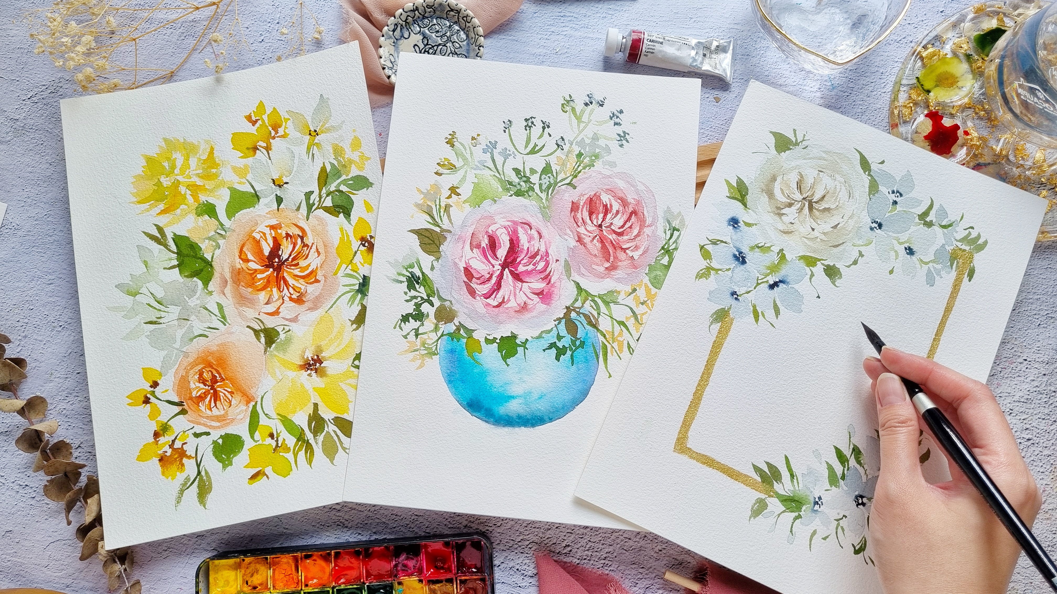
2. Class Projects Overview: [MUSIC] Before we
start the class, I will quickly show
you the projects. This is a daily challenge class, which means that
one flower module will be uploaded per day. By the end of the
seven-day challenge, all the modules will have been uploaded and it will be
available for you to watch. You can join me daily or you can just follow me at your own pace. Now let me show
you the projects. For day one, we're going
to paint sweet peas. This is the easiest project
in the daily challenge. We're going to treat this as
a warm-up exercise for you. On day 2, we are
going to paint lilac, so we're going to do a
more expressive style. What I love about this
project is that we get a different unique painting each time we do this technique. Let me show you
another painting. You can see that this one
on the right doesn't have as much details compared
to the left painting. Let me grab another painting. This one has more contrast because we added darker colors. With the techniques that
you'll learn in this module, you'll be able to paint
lilac in your own style. On day 3 we're going
to paint magnolias, so we're going to
do a simple take on this flower but we'll add
this beautiful background. I'll show you how to add those textures in
the background. On day 4, we are going to
paint ranunculus. There are different
types of ranunculus. For this project,
we're going to do the tight ones or the ones
that look like a rose. This is one of my
favorite flowers. On day 5, we are going
to paint peonies. I still find it hard to
pronounce this flower. In this module, we are
going to learn how to paint those fluffy pink
petals and I'm also going to show you how to
paint the expressive leaves. On day 5, we're going
to paint tulips. I used to have a hard
time painting tulips because they always end
up looking like blobs. But I discovered a
different technique that I really want to share with you guys because I
feel like it will really help you paint these
beautiful flowers. Lastly, on day 7, we are going to paint irises. At first, they can be daunting to paint because of the shape, but I will be showing you
how to achieve those nice, expressive, and organic shapes. You can also paint
this in another color, and we're actually
going to do that in the overview of this module. Those are all the seven
projects in seven days. I hope that you will enjoy and learn a lot from this class. Let's now move on to
the next video where we will learn about
the materials. [MUSIC]
3. Materials: [MUSIC] Let's talk about the materials that we
need for this class. For the paper, I'm going to use the Baohong artist grade paper. It's 100 percent cotton
paper and cold pressed. This is in a block form, which means that all sides are glued except for this part. You can use a palette knife or a cutter to slide off one sheet. Remember to let the painting dry completely before you
take out the sheet. Because we're using 100
percent cotton paper, you'll see that we
have a nice blending on the petals of these irises. Now, if you are on a budget, I would recommend using
the Baohong Academy. It's the student grade paper. Let me show you
what it looks like. This is also 300 GSM. It's the idea of thickness
for watercolor paper. I would say that this is one of the best student grade
papers that I have tried. This is also in a block form, and now I'm showing you some paintings done
on both papers. You might just get
more patches on the right side as the
student grade version. Then on the left side, you'll see that there's a more beautiful blend and
more texture on the paper. If you want to practice
on a sketch book, but you're on a budget, I would suggest
using caddy paper. I love this book for
doodling every day. It does have a
texture on the paper. That's something that
you'll have to get used to. The only downside of
using this paper is that it has its limitations, so you can't really use all the watercolor
techniques on this paper. Let's now move on
to the brushes. We are going to use
the sizes I have here. Silver brush, black velvet, round in Size 6 and 8. Then I also have this
1.5 inch flat brush. When looking for a good brush, you have to look for a brush that can hold a lot of water, but it can still keep its point. Now if you don't
have a flat brush, that is definitely fine, you can still use
your round brush. This 1.5 inch flat
brush is very useful if you are painting up to
nine by 12 inch paper. On the other end of this brush, you have this bevel tip. You can also use this to add
some veins on the leaves. Now let me quickly show you the sample of the veins
that I'm talking about. You can also use just
an old credit card to add some veins on the
leaves or petals. Next, of course we
need watercolor paint. I'm using the
branch Shinhan PWC. It is a Korean
artist great paint. They all come in
tubes like this, but what I do is I transfer
them into smaller half pans. The colors that you
need per module will be indicated before you
start the overview. Next, we need a mixing palette. I'm just using the
lid of my metal pan. It's from the brand core, but I've changed the paints inside this watercolor palette. You can also use a ceramic
plate or a plastic palette. That's also okay. Of course we need a jar of
water and then you also need tissue paper to blot out the excess moisture
in our brush. So we are done with
the materials. Now let's move on
to the next video. [MUSIC]
4. Tips Before You Start: [MUSIC] I'm sharing with you
some tips before you start, and this is specifically
for beginners, but if you have already
taken my previous classes, then you can skip this video. Let's start with the basics. The first question
that most painters would ask is how do
you hold a brush? I always say that initially
you hold it like a pen, and then just adjust your hand until it feels more comfortable. It's also best to start at a 45-degree angle when
you are painting. If you want to paint
some small details, then you want to
hold your brush near the bristles so that
you have more control. It looks like this. But if you want a
looser way of painting, then you hold it
towards the end of the handle, just like this. Your wrist will immediately
feel loose and free. Most of you probably have
half pans just like this, so before you start you can get a spray bottle and just
spray some water onto the half pans and let it sit for just a few minutes so that the paint will be
nice and moist. This way it will be easier
to pick up the paint. When we're about to start, the first thing we
need to do is to wet the brush and then now
let's grab some paint. I'm going to grab
permanent rose. Then just swirl it on your
palette to make sure that you are mixing the
paint well and that there are no
clumps of paint. You can grab some more
water to thin it out. Now let's just
swatch this paint. You will see that we
have a nice bold color. Now let's grab our water jar
and I'm going to just dip my brush in the jar and
tap the excess water. This way, we can create
a lighter color. You'll notice that we now have
a lighter pink and you can dip your brush again to
get an even lighter color. Throughout the class you'll
see me use this technique. Now let's talk about controlling
the water in your brush. When you dip your brush
in the water jar, you will notice that the
value will become really big. It's really loaded
with a lot of water. What you need to do is just
to tap it on the rim of the glass to get out that
excess water. There you go. But of course, it depends on the type of brush
that you're using. Some brushes may
absorb more water, so we have to try it on
your own and observe. But at least for now, you have a starting point. Another way to control the
paint or water in your brush, is to dab it in tissue paper
before you start painting. I just grab some paint and dab the excess moisture
in this tissue paper. Now I have a nice and
even brushstroke. Sometimes when you have too
much paint in your brush, then you'll get
lots of puddles on your paper and that
doesn't really look good. Let's do some simple
brush drills. I'm just going to grab a green paint and you're
going to use the tip of the brush to create some hairline strokes
or some thin strokes. When you're doing this, you need to apply it really light pressure onto your brush. Then when you add more
pressure to your brush, you can create a thicker stroke. Let's try that out. Now this is also a good way to get to know your brush better. If you really press your
brush onto the paper, you get a very broad stroke. You will see that the are
bristles are fanning out. Now let's try a C-shape petal. This is what we normally use for painting roses and
other flowers. Let's start at the top and
then we're going to slowly press our brush and just
move it in a curve manner. You can see it, we
have pointy tips. This is something that you can practice for painting petals. You can also try to vary
the shape and the size so you can paint some
smaller ones right here. You can make it thin or thick. The point of this
exercise is really to get to know
your brush better. You can also try to
paint some dots and this is a technique that we'll use to paint some fillers later on. Another exercise that
I usually do for brush control is to do
some wavy lines like this. You can start with
the thin pressure going up and then when
you're going down, you add more pressure
to your brush. Let me show you the fading technique which
we will use in this class. Let's just paint a C-shape. After that, let's
rinse our brush and just tap the excess water. Then you're going to try and feed one side of this stroke. You will see that this side on the right has really
blurred edge. You can see that
it looks very soft compared to the left side, which has a sharp edge. For some of the projects we
are going to use the wet on wet technique and let me
just give you some tips. I'm just going to quickly wet a small area with
just clean water. Then let's grab some paint. I'm going to drop it
on the wet paper. You will see that we have
some soft edges over here. It's also spreading a bit wider. To control that paint, what you need to do is to dab your brush in a tissue paper before you start adding
the paint onto the paper. This way you'll be able
to control how much the paint spreads on wet paper. I hope these tips were helpful. You can check out my
other classes for more in-depth tutorial
on brushstroke gills. I will see you in
the next video. Let's start day 1. [MUSIC]
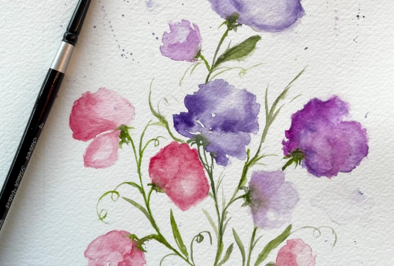
5. Day 1: Sweet Pea Overview: Before we start painting, let's try to sketch some
petals so that we can be more familiar with the overall
shape of this flower [NOISE]. You can see that the petals have a lot of frills
towards the edges, so you can see some wavy edges. You also have different
shapes depending on where the flower is facing. Let's also try to
sketch that so that we can have different
shapes in our composition. I love the organic
shapes of this flower. Because the petals all look
different from each other, we can be more creative in terms of translating this
flower into a painting. We can do [NOISE] petals
that are overlapping, and later on I will show
you how to separate those petals so that they won't look like a blob of paint. I will also include
the link of this book in the Resources
section of the class. Before we start, I'm
just going to show you the colors that we need for this overview and also
for the final project. The first color is
permanent rose, next we have permanent violet, and then we have some lilac. Next we have lavender. For this stem we're going to
use sap green and we're also going to add in burnt umber to give that nice
earthy green color. I'm going to show you
different approaches to painting this flower. Right now I have
here permanent rose so we want a more
pigmented mixture. Using just the tip of the brush, we're going to create
a jagged edge. We're trying to wiggle our
brush to create these frills. Once we have that outline, I'm going to rinse my brush
and tap the excess water, and we're just
going to fade away the inside and then I will slowly start to shape
it into a petal. You can try to experiment
with the shape, you can add more frills, and then you can also grab
some more paint and just drop it in some area so
that there's contrast. Right here I'm doing a more
simple interpretation of this flower and
now we're going to add this sap green as the stem. Now we're done with
this approach, let's move on to the next one. We're going to do a
wet-on-wet technique. Now, let me just tilt
my paper so you can see the reflection of
the brush strokes, I'm using just water. We want it to look
uneven and organic. You can also leave some
whitespaces if you want. Well, this petal is still wet, you can drop in some color. I'm using just permanent rose, you can also use
different colors because sweet piece comes
in different colors. You can leave it as is or
you can try to fade away some of the colors and
just mix it and blend it. While this is still wet you can also drop in another color, so I'm going to add
some permanent violet and this will make it
look more interesting. You can see that I did not touch the center
of this petal, I kept it white just so that it will look more interesting
and it won't look flat. Now let's try an
overlapping petal. One is at the back, one is in front. Now I'm going to
paint the back petal. I started with this
really faint color, and now I'm going to add
one more petal in front. You can see that there's
a space in between, and that is to separate
these two petals. To add more contrast let's add permanent rose and you want
a more pigmented color, so I'm going to
add it just stores the outline of this flower. I'm also trying
to fix the edges, so we want more frills. When you're painting
simple flowers like this, you want to add more contrast on the petals so that
it won't look flat. To try to experiment, this is a fine way to try out different
brushstrokes as well, so you can lay your brush really flat on the paper like
what I'm doing here. I have already dark
violet on the left side and now I just rinse my brush so I can create a lighter color. I'm going to attach these
two petals together. You can see that as I'm
painting this petal. I'm also trying to
wiggle my brush so that I can get a
more organic shape. Now we can add a stem
using sap green. You can go ahead and
clean up some areas or add some more pigment
to some areas. If you want to add
more punch and more color to the flowers
just wait for it to dry, and then we'll go back in
and add some more strokes. Right here I just have a more
pigmented permanent rose, I'm going to do some outline. You can see I'm trying
to just wiggle my brush. After that let's rinse
our brush and just fade away certain areas, so blot the brush onto the tissue paper to
absorb the excess water. We don't want our brush to
be too wet at this point, and this will look
a lot better when they are put together
in one stem. [MUSIC] I think we're ready, so now let's move on
to our final project.
6. Day 1: Sweet Pea Final Project: [MUSIC] Welcome to day 1. This is the sweet
pea final project. To start, we need
to just lightly sketch some long
and curvy stems. I'm going to start
with three stems. You can do more and also you
can make it overlapping. After which we can try to
draw some petals as a guide. Try to do petals in
different shapes, in different sizes so that it
will look more interesting. This is really just a guide. You don't really need to follow
the petal that you drew. Also, I'm not really going
to draw all the petals. I'm going to leave
some spaces to give some creative freedom in
adding some smaller flowers. Sometimes you can also just draw some
shorter stem sticking out and then later on just paint a petal to attach to that stem. Now let's put some
color on this paper. I'm using permanent rose. Let's start with
the first petal. I'm going to just lay my
brush flat and try to wiggle so that I can get
those nice wavy edges. Then I'm going to rinse
my brush and just fade away some areas of this petal. I'm also going to add some darker permanent rose
mixture towards the edges. While this is still wet, you can try to fix the
shape if you want. You can also add just a
tiny petal right here. Just make sure that
there's a wide space in between the smaller petal
and the bigger petal. Now let's add some stem. I'm using sap green, and I'm going to draw
it all the way down. With the permanent rose again, I'm going to add more petals. You can see that I'm just
trying to wiggle my brush. I'm also going to change
the angle of my brush so that I can get some
more organic strokes. When you're happy
with the shape, you can add a darker or a more
pigmented permanent rose. If you want, you can also
add some crimson lake. Then let's just
attach this flower to the main stem using sap green. Now let's try a
different approach. This time I'm just going
to paint with water. You can see that I
actually painted beyond the sketch that I did and
that's definitely okay. While this is still wet, we're going to grab some
paint and just drop it in. I will just leave it as is. You can also use a
different color. Just try to have fun and experiment with colors
and techniques. Now let's move on to
the center stock. Right now I have here permanent violet and I really
made it more pigmented. Then you're just going to wiggle our brush and do an
outline of the petal. Then once you have this outline, I'm going to rinse my brush and just tap the excess water. Now we're going to
fade away that stroke. Just add some water
in the center. While this petal is still wet, you can fix the shape. You can also add just a
smaller petal right beside it. We're done with this. Let's grab some sap
green and add a stem. You can see that I'm going
to skip a certain area because that's going to be
the space for another flower. Just to make your painting
look more interesting, try to face the flowers
in different directions. Let's move on to the next one. I have here the color lilac. It's a beautiful color that I've recently
added to my palette. Again, I'm going
to do an outline. You can use just the
tip of the brush to wiggle the outline so that
you can have some frills. You can also try to
separate some petals. After that, let's
rinse our brush. Then let's fade the center. I do want to add more contrast and I'm going to grab
some permanent violet. I'm just going to drop it in
this petal while still wet. Now let's attach it
to the main stem. Then you can also paint some
shorter stem sticking out. Using the color lilac, we're going to add
a smaller petal. Now I'm going to rinse my brush and just fade away that stroke. I'm going to also try to
fix the overall shape. I'm going to mix permanent
violet and permanent rose. Now let's move on
to another flower. We want these two petals
to be facing each other. This petal has an
almost oval shape. Then with just a clean brush, I'm trying to fix this shape. Just keep on trying to wiggle
your brush so that you can get that nice wavy edge. You can also try to
rotate your paper so that you can paint
at a better angle. The reason why I'm
trying to fade away the strokes is because I want
some areas to be lighter, some are darker
because that will make the petals look more interesting and it
will not look flat. With a sap green color, you're going to add the
stem all the way down. You can see that I made
it a little bit curved. The last flower that we painted looks a little flat right now. To troubleshoot that, we
can add some more color. I'm adding a more pigmented
mixture of permanent rose and permanent violet while this
base flower is still wet. You can also try to lift the paint if you're
not happy with it. I have here a damp
brush and I'm just trying to lift or
rub off the paint. [NOISE] Now let's try
to fill in some areas. I have here lilac and
I'm going to paint a smaller petal because there's
a white space over here. Now, we can also try to
add some thin leaves. I'm using also sap green and
I'm adding it in between some of the flowers and also to fill in some of the white areas. Sweet peas has
these swirly vines and I'm also going to add
that element to this project. I'm just using the tip of the brush and just
doing some swirls. It's really fun to do. Now if you have some leftover
paint on your palette, you can use that to add
some smaller petals. Now, this whole painting
is already dry. I just have here a more
pigmented permanent rose color. You can see I'm doing an
outline on this flower. Then I'm just going
to rinse my brush, dab the excess water, and just fade away one side of that stroke to
make it look softer. I'm going to do this on
some of the flowers here, just to add more definition
and more contrast. Now let's move on to
the center flowers. I have here a very pigmented,
permanent violet color. I'm also doing the same outline. Now, we're just going
to fade it away. Here's the fun part. We are going to add
some splatters. I'm just going to tap my brush. I'm using just any color
that's left on my palette. You can also brush some
areas with just clean water and then try to splatter
some paint on top of it. This way you can get
some soft effect when the paint hits
that wet paper. I'm just going to
paint some more areas with just clean water. You can see that some
of that green paint actually faded away and
it also looks nice. When adding splatters. I usually don't use pigmented colors because I
want just some soft splatters. Because we painted some areas
with water you can see that there's a soft effect
going on right here. Now let's also paint this
area with some water. Then I'm going to
grab some more paint and just add some
more splatters. For the splatters so that
it won't look too messy, my tip is to use the same colors that you
use for the flowers. I guess we can stop right here. It looks really good, but you can also add some
more splatters if you want. Congratulations for
finishing this project and I will see you
in the next video. [MUSIC]
7. Day 2: Lilac Overview: Lilac is mostly associated with love, happiness, and innocence. Today, we are going to
paint it in a loose, soft and expressive
style, so let's start. Here are the colors
that we will use. Lilac, lavender, permanent rose, permanent
violet, indigo. Then we have sap green, which is one of my
favorite green colors. Next, we have cerulean blue. Now, let's just mix some
of the colors here. Going to mix permanent
rose and permanent violet. We're going to use this
for the lilac later on. You can also mix
lavender and lilac. Next, if you want a
darker shade of green, you can mix indigo
and sap green. Now, we're going to use cerulean blue to paint some
white flowers. I'm just going to quickly
dilute this in a lot of water so you can see that you have
this nice light blue color. To make it a little
bit more neutral, you can add a little bit of indigo and then you can also
add a little bit of green. We're going to use
these colors later on. Now, let's start painting. I'm going to show you different versions of
the lilac paintings. What's great about this is
that every time you paint, it always comes out
different and unique. Now, you can create
some soft lilacs, or if you want more contrast
then you add more indigo, just like the rightmost
painting here. Definitely by the
end of this module, you'll be able to create your own lilac painting
in your own style. Now, let's do some
quick strokes. These will look like
check marks and I'm using just the side and the tip of the brush to create
these strokes. You can also try to
wiggle your brush and these are strokes that we
will use for the lilac. Try to vary the pressure in your strokes so that you
can get different shapes. Let's rinse our brush and
just tap the excess water. We can try and fade away some of the strokes that
might look too sharp. Now, this is a technique
that we will do later on. Let me just show you some reference photos
from Pinterest. Always look for several
reference photos so that you can see the
flower in different angles. Now, for this exercise, we're going to do two versions. One is wet on wet and
another one is wet on dry. Let's grab a flat brush. You can also use a round brush and we're going to
grab some clean water. I'm just going to paint
water on this side. We don't need a lot of water. We just want the
paper to be damp. I'm trying to tilt
the paper so that you can see the reflection. Now, let's grab
some lilac and I'm going to drop it
on the wet paper. You'll notice that the paint
is spreading quite fast. If you want to control
it better then you have to dab your brush
in a tissue paper. Now, let's try it. You can see that we can control the paint
better on wet paper. We're painting this lilac
from the top going down and just make sure
that you're leaving white spaces in-between
your strokes. For the upper half, I painted it with lilac. Now, for this bottom half, I grabbed some lavender. We want this lilac
to be multicolored. Let's grab some more paint. I'm going to mix
lilac and lavender. Because we painted on wet paper, the effect is that it looks
very blurred and soft. This area is already dry, so let's just go back in and paint the paper with some water. Again, we're going to use lilac and I'm going
to use the tip of the brush and just
dab it on the paper. You can try to slightly
wiggle your brush. To add some shadows, let's grab a diluted
permanent violet and I'm going to drop it in right here towards
the bottom part. Using sap green, we
are going to add some stems and I'm going to just dab my brush in
the tissue paper. We don't want this green
color to be too wet. This base flower is
still wet and I'm just going to go back in
and add some more color. This is a mixture of
lilac and lavender. We don't want this to
look too overcrowded. We need to space
out the strokes. They shouldn't be too
close to one another. We can also try to extend
a little bit over here, and that will look nice. While waiting for this to dry, let's move on to the
wet on dry technique. For the colors,
we're going to mix permanent rose and
permanent violet. I'm going to start at the top
and we're just going to use the tip of the brush and
stamp it on the paper. Just lightly press your brush to create these brush markings. Try to stipple the brush onto the paper and make sure that you have white spaces in-between. Now, let's try to
soften some areas. I'm going to rinse my
brush and just fade away some of the strokes
to make it look softer. We can also try to fix
the shape of this lilac. It means that we
can try and extend some areas or fade
away some strokes. To add some shadows or contrast, I'm going to grab
permanent violet, I dilute it in a lot of water. I'm going to put this towards the bottom part of the lilac. Let's grab a more pigmented
permanent violet. I think we need more contrast. Now, let's grab sap green, and I'm going to just
add some stems in between some of the flowers
and all the way down. Let's just add a few
more finishing touches. I think we can add
some more contrast towards the bottom part. We want this to be quite loose. It means that we
shouldn't really add so many strokes and I'm going
to leave some areas as is. Let's go back to the
flowers on the left. This is already dry. We can now add a second layer. I'm mixing permanent
violet and indigo. We want to dilute this
in a lot of water. I'm going to separate these two lilacs and you're just going to
paint a wiggly line. Now, let's rinse our brush and I'm going to fade away one side. By doing this, we're separating the two stalks and
we're also giving an illusion that one lilac is in front and the other
one is behind it. Now, let's grab some more
paint and I'm going to drop it right here so that there's
just more contrast. It's quite amazing that
a simple technique like this can separate
the two flowers. Now I'm mixing lilac
and lavender and using just the tip of my brush, I'm going to create
some wiggly lines. I'm also going to do
some check marks. Again, you have to space
out the brush strokes. We don't want it to be
too close to one another. You might see some
whites paces over here, so we're just going
to leave it as is. We're going to add some darker color in
between these two stalks. Now, I'm going to add a few more stalks towards the bottom, so this is just permanent violet with a little bit of indigo. I want more contrast. Feel free to use different
colors for the lilac. We're almost done. I'm just adding some more
definitions on the stems. Let's look at the
two techniques. You'll notice that
on the left it looks softer because we
painted on a wet paper. On the right you have harder edges and that's because
we painted on dry paper. Now, let's grab some indigo with a little bit of
permanent violet. We can add some more
strokes towards the bottom just to
add more depth to it. Now, we can try to
fade away some of the strokes to make
it look softer. We can also add more
indigo in this area. If you want a really
loose style of lilac, try not to add too many
strokes for the second layer. Both techniques produce
beautiful lilacs. It's up to you which
one you want to use. Now, let's move on to
our final project. See you in the next video. [MUSIC]
8. Day 2: Lilac Final Project: [MUSIC] Let's paint the
final project for Day 2. You're going to paint lilac. For this project, we are
going to paint five stocks. What I need to do
is we need to draw five lines and this will be the guide as to where
the lilac will be. I am drawing lightly
because once you paint on top of
this pencil sketch, you won't be able to
erase it anymore. Let's do a wet on wet technique. I just have here my
flat brush and I am just painting the paper
with clean water. We don't really need
a lot of water. We just want the paper
to be quite damp. I'm tilting my paper
so that you can see the reflection of
the brushstrokes. You can see that
there are no puddles, which means that I
don't really have a lot of water on this paper. The first color we need is lilac and I'm just going to grab a pigmented color and you're going to dab
it on the paper. I'm starting from the top
of the lilac going down. Now, I'm just grabbing some lavender and
just tapping my brush and trying to also sway my brush so that I can get
some more expressive strokes. Make sure to leave
some white spaces in-between your strokes. Now, let's move on
to another stock. I'm doing just the
same technique. Towards the bottom, I'm
adding more lavender. Now, we're done with
the two stocks. We're moving on to the middle. This is the highest
point and you can see that we have a
really soft effect because the paper is still wet. You can also grab a little
bit of permanent rose. That will give it a
little bit of warmth. I want this lilac
to be multicolored. You can see that I'm switching
colors again and again. At the same time, I am making sure that it's
still looking really soft. We don't want super
pigmented mixtures. We are now painting
the fourth stock, which is on the rightmost. Later on, we're going to paint the fifth one in a
different color. Now, let's grab something
darker for shadow. I am just using permanent violet and we're
going to add it towards the bottom part of the lilac because that's where the
shadow is going to be. At this point, the
paper is still wet so that's why we have
to work quite fast. Once the paper becomes dry, then our strokes
will be sharper. Now, let's go back into
some of the stocks. We're going to extend some
areas or add some more shadow. At this point, you just
want to fix the shape. For this area, we're going
to paint a white lilac. It's already dry,
so I'm going to add some more water on the paper. Now, let's grab
some cerulean blue. I'm going to add a lot of
water and then we can add some indigo just to give
it a more neutral color. I'm going to do the
same technique. We're just going
to dab our brush. At the same time, we're
making sure that there are spaces in-between our strokes. Then you can also grab a
little bit of green and add it to your
cerulean blue mixture. Now, let's grab sap green. We are going to
paint some stems. I'm going to add the stems
just in-between the flowers. I'm going to skip
some areas to give an impression that some
flowers are in front, some are at the back. Now, we can extend the
stems all the way down. Now, some parts are already dry and now we can
add some layering. I just have here lilac, and I am just trying to
scribble some strokes. Just use the tip of
your brush to create the small checkmarks or
they actually look like letter U. I'm going to grab some lavender and you're going to add it right here
towards the bottom part. Try to space out the strokes randomly so that it
will look nicer. It's also best not to put too many second layer strokes because it will
look too crowded. We still want to preserve more of the first layer that we did. Now, I'm just going to mix
permanent violet and indigo. We can do this to
separate the lilacs. I just drew a wiggly line and then I'm going
to rinse my brush. We are going to
fade away one side. By doing this, you are putting one lilac in front and
another one at the back. You can see that this area
doesn't have a lot of details. You can just add a few
more strokes using lilac. We can also add a little
bit of violet to that. Just dab your brush, then you'll be able to create these beautiful organic
brush markings. We are almost done with that. Now, let's try to separate
the other lilacs as well. I'm going to do another
wiggly line over here, then let's rinse our
brush and fade it away. Did you see the difference? Let's do one more
on the other side. This is just a
subtle technique to separate the stocks
from each other. Now, while this
area is still wet, you can drop in a little
bit of that darker color. You can use permanent
violet with indigo or just use indigo as is. For the white lilac, let's scrub a very
diluted cerulean blue and just dab our brush. We can also add a little
bit of that sap green. Just make sure that the color in your brush is really
quite translucent. You don't want it to have
a really dark mixture. You can also add
some diluted indigo. It's actually coming
altogether now, but we can add some
more contrast. This is just permanent
violet and indigo again, but this time, I made
the mixture just darker. You're going to add
a few brush markings towards the bottom part. You can also add
some darker areas in between the lilacs so that you can just give it more emphasis that they
are two separate stocks. Then you can also try to fade
away some of the strokes if they look too sharp or too bold. At this point, you can
look at the overall shape of your lilac bouquet. You can try to just extend some areas just like
what I'm doing here. Don't forget that you have the creative freedom to paint
this beautiful bouquet. Now, let's add some leaves. I'm using just sap green. We are really going to
just press our brush onto the paper to create these
nice expressive strokes. The brush is a little dry, that's why you get those
nice brushstrokes. To give more contrast
to the leaves, you can add some indigo to your sap green and just
drop it on the leaves. At this point, you can add some stem
sticking out or just give more emphasis on
the color of the stem. We're going to add a
darker green color. For me to make this
look really loose, the trick is really not
to add so many details. You really need to
be more mindful when it comes to
adding a second layer. To make this look more dramatic, we are going to paint the
white areas with just water. You can see that some
of the leaves have started to fade and
that's definitely fine. I'm going to tilt the
brush so that you can see the sheen on the paper. I'm going to grab some lilac and just add it onto
the background. You can add some
lavender or violet. I suggest using the colors
that you use for your lilac. I love doing this
technique because it just gives off that soft effect. When you're adding color
to your background, make sure that it's not
too dark because you do not want to overpower
the main flowers. Now, you can add some splatters. I just have here permanent rose. You can use any other
color in your palette. I think we need more
contrast for the stems, and what you can do is you
can make sap green and indigo and just paint
some more stems. You want a nice balance
of contrast here. You want some soft flowers, but we also want
some darker stems. I'm just going to go back in and add some finishing touches. What you can do is you
can take a photo of your painting and
just look at it from afar so that you'll
know if you need to add some more details or
just leave it as is. That was a really quick project. I hope that you enjoyed
painting this today. Join me on day 3 as we
learn to paint magnolias. [MUSIC]
9. Day 3: Magnolia Overview: Before we start, I'm going to
just list down some colors that we will be using
for this overview class, and for the final project. We need permanent rose, and then crimson lake. Next we need sap green, this is a beautiful
all around green. Next we have burnt umber, and lastly we have indigo. Here are a couple of photos from Unsplash and
also Pinterest. I usually get different
photos of the same flower just so that I have an idea of what it looks like
in different angles. For this class, I do want
it to be more approachable, so I want to simplify the way of painting all the
flowers in this class. We're going to paint magnolias that are facing on its side. We're going to try one
that's about to bloom, and one that has a
more open flower. My advice when
trying a new flower, you can get a photo, save it on your phone, and then just loosely
draw the shape of the petals and the overall
shape of the flower. Right now let's get into
some simple sketching. Let's start with a center petal. I'm just going to
loosely draw this shape, and then on each side we are going to attach
one petal each. As we go down to the
bottom part of the flower, it's a little bit narrower. It almost looks like a letter V, but of course you can
definitely change the shape. Now let's start to fill
this with some color. I am missing just
permanent rose. This is a really diluted color, but you can also use
just clean water. I'm going to paint on the
inside of this outline, but you definitely don't
need to follow the shape. What I'm also doing is, I'm
leaving some white spaces, so I'm just going to tilt
my paper so you can see it. I'm going to leave it as is. Then now, once we are ready, we can add some more color towards the base of this petal. We want a more
pigmented mixture. We're doing the wet-on-wet
technique so that we can have some softer petals. You can see that the colors
are blending nicely because the petal is still wet as
we add more color on it. Now, let's start painting
the petal on the right. I started from the
bottom going up. I'm also making
sure that there's a space in between the petals. Now we can start
adding a darker color. You can also start fixing the overall shape
of this flower. Let me grab some
permanent violet, and I will add a lot of water. We want this to be really light. I'm going to add it towards
the edges of the petals. This will give that shadow look. This looks like it
needs more contrast. I'm going to grab
some more of that permanent rose with a
little bit of crimson lake. Let's tap our brush in a tissue paper because we
don't want it to be too wet. Now, I'm just going to add
more color towards the base. You can see that we have
more control over the paint. It's not really
spreading like crazy, and that's because we
absorbed the moisture into the tissue paper before
we paint on the paper. I'm going to add
this green area over here that holds the petals. For the branch, let's just
grab some burnt umber. Now let's do one more. This time I'm going to freehand
the shape of this flower. There will be no
sketching for this part, so I'm just using a really
diluted permanent rose, and I start with this
thin petal on the left, and then now we're going to add the thicker petal in the center. We're doing it really
slow and also making sure that we have some spaces
in between the strokes. If you're happy with the shape, you can grab a more
pigmented permanent rose and just drop that
in the center. Now let's grab
some crimson lake, and dumb the excess
moisture in a tissue paper, and you can add it
towards the base. You can also use this
to separate the petals. When you're happy you can add
the stems and the branches. That's looking really
good as you can see. We're just trying to interpret
this in the simplest way, so that it's just easier
to paint the magnolias. Now, let's move on
to another flower. This is going to be more open. It means that there
are also more petals. I'm just using a very
diluted permanent rose. You want the light pink color, and also making
sure that there are some whitespaces that
I will leave behind. Let's add some more petals. They are all meeting at
the base of this flower. You can see that they're
all pointed at this part. For this flower,
maybe I'm just going to settle with four petals, but you can definitely
add some more. Then with a more
pigmented permanent rose, we're just going to add
it in between the petals, just to separate the petals. Now let's put some
stem and a branch. I'm just using sap green, and also burnt umber. It looks a little flat, I'm going to add some shadow. This is just a really diluted
permanent violet color, I'm going to add it towards
the tips of the petals. To add more contrast, let's grab some crimson lake, I'm going to dab my
brush in a tissue paper. Then we're going to paint
some strokes in between the petals and also mostly towards the base of this flower. We really just want to capture
the essence of a magnolia. Now let's try to do a recap. Let's try to do some recap. We need one petal. We want it to be elongated, and we also want the
two sides to be pointy, at the same time leave
some white spaces. For the petals on the side, you can do an S stroke. You can see that I am
just doing this S shape. Let's try to do
that one more time, but from the other side. Now let's combine
these three petals, so we're going to
start with the center. Next, let's attach
the side petals. It's usually easier to do it
from the bottom going up. You can do an S
curve if you want. Like what I always say, one good thing about painting
loose florals is that they always look different and unique every
time you paint it. Now I'm going to grab just some more pigmented permanent rose. I'm just going to put it at
the base of this flower. Then we can grab
some crimson lake and just dab the excess
moisture in the tissue paper. You can use that to add
contrast to this flower. You're done with
practicing this flower. Now let's move on to
the final project. See you in the next video.
10. Day 3: Magnolia Final Project: [MUSIC] Welcome to day 3. We are going to paint the
final project in this video. To start, we need to
just draw some markings. I'm just drawing
a letter U shape, and that will be the
mark for the flowers. We're keeping it simple. I'm only doing three flowers here and then we're going to be adding a
background later on. Let's prepare the colors first. I'm going to be mixing
some permanent rose on my palette and then we are
going to add a lot of water. We want this to be
really, really light. We're going to start with
the center petal first. I'm just going to
slowly build the shape. I'm using a size 6 round brush. We do want this to be quite wet because we're going to do
the wet-on-wet technique. I'm going to add
another color later on so you can see the
sheen on the paper. I have a more pigmented
permanent rose on my palette and
I'm going to drop that in towards the
sides of this petal. Now we are going to add some more petals on the
left and right side. I'm just going to make
sure that there's a white space in between the petals to separate
it from each other. I usually find it
easier to add petals starting at the bottom or at the base of the flower going up. Now I'm just adding some more color towards
the base of this flower. I'm also being more
mindful about adding white spaces so that it won't look like just one single shape. To add some shadow effect, I just have here some indigo. I'm going to mix that
to my permanent rose. You want to really
add a lot of water so that you just get a
subtle violet color. Let's add that towards
the tips of the petal. If you already have a violet
color in your palette, you can just use that and
dilute it in a lot of water. Now let's look at
this from a top view. I think we need more contrast. I'm going to grab some
more crimson lake. I really want a very
pigmented color. Again, I'm adding it towards the base of this
magnolia flower. Now let's grab
some sap green and attach it to the base of the flower with
some burnt umber. Let's just add a branch. Just to make it
look more natural, I'm going to slightly wiggle my brush and I'm also going to dab my brush in
a tissue paper. This is the way to do a dry
brush technique so you can see that texture over
there. It's looking good. Now let's move on to the
next magnolia flower. I'm going to use a
very faint color. This is just permanent
rose with a lot of water. I'm going to start
with the center petal. I'm going to add just a few more curved strokes on the side. You can see here is a reflection of the
brushstrokes that I'm doing, and you can see that there are some spaces in
between the strokes. Then now let's just grab a darker color or a more
pigmented permanent rose. I'm just going to drop
that in at the base of the flower and just let that bleed into the wet brushstrokes. Again, we're doing the
wet-on-wet technique because we want a soft effect. You can also try
to fix the shape, and then now I'm going
to add more contrast. Let's just grab some crimson
lake and permanent rose. I'm going to dab my brush
in the tissue paper, then you can start
painting some strokes. This way we can try to really control the
paint in our brush. You can see that the paint
is not spreading so much because we are able to control the amount of water
in our brush. I think we are good. Now, let's just attach
that to our branch. It looks a little flat, so I'm going to add some
shadows and we want this violet color towards
the tips of the petals. Let's now move on to
the third flower. I just use a very diluted
permanent rose color and we're going to start
with the center petal. I'm going to do an elongated
shape and at the same time I'm leaving some white
spaces inside the petal. This magnolia is
going to be more open compared to the first
two that we painted. I'm just going to do some
more curved strokes. I'm trying to tilt the paper
a little bit so you can see the sheen on the paper. Sometimes it's difficult to see the shape if the color
is really light. Now let's add one more
flower on the left. You can see that it's
pointing towards this part where the petals meet. I'm going to add one more petal. This will look like the
petal is just hanging. You can see that
I'm really pressing my brush so that I can
get a broader stroke. While the base is still wet, we are going to grab some permanent rose with a
little bit of crimson lake. I'm going to add it towards the base and in
between the petals. If the strokes are
too bold in color, you can just grab a
clean brush and just lift or fade away
some of the strokes. I'm now going to add some really diluted violet color and you're just going
to add it towards the tips of the petals. You can actually
stop right here. But if you're like me
who wants more contrast, you can grab some crimson lake, dab the excess moisture
in a tissue paper, and just dab your brush lightly onto the base of this flower. We're almost done with
the main flowers. I'm just going to
grab some burnt umber to paint some branches. You can try to slightly wiggle your brush so that you can
get a more organic stroke. I'm trying to look
at this from a far and it seems like we need to add just a small petal over here
to make it more balanced. I think I'm happy with that. Now it's time for the fun part. I'm just going to
grab my flat brush and just paint the background
with some clean water. If you don't have a flat brush, just use your
ordinary round brush. I am not going to paint
over the magnolias. I am instead going to create an outline around this flower. You'll see that there's actually a white area that I
will leave behind. I'm just going to slowly
paint around the flower. I'm trying to tilt the paper so that you can see the reflection. Now in this area, you can
paint over the branches. It will look
beautiful because it will slightly fade away. You can see that the
brown color is bleeding. Just continue adding
some water all around. Here comes the fun part. We're going to add a splash of color onto the background
so that it will look happy. Right here, I have
some sap green. You can also use yellow
green or green gold. I chose some sprinklers
for the background. You can see that I'm doing
an outline on the edges of the petals and I'm leaving
just a small white area. It's not the same tone
for the entire painting. You can see that I have
a more pigmented green. Then towards the bottom, it's a lighter green color. We don't want the
background to be too flat. Now I'm adding
some cerulean blue towards the top portion
of this painting. I feel like it will give
the impression that you have a blue sky in
the background. Now I'm just going to try and
combine these two colors. We can also try to fill in those tiny gaps in
between the flowers. Now on the right side
of the painting, we are going to use a pink
color for the background. I'm using just a very
diluted permanent rose. Again, if you're adding some
color in the background, you might want to use a color that you have
used for the main flower. You can see the
beautiful faded effect, and that's because we're
painting on a wet background. That's going to give
us that blurry effect. Just to give a more
dramatic effect, you can grab a more
pigmented permanent rose and just paint some
quick strokes. We're almost done,
but I'm going to add one more magic effect. But before that,
you can see that there's a little bit of
sheen on the right side. On the left side, it's still a little bit damp, but it's more dry compared
to the right side. What we're going to do
is we're going to grab some water and I'm going
to add some splatters of just water onto the background and you'll see that effect. You have like a bokeh effect and you can see that
beautiful texture. I'm also going to do that on the right side and I want you to just observe the difference. Let's try that over here. You'll see that it's more
dramatic on the left side, and that's because the paper is more dry on the left side. While on the right side, you still have a little
bit of that sheen, so the water droplets
on the right had more time to really blend
in with the background. Just remember that the
paper shouldn't be too wet or else you won't get
this beautiful effect. It really is all about timing and it's something that
you do need to practice. Over time, you will
get to know more about your paper and your paint. Just be patient. Now I'm just going to
grab some burnt umber and I will try to add more
details on the branches. Let's add some
finishing touches. I just have here
some permanent rose. It's a little bit darker, and now let's add
some thin veins. I'm going to start
from the bottom going up to maybe midway, not really all the way up
to the tip of the petal, and this small detail will really make a huge
difference overall. If you want to
change the color of the background, it's
definitely fine. Some people like to add
indigo so that you have a dramatic dark background and
it's definitely up to you. I hope that you
enjoyed this project. I will see you in the
next video where we will learn how to paint a ranunculus. [MUSIC]
11. Day 4: Ranunculus Overview: [MUSIC] Welcome to Day 4 and today we're going to
learn how to paint ranunculus. This has a rose-like shape
which has some thin petals. Now let's start. Here are
the colors that we will use for both the overview
and the final project. We're going to use
brilliant pink, permanent rose,
permanent yellow deep, permanent yellow
light, sap green, indigo, cerulean blue,
and burnt umber. Right here I have a reference photo that
I found on Pinterest. You'll notice that this type of ranunculus has a
really tight shape. Like what I mentioned, it
has a rose-like appearance. Let's just try to quickly sketch it so that we can
understand it better. You can see I have
that small dot in the center and then you're
just drawing some C shapes. This one has more petals
bunched up compared to a rose. Then towards the outer
part of this ranunculus, some petals are getting bigger. We are also going to
draw it bigger as well. That's just a very quick sketch. Now let's try to look for the
different reference photo. It's always nice to
look for a lot of photos and look at the flower
from different angles. I have decided to
use this photo. You'll notice that
there's a green part in the center and then towards
the middle and outer part, you have the pink petals. Let's start with sap green. I'm just going to paint
some small C strokes. I'm going to leave
the center blank. You can see that there's a
white space in the center. Now let's mix the pink petal. I'm going to use brilliant pink with a little
bit of permanent rose. We want to add a lot
of water because you want this to be
quite translucent. Around this green ring, I am going to paint
more C shapes. After that, we can rinse our brush and just fade
away some of the strokes. We want this first layer
to be light in color because we're going to do another layer where we
will add more details. Now let's just continue
adding some more petals. I'm making some
bigger size petals. I'm also adding a lot of
water so that I can get that nice light pink color. We need to let this
dry but as we wait, let's try to move on
to the next exercise. Let's paint a ranunculus
that is at an angle. I'm going to start
with this oval shape. I'm going to use the
same pink color and now let's paint some
C strokes again all around and make sure that you have some white
spaces in between. Right here I'm trying
to vary my strokes, you can see that some are
thinner, some are thicker. You can see that
the color turned a little bit brownish pink and that's because there's a little bit of
green in my brush. It might have mixed up
with the pink color. To make it look like
it's on its side, we want to add more
petals towards the bottom layer of this flower. Now you'll notice that
the left flower is top facing flower and the right
one is facing on its side. Now, this is already dry. Let's grab some sap green, I'm just going to add more
color on that green area. I'm using the same brilliant
pink and permanent rose mixture and we are just going
to paint some thin strokes. These thin strokes that we're doing will look like the petals. When you look at the ranunculus, you will see that it
has some tight petals. For some areas you
can try to fade away some strokes if it looks
too strong or too bold. Now towards the outer part, we want to really soften it. What we did here as a summary, we painted the base color
first for this ranunculus, and then for the second layer, we're just adding
those thin C curves that will represent the petals. Moving on to the second flower, I'm just going to add
some more details in that green area just to
give it a pop of color. I'm still using
the brilliant pink and permanent rose color. We're just going to
paint more C curves. Just make sure that you
are leaving some spaces in between and then after that, you can rinse your brush and just fade away some
of the strokes. For the bottom part
of this flower, we're going to make
the petals bigger. If you want more contrast, you can go back in and just
paint some darker strokes. You can also make their strokes thinner than what I
had painted here. To complete this look, we need a dark center. I'm going to use indigo, but you can also use sepia, or if you have a black paint
that will work well too. I'm just going to use the tip
of the brush and just tap it on the paper to
create these small dots. Now if you want to
add the third layer, just wait for this to dry
and when you're ready, just grab that permanent
rose and brilliant paint mixture so you want it
just maybe shade darker, and just try to paint
some thin C curves again. You'll notice that on the
left side it looks more like ranunculus because we
added just more details. Now let's try adding
some more strokes. On the right are ranunculus. Then of course you
can also try to fade away some of the strokes. Now we're done. I'm just
going to quickly add some stems so that
it will look nicer. You can definitely do
this in a different color using the same method that
we did to paint this flower. Now, you're ready for
the final project. Let's move on to the next video. [MUSIC]
12. Day 4: Ranunculus Final Project: [MUSIC] Welcome to Day 4 and now we're going to
paint the final project. To start, we're going to
paint three main flowers. When you're repeating
a bouquet like this, make sure that the flowers are painted at
different heights. It will look good if they are diagonally across each other. I have chosen some
spring colors, but you can also paint it in
other colors that you like. To start just try to
sketch some circles on your paper and that will be the guide on where
the flower will be. Let's start with the center
of the first ranunculus. I am going to grab
some sap green. Let's paint some C-shapes. We are going to form a circle and we're going
to leave the center blank. Now let's rinse our brush
and grab another color. I'm going to use
brilliant pink and I'll just add a little bit of permanent rose to
make it warmer. We really want this
to be quite diluted. Now let's start painting some thin C-shapes and it didn't look like it's
hugging the center. Of course, don't forget the spaces in between
your strokes. You can also rinse your brush
to create a lighter color. You'll notice that we're
trying to build this slowly. We're adding just some
small C-strokes all around it because we don't
want to overdo this flower. The main center of this
flower is in the middle, it means that this is
a top-facing flower. Let's move on to
the second flower. I'm using sap green
again for the center. Just use the tip of your brush to create
these tiny strokes. We're going to switch to a different color
for this flower, I'm using permanent
yellow light. You feel like using
a yellow paint for a flower really makes your
painting look happier. You can also add a little bit of permanent yellow deep
to get a warmer color. Another combination
you can do is get the yellow paint and one
that's yellow, orange. You can do that for this flower. You're just going to keep
on adding some petals. It doesn't have to look perfect. Remember that this is the
first layer or the base. It means that we can
try to fix the shape again on the second layer. It's looking good. Now let's
move on to the third flower. I'm using the same sap
green for the center. Just scribble some
small C-shapes. Once you have that round shape, we can now move on to
adding some more petals. I'm using permanent rose here. We want this to be more pink and I just made it a
little bit more pigmented. You'll notice that the
flower at the bottom looks more like a pastel pink. It also helps if you do
the strokes quickly so that you can get those
nice pointy tips. Now let's paint some
bigger size petals. I'm just really trying to press my brush to create
a broader stroke. This will be a ranunculus
that is on its side. You can see that we have more weight towards
the bottom part. Before we start
adding some fillers I'm going to establish
the stems first. We're using sap green again. It looks nice when the
stems are overlapping. Because by doing this, it also gives an impression that some flowers are in front, some are at the back. Now let's add some
small green buds. Just going to add this to the white spaces in
between the flowers. This is a great way to add
a height to your bouquet. Just to add a little bit of warmth and just more
contrast as well, you can add some burnt
umber to your sap green and just drop it on
the green bars that we did. Let's grab some
cerulean blue and dilute it in a lot of water. We're going to use
this for the filler. But you can also grab a
little bit of indigo and you can see that I've added
indigo to cerulean blue. Then now we're going to tap
our brush onto the paper. The small dots will look
like small flowers. But when you're doing this, you have to make sure that the mixture is
quite translucent. Using a smaller brush, I'm going to grab
some sap green, and then now let's add a stem to attach through those
small flowers. We're going to keep on
adding these fillers. It's a good way to
add more color to your bouquet without the need to paint another main flower. I also think that this brings more texture to your bouquet because it has a
different shape. You can also add
some stem sticking out and that will be your guide later on when you want to
add some leaves or fillers. I think we can add a spray-on
small flowers over here. Mixing sap green and
any brown color like burnt umber gives an
earthy green color that looks quite natural. We are going to use this for our bouquet and add some leaves. I'm going to try and
add more leaves near the flowers to make
it pop up even more. You want to highlight
the main flowers. That's why we're adding some fillers and leaves
are all around it. This layer is already dry. We can add a second layer. I'm just going to add
some more sap green. Next, let's just grab some brilliant pink and
add permanent rows. We're going to use this
for the second layer. I did not use
brilliant pink alone because it's too light in color. You want just a bolder color. Now let's just rinse our brush to fade away some
of the strokes. We can paint broader petals towards the outer
part of this flower. You can hold your brush towards
the end of the handle so that it feels looser when
you paint these petals. Let's move on to the
second ranunculus I added some green
in the center again. Now for the petals, we're going to use the same mixture of permanent
rose and brilliant pink. Now you can paint
just lines or you can paint a thicker C-shape. You can also vary the gaps
in between the strokes. Some will have huge gaps
in-between brushstrokes. Some will have smaller gaps. Now onto this third ranunculus, I'm using permanent yellow
deep for the second layer, so you're going to do the
same C-shape strokes. If you want it to look tighter
and with more details, you can paint thin
lines instead. For the outer parts, I'm
just going to quickly fade it away to make
it look softer. Now for the center
of the ranunculus, I'm going to grab a very
pigment and indigo. You can also use
sepia or black color, using just the tip of the brush, lightly tap it on the paper to create these small dots strokes. Onto the finishing touches, you can add some more strokes just to add more
contrast to the flowers. You'll notice in this part I painted a really
thick stroke and I just plotted out with some
tissue paper to erase it. Now it's gone and it
looks a lot better. Whenever I make a
mistake in my classes, I usually try to still
include it because I want to show you how I
have tried to correct it. Looking at this from afar, I feel like we need to add some more fillers just
to add more volume. So we need the pop of color. I'm going to just grab this pink color and just
paint some small flowers. We're just going
to dab our brush to create some
petal-like strokes. Can also grab this
permanent yellow deep and also put a pop of
color on the left side. Let's add some veins on the leaves to just
give it more texture. When you're painting a
bouquet don't forget to add details in between
the main flowers. Usually, there are small gaps
that you need to fill in. You can also try to
extend some areas, like in this part, I just added a longer stem. Sometimes you just need
to add more weight in some areas to make
it look more balanced. Then right here we can add
a spray or flowers again. You can also paint
smaller leaves. Adding a variety of leaves will make a bulky look more
interesting as well. We are done. Congratulations
for finishing this project. I hope that you enjoyed
painting this flower. Now let's move on
to the next video where we will learn
how to paint peonies.
13. Day 5: Peony Overview Part 1: [MUSIC] Peonies are one of my favorite flowers. They just look so
gorgeous and feminine. Today, we will capture
the essence of this flower and turn
it into a painting. Let's jump in. Here are the colors that we
will use for this module. Let's start sketching. We are going to simplify
the shape of a peony. I'll start with two petals and front and now we
have this letter U and right behind it we are going to add
some more petals. Now onto the sides. I'm still trying to
maintain that cup-shaped. So since this is a peony
at a side view angle, we want some petals facing down. So that's a simple shape. You can add some details
in the center as well. We'll be using this
as a guide for painting our loose peony later. Now let's try to draw
a top facing peony. We're going to paint
full petals here. This will be the first layer, and then right behind it, we're going to draw
some half petals. This is just an given illusion that some of the petals
are at the back. For the bud, I'm going to draw an oval shape and then a
letter C shape beside it. There you go. You
have a peony bud. let's start painting. I have here permanent rose with a little bit
of burnt sienna. This is just one way to
create a peachy pink color. Let me just swatch that. Then I'm going to just add
some more water and you'll see that you have that nice
light, peachy pink color. Let's try to practice
some petals. Just slowly pressing your
brush onto the paper and then on the right side
I'm just painting some lines. Now you can grab a little bit of water to extend some areas. Don't forget to leave
some whitespaces. Let's do this one more time. I usually put more pressure
on the first stroke so that I can get a thick stroke. Now just add some texture. I'm just going to use the tip of the brush to create some lines. Now let's move on to
painting a full-sized peony. Again, I'm going to start with a thick stroke and
then I'm going to build it up using
some thin strokes. Now I just rinse
my brush so that I can extend some areas. That's the first petal. Now let's grab some more
paint and I'm going to paint one more petal
on the right side. Now we have the
two front petals. After that, we're going to
add some petals at the back. It's better to start
with a small petal and then you can
slowly extend it. Then I'm going to
use just the tip of the brush to add
some more lines. I know it looks a
little odd right now, but don't worry you will keep on adding petals to make
it more beautiful. Store is the bottom side so we're going to
add some petals. You see this white
gap over here. We're going to try and
combine the petals. On the other side, I'm just going to paint
some quick strokes. Now you can grab a
more pigmented paint and just drop it in some of the petals that will make this flower
look more interesting. Now to paint this bottom
petal you can paint a loop to create
that nice shape. I also kept this part white, so we did not paint
anything on this area. To add more contrast, you're going to just drop in a more pigmented mixture of permanent rose and burnt sienna. We're doing this while the
base peony is still wet. That's because we
want some soft edges. So add a darker color
in between the petals. Now I'm going to grab some
permanent yellow deep. You can also use
any yellow color and add it in the
center of this peony. Let's go back to the peony
in a while when it's dry. For now, I wanted to show you different versions
of this peony because I think that you can paint in your own unique style. Now I'm just loosely
drawing some petals but I'm not really going to
follow the exact sketch. Instead of two main
petals in front, I'm going to start with
just one over here. This will be the
main petal in front. You'll see that I actually
left some whitespaces. Then I'm going to attach
some petals beside it. So we want the petals
to meet right here. That's where all the
petals come from. For this style I'm
going to make it more loose so I'm adding
more water to my brush. Right now we're just trying to seal the top and
add some petals. You can try to combine
the top and bottom petal so that it doesn't look like it's separated
from each other. Now let's add one more petal
on the lower left side. This is going to point towards the base of this peony
where the petals come from. We don't really need
an exact number of petals when painting
in a loose style. Just add the petals as needed. If there are some white gaps, you can just paint some lines, you don't need to
paint an entire petal. You will immediately see
that this second peony that we did looks different
from the first one. Now let's add some contrast. I have here just
some more pigment permanent rose and
burnt sienna mixture. I'm adding it towards this
area where the petals meet. For the center, let's add some permanent yellow deep or any yellow color
in your palette. I'm just going to leave it as is and go back to it later on. Now let's do a different style. This color has more burnt
sienna in it that's why it's a bit more brown compared to the first two
flowers that we did. We have two main petals in front that is in a
letter V position. Then for the top, we are going
to just paint one petal. Next, for the lower left side, we're going to attach one more and also on the right side. Now let's close off this area. For the bottom petals, we're going to paint
it on its side. That's why it looks shorter. When you're painting
in a loose style, sometimes you lose those
important details. That's why it's important
to add some contrast. I'm adding a darker color. We add the darker color
where the shadows are. It's usually in
between the petals. Now let's add the yellow center, just let it bleed
into the petals. Then later on we're going
to add more details. Let's wait for all
the flowers to dry. Now let's go back
in when it's ready. I have here a permanent rose with a little bit
of burnt sienna. You're going to add
the second layer. This second layer with more
details to our flower. Right now I'm just painting
on top of some of the petals. Then I'm going to try and fade
away some of the strokes. We still want to see
the first layer, so we're not really
going to cover the first layer entirely. You can also paint some wispy
strokes just like this. Now let's add in
some more contrast towards the base of this peony. You can grab a more
pigmented permanent rose. Now for the center, I'm going to use permanent yellow deep, going to paint some thin lines. Now let's grab some burnt umber. Again, I'm going to
paint some thin lines. This is just to add more depth to the
center of the peony. Then now you can add
some small dots. I'm just going to add a few
more finishing touches. The more strokes that you
add on a second layer, the fluffier it will look. Just make sure that you
have some spaces in between your strokes so that it
will not look too crowded. Now moving on to
the second peony. You can see that we don't have
a lot of details anymore, that's why we're
adding a second layer. Right now I'm going over
the petals in front. Then now onto the sides, just paint some quick
strokes first and then later on you can
try to fade it away. This area looks too stiff, so we're just going to
try and fade it away. Now let's move on to the center. I have here permanent
yellow deep. You can also use yellow
orange or burnt sienna. Now let's grab some burnt
umber just to add more depth. We're doing two colors
for the center. Let's go back to
the first peony. I'm going to add some
darker lines just to add more contrast then I think
it looks a lot better now. Now for the third peony, you'll notice that we've
lost more details. I'm going to go back in with the second layer and
add some petals. Now, don't worry if you made a mistake on the first layer, you can definitely still save it by adding a second layer. You can also try to reshape the flower and
extend some petals. It's time to add
some more contrast. I'm just trying to swatch the color to see
if it looks right. Let's add some more color
towards the base of this peony. Now for the center, let's use permanent
yellow deep and just add some thin
lines and some dots. Now grab burnt umber or burnt sienna and just
layer it in the center. This already looks good. Now let's move on to
painting a peony bud. I'm going to use a really
diluted permanent rose color. Then let's paint one oval shape. Then on the right side, we're going to paint
just a letter C shape. Then I'm going to attach those two strokes and add
some more thin lines. Now let's grab a more
pigmented permanent rose and drop it at the top
of this peony bud. Then towards the bottom we can add a stem using sap green. Now let's do this one more time. You can paint an oval shape. Then you can paint a leather
C shape on the right side, or just paint some thin lines. Then drop in a more
pigmented color towards the top of
this peony bud, make sure that you're
leaving white spaces. Lastly, we are going to add a stem just using
the sap green color. I think we need more contrast, so I'm just going to lift
some color on this peony bud. Then now let's grab
a darker pink color. I'm going to just drop it back in at the top of this peony bud. There you go. It looks
a lot better now. [MUSIC] All right, let's move on to the next video.
14. Day 5: Peony Overview Part 2: [MUSIC] In this video we are going to paint
the top facing peony, so it can be quite overwhelming to see the
many layers of petals, but we will try to
simplify it in this video. This is going to be my
reference photo on the left, I have here permanent
yellow deep, and you're just going to paint some thin lines in
different lengths. This will be the
center of this flower. Next, let's grab a very diluted permanent rose and we're
going to attach some petals. I started with a broad stroke. I'm using the side of
the brush to paint this. You can add more water to
your brush so that it's easier to paint these
nice and loose strokes. I'm also doing a loop stroke, so let me show you one. We can also add some
smaller strokes, you can see that I'm adding
a variety of strokes. Some are bigger,
some are smaller, and we're also lightly touching the yellow center
so that it will bleed into the pink petals. Now we don't really have
a specific number of petals that we need
to paint here. So now let's just try
to fix some areas. I'm going to extend some
petals to make it look bigger. It's very important to leave some white spaces in
between your strokes. Now to add more contrast, I'm just going to put a more pigmented permanent rose towards the edges
of this flower. Using the tip of the brush, I'm just trying to
wiggle it so I can get some nice jagged edge. You can also do it this way. Just try to wiggle your brush, you can get a nice
organic shape. While this is still wet, I'm going to grab a more
pigmented permanent rose and just add it in
between the petals. Just for a more dramatic effect, we're going to add just
a few darker areas towards the tips of the petals. Once this dries, you'll notice that it
will look lighter, but don't worry
because we're going to add a second layer. This is about one shade
darker than the base color, so what we're going to
do is we're going to add just some petal-like strokes, and I'm painting on the
inside of each petal. Let's do that one more time
so you can see it better. I'm going to paint
it just like this, and you'll notice that
there's a space over here, so this will give an illusion that you have layered petals. So try to do the strokes
randomly so that it won't look too
perfect or too even. If you've made a
mistake, don't worry, you can always go
back in and try to fade some strokes or
blot out some paint. Now, let's go back
to the center. I'm going to use
permanent yellow deep and just add another
layer of thin strokes. Next, let's add a contrast. I'm going to use burnt
sienna so that we have a darker brown color. Now we can go back into the petals and add
some more contrast. I'm using a more
pigmented permanent rose, so we're adding the color
in between the petals. Then now I'm going
to add some towards the tips of the petals. The flower is still
a little bit damp, that's why you can see that
the strokes have soft edges. If you want this
to look sharper, then you have to wait
for the flower to dry before you add this layer. We can stop right here, but I think we can add just a few more darker lines in the center just to
give it more contrast. Next, let's try to paint
some expressive leaves. Let's make sap green and sepia, this will give you a
nice dark green color. Let's start with a thin line, and then we're going
to really press our brush and just slowly
lift it towards the end. Let's do this in a
different angle, then I'm going to
just add some line. You can also dab your brush in a tissue paper if you want
a dry brush technique. We'll start with the thin line, then just press your brush
and also try to wiggle it. This one still looks
a little bit wet, so let's try it one more time. Again, start with thin line and just press your
brush onto the paper, and that's the dry brush
technique right there. You'll see those white
spots inside the leaf, now let's try to
reverse our strokes, so we're going to
start from outside, then going in, and just add the stem. This is something that you can practice and just paint it in different angles and
in varying pressures, it will also help you learn
more about your brush. Painting leaves is a
good starting point to learn how to do some
expressive strokes. We are done with this module. I hope that you had fun
painting different peonies. Now, let's move on to
our final project. [MUSIC]
15. Day 5: Peony Final Project: [MUSIC] Welcome to Day 5, and we are going to paint
this beautiful peony. Now let's mix the
colors that we need. I'm going to mix
permanent rose and burnt sienna and then
we'll add a lot of water. You can do a peachy
pink color by adding more permanent rose but if
you want a brownish pink, you can add more burnt sienna. Before we start painting, I'm just going to
lightly draw a letter U. This also looks like a cup, and this will be our guide
for painting the petals. Let's start with
the first petal. I'm going to do a
broad stroke and then on the right side
I'm just going to paint some thin lines. Some of the lines have combined so I'm just going
to try and fix the shape. Let's grab some more color. I'm going to start with the
petal on the right side. This will be a
little bit smaller. Now let's do the top petal
and it will look like a dome. I will also leave
this space blank because we're going to add
a center detail later on. I'm just going to quickly attach the top petal to
the bottom petals. You can see I just
painted some lines. It's now time to adjust
the shape of this flower. You can see that I
extended some petals. We're doing this slowly, just painting one stroke at a time and you're also
leaving some white spaces. We're going to do a
slightly different approach to painting this peony. Just below this cup, I'm going to do some
check-mark strokes, but it also looks like
a letter C shape. Now let's do some loops
over here and then let's add some more petals on the right to make it
look more balanced. Let's soften this area. I'm just going to
dab my brush in a tissue paper to absorb
some of the excess paint. While this flower is still wet, let's grab some permanent
yellow deep and add this color in the
center of the peony. We will really let it bleed
into the pink petals. Right now we don't have
much details there, but later on, we will go back in to
paint a second layer. Let's look at this
from a top view. Now, I am just going to
quickly adjust the shape. When you're ready you can
grab some green paint. I am using sap green and
you're going to attach a stem. Now I'm grabbing some sepia. I'm going to add it
to the sap green to get a dark green color. We can now add some leaves. I'm going to do this
expressive style that we learned earlier. Now let's try doing
it from this angle. I'm going to start right
here and just press my brush towards the
left and then you can add another stroke below then attach
that to the stem. Now if you want to
make it look more dramatic or with more contrast, you can grab some more sepia
and you're just going to drop in some darker areas
in some of the leaves. All right, so we're
done with the leaves. Now we're going to
add a second layer, but it's still quite damp. We have to wait for this to dry before we add
the second layer. Let's check this again. This is good to go. Now let's move on to
adding the second layer. I have here, a permanent
rose and burnt sienna. We really want a very
diluted mixture. We want this to be translucent. Let's paint the two main
strokes. This is too dark. I'm going to grab
some more water and just try to fade it. Now let's grab some more paint, and this looks a lot better. We're painting some
petal strokes on this base flower but we're not really trying to
fill in all the petals. You can see that I'm
leaving some spaces. Again, we're doing that
because we want this to have an illusion that you
have layers of petals. Right now I'm just trying
to fade away some of the strokes so that
it will look softer. Let's make a more
pigmented mixture of permanent rose
and burnt sienna. I'm going to add it
where the petals meet. That's where the shadow will be. You can also add it in
between the petals. You can see right
here that it looks really beautiful because
you have soft areas. Then you have areas that have more color in it and that
gives it more contrast. When you're painting
loose florals, it's always a balance of
soft and dark colors. Now let's go back
into the center. I'm using permanent yellow deep, I'm going to paint some thin
lines to add some details. I'm also letting it bleed
into the wet petals. Now let's grab
some burnt sienna. You want a really strong color. I'm going to layer this
with burnt sienna. I'm going to paint
some thin lines and also some smaller dots. Now, if you wanted to
add a darker color, you can use burnt
umber or a sepia. Let me just show you what
will happen if we add that. You can immediately
see that the flower came alive because we
have a dark center. We're on to the
finishing touches. I'm going to add just a
darker color right here. Just wanted to add
more contrast, so it will look nicer. All right, so we are done. I hope that you enjoyed
painting this quick project. You can do so many
versions of this flower, like what we painted
in the overview. [MUSIC] Let's move
on to the next video where we will learn
how to paint tulips.
16. Day 6: Tulip Overview: [MUSIC] Tulips look easy to
paint because of the shape, but it's actually
quite tricky because that simple shape can turn
into a blob very quickly. For today's video, I'm going
to show you a technique that is foolproof and will
achieve a nice result. Are you excited? Let's jump in. Here are the colors that we
will use for this module. The first one is Crimson Lake. Next, we have permanent
rose, permanent violet, burnt sienna, vermilion, sap green, and lastly indigo. Let me just quickly show you how I usually paint
tulips in the past. I usually paint tulips in broad strokes and
with big shapes. It's a good technique, but the problem is that you can easily turn it into
a blob of paint if you're not careful with
adding the white spots or the white spaces in
between your strokes. There's also a tendency
for it to look flat because you're
using just one color. For the technique that
I'm going to show you we're going to paint
an outline first, and then we're going to fade
it and fill in the gaps. Let's just do some
quick brushstrokes that we will use for
painting tulips. I'm just going to
grab permanent rose. Instead of painting just
straight lines like this, we want more movement
in our strokes. Let's start with
the light pressure and I'm going to slowly press my brush and lift
it towards the end. There is varying pressure
in just one stroke. For this exercise, only the tip of the brush is actually moving. We're using just the tip
of the brush so that we can create those
nice wispy strokes. Let me just put an x mark
on the straight line and a checkmark on those
nice wispy strokes, and you can see that there
is definitely more movement. Try to do this exercise over and over until you become comfortable
painting this stroke. You'll notice that I start with a light pressure and then
I'm just slowly pressing it towards the
middle part and just dragging it again towards
the end of the stroke. Try to change the angle
of the brush so that you can get a variety
of brush strokes. Let's go to sketching. Here is a photo of
a bunch of tulips. It's always good to draw the shape of the
flower before you start painting just
so that you can get to know the flower better. Right here we have a
bulb and you can see that there are flaps of petals, and I'm going to try and
just draw it simply. Let's draw the main shape of
the flower which is a bulb, so this is a letter U shape. We can do some flaps over here and you can try
different versions, and then let's just
close off the top part. Let's do one more. I'm going to try and
draw this tulip. Right here we have
just a thin flap. I'm going to try and
do that as well and then on the right side
you have a big petal. We're done with drawing, now let's go to painting. I have here two brushes. I have size 6 and size 8. We're going to use one brush
to load with just paint and another brush to rinse or
fade away some strokes. I'm mixing permanent
rose and Crimson Lake, we want this to be a
really pigmented mixture. Let's paint the outline, so I'm doing some wispy strokes. You can see that some are thin, some are thick, and I'm also not doing
just one single line. You want this to
have short strokes. Let's rinse our brush
and we are going to fade away our strokes. By doing this technique, we can have a nice soft petal. Let's grab some more
paint and add it to the tulip because we need
more color for this flower. The colors look too strong, so I'm going to grab a
clean brush and we are going to just fade away
some of the strokes again. While this base
flower is still wet, I'm going to grab some vermilion and we just want to mix
that to our permanent rose. Let's add this
color to the tulip. Adding an orange color gives
some warmth to this flower. Let's just quickly add a stem, and I'm using sap green. Let's move on to the next tulip. I'm going to do the same
strokes that we practiced. These are nice wispy
strokes and then doing this outline of the tulip. I know it doesn't look
like much right now, but once we start painting the final project you'll realize that this is a really easy
and helpful technique. I notice that by doing
this technique there's less chance for your tulips
to look like a blob of paint. That's because we're doing
it slowly and we're just painting thin lines and
just fading it away. Let's add a stem. Don't worry about the
shape of the tulip, we are going to go back
in for a second layer. This is already dry, so I'm going to just
mix permanent rose with a little bit of burnt sienna
and permanent violet. We want a darker color
for the second layer. We're going to do
the same outline and you want this to
be a wispy stroke. We can also add some thin lines towards the bottom
part of this tulip. While the strokes are still wet, I'm going to go back in and fade away some of them to
make it look softer. Let's move on to
the second tulip. We can add the dark lines
in between the petals or on the outline of
the shape of the tulip. Just to add some
texture on the petals, let's add some veins. We are going to paint more
styles in the final project. For now, let's move on
to painting some leaves. The leaves of the
tulips are elongated, I'm going to use sap green. We are just going to
start right here at the bottom and then I'm going to slowly press my brush and drag it to create these
elongated leaves. Let's do it one more time. You want to lift your
brush towards the end of the strokes so that you
get that pointy tip. Now we are done. Let's now move on to
the final project. [MUSIC] See you in
the next video.
17. Day 6: Tulip Final Project: [MUSIC] Welcome to Day 6, we're going to paint
the final project. Right here I just
catch three tulips, draw an oval shape
just like this. Then you can attach some
petals right beside it. Right here I made the over
quite big and then I'm going to just add a smaller
petal right beside it. For the tulip on the left side, it actually looks
like a heart shape. You want to position the
tulips in different heights. It just looks more pleasing in the eyes because it's
not too crowded. Let's start with
our first tulip. I'm going to mix permanent rose with a little
bit of crimson, but you can use just
a permanent rose. Now, we want this to
be quite pigmented. Now, I'm going to do an outline. Just remember to paint wispy strokes so we're
not doing straight lines. It also helps to do it quickly. Now, let's grab another brush. I'm just going to add some
water and fade this area. Let the paint flow into
the wet area right here. I'm also trying to fix
the shape of this tulip. Let me just close off this area. Now, let's add a
little bit of warmth. I'm going to grab vermilion. This is just a very
diluted orange color. Now, let's add a little
bit more contrast. I'm going to add more pigment towards the bottom
part of this tulip. Notice that we're not really
moving the paint so much. We're just leaving it as
is on the wet surface. That will give it a
more natural look. For the second tulip, I'm going to add
more crimson layer and maybe just a little
bit of violet in it. Now, let's do an outline
so it will look like the petals are overlapping
from this perspective. I'm also going to do this area
a little bit more rounded. Now, let's grab a clean brush. I'm going to fade
away the inside. We're going to add just water. Now, let's close the top. You can add a little
bit more color on the body of this tulip. Now the center of the
tulip will look darker, so we're going to add
just more pigment here. This stroke is two pigmented. I'm going to grab a clean brush and we're going to
absorb that paint. I will also try to
move it around. It's easier to fix some
areas when it's still wet. Moving on to the third tulip we're going to do
an outline again. We don't really have to do an outline for the entire
shape of the tulip. We only want a few strokes because we want it to look soft. These tulips do not look
flat because as you can see, you have different
tones in the petals. Notice that there are darker and lighter areas and that's because of the
technique that we're doing. Just continue to
feed the strokes. I do think that this technique
is more manageable for beginners because we are doing the strokes
little by little. It's not too overwhelming. This is too dark. I'm going to try and
leave some paint. Now, let's add some more. I'm going to add a little
bit of that vermillion. Towards the bottom let's add a more pigmented permanent rose. Then we're done with
the main flowers. We are now going
to add the stem. We do want the stem to be
straight or slightly tilted, but not too curved. When I was starting out
with painting tulips, I usually painted it with a curved stem because that's
how I paint loose florals. But it just doesn't
look that natural. It always ended up really bad. Now, let's add some leaves. You can add some indigo
to your sap green if you want a
darker green color. I'm going to start from
the bottom going up. We're just going
to drag our brush. I'm also going to
make sure that I have different shades of green. Some are lighter,
some are darker. Don't be too nervous about
where to put the leaves. We are going to fade
it away in a while. The painting is still damp. I'm going to grab some water. I'm using my flat brush and I'm painting over the
leaves that we just did. The leaves are still damp. That's why you can see
that it looks faded now. I'm also going to fade
the top of this tulip. Now, let's continue to add
some water in some areas. Then we can grab
some permanent rose. I'm going to add it
near the tulips. It will look like the tulips are fading into the background. I'm going to add a little
bit more over here, just near the flower. When you're adding
this background, you want the color to
be a little bit light. You don't want it
to be overwhelming. We don't want to overpower
the main flowers here, which are the tulips. We want the background to
complement the main painting. I'm always painting in
a diagonal direction. Now, you can add a little
bit more pink over here. I'm still working on wet paper. Try not to fade away
all the leaves. We want a mixture of faded
leaves and sharp leaves. Now, let's grab a very
pigmented sap green. I'm going to dab the excess
moisture in a tissue paper. Now, let's add some leaves. You can see that the leaves has a very soft effect and that's because the
paper is still damp. You'll also notice
that the leaves are not spreading too much and that's because we
were able to control the amount of moisture
in our brush. Let's add more
contrast in this area. I'm just going to add indigo with a little bit of sap green. We made a mistake here. This leaf is too dark
and I'm going to rinse my brush and try to
absorb this paint. I'm also going to try
and move it around. Now, you'll see that
the color is lighter. We can also go back in to add some color to some
of the leaves. It's now time to add the
second layer to the flowers. I'm mixing permanent
rose and crimson lake. Now if you want it
to look deeper, you can add a little bit
of permanent violet. Using a smaller brush, a size six brush, we are going to paint
some thin wispy lines. I'm adding it towards the
outline of this flower. Now, let's rinse our brush and fade away some
of the strokes. Let's move on to
the second tulips. Again, I'm going to
add just a few strokes on the outer part
of this flower. Then we're also going to add
a darker area in the center. Let's move on to
the third tulip. I'm going to add some veins on the petals and add
some thin lines. Just use a tip of the
brush so that you can create some delicate lines. It's also best to paint small and thin lines so that
it's easier to blend out. If needed you can
grab a little bit of color and add it back
into the petals. Right now, I'm just adding
a few finishing touches. We're just adding back in
more color to the flowers. [MUSIC] Now, let's grab a
dark green color and just paint it on top of
the existing stems. We want a darker stem to make the flowers
pop up even more. Let's try to fade
away this area. I'm trying to shape out
the bottom of this flower. You're trying to spread this green color right
below the tulip. Let's do this for
the other flowers. You'll immediately
see the difference. Right here let's grab
a dark green color. I'm going to put it
right below this tulip. You can see now that the
bottom part is more defined. This makes the flowers pop up. Even if you have a background. This area has a
little bit of smudge. I'm just trying to fade it
away to make it look better. I can go back into some of the flowers if you
need to fix something. Just use a clean brush and
just lift off that color. We are done. I hope that you
enjoyed today's project. Now, let's move on
to the next video where we will learn
how to paint irises. [MUSIC].
18. Day 7: Iris Overview: [MUSIC] In today's video, we are going to learn
how to paint an iris. Here are the colors that we
will use in this module. We have permanent yellow deep, next is yellow ocher, and then burnt
sienna, burnt umber, permanent rose, crimson
lake, permanent violet, ultramarine blue, Prussian blue, and we have indigo, and lastly sap green. Here's a photo of an iris, so we're going to try and
sketch this one first. You can see that there
are a lot of ruffles and frills on the petals. I'm going to split
this into two parts, we have the top main petal and then we have
the bottom petal. As I'm drawing
this I'm trying to wiggle my brush
so that I can get some wavy lines for the
edges of the petals. We also added those long
and slender side petals, now we can just add some
more petals at the back. There are different
kinds of irises, I love the bearded iris. This is just one
way to paint this. We're going for a shape
that is easy to paint. Now I'm just mixing permanent
rose and burnt sienna. We want this peachy pink color. Let's try to practice painting
just one petal first, I'm using this color and
we're going to wiggle our brush so that we can get those nice frills on
the edges of the petal. As I'm doing this, I'm going to slowly form
the shape of the petal. Now you can also add some more water because we're going to do a
wet on wet technique. Just to add some more texture, you can use the tip of
your brush and try to wiggle it so that you
can get more frills. Now this is just an exercise, we're just going to have fun and just drop in different colors. I'm going to add
permanent rose in some areas and because the
base petal is still wet, you can see that we
have soft edges. It's really fun to paint
irises because they all look different and they have beautiful
color combinations. Now I'm going to grab
permanent violet. I'm just going to add it
randomly on the petal. When you're done adding
the colors that you want, we can now add some veins. I'm using just the tip
of this brush handle. You can use a palette knife
or maybe an old credit card. You must do this technique while the base
petal is still wet. It also helps if you have
darker areas in the petal, that will give you darker veins. I'm now using my round brush and just using the tip
of the handle, you can try to explore
that with your brush. We're done with the petal, now let's try to
paint a full iris. I'm using the permanent rose
and burnt sienna mixture. This is going to be
my reference photo, which I saw on Pinterest. I really love the peachy
pink and purple combination. Now we're just painting the top petal and I'm
using a really wet brush. You can also leave
some whitespaces. Let's move on to
the bottom petal, I'm mixing permanent rose
with permanent violet. I'm not going to attach
these two petals together, I'm going to leave a
whitespace in-between for now. Just using a really
wet brush lets try to paint the bottom petal, try to wiggle your
brush and also you can introduce more
water to the paper. We're not really
going to be strict about how we paint this. You can draw an outline first if you want and then just
fill in the center. We really just want
this to be quite wet so that we can add
some more color later on. Now let's move on
to the side petals. I'm using the same color
and I'm just going to try to wiggle my
brush going downward. Start from the center
of the flower and just try to wiggle
your brush again. Now let's grab some
permanent violet, you want this to be
quite pigmented, we can drop it in some areas. We can also add a little
bit of burnt sienna. This is just to give more
warmth to the color. Let's just try to make
something more pigmented, it's permanent violet
with burnt sienna. I'm going to try to add some
more color on this petal. As you do this you
can also try to adjust the shape of the petals. Now let's grab this
permanent yellow deep. I'm going to add it in
the center of this iris. I'm adding this while the
base flower is still wet. We can try to just
spread it around. Really have to do this quickly because we want the
petals to still be wet. Now I'm just going to
add some more contrast on the top petal, is the same permanent rose
and burnt sienna mixture, but I just made it a
little bit more pigmented. I'm going to add it towards
the edges of the petal. When you're adding the colors, it really depends on your interpretation of
your reference photo. I love how we can be creative
in painting this flower. For the bottom petal, I'm going to add a little bit
of pink or permanent rose. This is looking good now with
a more pigmented center, I'm going to grab burnt sienna. You can also use burnt umber or any dark color
in your palette. It's now time to add some veins. I'm using the handle
of my brush again. Let's add some veins. I'm just grabbing
some color from the darker areas along
the edges of the petal. This will help
produce darker lines. Let's do this on the
top petal and you can see that this petal
is already dry. The veins are not as prominent, but I don't really mind
because I think it looks great that we have darker
and lighter lines. You can try to wet the petal first before you add the veins. Now I'm going to add a stem. Let's just use sap green. Let's wait for this flower to dry so we can add more details. In the meantime, let's try
to paint another iris. We have a blue iris here, but I'm going to change
it up a little bit. You can definitely do
this in your own style. This style, I'm going
to mix ultramarine blue and add a lot of water. I'm going to start
with the top petal, and then I'm going to
grab some more water. I'm going to make this
petal really wet. You will see that
I'm also trying to leave some whitespaces. We're building
this petal slowly. You can just try to
wiggle your brush to create some nice
organic strokes. Feel free to change the shape a little bit depending
on your style. Now let's try to play around
and drop in some color. I'm using just a more
pigmented ultramarine blue, but you can add other colors. This is a very forgiving
flower to paint, so don't worry about
the shape too much. Now let's grab a little
bit of cerulean blue, just to give it a pop of color. Let's change the color
for the bottom petal, I'm using Prussian blue. Let's just try and
wiggle our brush to create an outline first. Try to paint lightly because we don't want this to
look too heavy. Now let's grab some water
and just try to spread it around until we form
the shape that we want. Now, let's start adding
the side petals. I'm going to start
with a light pressure and then just slowly
press your brush and wiggle so that you can
have a nice petal shape. You can also grab a more
pigmented Prussian blue, so that you have dark petals. Think of it as standing
with your brush. You can just try to
wiggle it so that you have a more organic shape. You can always go back and
fix the shape of the petals. I'm going to add more contrast. This is just more
pigmented Prussian blue, going to add it
towards the edges. Now for the center, I'm going to grab
permanent yellow deep, and we'll use this yellow to attach all the petals together. You can try to spread it around. If you feel like
the shape looks a little odd right now
when you're painting, you can go back in and
try to extend some areas. I'll add some contrast
in the center. I'm using brown sienna, but you can use
burnt umber as well. To give this a punch of color, we can add some indigo. This will give a
really dark edge. Now that we're happy
with the shape, we can try to add some veins. You can also try painting the veins from the
center going out. This is like we're grabbing
the color from the center and we are trying to spread
it through the veins. I'm going to go back in
and add some more petals. It depends on you on how fluffy you want
the petals to be. Now let's grab a green color. I'm just going to add the stem. This first iris is already dry. Let's add a second layer. I have the same mixture of permanent rose and burnt sienna. We're going to try and
paint some thin lines. This layer will
give it more depth. We also want to space
out the brush strokes. We don't want it to
look too crowded. For the bottom petal, I'm using permanent
violet with brown sienna. We have this brownish
violet color, just like the wiggle
your brush and add it on the edges
of this petal. Now let's rinse our
brush and try to fade away this color. You can also paint some lines. You can immediately see
that it came alive. I'm going to grab a
little bit more of that permanent violet and
add it towards the edges. You can also try to
paint some thin lines. This is going to add
a beautiful texture. For the center, I'm just
going to grab brown umber. You can put a few
dots in the center so that we have a
nice dark contrast. Some of the veins that we painted look a little
messy right now. I'm just going to try
and fade it away. Let's try to lift
some of that color. Let's move on to
the second iris. I have diluted ultramarine blue. We're going to do
the same technique. We're going to add
some thin lines, and we want this color
to be translucent. For the bottom petal, you can mix Prussian
blue and indigo so that you have this nice and
dark, rich blue color. I'm going to try and
add some thin veins. For the center, let's
add some brown umber. Just add some finishing touches. We're almost done. This is just one of the
easy ways to paint an iris. You can definitely try
irises in different angles. Now we can still add a few
more finishing touches. We're almost done.
I think you're ready to do the final project. See you in the next video. [MUSIC]
19. Day 7: Iris Final Project: [MUSIC] I hope that
you're excited. We're going to do our last
project for this class. I really wanted to cover more color combinations and also different shapes of irises. We're going to paint
the pink iris that is facing a little
bit on its side, so the petals look different and then
we have another iris that is facing us but the
colors are white and yellow. We can try to sketch the shape of the
petals that we want. This will be our
guide when painting, but you can also
do it free hand. In this final project, we're going to
paint two flowers. Now let's try to add some color. I have here permanent
rose and then I'm just going to grab
crimson lake and vermilion. We're just going to
prepare some colors. Right here, I'm going to mix vermilion and the
permanent rose. The mixture is
quite translucent, so we added a lot of water. Let's start with
the first petal. Just try to wiggle
your brush so that you can create that
nice, frilly edge. You can also leave some
white spaces in the center. Let's drop in a little
bit of that vermilion to give it some morphs
and on the edges, I'm going to drop
in crimson lake. You'll want the crimson
lake to be quite pigmented. Let's try to wiggle our
brush from the bottom going up and this will
be another petal. I'm going to slightly
wiggle my brush so that we have a nice
organic shape. Now we can grab a more pigmented permanent rose and
just drop it in. You can also add a
little bit of vermilion. When doing the wet-on-wet
technique sometimes it's tempting to mix the
colors on the petals, but I assure you
that it will look better if you leave it as is. I added a little bit of vermilion in the
center of the petal, and now we're
adding a little bit of crimson lake on the edges. Now if you want it
to look warmer, you can add burnt sienna, like what we did here. For a more dramatic effect, you can add permanent violet towards the tips of this petal. Now I think it will look better if it looks a
little bit pinkish, so I'm just going to add in
crimson lake to that violet. Now we can start adding that to some of the petals as well. I usually add it on the
edges or in between petals. Now onto the last petal, I'm just trying to wiggle
my brush to create a nice organic shape and then we'll drop in
permanent rose and violet. This looks like it needs
a little bit of pink. I'm going to grab crimson lake. This is a really
pigmented color. Now you can also mix
that with the violet. As you can see, I'm
just trying to mix the colors that are
already on my palette. The base petals
are all still wet. That's why when you add a
new color on top of it, it just blends in
with the base color. Now let's add a stem. I'm using sap green. Let's just do a quick
stroke to paint that stem. While the stem is still wet, you can grab some indigo and
just add that to some areas. It's now time to add some veins. I'm using the end
of my brush handle. Just make sure that
the petals are also wet when you're
doing this technique. If the petals are already dry, you can try to re-wet it. Just paint another
layer of water. Now let's add more contrast. I'm going to mix permanent
violet and burnt sienna. Just going to add it
right here in the center. You can also drop it in some
of the areas of this iris. I'm going to add it towards
the edges of the petals. Mixing violet and brown will produce a really
beautiful color. Let's move on to
the second iris. I'm going to mix sepia and yellow ocher with
a lot of water. The top petal is
going to be white, and we're going to use this color to paint
the white petal. Let's start to paint this petal, but it looks too brown to me, so I'm going to
try and fix that. I wanted to neutralize it, so I'm going to add a
little bit of blue. I'm going to grab indigo and we are going to dilute
it in a lot of water. That looks too dark.
Let's just add in more water and I'm going to try and add that to the petal. Now it looks two-toned and
I think it looks great. That's one way to
paint a white flower. You have to really
mix different colors. Also notice that I'm
leaving some white spaces. Let's move on to
the bottom petal. I am using permanent
yellow deep. Just try to wiggle your brush. You can paint an outline
first and then just fill it in with color
or even just water. Now let's grab a
pigmented burnt sienna, and we're going to drop it in this petal while the
petal is still wet. It looks too sharp. I'm going
to rinse my brush and try to fade away some of the areas. You can also try to
move around the paint. You can go back in with a permanent yellow deep and
just paint the side petals. Now, if you have the
color quinacridone gold, that will look
wonderful on this iris. As you can see, I'm not really attaching the petals
yet to one another. Now let's add the center. I am using this burnt sienna. You can use burnt umber if
you want it to be darker. Now we can go back and
add a little bit of that indigo and just fix
the shape of this petal. Now we're going to
add some veins. You can use an old credit card or maybe your palette knife. Do this when the
petals are still wet. Now I'm going to grab my
sap green and add the stem. We can also add some leaves, these are elongated leaves. Then while the leaves
are still wet, you can drop in some indigo so that you have some darker areas. We are now ready for the second
layer of the first iris. This is just a mixture of permanent violet
and burnt sienna, so we want it really
a pigmented mixture. I'm going to add some really
thin and wispy lines. I'm usually adding this towards
the edges of the petals. Now let's rinse our
brush and just tap the excess water and
then I'm going to try and fade away
some of the strokes. Using the color
left in my brush, I'm going to try and also
paint some thin veins. Let's bring back
some more color. I'm using crimson lake here. This looks good. Now let's
move on to the second iris. We are going to do
the same technique. I'm just grabbing
some burnt sienna. You want this to be
quite pigmented. I'm going to draw
some wiggly lines. Try to put spaces in between your strokes so that it
doesn't look too crowded. I'm going to rinse my brush and just fade away some
of the strokes. [MUSIC] I'm just going to
blend in this area because it looks a little messy. For the white petal,
we are going to use this very diluted
indigo color. I'm just going to
add some veins. You have to make sure
that this is really diluted and quite translucent. You don't want some
thick and bold lines. We want the strokes
to look very subtle. Right now it looks
a little dark, so I'm going to use a very diluted permanent
yellow deep and just add another
layer right here. Because we added that, you'll notice that there's a
certain glow to this flower. For more contrast in the center, you can grab some burnt umber. I'm just going to put
some dots in the center. I hope that you're enjoying
painting this iris. It really is nice
to experiment with different color combinations
and also different shapes. You can stop right here
and take a photo of your painting and
then look at it on your phone so that you can have a different perspective
and that way you'll know if you need to add some more petals or
if you need to stop. Now we are done with
our final project. [MUSIC] I'm pretty sure you have a very beautiful
project in front of you so now let's move on to
the conclusion of this class. [MUSIC]
20. Final Thoughts: We have reached the
end of the class. I hope you enjoyed learning new florals and painting
them in different styles. Continue to practice and explore these flowers in
different colors. Here's a quick guide to
start your projects. First of all, it would be helpful to the query
reference photo. You can search on Pinterest
or browse through a book. Next is to simplify the shape of the flower through
sketching the petals, two-step main petals, and add details later on. After sketching identify
the colors to be used and paint the petals individually
as a warm-up exercise. Lastly, using the
skills that you learned in this class in your
creative freedom, paint the flower
in your own style. I hope to see your
projects soon. Don't forget to upload it in the project gallery
section of the class. If you upload it on Instagram, don't forget to use this
hashtag so I can see your work. Thank you again for
taking this class, and I'll see you
in the next one. Bye. [MUSIC]
21. Bonus Video: Spring Florals Bouquet: [MUSIC] Welcome
to a bonus video. I'm really excited to
share with you how to paint this beautiful
spring flowers bouquet. To start, we're going to
paint the main flowers first, which are the random colors, and then we're going
to paint the tulips, and then the sweet peas, then after which we
are going to add those smaller details
like leaves and fillers. So let's start. Let's
prepare our paints. I am just grabbing
here some sap green, and then I'll grab
permanent rose. Just add a little bit of that brilliant pink to
lighten this color. But if we don't have
brilliant pink, well, permanent rose is
completely fine. Let's start with the
center of the ranunculus. I'm going to paint
some thin C strokes. I'm using a size 6 round brush. Just use the tip of your brush to create those nice thin lines. Next, let's grab this pink color and you're going to
paint the outer petals. So this is going to be bigger than the green
strokes that we did. So don't forget to leave some spaces in-between
your strokes. We want the strokes to
be hugging the center. Let's just go ahead and
add some more petals until we achieve the right size, and the size will depend on the size of your
paper as well. I'm using a seven by
10 inch paper here. So we're done with
the first flower. Let's move onto the second one. I'm starting with that
green center again. Then next, let's grab a little bit of
permanent yellow deep. If we don't have this color, just use any yellow
paint in your palette. You can add a little bit of orange just to make it warmer. Now we're going to paint
some more C strokes and just vary the size and the length of the C-shape size you're going to paint to make it look
more interesting. You can also raise your brush
to get a lighter color. Now let's move on to
painting the tulips. I have here a very pigmented permanent
rose color in my brush. We're going to start with the outline just like
how we practiced it. This will help us give an idea of the general
shape of the tulip. Now I'm going to rinse my brush
and tap the excess water. We're going to just fade away
the inside of this flower, that will make it look softer. You can add some more
strokes at the top just to close off this flower. I'm just letting my brush absorb all the extra water
on this flower. Now let's grab some sap green and attach it at the
base of this flower. Just to give this more contrast, we're going to go in and add just a little bit more of that permanent rose to give
more color to this flower. For the next tulip, I want it to be a
little bit softer. So I'm going to grab some brilliant pink and you're going to do
the same thing. We're going to paint
an outline first, so it looks like
a letter U-shape. We're just going to add
the folds of the tulip. Now let's rinse our
brush and just tap the excess water
and you're going to start fading the inside again
to make it look softer. This is one of the easiest
ways for me to paint a tulip without it looking
like a blob of paint. While this tulip is still wet, we're going to bring
back some color. I'm going to add a little bit of brilliant pink with
permanent rose. So you want it to be
a little bit darker. Now we are going
to add some stems. I'm going to just
extend the stems of the tulips so they go at the
back of this ranunculus. Then now you can add some stems for the
ranunculus itself. You can grab a
little bit of water and just paint it on
top of that stem. We are just doing that
to make it look softer. It's now time to
add some leaves. I'm going to just
make sap green and indigo to get this
nice dark green color, and you're going
to add the leaves first in-between
the main flowers. You can try to paint some
irregular shaped leaves so that it looks natural. You can also paint
some thin strokes that will look like
stem sticking out. You can attach leaves or
fillers to that stem later on. [MUSIC] Now that we have
established some leaves, we are now going to
add some sweet peas. I'm going to just mix permanent violet
and permanent rose. We're going to add it
right here at the top, and what you can
do is you can just press your brush
onto the paper and try to wiggle it so that you
have a nice roughly edge. You can also try to
vary the values. You can see that some of
the petals are darker, some are lighter and that will make your painting
look more interesting. Let's add another color. I have here lilac. If you don't have lilac, it's completely fine
if you want to use just violet and just
add some pinks. You can also add a
little bit of blue. So on the right side we're also going to add some sweet peas. Just try to wiggle your brush to create that nice organic shape. Then you can just grab
some sap green and attach it to the main bouquet. Now let's try to fill in
some of those pieces again. I'm going to be using just sap green with a little
bit of indigo. You can also add a little
bit of brown to your greens. Just try to vary
the colors as well. I also wanted to make
this area look fuller. What I'm going to do
is I'm going to add just some petals right here and that will fill up
some of the white spaces. Now let's make this ranunculus
pop up even more by adding some leaves on the
edges of this flower. It's best to use a nice dark
green color for this part. Now let's add some fillers. I'm going to use
greenish yellow. Greenish yellow is a
really beautiful color to make your painting pop up. It's a happy and cheerful color. You can just paint some
petal-like strokes and attach a stem to it and that will already look like a
beautiful filler. For this part, let's try painting a more
expressive flower. I have here just permanent rose with a little
bit of violet, and what I'm going to do
is I'm going to just dab my brush to create
these unique shapes. You can see that they
are petal-like shapes, but they have different sizes. Now I'm just going to grab
some water and try to just fade away some of the strokes
to make it look softer. Next, let's grab some sap green and I'm just going to
attach some stems. It's now time to
add a second layer. I have here just a more
pigmented sap green. We're just going to follow the strokes in the first layer. For the pink color,
I'm going to use brilliant pink and
permanent rose. We're going to paint
those C shapes first, and then after which, I am going to rinse my brush and fade away the strokes to
make it look softer. Try to vary the size
of the C shapes, you want some to be
bigger, some more smaller. Let's move on to the
second ranunculus. I'm using sap green
again for the center, and then now let's
grab a little bit of that permanent yellow deep. This is also a good way to bring back the color to the flower. Grab a clean brush
to soften the edges. To give it more depth, we're going to add
some indigo in the centers of the ranunculus. Just simply dab
your brush to get those nice dotted strokes. Now let's add some more
details on the tulips. I have here just a permanent
rose and then just painting some veins
on the petals. Let me show it to you up close. The strokes look a little
too bold right now, but we can always go back in and fade away the strokes
to make it look softer. You can see this area
doesn't look that good, so I'm just going to
try and cover it up. I have here just permanent
rose with a little bit of blue and you can
add a second layer. I'm also trying to wiggle my brush to create
those ruffles. If you made the same
mistake that I did, don't worry about it, you can always go back in and add a second layer to cover it. It's now time to add those small details that
will make a big difference. We're adding these
small yellow flowers using permanent yellow deep, and I'm just scattering all of these small flowers just
to give it a pop of color. Then, of course, don't forget
to add the green stems. Let's add some indigo
to the handle of this bouquet just to
give it more depth. This already looks good, but I decided to add some white details just to
give that extra character. I'm using just white
gouache right here. We're adding some small circles that will look like pearls. You can definitely do a
different design if you want. Now I'm going to
add some strings. I'm using this Posca pen, this is an acrylic pen. You can also use your brush
to do these small details. I honestly find it easier to add the small details using a pen. Using the same white pen, we can add some white veins. You can add some small dotted
fillers or some berries. Feel free to add it
according to your own style, and this technique will look
good on a dark background. So you can see that I'm adding these white details on
really dark green leaves. Just to make these
pearls pop up even more, I'm going to grab a dark
green color and add some outline to
these round shapes. You will definitely see a huge difference when
you look at it from afar. Right now, I'm just
trying to fade away the green strokes that I did just to make it look softer and make it
look more seamless. We are done. Congratulations
for finishing this project. I hope that you enjoyed
this bonus video [MUSIC] and I hope to
see your work soon. Bye.
 Joly Poa, Watercolor Artist