Transcripts
1. Welcome to Class!: Welcome to Watercolor
one oh one. If you're feeling a
little nervous about starting your watercolor
journey, don't worry. You're in the right place. My goal with this class is to help ease you
into the world of watercolor with a sense of
playfulness and curiosity. We'll keep things
simple and focus on having fun, exploring
techniques, and building confidence
so you can let go of any fear and start creating
beautiful art in no time. First, let me introduce
myself. My name is Priya. I've been a watercolor
artist for many years now, and my journey started just like yours with a blank
sheet of paper. So I totally understand just how intimidating it can
be when you first start. Over the years, I've
taught thousands of students both online
and in person, and I've created numerous watercolor classes
and tutorials, focusing on everything
from loose florals to tropical plants to
intermediate painting techniques, and a little bit of
everything in between. So whether you're
holding a brush for the first time or you just
need a quick refresher, be here to guide you
every step of the way. In this class, we'll get
to know our supplies. We'll practice water control and mixing up different
consistencies of paint. We'll explore basic
techniques like wet on dry, wet on wet and dry brushing. We'll troubleshoot some
common mistakes that can be really frustrating when
you're first starting out. And we'll wrap it all up with two fun and
approachable projects a loose floral composition
to work on our expressive, wet on wet techniques, and a serene mountain range to practice our value
and layering skills. As you go, feel free
to pause the videos, rewatch sections as needed, and most importantly,
work at your own pace. I want this class to be a space where you feel
encouraged to explore, make mistakes, and
grow as an artist. So let's get started and see where your creativity takes you.
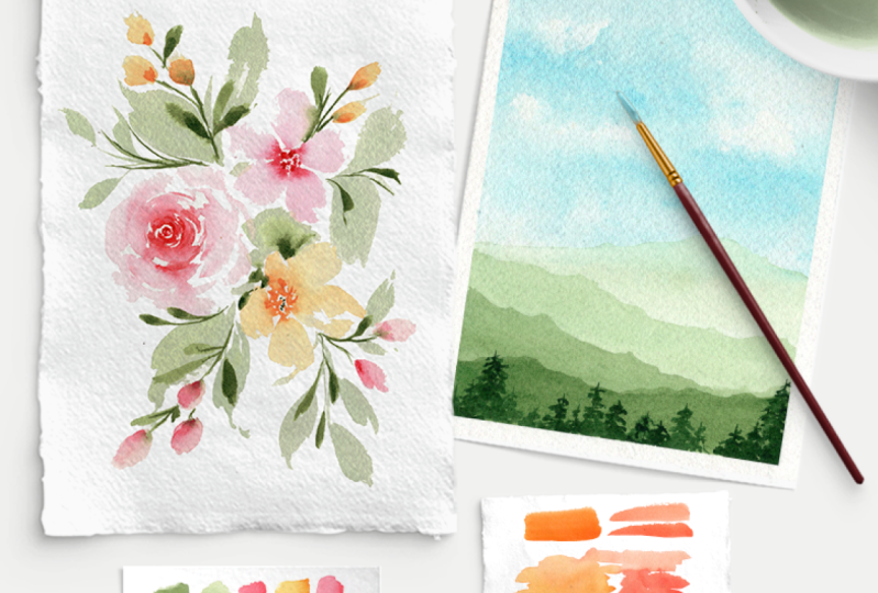
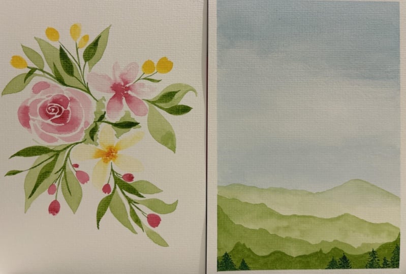
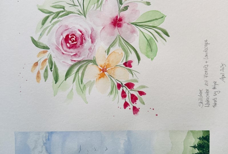
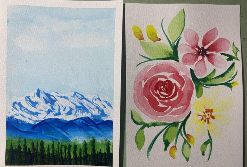
2. Class Projects: I mentioned in the intro video, we're going to finish
this class with two final projects so you can
put your new skills to use. The first project
will be a dainty, loose watercolor
floral composition with some flowing leaves. This will really help you hone your brush control and get
comfortable with the loose, expressive style of painting. And the second project is a clean and simple
mountain range landscape, which will challenge you
to practice layering and working with different paint
consistencies and values. I'll walk you through each of
the projects step by step, so don't worry if these look a little intimidating
at this point. Just wanted to give
you a little preview of what's to come at
the end of class. And up next, we'll
talk all about the ins and outs of
watercolor supplies.
3. Watercolor Supplies: Let's chat about some
of the supplies you'll need to start your
watercolor journey. Supplies can get
complicated and expensive, but you don't need a
whole lot to get started, and there's no need to invest in the most expensive
tools right away. Start simple, figure out what you like best and
build from there. And just a quick note,
my supply guide PDF is linked down below. If you want to check
it out, that includes my top recommendations for
all things watercolor. Let's start with
watercolor brushes. I'm sure you already know what
a paint brush looks like, but here are a few
of my favorite ones. Now, the anatomy of a
brush is pretty simple. You have the handle the crimp, the feral, and the bristles. And within the bristles, this is the belly of the brush that holds your water
and your paint, and this is the
tip of the brush. You'll probably hear me use those terms as we
start painting. There are also different
shapes of brushes. The most common
one you'll see is a standard round
brush like this. Round brushes have your
typical brush shape with the belly being
the thickest part. And then they come to a
point like this at the end. Round brushes are
super versatile. You can create thick strokes, washes and fine point strokes. So I definitely recommend
starting with a round brush. There are other shapes
like a Filbert brush, which is a flatter brush
that has a curved edge. There are flat brushes, mop brushes, wash brushes, so many different
types to be aware of. But in most cases, a round
brush will do just fine. As for sizes, I'll show you what some of the most
common sizes look like. It's pretty self explanatory. Smaller numbers mean
smaller brushes. So this is a size
two round brush versus this one here is
a size 16 round brush. And then you have all of
these ones in between. I personally stick around size six or eight for most
of my paintings. So if you're thinking of
just buying one brush, a six or eight would be
great to start with. Moving on to watercolor paper, there are a lot of
strong opinions about watercolor
paper out there. So for now, let's just
stick to the basics. Paper is usually referred to as either student grade
or professional grade. Student grade paper is a lot
cheaper and more accessible. It's great for when you're
first starting out, but there are some downsides, like your colors might
not appear as vibrant, and it doesn't absorb
water as well. So sometimes it kind of just sits on top of the
paper surface, and it can be a little harder to make smooth blends of color. But again, totally
fine for beginners. Professional grade paper,
on the other hand, is quite expensive,
but it's 100% cotton. So that allows for
a lot more control when you're layering
and blending, and it actually feels pretty different than
student grade paper. So this is really the only
one of those supplies that I do recommend switching over to the nicer stuff if you can, because it takes a little
bit of practice to switch from the cheaper
student grade paper to the higher grade paper. So again, definitely
not a necessity. But if you want to advance
your skills a little bit faster and really invest in
furthering your art practice, higher quality paper will make
a significant difference. That being said,
I personally used student grade paper for
the first two years of my watercolor journey. So I just want to reiterate
that you can absolutely still paint really
beautiful things using student level paper. And one more thing you
might hear often in the watercolor world is cold press versus
hot press paper. Cold press paper has a
rougher textured surface. It's my personal favorite, and hot press paper is smooth. And finally, we have our
paint and paint palettes. Typically, you can either buy paint in tubes or in palettes. Let's talk about palettes first. This is an example of a pre
mixed watercolor palette. This is the art philosophy, watercolor confections,
Woodlands palette. Now, the pros of buying premixed palettes like these
are they're very portable, so you can just take
them out on the go or fold them up in
your workspace nicely. They're usually pretty
cost effective, too. These ones are somewhere $20-30, but they've lasted
me several years. And in general, they're
just easy and convenient. You can just open it
up and start painting. But it offers a little
less customization and control when
you're color mixing. These here are professional watercolor tubes
from Daniel Smith, but there are also a ton of cheaper student grade
tubes from other brands. Buying your paint
in tubes offers you a greater control when
you're color mixing, and they're typically
more suited for larger paintings
when you need to be able to mix up
a lot of paint. However, they can
be trickier to use. They're a bit messier, and they're definitely
more expensive. This one tube alone
was somewhere $20-25. But again, this one is
a professional brand, so there are a lot cheaper
options out there. For complete beginners, I do recommend starting with
a palette like this. That way, you don't
have to worry about color mixing or buying
a bunch of tubes. You can just open it up
and start experimenting. And one last thing,
if you buy tubes and you want to have a separate
palette for mixing them, you can find plastic ones at an art store that'll
work just fine. You can find ceramic
or porcelain ones. You can even go
to a thrift store or a home goods store and find a pretty ceramic dish or a serving plate
that you like, and that works really well, too. Other supplies you'll need
for watercolor painting are a jar or bowl of
clean water to rinse off your brushes in
between colors and a paper towel so you can dry
your brushes as you paint. Now that we have
our supplies ready, let's move on to some
foundational techniques.
4. Mastering Water Control: Water control is one of the trickiest parts
of watercolor, but it's also the most
important skill to master. Here's a simple way
to think about it. If you don't have enough
water in your brush, your strokes are
going to look very streaky and dry like these ones, and that's going to make
it really hard to blend your colors and make things
look nice and smooth, which is what we
all want, right? On the other hand, if you have too much water
in your brush, for instance, if water droplets are falling off the
edge of your bristles, you'll end up with
unpredictable blooms, harsh edges when
your paint dries, and it can also cause your
paper to warp pretty severely. Want to find yourself
somewhere in the middle where your
paint flows smoothly, and you can create clean, vibrant strokes and blend
your colors seamlessly. Think of it like goldilocks. Not too much water,
not too little, but just the right amount. Let's practice together
with a simple exercise. Go ahead and load up your brush with some water and paint, making sure your
bristles are nice and damp but not overly wet. Take a look at what
mine looks like here. See how I don't have water
gushing out of my brush, but you can also tell that the belly of the brush
is nice and full. That's where you want to be
right in that sweet spot. Now, let's create
some basic strokes on your paper and
see how it looks. If it's streaky, add a bit
more water to your mixture. And if it's pulling up or creating puddles on
top of your paper, tap some of that excess water onto your paper
towel and try again. Keep playing around and making different
strokes on your paper, and try to get ten consistent, even strokes in a row. That way, you'll start to feel comfortable and
confident knowing what amount of water it takes to get those clean, smooth marks. Your time with this
practice exercise because water control is an important foundation for everything else
we'll do in the class.
5. Practice Strokes: Now that we know what
our brush should feel like in terms
of water control, let's practice making some
different types of strokes. I'm going to
demonstrate this using a standard size six round brush. Let's start with a dainty, fine line stroke using the
very tip of your brush. So load it up any color
you want and just delicately run the tip of
your brush along your paper. Not applying very much
pressure here at all. So your bristles are just
barely touching your paper, and you'll create
these beautiful, thin, dainty lines which are perfect for adding
details to your artwork. Keep making these
strokes until you're feeling comfortable with
this amount of pressure. Now, let's do the opposite. Load up your brush again. But this time, when you're
pressing down on the paper, push down so that the belly of your brush expands out
onto the paper like this. See how thick that
is. It's pretty cool to see just how versatile
one brush can be. Big, heavy strokes like this are often used to create
washes of color, especially in landscapes
when you're painting skies, water, or the ground. Now let's put the two together. Let's paint a line
across your paper, switching between
light pressure, heavy pressure,
and light pressure and see how your strokes differ. Go ahead and practice
this a few more times until you feel
comfortable with it. And this is actually
a great exercise for painting leaves like we'll do in our floral
project at the end of class because to create leaves, you're also going to go from light pressure to heavy pressure
to light pressure again. So the more you can control
your brush movement and understand how pressure
affects your strokes, the better off you'll
be later down the road. So don't skip out on
these practice exercises. And finally, let's
practice a C curve. This type of stroke is used a lot in loose floral paintings, especially for roses
like this one. It's called a C curve
because it's in the shape of the letter C. You start
with thin pressure, apply more pressure as you create the middle
part of the C, and then end with
light pressure again. Go ahead and practice
a few different types of s curves so you
get the hang of it. Try some that are
small and dainty and others that are
bigger and fluffier. Now, of course, there are
1 million different ways you can use your
brush as you paint, but these are just some of
the most common strokes. So keep up the good work, and I will see you
in the next lesson.
6. Paint Consistency & Values: Now that we've practiced
some basic strokes and we've talked
about water control, we can move on to paint
consistency and tonal values. These concepts might
sound a little technical, but don't worry,
they're actually very simple once you
get the hang of them. Paint consistency and values
kind of go hand in hand. Consistency is as it sounds, your paint mixtures can be
thick and creamy like butter, or they can be thinned
out and watery like tea. And same goes for values. Think of values as the relative lightness
or darkness of a color. Your dark values are
more concentrated, usually thicker
mixtures of color. And your lighter values
are less concentrated, thinner mixtures
using more water. Let's practice mixing up different consistencies
and color values together. So start by mixing up a color, again, any color you choose, and just use a very
small amount of water so that your mixture
is pretty concentrated. See how mine looks
thick and creamy. Once you're at that
point, go ahead and paint some messy swatches on your paper and notice
how it's thick and dark. Make as many marks as you want. Just get comfortable painting
in that creamy consistency. Now, using that
exact same color, add a bit more water
to your mixture, so it's a milky consistency and a little bit
lighter in value. Paint some morse watches right next to those
ones you just did and notice how much
lighter that paint looks. Finally, mix up a thin, watery mixture. Use plenty of water
and make sure your paint looks like
the consistency of tea. So we're using a lot of water here with just a
tad bit of pigment. Once you're at that consistency, go ahead and paint a
few more swatches on your paper next to the
ones we've done so far. Once all your swatches are done, go ahead and compare
them together. Now, keep in mind, these
are not different colors. They are all the
exact same color, but they are different values. We have our thicker dark values, our medium values here, and our thin light values. And these all just depend on the amount of water
used in your mixture. Understanding how
they work and getting comfortable mixing
different values like this will be essential in making
your artwork come to life with highlights
and shadows and depth. Look at these examples
for a second. This is the same painting, but this one here didn't
use different values. So you can tell it looks
pretty dull and flat. Whereas this one, you can see lighter and darker
values of each color, which adds depth and
dimension to the painting, and it really makes that
lemon come to life. Feel free to play
around with the samur, and in the next
lesson, we'll talk about common
painting techniques.
7. Wet-on-Dry Technique: Let's dive into some of
the most common techniques that watercolor artists use, starting with wet on dry. The wet on dry technique is
the most straightforward, and it's actually
what we've been doing so far in this class. We've been putting wet paint
down onto a dry surface, whether that's dry paper or
another layer of dry paint. When you apply paint
onto a dry surface, there's nowhere for the paint to go other than
where you place it. So it allows you to have greater control over your strokes, your lines, and your edges. Let's practice this some more by applying strokes of paint
down onto your paper. You can make any type
of stroke you'd like. Just take note of
how much control you have over your
brush and your paint. Go ahead and paint some lines, some circles, color
swatches, whatever you want. The wet on dry method is
perfect for adding details, and it's used a lot in the realistic illustrative style where control is essential. Now let's try wet on dry again, but this time on
top of dry paint. So first, mix up a very
light value of color. Remember, light value
has more water and go ahead and paint
a large swatch of color onto your paper. Once you have your swatch,
let it dry completely. That's super important.
We want this layer to be super dry before
we add the next one. Once it's dry, paint some more strokes on top
using a darker value, so a more concentrated mixture. And notice how it's just like painting on top of blank paper. You have complete control
of where your paint goes. So even though we're
painting on top of paint, it's still wet on dry because that first layer is
dry, just like paper. This technique will
come in handy for our final project
at the end of class where we'll need to layer wet on dry for our mountain
range landscape. Keep practicing your wet on dry strokes before we move
on to the next technique.
8. Wet-on-Wet Technique: Let's move on to the
wet on wet technique, which is exactly how it sounds. You're applying wet paint onto another layer of either
wet paint or water. And this is truly one of the
most fun techniques because it allows the paint
to just bleed and bloom on the
surface of your paper, and it creates unexpected but
really beautiful outcomes. Let's practice this
one by painting a thin layer of clear water
down onto your paper. Then load some color onto
your brush and gently start tapping it on top of
that layer. See how it blooms. Try it again by painting another clear swatch this time
in the shape of a circle. Then load up your brush again and line the outer
edge of that circle. This is a super fun
exercise to let go of control and just watch your
paint do its own thing. You can also use this
technique on top of another layer of color
that's still wet. For example, try painting a random shape with
a light color. I'm going to use
yellow for my example. Then take another
color that's darker. I'm going to use this dark
pink and drop some of that color on top and just watch those
colors play together. I really want you to
just experiment here, play around with your
shapes and your colors, and please don't feel like you're wasting paper
when you do this. This is all really great for getting to know
your supplies, getting a feel for the
wet on wet technique, and building up
your muscle memory. Now, the most important
thing when you're using this wet on wet
technique is to make sure that that first layer of paint or water is thin and even. If there's too much water where it's pooling
up on the page, you'll end up with really
harsh edges when it all dries. And oftentimes your
paint will just bubble up instead of blooming. On the other hand, if the first layer doesn't
have enough water, there won't be enough
liquid there on the surface for your
paint to expand. And you'll end up
with streaky strokes just like we talked
about earlier. So try your best
to create a thin, even layer of water or paint before going in with
your second layer. Keep on practicing and we will move on to dry brushing up next.
9. Dry Brushing Technique: Next up is the dry
brushing technique, which is used to create
really beautiful texture. Now, I will say, after
learning about water control, the dry brushing method may feel counterintuitive
and awkward because we're going to be
purposefully not using enough water so that we can
create those streaky strokes. So instead of keeping
that perfect balance of water in your bristles, you're going to get
color onto your brush, but make sure your
bristles aren't too wet, and then try applying it
straight onto your paper. You can paint streaky lines, dot your brush onto the
paper for a spotted texture, play around and see what
types of marks you can make. Again, this one
might feel a little uncomfortable because
you're purposefully making it too dry. But this dry brushing technique
is used most commonly for adding texture to your
paintings as a final touch. I've personally seen
it used most often in landscape paintings for
adding clouds to the sky, adding a wavy texture
to seascapes or for adding that wooden texture
for tree trunks and branches. Keep practicing your
dry brushing technique, but when you're done, make sure you rinse
off your brush. And use your fingers to gently form the
bristles back into shape because the dry
brushing technique can be a little
harsh on your brush. So you always want to
remember to return it to its original shape
when you're done to help protect the longevity
of your supplies.
10. Troubleshooting Common Mistakes: Watercolor painting
can and should be relaxing and
joyful. Let's face it. It can also be
extremely frustrating, especially when
you're just starting out and you're just trying to
get the hang of everything. So let's talk about some of
the common mistakes that beginners make and how you
can overcome them with ease. The first common mistake
is over using water. Talked briefly about
this earlier in class, but it's a biggie, so we're
talking about it again. Beginners often oversaturate
their brush with water, leading to
uncontrollable puddles, pooling, buckling, or
warping of the paper, and harsh edges when
everything dries. So what's the solution,
Mastering your water control. If this is still tricky for you, go back to our water
control exercise earlier in class and
keep practicing. More you get a feel
for how much water is too much and how little
water is too little, it'll start to feel
like second nature, loading up your brush with
just the right amount. And also, if you're
in the middle of painting and you end up
with too much water, you can always fix it by
drying off your brush and letting your bristles soak up any excess water
on the paper. That's an easy way to mitigate water control issues on the go. Next issue is dealing with
muddy or dull colors. And this usually happens when you're mixing too many colors. You're not cleaning
your brushes properly, or you're not switching
out your water jar enough. And when this happens,
your brush never really gets fully clean
when you rinse it out, which leads to those
muted, messy colors. And we want to
avoid that, right? We want to work
with those bright, vibrant, beautiful colors. So to fix this,
first and foremost, try starting with very
simple color palettes. Even now, I usually stick to minimalistic color
palettes in my paintings, but especially in the beginning, this is helpful to keep
your artwork clean and simple and avoid over
mixing your colors. And, of course, make
sure you're swapping out your water jar when it
starts to get too dirty. Up next is overworking your
paintings, which is super, super common, even for
intermediate and advanced artists. Constantly going back and
forth over an area of your painting can damage the paper causing
it to pill or tear. And it often leads to messy,
overly busy paintings. Now, of course, this does depend on the style
you're going for, but oftentimes the
earlier version of our artwork looks
more beautiful and clean than those
later versions when we just couldn't help but add more and more to a painting, ultimately just adding too much. Top recommendation, take a step back every now and then
when you're painting. This can help you
make sure you're not overworking a piece or adding too many details
to an already busy painting. Look at your piece with
fresh eyes and ask yourself if it really
needs another layer. And if it does, that's fine. Just make sure you're using gentle brush strokes to avoid
any damage to your paper. Another common mistake is not utilizing a range
of tonal values. Remember the lemon paintings
I showed you earlier? It's common for beginners to create paintings that
look more like this one, because they start painting
with bold dark values right off the bat
without leaving any areas of lighter values. And I totally get it. It
can be really tricky to get the hang of tonal values when you're
first starting out. But when your first few
strokes of a painting are already in that
mid to dark range, your pieces often end up
looking dull and muddy because there's no room for the highlights. So
what's the solution? Always start lighter
than you think you need and then build up your
layers darker from there. Understanding color values was the number one thing
I wish I learned and practiced earlier on in
my art journey because it truly makes such a big
difference in your artwork. Try painting something
with only one color, but bring out the highlights and the low lights using
your range of values. This can be a great
exercise to get the hang of values before you get into
more complex color palettes. We have a couple more
common problems to tackle. The next is a lack of planning. Lot of times, you
want to jump straight into a painting when
inspiration strikes, especially when you're
excited about a new idea. But so many times
what you see in your head doesn't
pan out on paper. Maybe the colors aren't right, your composition or
proportions are wonky, and you end up really
frustrated or down on yourself. Trust me, I've been there, and I still do this
from time to time. Oh, I want to be clear. I'm not saying you need to
plan and sketch and test out all your colors every time before you
sit down to paint. That's definitely not the case. You can learn a lot and
advance your skills through experimentation
and expressive play. But for those ideas of paintings you're really
excited about or for those paintings where
you want to create a final piece or a new
greeting card design, for example, you'll want
to take some time to plan. Swatch out a few
potential colors and make sure they
work nicely together. Sketch out a few
thumbnails to figure out composition before you
jump into the final piece. This can save you from a lot of headache and disappointment, and it will give you a better
chance of things going right when it's time to sit down and paint your masterpiece. And finally, we have the
fear of making mistakes. Many beginners are so
afraid of messing up or wasting a blank sheet of paper that they never end
up creating anything. Look, exploring a new medium, learning your supplies,
figuring out your style, and growing as an artist. It'll include a lot
of ugly, messy pages, filled with scratchy
brush marks, muddy color palettes, unfinished sketches and
probably some torn up paper. I've definitely
been there before. So try your best to be
gentle with yourself. Use cheap paper
in the beginning, so you don't feel
bad wasting it, even though you're never
really wasting it. And remember that for every masterpiece you end up creating, there's bound to
be a whole folder of paintings that didn't
quite make the cut. It's completely normal, even
for experienced artists. Some people even buy a
dedicated sketchbook that is just for
making ugly work. There's no expectation
or pressure in the you can just scribble
and practice, and no one else needs
to see it but you. In the next video,
we're starting our first class project, which is our watercolor
floral composition. So I'll see you over there.
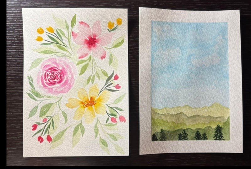
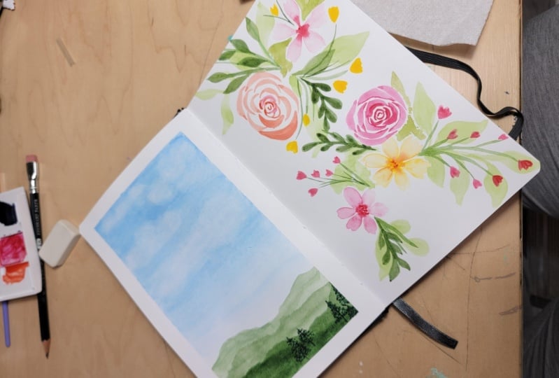
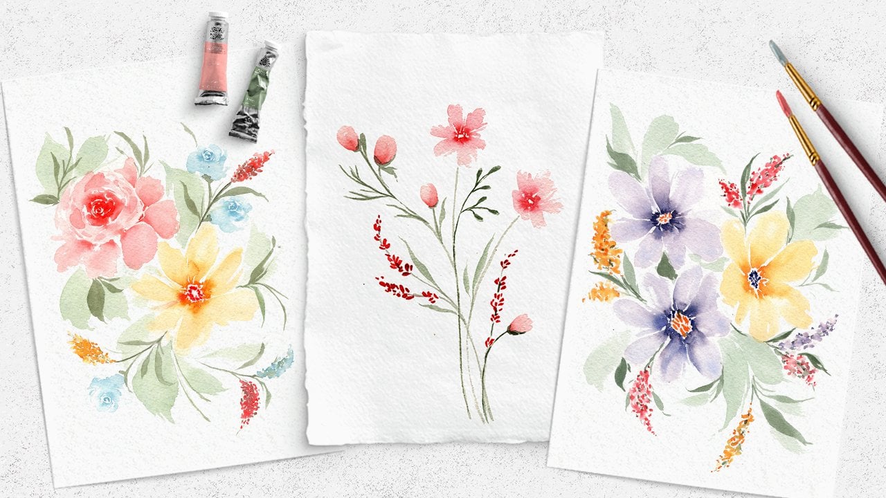
11. Watercolor Florals: Rose: Starting project number one with a simple loose floral piece. We're going to paint a
few beautiful flowers, including a rose where we can practice those sea curves
that we did earlier. And we'll also include some
leaves and flower buds. This will be painted
in a loose style, so get ready for some wet
on wet brush strokes. The colors I'm using
in this painting are a medium pink, a warm, yellowy orange, a darker pink, and various values of sap green, some light and some darker. But feel free to use any
colors you have at home. I want you to focus more so
on the painting process and the techniques more than worrying about choosing
the perfect colors. So I have trimmed down my watercolor paper
to a five by seven. It's usually a
little bit easier to paint smaller when you're
first starting out. So you're more than welcome
to use any size you like, but five by seven is generally a nice size to still be
able to add what you want, but a little bit smaller scale, so it's a little
less intimidating. Now, we're going to paint three different flowers like you saw. So I'm going to actually
start with the rose, and the rose will be
in the middle left. So find that middle left
portion of your paper. And we'll get
started. For my rose, I'm going to be using
this deep reddish pink. Again, you can use
any color you want, but I want the center of my
rose to be a dark value. Remember, darker value means there's less water
in my mixture, so I'm pulling straight
from my watercolor pan here and just getting that deep dark red right on
the tip of my brush. And for the center of the rose, we're going to be
doing the C curves or the C strokes like we
practiced earlier in class. So remember, that's the strokes
that are in the shape of the letter C. Now,
when you paint roses, another thing I want to mention is the center of the rose is darker and we get lighter as we approach
the outer petals. We also will be smaller in the center and bigger as we
reach those outer petals. So we want these first
strokes to be very dainty. So I'm just using the
very tip of my brush. I'm barely going to push down. And I make that tiny
little sea curve. And we're going to do a
few of these to create the center of the roast,
kind of overlapping. You want to leave
some white space. But just go ahead and add some
dainty little sea curves. Remember, you're going light
pressure, heavy pressure, light pressure, and kind of swooping or curving
your brush as you go. So see how these strokes
are getting slightly bigger as I approach the
outer edge of the roast. But I'm maintaining
some white space there. That's super important.
Now I'm going to rinse off my brush a little bit
so I have a lighter value. Lighter value means
it's less concentrated, and I'm going to push down. I'm still adding s curves, but you can see they're
getting bigger, and they're slightly
lighter because I watered down my mixture
a little bit more. Always maintain that
white space as you paint roses because if I don't
have any white space, it just turns into a blob of
color, which no one wants. So the white space really
helps to define these petals. I'm adding a little bit
more water into my brush and really pushing down to
get these thicker strokes. So remember when we practice our strokes earlier in class, when you push down
and the belly of your brush expands like this, you can see the
bristles expanding. You get those larger strokes. Now I'm rinsing off
my brush even more, so I have a super
light value now, and I'm going to finish
out these powder petals. I don't want my
rose to be too big, but these petals are nice
and light and fluffy. Now, one of the best
parts of doing wet on wet loose style florals
is you can go back in. I have a dark value
on my brush again. And because these
petals are still damp, when I go back and tap in a darker value like
this, wet on wet. Remember, I'm adding wet
paint on top of wet paint. You can see that color gently bloom and bleed out
into the petals. See that? You have
a gentle bleed of color. So I'm just
going back in. You don't have to do this
part if you don't want to, but I like to really deepen the center of my roses and just add a little
bit more definition. So I'm going to let this dry and then we'll move on
to the next flower. And if you're struggling
with this rose, remember, take your time, try not to get too frustrated, and always be sure to
leave that white space. That's one of the
most important things when you're painting
roses like this. Like I said, if you
don't have white space, it just turns into
a blob of pink, and you don't really get any
definition in the petals. So let this dry and we'll
do the next flower.
12. Watercolor Florals: Additional Flowers: Next flower is going to be up and to the right from the
rose we just painted. So I don't want it to be
too far to the right, but just a little bit overlapping and above
that rose we just did. And I'm going to use a
slightly different pink color you can see this one's a little bit lighter than
this one I just did. And again, my first few strokes for this are going to
be very dark value. So I'm pulling
straight from this pan here and make sure you have a good amount in
your bristles here. So I have a good amount
of water and pigment. Now, for this flower,
this is a basic, loose, five or six petal flower. I'm going to start
by just painting some little tiny dots
down on my paper. But you can see they
look like little puddles almost because I have so much pigment and
water loaded up in my brush. Now, this is the important part. I'm rinsing off my
brush completely, so I just have clean water. And we're going to
pull this color from the center to create our petals. So you can see I'm pulling
that pink from the center, barely applying any pressure, and then pushing down
and lifting back up, and you can see that pigment
follows where the water is. And I create that big,
beautiful flower petal. Now, if your center
dots start to dry, you can always go back in with more color and just re
wet them because we want to make sure we have
plenty of color in that center spot to pull
out into the petals. Rinse off my brush again, so it's nice and clean, and
we'll do the same thing. Pull out some of that
color using the tip of your brush and then push
down, lift back up. You can see the
belly of my brush is expanding and creating
a beautiful petal. This is why I said
those practice exercises are so important because you're really
utilizing your brush in a lot of different
ways for this project. We're using the tip of the
brush to pull out the color, and then you're pushing
down and lifting back up to create the flower petals. Now, as you go, if you
see any spots like this, I have a little too
much water there, so I can just use damp bristles to kind of
smooth that out. I don't want any harsh lines. I'm just creating these
nice loose petals. And I can already tell these center strokes are
starting to dry. So again, you can
always rewet them. Just tap some more
pigment in there. But remember to rinse off your brush when you
come to do this part. You're pulling out the color and pushing down to
create the petals. I'll turn my paper so I
can pull these petals up, pulling out the
color and pushing down. To create my petal. Let's do one more there. This one will have
to be a little bit smaller because
I didn't leave myself a whole lot of room. But I'm going to just paint
one final petal there. So now we have our rose and we have this
beautiful flower. Again, I can see that I'm not
gonna like that edge there. It's a little bit too stark of a contrast between
the dark and light. So I'm just going to use my damp brush and
smooth it out a bit. That's one of the best parts of watercolors. It's
very forgiving. While it's still wet, you can really rework it
however you want. Now, again, using the
wet on wet technique, I know that the center of
my flower is still wet, so I'm going to go back
into my dark pink, pull it straight
from the palette, and gently tap some of that dark color back
into the center. I want the center of my flower
to be the darkest part. And because we pulled out so much pigment into the petals, it lost a little bit of its
vibrancy in the middle. So you can go back in and
tap some of it back in. Now, for our final primary
flower in this piece, we're going to do a very similar one to
this, but just down below. Now, for this one, of
course, as I said, feel free to use any
colors you want, but I'm going to be using
this warm, yellowy orange. So once again, I'm going to
pull directly from my palate. And this time, instead of doing the circle of dots
like we did here, I'm going to do a little
bit more of an oval shape. Using the tip of my brush. I'm just dotting
down some pigment. But it's in more
of an oval shape, and that'll allow us to create a little bit of a different
perspective of flour. But again, you want
to have plenty of pigment and water
there in the center. So I'm going to add a few more Make sure it's really
nice and juicy in there. And we'll do the same thing. So we're getting lots
of great practice. Rinse off your brush and start
pulling out these petals. I'm going to start on
the right side because I want the left side to be
a little bit shorter. Pull out the color
and push down. Now, I usually end up doing two strokes for
each of my petals. And remember, you can re wet this center area if you want. But if you want skinnier petals, you can just do one stroke. I like the size of doing two, so I pull it out, push down, and do the same thing
right next to it. Pull it out and push down. This color is a little bit
harder to see on camera, so apologies for that, but it's the same technique
we did on the other one. Let's add another petal here, pulling out the pigment, pushing
down to create my petal. Let's do a couple
more on either side. Pull out the pigment, push down. And again, the center
areas slightly drying up, so I'll add a
little bit more and then rinse off my brush and
continue with these petals. So these types of flowers
are really great way to master your brush
control even more. And it's kind of a delicate
blend between being loose and expressive and making sure all your petals don't
look the exact same. You want it to look
natural and organic. But you also need to have
a little bit of control. Like I said, we don't
want these flowers to turn into blobs. And if you lose control,
you're working too quickly and you don't
leave white space, that's when you can get into some frustrating
situations where you don't really see petals, you just see blooms of color. So you kind of have
to balance being quick and loose with also
practicing brush control. And if you want,
something I like to do is I'm going to take
my pink color again. And I can see that the center of this is still slightly wet. So I'm going to just gently, gently tap some
of that pink into the middle for the
center of this flower. And you can see the gentle bleed between the pink and the yellow. I don't want to add too
much because I don't want my pink color to go wohing
out into the petals. I want this flower to
primarily be yellow. But that helps add
a nice contrast, and it ties both those
colors in together. So let's let these
three flowers dry and then we'll add some
leaves and filler flowers.
13. Watercolor Florals: Leaves & Foliage: Okay, so these have
had some time to dry, and now you can
kind of see where those main flowers are placed. So next, I'm going to add
our first layer of leaves. As I mentioned
earlier in the class, you can always go from lighter
colors to darker colors. So this first layer of leaves is going to
be very light value. So we'll be using a lot of
water in our paint mixture. And then as we add more
fillers and the second layer, we'll start to build up
that depth a bit more. So for this first
layer, go ahead and mix up a light value of green. I'm using sap green, but any color you like is fine. And you can see I have a lot
of water in my mixture here, so I'm working with
a very light value. Also moved up to a
size eight brush. I want this first layer of
leaves to be nice and big, and then we can add darker
daintier leaves on top. So I'm going to take my
brush and paint a giant leaf coming out in between
these two flowers. So what I'm going to do to paint my leaf is I start
with light pressure. I apply heavy pressure. You can see the
bristles expanding, and then I lift back up, and I'll do the same
thing right next to it to make this leaf even wider, pushing down and
lifting back up. So that is generally the cadence or the technique that you'll use to paint
leaves like this. You're going light pressure, heavy pressure, light pressure. I'm going to load
up some more color, and we're going to
add a few more. This time, I'm going
to have some leaf stems curving off to the side. So I'm going to start
with a light dainty line, and then we'll add
some more leaves. So light pressure, heavy
pressure, light pressure. Make it a little bit wider. And let's add a couple more
coming off of the stem. Push down, lift back up. And how about one more
coming off this side? So light pressure to
create the dainty stem, and then I'm pushing down
and lifting back up. Push down, lift back up. Okay. Now, as I said, we will be adding more
layers on top of this. So we want to make sure that
this first layer is nice and light so that we
can go back over on top with a darker green. Let's add another big
leaf coming out here, starting with the
dainty little stroke, pushing down, lifting back up. Let's do the same thing
right next to it, make it a little bit bigger. And you can see, as I add
each of these leaves, I'm not adding a leaf that's going straight up or
straight out to the side. I want a little bit of movement because leaves in real
life or stems or foliage, they always have a bit
of movement to it. They're never
perfectly straight. So make sure you're keeping
your wrist nice and loose. Now, for this center area, since there's not enough room to put an actual leaf there, I just want to imply that there's foliage or
greenery in between. So I'm just going to kind
of plop some color down. In between these flowers. Again, it's a light color, and these aren't leaf
shapes by any means, but you can see that it kind of indicates that there's
some greenery there, but we can't necessarily
see each individual leaf. So if you have some white
space in between your flowers, you can just pop in some color, and we'll continue
adding these leaves. Loading up my brush
with a little bit more. And I'm going to add
a couple coming off of this right side. So again, dainty line
and then pushing down, lifting back up, and I'm
making sure to curve it. Kind of coming up
around that flower. And let's add another
one coming down. Pushing down, lifting back up. And I've mentioned
muscle memory before, but it's super important
in watercolor. So I know it's a lot of
repetitive motion when you're doing flowers to do each of these
huddles the same way. And when you're
doing leaves, it's a lot of the same movements, but that's how you're
really going to start to build up
your muscle memory. So that later down the road, when you get more
practice under your belt, you don't even have
to think about it. You can just start painting and it just
flows from your brush. So let's load up
some more color, see how light my mixture is. And we'll add a few more
leaves for this first layer. Let's do some coming
off of the bottom left. I really pushing down to create nice big juicy leaves.
Just like that. I might add a little stem here. But I want to make sure
I'm not adding too much at this stage because I am going to do a second layer of leaves. So if I add too many now, I won't really have room
to add more as we go. And like we talked about in
the troubleshooting lesson, overworking paintings can
definitely be an issue. So it's always best
to keep it nice and simple and then add
more to it if you want. But if I go too hard now
and add a bunch of leaves, I'm going to not have enough
room to add all the details. So let's add one fin a little
bit coming off of here. I want this piece to
be nice and balanced. So let's do another stem
kind of curving like that, using the tip of my brush, and then pushing down to create these little
leaves coming off of it. So thin and thick
thin and thick. Always making sure
that I'm adding movement to each
element in this piece. So here's where we're
going to start, and we need to let
this dry completely because I want to layer
stuff on top of it. If I were to layer
additional leaves right now, these are still really wet, so they wouldn't
really be defined. It would just kind
of bleed and bloom, which is fine if you're going
for a very expressive look. But for my second
layer of leaves, I want them to be a
little more crisp. So go ahead and let this dry. And in the meantime,
you can start mixing up a slightly darker
value of green. So now I've added
a little bit of deep sap green to my mixture, and you can see it's quite a bit darker. I have less water. And I'm pulling a
lot more pigment straight from my palette here. So make sure this mixture is darker than your first layer. And now we can start adding
our second layer of foliage. So this is when I really like to be a little bit more expressive. I do a lot more dainty
leaves at this stage. So the bottom layer
is really to build up the fullness of
the composition, and then these darker layers are the more dainty little
stems and filler flowers. So I'm going to be using the
tip of my brush quite a bit. So starting on the left side only because I'm right handed, so I always work
from left to right, so that my hand doesn't
accidentally smudge any paint. But I'm going to start by just
using the tip of my brush, and I'm just going
to gently add some wispy little stems here.
It's nothing crazy. Just adding a bit
of foliage there, and then I'm going to
overlap these two leaves. So for this, I'm going to
take the tip of my brush. Again, keeping it
nice and dainty. And then pushing down
to create some leaves. And you can see, because the second layer
is darker than the first, it lays over it nicely. If this first layer of
leaves was too dark, and then I tried going
in with a lighter color, it wouldn't be able to show
up over the darker color. So you always have to
work from light to dark. And I'm going to leave
this be for now. I am going to be
adding more later on, but that's when I add
some more filler flowers. Using the pink and yellow that we've done for
the primary flowers. So again, I don't want
to go overboard here. I'm just sort of adding in
the second layer of leaves. And a lot of these, like I said, are going to be pretty light. So using the tip of my
brush and then pushing down tip of my
brush, pushing down. And now we have this kind of
awkward space in between. So again, I'm going to make sure this has
some movement to it. So creating a curve and then just pushing down to
create some more leaves. Again, this area doesn't have
to be perfectly defined. That looks good to
me. Let's move down. Again, using the
tip of my brush, just kind of creating these
wispy little strokes. And you can play around here with how much pressure you add. So you can see these
strokes were really wispy, barely put any pressure down, and then some of them are
a little bit thicker. Now, I know for sure I want to add some filler flowers here, so again, I don't
want to go overboard. But I can just start adding a little bit
of dainty foliage. And you can see the second layer really brings the bouquet to life because now you can see layers of leaves and it
doesn't look so flat. So watercolor is definitely kind of a trust the process
type of medium. It doesn't always look
great in the beginning. But as you add onto it and you kind of build
out your layers, your piece will really
start to come to life. So again, just adding some
wispy little marks here, using the tip of my brush, and this is really where you
can infuse your own style. So especially in the beginning, it's totally fine if you want to copy every single
step that I'm doing. But especially in
compositions like this, it's really fun to just
try to experiment, add some leaves where
I'm not adding them. Maybe you have some areas
that are a little more bare. You can add more leaves there, or if you want to have them going in a different direction, that is totally up to
you as the artist. So I'm just going
to finish adding a couple little leaves. And then we can go in
for the filler flowers, which is my personal favorite.
14. Watercolor Florals: Flower Buds: Okay, so here is how our
composition is looking so far. I think it looks great.
It looks pretty balanced. We have some good movement, but I want to add some more color, and that's where you
can add filler flowers. Now, I'm going to be
doing my filler flowers in the same colors
that we've already used so that we can keep it nice and consistent and simplistic. And as I do this, I'm going to start
with the yellow ones. And when I decide where I
want to place these flowers, I want my yellow ones
to be up more towards the top of the piece because my main yellow
flower is down here, and I want to create a sense
of balance within the piece. So we already have a lot
of pink up at the top, so my pink fillers
will be at the bottom. And we already have yellow
here at the bottom, so the yellow fillers
will be up at the top. So those are just some
things you want to think of as you work on pieces like this is creating a
sense of balance. I will say, if you're enjoying painting florals like this, I do have a whole class
that is a 15 day challenge all about watercolor florals and how to arrange
your compositions. So if you're enjoying this, I would definitely
recommend that one. But, yeah, that's
just something to keep in mind is a
sense of balance. So that's why I'm
going to start by adding my yellow
fillers up at the top. So I've loaded up this
same warm yellow tone, and I'm going to
just kind of push my brush down and create
a little egg shape. And that's going to
be my first filler. I'll do another one down
here, right next to it. It's a little bit lighter. And let's have one coming
off to the side as well. Now, for now,
there's going to be some fillers that are kind
of floating off in space, but we will go
through and connect them all in the next step. But for now, just kind
of plopping it down. Again, I don't want
any of my elements to be lined up directly
next to each other or right on top of each other because when I add in the
stems that connect them, I again, want to keep that
curved movement in mind. So these are all just things
to keep in mind as you add your elements and really start to build
out this composition. So that's looking good for now. I'll go back into my
pink color that I used for the flowers
up at the top. And we'll do the same
thing down here. So I'm just plopping
my brush down. I'm not worrying about creating a perfect flower petal
or anything like that. I'm just pushing it
down. You can see my bristles expand
and lift back up. I'm also adding them
in different values, so you can see that little bud was a lot lighter than this one. And that helps make
sure your painting is nice and interesting
and you have contrast. So let's add a couple more here. So dainty little guys, and might as well add one or two on this bottom
right side as well. Now, the final step is reloading my brush
with the dark value. This is our last layer, so it
needs to be nice and dark. And then we're just
going to simply attach all of these little flower
buds that we just added. So using the tip of my brush, you can see this layer
is a little bit darker. And I'm just using the
very tip of my brush to create these
dainty little stems. So first, we want to make
sure they're all connected, and then if you want, you can add some more little
leaves coming off. It's up to you. Just have fun
with the creative process. Now we can attach these ones. I'm going to start
the stem here, but then the stems going to
be going underneath that petal and then coming out
again to attach to these buds. Now we can move down here
and do the same thing. Again, because this color
is so deep and dark, it goes really nicely on top of the first
layers we already did. So we have the very light green. We have a medium green value, and then this one is
our darkest green. And that allows us
to really build up these layers and create
a sense of depth. So just making sure all
these little buds are attached and adding
in any final details. I'll say it again.
You definitely don't want to go overboard. And during these steps, that's usually when I find
myself going overboard. It's just adding too many
little stems here and there. So I'm going to
call it Good as is, and that will be our project. I encourage you to try painting a few more flowers to start building up
your muscle memory, which is super important. And when you're ready,
I'll see you in the next lesson for
project number two.
15. Mountain Landscape: Sky: Project number two is our beautiful mountain
range landscape. This project will allow us to practice using different
tonal values and we'll also practice layering
colors using the wet on dry process we talked
through earlier in class. Since we'll be painting
a few different layers of sky, mountains, and trees, we're
going to have to be patient and we have to let
things dry in between. But that's all part of
the watercolor process. The colors I'm using for this
piece are a light sky blue. And various shades of sap
green for the mountains. But as I always say, you
can use any color you want. We're focusing on technique. We're not worrying
about color mixing or using complex color palettes. Now, just like in
the first project, I'm also going to be using a five by seven sheet of paper. And since we're going
to be using a lot of water in this and I want
to have a clean border, I'm actually going to
use masking tape and tape down my paper to this old
little piece of cardboard. So I'm going to be
using this artist tape. It's from Holbein, and
it's soft artist tape. You can also use masking tape. Or if you don't want to tape
down your paper at all, that's totally fine, too. I just like having a
crisp white border, and sometimes your paper can
start to warp a little bit, and having it taped down prior to painting
can help with that. So I'm going to be starting with my light blue to
block in the sky. Now, I want this to be nice
and watery and I'm also using a size ten brush so I can
really cover a lot of area. And we're going to start
by laying down a wash of light blue or whatever
color you choose for your sky, and we're just going to do
about two thirds of the paper. The rest is going to
be our mountains. So we want to make
sure that when our mountains attach with the
sky, it's nice and light. So we're going to start by applying some of that
blue down on the paper. So you can see I'm using
the belly of my brush, and I'm really creating
these thick strokes. So remember, when we practice
this earlier in class, the thicker strokes
is when the belly of our brush really expands
down onto the paper, and I'm just working
side to side, reloading my brush often and just creating a very
smooth wash of color. And like I said, when we
reach the bottom of our wash, we want it to be
lighter because that's where it's going to meet
with the mountains. So I'm going over the top part to make it a little bit darker. Just working side to
side, creating our sky. So this is about as far
down as I want to go. I want to have plenty of
room to add our mountains. So that's going to be our sky. You can leave it
as is, or one of my favorite tricks to
create some clouds is to take a crumpled up piece of paper towel and I just kind
of tap it on the page, and you can see it
creates this kind of sky cloud texture. So I'm not pushing down too hard and I'm not doing too many, but you can already
see those kind of clouds start to form. And that's just a simple
little trick that I like to do when I'm
painting skies like this. So it's very subtle, but it does add a little
something to the painting. And while it's still wet, I only want to do one
layer in total of the sky. So while it's still wet, I'm
going to go back in and just tap in a little bit of a
darker value of my blue. It's just dark in some areas. Again, not going overboard, but just kind of
bringing back some of that vibrancy and building
out our sky a little bit. So I'm going to call that good, and we want to let
this dry completely. And we used a lot of
water for this wash, so it might take
some time to dry, but we really want to
make sure that when we go in and add our
mountain layers, we're not getting any
bleeding of color.
16. Mountain Landscape: Mountains: Now that this is nice and dry, we can start with
our lightest value of green for the mountains. Of course, you can use
any colors you want. If you want to do blue mountains or gray mountains, that's fine. Just make sure whatever
color you use is very light. So see how I have a lot of
water in my mixture here. We're going to build our
mountain layers from light as they're further away and then darker
as they get closer. So starting with light, I
have a size eight brush, and I'm just going to
paint a really light, delicate little mountain layer. So it's coming down slightly
overlapping with the blue. And I'm going to bring it
down to a lighter value, not all the way down to
the bottom of the page, but just a little bit. So I'm using quick little
strokes here, and you can see, I created a tip here for
the top of the mountain, and then I'm just kind of
creating a jaggedy edge. It doesn't have to be
exactly like mine. Just fill it in.
Until about here. Now, we don't have to paint
the rest of the page because we're going to be adding
darker mountains on top. So all we really
care about now is creating that first layer
of a very light green. Now, once again, we're
going to have to let it dry completely before we add
on the additional layers. So in between each
mountain layer, we need to let the
paint dry completely. If I were to go try to add
another mountain on top, it's going to bleed
into that first layer, and we want crisp,
clean mountain edges. So make sure you're patient
and you let this dry. Once that first layer is dry, we'll get a slightly
darker value. And we want each of
these transitions to be nice and gradual. I don't want to go
from the super light green to a dark intense green. I want to just kind of
gradually get darker. And I'm going to put four different layers of
mountains on my painting. You can do more,
you can do less. But it's good to
have that in mind, so you can kind of gauge what value you want
each layer to be. So now we can go on top. I'm not going to go too close to this first layer
we already did, but I do want it to overlap. I don't want to see any
of this white space. And for this one, I'm going to start from the left side
a little bit higher. And that's even a little
bit darker than I want, so I'm going to rinse off my brush and kind of
dilute that a little bit. And again, wiggling
my brush a bit, overlapping that layer,
and then bringing it down. So again, I'm just
kind of creating a jaggedy mountain edge. And then I'll rinse off my brush and bring that color
down a bit more. Again, we will be putting darker layers on top
of each one of these, so you really don't have to
bring the color down too far. Let's go ahead and let this dry, and then we'll do
the third layer. All right, third layer
coming right up. I'm going to make
it slightly darker. And again, I'm
going to start from this left side and just
gradually bring this one down. And I'm going to need that
to be quite a bit darker. So I'll load up some
more color in my brush. And you can see, I just
wiggle my brush as I work my way down to create
that edge of the mountain. And I am going to do
one more layer of mountains down here at the
bottom, along with some trees. But for now, I might as well just bring it all the way down. And you can really add your
mountains however you want. They can be more
like hillsides and you can do it a little
bit less jaggedy. Or if you want them really sharp and steep,
you can do that. Again, this is where
you can exercise your creative freedom and start building up
your confidence. So there's our third
layer. You can see it gradually getting darker. And so our last layer, once this is all dry, will be very dark and bold, and then we'll go even darker and add a little
bit of tree line. So let this dry and then we'll do our final mountain layer. Okay, so we're on to our fourth and final
layer of the mountains. I don't want to go too
dark to where it's almost black because I do want to add a little bit of tree
line at the bottom, which needs to be even darker. But I do want this
fourth and final layer to definitely be darker
than the third one. So go ahead and mix that up. And remember, as we do
each of these layers, this is the wet
on dry technique. So even though we
are overlapping layers and layers of paint, we're waiting in between each layer so that
it's nice and dry, and that allows us to get the crisp lines in between
each layer because it's dry. So it's almost as if
we're just painting on blank paper because
everything's dry, so we're not getting
any bleeding of color. So this is really great practice for learning how to
layer using wet on dry. So once you have your
dark mixture ready to go, we can get started with the
last layer of mountains. So I'm going to
actually have this one kind of overlapping that third layer and
then coming down. Again, you can do any type
of mountain you like. You can do it in a different direction than mine is going. I just kind of wing it gently kind of bring my brush
down across the paper, creating some jaggedy edges. And I want it to be even darker, not too dark, but a little
bit darker than I just did. So going over one final time, making sure it's a
nice, even layer. So there is our final little
gradient of mountains. We're going to let this
dry and then we'll go in with a very, very dark value. You can even use
black if you want. And I'm just going to add
some little tree tops peeking out at the very bottom. So great job with
your mountain range. Go ahead and let this dry
and then we'll finish it.
17. Mountain Landscape: Trees: Okay, for our last layer, which is the tree
line, of course, you don't have to
do this part if you just want to keep it a
simple mountain range, but I'm going to use
my deep sap green, which is a very dark green. It's almost like a black if I pull straight
from the pigment. I've moved down to
a size five brush so I have a little
bit more control, and I'm going to start adding in a little bit of a tree line
down here at the bottom. So starting from left to right, all I'm going to do,
you don't have to make these trees very
complicated or detailed. All you have to do is use the tip of your brush and
create the little tree trunk. Going to make mine a
little bit taller. And then you're just kind of
pressing down your brush, making some blobby little
shapes for the branches. I'm not making detailed
strokes for each of these. I'm just kind of
pushing down my brush, leaving a little
bit of white space, and then bringing it all
the way to the ground. I'll do another little
guy to the left, starting with that little line for the trunk and then pushing down and just creating blobby little shapes
for the trees. Now, I don't want to
do too many of these. I'm just going to do a few all
the way across the bottom. You can make them really
however you want. You can only do a few
of them if you want. You can line the
entire thing and make a really lush forest
if you'd like. Just make sure we add them. You're making them a
little bit different. You don't just want a straight across line that wouldn't
look very realistic. So you can see this one's a lot shorter. This one's
a bit taller. This one on the left is
a little bit in between, and then I'll move over
and add a few more. I'm not going to do it, like I said, across the entire thing, but just adding a few
little groups of trees, starting with the trunk. And see how I'm just
kind of tapping my brush down and creating full
little tree just like that. Let's make this one
a little bit taller. Using the tip of my brush, I'm not putting a whole lot
of pressure down on the page. Just kind of working my
way from left to right, filling out these trees. I know for sure I want to
have a tall one over here, so I'll use the tip of my brush, try to create a straight line, and then start adding
in those branches. So the tip of your
brush is just kind of gently scraping on the page. I'm not pushing down too hard. Just tapping it down
to create these trees. Like I said, you can add as
many or as few as you'd like. You can also add some birds
in the sky, if you want. You can really make
this painting your own. And it's such a simple
painting that if you end up not liking what
you made, that's all good. This is a great
practice exercise. And it's, like I
said, so simple, you can always remake it
and make some changes. So I'm going to call
that good for mine, and we can go ahead
and remove the tape. And there is our
beautiful landscape. See how that tape created
a nice, clean border. I personally love that look. Keep up the great work,
and I'll see you in the next lesson to
wrap up this class.
18. Resources and Final Thoughts: A huge congrats to you. You made it to the end of this beginner's
watercolor class. I truly enjoyed painting
along with you today, and I hope by now you're feeling
more comfortable, brave, and ready to move forward in your watercolor journey
with confidence. We learned a lot in this class, so let's quickly review. We started by learning all about supplies and what you
need to get started. We dove into water control, which by now you know is the
foundation of watercolor. We practiced painting different
strokes with our brushes, and we learned three of the
most common techniques. Wet on dry, wet on
wet and dry brushing. We talked through some of
the most common mistakes and frustrations that beginners face and how to overcome them. And, of course, we finished by completing our two
beautiful projects, a loose watercolor
floral composition and a simple, serene
mountain range. Well, investing in good supplies
and diving into classes like this one can definitely help speed up your
learning process. The absolute best thing
you can do to further your skills from here
on out is to practice, practice, and practice some.
There's no way around it. Do your best to be gentle with yourself, enjoy the process, embrace your mistakes
and learn from them, and appreciate all of your
artwork, even the ugly ones. If you're ready to
take your art to the next level and learn
some more techniques, feel free to check
out my other classes, or join me in my shorter
tutorials over on YouTube. I'd love to see you
there. Thanks again for joining me in this class, and as always, happy
painting from me to you.
 Petals by Priya Watercolor, Watercolor Artist & Teacher